BAD RECEPTION #4 hits your local comic book store March 11th, but thanks to AfterShock Comics, Monkeys Fighting Robots has an exclusive four-page preview for you.
About the issue: With only a few remaining guests, the tables begin to turn as a shocking secret is revealed about Hashtag. A desperate plan is hatched to capture the hunter, but things go awry when the killer reveals a trap of his own — one that will forever change the relationship of the newlywed couple…if they live.
Written and drawn by AfterShock’s very own Juan Doe (DARK ARK, AMERICAN MONSTER, WORLD READER), BAD RECEPTION is a searing horror story that doubles as a topical, satirical critique on society’s obsession with technology, social media and the cult of celebrity.
BAD RECEPTION #4 is done entirely by Juan Doe – from the writing, to the interior art, to the cover.
Check out the BAD RECEPTION #4 preview below:
Are you reading BAD RECEPTION? Sound off in the comments!
The finale chapter of Spider-Verse hits your local comic book shop on March 4, but thanks to Marvel Comics, Monkeys Fighting Robots has a three-page preview of issue six.
The book is written by Jed MacKay, with art by Źe Carlos, Chris Sotomayor brought the color, Joe Sabino dropped some letters, and Dave Rapoza is the cover artist.
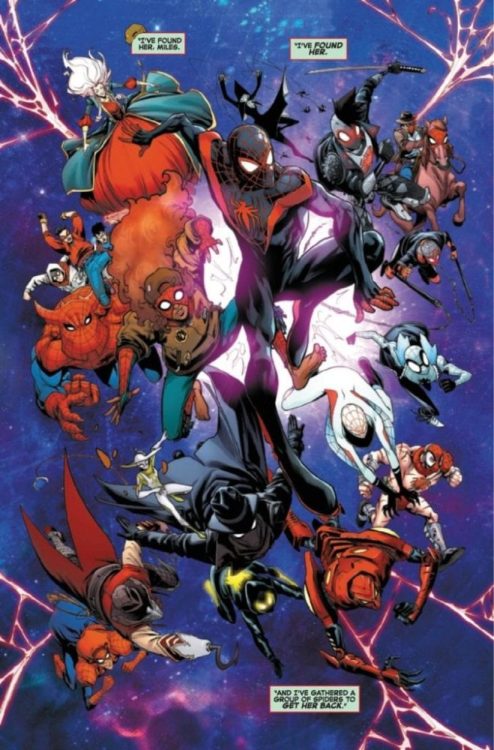
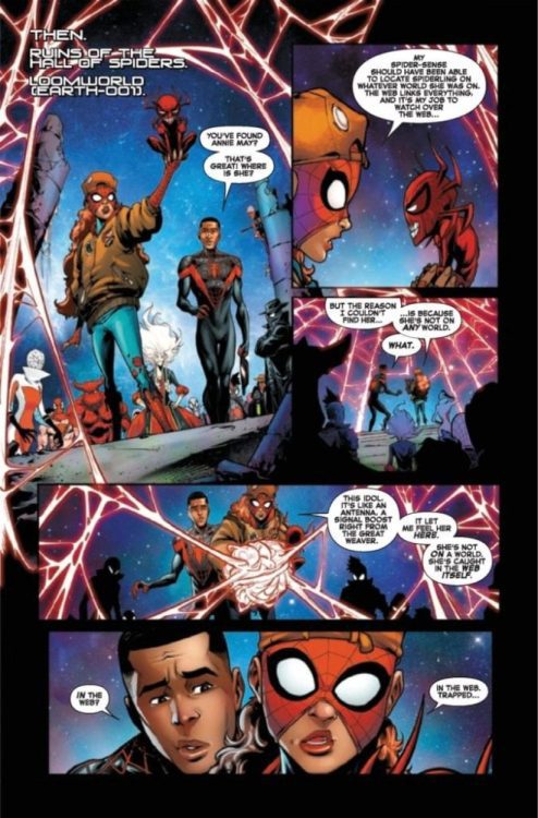
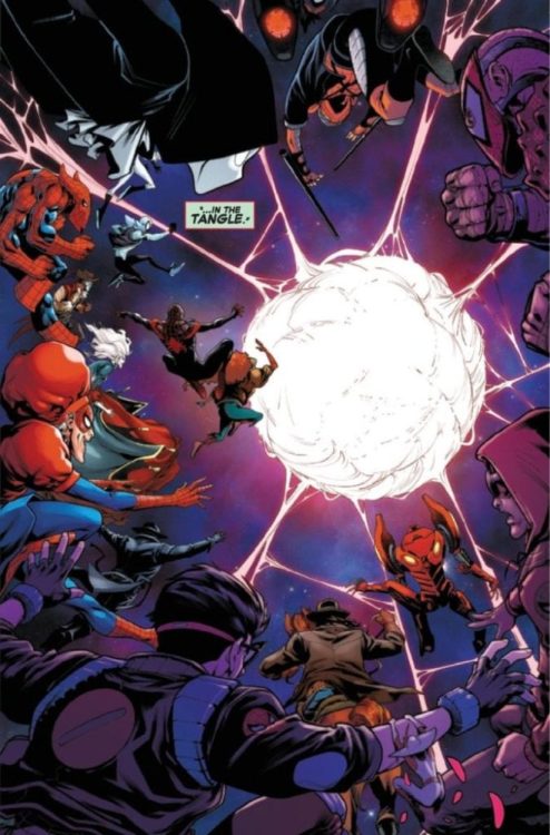
About Spider-Verse #6 (of 6): The conclusion to SPIDER-VERSE is here! All the various threads of this series (Miles Morales, Spider-Man Noir, SP//dr, Webslinger, Spider-Ma’am, and all the other Spider-People and Spider-Sonas) come together to re-spin the Web of Life and Destiny! But the journey won’t be easy, so don’t be surprised if all the spiders don’t make it through alive!
What do you think of MacKay’s Spider-Verse, do you have it on your pull list? Comment below with your thoughts.
Enjoy the Spider-Verse #6 Preview:
Spider-Verse Side notes:
Brian Michael Bendis and Sara Pichelli created Miles Gonzalo Morales, with his first appearance in Ultimate Fallout #4 from August 2011.
David Hine, Fabrice Sapolsky, and artist Carmine Di Giandomenico created Spider-Man Noir, with his first appearance in Spider-Man: Noir #1 from February 2009.
The Steel Age of Comics is a working title for the comic books that came out between 2011 and 2026. But where is this all coming from? Fans more than likely know about the Golden and Silver Ages. They were the times of comics that reflect the human conditions and mindsets of publishers and readers. So what exactly happened in the preceding Iron Age to give the foundations for this Steel Age? More importantly, why is 2011 the beginning of this age? This is the research from the gutters.
The BC (Before Comics) Age
If you have ever heard of the Golden Age or Silver Age, it might be because of movies or even comic books. But it’s a concept that creatives used dating back centuries. The most recognizable is the Greek version, the Ages of Man. In it, they describe human existence into different stages. Each seen through different eyes but more or less have the same meaning behind it. All of which says the pessimistic message of how the divine-human existence degrades into something less valuable. Hence why Gold is at the top while Iron is at the bottom.
The Comic Ages
Comics, especially that of superheroes, are practically modern versions of myth and legend. Just ask Grant Morrison’s book Supergods. Naturally, fans and historians like to compare these stories to tales of old and how they reflect the human condition. The desire for wish fulfillment exemplifies the Golden Age during the dark days before and during WWII. From 1938 to 1954, comics had little to no limitations in what it could portray. This includes Superman throwing a car with a passenger inside and Batman more willing to kill people. All to the detriment of what became the Comics Code.
The Silver Age is a reaction to comics losing its popularity but getting back into the mainstream by submitting themselves to the Code. As a result, most of the stories from 1956-1970 are full of dialog exposition and goofy stories. If you see Spider-Man stories during this era, you might get a glimpse of people babbling science to explain what’s happening. All of which cause the self-fulfilling prophecies that comics are just for kids.
The Rusting Weapons
Then comes the Bronze Age (1970-1984), where creators have to fight for the right to show more realistic subjects. Take for example, the Green Lantern/Green Arrow story where Oliver finds out about his sidekick Speedy’s heroin addiction. It wasn’t the drugs’ use so much as it was about the struggles people go through under its influence. Several other series follow suit with stories of characters with relatable flaws in attempts to bring back meaningful wish-fulfillment like in The Dark Knight Returns. All while bundling everything up in trade paperbacks and graphic novels.
Unfortunately, some creators and publishers took those concepts to the point of parody. Look no further than Death of Superman for how the series grew dark for no apparent reason. Or even Youngblood for unrestrained wish fulfillment. This results in why comics from 1985-2010 are given the dual name of the Dark/Iron Age of Comics.
What Gives The Modern Age its Steel Components?
Throughout this era, comics that once had shot up in popularity begin to fizzle out. Marvel probably suffers the worst of this as a result of factors like laying off its creatives such as Jim Valentino. Maybe those Greeks were onto something about the lowest point. Yet that would be ignoring the people who make the best of these situations. It’s during these low points that DC decides to implement its Vertigo imprint fully. Almost as if using whatever pure pieces of Iron to create masterpieces. Marvel even uses the more absurd elements of this period to create events like Infinity Gauntlet. That’s not even mentioning the rise in the direct-market for comic shops.
The Steel Age Reforges
That’s not to say that elements from the worst of the Iron Age can’t inspire new stories. Kingdom Come and Marvels are a testament to that. Both series with their art by Alex Ross show worlds where despite the flaws in warped Iron (blowing up Kansas or failing to save Gwen Stacy), they can be remade for an age of steel. Of course, there are different types of steel and situations that suit them best.
For long-running characters like Daredevil, it’s a matter of balance between the original swashbuckler and the hardboiled ronin. Others, like Carol Danvers take a long time to fold out the impurities to become their best selves. But even as Captain Marvel, there are still challenges ahead that require careful steps to remain consistent. Then there are times when publishers reinvent the wheel with Ms. Marvel‘s Kamala Khan. Because sometimes you have to try and work from a new angle to appeal to a broader audience. In Kamala’s case, it’s about dealing with the labels of millennials and how to find the right balance in life. Like all of life’s struggles, it takes several tries and tolerance to get right.
When Does The Steel Age Begin?
So with all of that in mind, how does the Steel Age begin in 2011? Especially since that’s 25 years after the agreed-upon beginning for the Modern Age of Comics. According to TV Tropes, the “Iron Age” of comics are codified by “Retcons, Reboots, Retools, and Alternate Universes” as necessities. Because when continuity gets in the way of telling a good story, it’s necessary to start fresh. 2011 is just the point where everyone tries again by putting everything in one package while pruning the liabilities. Namely by embracing the digital medium and cutting ties with the Comics Code. Because if you can give comics to people directly through digital means as Marvel does, why bother with putting up with stuffy desk workers who help ruin your reputation?
What Happens After This Steel Age?
The ages of comics always reflect the needs and desires of the world around them. All while paying respect to what’s come before. A number of outside factors always necessitate the need for change. The Steel Age is exemplified by getting rid of outdated concepts like the Comics Code and embracing modern mediums like the internet. Story-wise, the best comics of the era are about finding the balance between wish fulfillment and realism.
Until then, there will be fans out there trying their part in how they want comics to be presented in their modern age. Anything to comment about this? Leave your thoughts down below.
Prior to the Winter of ’92, comics in print were largely relegated to darkly lit comics shops or the poorly-maintained spinner rack in a local grocery store…and then came THE DEATH OF SUPERMAN. A comic book story – not a movie or television adaptation – was the topic of discussion on the 6 o’clock news, and I had never seen that before.
Growing up as a comics fan, the characters and their stories were something you discussed among, well, other fans. Sure, you could say “Everyone knows who Superman is” from SUPERMAN: THE MOVIE or the deluge of t-shirts, toys and assorted knick-knacks that float around the market at any given moment, but this moment in Winter of ’92 shifted awareness away from the character of Superman to a specific story arc. For once, the story of his actions and deeds became as noteworthy to the general population as the symbol himself.
You can read a fairly good historical account on Wikipedia of how DC Comics came up with the concept to kill Superman. Mike Carlin, the legendary Dan Jurgens, Roger Stern, Louise Simonson, Jerry Ordway, and Karl Kesel were discussing story ideas, and Ordway jokingly suggested killing Superman (temporarily, of course). The idea was to emphasize Superman’s importance to the world within the comics in a new way. The joke turned into reality, and it was a great success, selling over 6 million copies at release. By comparison, comic monthly sales figures for Batman or other top-tier characters at that time was a little over 100,000 copies.
What Ordway and the other writers hadn’t guessed was how important Superman was to the world outside of the comics. The Death story tapped into something that comics fans like myself already knew: these characters and their stories are our modern mythology. They shape our vision of what a world of magic and wonder could be like. Comics show us how heroes save and villains destroy. We cheer when the battle is won, and we hold hands when a friend is lost in battle – fighting for what’s right.
Lois Lane cradling the body of Superman from issue #75
There I was. Winter of ’92. Back from my weekly trip to the comics store with my little brother. Sometimes we hung out at the mall, and we discussed the latest issues of Batman or Green Lantern. Then that news story came on talking about THE DEATH OF SUPERMAN with their man-on-the-street reaction clips. The reaction from everyday folks was sorrowful. Some even showed a touch of grief. It never occurred to me that anyone cared about Superman outside of those darkly lit comics shops. Yet, here was the real world talking about…a comic book story. Everyday people, living their everyday lives expressing shock and sadness as if they had lost a friend.
That’s when I knew comics mattered more than just floppies. New Comic Book Day wasn’t something that only hardcore nerds looked forward to every week. They mattered more than just to my little brother or me or to my (very small) circle of friends. Superman and his adventures mattered to the world.
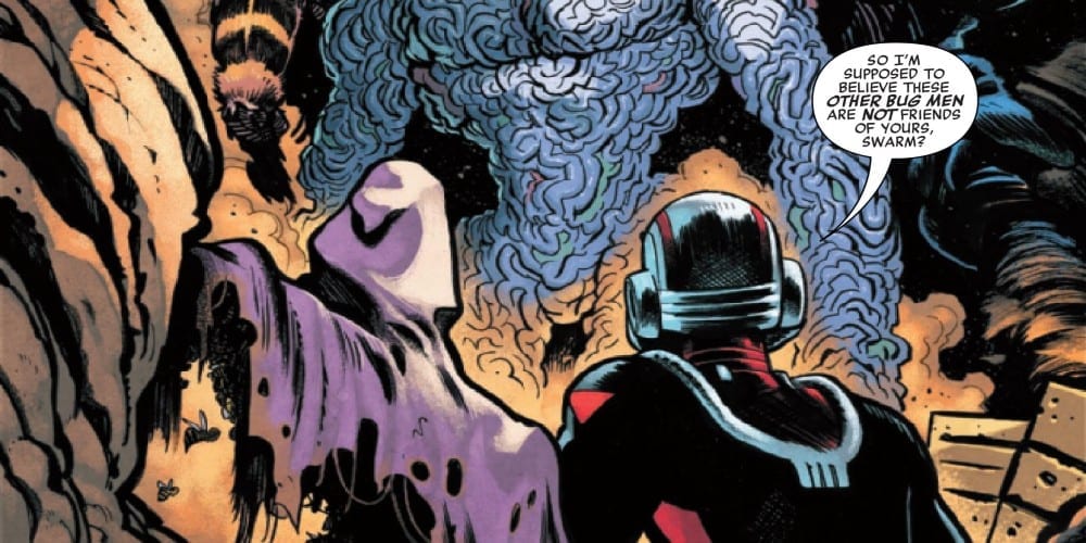
Due to the efforts of Zeb Wells, Dylan Burnett, Mike Spicer, and VC’s Corey Petit, Ant-Man #2 continues the solo adventure for the size-changing Avenger. Does the appeal shrink from the first issue moving into the second or does the issue deliver where it counts?
A global conspiracy uncovered! Ant-Man faces off against a new host of villians unlike anything we’ve ever seen before – and they’re not falling for any of his tricks. With his back against the wall, will Ant-Man be able to stand his ground or end up squished beneath their heel?
Writing
The issue opens with a summary of the 1st installment by Pamela the ant. When you find yourself saying “I never knew I needed an ant to narratee a comic recap” you know you have hit comedy gold. There is greater attention to comedy in the second issue despite the world-ending villains begin introduced. There is also a great back and forth between Ant-man and the Swarm. Ant-Man is reluctantly saving the villain but makes it a point he and the villain are in no way chums.
Writer Zeb Wells does make sure to not just the whole issue a comedic outsing. There are hints of Ant-Man’s daughter Cassie wanting to go hang out with the West Coast Avengers. It’s good to see character development hasn’t been forgotten even though there is an intended increase in humor.
Artwork
Though Dylan Burnett does draw a few rather weird facial expressions in the issue, some of them help to land a humorous reaction. There also is a very disturbing moment involving an exploding insect. Credit where credit is due, it’s a scene made more memorable thanks to the artwork.
The colorwork by Mike Spicer adds to the special effects of the issue. Ant-Man’s ability to make things shrink and grow to the various insect-based opponents in the issue are of particular note. Basically, the coloring helps to action to flow in a very impressive manner.
The lettering by VC’s Corey Petit helps to communicate the different methods voices present throughout the issue. The different speech bubbles from the villains and from the insects offer an auditory aspect to the issue. Also, the style used for the main villain showcases him as a definite impending threat.
Conclusion
Ant-Man #2 is still funny and is building to a much bigger development. The biggest questions introduced center around if Cassi will go the West Coast Avengers and if Ant-Man will be in a better place when its all over. Hopefully, he won’t go to the West Coast Avengers thought. It just doesn’t seem like his kind of team.
Suicide Squad #3, written by Tom Taylor, with art by Bruno Redondo, colors by Adriano Lucas and letters by Wes Abbott, continues to play things close to the chest. With every answer, we get ten more questions. And with this creative team on its A-game, this no-holds-barred series continues to be a wild ride.
Writing
Taylor likes to keep the readers in the dark as much as possible. It’s a brilliant approach for an espionage-thriller. In past projects, Taylor has worked out of continuity. This gave him the license to kill off or maim characters left, right and center. Essentially, he was able to imbue his stories with real stakes as the “but they’ll never kill Superman” logic no longer applied. When moving to a project like Suicide Squad you would expect him to be limited in changes to continuity. Thank God that’s not the case. Each new issue, something new happens that you didn’t think DC would let him do. It’s wonderful.
Art
Though Redondo’s style is very naturalistic, he occasionally takes the “Kevin Maguire” approach in this issue. Especially when things are heating up and a lesser comic would fight the “cheesiness” only to make it worse, Redondo gives the characters wild expressions. Their over-expressive faces in otherwise tense scenes assures us this creative team doesn’t take itself too seriously. Redondo knows the Squad is as goofy as it is deadly, and balances those two aspects of Task Force X with precision.
Coloring
Lucas’ colors continue to be nothing but fun. While his Tarantino-esque color palette from previous issues still finds its place here and there, much of the issue takes a darker tone. And in each dim scene, Lucas seems to make any excuse to make the scene gorgeous. When the Squad is talking in a sewer over a dead body, the sewer walls are lined with red lights. And so the entire scene is set in a red glow. It’s great to see that Lucas can have fun, not only with neon yellows, but in the darker scenes too.
Lettering
Abbott’s lettering for Suicide Squad #3 is simple but brilliant. The slightest variations in the size of characters’ lines immediately establishes the power dynamics of a scene. When Lok speaks to a soldier, the soldier’s lines are written smaller. Of course, Abbott shows us the soldier’s feeling that he isn’t allowed to talk. Abbott’s sound effects are also lots of fun. They often take the form of whatever is making the noise. The sound effects that accompany a wound look like blood gushing out. The sound effects that go along with electricity look like lightning bolts. The lettering becomes a part of the art throughout the issue.
I’m calling it. This may be the best book of the year. And it’s only February. If Taylor and company continue to fire on all cylinders, we are in for a wild and magnificent ride. They know when to keep their readers in the dark, and even when they provide answers they know how to keep us asking questions. Pick up your copy of Suicide Squad #3 on February 26th at a comic book shop near you.
Sooner or later the inevitable replacement of the old gritty Constantine with a “new-age” version had to happen, it just seemed to happen sooner in this weeks’ John Constantine Hellblazer #4, from DC Comics.
Art by Matias Bergara. Colors by Jordie Bellaire.
CONSTANTINE ATTITUDE
During the previous arc (reviews here), writer, Simon Spurrier took Constantine back to his roots with horror and the good ol’ Constantine attitude. For the second arc, Spurrier drops the horror, ramps up the attitude and introduces one of Constantine’s worst fear; a gentleman, scholar, clean-living, vegan acolyte of love—Tommy Willowtree. That’s how DC Comics bills Willowtree, citing him as someone that Constantine will instantly hate. That he does. But damn, hate was never this fun.
Continuing the trend of bringing Hellblazer and Constantine to their roots, Spurrier has him don his original outfit. Granted this doesn’t last long, nonetheless, the outfit looks dapper. But, as fun as Constantine is by himself, he always plays off others better, which Spurrier excels at. The moments between Constantine and Vestibulan are great, yet when Willowtree is introduced you know Constantine will be more insufferable than usual. By the end, you’ll be wanting more issues with the duo. But, sadly as everyone knows, anyone close to Constantine doesn’t last long.
Spurrier uses Willowtree as a plot device to showcase the vast difference between the old way and the new way. This is seen as a continuation of the previous arcs threads of “finding a home for Constantine in the modern world” (thanks Darryll). Yet, instead of battling a gang and a hobo he is against one that idolizes him to the point of wanting to be him. Willowtree essentially is Constantine, yet a newer version that’s not such a bastard. Plus, he wants to help and learn more from the person he idolizes.
Art by Matias Bergara. Colors by Jordie Bellaire.
BASTARDLY PERFECT ART
Matias Bergara has a stylized art that can be identified in a lineup. This art works perfectly with the story Spurrier sets out to tell. Bergara is able to easily switch between the genres presented while looking elegant the entire way. The panel placement and pacing that he employs work perfectly, helping tell the story needing to be told. This can be seen when Constantine leaves his place and runs into what they dub Turd-Goblin. During the page before the reveal, Bergara uses a mix of varied sized panels that pick up the speed towards the end.
Then, BAM, the next page Constantine and the reader are introduced to the ugly Turd-Goblin. The use of small panels to quicken the speed and a full silent page to reveal the monster is delightfully done. Pacing aside, Bergara’s art looks amazing in motion. In the few moments action occurs he makes sure said element pops off the page, giving a chaotic feeling. All this while being able to nail the comedic timing of every moment perfectly.
There’s been a beautiful storm happening in the color scene lately, and that’s Jordie Bellaire. She’s been around for a few years, yet it seems in the last few you can just about see her name everywhere. Much like Bergara, she is able to adapt to different genres. The combination of her colors and Bergara’s art is beyond words with their beautiful execution. For most of the issue, she keeps the colors bright and vibrant, matching the tone. But, when the time calls for darker shades she equally excels.
There are a few moments where Bellaire drops the background color and relies on white. During these, she is able to make the characters pop even harder during the panel. In Hellblazer #4 she is able to make the landscapes so gorgeous you want to visit everywhere they go. When the sun shines, she makes damn well sure you know it.
Art by Matias Bergara. Colors by Jordie Bellaire. Lettering by Aditya Bidikar
THE MAGIC IN WORDS
There’s a lot to love in Hellblazer #4. It seems every creator attached is in complete sync with one another. The same can be said in Aditya Bidikar’s lettering. Throughout the issue, Bidikar bolds the important words, giving each bubble a pop that helps read what is happening. Better yet, when Constantine whispers or speaks quietly he letters what he says in a smaller font. During these moments he never makes them too small, just enough to know he is whispering.
As great as the lettering is, there is but one minor gripe. Very minor. When Vestibulan talks/texts and the phone isn’t visible Bidikar letters it with a rounded edge. Yet when the phone is visible and you are reading the text it is a hard angle. The difference between the two look weird, especially when the panels are next to each other. Alas, for such a great issue a blemish such as this is small.
Art by Matias Bergara. Colors by Jordie Bellaire.
OPPOSITES ATTRACT
It would be easy to single out multiple pages in Hellblazer #4 and talk about how amazing the art is in various facets. Yet, here we’ll quickly focus on Willowtree’s confusions to Constantine in a car (seen below).
Art by Matias Bergara. Colors by Jordie Bellaire. Lettering by Aditya Bidikar
Bergara’s scene direction makes what could’ve been a visually word-heavy, boring page into an intelligent one that shows everyone’s reaction. In the establishing panel, he showcases everyone involved, then moves into Willowtree’s speech. By having Constantine watch Willowtree’s speech in the mirror he is able to show his noncaring attitude for the “Evil is at large” speech; thus reinforcing the difference between the two. Following this is the reaction shared between Constantine & Noah who seem to be getting along cheerfully.
Between the blocking, pace, reactions, and Bidikar ‘s word placement said page turns out wonderful. Each page in Hellblazer #4 reads as such and deserves a Panel Breakdown.
A BLOODY FANTASTIC ISSUE
Everything about Hellblazer #4 is fantastic. It reads differently than the previous issues, yet it’s a great genre detour that gives the reader a breather. Even if you aren’t caught up on DC Comics’ newest Hellblazer it’s worth reading. Granted you should be reading the new relaunch as it is great, but the beginning of the second arc shows that the first wasn’t just rookies luck. Plus the last few pages and cliffhanger are immensely hilarious and ends the issue on a high note.
Memorable Quote: “Pun magic. You do fucking pun magic.” – John Constantine.
Hey, I love puns and think that pun magic sounds awesome! Granted I suck at Puns, nonetheless, Zatanna has backward speaking magic, what’s wrong with Puns?
Side Note: I absolutely love the team behind Hellblazer #4. Bergara’s art was what originally drew me into Spurrier’s CODA last year. The duo is a dream team in the comic scene, yet aided by Bellaire and Bidikar they’re a force to reckon with.
NEW LOOK, SAME BASTARDLY MAN
What have you thought of Hellblazer #4’s different vibes from the recent issues?
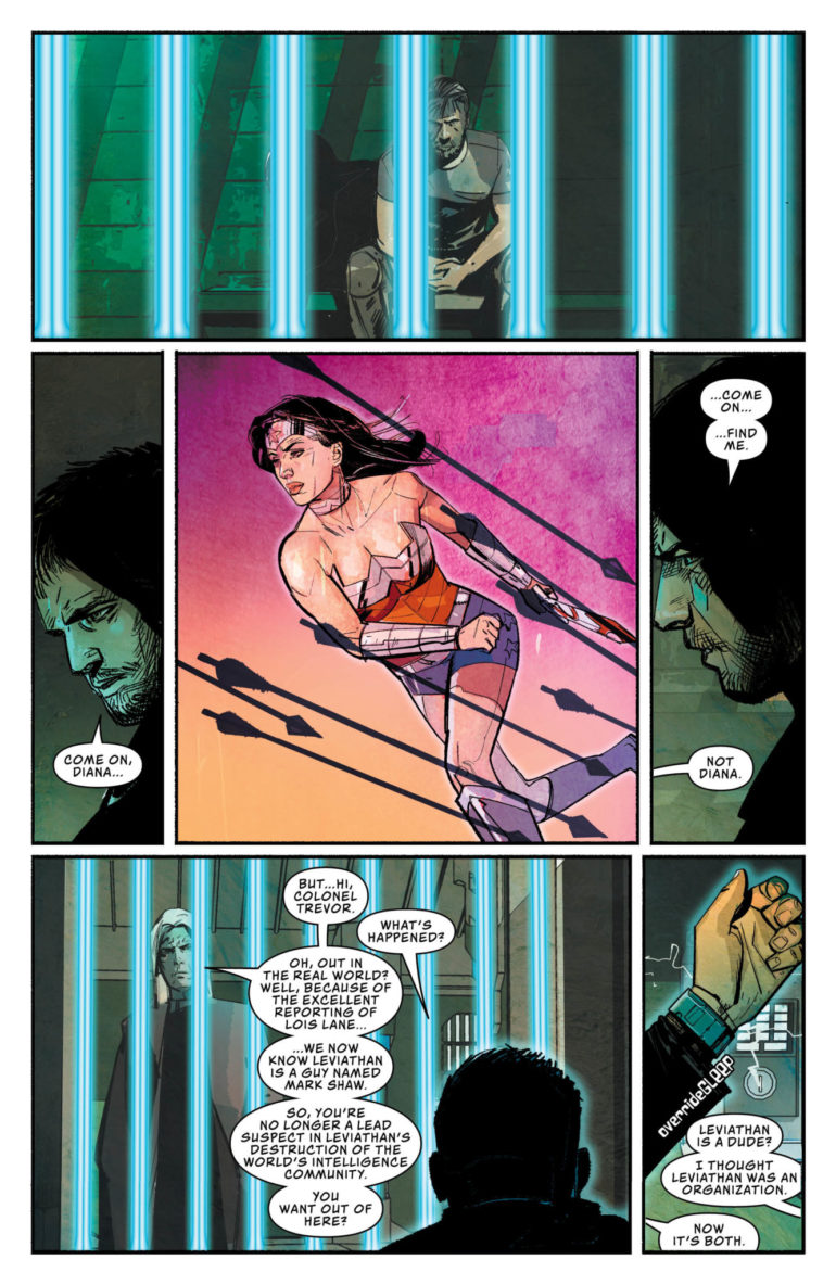
Leviathan is an organization that’s been apart of DC for a while. While it first started as a rebel group of Assassins lead by Talia Al Ghul, Bendis turned it into something a bit bigger. Using an old antihero as the new mysterious face of the organization, Leviathan became a dangerous spy organization that destroyed the major spy organizations of the world. Argus and the DEO were left in ruins as their leaders were imprisoned. A small group of detective superheroes quickly uncovered the plot and exposed Leviathan as former Manhunter, Mark Shaw. With his plan exposed, Leviathan retreats to do battle another day. Is that day today?
**Some Spoilers Below**
Story:
After being exposed by Lois Lane, Leviathan regroups as he prepares for his next big plan. He commands his troops to continue their work across the globe. In America, a man named Kingsley Jacob releases Steve Trevor from prison. He offers him a position in a group that will take down Leviathan, but they’ll need some help. Steve Trevor begins heading across the country and recruits people for this new spy organization. He recruits Director Bones of the DEO first before getting Green Arrow, Talia Al Ghul, Question, and Manhunter. Together the team forms into the super-spy organization, Checkmate.
When picking up this story, I was hoping we’d get more action and spy antics to excite readers. This ended up being a slow build-up to that potential action. While it is interesting to see these organizations grow in the long run, as a single issue, it’s incredibly dull. The action sequences are very sparse, with only a page of quick punches making them up. This issue is strictly set up Checkmate to take on Leviathan.
Speaking of Checkmate, this team doesn’t make a whole lot of sense. Steve Trevor and Director Bones make sense. They have faced espionage in the past and are just out of the spotlight to go undetected. Then we have Green Arrow and Question, two who tend to work solo. They’ve obviously worked with teams in the past, but working for a secret organization seems a bit far fetched. Then we have Lois Lane, probably the most out-there of the whole group. Other than being the wife of Superman, she brings nothing to the table except her father’s last words. Honestly, this team was only made because they’re B-listers that was in the previous story. I want to be proven wrong as we move forward, but Bendis is going to need to do a lot.
Art:
I know some enjoyed the look of Event Leviathan and will love the look of this book. This reviewer isn’t one of those people. It’s okay, and Alex Maleev does a decent job of carrying all fronts of art. It fits the story, being dark and gritty as the world of super spies tends to be. The best-looking part of the book is Leviathan, both the organization and the leader. They look like a true force to be reckoned with, and honestly, I can’t imagine them without Maleev’s style.
Conclusion:
While there will be fans of this issue, especially those who loved Event Leviathan, those seeking a more action-packed story should look elsewhere. Unlike the previous story, there’s no great mystery for us to get invested in. Aside from the big cliffhanger at the end, most of this story is incredibly dull and a chore to get through. This is the first part of a grander story, and I hope that it’ll be more exciting. Leviathan is an interesting villain but isn’t sort of an exciting story. Here’s hoping Bendis can turn it around into something we can all get behind.
Writer N.K. Jemisin and artist Jamal Campbell return to the City Enduring with “Far Sector” #4. This uses sharp, attitude-filled dialogue and intelligent political parallels to offer commentary on the intense events of the prior issue, while building the behind-the-curtain tension for both the City Enduring and Sojourner herself.
“With the so-called Peace Division firing upon the protesters it’s meant to protect, new Green Lantern Jo Mullein devises a novel solution to bring the chaos to a close-one that causes the rookie Lantern to run afoul of the City Enduring’s leadership council. Meanwhile, we learn more about Jo’s recruitment into the Green Lantern Corps, and the nature of her mysterious and unique power ring.”
Writing & Plot
N.K. Jemisin‘s scripts in “Far Sector” are full of naturalistic but personality-filled and distinctive dialogue and narration. Jo Mullein’s dialogue and inner-narrative speech are completely honed to a recognizable and distinctive manner of delivery. The other characters are given their own distinct diction in their dialogue as well, making reading the often lengthy sequences of conversation and debate (mostly the latter) in issue #4 a pleasant trip at least. The plot here takes its time to dissect the decisions made by the council and its security force in the last issue by using obvious parallels to our own reality. The struggle Jo faces as a galactic peacekeeper against a planetary police force is a compelling one that’s layered with poignant and relevant moral arguments. It’s a consistently engaging plot to dive into from issue to issue, whether it focuses on action or interpersonal relationships or planetary politics.
Art Direction
There isn’t much to say about Jamal Campbell‘s absolutely astonishing artwork in “Far Sector” #4 that hasn’t already been said. The massive variety of character designs that inhabit the crisp futurism of the City Enduring is a feast for the eyes from month to month. Campbell’s colors once again arrive in a slew of sci-fi neons and digital hues that are a wonder to behold, making this one of the most gorgeous comics on stands right now. The lettering from Deron Bennett utilizes a soft but clean and bold font that changes in subtle ways depending on the character speaking and the manner they speak in. It’s a simple yet highly effective choice that guides the reading experience along flawlessly.
“Far Sector” #4 is yet another great issue in one of the best comics DC is putting on stands right now. N.K. Jemisin’s poignant and compelling scripts work hand in hand with Jamal Campbell’s gorgeous futuristic art to bring out one of the sharpest comics in recent memory. Be sure to grab a copy of this chapter on 2/26!
JUSTICE LEAGUE DARK #20 hits comic book stores on Wednesday, February 26th, and readers will find that our heroes’ past actions have spawned devastating consequences. The Justice League’s Dark rewriting of the rules of magic back in WONDER WOMAN & JUSTICE LEAGUE DARK: THE WITCHING HOUR has left the primal forces of nature imbalanced. And it looks like The Green is already wrecking havoc across the country.
Story
In an unexpected turn of events, the citizens of Los Angeles find themselves in the midst of a most unusual fungal outbreak. Hundreds of spores have begun sprouting from the heads of people, leading them to behave erratically. We can sense the panic spreading like a swarm of bees, especially when a man climbs to the top of a building and explodes.
Watching the horror unfold, Animal Man, a person steeped in the animal power of The Red, reaches out to Detective Chimp and the rest of Justice League Dark to assist in the crisis. They soon learn that the forces of nature are all out of whack due to their very actions.
Ram V and James Tynion IV’s script paces wonderfully, guiding readers through this horrific outbreak and the subsequent panic and response from our heroes.
Artwork
The artwork is both chilling and awe-inspiring. Kyle Hotz’s penciling and ink work offers readers surreal looks at a city infested with a fungus of sci-fi proportions, with grotesque illustrations of the fungi in the middle of an otherwise normal metropolis. Fco Plascencia’s coloring works well with this via effective uses of earthy colors for the creatures in the midst of the city’s bland landscape. In addition, Rob Leigh’s lettering does a great job of differentiating between each characters’ dialogue, helping readers follow the action across the ever-changing landscape.
Comic Covers
Main Cover
Guillem March’s main cover artwork depicts Animal Man front and center, standing over the corpses of his fallen teammates. This shows readers how much the rest of the team will depend upon him in the coming conflict.
Variant Cover
Clayton Crain’s variant cover features Wonder Woman, Zatanna, and Detective Chimp, giving us a close look at three of the team’s most pivotal members.
Conclusion
JUSTICE LEAGUE DARK #20 introduces a new threat unlike the Justice League Dark team has ever seen. And after reading this issue, we can’t wait to see where the story heads next.
Do you think of heroes can bring balance back to the forces of nature? Let us know in the comments below!


 Comics, especially that of superheroes, are practically modern versions of myth and legend. Just ask Grant Morrison’s book
 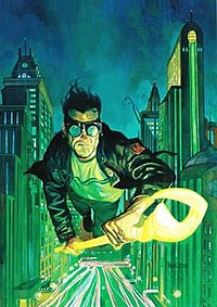 Throughout this era, comics that once had shot up in popularity begin to fizzle out. Marvel probably suffers the worst of this as a result of factors like laying off its creatives such as Jim Valentino. Maybe those Greeks were onto something about the lowest point. Yet that would be ignoring the people who make the best of these situations. It’s during these low points that DC decides to implement its Vertigo imprint fully. Almost as if using whatever pure pieces of Iron to create masterpieces. Marvel even uses the more absurd elements of this period to create events like Infinity Gauntlet. That’s not even mentioning the rise in the direct-market for comic shops.
 For long-running characters like Daredevil, it’s a matter of balance between the original swashbuckler and the hardboiled ronin. Others, like Carol Danvers take a long time to fold out the impurities to become their best selves. But even as Captain Marvel, there are still
  So with all of that in mind, how does the Steel Age begin in 2011? Especially since that’s 25 years after the agreed-upon beginning for the Modern Age of Comics. According to TV Tropes, the

")