Valiant Comics’ X-O MANOWAR #1 jumps right into the action with a fun, lighthearted adventure created by Dennis Hallum, Emilio Laiso, Ruth Redmond (colors), and Hassan Otsmane-Elhaou (letters). It’s a fast-paced story that mildly suffers from cluttered art design.
Story & Dialog:
Writer Dennis “Hopeless” Hallum has crafted a fun fish-out-of-water story to restart one of Valiant’s headlining characters. Right from the start, you’re introduced to Aric, a 4th-century Visigoth, who returns to Earth after centuries in captivity with an alien race called the Vine. During his time away, Aric is bonded with a powerful super-suit run by an advanced AI that can access all Earth communications and stores of knowledge to bring the hero up to speed.
It’s a brisk 20 pages that showcases everything from a space battle to a basketball game that goes comically wrong to the accidental destruction of a neighbor’s car. Where the dialog really shines is the internalized interaction between Aric and his suit’s AI, Shanhara. Shanhara directs Aric to trouble spots and fills in his knowledge gaps about modern life. They bicker like an old married couple, which works to keep the tone light most of the time.
Where the story falters slightly is in the inconsistencies with Aric’s assimilation into modern Earth life. He recognizes stinger missiles and assorted types of firearms, but doesn’t know the purpose of a wrench. It’s a small quibble, but there are several examples peppered throughout the issue that pull you out of the story briefly.
Lastly, the issue opens up several questions that are not answered by issue’s end in order to keep you invested and interested in the story. Questions related to backstory (e.g How did he lose his left hand? How did Aric make it back to Earth?), and questions that presumably are setup for future issues (e.g. Who was the evil scientist? How does he know Aric? What’s with the evil killbot?). I’m interested to see how and when these questions are eventually answered.
Art:
The issue is jam-packed with panels by Emilio Laiso, and that is both the highlight and the shortcoming of this first issue. Ruth Redmond’s colors are bright, the characters are distinctive, and nearly every inch of space is filled with action. It’s a visually engaging issue. However, some pages are overstuffed with panels so much that it’s difficult to make out what’s going on. Most of the panels seem to be locked in constant close-up mode, making every scene feel small. Several of the bigger action scenes would work better if they weren’t crowded out by surrounding (overlapping) panels and the artist had pulled back to give a wider picture of what’s going on. Give the scene more room to feel big.
Otsmane-Elhaou did a remarkable job with the lettering by balancing the external conversations with the internal dialog and (in one case) translating an alien language. Through it all, the lettering remained clear and easy to follow.
Conclusion:
X-O MANOWAR #1 is a well-written start for a new reader interested in Aric’s adventures. The story is full of action without taking itself too seriously, and the interaction between Aric and his suit’s AI carry the story through. The art is visually interesting even if the perspective and overlapping panels make several pages feel muddled and small. It’s worth picking up.
Marvel Comics made a lot of news at this year’s C2E2 convention. Buckle up and we’ll try to hit the big items below:
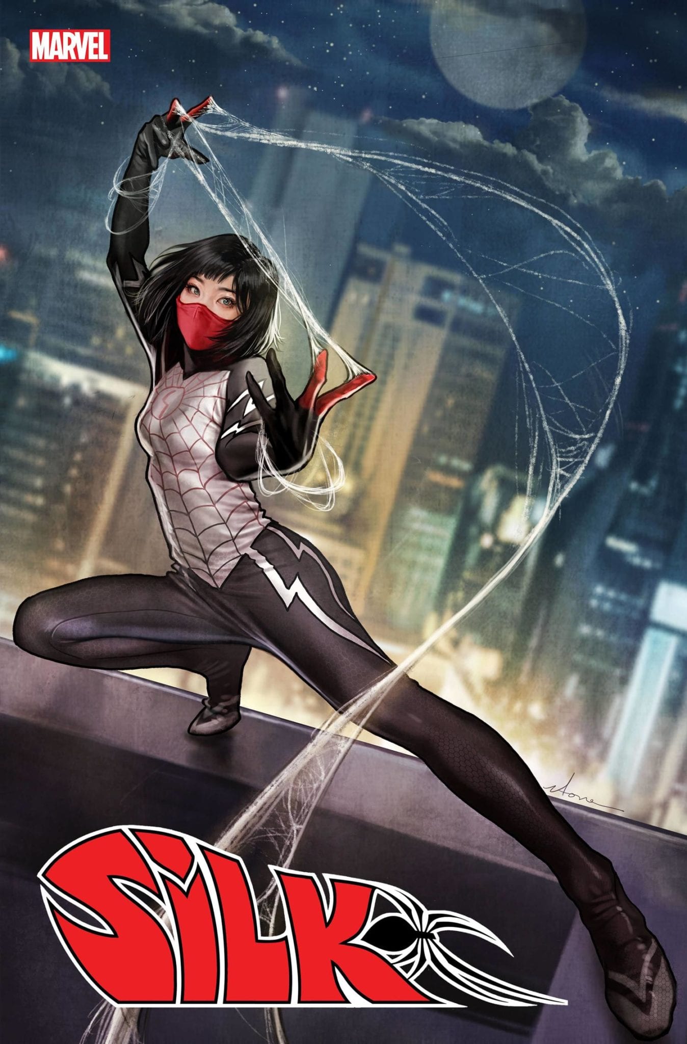
Silk a.k.a. Cindy Moon, the Korean Spider-Man spinoff character, will be getting her own series this July from writer Maurene Goo and artist Takeshi Miyazawa. Goo said in a statement that followed the announcement, “The opportunity to write a Korean American super hero—a woman, no less—is one that I never thought would come my way.”
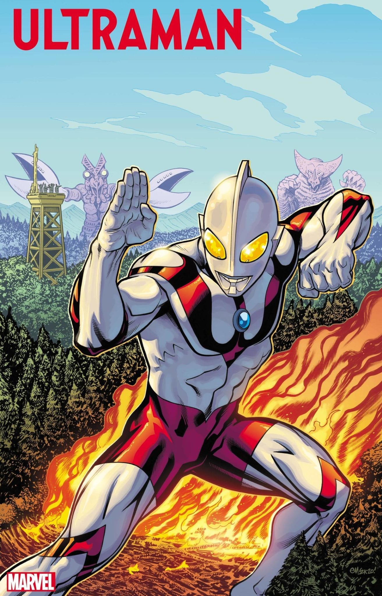
Japan’s Ultraman arrives at Marvel in a five-issue limited series by Kyle Higgins, Mat Groom, and Francesco Manna. This follows from the publisher’s partnership with Tsuburaya Productions announced last year.
The big X-Men event of 2020 was also unveiled at C2E2: July’s 15-part X of Swords, where ten mutants will wield different legendary blades from across the Marvel Universe against a yet-to-be-revealed threat. Writers Jonathan Hickman and Tini Howard will be the primary drivers behind the event.
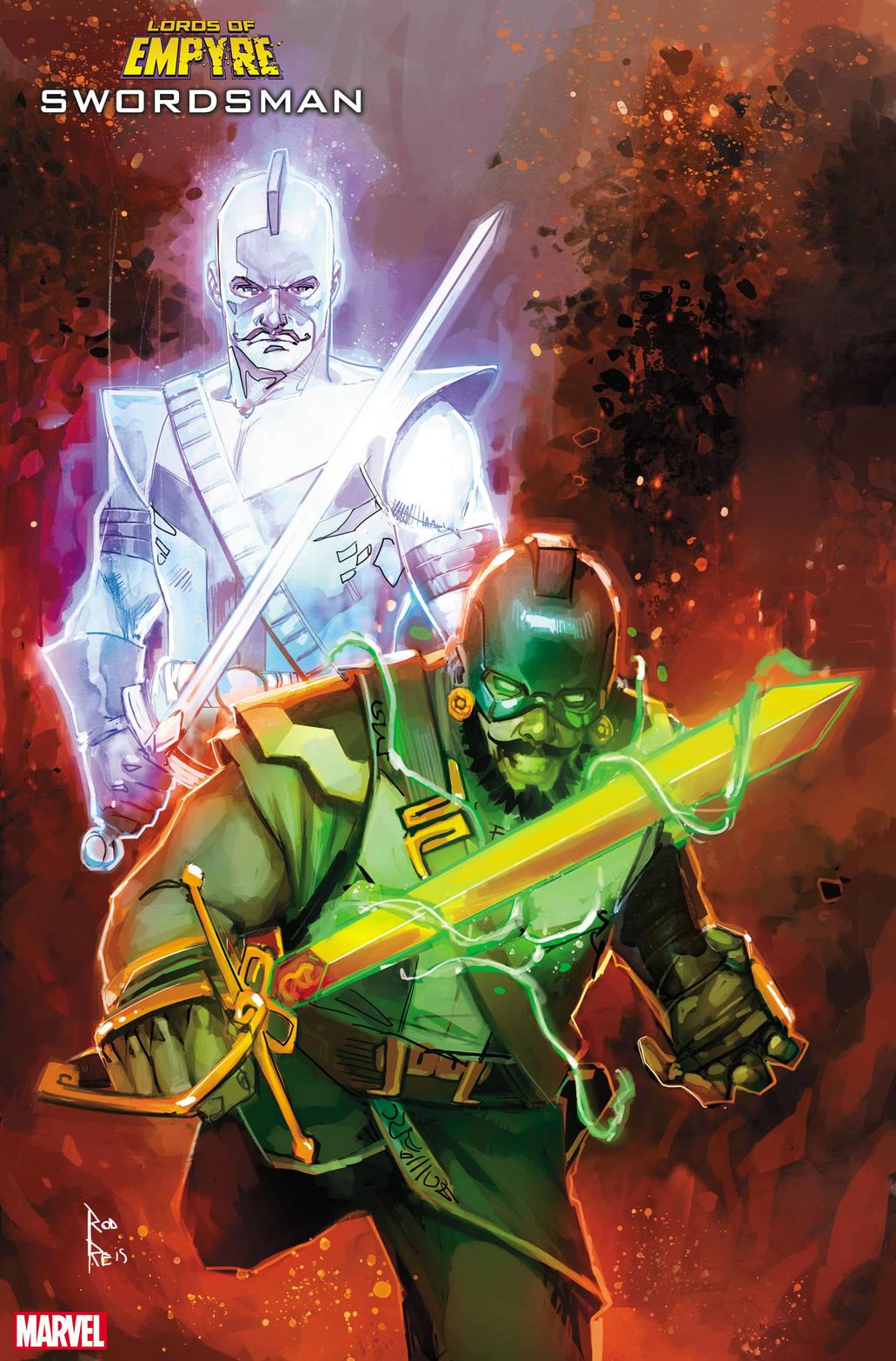
And speaking of events, with Empyre almost upon us, Marvel revealed more tie-in titles at the title’s C2E2 panel. They include three Lords of Empyre one-shots: Emperor Hulkling by Chip Zdarsky, Anthony Oliveira, and Manual Garcia; Celestial Messiah by Alex Paknadel and Alex Lins; The Swordsman by Paknadel and Thomas Nachlik.
Additional tie-ins will be The Invasion of Wakanda by Jim Zub and Lan Medina; Storm Ranger by Saladin Ahmed and Steven Cummings; Empyre: Spider-Man by Taran Killam and Diego Olortegui; and Empyre: Captain America by Phillip Kennedy Johnson and Ariel Olivetti. The Fantastic Four and Avengers main titles will be doing much of the heavy lifting.
Old school Marvel fans will not only appreciate the return of the Swordsman, but the amount of groundwork being laid to tie this new event into the Kree-Skrull War of old.
C2E2 was only the first in a long line of conventions for the year, so more reveals are no doubt on the way. Keep an eye on Marvel.com for these and other upcoming titles.
When people think about comic book creators they tend to think about the writer or artist first, depending on where personal interest lies. In the same way a movie director or star is the first port of call for selling a movie.
But just like a movie, a comic book is created by a number of people. They each add something to the pot and help create the wonderful soup you pick up month after month. Most people don’t realise that’s the case and only see the main ingredient but they would probably notice if those hidden ingredients weren’t there.
Everyone has read a comic where the images are crowded with massive word balloons, the text inside a mix of inconsistent fonts with haphazard emphasis. The plot is actually lost beneath a behemoth of Comic Sans and bold words, with crossed balloon tails that overlap a character’s face.
What those comics need is a good letterer, which leads us nicely into King of Nowhere.
The first issue of King of Nowhere is published by BOOM! Studios and released on 4th March. It is written by fan favourite W. Maxwell Prince and illustrated by Tyler Jenkins. The lettering has been provided by Andworld Design, the lettering and design studio that was founded by Eisner nominated Deron Bennett.
Lettering is often the unsung hero of comic books. Seen only as a way to relay the speech and thoughts of the characters to the reader. It is overlooked despite being the focal point for the audience. Studies are currently being undertaken to determine how people interact with comics and the initial findings is that our eyes pick out the text first before the image. Therefore, if you get the lettering wrong, it will affect the way that your reader will interact with the rest of the comic.
Luckily for Prince and Jenkins, Andworld Design are experts at what they do.
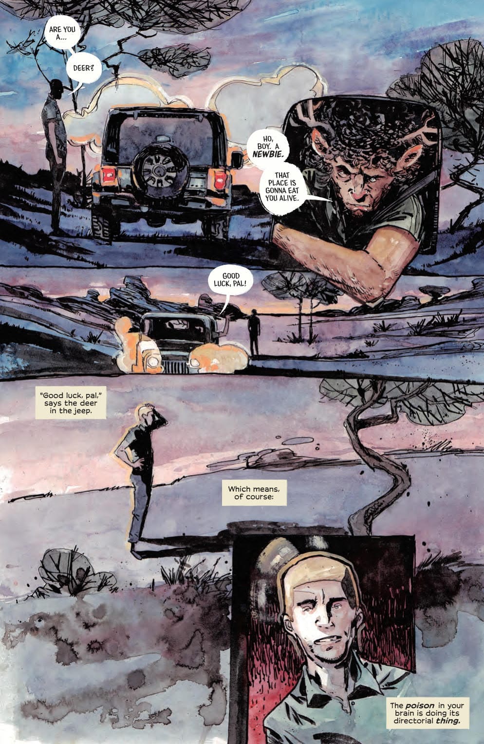
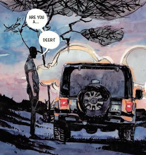
King of Nowhere #1 Page 3 Art Credit BOOM! Studios
Functions of the Letters
The lettering has two main functions. Firstly to impart information to the reader, such as the inner thoughts of the central character, Denis, as he staggers through the unknown town of Nowhere. And secondly, to help establish the mood or tone of the comic. The lettering has to mirror and reinforce the concepts set out by the illustration and plot.
The First function is easy to see within the King of Nowhere. Taking the third page as an example, the script enforces the situation that is facing Denis. The speech points out the obvious from his point of view, “Are you a… Deer?”.
This observation is reinforced by the next panel on the page, with the character leaning out of his car. The statement is taken a little further with the Deer’s reply because he imparts information that is not otherwise presented to the reader. “A newbie. This place is going to eat you alive.” From this the reader learns that Denis is not where he should be and that there is a certain element of danger in this town.
But this is scripting, where the lettering comes in is via placement. The script alone does not inform the reader that Denis is unsure about what he is looking at or that he is having a moment of disconnection from the world around him. That element is relayed through the placement of the speech balloons and the break, with a linking tail, of the sentence.
King of Nowhere #1 Page 3 detail Credit BOOM! Studios
The two balloons joined by a link give the impression of a pause, enhancing Denis’ uncertainty. The reader quickly discovers that the character does resemble a deer which in turn makes them question the pause. It is obviously a deer which means that a) Denis wasn’t expecting to see a deer, therefore this is not a normal occurrence for him, and b) Denis is questioning what he sees to discover where the problem lies, is it with him or the world around him.
There are a number of ways that the speech could have been laid out, each would have produced a slightly different emphasis on the sentence. By using a linked balloon the pause accentuates the final word. It becomes a question about the species of the creature. Two separate balloons might indicate that Denis was trying to find the correct word to describe what he was looking at and a single balloon would rob the moment of the confusion the central character was feeling.
This is just one small example of something Andworld Design does throughout King of Nowhere. Placement, emphasis, and the layout of the speech gives emotional information to the reader and extends understanding of the characters/situation.
King of Nowhere #1 Credit BOOM! Studios
Designed Contrast
The other wonderful thing that Andworld Design does relates to the actual design of the word balloons and caption boxes. To understand the brilliance of the design you have to first understand the concept of the comic because the two are linked.
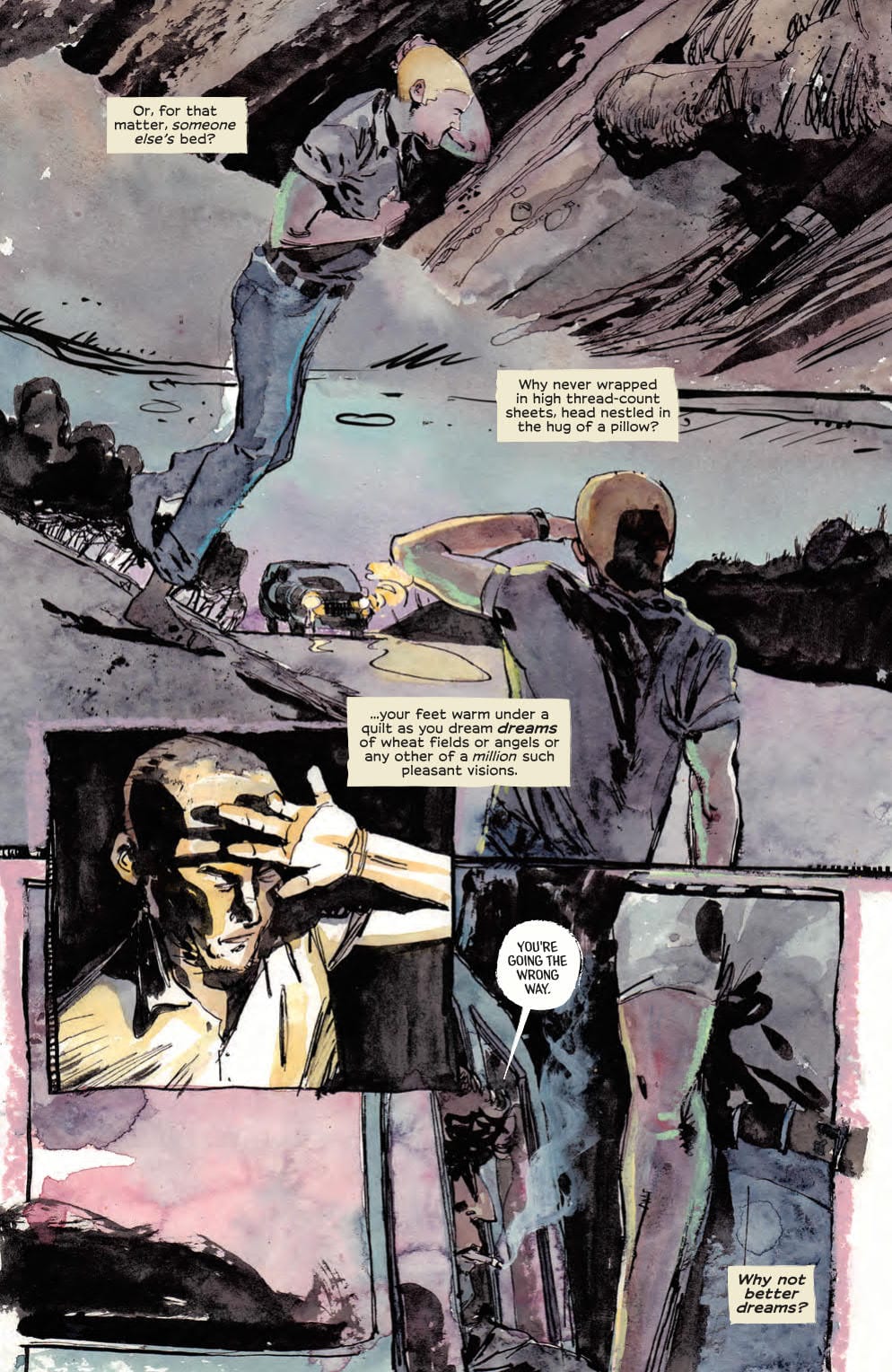
King of Nowhere is about a man lost in a world that is familiar in a number of respects but alien in others. It’s like Nick Burkhardt suddenly being able to see the Wesen in Grimm. Denis understands the mechanics of the town he is walking into, cars, bars, violence, but he has trouble reconciling the appearance of the people he sees. Ergo, he believes he is in a dream.
There are a number of elements in the comic that reinforce Denis’ state of mind. Some of it is in the speech, some in the artwork, but the lettering gives the reader the best indication of Denis’ state of mind.
The lettering is displayed in two ways throughout the comic: speech balloons and caption boxes. The first represents the town of Nowhere. It is rooted in the town, a part of it. The second is the inner thoughts of Denis and therefore do not belong to the town. His thoughts have strong links to what came before, what Denis understands ‘normality’ to be.
Andworld Design knows the distinction between the two and as such treats the two modes of delivery slightly differently. The caption boxes are, for want of a better term, ‘classic comic book’. The design is straight forward; rectangular boxes with aligned text inside. There are no borders but the distinctive yellow colouring creates a natural barrier between the boxes and the world behind them.
The caption boxes are as normal as possible, something recognisable by anyone who reads comics. They are Denis’, and by extension the readers, link to the real world; or at least what Denis understands the ‘real’ world to be.
King of Nowhere #1
In contrast the speech balloons are abnormal. They do not conform to the tradition of usual comic book speech balloons, but only in a subtle, slightly different way. There is the white background with the black text that a reader would expect but the rest of the design is off kilter. Their shapes are irregular with the borders barely visible or in some cases, encroaching onto the white. In short, they represent the unfamiliar world that Denis has found himself in: it’s just not quite right.
The design contradicts what the reader would expect from the speech balloon. In another comic this might cause a problem, but in King of Nowhere it is perfect. The contrast between imperfect speech balloon and ‘normal’ caption box reinforces the central characters dilemma and the core of the plot itself. Something so simple creates a visual dynamic on the page that enhances character and plot.
It gives the comic depth and another layer of storytelling. It is also something that is unique to comic books. What other medium can create a visual contrast between the voice inside a character’s head and the one other characters can hear?
There are a number of comics out there that have outstanding letterers, King of Nowhere is just one of them. Without their hard, often overlooked, work the comics we read would lack an element that makes comics such an exciting medium. With the possible exception of Picture Books, Comics are the only medium that utilise Letters as a visual component in every aspect of the storytelling process. Andworld Design excel at what they do and I can’t wait to see what they do in future issues of King of Nowhere.
One of the ever-rising energy options widely used by various households in the UK is green energy. Regardless of this increasing number, there are still individuals with the notion that it is more expensive paying their gas and electricity bills using green energy. This is not true; on the contrary, it saves cost, creates a clean environment and could even generate profits if the right steps are taken. This article will help you understand what green energy is and how you can significantly benefit from it.
What Is Green Energy?
Green energy or renewable energy is produced from natural sources such as sunlight, tides, wind, algae, plants, and geothermal heat. They are renewable, in the sense that they can be naturally reproduced. As we advance, there are more energy suppliers that offer green energy tariffs, based on the supply of eco-friendly energy, to various households. The energy supplied is 100% renewable and comes in various forms, ranging from wind farms to solar panels.
In the UK, there is a regulatory body that oversees the supply of gas and electricity by energy retailers to households. This regulatory body is known as Ofgem – Office of Gas and Electricity Markets. They have implemented a Green Energy Certification Scheme that provides scrutiny and audit to willing energy providers, after which their services are being certified as ‘green’.
Although some energy providers are not certified by Ofgem, they still provide environmentally friendly energy to consumers.
Is It Cheaper To Use Green Energy?
Green energy is slightly more in price when compared to the standard energy tariffs – the reason being that it costs a lot to produce renewable energy. However, it has its benefits. An important factor to note is that not all energy suppliers have expensive green energy tariffs. There are suppliers that offer cheap tariffs; all you need to do is to find and compare various tariffs from energy suppliers to get the best deals. This way, you can save tons of money and conserve energy.
How To Get The Best Green Energy Deal?
There are several energy companies out there that offer various amazing deals on energy tariffs. One of them is Simply Switch. They give you an option to compare various energy services available. You can get the best deal based on your location. There is a list which is available on request that contains various green energy tariffs in price order, from which you can select the best option for your needs.
Green Energy Tariffs You Can Compare?
There are various utilities that are made available for you to compare, including gas and electricity, as well as mobile phones and broadband. The following energy categories can be compared:
Electricity Only
Gas Only
Green Energy
Duel Fuel
If you a looking for a platform where you can compare prices of various energy utilities and their providers before you switch to a cheaper and efficient option, you can do that quickly, easily, and freely still using Simply Switch. All you need is to enter your postcode. If you would like to know more about green energy options, please visit this link: Simply Switch – Energy Comparisons.
We only had one five-star review in February, and it was for Suicide Squad #3 by Tom Taylor, Bruno Redondo, Adriano Lucas, and Wes Abbott. In fact, reviewer Zac Owens has given each issue of Suicide Squad a perfect score, making this run an early contender for comic of the year.
“I’m calling it. This may be the best book of the year. And it’s only February. If Taylor and company continue to fire on all cylinders, we are in for a wild and magnificent ride. They know when to keep their readers in the dark, and even when they provide answers they know how to keep us asking questions.”
By Simon Spurrier, Matias Bergara, Jordie Bellaire, and Aditya Bidikar
“The team behind HELLBLAZER #4 are in complete sync, making one of the best issues to date. HELLBLAZER #4 does everything right and will have you going through a range of emotions. If you haven’t started Constantine’s newest series you absolutely need too.”
By Michael Moreci, Jheremy Raapack, Abraham Lee, David Kim, Nuo Xu, Marc Conroy, and Farhad Heydarian
“Get ready for a series that will make your 80s nostalgia sense explode, because there’s a whole lot more coming.”
(Hexagon #1 technically isn’t out until March 18th, but our review came out in February, so I’m counting it! Be sure to tell your shop to order you this one.)
By Ryan Parrott, Jacob Edgar, Kike J. Diaz, and Hassan Otsmane-Elhaou
“The creative team behind Dynamite’s DEATH TO THE ARMY OF DARKNESS #1 nails the tone of the movie perfectly. Fans new and old alike will find something they love in the introductory issue of Team Ash.”
AfterShock Comics’ latest sci-fi title, Join The Future by Zack Kaplan, Piotr Kowalski, Brad Simpson and Hassan Otsmane-Elhaou, is another great book by this ever-growing publisher.
From AfterShock Comics-
The Future. Ultra-modern megacities reward millions of their citizens with a completely funded life, with every need met, from food to housing and healthcare, in order to compete in an economic power struggle in which population is key. But a few rural residents still cling to their independence in what last American small towns are left. When a nearby megacity pressures the people of a small town join up or else, a teenage girl named Clem will learn how far she’ll go to defend her principles.
Writer Zack Kaplan is no stranger to science fiction. He has always had an ability to conceive high concept ideas and then ground them with relatable characters. Kaplan does that once again in Join The Future, and it works great.
The issue opens with exposition, but as it’s a video inviting people to join the megacities; the format and info dump work. The fact that it feels artificial; full of corporate-speak and even current controversial ideas like universal basic income makes it that much more authentic and relevant.
So when Kaplan brings us into the small town and the protagonist Clementine Libbey, daughter of the town’s Mayor, we are immediately jarred as to how quiet and personal those scenes are. As Clem’s father teaches her to hunt with her brothers, Kaplan sets up not only each member of the Libbey family on their own but also their dynamic as a family as well (the scene goes from quiet to loud fast!). It’s a great use of dialog and action. A quiet scene between Clem and her brother (who is hiding to listen to music on a forbidden electronic device) is not only a highlight, but it’s a scene that leads to a tragic ending.
And what an ending it as. No spoilers but worlds collide and the reader is left saying ‘Holy Shit’.
Art
Sci-fi comics have to rely heavily on art. Creating a new world that is believable is not easy. It takes attention to details most artists take for granted. Things like new and different kinds of architectures, clothing, tech, etc. In Join The Future, Piotr Kowalski and Brad Simpson not only have to do that, but they also have to create the more western-influenced vistas as well. They knock it out with both. The attention to architecture and detail in the future scenes have an Otomo (Akira) quality to them, with the colors of falling into a very Euro-comics palette. In contrast, the small town ‘western’ scenes almost have a Tim Truman(DC/Vertigo’s Jonah Hex and various westre vibe to them. It’s a great balancing act that both Kowalski and Simpson do together.
This is also a beautifully lettered comic. There are a variety of fonts and the pages never feel cluttered. The word placement only adds to the composition of the page and keeps the reading flowing.
Conclusion
Join The Future is not just a compelling and beautiful comic. It’s also the kind of emotionally engaging and thought-provoking story that makes the best use of speculative fiction.
Not just a childhood-to-adulthood debate, the fierce battle deciding whether Marvel or DC is better has transformed into a war. Disagreements in bars and social media quickly turn into endless bickering and unkind film reviews.
In retrospect, both companies have been a glorious success which has influenced many forms of entertainment from movies to series, video games, board games and even casino slot games. The latter may be news, but you can find the best online slot casinos at CompareCasino.com. It is only when the two industries are pitted against each other that people become critical.
So, where did the competition come from? How did it develop, and what does it mean for both enterprises?
Where Did the Rivalry Begin?
The rivalry between Marvel Comics and DC Comics originated as small arguments between the respective writers, making claims that their counterparts were stealing characters and ideas from one another.
To be factually correct, DC has been credited with inventing superheroes when they introduced the world to Superman almost a century ago. It was around three decades later that DC answered the appearance of Superman with their superhero, Human Torch.
These were the early signs of a rivalry bubbling up, and around the same time, that competition was confirmed. Stan Lee and Jack Kirby came up with the Fantastic Four to compete with DC’s growing success with their Justice League.
An Expanding Battle Ground
The origins of the competition predominantly surrounded the development of characters, but that soon developed into narratives and many other aspects of their work once the niche expanded into movies and TV series.
It could be argued that DC finally overtook the work of Marvel at this point through their releases of the Superman series and Batman by Richard Donner and Tim Burton, respectively. Although Marvel, fought back from the dead in superhero style when they released Spider-Man at the turn of the century, which became a massive box office seller.
Yet, DC threw their punches with the Batman Trilogy by Christopher Nolan. This also earned the late Heath Ledger an Oscar for his performances as The Joker. Marvel then returning the serve with a standout showing of The Avengers.
Overall, both companies broke free from the arguments in comic book shops and started battling on the red carpet and still today on streaming services. By entering more entertainment formats, just like the ones mentioned at the beginning of this post, the debate on whether DC or Marvel is better continues among more demographics than ever before.
Always Good for Business…
The competition is healthy because it pushes each team to come up with better products every time, something that all fans will agree has been achieved. It is also beneficial for the industry as a whole because more people are talking about this unique and exciting genre.
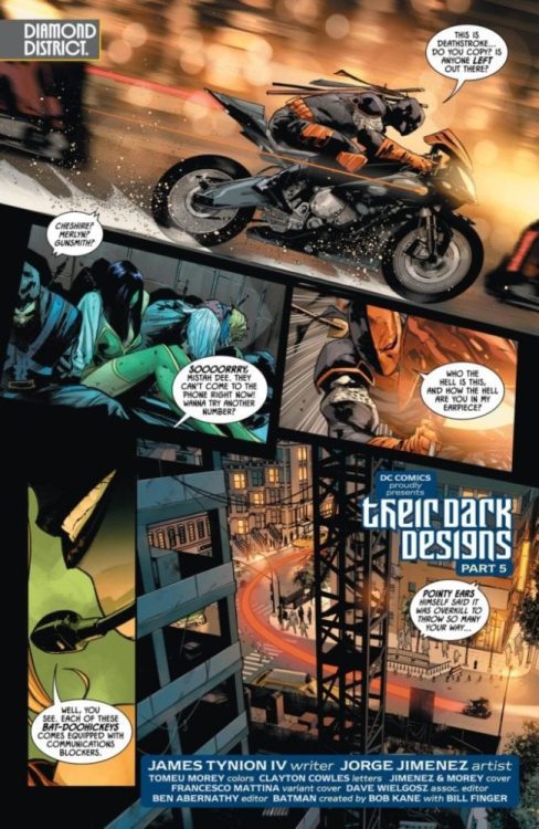
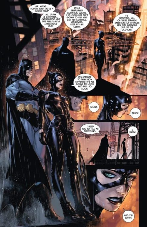
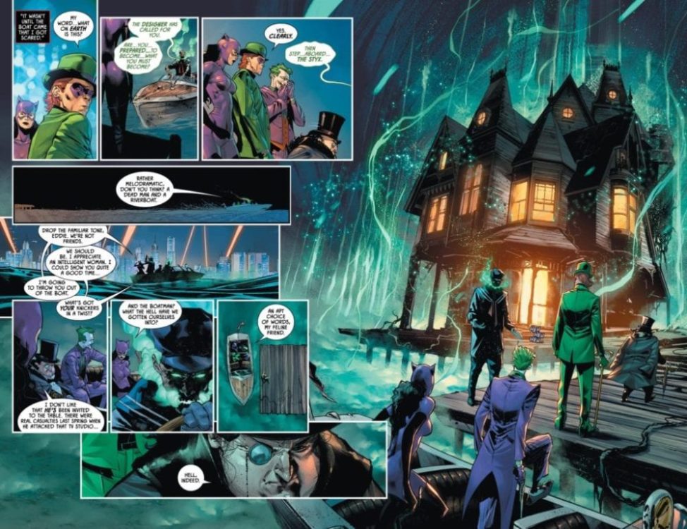
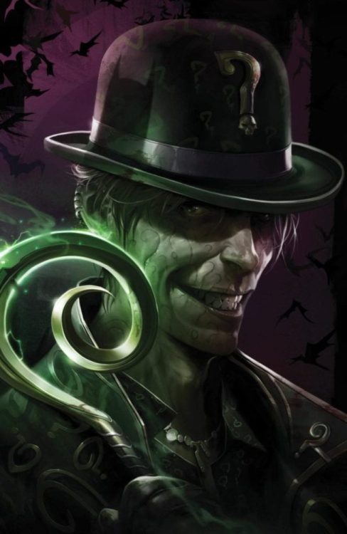
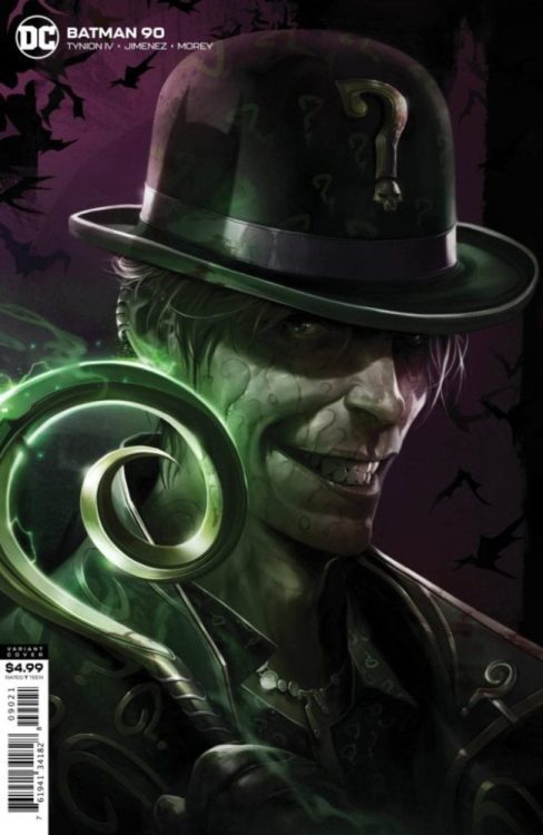
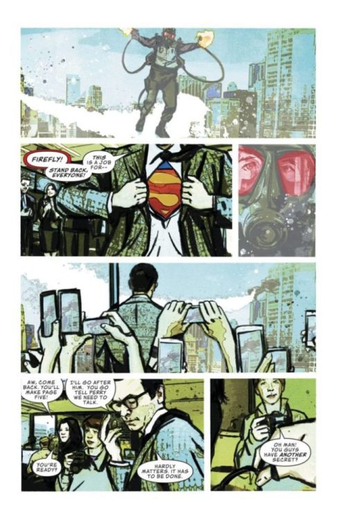
Batman #90 hits your local comic book shop next week, but thanks to DC Comics, Monkeys Fighting Robots has a seven-page preview for you to peruse.
The book is written by James Tynion IV, with art by Jorge Jimenez, Tomeu Morey dropped some color, and you are reading Clayton Cowles letters.
About Batman #90: The mysterious master criminal known only as the Designer once brought together Gotham City’s greatest criminals to plot the perfect crime, and now his plan has been unleashed upon the city in all its might. Batman will go to any length to uncover the grand design, but Catwoman is the one who holds the greatest secret. If Batman wins against the Designer, he will lose everything.
What do you think of Tynion’s run on Batman so far? Comment below with your thoughts.
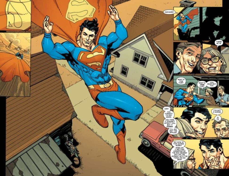
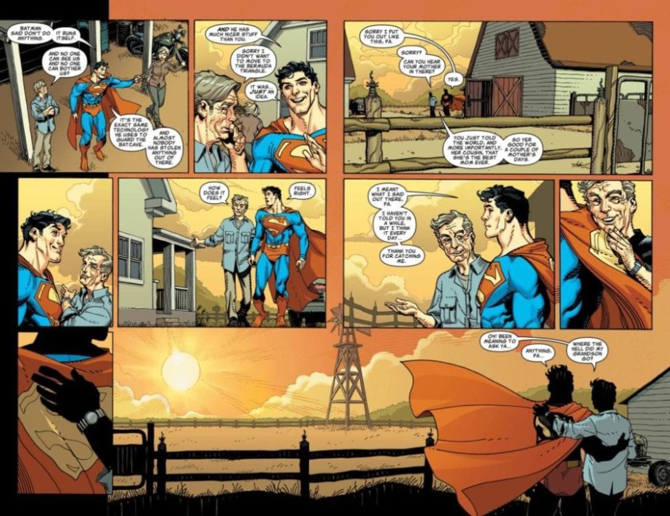
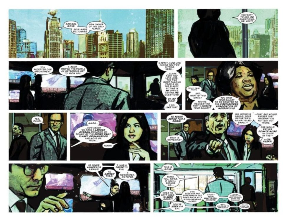
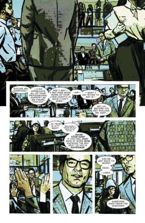
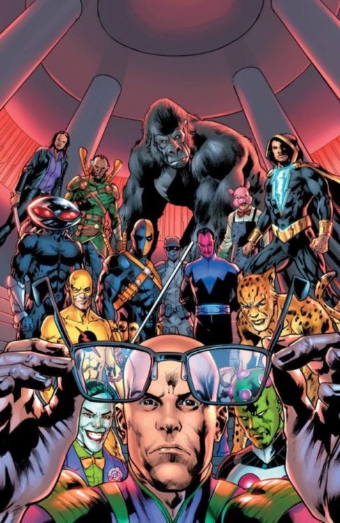
Superman Villains #1 hits your local comic shop next week, but DC Comics dropped a preview for Monkeys Fighting Robots to share.
The book is written by Brian Michael Bendis, Jody Houser, and Matt Fraction. There is a massive art team working on the 48-page one-shot, including Scott Godlewski, Steve Lieber, Bryan Hitch, Jim Mahfood, Cully Hamner, and Riley Rossmo.
About Superman Villains #1:
The Man of Steel’s greatest villains react to the biggest news to ever rock the DC Universe. Lex Luthor, Mongul, Toyman, The Joker, and more of the world’s greatest villains must come to grips with how the world changes now that the truth has been revealed by Superman. Some of comics’ most unique and creative voices unite to tell a story that changes all the rules.
What do you think of Bendis’ run on Superman? Comment below with your thoughts.
Enjoy the Superman Villains #1 Preview:
Superman Villains #1 Sidenotes
Jerry Siegel and Joe Shuster created Lex Luthor, with his first appearence in Action Comics #23 from April 1940.
There are two versions of Mongul. Len Wein and Jim Starlin created the first version, that appeared in DC Comics Presents #27 from November 1980. Then Peter J. Tomasi and artist Scot Eaton created the second version, first appearing in Showcase ’95 #8 from September 1995.
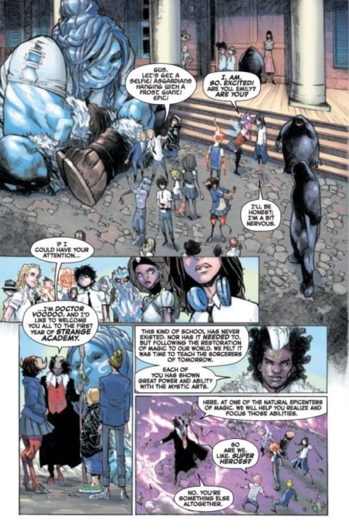
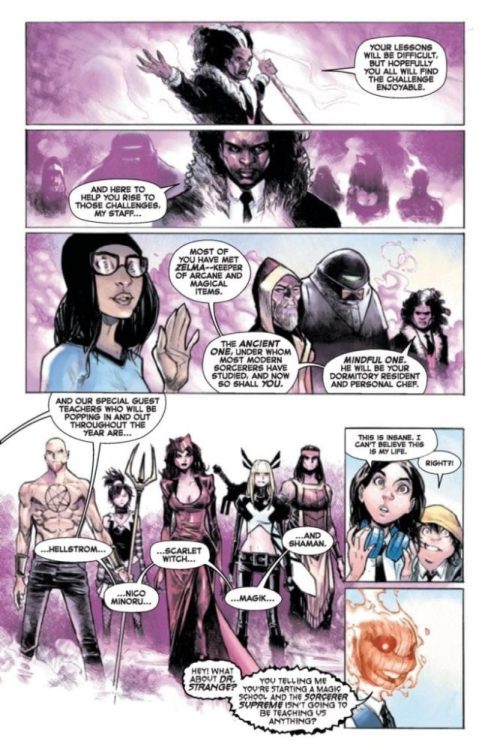
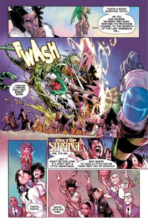
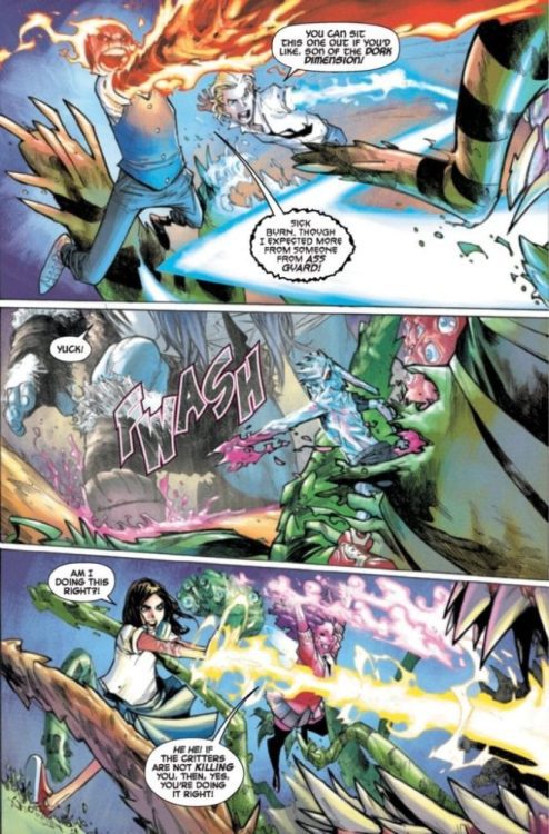
Strange Academy could be one of the most refreshing ideas Marvel Comics has come up with, in a long, it also does help that Skottie Young and Humberto Ramos are working on the project. Awesomely, Marvel sent us a four-page preview Friday afternoon.
The book is written by Skottie Young, with art by Humberto Ramos, colors by Edgar Delgado, and letters by Clayton Cowles.
About Strange Academy #1: A SORCERER SCHOOL FOR THE MARVEL UNIVERSE!
The Marvel Universe has mysteriously changed in such an alarming way that Doctor Strange has done what he’s avoided for decades; he’s opened a school for young sorcerers. Young people from around the world with aptitude in magic have been brought together in New Orleans to study the Mystic Arts under Strange, Brother Voodoo, the Ancient One, the Scarlet Witch, Magik, Hellstrom, and ALL your favorite Marvel magicians. But with all the new magical threats, is it too late?!
Strange Academy #1 hits your local comic book store on March 4, enjoy the preview below.
Do you have Strange Academy on your pull list? Sound off in the comment section below.
Strange Academy side notes:
Steve Ditko and Stan Lee created Doctor Strange, with his first appearence in Strange Tales #110 from July 1963.
Stan Lee, Roy Thomas, Len Wein, and John Romita Sr. created Brother Voodoo with his first appearance in Strange Tales #169 from September 1973.