Home Blog Page 335

Review: Starting the Second Round in DOCTOR TOMORROW #2

Doctor Tomorrow #2 certainly reminds everyone who is the subject of discussion

Doctor Tomorrow #2 out this week from Valiant Entertainment displays the importance of rereading just a single issue because that can make all the difference in the world. Not only in seeing a few small art details but also how the plot moves and could develop.

Recap

Doctor Tomorrow follows the titular characters as they try to stop their arch-nemesis, Hadrian, from destroying the Valiant Universe. But there appears to be more to the story.

Doctor Tomorrow #2 Writing

Especially when Alejandro Arbona has the mentor plunge his younger self into Doctor Tomorrow #2’s conflict. Bart barely does anything, and that makes him feel like he’s not contributing enough. The hardest person to be in comparison with is yourself, after all. Bart still is only 15, and he needs support, but everyone, including his dad, seems too busy. But even with a helper like Gretchen he still feels overwhelmed.

Then there’s Doctor Tomorrow himself, he seems to have everything under control. If not for Ivar, The Timewalker‘s Neela Sethi he would almost be a Marty Sue. Almost… Why would Doctor Tomorrow bring his younger self with barely any training? Going off on a hero’s journey from the first issue, it seems that the mentor is the challenge that will drive Bart to the abyss. Not unlike how Hadrian is the one who jumpstarts Doctor Tomorrow’s Hero’s journey.

Doctor Tomorrow #2 Art

Doctor Tomorrow #2 on body language movement
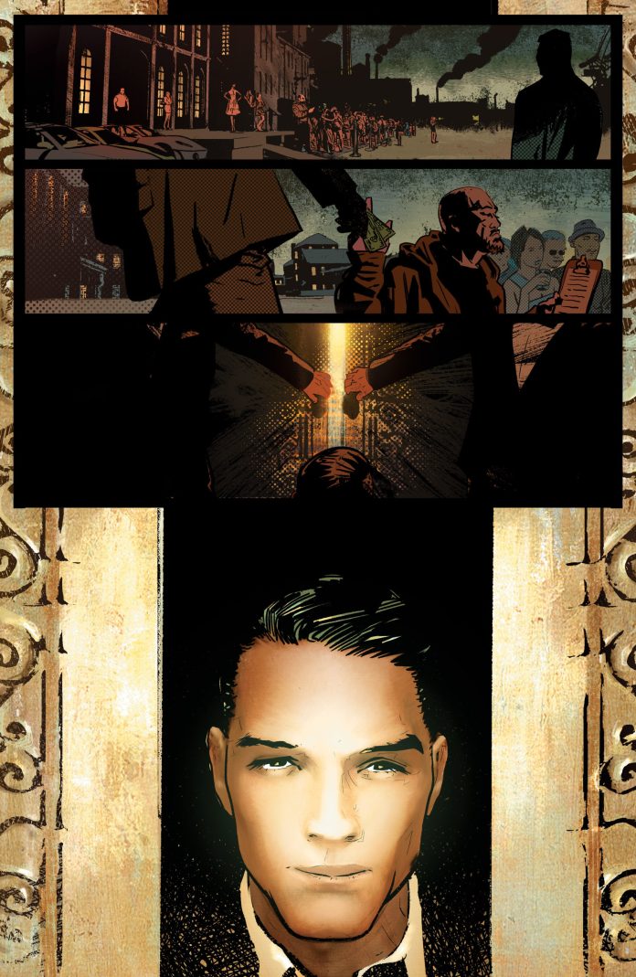
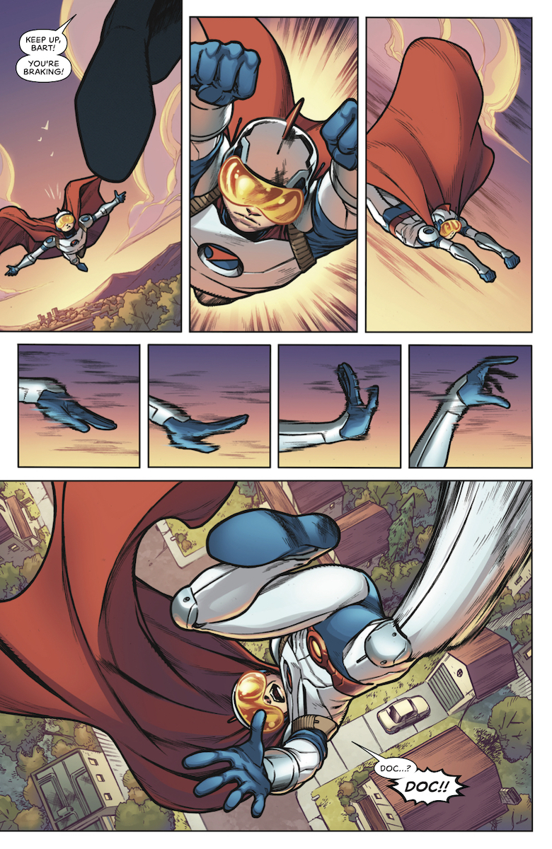
Jim Towe continues to provide some dynamic artwork in Doctor Tomorrow #2. The subtle but notable body language provides detail into how small changes can make significant differences. From how Bart pilots his super suit to the confrontation with Hadrian. But by the time most of the Valiant Universe shows up, there’s a certain lack of detail that takes away from the big moment on the last page. Faith and Livewire practically have the same face for example.

Coloring

Diego Rodriguez puts his blending colors in some of the most appropriate places like Bart’s visor. Others like the disguise worn by Neela and how it deactivates is probably where it appears the best. Because highly advanced imagery has to look futuristic and bizarre. Yet he slips up a couple of times when Bart’s trunks turn from blue to white.

Lettering

Pay attention to the artClayton Cowles arguably is the most consistent in Doctor Tomorrow #2. The captions and word balloons feel inspired and appropriate. Perhaps that best comes in when Doctor Tomorrow spreads a message while recorded on the phone. The text and word balloon indicate both the medium and how the Doctor’s voice would be altered. The onomatopoeias are, for the most part, color-coded for character acts. Light blue is for Bart and Doctor Future when not using their equipment. The ones that aren’t are for standing out against the background and are mostly mundane actions like knocking.

Get Doctor Tomorrow #2 To Reread

Doctor Tomorrow #2 is shaping up to be a good story. Along with a tale of heroics is a mystery that the reader can catch onto without backpedaling. Not only that, but how it can come to pass when the characters interact.

Monkeys Fighting Robots Youtube

Review: THE VISITOR #4 – Revelations Both Mundane And Villainous

The Visitor #4 Cover

The Visitor #4 is to the point where everything finally starts to have some revelations, at least in terms of morals. But is it enough for readers to see everything through to the end?

Recap

The Visitor revolves around a time traveler trying to stop a Japanese AI project from happening. One so secret that not even the supporting cast can talk about it.

The Visitor #4 Writing

Paul Levitz in his attempts not to reveal crucial details too early has only been feeding readers redundant details. The Visitor #4, however, makes some of what happens before slightly more relevant. Take for example Hayashi, the aide to the overbearing Abe. In the last issue, his snake-like behavior shows his true intent in this issue. Hayashi’s care for Abe is just a means to an end and was waiting for a chance to be rid of him. Kubo meanwhile shows how he manipulates people which might even include Ogawa. Whatever the Visitor is trying to prevent it looks like it was sinister since the beginning. With the ending of the issue revealing the Visitor’s full face, this threat might be familiar to fans of Rai.

The not-so important revelation that shows the redundancy

Unfortunately, these revelations’ importance is highlighted by another one. The Visitor is able to fight off Talia Daubney because The Visitor #4 reveals she has a bionic leg. This along with the Japanese official’s motivations would be better if the revelations came earlier. But at least the romantic subplot is put to the side.

The Visitor #4 Art

MJ Kim works with David Tinto to illustrate some dynamic action scenes. The scenes where the Visitor jumps onto a train to avoid being gunned down by helicopters shows a decent seesaw effect. With the gunfire being so rapid, it perfectly displays the Visitor’s resourcefulness. Meanwhile, the character’s movements show the most appropriate body language. Whether it’s Abe’s shock towards Hayashi or Talia trying to level with Ogawa, readers might not even need the word balloons.

Coloring

Ulises Arreola continues his impressive coloring especially in contrast to dark backgrounds. As for the bright color coding, it’s nice to see consistency such as the bright oranges displaying danger. Whether it’s helicopter machine gun fire or even the lights of a helicopter that transition from light orange to red. Blue meanwhile retains its revealing nature with the helicopters’ searchlights or even the Visitor’s mask when he takes it off.

Lettering

The best part of the Visitor is always the artworkSimon Bowland has a much simpler time in The Visitor #4, keeping a decent flow with the word balloons. The few times there are onomatopoeias they get a color code to match Arreola’s bright lights. But perhaps the best usage comes from when The Visitor meditates and data in futuristic fonts decorate his silhouette. An admittedly impressive feat and one that shows the momentum of the series picking up.

If You Skip 2 and 3, Try Visitor #4

The Visitor #4 is the issue where the plot finally starts to pick up after a lot of backpedaling. While it’s nice to see the plot move forward, it’s also a reminder that the series took a very long time to get to this point. So if you want to finish this series to see where it’s going, all the better. But if you’re a first-timer to this series, it might be best to pick and choose where you go.

Are you reading The Visitor? Comment below with your thoughts.

Monkeys Fighting Robots Youtube

Review: ARCHANGEL 8 #1 A Dark And Thoughtful Thriller

Archangel 8 #1
Archangel 8 #1 Credit: AwA Upshot

New comics publisher AwA Upshot release Archangel 8 #1 this week. One of four brand new titles launching the publisher, Archangel 8 is written by master storyteller Michael Moreci with art provided by CP Smith, Snakebite Cortez, and Sal Cipriano.

A realist looking, gritty thriller, Archangel 8 has a twist in its tale, one that is not apparent until the final page of issue one. Described as the Punisher meets Hellblazer, the style of this comic matches what you would expect from the member’s of AwA’s Creative Council. With names like J. Michael Stracynski, Reginald Hudlin, and Garth Ennis, working behind the scenes it’s not surprising that there is a Mature Readers tag on the front of this comic.

Producing a first issue is hard enough but acting as one of the front runners for a publisher? There is a lot riding on Archangel 8. The question is, does it deliver and give AwA Upshot a high flying launch?

Archangel 8 #1
Archangel 8 #1 Credit: AwA Upshot

Writing/Story

Michael Moreci has written some engaging, outstanding comics in recent years and if you are not familiar with his name I recommend you hunt down some of his work. If he experienced any additional pressure working on this title for a new publisher then it’s not noticeable in the comic.

The general plot is straight forward. Number 8 is a hired mercenary brought in to do a job. It’s not a pleasant job and the nitty gritty of his instructions are slowly unravelled as the plot progresses. In essence, it is like the movie Gross Point Blank minus the love story. And the jokes.

The twist in the tale is kept hidden until the end of the first issue, where a splash page reveals an entire new perspective of the story. Unfortunately, outside of the comic pages, the twist isn’t quite as secret as it should be. Press releases and solicitations give too much away so that the reader goes into the comic looking for the clues and references. Even the cover is a give away. If you can avoid anything about the nature of this comic before reading it, I would highly recommend doing so. I would also highly recommend reading the comic.

Moreci centres the plot around Number 8 and the mission he is given. The situations and locations that Moreci puts the character in helps to define the world that Archangel 8 is set in but also the personality of Number 8. The reader learns about the violent nature of the job through visual metaphors and stark imagery. Number 8’s distance from the world and his, seeming, emotional detachment are evident in his conversations where he starts to question something but he is quickly subdued.

Archangel 8 #1
Archangel 8 #1 Credit: AwA Upshot

Art Style

This first issue sets the scene early on and then spends the remaining pages constructing a tone. Number 8 is very similar to Marvel’s Frank Castle. He has a confidence that can easily be mistaken for arrogance, and appears to be a magnet for violence. The darkness that surrounds the character and the locations create a moody, almost melancholy atmosphere. This is accentuated by the constant autumnal references and imagery.

CP Smith’s art is outstanding, especially with Snakebite Cortez’s colors over the top. In places it is almost photo-realistic but in others expressionist and even abstract. The inks and the color create the autumnal feel, with the warmth of the summer ebbing away to leave a coldness. This combines with the central characters voice-over to produce a darker overall tone.

There are moments of artistic brilliance within these pages. There are panels that work within the context of the story on a number of levels and often stand out on the page. Smith has clearly designed his layout around these images, purposefully drawing the reader’s attention to certain panels, even before the page has been read. This forces an idea or emotion on the reader even before they have started to read.

So much of Archangel 8 #1 is about atmosphere, something which the artwork pushes off the page into the heart and mind of the reader. Cipriano’s lettering tempers some of the harshness in Number 8’s world. He uses rounded caption boxes for the voice over, immediately giving it a softer edge than expected. The reader becomes drawn to this hit-man, soothed by the eloquence depicted by the style of the caption boxes.

In addition, the speech is rendered in a naturalistic way. It’s straightforward and evenly displayed. You get the sense of realism that comes from most of Smith’s art. Occasionally the sound effects are comical, reflecting the action, while others are harsh and violent. Cipriano adopts a similar realistic/abstract approach taken by both Smith and Cortez.

Archangel 8 #1
Archangel 8 #1 Credit: AwA Upshot

Conclusion

If you can avoid spoilers for the twist and don’t mind violent thrillers, then this comic will be a wonderfully, satisfying read that leaves you begging for more. This is definitely a comic that will be appreciated by fans of the Punisher, Simon Spurrier’s recent Hellblazer, and Vertigo comics in general. It put this reviewer in mind of Garth Ennis’ Unknown Soldier mini-series or J. Michael Stracynski’s Ten Grand.

A successfully engaging first issue with gorgeous artwork and smart lettering throughout. Archangel 8 does everything you would expect a first issue to do and announces the arrival of a new publisher in style. Moreci continues to impress and the cliffhanger at the end of this issue leaves this series wide open for the rest of it’s run.

If Archangel 8 sounds like your type of comic I would highly recommend it. Not only do you get an amazing read but you also get to support a new publisher. A win/win situation.

Monkeys Fighting Robots Youtube

DC Comics 6-Page Preview: BATMAN #91

DC Comics Preview: BATMAN #91

Batman #91 hits your local comic book store this week, but thanks to DC Comics, Monkeys Fighting Robots has a six-page preview for you to look over.

About the issue:
To save Gotham City, Catwoman will have to commit the greatest heist in the city’s history! But hot on her trail are the Penguin, the Riddler, a horde of assassins, and the master criminal called the Designer! And the most dangerous person standing in her way is the man she’s trying to save: Batman. And what complications will his arise from his new sidekick, Harley Quinn?

Batman #91 is written by James Tynion IV, with art by Rafael Albuquerque, Jorge Jimenez, Carlo Pagulayan & Danny Miki, Tomeu Morey worked on colors, and Clayton Cowles gave us letters.

Enjoy the Preview:

Bill Finger and Bob Kane created Batman.

Monkeys Fighting Robots Youtube

Review: Get The Hell Out of Town in RED BORDER #1

The contentious topic of the U.S. border is given a compelling twist in Jason Starr and Will Conrad’s “Red Border” #1. This issue offers a new look at the people who are forced to make the run from Juarez while also crafting an intense and unpredictable comic.

“When a young, middle-class Mexican couple targeted for death by the Juarez Cartel flee across the border into Texas, they wander into a house of horrors beyond their wildest imagination. Rescued by a mysterious local who takes them to the safety of his family’s ranch, the couple soon realize their hosts have more than just skeletons in their closet, and the army of assassins on their trail might be the least of their problems.”

Writing & Plot

Jason Starr‘s script is a smooth balance of naturalistic dialogue and tightly paced action. There is a believable mix of solid conversational dialogue and, of course, complete panic. There’s a cinematic approach to the presentation of characters and directing of panels that makes it easy to engage with as an audience. The most interesting choice of this issue however, is the kind of characters that Starr makes his protagonists. When most American audience members have a picture in mind of someone trying to cross the Southern border, it’s typically a harmful and inaccurate stereotype; a caricature of real Mexican people. “Red Border” however chooses to use a Mexican couple that is almost indistinguishable from typical middle-class Americans. Now, there is a potential can of worms that can be opened from choosing this type of milquetoast character archetype in order to make the story easier to interface with for most readers. This is an issue for another article. As it stands solely as a creation of action/horror fiction, this comic is an impressive feat of pacing and character writing.

Art Direction

Much of the cinematic styling mentioned earlier actually comes from the phenomenal artwork from Will Conrad and Ivan Nunes. Conrad’s pencils create an almost photographic representation of a variety of different characters with varying features and body types. The enviornmental and accessory detail as well is near unmatched in any comic from recent memory, and it’s clear he has gone through great pains to create a realistic world for this comic to take place in. His style grounds the story in a visual sense that is easy for the reader to become engrossed with, as if they were watching an action thriller. The colors from Ivan Nunes further this artistic agenda with quiet, realistic tones and convincing layers of blood and filth to bring this gruesome tale to life. Everything from the reds, browns and faded greens of the desert to the flashy whites and purples of gangster’s opulent clothing is given nuance in terms of color and shadow. This comic is a prime example of writing and art meeting to perfectly craft a specific storytelling style.

“Red Border” #1 is a thrilling and intriguing start to a series with a premise that requires some thoughtful writing. Writer Jason Starr makes an interesting choice with his protagonists and crafts a mix of stellar dialogue and tightly paced scenes. The artwork from Will Conrad and Ivan Nunes takes a cinematic approach to comic storytelling and becomes one of the best looking books in recent memory. If you’re up for an unpredictable thrill, be sure to grab “Red Border” #1 when it hits stands on 3/18!

Monkeys Fighting Robots Youtube

Aric of Dacia: Tolerating Life’s Changes With X-O Manowar

The Sides of Aric of Dacia

Aric of Dacia, that’s a name Valiant likes to use regularly in X-O Manowar, but people still don’t know who he is. That’s mostly because with each relaunch, there must be something for people to relate to him. Back in his early days (the 90s), X-O Manowar is Iron Man meets Conan the Barbarian. Complete with owning a conglomerate company to the struggle of his Visigoth hunter heritage. But today comes the need to find what works and what doesn’t; being a corporate overlord certainly doesn’t sit well with audiences. Aric can be king a with a wife at one point but then a farmer who rejects his armor next. For X-O Manowar, it’s about adjusting to the world as much as it adjusts to him. Spoilers ahead for people not caught up on X-O Manowar lore.

Aric of Dacia: Tolerance vs Acceptance

Aric in just about all of his beginnings is at the top of his world thanks to his family and loyalty. He’s also rather forward-thinking and accepting of different viewpoints. In the beginning of Valiant Comics (from the 90s), he even converts to Celtic for his wife’s sake. But later series, including the one by Matt Kindt, show how Aric finds that tolerance like with the Romans is not the same as acceptance. The world always changes, and sometimes people fit in better in very specific circumstances. As did the brother of one of Aric’s friends for his intelligence at Rome over Dacia. The rest of the Roman Legion, however, considers the Visigoth as savages. Something Aric is eager to retaliate for. Which lands him in hot water with the Vine who he mistakes as Romans.

Aric afterward shows no love for the invading spider-like Vine. However, when Aric acquires the Shanhara armor, he gains both devotion and animosity. Commander Trill is the ideal warrior of the Vine in how they conquer worlds. The High Priest meanwhile provides insights into how people have their layers. While Aric will never forgive many Vine, he shows compassion to the Vine, who helps him reconnect with Visigoth descendants. He even welcomes them to New Dacia when they are left splintered despite the animosity from Earth. The planet was one of their targets, complete with sleeper agents. Because even despite every atrocity, everyone deserves to find a place to belong. Something Aric gives to even Trill at the end of Robert Venditti’s run. Tolerance is about learning to live with the good and bad, but it can take a lifetime to accept.

Aric the Wanderer

Aric never seems to be able to stay in one place. Rather than go back to New Dacia after Venditti’s run, Aric takes up farming on a world outside of Earth. All despite the fact that he’s separated himself from his wife. Even when he settles down with a new love interest at the beginning and end of Matt Kindt’s run; he does it all over again with Dennis Hallum, just on Earth in a city. To venture a guess, it seems to be because Aric is trying to adjust to the way things are. When he first comes back to Earth with the New Visigoths, he tries to get back their old land. Which almost starts a nuclear war.

But to get in the good graces of the US for the New Visigoths, he has to do service to the US government. After a while, he got sick of it and wanted to live in peace until he’s propelled back into conflicts. Now he’s trying his best to live on Earth while assimilating himself into it. All while still trying to hang onto his Visigoth identity. He still chooses to hunt game rather than use money for example. Sometimes he still can’t find the right person to spend a lifetime with. It’s a struggle, but between his second wife and a single mother and her son, he’ll find them eventually.

Aric From New Dacia To Earth

Not that you have some idea of Aric of Dacia do you see why Valiant likes to use him? Doing away with the Iron Man-like qualities allow readers to see a very tolerable and endearing character. Aric, like many of the readers, is still trying to find where he fits most in the world. Being a superhero can’t ensure success, sometimes you have to move onto other things and people. Because only then does anyone adjust themselves into the world as much as it adjusts to them.

What do you think about X-O Manowar? Leave your thoughts in the comments.

Monkeys Fighting Robots Youtube

Review: Star Wars Bounty Hunters #1 Turns The Hunter Into The Hunted

Star Wars-Bounty Hunters #1, Bermejo Cover

STAR WARS: BOUNTY HUNTERS #1 is a worthy complement to The Mandalorian on Disney+, taking place just after the events of The Empire Strikes Back.

(What? You haven’t seen The Mandalorian!? Stop reading and watch it now. Did you do that? Okay, let’s go!)

Cover Art

Lee Bermejo painted a highly textured and gorgeous cover. I’m a stickler for proper lighting and shadows on the cover of a comic book. Bermejo nails the shadows with a beautiful night scene.

Writing

Ethan Sacks evokes the spirit of the original trilogy here. It’s no secret Lucasfilm has had a rough time in the last few years, and maybe they would do well to take a cue from Sacks (just sayin’). Sacks takes a few of the minor characters from Empire and builds a compelling setup for a mission-gone-wrong. He peppers in just enough easter eggs to make this story feel like it’s part of the Star Wars Universe while still allowing the story to stand on its own.

The only critique is that the story is mostly a setup that chooses to withhold a key element. Why are the bounty hunters chasing one of their own? Nakano Lash has done something that’s not completely explained, and that lessens the empathy (or not) for both the hunter and the hunted, depending on your perspective.

Coloring

Arif Prianto manages to do something here that most colorists either forget or don’t know how to do: colorizing for flashbacks. The first few pages appear muted, almost dull until you realize it’s intentional to separate scenes from the past with the present. Prianto does an expert job transitioning the colors to convey the passage of time.

Lettering

Does anybody know what laser guns sound like? No, but Travis Lanham makes you believe those sounds are real without actually making a sound. That’s the highest compliment you can give a letterer, and Lanham deserves it here. What does “FZZYYUUU” sound like in real life? Unknown, but it works.

Star Wars Bounty Hunters #1, Lettering Sample

Pencils/inks

When you mix established characters with new ones, there’s a risk they won’t look like they fit together. Paolo Villanelli took a chance and won with the designs of a whole cadre of bounty hunters and seedy gangsters.

Villanelli also made a host of wise choices with the camera angles on nearly every page, giving this issue, filled with action, a lot of energy.

My favorite panel can be found on page 22 on two successive close-up panels. All you see is a gloved hand reach for the ship’s throttle. The hand pauses then retracts. It’s a simple, little movement, but in that simple, little close-up, you understand precisely what the character is thinking and what they’re about to do. Without seeing a facial expression or saying a word, his intention is clear, well done, Villanelli.

Conclusion

STAR WARS: Bounty Hunters #1 is a perfect tie-in to The Empire Strikes Back that pairs well with The Mandalorian. I highly recommended this book for any Star Wars fan.

Monkeys Fighting Robots Youtube

Review: ALIENATED #2 Demonstrates That Alien Power Corrupts The Most

Alienated #2
Alienated #2 Credit: BOOM! Studios

Hitting the shelves this Wednesday from BOOM! Studios is the second in the new science-fiction adventure comic Alienated. After a magnificent opening issue last month, the creators expand on the core premise while remembering that character is key.

One of the tropes of the Slasher Horror Movie is that the protagonists are teenagers, who simply react to situations without any thought and often in the most ridiculous of ways. This is of course necessary for the plot to move forward. Without them the first victim would lock the killer in the house and phone the police from a safe distance.

This trope is just as popular in science-fiction because the way that a child, or young adult, would react to an alien creature that can read your mind and telegraph your thoughts to others is different to how the average adult would react. This is important to remember when reading Alienated by Simon Spurrier and Chris Wildgoose.

Alienated #2
Alienated #2 Credit: BOOM! Studios

Thought Projections 

In this second issue, the central characters are beginning to learn exactly what the strange alien life-form, nicknamed Chip,  can do for them. However, there is still a lot of unknowns and there has already been one casualty.

Spurrier aims to balance the childlike wonder at the alien with the corruptible force that the alien’s power brings. He packs the comic with the lives of these young adults and the dramas, traumas, and experiences that they face on a daily basis. The central concept of Alienated is the hardships that the teenagers face: the alien intervention is just a plot device that enables Spurrier to examine these children’s lives.

At times it’s brutal and scary, at other times it’s amazing and awe inspiring. This is exactly what it is like growing up. Everything is heightened, over the top, life or death. There is no middle ground being a teenager and reading this comic portrays this perfectly. The central characters experiment with their new powers will little regard for the consequences but how long will that last?  Already, two issues deep, Spurrier is changing the game, introducing the effects of the actions the teenagers have taken.

Alienated #2
Alienated #2 Credit: BOOM! Studios

Alien Art

Wildgoose has a very distinctive art style. It suits young adult comics as it is very precise and descriptive. The character design is wonderful, with each cast member an instantly recognisable figure. The scenes are full of personality and honest interactions. The fine lines of Wildgoose’s inks makes it possible to fill the panels with detail without over complicating anything.

As the audience moves through the story they can follow the main plot from panel to panel with ease but just as easily stop and ponder the details in the background. In the very first panel there are a number of interactions between characters, each telling their own little story. However, this actually sets up the theme for the comic as a whole.

Wildgoose loves to add tiny details to scenes because it makes the world of Alienated a much fuller experience. It also helps with the storytelling later in the comic. As various situations arise the background begins to play a part in highlighting elements of the plot, becoming as important as Sam, Samantha or Samir. There are some wondrous and expressive uses of background in this comic, which is not something that you get to say a lot.

Alienated #2
Alienated #2 Credit: BOOM! Studios

Letters and Colors

Another pleasure of Alienated is Jim Campbell’s lettering. There are a lot of interactions in this comic, spoken and thought projected, not to mention internal dialogues and messages between the characters. In short, Campbell has a lot to do. The shape of the speech balloons differ between the types of interaction so it is easy to tell when words are spoken out loud or transmitted internally.

Campbell gives all of the text personality, a great achievement indeed. From the characters speech to the sound effects and even the notes left to Sam by his mother, each element is treated with great care and attention.

No review of Alienated would be complete without highlighting the exceptional coloring job by Andre May. Last issue, May set a president for how he would approach the coloring of this comic. Each of the three Sam’s have their own color allocated to them which is not only used in the clothes that they wear but seeps into the backgrounds, their speech, even in their fantasies.

The colors not only accentuate the personalities but they help set mood and theme. A dream sequence early on is colored a sickly green to represent the uneasiness of the situation and the feeling of the character witnessing the turn of events. This uneasiness is present in each panel and after just three panels the reader is experiencing the same emotional reaction as the dreamer.

Conclusion

The threads of this plot are winding and engaging. Some of it feels familiar, like a comfortable Sunday afternoon film, but it also challenges you as a reader. It forces you to look at a situation from one point of view but then, like a sneaky mischievous imp, shows you the other side. The concept of hero and villain has no place in Alienated.

The plot is engaging, the art engrossing, and the outcome is a comic that simply won’t let you put it down. It’s almost as if Chip has mentally grabbed you and rooted you to the spot while he feeds upon your enjoyment. Spurrier and Wildgoose are on to a winner with this blend of 1980’s science-fiction movie and modern social commentary.

Monkeys Fighting Robots Youtube

SPARTACUS: What A Rebel Gladiator Says About Mythology in Entertainment

Monkeys Fighting Robots

The entertainment industry is very much about superheroes right now. But that doesn’t stop mythological figures and stories from sneaking in alongside modern and sci-fi elements. And we’re loving the mix of ideas almost as much as a full-fledged epic movie or TV show. Classic features are still very popular across all sectors of entertainment, including comics. So it’s worth exploring what exactly makes ancient Greek, Roman, Norse, and Chinese myths so attractive. After touching upon various examples of how they influence modern audiences, we’ll focus on a particular hero that has inspired generations: Spartacus.

Mythology in Movies, TV and Comics

Readers of comic books know very well how much creators enjoy throwing ancient legends into their stories, whether obvious or obscure. A good example of the past few years is Avengers: No Road Home having Hercules take center stage on the team’s quest to reverse the darkness that has taken over the galaxy. The hero’s involvement follows the destruction of Olympus and its Immortals, at which point he joins forces with the likes of Voyager, Rocket, Hulk, and Scarlet Witch.

And then you have TV and streaming technologies starting to outshine the movie industry. Amid megastars like Antony Hopkins and Reese Witherspoon joining shows, there are also lots of great productions popping up to enhance mythology promoted by blockbusters. Netflix’s Ragnarok is a refreshing Norwegian retake on Thor, Loki, and the giants. One of several unique programs to change everything we think we know about our favorite legends.

But the silver screen isn’t done yet. The next live-action adaptation of Disney’s beloved animations is Mulan, set for release in July 2020. What some people may not know is that the story is based on the Chinese legend of a warrior woman called Hua Mulan. Whether real or fictional, Syfy Wire explains how the tale was retold many times before and after Disney’s contribution. Have you heard of Deadpool Killustrated? In Vol 1 #2, she’s one of the characters trying to stop Deadpool from slaughtering literary figures.

You’ll find mythological influences in the strangest of places. Take, for example, the link between Attack on Titan and Francisco Goya’s paintings, including Saturn Devouring His Son. Protagonists and ideas of the past seem to serve modern creators quite well, somehow inspiring brand new concepts. That’s why classic heroes like Spartacus stay – or are kept – in the spotlight. Their stories continue to make an impression on viewers and readers.

Who Was Spartacus?

Long before Pacific Rim 2’s Steven DeKnight directed the Spartacus TV series, the Roman slave turned-gladiator and rebel leader was a real person. Born in Thrace, the former soldier ended up starting the Third Servile War. He’s remembered as a symbol of revolution against tyranny, one that’s carried a powerful message over the ages.

Encyclopedia Britannica states that Spartacus’s forces grew to over 90,000 strong. They fought their way across Italy in pursuit of freedom, and were only defeated when commander Marcus Licinius Crassus caught them between eight legions of trained soldiers. Spartacus apparently died fighting, which only added to his fame as a strong and honourable leader. And today his legend lives on in screens and comics.

Spartacus Themed Entertainment

The first production to flesh out the gladiator’s story was Stanley Kubrick’s Spartacus (1960), starring Kirk Douglas. While Ridley Scott’s Gladiator (2000) could be seen as an adaptation or homage, no other Spartacus-related movie has tried to rival the original’s critical acclaim. But then 2010 saw the introduction of the TV show that enjoyed an equally warm welcome and continued to captivate viewers to its end in 2013. The actual title of the series, however, suggests a connection to another medium of entertainment.

The Spartacus: Blood and Sand comic books by Devil’s Due Publications were a smooth prelude to the show, focusing on minor characters that would later appear on people’s screens. This project also inspired a four-part motion comic available on retailers like Microsoft and Amazon. But the hero has kept gamers busy too.

Spartacus Legends, developed by Kung Fu Factory and published by Ubisoft in 2013, was a short-lived free-to-play video game based on the Starz TV series. Then there are also other titles in the further entertainment industry featuring the famous rebel. For instance, Betway has SG Gaming’s new Spartacus slot with a classic Roman design and gladiator-themed symbols. When you’ve had your fill of reels and bonuses, why not try a round of Spartacus: A Game of Blood and Treachery? The board game comes with an expansion that allows four players to battle and scheme their way to victory.

This is only a sample of the range of merchandise you’ll find out there making use of Spartacus’s inspirational status. Depending on your tastes – cinema, books, video games – you can find out for yourself just how extensive classic mythology’s effect on entertainment really is.

Monkeys Fighting Robots Youtube

Are Alternate Comic Book Sizes Better Than the Standard Format?

Superman: Year One

The size of Comic books has remained relatively constant since the Golden Age, but through printings such as DC Comics’ Black Label line, we are now being introduced to page sizes that completely alter how we take in the beloved medium. The only question is: are these new sizes superior to the standard format we have been reading for years?

The Dark Knight Returns was the first comic book to be referred to as “prestige.” These books are typically longer in length and are printed on a higher quality paper but still have the same page sizes as standard comic book issues. Now, with comic books such as Superman: Year One and Batman: Damned, page sizes are larger and drastically change how panels are presented.

Superman: Year One has a format so that the side ratios almost create a square, measuring 8.5” by 10.75.” One of the advantages to this new size is the freedom it gives to the artist, in this case, John Romita Jr, to create visually stunning single-page spreads, that achieve almost the same effect as a double-page splash would in a standard issue of a comic. A double-page spread can have a more significant impact than could be achieved in the standard issue of a comic and provides the artist with the freedom to go into more detail in his or her artwork, knowing it will come across effectively on the page. The artist for Batman: Damned, Lee Bermejo, once said in an interview with Syfy Wire about the new page size that “You fell into the story more, widescreen scenes got really widescreen. The new format really brings something else to the storytelling. I think it was more immersive.”

Superman: Year One Splash Page

However, changing the size of comic books makes it difficult for long-time collectors. Different sizes mean that packaging these books requires new bags, which a collector may not have on hand. While DC’s Black Label wants these larger issues to be able to fit in magazine storage bags, but collectors who did not already collect magazines need to go out and purchase them. Even then, comic book storage bags often come in bulk, but larger issues do not come in a large enough quantity to warrant such a purchase. If a collector were to spend money on these new sizes, they would most likely have a large surplus of magazine bags afterward.

Probably the most important aspect of what these larger sizes do is allow pages heavily crowded with individual panels to remain stunning. Take the 16-panel grids that Frank Miller used for his iconic story The Dark Knight Returns: these panels allowed for a lot of story to be covered in a short space, but did not allow for much artistic flexibility in a normal-sized comic book. The Dark Knight Returns was beautifully crafted and allowed for each of these panels to still be enjoyable, but the 16-panel grid is extremely difficult to pull off when limited by the size of the standard comic book. If the same technique was utilized on a page the size of those in Superman: Year One, however, the same effect could be achieved at a much larger scale. Each of the small panels would be much easier to comprehend, there would be less worrying about dialogue cluttering a panel, and there would not be confusion resulting from having small images tell the story. The ratio of width to height of these pages would also cause each of the panels of the grid to have a shape much closer to a square, as opposed to the movie-poster-like ratio that occurs in The Dark Knight Returns.The Dark Night Returns Sixteen Panel Grid

With all the advantages that this new expanded size brings, the main factor that could limit their success would be pricing. Comic books started as a cheap form of entertainment but have become quite an expensive hobby. These new comic books are larger, so it is only natural that their prices are higher. The average comic, such as Batman #87, costs the reader around $3.99 to purchase. The first issue of Batman: Damned cost $6.99, and Superman: Year One #1 cost even more at $7.99. Obviously, this is because of the better quality of the paper and longer page count of each comic book, but it is up to the reader to decide whether this increase in content and quality is worth it. To be fair, the first issue of Superman: Year One was twice the size of a standard comic book, and with the larger page size and better paper quality, you are actually getting a better deal for its price. Still, the cost of these new formats might be more than some people wish to spend on comic books.

These alternate page sizes are a new frontier for comic artists and writers alike and have the potential to revolutionize the medium. While dialogue and the artwork play a major part in comic-book storytelling, it is the layout of the panels that make it a story. Due to the page size changing, so will the way stories are told upon it, which is why this is such an exciting area in comic books at the moment. Alternate sizes have several distinct advantages over what we see every day in our local comic book stores, but might be too expensive for the casual reader.


Do you want to see more variety in comic book page sizes? Let me know in the comments below!

Monkeys Fighting Robots Youtube