Home Blog Page 330

SUICIDE SQUAD #4 Starts Offering Some Answers

DC Comics Suicide Squad 4 Tom Taylor

Written by Tom Taylor, with pencils by Daniel Sampere, inks by Juan Albarran, colors by Adriano Lucas and letters by Wes AbbottSuicide Squad #4 out this week from DC Comics starts doing some explaining. The creative team behind this mysterious series, take a moment to provide some answers. Though some of the exposition seems slightly clunky, this team is working off of so much good credit; they’re allowed a couple of necessary evils.

Writing

Taylor writes in a rather uncharacteristic way in this issue by bringing readers into the know. The Squad briefly steps off the grid, which becomes an opportunity to catch us up. And though the issue is very explanatory, Taylor’s exposition makes sense and is delivered believably. It’s cushioned by witty banter and fueled by Harley’s need to be kept in the loop. Perhaps the answers aren’t necessary, as the questions are satisfying as is, but Taylor quickly adds more questions to fill the void. Taylor’s charm is that he only provides answers when absolutely necessary. He knows mystery is a reader’s motivation, and some answers aren’t even needed. Some of these answers about Task Force X seem premature. But the pattern of this series suggests this issue is a brief rest stop on the road of subtlety.

Art

Sampere and Albarran amp up the “Kevin Maguire” effect they’ve used in past issues for the Squad. Harley’s overly expressive face cuts the tension in each scene without fail. When the backstories get grim and gritty, one look of perplexed reaction brings us back down to earth. Sampere and Albarran essentially divide the characters into two camps. The goofy, loveable ne’er-do-wells and the dramatic, mercenaries who take themselves a little too seriously. Sampere and Albarran’s depiction of these characters creates balance in each issue. The overly dramatic scenes are eased with jokes, the jokey scenes are interrupted by badassery. The approach creates a kind of symmetry for the whole series.

Coloring

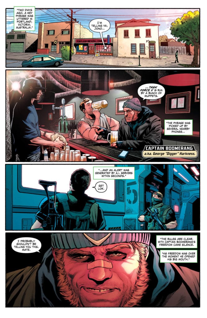
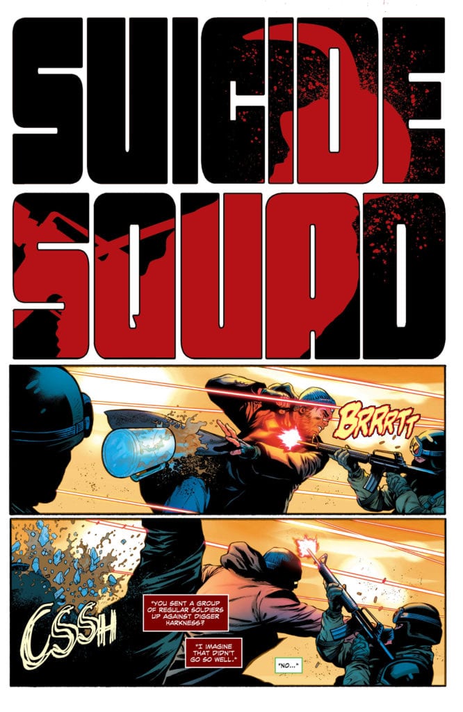
Lucas’ coloring is the barometer of this issue. With the slightest changes, Lucas can make a scene serious or fun. At the beginning of the issue, a boomerang causes bloody mayhem. The silhouette of the unlucky victim is red against a black background. It’s like a Tarantino overture (I know I bring QT into it a lot but man, the similarities!). Later, the same thing happens but the colors are swapped. Black silhouette on a red background. Suddenly it doesn’t feel like “fun” violence. It’s disturbing. Lucas makes the moment feel slightly more real. His mastery of color creates a tonal rollercoaster in this Suicide Squad run. Who doesn’t have fun on a rollercoaster?

Suicide Squad Tom Taylor DC

Lettering

Abbott has got to run out of fonts at some point. It seems like he creates a new font for every sound effect. His variety is just fun. You’d think a head exploding and a car exploding would look exactly the same on the page. But Abbott creates slight variations so that nothing feels recycled. Each sound effect is also given a very particular level of visibility. Some moments feel big and gaudy, like tires screeching or glass breaking. But Abbott often creates sound effects that blend into their surroundings. A drowning man’s cries blend into the water. It takes a couple of reads to even notice they’re there. But this gives the sense that he can’t be heard. Abbott visually shows us what sounds blend into the white noise and what sounds stand out.


This issue is a little out there for this creative team. The Suicide Squad seems to be sharing more than they have in the past. But, having set the stage well, and having placed exposition amid hilarity, the issue still works. This creative team is responsible for a great series, but adding a lot of new characters to the DC Comics universe can be difficult. Perhaps out of fear of losing the readers, this issue gets a little more heavy-handed than the rest. But the job’s been done. We’re up to date. Let the chaos of the next few issues ensue. It’s going to be great.

Pick up DC Comics’ Suicide Squad #4 this week at a comic book shop near you. Find local comic shops at comicshoplocator.com. Or if you’re a local in the Halifax, Nova Scotia region, head over to Strange Adventures.

Monkeys Fighting Robots Youtube

Review: ACTION COMICS #1021 Is Luthor’s Endgame

Action Comics #1021, Romita cover

ACTION COMICS #1021, available from DC Comics on March 25th, showcases the final defeat of the Justice League at the hands of the Legion of Doom, aided by Red Cloud and Leviathan. Our heroes lie broken at the Legion’s feat. Is this truly the end? Let’s find out.

Cover

John Romita Jr. and Klaus Janson take on the cover art and interior artwork for this issue. They do an outstanding job rendering our heroes with speed and purpose. The costumes are bright and stand out against the background.

Romita and Janson made an odd choice, however, with the grouping and perspective. It looks like Superman is flying over the city and yet Impulse and the other non-flying characters are running beside him. Either the definition of the backdrop needs to be sharpened to clarify the team is moving at ground level, or this grouping of heroes doesn’t make sense from their position.

Writing

ACTION COMICS #1021 is a serialized issue, so it helps to have read the prior books to understand all the players and how they got to this point in the conflict. Brian Michael Bendis still manages to write an engaging story, even if you don’t know how we got here. The action is well-paced, and Bendis included more than one surprise to satisfy.

Bendis wrote dialog that suits the personality of each villain, as they do most of the talking. Superman and Superboy also share a pseudo father/son moment that reminds you why Clark’s upbringing is what makes him Superman more than his just his powers. It’s a sweet moment, and Bendis writes it well.

Coloring

Brad Anderson is responsible for the coloring in this issue, and his work is the best part of this book. There are several scenes where colors show the reader what’s happening without a narrator or dialog to fill in the clues. Yet, the coloring makes it very clear what is happening.

Favorite Panel/Page: There’s one panel in particular, without spoiling it, where a group is teleported away in a flash of blue light. There’s no lettering, narration, or dialog on the panel. There are only pure blue color gradients and a silhouette that makes the panel look very close to a lit-up photograph—high praise for Anderson on the coloring.

Pencils/Inks

Romita tackled pencils, and Janson partnered up for inks. To be blunt, the Romita style can be a bit of an acquired taste. Romita like lines – LOTS and LOTS of lines – to render shading and depth. It’s not everyone’s cup of tea, but it’s definitely a signature and instantly recognizable style.

Here, the Romita style of lines and shading mostly works except for the faces. For Superman especially, it looks like the Man of Steel has a lot of odd tribal tattoos on his face instead of the lines representing depth and contour. The faces would look better of either thinner lines were used, or go the “less is more” route and just not use so many lines by relying on color shading to bring the contours through.

Action Comics #1021, Pencils sample

Conclusion

ACTION COMICS #1021 is a well-written and well-paced skirmish between the super teams. The coloring takes top marks, but you may be lost if you haven’t read the prior issue(s). This is a take or leave it recommendation.

Writer’s Note: Local Comic Shops (LCS) are going through a tough time right now with the pandemic outbreak of COVID-19. Comics fans of every flavor that care about his or her LCS should try to do what they can. So, here’s my part:

If you’re in Northern Delaware, South East Pennsylvania, or Southern New Jersey area, please take a moment to visit Captain Blue Hen Comics in Newark, DE. Say ‘hi,’ pick up a book, order a book (they’re on Comichub.com), and let them know you support them.

If you’re nowhere near that area, please find YOUR LCS using Comic Shop Locator and lend your support.

Thanks, and stay safe.

Monkeys Fighting Robots Youtube

The Cost of Being a Hero in LUCY CLAIRE: REDEMPTION #4

LUCY CLAIRE: REDEMPTION #4, out this week from Image Comics, brings us back to a world full of werewolves and monsters. This is the world in which Lucy became a hero, before losing everything she ever loved.

Lucy is looking both determined and haggard on this cover of Lucy Claire: Redemption #4.

***SPOILER WARNING***

Lucy Claire: Redemption is an impressive feat, no matter how you look at it. Written, illustrated, and lettered by John Upchurch, you better believe that this entire project was a labor of love. This is a world where werewolves once again roam the streets, hunting as they please.

That is unless a disgraced werewolf hunter steps up to do what must be done. Enter Lucy Claire. She once eradicated the lands of all the monsters, but it cost her everything. Now they’re back, and so is she.

Lucy Claire: Redemption #4 shows us the cost of prolonged retirement. Lucy Claire is still a total badass…but she’s definitely lost her edge. Her injuries are a testament to that fact. The truth of the matter is, Lucy has been through hell and back, the worst of it being the emotional toll she’s taken.

As you can tell, Lucy may not be at the top of her game. Not yet, at any rate.

The Writing

Lucy Claire: Redemption #4 is an intense read from cover to cover. Many fans already sussed out what Lucy has gone through, but it wasn’t confirmed. Not until now. More than that, we had no way of predicting how far the depth of her pain went.

Now we know. And it is so much more complicated than we could have ever guessed. This is the dramatic twist that we should have known was coming. Everything about this plot has been leading up to something much more insidious.

On that count, this series has done an excellent job. The truth has been successfully obfuscated at every turn, up until now. Leaving only hints, just enough to tell us that something is being hidden from our side.

It’s enough to get readers desperate for the next issue. Desperate to find the truth of this story. Even now, with a major reveal out of the way, it still feels like there’s more to this story. That’s involved storytelling right there, and it is intense.

Speaking of intense, this is not a series that shies away from raw pain and emotions. That is what makes Lucy’s story so powerful and compelling. That remains true in this issue, even when she was less of an active participant than usual (which in itself is creative storytelling).

The Art

Lucy Claire: Redemption #4 is full of stunning artwork, as per usual. Everything from the backdrops, to the monsters and characters that fill the pages are so bright and striking to look at. Though naturally there are several highlights worth talking about.

Each and every character in this series is unique and carefully crafted. They’re iconic and identifiable at a glance – even the newly introduced ones. Lucy, in particular, has such an elegant style to her. She’s a character that radiates both pain and strength.

The monsters are no different. There are a variety of werewolves in this series, that alone is surprising enough. But they all feature unique designs, along with complex rules and abilities. It makes for an appealing read, especially when the fighting gets intense.

In Conclusion

Lucy Claire: Redemption #4 is another intense addition to this dramatic tale. The revelation in this issue is not one we could have predicted, though in some ways it feels like we should have. That’s all proof of careful storytelling.

Things are likely going to pick up from here, which is saying something. There’s another major fight on the horizon, as well as more answers (hopefully). Any guesses for what will happen next?

Monkeys Fighting Robots Youtube

A Struggle Over Power and Gold in BATGIRL #45

BATGIRL #45, out this week from DC Comics is about to throw our beloved Batgirl into a whole new dilemma, one involved power struggles as you’ve never seen before. It’s a dramatic beginning and one that pulls another hero into the fray.

Batgirl is looking mighty concerned on this cover of Batgirl #45.

***SPOILER WARNING***

Batgirl has been through quite a lot in recent times. More specifically, she’s facing a new challenge: the concept of letting somebody she thought was an enemy get close to her. It’s not the battle she expected to be fighting right now, but the last plot arc forced her hand.

Now another challenge has come up, one that may very well distract her from all of the decisions and promises she just made. To be fair, this problem seems to be targeting the homeless in the area, and as such should become a priority. The fact that it is affecting every part of her life just makes it appear all the more obvious.

A snowy scene for this alternate cover of Batgirl #45.

The Writing

Cecil Castellucci has once again brought us a compelling plot, one that grounds Batgirl firmly in the city that created her. Batgirl #45 brings yet another villain to the forefront. But unlike many of the others, their actions are much more insidious.

Power and wealth. Those are two common threads that keep cropping up with Gotham’s villains. Again and again, we see those concerns. Yet we’ve never seen them in this unique combination. The newest antagonist – and their actions – are terrifying. Yet unique. It’s already going a long way towards making them stand out among the crowd.

For the readers that is, not for the city itself. The city at large seems to be overwhelmingly unaware of the problem. Which is about par for the course, when you think about it. This plot has done an excellent job of portraying a city rocked by many changes and dangers, all while fighting to move forward.

In doing so, it shows us what happens to those that fall by the wayside. The people that get overlooked. It also highlights the willingness of others to look the other way. There’s something deeply disturbing, and very human, in that.

Finally, this issue concludes with a cameo of another beloved hero. She’s not one we get to see all that often these days, so it’s a welcome sight. Perhaps we can count on the next few issues containing a team-up?

This whole scene is terrifying if you think about it too much.

The Art

Batgirl #45 perfectly captures the horrifying process brought about by this latest villain. And horrifying is the correct word here. Power, metals, and the human body should never combine in such a manner.

There’s no doubt that these scenes would not have carried the same level of impact, if not for the artists involved in the project. Likewise, they brought Barbara’s reactions to life and the fight scenes that inevitably followed as well.

Carmine Di Giandomenico was the lead artist for this issue. As such, they’re largely responsible for the scenes I’ve described above. The ‘statues’ are truly alarming, especially when you catch sight of them being formed. It’s not something that you can easily shake. Presumably, it isn’t something that would be easy to portray either, yet it was done fantastically here.

Jordie Bellaire is the colorist for this issue, and they likewise did a fantastic job. There is a striking juxtaposition later in the issue that is particularly eye-catching. It isn’t every day you get to see two heroes with such distinct and different color palettes working alongside one another.

Finally, Andworld Design was responsible for the lettering, and their work was flawless. As always. The little details are what sells it, making Barbara’s train of thought concise and clear throughout the pages.

Batgirl #45 features what appears to be a most horrifying fate.

In Conclusion

Batgirl #45 is an intense beginning to a new plot. It flows smoothly from the conclusion of the last, though it takes a more horrifying turn in very short order. This issue went a long way in reminding us of the humans that reside within the city, and that sincerely added to the impact of what is happening.

Monkeys Fighting Robots Youtube

A New Perspective in STAR #3

STAR #3, out this week from Marvel Comics continues the tale of their new villain, only things have taken quite the turn for her. Once she was a plucky reporter, now she’s the enemy of Captain Marvel herself.

Is anyone else concerned with the potential for disaster that Star carries within her?

***SPOILER WARNING***

Ripley Ryan was once a happy reporter, content to work on fluff pieces about heroes. Now? Now she’s a villain with access to immense levels of power. If she can only learn to control them. That is the crux of this miniseries.

Star is a five-issue miniseries, which means we’re not more than halfway through our plot arc. Thus far, we’ve seen her interact with several heroes and villains alike, all to different ends. Yet none of that could have prepared her for what is about to happen in Star #3.

Birth of a Dragon Part Three’s cast, as well as a reminder of what the infinity stones correlate to.

The Writing

Star #3 will shake you to your core. It provides a unique perspective on the dynamics between heroes and villains. More importantly, it provides insight into what happens to the civilians unlucky enough to get caught in the crossfire.

It’s something you see in nearly every comic book issue. After all, heroes are usually doing everything they can to save people. But what about those people? The ones that don’t get saved? Or the ones that never would have been in danger in the first place, if not for the hero?

Star #3 lends those people, the unlucky ones, a voice. Sure, most of those characters will not take a dark turn, they’ll never become enemies. Heck, most of them won’t even become named characters. Yet there’s still something to take away from this tale.

Kelly Thompson has created something fascinating here. A fact that become so clear in Star #3, thanks to the panic attacks and flashbacks that Star experienced. There’s something so broken yet so human about the way she behaves. It has suddenly driven home everything she’s gone through.

That makes for one powerful read. Even if you don’t agree with Star’s actions, it’s difficult not to sympathize with her panic and her pain. Something that is likely to get worse before it gets better, considering all of those who are now actively hunting her.

Was that whole battle nothing more than her internal war?

The Art

The artwork found inside Star #3 is amazing. It’s gritty, raw, and extremely emotional. It isn’t afraid to show off the good and the bad. That goes for heroes and villains alike. It’s not something you get to see every day, yet it is exactly what this plot demands.

Javier Pina and Filipe Andrade were the lead artists for this issue. If not for them, Star’s pain, fear, and anger would never have been so evident. That they portrayed Star as both strong and capable of panic attacks means so much.

Meanwhile, Jesus Aburtov was responsible for the colors, which are brilliant and bring the artwork to life. Captain Marvel has never looked so vibrant, and yet there’s almost an insidious tone to that, courtesy of Star’s perspective.

Finally, VC’s Clayton Cowles provided the lettering, and they did an excellent job. Their letters lead the reader from panel to panel in such a smooth flow. You almost don’t realize you’re being lead along.

Scarlet Witch does have a way of getting into your head, doesn’t she?

In Conclusion

Star #3 was a dramatic and compelling read. That it was able to make Ripley read as being so painfully human, so flawed and so extremely angry, just makes it all the more interesting. This is a perspective fans almost never get to see, and they’re making the most of it.

It’s hard to believe that there are only two issues left in the series. Given how this issue ends though, we can probably guess how Star #4 will begin. With a fight. Or more accurately, with a rematch. Care to guess how that will go?

Monkeys Fighting Robots Youtube

QUANTUM & WOODY #3: A Tale of Deception and Ghosts

QUANTUM & WOODY #3, out this week from Valiant Comics continues the epic and insane quest of two brothers. One is a hero born and bred, the other has an uncanny knack for knowing how to work the system. Yet they’re both heroes, or so they believe.

Quantum & Woody jammed into a high school locker? Sounds about right.

***SPOILER WARNING***

Fans of Quantum & Woody will have found this series to be hilarious, entertaining, and fueled by utter chaos. If we’re being honest, that is half the draw right there. The series follows the dynamic (and chaotic) duo which the series is named after.

It’s an energetic series, to say the least. That’s thanks mostly due to the determined efforts of one brother to become a hero. All while the other brother is scheming away. Okay, the inclusion of several comical villains hasn’t hurt matters either.

This latest reboot was originally intended to be a five-issue miniseries. But thanks to current events, it looks like the series is actually only to run for four issues. That’s a major disappointment to many a fan (ourselves included). But at this point, we’ll take what we can get and be happy about it. At least we’ll have one more issue to look forward to.

In the latest round of chaos, Quantum and Woody have been called upon to visit their old high school of places. Though perhaps saying they were called upon is a bit of an overstatement. On the bright side, we do know that this issue is going to be as amusing as we could have ever hoped for.

First, they were jammed into a locker, now they’re all mashed against this cover. What’s next?

The Writing

Quantum & Woody #3 was every bit the insanely entertaining roller coaster we had been hoping for. Better yet, it was full of many different elements, all of which combined to make for a compelling read.

Written by Christopher Hastings, this issue was full of dramatic reveals, brotherly tension, jealously, and foreshadowing. It had so much for the fans to love, and that’s before taking into account the whole high school shenanigans trope (and ensuing chaos).

The idea of these two heading back to their school is amusing on its own, throw in a cranky old principle (who appears to be ageless), a plot of missing children, and some ghosts…and well…you’ve got a mess that these two won’t hesitate to dive headfirst into.

Part of what made this issue such a great read is the fact that we’re finally seeing behind the curtains. Long (well, three issues) have we suspected that there’s more going on in regards to

Woody’s visions. But not we’re finally allowed to see behind the curtains, and it is not a disappointing sight (unless you completely misjudged Woody, that is).

This revelation brings with it a plethora of emotions. Curiosity, concern, and all of the obvious points. And perhaps just a touch of pain, since we now know that there’s only one issue left to resolve everything.

It’s time for a noogie on Quantum & Woody #3 alternate cover.

The Art

The artwork in Quantum & Woody #3 is as vibrant and alive as the plot itself. Bordering on the psychedelic at times, this is an issue unafraid to have a bit of fun with what has been made available. Given that this is Quantum & Woody we’re talking about, that’s a whole lot, so that is saying something.

Ryan Browne (art), Ruth Redmond (colors), and Hassass Otsmane-Elhaou (letters) worked together to create something as entertaining as it is insane. There are scenes of fire, power, ghosts, teenage drama, and so much more.

Yet it all first in perfectly with the plot itself. Quantum and Woody’s different methods of investigation wouldn’t have had nearly the same impact, if not for the artwork that brought it to life. Likewise, the ghosts feel all the more horrifying thanks to the particular style chosen.

On the bright side, they really seem to be having fun on this alternate cover of Quantum & Woody #3.

In Conclusion

Quantum & Woody #3 was everything that fans could have hoped for, and then some. It was comical, concerning, and full of future plot points. Best of all, it gave us another chance to love this chaotic duo, and appreciate the different ways in which they look at the world.

Monkeys Fighting Robots Youtube

Determination and Grit in STRANGER THINGS: INTO THE FIRE #3

STRANGER THINGS: INTO THE FIRE #3, out this week from Dark Horse, continues the dramatic tale of Nine and Ten. They were once part of the same program that created Eleven. Only their fate isn’t as easy to follow.

Jamie is looking a wee bit disturbing in this cover of Stranger Things: Into the Fire #3.

***SPOILER WARNING***

Stranger Things: Into the Fire is a four-part miniseries, giving the focus to the subjects that came before Eleven. Specifically, it focuses on the two directly before her: Nine and Ten. As twin sisters, you’d think they both had the same gifts.

You’d be wrong. One carried all of the talent, while the other seemingly came along for the ride. Now the tables have turned, with the second sister determined to find and save her sister, no matter the cost.

The sisters are together once again on this alternate cover of Stranger Things: Into the Fire #3.

The Writing

Stranger Things: Into the Fire #3 is a fascinating read. This is an issue that takes all of that building tension and turns it explosively outward. Almost literally, as the case may be. Yet Marcy is more determined than ever to find her lost sister.

We all know that Dr. Brenner is a monster, yes? Or rather, was. We don’t need to have that fact reinforced. Yet that is exactly what happens, the more we dig into the past of this facility. As it turns out, Eleven was not the only one traumatized by her success.

For her success made the rest redundant. And redundancy is as good as dead when you have somebody like Dr. Brenner in charge of your fate. That is the story that unfolds on the pages. Or at least, it’s part of the story.

Then again, we’ve learned so much about the past subjects. Through comics and books, and flashbacks. We know they’re survivors. Through sheer determination and more than a little bit of luck. That is the story that Jody Houser has built onto here. A tale of how these characters have managed to survive incredible odds.

Granted, since there’s still one more issue left, we don’t actually know if they survive. Nothing is a given in this world. We learned that lesson the hard way during the last series. Yet, there’s something very human about the struggle. A fact made clear in this issue.

A heartbreaking scene can be found on this alternate cover of Stranger Things: Into the Fire #3.

The Art

Stranger Things: Into the Fire #3 provides memorable and iconic artwork. It’s a perfect match for the rest of the series we’ve seen thus far. Though admittedly the tone and colors may look slightly different if you’re expecting the Netflix series.

The creative team involved in this project is not a small one. Ryan Kelly (pencils), Le Beau Underwood (inks), Triona Farrell (colors), and Nate Piekos of Blambot (letters) all worked together to bring this series to life.

While the majority of this series has been creatively designed, the true highlight of the series has to be the imagery surrounding Jamie – the psychokinetic twin. There’s something beautiful and elegant about it, all while being utterly disturbing. It’s exactly what this series needed.


In Conclusion

Stranger Things: Into the Fire #3 continues Marcy’s quest to find and free her sister. Only, things never go according to plan. Not for the subjects of this particular lab. With only one issue left to resolve this plot, it’ll be fascinating to see how these two sisters reunite.

Monkeys Fighting Robots Youtube

The Perfect Knight in ONCE & FUTURE #7

ONCE & FUTURE #7, out this week from Boom! Studios, brings Duncan back into the field once again. He may have saved the day, alongside his grandmother, but that does not mean the job is done. Far from it, in fact.

Duncan and his grandmother are back on this cover of Once & Future #7.

***SPOILER WARNING***

Growing up, Duncan had no idea that the family business involved hunting and killing monsters while keeping the world safe from the horrors they bring with them. Now, Duncan has picked up that sword and task for himself.

It’s something he’s still learning about, and thus he’s bound to stumble here and there. But hey, he survived the last round of adventures, and he knew even less back then. But what he’s about to face now? That’s an entirely new and different set of threats.

Once & Future #7 is the start of a new plot arc. Yes, that does mean that there will likely be more dead things and kings coming back to try and rule the land. But that’s the draw of this series, this sense of warped history and legends of old.

A terrifying sight to behold on this variant cover of Once & Future #7.

The Writing

Once & Future #7 is everything fans had hoped for, and then some. It’s a dramatic continuation of the horrifying tale. We knew that the story was far from over, when Duncan believed that he had thwarted the evil King Arthur’s plans. But it was never going to be that easy, was it?

Kieron Gillen has written an issue full of surprising elements and careful character development. The threads left out from the last plot have once again been picked up, but he’s also laid the groundwork for more.

That likely means that things are about to get a whole lot busier for Duncan and his grandmother. So they should probably work through their issues sooner rather than later. Just a suggestion, of course.

The truth of the matter is, the balance between family drama and horror is perfection in this series. It reminds us that the heroes taking down the monsters are human, for good or for ill. In this instance, it’s a little bit of both.

The creative team involved, as you can see, it is not a small cast.

The Art

Once & Future #7 features some truly spectacular artwork. If you’ve checked out any of the previous issues, then you already have a strong idea of what is in strong for you here. Here, horror meets fantasy in a blinding and stylistic manner, one that is highly entertaining and memorable.

Dan Mora is the lead artist, providing the lines that set the tone. His ghouls and monsters are superb, being that right balance of magical and disguising (being undead and all). It makes them feel more real, but not too real. It also adds so much impact when an injury occurs, because he does not shy away from those scenes.

Tamra Bonvillain is the colorist, a fact that was probably pretty clear from just a glimpse. The colors are vibrant and almost feel alive. The magical elements of the series look exactly that – magical. Even when said magic is surrounding an army of the walking dead.

Last, but certainly not least, we have Ed Dukeshire, the letterer for this project. There’s a lot to appreciate about the work done here, not least of which being the decisions behind making the undead voices distinct.

And so Galahad volunteers himself once again.

In Conclusion

Once & Future #7 was an alarming and compelling read. One that has once again kicked off the series, carrying along old threads and creating new ones at the same time. It’s clear that this series, and thus Duncan’s battles, are far from over. Here’s looking forward to another epic battle in the making.boom

Monkeys Fighting Robots Youtube

Review: Into The Heart Of The Rot In JUSTICE LEAGUE DARK #21

JUSTICE LEAGUE DARK #21 hits comic book stores on Wednesday, March 25th, and it is a remarkable sequel to the story laid out in last issue. Readers will remember the League fought off a fungal invasion of Los Angeles, leading John Constantine and Zatanna to investigate the magical cause behind the outbreak. It seems the elemental forces of nature are warring with each other, and it’s up to our heroes to restore the balance.

Story

The narrative takes readers straight into the heart of the Rot: Lewton Reformatory. It is here they hope to meet Abigail Arcane, an individual capable of tapping into the Rot. They plan to ask her to help them quell the raging Green and Red forces of life.

Zatanna and Constantine soon encounter the heart of the Rot. There they are confronted with a swarm of undead creatures, leading Constantine to jump ahead using magic in an attempt to confront Arcane. However, what he finds might be more than he bargained for.

Ram V’s script is perfectly paced, guiding readers from one unnerving scene to the next. Readers will hold their collective breath as they watch Constantine and Zatanna attempt to bargain with the very forces of death itself.

Artwork

Alvaro Martínez Bueno‏’s penciling and Raul Fernandez’s ink work, combined with June Chung’s coloring and Rob Leigh’s lettering, effectively crafted an issue full of adventure and horror. The details on the fungi and monsters, varying shades of purple in the Rot, and eery font for the word balloons set the tone for this intriguing issue.

Comic Covers

Main Cover

Yanick Paquette and Nathan Fairbairn’s main cover features our heroes taking on the revitalized monsters of the Rot. This shows the overwhelming forces that are attempting to invade our world.

Variant Cover

Clayton Crain’s variant cover is similar to the main cover, but it uses darker tones to create a sense of mystery.

Conclusion

JUSTICE LEAGUE DARK #21 gives readers a deeper look into the Parliaments of Life and the very forces of death itself. We’re anxious to see how this storyline plays out.

Do you think there’s a solution in sight for our heroes? Lets us know in the comments below!

Monkeys Fighting Robots Youtube

It’s All A Gray Area With FALCON & WINTER SOLDIER #2

Falcon & Winter Soldier #2 Cover

In Marvel Comics’ Falcon & Winter Soldier #2, on sale March 25, writer Derek Landy adds new layers to the mystery surrounding Hydra’s resurgence by forcing the heroes to work with a vile villain. Plus, he pits Sam Wilson and Bucky Barnes against each other in a battle of moral superiority that purposefully leaves the reader unsure where to stand.

FalconWinterSoldier2SamBucky
Sam and Bucky regroup after a setback.

Falcon & Winter Soldier #2

Writer: Derek Landy

Artist: Federico Vicentini

Color Artist: Matt Milla

Letterer: VC’s Joe Caramagna

“You’re Not The Punisher, Buck.”

Landy takes some of the seeds he planted in the series’ first issue and turns them into strong narrative threads. The dynamic between Sam Wilson and Bucky Barnes continues to carry the story; again, the duo butts heads for their crime-fighting methods. Whereas Sam prefers to fight like Steve Rogers and avoid killing, Bucky’s willing to do whatever it takes to get the job done. When the former Captain Americas regroup after they were dealt a setback last issue, Sam gives Bucky a speech about why killing is wrong. Using The Punisher as his main example, Sam tells Bucky he’s better than that. Bucky maintains his philosophy — killers deserve to be killed — but Sam doesn’t budge. Despite Sam’s attempt to take the moral high ground, Landy continues to plant doubt in the reader’s mind by showing that Sam and Bucky are more alike than they think.

Falcon Winter Soldier 2 Train
Despite the differences between Sam and Bucky, this is still a buddy cop story.


Throughout the issue, the art team augments this comparison. Artist Federico Vicentini depicts a lengthy fight scene on a train. Sam and Bucky both get a lot of blood on their hands, and Vicentini and color artist Matt Milla make Sam look particularly brutal;  he constantly grits his teeth while he brutalizes some wannabe assassins. The art teami plants some natural irony in the issue when Falcon beats the daylights out of some goons right after he criticizes Bucky’s tendency to use lethal force. There’s room to flesh out this hypocrisy but, for now, the creative team’s subtlety is working. As Sam and Bucky continue to investigate Hydra’s latest revival, the potential conflict remains the series’ main draw.

“Cut Off One Head…”

It wouldn’t be a spy thriller without a moral grey area. Here, Bucky and Sam are forced to work with one of Captain America’s most heinous villains. Landy firmly suggests the heroes are better off working with the devil they know than they are dealing with a new, unpredictable threat. As with Sam’s characterization in the fight scene, Landy shows readers the dark side of the superhero world. Bucky’s so outraged to see the villain that he holds a gun to his head and yells, “Can you reverse a gunshot to the head? Vicentini conveys Bucky’s rage by featuring stress lines on his face and a half-crazed look in his eyes. Eventually, cooler heads prevail, but it’s quickly becoming clear that Cap wouldn’t completely approve of this mission.

The second installment of Falcon & Winter Soldier takes the best parts of its predecessor and makes them even more compelling. Landy interrogates the assumed superiority of superheroes with “no kill” policies and crafts a mystery thriller that leaves the reader wanting more. Hopefully, the next issue will ramp up the suspense to make this story a genuine thriller.

Normally, we’d advise you to check your local comic book store for this issue. But, given the circumstances, it might be safer to buy a digital copy.

What’d you think of Falcon & Winter Soldier #2? Do you agree with Sam, or do you share Bucky’s perspective?

Monkeys Fighting Robots Youtube