Home Blog Page 269

FIREFLY #19: How To Create Enemies And Lose Friends

The cover of Firefly #19 shows a few fan favorites, once again in jail.

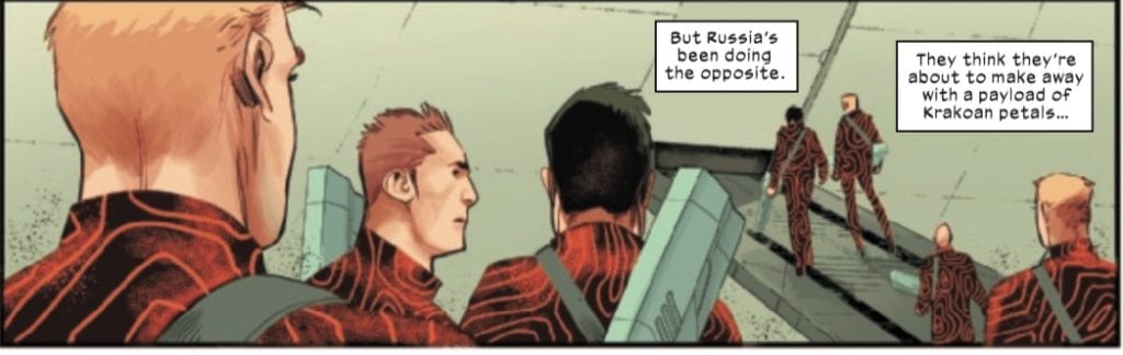
FIREFLY #19, available now from Boom! Studios continues the story of Sheriff Malcolm Reynolds. Once the captain of Serenity, now the Sheriff of a small moon in desperate need of help. It’s not a position fans ever expected to see this character in, that’s for sure.

spoilers ahead

Once upon a time, Malcolm Reynolds ran a crew, all as loyal as can be. Well, they were mostly loyal. Now that crew has been spread throughout the stars, and Mal has taken up a new job in life. It’s perhaps the least likely job ever for this particular character.

He’s now the sheriff of a moon, and he’s doing his best to resist those higher up in the food chain, though this time he’s doing it from the inside. Is this where the series would have eventually ended up, had Firefly never been canceled? It’s hard to know.

It’s obvious that the series has taken a stronger focus onto Malcolm Reynolds. It felt like a temporary move at first, but with each issue, that sensation seems to be drifting away. All while leaving fans missing their favorite (and noticeably absent) characters.

Where are Walsh, Zoe, Shepherd Book, River, and Simon? While the series has told fans were Kaylee, Jayne, and Inara are, the rest of the crew seem to have disappeared from the universe altogether. It’s quite a depressing thought.

Zoe is front and center on this variant cover for Firefly #19.

The Writing

Firefly #19 is one of those issues that will leave fans scratching their heads. Just what exactly is Mal up to? Are we still seeing the symptoms of a longer game, or has our favorite captain finally lost his way?

Greg Pak is still at the helm of this project, providing a look at what must be an alternative version of the world and characters we’ve come to love. Set after the events of Serenity, many changes have been formed here are there.

At first, it was tempting to try and guess how this plot would wrap back around upon itself, how it would bring the crew back together and make them stronger than ever. That temptation has decreased over the last few issues.

There’s still this sense of lingering curiosity, but the hope is dwindling. It’s hard not to miss beloved characters, especially after all this time (and all of the changes they’ve faced).

On the bright side, this series hasn’t been afraid to take risks. There have been plenty of those, especially in terms of character development. This has forced fans to take a step back from their assumptions and expectations, and simply enjoy the show.

The Bandit King strikes again!

The Art

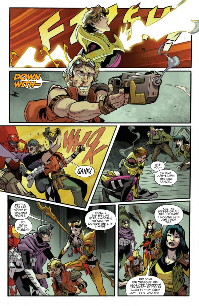
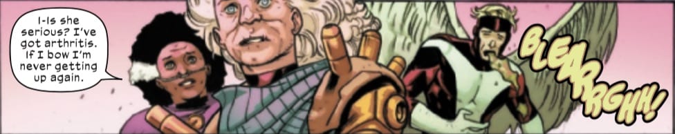
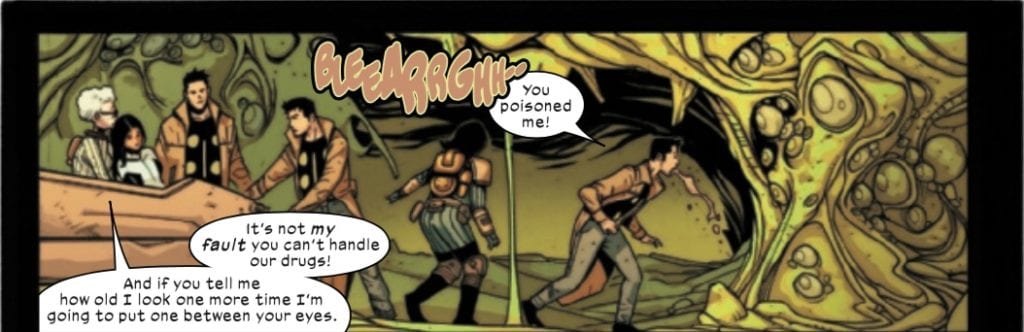
One of the biggest highlights of Firefly #19 is, without a doubt, the artwork found within its pages. The series has taken on a heavily stylized look, but it’s something that suits the aesthetic of the world quite nicely.

Lalit Kumar Sharma is the leading artist for this issue. He’s the one responsible for all the character designs – both for new characters and for the changes made to old characters. All while providing a rough universe for them to reside in. Throw in more than one action sequence, and this issue has a visually compelling base to work with.

Francesco Segala provided the colors, taking Sharma’s work to a whole new level. It truly does read as a Western set in space, with the colors of both genres merging in unique (but pleasing) ways. The starry backdrops are a treasure and make the series worth checking out.

Jim Campbell is the artist responsible for the lettering, and as always, he did a brilliant job here. Carefully placed letters lead from one panel to the next, telling their own story along the way.

He does, indeed, have a good point.

Conclusion

Firefly #19 may be carrying on in a world many have come to love, yet it also feels so different from that original series. It has truly evolved with time, turning into something unique to the comic book industry.

Monkeys Fighting Robots Youtube

A Shocking Revelation In SPIDER-WOMAN #3

Spider-Woman #3 is about to send Jessica Drew on a whole new adventure.

SPIDER-WOMAN #3, available this Wednesday from Marvel Comics, throws Jessica Drew back into the fray. Her latest series has given her more than ever to contend with, including a brand new suit.

spoilers ahead

Jessica Drew, aka Spider-Woman, is back with her own series, and the stakes have never been so high. At least, not so high and so personal. She’s been backed into a corner, and we all know how well that is going to go over.

Spider-Woman #3 continues the latest adventure for Jessica Drew. Sometimes is horribly wrong with her – and now she’s on a race against time (and her body) in order to set things right. This has brought about its own challenges, as one might expect.

Even with these complications, it has been a delight to see Jessica Drew nabbing her own series once again. While the occasional appearance in events and other series (mostly Captain Marvel), has been nice, this feels so much more real.

The darkness before the storm?

The Writing

This latest Jessica Drew series has already been so full of twists and turns – and it’s only a few issues in. Don’t worry, Spider-Woman #3 has no intention of breaking that streak. Written by Karla Pacheco, this is an issue full of action and more than a few climactic moments.

This series is simultaneously portraying Jessica at her best and at her worst. She’s fighting to stay alive for the people she loves, all while struggling against something out of her control. It’s a fine balance, but oddly enough, it all just makes her character feel more human.

A human who has all the right in the world to be feeling extremely angry at the moment. She’s been put through hell and back. Sure, it may all have been done for good reasons, but that hardly changes the fact, now does it?

This issue is full of that anger, to an almost satisfying level. Yet even that isn’t enough to stop the revelations heading Jessica’s way. Which naturally results in a bit of a cliffhanger for the next issue. Who’s placing bets of Jessica starting another fight?

Running parallel to Jessica’s scenes are some moments that are, quite frankly, hilarious. Roger and Gerry are a hilarious pair, though admittedly, Roger is hard-pressed to keep up with that child. It’s a moment of fresh air, before diving back into this tense adventure.

To be fair, she’s got a good reason to be angry.

The Art

Spider-Woman #3 features some bold artwork, as it should. Jessica Drew’s story is dark and complex. The artwork supports that, all while providing an issue full of action, and even a chuckle-worthy moment or two.

Pere Perez was in charge of this issue, providing a broad range of scenes, emotions, and events. Everything from Jessica’s battles, to her emotional (read: extremely angry and ticked off) reactions, as well as everything in between. The contrast between certain scenes was impossible to avoid, and did an excellent job of highlighting her emotional/mental state, and how inaccurate her assumptions are.

Frank D’Armata provided the colors for this issue, bringing the art to life in a bold way. Literally. The colors are vibrant, with only one exception. It was clever to have the scene portraying other characters appear a bit more muted, almost like a flashback. It made it stand out, all while hinting at more.

VC’s Travis Lanham did the lettering, and it was so satisfying here. Thanks to his work, you can really feel it when Jessica lets loose on an enemy. There’s a real sense of impact, not to mention that at times one can almost hear her anger seeping off the pages.

She looks so alive, ironic since she’s fighting to stay alive.

Conclusion

Spider-Woman #3 threw some serious curveballs our way, and while it did leave a bit of a cliffhanger, it’s an experience worth reading. Her journey is full of anger, and rightly so. Yet all of that leaves us wondering: how’s she going to react to this latest twist?

Monkeys Fighting Robots Youtube

How Things Just Went From Bad To Worse In ONCE & FUTURE #10

The enemy refuses to stay down on this cover of Once & Future #10.

ONCE & FUTURE #10, available Wednesday from Boom! Studios continue Duncan’s journey as he learns to fight things that go bump in the night. Unfortunately, things look like they’re going to get worse before they get better.

spoilers ahead

Duncan has only been a hunter for a short period of time. Yet in that time, he’s already faced a king of legend and lived to tell the tale about it. Now he’s about to come up against another legend of old. What are the odds that he’ll get lucky twice?

Once & Future #10 brings fans back to a world of quests, lore, and violence. Only, in this case, the legends are not as magnanimous as they would have had us believe. No, they’re much darker, having had plenty of time to become warped and twisted.

The panic that comes with trying to get somewhere in time.

The Writing

The tale of one family’s battles against creatures of lore continues in Once & Future #10. Written by Kieron Gillen, this issue is tense and absolutely full of battles to stay alive. And to save the day, of course.

Once & Future #10 doesn’t hesitate to throw readers into an anxiety-inducing scene. It makes sense, given the last issue ended in a bit of a cliffhanger. Though the suspense seems to go up a few octaves before the revelation fully hit home.

The tension seemed to grow with each passing page until connections were finally forged. That’s when it became clear how bad things were. Oddly enough, it was almost a relief, since at least now we know. The unknown is always worse, as evidenced by what readers will experience here.

The series of events leading up to the action was tense, making that climactic moment feel larger than life. Or perhaps not, since there really isn’t a struggle larger than the one to stay alive. It’s a tone that was played to perfection here, all while once again setting up for something more.

The constant throwbacks to lore and legends have been a delight, especially towards the end of this particular issue. Once again, pointing towards the fact that this is not a problem that is going to be easily pushed aside.

A real-life moment within the comic book world!

The Art

Once & Future #10 is full of bold colors, dramatic fights, and even more terrifying creatures. In short, it’s entirely at home with the rest of this series. Dan Mora (art), Tamra Bonvillain (colors), and Ed Dukeshire (letters) have worked together to bring this issue to life, and it was well worth the effort.

The juxtaposition between the build-up scenes cannot be ignored. On the one hand, there’s Duncan’s panic expressions and actions to get somewhere and fast. Then there’s Gran, enjoying a rare evening off. It set the tone for what was to come.

What followed was every bit as daunting as one could expect, after such a build-up. It was a monster of legendary proportions – literally. Yet the artistic team was up for the task, portraying unexpected twists in the action.

The colors went a long way in setting the otherworldly feel to this issue, as with the rest of the series. One can see how magic and legend could seep back into the world when it’s full of such brilliant hues.

There’s more than one way to travel, apparently.

Conclusion

There are times when the wait between issues is simply unbearable. That is going to be the case now, following Once & Future #10. The cliffhanger alone will be enough to leave readers eager to see how Duncan and his Gran are going to get out of this mess.

Monkeys Fighting Robots Youtube

Review: EMPYRE: X-MEN #4 – An Anticlimactic (Though Heartfelt) End

On August 19, Marvel Comics releases the final issue of its Empyre tie-in series, Empyre: X-Men #4. Writer Jonathan Hickman returns to the series with pencilers Jorge Molina & Lucas Werneck (also doing inks), inker Adriano Di Benedetto, colorists Nolan Woodard and Rachelle Rosenberg, and letterer VC’s Clayton Cowles.

spoilers ahead

Writing

In a series with rotating creative teams that has seen its share of escalating action, this issue brings the series to a close with a lot of jokes and maybe a few tears, but it is quite anticlimactic.

Readers discover the Scarlet Witch’s fate and a plan she set in motion with Doctor Strange to end the Genoshan zombie threat that comes as a bit of a deus ex machina. At the same time, Beast commits intellectual property theft again, Hordeculture.

One of the more touching parts of this issue is when the zombie Explodey Boy comes face to face with his (fully) resurrected Krakoan counterpart. The two have a very heartfelt conversation and catch up before zombie Explodey Boy sacrifices himself to end the Cotati threat by blowing up inside of the giant Cotati creature, causing all the Cotati to die Phantom Menace style. Likewise, as noted earlier, the zombie threat (from the actual zombies and Magik the “zombie queen”) also ends with ease.

Many readers may walk away wondering what the point of this story tie-in was, other than merely piggybacking on the main Empyre event for a chance to sell more comics. Perhaps the Hordeculture plot will pay dividends down the road, but there is no confrontation between the X-Men and Scarlet Witch, so while I initially believed this story might tie into the underlying Scarlet Witch/Pretender plot thread from the X-books, that doesn’t seem to be the case. But given the ease with which the big bad of Empyre, the Cotati, are dispatched, one still finds this series, as a whole, a bit vacuous. As Explodey Boy tells his zombie, this was “some kinda interesting stuff wrapped in a bunch of other not-so-interesting nonsense.”

Art & Colors

The art team (and there is very literally A TEAM working on this issue) continues to give the series a consistent look, even if the writing sometimes feels like “and then another random thing happens, and then another random thing happens, and then another random thing happens, etc.” The art has been one of the strongest parts of this series.

One sequence that the art team creates to significant effect involves a flashback to Beast’s work with Opal on Krakoa.

The use of black and white to indicate a flashback as we read Beast’s internal monologue plays well in this issue. It communicates Beast’s memory without relying on overly clunky exposition.

It was also refreshing to see the series return to the series-opening sequence, where Wanda was confronted by the horde of zombies and screamed in terror. While her final scream might have made readers believe she was overwhelmed by the zombie horde (although most likely not, given her presence in Strange Academy), we are reminded here what a badass she is.

Wanda is no damsel in distress. She’s a powerful witch, and the art team does a fantastic job portraying her as the confident super being that she is, while still conveying in other places that she is a person carrying deep regret over her past actions.

Lettering

As has been the case for the whole series, Cowles’s letters are great, and there are several really clever dialogue moments. As mentioned before, the interactions between Explodey Boy and his zombie are priceless, particularly a comment that might as well be a comment on X-Men continuity and storytelling over the past decade.

Another great humorous moment, in an issue with a lot of them, comes at the beginning of the issue when Wanda and Doctor Strange are looking for the materials to undo Wanda’s mistake. When the two of them go to Asgard to get a branch from the World Tree, the Asgardians suffer from a bit of deceit.

Cowles’s does an excellent job playing up the humorous effect here with his lettering. Magical bastards indeed!

Conclusion

Judged as a whole, this series is fine enough of a tie-in, even if the plot did feel randomly strung together at times, and ultimately, a bit pointless. Each issue ended with a cliffhanger whose role was acknowledged although to necessarily substantially built upon by the next creative team, who added their share of random escalation until the final issue when everything ended a bit anticlimactically. As a fun, crazy comic book story, it probably works. As a must-read for either Empyre or the overarching X-titles narrative(s), not so much. Perhaps Hickman and company will address Scarlet Witch’s tampering with Genosha when she finally faces a reckoning with Krakoa, but we’ll have to wait and see.

What did you think of Empyre: X-Men #4? What did you think of the series as a whole? Tell us in the comments below!

Monkeys Fighting Robots Youtube

Review: X-FORCE #11 – Krakoa Gets Attacked…Again.

On August 12, Marvel Comics released X-Force #11. Exploring some of the fallout from his Wolverine series, writer Benjamin Percy is joined by artist Bazaldua, colorist Guru-eFX, and letterer VC’s Joe Caramagna.

spoilers ahead

Writing

One advantage of having the same writer writing multiple titles is the ease with which they can cross-pollinate between those titles. Picking up on the events from Wolverine #3, the issue opens with an autopsy of the Russian supersoldiers Wolverine and the Marauders encountered in that issue, only to discover these supersoldiers are far deadlier than they first appeared, with a violent twist on the Russian Nesting Doll. Meanwhile, Colossus struggles with his reluctance to become an active combatant again, all while showing that deep down, he’s still a hero.

Also, while the X of Swords event isn’t supposed to drop until the Fall, this title appears to plant some seeds leading up to the event as readers learn that the latest attack on Krakoa is an attempt to retrieve “the Sword of Cerebro.” And, of course, in what has become an X-Force tradition, Quentire Quire gets gruesomely killed, although not before we find out he’s sleeping with one of the Cuckoos (wonder how that’s going to go over with Cable?).

For those who might’ve been expecting a fight between Colossus and Omega Red, you might be disappointed. Dustin Weaver and Edgar Delgado’s cover is well-drawn but doesn’t quite reflect the contents inside. However, given that the X-books, mainly Percy’s, are focusing on an escalating conflict between Russia and Krakoa, and it is hinted at that the mutant nation might’ve been betrayed from within, the cover may foreshadow a potential future conflict between Colossus and Omega Red.

Art & Colors

The art team does a good job highlighting the menace of the Russian supersoldiers. Bazaldua and Guru-eFX’s depiction of even the dead soldiers makes them look more menacing than they appeared in Wolverine #3.

Russian supersoldier in X-Force #11.
Russian supersoldiers in Wolverine #3.

The art and coloring make their body armor, and even their (dead) faces appear more menacing than they did in Wolverine.

One great collaboration on the art team happens when Kid-Omega is killed. The scene is set up wonderfully, with Quentin’s contentment being established only to have it violently interrupted.

There are several things that work about this sequence, not the least of which is the clever means by which Quentin’s death furthers the plot, since the Russian agents can’t get through the Krakoan gates, and so couldn’t escape with the sword. Killing Quentin and pushing him through, however, accomplishes just that.

In terms of its execution, seeing Quentin’s contentment give way to shock in the splash of red (along with the stabbing sound effect) conveys the gruesomeness of the situation, while still being able to be played for laughs…albeit very dark laughs.

Lettering

Caramagna’s letters are on point in this issue. Very early on, his letters help establish the impending danger facing Krakoa in this issue, in a scene that’s quite Alien-esque.

That movement from the silence of the dead to the chest-bursting Russian supersoldiers creates a very palpable “oh shit!” moment that sets the tone for the entire issue. And you couldn’t get that without “SKELCH.”

One area that was a little unclear was the purpose of the prose sections in this issue. Typically, these sections serve to provide plot details that aren’t shown (which isn’t necessarily a good strategy) or to flesh out a character’s own private thoughts or to show the reader some sort of communique. In this issue, the prose sections are partial chapters of a novel or memoir. Who is speaking is a bit unclear, but hopefully, Percy and company flesh this out and make it understandable in future issues.

Conclusion

X-Force #11 catches Krakoa with its pants down as they suffer a biological attack from Russia, and it appears to establish another piece of what I’m sure is part of the lead up to X of Swords. Percy and company establish a challenging enemy for X-Force, continuing to escalate the conflict with Russia, which will probably eventually involve Colossus getting involved, despite his protests to the contrary.

What did you think of X-Force #11? Is it laying the foundation for X of Swords? Will Kid-Omega ever NOT die in an X-Force issue? Tell us what you think in the comments below!

Monkeys Fighting Robots Youtube

Review: MARAUDERS #11 – Kate’s Fate Revealed!

The fate of Kate Pryde is finally revealed in Marauders #11, released by Marvel Comics on August 12! Writer Gerry Duggan, artist, Stefano Caselli, colorist Edgar Delgado, and letterer VC’s Cory Petit bring readers another issue of what is easily one of the strongest X-titles currently being published.

spoilers ahead

Writing

This issue begins with a tender moment, with Nightcrawler writing a letter Kate while she’s “away” in order to keep her in the loop of all the goings-on around Krakoa. The X-Men then hold a ceremony for Kate, and a sense of sadness hangs over the book. That sadness quickly turns to anger, however, when Lockheed returns, and Emma Frost discovers that Sebastian Shaw betrayed Kate. Rather than take this discovery to the Quiet Council, Emma keeps it to herself, setting up a future (and probably ongoing?) conflict in the series moving forward.

Finally, the moment readers have waited for finally happens…Kate returns! The mystery of how to resurrect her is uncovered, and hopefully, this will move the narrative one step closer to revealing why she can’t go through the Krakoan gates.

Again, this is a solid title, with a well-paced story, and a lot of good character moments and interactions. Readers will have to wait for the fallout of Kate’s murder by one of her fellow mutants and Hellfire members, as well as for the significance of the B-plot involving Storm and one of the agents of the X-Desk.

Art & Colors

The art team crafted a gorgeous issue filled with some beautiful and poignant imagery. One image that particularly stands out comes at the beginning of the book, with Kate’s body being shown.

There has been a sadness hanging over this book, and a general sense of uncertainty hanging over the X-titles, ever since Kate’s death. This image drives that home, particularly given reader knowledge of the circumstances of her death.

Given the themes of life and death in this issue, it is only fitting that the next image to highlight comes from Kate’s rebirth, beautifully colored by Delgado.

Caselli and Delgado complement each other very well here, with the fetal imagery and ambient lighting working in tandem to show us Kate’s fetal state before she can phase through the egg.

Again, thematically, it is beautiful that this issue is bookended by the themes of death and rebirth, subjects that the art team can skillfully convey.

Lettering

In an issue full of some tender moments, one of those moments is used as a framing device to begin the issue: Kurt’s letter to Kate. Kurt’s words establish the tone for the entire book as sad but hopeful. Petit’s letters are well-done here as he overlays the images with Kurt’s letter to his dear friend. Particularly worth of note is how the lettering provides a nice touch to the image of Kate’s dead body (noted above) by simply stating, “when we meet again.”

It’s a heartfelt sequence, and Petit does a beautiful job working in tandem with the art team to add a nice verbal flourish. In an issue mourning the death of a teammate and friend, all of Petit’s letters operate that way, not overwhelming the scene but appropriately accentuating the scene when needed.

Conclusion

It’s good to have Kate back, and moving forward; it will be interesting to see how the conflict with Sebastian Shaw will play out. Will he eventually meet the same fate as Sabretooth, exiled below the surface of Krakoa for his crimes? Or will Kate and Emma be able to put him under their thumb? And has a new relationship with the X-Desk opened up future avenues for cooperation, or is there a conflict being foreshadowed with the U.S. government?

What did you think of Marauders #11? Tell us in the comments below!

Monkeys Fighting Robots Youtube

Review: EMPYRE: X-MEN #3 – Things Keep Escalating…

On August 12, Marvel Comics released Empyre: X-Men #3. With rotating writing and artist on each issue (I’m guessing to accommodate the weekly releases), writers Vita Ayala, Zeb Wells, and Ed Brisson are joined by artist Andrea Broccardo continue this tie-in tale to Marvel’s larger Empyre event. They are joined by mainstays of the series Nolan Woodard on colors and VC’s Clayton Cowles doing letters.

spoilers ahead

Writing

Empyre: X-Men #3 is a messy issue. A fun and action-packed issue, but a messy issue. At times, it’s a bit difficult to keep track of all of its moving parts. The issue moves back and forth between the action on Genosha and characters on Krakoa, with a few characters, like Hordeculture’s Opal, being teleported to Krakoa, and somehow returning to Genosha off-panel.

Highlights include Magik’s discovery of the staff Scarlet Witch used when she attempted to resurrect the dead Genoshans, although still no sign of the witch herself. Upon grabbing the staff, however, Magik is overwhelmed by its power, becoming “the Zombie Queen of New Genosha,” whatever that may mean. We’ll see what this development means in the final issue.

Meanwhile, the Cotati threat escalates even further, with the seedpod giving birth to a monstrous creature, which one of the dismembered Cotati indicates will lead to the deaths of everyone on Genosha.

This series keeps exponentially growing (albeit messily) in scale, and the final writing team will have its hands full tying up all the loose ends while hopefully giving readers insight into the Scarlet Witch’s whereabouts.

Art & Colors

It’s worth noting here that Eduard Petrovich’s cover doesn’t quite reveal the actual contents of the issue. While I appreciate the partitioning of the cover between the Cotati, the X-Men, and the Genoshan zombies, Cyclops, Polaris, Magneto, and Colossus don’t appear anywhere in this issue.

Inside the issue, Broccardo is able to jump right into this event, with the change in artist barely being registered (this is a credit to the artists across the three issues). One of the standout panels from Broccardo includes her full page of Nightcrawler jumping into action.

It’s always nice seeing the elf charge into battle with a smile on his face and a sword in his hand! We don’t get quite enough of fun Kurt jumping around in the X-titles.

Another great panel includes one of the Cuckoos (it doesn’t specify exactly which one), who gets cut off from her sisters and is about to be killed by the zombies. Resurrection may be a reality on Krakoa, but the writers and artists do a decent job in this panel, reminding the readers that one ought not to think that resurrection is without its cost.

Although Magik saves her, the tears on her face and her request to be brought back without the memory of being eaten reminds us that there can still be traumatic consequences to the characters even with resurrection.

Of course, Woodard’s colors have been constant throughout this series, helping in part to keep the look consistent even with rotating artists. Woodard’s shifting yellow-green, and brown-orange-red hues have been consistent throughout, accentuating the plant-based Cotati and the plant-based Krakoan weapons while also providing a nice contrast to the viscera and rot of the zombies.

Lettering

Cowles’s lettering remains steady in this issue, and he’s certainly given plenty to do. THIS panel alone gives him a fair share of dialogue and sound effects to put in.

*Nog Nog* indeed.

There was one place in the lettering (and in the art) that may bring some confusion. In a transition from a panel featuring Angel to one featuring Multiple Man, you’d be forgiven for thinking that the letterer, the artist, or both mixed up characters’ locations and dialogue.

You’d be forgiven for thinking that the dialogue between Jamie and Warren got mixed up here since Hordeculture chastises Jamie for calling them old, but the last person to call them old was Warren. Also, the panel before Jamie throwing up is of Warren throwing up. Initially, I thought a mistake had been made in terms of the art or the lettering, but the effect is probably meant to mirror the similar effects of getting over Hordeculture’s pheromones (nausea, calling them old, etc.). And yes, Jamie had been dosed in issue #2, so it makes sense that he’d be having the same symptoms as Warren, even though the previous issue highlighted Warren’s susceptibility to the pheromones.

Conclusion

Overall, this was a fine third issue, filled with action that at times can be a bit confusing to follow. We will see this week if issue #4’s writing team resolve the escalating conflict with the Cotati, the zombies, and the fate of the Scarlet Witch.

What did you think of Empyre: X-Men #3? Tell us in the comments below!

Monkeys Fighting Robots Youtube

Review: STEALTH #4 Is The Action Movie Rental You’ve Been Waiting For

Stealth #4, Howard cover

STEALTH #4, available from Image Comics on August 12th, follows all the players – Tony, Stealth, and Dead Hand – as they converge towards the final showdown. Mike Costa’s story leans heavily into the action movies of the ’80s and ’90s to bring you a chapter that’s violent, tense, and surprisingly humorous.

Cover Art

Jason Howard’s cover is a beautiful blend of action in pulp. The henchman is getting ready to blast away when you see the reflection of Stealth bearing down via a pool of blood. The cover plays up and on the violence of the issue well, but the angle of the reflection is off, so it was a little distracting.

Writing

Costa’s story picks up right after the events of issue #3 (you can read our review here). Tony is searching for Stealth. Stealth is cornered in an old safe house. And Dead Hand is killing anyone who gets in his way.

Costa does a great job weaving the three-character threads towards convergence. Tony uncovers the clues to Stealth’s plan if you can call it that. Stealth is racing to uncover the tools he needs to defeat Dead Hand before he loses his memories. Dead Hand throws grenades and kills rival gang leaders to consolidate power and bring down Stealth in a very public way.

Different from the previous issue, this entry had a few dark humor jokes that caught me off guard. The jokes made the issue more fun to read, and it gave off a distinctly RoboCop (1987) vibe in their absurdity. Excellent work overall by Costa.

Stealth #4, writing sample

Pencils/Inks

Nate Bellegarde lays down a no-nonsense style to the art for this issue. All the panel angles are straight on without coming off as flat. The character renderings have a grounded and realistic quality to them, and the action is – in a word – cinematic.

At the risk of sounding redundant, this entire issue reminds me heavily of the better action movies of the ’80s and ’90s. The exploding house looks straight out of a Lethal Weapon (1987) film. Maybe the creative team has a thing for movies released in 1987.

One panel, in particular, caught my eye for its freeze-frame effect I don’t believe I’ve ever seen before. A henchman shoots a gangster in the head, but rather than projecting the typical splatter from the shot; you see the gangsters face bulge out from the bullet’s exit point at the precise moment before the bullet comes out. It’s a panel that’s equal parts disturbing and fascinating to see—really cinematic art here by Bellegarde.

Coloring

Tamra Bonvillain’s color work is gorgeous in this issue. Rather than muting all the panels to keep it sober and gritty, the colors are almost cheery in their brightness. That cheeriness helps to elevate the absurdity of the violence and infuse the book with a bit of grindhouse ambiance.

Stealth #4, coloring sample

Lettering

Sal Cipriano’s lettering does well for maximizing every square inch of space. For an action movie-esque issue, there’s quite a lot of dialog going on. Surprisingly, the high volume of word balloons never got in the way of the high-quality art, and it kept the pace moving nicely.

Conclusion

STEALTH #4, available from Image Comics on August 12th, reads like one of the better action movies of the last few decades. The story is action-packed with a few surprising jolts of humor to make the issue thoroughly entertaining. The art is colorful and cinematic, and this issue would serve as an excellent pitch for a film or streaming adaptation.

Monkeys Fighting Robots Youtube

How Red Seeps Into the World In RED MOTHER #7

The red is getting ever closer in Red Mother #7.

RED MOTHER #7, available this Wednesday from Boom! Studios, continues Daisy’s journey, following the aftermath of that horrible night. This dark series is a puzzle waiting to be solved by the readers.

***SPOILER WARNING***

spoilers ahead

Red Mother is a series following Daisy McDonough and the events that follow the worst night of her life. Ever since the attack, nothing has been the same. Her life feels haunted. By the loss of her boyfriend, the damage to her eye, and haunted by a mysterious red figure.

The Red Mother is a psychological horror series through and through. Realistically, it is not a series for the faint of heart or those that have trouble seeing the damage that occurs around the face. That is the sort of imagery prevalent within these pages.

Daisy is looking mighty haunted on this alternate cover of Red Mother #7.

The Writing

No matter how far Daisy runs, she cannot get away from what is haunting her. Or is it hunting? She’s made it to another continent, and yet the red is still there, right at the corner of her vision.

Jeremy Haun has continued his thrilling and terrifying tale in Red Mother #7. Daisy’s journey is feeling increasingly claustrophobic, as the supernatural following her gets ever closer. The sense of foreboding is on point in this issue, as are many other subtle elements.

All of which weave together to create a dark and concerning tale. Even the moments of brightness cannot chase away the dark or in this case, the red. It almost feels like the moments of happiness in Daisy’s life as put in place to remind readers of everything that can (and will) be lost when it all goes awry.

There are a lot of elements to appreciate in this issue. The commentary on street art, the subtle clues dropped here and there, as well as the significant revelations. None of it should be ignored, as it’s all building up to something. The question is, what?

A world of red is waiting to invade.

The Art

The artwork behind Red Mother #7 is every bit as haunting as the story it supports. Though in an exceedingly more deceptive manner. Danny Luckert has been the lead artist for this project, working alongside Ed Dukeshire for lettering.

There are panels where the world looks almost normal, only to flip towards the red spectrum. It’s a twist that fans of the Purple Man will easily recognize – and that makes it no less terrifying. In fact, the opposite could easily be argued for.

The artwork on these pages subverts all expectations, turning bright colors into moments of pure horror. The twist leaves a strong sense of anxiety, proving how effectively it manipulates the reader’s emotions.

All of this is coupled with a sense of light, which the series isn’t afraid to play with. Dark shadows are bouncing all over the backdrop, while light dances over the hands of leading characters. Is this just a moment of playfulness, or a hint towards something much darker?

Likewise, the lettering for this issue is so carefully crafted. There’s a real sense of impact, subtle cues that spring from the placement of the words. It’s subtle, yet it also carries the readers along in this twisted tale.

A timely conversation about street art.

Conclusion

Red Mother #7 is a complex issue, providing ample opportunities for concern while building up for something so much bigger. Like the calm before the storm, things are about to get a whole lot more complicated in Daisy’s life. That is a message telegraphed very clearly in this issue.

Monkeys Fighting Robots Youtube

POWER RANGERS: DRAKKON NEW DAWN #1 – Recovery Scars

Power Rangers: Drakkon New Dawn #1 Cover

Power Rangers: Drakkon New Dawn #1 is the beginning of a spin-off to Boom! Studios’ main Power Rangers series. The story written by Anthony Burch, with artwork by Simone Ragazzoni, colors by Raúl Angulo, and lettering by Ed Dukeshire, focuses on the World of the Coinless trying to recover after the Shattered Grid crossover event.

Power Rangers: Drakkon New Dawn #1 Story

Power Rangers: Drakkon New Dawn Alternative CoverBurch stepping out of his partnership with John Carpenter and the horror genre pens Power Rangers: Drakkon New Dawn #1. Continuing off of Power Rangers: Ranger Slayer, a post-upgrade Kim is trying to lead a rebuilding of her reality’s society. But things are not easy as old wounds in both of Coinless and Power Sentries are manifesting every other day. All of which reflects in the company Kim keeps. Some include her former ranger teammates who know her brainwashing into the Ranger Slayer and old enemies like Scorpina, whose condescending attitude makes it hard to be in the same room with. Yet it’s the struggle to find tolerance that makes the rebuilding efforts worthwhile. Because not all of who went against Drakkon or joined him are purely good and evil, respectively, some of the Sentries only wanted to protect those they could under Drakkon’s rule.

So Kim takes it upon herself to dismantle any remains of Drakkon’s influence, starting with a prison. Years of trauma continue to haunt this place, especially in the prisoners. One prisoner, in particular, serves as what kickstarts the story as a reminder of Drakkon’s aftermath. Drakkon may be gone, but he leaves behind a nasty surprise that may push Kim and friends to the brink.

Art

Ragazzoni gives a distinctive look to the world of Power Rangers: Drakkon New Dawn #1 in terms of character design. Most characters not in Ranger suits look worn out and ready to break. It’s a display of the amount of trauma that still resides in the World of the Coinless. However, the Ranger suits are more or less masks to hide their exhaustion. It’s merely a means of keeping themselves together in a world where these suits are the marks of Drakkon’s influence. No one displays that better than the Prisoner Ranger whose crudely put together design demonstrates his place in a terrible surprise from Drakkon.

Angulo’s coloring in Power Rangers: Darkkon New Dawn #1 shows a grim bleakness throughout the issue. While the brighter colors do appear throughout the issue, the muted atmosphere and flat colorizations hold the brightness back. In fact, when color with more luster appears later, it’s not life returning to a barren world, it’s a harbinger of destruction.

Every detail in the artwork

Dukeshire provides lettering that is uniform, never straying from the panels. Some of the fonts even get a stylization to coincide with the emotional states that characters are in. A boat of rage is often with an orange font word. Caption boxes stand out enough for readers to follow them without getting in the way of the images. But what really stands out are the wordmarks that possess details that are drawn for this very occasion. They are not extremely bright, and the flat colorization belies their impact as they jump between panels.


Get Started With Power Rangers: Drakkon New Dawn #1

Power Rangers: Drakkon New Dawn #1 begins an exciting spin-off series that displays how an already bleak setting can get even worse. Yet the creative team is going to make this series something fans will never forget.

What do you all think? Is it time to move on from Ranger Slayer and Drakkon? Or do you want to give this series a try? Leave your thoughts in the comment section below.

Monkeys Fighting Robots Youtube