Home Blog Page 226

Review: CROSSOVER #1 – A Must-Read New Series

Crossover #1 Cover

Crossover #1 is the new series, out now from Image Comics, that you need to pick up. Full of extraordinary situations and genuine emotion-provoking scenes, Crossover is sure to be a series you won’t want to miss.

About the Book:
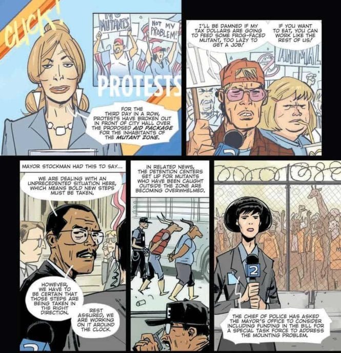
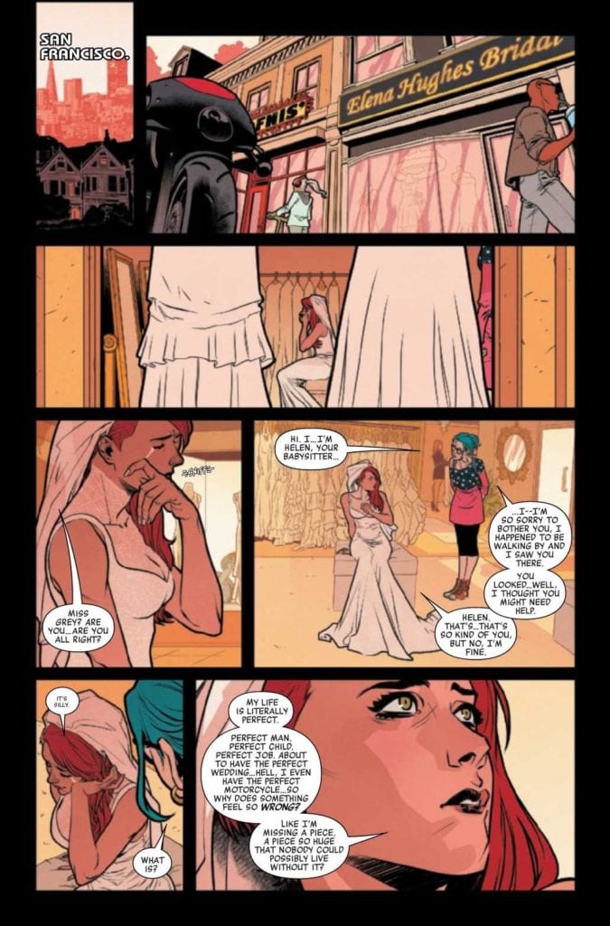
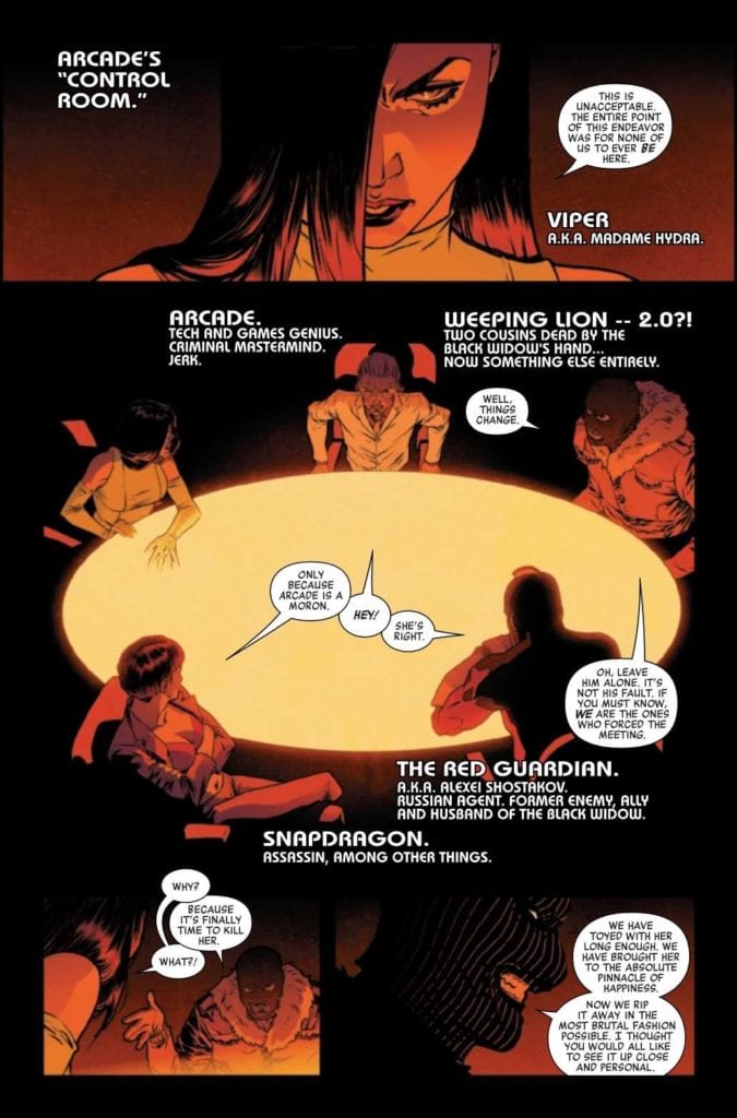
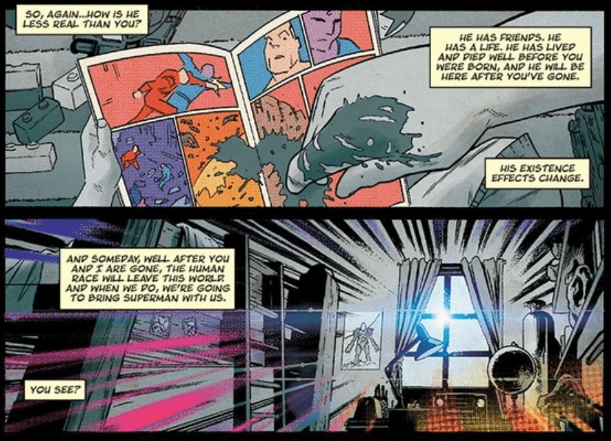
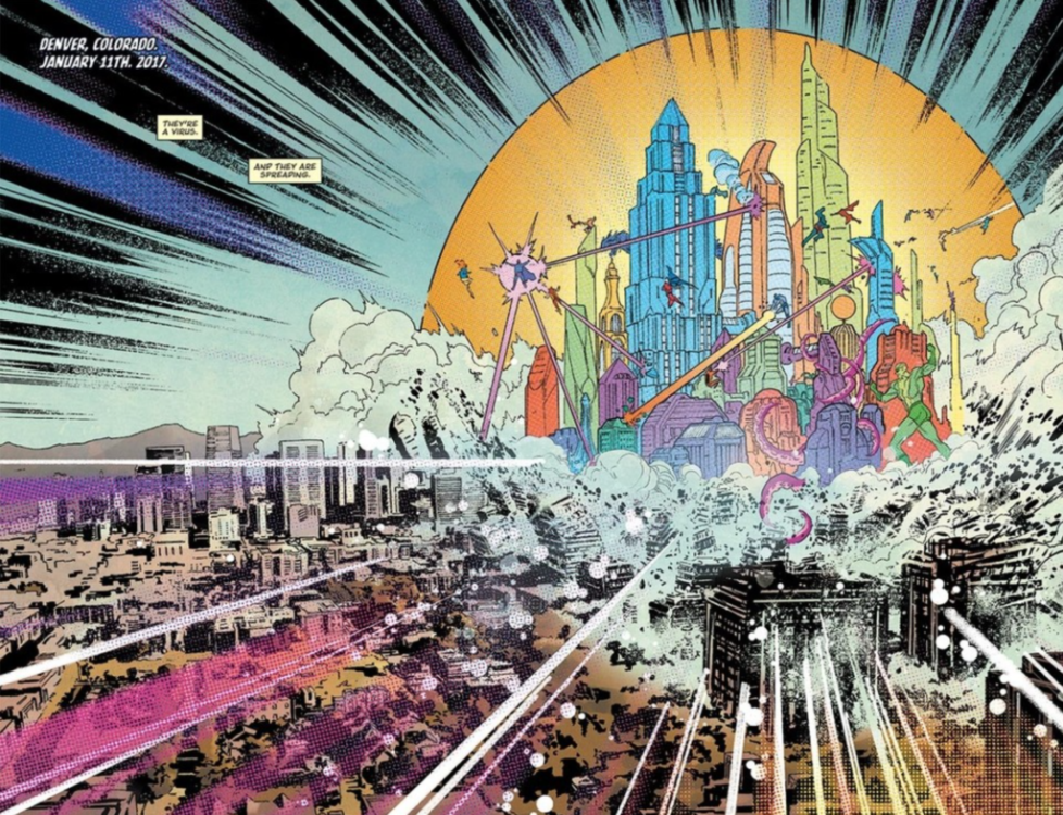
The heroes that we know from comic book pages have become real, and the damage they have caused is horrific. They are now contained, but the world has drastically changed because of their presence. Now, one girl is about to find herself wrapped up in a situation unlike any she’s experienced before.

Crossover #1 Story

Crossover #1 Story

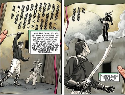
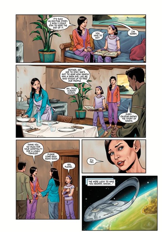
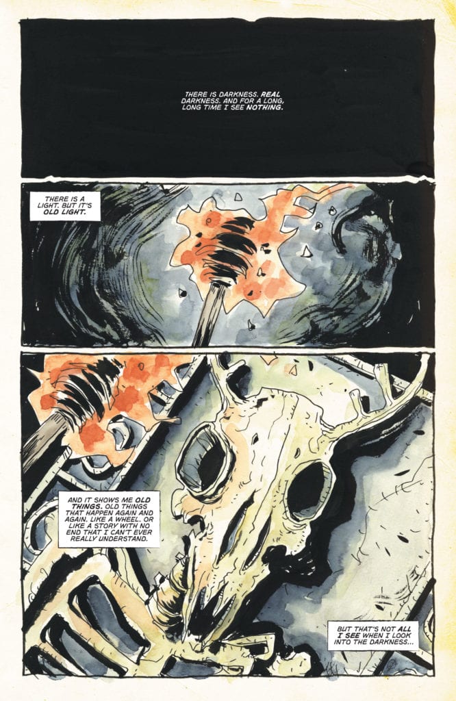
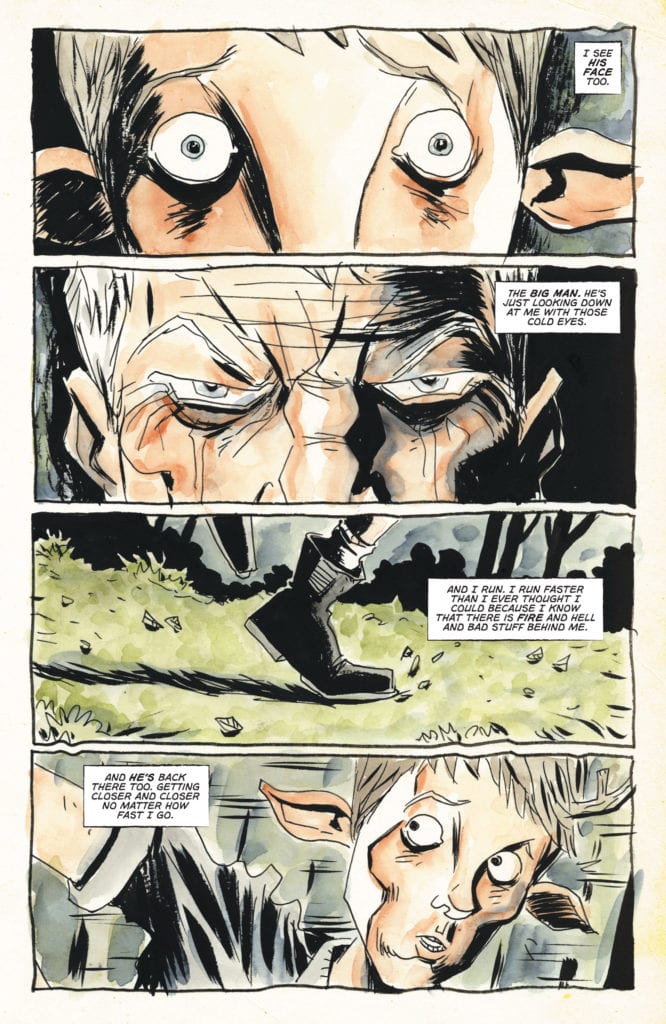
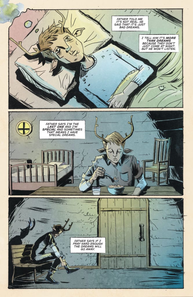
This issue was an absolute pleasure to read. Donny Cates does a brilliant job of immersing us into this entirely new world that once was like ours but has been changed by the appearance of superheroes. We get this wonderful glimpse into so many aspects of this world, and yet by the end of the issue, we have barely scratched the surface of what it has to offer. First, Cates uses an unknown narrator to explain to us what transpired that caused the world we see to become so different. Then the narrator introduces us to the main character, who we follow throughout one of her typical days. Her everyday life shows us a completely alternate version of a location I’m sure many readers are very familiar with, highlighting how much the world has changed. When the main character’s typical day no longer becomes as typically, Cates can give us circumstances that will lead to the main character and the reader being able to see more of this fantastic world. Crossover #1’s story also coves quite a few serious themes and successfully pulls at the reader’s heartstrings. The transition into this entirely different world is seamless, and it would be difficult to think of a way to do it better.

Crossover #1 Art example

Art

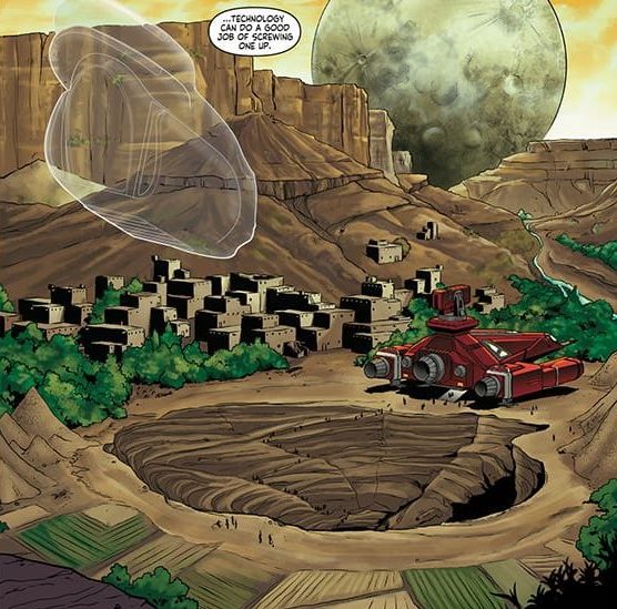
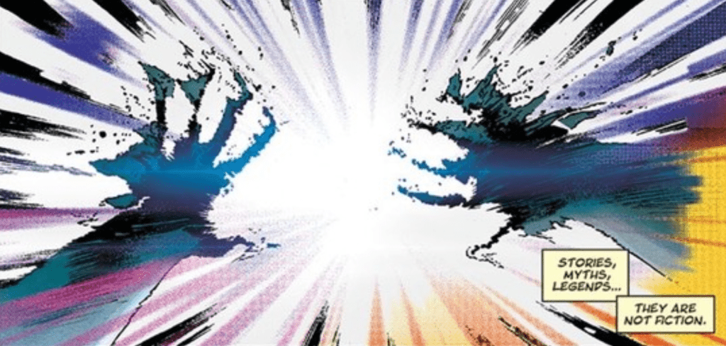
Geoff Shaw provides some stunning art in Crossover #1 that is integral to making the issue such a wonderful experience. Having the heroes drawn in a style that reflects old comic books – with them covered in dots – creates a nice contrast to the other characters’ sharp lines and scenery in the issue. Shaw also enhances the issue with his remarkably expressive drawings and detailed faces. There is wide diversity in his characters through body type, race, and physical appearance, making the world seem more realistic. Panels filled with many people reflect the many different individuals we see every day, rather than an artist who habitually makes all of his characters look similar.

Crossover #1 has some fantastic coloring from Dee Cunniffe. There is an enjoyable variety of colors used and many bright colors that liven up the page. Cunniffe also does some interesting coloring in the issue when a particular panel needs emphasis. Cunniffe gives everything in the panel a blue tint as if to say that time has stopped in the panel to provide us with enough time to comprehend the situation. The technique has a similar effect to when a film uses slow motion. It is odd to see this in a comic book since each panel already acts as a frozen image in time, but through Cunnife’s coloring, the technique works wonderfully.

Crossover #1 Coloring Example

The lettering of John J. Hill does not do much to surprise the reader for most of the issue, but when it comes more into play, Hill’s talents become apparent. Crossover #1 has an unknown narrator. The captions used for his are bland, with a common font and a tan background. This is understandable, as you want the narrator’s world to blend in with each panel and seem as it was just a part of the world. However, besides this and ordinary speech bubbles, there isn’t any lettering to comment on for much of the issue. While these two lettering choices do serve important roles, they are by no means impressive. Towards the end of the issue, everything changes, and the lettering becomes much more exciting as the story quickens the pace. Hill uses bold captions, giant fonts, and everything else a reader hopes to see in lettering. I hope it continues for the rest of the series.

Conclusion

Crossover #1 is an issue that you will not want to miss. It wonderfully sets the stage for a riveting new story and has brilliant artists on the project to make each issue a visual spectacle. If you have doubts about this new series, pick up a copy of this marvelous first issue, and it should change your mind.

Monkeys Fighting Robots Youtube

Box Office Flashback: November – Christmas Antics And Deathly Magic

Looking at box office history reveals the shifting or non-shifting trends of movie audiences. Thirty years ago, comedy took home all the money; twenty years ago, it was the same story, but ten years ago, the action-packed end of an epic saga won the day.

November releases typically come without much fanfare and for a long time was a month reserved for family films, drama, and maybe an Oscar contender or two. November paves the way to December’s releases of Oscar-bait and box office dominators, but both months have seen the decades change the type of movie that shows up on screens. There aren’t enough months for the kinds of films releasing today.

So, who took the box office crowns in our analysis this month? Let’s take a look back ten, twenty, and thirty years ago at the biggest movies released in November.

1990 • Home Alone • 143.5 million

home alone-film-box office

November 1990 is a pretty epic year when it comes to memorable, money-making films. The champ this year, Home Alone, was a blockbuster that made Macaulay Culkin a super-star. Home Alone shattered records on its way to a massive haul of nearly 500 million worldwide. Anthony Edwards and Joe Pesci are classic hapless villains who suffer booby trap after booby trap set by Kevin McCallister, the kid who’s home alone. By the time it’s theatrical release was over, Home Alone was the third highest-grossing film behind Star Wars and E.T.

Home Alone‘s box office numbers blew away the competition released in November of 1990. But the distant second-place finisher, Dances With Wolves, took home a lot of gold at the Oscars (winning 7 out of 12 nominations). Three Men And A Little Lady came in third, just ahead of Steel Magnolias, Rocky V, and Little Mermaid. Whoa. What a year! It doesn’t end there; Misery, the Stephen King adaptation that made Kathy Bates an icon, wasn’t too far behind, and neither were Predator 2 or Child’s Play 2. November 1990 was a cavalcade of film releases that left a lasting impression on pop culture.

2000 • How The Grinch Stole Christmas • 251.6 million

the grinch-jim carrey-dr seuss

Ten years after the epic November of 1990, How The Grinch Stole Christmas starring Jim Carrey took the box office crown. Like Home Alone, The Grinch was far ahead of all the other films released in November 2000. Carrey was at the peak of his star-power, having done Liar, Liar, The Truman Show, and Man on the Moon before playing the titular Grinch. Ron Howard, the man who famously finished Star Wars: Solo and brought Dan Brown’s DaVinci Code to the screen, directed the to an impressive nearly 400 million dollar box office haul.

Charlie’s Angels from director McG came in second with roughly fifty percent less domestic box office than The Grinch. Charlie’s Angels was a hit powered by its stars Drew Barrymore, Cameron Diaz, and Lucy Liu. It also spawned a sequel and later, a reboot with Kristen Stewart. M. Night Shyamalan’s Unbreakable became the third straight hit for the director and may have had a subtle but notable impact on how a superhero movie could operate. Rugrats In Paris came in fourth, which proves just how much power the cartoon had at the start of the 21st century. 102 Dalmatians, the sequel to Disney’s classic animated film with the iconic Cruella Deville, came in the fifth spot.

2010 • Harry Potter and the Deathly Hallows: Part 1 • 177 million

harry potter-film-box office

November 2010 features the beginning of the end of the Harry Potter films. Sort of. Daniel Radcliffe, Emma Watson, and Rupert Grint returned for the first half of the final chapter in JK Rowling’s epic tale of the boy who lived. Harry Potter is a franchise, unlike few others that spanned eight cohesive films. It was mostly faithful to the book, and it’ll be a long time before anyone attempts to put those books on film again. The Harry Potter universe continues to deliver by expanding the universe with theme parks and spinoff films.

Harry Potter safely took the box office crown, and there was little doubt it wouldn’t. Two animated films battled for second and third place. Tangled, the movie loosely based on the German fairy tale “Rapunzel” took second place with 161.2 million. Just behind at 143 was Megamind, the superhero animated film with the voice talents of Will Ferrel, Tina Fey, and Brad Pitt. The comedy Due Date starring Robert Downey, Jr. and Zach Galifinakis came in a distant fourth, beating out the Chris Pine, train gone crazy film Unstoppable.

November 2020 & Predictions

Covering the box office this year is dismal, and the impact on an entire industry is dire. Exhibitors like AMC And Cobb weren’t doing all that great pre-COVID, as evidence by falling domestic ticket sales for nearly two straight decades. Now, the long, grueling fight against the virus has effectively crushed the industry. There’s no telling where things will go from here. In August, a judge removed the Paramount Decree of 1948, which barred studios from owning theater chains. The future of movie theaters may end in the hands of studios like Disney, who will be able to own the experience, from production to distribution, once things get “back to normal.” However, streaming, video games, and V.R. aren’t going away and further dominate the entertainment landscape.

Which of these films do you still watch today?
Leave your thoughts in the comments below!

Read more from Ruben R. Diaz!

There’s so much more on PopAxiom!

Monkeys Fighting Robots Youtube

Review: THE ORVILLE #3: HEROES PART 1 OF 2 — Talla Fights Against Oppression

THE ORVILLE #3: HEROES PART 1 OF 2, available in stores on Wednesday, November 4th, details the crew’s fight against an oppressive organization. Talla Keyali, a Xelayan Lieutenant serving with the team, leads the call to help the Okudum people. She developed a bond with one of their families five years prior, even reading a storybook with the daughter detailing the feats of a hero who fought against oppression. Unfortunately, Talla and team learn another alien race (the Nazh) is harming them in the present as well.

The resulting story details the challenges that arise for those who fight against oppressive systems.

Story

The issue’s story opens with flashback to Talla’s past, giving readers context regarding her connection with the Okudum. The former Ensign took part in a mission to better understand the people of the planet as they resembled her own race.

This narrative technique brilliantly sets readers up for the story to come. By providing a backstory relating one of the main characters (Talla) to a new setting, writer David A. Goodman helps readers care about what she cares for. This knowledge of a character’s backstory can make all the difference when it comes to enticing readers.

Returning to the present, Talla, Captain Ed Mercer, and rest of the crew make plans to investigate the Okudum and a mysterious advanced piece of machinery found on their planet. What’s odd is that this society has historically shied away from advanced technology, opting to live in harmony with their land. Can the Orville team figure out who is responsible for the drastic changes in this society? Is it the oppressive Nazh group? And if so, should they fight back?


Artwork

David Cabeza’s penciling and ink work provides realistic illustrations of each character. It’s almost as if one was viewing a photo of Seth MacFarlane whenever Ed appears in a panel. Micahel Atiyeh’s coloring provides nice contrasts between the earthen tones of the Okudum landscapes with the Orville uniform’s colorful hues. And Rikchard Starkings & Comicraft’s Jimmy Betancourt’s lettering frames the illustrations beautifully with narrative and dialogue boxes that blend well with the colors of the panels.

Conclusion

THE ORVILLE #3: HEROES PART 1 OF 2 opens up a new storyline rooted in an intriguing character. We’re excited to see more of Talla in the issues to come.

What did you think of this issue? Let us know in the comments below!

Monkeys Fighting Robots Youtube

Review: TEENAGE MUTANT NINJA TURTLES: JENNIKA II #1 And The Influence Of Xenophobia

TEENAGE MUTANT NINJA TURTLES: JENNIKA II #1 hits comic book stores on Wednesday, November 4th, giving readers an all-new take on the newest Ninja Turtle. The issue details how this fan favorite and relatable character navigates forces of oppression both within and without her community of mutants. Xenophobia, it turns out, can infect even the best of us.

Story

Like much of the current TMNT run, this issue focuses on the fallout from the explosion that created Mutant Town. The media outlets and public at large seem to have gotten over most of the shock at meeting the mutated citizens, but their attitudes have turned hateful—an even worse predicament.

After a montage of public outrage toward these mutants who are “different,” the story shifts to Jennika exploring the streets of the town. Unfortunately, the people living there appear to be facing difficulties apart from the media.

The ninja comes across two mutants fighting over a grocery bag. But it’s unclear which one is the aggressor and which is the victim. Acting on unconscious instincts, Jennika treats them both as criminals, even going so far as to attack an alligator person.

But this incident isn’t the end of Jennika, and Mutant Town’s, problems. The young ninja soon encounters another mutant that’s completely out of control. Could this further stain the reputation of the town to the public at large?

Artwork

Brahm Revel’s penciling and ink work captures Jennika’s style beautifully, detailing a Ninja Turtle whose movements are swifter than her counterparts. These illustrations, colored by Revel as well, gives life to both Jennika and the other characters with rich hues. What’s more, the artist’s lettering seamlessly shifts styles to let readers know if the character interacting online, speaking aloud, or performing an action.

Conclusion

TEENAGE MUTANT NINJA TURTLES: JENNIKA II #1 offers readers a relatable character and timely analogies to our real world issues. We’re anxious to see what’s in store next issue.

Do you think the other mutants could find themselves in the same situation as the one Jennika encounters? Let us know in the comments below!

Monkeys Fighting Robots Youtube

Review: MY LITTLE PONY/TRANSFORMERS #4 Brings The Fun To A Close

My Little Pony/Transformers

My Little Pony/Transformers #4 out this week from IDW Comics brings the mini-series to it’s ending. There was no grand arching mystery or fate of reality hanging in the balance as the issue reached its conclusion. Does this mean it’s boring? Thanks to the work of Ian Flynn (writer), James Asmus (writer), Sara Pitre-Durocher (line art), Tony Fleecs (line art), Joana LaFuente (coloring), Lauren Perry (coloring), Jake M. Wood (lettering) and Neil Uyetake (lettering) the issue is far from boring as possible.

Summary

Optimus Prime and Twilight Sparkle finally band together the ponies and the Autobots to get things back to normal. The finale you’ve been waiting for is here!

My Little Pony/Transformers

Writing

The first story “Strength In Numbers” has Applejack doing her best to take on the Insecticons. It’s amusing to see how the Apple Family faces off against such an infestation. Sure, previously Insecticons have been shown they are strong enough to eat through metal doors, but Ian Flynn shows how if a family comes together they can conquer anything.

The second story, “Finale” by James Asmus brings the mini-series to a close by having an all out brawl with Decepticons and Changelings on one side and Autobots and Ponies on the other. It’s crazy and over the top but as stated in the very first issue of this mini-series, it’s all supposed to be about having fun and enjoying the ride. Well, the stories definitely succeed in this aspect.

My Little Pony/Transformers

Artwork

The art by Sara Pitre-Durocher for “Strength in Numbers” offers a good feel of comedy as Applejack struggles valiantly against the giant robotic bugs. The two-page splash as the Apple Family and Insecticons face-off is one of the best moments of the issue. With Joana LaFuente on the color, there is a great contrast between the earth tones of the scenery and landscape with the metallic exteriors of the Insecticons. The lettering by Jake M. Wood the jokes are able to land thanks to proper placement of word balloons and more minimal use of sound effects.

With the second story “Finale” the art by Tony Fleecs, the other great moment of the issue plays out. The previously fight scene between the two factions erupts giving off the same mixture of entertaining chaos coffered in the previous issues. The color by Lauren Perry adds to energy as the battle unfolds and the good guys prove just how powerful friendship can be. The lettering by Neil Uyetake doesn’t skip on the sound effects and instead helps keep the flow high as the battle reaches its apex.

My Little Pony/Transformers

Conclusion

My Little Pony/Transformers #4 wraps everything up but finds a way to hint there could be more of this kind of antics in the future. The series offered some zany and just plain enjoyable experiences. With any luck, this will not be the last time Cybertronians and Equestrians cross paths.

Monkeys Fighting Robots Youtube

Review: A Confusing But Wholly Intriguing Start in SWEET TOOTH: THE RETURN #1

Writer and artist Jeff Lemire (Black Hammer, Animal Man) and colorist Jose Villarrubia have returned to continue the tale of one of the best original comic stories of the past 20 years with “Sweet Tooth: The Return” #1. This new chapter of the sequel to the late-era Vertigo masterwork Sweet Tooth is packed with every bit of charm and storytelling intrigue that Lemire packs into basically every first issue he’s ever written, combined with his signature perfectly quirky art style. While some may find this issue frustratingly confusing, The trust in Jeff Lemire as a storyteller along with this issue’s obvious quality make this a completely enticing first issue that makes me want to see this mystery through to the end.

“Once upon a time there was a little boy named Gus. He had antlers and lived with his father in a little cabin in the woods. Then his father died, and the big man with cold eyes took Gus away. Gus went on many great adventures, found friends, love, happiness, family, and acceptance. Now, years later…it begins again. A young boy with antlers and deer-like feature wakes in a bizarre and completely foreign world where the last humans struggle to survive. They tell the boy he is special, he is chosen, and that he alone can lead them back to a world dominated by the oppressive Hybrids. “Sweet Tooth: The Return” is no re-hash of the original series, but rather a bold re-imagining of the Sweet Tooth mythology; taking elements of the original series and remixing them into something familiar, but totally new. A divided world. A planet long ago past the point of devastation. And at the center of it all, a child who didn’t ask to be born into any of this, but who has no choice but to try and forge some life for himself. His visions and dreams may not be real at all…they may just be fiction. But they are hope. And sometimes hope is enough.”

Writing & Plot

I find anymore that jumping into anything written by Jeff Lemire affords a kind of assurance of quality. Almost everything the guys puts out anymore is comics gold, and I have no doubts with “Sweet Tooth: The Return” #1. Lemire always seems to start a series with an enticing amount of mystery. From Black Hammer to Gideon Falls, and even to the original Sweet Tooth series, he knows how to present just enough info to get a reader acquainted with a world and its basic rules, all the while building an impossibly engaging mystery inside the narrative. The same goes for “The Return,” but with the added element of confused familiarity. The basic plot of this comic is so similar to that of the original opening issue of Sweet Tooth, but it contains so many weird variations. It’s almost as if Lemire forgot about the original Sweet Tooth, then played a game of telephone with a big group of people where the first person described the original comic’s plot and Lemire wrote down what he heard. This issue is a strange distortion of the original’s first issue, and this comic being a reimagining makes this all really intriguing. While I can see this being a delectably strange treat for fans of the original series, I’m not so sure new readers will get as much from the experience. So much of what makes this mystery work so well is that it’s rooted in what the reader already knows about the prior series. It’s certainly still a smartly paced issue, where Lemire wisely holds back as much info as he can while still offering plenty of story and character bits to keep the reader strung along. New readers will be treated to a strange world full of questions, much like people who read the original series’s opening issue were. However, those of us who did read the original comic will be reintroduced to that world, but with the additional sensation of knowing we’ve seen this before but knowing everything is out of place; and we desperately need to find out what has happened. I mean, it’s Jeff Lemire. There’s no doubt in my mind that this will be a journey worth taking.

Art Direction

Not only is Lemire orchestrater of “Sweet Tooth: The Return” #1’s narrative and dialogue, but he also crafts the world with his own artwork. Lemire’s visuals are intimate and quirky, filled with fantastic character-focused detail and a lo-fi visual style. The aesthetic of Sweet Tooth as a whole will definitely not be for everyone, especially those who prefer more conventional or higher-fidelity visuals. However in my opinion, and I wager also the opinion of most Sweet Tooth fans, Lemire’s unique pencils are inseparable from this story, and “Te Return” couldn’t possibly pretend to be Sweet Tooth without them. To complete the visuals is returning colorist Jose Villarrubia, whose gorgeous watercolors range from pleasantly appropriate to downright euphoric based on the scene. The lettering from Steve Wands offers the same sort of professional roughed-edged aesthetic that the rest of the comic contains. The main font is partially classical, but with a rough-hewn design to it that fits the dialogue of Sweet Tooth himself as well as the rest of the cast (who I’m sure we’ll meet soon). The effect lettering uses a similar kind of unfinished design that matches with Lemore and Villarrubia’s visuals perfectly. This is exactly what any fan of Sweet Tooth could want in terms of the artistic vision of a new series in this world.

“Sweet Tooth: The Return” #1 is an opening chapter that is constantly posing questions to the reader. This comic’s status as both a reimagining and semi-sequel to the original series makes the mysteries it opens an entertaining lure for new readers, and a genuine mind-bender for fans of the original series. Jeff Lemire’s ability to open a story with a fine balance between thoughtful characterization and an intrigue-shrouded plot holds strong on this opening chapter. His unrefined but charmingly intimate visual style feels like coming home when opening pages to return to the world of Sweet Tooth. Whether you’re a fan of the original series or if this is your first time seeing a hybrid, you owe it to yourself to pick up this new #1 when it hits your local comic shop on 11/3!

Monkeys Fighting Robots Youtube

Review: BUZZARD #1 Has A Punk Rock Flair & Off-The-Wall Violence

Buzzard #1 Review Cover

Take a look at the cover of the first issue of Buzzard, and you’ll know exactly what you’re about to read. It’s unapologetically British, with a punk rock flair and off-the-wall violence.

Buzzard is created by Andrea Wolf, with art by Ezequiel Assis, cover art by Samuele Zardinoni, and cover graphics by Rob Jonesand. You can check out the second issue, which is currently funding on Kickstarter right here.

About the series:
Welcome to modern Britain: a lost land where folks look for meaning in bizarre places, with devastating results. CEOs double as vigilantes, bored millionaires role-play as neo-Nazis and jaded scientists toss ethics in the bin to chase massive leaps. All under the beady eyes of commoners too apathetic to give a damn. 

Erik Lincoln aka Buzzard, obnoxious high-schooler-by-day/bladed-armed-hitman-by-night, navigates this chaos better than anyone. Is he a daredevil with peanuts for brains? I mean, yeah. But though he toys with his own life, he’ll do anything to improve his sister’s.

This balls to the wall action-comedy delves with irony and gusto into the contradictions and challenges of today’s world, fueled by British humour and running on a manga edge.

Story

Without giving too much away, it takes a minute to get an idea of where the story is going in the first issue of Buzzard, pivoting to more hi-tech science fiction. That is hardly a criticism, because Wolf gives us plenty of time to get to know the titular character. Buzzard is a smug, verbose anti-hero who has a love for his country. What stands out in this book is the dialogue and captioned narration, as Wolf does a stellar job at keeping the language loose and raw. And it’s also funny. It really helps paint a picture of who Buzzard is and the world he is fighting his way through.

Art

Much like the writing, Assis’ artwork has an intense and unrestrained edge to it. The bone-cracking and blood splattering is in full effect in the first issue of Buzzard. The lack of color gives it this grungy, noir feel, which really helps in emphasizing the seedy underbelly of Britain showcased in the book.

Conclusion

You can support Wolf, Assis, and the whole Buzzard team by checking out the second issue on Kickstarter. You can also support the creative team by following them on Facebook.

Monkeys Fighting Robots Youtube

Review: U.S. AGENT #1 – Georges Jeanty and Karl Story’s Art Elevates The Issue

US Agent #1, Checchetto cover

U.S. Agent #1, available from Marvel Comics on November 4th, reintroduces the pseudo-hero fallen on hard times and taking low-status military assignments just to get by. Christopher Priest’s story and the art team of Georges Jeanty and Karl Story bring readers a satirical take on the life of a has-been hero that’s more Deadpool and Wolverine than Captain America.

Cover Art

Marco Checchetto’s cover is deceptively excellent. The subtle punches of red and blue in Agent’s suit make him stand out from the heap of bodies surrounding him. Agent’s simple “skol” toast projects haughty energy, and the pinpoint gleam off his shield reminds the reader that despite his gruff exterior, Agent is an unapologetic patriot.

Writing

Priest’s writing style of late has been a challenge to get through. The scene transitions are very jumpy, and the dialog between characters is sometimes punctuated with dated references. Referential humor can be hit or miss. I thought there was a bit of both in this issue. I was amused with some scenes but rolled my eyes painfully at others.

In a recent Syfy interview, Priest explained how this was an opportunity to show multiple characters with multiple points of view, sometimes leading to uncomfortable moments. To that end, Priest succeeded as Agent is decidedly not politically correct – stopping just short of being overtly racist. To keep things in balance, Agent’s partner in this mission (an Asian government asset) is no better in a completely different but equally offensive way. To be clear, this is not an offensive book, but everyone in it is, in some form or another, is a terrible person. Think Archie Bunker (if anybody today even remembers who that is) with shields and guns, and you’re on the right track.

Did I enjoy the story? I enjoyed some of it. The humor is not going to be everyone’s cup of tea, and the jumpy narrative style lacks focus. In short, U.S. Agent #1 is a mixed bag.

Pencils/Inks

Jeanty ad Story’s art is a fantastic match for Priest’s tone and tenor. From the interviewed mine workers to the detained pizza delivery folk, all the characters have a slightly exaggerated quality to their designs. Those exaggerations don’t rise to the level of cartoonish caricature, but the designs add an element of surreality to the situation, which enhances some of Priest’s humor.

It’s easier to laugh at a joke when the butt of the joke looks like a joke. But it’s not just humor that works in this issue. The action is kinetic and bone-crunching. Shields and bodies fly in all directions, but Jeanty and Story wisely keep the action serious instead of slapstick. The juxtaposition of action and humor through the art makes this a very visually pleasing issue.

US Agent #1, art sample

Coloring

Matt Milla’s coloring work is bold and eye-catching. In particular, the coloring on the costumes, both hero and civilian alike, stands out against the backgrounds for some enjoyable pop.

Lettering

VC’s Joe Sabino’s lettering work is excellent in this issue. The punchy, humorous dialog is rapid. Sabino keeps the dialog moving and breaks the bubbles up at just the right points for the jokes to land with maximum effect. This is nice work by Sabino.

Conclusion

U.S. Agent #1, available from Marvel Comics on November 4th, is an irreverent take on the Captain America wannabe whose latest assignment suffers from his lack of finesse. The jumpy storyline has some strong moments and jokes that hit more than miss, and the art elevates this issue beyond the sum of its parts. U.S. Agent #1 is a recommended read.

Monkeys Fighting Robots Youtube

Review: HELLBLAZER: RISE AND FALL #2, Speak of the Devil

Taylor Hellblazer DC Comics

Written by Tom Taylor, with art by Darick Robertson, colors by Diego Rodriguez and letters by Deron Bennett, Hellblazer: Rise and Fall #2 is a funny, horrifying, and brutal look at a day in the life of John Constantine. This issue has you disturbed and laughing at the same time. Hellblazer: Rise and Fall showcases all the dangers that just come along with being someone like Constantine. He’s got ghosts, demons, and the devil himself to stay one step ahead of. We’ll just have to see if he’s bit off more than he can chew this time.

Writing

Taylor’s writing shines the most when he writes Satan. Not because his version of Satan is especially funny or scary, but because Taylor actually chooses to characterize him. While many writers would write Satan as mystically “always one step ahead” or as a cool-headed embodiment of evil, Taylor makes Satan like a petulant child. He messes with Constantine gleefully and seems to know what he’s doing. But when backed into a corner, Satan loses his shit. The whole story of Lucifer is characterized by one thing: he wanted to be his own master. Taylor plays on this every time Satan gets ordered around, even in the most innocuous cases. It makes the character feel like flesh and blood, red horns and all.

Taylor Hellblazer DC Comics

Art

From page one, Robertson gives us something to worry about. We see four panels stacked on top of each other, just showing Constantine’s eyes. Robertson creates an immediate sense of urgency. The first panel is just Constantine’s eyes closed, looking peaceful. The second panel, his eyes are almost the same. We can see the muscles creasing as he’s beginning to open them. Then suddenly, the third panel has his eyes fully open. Through this gradual to sudden shift, Robertson establishes the speed of the moment. Constantine’s eyes have snapped open, and in the fourth panel he’s looking in horror and fear at what’s next to him. Robertson uses time on the page masterfully to allow us to empathize with Constantine’s panic.

Coloring

Rodriguez’s minimalistic approach to coloring this issue allows room for colors to represent certain things. When following Constantine in everyday England, everything looks pretty similar. The browns of the brick buildings match the colors of everyone’s coats and the dirty streets. There aren’t many eye-catching colors on these panels. But when get a page or two seeing events that occured in Hell, everything is colorful. We see yellow fire and red gore. Throughout the rest of the issue, it’s clear to see that red marks a demonic presence. First, we have Satan walking around in his typical crimson form, and then we get the blood and guts that follows where demons go. The only other noticeable use of red is the red of Constantine’s tie. He’s a man who has one foot in both worlds. He’s in a brown suit with grey pants, but around his neck we see a badge of his other citizenship.

Taylor Hellblazer DC Comics

Lettering

Bennett shows that many of these characters have a kind of rapport. When Constantine and Satan are talking back and forth, Bennett often connects multiple balloons from one character with a join. So when Satan interjects, we follow the join to what Constantine is saying next. It makes it feel like there’s a back and forth between these two. Whereas, when Constantine is trying to calm Satan down while they’re at a bank, his lines are in independent word balloons. There’s no banter, it’s him struggling to communicate and make himself heard. The fact that Constantine ever has a back-and-forth with Satan, however, gives us plenty to worry about.


Hellblazer: Rise and Fall #2 keeps us on the edge of our seats. It’s a source of constant worry, laughter and intrigue. John Constantine is staying one step ahead in this wild ride. With Satan joining the cast of characters, it’s just going to get wilder. Pick up Hellblazer: Rise and Fall #2, out from DC Comics November 3rd, at a comic shop near you!

Monkeys Fighting Robots Youtube

That Creeping Feeling In BLACK WIDOW #3

BLACK WIDOW #3, available Wednesday from Marvel Comics, brings the next installment of the Black Widow’s adventure, and it is full to the brim of surprises, and action. Though the latter is probably less surprising, given the leading lady.

Time to listen to the experts here.

Natasha Romanoff, aka the Black Widow, has seen her fair share of stories at this point. Yet none of her tales have unfolded quite like what has been portrayed in this latest series. Written by Kelly Thompson, this is a version of the Black Widow like never before.

Natasha’s new life is full of changes, and by all appearances, it’s perfect. But appearances can be deceiving, something that Natasha probably knows better than most people. Even she can see the cracks that are forming.

Black Widow #3 brings us back to this setting, with the third part in ‘The Ties that Bind‘, and it’s starting to feel like only a matter of time before those behind it start to feel the pain. Has anybody started a timer yet?

Perhaps it is time to trust Natasha, while still being ready to act.

The Writing

Kelly Thompson’s vision for Natasha Romanoff continues in Black Widow #3, and the stakes are getting higher. This issue is a cocktail of emotions and experiences, balanced in a way that only Thompson can handle.

There’s room for comic relief, and then there’s room for several darker themes and implications. It all weaves together, creating a narrative that is fairly accurate for the one known as Black Widow. Yet, this tale very much feels fresh and different.

This whole plot has been toying with several themes, perfection, illusions, love, and knowing oneself, just to name a few. Many of those themes are still present in this issue, while other darker ones rear their ugly heads.

All put together, it makes for an enthralling read. This is a story with high stakes, and for reasons completely unexpected for this heroine. It raises countless questions, but we’ll have to keep reading in order to get those answers.

Meanwhile, Natasha seems to be having a moment while trying on her gown.

The Art

Black Widow #3 is full of brilliant and intense artwork. It really makes the story come into focus, both the good and the harrowing. In many ways, the artwork makes Natasha’s current life feel so shockingly real, a burst of colors across a darkened screen.

Elena Casagrande is the lead artist for this arc, and she truly outdid herself in this issue. There is something about the juxtaposition portrayed here that really strikes home. It’s one part slice of life, and one part action. Yet the two work wonderfully together. Not to mention, the designs revolving around Natasha (her hair, her dress, etc) look phenomenal.

Those vibrant colors were created by Jordie Bellaire, and they work so well in setting the scene. There’s no denying the truth, not with Natasha’s hair demanding attention. Or a million other details made to stand out here.

The lettering was provided by VC’s Cory Petit, and it’s the back half of Black Widow #3 where the lettering really gets a chance to shine. Natasha’s actions are not silent, nor do they lack impact, and it’s all thanks to Petit.

A peek behind the curtain, so to speak.

Conclusion

Black Widow #3 is an issue that ups the ante, while setting the scene for even more confrontation in the future. It’s both dramatic and intriguing, portraying a completely different version of a beloved character. The sheer level of risk-taking in this arc is going to make it memorable for a long time to come.

Monkeys Fighting Robots Youtube