Home Blog Page 215

Review: WEREWOLF BY NIGHT #2 Loses Control

Werewolf By Night #2, McKone cover

WEREWOLF BY NIGHT #2, available from Marvel Comics on November 25th, cuts Jake’s teeth with his first big monster battle while Red Wolf and JJ track him down. Written by Taboo and Benjamin Earl, this issue reveals some interesting tidbits for the future.

Cover Art

Mike McKone’s cover is exactly what a reader is looking for in a monster brawl. Jake, in werewolf form, slashes and rips his way through the hybrids with feral energy. Amid the chaos, you’re instantly drawn to Jake’s eyes as his inner monster takes over the fight.

Writing

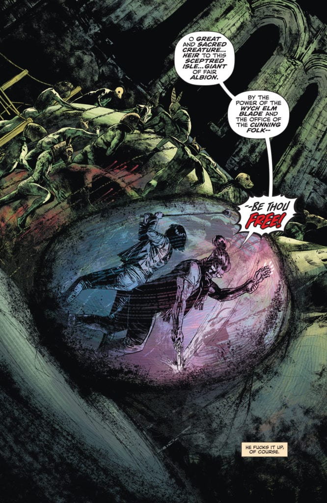
Picking up immediately after the end of issue #1 (read our Werewolf By Night #1 review here), Jake dives into an animalistic battle with the hybrids to save the caravan captives. The next morning, a battered but healing Jake finds he’s now on the run from the local law, Red Wolf, JJ, and the mercenaries hired by the Life Corporation.

The writing by Taboo and Benjamin Earl here – in a word – okay. This issue is more setup than a story with not much forward progress in the arc. It’s still an original premise, but it needs weight or emotional depth. I want to be invested in Jake’s situation, but you never get the sense he’s in any real danger or that he’s bothered by the burden of his curse, or that he feels much of anything.

The parts are there, the dialog is generally good, and the plot largely makes sense, but I need a reason to care about these characters. Right now, that’s the missing piece.

Pencils/Inks

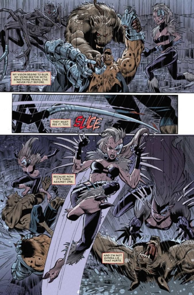
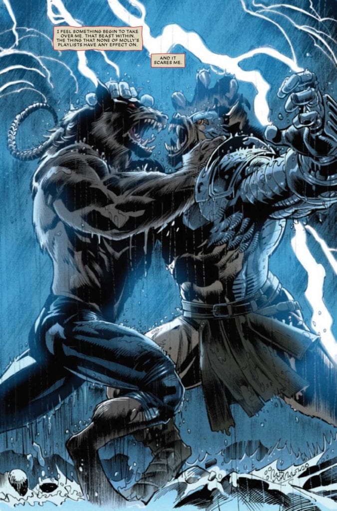
Scot Eaton and Scott Hanna’s art for this issue is fairly solid. Of course, the big selling point for this issue is Jake’s epic battle. Eaton and Hanna deliver on that front.

Jake’s werewolf is full-on powerful in every frame. The leaping, slashing, stabbing, and biting acrobatics fill nearly every panel beautifully.

Werewolf By Night #2, art sample 2

As a bonus, there’s an interesting few pages where Jake dreams of the werewolves in history, and it’s a treat to see Eaton and Hanna’s take on different werewolf forms. I especially liked the homage to the original Werewolf By Night. Overall, this was a visually enjoyable issue from Eaton and Hanna.

Coloring

Miroslav Mrva’s earned praise in issue #1 for the excellent application of moonlight glow on the desert scenes for authenticity. Mrva scores again with beautiful reds and yellows during a desert sunset. Color is the musical score of a comic, and Mrva shows fantastic mood energy in the colorwork here.

Werewolf By Night #2, art sample 1

Lettering

VC’s Joe Sabino is fairly solid in the placement and readability. But somehow, the lettering did not integrate well with the artwork in this issue. The word bubbles and caption boxes are much brighter and sharper than the panels they inhabit. In isolation, the lettering is good. Combined with the art, it doesn’t mesh well.

Conclusion

WEREWOLF BY NIGHT #2, available from Marvel Comics on November 25th, takes a few steps forward on the story and treats the reader with strong visuals. If the writers can add some emotional punch, this has the potential to be a memorable book. WEREWOLF BY NIGHT #2 is a guarded recommendation.

Monkeys Fighting Robots Youtube

Review: X-O MANOWAR #2 Wrestles Robots And Reality

X-O Manowar #2, Ward cover

X-O MANOWAR #2, available from Valiant Entertainment on November 25th, brings Aric face-to-face with the consequences of superheroes intervening in global conflicts. Dennis “Hopeless” Hallum’s story is equal parts robot smashing and social conundrum, and it proves to be this reviewer’s pick of the week.

Cover Art

Christian Ward’s painting of Aric striking a powerful pose is a strong cover. Aric stands out against the swirling cosmos, ready for battle. His fiery sword quickly captures the reader’s attention, but the cover lacks movement or energy. Otherwise, it’s a gorgeous cover.

Writing

Whew! This book’s been on hiatus for eight months, so I admit I had to go back to re-read issue #1 to remember what’s going on (read the MFR review of X-O Manowar #1 here). A robot accosts Aric while he flies in to stop a warzone battle in Ukraine. Issue #2 picks right up with Aric’s battle with the robot, only to learn the robot is a lure for a potentially more dangerous enemy …or is it an ally?

Hallum wisely toned down the fish-out-of-water elements from the first issue to focus on Aric’s obvious strengths while fighting battles on multiple fronts. Ultimately, Aric is confronted with the dilemma of choosing to interfere in human conflict to save lives versus non-interference in the natural evolution of governmental conflict. While not necessarily original, Hallum’s presentation of this dilemma takes this title to a deeper level of interest.

The story is well-paced, the action is exciting, and the arrival of the villain(s) and their “offer” makes for a mature and dramatic sophomore issue in the series.

Pencils/Inks

One of the main critiques from issue #1 was the claustrophobic panel design mixed with the rough art style. You couldn’t tell what was going on in some of the panels.

I’m pleased to report this issue has significantly better art. Emilio Laiso stepped up big time with more splash pages and full-length panels to let the art breathe when it needed it. Penciling and inking are more precise and detailed. I get a much better sense of what’s going on, even in the smaller panels.

It’s not just the skill that’s improved, but the visual storytelling is bigger and more epic. The opening fight sequence is hard-hitting, and the secondary attack by [REDACTED] is big enough to impress on you the horror of what’s happening. Laiso made this issue superior in every way to its predecessor.

Coloring

Ruth Redmond is the master of pop with this issue. Every panel that shows Aric in armor is bold. His golden armor highlights stand out to imply power. The boldest highlight comes during the explosion scenes near the end of the book where Aric is drenched with scorching flames as he howls in anger over the attack. It’s an impressive display by Redmond.

Lettering

Hassan Otsmane-Elhaou completes this issue’s fine artwork with loud, ragged paint strokes to depict the BOOM’s of the final explosion. It’s messy, ugly, and loud… just as an explosion should be—excellent lettering work here by Otsmane-Elhaou.

Conclusion

X-O MANOWAR #2, available from Valiant Entertainment on November 25th, improves on the first issue by magnitudes with better art, more thoughtful storytelling, an enigmatic villain (or ally?), and a strong moral dilemma for our hero. This is my highest recommended book of the week.

Monkeys Fighting Robots Youtube

Great Minds Think Alike in STAR WARS: DOCTOR APHRA #6

STAR WARS: DOCTOR APHRA #6, available Wednesday from Marvel Comics, brings us back to a character that is very talented at getting in over her head. Way over her head, as recent events have happily proven.

We’d advise against getting in her way…

It is well known that Doctor Aphra has a way of getting in over her head. That’s pretty obvious by now, right? After all, she got wrapped up in Darth Vader’s story, and instead of running for her life at the first opportunity, she continued with her planning.

Now, in Doctor Aphra #6, it looks like Aphra is about to start messing with another strong player in this universe. Granted, Domina Tagge is no Darth Vader, but she still has plenty of power to wield.

As the events in the previous issue proved, and will likely prove again in what is to come. That raises the question, how is Doctor Aphra going to get herself out of this situation? Or rather, what scheme is she going to come up with next?

Regal yet terrifying. Perhaps she will be the perfect counter to Doctor Aphra.

The Writing

Doctor Aphra #6 does an excellent job of setting Domina Tagge up as a woman not to be messed with. All of her power – and her decision making – is quickly put on display, through a lot of careful writing on Alyssa Wong’s part.

It certainly set the scene for what is to come. As did the introduction to this issue, for that matter. It was all quite clever, with hints of sardonic humor woven throughout. It seems like a new match for Doctor Aphra has formally been introduced.

This is an issue full of action and drama, of the sort that only Doctor Aphra can bring to bear. If you’ve read her past issues, then you can probably guess at least some of that content. With the action comes a hint of humor, as characters interact and get in each other’s way. Again, that’s something very familiar for her series.

Doctor Aphra #6 is full of intrigue as well, as the whole issue is really setting up for something more. A bit of a surprise there, as the previous issue would have led us to believe that a major confrontation was waiting.

That bounty is surely going to make Aphra’s life a bit more difficult.

The Art

The artwork in Doctor Aphra #6 is another impressive addition to her collection, as Aphra bounces around the galaxy, making friends and enemies at the same time. There are a variety of scenes portrayed within these pages, and every one is worth checking out.

Ray-Anthony Height (pencils), Robert Gill (pencils), and Victor Olazaba (inks) created some tense scenes here. Some are full of movement and action, while others simply full of strong, stubborn, and slightly terrifying women. Domina Tagge looks particularly regal, in a simple yet elegant gown.

Rachelle Rosenberg’s colors make everything pop, and then some. Her beautiful purple and starry backdrops are to die for, while the characters are given vibrant accentuations that make them stand out.

VC’s Joe Caramagna’s letters are the icing on the cake, so to speak. The subtle sound effects feel real, thanks in part to Aphra’s reactions, and in part to the placement and design of the letters themselves.

Even Black K can’t resist that amount of credits. No real surprise there.

Conclusion

Doctor Aphra #6 is another action-filled issue, but one with several twists along the way. In many ways, it parallels other major adventures for Aphra. That doesn’t bode well, even while leaving an opening for something exciting in Doctor Aphra #7.

Monkeys Fighting Robots Youtube

Wash’s Tale Unfolds in FIREFLY: WATCH HOW I SOAR

FIREFLY: WATCH HOW I SOAR, available Wednesday from BOOM! Studios, provides some unique inside into a long-standing favorite from the show Firefly. Hoban ‘Wash’ Washburne takes center stage for this adventure.

A dark introduction to Firefly: Watch How I Soar.

Perhaps this should go without saying, but if you’re a fan of Firefly, yet haven’t seen Serenity yet, don’t read Wash’s story, unless you want some major spoilers. Likewise, reading the rest of this review may not be the best idea.

Firefly: Watch How I Soar is a graphic novel that collects five stories of the one and only Wash, pilot of Serenity. These stories revolve around the ultimate fate for Wash, the one waiting for him at the end of Serenity.

Coming alongside these five stories is a massive creative team, with Jeff Jensen, Ethan Young, Jorge Corona, Jared Cullum, Giannis Milonogiannis, Jorge Monlongo, and Jordi Perez all lending a hand to make the project fly.

Wash’s love of dinosaurs is still going strong.

The Writing

As mentioned above, there’s no escaping Wash’s fate in Firefly: Watch How I Soar. Naturally, that’s going to make this read a bit sobering, right out of the gate. These are the stories and images that popped into his head in those final moments.

Yet there is something beautifully uplifting about these five stories. Not just because they’re what Wash himself treasured, but because Wash truly was a positive person. Those bright traits shine through in, both in the subject and the writing itself.

The whole tale begins far in the past, showing off a very young (and adorable) Wash. It explains so much about his origins – and his fascinations. From there, the stories continue to show Wash growing up, making a point of showing those moments that helped make him the character we all know and love.

Except for the last story, which is quite the twist. I’m not entirely sure if this story helps to soothe the ache, or if it actually managed to tear open an old wound that fans had long thought healed. Perhaps it did a little bit of both.

Has Wash ever looked so exasperated?

The Art

Firefly: Watch How I Soar is a fantastic example of varied artwork. Each story, every single jump in time, brings with it a new style. It’s actually quite clever, and certainly worked well to keep things fresh.

The first art style portrayed has a very strong sense of flow, as Zoe and Wash sometimes literally float across the pages. It’s evocative, representing both their love, and the future that waits for Wash.

One of the most dramatic transitions makes a jump to what almost feels like watercolors, at least for a moment there. The colors are muted, with soft edges all around. Amazingly, that doesn’t take away any impact from Wash’s flying skills. If anything, it enhances them.

Other styles feel more classic, sometimes leaning towards a cartoon style. Each one has a different focus. The transitions in art style makes each change in scenery clear, without a word ever having to be spoken.

There are many details and moments worth noting and commenting on, but to talk about them in detail would spoiler many of the small surprises found within. One thing is clear, this entire graphic novel really did capture everything that made Wash who he is, and it shows.

A swampy beginning to this story, full of Wash’s imagination and more.

Conclusion

Firefly: Watch How I Soar is a little bit of everything. It’s heartwarming, it’s heartbreaking. It is the past, and the future. Any fan of Wash will likely enjoy this collection, for the past it portrays, and the future that could have been.

Monkeys Fighting Robots Youtube

Review: THE CROODS: A NEW AGE Dishes Out Fun Sequel

The Croods: A New Age is sure to have families across the world laughing this Thanksgiving. A worthy sequel pitting The titular family against their biggest challenge yet, another family. This is a slight improvement over the original’s weak story, and there’s a lot more heart this time around. It effectively establishes a purpose, which was lacking in its predecessor makes this a superior sequel.

Dreamworks’ follow-up delivers a story smothered in heart, colorful animation, and a message of accepting each other’s differences. The star-studded cast returns, the jokes are in large quantity, and it’s just an overall good time. The Croods: A New Age corrects the previous errors and is easily one of the best animated films this year. Directed by Joel Crawford, The Croods: A New Age stars Nicholas Cage, Emma Stone, Ryan Reynolds, Peter Dinklage, Leslie Mann, and Kelly Marie Tran. The Croods have come across their biggest threat, the Betterman’s, a more evolved form of humanity. Guy (Reynolds), who is searching for his tomorrow with Eep (Stone), begins to act differently after reconnecting with old friends. The two families are at war until a threat arises forcing them to put their differences aside.

Eep Crood and Hope Betterman in The Croods: A New Age

The film was penned by Paul Fisher, Bob Logan, and Kevin and Dan Hagerman who have collaborated in the best way here. Eep and Guy seem to have a steady relationship, but Grug (Cage), her father is still determined to keep the pack together. Once the Betterman’s are introduced the film takes off because they are a contrast to our titular family, so they instantly look down on them. The Croods love their caveman habits such as eating dry twigs for dinner, but the Betterman’s prefer fine dining and more luxurious attractions. The writers create turmoil between the families by revealing that the Betterman’s are old friends of Guy and his parents.

How the film addresses different lifestyles and looking down on others for what makes them who they are is wonderful. Guy has been looking for his tomorrow ever since his parents passed, and he begins to overlook his findings when Hope Betterman (Tran), an old friend reunites with him. The development of The two feuding families is the film’s strongest aspect, as it highlights an important message about parenting, and how life experiences can shape everyone differently. Aside from its messages, The Croods: A New Age will keep audiences laughing from start to finish thanks to a few jokes, so this will be a hit this holiday season. The Croods: A New Age stumbles a bit once a new conflict is introduced, but manages to still wrap up on a high note.

The Croods arrive at the Bettermans in The Croods: A New Age

The cast delivers yet again, and the new additions fit right in as if they were here since the last film. Stone and Reynolds do a terrific job making the chemistry between Guy and Eep seem believable. The rivalry between Phil Betterman and Grug Crood is hilarious thanks to Dinklage and Cage, who have one of the years best fatherly feuds. Crawford’s directional debut is solid, as he has put together an animated blast that has something for everyone to appreciate. It’s a beautifully shot film that features superb animation, and it’s some of the best in recent memory. Crawford understands how to evoke emotions from his audience and the film’s color scheme this time around is a massive increase.

The Croods: A New Age was a much-needed improvement over its predecessor, and perhaps that’s why this one seems so great. Still, this sequel is well made and includes terrific voice work from a star-studded cast. A cast that will keep you glued throughout the entire runtime, but the film’s underlying messages might cause discomfort for some parents, or it could be an eye-opener for others. The Croods are back for more, and fans of the original should have fun with this latest outing.


Monkeys Fighting Robots Youtube

Review: POWER PACK #1 Gets The Band Back Together

Power Pack #1, Stegman cover

POWER PACK #1, available from Marvel Comics on November 25th, brings the titular, super-powered siblings back together after years of fighting solo across time and space. This time their biggest threat is the US Government. Written by Ryan North with art by Nico Leon, this first issue in the series finds the kid team caught up in the Outlawed event when all they want to do is kick butt.

Cover Art

Ryan Stegman’s cover work for this inaugural issue is generally good. Katie Power is the focus of this cover, and that’s reflective of the internal story. With Katie and Julie fully powered up, they provide some strong visuals to leap off the cover. I would have liked to see more energy in the composition because it lacks oomph.

Writing

Shenanigans. North’s story is best summed up as Brady Bunch-style shenanigans. The kids get together after several years apart, fighting evil. It’s their parent’s wedding anniversary, but they do the best to sneak out of the house to fight a villain terrorizing an orphanage.

The lies and excuses they tell to sneak away from their parents are amusing but ridiculous. The dynamics of the kids feel very natural for siblings. And the strangely naive reaction of the parents to their ridiculous excuses is humorous. For the most part, it works as a quirky little book.

That said, what doesn’t make sense in this book is an overly long crayon story at the beginning where Katie imagines telling their parents about their lives as superheroes. Katie is depicted as somewhere in the 8-10-year-old age, but her crayon drawings and manner of speech are closer to a pre-schooler. It’s really offputting. Either the artist totally missed the mark on drawing Katie too old, or North’s writing completely misunderstands how a 10-year-old speaks, draws, and behaves. It’s difficult to look past this misstep when Katie is the central character in this issue.

Pencils/Inks

Nico Leon’s art style was an excellent choice for this book. Lon uses diffuse lines and curves to give every character and setting a softness that feels like a cartoon without being cartoonish. It makes the book very accessible for younger readers, and it plays up the silly tone very well.

Power Pack #1, art sample 1

In addition to the excellent lines, Leon demonstrates remarkable use of acting through body language. Jack, in particular, is slouching, grinning, fist-pumping, and high-fiving at every opportunity. Even when the kids aren’t fighting or doing anything heroic, Leon uses body language to instill a constant level of action throughout.

Power Pack #1, art sample 2

Colors

Rachelle Rosenberg is a perfect colorist for Leon’s art style. The shading is bright and sunny on every panel to set a consistently cheery mood. I often point out artists using deep, dark shadows to amplify drama, but it can work equally well to use bright light for cheery energy. Rosenberg pumps up the cheer to add a light-heartedness to an already fun story.

Lettering

VC’s Travis Lanham’s lettering is clear and well-paced for a fairly light issue. I enjoyed the fact that Lanham took the opportunity to inject a little fun into this issue with dinner table sounds like “SMOOCH” and radio musical notes. Lanham had some fun with this issue, and it shows.

Conclusion

POWER PACK #1, available from Marvel Comics on November 25th, is a light and cheery start for the super siblings’ return. Despite Katie’s bizarre characterization, the action is fun, and the family interactions are amusing. The bright art pulls it all together. POWER PACK #1 is a recommended read.

Monkeys Fighting Robots Youtube

Review: COLONEL WEIRD: COSMAGOG #2 Shows Our Inner Child

Lemire Weird Dark Horse

Dark Horse Comics’ Colonel Weird: Cosmagog #2, from the Black Hammer Universe, shows the frightened child at the center of this story. Writer Jeff Lemire and artist and letterer Tyler Crook peel back the layers of this complex character to show how he’s as scared as the rest of us.

Writing

The first time I read this issue, I was a little bored. There weren’t space battles and aliens. Well, there were, but they were practically off-panel. I expected this issue to be a little more sci-fi, even though the first issue was equally subtle. But Lemire doesn’t care about what we think makes Colonel Weird who he is. Lemire wants us to see why Colonel Weird is actually just like everyone else. The space battles can wait. Lemire wants us to see Weird with his mother, crying because he’s scared to go to sleep. He wants us to see Weird’s forehead resting against his wife’s face as they lay in bed and talk about his worries. So when we do see Weird as we’ve known him: haggard, floating, and ready with a blaster, we see past the window dressing to the scared little kid underneath. This script is subtle, it’s slow, and it’s damn gorgeous.

Lemire Weird Dark Horse

Art

Crook never wants us to separate these different ages of Weird in our minds. When Weird is lying in bed with his wife, his head is positioned exactly like it is on the following page, when he’s a kid again, out in a dark field at night. Not only does this help us experience time as Weird does, but it gives us the sense of his growing worry. His fear and anxiety aren’t reset with each new jump through time. In fact, we see young Weird in the classroom near the end of the issue. He sees something strange out the window, and his face is horrified. He’s scared of the things that are bigger than him, the things he doesn’t understand. Then, when we hop back to see the Weird we know, fighting alongside Black Hammer, he has the exact same look on his face. It’s killing him to know how everything turns out. Everything but his own end.

Coloring

Crook captures the feel of childhood. You can feel the happiness on the page as Weird walks by the river on his own. But once bullies dunk him underwater, Crook shows Weird a glimpse of the Para-zone. When he comes back up, the same scene looks grey, muddy, and brown. Later, when Weird is tucked into bed and talking with his mom, Crook makes the rest of the room look dark and scary. Weird and his mother are in a small halo of light. Yet when he’s an adult, Crook gives the room a light blue glow with all the lights off in his room. Crook makes the scene look like you’re seeing it now that your eyes have adjusted to the dark. This is a brilliant representation of him growing up. Yet his fear is still there; he’s just figuring out what it is he’s afraid of. Maybe it’s simpler for young Weird. Being afraid of the dark is a lot easier to wrap your mind around than being afraid of your fate.

Lettering

Crook brilliantly melds his lettering into the art. The “plop” of mud hitting the back of Weird’s head looks like mud spraying through the air. When a younger Colonel Weird is fighting aliens, the sound of his blaster actually blasts through the aliens. But just as Weird’s speech changes after he sees the Para-zone, his sound effects do too. His dialogue goes from being clear to looking warped with a winding tail, and his sound effects look frantic. When Black Hammer and Weird are fighting Hellementals, the sound of his blaster looks different than it did when he was younger. It’s almost as though the “zak” noise was hurriedly scribbled onto the page. It’s a brilliant visual representation of Weird’s growing desperation.


Lemire and Crook have created another gorgeous issue in this series. Dark Horse’s Colonel Weird: Cosmagog #2 is subtle, and it dives right into Weird’s beating heart. Lemire and Crook have taken a character who can see everything and asked him to care about all of it. It’s Dr. Manhattan with a beating heart, and it’s beautiful. Pick up Colonel Weird: Cosmagog #2, out from Dark Horse on November 25th, at a comic shop near you!

Lemire Weird Dark Horse

Monkeys Fighting Robots Youtube

FANTASTIC FOUR ANTITHESIS #4: A Nostalgic Ride

Fantastic Four Antithesis #4 Cover

Fantastic Four Antithesis #4 out November 25 from Marvel Comics from veterans writer Mark Waid and artist Neal Adams. Joining this nostalgic ride is inker Mark Farmer, colorist Laura Martin, and letterer Joe Caramagna. This issue closes out a mini-series capturing the essence of Marvel’s First Family.

Fantastic Four Antithesis #4: Family First

Fantastic Four Antithesis #4 is definitely for fans of the Fantastic Four because Waid keeps this series simple. In this issue, readers witness the team’s pure essence, feeling less like superheroes and more like a family. The love and support they give to Mr. Fantastic as he goes through an identity crisis and an ultimate sacrifice expertly show the familial chemistry. Even the parts to get there by bouncing off different characters like Galan (a de-powered Galactus) and The Thing feel authentic. Anyone familiar with The Thing’s own identity crisis knows how complex this makes him. All of these little things converge into a wholesome conclusion that fits perfectly between different runs.

The Family Dynamic

Adams gives a dynamic flow to Fantastic Four Antithesis #4. Everything from the panels to semi-splash pages move the plot from the top of one page to the next. That’s not even bringing up the evocative and stylistic designs that show the Fantastic Four’s emotional stakes in the plot. The way their faces and body language act show a direness that affects all of their decisions. Farmer’s inking assists in bringing out the intensity by lines thickening in reaction to bigger scenes. For example, a splash page where a gigantic but vulnerable Galactus-Reed towers over the Four. The Invisible Woman ironically looks the most visible when speaking to him despite being near the scale of his ankle.

Martin’s coloring gives even more depth to these situations; the above splash page features a misty rain covering Galactus-Reed to show his growing vulnerability. All while the blue-white lightning from the same storm displays the threat the Four face from him. VC’s Caramagna complements just about everything; the word balloons assist in Adams’ flow, while the blue Kirby Krackle style word balloons of Galactus-Reed show how much power he has in the immediate situation.

Fantastic Four Antithesis #4: It’s Fantastic!

Fantastic Four Antithesis, a passion project between two veterans who respect one another, is an enjoyable romp. One that can leave readers pining for the treasury edition of this series. After reading Fantastic Four Antithesis #4, I want more series like this from Marvel. Nothing that gets in the way of continuity, just quality adventures featuring the spirit of Marvel’s biggest characters.

Monkeys Fighting Robots Youtube

Review: SUICIDE SQUAD #11 is the End of the Beginning

Suicide Squad Tom Taylor DC

DC Comics’ Suicide Squad #11 concludes this no-holds-barred romp through the DC Universe. Or does it? Writer Tom Taylor, artist Bruno Redondo, colorer Adriano Lucas and letterer Wes Abbott suggest that they might have more planned for this team. Regardless of what comes next, this finale issue is the send-off we all wanted.

Writing

Taylor doesn’t waste any time on this issue. He puts a couple of quick twists at the start of the book but doesn’t feel he needs to explain them. He knows we’re following, and he wants to get to what’s next. As everything begins to wind down, Taylor reminds us why we love the Suicide Squad so much. They’re mouthy, and they don’t play by anyone’s rules. Taylor brings them face to face with some of the biggest players in the DC Comics Universe, just to show that they don’t flinch for a second. Taylor gives us one final nod that this may be the beginning with some careful tying up of loose ends. Let’s hope he’s right.

Art

Redondo reminds us that the Suicide Squad doesn’t have to be the big-timers to have power. When members of the Justice League show up, Redondo makes a point of them taking up a lot of space on the page. They’re huge, and their presence is felt everywhere. But it’s a small lady, walking right up to Batman and looking him in the face, and Wink peeking over his shoulder, that drive the scene. They’re small, but they’re powerful. And as we see The Revolutionaries retake flight as a team, Redondo shows us how much power they have. Each of the pages of them in action has the whole panel grid slanted, on the diagonal. It gives us the impression that these people really are revolutionizing the world they live in.

Coloring

If you look at Lucas’ pages in Suicide Squad #11 as a whole, you could almost assign a single color to each. The first few pages start with a soft blue, with red sprinkled in. It’s a scene that’s set up to look grim and serious. Lucas establishes this tone so that one of the characters can ignore the situation’s seriousness, with great comedic effect. Later, as we transition through red and purple pages, Lucas begins to focus in on the color yellow. Yellow, which has so often been the fun backdrop to a fist to the face or a gun going off, becomes the color of The Revolutionaries. They themselves are bringing a new dawn, with a bright yellow morning on the horizon.

Suicide Squad Tom Taylor DC

Lettering

Abbott tones down a lot of the fun sound effects in this issue. We get the “bang” of guns, but they look subdued and small. There’s one particular moment that you would expect a large “boom” from, but no boom comes. It’s very quiet for an issue of Suicide Squad, but that’s because Abbott wants us holding our breath. As things resume to an even keel, Abbott goes back to the status quo. Large, vibrant sound effects for even the most simple noises. It acts as a kind of celebration of the return to norms.


DC Comics Suicide Squad #11 is a fun, crazy, hilarious end to a fun, crazy, hilarious series. Taylor, Redondo, Lucas, and Abbott have put out some of their best work with this series. And if we’re lucky, this finale may mean there is more to come. Pick up Suicide Squad #11, out from DC Comics on November 24th, at a comic shop near you!

Monkeys Fighting Robots Youtube

Review: JOHN CONSTANTINE: HELLBLAZER #12’s Glorious Conclusion

John Constantine Spurrier DC Comics

John Constantine: Hellblazer should never have been canceled.

The book is one of the strongest series to ever come out of DC Comics this century (2000-2020). Its conclusion, with issue #12, cements that fact. Writer Simon Spurrier, artist Aaron Campbell, colorist Jordie Bellaire, and letterer Aditya Bidikar somehow take a series, cut down in its prime, and whittle all of their plans down to one magnificent final issue. DC Comics John Constantine: Hellblazer began as a slow trudge towards its ending, with each new development carefully teased out. This creative team isn’t scared to break the mold and get the wheels moving in order to bring us a finale that truly delivers.

Writing

There are some obvious downsides to Hellblazer‘s premature cancellation. Spurrier finds himself in the unhappy place of having to move the plot very far, very quickly. That’s nearly impossible to do without being over-explanatory and heavy on the exposition—something Spurrier typically avoids artfully. Hellblazer #12 is, in fact, very expositional. Constantine spends much of the issue describing what’s going on as it happens. But Spurrier doesn’t allow it to feel like he’s preaching at us. The book still feels natural.

That’s because Spurrier never loses John’s voice in all this. Every moment of explanation is written as a kind of “Damn, the poor sod has no clue what I’ve got him into.” The tragedy that is John Constantine is heightened by each confession of what’s really going on. So, despite Spurrier’s captions being essentially a narration of events, they’re not only necessary, they’re brilliantly executed. The reader never feels talked down to. And Spurrier has created enough of a cryptic and subtle plot that John’s explanations are important to hear. This shouldn’t have been possible. But Spurrier condensed what may have been months and months of plans down into one fantastic script, without sacrificing any of this series’ quality.

John Constantine Spurrier DC Comics

Art

So much of Campbell’s art in this chapter focuses almost claustrophobically on John. Occasionally we see K-Mag, Noah, and the others, but there’s an artistic jostling of these characters. It’s as though Constantine, himself, is pushing them off to the sidelines. After K-Mag has been scrying, it’s not long before Constantine has taken over, pushing K-Mag out of the way. And while Tommy and Nat are busy dealing with their own fight elsewhere, Campbell sets up the conflict and then keeps us from the action. Instead, we see Constantine trying to put a stop to it from miles away.

The only other character that gets quite the same amount of attention from Campbell is, well, John Constantine. This Constantine being the older version. Campbell makes two things clear with this: this is the showdown we’ve been waiting for, and Constantine is too scared to get attached. It’s as though John can only look at his enemy or stay focused on himself because he knows there’s going to be collateral damage. He doesn’t want to have to face those getting caught in the crossfire.

Coloring

Bellaire begins our journey, back where she left us. In the same rotting cesspool of green where the last issue finished. But soon, we’re back with John, miles away. Bellaire colors John’s scenes in a bluish haze. Except for a few vibrant moments, even the blood in these scenes looks dull. Bellaire’s coloring works in tangent with Campbell’s art. It’s a window into John’s soul. He can’t allow the true nature of what he’s doing to sink in, so he keeps everything at arm’s length. The blood, which he’s covered in up to his elbows, blends in with the rest of the scene because John won’t allow himself to think about it.

Later, when John Constantine, the older, gives our own Constantine a call, Bellaire highlights the difference between them. In a nine-panel grid, set up by Campbell, Bellaire shows the human colors of John Sr. along the diagonal. The older Constantine actually looks human; his flesh looks fleshy, while the younger Constantine is still blue and distant. This is John’s worst nightmare. A version of himself that lets his guard down and experiences everything around him, no matter how horrific.

John Constantine Spurrier DC Comics

Lettering

Bidikar shows Constantine’s own discomfort with each new revelation. John Constantine is typically a very confident man, but this issue shows he may be in over his head. As the issue progresses, we see the difference between John’s confidence and his fear through Bidikar’s text boxes. Most of John’s narration is easy to see. Bidikar places these captions in orange text boxes that stand out. But occasionally, John seems a little like he doesn’t want to be telling us his thoughts. He talks about why he came back to K-Mag, admitting that he’s got no other options, and the narration is placed outside of a text box. It’s just lettering up against the art. It feels less confident and almost as Constantine wants us as readers to miss this bit.

Bidikar does this several times throughout the issue. It’s the moments when John loses his confident tone. “Bugger. All” is a prime example of his panic setting in. But it’s also the important moments of John letting his guard down for a second. Bidikar brilliantly highlights these moments by not highlighting them. The captions stand out because they’re trying to blend in with the page. It’s a brilliant step into the mind of the character. John Constantine is exactly the kind of man who would mutter the world’s truths under his breath.


DC Comics’ John Constantine: Hellblazer #12 has no right being this good. It’s too many brilliant stories, smooshed into one issue, with incredible grace. Spurrier, Campbell, Bellaire, and Bidikar have created a beautiful finale, against incredible odds. This issue may deliver, but it only makes it harder to say goodbye to this series and leaves one wondering what could have been. Pick up John Constantine: Hellblazer #12, out from DC Comics on the 24th of November, from a comic shop near you!

Monkeys Fighting Robots Youtube