Home Blog Page 214

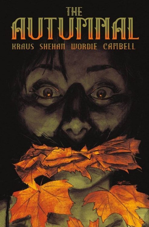
Review: THE AUTUMNAL #3 Brings Hope and Rising Horror

Writer Daniel Kraus and artist Chris Shehan return with another fantastic chapter of their character-centered horror series with “The Autumnal” #3. Along with colorist Jason Wordie and letters by Jim Campbell, this issue delivers more fantastic emotion and relatability from its protagonist while never letting up on the story’s unnerving atmosphere. With a brilliantly put together script and fantastic visual work, this is another chapter in one of the most well-constructed horror comics I’ve read in recent memory.

“A drunken bender lands Kat in front of a wise and handsome tattoo removal specialist, yet she’s drawn back to eerie Comfort Notch, where a trove of old photos reveal the figure behind the town’s ominous legends.”

Writing & Plot

Daniel Kraus has made sure to spend plenty of time getting to know our lead characters with every chapter so far, but in “The Autumnal” #3 we get our first bits of outward vulnerability from Kat. The internal struggle this woman has had in trying to keep herself happy despite past trauma all while raising a daughter has been handled with careful sincerity by Kraus. She feels like a real person more and more each issue. The fact that her story ties in so well with whatever the hell is happening in Comfort Notch is this comic’s true work of wonder thus far. I’ve noted before how this comic pulls off its sense of tension so well because of how much the reader is made to care for the characters while also intertwining their lives with the horror at hand. The more uncertain the lead characters are, the more we are. The more frightened and unnerved they are, it’s the same for us. Kraus doesn’t give the audience any additional pieces to the puzzle; for the most part, we know just as much as Kat and Sybil do. The mystery behind the haunted autumn views of Comfort Notch is a mesmerizing tale of cultish and eerie behavior. Experiencing this tense horror tale from Kat and Sybil’s perspective continues to be an immense pleasure.

Art Direction

Artist Chris Shehan performs some of his best work yet (which is saying a lot) with his pencils on “The Autumnal” #3. His character animations and expressions is at its peak here, with much of the focus being on the subtle changes in expression from panel to panel. There’s a sequence where Kat is venting about her current experiences in Comfort Notch and her past trauma over a 6-panel grid (think the interview sessions in Heroes in Crisis), and Shehan draws Kat’s emotional journey across her face in a brilliantly recognizable yet subtle way. His design for the most creepy moment yet (no spoilers) is also chilling and will stick with you long after the comic is bagged and boarded. His panel direction is once again top-notch as well. There’s a sense of character focus combined with artsy cinematic appeal that is reminiscent of the cinematography seen in great horror films, but crafted in a way only achievable in comics. The colors of Jason Wordie are once again outstanding, immersing the comic in stunning amber autumn glows and foggy urban smog. Jim Campbell’s lettering utilizes a sort of soft, modern font that is used in a variety of ways. When characters whisper or talk to themselves, Campbell just uses small, faint lettering. It’s a move that’s been done, but not quite to this degree (at least not that I’ve seen) and it’s very effective. This is yet again a phenomenal piece of work from the visual team.

“The Autumnal” #3 is yet another chapter in this horror series that balances levity and character development with a deeply unnerving atmosphere. Daniel Kraus pens a script that mixes relatable human emotion and experience with a mysterious supernatural horror that makes for an intoxicating genre experience. The visual work of Chris Shehan and Jason Wordie is immensely detailed and well-animated and paints the town of Comfort notch with a deceiving beauty. This is another fantastic installment in this new horror series, and I can’t recommend enough that you grab this newest issue from your local comic shop when it releases on 11/26!

Monkeys Fighting Robots Youtube

Review: MEGA MAN: FULLY CHARGED #4 – Introducing A New Version of Zero

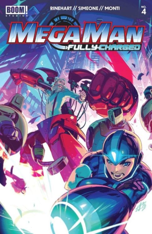
Mega Man: Fully Charged #4 Cover

Mega Man: Fully Charged #4, out now from BOOM! Studios, is a fast-paced issue full of important moments and events that will make your jaw drop.

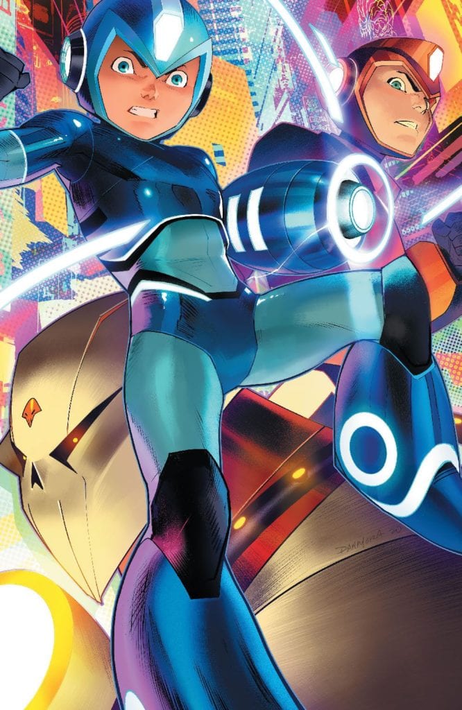
The previous issue of Mega Man: Fully Charged ended with the shocking introduction of Zero into the world of Mega Man: Fully Charged. Fans of Mega Man will know the character Zero from his introduction in Mega Man X and later his own series, Mega Man Zero, which both take place after the events of the classic Mega Man game series. Since the world of Fully Charged is separate from the games, any knowledge we have of Zero is irrelevant. However, Zero’s appearance in the previous issue is still enough to leave readers desperate to get their hands on Mega Man: Fully Charged #4.Mega Man: Fully Charged #4 Variant Cover

While the mere presence of Zero in Mega Man: Fully Charged #4 is enough to excite fans, Marcus Rinehart immediately reveals more about this new version of Zero to draw the readers in better. As more about Zero’s identity is uncovered, we are connected more with the character, making the issue a thoroughly engaging read.

Another way that Rinehart is able to make Mega Man: Fully Charged #4 such a riveting issue is through constant surprises and gripping moments. This issue is stuffed full of action, as Skull man and his followers face off against Mega Man and Zero. Action-packed scenes are difficult in comic books since to show off the beautifully drawn moments of combat, much of the page needs to be occupied, which makes it challenging to fit in the story. Mega Man: Fully Charged #4 solves this by interspersing scenes that leave the reader in shock. These short moments are dense in content, so the reader doesn’t feel cheated (in terms of story) when the issue features a lot of action.

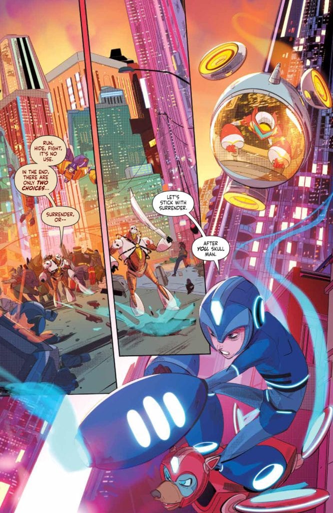
Mega Man: Fully Charged #4 Art Example

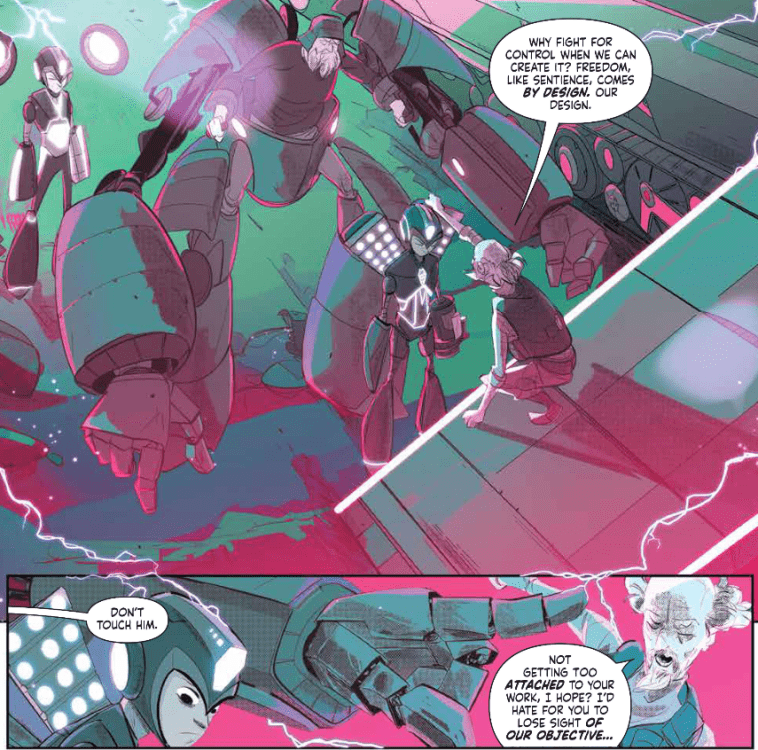
The art of Mega Man: Fully Charged #4 was done by Stefano Simeone, and it does a phenomenal job at bringing the issue to life. Since the issue is full of action and Simeone is a king of dynamism, each page is a brilliant spectacle that continuously draws you in. Every form in the issue looks as if it was a snapshot pulled from an intense battle, and this does wonders to make the issue an exciting read. It would also be a sin not to mention the glorious backgrounds that Simeone fills the issue with — mostly composed of highly detailed cityscapes — and the new designs of iconic characters. While Zero is an entirely new design, other characters in the issue are given new ways to engage in combat, and their new looks are stunning.

The colors of Igor Monti never cease to amaze or turn Mega Man: Fully Charged #4 into a sight to behold. Monti has provided astonishing work throughout the series and always pairs exceptionally well with Simeone’s art. This issue is particularly impressive, as Mega Man faces off against his foes and the sun sets on Silicon City. The vibrant colors of Mega Man, his friends, and his enemies on the same page of the setting sun, which creates a warm hue, is an awe-inspiring sight. The issue also contains more flashback scenes, whose distinct colors make it clear it is a flashback and set a grim tone.

Mega Man: Fully Charged #4 Colors Example

Mega Man: Fully Charged #4 contains the lettering of Ed Dukeshire, which is some of his best work in the series so far. The large amount of action in the issue allows for many sound effects, and Dukeshire does not disappoint as he provides a pleasant variety of fonts in his lettering. Dukshire also gives his fonts a robotic feel that blends in nicely with the setting of the series.

Mega Man: Fully Charged #4 is an incredible issue that knocks it out of the part in both writing and art. We figure out more about characters, there are more wonderful twists, and the action is continually engaging. The art is superb, and the turn of each page feels like an absolute pleasure as you gaze upon what Simeone, Monti, and Dukeshire are able to create. If you aren’t reading Mega Man: Fully Charged, you’re missing out.

Monkeys Fighting Robots Youtube

X OF SWORDS Aftermath: Arakko Runs Up The Score And Storm Beats Death In X-FORCE #14

X of Swords comes to a close this week, and while these articles will avoid any in-depth discussions about how these remaining issues lead into the ending, I will still be looking at evaluating this event, its easter eggs, and its storytelling nuances.

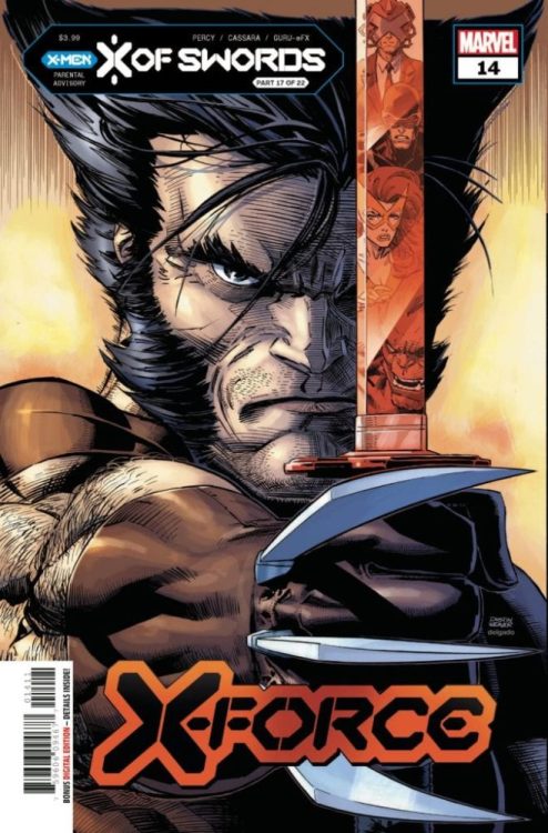
X-Force #14 reinforces my earlier comments about this event’s anti-climactic nature, as this issue breezes through multiple challenges, very few of which involve actual sword fights to the death. Instead, readers are treated to single panels depicting a dance contest, characters solving a literal puzzle, and Gorgon rushing to make love to a rock (for real). Unfortunately for Krakoa, Arakko wins most of these contests, with Captain Avalon accusing Saturnyne of rigging the contest against Krakoa (more on this in my future piece on Cable #6 and X of Swords: Destruction).

This issue culminates with Storm’s conflict with Death, but unfortunately, she is still drunk from the blightswill and cut off from her powers. Some might have assumed that this would put Storm at an insurmountable advantage, but for long-time X-fans, Storm’s victory here is no surprise.

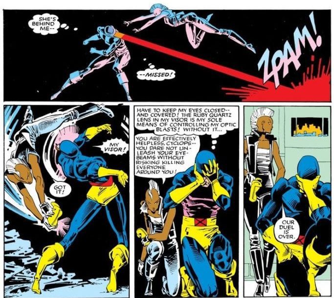
All the way back in X-Men #201 (1986), a powerless Storm dueled with Cyclops to determine who would lead the X-Men…and won! By catching her still empowered colleague by surprise, she was able to turn his powers against him and win.

A powerless Storm is still a dangerous Storm, as Cyclops learned back then, and as Death learns in this issue, as Storm turns his own powers against him and wins. All while she was powerless. And drunk.

While this event has been a bit iffy in excitement, it is nice to see the depiction of a powerful, competent Storm, who even without her powers can overcome Death itself.

X-Force #14 is available now!

Monkeys Fighting Robots Youtube

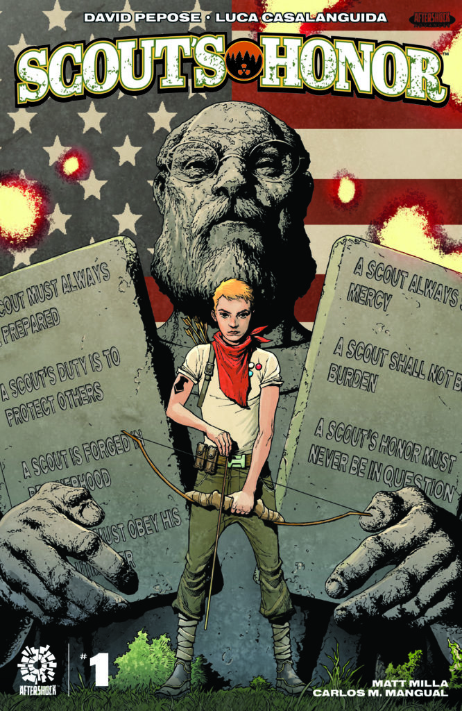
AfterShock Comics Exclusive Preview: SCOUT’S HONOR #1

scout's honor aftershock comics exclusive preview

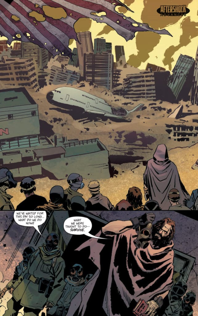
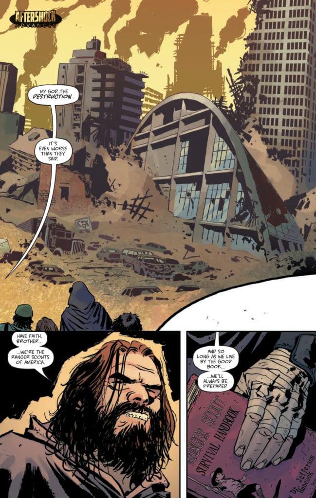
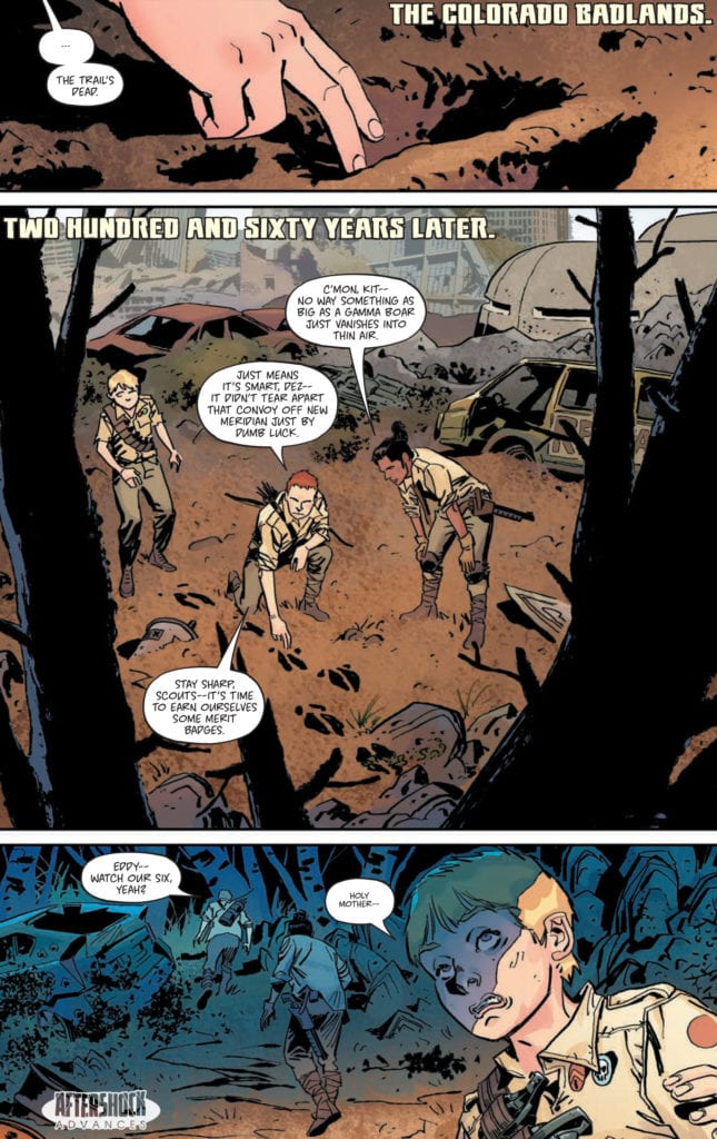
SCOUT’S HONOR #1 hits your local comic book store January 6th, but thanks to AfterShock Comics, Monkeys Fighting Robots has an exclusive four-page preview for you.

About the issue:
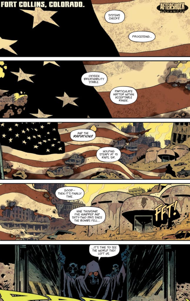
Years after a nuclear apocalypse, a new society has risen from the ashes…and their bible is an old Ranger Scout manual.

A young Ranger Scout named Kit has endured the harsh survivalist upbringing needed to conquer the irradiated Colorado Badlands. But after discovering a terrible secret once lost to history, Kit must risk everything on a dangerous quest to uncover the truth behind the Ranger Scouts’ doctrine.

From multiple Ringo Award-nominated writer David Pepose (Spencer & Locke, Going to the Chapel, The O.Z.) and artist Luca Casalanguida (James Bond, Lost Soldiers) comes a post-apocalyptic coming-of-age tale that proves when all you know is a lie, a Scout’s Honor is the only way to move forward.

SCOUT’S HONOR #1 is by writer David Pepose and artist Luca Casalanguida, with colors by Matt Milla, and letters by Carlos M. Mangual. The main cover is by Andy Clarke with Jose Villarrubia, with the incentive cover by Brent Schoonover.

What Pepose has to say about the series:

“While our series is as action-packed as you might expect from a book about a post-apocalyptic Boy Scout cult, SCOUT’S HONOR is really a story about losing your religion — about what happens when you learn there’s two sides to every history book. As a tough-as-nails Ranger Scout hiding a deep secret of her own, Kit’s journey of self-discovery and spiritual exploration feels so timely and important given our polarized modern era, and teaming up with artist Luca Casalanguida, colorist Matt Milla and letterer Carlos M. Mangual means the Colorado Badlands couldn’t be in better hands. I can’t wait for readers to earn their merit badges this January with the debut of SCOUT’S HONOR.”

Check out the SCOUT’S HONOR #1 preview below:

scout's honor aftershock comics exclusive preview

scout's honor aftershock comics exclusive preview

scout's honor aftershock comics exclusive preview

scout's honor aftershock comics exclusive preview

scout's honor aftershock comics exclusive preview


Are you looking forward to SCOUT’S HONOR? Sound off in the comments!

Monkeys Fighting Robots Youtube

INTERVIEW: Director Shae Sterling Brings Visitors To Earth In Alien Addiction

Aliens land in New Zealand, but they aren’t out for world domination in Alien Addiction, a science fiction-comedy film from Shae Sterling (High Octane: Detonate) and starring Jimi Jackson (The Australiana Hostel).

Riko (Jimi Jackson) is an aimless 20-something in a group of aimless 20-somethings played by Tane Huata, Tukairangi Maxwell, and Harry Summerfield. The slacker foursome spends their days playing the boardgames “Galaxy Gods” then racing to the local pub for a drink and possibly a hook up with a backpacking traveler. Two visitors from outer space arrive in the small, rural area of New Zealand, searching for their next high, and chaos ensues.

PopAxiom and Shae spoke about falling in love with movies, remakes, and making Alien Addiction.

Inventive Nature

Shae Sterling is from New Zealand, where he’s spent years directing music videos for Sheila E, T-Boz (of TLC fame), and Snoop Dogg. “I was a big fan of films when I was young. I’d get home from school and watch things on VHS. I took to Star Wars and Spielberg movies. I’d watch them over and over again until I knew them line-for-line.”

The director-to-be says, “I got my hands on a video camera when I was young, around 10. Back then, no one had one; this was in the 80s. So, I got to dabble a bit. By the time I was fifteen, I’d done a little media stuff in school, and I decided to be a director.”

“The rest is history,” Shae adds.

“For how small the county is, we have an amazing film industry,” Shae says about New Zealand, which has produced Peter Jackson, Taika Waititi, and Jermaine Clement, to name a few. “We’ve got James Cameron filming Avatar and the Lord of the Rings TV series going on down here.”

Shae shares a moment when indie filmmaking met blockbuster budget filmmaking. “I’m down at the lighting shop renting some lights, and in comes some dude with an Avatar TV shirt asking if the lights in the shop are waterproof.”

New Zealand consistently produces film and television that is quirky, eccentric, but also down to earth, funny, and full of the feels. “We have a backyard humor with an inventive nature.”

jimi jackson-alien addiction-film

About Alien Addiction

Alien Addiction is a low-budget film though it doesn’t look it with cinematography that is lush and vibrant. “We used the strengths of the film; the actors, dialogue, and the quite feel.”

“I think if I’d spent money on better cameras,” Shae says, “then the FX, it wouldn’t have that retro-y humbleness. It’s not trying to impress you all the time; it’s just letting you get into the story.”

Shae used a Panasonic GH4 to get Alien Addiction done. It’s not the usual camera used today by most movie productions. “I could’ve had a better camera, but I wanted it to have a unique look. Everything these days they shoot on ARRI Alexa or RED, and it’s all starting to look the same to me.”

“I went with my guns,” Shae proclaims, “and used something that has a different look to it. If everything looks the same, then what are we doing here?”

Shae was busy trying to get another movie made before Alien Addiction was a neuron firing in his brain. “I had another movie I was trying to get done before this and wasted a year of my life trying to get that going. I was pretty upset having to put that on the shelf.”

However, unfortunate events turn into new opportunities. “I had the idea for the Alien Addiction movie and decided I was going to fund the thing myself. Teaming up with Jimi Jackson was great; he was someone I could trust, and he was invested in the project.”

The first step to funding Alien Addiction started with Kickstart, which “failed,” according to Shae. “So, I said, screw this, and got some cash on my own, and I decided to do one block of filming, which is about two weeks. We got about 40 percent of the movie, but it took ages to get to the next block. I had to keep doing it for three years before I got it done.”

Filmmaking is never an easy process, “but it was heaps of fun when we were out there filming. So many good times. The best part about it was escaping from our everyday lives.”

“We shot it outside of Auckland,” Shae shares, “in a small area, so we’d be there for a week and focusing on this movie.”

Jimi Jackson is one of those force of nature type comedic talents. “He was so good. I wrote scenes knowing he could improvise as well. I’d suggest a few things, and then he’d go off and adlib and improv. He’s so good at it; he’s got a quick wit. The same with Thomas Sainsbury.”

“About 70 percent of the film is the script,” Shae says, “and the rest is the room we played with. The scene where Jimi’s teaching them to play rugby is all Jimi.”

Making Aliens

Alien Addiction features two oddball aliens making their way around New Zealand searching for their particular type of mood-enhancing chemicals. “We were auditioning people, and my partner Melanie Price was helping me. She’d play a pretend alien, and we’d get all these dancers to come in and do different movements.”

It wasn’t quite working for Shae. “I realized my partner was good at it.” So, Melanie Price became one of the aliens, along with Steven Samuel Johnston. “At the time, Mel was pregnant, and we needed to start filming. By the time we started, she had a big belly, so we introduced that to the aliens. So, she’s pregnant in some of those scenes.”

The pot-bellied extraterrestrials were born, and so was Mel’s child, making the natural belly disappear. “She had the baby then used a specially made pillow device.”

The design of the aliens is equal parts charming and spooky. “I realized I’m not going to have the money to do a moving mouth. So, I did this tiny little mouth.”

The aliens also have a funny walk, which seems unlikely to keep up with the average person’s walking speed. “Yeah, I always tried to stage them ahead of people. They couldn’t keep up.”

Shae loves his aliens. “They’re kind of ugly looking but still kind of cool.”

alien addiction-interview-director

Wrapping Up

Shae grew up on a healthy diet of Spielberg, Lucas, Cronenberg, and other directors of the 70s and 80s. He names a few of his favorite filmmakers. “I do like some of Roman Polanski’s stuff; Paul Verhoeven, Christopher Nolan, James Cameron, and Ridley Scott.”

It’s the era of remakes, but Shae says, “I’m not a big fan of remakes. It’s annoying. Surely there are more new stories.” So, Shae isn’t fond of remaking movies, but says, “There are sequels to movies that weren’t so great. I’d happily re-do the sequel to RoboCop, especially part three; part two wasn’t that bad. Terminator 1 & 2 are some of the best sci-fi action films ever made, and I would’ve had some fun with a part three or four.”

Shae loves indie filmmaking, though no director would turn down a lot more money for any given project. “There’s nothing worse than watching a big, expensive action movie where you don’t care what’s happening.”

Alien Addiction is out on iTunes, Amazon Prime, YouTube Movies, and more. So, what’s next for Shae? “I have three other dynamite movies. I’m looking to settle on one of them.”

Is Alien Addiction on your watch list?

Thanks to Shae Sterling and October Coast
for making this interview possible.

Want to read more interviews? CLICK HERE.

Monkeys Fighting Robots Youtube

Marvel Comics Exclusive Preview: THE UNION #1

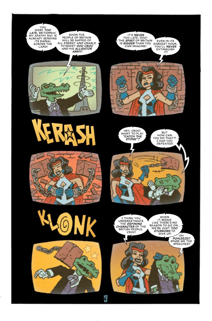
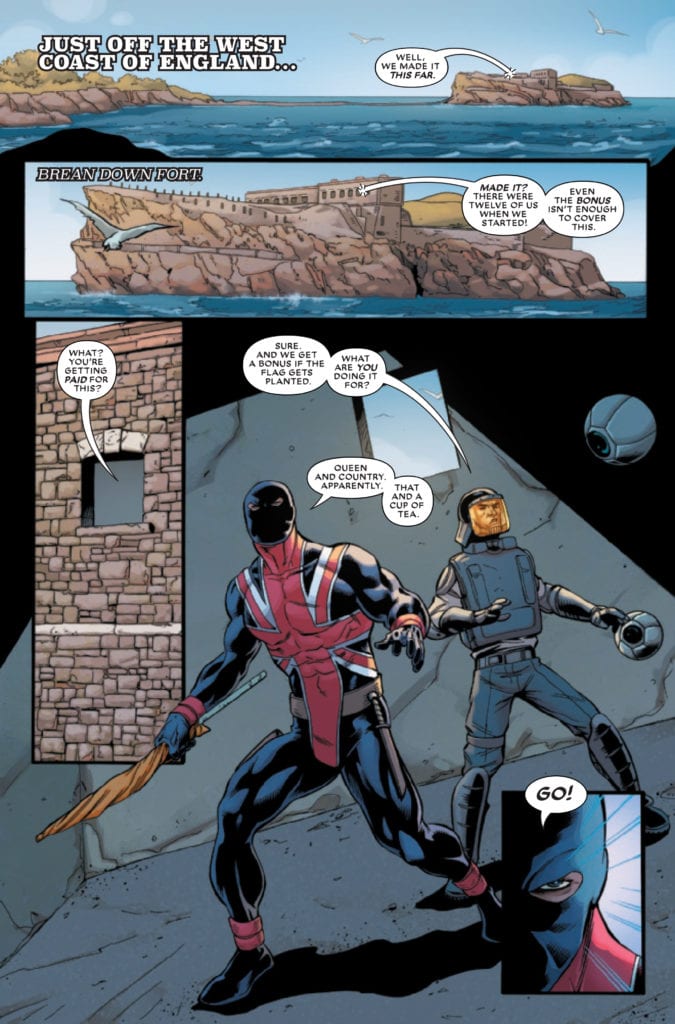
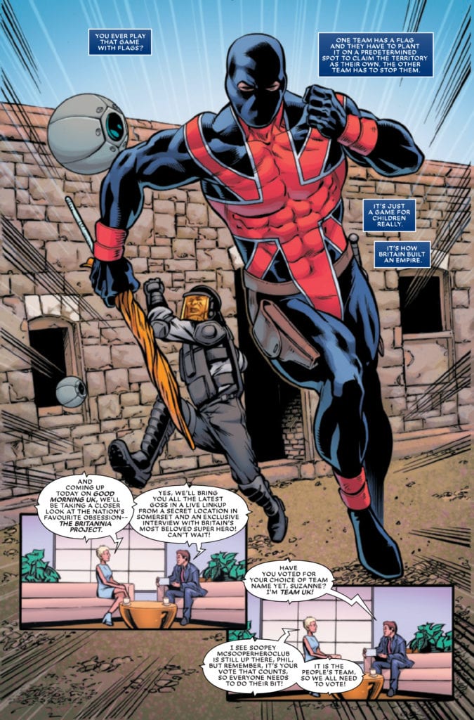
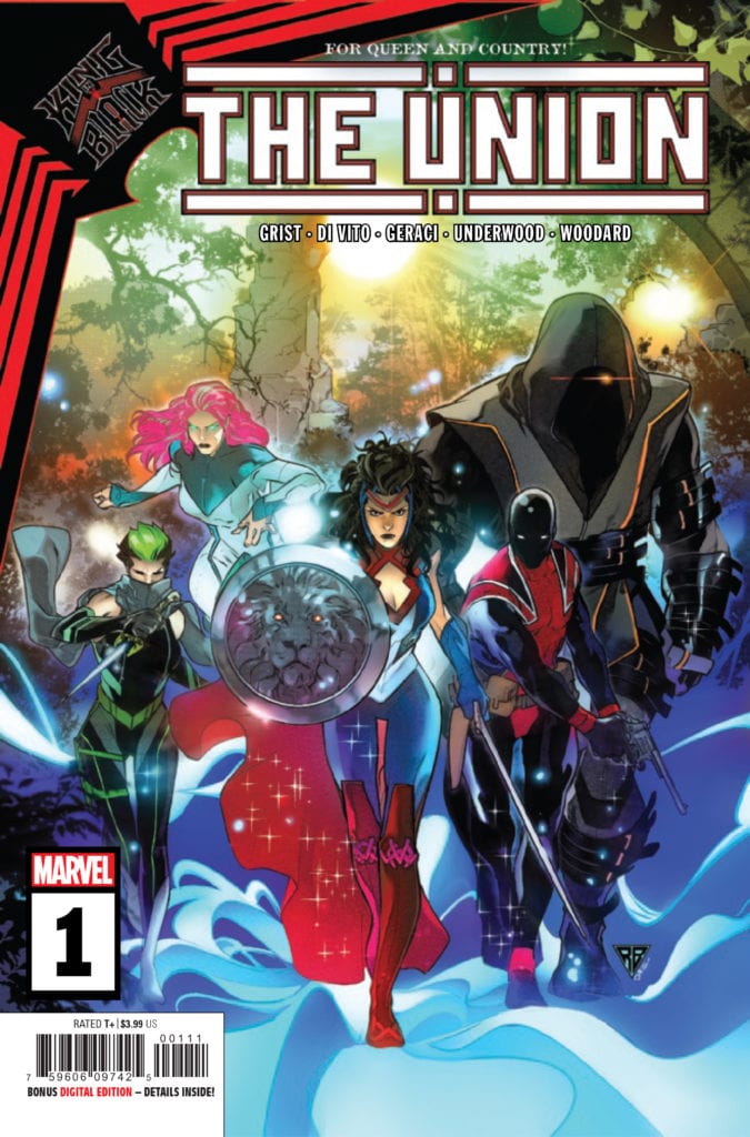
marvel comics the union #1 exclusive preview

THE UNION #1 hits your local comic book store December 2nd, but thanks to Marvel Comics, Monkeys Fighting Robots has an exclusive four-page preview for you.

About the issue:
The grand unveiling of The Union! A team of super heroes gathered from all over the United Kingdom, featuring Union Jack, Snakes, Kelpie, Choir, and their fearless leader, Brittania! But when disaster strikes on their first public debut the fledgling team is immediately pushed to their limits!

THE UNION #1 is by writer Paul Grist and artist Andrea Di Vito (with Grist also working on pencils). Inks are by Drew Geraci and Le Beau Underwood (also with Grist), colors are by Nolan Woodard, and letters are by Travis Lanham. R.B. Silva and David Curiel did the main cover.

The five-issue miniseries is spinning out of Marvel’s KING IN BLACK crossover event, which also begins on December 2nd.

Check out the UNION #1 preview below:

marvel comics the union #1 exclusive preview

marvel comics the union #1 exclusive preview

marvel comics the union #1 exclusive preview

marvel comics the union #1 exclusive preview

marvel comics the union #1 exclusive preview


Are you looking forward to THE UNION? Sound off in the comments!

Monkeys Fighting Robots Youtube

Marvel Announcement: The Next Event In Mutant History Begins With REIGN OF X

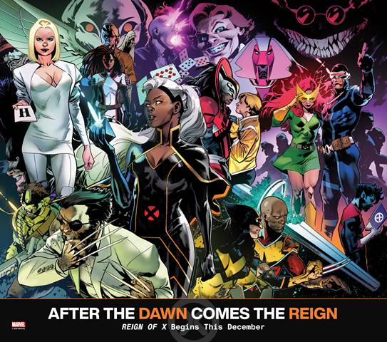
Reign Of X #1, promo image

Marvel Comics readers who’ve enjoyed the X of Swords event wrapping up this week won’t have to wait long for the next chapter in Mutant history. Marvel has announced the next event from Jonathan Hickman will launch this December with REIGN OF X.

Says Marvel about the new event: “The REIGN OF X will see the forming of new teams, the return of major characters, new threats brought about by classic villains, and more game-changing revelations that will alter the X-Men mythos forever!”

You can check out a preview of the first issue’s cover and read the full Marvel press release below.

Are you ready for another Hickman/Marvel event? Did X of Swords leave you wanting more? Let us know what you think in the Comments section, and please share this post on social media using the links below.

AFTER THE DAWN COMES THE REIGN

Reign of X begins this December!

New York, NY— November 25, 2020 — Today, fans witnessed the startling conclusion of X of Swords, the sprawling crossover that represented the latest chapter in Jonathan Hickman’s grand vision for the X-Men, and learned that the REIGN OF X was upon us!

Hickman’s bold take on mutantkind began last year in the critically-acclaimed House of and Powers of X and continued in the Dawn of X, ushering in a slate of brand-new X-Men titles that took the comic book industry by storm. Now, the saga continues in REIGN OF X, a new era encompassing the upcoming story arcs in all your favorite X-titles. The REIGN OF X will see the forming of new teams, the return of major characters, new threats brought about by classic villains, and more game-changing revelations that will alter the X-Men mythos forever! Check out what’s to come in a mesmerizing teaser image by superstar X-Men artist Mahmud Asrar!

“The REIGN OF X is upon us … and here’s a sneak peek of what it will bring! Like Dawn of X and X of Swords before it, REIGN OF X has been meticulously crafted by Jonathan Hickman and all the other uncanny X-writers of our day, and we can’t wait for you to see what they’ve cooked up!” Editor-in-Chief C.B. Cebulski explains. “In the meantime, eagle-eyed readers should take a CLOSE look at this magnificent montage of mutants drawn by Mahmud Asrar.  Everything on this image was included for a reason and will have heart-pounding pay-offs in the near future for our favorite Krakoans.  After the dawn comes the reign, and what a reign it will be!”

It all begins in December as the X-Men deal with the fallout of X of Swords and look to the future. Here’s what’s to come next month:

HELLIONS #7 by writer Zeb Wells and artist Stephen Segovia will explore the aftermath of the team’s brutal massacre in X of Swords.

Writer Leah Williams and artist David Baldeon continue to investigate mutant deaths and explore the complexities that come with resurrection in X-FACTOR #5.

Kate Pryde and Emma Frost finally enact their long-awaited revenge on Sebastian Shaw in MARAUDERS #16 by writer Gerry Duggan and artist Stefano Caselli.

Mutantkind sets their sights on the galaxy and beyond in writer Al Ewing and artist Valerie Schiti’s groundbreaking S.W.O.R.D. #1.

An old foe rises in NEW MUTANTS #14, the beginning of a wild new era for your favorite young mutants by writer Vita Ayala and artist Rod Reis.

Wolverine reunites with Maverick and Team X in WOLVERINE #8, a special over-sized milestone issue written by Benjamin Percy with art by Adam Kubert and Viktor Bogdanovic.

The search for Captain Britain is underway as Excalibur returns to Otherworld in EXCALIBUR #16 by writer Tini Howard and artist Marcus To.

X-Force will stop at nothing to protect Krakoa, even if it means interrogating their own, in the action-packed X-FORCE #15 by writer Benjamin Percy and Marvel’s Stormbreaker artist Joshua Cassara.

And Cyclops makes a fateful decision regarding the future of the X-Men in X-MEN #16, written by Jonathan Hickman with art by Phil Noto.

The future of mutantkind is here! Don’t miss X-Men history in the making when REIGN OF X begins next week! For more information, visit Marvel.com.

Reign Of X #1, promo image

Monkeys Fighting Robots Youtube

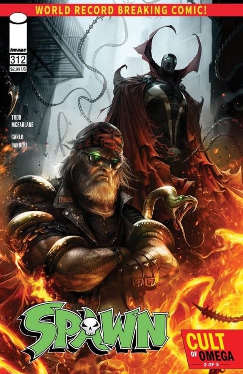
Review: SPAWN #312 – Which Hellspawn Is Your Favorite?

SPAWN #312 hits comic book stores on Wednesday, November 25th, bringing readers closer to the impending conflict between Hellspawn and the forces of both Heaven and Hell. This story jumps between many characters’ perspectives to give their take on these events, giving readers a chance to connect with figures other than Al Simmons himself. The result is a tale full of surprises each Hellspawn must face in their own way.

Story

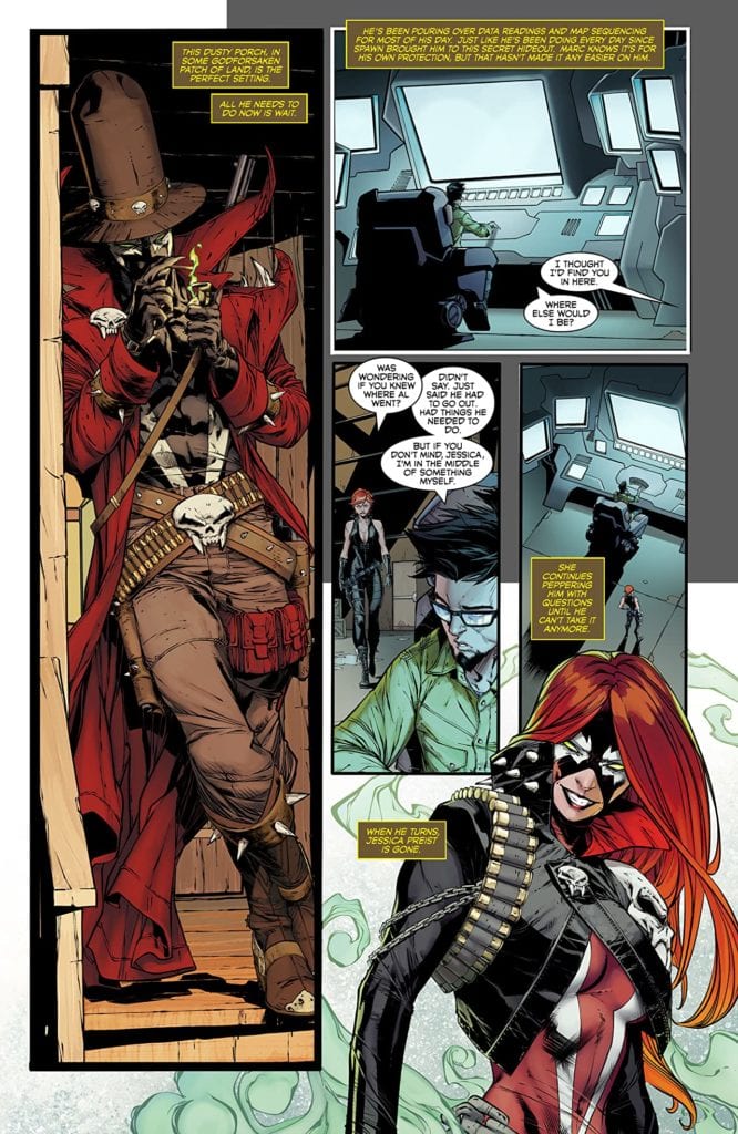
Building off of the previous issues’ events, #312 expands upon Simmons’s recent breach of time itself. The story hones in on multiple versions of Hellspawn facing the ramifications of this reality, ranging from Gunslinger Spawn to Jessica Priest.

Each Hellspawn reacts differently to the impending threat. Gunslinger faces a horde of demons head-on, Priest carelessly runs about as if nothing is different, and Simmons spends his time hectically planning for what’s next.

Todd McFarlane’s narrative further differentiates each Hellspawn, showcasing each of their unique personalities. This helps readers fall in love with those characters that entertain them the most.

Artwork

This issue’s illustrations are astounding in their ability to capture the story’s action. Carlo Barberi’s penciling and ink work, alongside Peter Steigerwald and Jay David Ramos’s coloring, brings each character to life. The dark shades of black mixed with bright reds shows how each Hellspawn is connected despite their unique outfits. We also loved how Tom Orzechowski’s lettering placed the focus on Simmons’ by casting his dailogue within jagged, black borders.

Conclusion

SPAWN #312 is an epic connecting story that sets the stage for action on multiple fronts. While not the main tale in the Cult of Omega arc, this issue is integral in its effective character development.

Who do you think is the most powerful Hellspawn right now? Let us know in the comments below!

Monkeys Fighting Robots Youtube

Review: X OF SWORDS DESTRUCTION #1 – The Ending Lands Sideways

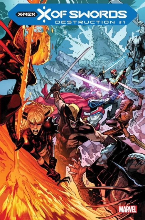
X of Swords Destruction Cover

X of Swords Destruction out this week from Marvel Comics is the finale to the X of Swords crossover. Writers Jonathan Hickman and Tini Howard end the emotional arc of Apocalypse along with other events. Artist Pepe Larraz displays the scale of the stakes through its many characters. Colorist Marte Garcia converges the many sides from the numerous series together through bright colors. Letterer Clayton Cowles and designer Tom Muller add the details to bring the story together.

spoilers ahead

X of Swords Destruction: Tarot Meanings

Hickman and Howard put a lot into X of Swords as a whole; so much it’s impossible to fit everything in 44 pages. X of Swords Destruction #1 main achievement is the character development of Apocalypse. Apocalypse’s main motivation comes less out of his usual Social Darwinism and more out of love. The lengths he goes to reclaim his wife, Genesis, from the demonic Annihilation shows a new dynamic. Gone is the mutant overlord doing whatever it takes to win; his “humbling experience” from his own children displays a vulnerability that humanizes him. This same experience is what empowers Apocalypse to overcome what Genesis couldn’t and end the conflict.

When it comes to the rest of the plot threads leading up to X of Swords Destruction #1, it seems they are sidelined. Despite elements from Cable, Marauders, and a set-up to the upcoming S.W.O.R.D. series by Al Ewing, they feel more aesthetic. It’s almost as if this part of the finale is less of a conclusion and more of an advertisement. Many questions arise, like what happened to Solem, who vanished for no reason? Again this seems like setting up for a sequel that kind of spoils the overall story’s experience.

A Smorgasbord Of Appearances

X of Swords Destruction #1 features dynamic artwork by Pepe Larraz, particularly his ability to draw epic scenery. The many characters he can draw in one panel are remarkable with how the X-Men stand out among their enemies. The page with the Annihilation mask meanwhile shows the conflict between Annihilation, Genesis, and Apocalypse perfectly. With how reflections in the mask distort and form, it perfectly encapsulates the chaos going on around everything.

In the meantime, Marte Garcia takes the opportunity to tribute the other series that makeup X of Swords Destruction #1. Bright colors are used to indicate elements from different Dawn of X series; green for Cable, blue for X-Men, and (usually) purple for Excalibur. VC’s Clayton Cowles as letterer drives home the conflict with Annihilation with its black word balloons trying to overtake its host’s white ones. To top it all off, Tom Muller’s infographics fill the reader in on what they might miss between the panels.

X of Swords Destruction: Ready For The Next

As X of Swords Destruction ends its run, a new chapter in Dawn of X is ready for readers. With Apocalypse completing his arc, only time will tell what the future has in store.

Monkeys Fighting Robots Youtube

Review: WEREWOLF BY NIGHT #2 Loses Control

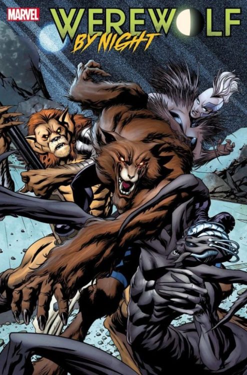
Werewolf By Night #2, McKone cover

WEREWOLF BY NIGHT #2, available from Marvel Comics on November 25th, cuts Jake’s teeth with his first big monster battle while Red Wolf and JJ track him down. Written by Taboo and Benjamin Earl, this issue reveals some interesting tidbits for the future.

Cover Art

Mike McKone’s cover is exactly what a reader is looking for in a monster brawl. Jake, in werewolf form, slashes and rips his way through the hybrids with feral energy. Amid the chaos, you’re instantly drawn to Jake’s eyes as his inner monster takes over the fight.

Writing

Picking up immediately after the end of issue #1 (read our Werewolf By Night #1 review here), Jake dives into an animalistic battle with the hybrids to save the caravan captives. The next morning, a battered but healing Jake finds he’s now on the run from the local law, Red Wolf, JJ, and the mercenaries hired by the Life Corporation.

The writing by Taboo and Benjamin Earl here – in a word – okay. This issue is more setup than a story with not much forward progress in the arc. It’s still an original premise, but it needs weight or emotional depth. I want to be invested in Jake’s situation, but you never get the sense he’s in any real danger or that he’s bothered by the burden of his curse, or that he feels much of anything.

The parts are there, the dialog is generally good, and the plot largely makes sense, but I need a reason to care about these characters. Right now, that’s the missing piece.

Pencils/Inks

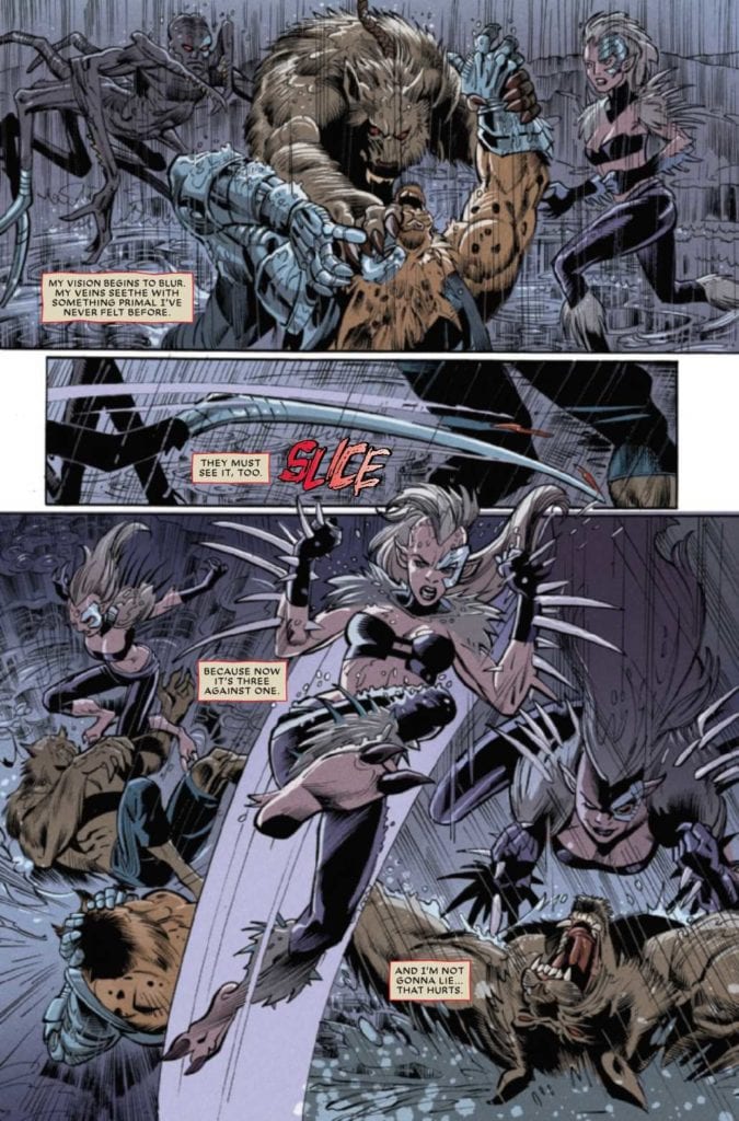
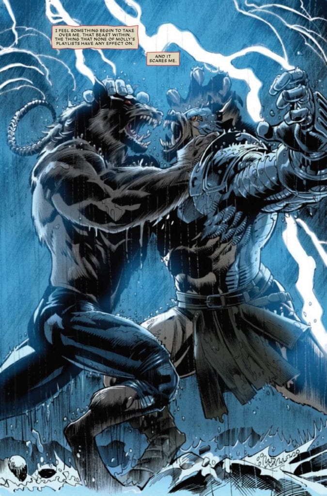
Scot Eaton and Scott Hanna’s art for this issue is fairly solid. Of course, the big selling point for this issue is Jake’s epic battle. Eaton and Hanna deliver on that front.

Jake’s werewolf is full-on powerful in every frame. The leaping, slashing, stabbing, and biting acrobatics fill nearly every panel beautifully.

Werewolf By Night #2, art sample 2

As a bonus, there’s an interesting few pages where Jake dreams of the werewolves in history, and it’s a treat to see Eaton and Hanna’s take on different werewolf forms. I especially liked the homage to the original Werewolf By Night. Overall, this was a visually enjoyable issue from Eaton and Hanna.

Coloring

Miroslav Mrva’s earned praise in issue #1 for the excellent application of moonlight glow on the desert scenes for authenticity. Mrva scores again with beautiful reds and yellows during a desert sunset. Color is the musical score of a comic, and Mrva shows fantastic mood energy in the colorwork here.

Werewolf By Night #2, art sample 1

Lettering

VC’s Joe Sabino is fairly solid in the placement and readability. But somehow, the lettering did not integrate well with the artwork in this issue. The word bubbles and caption boxes are much brighter and sharper than the panels they inhabit. In isolation, the lettering is good. Combined with the art, it doesn’t mesh well.

Conclusion

WEREWOLF BY NIGHT #2, available from Marvel Comics on November 25th, takes a few steps forward on the story and treats the reader with strong visuals. If the writers can add some emotional punch, this has the potential to be a memorable book. WEREWOLF BY NIGHT #2 is a guarded recommendation.

Monkeys Fighting Robots Youtube