Future State: Green Lantern #1, out now from DC Comics, shows us enthralling tales where members of the Green Lantern core lose their power rings. What will become of some of your favorite heroes when they are stripped of their powers?
“Last Lanterns”
The main story of Future State: Green Lantern #1, titled “Last Lanterns,” is an action-heavy story of John Stewart and a group of other lanterns defending an alien planet against invading hordes, which is easier said than done when none of them have access to a power ring. What we get is an epic gunfight that allows for the dynamic art of Tom Raney to shine. I felt the story lacked slightly, but Geoffrey Thorne more than made up for it by allowing the artist and colorist to shine. Thorne also did a fantastic job of establishing the feeling of a chaotic battle happening on all sides, which gives the reader an uneasy sense that an attack could come from anywhere. Mike Atiyeh provides a pleasant color palette to the story, and the brightly-colored aliens add energy to the otherwise plainly colored world. Andworld Design provides bold captions that add weight to action scenes and causes dramatic moments to have a much more profound impact on the reader.
“The Taking of Sector 0123”
“The Taking of Sector 0123” is a wonderfully written tale in Future State: Green Lantern #1 of Jessica Cruz defending a station from yellow lanterns. Written by Ryan Cody, the story feels a lot like Ridley Scott’s Alien, only now our hero is the vicious monster creeping through the vents. It is an intense story that is wonderfully complemented by the art of Sami Basai and the coloring of Hi-Fi. The lettering utilizes a stunning technique that works hand-in-hand with a story element. It is rare to have lettering make such a profound impact on a story, and it is incredible to see. I can’t describe the amazing lettering technique without giving away any spoilers, but rest assured, Dave Sharpe knocks it out of the park with his lettering in Future State: Green Lantern #1.
“The Book of Guy”
Guy Gardner is a character that is very easy to mishandle. His brash attitude is a neat trait, but it can result in him being unlikable if handled incorrectly. When the ring is taken away from him in “The Book of Guy,” Ernie Altbacker is able to tell us a Guy Gardner story that gets to the core of the character, and it is delightful. Clayton Henry’s art provides for excellent facial expressions that make every piece of dialogue pack a harder punch, and Marcelo Maiolo’s coloring features beautiful gradient shading that brings the characters to life. Steve Wands arranges the lettering so that the story is able to flow smoothly, and the result is an amazing, feel-good story.
Conclusion
Future State: Green Lantern #1 is not a book you will want to miss if you’re a Green Lantern fan. It presents your favorite characters in a way that we don’t often get to see and puts them in interesting situations that are an absolute joy to read. The art and coloring is breathtaking, and the issue features some of the coolest cases of lettering that I have seen in a while.
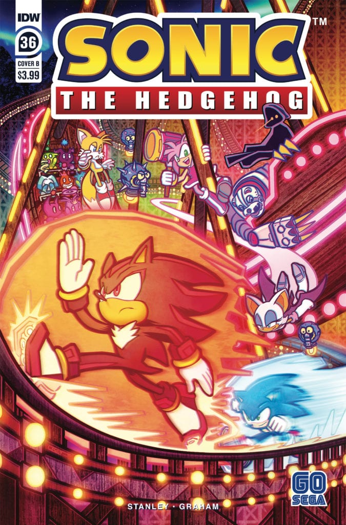
Sonic The Hedgehog #36 comes out this week from IDW comic and concludes the “Chao Races and Badnik Bases” storyline. The first story after the metal virus arc, this more lighthearted tale takes time to lay the groundwork for events happening in the future. The wrap-up arrives thanks to Evan Stanley, Reggie Graham, and Shawn Lee.
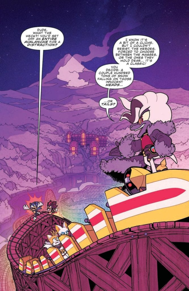
Strap on your snowshoes, an avalanche is headed straight for White Park Chateau! Sonic and gang are going to have to act quickly if they want to save the White Park guests and stop the hooded figure from getting away with Tails!
Writing
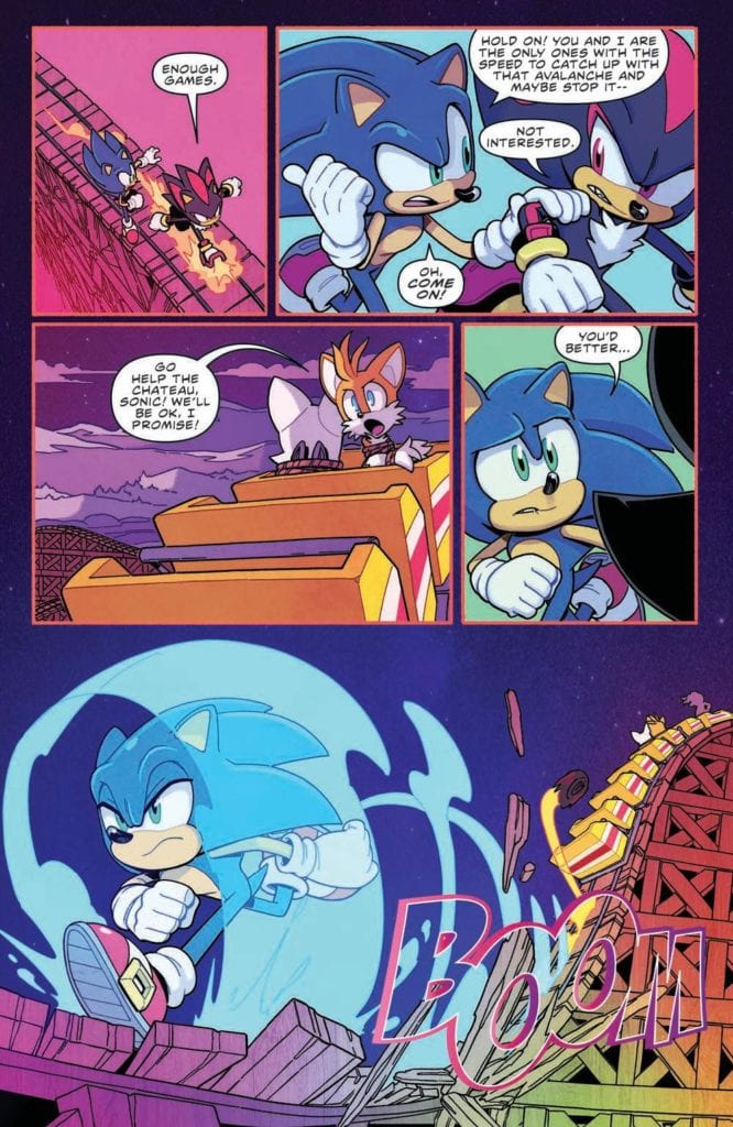
Sonic has a lot on his plate this issue, having to save Tails and Rouge, and at the same time find a way to stop an avalanche. Luckily he doesn’t have to do it alone and a lot of characters aid in helping to set things right. It’s a decent issue with some entertaining moments but honestly, it does not exactly knock your socks off good.
Thie issue wraps up the arc without major revelations but there is a lot of setup for future events. Writer Evan Stanley seems to be setting up the pieces for future events. Between the introduction of Belle The Tinkerer and Dr. Starling’s schemes, the groundwork for bigger happenings down the line is on display.
Artwork
The art by Evan Stanley again focuses on his strong suit by displaying strong character expressions. Thanks to serving double duty as Artist and Writer, Stanley finds a way to convey a lot of emotion into the look and feel of the characters. This can be seen in the above picture as Sonic displays frustration and Dr. Starling exudes smug confidence.
The colorwork by Reggie Graham enhances the issue. Not only does it help to accentuate the visual effects such as Sonic’s speed but it also adds aesthetic to the setting. A particular panel of note came in the small detail of the character getting a little lighter to demonstrate a hole was opened in the roof.
The Letterwork by Shawn Lee adds an auditory aspect to the issue. Lee finds a way to perfectly blend effects into the issue without them detracting from the other visuals in the panels. This seems to be a lost talent when it comes to a lot of letterwork present in modern comics.
Conclusion
Sonic The Hedgehog #36 isn’t a must-read issue but it still is an above-average experience. Thanks to the creative team who made it, even a minor storyline ends up being an entertaining adventure. Still, with the introduction of Belle, it would best for fans to pay attention to this series as a mystery is brewing.
King In Black: Planet of the Symbiotes #1 begins a special tie-in from Marvel Comics out on January 13. This serves as a sequel to characters from the tie-ins of the preceding event Absolute Carnage.
Background
In the Absolute Carnage event former Venom co-stars Andi Benton and symbiote Scream bonded to fight the monstrosities of Knull. The titular King in Black is a fierce entity with a cult following within the institute of Ravencroft. So dangerous a threat that current warden John Jameson (Man-Wolf) needs assistance from Misty Knight to deal with the cult.
Planet of the Symbiotes #1: A Decent Callback
The Scream story of King In Black: Planet of the Symbiotes #1 by Clay McLeod Chapman does the title justice. In a tribute to the original event from the 90s, Chapman demonstrates the event’s premise in a manner more akin to a horror movie. Both of these series deal with how families can be toxic. With some of Venom’s offspring on a killing spree under Knull’s influence, it’s nice to see Scream take after their parent’s more heroic side. Besides coming off Curse of Carnage, Scream already feels at home with Andi. This is thanks in no small part to Andi’s nurturing side when she comforts a mourning child.
Guiu Vilanova gives the symbiotes a fittingly monstrous appearance, especially in their hybrid form. The gaping mouth in the middle of the gestalt body is practically a demonstration of Knull’s influence. Since he is able to speak through this mouth, the threat of the Scream symbiote becoming one with this atrocity is terrifying.
Thankfully, Dean White’s coloring demonstrates in Scream’s design that she’s unlike her sibling in every way. Her bright yellow and red appearance complements her host Andi’s pyrokinetic abilities. This source of light is able to drive away the dark colors of the Hybrid.
Ravencroft’s Monster
The other half of Planet of the Symbiotes #1 features another monstrosity that will make King in Black even bleaker. Since Ruins of Ravencroft, Frank Tieri has been building up Cortland Kasady as a legendary figure. Now with his appearance as a zombie symbiote, Cortland is ready to wreak havoc in Knull’s name. The title of Plague perfectly demonstrates the threat he presents; the ability to drain the life of anybody in his vicinity. With Knull sicking Plague on Dylan Brock, there is a tough road ahead.
Danilo S. Beyruth designs this Plague monster in a way that would evoke terror. The lanky/ghastly form of him looks frightening enough. Rachelle Rosenberg’s purple coloring and glow accented by Plague’s flowing hair make him look terrifying. That’s not even including the stream of black specks Plague uses to steal his victim’s life. Plague is practically a death personification ready to do his master’s bidding. And unlike the Scream story, there’s little indication of a way to stop him.
King in Black: Voices of the Symbiotes
VC’s Cory Petit gives every symbiote in King in Black: Planet of the Symbiotes #1 a unique voice. On simple coloring they match the designs of each symbiote’s appearance: Scream’s external voice is red with a yellow word balloon, her internal thoughts are yellow with red captions. The designs of the word balloons are what makes them more unique as they look distorted. This highlights their alien appearance and their connection to their God Knull. The fact he can connect to every symbiote denotes the fact that any symbiote can become his servant.
One small bit of confusion comes in the use of purple captions and word balloons. The former is from the internal monologues of Andi, while Plague speaks the latter. While both are death bringers to their intended targets they are on different sides. It seems like there should have been a way to differentiate these two.
King In Black: Planet of The Symbiotes #1…Is Supplementary
King in Black: Planet of the Symbiotes #1 is best for readers familiar with related material. Both segments are major developments, but it requires background information to appreciate fully. Since the Ravencroft story seems to be leading into the main Venom run, readers will probably be confused by Plague’s appearance. Some fans might even require knowledge of the original Planet of the Symbiotes to see how this series stands out. Otherwise, this issue is just okay.
King In Black Thunderbolts #1 begins Marvel Comics’ newest rendition of a supervillain ensemble on January 13. Through Kingpin, writer Matthew Rosenberg puts Taskmaster and Star through a gauntlet they might not survive. Artist Juan Ferreyra showcases the entire issue’s dire mood with impressive panel work, scale, and shading. Letterer Joe Sabino completes the package through his word balloons.
The Kingpin’s Comeback Thunderbolts
King In Black Thunderbolts #1 follows the Kingpin’s copyright legal version of the Suicide Squad. Rosenberg puts some of Marvel’s less egotistical villains together for the chance of seeing their personalities bounce and clash.
Taskmaster remains one of the more levelheaded characters, as his record with dealing with the absurd suggests. So when he encounters an event so absurd, his practical mind gives him the most common sense. Taskmaster knows when the Thunderbolts need the right equipment and can’t afford a distraction.
Because Star is the only one with any firepower to survive against giant symbiote dragons, her recent series keeps her fresh and full of opportunity for developments despite her newcomer status. She wants to be a hero but has limitations in both power and opportunity for good. Luckily one of her co-stars seems to provide just enough backup to make up for it.
Batroc the Leaper is always a fan-favorite character and serves as good comic relief. His lighthearted attitude complements both his more serious teammates and the whole situation. Back in the initial meeting, he displays a more professional attitude than Taskmaster. No amount of death threats seem to get him down.
King In Black Thunderbolts #1: Keeping Control
With Ferreyra serving as the overall artist of King In Black Thunderbolts #1, it says a lot about his dedication. His panel layout certainly attests to this statement, including the use of a 9-panel grid. That one page, along with Kingpin’s presence, demonstrates the amount of power he has over the immediate situation. One way or another, Wilson Fisk will get what he wants out of the Thunderbolts.
The other giant of King In Black Thunderbolts #1, Rhino, also demonstrates his presence in scale alone. His large size gives him an edge over others in hypotheticals. The fact he wasn’t in the issue’s introduction with the rest of the team calls into question his fate.
Finally, there comes the colors and shading within the issue. Anyone following King In Black knows the situation is dark, with shadows blanketing the panels. To make matters worse, the color red is practically a signifier that someone will die or is at risk of dying. Considering Star’s role in King In Black Thunderbolts #1, the red on her costume makes her a target.
Letters Between Artists
VC’s Joe Sabino is the main letterer of King In Black Thunderbolts #1. The word balloons he employs keep the pacing and tone in overall flux. A single splash page with a speech shows Kingpin’s presence and the Thunderbolts in question. Then there are the widescreen panels that feature short but sweet sentences to not slow down the action.
One point to question is the SFX; crashes, a gunshot, and a sudden attack look more like Ferreyra’s art. Either Sabino is really good at making SFX extensions of his co-artists, or Ferreyra is going uncredited for this.
Pay Attention to King In Black Thunderbolts #1
King In Black Thunderbolts #1 brings out the best in an ensemble of villainous characters. Each has a role that makes them stand out and complement one another. It’s something that the artwork goes to lengths in order to showcase their roles and the stakes they face. This iteration of the Thunderbolts is one team to keep track of.
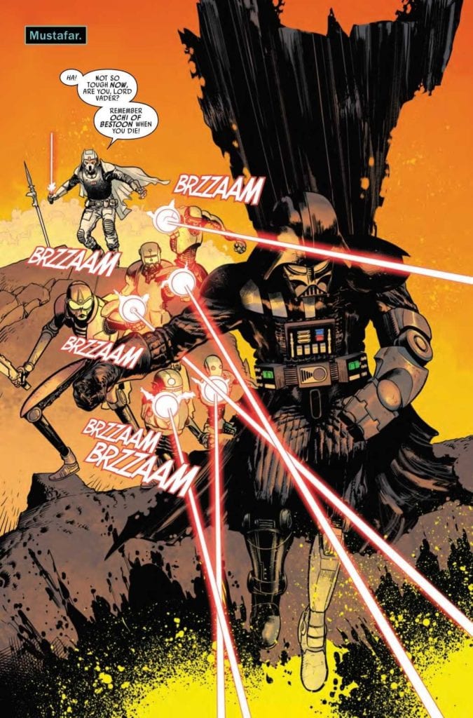
STAR WARS: DARTH VADER #9, available in comic book stores on Wednesday, January 13th, continues the tale of Darth Vader’s journey from exile on Mustafar. The Sith assassin Ochi of Bestoon is hot on his tail after their fight last issue. Fortunately, Vader narrowly escapes the mercenary’s grasp. But when a group of droids join in the hunt, can the Sith Lord fight back and learn more about Emperor Palpatine’s plans?
Story
After surviving his encounter with the Eye of Webbish Bogg, Vader is ready for some answers. He was able to retrieve a strange piece of arcana from the odd creature—a Wayfinder that promises to reveal Palpatine’s secrets. With this artifact, Vader believes he will be able to uncover what lies in store for the galaxy.
However, readers soon find that Ochi and the droids he hired are hot on the Sith Lord’s tail. These hunters were promised the chance to harvest valuable pieces of Vader’s artificial body parts. And it’s here readers see a flashback to Palpatine’s rescue all those years ago.
Greg Pak’s writing brings readers into the thrilling world of Vader. Readers experience the complex attitudes he feels toward the man who both saved and left him for dead. On top of this, we are inspired by the man’s sheer resiliency when facing a slew of assailants. We see a fighter whose value lies not in special body upgrades (many of which have been lost), but in his willpower.
Artwork
The illustrations throughout STAR WARS: DARTH VADER #9 are full of action. Raffaele Ienco’s penciling and ink work casts Vader, Ochi, and the droids seem to move from panel to panel fluidly. These are further fleshed out with colorist Neeraj Menon’s solid blacks, browns, and silver hues of the characteres set against the blazing red and orange landscapes of Mustafar. In addition, VC’s Joe Caramagna’s lettering styles does a great job of distinguishing between the robot and human voices.
Conclusion
STAR WARS: DARTH VADER #9 highlights some of the best qualities of the Sith Lord. It’ll be interesting to see how he moves forward with so many forces set against him.
Do you think Vader will ever discover what Palpatine has in store? Let us know in the comments below!
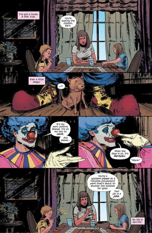
From the brilliant mind of writer W. Maxwell Prince comes a new series in HAHA #1, available in comic book stores on Wednesday, January 13th. In this classic style of one-shot storytelling, readers take a look at the inner life of a true-blue clown. But it’s not all jokes and red noses. Life can be difficult, especially for a clown. But sometimes staying positive can bring unexpected surprises.
Story
This inaugural issue introduces us to a clown named Bart in the first few panels. His family, a wife named Brenda and two children, watch him prepare for work from their breakfast table. While the children greet him cheerfully, Brenda bemoans his chosen profession (something that appears to be a daily occurrence).
He soon learns he’s losing his job; his place of work, Funville, isn’t fairing well in today’s modern world. What’s more, a former employee and a group of nefarious individuals seem to be eying his severance check.
But Bart refuses to give into the negativity. In him readers find a person defying the harsh aspects of reality—someone they may even admire. But whether this defiance turns out to be a bold stand or a rejection of reality remains to be seen.
Prince’s brilliant writing combines elements of drama and horror in this engaging one-shot story. It’s an issue detailing the life of an individual who dares to be happy in a world that seems completely against him. It’s up to the reader to decide whether he’s a model for us, or in denial.
Artwork
Vanesa Del Ray’s penciling and ink work, Chris O’Halloran’s coloring, and Good Old Neon’s lettering came together beautifully in this first issue. The characters and settings seamlessly shift from quasi-realistic styling to surreal, warped versions of that reality. These are brought to life through an effective use of bright colors against duller backgrounds, which helps emphasize Bart’s positivity in a world of indifference. And the lettering complements these illustrations wonderfully—their squiggly styles add just the right amount of eerie vibes.
Conclusion
HAHA #1 is the intriguing and thrilling story fans have come to expect from this creative team. We’re anxiously waiting for the next installment in this engaging new series.
Do you think there’s something supernatural going on with this particular clown? Let us know in the comments below!
Writer and artist Jeff Lemire’s sequel to his career-making hit hits its third chapter with “Sweet Tooth: The Return” #3. This issue ups the tension of the story by increasing the cast of important characters, each with their own personal stakes in this mysterious game being played. The mystery surrounding the hybrids, the world they now live in, and this new “Gus’s” relationship to the events of the prior story starts to clear – while still staying just out of reach. With tight pacing, brutal action, and Lemire’s trademark charming art style, this is yet another stellar comic issue for both Sweet Tooth fans and newcomers.
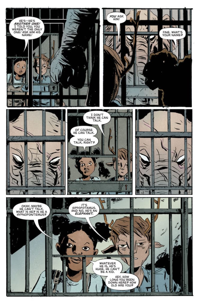
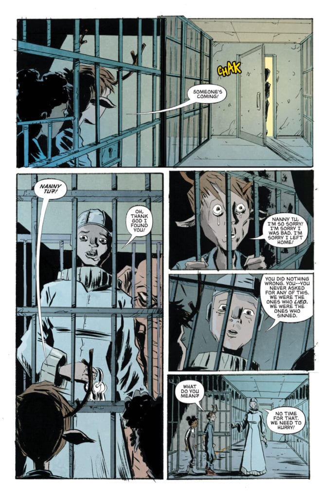
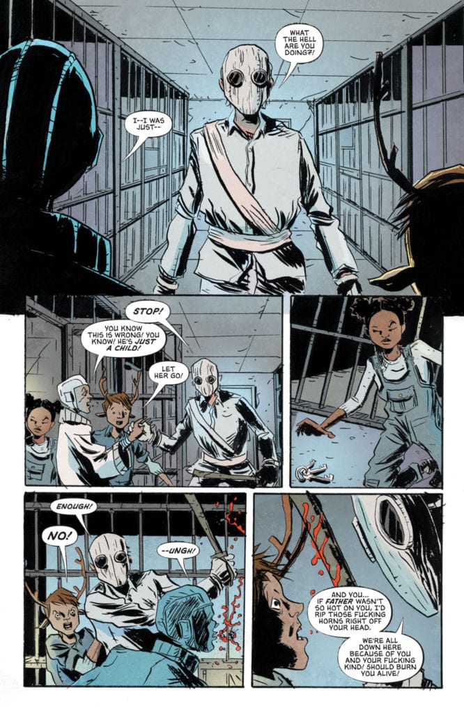
“Oh no, oh no! Things are even worse now! Father told the boy and Penny to go to the jail cell for a time out, but now it looks like they have escaped! And what’s this? One of Father’s nannies has gone missing too? And the Downsiders are angry with Father? Oh dear, this simply will not do. Not one bit. The people must be put back in their places. Order must be maintained. Otherwise humanity cannot survive. Will Penny and the boy ruin Father’s perfect plans, or will he have to put an end to the meddlesome children?”
Writing & Plot
“Sweet Tooth: The Return” #3 feels like the part of a roller coaster just after the initial climb, just as gravity begins to let go and your stomach is jumping through your lungs. The tension and mystery of the first two issues is reaching a fever pitch, and it culminates from two perspectives: the perspective of the “downsiders” living under the rule of the conspiring Father, and “Gus” and his new friends. This is a shockingly bloody issue thanks to the introduction of Gus’s newest ally (a freakin’ elephant hybrid) wreaking tremendous havoc, and the final page reveal is a doozy of a cliffhanger. This issue’s pacing makes the absolute most of the 22-page comic book length, condensing an immense amount of story into this comic. It’s all done with almost no narration, and most of the exposition coming in the form of personal dialogue from the characters. The plight of the “downsiders” living under authoritarian zealots and having friends and family members go missing without explanation is not a new tale, but Lemire’s storytelling is so compelling that it makes this group of character immediately interesting. The way Lemire is tying this series back into the original is a steadily unraveling mystery that has officially launched into overdrive, with mystery colliding with character driven desperation and hope. It’s a Lemire story, after all.
Art Direction
I’ve talked at length about the charm and beauty of Jeff Lemire’s art and how it works within Sweet Tooth in may previous reviews of the series. “The Return” #3 does more of that, with the same intimate detail that makes Lemire’s visuals so special. It’s his animation of facial expressions that really stick out here (and in all of his art really), and it effortlessly pulls you in to the characters. The newest introduction to “Gus’s” party includes an elephant hybrid who on the outset doesn’t appear to show much emotion. You know, because he’s basically an elephant. However, Lemire ingrains the tiniest subtleties into his expressions to create expressions of anguish, rage, and trust when confronted by his torturers and his new friends. His panels and visual direction are directly character focused, with what must be half of the panels in the book showing the speaking character’s face directly facing the reader. Lemire’s deceptively complex work hides under the fact that it is aesthetically so rough-looking. His work is aided by colorist Jose Villarrubia, whose work adds stunning watercolor dimensions to the characters and their world. The sterile whites and dim grays of their underground society are met with jarring yet beautiful psychedelic color arrays during flashbacks. The visuals are exactly on par with those in the original comic, just with a backdrop of caves and laboratories rather than forests and post-apocalyptic towns.
“Sweet Tooth: The Return” #3 is a gripping third chapter that ramps up the story’s pace and puts more character’s cards on the table. Lemire has begun to divulge larger chunks of this story’s connection to its predecessor, but is still focused on a more present and character-centric delivery for this tale. His artwork with the help of Jose Villarrubia’s colors are still every bit as detailed and charming as they were in the original series. Be sure to grab this newest issue from your local comic shop on 1-12!
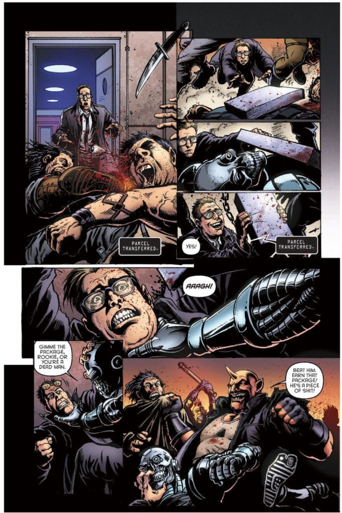
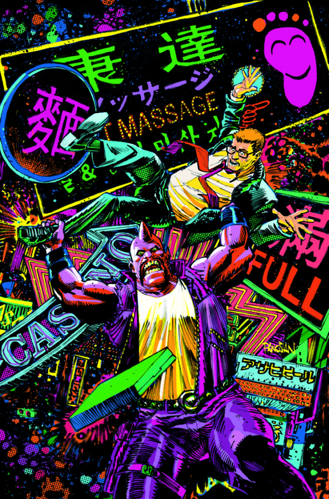
Humanoids’ Space Bastards #1 is a lot to stomach. It’s the dark comedy sci-fi we all wish we’d thought of. Writers Eric Peterson and Joe Aubrey, with artist Darick Robertson, colorist Diego Rodriguez, and letterer Simon Bowland show us a world that makes just a little too much sense. In Space Bastards, members of the Intergalactic Postal Service must do anything to get their package delivered. That includes maiming, killing, and otherwise fucking up anything or anyone that gets in their way. In fact, the more bloodshed there is, the bigger the paycheck.
Writing
Peterson and Aubrey’s script might seem wild, but it’s also incredibly simple. Violent postage people in space. That’s all it is. But it’s a simple idea that goes a long way. Part of what makes this script work is the bridge Peterson and Aubrey make between the new and the familiar. Sure, the whole Intergalactic Postal Service is new to us, but a violent, deadly, mean veteran of the service, like Manny “The Manicorn” Corns, is something we’ve seen before. He’s the unlikely mentor of our wide-eyed protagonist, David S. Proton. Proton, down on his luck and out of a job, is desperate for things to go right for once. It’s the basic set-up for any good script. But Peterson and Aubrey don’t stop there. They lull us into believing it’s a typical story and then pulls out all the stops. It’s a raucous first issue that promises to be as unpredictable as it is bloody.
Art
Robertson brings all of his famous grit and gore to Space Bastards. Whether it’s someone splattering on a sidewalk or getting knifed in the back, readers know Robertson’s the right man for the job. But Robertson does more than create a great death scene… or death scenes. He shows just how different David S. Proton and Manny are from one another. On every page, Manny looks like a damn giant. He is huge, and the terrified faces of every other character seeing him confirms that. But Proton is just one of the many characters who are running scared. He not only looks sweaty and pale, but he looks small. Robertson shows him peeking out from behind Manny’s head or getting up off the ground. He’s smaller on the page than Manny, and he’s almost always pictured beneath Manny too. Robertson shows us clearly who wears the pants in this partnership and has fun doing it.
Coloring
This entire issue is colored in just three colors. Rodriguez uses hues of orange, blue, and occasionally green to show us the world of Space Bastards. And it’s pretty clear what each of these colors stands for. Manny walks around, orange-skinned and raining destruction down on whoever gets in his way. Proton, in his blue suit, squeamishly gets through whatever comes his way. But the both of them are slaves to the green lights of the Intergalactic Postal Service’s armbands. The green lights of their screens are the futuristic version of a green dollar bill. And so Space Bastards becomes a fantastic combination of blue cowardice, orange chaos, driven by the green of greed.
An awesome Black Light Variant Cover by Dan Panosian
Lettering
Bowland makes a point of keeping much of the dialogue together. Instead of large paragraphs being told in multiple word balloons, they get delivered in one big chunk. At first, this seems a little weird, but it makes sense as you read what’s actually being said. The world of Space Bastards is crazy. The kind of crazy that you just have to push through. So when David S. Proton is being told the details of the job he’s just signed up for, the people walking him through it don’t give the instructions much room to breathe. That’s because every moment Bowland gives us a pause is an opportunity for Proton to turn tail and run. Bowland really showcases how wild this world is by showing how quickly characters have to convey information, so no one has time to think about it too much.
Space Bastards is about as crazy as it sounds. It’s a blood-splattered charge across the galaxy, with lots of parcels to deliver. Check it out if you like dark comedies and have always wished they’d be in space. Pick up Space Bastards #1, out from Humanoids on January 13th, at a comic shop near you!
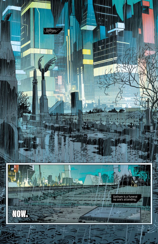
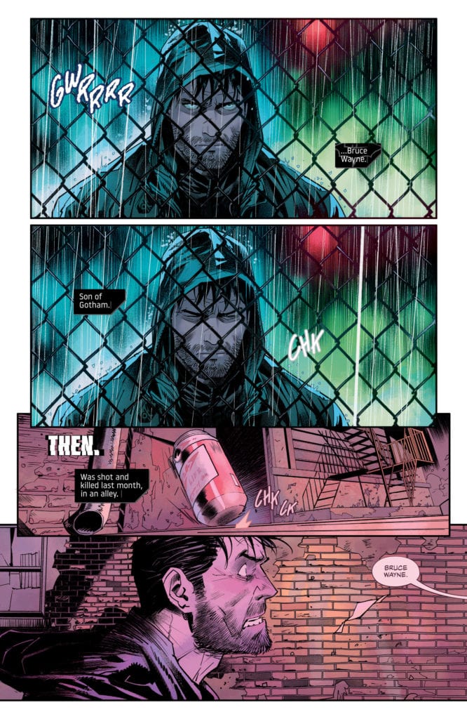
Dead looks good on Bruce Wayne. That’s because Batman’s character is always at his most entertaining when he’s backed against a wall. Plenty of creators have found new ways of doing this. Take his fortune, take his loved ones, take his sanity. But writer Mariko Tamaki, artist Dan Mora, colorist Jordie Bellaire, and letterer Aditya Bidikar have crossed even more lines in DC Comics’ Future State: Dark Detective #1. They’ve taken his life.
Writing
Tamaki immediately sets the tone, seamlessly and brilliantly. “Gotham,” she begins with a caption. “Gotham is a funeral no one’s attending.” Her false start says everything. It’s a sentence the speaker doesn’t have the energy to finish. And that’s the entire theme of this story. A Gotham City that’s even more rundown than we thought possible. People who somehow care less than they did before. And Tamaki leaves us wondering if Bruce Wayne cares anymore either. Is he fighting to save Gotham, or is he merely fighting to survive? Tamaki doesn’t answer these questions. She pulls back the dialogue and the captions, leaving the large pauses in between ripe with subtext. Tamaki shows, she doesn’t tell, and Dark Detective #1 is beautifully mysterious for it.
Art
Mora has always been a fantastic artist. But he pushes himself to new heights in this issue. His gritty images of Bruce running through the shadows are juxtaposed against his cleaner panels on billboards and in restaurants. Mora also gives this issue a sense of flow. Like ending one paragraph with a transition to the next, but instead with images hinting at the next scene. A girl getting ketchup on her hands in a fast food joint is followed by Bruce’s bloody fist as he bangs against a door. A neon image of Batman in his prime gives way to a picture of Bruce Wayne on a billboard. Mora isn’t just drawing a comic. He’s creating a visual essay, linking themes together and transitioning from point to point with subtlety and precision.
Coloring
Bellaire has been the colorist behind some of comics’ greatest hits. So it means something when I say that Dark Detective #1 is some of her best work. Everything in this version of Gotham is washed in neon lights. It’s both beautiful and claustrophobic. We don’t get to see characters as they are; we see them under Gotham’s bright “shadow.” Bellaire associates these neon colors with the new tyrannical villain, the Magistrate. So when Bruce is in danger, Bellaire underlines it with another neon yellow panel. It’s a visual warning sign, telling Bruce to run. And the few times we do see characters without a neon hue, it’s equally depressing. Bruce, on his own in an alley, looks left out in the cold. He may be free, momentarily, from Gotham’s neon eyes, but his lack of color makes him look pale with fear. We’re not left confident, exactly, that Bruce will get out of this one unscathed.
Lettering
Bidikar makes this issue fun and terrifying all at once. They punctuate moments like Bruce falling from a building. The “KRASH” exploding from the bottom of the panel gives us a sense of Bruce’s pain. But Bidikar also creates a sense of urgency. When Bruce is suddenly being followed by the Magistrate’s drones, Bidikar gives us a sense of how close they are from their dialogue. “STOP ALL MOVEMENT!” shows up in large letters at the bottom of a page out of nowhere. The drones are on top of him. But as Bruce begins to get away, their dialogue shrinks. And then, of course, as they begin to catch up with him again, their dialogue gets bigger. It’s Bidikar’s way of showing how close the danger is and getting us on the edge of our seat for what could have otherwise been a forgettable chase sequence.
Grifter in “No Future Past, Pt. 1”
Writing: 3.5/5
Art: 3.5/5
Coloring: 4/5
Lettering: 2/5
Writer Matthew Rosenberg, artist Carmine Di Giandomenico, colorist Antonio Fabela, and Andworld Design lettering brings us a chaotic look into Cole Cash’s life, AKA Grifter. As if Grifter’s life wasn’t chaotic enough, he now lives in a dystopian Gotham, so on the brink, he’s starting to look more and more like a good guy by comparison.
Writing
Rosenberg certainly understands a character like Grifter. We see Grifter living from one moment to the next, never really thinking of the future. “Friends of yours?” Luke Fox whispers to him as they come to face-to-face with a new character. “Not sure,” Grifter whispers back. He constantly improvises and has a short term memory when it comes to his mistakes. If Rosenberg had been a little more restrained with his script, trusting the reader to connect some dots instead of connecting them himself, this storyline would have hit home brilliantly. Rosenberg has these characters’ voices down pat; he needs to trust that his premise is already clearly set up between the lines.
Art
Di Giandomenico creates little moments of order in the chaos. At one point, as Grifter stabs a thug in the chest, Di Giandomenico draws an action line from the knife in one panel to it hitting its mark in the next. And in a bustling prison car, it’s not the kicking and screaming we notice, but the casual smile on the prisoner’s face. Unfortunately, we don’t get many opportunities for these little moments. Many of these pages are chock full of gunfights and chase scenes. While they are exciting, there isn’t always much to focus us in on. Di Giandomenico creates action and chaos often in these pages, but it’s the brief seconds of order that shine.
Coloring
Fabela’s color palette is quite reserved in this storyline. Despite big explosions and crazy gunfights, much of the story is red or blue. It flies in the face of the subject matter of the story. But it makes sense. This is a world that is controlled. Fabela shows us what Grifter and Luke Fox are fighting for, or at least what they’re fighting against. The oppressive simplicity of each page speaks of the micromanagement of the Magistrate and his allies. So, with a few flashes of yellow and a splash of purple, Grifter and Fox hope to get back to the colorful world they’ve lost.
Lettering
It’s hard to find much to praise in Andworld Design’s lettering. With massive blocks of text being delivered in singular word balloons, there’s no sense of rhythm or tempo. And the robotic looking “BLAM” sounds of guns going off get repetitive and boring quickly. Occasionally, though, Andworld Design makes an interesting choice, a choice you can hear. “Yo, you’re Cole Cash?” a thug says. “You’re dead,” follows it up, in a connected balloon. That’s a pause you can hear, and it has a terrifying effect. But frankly, much of the rest of the story feels impersonal and robotic. Mostly, it’s a story you’re reading with your eyes, not hearing in your head.
DC Comics’ Future State: Dark Detective #1 is definitely worth the read. Tamaki, Mora, Bellaire, and Bidikar’s story is a perfect introduction to this dystopian world. While Rosenberg, Di Giandomenico, Fabela, and Andworld Design’s story stumbles a little, it’s still an action-packed blaze of glory through DC’s new Future State. Pick up DC Comics’ Future State: Dark Detective #1, out January 12th, at a comic shop near you!
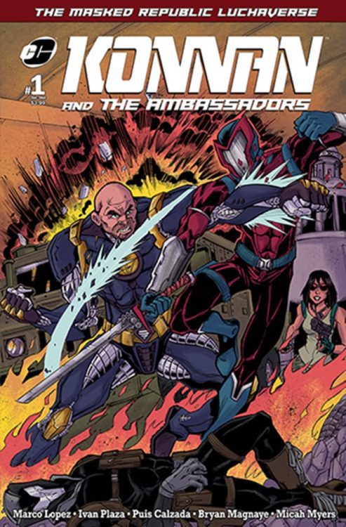
Announced last week, George Salinas of Bridge Works Entertainment has partnered with Ivan Plaza, owner and founder of the Latinx comic book publisher, Chido Comics, to produce their next TV and film titles. No timetable was announced but the partnership will bring new premium television series and films to the U.S. audience, according to the press release.
“Latinx culture has a lot to offer with many great artists coming up not being able to be seen,” Salinas explains. “We don’t have much representation to speak from in these areas, but I see the hunger of the industry to give us a platform. We need to create these platforms to develop and nurture the talent on every side.”
Chido Comics is a boutique publisher that has produced The Masked Republic Luchaverse and the Lucha Underground Comics. Next up for the publisher is the original mini-series, COQUÍ written by Plaza, with art by Matteo Illuminati, and letter work by Carlos M. Mangual.
Chido Comics titles
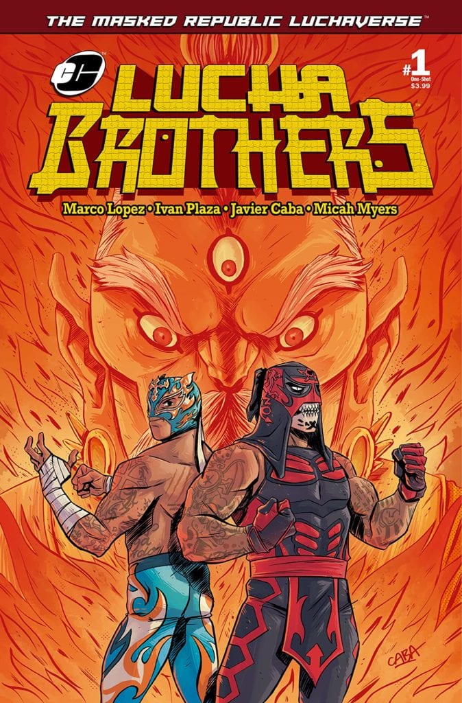
Masked Republic Luchaverse: Lucha Brothers #1 They are arguably the greatest tag team in modern-day Lucha libre. Brothers Penta Zero M and Rey Fenix, were orphaned at birth and raised by missionaries who traveled the world teaching them about a multitude of cultures… and each one’s fighting style. Now, as adults, simply being one of the greatest luchadores isn’t enough for Penta! With the help of his brother, he has found the location of an ancient power that he believes can make them the greatest warriors the world has ever known!
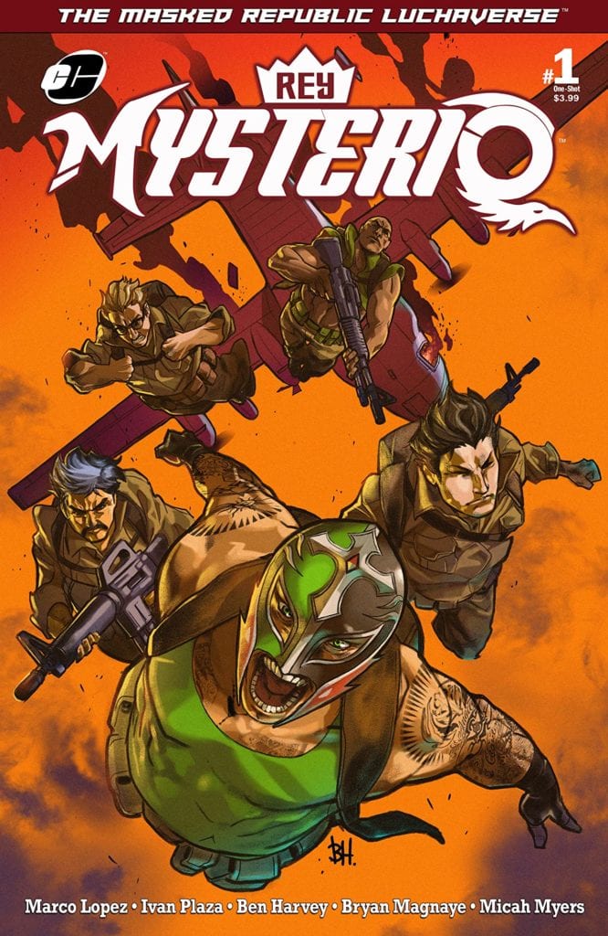
Masked Republic Luchaverse: Rey Mysterio #1 The current in a family of Mysterios that dates back centuries, each one trained to be a champion of the people and to take on a great evil that has been prophesied to return and plunge the world into darkness. Rey Mysterio is on a quest, aided by the military clandestine group known as “The Ambassadors.” The mission is clear: retrieve the one thing Rey will need to take on this returning evil… THE MASK OF THE FIRST MYSTERIO!
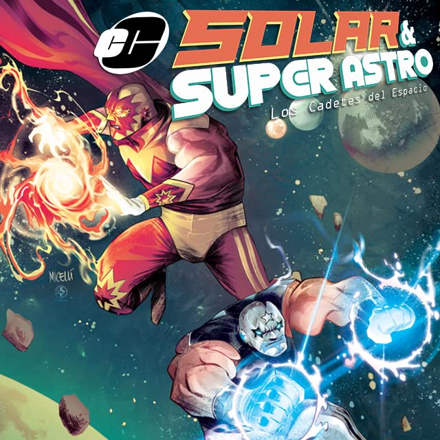
Masked Republic Luchaverse Solar & Super Astro #1 At the triumph of a centuries-old galactic war, all that was left of the warriors were Solar and Super Astro. They headed off into space to never to be heard from again…or so they thought. After a millennia of intergalactic travels, their ship crashed on Earth. Their powers had vanished, and they settled into their new mortal lives. Now, years later, a message from the deepest corner of the universe has interrupted their ordinary lives. A recent accident has released an immense destructive power back into the world, a power that they thought was lost forever. What epic adventure awaits them? Who’s attempting to contact them, and how can they save not just our planet, but the universe itself?
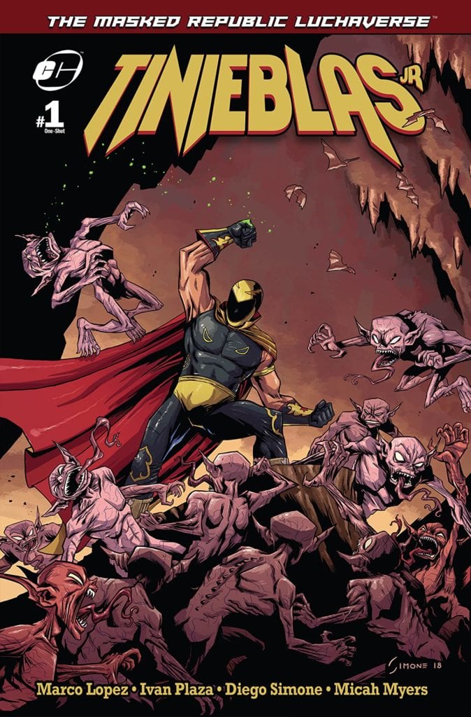
Masked Republic Luchaverse: Tinieblas Jr #1 Tinieblas Jr is the proud inheritor of a legacy that dates to the early 1970s when his father Tinieblas started his Lucha libre career. However, unknown to anyone but a small select few, Tinieblas Jr is also the protector of both human and monster realms. A monster hunter, taking on the legions of the damned and all manner of creatures that go bump in the night! Today, out of his secret lair with his assistant Ramona, they decide to help a close friend solve an age-old mystery. A mystery so old, it will change both the human and monster worlds forever!
Masked Republic Luchaverse: Konnan and The Ambassadors #1 As the Ambassadors’ leader, Konnan has faced off against doomsday cults, alien invaders, rogue temporal thieves, and civilizations at the center of the earth. Now, the organization faces its greatest mission: getting to the bottom of a seemingly unstoppable series of worldwide catastrophes of unknown origin while Ambassadors’ bases are being destroyed one by one by a new global criminal faction calling themselves the Knights of Draconis! Will this ruthless and cunning organization on the rise put an end to the Ambassadors and all that they protect?


 With Ferreyra serving as the overall artist of King In Black Thunderbolts #1, it says a lot about his dedication. His panel layout certainly attests to this statement, including the use of a 9-panel grid. That one page, along with Kingpin’s presence, demonstrates the amount of power he has over the immediate situation. One way or another, Wilson Fisk will get what he wants out of the Thunderbolts.


")