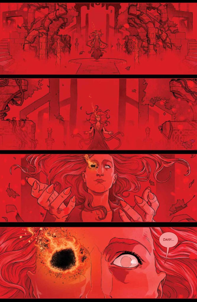
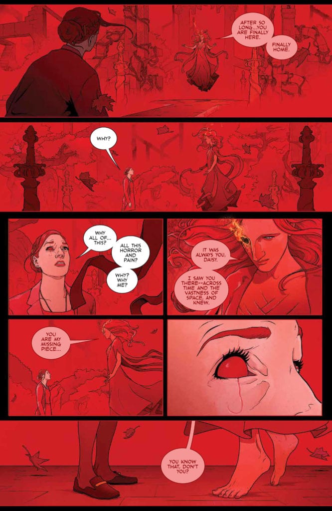
THE RED MOTHER #12, available Wednesday from BOOM! Studios, concludes a series full of horror, gore, and trepidation. Daisy’s story has been far from an easy one, yet that makes it all the more compelling.
A haunting beginning to The Red Mother #12.
It’s hard to believe that we’re already twelve issues into The Red Mother, and that this issue brings about the finale. Yet it also feels right, in a weird way. This whole time has been about readying Daisy for a final confrontation. Perhaps, somewhere along the way, the fans were readied as well.
The Red Mother #12 has a lot riding on it. There are so many questions left unanswered. Plots that need to be tied up. All while maintaining that horrifying tone that the series has perfected so early on.
That thought raises a couple of important questions. Will this be a conclusion in true horror fashion? Or will it bring about a more satisfying ending? One that feels right for all characters involved – not just the monsters that crawl out from the shadows.
That is not a world most people would want to be lost in.
The Writing
Close your eyes. Imagine all of the ways in which The Red Mother might conclude. Or don’t, because Jeremy Haun’s writing will exceed any hopes or assumptions about the series. This is a series that has chilled and thrilled from the start, so there shouldn’t be any doubt about how it’ll end.
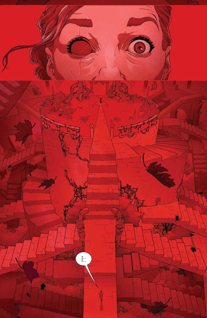
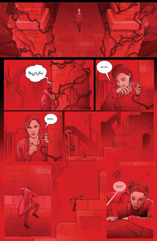
The Red Mother #12 is a haunting issue. Not just for what it puts Daisy through (though there certainly is that), but for the implications made throughout. There’s always been this sense of something larger at work, and now fans have gotten a glimpse at the true scale of things.
So, while this issue certainly does answer many of the lingering questions from this series, those answers are far from being a comfort. Then again, we wouldn’t be reading this series if we were seeking comfort now, would we?
All conclusions are bittersweet, but this one had a few unique twists worth mentioning and remembering. First, it gave a feeling like the whole ordeal was worth it. Second, while the series is undoubtedly wrapped up (with a neat little bow), it did leave room for a sequel. Gotta love it when that happens.
Just need a quick moment before dealing with this nightmare.
The Art
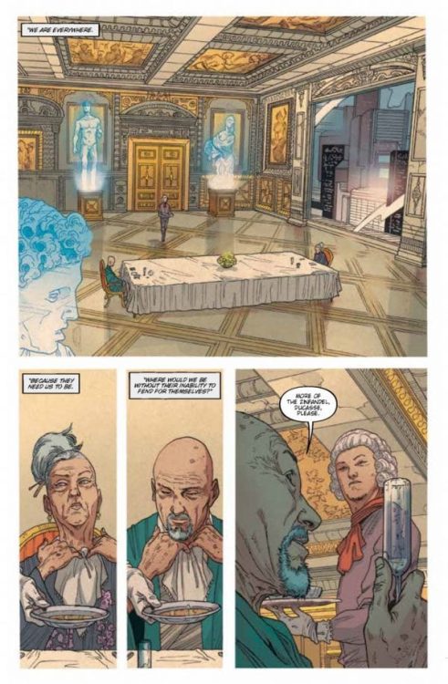
The artwork* found inside The Red Mother #12 may just contain some of the best art from the entire series. It still has all of those bold designs, but they’re more dominant than ever here. Of course they are – the Red Mother’s appearance is no longer a thing being hinted at.
Danny Luckert’s work really does bring the whole tale to a new level. Daisy’s world can be beautiful. Or it can be terrifying. It all depends on the lens that Luckert chose to portray, as this issue made painfully clear. The stark contrast between the beginning of this issue, and the conclusion is hard to avoid, and it complements the points being made perfectly.
The colors were vital for this entire series. Really, that’s true for any series (or character) where a dominant color is such an important element. But it goes beyond that as well. While the lettering, provided by Ed Dukeshire allowed for a sense of sophisticated subtlety, both in design and storytelling.
*The Red Mother #12, as with the rest of this series, delves into graphic detail revolving around certain body parts. It’s a repeating theme, so readers likely already have an idea of what is to come in this issue. Still, it seemed worthwhile to mention here, as it is more aggressively illustrated here.
And there she is. The Red Mother.
Conclusion
The Red Mother #12 was a highly disturbing read for a lot of reasons, but it also brought with it some light. Together, these twining emotions allowed for a series finale that will stick in my mind for quite some time.
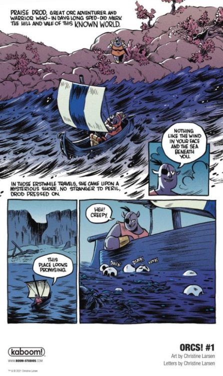
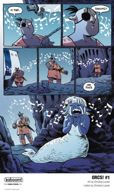
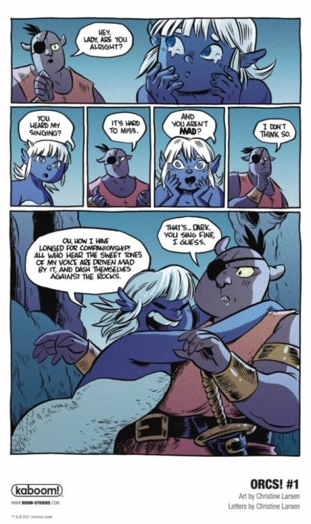
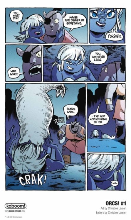
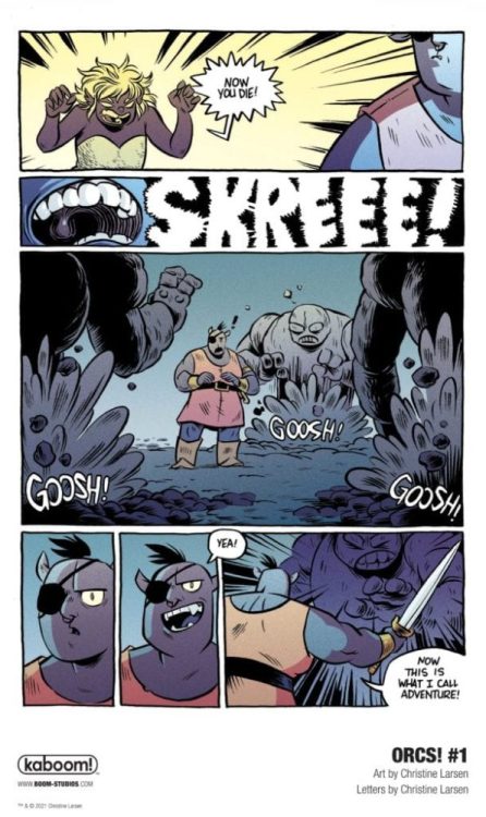
ORCs! #1 hits your local comic book shop on February 10, but thanks to BOOM! Studios, Monkeys Fighting Robots has an exclusive five-page preview for our readers.
About ORCS #1: The Adventure Starts Here! Join Bog and his crew, who were banished from their Orc village by King Hrograhgah (it was a simple misunderstanding, involving an acorn-related prank!) and must now venture out into the world to seek their fortune and hopefully, one day, find their way back home again. Bog, Zep, Pez, Utzu and Gurh’s many adventures will find them entering the dreaded Eerieasallhel Forest, facing off against Trolls, Gnomes, squirrels and more, and even following in the footsteps of the legendary Orc hero, Dod One-Eye!
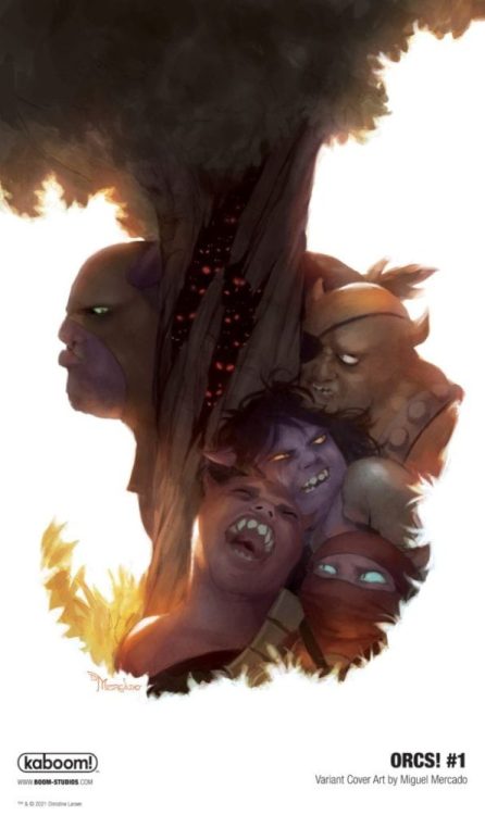
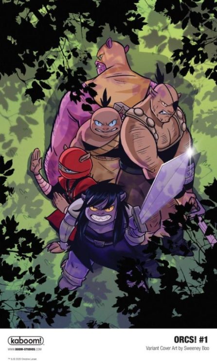
The six-issue series is by cartoonist Christine Larsen (Adventure Time, By Night) featuring main cover art by Larsen, as well as variant cover art by Sweeney Boo and Miguel Mercado. You can get a digital copy of ORCS! #1 from ComiXology, iBooks, Google Play, and Madefire.
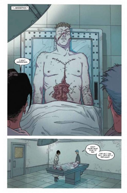
Writer Mike Johnson and artist Andres Guinaldo return with to the grimy streets of Neo-L.A. with “Blade Runner 2029” #2. Along with colorist Marco Lesko and lettering by Jim Campbell, this 2nd chapter of this Blade Runner sequel-series does exactly as a proper sci-fi installment should, offering fantastic noir storytelling while expanding on the fiction of the original story in unexpected ways.
“Blade Runner Ash hunts the streets of Los Angeles for renegade Replicants. She finds her loyalties and humanity challenged by two Replicants… one offering her salvation, the other deadly damnation.”
Writing & Plot
Mike Johnson’s focus in “Blade Runner 2029” #2 is a combination of building the case for replicant identity in this ruined future, as well as keep this story that perfect brand of cyberpunk noir this universe is known for. This comic has the plot progression of a properly planned detective thriller, with each issue so far having Ash follow a continually more engaging trail of breadcrumbs. This issue leads to a replicant underworld I hardly believe most Blade Runner fans could possibly see coming, but that also makes perfect sense and adds even more character to this oppressed group of people. The undertones of class commentary and capitalist critique are still heavy on every page, ensuring that Johnson is well aware of what this series, and cyberpunk as a whole, truly represent. The use of the comics medium to craft a complex mystery is on full display here, as Johnson uses a mix of noir-style overhead narration mixed with silent panels to portray the big moments both subtle and action-heavy. The dialogue is reminiscent of that in both Blade Runner films, a mixture of that noir-jazz, naturalistic phrasing, and in-universe references. This is a finely tuned and well-paced script that makes jumping back into this world both effortless and irresistible.
Art Direction
The pencils and direction of artist Andres Guinaldo peg him as the perfect creator to craft the visual story of “Blade Runner 2029” #2. His eye for detail in every aspect of drawing, from character animations, to clothing, and scenery straight from Ridley Scott’s original film, makes the atmosphere of the book effortless to be pulled in by. His style offers a sort of stylized grittiness to the book, with a design aesthetic that directly pulls from the films but also has its own artistic look. Guinaldo’s thin lines and detailed facial expressions feel similar to a combination of Moebius and Frank Quietly. He also has a fantastic eye for pacing and panel direction, as every scene is set with big panels that track motion and action, as well as more intimate shots that capture the small details in Ash’s investigation. The colors from Marco Lesko swing all over the place depending on environment, and they set the tone of each page perfectly. You can feel the humidity and pollution in the fog and neon filled streets of Neo-L.A. all because of Lesko’s tonally rich colors. At the same time, scenes that take place in speakeasys and the flashy homes of aristocrats sing with bright fluorescent lighting and vivid dress. The lettering from Jim Campbell is clean and modern, with a sort of standard sharpie-esque font that is easy to read while also conveying tone in narration and dialogue. The work of the visual team on this comic shows that the legacy of Blade Runner is in great hands.
“Blade Runner 2029” #2 is a foggy and tense second chapter to this next story in the iconic cyberpunk saga. The script from Mike Johnson is a demonstration of fantastic sci-fi neo-noir genre handling, with each page being a piece of an increasingly fascinating puzzle. The visuals from Andres Guinaldo and Marco Lesko bleeds with the damp and polluted cityscape of Neo-L.A., to the point where I could almost taste the cheap bourbon and dirty night air. Be sure to grab this latest issue from Titan Comics when it hits shelves on 1-13!
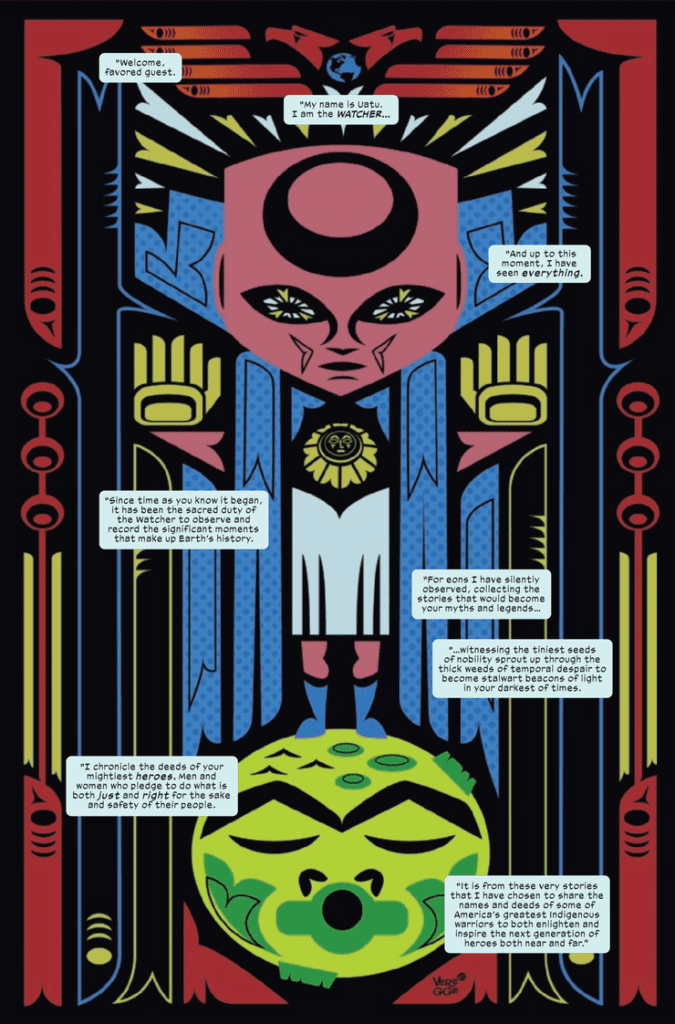
Marvel Voices Indigenous Voices #1 continues Marvel’s Voices project where diverse creatives put together an anthology about Marvel characters. Heading this project is veteran artist Jeffrey Veregge who writes and illustrates the “Watcher” introduction to Marvel’s indigenous characters.
Following this is “Echo: Hitting Back” with Rebecca Roanhorse as writer, Weshoyot Alvitre as artist, and Lee Loughridge as colorist. Then comes “Mirage: Multifaceted” by writer Darcie Little Badger, artist Kyle Charles, and colorist Felipe Sobreiro. Finally, my favorite of the bunch, “Silver Fox: Blue Moon” features writer Stephen Graham Jones, penciler David Cutler, inker Roberto Poggi, and colorist Cris Peter.
As a bonus, there is an afterword and a look at SkyView Way owners Taboo and B. Earl’s project featuring Sorcerer Supreme/Ghost Rider Kushala. The anthology is now available after November 18.
Marvel Voices Indigenous Voices #1 On Representation
Marvel Voices Indigenous Voices #1 features Veregge using his art and the Watcher to showcase Marvel’s numerous Native American characters. It makes the Watcher’s omnipresence feel like he touches every part of the Marvel Universe. After the intro, it’s a little disappointing that only three of these characters get segments, especially since half of the characters on the cover don’t appear at all. The ones that do appear feature each writer bringing out some of their authentic experiences through these characters.
Roanhorse talks about multiculturalism through Maya Lopez, and how that makes you open to experiences. Maya has faced a lot of loss. Loss that can’t just be fixed by a few familiar faces. So when Maya meets with people who have rituals for confronting tough pasts, it reminds her of the friends she once had in a unique way.
Little Badger uses Dani Moonstar to talk about community. She helps those like her hopefully find extended homes. Despite how the X-Men have been keeping their distance from the rest of humanity, Dani’s never been about assimilation. She is still Cheyenne and is willing to help out a fellow American Indian mutant without coercing him into Krakoa.
Jones, through Silver Fox, shows the struggle of these various communities to be more than victims of history. Silver Fox and her husband are fighting for their future, even as it becomes apparent to the husband that it’s a losing battle. Being able to see into the future can do that to a person.
That’s why Taboo and B. Earl take the time to tell the story on how they met and came to work with Veregge, at the end of Marvel Voices Indigenous Voices #1. Now they create and expand Native American characters like in Werewolf By Night and Doctor Strange’s Kushala. There are things to look forward to after Marvel Voices Indigenous Voices #1.
Art
These artists all get a chance to show how they present themselves in Marvel Voices Indigenous Voices #1. Veregge naturally opens big with his distinct S’Kallum art style for covers. The abstract nature of it presents a surreal and unique introduction to the matters at hand. While it makes the subjects seem mythical, the art following shows how human these characters are.
Weshoyot Alvitre showcases Echo: her acrobatic movements and how small she feels among the stars. And Lee Loughridge makes space look like a gigantic ocean.
Kyle Charges shows the scales of what Mirage faces through angles and closeups. These make explanations and questions feel important when it comes to Dani’s character. Coloring from Felipe Sobreiro makes these points more authentic as, during a talk, Dani looks likes she’s part of the background until she speaks up.
David Cutler puts a big emphasis on displaying emotions in the Silver Fox comics, through facial expressions. The inking by Poggi enhances the struggles. Dark patches forewarn of death. The cool to cold coloring of Cris Peter is neither friend nor foe to Silver Fox.
United Under Lettering
Ariana Maher of VC is both professional and creative in the lettering of Marvel Voices Indigenous Voices #1. The dialogue takes up just the right amount of space. Other elements like captions and text messages have a more creative touch to them. The Silver Fox story, in particular, has stylized captions that look like old timey paper, which adds to the atmosphere. It tells of Silver Fox’s age while the crinkling appearance suggests some brooding. It gives more atmosphere to the story.
Consider Marvel Voices Indigenous Voices #1
Within Marvel Voices Indigenous Voices #1 is a hopeful beginning for creatives of less represented cultures to appear in the mainstream. With representation being something to strive for, it’s going to take a number of people from different backgrounds to make it authentic. Whether it’s the story potential of future releases, evocative art, and creative supplementary elements, there’s bound to be something for readers to enjoy. Enough for readers to look forward to future releases of more comics by these creators and other voices in the industry.
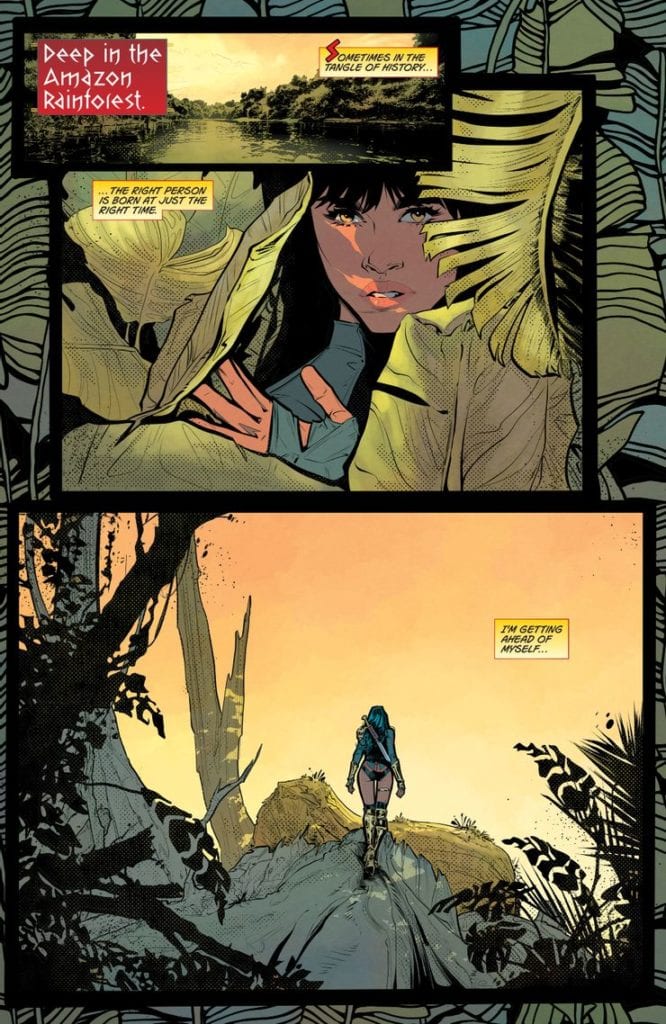
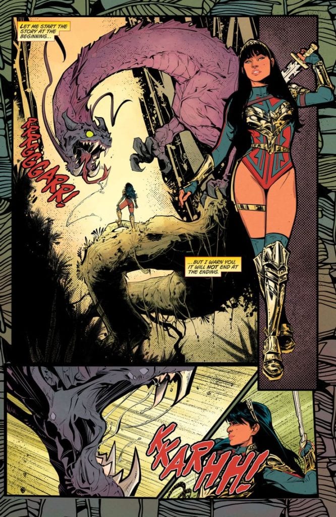
FUTURE STATE: WONDER WOMAN #1, out now from DC Comics, is the first issue of a two-issue miniseries by writer/artist Jöelle Jones, colorist Jordie Bellaire, and letterer Clayton Cowles. With an ingenious, fun plot and gorgeous, captivating artwork, this issueserves in these difficult times as the ultimate escapist adventure.
Writing
Within the first 8 pages, Jones solves an issue readers have pointed out for a long time regarding DC’s heroes- they’re too perfect and powerful to be able to relate to them. Jones manages to solve that by introducing Yara Flor as a heroic character, a woman on a mission; Yara serves as the mediator between the gods and humanity. She is powerful, cheeky, and unapologetic. But, Jones doesn’t let us forget throughout the entire issue- Yara is also flawed and makes mistakes. Those errors move the plot forward brilliantly and make it too easy for the reader to fall in love with the futuristic Wonder Woman instantly.
Art
To help the reader get further engaged, Jones hones in on each background character’s looks. The feeling I’ve personally got when catching glimpses of those background characters that end up having nothing to do with the plot reminds me of the feeling people got when experiencing Star Wars: A New Hope for the first time. I couldn’t help but feel this fiery curiosity inside to know more about these characters. I immediately started wondering about their backstory or about what adventures are they going to embark on- A feeling I haven’t felt in a long while.
Also, the facial expressions look skillfully expressive; the backgrounds look well-detailed, beautiful, and engulfing. Everything about the artwork enchants the reader. Personally, I’m looking forward to getting further lost in the world Jones has created.
Coloring
Bellaire’s coloring in this issue basically invites the reader to enjoy this world’s uniqueness even more. Bellaire colors each page with vibrant, bold colors that make the pages pop wonderfully, elevating Jones’ magnificent artwork and complimenting it. Most notably, the way Bellaire colors the skin tones always remains realistic to a certain extent but still makes each character look full of life. Great work from Bellaire.
Lettering
Cowles’ lettering definitely delivers and manages to elevate the fun even more with colorful sound effects and balloons. Almost every character in Future State: Wonder Woman #1 has its own unique, stylized balloon. Cowles also places the balloons in a way that never distracts the eye. I especially liked Cowles’ choice to never design the captions as a perfect square, making it a lot more appealing to the eye. It’s another “lettering rule” Cowles breaks to elevate the comic’s freshness.
Conclusion
Admittedly, this first issue makes me wish it didn’t have to end so soon. Future State: Wonder Woman #1 is a breath of fresh air; A perfect example of why Jöelle Jones is a rising star in the comics industry. Strongly recommended to anyone who wants to escape today’s harsh realities and embark on a wild adventure.
Comic superheroes are not Sherlock Holmes, who holds a Guinness World Record for being portrayed 254 times since his creation. In terms of this number, they are not even close. Yet, ask any kid whether they know Batman and Superman along with Sherlock? The answer will very likely be YES, with the high probability that younger kids will recognize superheroes even faster.
Kudos to DC Comis: they have surely succeeded in capturing the hearts of their fans and beyond. The dominance & rivalry of Marvel and DC in the comic industry became so evident that even people whose interests are far from the comic world know the central characters and the universe they come from. Both Marvel and DC penetrated not only cinema and video games but also the more distant niches. For example, you’ll easily find Marvel-themed LEGO packs or slots dedicated to DC superheroes — brands exploit this as a sure-bet theme for their new products.
However, the knowledge of an average person about comics ends here. Sometimes, we’re sorry to realize how many universes never intersect with the minds of the majority. DC and Marvel may be the largest brands, but not the only ones worth exploring.
Today we’re going to bring some justice into this Injustice and present you with a few indie comic publishers, some of which you could have never heard about.
Aftershock Comics
Aftershock is the freshman on the comic market — the company was founded in 2015. Despite being that young, it already gained some popularity among comic fans, to some extent thanks to the prior experience of founders: Joe Pruett, author of iconic experimental book Negative Burn, and Mike Marts, who was an executive editor at both Marvel and DC of X-Men and Batman franchise.
The publisher is known for superb visuals and future-oriented, dystopian narratives. The most popular examples of its titles are apocalyptic Stronghold, a tale of dark powers Babyteeth, and insanely uncomfortable Animosity.
Antarctic Press
Antarctic Press is quite a well-known yet still an alternative comic book publisher. Specializing in “amerimanga” with its distinctive art and storytelling practices, it offers a different perspective on the American comic market and also contributed a lot to developing furry comics. Overall, they published over 850 titles since the company’s birth in 1984.
The titles to pay attention to are iconic Ninja High School, the oldest publisher’s series, which is still running, Gold Digger, and Box Office Poison. Antarctic Press also issues a lot of political parody series — right now, for example, the main page of their website is all about Trump’s comic collection.
Last Gasp
Last Gasp is positioning itself as a distributor of underground art and writing for 50 years. The themes and attitudes of the company always have been ahead of time. They are known for exploring ecological issues in their Slow Death since 1970: the times when the plastic boom everyone is talking about now was only unfolding. Also, they created an influential all-female anthology titled Wimmen’s Comix, which focused on the feminist concerns of the 70s-80s.
Nowadays, Last Gasp is focusing on graphic novels, art, and photography books. However, the vintage underground comics series are definitely worth reading today — they are still available for purchase on their website.
Oni Press
It’s hard to say that Oni Press is a little-known publisher. There are plenty of Oni Press comics based on Nickelodeon. You, as a comic fan, likely know that Rick & Morty is one of the publisher’s flagships, with Invader Zim and Kaijumax following the leader.
The publisher avoids “superhero” themes, focusing more on romance, drama, thrillers, and cartoon-related topics. They value realism in their stories, yet with some exceptions: for example, a relatively new series, The Vain, is about the company of robbers who are also vampires.
Iron Circus Comics
Iron Circus Comics was founded in 2007 and was largely specialized in issuing an erotic comic anthology named Smut Peddler, which was created by women for women. The publisher stepped aside, creating only erotic comics later on, and now the company’s titles include political-themed books like Banned Book Club and re-imagination of traditional European folktales like The Nixie of the Mill-Pond and Other European Stories. This is the one from our list that is open for submissions now: who knows, maybe you will be the next rising star in the comics universe.
Aside from these five, there are dozens of decent publishers to check out, including the younger ones. The brightest examples of those started within the last 5 years are TKO Studios, Behemoth Comics, AWA Studios, and Darkside Comics.
“The Independent Filmmaker’s Guide to the New Hollywood: Success in the Era of Netflix and Streaming Video” is author and filmmaker Gabriel Campisi’s third book about the business of filmmaking, this time focusing on the streaming storm that’s evolving the way we consume entertainment.
PopAxiom spoke with Gabriel about falling in love with movies, how things have changed, and his latest book, “The Independent Filmmaker’s Guide to the New Hollywood: Success in the Era of Netflix and Streaming Video.”
First Films
“My father was a private investigator,” Gabriel says when I ask about where filmmaking came into his life. “He had a Super-8mm camera. When I was 8 years old, I watched Star Wars, and I wanted to make movies from that day forward. But I had no idea what I was doing at that age.”
Gabriel not only received the gift of a Super-8mm camera from his father, but he also learned a few tricks. “My father taught me how to do still-frame animation,” he says. And soon he started putting all these new skills to the test. “By the time I was 13, I was shooting a lot more elaborate short films. By the time I was 15, I did one and sent it out to a huge film festival, and I won first place.”
The success of The Lost Creature was only the beginning for Gabriel. “I just kept going after that. I love it. Filmmaking is in my blood. Right after high school, I started working ground-level as a production assistant, and eventually got into camera work, production supervising, and editing.”
About The Independent Filmmaker’s Guide
“The Independent Filmmaker’s Guide to the New Hollywood: Success in the Era of Netflix and Streaming Video” is Gabriel’s latest book on the film industry. “By the time I was 25, I was doing a lot of big stuff. I was working in Hollywood, and on my way up.”
But then life happened. “At 25, I took a big detour,” he reveals. “I was forced to step away from the business due to personal family issues. I still stayed in the game by advising other filmmakers and helping with their movies.”
Consulting work is what paved the way for writing about making movies in his first book, “The Independent Filmmaker’s Guide to Writing a Business Plan for Investors.”
“The first book I wrote because I helped a friend get financing for his film in Los Angeles. He wanted to make a movie and knew all about production, but not about the business and the money. So, I started coaching him.”
Later, Gabriel says, word got around, and he “helped a few others do the same thing.” Friends kept telling him to write a book to help independent filmmakers figure out financing, but Gabriel “wasn’t convinced.”
However, after a year of prodding from and arguing with filmmaker friends, Gabriel “finally put together a business plan with a cover letter and sent it out to five book publishers. All five publishers responded within a month or two and said yes, they were interested. I was blown away. I didn’t think that would happen.”
Gabriel’s second book, “The Independent Filmmaker’s Guide to Writing a Business Plan for Investors — Second Edition,” was the 2012 follow-up. Gabriel wrote it, he says, because “the business had started to change.”
Now, “The Independent Filmmaker’s Guide to the New Hollywood: Success in the Era of Netflix and Streaming Video” comes on the heels of more seismic changes in the industry. “I’ve seen how much has shifted in just the last five years. It’s completely upended the business.”
Gabriel says what has happened is unprecedented. “The market changed, the strategies changed, the technology changed, and the business changed,” he says about Hollywood over the past decade. “Before you could sell units, you could count DVD sales or movie tickets. Now, we are dealing with online metrics and analytics, and it’s a whole different thing. So, I told my publisher it might be time for a new book.”
“The Independent Filmmaker’s Guide to the New Hollywood: Success in the Era of Netflix and Streaming Video” is not about how to make a movie. “In the introduction, I say, today the technology is so cheap that just about anyone can go out and make a movie. The book’s not about that. It’s about making a movie for commercial success in today’s industry.”
Streaming Versus Cinema
“I interviewed a bunch of my friends from Hollywood — filmmakers, producers, and executives,” Gabriel says about the book. “I spoke to studio level, the middle of the road, and independent filmmakers alike. In the pre-COVID world, they were already trying to figure out how to get people out of their homes and into theaters.”
The pandemic has hurt the exhibition business even more. “However, I don’t think movie theaters are going to go away,” Gabriel says.
We discuss the possibility of “vertical integration.” Back in the 40s, judges considered it counter-productive to allow studios to also own theaters. “They considered it unfair to third-party players,” Gabriel says. “Now, with streaming, the competition shifted, and they took it down.”
The streaming showdown is in full effect. In 2020, NBC/Universal and Warner Brothers, two major studios, launched their streaming services to compete with Netflix, Amazon Prime, AppleTV, and Disney+. Gabriel says, “A lot of people don’t know this, but Netflix and all these companies are losing money hand over fist. The competition is so fierce, and you have to get new customers and retain old customers. The only way to do that is with more products. Content, content, content. So, they’re spending billions every year to make new content so that they can stay on top.”
“The other platforms, Disney, Amazon, etc.,” he continues, “are spending billions to fight Netflix and get a piece of the streaming pie. They’re betting on the future by spending billions today. Who knows who will be standing ten years from now?”
Can streaming services continue to justify spending hundreds of millions of dollars on a project? “There’s going to come a time when they can’t justify the expenses any longer, but the reason they do it is to offer the audience something they can’t see elsewhere.”
Gabriel says no one knows for certain where this is all going to lead, and then jokes, “There’s a lot of creative accounting, too, but that’s a whole other book!”
New Game
The age of streaming presents new opportunities for both creators and viewers. But it creates new problems, too. “The biggest thing is that it’s a whole new game. I have friends that are still stuck on the old system. They’ll shoot an indie movie for a few hundred-thousand dollars, and then they can’t get the sales they need to cover the budget. They take it all around the world, and nothing happens to their expectations. It’s a buyer’s market. There’s so much product.”
“The pie is getting bigger,” he says about the modern age of seemingly endless amounts of content. “But the slices are getting smaller. That’s the number one thing I tell everyone. As long as you keep that in mind, you can proceed accordingly.”
As Gabriel’s book discusses, the proper things include taking advantage of new paradigms. “You can work with an aggregator or distributor, know where the movie is going to end up. I tell everyone now, you need to talk with your distributor first. Get an idea, realistically, about what kind of money you can make. Ten years ago, you could shoot a movie for half-a-million dollars and sell it all over the world. You’d easily quadruple the money. You can’t do that anymore. You have to try and do a deal ahead of time.”
Gabriel shares a story of how things happen today in the business. “People will now go to a channel with several projects to pitch. And the channel will say, ‘No, on this one, we’re doing something like it; this one is too dark, but we like this one.’ The channel will say, ‘If you shoot this movie and get this actor, we’ll give you a million dollars. So, the filmmakers go off and shoot the movie for half-a-million, let’s say, because they know they’re not getting more than a million. They deliver the movie, receive the money, and profit that way.”
Gabriel’s book goes into great detail about the four elements you have to keep in mind these days, which he calls the four pillars of Hollywood. “First, it’s proper communication, second is entertainment, third is technology, and fourth is the business. You have to well-versed in all of these things. If just one of these is off, you run the risk of not doing well. A lot of filmmakers tend to only worry about one or two of the four.”
Gabriel talks about a guy he knew who went out and got the best equipment available, but made a terrible movie with it. “He had the technology,” Gabriel says. “But technology alone is nothing more than a tool. A paintbrush is only as good as the artist.”
Wrapping Up
Decades after learning a little animation and how to use a Super-8mm camera, there is no lack of enthusiasm for making movies when talking to Gabriel. “Movies are our imagination come to life, and it’s part of who we are. What’s the difference between a hundred years ago and today? Nothing. We’re still expressing our imaginations.”
“The Independent Filmmaker’s Guide to the New Hollywood: Success in the Era of Netflix and Streaming Video” is out and available at book retailers both online and off.
So, what’s next for Gabriel? “Well, I had two movies that came to a grinding halt because of the pandemic. The big thing now is, and I asked for permission to reveal this, I’m working with Scott Mitchell Rosenberg, one of the coolest filmmakers you’ll ever meet. He’s the guy behind all the Men in Black movies and Cowboys and Aliens at Platinum Studios. I’m on the production and creative team that also includes filmmaker John Lechago, another amazing person. I can’t say more at this time, but hopefully soon audiences will get to see what we’ve been working so diligently at.”
Is The Independent Filmmaker’s Guide to the New Hollywood: Success in the Era of Netflix and Streaming Video on your reading list?
Thanks to Gabriel Campisi and October Coast
for making this interview possible.
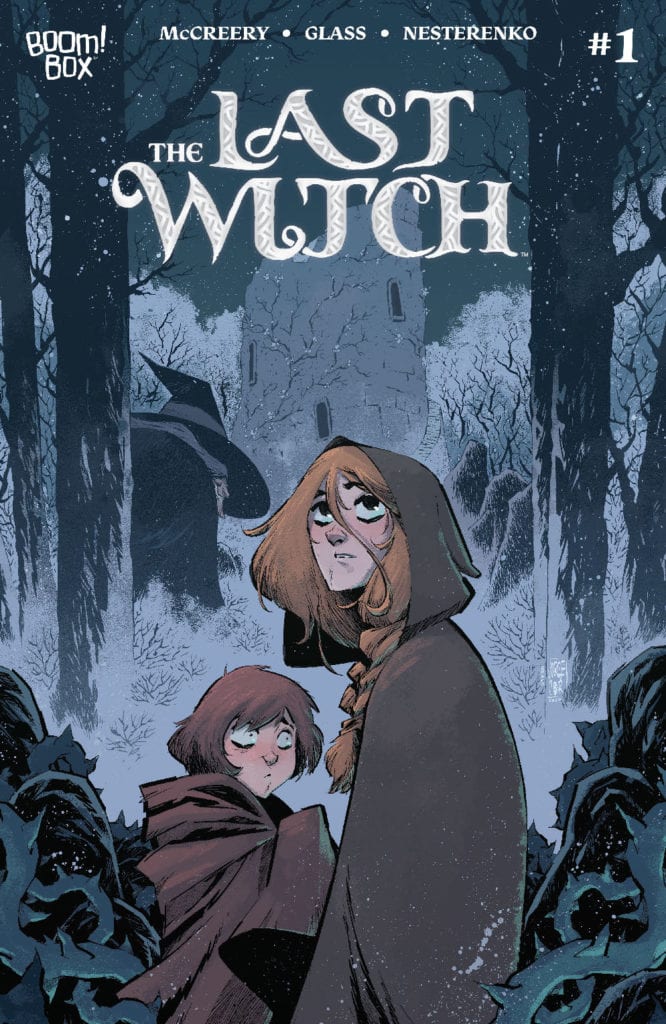
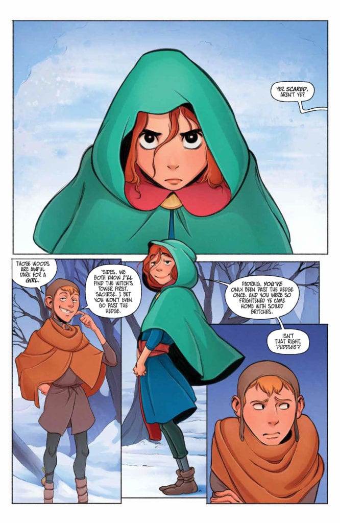
LAST WITCH #1, available now from Boom! Box is the first issue in a brand new series. One that feels like a fairy tale of old, as Saoirse starts an adventure that she will very likely find a very different ending for.
Saoirse and her brother are featured here on the variant cover of Last Witch #1
Last Witch #1 is a bright and bold introduction to a brand new series. One that feels eerily familiar in many ways. If you’ve ever read a fractured fairy tale, then the odds are good that you know exactly what feeling the Last Witch sets out to elicit.
Conor McCreery (Writer), V.V. Glass (artist), Natalia Nesterenko (colors), and Jim Campbell (letters) teamed up to bring this imaginative world to life, and it truly does strike upon the desired notes. Right from the first page, there’s this sense of magic about to descend.
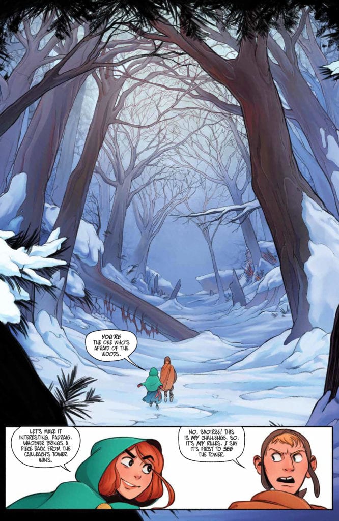
The series begins with young Saorise, a determined girl who wants to go off on an adventure. Boy, is she about to get that wish. She’s always been told to never enter the woods during this time of the year – for that is when the witch seeks her prey. As you might have guessed by now, the witch’s prey is children. Naturally, we all know that Saorise is about to disobey that order. Yet that is only the beginning of this strange new tale.
A little Saoirse takes center stage on this variant cover of Last Witch #1.
The Writing
Last Witch #1 is a tale that immediately sucks the reader into the narrative. Saorise is every bit a typical child. She’s stubborn and driven and feels chafed by all the rules that her elders set upon her. Feel familiar?
It’s the perfect setting for the rest of the tale to leap from. McCreery weaves in classic narrative elements, many of which are common to fairy tales and folklore, while also portraying a new journey in the process.
In many ways, the first issue reads with a strong sense of inevitability. We all know that Saorise is going to disobey the rules. We all know that she’s going to put herself (and potentially others) in danger. What we don’t know is how long it will take before the tide turns. Or how badly things will go once they do.
The fact that Last Witch is already proving to be compelling despite these known factors is impressive. It’s making creative use of our expectations and assumptions (thanks to years of reading tales with similar tones), and I, for one, can’t wait to see where it’ll take us next.
Another impressive feat for this first issue would have to be the characters themselves. We’ve only been reading about them for a little less than forty pages, yet they already feel real. They feel human, and thus their endangerment or loss also feels real.
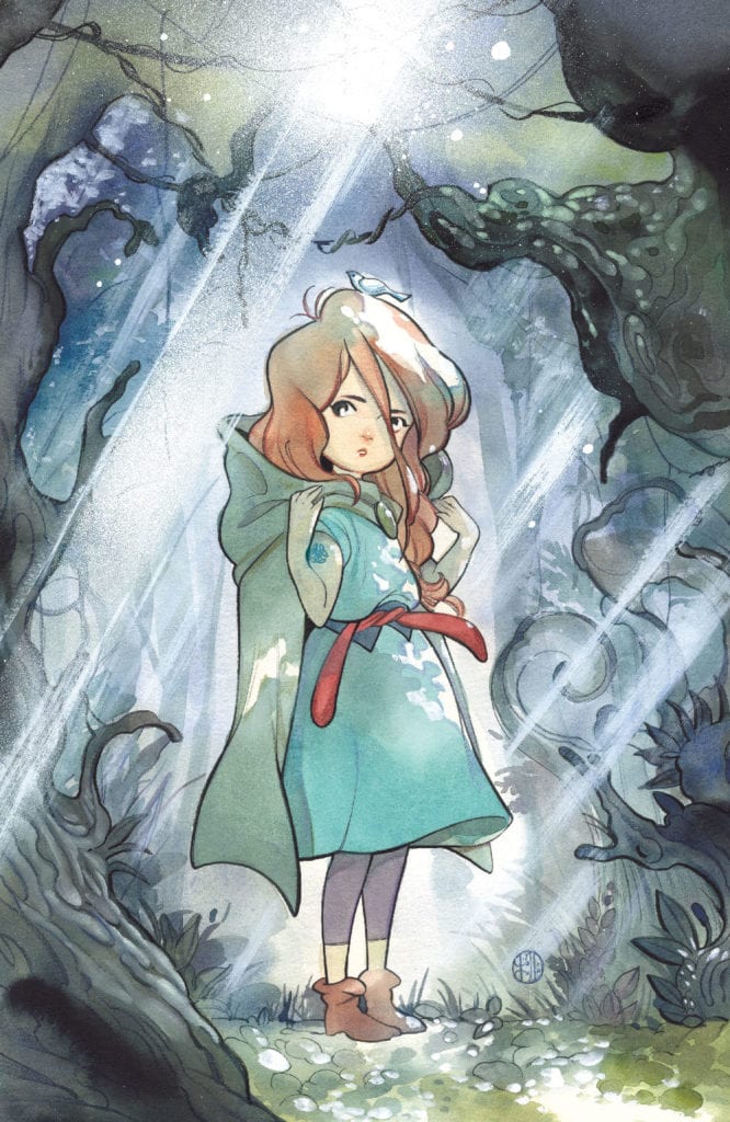
A determined face for the start of this series.
The Art
The artwork is one of the many elements that make Last Witch #1 shine so. The colors are bright as the snow portrayed upon the pages. Which, combined with the bolder designs and shapes, makes for a captivating scene.
Saorise’s design steals the show on many occasions. Her vibrant hair and cloak are certainly meant to do exactly that. Yet, it isn’t the only feature worth talking about. The artwork carried with narrative elements as well, some of which would never have worked in any other format.
Take that sense of foreshadowing, which appeared simply by one repeating word. Followed by the horror that comes with its sudden absence. It was wonderfully done and helped to enhance that entire series of events.
Look at that stunning forest! No wonder she wants to explore it.
Conclusion
Last Witch #1 introduces a series worth checking out – especially for any fan that loves a good retelling. With a few twists, that is. The combination of familiar and new will leave readers enjoying this series; that much is already quite clear.
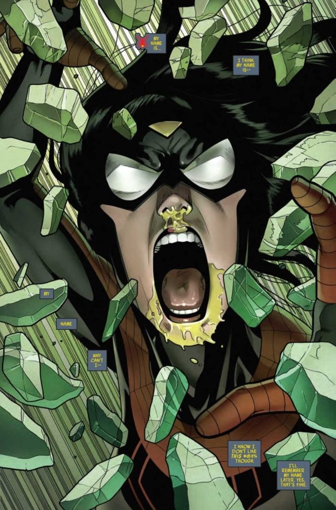
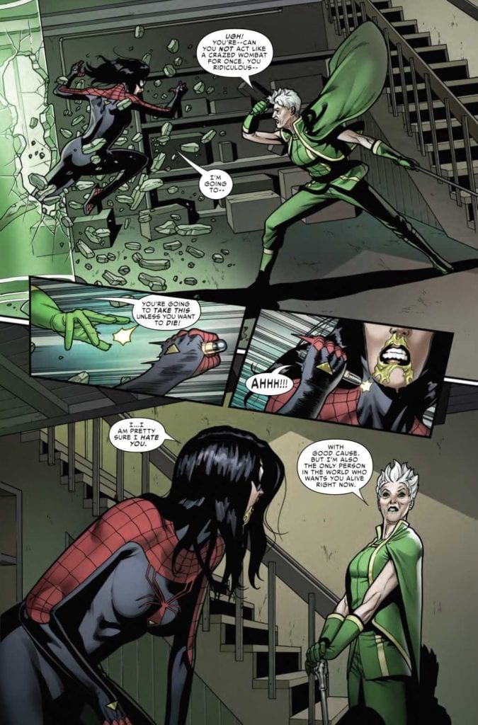
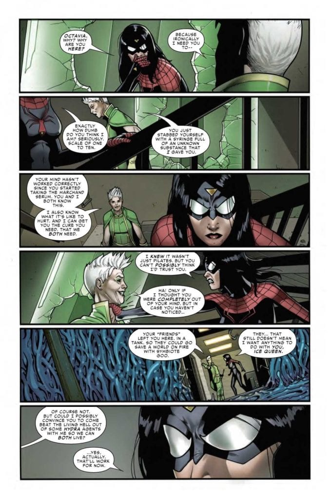
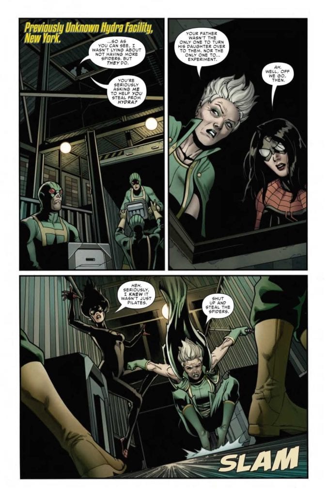
SPIDER-WOMAN #8, available now from Marvel Comics, is about to portray a version of Jessica Drew that fans don’t typically get to see. All while a major war is happening in the background, as The King in Black rages on.
Jess is not looking great in Spider-Woman #8.
The Knull Invasion may be in full force, but that is not the first concern on Jess’ mind. Heck, it’s hardly a blip on her radar – despite all the reasons why she should be very concerned. Instead, she’s entirely focused on finding the cure not only for herself but for her niece, and eventually, for her son as well.
All good reasons to be concerned, to be sure. Yet her temporary cure comes with just as many problems as it solves. As evidenced by her behavior in Spider-Woman #7. Not to mention her reasoning for joining up with a new ally.
This is an ally that any Spider-Verse reader will recognize on sight, and with good reason. Now, Spider-Woman #8 is about to dive into a new series of adventures, and they’re going to come with quite the cost.
Not my first choice in a partner, but desperate times?
The Writing
As you might imagine, Spider-Woman #8 brings with it many surprises. Good to know that Karla Pacheco still has a few dramatic twists hidden up her sleeve. The progression (or rather, regression) of Jess’ mental state has become so painfully clear.
A fact that becomes even less avoidable if one was to go back and binge the series all in one go. Her character has changed drastically over the course of these eight issues, and it’s starting to feel like the transition is far from over.
What is really telling is that this major event, King in Black, has become a background event for Jess. Which, if one was to stop and think about it for even a minute, doesn’t make much sense. Seriously, where is her family at the moment? Is there anyone ‘safe’ at the moment?
Those concerns merge with concerns surrounding Jess’ actions, as Spider-Woman continues her hunt for a cure. It is admittedly interesting to see the different ways in which these two women think and how they handle different problems. Yet that interest is not enough to outweigh everything else rising to the surface.
And so a plan is forming.
The Art
As with the rest of this entire series so far, Spider-Woman #8 is full of brilliant artwork. Sometimes literally, as the case may be. It seems at times as if the colors themselves were about to pop right off the pages.
Pere Perez’s artwork is exactly what Spider-Woman’s series needed. The myriad of emotions and battles her character goes through in a single issue are perfectly captured here. Sometimes in shocking detail.
Meanwhile, Frank D’Armata’s set the tone. The green hues practically feel sinister, while the darker tones help to carry it all. The bright pops of color feel almost alarming in contrast, a fact that was certainly intentional.
VC’s Travis Lanham really outdid himself here, as once again, Jess’ actions really do carry impact. Sometimes literally, as crashes and crunches happen all over the pages. There’s no denying the damage this woman is causing.
Okay, this team-up is actually pretty terrifying.
Conclusion
Spider-Woman #8 is a tense and compelling read, albeit a concerning one. The creative team behind this series has done a wonderful job taking risks while also giving Spider-Woman plenty of chances to show off her abilities.
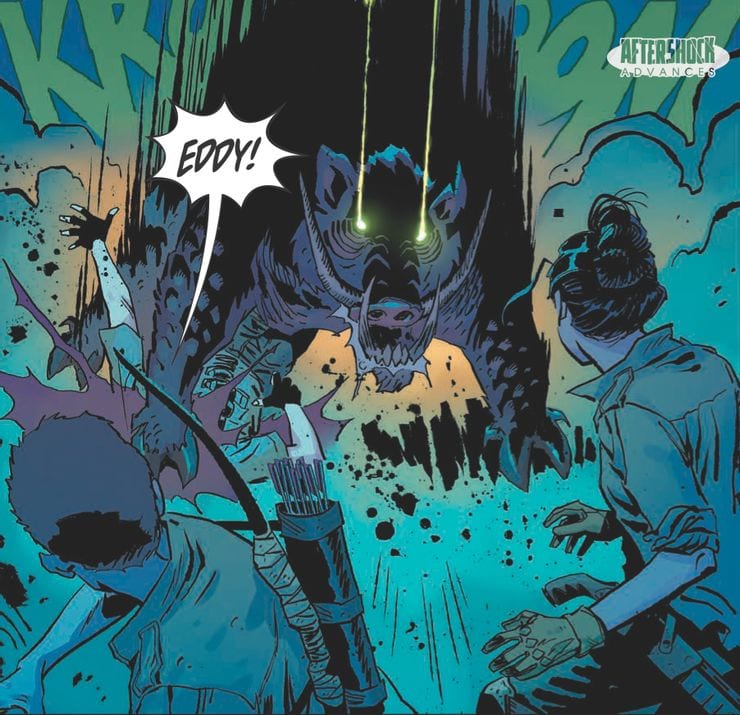
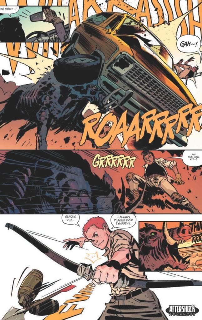
In AfterShock Comics’ latest futuristic drama, Scout’s Honor, a new world order has been built on an archaic belief system. This new series flings the reader into the distant future and asks the question on everybody’s mind, What happened to the Ranger Scouts of America? The comic is a character driven thriller from the writer of Going to the Chapel, David Pepose, and artist Luca Casalanguida.
Scout’s Honor #1 Credit: AfterShock Comics
Badge of Honor
A group of survivors fight to stay alive in a world that has turned against them. The remnants of a civilisation long since destroyed has grown up on the beliefs and teachings of one man, the true profit, Doctor Jefferson Hancock. With a problematic system of trial and reward, the new religion is based on the Ranger Scouts of America, with the worship of bravery and honor. But as the plot unfolds, age old corruption and greed are shown to have survived along with the hierarchy of power.
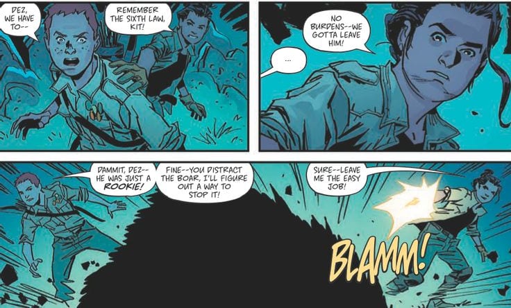
Scout’s Honor is a story told through character moments. David Pepose has crafted an elaborate world but it is presented to the reader by defining the people Pepose introduces. A dramatic opening plants the seed for the future environment before jumping forward in time to introduce Dez and Kit, the central characters. A battle with a radioactive boar is a chance to shape the environment and cement the characteristics of Dez and Kit but the moment is quickly over. The boar itself is a plot device to establish the dangers of the world and highlight the bravery of the two boys before the plot moves on.
Pepose plans each scene as a way of expanding the reader’s understanding of Kit and leaves the difficult world building to Luca Casalanguida. The art work is detailed and portrays an uninviting world where the only warmth is indicated through the orange glow around the uncomfortable religion. The contrast between the words the Scout Master says and the realities depicted across the pages is a scathing indictment of religion. The written words of a childhood organisation have been twisted to form a misogynist gang of reward seekers. It’s like the Cat Religion from Red Dwarf but without the jokes, or the assimilation of Church and Military in certain episodes of Doctor Who. Pepose has deconstructed two modern institutions and turned them into a hellish nightmare world.
Scout’s Honor #1 Credit: AfterShock Comics
Future Images
The atmosphere created in the opening of Scout’s Honor is reminiscent of The Last American published by Marvel in the 1990’s. John Wagner and Alan Grants dystopian future has a single character walk through the detritus of American culture in a burnt out, forgotten world. Casalanguida appears to be channelling Mike McMahon’s style in the opening pages of Scout’s Honor before he populates his world with a host of survivors. The sense of dissolution within the landscape is forefront in the art even as the action sequences swirl through the panels like miniature whirlwinds blowing up dust. It is clear that the actions of these survivors have no great impact on the world and this gives the entire book a solemn feel, punctuated only by the brightness of the central character.
Kit is bold and beautiful throughout. Written as a true hero, Casalanguida imbues Kit with a dynamic element that it’s impossible to ignore. The coloring throughout the book is reflective of the locations but Kit’s bright orange hair is both a reminder of the all consuming religion and a way to make Kit stand out on the page. Matt Milla makes sure that the reader can find the hero at all times. His use of lighting within the panels is cinematic at times but goes beyond this, creating a hyper-realistic setting. The emotional charge of the story is brought out through the ever changing emphasis on light and shadow. Returning to the character as the central theme of the comic, the lighting is a representation of Kit’s many emotional aspects, changing as the character’s situation changes.
Throughout the comic there are a number of overlapping voices. At some points the caption boxes relate to a church service while the panels follow Kit through the, mostly unseen settlement. Three different voices speaking together, overlaid across the panels. Carlos M Mangual gives each voice a distinctive color. He changes the intensity of the color in the caption boxes to represent the strength of the voice or voices that are speaking so that you can easily distinguish between preacher and congregation.
Scout’s Honor #1 Credit: AfterShock Comics
Conclusion
Scout’s Honor is packed with twists and turns. Pepose leads the reader through this world in the wake of Kit’s adventures, always one step behind and playing catch up. This story format never lets you take a breath so that by the end you find yourself totally engrossed in the world. It’s difficult not to be swept up in the action and, before you know it, you’re on the final page, eager to turn back to the start and retrace your steps at a slower pace. You will find yourself wanting to take in the majesty of the art work and the complexity of the storytelling.
The comic contains some big themes that it has only just begun to explore but because these fit snugly into the plot it never becomes preachy. The characters are engaging and the art work is superb. AfterShock Comics have a successful track record with thrilling and intriguing stories, check out Bad Reception and Undone by Bloodas perfect examples. And with Scout’s Honor they have another surefire hit on their hands.


")


 Marvel Voices Indigenous Voices #1 features Veregge using his art and the Watcher to showcase Marvel’s numerous Native American characters. It makes the Watcher’s omnipresence feel like he touches every part of the Marvel Universe. After the intro, it’s a little disappointing that only three of these characters get segments, especially since half of the characters on the cover don’t appear at all. The ones that do appear feature each writer bringing out some of their authentic experiences through these characters.
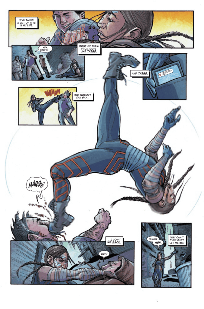 Weshoyot Alvitre showcases Echo: her acrobatic movements and how small she feels among the stars. And Lee Loughridge makes space look like a gigantic ocean.
 Kyle Charges shows the scales of what Mirage faces through angles and closeups. These make explanations and questions feel important when it comes to Dani’s character. Coloring from Felipe Sobreiro makes these points more authentic as, during a talk, Dani looks likes she’s part of the background until she speaks up.
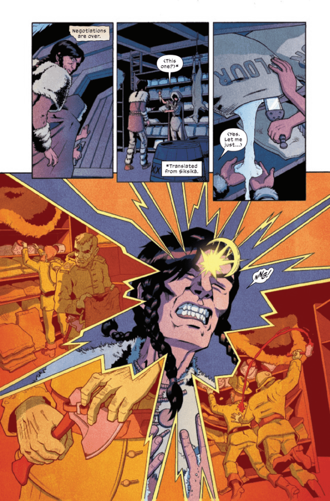 Ariana Maher of VC is both professional and creative in the lettering of Marvel Voices Indigenous Voices #1. The dialogue takes up just the right amount of space. Other elements like captions and text messages have a more creative touch to them. The Silver Fox story, in particular, has stylized captions that look like old timey paper, which adds to the atmosphere. It tells of Silver Fox’s age while the crinkling appearance suggests some brooding. It gives more atmosphere to the story.