Out now, Buffy the Vampire Slayer #21 continues the collaboration between writers Jordie Bellaire and Jeremy Lambert, and illustrator Andres Genolet. Rounding out the team are colorist Raul Angulo and letterer Ed Dukeshire. With new characters complicating the situation, the creators seem close to a crisis point for the Scooby Gang.
In previous issues, a new slayer, Faith Lehane, and her watcher, Wesley Wyndham-Price, were introduced, compounding the Scooby Gang’s problems. Now there are three slayers, two watchers, and, lurking in the background, a secret fourth slayer and a demon operating under the leadership of Anya. As the character count grows, so each character moment intensifies. Thus it is in issue #21, an Anya-centric issue.
Taking cues from the TV show and Dark Horse continuities, we’re introduced to a slightly different Anya in this issue. She’s still a vengeance demon, but Lambert and Bellaire give her a backstory as an erstwhile watcher who was fired for defending her slayer from the Council’s deliberate endangerment. For long-time fans of the character (myself included), such a decidedly feminist change feels so satisfying. Furthermore, the choice gives us a chance to root for a character other than Buffy in an otherwise unlikely scenario.
A Challenge
In the Buffyverse, the Watcher Council often seemed an enemy greater than demons and vampires. Because they were so feared, Buffy was the only one to stand up to them. Therefore, it’s refreshing to see Anya as a former Watcher, defying members of the Council to their faces.
However, this issue takes the conflict a step further with Anya and her not-so-dead slayer, Morgan, threatening not only the lives of the Watcher Council, but Buffy’s closest friend and father figure.
On an artistic level, Genolet matches the scope of Bellaire and Lambert’s drama through his use of close-up, wide-paneling, and instances of no panel delineation at all. It’s a big, intense issue. Angulo’s color palette of warm orange fire and cold blues accentuate the feeling that we’re drawing closer to the underworld. By contrast, Dukeshire’s lettering shows restraint with SFX and allows for an exposition-heavy scene to feel more like a movie than a novel.
Now, we have all the players, the subplots have dove-tailed, and the threat is clear. The only question is whether Anya will make it out of the impending climactic battle as a friend or a foe. It looks like all that’s left for the Scooby Gang is to find their way out of the Ring of Fire.
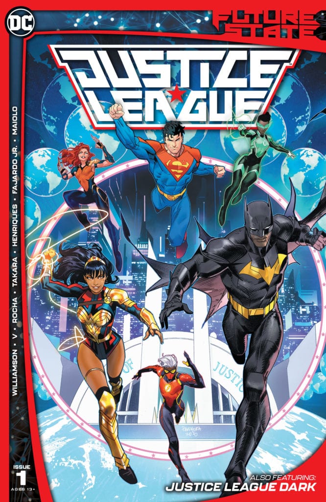
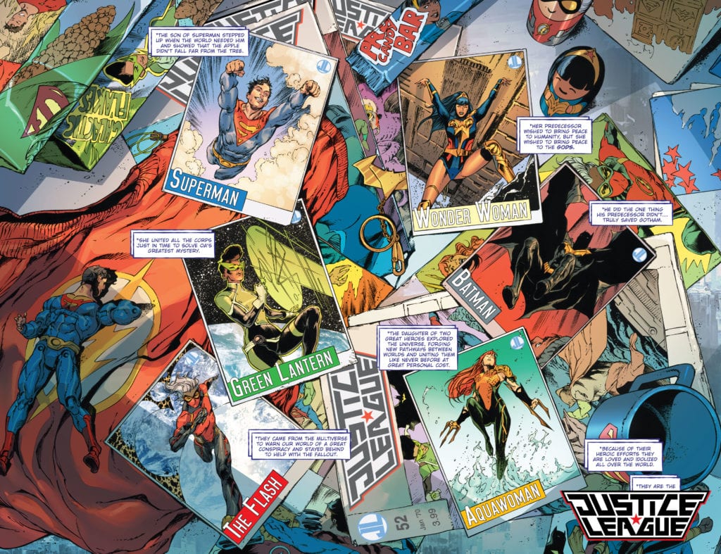
The Justice League of the Future Faces a Past Threat!
Future State is upon us, and we get to meet an all-new generation of heroes. Last week, we had several comics introducing us to the Next Batman, Superman, and more. As with the generation before, the heroes of tomorrow have gathered to form a Justice League of their own. We have new characters such as The Flash and Yara Flor, Wonder Woman, teaming up with names we’ve known for years, such as Jon Kent and Jo Mullein of the Green Lantern Corps. With all these heroes gathered, are they ready to take on the threats of this future?
**Some Spoilers Below**
Story:
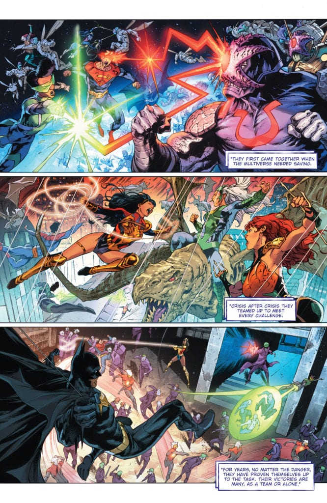
We open with a monologue explaining how this new Justice League has stepped up. The narrator revealed to be an old T.O. Morrow, goes through each member and how they’ve changed the state of the world. He says this to his new Legion of Doom and promises that together they will defeat the heroes. This doesn’t come to pass, as the next day, they are murdered. The League goes in, but with few clues, Green Lantern tells them all to wait until she figures out who did this. They all go their separate ways, but Superman doesn’t feel right.
This opening issue was honestly disappointing to me. Justice League, like all team-up comics, needs to have interactions at the forefront. Characters with such memorable personalities meeting and clashing is usually a fantastic time. We’re only told about this League’s accomplishments, but nothing really about their personalities. Granted, we know a little about Jon, Batman, and Yara, but unless you read Far Sector, the other three are entirely blank slates. Due to an incident(the one hinted at during Flash/Batman: The Button), the heroes aren’t allowed actually to get to know one another. What kind of team-up story is this when there are no stakes in relationships?
That being said, I am still intrigued to see where this story is going to go. The killers have been revealed as an old Justice League foe that hasn’t been seen in over a decade. While I will keep the identity a secret, the idea it implies is that these heroes will need to break their rule. The only way to beat an enemy such as this is to trust in one another completely. If that’s the idea the writers are going for, then I’m very excited.
Art:
Robson Rocha is the illustrator for this issue, and he does a spectacular job. This version of the Justice League looks fantastic, with the designs of the characters looking top-notch. Even the villains end up looking cool, making me feel sad that we wouldn’t get a proper action sequence with them. Rocha also succeeds in crafting the world itself, with the city looking breathtaking with its bright lights. It’s a nice contrast when compared to the run down Hall of Justice. This artist definitely needs more work at DC because he really brings his A-game.
Conclusion:
Overall I was disappointed in this issue, but I am not quite giving up hope on the series. We don’t get a ton of action or character, but the world is still interesting. The latter is definitely due to the fantastic work on the art team’s part. The story itself has left enough intrigue to pull people into the second issue, but it needs more work. This series would probably be more successful if we had more time to really get to know these characters. If we are able to get more character in the coming issues, then I think this mini-series will really succeed.
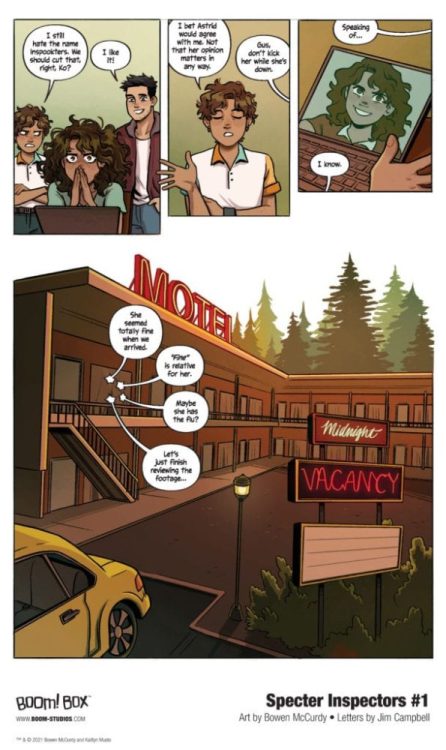
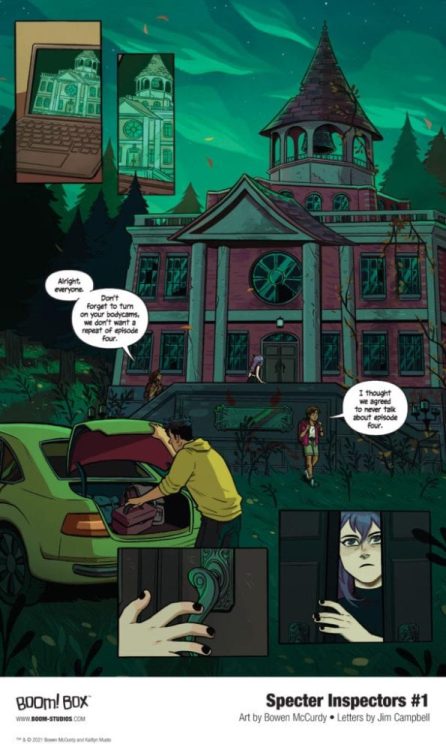
SPECTER INSPECTORS #1 hits your local comic book store on February 3, but thanks to BOOM! Studios, Monkeys Fighting Robots has an exclusive five-page preview for you.
About the five-issue mini-series:
True believer Noa, her cynical little sibling Gus, credulous camera man Ko, and Noa’s skeptical best friend (and secret crush) Astrid head to one of the most haunted towns in America to prove that ghosts exist, for all the social media likes! The investigations of hauntings uncover something more devilish than just a couple of ghosts, something that will put Noa and Astrid’s relationship to the test… and reveal the centuries-old sinister secrets of the town itself.
SPECTER INSPECTORS #1 is co-written by Bowen McCurdy and Kaityln Musto, with art by McCurdy, Erica Henderson and Mirka Andolfo worked on the variant covers.
“This book is everything I wanted to read when I was young; queer characters on adventures, ghosts, romance, and only a handful of demons. The story is based on one of the first comics I ever did, so it has a big place in my heart. I fell in love with the SPECTER INSPECTORS while writing them, and even more so while bringing them to life through art. I’m so excited to share them with you!” said McCurdy back in November.
Check out the SPECTER INSPECTORS #1 preview below:
Are you excited for SPECTER INSPECTORS? Sound off in the comments!
Wichita is a short film starring Jeremy Sisto (Clueless, FBI) and Maxim Roy (Mirage, OctoberFaction) as a married couple whose relationship is in a special place.
Of course, that lead sentence is vague for the sake of spoilers. Wichita’s limited run-time is carefully crafted for maximum effect by director Sergine Dumais and writer Bo Price.
PopAxiom discussed Wichita and more with Sergine and Bo.
Getting Started
Sergine and Bo have nearly 100 IMDB credits between them. When did the filmmaking bug bite? Bo answers first, “I’ve wanted to do it since I was about ten years old. I used to make movies with my friends back in Wichita, Kansas.”
“I started my career as a dancer, then I wanted to be part of the people telling the story and studied to be an actress,” Sergine shares. “I started a musical theatre career, but soon after, I wanted to be the one telling the story. I became a director in theater. I moved to Los Angeles about nine years ago, which is not a theater town. I had to reinvent myself and started a career directing voice over and did a lot of dubbing American movies into French.”
As theatre deprived as LA may be compared to places like New York, Sergine worked on stages throughout the city, including working with Jeremy Sisto. “While working with Jeremy on that play, I debated with myself if I wanted to transition to film. I thought, ‘If I do make that change, I want to work with this guy. And he’s now in my first movie.”
Transitions
What was the transition from theatre director to film director like? “It could not have been easier,” Sergine says. “This was a dream team. The cast and Bo were fantastic. Serge Desrosiers is a top DP [Director of Photography] from Canada that was kind enough to help. I had such great support. I leaned on my experience in directing actors; that’s my strength. For the rest, I leaned on my incredible team.”
Bo Price’s script for Wichita started from a familiar place. ”I grew up in Wichita in the 80s. At that time, the famous things that happened were that Barry Sanders won the Heisman trophy; Pizza Hut was created a few years before and made many millionaires in town; Kirstie Alley got on Cheers.”
These landmarks in Kansas history inspired Bo. “I thought if you could be from Wichita and win a Heisman or create a huge company or even get on TV, it was terrific.”
“About seven years ago,” Bo explains, “I thought it would be funny to write about these famous things. Famous only to people who are from Wichita. So it would be these people talking about these things as if they’re describing the Eiffel Tower or Statue of Liberty, but instead of these world-wide landmarks, they were talking about very specific things.”
Bo wrote a “little sketch” that “evolved slightly, but I didn’t think much about it until years later while working with Sergine. We’d done several projects together, and she asked if she could do one of my scripts as her first short. She picked Wichita.”
“For sentimental reasons,” Bo shares, “I’m glad she picked that one. It was exciting for me to have something called Wichita. The best part was she took what I’d written and transitioned it into something that could not exist without her.”
Bo credits Sergine with rounding up the incredible cast. “She approached it as a real story with real relationships and not as something funny that was name-checking these things. She brought her theatre skills to it that elevated the whole thing.”
“It’s a strange mix,” Bo ponders about the project as a whole. “Sergine brought the French-Canadian culture to this film about the culture in Wichita, Kansas that’s shot in Los Angeles.”
Making Wichita
Wichita is a short film that’s made the rounds at festivals and collected dozens of accolades. The shoot, according to Sergine, took “Two days. Jeremy came in and knocked out his scene in one hour. He’s so good.”
“It was a dream shoot,” Sergine says, “All the stars were aligned. We were nervous because we were expecting rain. And it was raining until ten minutes before we started shooting and started again right after we wrapped.”
The short shoot time and impressive turn-around from both lead actors were a result of preparation and familiarity. Sergine explains, “I’ve worked with Jeremy and Maxim, and we know how each other works. You know, if you meet the actor the same day and you only have a half-hour to rehearse, it takes almost all that time just to meet them. We didn’t have that problem. We made use of the half-hour from the get-go.”
Wrapping Up
“I’m a big Bob Fosse fan,” Sergine, the former dancer turned musical theatre actor turned director, says about inspiration. “When we were preparing to shoot Wichita, Marriage Story was on Netflix, and that was very inspiring.”
For Bo, his lifelong desire to become a filmmaker means his cinematic creative fuel goes way back. “My three favorites were Martin Scorsese, Stanley Kubrick, and Woody Allen. I love everything they did and couldn’t get enough of it. I admire any filmmaker who sort of becomes a genre with just their name.”
If Hollywood came knocking with a blank check to remake anything, what would Sergine and Bo Choose? Oh, that’s a tough one,” Sergine exclaims, but then the answer is clear. “For me, it would have to be a movie musical for sure. Sweet Charity, yeah, that’s my pick!”
“There are movies that I love like Wizard of Oz or Chaplin’s City Lights, which is one of the best movies ever,” Bo begins his answer. “I don’t know if I have the capacity to remake those. It’s fun to think about. I wish I had a better answer.”
What’s next for the longtime collaborators? “Right now, we’re working on a feature version of Wichita.”
Is Wichita on your watch list?
Thanks to Sergine Dumais & Bo Price and Rhapsody PR for making this interview possible.
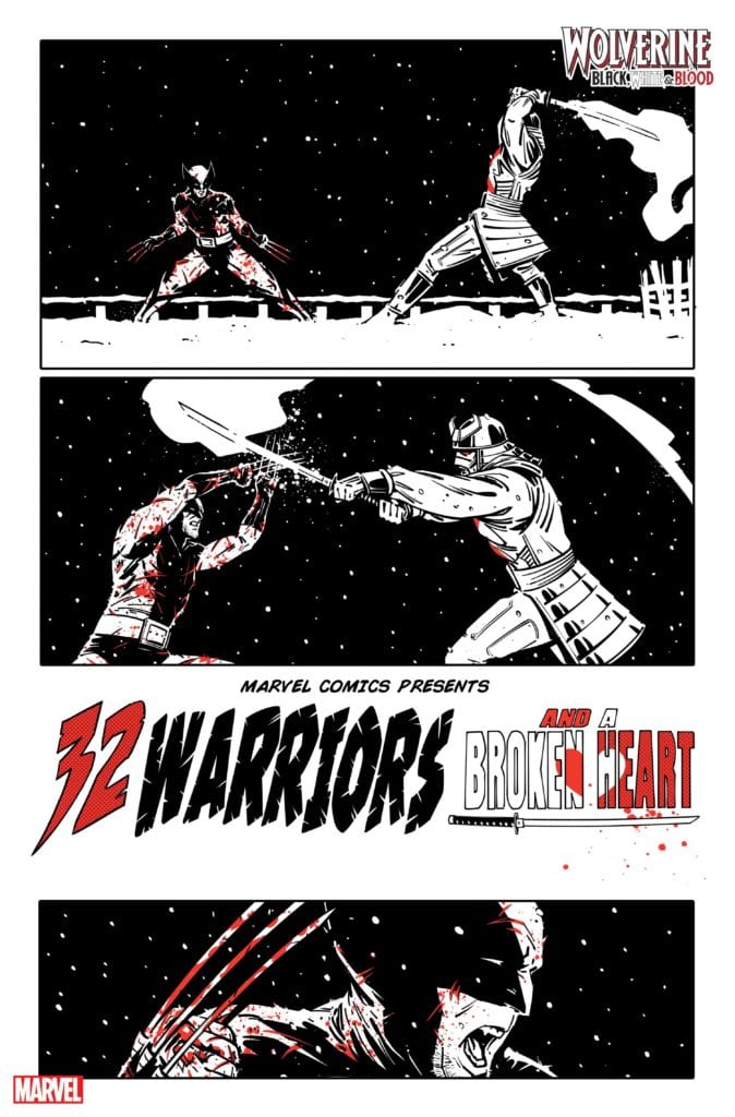
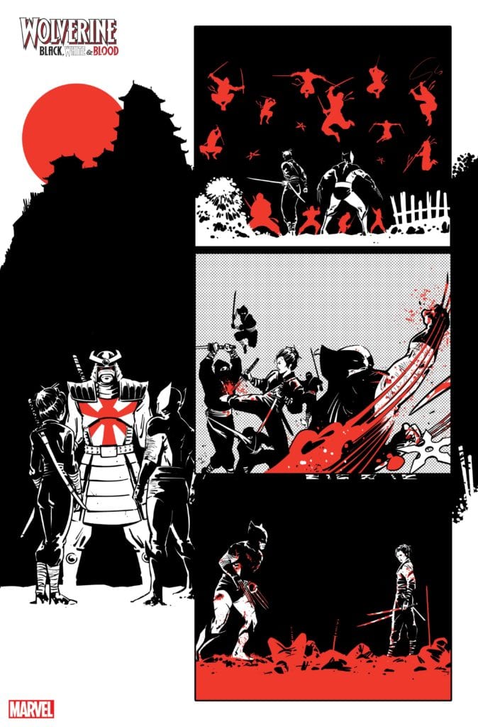
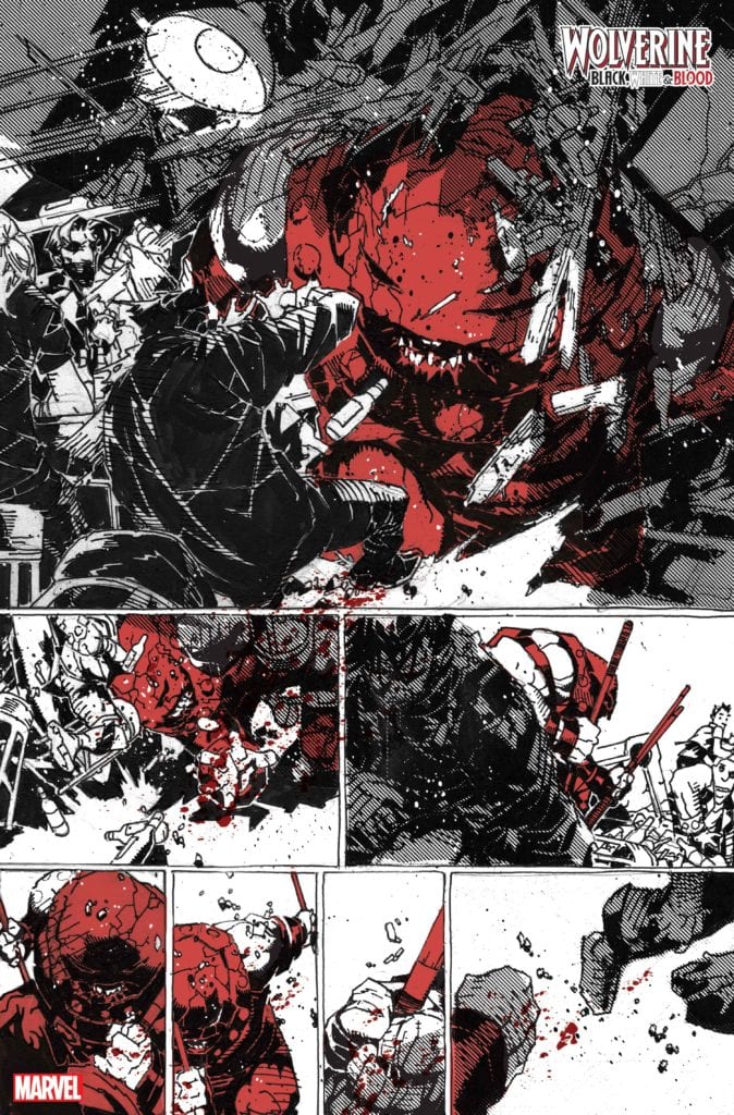
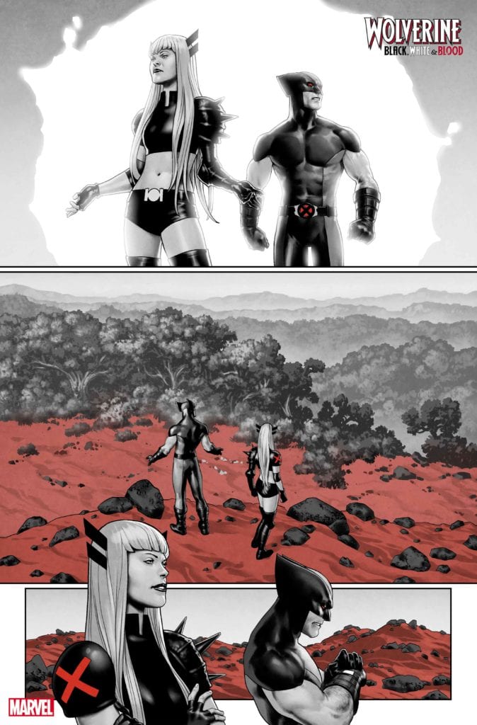
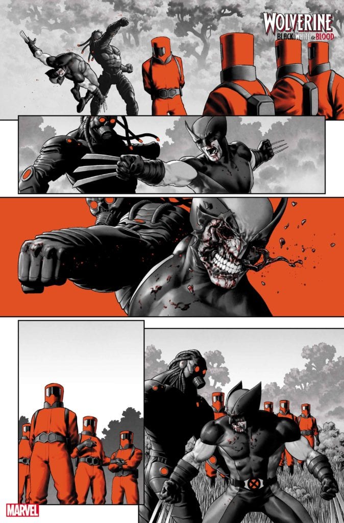
WOLVERINE: BLACK, WHITE, & BLOOD #3 hits your local comic book store February 10th, but thanks to Marvel Comics, Monkeys Fighting Robots has an exclusive first-look preview for you.
About the issue: THE BEST THERE IS BY THE BEST THERE ARE!
The groundbreaking series continues! Thrill to the Marvel Comics debut of Oscar winner JOHN RIDLEY (12 Years a Slave, The American Way) as he and JORGE FORNÉS bring LOGAN to Japan, where he will question his honor as he clashes blades with the SILVER SAMURAI!
Then, it’s back to his X-FORCE days with JED MacKAY and JESUS SAIZ, as WOLVERINE must stop A.I.M.’s plot for the red planet! And, nothing can prepare you for the unstoppable team-up of DONNY CATES and CHRIS BACHALO as Wolverine has a run-in with…COSMIC GHOST RIDER?!
Check out the stunning, unlettered preview art from each short story below:
Story by John Ridley & Jorge Fornes:
Story by Donny Cates & Chris Bachalo:
Story by Jed Mackay & Jesus Saiz:
Are you liking WOLVERINE: BLACK, WHITE, & BLOOD? Do you enjoy anthology comics as a whole? Sound off in the comments!
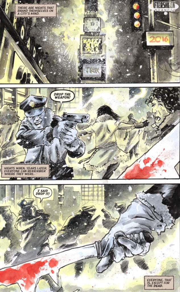
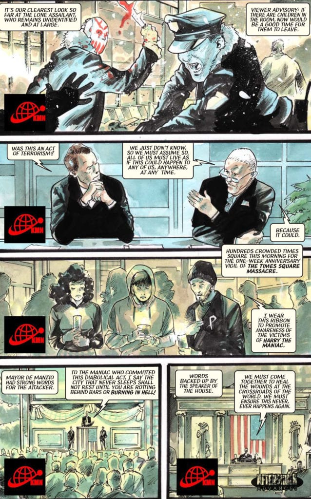
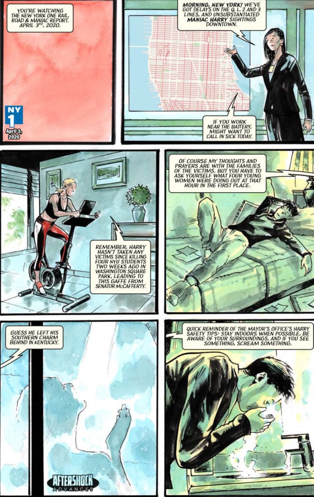
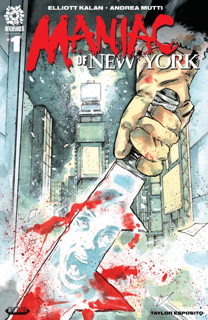
MANIAC OF NEW YORK #1 hits your local comic book store February 3rd, but thanks to AfterShock Comics, Monkeys Fighting Robots has an exclusive four-page preview for you.
About the issue: Four years ago, a masked slasher began stalking the streets of New York City.
Maniac Harry is inhuman, unkillable and unstoppable. Which is why the authorities’ solution has been to ignore him, and let New Yorkers adapt to a world where death can strike at any moment. When Maniac Harry starts killing his way through the subway system, trauma-haunted political aide Gina Greene and disgraced NYPD detective Zelda Pettibone become determined to go rogue and destroy him. But how can they fight a monster when they can’t fight City Hall?
MANIAC OF NEW YORK #1 is by writer Elliott Kalan and artist Andrea Mutti, with letters by Taylor Esposito.
“A frightening, thought-provoking, sometimes funny, always timely tale of murder, obsession and urban living.“
Check out the MANIAC OF NEW YORK #1 preview below:
Are you excited for MANIAC OF NEW YORK? Sound off in the comments!
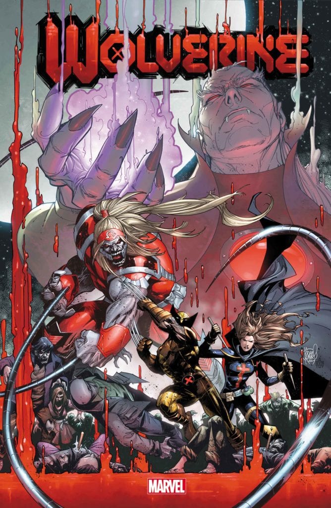
WOLVERINE #11 is due to hit your local comic shop in April, but thanks to Marvel Comics, Monkeys Fighting Robots has the privilege of revealing the cover and solicit text for you today!
The comic is by writer Benjamin Percy and artist Scot Eaton, with a cover by Adam Kubert.
About the issue: SNIKTERVIEW WITH A VAMPIRE! WOLVERINE takes the fight to the vampire nation in a quest to stop DRACULA’s plot to co-opt his mutant healing factor! But what sacrifices and moral compromises must be made before humans and mutants see the dawn?
Check out the WOLVERINE #11 cover below:
Are you reading WOLVERINE? Sound off in the comments!
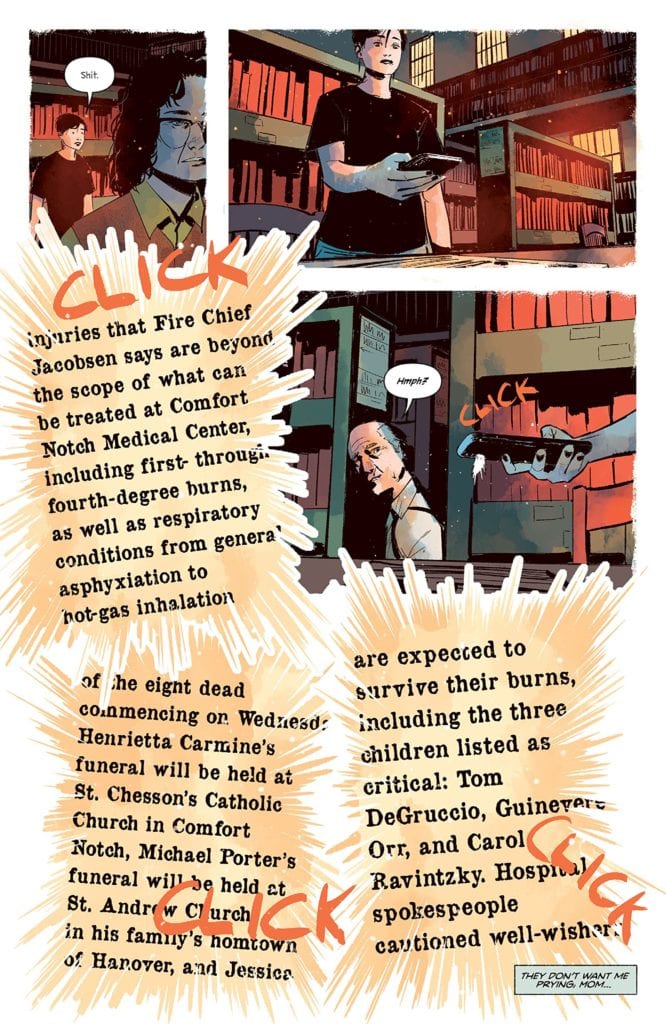
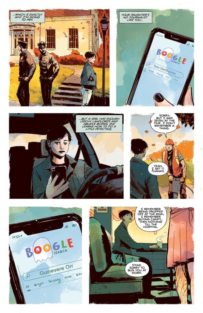
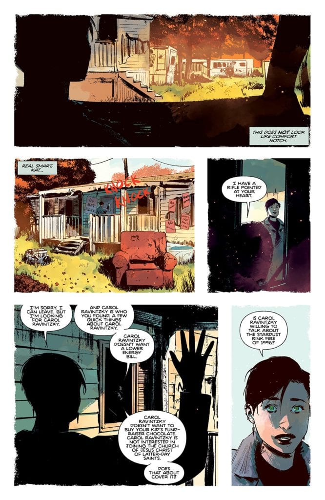
Writer Daniel Kraus and artist Chris Shehan, along with colorist Jason Wordie and letterer Jim Campbell, return to the town of Comfort Notch to tell some fireside tales of woe in “The Autumnal” #4. This fourth chapter has Kat going to great lengths to overturn the stones covering this town’s past, and she meets some…interesting characters in the process. While this issue is delivered largely in an exposition-filled chat, it’s such a creepy and entertaining story that it’s hard to be mad. With great dialogue and more insightful character-focused writing, along with more brilliantly atmospheric visuals, this issue may honestly be the best one yet.
“After Kat learns of an old tragedy that brought Comfort Notch to its knees, the bitter, burn-scarred Carol Ravintzky finally tells the tale of the terrible death of Clementine Biddle.”
Writing & Plot
Daniel Kraus pens a familiar part of any horror story in “The Autumnal” #4. This issue functions as the part of the narrative where the protagonist (Kat) seeks the input of an expert or survivor (Carol Ravintzky) in her investigation to uncover the supernatural mystery plaguing her and her new hometown. What commences from this point on is a quiet chat with a physically and emotionally scarred woman detailing not just the horrific fire that killed numerous children, but the true nature of the alleged curse behind Comfort Notch. While the expository storytelling from Carol (and by extension Kraus) is an almost cliched part of any horror story, it’s delivered with such an air of tension and creepiness that it can’t even be faulted. The backstory to the entity living in the woods of this peaceful town is also relatively unoriginal, but again, the delivery is just so damn satisfying. Every passage of dialogue and narration is written with such loaded suspense while also sounding wholly unique to the character speaking the lines. The other big narrative part of this chapter is also the foil to the “expert opinion” portion, and also an aspect not often seen in a horror story. There’s a scene later in the comic that plays as the skeptical portion of the horror formula, where another character attempts to explain away the supernatural elements with real world logic. However, this scene and this character turn that notion on its head. This character doesn’t outright say Kat is crazy for believing in the possibility of what’s happening in Comfort Notch, nor does he discredit the possibility of there being some strange things happening in the town. What he does instead is offer his input based on his experiences, as well as a genuine opinion on how people cope with trauma and how these elements are linked. It’s a beautiful moment that I don’t think I’ve ever seen in a horror story regardless of the medium. The fact that this series continues to be both intensely unnerving and so human is a wonder on behalf of the writer, and makes this one of the best comics coming out on stands right now.
Art Direction
Of course, the real reason this comic is so unnerving and atmospheric is because of the artwork from Chris Shehan and Jordie Bellaire. Shehan’s thick lines and shading give dimension to the well-animated characters, some of who look to have more history that even the oldest buildings in Comfort Notch. Each panel is full of depth, with buildings and scenery designed with a gritty realness that’s somehow also blended with the feeling of being something out of a fantasy novel. While most of the visuals in this book stay away from the supernatural, the sequence in which Ravintzky is reciting the town’s big unnatural secret is put together in a dreamlike web of blood and visual horrors that excel in keeping up the terror. The colors from Bellaire are a stunning watercolor-style blend of cool autumn hues and foggy damp, foggy nights. Every surface in each panel is rife with texture that’s blotted with tiny specks of different shades to give everything a realistic dimension. There’s also the constant specter of shadow caused by moonlight or what appears to be sunset, and it always sets the tone of the book perfectly. It’s visually reminiscent of Dean Cundey’s cinematography on the original Halloween. The letters from Jim Campbell are a great blend of font usage, from a more typical font during central character’s dialogue and narration to a scratchy, razor-in-a-chalkboard font during more unnatural goings-on. The visual work on this chapter, as in every chapter prior, is a gorgeous and thematic use of the comics medium to convey this unique horror tale.
“The Autumnal” #4 is a special comic not just for its own series, but for what it does for horror storytelling as a whole. Daniel Kraus has constructed a script that uses some classic clichés from other horror stories and not only executes them brilliantly, but he actively usurps those clichés by introducing insightful commentary into the story. The visual work of Chris Shehan and Jordie Bellaire is a foggy and eerie yet gorgeous view of the autumnal northeast, that switches to being intensely foreboding at the drop of a hat. This continues to be one of the most unique comics, and horror stories as a whole, on shelves right now, so be sure to grab this newest issue when it releases on 1-13!
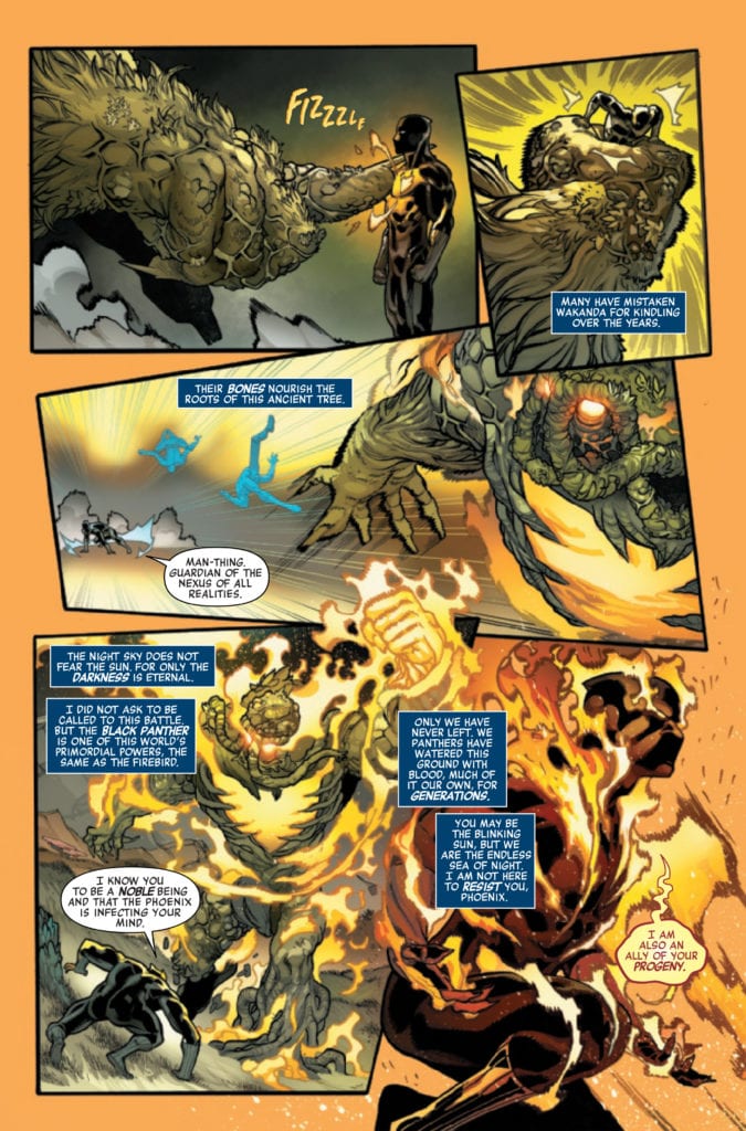
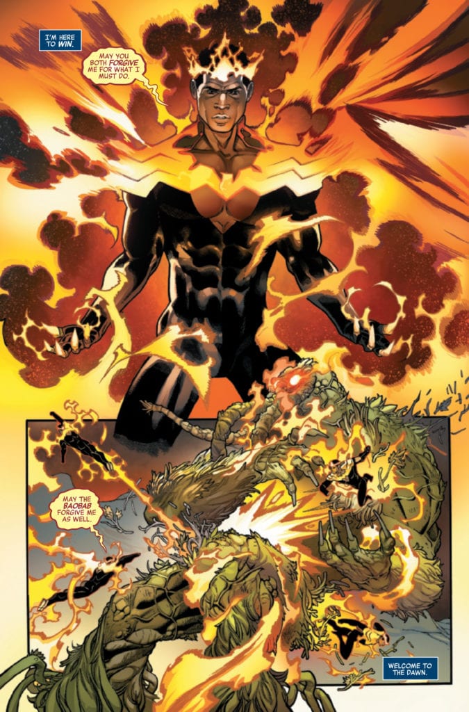
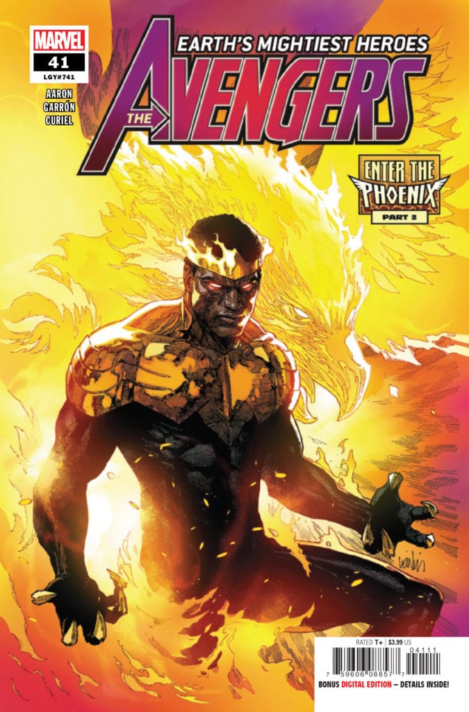
AVENGERS #41 hits your local comic book store January 20th, but thanks to Marvel Comics, Monkeys Fighting Robots has an exclusive four-page preview for you.
About the issue: THE BATTLE TO DECIDE THE ALL-NEW PHOENIX CONTINUES! Who will wield the power of the PHOENIX FORCE? A globe-spanning tournament is underway, under the direction of the firebird itself, pitting some of Marvel’s greatest heroes against their fiercest enemies and also against each other, giving each of them a taste of the awesome cosmic might that’s at stake. All will be transformed. Not all will survive.
AVENGERS #41 is by writer Jason Aaron and artist Javier Garrón, with colors by David Curiel, and letters by Cory Petit. The cover is by Leinil Francis Yu and Sunny Gho.
The issue is the second part of the “Enter the Phoenix” storyline.
Check out the AVENGERS #41 preview below:
Are you reading Marvel’s AVENGERS? Sound off in the comments!
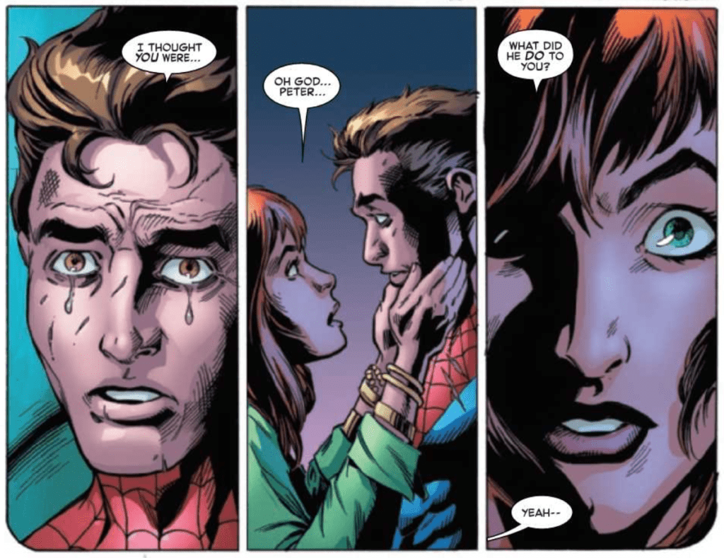
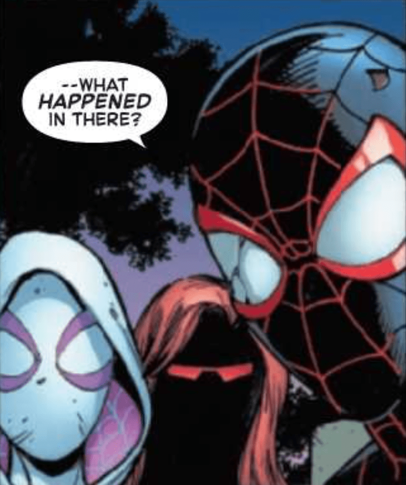
The Amazing Spider-Man #57, out now from Marvel Comics, is an issue full of biting dialogue and story that is supported phenomenally by the art, coloring, and lettering.
It has been a while since we’ve had an issue with writing this splendid. Nick Spencer makes The Amazing Spider-Man #57 into an unforgettable issue. Characters are pushed to their breaking points, and this is accompanied by dialogue that stings. I was taken aback several times while reading and verbally gasped at one moment. Spencer also makes use of silent panels, which leaves the reader haunted by the actions that occurred before them. All of this combined provides for a captivating issue that leaves the reader gripping the pages tight in suspense, wondering what will happen next. In true Spencer fashion, the issue features a cliffhanger, but it is not on the final page as we would expect. Instead, the last page has silent panels and a quick dialogue exchange that perfectly captures the dread the characters feel of what is to come. It is a thoroughly spine-tingling scene.
Mark Bagley’s pencils and John Dell, Andrew Hennessy, and Andy Owens’ inks create some spectacular art for The Amazing Spider-Man #57. The staging of panels and body language of characters adds a remarkable amount of weight to dramatic scenes, and I’m not even sure how it’s possible to show so much emotion through a character’s mask. The team also uses techniques such as characters extending past the panels’ borders, which is always a fantastic way to make the issue feel more energetic.
The Amazing Spider-Man #57 features the coloring talents of Rachelle Rosenberg and Edgar Delgado, and they greatly enhance the reading experience. The initial palette used has very calm and cool colors, and later in the issue the palette is dramatically shifted in a manner that shocks the reader. It goes in hand-in-hand with the story and results in a jaw-dropping moment. Rosenberg and Delgado also use methods such as using a brightly colored background to instill energy into a scene, which is done in an extraordinary way in the issue.
VC’s Joes Caramagna lettered The Amazing Spider-Man #57, and his choices help make the dialogue-heavy scenes a joy to read. By emphasizing the right words and arranging speech bubbles in a way that allows the story to flow uninterrupted, Caramagna helps immerse the reader in the scene. Caramagna also utilizes techniques such as making the borders of speech bubbles thicker for emphasis, which is highly effective.
The Amazing Spider-Man #57 is a wild ride from start to finish and pulls out a plethora of emotions from the reader like few comics are able to do. The art is gorgeous, and this issue features some of my favorite coloring of the entire series. The lettering helps it all flow smoothly, and we are left with an astounding issue that any Spider-Man fan would be disappointed to miss.


")