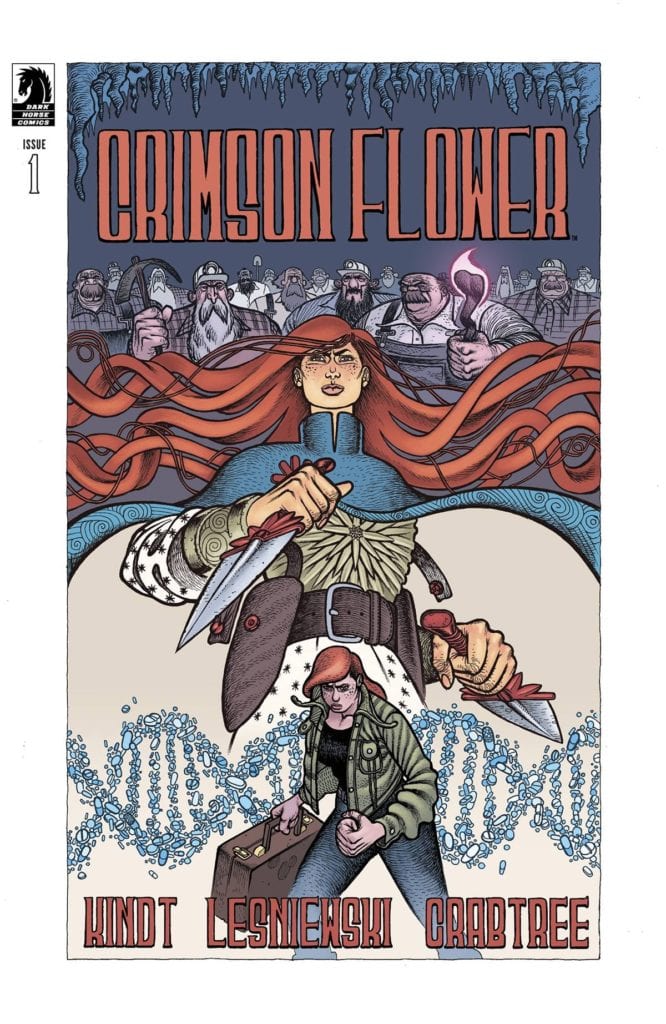
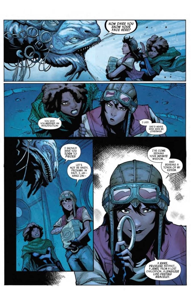
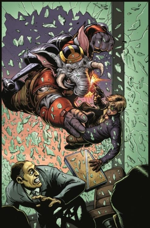
One woman's quest for revenge is fueled by the legends of old.
CRIMSON FLOWER #1, available Wednesday from Dark Horse Comics, is the start of a new series full of lore and revenge, as one woman seeks to right the wrongs of her past. The lines between fantasy and reality are about to blur thanks to this series.
One woman’s quest for revenge is fueled by the legends of old.
Avid readers are certainly familiar with the concept of infusing an active (and frequently alarming) plot with bits of folklore. Or they’ve come across a fairytale retelling or something else. Yet these twists aren’t as common in the comic book world, making Crimson Flower a standout right from the start.
To be clear, this is not a fairytale retelling. Though it is twisted, so it has that much going for it. The series follows a young woman, one who has always had a love of Russian folklore. Her love wasn’t diminished, even after witnessing a horrible event.
If anything, it solidified the world for her. Now she has an escape, as well as a plan for acting out her revenge fantasy. And it all starts with Crimson Flower #1.
The Writing
Crimson Flower #1 is a disturbing yet enchanting beginning to this series. With a few quick flourishes and some personal information, readers are quickly sucked into this harrowing adventure. The folklores pulled into this issue certainly feel right at home with the gore and bloodshed that splashes across the pages.
Written by Matt Kindt, there is something almost ethereal about how the stories seep onto the page, around the protagonist and her actions. The result is an intentionally confusing situation, as the lines between fact and fiction fade away, giving the character complete control over the narrative.
There are moments wholly grounded in reality – most of which surrounding the main character’s backstory and her explanation for being. Once that bit is out of the way, readers are thrown headfirst into something else.
The lore pulled into this issue would have been powerful enough on its own, but it’s the visual storytelling elements that take this series to a whole new level, as the two work flawlessly together.
The Art
Crimson Flower #1 is, visually speaking, one of the most unique issues out there right now. The characters are heavily stylized, while their worlds are open to new interpretations and changes in form, as legends take over the storytelling.
Matt Lesniewski (artist) and Bill Crabtree (colorist) did a truly wonderful job here. One of the most striking decisions made for Crimson Flower is the choice to play with proportions. One moment the world looks ordinary. The next, a hallway grows in length, or a hand or hair grows a mind of its own.
It is alarming and compelling, all at the same time. When combined with the textures and colors, it becomes an absolute mind-bending experience. One that is narratively fitting and admittedly highly unique. All of which leaves an intense first impression about this series.
Conclusion
Crimson Flower #1 is a bold and somewhat dark introduction to a series that is as memorable as it is unique. The inclusion of Russian folklore has already done so much to make this story feel alive, especially when used alongside all of the spirited artwork.
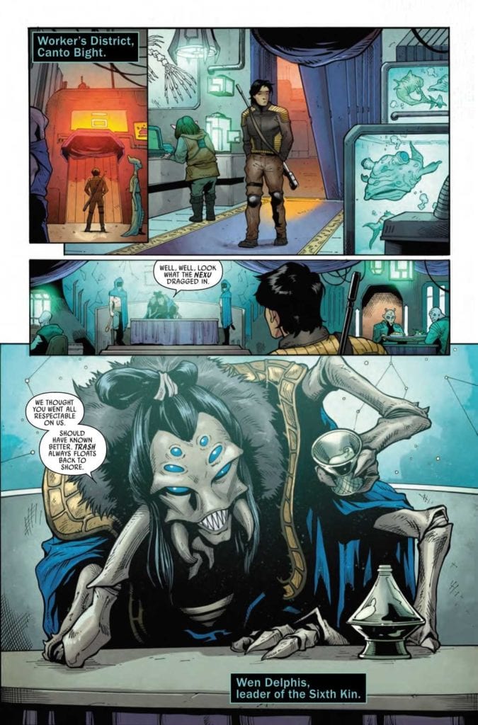
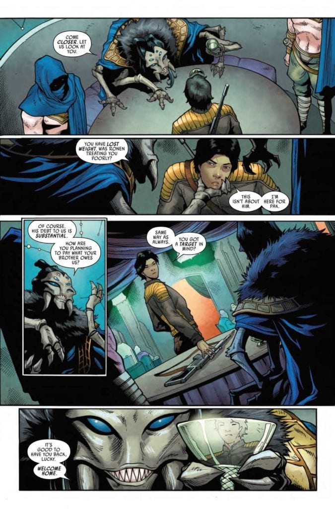
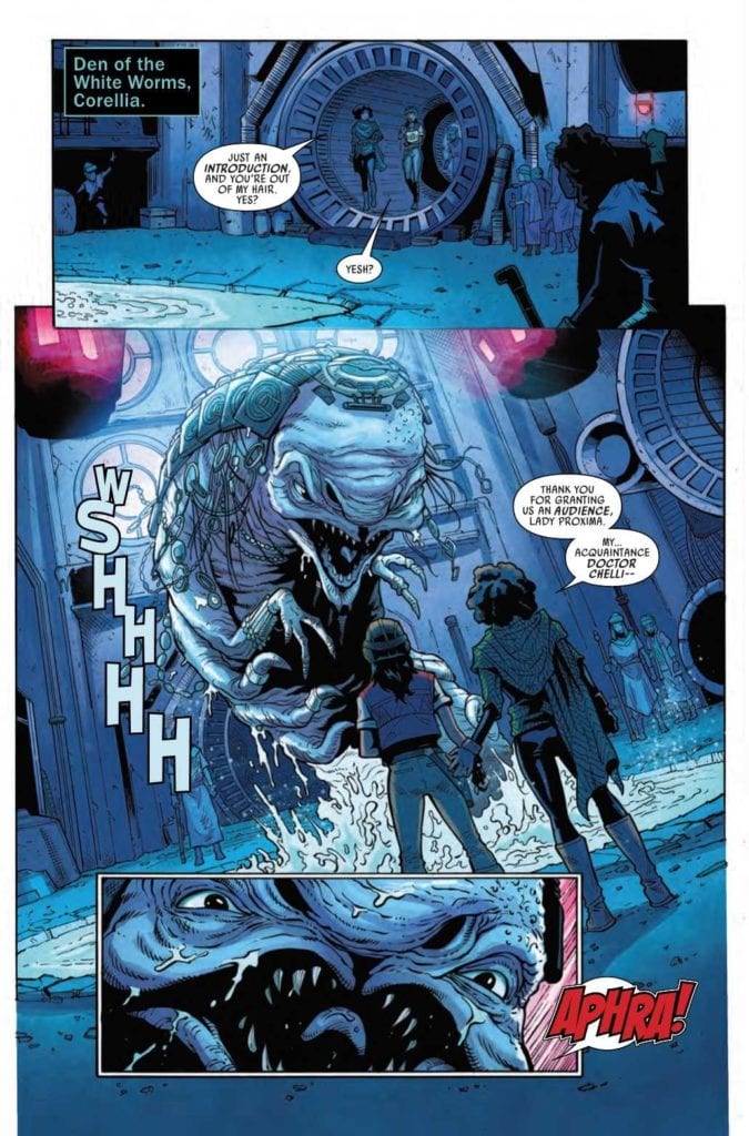
STAR WARS: DOCTOR APHRA #7, available Wednesday from Marvel Comics, continues Aphra’s latest (and chaotic) run. It appears that she hasn’t learned her lesson about sacrifice for the sake of others. Or the concept of laying low.
Back to Canto Bight, huh?
At this point, fans of Doctor Aphra are already painfully aware that she is not a character capable of laying low. Even when her life depends on it. As evidenced by her latest series of events – when by all accounts she should probably still be hiding from a certain big bad in her life.
That being said, if there’s one thing that Aphra is good at, it’s being entertaining. Okay, that and turning friends (and more) into enemies. It’s a talent of hers, though probably not one that she’d be willing to brag about.
In Doctor Aphra #7, she’s going to have to rely on one of those friends turned enemies (of a sort) in order to achieve her goal. Well, her latest in a long line of goals. All while still having several bounties on her head. Because, well, she’s Aphra.
That….that probably is going to go well, is it?
The Writing
Doctor Aphra does her best work when she’s under pressure, doesn’t she? Perhaps that will go a long way in explaining some of the events in Doctor Aphra #7. She’s been hired by somebody who by all rights should be her enemy, with the hopes of getting her hands on a shiny piece of tech. That sounds about right, doesn’t it?
Alyssa Wong has written an issue full of sass and quips – in a way that only Aphra can elicit. The inclusion of a favorite character helped to carry the narrative for this story, leaving moments of tension and humor all over the place.
Throw in the thrill of a chase, and building concerns from a secondary plot, and suddenly there’s a whole lot going on in Aphra’s life. Not all of which she’s completely aware of. A fact that will almost certainly change in due time.
The end result is a highly entertaining issue, one that feels surprisingly lighthearted, despite everything else going on. In that sense, this probably is more akin to a set-up issue than not, which leaves readers wondering how it’s all going to play out. (Knowing Aphra, something is bound to go wrong at the worst time possible).
Who’s surprised by that reaction?
The Art
Once again, the artwork in Doctor Aphra #7 succeeds in being impressive. This series really does nail the whole look of Star Wars as a whole, while throwing in some visual twists that are pure Doctor Aphra.
Minkyu Jung (pencils) and Victor Olazaba (inks) found the perfect balance between action and humor. One moment Aphra has a gun to her face, the next minute she’s laughing it off and portraying that swagger we all know and love.
Rachelle Rosenberg’s help to enhance the entire look, going for a brighter palette to compliment the serious use of tech in her life. There’s a lot to love here, but it’s perhaps the lighting that steals the show.
Finally, VC’s Joe Caramagna’s lettering leaned toward the informative side of things, but it is exactly what this issue called for. With all the scene changes happening all over, it would have been so easy to get lost otherwise. Though Caramagna did run with the excuse to be expressive when sent his way.
She’s got her scheming face on.
Conclusion
Doctor Aphra #7 was another entertaining addition to this series, as she stumbles and schemes her way through a life of crime. This is an issue that many fans will appreciate, if for no other reason than the inclusion of a fan favorite.
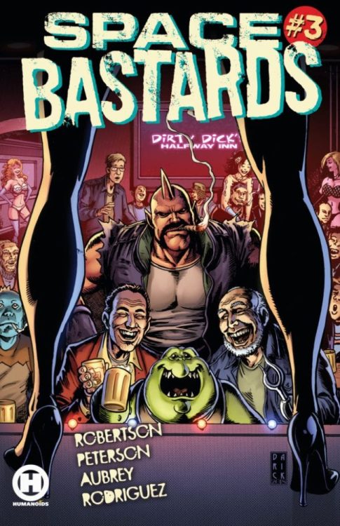
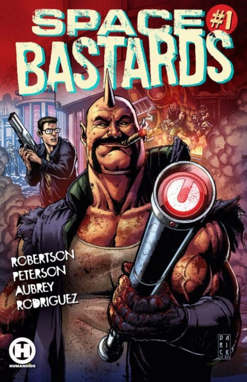
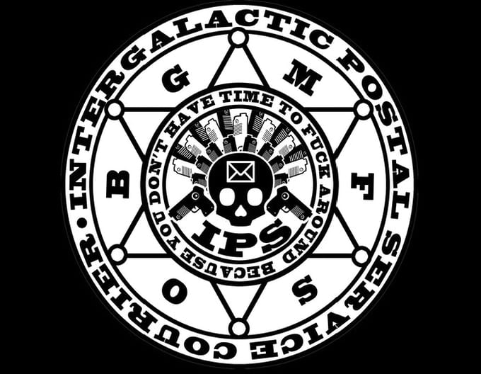
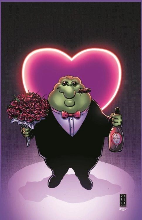
Chances are, if you visit Monkeys Fighting Robots a lot, you’ve heard a little about Space Bastards already. That’s because the wonderful people at Humanoids have been super generous in giving us information on this awesome new series. We’ve reviewed the first issue, which was a blast, and interviewed writers Eric Peterson and Joe Aubrey. But the fun doesn’t stop there! MFR got to send in some questions to superstar artist, Darick Robertson, best known for his work on The Boys. Robertson gave us amazing behind the scenes looks at his process and talked about his role in forming the world of Space Bastards!
Monkeys Fighting Robots: From what I know of your work, Mr. Robertson, Space Bastards just seems like a perfect title for your style. How soon did you know you wanted to join the project?
Darick Robertson: Actually, it took some persuading. Not because I didn’t see the potential, I was just so busy with other projects at the time that I didn’t see room on my plate for anything more than a few covers for the original Kickstarter inception that Joe & Eric had. Eventually, I got to know Eric and Joe better and they came at me with an offer to fund the project and make me a co-creator of the property, and with that I got on board and set about redesigning the characters and the visual world.
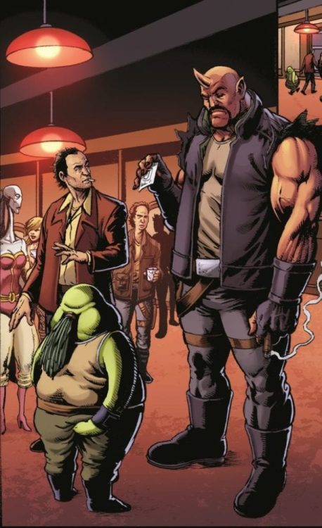
MFR: You’re working on Space Bastards for the first volume, “Tooth & Mail,” featuring the characters Manny “The Manicorn” Corns and David S. Proton. What was the process like working with Peterson and Aubrey to bring these characters to the page?
DR: Actually, the work was completed back in March of 2019. I penciled and inked over 200 pages for this first arc. Working with Joe and Eric was fun, in that they have such a deep rooted passion for the characters and story, going back to making short films about the cast years ago. Joe has a keen eye for continuity and details, while Eric is happiest it seems when discussing story ideas and making things work. They both have a great sense of humor and are a lot of fun to be around. Promoting this with them years back at San Diego Comic Con was some of the best times I’ve had there.
MFR:This is a really cool futuristic, maybe even dystopian, world that you’re a big part of creating. Most people reading Space Bastards are going to see your version of this world first, and artists that follow will likely take cues from you as well.
DR: That’s been the case, yes, the forthcoming artists are working from my initial designs from what I can tell.
MFR: What about that was challenging?
DR: The only challenging part was the schedule, as I was pouring a lot of detail into the pages and also taking the scripts and tinkering with it, so that I could navigate the pacing of the story, page turns, and panel management. We ended up with like five drafts of the first issue script.
Even with the most experienced of comics writers that I’ve created with, I tend to work things out on the page so things flow a certain way and I’ll bring suggestions and workarounds. Being somewhat new to this format, Joe and Eric had essentially taken their screenplay and had converted it into a comic script format, with page breaks and some panels with sizes suggested, but ultimately they wanted me to have fun with it and do my thing, so that took a little getting under the hood in places and making things flow visually.
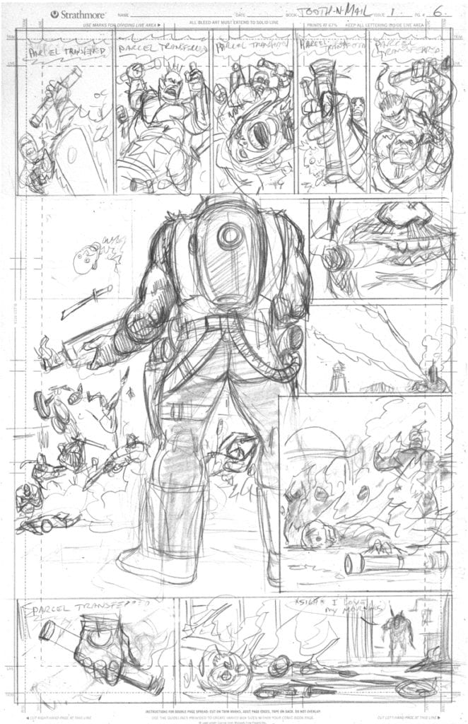
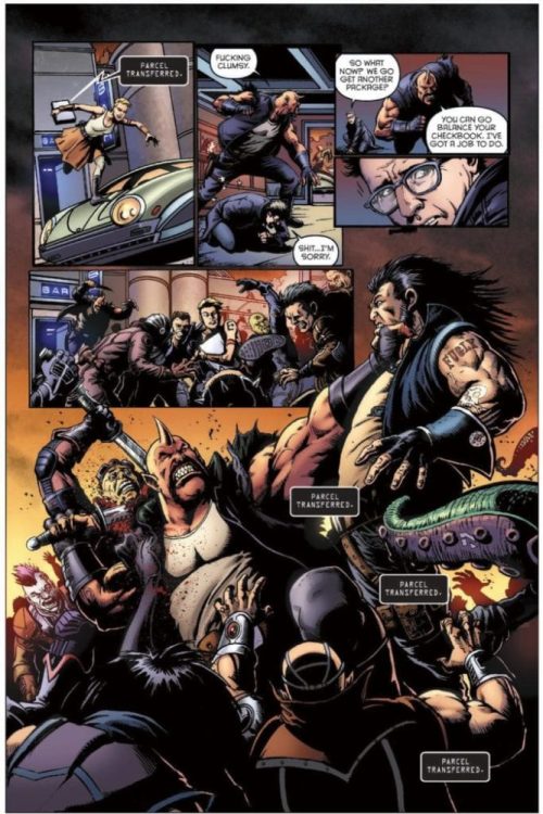
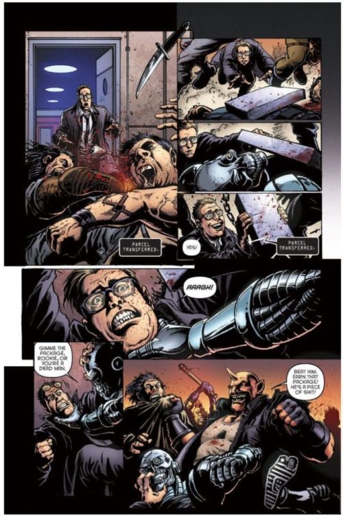
There’s a thing that happens between screenplays and comics that people unfamiliar with the format don’t always recognize and it’s how the ‘real estate’ of a comic page is different than how things play out on film. In a film, you don’t have to leave room for the dialogue or the sound effects; The characters just speak. But in a comic, if a character is making a big speech, then backgrounds and things like that, are going to be obscured. So the scripts would have suggestions for panel sizes, but often I’d come back with suggestions how we could keep the point of the moments but play it out a bit differently. When inking my own work I pencil very loosely, just to get the story beats established and then present it to the writer so we are in agreement before I go and put all the ink detail in.
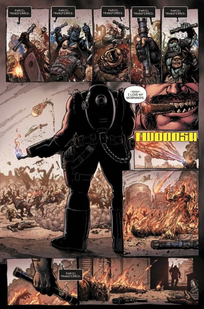
For example, this is a place where I suggested breaking the melee into multiple panels across the top and have the parcel transferring in every panel of the melee might work better as a gag… The story is the same, I just changed up the beats a bit, and Joe and Eric loved it.
MFR: What about it was exciting?
DR: It’s a really imaginative platform and concept they created, and anything seemed possible. That’s one of the things I loved about Transmetropolitan and Ballistic; the worlds where I can create in a space where anything goes are the most fun for me. Joe and Eric like to push boundaries and create outrageous scenes, and trying to capture that lightning in a bottle was fun. I really wanted to maintain that crazy energy we had at the beginning of the project and bring that forefront for the story.
MFR: In the first issue, you do a great job of giving us visual cues of the dynamic in the room, particularly with Proton and Manny.
DR: Thanks!
MFR: Manny towers above anyone, but you really show us just how much bigger and better he is than Proton. The first scene of the issue, a flash forward, shows us there are going to be lots of characters joining the cast. As dynamics shift and as we get more people on each page, did you change your approach of using size and position to show power?
DR: Yeah, that did become challenging as the final issues I drew are absolutely bonkers. I was drawing the whole cast, which you can see on my virgin variant cover for #1, and multiple locations with things happening simultaneously in space as well on Roy Sharpton’s crazy refuge planet with alien dinosaurs and absolute craziness going on. But my approach remained focused on telling the story through character dynamics and such… in issue 3 you’ll see how Davey has grown in confidence and skill, but how Manny remains a threat.
MFR: Space Bastards is a perfect series to just go on and on, with a revolving door for new characters. Hopefully, it runs for a very long time. It certainly deserves to. In that case, do you hope to come back and do the art for more issues in the future someday?
DR: Yeah, I’d be into revisiting this. I designed and co-created these guys, so there’s a little bit of an attachment there… doing the Virgin cover, which I created recently, was the first time I revisited this world since I finished the art in 2019 and it was like hanging out with old friends.
MFR: Last question. What exactly do you have againssst Lizard People?
DR: Lizards, fine. People, fine. Lizard people… Go shed your skin somewhere else! No sleestaks here!
The first volume of Space Bastards, published by Humanoids, is written by Eric Peterson and Joe Aubrey, with art by Darick Robertson, colors by Diego Rodriguez and letters by Simon Bowland. And starting in the second volume, writers Peterson and Aubrey are getting a bunch of different artists in for a one-shot, a couple annuals and some specials. Artists include such talents as Simon Bisley (Lobo) and Clint Langley (2000AD)!
Jump aboard the Kickstarter to keep so this wild series keeps going, and so Peterson and Aubrey can pay advances to their awesome artists! And for all other Space Bastards information, go to Spacebastards.com!
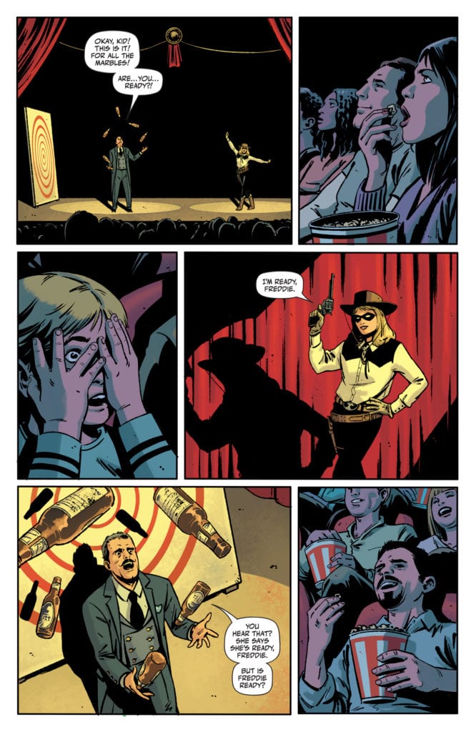
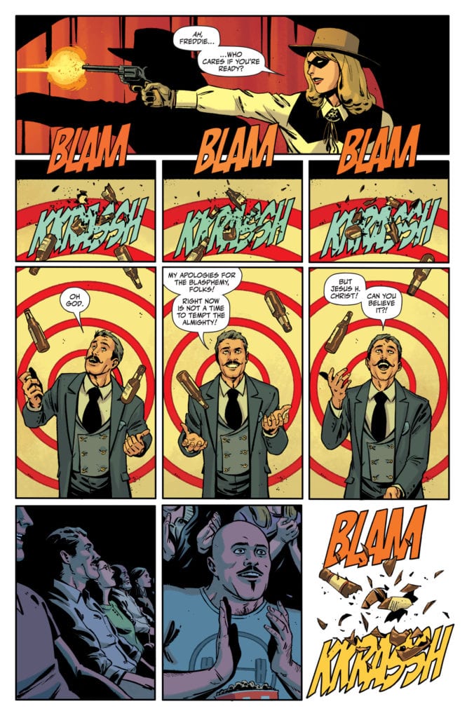
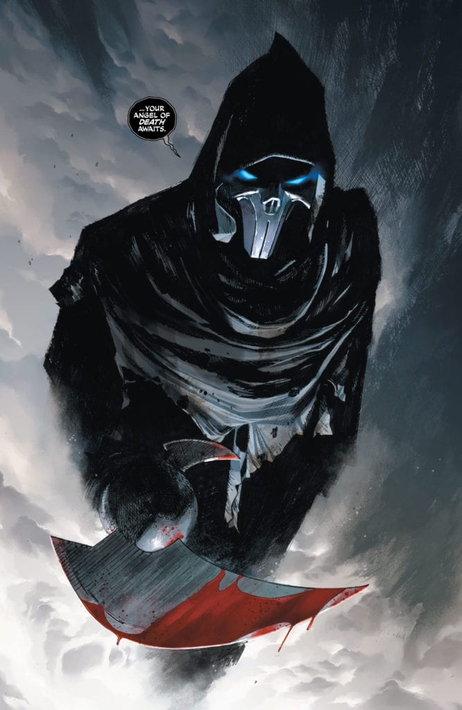
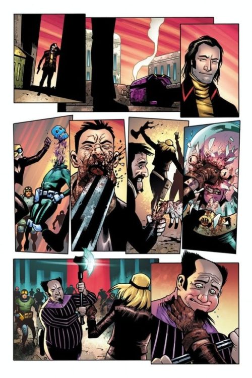
DC Comics’ Rorschach #4is not an easy read. That’s not because it’s not good or clear. In fact, it’s devastatingly clear. No, Rorschach #4 is hard to read because it feels right on the money. Writer Tom King, artist Jorge Fornes, colorist Dave Stewart and letterer Clayton Cowles put forth an issue that discusses insanity. But it’s an insanity that feels dangerously accepted.
Writing
King introduces us to a new character in this issue. A strongman from a circus who knew Laura Cummings, the Kid, very well. In this issue, King begins to show how big the image of Rorschach has become. Rorschach is no longer just a man, he’s a way of life. And the beliefs of The Kid and Muscles, the Man Mountain, feel both insane and strangely believable. We see The Kid’s obsession with Rorschach is not something that’s new. She’s practically begun her own cult.
And watching Muscles respond to question after question, King shows us how deeply the Kid’s roots go into her followers. Logic can’t stand against a cult. Every moment that our detective protagonist tries to push Muscles to see the truth, is met with a vacant smile. King isn’t grasping at straws here. He’s, sadly, depicting what it’s like when someone can do no wrong in your eyes. That’s why this issue feels so timely.
Art
Fornes seduces us into accepting this dangerous view of the world as normal. Not only do all of the interactions between The Kid and Muscles seem completely innocuous, but Fornes dives right into typical comic book action. We see Rorschach and a supervillain on a rooftop or Rorschach pummeling crooks. Fornes makes it look like any ol’ comic. His sound effects do the same. The “AAAAAAAAAAA!” of someone falling down an elevator shaft is playful. The “SKRKKRKKK” of them hitting concrete is minimal and muted. Fornes is highlighting the fun in the brutality, not the consequences of it. He’s showing us how someone could get lost in the high. How someone could lie to themselves and believe it.
Coloring
Stewart makes this issue beautiful. The beautiful lie Muscles is telling himself. When Rorschach is on the rooftop, having a showdown with a dramatic villain, Stewart sets the stage fantastically. In fact, fantastic is the right word for it. It’s a fantasy lighting that gives each moment a sense of relevance. But something changes when Rorschach drags the villain inside. The greenish hue of fluorescent lighting is like a wake up call. And the red panel of someone plummeting to their death is like a smack in the face. It’s a reminder. This might look beautiful, it might seem steeped in relevance and honor, but it’s brutal and unhinged.
Lettering
Rorschach #4 has one hefty script. But part of what makes it work is how Cowles punctuates scenes with short lines. Separated from the rest of someone’s dialogue, Cowles finishes a monologue by leaving a final line alone on the page. These are the lines that get under the detective’s skin. “See, that’s just me,” Muscles says after describing a particularly disturbing scene. Muscles’ nonchalance is terrifying. “I wasn’t crazy,” Muscles says after a speech that definitely sounds psychotic. Cowles underscores Muscles’ most dangerous lies. He doesn’t let them get lost in the rest of Muscles’ tirades.
DC Comics’ Rorschach #4 is terrifyingly normal. Our new character, Muscles, the Man Mountain, is completely bought in to the lies he’s been told and the lies he’s told himself. King, Fornes, Stewart and Cowles tell a story we need to hear. They show us how easy it is to fall for a narrative that makes us the center of the universe. It’s another chapter in a series that has its finger on the pulse of our historical moment. Pick up Rorschach #4, out from DC Comics January 19th, at a comic shop near you!
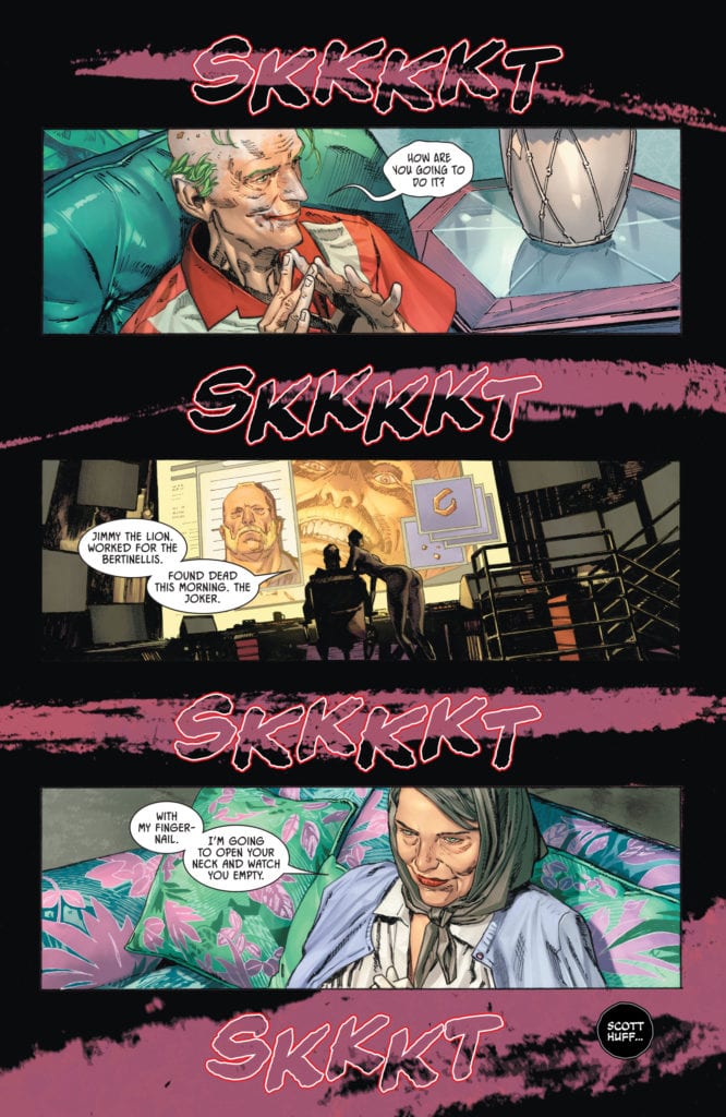
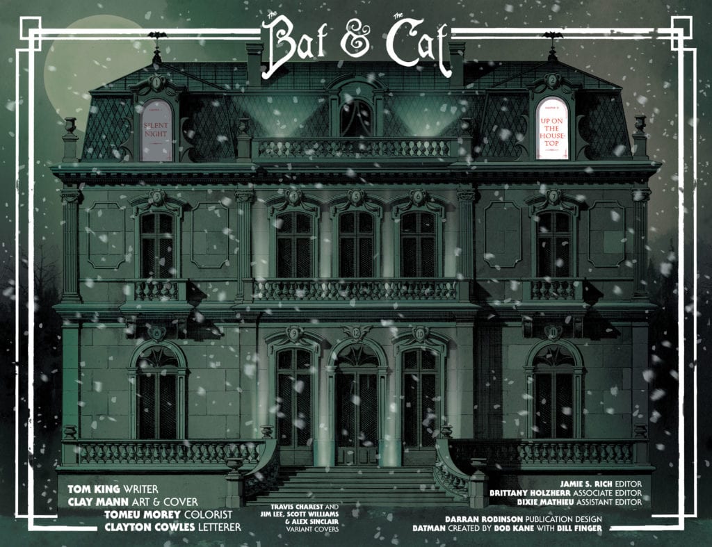
There’s an aspect to DC Comics’ Batman Catwoman #2that might feel predictable. But that’s because writer Tom King, artist Clay Mann, colorist Tomeu Morey and letterer Clayton Cowles place good storytelling over “shock and awe.” There are definitely moments that’ll shock readers, but so much of this script is the inevitable next step of the explosive first chapter. This issue is hard to talk about without spoilers for Batman Catwoman #1, so be warned, some spoilers ahead for the first issue of this great new series!
Writing
Just like the first issue, Batman Catwoman #2 is more about Joker and Catwoman than it is about the Bat. In fact, Batman is a small player. He’s the eye of the storm, as Joker, Phantasm and Catwoman bring down chaos all around. We’re seeing the fallout of Andrea Beaumont coming to town and Selina stealing Jimmy the Lion’s necklace. King has us following everyone but Batman. Batman appears only to try and piece together everything we’re seeing all the other characters do. This isn’t a script with secrets. At least not secrets kept from us. It’s one where King gives us all the information so that we can watch Batman clamber around in the dark.
And with Catwoman and Joker’s conversations in the future, everything has some distance. When Catwoman and Joker talk about the night they almost killed each other, she says “I knew you’d make it.” “You say that now,” Joker replies. “You can say anything when everything was so long ago.” That’s the purpose of these scenes. It feels like two people returning to the scene of the crime. It somehow minimizes present day events while also creating a mysticism around them. What changed them so much? So much that Catwoman and Joker would meet back up, years in the future, still talking about it? That’s what Batman Catwoman #2 begins to do: show the chaos that’ll leave scars for decades to come.
Art
Much of the mysticism of Batman Catwoman #2 comes from Mann’s depiction of characters. It’s incredibly rare in this issue that we see characters straight on with their faces unobscured. We either see half their face, see them in profile or their faces are blurred by shadows or windows. This is particularly true of Catwoman and Joker. It’s as though they’re scared to look at the reader. Like they’re guilty for everything that’s happened in the previous issue. And Mann continues to draw a connection between these two. One moment where we see them both, face on without anything in the way, they look nearly identical. Selina looks crazed and scarily similar to the Clown Prince of Crime.
And Mann’s depictions of Bruce look almost identical to one another. He’s got the same set jaw we see under the cowl, even if he’s just eating dinner with Selina in civilian clothing. Through this, Mann shows us that Bruce is beginning to worry about Selina. He’s still got his guard up around her. So, while the cowl might come off, the suspicion in his eyes never does. He’s always on the job in this issue, never taking a break.
Coloring
The first issue had a color scheme of purple, green and red running through it. Morey continues that color palette but adds in a few more symbolic hues. We still see the kinship between Catwoman and Joker. Old man Joker’s home is covered in greens and purples, and old lady Selina is wearing a light purple cardigan. In fact, Selina is often shown garbed in different shades of purple. In the future, old man Joker is wearing a red shirt, like the years of violence that hang around his neck, but in the present he’s gleefully sucking on a red candy cane, drinking the violence in.
But Morey also throws in shades of blue and orange. A blue moon covers the page in its light. Batman and Phantasm’s eyes glow blue. And all of the major plot devices are depicted as orange or yellow. Jimmy the Lion’s gold necklace, the bright light of Batman’s signal, the orange hued scene of a fateful night at a bar. These are all the things that drive the plot forward. Morey hones us in on the most important scenes and the most important objects. Morey is creating a work that could have a key or legend for it. Every color is there for a reason, steeped in storytelling relevance.
Lettering
Cowles brings so much rhythm to this script. He breaks up every line into small portions. It gives room for the art, but also adds a sense of silence. We hear the pauses between each sentence and the quiet that surrounds their dialogue. It’s as though each thing said is piercing through a layer of silence. And the sound effects don’t jeopardize the silence of the issue either. The “PWFF” noise of bullets hitting a chair is colored similarly to the upholstery. And while the “AAAAAAAAHHHH” of someone being stabbed stands out in yellow, it’s small enough on the page to look muffled and distant.
Cowles also attains a sense of silence by hollowing out his sound effects. Some are just outlines. The “SKKKKT” noises across the page don’t get in the way of the splash of purple blood. As big as the letters are, their transparency makes them still seem quiet. This way, noises can catch our eye but still feel restrained. Overall, Cowles gives the issue a tone of spookiness. It’s subtle, the quiet sizzle of the fuse before the bomb goes off.
DC Comics’ Batman Catwoman #2 might be predictable, but it will still keep you on the edge of your seat. It’s no less chaotic for its predictability. King, Mann, Morey and Cowles are writing a love letter to comics and they’re not letting twists or tropes get in the way. They’re writing a quality story that takes its own consequences seriously. Pick up Batman Catwoman #2, out from DC Comics January 19th, at a comic shop near you!
PANTOMIME #3, out now from Mad Cave Studios, is the third issue of the crime miniseries by writer Christopher Sebela, artist David Stoll, colorist Dearbhla Kelly, and letterer Justin Birch. This issue’s story plays out in brilliant, unexpected ways, and the art continues to amaze the reader and appear well thought out.
About the issue:
Our kid thieves have been under the boot of the Manager for too long, and finally, the table is set to fire him. Can they succeed in breaking the cycle, or will the Manager make good on his promise?
Writing
One of the best things a writer can do is have their reader on the edge of their seat with each twist and turn. In this third issue, Sebela does just that. At the issue’s beginning, there is still an unsolved question hovering in the reader’s mind: Will the kids’ plan to “fire” the Manager succeed or fail terribly? And throughout the entire issue, no one knows for sure. There is always a sense of danger in the air. We get the feeling that the Manager is going to interrupt the kids and their plans at any second. Whether he does or not, you’ll have to see for yourself. But, just the fact that Sebela makes the reader feel this way is a great testament to his effective storytelling skills.
Art
Stoll’s artwork definitely stole (pun intended) the show in Pantomime #3. His clever layout choices, expressive facial expressions, and his simply beautiful, stylish artwork are all things the reader is well familiar with. But, what catches the reader’s eye even more and improves the reading experience is how Stoll chooses not to show certain moments in this issue. A terrible incident happens in the first few pages of this comic, and to emphasize how traumatic the experience was for our main character, Haley, Stoll decides to add all-black panels that are placed in a very unorderly manner. Stoll barely shows the reader anything of what really went down. This clever use of layouts and Stoll’s choice of what to show and not to show further puts the reader in Haley’s shoes and reminds us once again that everything we see taking place is viewed through her eyes and memories.
Coloring & Lettering
Kelly continues to play with the reader’s emotions brilliantly. Every single page has a certain feeling or mood. Whether it’s sadness, a sense of danger, innocence, or happiness, Kelly manages to convey those feelings flawlessly simply by using different color palettes or color groups. Especially when the aforementioned traumatic experience plays out, Kelly colors the panels in monochromatic reds. This leaves no doubt in the reader’s mind as to what they need to feel here. Great work from Kelly.
Birch’s lettering continues to be effective and in service of the story. The balloons and captions are placed in a way that makes Pantomime #3 an easy reading experience. I’ll forever be a fan of Birch’s choice to have word balloons coming from the kids’ hands, when they’re speaking in sign language. It’s a small detail, but it makes a huge difference.
Conclusion
Pantomime #3 continues to be both one of the best and most criminally underrated comics on the shelves. Every creator brings their A-game here- I just wish this comic was as appreciated as it deserves to be. Strongly, wholeheartedly recommended!
Eric Peterson and Joe Aubrey are the wild-minded writers behind the brand new series Space Bastards. Their first issue is out at your local comic book shop now, and volume one — illustrated by The Boys artist Darick Robertson — is available for order starting today!
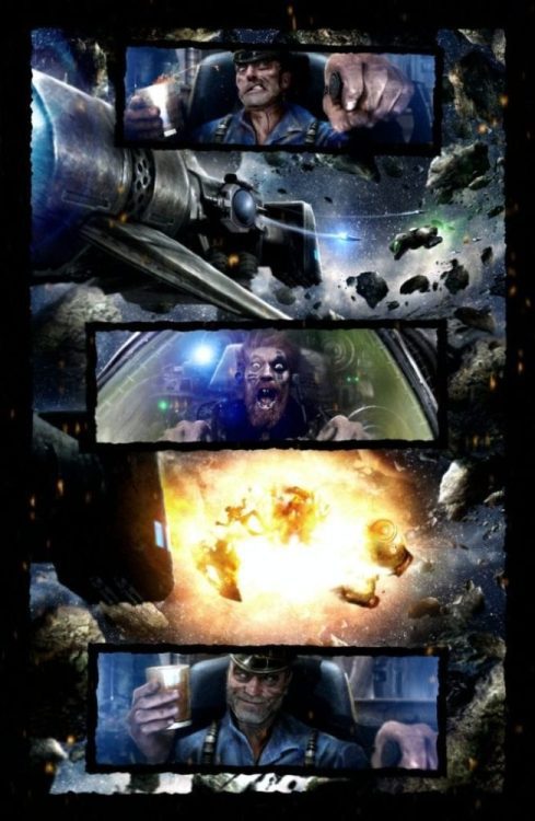
A little about Space Bastards: In the first volume, “Tooth & Mail,” Peterson and Aubrey are joined by Robertson, colorist Diego Rodriguez, and letterer Simon Bowland. The story follows veteran mailman Manny “The Manicorn” Corns and his newbie partner David S. Proton as we’re introduced to the bloody, gruesome world of interplanetary postage.
And later in the year, Peterson and Aubrey will add brilliant artists like Simon Bisley (Lobo) and Clint Langley (2000AD) to the team for a bunch of Space Bastards specials, a one-shot, and a couple of annuals! The Kickstarter for volume 2 just launched this morning — check it out!
And read on for our interview with Peterson and Aubrey:
Monkeys Fighting Robots: Where in the world did such an outrageous idea come from, and what is it that you have against postal services?
Eric Peterson: Oh crap no I have nothing against the postal service. Not at all! It was born out of my original teenage dream of making stories about dudes in space that have it hard and give me an excuse to write smuggler stories, heist stories, etc. And then I think after sleeping under my desk in some production jobs in my late teens and early twenties, I just sort of realized “This is what life is,” and the smuggler thing turned to “if a smuggler has a job, what is it?” “Oh its moving packages from planet to planet and getting shot at and getting into trouble.” Add to the mix my best bud Joe as co-writer for like over a decade and it elevated the piece into what it is today.
Joe Aubrey: This comic will do for postal carriers what Raiders of the Lost Ark did for archeologists. (Or perhaps what Silence of the Lambs did for psychiatrists).
MFR:There are some really cool influences you can see here in Space Bastards #1. Little things like the big corporation being called “Wayne Powers,” like the company in Batman Beyond, and Manny Corns being a bit of a Lobo type character. What were some other things that inspired you guys to make this?
EP: Powers Industries was really inspired by just the antithesis of Roy and the Intergalactic Postal Service. If they are cutting a bloody swathe across the galaxy, who would be the opposite of that? A well-meaning corporate machine that is there to build infrastructure across the cosmos to bring safety and prosperity. There’s no hyperbole there. I think Wayne Powers, CEO of Powers Industries, ultimately does want that. In terms of how, why, etc— readers will have to continue on a bit to find that out. Manny definitely has some Lobo in him, but I don’t think he was originally cut out of that cloth. Generally speaking we wanted a character who, if you put giant heaps of money in front of him and then an intangible thing called revenge right next to it, he’s going to reach for revenge. I think most of the inspiration behind the characters in year one of Space Bastards is pretty grounded in personal tales or things we relate to, just blown up larger than life.
JA: Wayne Powers’ name came from an early fan whose name actually is Wayne Powers. Back in 2013, before Darick Robertson’s involvement, he understood Space Bastards and was so supportive of the book that we felt we had to honor him somehow.
MFR: This issue really starts off with a huge scene, one that we can put together is coming up sometime in the future. How do you feel setting up an ending, or showing a flash forward, changes a reader’s experience of a work? (For what it’s worth, I’m a huge fan of dramatic irony. Loved the first scene.)
EP: Hey thanks! I’m almost never a fan of it. And then there’s like these little outliers like Breaking Bad season two or Tarantino films or Sunset Blvd that make me just love when it is done correctly. I think if we were telling a story of altruistic selfless people who ultimately end up prosperous and maybe start from a place of despair it wouldn’t work. I lean on the Scorsese ruling on this— when you want readers to anticipate an inevitable train wreck it can be handy for setting the stage.
JA: Issue 1 is our tamest issue. There’s less chaos and complexity than in subsequent stories. That flash forward is our promise to readers that things get ramped up fairly quickly.
MFR:How long do you see this series going for? It feels like it has huge potential to go on for ages, even if not all the characters stick around.
EP: Forever. Absolutely forever and ever. We have an ending in mind, as well as a lot of major plots that we think could span a long time. Ultimately I hope readers have enough of a good time with year one’s issues to give us the chance to play this out how we want to. At the same time, I do hope I get the chance to wring every ounce of Space Bastards out of my blood because my life has been infinitely more meaningful not only writing these stories with Joe but also getting to see the end result from the artists. Every day that I get a fresh page from the artists I grew up reading and loving is like a miniature Christmas for me.
MFR: Space Bastards is lots of fun, but it has a lot going on beneath the surface. A major theme, right from the get-go of Space Bastards, is how greed makes us see others as less than human. Just obstacles in the way of our next paycheck. Do you think your work is prophetic at all, hinting at where we’re headed, or do you just see it as a funny hypothetical future?
EP: Hmm… Good question. I’m not sure that I view it as prophetic as much as just a hyperbolic version of the way things are. I’m guilty. I have been pretty coin operated in times of my life. There’s something to be said for the importance of owning your own future. I also think there is a cost. I’m not sure this cost existed in the same way hundreds of years ago, but I think Robert E. Howard would say “Uh yeah, for sure.” I have a lot of fun exploring those observations with Space Bastards, the cost of pushing the pendulum.
JA: We are trying to entertain our readers. Make them laugh. All of this is satire. I suppose our story could be viewed as a cautionary tale against the extremes of capitalism, but hopefully our real life future is steered toward something less dire and isolating.
For more updates find Humanoids on Twitter, Facebook and Instagram. For all things Space Bastards visit Spacebastards.com. Check out my review of Space Bastards #1 and the Kickstarter for the Space Bastards Vol. 2 hardcover! You heard Eric Peterson, this series is going on forever, so back it on Kickstarter to make sure that’s the case.
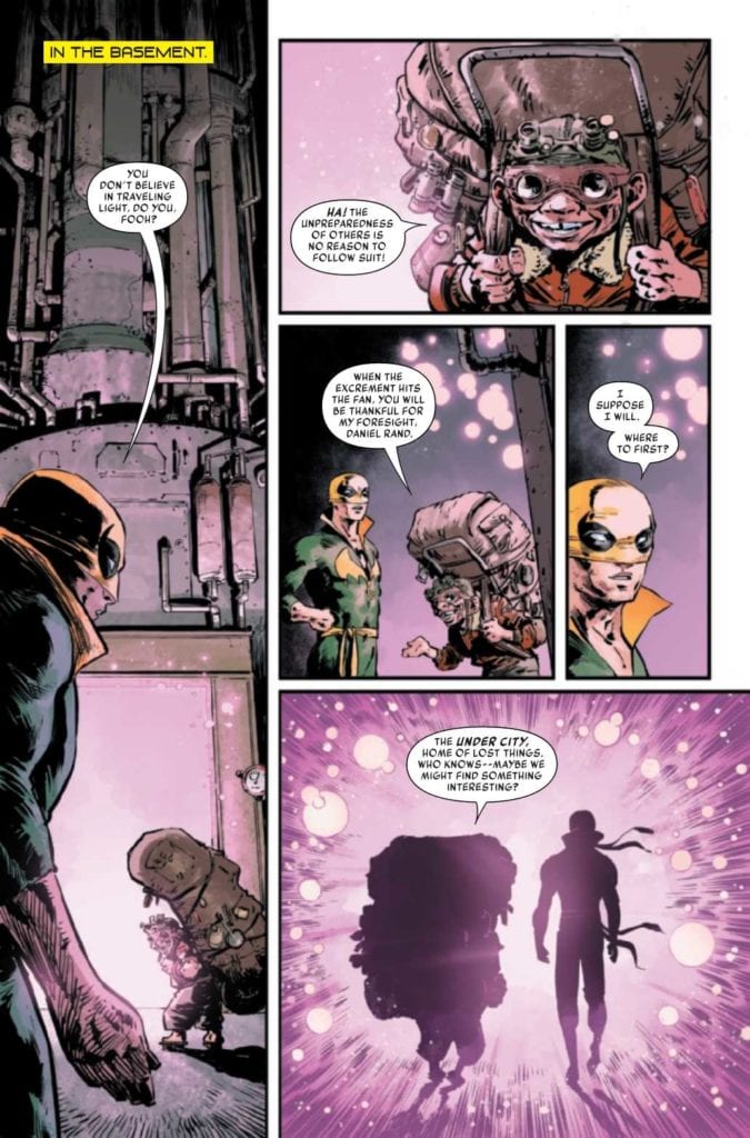
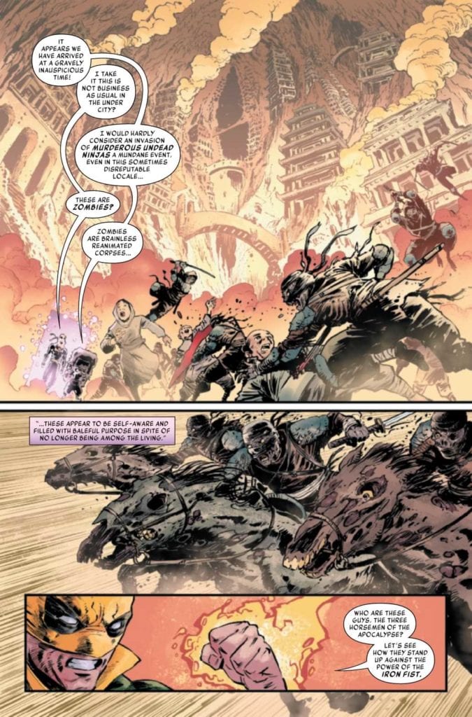
Iron Fist: Heart of the Dragon #1 by Marvel Comics hits your local comic book shop on January 20. Veteran writer Larry Hama works with artist David Wachter to showcase the scales Danny Rand faces. Colorist Neeraj Menon highlights the mystical elements of an underutilized part of the Marvel Universe. Finally, Travis Lantham gives a voice to every action.
The Iron Fist world has always been full of potential, with martial arts characters carving a niche within Marvel. While the likes of Shang-Chi occupy one corner and Daredevil touches upon another, they never seem to interact. That seems to be changing this time around.
Of Course, It Has Ninjas
Both Hama and Wachter have experience within the martial arts sub-genre, especially with ninjas. Hama throws the cast immediately into a conflict without warning, with a healthy dose of ironic humor. Iron Fist’s first impression of location is not with shock but with a mundane outlook. Because for a superhero universe, zombies are just another Wednesday.
Wachter demonstrates the scale of Iron Fist: Heart of the Dragon #1 through architecture. In just one of the settings, the building of the Under City, along with the burning smoke, look disorienting. For anyone other than Iron Fist, a sudden attack from a zombie calvary would kill them in an instant.
The fight scenes evoke the capabilities of the characters, often through panel work. The panels featuring Iron Fist, in particular, showcase the champion in both anticipation and split-second movements. In just one page, Iron Fist destroys a zombie ninja and its horse in the blink of an eye, which is why appearances from fighters who can keep up with Iron Fist like Taskmaster have fewer panels. These bigger panels emphasize the explosive blows they use to keep Iron Fist off balance.
Iron Fist: Heart of the Dragon #1 Mystic Colors
Menon provides Iron Fist: Heart of the Dragon #1 with a mystic undertone. Among all of the dangers that are highlighted with yellow and red, cooler colors exist in contrast. For example, a mystic doorway is purple, acting almost like a warning of danger ahead, unlike the safer Rand Tower. Then there comes a visitor near the end of the issue which is coated with a glow of blue whose very presence can cause some relief. Anything specific might be spoilers, so let’s just say that this entity is godly in every way.
Impact Lettering
VC’s Lantham keeps pace throughout the issue through efficient use of word balloons, captions, and SFX. In keeping pace with the action, no more than two sentences in carefully placed word balloons occupy a panel. The few uses of captions differ from highlighting locations to a monologue of a character off-panel. As for the SFX, each usage of action is unique, never repeating a usage for similar occurrences. This gives each blow by the characters a distinct identity. This all gives readers something to look forward to in later issues.
The most unique use of all the lettering in Iron Fist: Heart of the Dragon #1 comes from a surprise visitor. Her divine presence has her speak in a distinct light blue font that denotes her benevolence. This is why the plea she relays to Iron Fist feels so dire. There is a threat that a divine incarnation of compassion cannot face.
Psyche Yourself Up In Iron Fist: Heart of the Dragon #1
Within this issue is a chance to see a part of the Marvel Universe between heroics and magic. With plenty of martial arts action to go around, a plot of intrigue is boiling to the surface. Could this new force have something to do with Marvel’s evil ninja clan The Hand, considering the zombie ninja? Iron Fist: Heart of the Dragon #1 leaves readers begging for more.
The Crown is a Netflix series about England’s royal family from creator Peter Morgan, which tackles the drama and power struggles that have gone on behind the scenes for decades and, more realistically, centuries. Editor Morten Højbjerg sat in a dark room for long periods to cut together the shocking and controversial seventh episode of season four.
The Crown’s fourth season premiered on Netflix in November, delivering another stellar set of episodes praised by audiences and critics alike. Season four covers the family from 1979 to the early 90s, which means topics such as the rise and untimely death of Princess Diana are pivotal moments. Helena Bonham Carter’s Princess Margaret features in episode seven, “The Hereditary Principle,” which reveals another royal secret that must stay hidden.
PopAxiom and Morten spoke about becoming an editor, choosing between Helena Bonham Carter’s takes, and editing The Crown episode seven.
He Looks, He Sees, He Reacts
It’s common that people’s origin story in the filmmaking business usually starts with falling in love with film at an early age. From there, it’s a dream waiting to be fulfilled. For Morten, that’s far from his reality. “I’m a country boy,” he laughs then continues, “I’m from the countryside. In my family and upbringing, there was no creative intent or film industry anywhere around. I grew up thinking I was going to be a veterinarian.”
For a long time, Morten admits, “I didn’t even know what editing was or even thought about what it took to make a film.”
“I moved to Copenhagen,” he says, “and by a weird coincidence, I got a job as a runner at a production company. It was back in the day when editing was physical on actual film.”
The company Morten was working for “bought a state-of-the-art machine, the AVID. It was one of the first machines in Denmark. But nobody knew how to use it. It was a brand new technology.”
“I became incredibly fascinated by this machine that let you cut video on a computer,” Morten reveals, “It was mind-blowing.”
Morten’s fascination with the AVID lead to “digging into it by reading the manual. I started cutting little things. Before I knew it, I was cutting commercials for Playstation and car commercials.”
By this point, already a working editor, Morten “applied for film school to learn the theories behind what I was doing.”
After four years at the National Film School Morten, “never looked back.”
“You can cut from a super-wide shot where you can barely see the characters. They’re just tiny moving objects in the back of the frame. And then you cut to a close-up shot, continuing the movement, and your brain knows that this is that person.”
About The Crown
The Crown is an acclaimed show with three seasons of top-quality storytelling under its belt. “When you come in on something like this, that’s such a massive show, and there’s three entire series before it you’re expected to know the show. You have to understand the universe and contribute to that.”
Morten’s work on The Crown featured a lighthouse in the form of a person. “Show-runner Peter Morgan, who is also the writer of most of the episodes, it’s his child. He’s a lighthouse. If you have questions, thoughts, comments, or you’re just in doubt, you can always ask him. He will know. He is The Crown.”
The Crown’s an evolving beast that’s painstakingly taking viewers on a dramatic ride with the royal family. It’s dense and detailed. “It’s incredibly useful,” Morten adds, talking about Peter and his intimate knowledge of the show. “It gives the whole thing a singular feel.”
“Every episode is sort of treated as an independent piece of work,” Morten says, “There’s never a time when an editor works on more than one episode in a season. We live with our episode. I worked on my episode for six months. You’re very much encouraged to treat each episode like a feature film.”
The Crown is a big production that can often make the cogs in the wheel feel small. “You’re part of this big wheel that’s spinning, but you’re also making a special piece.”
The Character
Prior to working on The Crown, Morten edited four episodes for the Amazon series Hanna based on the action film from 2011. “From project to project, it takes a bit of time before you completely land in the universe. Coming from Hanna, which is this complete other kind of thing, you jump into this Royal Family thing, and it couldn’t be more different.”
To some, it might sound jarring, but to editors, it’s part of the fun. “But it’s always like that somehow, which is one of the fascinating things about the work. You get to submerge yourself in so many different universes, and then you’re there for a few months, maybe a year. Then you leap out of it and into something else. It’s inspiring. Of course, it’s completely schizophrenic, but I feel fine.”
Helena Bonham Carter, as Margaret, sister of Queen Elizabeth and the family gut-puncher who likes to call BS, features heavily in “The Hereditary Principle.” Morten has to decide which version of a scene a legend like Carter is better. “Having to choose between cuts is almost impossible. There’s nothing you want to cut out.”
“The first cut is usually much longer,” Morten admits. “They shoot so much, and there’s so much to work with. But you gotta take that chisel and hammer out the sculpture.”
It’s not so strange that “The first cut is bulky,” Morten reveals, “because you want to keep some choices open. You keep it in as long as possible until it has to go because the episode is just too long. If you trim it down to maximum efficiency from the get-go, you risk losing a lot of subtle things.”
“The Hereditary Principle” is a significant episode of season four in a series where every episode feels significant. “It was such a pleasure to be a part of The Crown. Editing scenes, together with those incredible performances, was a wonderful experience. Whether it’s spaceships or bank robberies, it’s always about the character.”
Wrapping Up
“Sometimes you watch a film, and it brings you back a great feeling, and it’s so surprising. It takes over. It’s so fantastic,” Morten says.
Morten says he’d love to do “something like Joker. It’s one of my favorite films of recent times. I want to do something that has that kind of intensity and authority. Brilliant storytelling. Joaquin Phoenix was just fantastic.”
The life of any filmmaker is never a dull moment. What’s next for Morten? “I’m working on a film in Iceland at the moment. It’s dark and very windy. Apart from that, it’s great. It’s a film based on a real-life incident in the early 20th century about two explorers who get stuck on the ice.”
Did you watch The Crown on Netflix?
Thanks to Morten Højbjerg and Impact24 PR
for making this interview possible.
Over the past six months and five issues, Writer Saif Ahmed and artist Fabiana Mascolo have been telling one of the most emotionally impactful and socially important comics of the past decade. Now,this tale reaches its end with Yasmeen #6. This final chapter neatly wraps up all of its plot threads in an emotionally cathartic and sentimental manner that, while admittedly a little cheesy, is still an uplifting and satisfying end to this outstanding comic story.
“Past and present clash in the series finale as Yasmeen must find the courage to face her darkest memories during a police investigation into her history. Meanwhile, Wassan forces Khalid to listen as she tells him about what Yasmeen had been through in Iraq, prompting Khalid to reveal a dark part of Yasmeen’s survival story.”
Writing & Plot
Every issue of Yasmeen has been a heavy shot of devastating circumstance coupled with uplifting hope. This final issue gives us that same mix, with the story Yasmeen’s time in captivity coming to a close as well as resolving the recent issues in her current life. This chapter contains a surprising and effective action sequence from the perspective of Iraqi soldiers that (while obviously not the main focus of this book) is written so well it makes me want to see Ahmed take a stab at writing a war story. The focus of this point however is the unimaginable loss Yasmeen witnesses during this moment, and how that influences her perspective in her new life. The other end of this comic is about Yasmeen’s affect on the people who surround her, and every element of reality that this entails. From the encouragement she gives her friends to the thoughtless comments and racism she receives, there’s sharp commentary for every part of the story. The character highlight of this issue is the resolution of Yasmeen’s father’s story. He had been getting to the point where it was hard to sympathize with due to how he had been ignoring his own daughter, but this plot resolves in a believable manner that allows us into his perspective and basically grants him another chance as an audience. This issue is written in the usual form of flashbacks intercutting with the present day, and it’s used as cleanly and effectively as it has in every issue thus far. Like in the past couple of issues, the present-day moments involving Yasmeen and her high school friends can come off as a little corny and a little bit cliched, but there’s an emotional sincerity to the script that makes this elements easy to overlook. This issue also feels a bit breakneck in terms of pacing, as the final pages wrap up different subplots in a montage style. This is a fine way to end those plots, but it does feel like it robs certain stories of their emotional weight. Overall, this is still a satisfying and cathartic end to one of the best comic stories of the past year.
Art Direction
Artist Fabiana Mascolo once again delivers the gorgeous light tones and character focused visual direction this series has always used in Yasmeen #6. Her linework and focus on character’s facial animations gets us into the headspace of the cast with little effort, as all of her interpretations of emotion are visually spot-on. She also gets a chance to work with some explosive action on this issue, and she excels. The panels full of fire and men making tense tactical decisions, as well as the emotional devastation embedded in these scenes, are some of the most memorable moments of the entire series. Mascolo’s colors are yet again an array of light, as if every panel regardless of what time it takes place has this wave of sunlight being flashed upon it. As per usual, Mascolo’s panel direction is a well-crafted mix of character close-ups and intercutting between past and present. Her shots present the most emotional scenes in a manner that captures the emotional journeys of every affected person, and her structure for switching from flashback to present-day is neat and flawless. It has to be said however that the quality of the pencils seems more inconsistent than in prior issues. It isn’t a widespread issue, but there’s a noticable quality dip in a few select spots that I’ve never noticed in prior issues. This being said, Yasmeen #6 is still a stellar book in terms of visual creativity.
Yasmeen #6 is an emotionally satisfying end to this courageous and important comic series. Saif Ahmed’s script dedicates itself to delivering effective ends to every character’s arc. His handling of unimaginable trauma is sincere and respectful while also being optimistic and offering messages of hope. While the story here can be a bit corny and the pace is a bit rocky near the end, this is still a great issue that does this outstanding series justice. The visuals of Fabiana Mascolo, while inconsistent compared to prior issues, is still a gorgeous mixture of character studies and sharp panel direction. Be sure to grab the final chapter of Yasmeen when it hits shelves on 1-20!


 Wachter demonstrates the scale of Iron Fist: Heart of the Dragon #1 through architecture. In just one of the settings, the building of the Under City, along with the burning smoke, look disorienting. For anyone other than Iron Fist, a sudden attack from a zombie calvary would kill them in an instant.

