Writer Daniel Kraus and artist Chris Shehan, along with colorist Jason Wordie and letterer Jim Campbell, return to the town of Comfort Notch to tell some fireside tales of woe in “The Autumnal” #4. This fourth chapter has Kat going to great lengths to overturn the stones covering this town’s past, and she meets some…interesting characters in the process. While this issue is delivered largely in an exposition-filled chat, it’s such a creepy and entertaining story that it’s hard to be mad. With great dialogue and more insightful character-focused writing, along with more brilliantly atmospheric visuals, this issue may honestly be the best one yet.
“After Kat learns of an old tragedy that brought Comfort Notch to its knees, the bitter, burn-scarred Carol Ravintzky finally tells the tale of the terrible death of Clementine Biddle.”
Writing & Plot
Daniel Kraus pens a familiar part of any horror story in “The Autumnal” #4. This issue functions as the part of the narrative where the protagonist (Kat) seeks the input of an expert or survivor (Carol Ravintzky) in her investigation to uncover the supernatural mystery plaguing her and her new hometown. What commences from this point on is a quiet chat with a physically and emotionally scarred woman detailing not just the horrific fire that killed numerous children, but the true nature of the alleged curse behind Comfort Notch. While the expository storytelling from Carol (and by extension Kraus) is an almost cliched part of any horror story, it’s delivered with such an air of tension and creepiness that it can’t even be faulted. The backstory to the entity living in the woods of this peaceful town is also relatively unoriginal, but again, the delivery is just so damn satisfying. Every passage of dialogue and narration is written with such loaded suspense while also sounding wholly unique to the character speaking the lines. The other big narrative part of this chapter is also the foil to the “expert opinion” portion, and also an aspect not often seen in a horror story. There’s a scene later in the comic that plays as the skeptical portion of the horror formula, where another character attempts to explain away the supernatural elements with real world logic. However, this scene and this character turn that notion on its head. This character doesn’t outright say Kat is crazy for believing in the possibility of what’s happening in Comfort Notch, nor does he discredit the possibility of there being some strange things happening in the town. What he does instead is offer his input based on his experiences, as well as a genuine opinion on how people cope with trauma and how these elements are linked. It’s a beautiful moment that I don’t think I’ve ever seen in a horror story regardless of the medium. The fact that this series continues to be both intensely unnerving and so human is a wonder on behalf of the writer, and makes this one of the best comics coming out on stands right now.
Art Direction
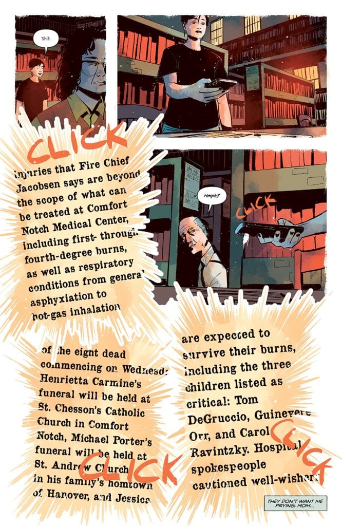
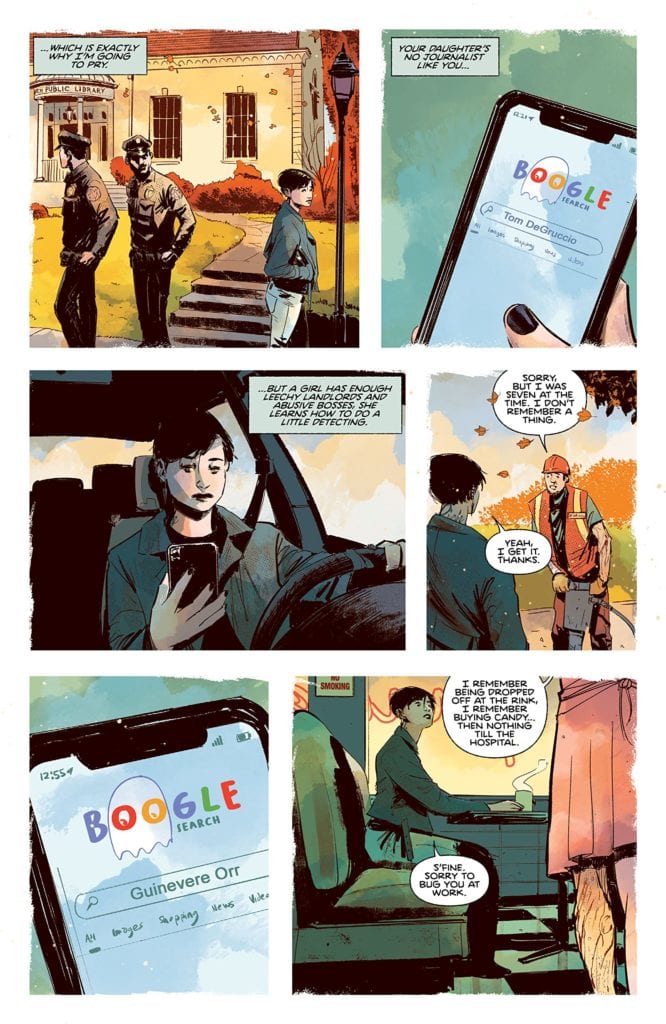
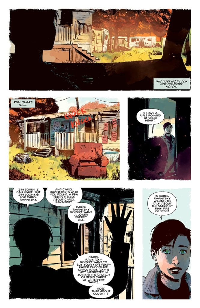
Of course, the real reason this comic is so unnerving and atmospheric is because of the artwork from Chris Shehan and Jordie Bellaire. Shehan’s thick lines and shading give dimension to the well-animated characters, some of who look to have more history that even the oldest buildings in Comfort Notch. Each panel is full of depth, with buildings and scenery designed with a gritty realness that’s somehow also blended with the feeling of being something out of a fantasy novel. While most of the visuals in this book stay away from the supernatural, the sequence in which Ravintzky is reciting the town’s big unnatural secret is put together in a dreamlike web of blood and visual horrors that excel in keeping up the terror. The colors from Bellaire are a stunning watercolor-style blend of cool autumn hues and foggy damp, foggy nights. Every surface in each panel is rife with texture that’s blotted with tiny specks of different shades to give everything a realistic dimension. There’s also the constant specter of shadow caused by moonlight or what appears to be sunset, and it always sets the tone of the book perfectly. It’s visually reminiscent of Dean Cundey’s cinematography on the original Halloween. The letters from Jim Campbell are a great blend of font usage, from a more typical font during central character’s dialogue and narration to a scratchy, razor-in-a-chalkboard font during more unnatural goings-on. The visual work on this chapter, as in every chapter prior, is a gorgeous and thematic use of the comics medium to convey this unique horror tale.
“The Autumnal” #4 is a special comic not just for its own series, but for what it does for horror storytelling as a whole. Daniel Kraus has constructed a script that uses some classic clichés from other horror stories and not only executes them brilliantly, but he actively usurps those clichés by introducing insightful commentary into the story. The visual work of Chris Shehan and Jordie Bellaire is a foggy and eerie yet gorgeous view of the autumnal northeast, that switches to being intensely foreboding at the drop of a hat. This continues to be one of the most unique comics, and horror stories as a whole, on shelves right now, so be sure to grab this newest issue when it releases on 1-13!

