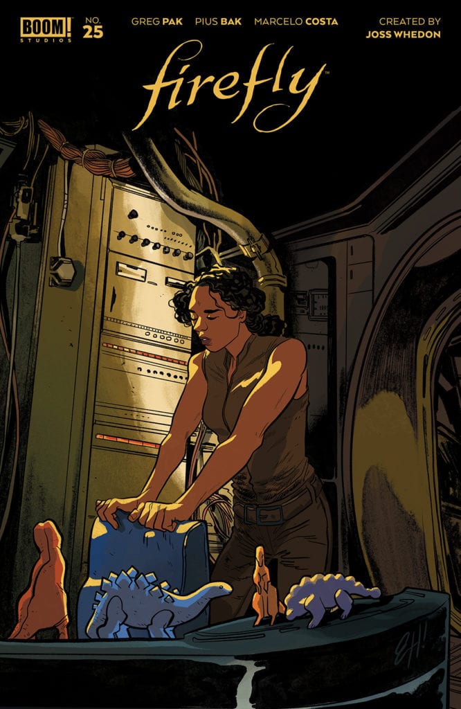
FIREFLY #25, available Wednesday from BOOM! Studios, is about to answer many of the questions fans have been holding onto all these years. Namely, what happened to the crew, after the battle in Serenity?
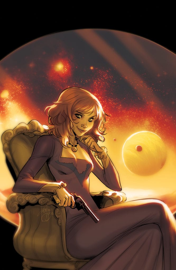
Such a bittersweet scene for this alternate cover of Firefly #25.
Serenity released back in 2005, and one of the questions fans always wondered about is what would happen next. Well, their first question was one full of hope for a sequel, if we’re being completely honest here.
Firefly #25 is an issue that jumps forward in time, to a point after the events of Serenity. The goal, naturally, is to answer many questions that the fans have had about what would have happened to the surviving characters following the fall of the Alliance.
Please tell us that Saffron is about to show up and start making trouble!
The Writing
I went into Firefly #25 more or less expecting the series to pick up right where the movie left off (give or take a few years). What I got instead was a bit more of a surprise. This first issue doesn’t drop the past events of the comics, but instead merges both worlds together.
It’s going to be interesting to see how Greg Pak continues to integrate these two plots, as in many ways it feels like we’re dealing with many changes. There’s the obvious of course, but it goes beyond that as well.
This is an issue that is both surprising – in the twists that it brings with it, and just a little bit disconsolate. There’s a real feeling of loss mixed throughout the pages. As there should be. It’s a sentiment that many fans can relate to, both following the end of the movie, and the cancellation of the series.
It makes for a melancholy start to this new plot arc, but it’s balanced nicely by the intrigue that has created. As I already hinted at, there are many changes happening, some of which will make sense to long time readers. Others that are clearly meant to be explained at a later point.
You can’t take the sky from me.
The Art
Where Firefly #25 has to merge two major plot points together, the artwork has, even more, to contend with. Yet it rises to the occasion, portraying a variety of scenes, characters, and changing dynamics in flawless transitions.
Pius Bak was the lead artist for this issue, toeing a careful line for the characters. Many are immediately recognizable, while still clearly showing signs of time passing (painfully so, in some cases). It’s not just in the way they dress, but in the way, they’re portrayed to carry themselves.
Marcelo Costa’s colors brighten up the scenes, even those of a more sober variety. The backdrops are understated, yet compliment the tone of the series as a whole. It’s when something shocking occurs, or power is running free, where the colors really seem to steal the show.
The lettering, provided by Jim Campbell, is the final touch necessary for this series. The highlight, in this case, would have to be the sense of action and feel of combat that the lettering carries. All while leaving room for a narrative twist on things.
This is quite the change.
Conclusion
Firefly #25 is not exactly the issue that I was expecting. But it has already done a solid job of holding my interest. It’s hard to say how new fans would feel, jumping in at this point, but those that have been following the series will almost certainly pick up on those somber tones.
Ultimately, this first issue in this new plot arc will leave fans hoping that things get better for those characters involved. All while being very curious about what is actually happening behind the scenes.
NOMEN OMEN #11, available Wednesday from Image Comics, dives back into a world of dark secrets and hidden magic. Dark forces have become commonplace as Becky’s battle for revenge (and for her heart – literally) continues.
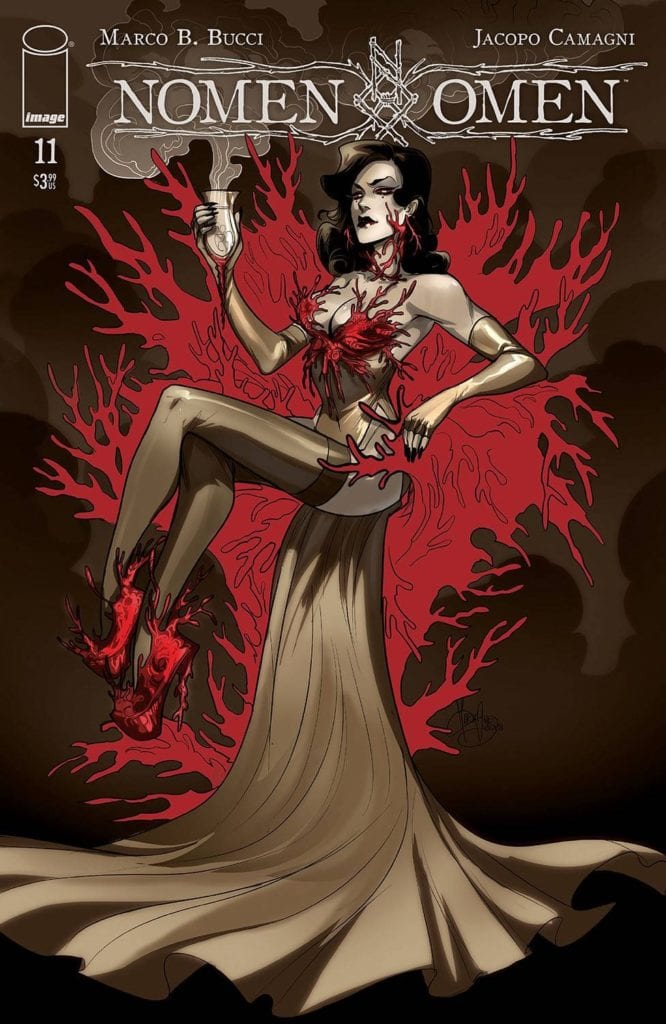
A sinister plan awaits in Nomen Omen #11.
We can all agree that as a whole, the series of Nomen Omen has never been afraid to get dark*. Both in the literal, and figurative sense. After all, the protagonist is literally fighting to get her heart back. A heart that was stolen by an ancient entity will ill intentions.
Still, the series has surprised readers (myself included) on more than one occasion. Nomen Omen #11 continues that trend, throwing characters and readers alike into a dark and twisting series of events that feel next to impossible to predict.
Even with all those odds, it still feels impossible to do anything other than root for Becky and her most unlikely group of allies. No matter how hard we root, it won’t change the fact that there are now only four issues with which her battle may be wrapped up.
The Writing
Nomen Omen #11 is a conundrum. On the one hand, it feels like a bright spot of hope. On the other hand, it is also the most depressing issue of the series (so far – no promises about what is to come).
Don’t get me wrong, it is brilliantly written, and all credit goes to Marco B. Bucci for that. In many ways, it feels like we’re hitting the climax of the series, and that means there are some twists in store for those that are invested in it.
And as we all know, when magic is involved, not all twists leave one feeling all happy and bubbly on the inside. The surprises in store stick true to the core of this series while leaving us wondering where things will go from here.
What is fascinating is the inclusion of other perspectives in this issue. That’s where the real sense of humanity comes from (ironic, given a few of the people we’re talking about). It grounds this new plot arc, while simultaneously reminding us of the stakes.
The Art
The artwork for Nomen Omen #11 is every bit as captivating as the writing itself. If not more so, in a couple of places. This is arguably the brightest issue of the series, visually speaking. Again there’s a sense of irony there, given what is going down.
Jacopo Camagni’s artwork is simply divine. The whole series has had a creative way of portraying magic – having a lack of color depict the absence of it, and vibrant scenes showcasing a world full of magic.
Well, that whole concept is taken to the farthest extension here, all while creating some truly breathtaking images. Honestly, they’re striking even without the context of what is happening. Throw that vital context in, and suddenly you have something otherworldly and frighteningly beautiful on your hands.
Fabio Amelia’s (from Arancia Studio) lettering is just as impressive. There are understated pages, and then there are times where the lettering becomes part of the background and artwork itself. Only to flawlessly transition right back. It’s breathtaking and brings with it a certain sense of weight.
Conclusion
Nomen Omen #11 may be the darkest issue of the series, but there’s still that lingering sense of hope. Not to mention, a very strong feeling of curiosity. We all know that the end may be near, but it isn’t here yet. So there is still time to battle, and thus still time to see things through.
*Nomen Omen #11 does indeed get fairly dark at points, though not quite as graphic as some of the previous issues. It does however provide a harsh reminder to past events, in the portrayal of a character and the setting they are trapped within.
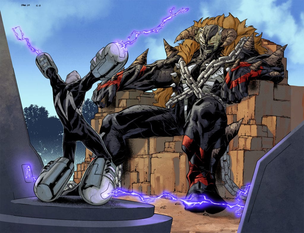
SPAWN #314 hits comic book stores on Wednesday, January 27th, following the aftermath of Al Simmons and Overt-Kill’s one-sided fight with Monolith. The enormous Hellspawn appears to care nothing for kinship, vowing to subdue Simmons and force him to meet the mysterious “master.” What readers will find is the enormous consequences of their hero catching up to him in full force.
Story
Simmons, witnessing the sudden destruction of his friend Overt-Kill at the hands of Monolith, is forced to experience much of the same pain. His Spawn abilities are severely weakened after breaking time a few issues back, leaving him virtually defenseless.
After his pounding, Monolith proceeds to drag Simmons to a make-shift. And what readers behold is an even more menacing Hellspawn than the former.
This “Omega-Spawn” expresses his grievances over Simmons decision to detonate his symbiote and fracture reality. Simmons says he felt there was no other choice and that the consequences would be minimal. Unfortunately, Omega-Spawn claims the actions trapped hundreds of celestial beings on Earth, and Cogliostro is seeking to take advantage of the Hellpspawn once again.
Writer Todd McFarlane brings readers along this increasingly hopeless journey as if they were in the story themselves. We watch as the protagonist faces the consequences of his past actions, enduring physical and emotional pain. And with the odds so drastically in his enemies’ favor, Simmons may give up any hope of rectifying his mistakes.
Artwork
Carlo Barberi’s penciling and ink work, Jay David Ramos’s coloring, and Tom Orzechowski’s lettering harmonize brilliantly in SPAWN #314. The bulky designs of Monolith and Omega-Spawn assert their dominance across each panel. Their forms are brought to life with solid shades of black, red, and orange. In addition, the lettering does a brilliant job of helping the reader distinguish who’s speaking—whether it be the narrator or one of the Hellspawns—using varied fonts and word balloon borders.
Conclusion
SPAWN #314 provides hardcore fans with all the blood, guts, and fighting that made them fall in the love with the series. We are anxious to see if Simmons has a chance in hell of turning the tides in he next issue.
Do you think Simmons has a chance at defeating Omega-Spawn at any point in the future? Let us know in the comments below!
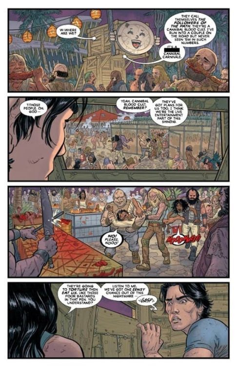
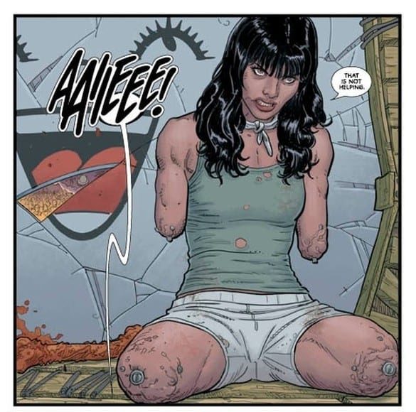
POST AMERICANA #2, available in comic book stores on Wednesday, January 27th, explores more of the post-apocalyptic land formerly known as the United States of America. The renegade Mike met the badass Carolyn last issue while attempting to navigate the American wasteland. Now the duo find themselves prisoners of an interesting group: wasteland cannibals.
Story
After the long diatribe by the dome’s leaders, we find a disoriented Mike attempting to make sense of his surroundings. The escapee asks Carolyn, who’s currently out of view from the reader, explains the dire predicament they now find themselves in.
But before he can take action Mike finally looks in Carolyn’s direction. And to his utter shock, she’s missing all of her limbs. But what actually lead to her predicament?
Steve Skroce’s writing is unsettling in both its shock value and dystopian vision of the United States’s future. Yet this makes this form of storytelling all the more engaging. The fast-paced, action-packed narrative offers ample opportunity for effective characterization. Despite the prevalence of a “rugged individualistic” mindset, our protagonists will learn than working together is the only path forward.
Artwork
The illustrations in this issue contain the quirky, surreal flair that many lines out of Image Comics have come to be known for. Skroce’s penciling and ink work depicts sprawling landscapes of ruined buildings and former landmarks that show the poor conditions the communities now find themselves in. Among this number are Carolyn and Mike, whose bloodied bruises and cuts stand out vibrantly with colorist Dave Stewart’s bright reds. In addition, Fonografiks’s lettering does an effective job of conveying the sounds of each scene using eye catching oversized fonts.
Conclusion
POST AMERICANA #2 takes this Mad Max inspired story to an entirely new, exciting level. We can’t wait to see what other challenges Carolyn and Mike face as they venture deeper into the former American heartland.
Do you think Carolyn and Mike will finally ditch the cannibals and take on the new U.S. government? Let us know in the comments below!
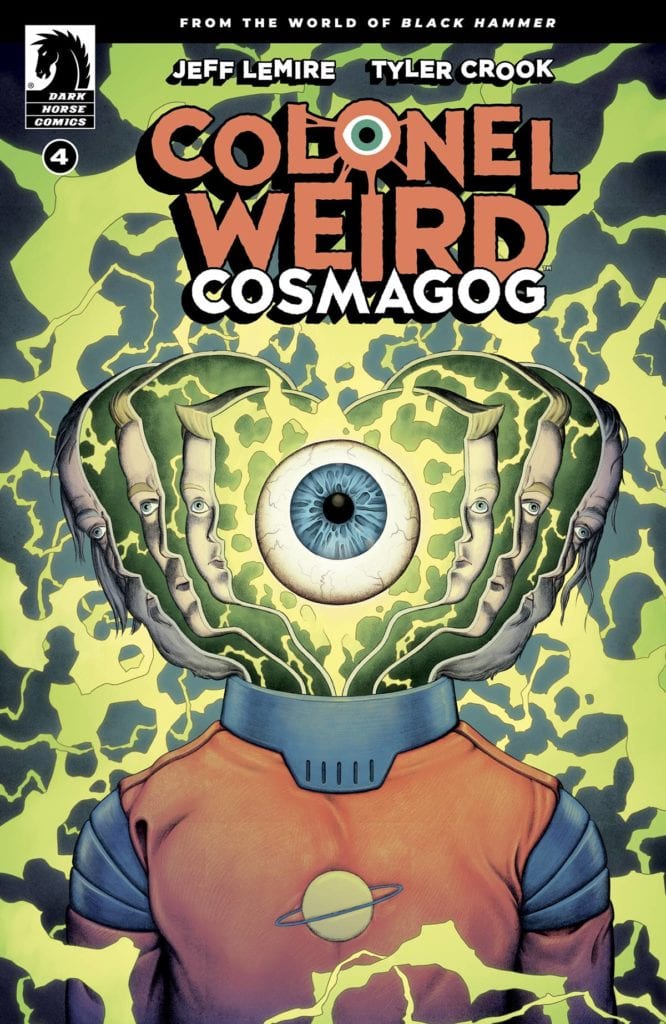
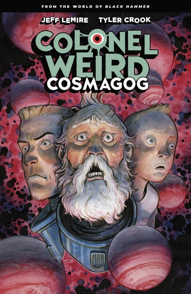
Not with a bang but instead with a rocket blast, Colonel Weird: Cosmagog comes to an end. Despite its ending, it’s the quiet and unassuming story of a space ranger with the world on his shoulders. But just like in past issues, writer Jeff Lemire and artist, colorist and letterer Tyler Crook, aren’t here for the alien battles or holes in the space-time continuum. No, Dark Horse’s Colonel Weird: Cosmagog #4continues to be about Weird’s heavy heart and his confused brain.
Writing
Since issue one, Weird has been trying to remember something. We’ve followed him, through time and space, to see that he’s a man who is cursed. He’s reliving and repeating each moment of his life. We see him in his most vulnerable times. We see him at home, crying about being bullied as a kid, or offering his hand to his wife Eve to show her the Parazone, which is destined to rip her to shreds. And, interestingly enough, Lemire doesn’t trod much new ground in this final script. Instead, we inch closer to the conclusion of each of these scenes. We not only see Weird as a little kid, crying to his mother, but we finally see how she consoles him. It’s the twists and turns of real life that have us on the edge of our seats. And when Weird says “I am tired of always trying to go the right way,” he speaks for all of us. Lemire captures the exhaustion of trying to live life well. It’s a universal feeling. Lemire underscores it with every hard decision a guilt-ridden Weird has to make, over and over again.
Art
Again, Crook traces a through line in the script. He shows us the scared face of a little boy, and how it’s not that different from a face that is decades older. Weird still feels scared. He’s been feeling scared his whole life. But as we close in on the conclusion of one scene, Crook shows us who Weird is different from. As Abraham Slam, Barbalien, Black Hammer and Golden Gail fight the Anti-God, they’re not scared. This world-eating adversary is the kind of big baddie we’ve seen in comics. These heroes are familiar with such threats. And so, they’re angry, not frightened. But Weird knows the only way to stop this menace. When Madame Dragonfly approaches him, Crook underlines her humanity too. She looks petrified. And finally, as they join hands, Crook shows how this moment felt to Weird. The page erupts, panels scatter. Weird’s world falls apart. It’s a beautiful representation of this act that has followed him throughout time and how doing it over and over again is tearing him to pieces.
Malachi Ward variant cover
Coloring
Crook washes nearly every scene Weird’s in, in one overpowering color. Whether he’s in the green of the Parazone or fighting the angry red Anti-God, Crook obscures Weird’s true colors with the light of a threat from without. In some ways, this reads like the pull of time. We don’t see what makes Weird who he is. We don’t see what he would choose. Instead, we see what he’s already chosen. Because Time is his master and just as his colors make way for the light of the page, Weird’s will bends to the will of Time. But, in one brief moment, Crook uses another color. A color that originates from Weird’s actions, the bright spark of him trying to fix something. And in that moment, Crook obscures some of Weird’s face. The white light makes it so we can only see his eyes and his knitted brow. But, in doing this, Crook makes us wonder if this is a moment where Weird lets himself hope. Without the frown and the gaunt cheeks on display, his eyes could just as easily be carefully hopeful, as they could be worried and scared.
Cover to the TPB collection of COLONEL WEIRD: COSMAGOG
Lettering
Crook, in his lettering, uses small, subtle moments to show a connection between Weird through the years. Child Weird looks up at his mother. “I– I’d forgotten about this…” In the next panel, present day Weird reacts. “Oh!” The lettering is small, like a realization that comes from deep within. “I’d– I’d forgotten…” he says, echoing his younger self, even in the syntax. And as Weird remembers what he’s forgotten, with the “KZZZZT” noise of a burst of hope, he begins to seem more sure of himself. His lines are no longer divided up into small whimpers, word balloons containing three to four words at a time. He speaks as confidently as Weird can, ellipses and all. Finally, Crook marks the end of this book with the “CHOOOM” of a rocket engine. He connects us back to our original expectations. The space battles and rocket launches of a sci-fi adventurer. Perhaps Crook is suggesting that Weird, unburdened, has some loud, swashbuckling adventures to look forward to.
Dark Horse’s Colonel Weird: Cosmagog is a delight. It’s good to know that some things are just damn near perfect. Pick up Colonel Weird: Cosmagog #4 orthe trade paperback, out from Dark Horse Comics January 27th, at a comic shop near you!
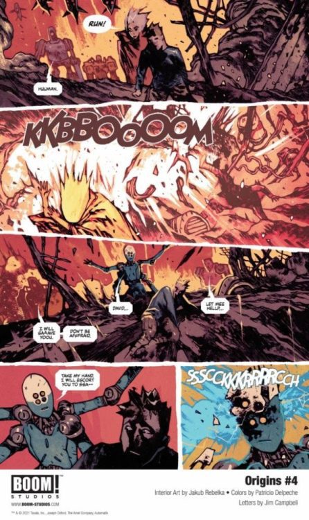
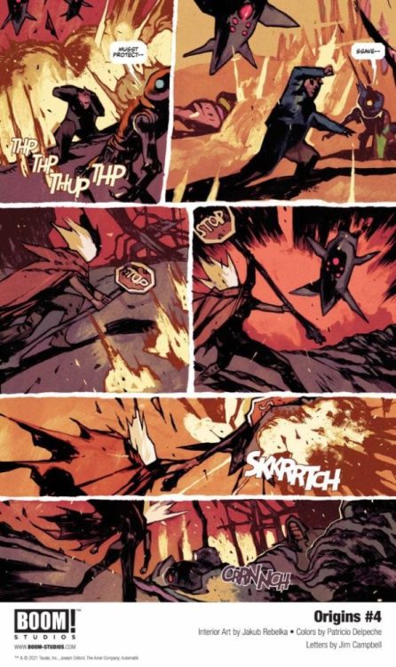
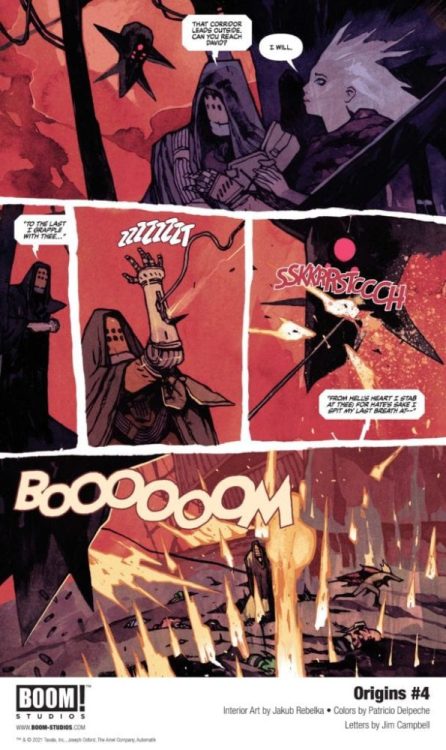
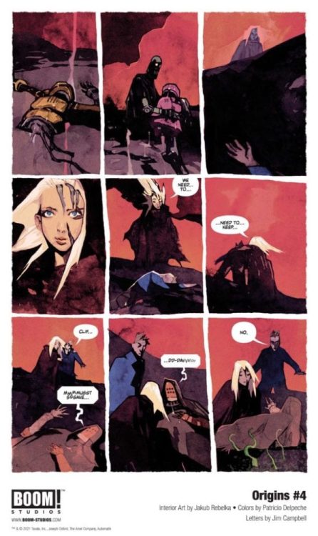
ORIGINS #4 hits your local comic book shop on February 10, but thanks to Boom! Studios, Monkeys Fighting Robots has an exclusive five-page first look for our readers.
The book is written by Clay McLeod Chapman, with art by Jakub Rebelka, Patricio Delpeche drops the color, and you will read Jim Campbell’s letter work. Rebelka’s panel design adds to the story’s desperation; it is like the comic is getting ripped apart.
About ORIGINS #4: When the Network discovers David and Chloe’s refuge, they’re forced to make a devastating sacrifice to escape. To continue into the desolate frozen wastelands towards David’s lab, they’ll need the help of their new-found allies if they want to survive.
Enjoy The Preview Below:
Digital copies can be purchased from content providers, including ComiXology, iBooks, Google Play, and Madefire.
The trade for Dry Foot out from Mad Cave Studios on February 24 collects the four-issue mini-series. Standing in contrast to the nostalgic decade of the 1980s, writer Jarred Luján depicts the struggles of Miami’s Latinx community. Joining him is artist Orlando Caicedo coming out of the Webtoon format to display his dynamic action sequences. Backing them up are colorist Warnia Sahadewa and letterer Justin Birch.
The Kids Get A Dry Foot
Luján gives each cast member reasons and motivations for their actions in Dry Foot. They are all in some way affected by Cuban Miami of the 80s, even if it’s not explicitly stated. The Pretty Boy of the group Fabian might be a flirt, but it’s a defense mechanism against his bleak home life. His mom is a drug addict and has a history of abusive boyfriends. From an early age, becoming a pickpocket was his way of surviving.
Then there’s the driving character of Dry Foot, Diego. Diego, among all of his friends, fears the possibility of falling into organized crime. How would the reader react to seeing their community members getting into gang wars and police shootouts? Diego’s only escape is his friends and the movies he enjoys, like Indiana Jones. Dry Foot brings a new perspective on the setting of the 80s; pop culture can be genuinely entertaining like in Hexagon, but for some people, it’s only an escape from reality. When Diego and his friends try out their heist in the style of Indiana Jones, things turn out badly.
The above is not even because of reality setting in for its own sake. It’s a natural character-driven reaction from another cast member, Angel considering his own home life. The setting of Cuban Miami showcases yet again by showing how family members can drive people towards ruin. Angel’s brother is a gang member and provides for his family’s survival. It’s all a genuine tragedy considering how much effort Luján takes to have the reader fall in love with all of these characters in such a short time.
Art of Dry Foot
Caicedo provides his distinctive style of dynamic action to Dry Foot. The panels and character movements have a strong sense of weight and urgency. Take a flashback when Fabian has to pull Diego back from when a police car almost hits him. It’s a big moment that the reader and Diego remember when it comes to who to trust.
Sahadewa provides the series with a number of lighting effects. This includes but not limited to colored lights evoking the neon signs of the 80s. Whenever there are lights on display, it’s an indicator of a big climactic moment. Like when a car suddenly bursts into a room.
Finally, lettering by Birch guides readers across every point of interest in Dry Foot. Every word balloon or SFX is practically an extension of actions on the page. This provides just the right amount of pacing for the reader to get through.
A Short But Sweet Ride
Dry Foot might require a little background knowledge to fully appreciate since it goes so fast. That doesn’t mean that the decisions made by the characters don’t have weight to them. Luján along with his creative team crafts a gripping narrative that takes a familiar 80s and puts them under a new lens. After all of the series that come in reaction to Stranger Things, it’s nice to see something urgent and down-to-earth. That’s what makes rereading this series such a splendor, looking at something familiar with a new context.
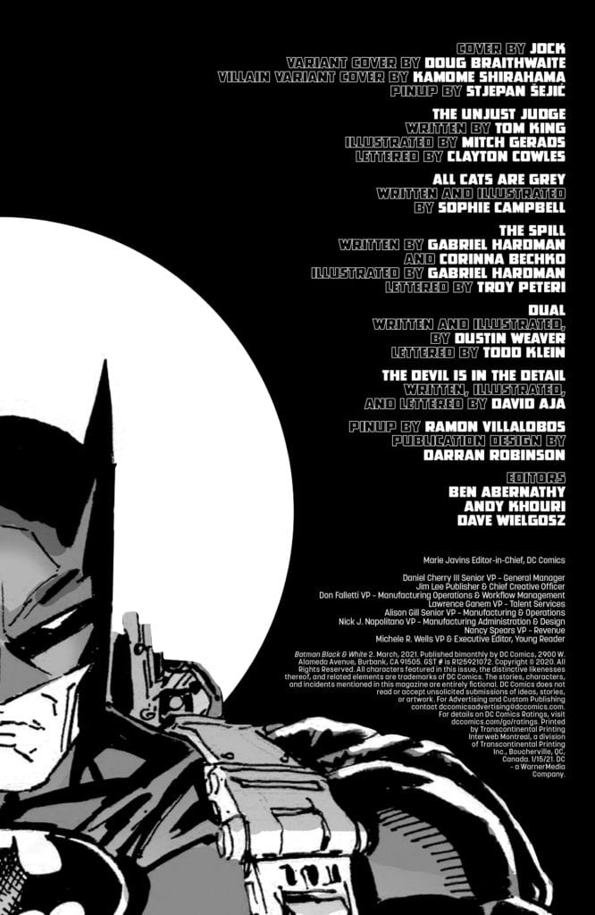
DC Comics’ Batman: Black and White #2 is absolutely fantastic. That’s because this anthology issue carefully bites off only what it can chew. Each story, by these brilliant creative teams, is incredibly simple. No need for exposition dumps, very few splashy fight scenes and even fewer twists. These are Batman stories at their best: quiet, methodical and mysterious. Just like the Dark Detective himself.
“The Unjust Judge”
Writing: 4/5
Art: 4.5/5
Lettering: 4/5
Written by Tom King, with art by Mitch Gerads and letters by Clayton Cowles, “The Unjust Judge” deals with faith and hard work. King brings Batman’s insecurities to the surface. He’s a man who wants to save everyone, and every failure rips him to pieces. Gerads will break your heart in this story. Batman’s face as he rails against his own failure, which gives way to overflowing grief, is devastating. And Cowles shows the relationship between Bruce and this man he’s trying to save. At first Bruce’s words come down towards the man, as though he’s more in control. But later, Cowles shows how they’re now on the same level, their words reaching upwards together. And with a brief panel, the man’s words stretch downwards, showing a shift in the dynamic and an acceptance of the situation.
“All Cats are Grey”
Writing: 4/5
Art: 4.5/5
Written and drawn by Sophia Campbell, “All Cats are Grey” is the epitome of simple storytelling. Campbell uses no dialogue, no captions. Instead, we take everything from pictorial cues. It’s experimental but incredibly down to earth. Campbell shows in black and white, and ironically very little grey, a chase scene between Batman and Catwoman. It’s fun and fresh.
“The Spill”
Writing: 3.5/5
Art: 5/5
Lettering: 3.5/5
Written by Corrina Bechko and Gabriel Hardman, with Hardman on art and Troy Peteri on letters, “The Spill” is a story about Gotham in the rain. We see Batman as we rarely see him: helpless. Bechko and Hardman show us Batman’s panic through his inner monologue, and perhaps they tell us just a tad bit more than we need to know. But as Joker comes on the scene, Batman’s mind quiets. It’s as though he’s suddenly in a position he’s familiar with. Hardman echoes the chaos of each moment on the page. Panels within panels quicken the script to emulate Batman’s panic. Peteri amps up the drama with big sound effects. But Peteri doesn’t let the sound effect get in the way of the action, hollowing out the sound of waves so we can see the water engulfing everyone. It’s a Joker/Batman story that feels familiar and new at the same time.
“Batman: Dual”
Writing: 3.5/5
Art: 4/5
Lettering: 4/5
“Batman: Dual,” written by Dustin Weaver, with art also by Weaver and letters by Todd Klein, is a high stakes supernatural mystery. Weaver creates a tense, intriguing plot. Batman follows an impostor, dressed in him but in white. Weaver’s use of poetic language to describe the chase gives this story the epic and dreamlike feeling it needs. Weaver occasionally wanders into the territory of overexplaining, but it makes sense. Batman is deeply confused and it’s almost as though he’s explaining events to himself, to figure it out. His art is detailed and often terrifying. Klein’s lettering is constantly changing. The cursive of Batman’s thoughts gives this story a mythic element. And Klein’s breaking up of dialogue and captions navigates the reader through what could otherwise be confusing pages.
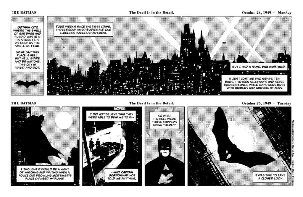
“The Batman: The Devil is in the Detail”
Writing: 5/5
Art: 5/5
Lettering: 5/5
It seems each issue of Batman: Black and White has a perfect story. Last issue’s was a story by G. Willow Wilson, Greg Smallwood and Clem Robins. This issue’s is “The Devil is in the Details” with David Aja on writing, art and letters. Aja writes this short story like an old newspaper strip. He even dates each row and writes “Back on Monday!” at the end of those that “came out” on Saturday. He writes in a 1940’s tone, with Batman explaining each step of the plot for the reader. But he rises above the era, setting the story apart from mere plagiarism. For two days in a row, Aja writes nothing more than a Latin prayer.
His art uses Ben-Day dots to create the texture of an old newspaper. Some corners have streaks of white, mimicking a fault in the printing. And the art is so simple. Aja zooms us in on a hand with a gun or the side of a hooded face. His lettering shines with captions that take up a whole panel on their own. It’s a fantastic recreation of the old style. Everything about it screams a love of comics. Aja’s subtle writing, somehow not sacrificed by intense use of exposition, his minimalist art and his passion for the medium all make this a perfect Batman story. One for the history books, especially since it has the look that it’s from one in the first place.
DC Comics’ Batman: Black and White #2 is even more fun than the last issue. Every story is beautifully simple. Pick it up, out from DC Comics January 26th, at a comic shop near you!
DC Comics’ Strange Adventures continues to show the complicated mess of war. Much like Edwin Starr, writer Tom King, artists Mitch Gerads and Evan “Doc” Shaner, and letterer Clayton Cowles, don’t think war is good for much. Just as in my last review, I’m no longer reviewing each storyline of Strange Adventures individually. Strange Adventures #8delivers a script full of important beats and these storylines continue to meld into one tantalizing tennis match.
Writing
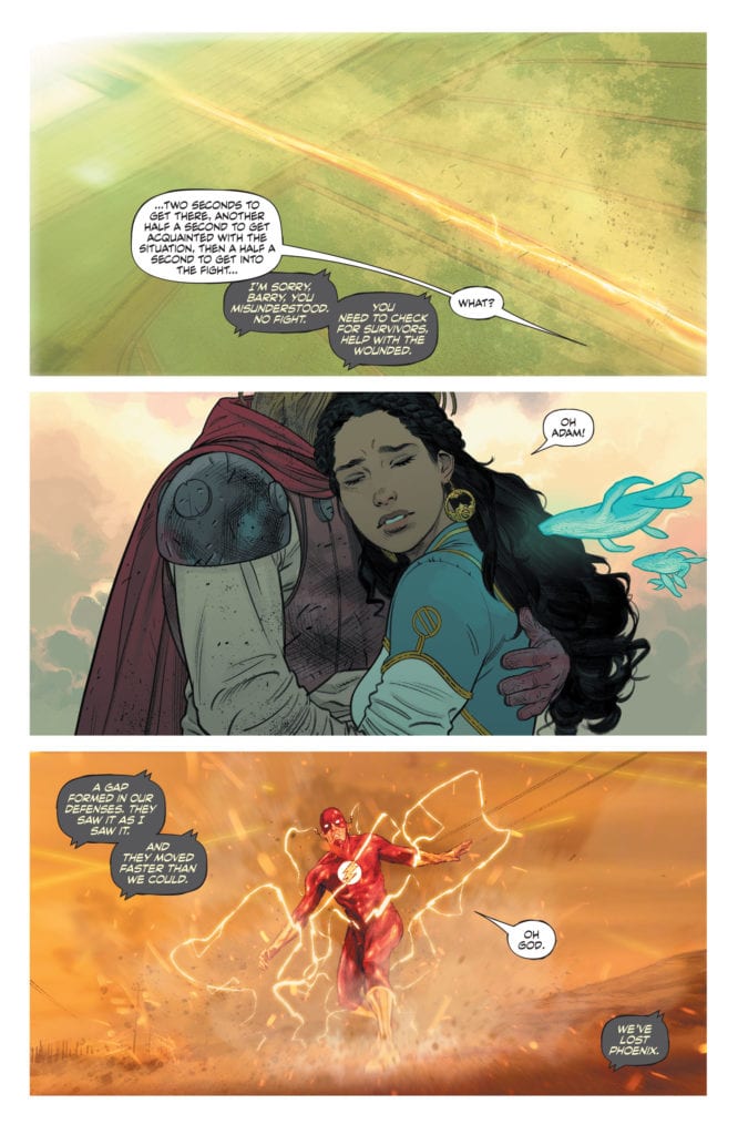
King was once writing two stories. At least, each storyline didn’t have huge parallels that were clear on a first read. King was writing about different eras, writing in different tones. Now, with the Pykkt war raging in both storylines, on Rann and on Earth, King presents us with some very similar events. On Rann, Sardath has captured a Pykkt warrior. On Earth, Mr. Terrific has done the same. And suddenly, we’re seeing the differences in our characters highlighted. When Adam Strange is called in to question the warrior, we see the contrast between him and Terrific. But King also shows the similarities. Terrific is meant to be the morally superior character, the one investigating Adam. We’re left wondering if war has made Adam cruel, but we’re also wondering if it’s currently doing the same to Michael Holt.
Art
Gerads does a wonderful job of showing both the immensity of war and how up close and personal it can become. At times, he shows us scenes of characters standing in wreckage. These heroes, larger than life to us, look like dots on the page. They’re overwhelmed by the destruction. But later, we see the punching, the stabbing and choking of war in close quarters. We see the expressions on the faces of those causing violence and those receiving it. We see the humanity that’s at stake.
Meanwhile, Shaner mostly shows us the delicate nature of peace. Everything is quite up close and personal with Shaner’s art. Adam and Alanna hugging, the look on Adam’s face as she washes him, the anger in their eyes as they fight. But Adam is among family. His fists should be lowered, his smile should be broad. Instead, his eyes are haunted. Shaner shows us that just because someone might have gotten out of a war alive, doesn’t mean they’re not dying on the inside.
Coloring
Both Shaner and Gerads use lots of reds, blues and yellows. It’s not lost on them that red and blue is often associated with America. They’re writing about characters who see themselves as above the law. Their way is the right way, simply because. Yet the yellow is the equalizing factor. It’s the fire of destruction. As the Flash looks over a decimated landscape, the sky is yellow as the ash catches the glow of the flames. But in Shaner’s storyline, the yellow isn’t fire or destruction. At least not overtly. The yellow is found in Adam’s hair and beard, and on his daughter’s shirt, even his gloves. It begs the question, what more destruction is Adam going to bring about? And what part will his daughter play?
Lettering
Cowles perfectly creates a sense of pace in this issue. When Alanna begins to talk to Adam about how the war is affecting them, Adam’s response is long winded. He goes into a speech that feels evasive. “I’m fine,” Cowles places in a tier below. It gives the moment space to breathe, to really highlight that it’s a lie. But it’s still tacked on to a long speech, like he’s trying to hide it among other words. And when Terrific fights a Pykkt warrior, Cowles uses the same method to show how capable Holt is. He’s talking throughout the fight, and he’s taking the time to give his dialogue rhythm and pacing. It’s nonchalant, while he’s fighting for his life. That’s because Michael Holt knows exactly who’s going to win.
DC Comics’ Strange Adventures is going stronger than ever. With four issues to go, this series is upping the stakes to reach its conclusion. It’s a subtle meditation on the power that war has over our humanity and our will to live. But it’s also about how fighting for your life can leave you haunted and empty. Pick up this fantastic new issue of Strange Adventures, out from DC Comics January 26th, at a comic shop near you!
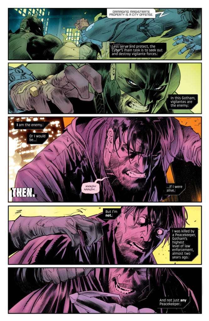
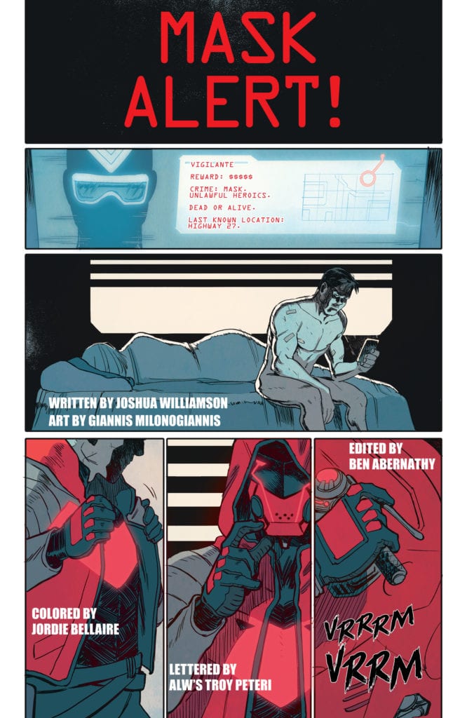
DC Comics’ Future State: Dark Detective #2 is a double feature, starring Bruce Wayne and Red Hood as lead characters. Mariko Tamaki writes the first story, “A Sign,” with Dan Mora on art, Jordie Bellaire on colors and Aditya Bidikar on letters. This is part two of a story following a “dead” Bruce Wayne, hiding from the many eyes of the Magistrate. “Mask Alert!” is written by Joshua Williamson, with art by Giannis Milonogiannis, colors by Jordie Bellaire and letters by ALW’s Troy Peteri. “Mask Alert!” shows us that Red Hood seems to be working for the Magistrate, hunting masks. Both stories show the chaos and mayhem of Gotham under a new leader.
Bruce Wayne in “A Sign”
Writing
Tamaki takes a very interesting route in this issue. She explores our fear of technology and being controlled. Bruce, in this chapter, lives with a conspiracy theorist named Noah. The man has his water brought in in bottles, for fear of mind controlling nanobots. And while we may look down our noses at a character like Noah, he’s not so different from a certain Bat. In fact, as the story progresses, Bruce becomes more and more empathetic to Noah. He even wonders if Noah might be onto something. So, while this issue is about conspiracy and fear, it explores it from a human angle. It shows how we all get a little scared when we don’t feel in control. In a moment in history where conspiracy and fear are proving to be destructive and immune to reason, Tamaki takes a step back and tries to understand instead of condemn.
Art
Mora continues to create a visual essay of chaos and order. We see Bruce, garbed in his new Batman suit, fighting one of the Magistrate’s “Cybers.” The next image is Bruce Wayne in civilian clothing, with the exact same expression. But Mora is showing us the difference between these situations. Because the next image we see of Bruce is unfamiliar. He’s wide eyed and panicked. You could almost call him feral. And as he sinks into the Gotham river, his face is equally unfamiliar. A look of resignation and disappointment. The Magistrate’s rule is that of an unflinching machine. So Mora pushes Bruce to be different than usual. He pushes him to emote, instead of being the stern Batman that we know. It actually creates distance between this Bruce and the Bruce of the past. And it makes it that much easier to side with him. It’s a human, desperate and panicked, versus a corporate machine. If this were any other version of Bruce Wayne, it would have been harder to see the difference.
Coloring
All of Bellaire’s most beautiful scenes also happen to the most dangerous. As Bruce runs for his life from a Peacekeeper, one of the Magistrate’s goons, Bellaire makes the scene look stunning. The bright yellow lights in the background, Bruce’s pink hued and panicked face in the foreground. And as Bruce falls into the Gotham river, the light of the neon signs filter through the water to turn the whole panel into a brilliant pink. It’s juxtaposed by scenes of Bruce investigating at night. The pale blues and greens are still beautiful, but monochromatic by comparison. Then, running from soldiers, the page comes alive again. Bellaire has the red light of Bruce’s motorbike look like a streak across the panel, following his movements. And the chase through the streets is colored by the dots and bars of yellow, red and blue lights of Gotham at night. Bellaire is lulling us into a sleep, then waking us up with bright colors like an alarm going off.
Lettering
Bidikar doesn’t just letter a work. No, Bidikar makes their lettering as much a work of art as every other aspect of this issue. The spacing, the fonts, the size, everything works together so you can hear every word clearly. At one point, Noah’s daughter comes to visit and is ticked off by someone taking a picture of the house. She yells at the woman with the camera and tells her not to get on her last nerve. The words “My,” “Last,” and “Nerve” are each given their own tier of the word balloon, getting bigger as they go. You can hear the anger rising in her voice. And as Noah has a melt down, Bidikar does something similar. His first line of dialogue is small, but still full of feeling through a brilliant use of bold. And then he yells again, this word balloon has bigger font and a jagged edge. His final line has font three times the size of his first. Bidikar carefully shows what it’s like to have panic sink in.
Red Hood in “Mask Alert!”
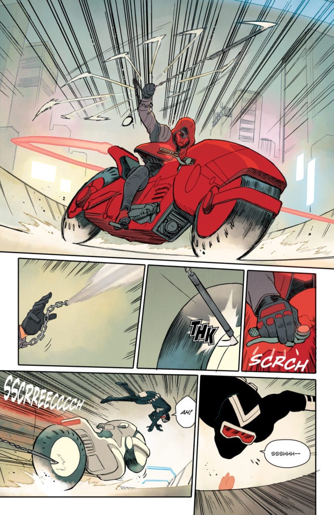
Writing
Williamson’s script works best when it leans on the art. He sets the scene brilliantly with nearly silent pages. Red Hood and Vigilante in a motorbike chase, or Red Hood following clues through a dilapidated neighborhood. These moments are clear and strong. Occasionally, Williamson writes the kind of thing that just wouldn’t be said. Officers at the precinct comment a little more on their day to day activities than you’d expect, considering they are in fact day to day. Jason is often piecing the plot together out loud. And when Ravager arrives on the scene, she comments a little too much on their dynamic. Some of it actually works. Ravager is the type of character to hold a conversation with herself if Jason won’t join in. But there are a few too many times it feels more like the writer trying to communicate plot than two people having a conversation.
Art
Milonogiannis’ art is definitely the highlight of this story. It won’t work for everyone. It’s a very cartoony style, especially for a Red Hood story. But that’s part of what makes it work. The playful, even funny, visuals helps cut through the seriousness that often surrounds Jason Todd. In fact, much of this story reads like Jason is wishing everyone would take him seriously, but they won’t. That’s especially true of Ravager. Milonogiannis presents moments of gore and violence with levity. Someone is sliced in half by Ravager who has a smile on her face. It’s perfect for her. She was raised to be a killer, so nothing fazes her. Milonogiannis makes the story incredibly fun.
Coloring
Bellaire’s coloring brings what’s important to the forefront. Characters are colored in deep reds, oranges and blues, while the backgrounds are pale and grey. Except when Ravager shows up. The background goes from grey to a beautiful purple. There are floating dots of pink and blue. As much as Jason tries to ignore her, Bellaire shows us there’s something between them. An energy that lights up the room. And as the backgrounds revert back to their greys and blues, Bellaire is reminding us these are characters that can leave this world behind. They don’t have to be trapped here in a bleak environment. It’s Jason who’s stuck in a cage of his own design.
Lettering
Peteri is quite experimental in this story. Most of the experiments really work, some fall short. Whenever a character swears in this story, Peteri places a “#@*!” on top of a black background. It’s definitely eye-catching and different, but placed in larger texts it looks a little odd and distracting. But Peteri does some other things that really work. When Ravager is asking Jason question after question, he finally responds, begrudgingly. His word balloon has some slightly flattened edges to it. It’s a visual representation of his disdain. The same thing happens when he says a villain’s name. Peteri brilliantly shows us moments where Jason’s rage bubbles to the surface.
DC Comics’ Future State: Dark Detective #2 shows the chaos of Gotham under the Magistrate. And it does so on both sides of the aisle. Whether you’re working for or against the Magistrate, your life is in the crapper. Pick up this great new issue, out from DC Comics January 26th, at a comic shop near you!


-1")