Home Blog Page 192

INTERVIEW: Composer Jordan Seigel Brings Balance To The Film Half Brothers

Half Brothers is a comedy-drama starring Luis Gerardo Méndez (Murder Mystery) and Connor Del Rio (Unfriended: Dark Web) as two unlikely brothers forced together on a long road trip. Composer Jordan Seigel created a score to balance the laughs and tears.

Luis Gerardo Méndez plays Renato Murguía, a wealthy Mexican businessman working in the aviation industry. Renato grew up loving planes thanks, in part, to his father. However, during an economic downturn, Renato’s father heads to America to find work and never returns. Renato grows up a shrewd man, always wondering what happened to his dad. The truth reveals itself when Renato gets word that his father is dying. The trip to say goodbye introduces Renato to his half-brother Asher played by Connor Del Rio, and together they set off on a journey to unravel their father’s past.

PopAxiom and Jordan discussed making music, playing piano for Peanuts, and balancing the score of Half Brothers.

Balance

Jordan is a Los Angeles native. “I’ve been playing piano since I was about five years old. My dad played piano and had a great ear. There was always a piano around the house, and it was a fun thing to do.”

“I was mainly doing classical music growing up,” he says, “but I didn’t excel at it. That didn’t happen until I found jazz.”

By high school, Jordan was “doing jazz, and it wasn’t until the end of high school that I said ‘I want to work in music.’”

At that point, the would-be composer “didn’t even know being a film composer was a dream yet.”

Jordan studied at the Berklee College of Music in Boston. “While I was there,” he says, “I loved playing piano, and I loved composing, and I searched for a good career path. Someone suggested film scoring. Growing up in LA, I knew about it, but I hadn’t thought about it. I loved films and the music from like Jurassic Park and Star Wars.”

Once Jordan started thinking about film scoring, he “started watching music with that ear and fell in love with it. I ended up majoring in film scoring.”

Jordan’s list of IMDB credits is rapidly growing, but he keeps a “balance composing music and still playing the piano.”

half brothers-composer-interview

About Half Brothers

Half Brothers centers on two men who didn’t even know the other existed. It was Jordan’s real-life (and close) brother who helped bring the composer to the project. “Luke Greenfield, he’s friends with my oldest brother. I knew him as my brother’s friend. He contacted me and said he was looking for composers for a new film. He sent me a list asking what I thought of the people on there. I said, ‘Hey, let me demo.’”

“I kept demoing over serval months,” he says, “I wrote for the montage and the ending. I read the script. I was only sent specific scenes during that time. I scored it as a drama.

Luke was on board, but the final decision rested on the shoulders of execs. “Luke fought for me on the project, because for a studio, I was a relatively unknown composer.”

The work on the demo was part of a long, evolving process for the Half Brothers score. “I don’t think there’s anything that I demoed that ended up in the final film. But the vibe of the movie and the music evolved to find this middle ground between comedy and drama.”

“It’s a long process,” says of making movies and the scores that accompany them. “I came on the project in December and finished the score by June. Things were being recorded, the VFX were being completed, and there was some uncertainty about the timing, but that’s how the process goes, and everything worked out.”

The evolution of the Half Brothers score involved the usual tough choices of what to take out. “The montage scenes were much longer, and it was making things too sad and taking away from the momentum.”

“We wanted to go full out Shawshank Redemption serious score,” Jordan says. “But We can’t do this. We have to find a middle ground within the context of each scene. Once we understood that the score fell into place.”

half brothers-film-comedy-drama

Wrapping Up

Thomas Newman and Randy Newman are significant influences for Jordan. “Bernard Hermann was a huge influence,” adds to his list, “to see what he did and how he approached scoring in terms of using restrictions to make a score interesting. He’d say, ‘I’m only going to use woodwinds or string quartet, interesting ensembles to create a unique score.”

“Ravel and Stravinsky are incredible,” Jordan says of classical influences. “Stevie Wonder is probably the greatest American songwriter. No one can write a song like Stevie. The Beatles. Duke Ellington in terms of jazz.”

Jordan shares what a dream project to him might look like. “Anything where I can write a really strong melody that can transport an audience. You get a melody in your head that moved you. The Pixar movies do that so well.”

Half Brothers is available on YouTube and Vudu. The score is available on Spotify, YouTube Music, and other services. So, what’s next for Jordan? “I get to play piano on AppleTV’s The Snoopy Show which comes out on February 5th!

Is Half Brothers on your watch list?

Thanks to Jordan Seigel and Rhapsody PR
for making this interview possible.

Want to read more interviews? CLICK HERE.

Monkeys Fighting Robots Youtube

Review: KING IN BLACK: BLACK KNIGHT #1 — A Self-Reckoning For The Ages

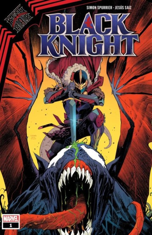
KING IN BLACK: BLACK KNIGHT #1, available in comic book stores on Wednesday, February 3rd, follows the troubled character of Dane Whitman amidst the symbiote god Knull’s invasion. Fighting to abate the call to violence from the mystical Ebony Blade, Whitman has spent a lot of time attempting to cultivate peace within his mind. But when a distress call from the Avengers is brought to his attention, we’ll see the Black Knight forgo all caution and seek to satisfy his lust for battle.

Story

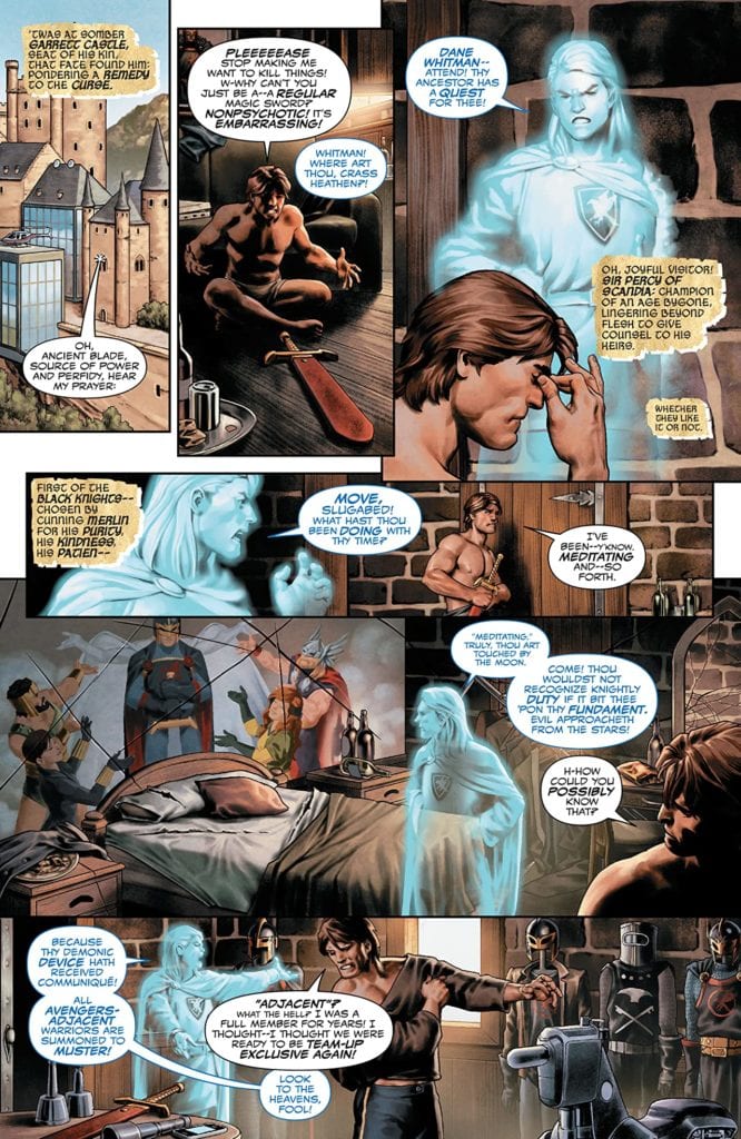
This issue is set in the midst of Knull’s army’s descent upon the earth. A medieval ancestor of Whitman alerts him to the Avengers call, who implores the knight to make a plan of action.

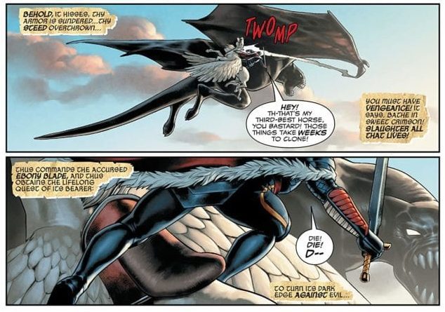
Feeling a sudden, irresistible urge, Whitman jumps into battle with a massive symbiote dragon. And the fight looks promising. But in the kerfuffle the symbiote god contacts him via telepathically, causing him to drop the Ebony Blade.

There’s an intriguing contrast in the story’s depiction of Whitman. On the one hand is the awkward guy who’s just trying to do his job (poorly), and on the other we see a caricature of a knight from storybooks, believing himself to be pure and valiant. But once Whitman comes into contact with Aero and other heroes, he’ll realize there are parts of his heart that so pure.

Simon Spurrier’s epic tale of Whitman’s self-evaluation is a thrill. The main protagonist must come to terms with his own morality, which reflects our own desires to be “good” while often falling short of them.

Artwork

The artwork in this issue is fantastic in its detail and fantasy elements. Jesus Saiz’s penciling, ink work, and coloring create epic fight scenes for readers. They offer shining swords and armor, detailed character designs, and colorful landscapes.

VC’s Cory Petit’s lettering was one of the best artistic features in this issue. Whitman’s fairytale-esque narration appears to be set on tattered pieces of parchment torn from a storybook.

Conclusion

KING IN BLACK: BLACK KNIGHT #1 is a fantastic one-shot featuring the intriguing psyche of one of the lesser known former Avengers. We hope there are more stories featuring Black Knight in the King in Black event to come.

Do you think the Ebony Blade has the power to vanquish Knull? Let us know in the comments below!

Monkeys Fighting Robots Youtube

Back to the Beginning in MARVEL ACTION: ORIGINS #1

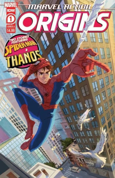
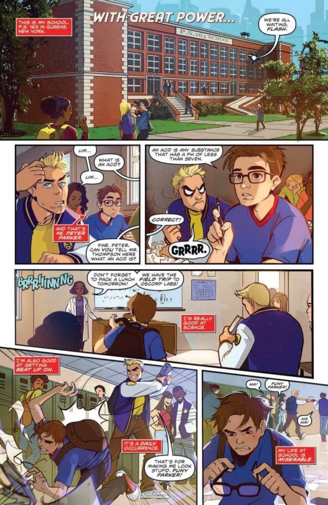
MARVEL ACTION: ORIGINS #1, available Wednesday from IDW, is about to transport fans, old and new, to a very classic point in the lives of Marvel characters. Their origin stories, that is. The first issue starts with a bang, introducing both Spider-Man and Thanos.

Enter Peter Park in ‘With Great Power.’

Marvel Action: Origins is a very honest series and title. It is exactly what it promises: a series of origins of those characters we love the best. While some fans out there may be tired of the idea of going through it all again, there’s also that hope that new fans will pick up this series and find a whole new appreciation for it all.

Plus, sometimes all we need is the chance to see a classic character in a new light, right? Marvel Action: Origins #1 starts out with one of the more iconic Marvel heroes out there: Spider-Man. From there, it jumps right to a classic villain; Thanos.

Yep! Both a hero and a villain get to tell their origin story in this issue, a trend that will continue, from the looks of it (hint: it looks like Captain Marvel and Green Goblin will be featured in next month’s issue!).

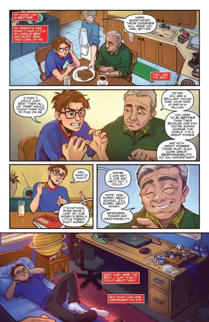
Don’t you just want to hug Uncle Ben?

The Writing

Marvel Action: Origins #1 starts out more or less exactly as any Spider-Man fan would expect, and I don’t mean that as a bad thing. Written by Christopher Eliopoulos, With Great Power contains a quick rundown of everything Peter Parker related.

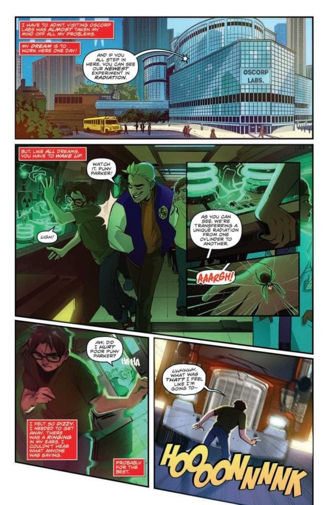
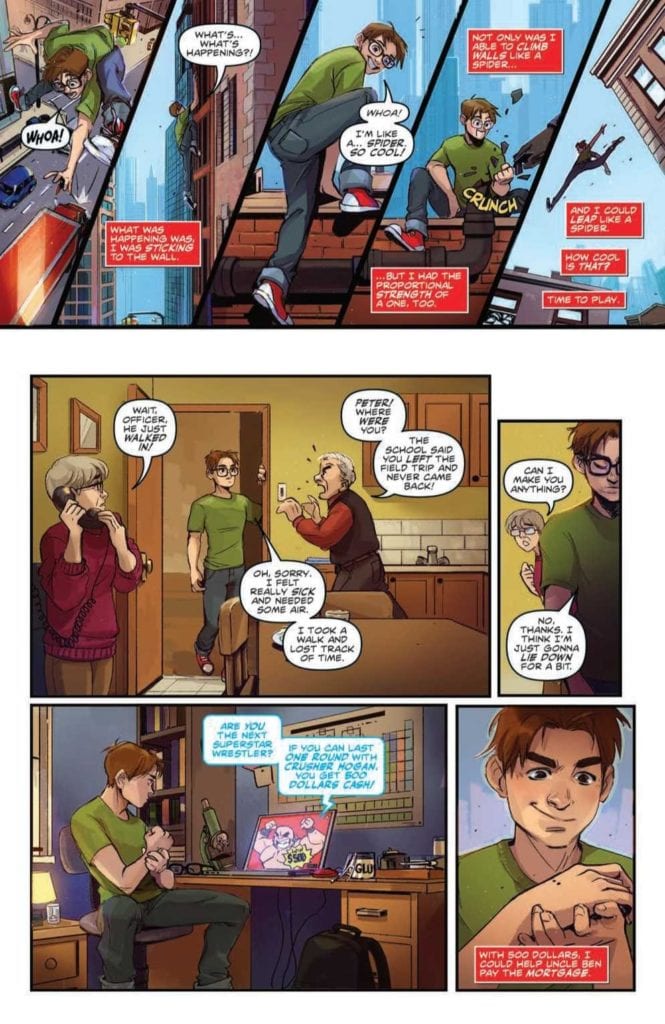
Or, more accurately, everything that happened to him in the earlier years. You know how the story goes, so I won’t rehash it here. I will say that Eliopoulos did a solid job of portraying the complexity of the situation for such a short period of time. All of which helps to quickly explain how this iconic hero came to be such a force of light for those that adore him so much.

Perhaps The Mad Titan will bring with it more surprises, but once again; both halves of this issue will be full of shocks to those newer to the franchise. Thanos’ origin story doesn’t quite start at the beginning, but once again helps to give a solid understanding of his character, his drive, and his ultimate goals. All while hinting at more, as we all know his character is more complex than a quick glance would hint towards.

We all know how this is going to go…

The Art

Marvel Action: Origins #1 was illustrated and colored by Lanna Souvanny, and lettered by Shawn Lee. Together they brought two very different characters to life on the pages. They portrayed the best and the worst they had to offer.

That’s a task in and of itself, even without having to illustrate so many Marvel characters. Admittedly, the second half gets the most there – as at least half a dozen different (and yet immediately recognizable) characters grace the pages.

The colors are bright and alluring, all of which probably hints once again at how this series would be great for a younger (and newer) audience. It’s eye-catching and flashy in all the best ways, yet sophisticated when it needs to be.

The end result is something that is memorable, even when the tones lean towards the more somber side of things.

The rise before the fall, as they would say.

Conclusion

Marvel Action: Origins #1 went a long way in portraying the highlights (and okay, the worst memories in Peter’s case) of two iconic Marvel characters. The series is all set up to showcase the important moments and origins of many a Marvel character. While none of this information was new, I still found myself appreciating seeing it all laid out so cleanly, and am looking forward to seeing how they handle one of my favorite characters and her origin.

Monkeys Fighting Robots Youtube

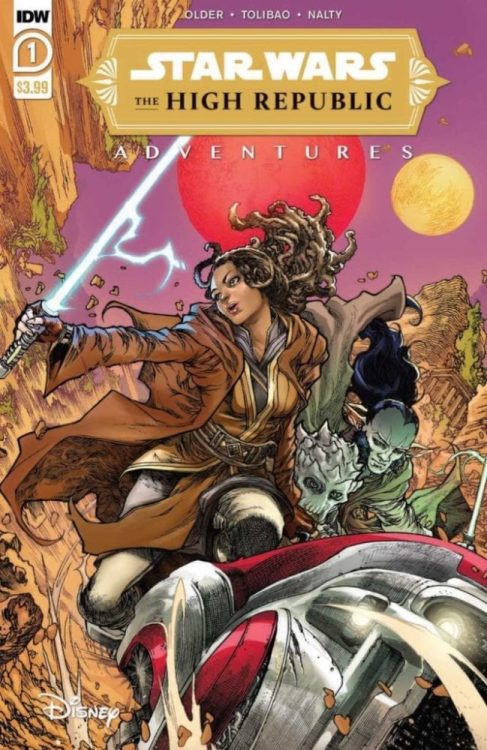
A New Beginning in THE HIGH REPUBLIC ADVENTURES #1

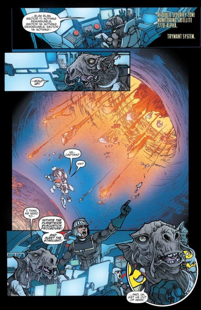
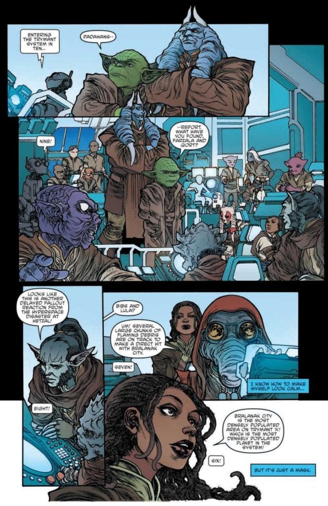
STAR WARS: THE HIGH REPUBLIC ADVENTURES #1, available Wednesday from IDW, is the start of an all-new series of Star Wars adventures. All of which will be set in the era of the High Republic – a current favorite among fans.

A planet in need of evacuation – talk about high stakes.

The High Republic Adventures #1 is the first of a new series following Masters and Padawans alike in a tale welcoming to all ages. The fact that it’s set in the High Republic just makes it all the more exciting.

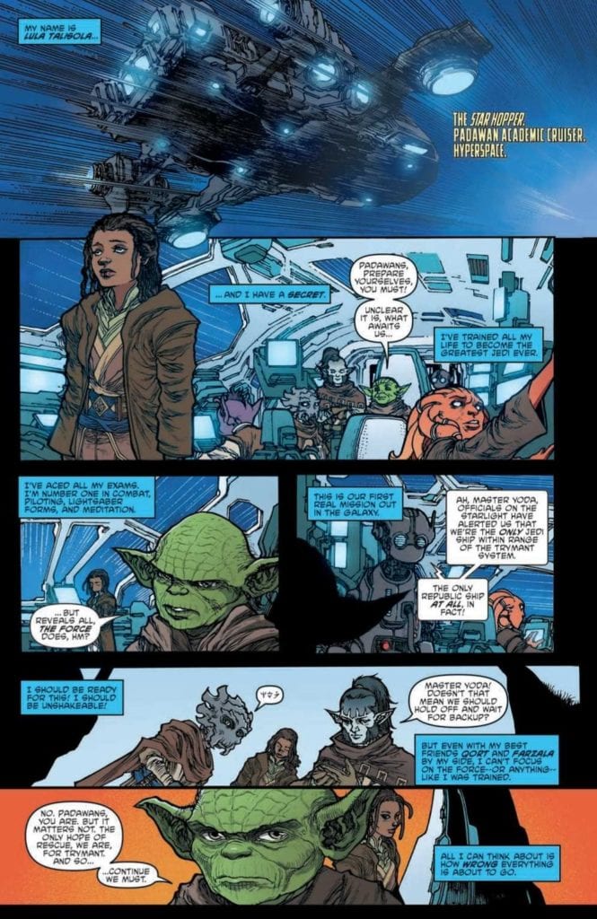
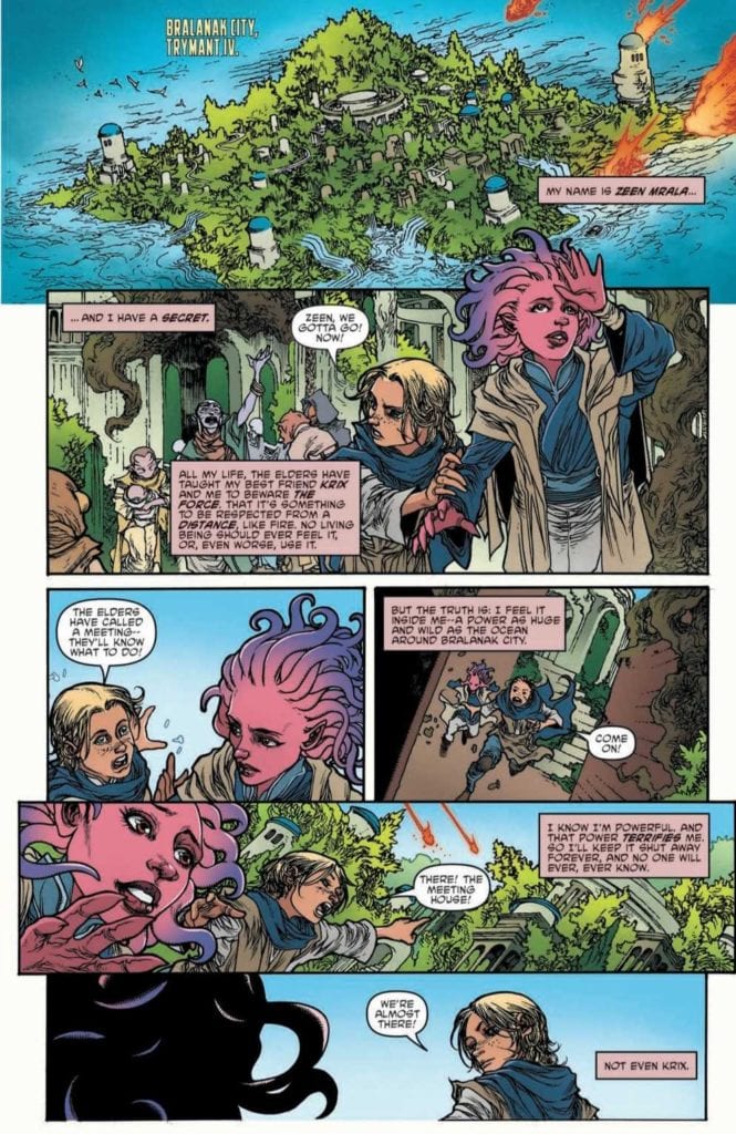
Collision Course is the first arc in this series, and it introduces a variety of characters. From those we know well (Master Yoda) to new younglings finding their way through life (Lula, Zeen). It’s already looking to be a high stakes adventure, which sounds about right!

Enter Lula Talisola, she’s a Padawan, and she has a secret…

The Writing

The High Republic Adventures #1 is this unique blend of thrilling adventures and comfortable storytelling that only Star Wars can manage. Even when portraying something so new and exciting – there’s something so relaxing about the idea of diving into a new adventure.

Written by Daniel Jose Older, this first issue wastes no time throwing readers and characters into the thick of things. In short order we’re introduced to two different sets of characters, as well as having a clear understanding of the stakes at hand.

The use of two different perspectives helped to speed things along quite a bit, naturally. It also helped to form a sense of kindred spirit, making what was an interesting story all the more compelling due to the potential that lay within.

The High Republic Adventures promised to be a series that any fan of any age can enjoy, and so far it’s proven to be truthful. While the main perspectives lean towards a younger range (read: young Padawans), there is still plenty for the adults out there to enjoy as well, even if it is simply the inclusion of some of their favorite characters.

Meanwhile, young Zeen on Trymant IV also has a secret.

The Art

The stylistic choices made for The High Republic Adventures #1 make it a truly standout visual experience. While the whole of the series resonates with that classical Star Wars look and style, it also showcases some unique styles and risks.

The lead artist, Harvey Tolibao (Magnus Arts), did a fantastic job of creating an entirely new set of characters – many of whom are not human. The variety is noted, and very much appreciated. Likewise, Tolibao portrayed younger versions of characters we know so well. And no, it doesn’t feel nearly as jarring as one might expect.

Rebecca Nalty’s colors are a highlight in my mind, as characters practically pop off the pages they are so vibrant. The backdrops and explosive elements also demand attention accordingly. Which admittedly helped to be a constant reminder of the danger they were all in.

The lettering, provided by Jake M. Wood, is the final touch for this issue. You can really feel the sense of balance that Lula was reaching for. While also seeing the rage and fear that coursed through those that stood opposite her. It’s impressively done.

The difference between Padawans and Masters.

Conclusion

The High Republic Adventures #1 held up to all the promises it made. Portraying a compelling and interesting start to this series. The fact that it can be appreciated by fans young and old is such a treasure. One that leaves room for new fans to find their way to the franchise.

Monkeys Fighting Robots Youtube

These Times Are Changing in RUNAWAYS #33

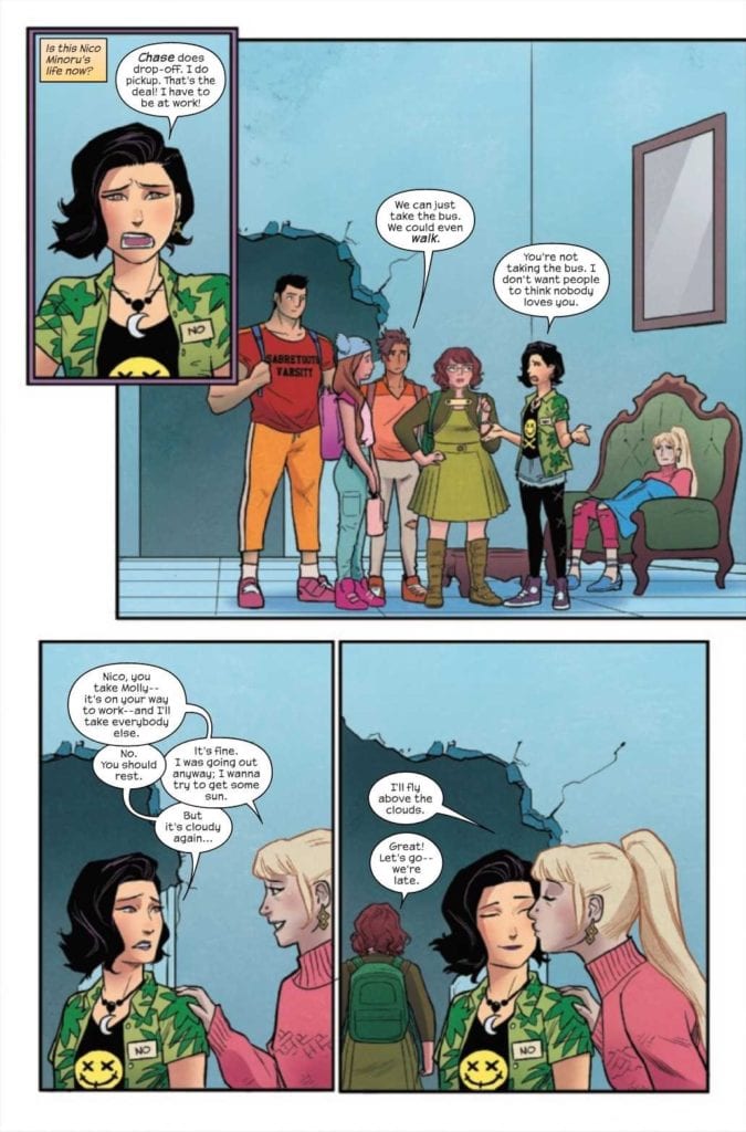
RUNAWAYS #33, available Wednesday from Marvel Comics, presents fans with a version of the Runaways that is in constant flux. Everything is changing, regardless of how tightly each and every one of them tries to hold on. An impressive feat, given Molly’s strength.

The Runaways are back!

The Runaways have been through it all. The best, and the worst, that the Marvel universe has to throw at them. However, the events involving Dr. Justice may very well have pushed this group of children (young adults now, really) too far.

Runaways #33, much like its predecessor, promises much change. In the last issue, we saw three of the crew heading back to school, alongside young Molly. That’s an unexpected move, for a group that typically has zero faith in the system.

Naturally, this act raises several questions. How long can this sense of normalcy (admittedly one full of adjustment and pain) last? What is the motivation for going back to school? And how long will outside forces allow the Runaways their freedom?

It’s important to remember current events when heading into this issue. There has been a lot happening in the wider Marvel ‘verse that the Runaways have largely been ignoring. They’re lucky to not have been pulled into many of the major events that seem to drag all the heroes under on a regular basis.

Time for school? Yet they’re missing a driver…

The Writing

In a way, Runaways #33 is fairly jarring. Not for all the insane things they’re going up against – but because they’re now railing against normal teenage battles. The contrast can be quite shocking when put up against their normal adventures.

It’s just further proof that Rainbow Rowell is trying to push these characters to new points, sneaking in character growth and surprises all over the place. Speaking of surprises, there are quite a few in store in this issue.

Some come with a sense of humor, mostly revolving around one (newer) Runaway in particular. Others carry a sense of foreshadowing, as they should. On that note, I really appreciate that Rowell hasn’t let that subplot drop, as I’m eager to see where it leads. While admittedly dreading it all at the same time.

It’s a complex situation that they’re in, and I honestly don’t think they’ve yet to grasp the full scope of it all. All of this makes for an interesting foundation for what happens next. A surprise cameo, or rather, two surprise cameos. In a way, it actually feels like it shouldn’t be a surprise. And yet it is. It adds yet another layer to the mess that the Runaways are trying to work through.

Who do you think just showed up at the Hostel?

The Art

The artwork inside Runaways #33 is bright and rich at the same time. While the series as a whole does tend to lean towards brighter colors, it just makes the darker moments (or the details that lack color) all the starker.

Andres Genolet did a great job of portraying a variety of scenes, from the classic high school trope to the slightly chaotic home life that the Runaways are more used to. However, it’s the last five or so pages of this issue that really steal the show. Those panels are full of life and action, showing a sense of animation that many of the characters seemed to (intentionally) lack up until that point.

Obviously, Dee Cunniffe’s had a major impact on this issue. The colors are bold, as is the style for this series, but it goes beyond that. Karolina’s coloring plays an important role in this issue, and it also feels like the background tones are leaning towards certain characters at times. It’s all very cleverly done.

VC’s Joe Caramagna’s lettering is perfection, as always. There are two scenes that really showcase the finesse in this case. Ironically, both scenes are fairly distinct from one another. Yet both imply a certain level of activity and intensity.

Well, that’s a surprise!

Conclusion

All things considered, it’s good to have the Runaways back. Even if several of their members are going through their own version of an existential crisis. Runaways #33 made for a fascinating issue, one that brought about plenty of change, and even more hints for what is to come.

Monkeys Fighting Robots Youtube

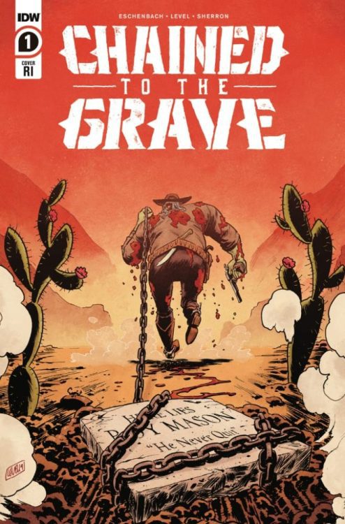
Review: CHAINED TO THE GRAVE #1 A Psychedelic Horror Western.

Chained to the grave
Chained to the Grave #1 Credit: IDW Publishing

The new title from IDW Publishing, Chained To The Grave, is a brave mix of genres. It throws horror into the Old West with lashings of humour. It is an action packed revenge story with a strong dose of family drama and, because that isn’t enough, there’s a mystery or two thrown in for good measure. Writers Andy Eschenbach and Brian Level invite the readers to take a walk through their weird world; a world visualised by Kate Sherron and Micah Myers.

With shelves full of superheroes fighting for realism, desperate to be taken seriously, Chained To The Grave throws off the shackles of the mainstream expectations and presents an unleashed comic book adventure.

Chained to the grave
Chained to the Grave #1 Credit: IDW Publishing

Raising From the Grave

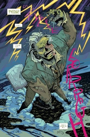
Eschenbach and Level’s tale starts with the resurrection of the protagonist, Roy Mason, and his confused journey home. Although the victim of a cruel shooting, Mason is not innocent and his own misdeeds have led him to the grave. The moment of death is presented by Eschenbach and Level through flashbacks like the wild flashes of lightning that accompanied Mason’s return to the living world. The remainder of Mason’s recent past is left for him to reveal to his children in a touching moment of family bonding. The writers allow the character to tell his own spin on events as a way to give the readers insights into the plot and also into Mason’s personality. He is fanciful and elaborate with a clear love for his family that comes across in the interactions that Eschenbach/Level portray in the script.

Sub plots spin out from the central premise as the readers are introduced to a number of characters. Some are clearly villains and some heroes but it wouldn’t be a western without a fair share of dubious figures whose intentions are suspect. The cliche of the genre is woven into the plot with humour and the narrative flow from page to page is brisk. This leaves the reader just enough time to question the links between the characters but not linger on the details.

At each beat of the story the writers twist your expectations, surprising you with a plot reveal or character trait. One thing that you can’t say about Chained To The Grave is that it’s predictable. From the opening page onwards you are never quite sure where the tale will take you but the journey is so wild that it doesn’t matter.

Chained to the Grave
Chained to the Grave #1 Credit: IDW Publishing

Visually Outlandish

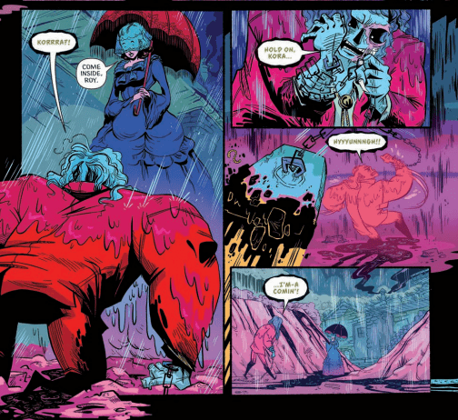
For people used to classic Sergio Leone westerns or the Marvel Old West characters like Rawhide Kid and Kid Colt, the most shocking part of Chained To The Grave will be the visuals. Kate Sherron isn’t shy about using color and the standard sandy yellows and tan browns of traditional western settings are eschewed for a more psychedelic color palette. Bright yellows and greens fill the day scenes while deep reds and lush purples reign at night. Sherron’s colors breathe fresh life into both the western and the horror elements which are at the heart of this comic. On some level it doesn’t feel fitting and yet Sherron makes it work.

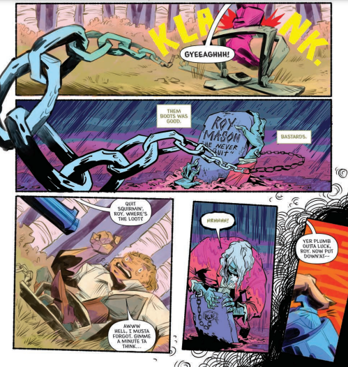
Part of the charm are Sherron’s figures with their bulky bodies and thin extremities. There is no pretense of reality, instead a pure enjoyment of caricature which in turn allows the colors to shine. The artwork is about expression and creating a mood, which is successfully achieved throughout. The design work gives the reader a sense of character and the locations reflect genre tropes. The scene in the graveyard is enjoyably gothic, with Mason’s wife dressed in all her splendor as she patiently waits for her husband’s return. As the setting shifts to the villain of the piece, the interior of the tent is dressed in spiritual paraphernalia, producing a different magical vibe.

Sherron creates an impressive dynamism across the pages by bringing the images out of the panels to cross the gutters. Sweeping chains and lurking figures break the constraints of the layout, opening up the world and allowing the reader to become immersed in the scene. Micah Myers’ lettering is a big part of this. Through the use of different fonts for certain characters and a constant shift in size and boldness, Myers captures the essence of the speech and the personalities behind the words. The tone that the lettering brings to the page enhances the humour and enriches the narrative.

Chained to the grave
Chained to the Grave #1 Credit: IDW Publishing

Conclusion

The full throttle plot and range of characters only work together because of the strength and commitment by the artist to her style. The visuals may take some getting used to, especially if you came looking for a Clint Eastwood western. Instead Chained To The Grave looks more like Image Comics Head Lopper or the work of Phil Hester for Aftershock’s Shipwreck. It’s brash and bold, and contains an exciting visual that challenges genre convention.

The plot is intriguing, although the supernatural element does overshadow much of the story and on occasion detracts away from the character building. On the whole the visual storytelling is strong enough to pull you through the pages, making you engrossed in the moment so that you don’t stop and think too hard about what is actually going on. If you want a pure genre story you’ll not find it here but that’s okay, Chained To The Grave is a comic to be experienced and enjoyed like a good B-Movie.

Monkeys Fighting Robots Youtube

Review: FAR SECTOR # 10 – The Plot Freaking Explodes

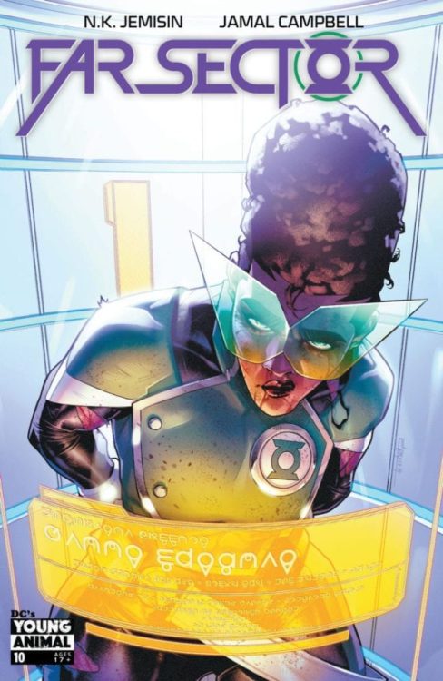
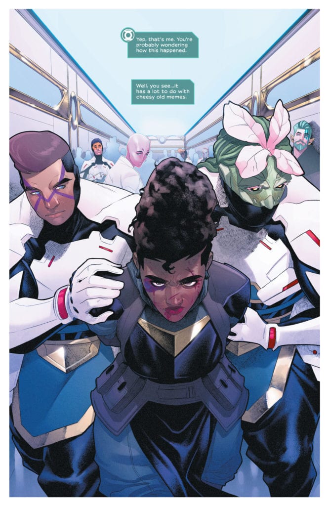
Ever since the first issue hit shelves, writer N.K. Jemisin and artist Jamal Campbell’s Far Sector has been a consistently brilliant and thoughtful read for each and every chapter. With this 10th issue, the steadily building political subplot that has been cleverly intertwined with Mullein’s murder investigation emerges into the forefront with explosive force, in a manner that is (like every issue thus far) disturbingly relevant to our current political situation. With another hyper-intelligent script and more staggering visual work, this may be the most exciting issue of this outstanding series yet.

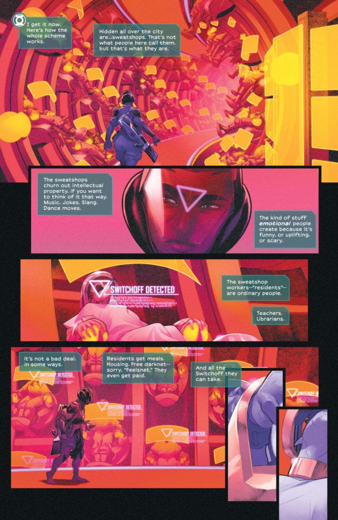
“Since arriving at the City Enduring, Sojourner “Jo” Mullein has confronted an insidious conspiracy of murder and mayhem, but even this most resilient Green Lantern reaches her breaking point when she uncovers an “emotional sweatshop” producing black-market feelings for a world without them. But Jo is only too human…”

Writing & Plot

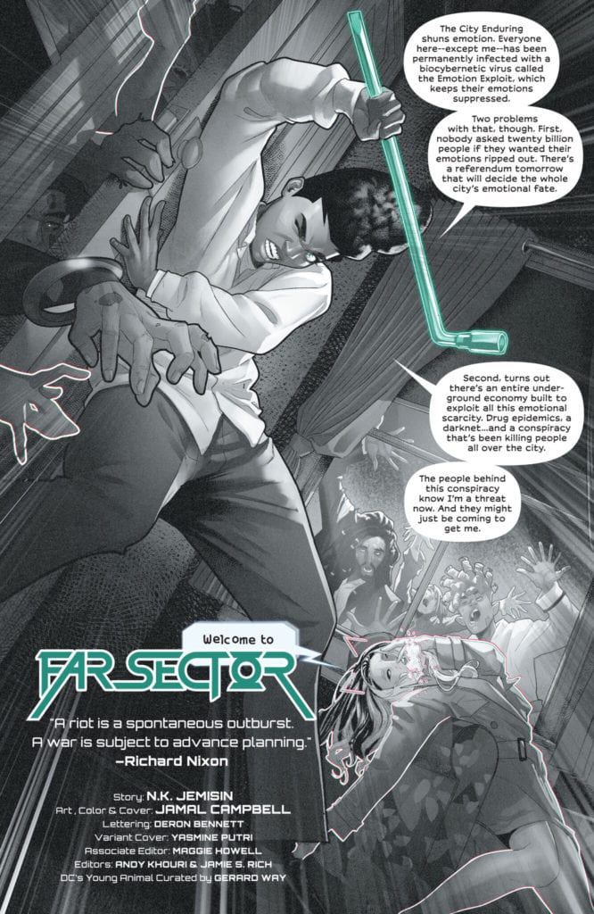
N.K. Jemisin has been taking her skills as an accomplished novelist and adapting to the comic medium with a natural ease many pros ought to be envious of. Each issue of Far Sector has been packed to the brim with discoveries, revelations, backstory, and random events both big and small that end up becoming major pieces of the plot. Far Sector #10 feels like the culmination of all these issues of work, with massive payoffs by way of a well-earned plot twist that honestly blew my damn mind. In terms of setting, this may be the most focused issue in the series thus far, as the entire comic takes place in only a couple of rooms in a police station. As a matter of fact, almost all of the dialogue is presented as sort of expository dialogue, with characters explaining their positions and discussing their discoveries they’ve made up to this point. One of the elements that makes Jemisin’s writing so impressive is that every line of dialogue and narrative packs a massive amount of weight to both the characters and the story at large. Every piece of discussion is vitally important here, and Jemisin deliberately keeps the focus small and cut off from the rest of the world so that when the issue’s big climax hits, it literally blindsides both the characters and the reader. Jemisin has also weaved a clever commentary on internet culture into this story that becomes disturbingly relevant and ominous in this chapter. I’ve been a bit critical of her use of internet memes as a plot device up to this point, but seeing how she uses them here absolves those issues. Now as far as the relevance of the big plot twist to our current political era, it’s actually a bit frightening how spot-on Jemisin’s appraisal of our political situation was in her take on the City Enduring. I can’t discuss it obviously because it’s a major spoiler, but I’ll just say that the discussion of the political events leading up the the major twist at the end of this book is topical to the point of prophecy. This is a masterfully written comic, and a stellar piece of science-fiction writing.

Art Direction

I can never have enough praise for Jamal Campbell’s art, but I honestly feel that his work here on Far Sector #10 may be his best yet. Instead of the sprawling vistas of a giant alien city, the scenery in this chapter is of almost nothing but the low blue lights and sterile whites of a police station interrogation room. What makes the visuals here so special however are the express attention paid to the characters’ facial animations. Now Campbell has knocked this element out of the park on every issue of Far Sector, it’s just doubly important this time around because of the story’s focus on character interactions and studying the emotions and reactions of every person in the room. The direction as well isn’t anything we haven’t seen before in terms of framing and panel construction, it’s just handled with such an expert level of finesse that it disappears into the story, and that’s the exact intention here. Both Campbell’s absurdly smooth penciling and his vibrant digital colors are put through a wringer of subtlety in this issue more than the usual grand sci-fi visuals and intense fight scenes, and he sticks the landing in a way that is unsurprising given his talents while still an incredible sight to behold. The lettering from Deron Bennett is once again solid and easily readable, reflecting the visual direction in how it expertly stays out of the way of the story’s seamlessness. Overall, this is another brilliantly drawn and constructed comic from some of the best creators in the business right now.

Far Sector #10 is the culmination of all of this comic’s careful planning thus far. Jemisin’s script is a string of intricate and vitally important conversations and narrative, delivered with tight pacing that swings a hefty right hook when it comes to the final page twist. Her use of internet culture collides with a searing indictment of our contemporary politics and late-era capitalist gig-economy. Jamal Campbell’s visual work is a series of focused character animations that perfectly frame the emotional journeys each character goes through in this chapter. This may be the best issue of Far Sector thus far, so be sure to grab a copy when it hits shelves on 2/2!

Monkeys Fighting Robots Youtube

Review: Making Deals With Eldritch Folk In THE DREAMING: THE WAKING HOURS #7

Writer G. Willow Wilson and artist Javier Rodriguez return for yet another chapter of their brilliant Sandman Universe series with The Dreaming: The Waking Hours #7. This issue, while still wholly entertaining, serves more as a transition point between two places in the story rather than a major event in and of itself. However, it still offers great moments of emotional character writing and plenty of well-earned appearances by classic Sandman characters. With this sharp writing and yet again solid (although a tad inconsistent) visual work, this is yet another great chapter in this part of the Sandman mythology.

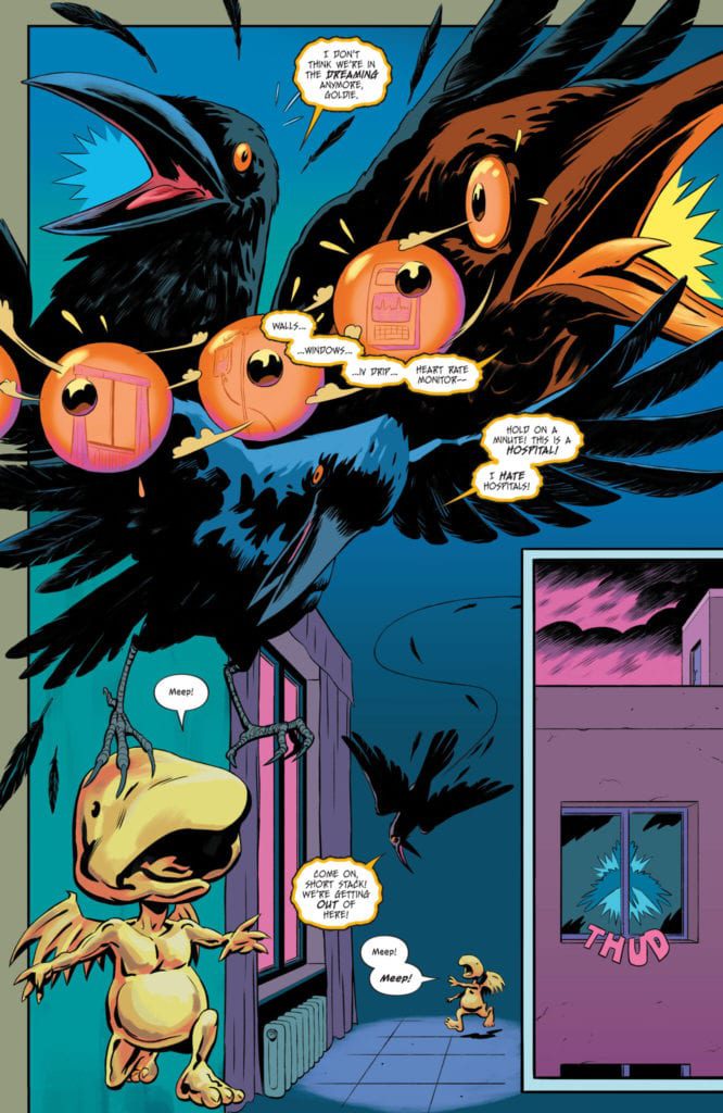
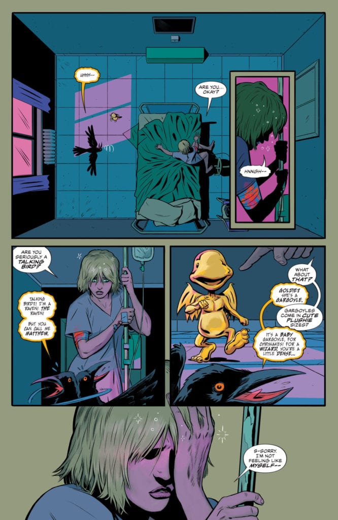
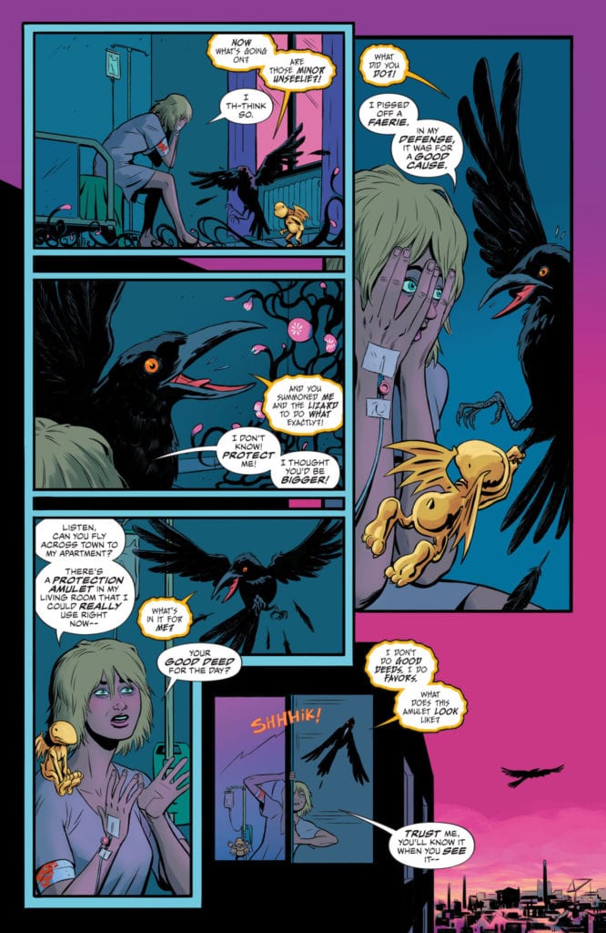
“Bleeding out in a hospital bed from a magic wound that will not heal, sorceress Heather After must swing open the gates of reality to find herself a protector…but is she prepared for the deal she’ll have to strike once she finds a champion with the dangerous power she needs? And speaking of dangerous power…what happens when Matthew the Raven catches a glimpse of one of the artifacts Heather’s been hiding away?”

Writing & Plot

G. Willow Wilson has a mastery when it comes to the pacing of this story, so The Waking Hours #7 feeling a bit more like a catching-up chapter rather than a major event feels like a genuine step rather than a misfire. Heather After is recovering from her injury at the hands of Puck and weighing her options, while also dealing with the fact that she unintentionally summoned a talking raven and a baby gargoyle to help her out of her crisis. There are still hugely important moments in this issue (including the summoning of another very important figure from the land of Faerie), as well as more sweet and heartfelt character writing. Heather’s lovable and caring himbo boyfriend is quickly becoming one of my favorite characters in this series. Wilson’s sense of dialogue and narrative is once again a brilliant mix of naturalistic and poetic. There are moments of dialogue that had me chuckling with great character quips, and plenty of scenes that kept me wholly invested in the story and all of the rising stakes in this story. This chapter clearly is setting up where we are headed in this tale of dreams and magic, and I’m sure it will be a journey worth taking.

Art Direction

I was pleasantly surprised and more than a little relieved when I saw that new The Waking Hours artist Javier Rodriguez was up to the task of taking over Nick Robles’s spot in the last issue. While his pencils here on issue #7 are still mostly very good, it’s hard not to notice that there are points where the visuals seem a bit rushed. For the most part, Rodriguez’s pencils are alive with detail and fluid animation. Every room and piece of ethereal architecture, and every mythical monster are all drawn with a stunning eye for detail and imagination. Every page of this comic looks like a true Sandman comic, with people and things that are impossible to think of come to exist in the pages in grand fashion. The general high quality of work makes it all the more noticeable when the pencils miss the mark by just a hair. There are some images that look to be of notably lesser quality, with wonky character features making themselves distractingly obvious. Much of the visual integrity and wonder is due to the colors of Mat Lopes, who has been offering his talents since the Si Spurrier Dreaming series that preceded this run. His work here and as it always has been is wildly vivid, with a massive variety of tones and shades. The deep purples and blacks of nightmarish sequences will quickly turn to bright neon blues and pinks, followed by the luminescent gold of looking upon a fallen angel’s true form. The letters from Simon Bowland once again nail the Sandman aesthetic of shifting fonts for the myriad characters while staying unobtrusive and easily readable. An overall solid, if not slightly inconsistent effort from the visual team.

The Dreaming: The Waking Hours #7 is a completely entertaining comic with its own set of twists and character reintroductions that is mainly concerned with pointing the reader in the direction of the future. G. Willow Wilson’s script of sharply paced and lined with great humor, stellar character writing, and meaningful plot-directing. The visuals from penciler Javier Rodriguez and colorist Mat Lopes are almost entirely fantastic despite what appears to be a bit of rushed penciling at points. This is another excellent chapter in the Sandman Universe, and I highly recommend you pick this one up when it hits shelves on 2-2!

Monkeys Fighting Robots Youtube

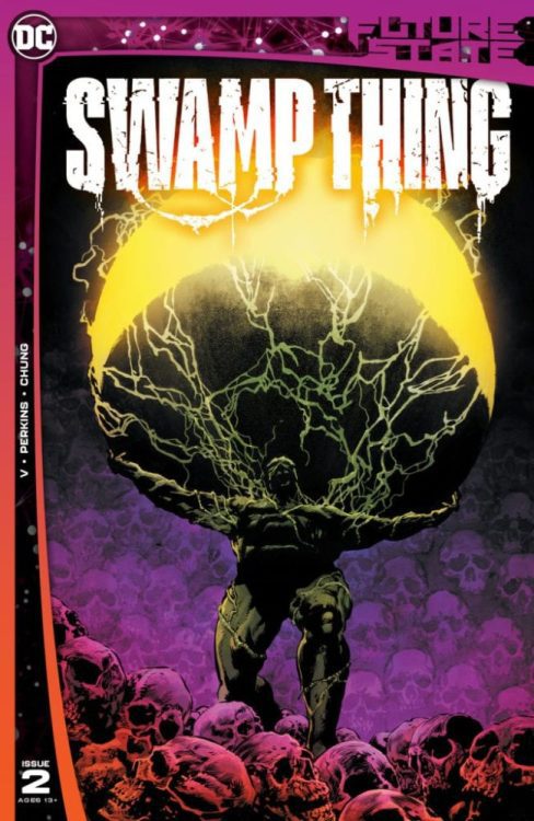
Review: The Legends and Myths of FUTURE STATE: SWAMP THING #2

Swamp Thing V DC Comics

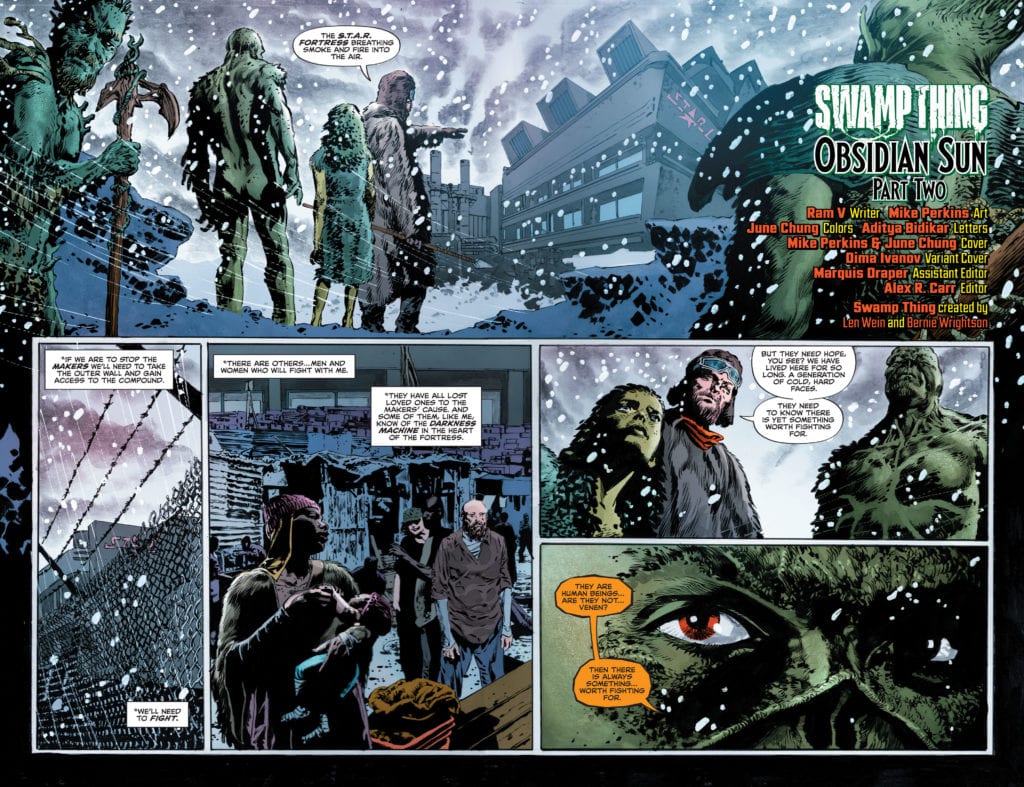
Future State: Swamp Thing may be a small part of the DC Universe, but it dares to be a world of its own. Writer Ram V, artist Mike Perkins, colorist June Chung and letterer Aditya Bidikar lay the foundations for their own universe. As this creative team births a new world into existence, we see the myths and legends that are its makeup.

Writing

Future State: Swamp Thing reads more like The Epic of Gilgamesh than it does a comic book. V uses poetic language to create a sense of mysticism. We’re seeing worlds end and realities born. V has amped up the stakes to impossible heights, but keeps us grounded with the questions of children and the curses of old men. It’s an epic that’s deeply connected to its characters. We’re constantly checking in with them to see how these life-altering moments are affecting them. And their reactions are an array of human emotions. One character weeps, disappointed in her master. A little girl asks, wide-eyed, what’s really going on as an old man screams and roars at what’s happening. Except for one scene, where some villains speak in a way that’s stilted and expositional, V doesn’t allow his epic language to get in the way of the human pulse beneath everything.

Swamp Thing V DC Comics

Art

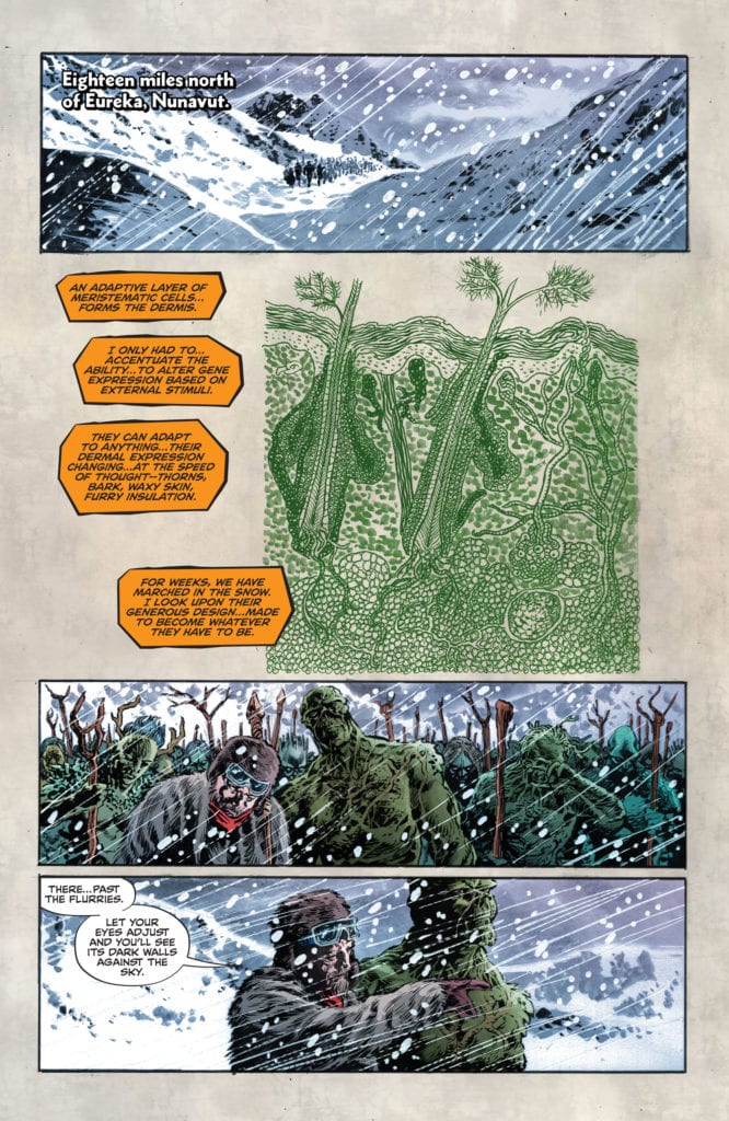
It’s interesting to see Swamp Thing relate to his “children.” When the old man Indigo laughs, Swamp Thing hides his face. Perkins shows us just enough to sense the emptiness in Swamp Thing’s eyes. And when Heather asks about why she’s been created, in a fury, Perkins reminds us just who she’s talking to. Her lips, parted to show gritted teeth, are pictured above a diagram of her anatomy. The bones, muscles and organs, looking like a page out of a biology book, are shown next to images of her railing against her creator. But once Swamp Thing has connected to each of his “children,” each moment beautifully portrayed, we see him standing amongst the humans. Perkins shows the shift in him. After years of being surrounded by those like him, Swamp Thing reconnects to his human side.

Coloring

Chung continues, like in the first issue, to play on shades of green and red. Green, the color of trees, is interrupted by tiny moments of red, the color of blood and humanity. We see it in Swamp Thing’s irises. They’re not the green or black that we might have expected. It reminds us of the man behind the bark, so to speak. When Heather speaks out to her creator, angrily, the background of the panel is red. She may be a plant, but her anger is human. But much of the other instances of red are strange. We see Woodrue, our sickly villain, covered in a red robe. Moments of violence and carnage have splashes of red in the midst of yellow flames. We can’t help but wonder, why does Swamp Thing give a damn about humanity? The violence and villainy shows humanity to be an ungrateful and cowardly lot. But that’s exactly it. Chung shows us these aren’t people who deserve mercy. But mercy is never deserved.

Swamp Thing V DC Comics

Lettering

The most noticeable thing about Bidikar’s lettering is Swamp Thing’s kinship with Woodrue. They sound the same. They speak through colored word balloons that have flattened edges. Yet it’s the coloring that makes the difference. While Swamp Thing’s dialogue is colored in a dark orange, Woodrue’s is a light green. Bidikar is showing that Woodrue may think he’s like Swamp Thing, but he’s really a pale imitation.

Bidikar’s best use of lettering happens between Heather and Swamp Thing. “NO!” Heather yells. Heather speaks in bolded letters and the word balloon has a thick green edge around it. “NO!” she says again. This time, the letters are italicized, bigger but thinner, and the word balloon has a jagged edge. “No…” she says finally, in small letters. It’s a gorgeous representation of fighting against impossible odds. She screams, she panics, and finally, she collapses in quiet grief. Bidikar turns what could be a forgettable page into an instance of raw, unadulterated emotion.


Future State: Swamp Thing #2 is huge. It’s an epic, rewriting the rules of the DC universe and daring to dream big. But V, Perkins, Chung and Bidikar never lose the human heart at the center. Even if its veins are full of chlorophyll. Pick up Future State: Swamp Thing #2, out from DC Comics February 2nd, at a comic shop near you!


Monkeys Fighting Robots Youtube

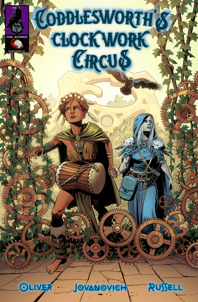
Review: CODDLESWORTH’S CLOCKWORK CIRCUS #1 Sets Up A Fantasy Adventure

coddlesworths clockwork circus cover

You gotta love a good fantasy saga like Coddlesworth’s Clockwork Circus, hitting Kickstarter February 2nd. I’m talking about one of those meaty, sprawling epics that takes its time to delve into background and mythology. A slow burn that takes up as much real estate (if not more) for worldbuilding as it does for character development. That’s what you get in the first issue of this fantasy steampunk adventure – a solid setup for what is sure to be a grand story.

Coddlesworth’s Clockwork Circus, written by Danny Oliver, with pencils/ink by Slobodan Jovanovich, and colors by Kurt Michael Russell, is funding its first issue on Kickstarter from February 2nd through March 4th 2021.

Story

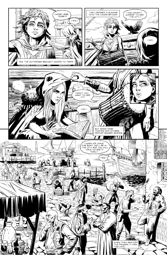
A flood of magic rushes into a steampunk world and two halflings with sorcerous powers join an eclectic troupe of circus performers in order to save the planet from destruction. The first issue sees the arrival of our halfling protagonists in a busy port city before meeting the first members of the troupe.

coddlesworths clockwork circus page

Writing

Writer Danny Oliver’s first words really help to set the tone in Coddlesworth’s Clockwork Circus. He starts the story with that classic narration in the vein of Galadriel at the beginning of The Lord of the Rings. It’s ominous and otherworldly, and even poetic. The reader gets a good setup to the story and characters. The writing helps transport you to this strange, new world of fantasy and magic. 

By the end of the issue, we don’t know too much about the protagonists, nor their intentions. But it is definitely enough to keep you intrigued and wanting to read the next issue. This first issue has clearly only scratched the surface of the world and story. Oliver is building something big and interesting here, and you should be on board for it.

Art

Artist Slobodan Jovanovich’s line work in Coddlesworth’s Clockwork Circus can be described as highly meticulous. The shipping pier has so much detail, from the cobblestone path to the people walking atop it. You can almost hear the waves crashing and the chatter amongst the patrons. And it goes on from there, as the protagonists make their way through the city, you will find more line work detail to admire.

Colorist Kurt Michael Russell offers a vibrant, warm palette that compliments the ink and pencils. The yellow-tinted backdrop makes the colors in the forefront – such as the clothing – pop tremendously.

Conclusion

An admirable setup to a seemingly interesting concept, packed with compelling narration and artwork that displays a great attention to detail, Coddlesworth’s Clockwork Circus is perfect for those who love to be transported to fantastical lands and epic storylines.

You can support Coddlesworth’s Clockwork Circus by funding its Kickstarter. Be sure to also follow Rem Alternis Productions on their website, or on Twitter, Facebook, Instagram, YouTube, Twitch, and Patreon.

Do you have a book on Kickstarter like Coddlesworth’s Clockwork Circus or Unicorn: Vampire Hunter that you would like reviewed/promoted? Send an email to info@monkeysfightingrobots.com!

Monkeys Fighting Robots Youtube