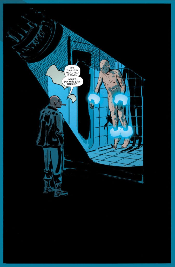
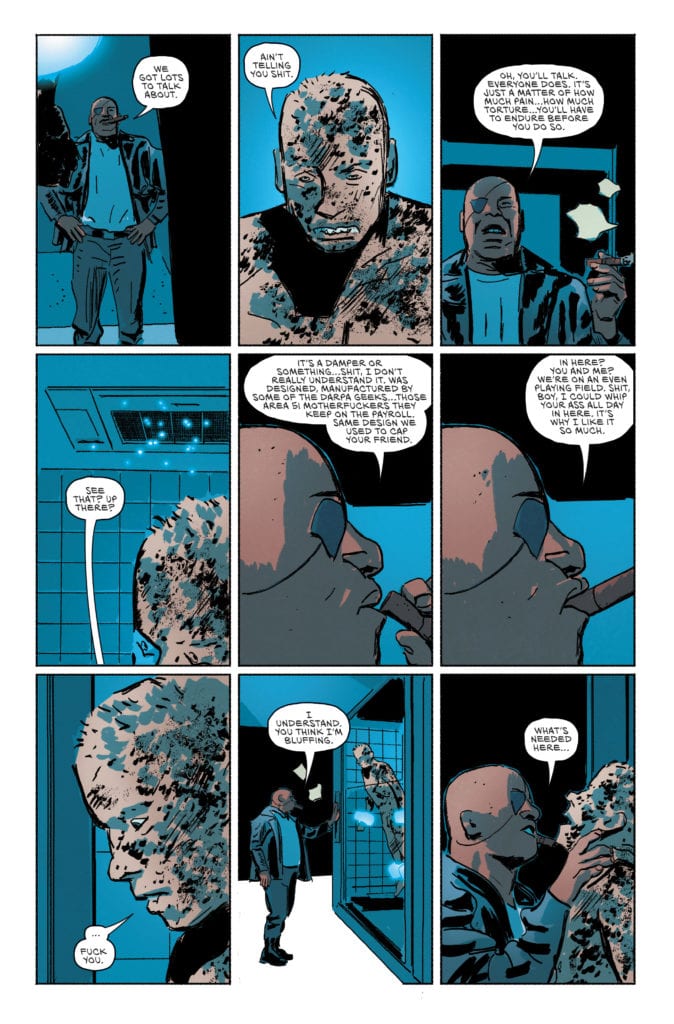
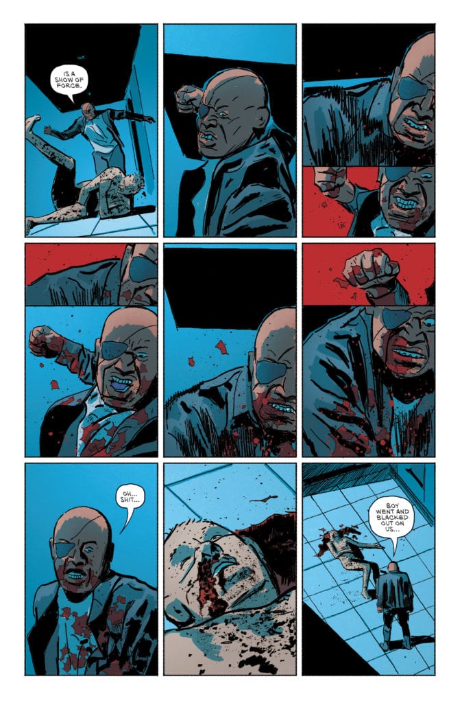
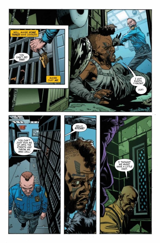
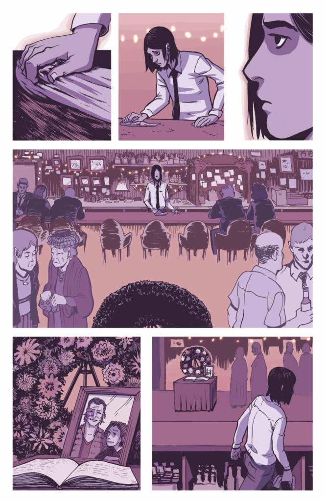
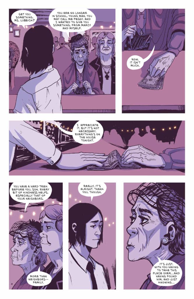
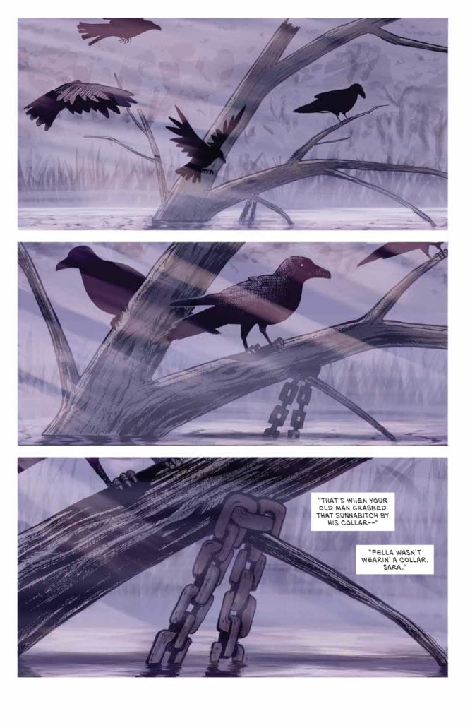
YOUTH Season 2 #3 hits the internet June 1st, but thanks to comiXology, Monkeys Fighting Robots has an exclusive six-page preview for you.
Sex. Drugs. Liquor. Murder. Superpowers.
About YOUTH Season 2 #3: One of the kids dies. One of the kids lives. Nothing is what it seems. The truth is revealed.
YOUTH Season 2 is by writer Curt Pires and artist Alex Diotto, with colors by Dee Cunniffe and letters by Micah Myers.
YOUTH is currently in development for Amazon Prime Video. It’s part of the comiXology Originals line of exclusive digital content only available on comiXology and Kindle. These titles will be available as part of comiXology Unlimited, Kindle Unlimited and Prime Reading at release.
Check out the YOUTH Season 2 #3 preview below:
Are you a fan of comiXology’s YOUTH? Sound off in the comments!
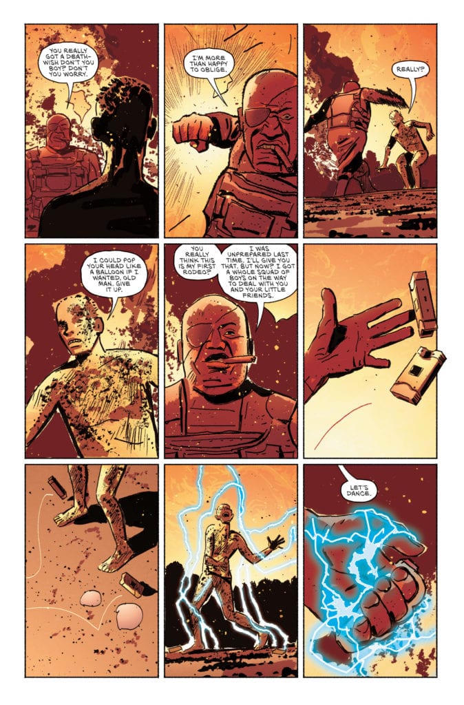
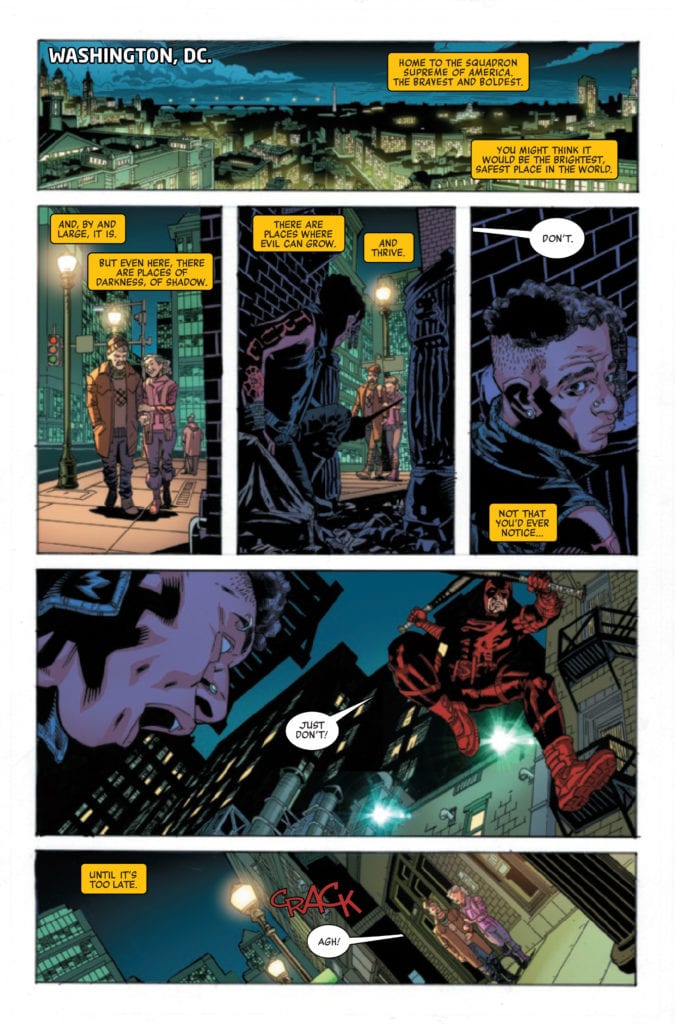
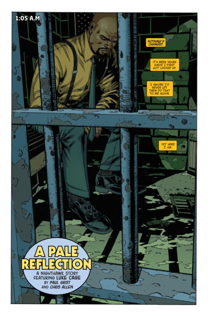
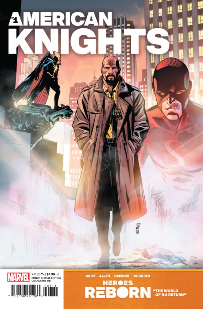
HEROES REBORN: AMERICAN KNIGHTS #1 hits your local comic book store June 2nd, but thanks to Marvel Comics, Monkeys Fighting Robots has an exclusive 4-page preview for you.
About the issue: An epic, oversize slugfest between the Squadron Supreme and an otherworldly group of Avengers for the final fate of the whacked-out world of HEROES REBORN.
The issue is by writer Paul Grist and artists Chris Allen and Marc Deering, with colors by Guru-eFX, and letters by Cory Petit. The main cover is by Chris Sprouse, Karl Story, and Neeraj Menon.
AMERICAN KNIGHTS is a 56-page one-shot set in the HEROES REBORN universe. It is a play on the street-level MARVEL KNIGHTS stories featuring alternate versions of Luke Cage and Daredevil.
Check out the HEROES REBORN: AMERICAN KNIGHTS #1 preview below:
What are you thinking of Marvel’s HEROES REBORN so far? Sound off in the comments!
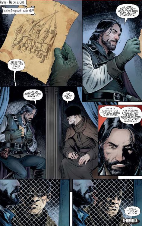
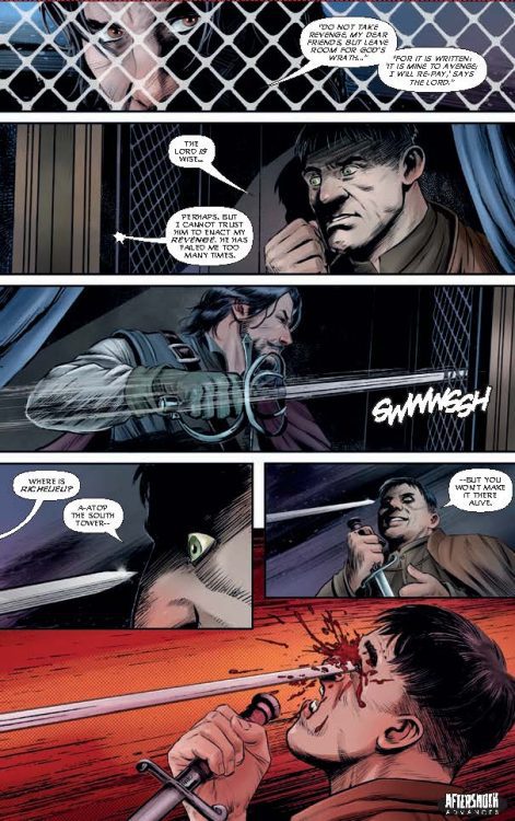
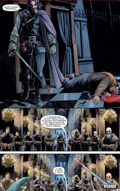
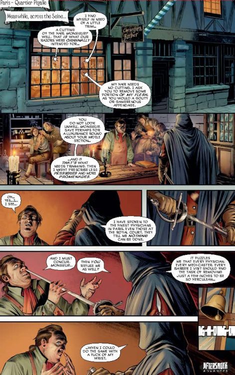
SEVEN SWORDS #1 hits your local comic book store June 16th, but thanks to AfterShock Comics, Monkeys Fighting Robots has an exclusive four-page preview for you.
About the issue: A weary and jaded D’Artagnan is drawn into a final conflict with the wicked Cardinal Richelieu, whose ruthless quest for power has led him to the supernatural. But the Last Musketeer can’t defeat these infernal enemies alone.
To save the world, he’ll need to join forces with seven iconic swashbuckling heroes: Don Juan, Captain Blood, Cyrano de Bergerac, to name a few. SEVEN SWORDS, who must overcome their host of differences and work together if they have any hope of thwarting Richelieu’s diabolical plans.
SEVEN SWORDS #1 is by writer Evan Daugherty and artist Riccardo Latina, with colors by Valentina Bianconi and letters by Dave Sharpe. The main cover is by Andy Clarke and Jose Villarrubia, with the incentive cover by JG Jones.
Daugherty has previously written films such as Snow White and the Huntsman, Divergent, and Teenage Mutant Ninja Turtles (2014).
Check out the SEVEN SWORDS #1 preview below:
Are you excited for SEVEN SWORDS? Sound off in the comments!
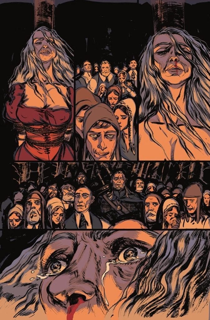
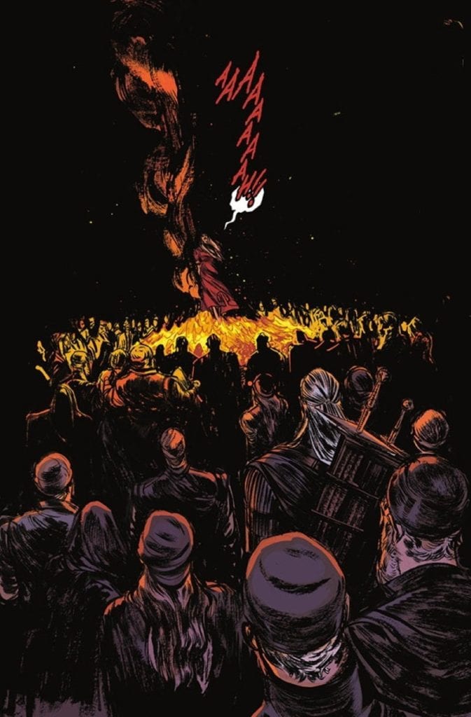
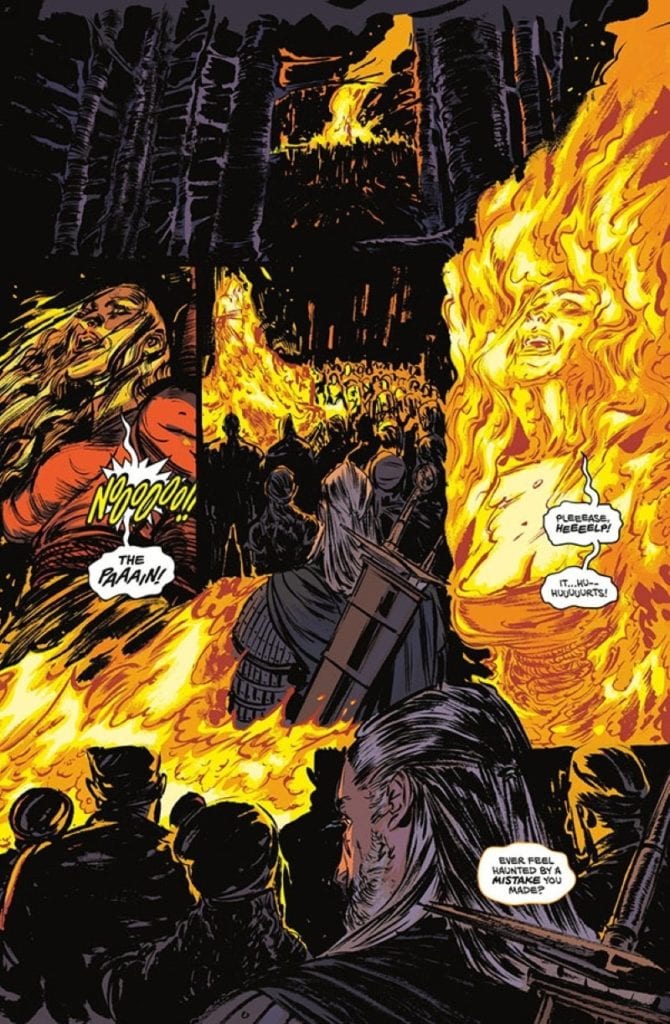
Writer Bartosz Sztybor and artist Vanesa Del Rey bring us the first issue of a four part mini-series set in the monster and blood-filled universe of CD Projekt Red’s masterpiece RPG trilogy. “The Witcher: Witch’s Lament” #1, with layouts by John Starr, colors from Jordie Bellaire, and letters from Aditya Bidikar, is a rough but entertaining start to this comic series. Uneven pacing and inconsistent art are saved by a fantastic atmosphere and characterizations that will take fans of the game series right back to this brilliant world based on Andrzej Sapkowski’s novels.
“Flames rise as a witch is burned at the stake. As Geralt searches for his next job, disturbing images of the fatal persecution appear before him, bringing an ominous warning.”
Writing & Plot
Bartosz Sztybor’s script for “The Witcher: Witch’s Lament” #1 does a solid job of setting up its immediate conflict and creating an eerie sense of tension from the opening page. The tone of the story is immediately crafted with Geralt watching a witch be burned at the stake, an event that he is responsible for in some way. Those who have played the Witcher games (or read the original novels, which this comic does not take as much influence from) know about Geralt’s complicated associations with witches and sorceresses, so seeing this as an opening is a seriously intriguing and emotionally conflicting start for any series fan. Sztybor nails Geralt’s characterization, from his gruff single syllable vocabulary to his internal conflict and thinly veiled remorse about his actions. His mercenary attitude is always just a front for his altruistic nature, but he still won’t suffer a fool or a double-cross. Unfortunately, this issue has a bit of trouble keeping its audience focused. It feels like the script can’t quite decide what the most important part of the issue is. This comic almost seems like its emulating the games in that its setting up side quests and subplots that complement the main arc; a maneuver that really only works in the gaming medium. There’s obviously an endgame in mind here, it’s just taking a roundabout way of getting there. This is still a solidly written issue that Witcher fans are sure to enjoy, it just has some bumps here and there that could easily be smoothed out in the coming chapters.
Art Direction
Visually, “The Witcher: Witch’s Lament” #1 is a properly atmospheric and eerie looking comic, albeit also a bit inconsistent. At its best, the pencils are absolutely stunning. Vanesa Del Rey’s thick and shade-heavy pencils populate this desperate world with an ever-threatening landscape and weary individuals. The ever-stonefaced Geralt of Rivia contrasts with the desperate, frightened, and scheming people he constantly runs into, perfectly replicating his visage and that dynamic from the games. The monsters are taken straight from CD Projekt Red’s artbook, with all the details there to make RPG fans rejoice. The panel layouts from John Starr are directionally easy to follow and flow reasonably well, making for a structurally solid reading experience. Jordie Bellaire’s colors are deep and varied, with an array of tones dancing across every surface and perfectly reflecting whatever light source is found in the panel (which in this world is only moonlight or fire, or nothing at all). Unfortunately, the way this comics dark atmosphere is handled can sometimes be a bit inconsistent. There are moments where it is hard to discern where the setting is and not just due to the comic’s atmospheric direction. This issue’s very stylized art direction can sometimes make character’s faces rougher than usual to the point where the art looks rushed. The lettering from Aditya Bidikar on the other hand is perfect for a comic set in this world, with scratchy and eerie font choices that vary based on character and tone of voice. This is a mostly solid looking comic, with just a couple of minor issue that drag the visual presentation down a bit.
“The Witcher: Witch’s Lament” #1 is a creepy and atmospheric opening issue that nails the voice and feel of the games (and novels) it is based on, while also a bit marred by some uneven pacing and inconsistent art. The character voice and main plot thread here is enticing and engaging to read, even though it can be hard to decides what needs to be focused on. The visuals are perfectly dark and unnerving for a nighttime hunt for ghouls and witches, although they can dip into the sloppy and rushed side from time to time. If you’re a fan of this grim and lore-rich universe, be sure to grab this issue when it hits shelves on 5/26!
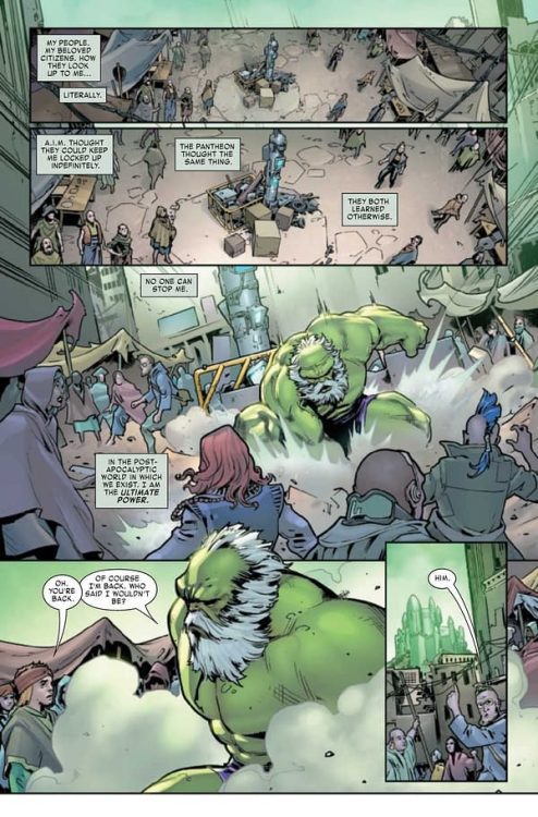
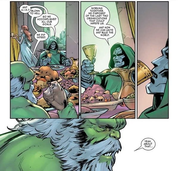
MAESTRO: WAR AND PAX #5 hits comic book stores on Wednesday, May 26th, bringing an end to this exciting Maestro miniseries. The Jade Giant found himself face-to-face with Doctor Doom, who he presumed to have perished with the other superpowered types in the past. Readers will witness a clash of titans in their vie for the throne in Dystopia. Bruce Banner might be the strongest there is, but Doom is known for having plenty of tricks up his sleeve.
Story
The story opens with an engaging internal monologue from Banner. Hearing how the tyrant views himself helps readers understand why he makes the choices he does. It confronts us with an unsettling question: If we had unlimited power, would we use it to rule over others? For Maestro, the answer is clear.
The city dwellers point Banner to Doom, who is now claiming the title of ruler in Dystopia. Readers would reasonably expect the two to dish it out upon meeting, but, surprisingly, they exchange formal greetings. They even have a shared meal. All seems too good to be true until Banner reveals the wine Doom sipped was poisoned, leading to the clash of egos we were waiting for.
Though the two often found themselves at odds in the past, something seems more enticing about this interaction. The jabs, insults and monologuing between these two is priceless. If readers didn’t know Banner had crossed the threshold into full villainy, they do now.
Peter David’s narrative writes both characters with impressive authenticity. These two are more similar now than ever before, yet they retain the unique aspects of their personalities that led us to love them.
Artwork
Javier Pina and Germán Peralta’s penciling and ink work, Jesus Aburtov’s coloring, and VC’s Travis Lanha’s lettering offered high quality illustrations for readers. The bulging muscles, colorful sorcery and destroyed buildings throughout the story’s setting draws us into its world. We also loved how the word balloons framed each moment of action, giving readers the details they needed while pointing them to the visual elements.
Conclusion
MAESTRO: WAR AND PAX #5 wraps up this miniseries in perfect Hulk fashion. The massive power of each opponent is only matched by their enormous egos.
What do you think lies in store for the citizens of Dystopia? Let us know in the comments below!
For a tale that takes a twist into unsettling waters, The Down River People from Archaia is an enthralling and moving story. Through the antagonist’s journey, Adam Smith and Matthew Fox are able to touch the reader’s heart while playing with modern horror tropes.
Smith and Fox use the long format of the graphic novel and create an undulating rhythm in the narrative that spreads across 13 uneven chapters. It touches on family loss, family reunion, police brutality, honor, and tradition. And through it, all Myers, the central character, has to deal with the growing depression within himself. It is a comic with many levels, and as a reader, you will have the urge to rip away at them to get to the end. However, Smith and Fox constantly slow you down and force you to experience the comic at their speed.
The Down River People Credit: BOOM! Studios
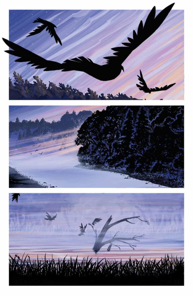
On the Bank
The opening three pages, which are almost wordless, set the scene beautifully for the rest of the book. Fox slowly introduces you to the world of The Down River People, swooping you in like one of the birds depicted in panels. The sequence also highlights one of the main features of Fox’s design for this book; minimalist mise en scene. The scenery is expressively rendered but always at a distance, a beauty to behold but not encountered. This contrasts Myers’ home and his life, where the sets are as simple as the flatbed trailer bar, and the props are sparse. There is a strong focus on two aspects of Myers’ life within the opening chapters, and almost all of the props guide the reader to these two things: alcohol and music.
Fox’s artwork is lyrical and focuses on the details; the wrinkles on an old man’s face, a close-up of a family photograph, or the constant reference to drinking through images of glasses and bottles. Myers’ life is soaked in the business of buying and selling alcohol. This appears to be his world but is it only because it was inherited from his father, Darnell? There is an emptiness to Myers’ life when we are first introduced to him, and this comes across superbly thanks to Fox’s manipulation of the world we see. This emptiness is explored in the narrative as Smith slowly reveals the details of Darnell’s death and the reappearance of Myer’s estranged mother. The book’s first half is an emotional toil for Myers, illustrated by constant drowning imagery as the antagonist is metaphorically pulled out of his depth.
The Down River People Credit: BOOM! Studios
Into the River
Some of the greatest horror films have slow build-ups that could be mistaken for a slice of life drama. Films like Audition by Takashi Miike, Midsommar by Ari Aster, and Nicolas Roeg’s seminal 1973 movie Don’t Look Now, all ease the viewer into a world before tearing it apart. The Down River People follows the same pattern of storytelling and is able to do so because of the graphic novel format. Smith and Fox build an encompassing, realistic world full of grief and cruelty over the space of 200 plus pages. The mundane, day-to-day life that Myers lives, despite his father’s death, is central to the opening chapters, leading the reader to believe that the plot could go down the ‘man against the system’ route. But there are hints that something else is coming and when the narrative shifts, the disturbing horror takes hold.
The horrific element of The Down River People is not of the slasher fair or grotesque demonic nature; it stems from a disturbing cult and the power the leaders have over people. Myers’ journey is about becoming dislodged from his life, and this leaves him susceptible to outside influence. The cult becomes a metaphor for the unstable and insecure world that has been born in recent years. The anxieties and paranoia that have spread through social media and even infiltrated legitimate news companies are repurposed here into a hierarchy of worship. Power is used to manipulate the weak, and the creepy mandate of love, which is used to cover the cruelty, makes your skin crawl more than any deformed, monstrous beast will ever do.
The Down River People Credit: BOOM! Studios
Style and substance
The pacing of the narrative and the page layouts draw you in and control your path through the book so that it becomes nearly impossible to put down. Even as the disturbing elements begin to emerge, the creators have you transfixed like one of the cult members. Part of the charm is the poetic nature of the art/text combination that elevates the experience by creating a magical-realist world—a place of wonder even when in disorder.
The devil is in the details, and The Down River People pays close attention to those details. Fox’s artwork is carefully crafted to draw the reader’s attention exactly where it needs to be. This is helped significantly by Mike Fiorentino’s lettering. The lack of harsh black lines around the speech balloons allows the text to sit within the image much better. It becomes a part of the scene. It also allows for greater emphasis within the speech itself. A word in bold stands out against the whiteness of the balloon.
The color works in much the same fashion as the lettering. Fox’s simplified color washes create a tone and a sense of location but do not overpower a scene. The color provides the backdrop for a page while the panels let the characters come through and be noticed. At times the colors create an idyllic, peaceful environment for cast interaction; at other times, there is a coldness that fuels the conflict in the narrative.
The Down River People Credit: BOOM! Studios
Conclusion
The Down River People is a thoughtful, moving, and then disturbing dreamlike narrative. It is a gripping read from the first chapter, with the creators having complete control over the reader. It is easy to read in a single sitting but demands that you take your time. This will be several hours of your time well spent.
Horror is experiencing a surge at the moment, even infiltrating the Big 2, and comics have a unique position to explore this genre, a visual medium that is to a large degree not constrained by budget requirements. Barry Windsor-Smith has recently returned to the comic world with a monstrous graphic novel packed with grotesquery. In Smith and Fox’s book, a subtler examination of the human spirit is played out with modern horror motifs leading the way. It has a slow build-up but is extremely rewarding at every step of the way.
This book took hold of me like no other comic has this year, and I highly recommend it. It’s for fans of the medium, fans of the genre, and fans of great storytelling. There is a lot to discover in the narrative and the artwork, making you want to re-read before even putting it down for the first time.
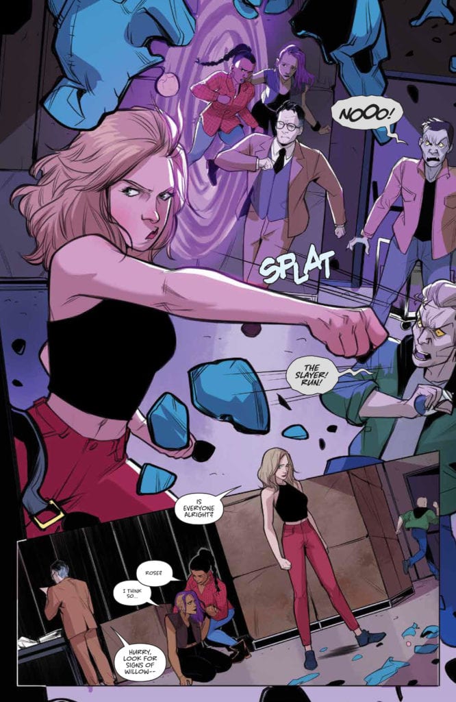
Buffyverse life is like a box of chocolates: you never know where or when an interdimensional portal will take you. Available now from Boom! Studios, Buffy the Vampire Slayer #25, takes us down a ’90s rabbit hole full of meta-references and a troubling time paradox. #25 is written by Buffy mainstay Jeremy Lambert and newcomer Valentina Pinti. Also returning are colorist Raul Angulo and letterer Ed Dukeshire.
Previously on Buffy, the gang chased after Willow through a portal. It appeared to have dropped them into season three, episode six of the TV series. Now, in issue 25, the gang realizes they’ve entered another dimension of the multiverse—a ’90s dimension. With the group split up, Buffy, Giles, Kendra, and Rose have to find Willow without bumping into their ’90s-era multiverse counterparts. Anya acts as a guide to deal with this unintended consequence of her subterfuge.
The Scoobies wade through cameos and meta-references that’ll make even the seasoned fans’ heads spin. Despite this, Lambert’s story remains easy to follow. But I couldn’t help thinking of all the references as pandering to fans familiar with both the TV series and original Dark Horse Comics. All notions of pandering aside, fans exclusive to the Boom! Studios run will find this issue satisfying.
Buffyverse
Artistically, Pinti changes up the cartoonish style established by Ramon Bachs in previous issues. While the characters’ clothing copies costuming from the TV show, they resemble the real-life actors even less than before. Pinti also favors thinner, more delicate lines and uses none of Bachs’ inky blotches and cross-hatching. These choices give an overall naturalistic style to the issue, which is ironic considering they’re in a dimension of the multiverse.
OUT OF THE PORTAL, INTO THE ’90s.
Such irony contributes to the eerie atmosphere of the issue. This dimension is familiar, yet not quite the Sunnydale we know. Pinti’s ironic naturalism plus stark negative space instill a subtle sense of discomfort and confusion, putting the reader in the shoes of the Scooby Gang. Further, Angulo uses more gray, brown, and red than ever before. This color palette feels both naturalistic yet verges on noir in its lack of warmth and saturation.
It’s like suddenly the Scooby Gang has become the other Hanna-Barbera Scooby Gang in a dusty old cartoon local. But Angulo doesn’t completely abandon the familiar background colors purple and blue, choosing to restrict them to scenes involving Anya and the portal. As we’ve come to expect, these colors evoke magic and, in this issue, mark where magic power lies. In that respect, the stark deviation from previous issues is beguiling as much as it is jarring.
Worlds Apart
For the reader and the Scooby Gang, the dimension’s mystery is distractingly alluring. But they still have to find Xander. Maybe the portal was never the right path to him in the first place. When the gang makes it back to real Sunnydale, the other dimension leaves them with lingering confusion. Is a time paradox the newest obstacle on the way to reuniting with Xander?
The stakes just keep getting stranger and stranger. With the rifts in the Scooby Gang now stretching across the multiverse, it’s more difficult to see any togetherness in their future. But if Buffy the Vampire Slayer #25 proves anything, it’s that the integrity of Buffy and her friends has drastic cosmic implications. What’s next for the Xander recovery mission may not only be saving a soul but saving the universe.
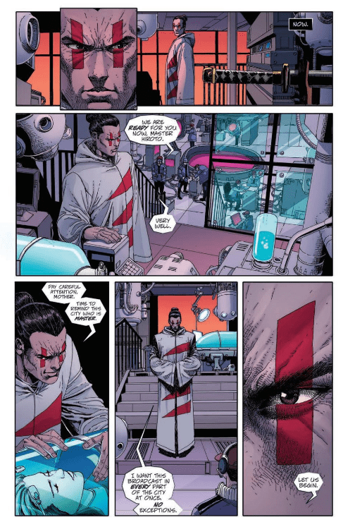
TEENAGE MUTANT NINJA TURTLES: THE LAST RONIN #3, available on Wednesday, May 26th, dives deeper into the mysterious circumstances surrounding Leonardo, Donatello and Raphael’s disappearance years ago. In the last issue Michelangelo stumbled across April, her daughter Casey Marie, and a host of other resistance fighters after attempting to infiltrate the new overlord’s base in New York City. But even teamed up, do our heroes have a chance of making a difference?
Story
The story opens up with the New York City overlord Hiroto, son of Karai and grandson of the Shredder, addressing the people. Readers will remember the warrior waging all-out war on the resistance forces in the city, which now includes Mikey, April, and Casey Marie. Now Hiroto pledges to fight even harder against these “terrorists,” weeding out anyone who gets in the way.
Back underground, April shows Mikey the severed head of the robot Fugitoid. Immediately readers find themselves swept into the past where they learn more about the circumstances that led to his brothers’ deaths; somehow Fugitoid is at the center of it all.
This form of storytelling employed by Tom Waltz and Kevin Eastman introduces us to each new piece of information with perfect pacing. This keeps readers from being overwhelmed. But it also builds anticipation as we uncover each event that led to the present dystopia.
Artwork
The illustrations in this issue are fantastic. Esau and Isaac Escorza’s penciling and ink work provide readers will an incredible amount of detail, which helps bring this dystopian version of New York City to life. We also loved how Luis Antonio Delgado’s coloring added tannish tints to the flashback scenes to help distinguish between the two periods. In addition, Shawn Lee’s lettering boxes were placed well in each panel to avoid distracting readers from the other illustrations.
Conclusion
TEENAGE MUTANT NINJA TURTLES: THE LAST RONIN #3 reveals much of the backstory information readers have been waiting for. We can’t wait for the next installment!
What secrets do you hope to see revealed in the next issue? Let us know in the comments below!
Disney’s Cruella showcases a devilishly good time filled with over-the-top antics and phenomenal performances by its two leads. Admittedly, the film didn’t seem like it would offer much based on the trailers, but Cruella is a live-action adaptation Disney should be proud of. It’s clever, risky, features a fitting punk rock backdrop, and provides enough humor to lighten the mood a few times. Cruella manages to pull off a satisfying examination of one of Disney’s most iconic characters and how she came to exist.
The live-action adaptations from Disney always spark conversation and Cruella won’t be any different once audiences have seen it. It probably runs a little longer than it should, but its overstay isn’t an unpleasant one thanks to the effort put into making it. Creating a live-action origin story for Cruella de Vil, the eccentric fashionista from 101 Dalmatians turned out better than expected. The film was directed by Craig Gillespie and written by Dana Fox and Tony McNamara. Cruella stars Joel Fry, Paul Hauser, Emily Beechman, Kirby Howell-Baptiste, Emma Thompson, Mark Strong, and Emma Stone. Placed in the 1970s, Cruella centers on Estella de Vil (Stone), the soon-to-be eccentric fashion designer, and the path that leads to her becoming Cruella de Vil.
Cruella details the ambitious childhood of Estella before shifting into her chaotic, and fashion-centered adulthood. Fox and McNamara tell an engaging story that does seem held back at times since this is a Disney film. The darker aspects of this film could have been better portrayed, but the script still delivers strongly on the mature aspects of this story. Estella starts as a young drifter, being raised by her mother Catherine de Vil (Beecham) in London. She doesn’t fit in, has dreams of being a fashion designer, and gets into physical altercations at school. An unfortunate event happens, leaving Estella to come in contact with Jasper (Fry) and Horace (Hauser), friends who will eventually assist in her criminal activity. As an adult, Estella works for the Baroness von Hellman (Thompson), a renowned fashion legend, who shares many similarities to Estella. After discovering a connection between her past and the Baroness, a rivalry develops, and the Baroness plays a major role in Estella’s rise to popularity.
Themes of distinctiveness shine bright throughout this film, especially during the interactions between Estella and the Baroness. Fox and McNamara flesh out a character study that takes a deep look at this clever Disney villain while still keeping it family-friendly for the most part. The twists along the way are shocking, unexpected, and assists in bringing Estella’s self-discovery full circle. The screenplay does enough to help audiences understand Estella, feel sympathy for her, but doesn’t make her out to be a hero. There are no heroes in this story, which is probably why Cruella will be compared to The Joker. Stone’s portrayal of Cruella makes this character just as charming as ever, and likable when she isn’t committing crimes of course.
Stone brings the charisma, wit, and charm you’d expect from the Cruella de Vil character. It’s clear she is having fun in this role, she eats up the scenery with her energy, demands your attention, and sinks into the headspace of this deranged individual. Thompson marvelously compliments Stone’s energy, as stated by the Baroness herself. When these two share the screen, it’s amazing to watch their characters upstage the other antics. Gillespie’s direction wonderfully captures the film’s over-the-top style, award-worthy costume designs, creates an emotional thrill ride, and sets a consistent rebel tone from start to finish. Cruella arguably features Stone’s best performance to date, as she is very believable as this diabolical fashionista and this is a role she should revisit.
Cruella may be two hours too long, but what it packs in those two hours is not to be missed. The back and forth between Estella and the Baroness can grow stale, but the film keeps you invested in seeing how this story ends. Stone’s enchanting performance here steers this film in the right direction anytime it seems to be going off course, and perhaps a follow-up wouldn’t be met with immediate dismissal. In a list of live adaptations that continues to grow, Cruella is one of Disney’s most memorable outings to date.
A Quiet Place Part 2 pulls off a difficult task by surpassing the original film and becoming one of the best sequels in cinematic history. In an attempt to expand this unfamiliar world, the film increases the intensity, focuses more on character building, and morphs into a heart-pounding experience from start to finish. Coming at a time where the world is looking for a symbol of hope, A Quiet Place Part 2 restores faith in sequels that can rival the initial outing.
Survival is pushed to a new level in this film, as it begins on the first day these unidentified creatures arrived on earth. After filling in some gaps for audiences, we’re thrown back into the lives of the remaining members of the Abbott family. The creatures have forced them out of their home to seek anything that resembles safety. Despite previous uncertainty, John Krasinski returns to write and direct A Quiet Place Part 2, which was a smart decision on his part. The film stars Millicent Simmonds, Emily Blunt, Djimon Hounsou, Noah Jupe, Cillian Murphy, and John Krasinski, returning via flashbacks. A Quiet Place Part 2 follows Evelyn (Blunt), Regan (Simmonds), Marcus, and Evelyn’s newborn venturing out into a world they aren’t prepared to face. The creatures aren’t the only threats, but after coming in contact with Emmett (Murphy), an old friend of the family, Regan decides she is going to take a stand against these creatures.
Evelyn (Emily Blunt) and Marcus (Noah Jupe) brave the unknown in “A Quiet Place Part II.”
Krasinski’s return as Lee Abbott is a minor one, but he is felt throughout the film thanks to his daughter, Regan. Krasinki’s focus on Regan and her journey to share her discovery of high-frequency sounds posing a threat to the creatures with the world is the heart of this film. She spent most of the last film blaming herself for what happened to her brother, and all hope seemed lost to her. A Quiet Place Part 2 allows Regan to forgive herself, protect her family, become confident like her father, and she is determined to assist countless people in battling these creatures. Krasinski’s writing this time around is about developing these characters, creating more nerve-racking predicaments for them to escape, world expansion, and introducing the idea of other threats besides the creatures themselves.
These human threats are never fully understood once they make an appearance, but perhaps more will come in the future. The introduction of Emmett is rather dull, as many did expect this character to fill in Krasinski’s shoes, but that responsibility fell on Regan instead. Emmett is a friend of the family, who was present during the creature’s first attack, and it’s implied he was one of the others communicating to Lee in the last film. He has lost his family, just like Evelyn, who insists on him protecting Regan. Jumpscares and abrupt endings aside, Krasinski’s script plays out like a Steven Spielberg film from start to finish, and while not as emotional as its predecessor, A Quiet Place Part 2 amplifies every aspect of the first film in tremendous fashion.
Man on Island (Djimon Hounsou) braves the unknown in “A Quiet Place Part II.”
Blunt shines as Evelyn Abbott, the only surviving parent for her three children, who are terrified for the most part. The moments between Marcus and Evelyn are comforting to watch, as she helps her son maintain his composure after he suffers an unexpected accident early on in the film. A rather exaggerated depiction of just how difficult a mother’s job can be, and Blunt plays the role to perfection. Lee’s death seems to have lead to Marcus feeling helpless, but he and his sister find their strength to stand tall together. Jupe’s performance will make you feel every ounce of pain his character endures throughout this film, but you will also feel his confidence as well once he finds it. As mentioned above, Simmonds steals the show as Regan Abbott, the courageous daughter who will not let her father’s death be for nothing. Simmonds is the sense of hope viewers will want to latch on to while she navigates this highly dangerous world.
Murphy is a great addition, despite his character being underwhelming, he delivers a terrific performance as this heartbroken family man. Krasinski refuses to let audiences breathe during A Quiet Place Part 2, as there is not a single moment where you will not pay attention to every last movement these characters make. The intensity in this film is overwhelming at times but makes for an exciting theater experience still. Moments in the film showcase events happening simultaneously and Krasinski captures it all so well, the transitions are breathtaking to watch. Marco Beltrami’s score blares in all its glory, only adding to the nonstop dread that lingers throughout the film. Krasinski makes sure to keep the emotions high during each act of this film.
Regan (Millicent Simmonds) braves the unknown in “A Quiet Place Part II.”
A Quiet Place Part 2 leaves the door open to venture out further into this world. Blunt has revealed this is only the first sequel in a planned trilogy, so perhaps the next outing will answer many important questions. Krasinski’s monster-filled world raised the stakes in all the best ways, and it’s clear he enjoys using the horror genre to tell compelling stories. A Quiet Place Part 2 is the movie theaters were created for, and it was worth the wait.