Home Blog Page 157

Review: MISTER MIRACLE: THE SOURCE OF FREEDOM #1 Tries To Escape From Its Own Mess

Writer Brandon Easton and artist Fico Ossio, along with colorist Rico Renzi and letterer Rob Leigh, bring us the return of Shiloh Norman in “Mister Miracle: The Source of Freedom” #1. Unfortunately, this return spawning out of DC’s Future State event is hampered by a script that tries to do too many things at once, coming off as overstuffed and hard to focus on. This is lifted up by some great work by the art team, making this issue a good looking but muddled debut.

“The Mister Miracle show used to be the hottest ticket in town, whether you caught him onstage escaping from perilous traps or spotted him on the streets of Metropolis taking out bad guys. What Shilo Norman forgot is the first rule of both showbiz and super-heroing: always leave them wanting more. Now it’s time to start showing the world what a miracle man can do. Showbiz/superhero rule #2: timing is everything. There’s a new performer in town who wants to knock Mister Miracle off his pedestal and stake a claim to his famous moniker! Can Shilo break free of this trap? (Why yes, that is a clue.)”
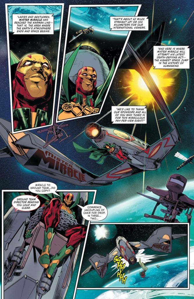
Writing & Plot

I’ll be completely honest and admit that I’m a bit biased against any Mister Miracle title that doesn’t star Scott Free as the man escaping from certain doom. It’s nothing against Shiloh Norman as a character, (I quite enjoyed his “Seven Soldiers” series under Grant Morrison), it’s just that I’m so attached to Free as this character. Now, with Free’s popularity at an all-time high after the success of Tom King and Mitch Gerard’s masterpiece, having a Mister Miracle title that stars a character many people may not recognize is a daunting task. This is why it’s so unfortunate that “The Source of Freedom” #1 stumbles in its attempt to bring Shiloh Norman back to the forefront following DC’s Future State event. This comic’s script has too many plots all happening at once, and none of them are really given enough time to breath. It feels like every other page there’s some major development involving something new popping up in Norman’s life, when we haven’t even figured out what the importance of the last conflict was. This issue is overstuffed with a romantic subplot, socio-political messaging, a cosmic threat, and Norman coming to terms with his identity as Mister Miracle and the problems he inherits with that identity. None of these plot elements really get much time to themselves. This being said, the most engaging part of this issue is Shiloh’s struggle with his secret identity as a black man and whether or not it’s his “responsibility” (as some would put it) to go public. The pages that focus on this struggle are the best part of this comic’s script, and I would have liked to see more of the issue tackle this struggle. Instead, we get a comic that struggles to find a focus and makes for a tangled reading experience.
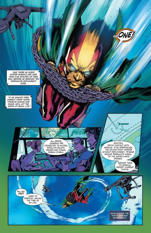
Art Direction

The saving grace in “Mister Miracle: The Source of Freedom” #1 comes in the form of Fico Ossio’s pencils and Rico Renzi’s colors. Ossio’s shadowy and stylized aesthetic is full of detail and kinetic energy. The way Ossio draws his characters in both their expressions and movements does a great job of placing us in the room (or falling from space in a ridiculous escape stunt) with the cast, and the emotions look and feel real throughout the book. The action and how it runs through the panels is full of forward motion and looks absolutely stunning. There is occasionally the sense that there is too much happening a once on a page, or that actions seem to be running together. I mainly attribute this to the script rather than the artist, however. Rico Renzi’s colors are saturated and complex, with tons of tonal variation and shadow. The Mister Miracle costume pops with a definition that makes it stand out the way such a look should stand out against the backdrop of a normal urban environment. Rob Leigh’s letters vary slightly with font changes and a clean look, but don’t do too much outside the basics. This is a sharp looking comic that manages to elevate a convoluted script into an enjoyable read.

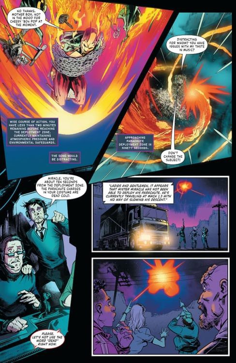
“Mister Miracle: The Source of Freedom” #1 is a sharply drawn but hastily written debut comic for this reintroduction of Shiloh Norman as the Apokalips-born Houdini. Brandon Easton’s script manages a couple moments of engaging writing and solid dialogue, but it mostly fumbles as it tries handling too many problems at once and never allows the plot to breathe. The visuals from Fico Ossio and Rico Renzi are vivid and stylistically awesome, making for a killer looking comic with its own unique aesthetic. If you’re a fan of the underdog Mister Miracle identity and want to give this a shot, pick it up when it hits shelves on 5/25!

Monkeys Fighting Robots Youtube

Review: STRANGE ADVENTURES #10 Blows This Thing Wide Open!

Strange Adventures King DC Comics

With DC Comics’ Strange Adventures #10, we get all the answers we’ve been looking for. Writer Tom King, artists Mitch Gerads and Evan “Doc” Shaner, and letterer Clayton Cowles, execute their big reveal. And boy, they sure do stick the landing!

Writing

King’s script has two sides to it, just like in every other issue of Strange Adventures. For parts of this issue, we follow Alanna Strange. She’s reading a letter from Michael Holt, Mr. Terrific. The letter is well written and intellectual. Its contents are brutal and devastating. But the other half of King’s script is the complete opposite. We follow Adam Strange during the Rann-Pyykt War. These scenes are casually brutal. Adam smiles as he shoots enemies through the head. He cracks jokes between war crimes. Both halves of this script do a phenomenal job of showing the human response to wartime. Some, like Michael Holt, must study it. They need to know why they fight on a philosophical level. Others, like Adam Strange, need to pretend they’re not fighting at all. It’s just a normal day to him, full of bloodshed.

Strange Adventures King DC Comics

Art

Gerads side of the comic focuses claustrophobically on Alanna Strange. We watch her go about her day. She looks glamorous and put together. Her face is unmoving. A mix of a smile and a look of determination. But at one point we see her sitting on the toilet, going through her phone. It’s a moment we feel like we shouldn’t be there for. But it’s clear this is a deliberate invasion of privacy. This is the one thing we’re seeing in Alanna’s day that isn’t rehearsed. And later, we see her take off her makeup. At first, it feels normal and part of her pre-planned day, until she has all of her makeup off. She glares at her own reflection. Gerads is showing us, in subtle interruptions to Alanna’s meticulously planned days, little moments of Alanna being human. He’s helping us understand Alanna at a time we need to understand her the most.

Meanwhile, Shaner’s pages are disturbingly comfortable with violence. Adam and Alanna often look full of happiness when they seem to be winning the war. But these moments of joy segue seamlessly into scenes of extreme violence. An action packed page of Adam charging into battle quickly leads to a panel of him executing Pyykt soldiers. Shaner’s pages once felt like a time capsule into the Silver Age. His characters looked happy and their trials were like something out of a movie. The consequences didn’t feel real. But now, Shaner is rubbing our noses in the consequences, but the smiles and the attitude of his characters hasn’t changed. It’s incredible. Shaner shows us vividly how normal the war has come to feel for Adam and Alanna as they grin through the carnage.

Strange Adventures King DC Comics

Coloring

Gerads pages often have a golden hue to them. It feels like you’re reading the comic through a glass of whisky. But he dials down the color palette slightly when Alanna is in the bathroom. When she’s applying her makeup, sitting on the toilet, or taking off her makeup, the colors feel less intense. It feels like she’s no longer putting on airs. These are the moments she is alone and has no one to perform for. Shaner’s color palette is consistently deep and full, with one exception. Right before the issue ends, we see Adam flying off on the right side of one of Shaner’s panels. He is uncolored, to the point that we can actually see some of the layers of Shaner’s penciling underneath. It’s as though the revelations of Holt’s letter are undoing parts of this fantasy the Stranges have created. The image that Adam has presented of his time in the war is quite literally being erased.

Lettering

When Cowles writes captions for Holt’s letter, he leads us down each page gently. We get three captions on one side of the page, one in the middle, and then three on the other. He guides our eyes carefully. It creates a sense of movement. But when we see Alanna taking off her makeup, the movement stops. All of Cowles’ captions are on the left of the page. For juxtaposition, when Alanna applies her makeup, which is shown in an almost identical way by Gerads, Cowles has captions on both sides of the page. So this is a clear difference. It suddenly feels static and unmoving.

The feeling the reader gets is almost one of whiplash. We’ve been gently following along and then we screech to a halt. It’s fantastic. Cowles snaps our attention back to the contents of the letter. And he makes us feel trapped in those captions. We no longer feel the range of movement we did before. And so, with that simple shift, Cowles highlights the importance of those final moments, and helps us see how Alanna must feel as she reads the same words.


DC Comics’ Strange Adventures is incredible. And with the bombs dropped in this issue, this creative team shows they can deliver on answers just as well as they delivered on mystery. Pick up Strange Adventures #10, out from DC Comics May 25th, at a comic shop near you!

Monkeys Fighting Robots Youtube

SHADOWMAN #2: Suckered In By A Thickening Plot

Shadowman #2 Cover

Shadowman #2 continues Valiant Entertainment’s tale of intrigue on May 26. Writer Cullen Bunn gives the titular character an attitude to match his suspenseful job. Artist Jon Davis-Hunt gives this issue a heavy dose of anticipation via illustrations. The feelings of intensity increase via Jordie Bellaire’s disorienting colors, and the lettering by Clayton Cowles provide sounds that beckon the reader onwards.

Shadowman #2 Folksy Horror

Shadowman #2 stands out by furthering a theme Bunn develops from the last issue. The people and demons Shadowman faces have a perverse drive for depraving acts. It’s as if some greater force pushes these people to normalize such macabre behavior for some direction in their lives. With Shadowman’s powers not allowing him to feel fear, the reader can’t help but feel it for him. Because with anger and disgust driving him, it feels like he is being exploited by a puppet master. As without the fear to hold back his worst impulses, Shadowman isn’t too different from his enemies.

Suspense Kills

Shadowman #2 art display
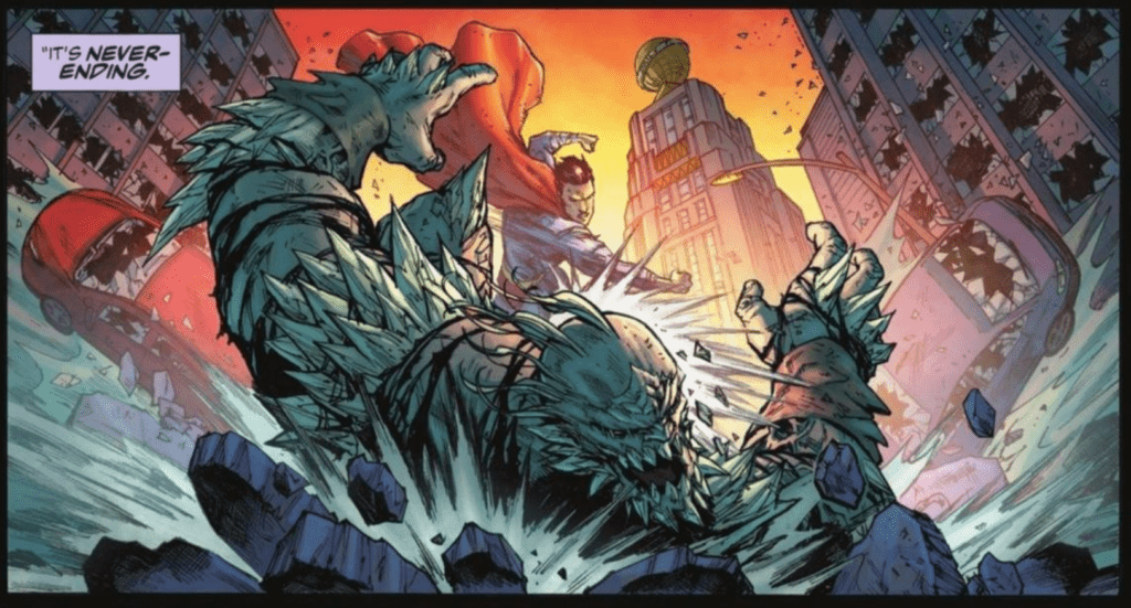
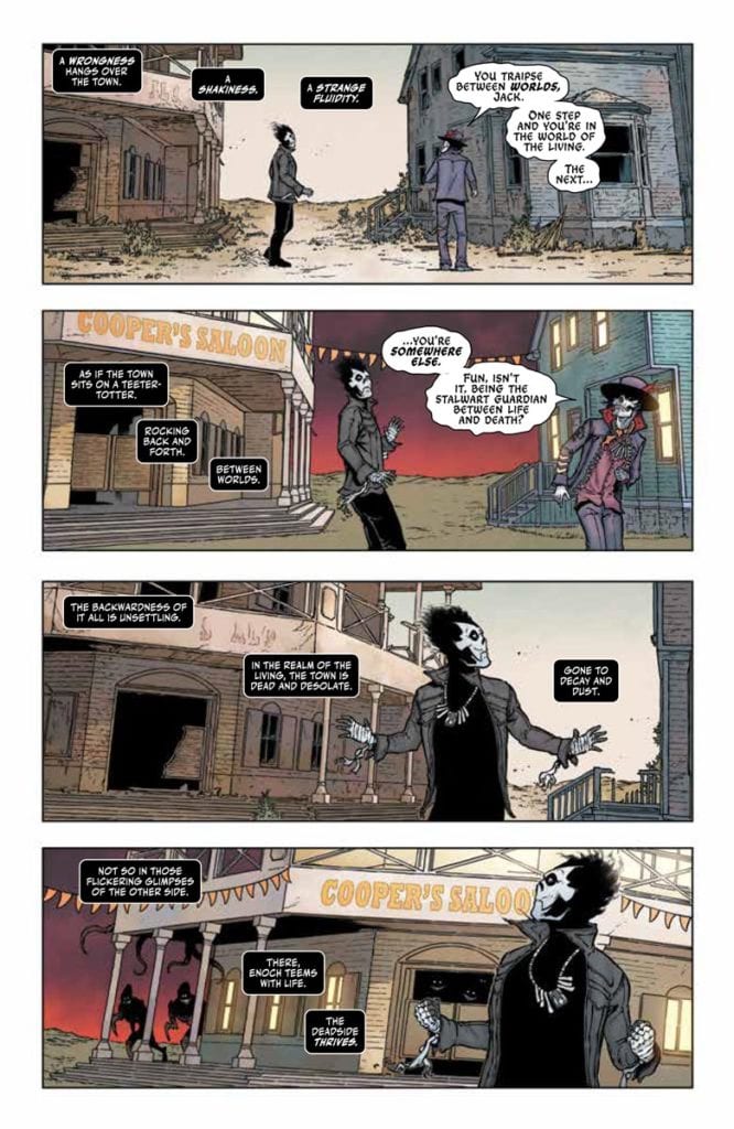
Davis-Hunt illustrates Shadowman #2 with an air of suspense. Each scene has an action taking place with something sinister flourishing. For Shadowman, who sees between two worlds, this is almost a given. Frankly, it’s hard to determine if the empty town or the ghost inhabited side is scarier. The Deadside looks lively with the demons living in it and the complementary color schemes by Bellaire. Unlike the dusty brown town that spits out ghosts. This is to say nothing of how Shadowman’s color scheme and outlining stand out in both realities; it highlights his role as a balance keeper of the Deadside.

The lettering by Cowles demonstrates the power of the voices spoken by the characters. Depending on the situation and a character’s presence, their voices enhance the scenarios. Looking at one page, Baron Samedi says everything to know about Shadowman’s role in two panels and stylized word balloons. Unlike how Shadowman takes a longer time to process everything through his captions.

Don’t Wait For Shadowman #2

Shadowman #2 gets a firmer grip on the reader by diving into the titular character’s psyche. There are forces at work that the reader has to realize for Shadowman because it feels like he’s looking for his footing. Readers can only wait until the next development.

Monkeys Fighting Robots Youtube

Read The First 5 Pages of SEVEN SECRETS #9 from Tom Taylor & Daniele Di Nicuolo

Exclusive Preview: SEVEN SECRETS #9

SEVEN SECRETS #9 hits your local comic book shop on June 16, but thanks to Boom! Studios, Monkeys Fighting Robots has an exclusive five-page preview for our readers. The book is written by Tom Taylor, with artist Daniele Di Nicuolo, colorist Walter Baiamonte, and letterer Ed Dukeshire.

About the issue:
With the first secret revealed and the world now watching, how much longer will the Order’s members be able to remain hidden? Casper and the surviving Keepers and Holders retreat once more to a remote safe house, even as Amon and the Seekers close in on them. Can the Order survive with a mole in their midst?

SEVEN SECRETS #9 features main cover art by series artist Daniele di Nicuolo and variant cover art by acclaimed artists Junggeun Yoon and Miguel Mercado.


Enjoy the preview below.

Monkeys Fighting Robots Youtube

Comics Studies: The Severed Head Affair

Crime SuspenStories
Crime SuspenStories #22 Credit: EC Comics

Or The Comic that Killed EC

Even without being an avid comic book reader, many people can still recognize some ‘important’ comics. These will, more often than not, fall into the ‘First Appearance’ category, whether that relates to a character or a creator. Detective Comics #27, for example, with its iconic image of Batman swinging across the city, a criminal in his arms; or The Amazing Spider-Man #298 which contains the first appearance of Eddie Brock and Todd McFarlane’s first issue on art duties.

These types of comics are fan favorites and often become highly collectable because of the desire to own a part of history. However, some comics have historical significance for other reasons, due to their links with social or controversial events. These comics might not have as far reaching recognition as others, but their significance is just as important in the foundation of the industry.

Take for example, Impact #1, published by EC Comics in April 1955. It might not be a comic most people are familiar with but the anthology contains a story by Bernie Krigstein, called Master Race. The strip is one of the most visually stunning and thematically important comics ever published. It is one of the first American comics to directly reference the holocaust.

Another EC comic, Crime SuspenStories #22, holds a place in comic book history for a slightly different reason. Unlike Impact #1, the contents and creators of this comic are not of particular interest but what the comic was used for has cemented it as a significant and collectable publication.

Impact #1 Credit: EC Comics

Juvenile Delinquency

The early 1950’s was a prosperous time for the comic industry in America. There were a number of publishers putting out hundreds of titles, selling upwards of 26 million comics per month.

These were often widely available, sold on newsstands and in grocery stores all across America. Relatively cheap, with cover prices of 10 cents per comic, it was easy for young readers to get their favorite titles every month. Publishers like EC Comics were thriving, in part because of the range of comics that they released but also because of the content. Crime and horror comics were big business and EC Comics were dedicated to releasing the best titles they could.

Comics such as Tales From The Crypt and Weird Fantasy are infamous and have as much of a following today as they had back in the 1950’s. The creators who worked on the titles were often at the top of their game and no-one, from writer and artist to editor and publisher, were afraid to push the boundaries of the stories they told.

However, there was a storm brewing, one that would decimate the comic industry. Towards the end of the 1940’s not everyone was happy about the comics that were circulating around the country. There was a growing concern about the contents of some horror and crime comics and the detrimental effect that they were having on children. Organizations were beginning to question if the rise in juvenile delinquency could be tied with the spread of the cheap comics that were popular amongst the younger generation.

Two articles published in 1948 kicked off the organized backlash against comics. Both articles were written by Fredric Wertham who became famous for writing The Seduction of the Innocent, a publication that arguably did more damage to the image of comics than any other published work. The two articles led initially to the formation of the Association of Comics Magazine Publishers, which failed to regulate content and had almost no effect at the time.

This initial failure fueled Wertham’s mission to fight inappropriate content and led to the book mentioned above and a US Congressional hearing into the effect of comics on Juvenile Delinquency. The hearing did not go well for the industry, leading to the formation of the Comics Code Authority and ultimately the downfall of EC Comics.

Subcommittee Hearings held in New York, 1954

Suspenseful Stories

So, what role did Crime SuspenStories #22 play in all of this?

When the 1954 Senate Subcommittee Hearings began in New York, it was clear from the outset that an element of scapegoating was taking place. Testimony was presented and the Committee asked questions of each witness, however the committee member’s were more inclined to ‘grill’ those arguing against the motion that comics were an unhealthy influence on the readers.

The first speaker on April 21 was Richard Clendenen, the executive director of the Senate Subcommittee To Investigate Juvenile Delinquency. He opened with a brief description of the comic publishing industry with some figures based on distribution and sales. He then went on to give some examples of the types of comics that the Subcommittee were concerned about. These comics included Black Magic Magazine, Mysterious Adventures, The Haunt of Fear, and Shock SuspenStories.

It was stated categorically in the opening statements that no-one wanted to infringe upon freedom of speech but content deemed unsuitable needed to be regulated. In the case of Crime SuspenStories #22, the committee barely got past the cover.

During the hearings William Gaines, EC Publisher and Co-Editor, voluntarily took a stand against the committee, despite recommendations to the contrary. His opening was defiant and bold. He was full of bravado, despite a lack of sleep and suffering from amphetamine withdrawal. Unfortunately for Gaines, the Committee had already heard Dr Wertham’s damnation of comics and their evil effects on the youth of America. As the publisher’s testimony continued he was drawn into lines of reasoning that would ultimately bring down the industry.

Chief Council Herbert Beaser asked the question, “Is there any limit you can think of that you would not put in a magazine because you thought a child should not see or read about it?”

Gaines replied by saying his limits were ‘the bounds of good taste’. It was at this point that Senator Estes Kefauver brought out a copy of Crime SuspenStories #22.

The cover of the comic shows the torso of a man, in one hand holding a bloody axe and the other a disembodied head of a woman. In the background a woman’s body lays on the floor, only her legs are visible. Senator Kefauver appears shocked by the comic he holds and asks Gaines if he considers it in good taste. Gaines’ reply is magnificent, in one respect, but completely damning in another. It is as if he is mocking the Committee and the Senator in an attempt to defend his art. Do you think the comic is in good taste?

Gaines: “Yes sir, I do, for the cover of a horror comic. A cover in bad taste, for example, might be defined as holding the head a little higher so that the neck could be seen dripping blood from it, and moving the body over a little further so that the neck of the body could be seen to be bloody.”

William Gaines
William Gaines giving evidence in 1954

Justifiable Self-Destruction

Gaines makes, in his eyes, valid points. In fact, these suggestions had been made to the artist, Johnny Craig, before the final artwork had been submitted. However, the exchange and the ‘horrific’ cover made national headlines and it was deemed that publishers were defending disturbing content that would warp a child’s mind. A single cover for a single comic spelled the end of crime and horror comics for an entire generation, toppling a hefty chunk of the industry with it. Fearing Government regulation, the comics industry backed down, created the Comics Code Authority, and set the bar for appropriateness too high for a large number of comics to reach.

One man’s belief in the work he published, and a single horror comic cover, changed the course of comic book history with ripples still being felt today. The next time someone asks you about an important comic book, remember Crime SuspenStories #22 and the massive change it brought to a multi-million dollar industry.

For further reading on the Senate Subcommittee Hearings please see the History of Comics Censorship on the cbldf.org website, Transcripts from the hearings at https://www.thecomicbooks.com/1954senatetranscripts.html and actual recordings at https://www.wnyc.org/story/215964-senate-subcommittee-juvenile-delinquency/

Monkeys Fighting Robots Youtube

S03E03 – Nightwing, North Hollywood, and Disc Golf

Monkeys Fighting Robots Podcast Logo

It is May 23, 2021, and if you are reading this, it means you have survived the apocalypse! I’m your host Matt Sardo, and boy did I have a week. Let’s talk about it.

  • Tom Taylor’s Nightwing run (79-80)
  • Zack Snyder’s Army of the Dead
  • North Hollywood is a fine French film about skateboarding. Disc Golf tournament recap Preparing for
  • Mare of Easttown
  • Kickstarter hump

Thanks for checking out the podcast, have a great week and let me know how you survived the past year.

Create more shit!

Monkeys Fighting Robots Youtube

STAR WARS: DOCTOR APHRA – How To Love Awful People

*Spoilers Ahead For Kieron Gillen’s and Si Spurrier’s Respective Doctor Aphra runs, as well as Gillen’s Darth Vader*


Greek philosopher Aristotle coined the idea of the “tragic hero” as a protagonist who “inspires both pity and fear” in the audience. This is a being whose tale we follow afraid of the repercussions their often reckless actions will have for their own livelihood – as well as the people around them. However, we end up feeling sad for them as (if the story is written well) we can’t help but empathize with the flaws this character has ingrained into them due to life experience. This character concept evolved and relaxed over the years, transforming into numerous permutations of the deeply flawed but still relatable lead of a story. The most well-known modern-day equivalent of Aristotle’s “tragic hero” is the now iconic “Antihero.” This is a character who may sometimes do good, but then swing wildly into the direction of villainy or immorality based on their own personal needs at the time. Every medium of storytelling has dozens of antihero stories, but the comics medium has become a nesting ground for the concept over the last thirty years. From the gun-toting muscle bros of the extreme 90’s to the post-apocalyptic survivors in many-an indie comic, the antihero may quite possibly be the most popular character archetype in the comics medium right now. It’s only fitting then that the first true antihero to be introduced into one of – if not the – most popular fictional universes of all time would be done so via comic books.

Chelli Lorna Aphra – aka Doctor Aphra – was introduced in by writer Kieron Gillen and artist Salvador Larrocca in issue #3 of Marvel’s Darth Vader in 2015. She is played as a character who is clearly too smart for her own good and never takes a side – unless that side is a 7 foot tall cyborg that threatens her with a lightsaber. She will gladly work for anyone who has an edge over her, but as we quickly find out, she is always scheming to retake the advantage. As her story in Vader continues, we get to see just how intelligent, resilient, and genuinely funny she is, as well as how unexpectedly vulnerable she can be. She makes a name for herself by constantly taking advantage of the people she gets even remotely close to, and this obviously wears on her. However, we don’t really get to see her at her dastardly peak until she is rid of Vader – sort of – and Gillen gives her her own book. It is in that solo book that the roller coaster of endearment and loathing also comes to fruition, and solidifies Doctor Aphra as a loveably awful human being.

Every person that Aphra comes into contact with, and this can be from she bumped into them on the street or they have a fully fledged romantic relationship, becomes fuel for the Doctor’s self-preservation instinct. No matter what situation she’s in, there’s always a plan in the back of her head take advantage of someone in order to stay alive. She has left – sometimes unwittingly – corpses in her wake in her quest to stay ahead of the game in this turbulent galaxy. As her travels take her to more dangerous places with people of better moral fiber, her regrets involving her actions begin to grow heavier. The Star Wars universe has rarely ever dealt in grey areas of morality; hell, the entire franchise is centered around the concepts of “dark” and “light.” Watching Aphra dart from Rebellion to Empire and back again in her attempts to stay on her own side, and the growing struggle within her to *maybe* not get everyone she knows killed in the process is a powerful and often infuriating experience. Her internal struggle is probably why Vader seems to take a small bit of liking to her…you know, before he decides to try and kill her multiple times. Doctor Aphra very much feels like the John Constantine of the Star Wars universe, only she raids ancient tombs and sells the spoils on the black market instead of irritating the denizens of Hell and contracting lung cancer. Much like the Hellblazer, most of the people who care for her end up scarred and heartbroken, if not as a smoldering corpse. Also like Constantine, despite her many actions pointing towards the contrary, she does actually at the end of the day end up on the side of good – or at least not as bad as she could have been. Through the many betrayals and abandonments and incidents of manslaughter perpetrated by Aphra, the end of her story here (at least at the end of Spurrier’s run) actually has her doing right by some of the people she cares about most, and for the galaxy at large. See, Chelli Aphra does sometimes try to be good – she’s just so damn bad at it.

With the creation of Doctor Aphra, Kieron Gillen and Salvador Larocca struck a chord of genius that the Star Wars universe nor its fans knew they needed. The crooked archeologist’s schemes and forced neutrality offer a perfect counterpoint to the often black and white morality of this franchise at large, making her a fascinating, frustrating, and fun as hell addition to this galaxy full of stories. From her failed relationships to her constant backstabbing in order to stay alive, she manages to make you unimaginably pissed while endearing herself to you more and more with every issue she’s in. Doctor Chelli Aphra is one of my favorite new characters of the past decade, and one of the best additions to the Star Wars story in the franchise’s history.


Monkeys Fighting Robots Youtube

Review: RADIANT BLACK #4 – A Pivotal Moment in the Series

Radiant Black #4 Cover

Radiant Black #4, out now from Image Comics, drastically changes the course of the series’ story, and nothing will be the same again.

Radiant Black #4 Lettering Example

There is so much to say about Kyle Higgins’ writing in Radiant Black #4, although the best parts of the issue would be difficult to describe without spoiling it. Do yourself a favor and pick up this issue at your local comic book store today. The issue begins with a dream-like sequence that raises questions and instantly hooks the reader. We also get more character development for both Nathan and his friend, Marshall, as well as an intense action scene that makes Radiant Black #4 an incredibly well-rounded issue. One of the best parts of Higgins’ writing was how he hinted at past events in a single line of dialogue. It was clear the name-dropped was a painful memory for Nathan, and it is not elaborated on, leaving the reader desperately questioning what happened.

Radiant Black Writing Example

Marcelo Costa’s art in Radiant Black #4 makes the book feel like a seamless experience. While the writing also assists in making the issue feel more immersive, the gorgeous double-splash page early on wows the reader and instantly draws them in. Characters’ faces are so expressive that empathizing with them becomes easy, and the action scenes are so dynamic it’s near impossible to tear your eyes away from the page. Costa also employs techniques such as characters overlapping the borders of a panel, action lines, and a trail of dust to show a character’s motion.

Costa’s colors, along with the color assistance of Rod Fernandes, turn Radiant Black #4 into a gorgeous issue. The dreamscape scenes are especially stunning, and starting with one so early on is a great way to capture the reader’s attention. The snowy scenery of the town was a great way to desaturate the palette, so when it changes during the intense fight scene, there is a stark contrast. Costa and Fernandes do a brilliant job complementing the art of this issue.

Radiant Black #4 Art Example

Radiant Black #4‘s lettering fits perfectly with the issue’s art. Becca Carey uses standard techniques such as making specific sound effects small and giving them a color that matches their surroundings to indicate their low volume and employs tactics that make her lettering stand out from the rest. This can be seen when an otherworldly being is talking to Nathan, and Carey gives them a blue ring around their speech bubbles, which helps cement their alien nature to the reader.

Radiant Black #4 is an issue that changes everything. It’s been a long time since I’ve seen a series that has made such a drastic shift so early on, and any fan who has enjoyed any of these issues will not want to miss this epic moment. Higgins, Costa, Fernandes, and Carey all put forth fantastic work that makes the issue worth much more than its selling price.

Monkeys Fighting Robots Youtube

Review: JUSTICE LEAGUE: LAST RIDE #1 – Much Left to Uncover

Justice League: Last Ride #1 Cover

Justice League: Last Ride #1, out now from DC Comics, shows us a possible future where the Justice League has disbanded, and many things are in disarray as a result.

Chip Zdarsky takes an interesting approach to introduce us to this new world in Justice League: Last Ride #1. A reader could get through more than a quarter of the issue before realizing that the story they are reading isn’t in current continuity. What’s so interesting about the story that Zdarsky presents us with is that the characters have not gone through a radical event that has changed them significantly from the characters we know. The world isn’t an entirely dystopian regime that has hardened our heroes or changed their ideologies; our heroes are the same as they ever were. Maybe a little sad and scared, but overall mostly the same. Justice League: Last Ride feels like a story DC would tell if they wanted to take a drastic turn in their continuity. The story is not too far along this deviated path in the timeline, so it does a fantastic job of making readers wonder where the story will lead and how much will change from what we know.

Justice League: Last Ride #1 Story Example

The art of Miguel Mendoça in Justice League: Last Ride #1 is gorgeous. There is tons of depth in panels that give the issue a cinematic feel, and Mendoça continually has characters and objects overlap the borders of a panel. This not only makes it so that these characters or items pop out more on the page and draw the attention of the readers, but it also has the effect of making the entire issue feel more immersive. Mendoça uses heavy shadows, which compliments the more somber tones of the issue, and overall
his work in the issue is what gives the somber moments weight.

One of Justice League: Last Ride #1‘s best aspects is its coloring. Done by Enrica Angiolini, the colors of the issue are not afraid to be bold, which helps place emphasis on specific moments and make the issue itself stand out. For example, when Superman is shown performing various heroic acts around the city, Angiolini decides to backlight him with a gorgeous sunset, which provides the moment with a certain amount of reverence. Angiolini also uses brightly colored backgrounds that don’t match the setting for certain panels as a way of helping the character express emotion and add energy to the scene.

Justice League: Last Ride #1 Coloring Example

AndWorld Design goes all-out in Justice League: Last Ride #1 and uses various methods to better express the characters’ manners of speaking. Examples of this include: expanding words past the borders of their speech bubble or making the border of a speech bubble bold to show that a character is screaming, making the letters of a sentence slightly misaligned to signify that a character is disoriented, and giving a particular word it’s own speech bubble to emphasize its importance.

Justice League: Last Ride #1 is an intriguing introduction to a world that only gives us as much information as we need and leaves us dying for more. The art, coloring, and lettering all come together to create some stunning visuals and an issue that quickly draws a reader into the series.

Monkeys Fighting Robots Youtube

Review: RED ROOM #1 Goes For The Jugular

Red Room

RED ROOM, Ed Piskor’s much-hyped new series from Fantagraphics, has finally arrived. And it’s the gore-splattering, blood-dripping horror comic masterpiece you have been waiting for. But we warned…entering the RED ROOM is not for the faint of heart.

Red Room: The Anit-Social Network #1
Written, penciled, inked, and lettered by: Ed Piskor
Published by: Fantagraphics Books

Aided by the anonymous dark web and nearly untraceable crypto-currency, there has emerged a subculture of criminals who live-stream and patronize webcam murders for entertainment. Who are the murderers? Who are the victims? How do we stop it?

Red Room is being billed as a series of stand-alone issues in a shared universe, and this debut certainly sets that up. Issue# 1 introduces us to Davis Fairfield, a seemingly schlubby and mild-mannered court clerk beset by a car accident that kills his wife and one of his daughters, with his oldest daughter, Bree, surviving. But in the tradition of Tales From The Crypt (and other pre-code horror comics) things take a dark, dark twist with Davis (SPOILERS AHEAD!).

See Davis is much more than a court clerk, he’s a snuff stream watcher and creator and because of that he is recruited by the Thelema family and becomes our eyes and ears into this new world (this a great bit of storytelling by Piskor.) The Thelema family is a group of murders who run one of the biggest red rooms in this world and they are the stars of Red Room. Costumed and themed, the Thelma clan is as if the Texas Chainsaw Sawyer family adopted wrestling gimmicks. It’s an idea that allows Piskor to create some crazy killers and concepts, and if this first issue is only a glimpse, then we are in for a brutal gallery of sickos. I can’t fucking wait.Red Room

The art in Red Room is comics and cartooning of the highest caliber. Anyone who has followed Piskor knows the man is extremely detailed. He fills pages and panels to the brim. Red Room is no different and in fact, seems even hyper-detailed. A lot of this is due to the various cartooning tools and techniques Piskor is using. Duotone, heavy-shading, cross-hatching and much more are prevalent on just about every page. And the level of detail is of course outstanding. The layouts and lettering are also fantastic, with pages using inventive things like ‘webcam’ POV panels and chatroom conversations.

The character designs are to die for. As said before, each killer has a ‘gimmick that allows Piskor to draw some great costumes and sets. It’s a great visual hook that opens up a lot of possibilities and that ‘rogues gallery’ is one of the main draws of the book (personally I’m hoping for a ‘killers’ trading card set or some kind of Who’s Who book!).Red Room

Red Room is definitely going to be one of the best comics of the year and frankly, a MONTHLY title like this a rare and should be supported. So make sure you add it to your pull list and enter the Red Room!Red Room


Red Room is available at your local comic shop and directly from Fantagraphics. 

Monkeys Fighting Robots Youtube