Home Blog Page 155

MAN-BAT #5: The Completion Of A Metamorphosis

Man-Bat #5 Cover

Man-Bat #5 ends this DC Comics miniseries on a high note on June 1. Writer Dave Wielgosz completes the titular character’s journey into self-actualization. It’s something artist Sumit Kumar displays through the life cycle of Kirk Langstorm with colors by Romulo Fajardo Jr., all while letterer Tom Napolitano showcases the weight of every action.

Man-Bat #5: Shedding For Honesty

Wielgosz commits the series towards a resolution focusing on Kirk’s recruitment into Justice League Dark. Man-Bat #5 is where everything comes together satisfyingly. Firstly there’s Kirk’s affliction symbolizing his conflict with his inner self. Then there’s how his attempts at fixing everything causing rifts between everyone he cares about. Ultimately, this issue confronts how Kirk’s desire to fix everything is what’s holding him back. So the issue ends on a positive if the uncertain note on Kirk’s future after finally letting go of his delusions.

Stages of Change

Man-Bat #5 page
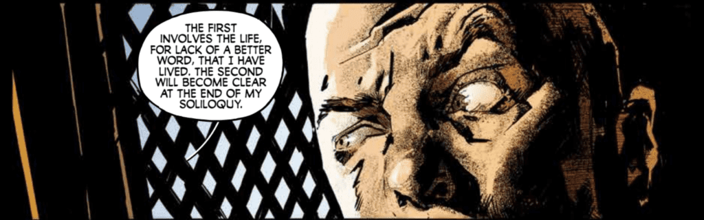
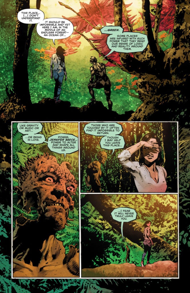
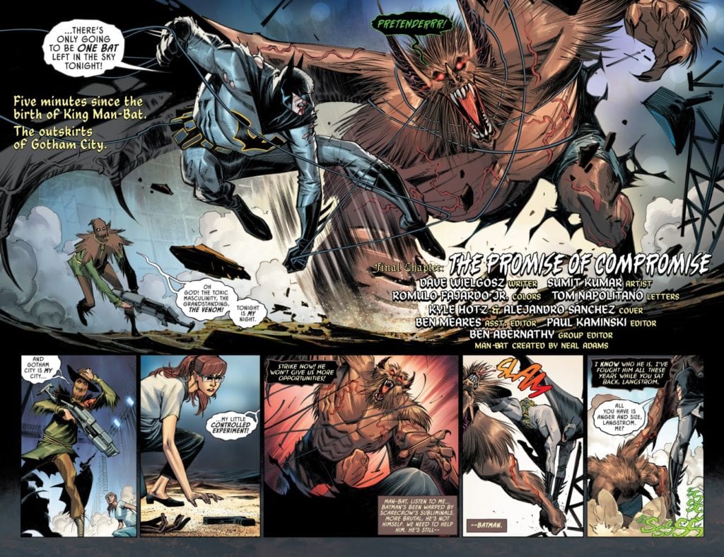
Kumar shows Kirk’s arcs in a physical sense through his illustrations. Man-Bat #5 begins with a swole King Man-Bat; it shows Kirk in a state of power but unstable mind, which is why some of the bigger plot points happen within Man-Bat’s mind where he and Kirk merge. With the end result being a Man-Bat with more human-esque facial features. This allows him to communicate with others without any more limitations.

The background colors by Fajardo display probably the high points of the characters’ inner conflicts. The cool night colors become more intense when Scarecrow uses his fear-inducing sonic weapon. Or how Man-Bat’s battle with Batman often has red backgrounds to display the heightened hostility between them.

Napolitano’s lettering brings more nuance to the conflicts of Man-Bat #5. Batman’s word balloons being slightly distorted shows how he’s under the influence of Scarecrow. Man-Bat, in the meantime, has a black word balloon with green outlines and fonts to show off his Venom augmentations. They are very similar to his captions, almost as if Man-Bat is powering his way through Langstrom’s influence. At least until the end, where their saturated captions show a compromise between them.

Complete Man-Bat #5

Man-Bat #5 ends this mini-series on a compelling note. After viewing Kirk Langstrom’s journey, readers can’t help but want to see more of him. Because while this stage of his life is complete, Man-Bat’s story isn’t quite over yet.

Monkeys Fighting Robots Youtube

ONION SKIN: The Many Layers Of Being An Aimless Adult

Onion Skin Cover

Onion Skin comes to comic stores from IDW’s Top Shelf imprint on May 26. Created by Edgar Camacho, this award-winning graphic novel reflects the lives of aimless adults.

Onion Skin Has Many Layers

What makes Onion Skin an award winner are its captivating characters and rich narrative. The protagonists, Rolando and Nera, both experience a sense of aimlessness common in twenty-somethings. It’s a familiar feeling of wanting to do something with life, but feeling stuck after numerous disappointments. Rolando certainly fits this mold after working an unfulfilling job to the point of a breakdown. Nera, meanwhile, is a free spirit enjoying life on the lamb but wants companionship. Their chance encounter is what pushes them out of their respective malaises. It’s a common, if relatable, feeling of taking a risk in life.

But what really stands out is how Camacho arranges the narrative to evoke aimlessness. The non-linear fashion of Onion Skin isn’t merely a design choice; it plays a role in-story. Throughout two timelines, it’s difficult to tell if these events happen in the past, future, or if everything’s just a dream. Rolando finds Nera familiar, and Nera has the food truck as if waiting for Rolando. But it feels like this is the first time they met. For all the reader knows, it’s alternate realities at play or a stress fantasy. The complete ambiguity of it all is a perfect rendition of being wayward.

Complementary Seasonings

Camacho decorates the two timelines with different saturations of color. Most of Rolando and Nera’s time with their food truck is clearer and brighter for objects to stand out. On the other hand, their time getting together permeates muted colors. These saturations complement the simpler illustrations to evoke joy or confusion, respectively. It’s almost like after a journey, Rolando and Nera get what they earn. That is until some of the muted atmosphere appears in the food truck timeline like they’re in danger of going back to being wayward. But it’s the lettering of Onion Skin with sound effects or word balloons that ties everything together.

Order Onion Skin

Onion Skin is a must-read story of being an aimless adult, not just in its characters but in how it can happen in any place or time. It’s certainly great enough to warrant rereads to try and make discussions about it.

Monkeys Fighting Robots Youtube

Review: SPIRIT UNTAMED Struggles To Ride Into The Sunset

Spirit Untamed is just another botched effort that insults the original Spirit: Stallion of the Cimarron. Spirit Untamed showcases another low point for DreamWorks, as this film struggles to find a reason to exist. The film manages to make the Netflix series, Spirit Riding Free, come off better than it is. Having only been to theaters once, nearly twenty years ago at that. Spirit’s return to theaters should be ignored because Spirit Untamed offers nothing to justify its 87-minute runtime.

A bland story carried by uninteresting characters is sure to deter audiences from returning to theaters. Spirit Untamed’s synopsis does tease a solid story to build on, but the execution is underwhelming. Children probably won’t have gripes with this film, and that’s ok because placing young girls at the center of the story should send a positive message that young moviegoers can appreciate. Directed by Elaine Bogan and Ennio Torresan Jr, the film is written by Aury Wallington and Kristin Hahn. Spirit Untamed stars Isabela Merced, Jake Gyllenhaal, Marsai Martin, Grace Moore, Eiza Gonzalez, and Mckenna Grace. It centers on a young girl named Lucky (Merced), who moves to a small town and bonds with a Kiger mustang named Spirit.

Isabela Merced as Lucky in DreamWork’s Spirit Untamed

Wallington and Hahn’s script sets a solid foundation, but fizzles out and becomes trite. Lucky is introduced as the daughter of a horse-riding stunt performer (Gonzalez), something that has been hidden from her. An accident leads to her mother’s demise, and Lucky has been raised by her Aunt Cora (Moore), who worries that Lucky’s lack of care for rules and restrictions will cause trouble for her. The script establishes that Lucky is very much like her mother in that regard, so her loved ones want to keep her safe since it’s believed that’s what got Lucky’s mom hurt. After arriving in town, Lucky’s initial disinterest is changed after meeting Spirit. When Spirit’s livelihood is put at risk, Lucky sets out to help her new best friend. The strongest aspect of Spirit Untamed is the relationship between Lucky and Spirt, the horse unlocks her confidence in the qualities her Aunt Cora is trying to deny her.

Sadly, the other characters are so uninteresting, Lucky isn’t that compelling either. The self-discovery she makes along the way sends a strong message to younger viewers but Spirit Untamed offers such a lackluster adventure in the process. Still, the script isn’t a jumbled mess, or incoherent, the characters are just dull, which brings the film down. Merced’s performance as Lucky makes the character’s growth pleasing to watch and lends to the self-discovery angle. The performances draw some interest, but the one-dimensional characters can’t be saved by it. Spirit Untamed’s animation isn’t very smooth either in comparison to the original 2002 film. If the characters don’t take audiences out of the film, the animation should get the job done with no issue. Bogan and Torresan’s directional debut isn’t a strong outing, Spirit Untamed doesn’t capture the emotional weight it’s searching for but it does offer great action and heartfelt moments for kids. There are some pacing issues along the way, which is what makes the film seem longer than what it is.

Eiza Gonzalez as Milagro Navarro

Spirit Untamed should go unnoticed because there are far better family outings for everyone to enjoy. The glimpses of hope the film shows aren’t enough to keep it engaging from start to finish. A movie for kids doesn’t have to suffer from weak scripts, animation hiccups, and a nonfulfilling story. Spirit Untamed won’t impress fans that grew up with the original film, or those that have an interest in Netflix’s series. This story about a girl and her horse does not deserve any attention.


Monkeys Fighting Robots Youtube

THE PURSUIT OF LOVE | TV Review

Based on a novel by Nancy Mitford, The Pursuit of Love was a lavish period miniseries from the BBC and Amazon Studios as it explores the lives of two young women during the Interwar period.

Linda Radlett (Lily James) and Fanny Logan (Emily Beecham) are cousins and best friends. Linda is a romantic who has a troubled love life. She gets married, has affairs, and enters politics during this turbulent time. Fanny is a well-read young woman who ends up marrying and settling down. Their relationship becomes strained during this period.

The Pursuit of Love was an ambitious series from the BBC and Amazon. It had an all-star cast and served as Emily Mortimer’s directing debut. What was delivered was a light and breezy series that also touched on some serious subject matter.

Mortimer was influenced by the works of Wes Anderson, using many of his techniques. The series was told from Fanny’s perspective. The narration was used to tell the backstories of characters and their current situation. This could have been dry and boring, but the writing and direction ensured that there was plenty of humor through the dialogue and framing. It made The Pursuit of Love an entertaining watch.

The use of the Anderson styling declined as the series progressed. This was due to the series becoming more focused. The aim of the first episode was to introduce the characters, the second looked at Linda’s failing marriage and her relationship with a communist, and the final episode was about her relationship with a French aristocrat and her second pregnancy just as the Second World War starts. However, the source novel was only 247 pages and at times it felt like the series was stretching itself thin. Yet it was still better than the last time I saw the BBC adapt a short novel into a three-part series (i.e. War of the Worlds).

The heart of the series was the relationship between Linda and Fanny and how they drift apart. As teens they were close, almost like sisters. But as they got older the relationship becomes strained because Linda flaked on her responsibilities. Fanny has to settle down and start a family whilst Linda leaves her. To Fanny, Linda reminded her of her mother, a woman that constantly left Fanny. Despite their issues they were still family.

The series also looks at wider issues because of the time it took place. This was a period where society was rapidly changing. This was a time where World War One was fresh in people’s mind, fascism and communism was on the rise, and the Great Depression afflicted the world. The series touches on a lot of this. Linda’s father was a War Veteran who hated foreigners and believed in status and that women are just meant to be wives and mothers. This runs into conflict with Fanny who was educated and his children rebelling in their own way, like going to Hollywood or fighting for the Republicans in the Spanish Civil War.

Linda’s relationships reflected different political views and social statuses. Linda’s husband, Tony (Freddie Fox) was an upper-middle-class banker and was a Conservative MP. Some of his family members were sympathetic to the Nazis. Christian (James Frecheville) was the Communist who offered Linda intellect, but she was out of her depth when she had to partake in humanitarian work. Fabrice (Assaad Bouab) was the French aristocrat that was able to give Linda passion and luxury just as World War Two was about to start.

The series did have a great cast. Whilst Lily James and Emily Beachem were fine leads, the scene stealers were Dominic West and Andrew Scott. They had some of the funniest lines and played some of the colorful characters in the series. Mortimer was also a delight in her small role as The Bolter, Fanny’s mother. She was so selfish that she will be a character audiences will love to hate.

The Pursuit of Love was a jolly series that fans of British period dramas will be satisfied with. It stands out because of its humor and visual style which helped make the series seem like an indie film.

Monkeys Fighting Robots Youtube

Review: BATMAN/CATWOMAN #5 and the Hysteria that Follows Darkness

Batman Catwoman King DC Comics

It’s often troubling to read a particularly dark story. That’s probably why we refer to them as “dark” in the first place. But creators have several tools to help us take their dark themes in. Some creators push the pedal to the metal. They say, “Oh, you think this is dark? You haven’t seen anything yet.” Others almost ignore it. Their characters, as a coping mechanism, push aside their trauma and fill the silence with laughter. Batman/Catwoman #5 fills its silences with hysteria. As this plot kicks into gear, writer Tom King, artist Clay Mann, colorist Tomeu Morey, and letterer Clayton Cowles show us that these characters are starting to break under the pressure.

Writing

King’s approach to the darkness in this plot is almost one of ignoring it. Catwoman gets drunk and taunts a bartender instead of grappling with some of the things she’s seen. But she has a madness that is just below the surface. It’s telling that we get three plotlines in this issue, and in only one of those is Selina drunk, but she acts with similar abandon in all three. She copes through self destruction. She finds comfort in witty banter and whimsical violence. But it all ends in blood and sweat. And the fact that these three plotlines are years apart, shows that she’s been carrying this trauma with her for a long time. King pushes deeper into what it’s like to be a superhero. He asks us to look at the scars that are left once the bright sound effects have long faded away.

Batman Catwoman King DC Comics

Art

Mann never lets us forget the dual nature of Selina’s self destructive tendencies. She’s a funny drunk, but she’s also brutal fighter. One page shows old Selina, looking down through her sweat at someone she beat the crap out of. Mann interrupts that panel by overlaying a picture of a younger Selina from the panel below. She leans against a wall with a bottle in hand, a slight smile on her face. She seems harmless one moment but ruthless the next. Similarly, Mann shows Selina’s snap from comic book violence to true gore. She dodges bullets and delivers karate kicks, only to pummel someone into a bloody mess a page later. Catwoman is unpredictable and Mann shows us this has potential to be just as scary as it is charming.

Coloring

Morey has reds, blues, and greens representing themes and moods in this issue. The red is always used in instances of violence. Even when it seems fun or bright, Morey quickly subverts it and brings it back to gore. Red surrounds Phantasm in every scene. She is an Angel of Death, after all. But it follows Selina into the future. We begin to wonder how much Selina has become a product of Andrea Beaumont’s actions, rather than Bruce Wayne’s. Morey visually links the two almost as though he’s asking us to spot the difference.

Batman Catwoman King DC Comics

Lettering

Cowles also shows us the link between Andrea and Selina. At one point, we see Andrea talking to one of her victims. (If “victim” is the right word.) She talks and her words surround him. Her speech bubbles create a wall around him, on the page. Visually, he’s boxed in by her, trapped. Cowles is showing us that her words tell him that he’s not getting out of this. Later, when we see Selina fighting with someone in the future, she does the same thing. In the midst of the battle, she speaks to her opponent. Her speech bubbles surround the other character, making it visually clear not only that Selina has the upper hand, but she’s also learned a thing or two from Andrea Beaumont.


Batman/Catwoman #5 shows the cracks that are forming beneath the surface. From its first issue, this story has been about the scars a life of crimefighting can bring about. Now we’re actually beginning to see where those scars came from. King, Mann, Morey, and Cowles continue to do some of their best work. Pick up Batman/Catwoman #5, out from DC Comics June 1st, at a comic shop near you!

Monkeys Fighting Robots Youtube

Review: THE SWAMP THING #4 is a Wonderful Mix of the Old and New

Swamp Thing V DC Comics

The Swamp Thing #4 reads almost as much like a page from a textbook as it does a comic. An exciting textbook. Its pages are chock full of history. Writer Ram V, artist Mike Perkins, colorist Mike Spicer, and letterer Aditya Bidikar turn the Green into a world of old comics and ripe new ideas.

Writing

V’s story is a collision of the old and the new. His fresh faced characters rub shoulders with legends. Perhaps it’s because V makes this history lesson so beautiful, or because this series has already been such a delight, but one can already picture writers of the future treating V’s story with the same gravitas. Though this issue risks being overly expositional, V sidesteps this pitfall. He informs us of the rules of this world through the inquisitive eyes of newcomers. But he also gives a unique voice to each of their guides. “How did you end up here?” Jennifer Reece asks the Floronic Man. “Half-formed and unwanted,” he answers. It doesn’t answer her question, but it tells us so much more about who it is that’s leading her through the wilderness.

Swamp Thing V DC Comics

Art

Perkins is Stephen Bissette. He’s Bernie Wrightson and John Totleben. Yet somehow, in all of it, he’s also Mike Perkins. Perkins seems to effortlessly take on the styles of his predecessors. He moves between his own style and theirs so seamlessly that it underlines again why Perkins is a perfect fit for Swamp Thing. But not everything Perkins does in this issue is an homage. His original work is a breathtaking ode to the all-encompassing nature of the Green. When Swamp Thing connects with the Green, he sees its power. Behind his head we see plant cells, the patterns on a leaf, large forests, and the indistinct image of a green land mass. The images show the scope of the Green, but they also surround Swamp Thing. Perkins envelops us in this world, making us wish we never had to leave.

Coloring

There’s a clear battle in Spicer’s pages between the Red and the Green. The Red represents Man’s encroaching influence. We see it in the flowers, spreading like a pestilence through the Green. But we also see it in Swamp Thing. The more the issue goes on, the more red seems to cling to our moldy friend. Some of it is Levi Kamei, as beneath the surface he’s still a man. We see images of Swamp Thing in the past, but as they catch up to the modern day they become more and more infused with red. But some of this crimson hue is the mysterious mark that Levi’s brother left on him. The red drips like blood but offers no answers just yet.

Swamp Thing V DC Comics

Lettering

One of the most noticeable things about Bidikar’s lettering is what’s missing. There are no sound effects. There’s plenty of action. Plenty of chances for a “BOOM” or “POW.” But Bidikar offers none, and it gives the Green an almost religious quality, like whispering in church. That’s not to say this issue’s lettering doesn’t have style and even a sense of fun. This whole issue just goes to show how much Bidikar does. Rarely do characters speak in plain speech bubbles with normal font. The Floronic Man, Ivy, and Swamp Thing all have their own fonts and speech bubbles. They each have their own sound. And when one character fades away, their words fade too. Bidikar is deliberately and brilliantly doing everything to add flavor to the lettering. It’s working.


The Swamp Thing #4 is beautiful and a fantastic mix of homage and innovation. This creative team is creating a series that feels quiet and gentle. Just like the Swamp Thing himself. Pick up The Swamp Thing #4, out from DC Comics June 1st, at a comic shop near you!

Monkeys Fighting Robots Youtube

Review: REPTIL #1 – An Effective Re-introduction

Reptil #1 Cover

Reptil #1, out now from Marvel Comics, gives new life to the character and sets up a fun and fast-paced adventure.

Reptil #1 Art Example
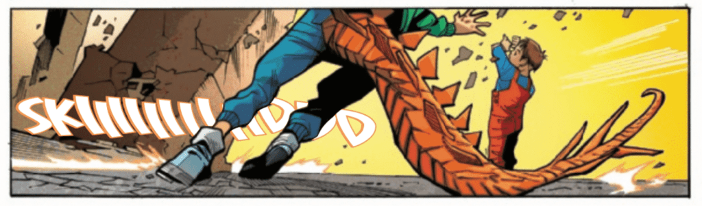
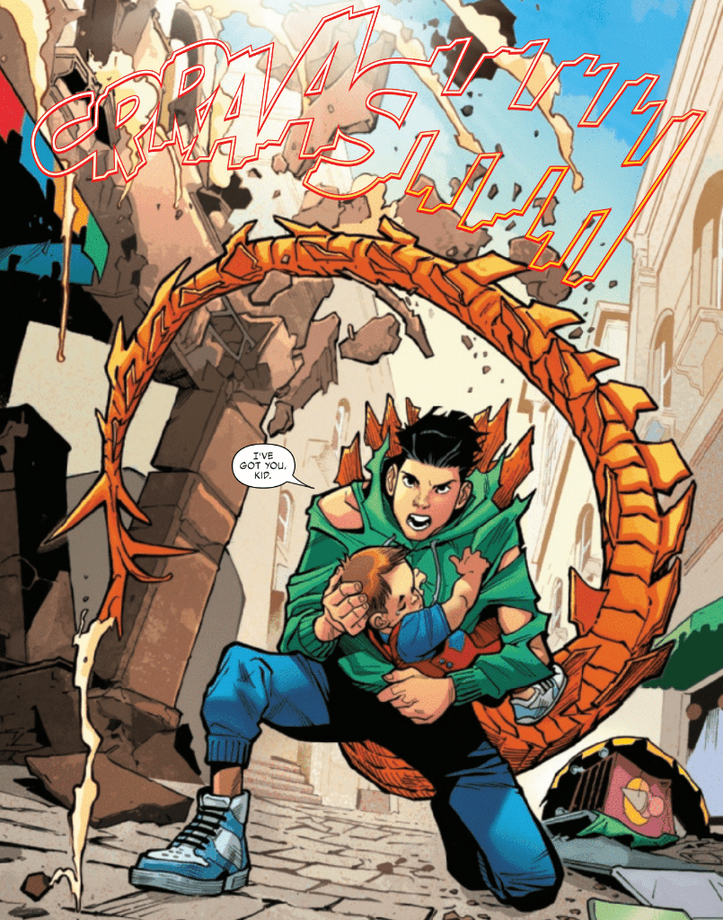
Terry Blas writes Reptil #1 in such a way that the series welcomes readers unfamiliar with Reptil with open arms. There is a quick and concise retelling of Reptil’s origin and the introduction of new conflicts for the character. Blas keeps us entertained throughout the entire issue with twists, turns, and a gripping cliffhanger to end it all. Not to mention the way he is able to address the serious problems the characters are facing while also making much of the issue feel light-hearted. Blas also has the main characters use Spanish phrases throughout the issue, which adds to their character and makes them seem more three-dimensional.

Reptil #1 Coloring Example

The pencils of Enid Balám and the inks of Victor Olazaba give Reptil #1 the fun feel it needs. The style features emotive and cartoonish figures that allow for a pleasant tone for much of the issue and serious moods when the story calls for it. The figures in this issue are also incredibly dynamic, which causes fight scenes to draw you in easily.

Reptil #1 benefits significantly from Carlos Lopez’s use of color. The entire issue has a broad color scheme, which causes the story to feel energetic. At certain moments, Lopez chooses to have a single color dominate a panel, which is a highly effective way to make the mood of a scene clear. This technique isn’t often used, which helps make the moments where it is used more impactful.

Reptil #1 Lettering Example

VC’s Joe Sabino’s lettering talents do wonders to help the story in Reptil #1. The lettering is standard for many moments, but when things get heated, the lettering changes to reflect that. By having moments where the lettering isn’t very eye-catching and moments where it is, Sabino creates a contrast that is certain to catch the reader’s attention, especially when Sabrino provides some stunning choices for sound effects during fight scenes.

Reptil #1 is a fantastic reintroduction to the character that starts a new intriguing storyline while also filling in new readers into what happened before. The art is light and enjoyable and perfect for a series of this style. If you want to join in on a wild adventure, be sure not to miss this excellent start to a new series.

Monkeys Fighting Robots Youtube

Review: KILLADELPHIA #13 – A New Figure Arrives

Killadelphia #13 Cover

Killadelphia #13, out now from Image Comics, once again brings us a captivating story with stunningly gruesome art.

Killadelphia #13 Art Example

Throughout the series, Rodney Barnes provides several backstories for historical figures that have lived up to the modern-day as vampires and somehow he is always able to make these tales thoroughly engaging. It has been done for John Adams, Abigail Adams, several characters who lived through historical times, and now a new figure in Killadelphia #13. Barnes’ choice of having this backstory be told through a confession booth is an intriguing way to get the character monologuing, and it is highly effective. The issue also features an awaited confrontation between two characters, and the result does not let the reader down.

Killadelphia #13 Writing Example

Killadelphia #13 is another issue filled with stunning art. Jason Shawn Alexander provides some gorgeous and gruesome imagery, expressive yet realistic faces, and impressive use of shadows. Many panels in this issue are composed of character silhouettes, which significantly helps the atmosphere of scenes. A panel that stood out in this issue had a character surrounded by a completely black background while they were coming to an important realization. The black blended in with the panel borders, so the void surrounding this character added lots of weight to this specific moment.

Luis NCT’s colors in Killadelphia #13 almost always focus on tone rather than the natural colors of the setting depicted, which results in a pleasant, stylized look. When a scene becomes violent and chaotic, reds will overpower the rest of the colors, making the scene more intense. It’s choices like these that make NCT’s coloring pair fantastically with the art of Alexander.

Killadelphia #13 Coloring Example

Marshall Dillon’s lettering in Killadelphia #13 gets the job done and allows the story to flow freely. Dillon uses several techniques to accomplish this. One such technique is providing a specific color for caption bubbles so the reader can be certain which character is speaking. The green color chosen for these captions is distinct from the rest of the palette, making it stand out from other captions. Dillon also changes the font and color of dialogue when some characters shout, and his font choices for sound effects always help scenes become more immersive.

You are missing out if you haven’t been following the Killadelphia series, and this issue reaffirms that point. Killadelphia #13 has the impactful moments and the beautiful art that this vampire tale has consistently provided us with, and it is not an issue you want to miss.

Monkeys Fighting Robots Youtube

Review: STAR WARS ADVENTURES: THE WEAPON OF A JEDI #1

the Force is strong

Luke’s Rebel mission takes a back seat on a journey from the Force. Available now from IDW Publishing and Disney, Star Wars Adventures: The Weapon of a Jedi #1 adapts Jason Fry’s 2015 novel. Written by Alec Worley and illustrated by Ruairí Coleman, the issue takes place somewhere between A New Hope and The Empire Strikes Back. Chris O’Halloran and Amauri Osorio provide colors and lettering respectively with design help from Germany’s 49 Grad Medienagentur company.

No classic Star Wars adventure would be complete without the usual suspects of Luke Skywalker, C-3P0, and R2D2. The gang’s all here in this issue. But here, Luke isn’t a Jedi quite yet. He has visions from the Force and senses things he doesn’t quite understand. So, when one Rebel mission is thwarted by an Imperial blockade, Luke follows the signs to the planet Devaron.

Homage

In fewer than forty pages, Worley and Coleman include two epic battles and carefully placed flashbacks that don’t slow down the pace. Other than a couple superfluous captions, everything is in service of character and plot. Worley’s script allows Coleman to show off the vastness of space and give us the action sequences fans expect.

homage to original trilogy
THE FORCE CALLS LUKE.

Artistically, Coleman copies the aesthetic of the original trilogy with a Silver Age drawing style. That is: line work is thin, there’s lots of cross-hatching, and inks are blotchy. Moreover, Coleman makes full use of page space with plenty of master shots and POVs to heighten the tension in action sequences. It’s so aesthetically satisfying and a fitting homage to the original trilogy.

Adventurous Adventure

Maintaining the homage is O’Halloran’s color palette. Earthy green, ruddy yellow, and deep Navy blue dominate in diluted hues. Nothing stands out as being particularly warm or cold, saturated or de-saturated. It’s familiar and so cool precisely because it doesn’t change or try to “fix” the tried and true Star Wars formula.

However, my one nitpick is that Osorio overuses special effects. It felt as if the letterer was trying too hard to evoke the sound effects of the films. Otherwise, Osorio’s font choice and dialogue placement complement the overall style well.

Regardless, as a peripheral fan of the Star Wars franchise, I see this issue for what it is: good nostalgic fun. I may not be invested in the series’ continuation, but I can appreciate this as being accessible to newcomers and another item in a seasoned fans’ collection. Star Wards Adventures: The Weapon of a Jedi #1 is an adventure indeed.

Monkeys Fighting Robots Youtube

Review: COMPASS #1 Shatters Expectations And Leaves You Wanting More

Review: COMPASS #1 (of 5) Shatters Expectations And Leaves You Wanting More

Compass #1 (of 5) from Image Comics hits your local comic book shop on June 16; the issue feels familiar, but then opens up a world that is vast and rich with potential.


About COMPASS:
Shahidah El-Amin is many things: scholar, cartographer, astronomer, mathematician, scientist, explorer, adventurer, and—when need be—two-fisted fighter. Setting out from Baghdad’s legendary House of Wisdom during the Islamic Golden Age, Shahi’s quest brings her to 13th-century Britain…where the Welsh are whispered to possess the secret of eternal life. But Shahi’s not the only one after it…


Writers Robert McKenzie and Dave Walker set up the story at a basic level without expanding on characters. This left parts of the story open for me to interpret, and it creates a shared journey between myself and the main character, Shahidah El-Amin. McKenzie and Walker also set up the first issue to build towards a specific moment, but cuts the reader off right before this moment. Where the story stops in the first issue is perfect because now I’m thirsty for the second issue. In the world of binging comics in trade form or watching a full season of TV in one sitting, it’s surprisingly satisfying to have to wait for the next issue and think about the story you just read. Since Compass has a mystery element, I can see people rereading the issue looking for clues.

Review: COMPASS #1 (of 5) Shatters Expectations And Leaves You Wanting More

Justin Greenwood has a Chuck Jones style to his art, which creates intoxicating moments with characters’ eyes. Greenwood’s artwork also brings several feelings to the table and forces me to adjust my perceptions. How Shahi moves in a panel, her smile, and the weapons she uses had me looking at the issue through the lens of Dick Grayson or Tim Drake, aka Robin, in the first action sequence as she is looking for the treasure. This is not bad because Robin is a character I like, and now there is a bond with Shahi by association. Then, as the story progresses, Shahi slowly breaks through the lens and becomes her own character, but never leaves my previous attachment. Greenwood changes how Shahi moves when she arrives in Britain, and this is where the “Robin” lens fades. There is a tougher, more determined feeling to how she is presented in a panel.

Daniela Miwa’s colors work well in the issue. The first half is very dark, with the back half very bright. The colors add to the storytelling elements as the world begins to expand as the pages get brighter. You literally go from tunnel vision to wide-open spaces. The dark colors make you focus on page details, where the brighter, more calming colors make you look at the page as a whole.

Letterer Simon Bowland doesn’t use a ton of sound effects, but when he does, you listen. The beginning of the issue is very dark and quiet, so when you read a “KCHUNK,” you almost jump out of your seat in fright. Bowland uses a well-balanced approach to the letter work that allows the reader to clearly understand the story and look for hidden meanings in the bold typeface.

Review: COMPASS #1 (of 5) Shatters Expectations And Leaves You Wanting More

Overall, Compass #1 (of 5) is a fun read with a solid mystery that grabs the reader’s attention. If you pick up the first issue, be prepared to have feelings and emotions that remind you of some of your favorite memories.

Monkeys Fighting Robots Youtube