Home Blog Page 83

Review: LITTLE MONSTERS #2 – “Never Grow Old, Never Die”

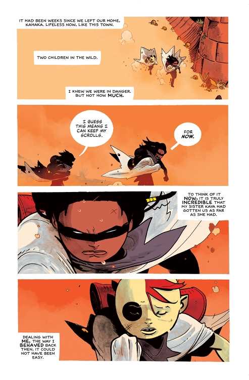
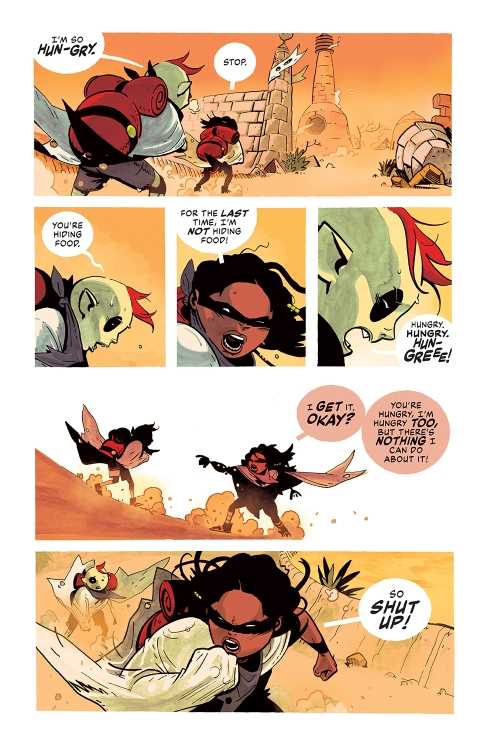
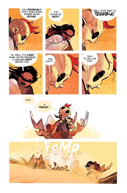
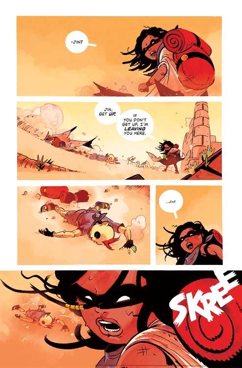
From modern comics icon Jeff Lemire (Gideon Falls, Black Hammer) and artist Dustin Nguyen (Descender, Robin & Batman) comes the stellar second chapter of their tiny vampire survival series in Little Monsters #2. Featuring lettering from Steve Wands, this issue delves into the past of certain cast members and reveals more about the children’s situation – and what has been kept from them. With a perfectly paced script and functionally perfect art work, this comic will be an absolute joy for fans of vampire fiction needing something new.

“When a man stumbles into their camp, the long-forgotten taste of human blood is quickly remembered.”

Writing & Plot

Jeff Lemire continues his streak of near-impeccable writing projects with his script for Little Monsters #2. Where the first issue worked as an introduction to this concept and the cast of characters, the 2nd chapter is a perfect launch point for the coming conflicts. Here, we get to see into one character’s past and an inkling of how they may feel about their vampiric life – and what that life sometimes means. We also get the exact opposite view of this lot in life, and some more hints as to the nature of the being who made all these children into little creatures of the night. The pacing of this chapter’s plot development is absolutely perfect. Lemire switches from a tense flashback sequence to the present view of multiple characters and it all feels so seamless. Being a cartoonist, with writer/artist credits on acclaimed titles like Sweet Tooth, Underwater Welder, and most recently Mazebook, he’s well aware of how to pace a comic to take advantage of the visual medium. Lemire leaves many panels and pages without dialogue, allowing for Nguyen to carefully craft a tense reading experience that will surely enrapture readers. We will need to have a conversation soon about how Jeff Lemire may very well be the most consistently great comics writer currently working.

Art Direction

As stated previously, Dustin Nguyen really gets to flex his creative muscles in Little Monsters #2. His stunning use of black & white in conjunction with his detailed and unique penciling will leave an indelible mark on a reader’s mind. If you’ve read the prior issue, or his work with Lemire on Descender or Ascender, none of his raw artistic skill will surprise you. However, his rendition of the story’s methodical pacing is true comics-exclusive magic. The way Nguyen takes Lemire’s narrative and so carefully blocks and directs it with his drawings is truly fantastic work. Scenes in this comic will stay with me for some time just because of how Nguyen places them, and how perfectly paced out the whole issue feels. The lettering from Steve Wands is subtle, and sort of blends into the reading experience. I mean this in a positive manner. Even his SFX lettering is subtle, coming in at the perfect moment in small doses to add the perfect punctuation to a tension-filled scene. Visually, this comic is an absolute feat, featuring the kind of storytelling only possible in this medium.

Verdict

Little Monsters #2 is a stellar 2nd chapter for this unique post-apocalyptic vampire tale. Jeff Lemire’s script is perfectly paced and steps in a compelling direction for the next stages of this plot. The visuals from Dustin Nguyen are starkly drawn and carefully directed, making for one of the most striking comics of the year. Be sure to grab this issue when it hits shelves on April 6th!

Monkeys Fighting Robots Youtube

Review: IMMORTAL X-MEN #1 Sets Up A Divided Council

One of the most intriguing things about this new era of X-Men has been the Quiet Council. While they’ve always played a role in every book, as readers we’ve never been able to see everything that they are up to. With Immortal X-Men #1 Kieron Gillen makes his triumphant return to the world of X-Men. Joined by Lucas Werneck on pencils, David Curiel on colors and Clayton Cowles on letters, we get an explosive first issue that won’t be forgotten.

WRITING

Kieron Gillen uses Mr. Sinister as our narrator for this first issue. Gillen has written Mr. Sinister before during his stint on Uncanny X-Men. Gillen’s voice for Sinister has not changed in Immortal X-Men. He’s cocky, hilarious, dangerous and untrustworthy. Gillen sows the seeds of discord throughout the council as they disagree on which new member to add to fill a vacancy. As a reader, we get to see all the backstabbing going on in the political world of mutants. One of the most fun parts of the issue is when potential candidates apply for the council seat. Gillen shows us why they feel they would be a good fit, and we also get the council members discussing why they wouldn’t. As far as first issues go, Gillen knocked this one out of the ballpark.

ART

Lucas Werneck’s pencils look great this issue. The beginning of the issue takes place in 1919. Werneck draws Paris gorgeously as Sinister sits next to a blue fountain. Werneck also draws Sinister cocky as he listens to the council argue over who gets the remaining spot. Werneck has him slumped in his chair with a crooked smile on his face. The background of Krakoa also looks beautiful as trees have sunlight shining in through them. Werneck’s pencils make it easy to go from panel to panel as the transitions are smooth. Pages where the council vote, Werneck goes through each member. Your eyes flow from mutant to mutant as you see them and it works really well on the page.

The colors by David Curiel are fantastic as well. During the council meeting, Curiel uses a light blue for the water in the background and some nice shading on the trees. This allows our eyes to focus on the mutants applying to be on the council. As the five bring a mutant back to life in Arbor Magna, Curiel uses a dark blue behind the characters. He offsets this with a vibrant orange and red as the mutant is reborn. These contrasting colors are gorgeous to look at and work perfectly together.

The letters by Clayton Cowles have a couple of stand out panels. Mr. Sinister, using fake outrage, yells “WHAT?!?!” during a council meeting. The text is large and goes the full length of his panel to show his outrage. This is a funny panel for readers and Cowles making the text large adds to the comedy. During a fight scene near the end of the issue, Cowles gives us a “BAMF” from Nightcrawler. The letters in the “BAMF” are staggered, which makes you feel the dynamism of the action.

CONCLUSION

Immortal X-Men #1 is an exhilarating read. Kieron Gillen writes the cast flawlessly as he reunites with his favorite mutants. The art team delivers a great performance that will be sure to please fans. Immortal X-Men #1 is available from Marvel Comics at a comic shop near you.


Monkeys Fighting Robots Youtube

Interview: Gary Moloney Talks Mixing Greek Mythology and Noir in DOWN BELOW

down below gary moloney kickstarter interview
Cover Art by Stephen Mooney (Inks) and Tríona Farrell (Colours), logo and design by Becca Carey

DOWN BELOW is currently wrapping up its campaign on Kickstarter, and we talked with the anthology’s co-editor Gary Moloney about how the project came together, and the power of noir.

The book is a collection of stories inspired by Greek Mythology “with a noir twist.” Moloney is editing the anthology alongside Paul Carroll; the two are founding members, along with Gareth Luby, of the Dublin-based comic collective Limit Break (we’ve previously spoken with Carroll about TURNING ROADS, another anthology project published under the LB banner).

Check out the campaign for a full list of the creators involved, but know that DOWN BELOW boasts 22 creative teams to bring readers almost 90 pages worth of comics.

Read on for our full interview with Moloney:

Monkeys Fighting Robots: DOWN BELOW is the second anthology from Limit Break after TURNING ROADS; what did you guys learn from your first campaign that you brought into this one?

Gary Moloney: DON’T UNDERCHARGE FOR SHIPPING! In all seriousness though, I should clarify at the start that Paul Carroll was the sole editor on TURNING ROADS. I only contributed a story last time around. So, to a large extent, these are lessons I learned second-hand. We did speak at length, however, about what we wanted from this campaign specifically taking into account the experience of having done TURNING ROADS.

The success of TURNING ROADS took us all by surprise. We were always confident that we’d meet our goal, but we didn’t expect to more than double it. So while there had been some preliminary ideas for stretch goals, which mainly included prints from established Irish artists, the pressure was on to come up with ideas on the fly. They proved to be quite popular and that’s why this time around we built those into our initial funding goal, the result being we had our pin-up artists on-board before launching the project. It also meant that we could structure our stretch goals around providing increased page-rates to our existing 22 creative teams rather than using it to commission new artwork.

MFR: What about Greek mythology and noir made you guys think, “These things need to go together?”

Moloney: We’d been talking about what a follow-up to TURNING ROADS might look like for a while. We knew that we didn’t want to do a second volume on the same theme (or at least not straight away). Paul and I had been engrossed in the video game HADES for a good chunk of last year, which led us into a downward spiral of binging all of Rachel Smyth’s LORE OLYMPUS (which I’d highly recommend) and listening to HADESTOWN. The more we thought about it, the more we thought that Greek Mythology would make for an interesting canon to explore, though it was Paul who originally suggested the idea. The noir of it all really came from looking at the core themes of those stories. They’re filled with betrayal and tragedy. There is always a bittersweetness to Greek myths even when they ostensibly have a happy ending. What is noir but that same aftertaste?
So, thematically, it made sense to us and I thought it would really spur the creativity of those pitching to us given that crime comics are more popular than they’ve ever been. And, truth be told, I just really wanted to edit a crime anthology. I’d discovered my love for writing in the genre a few years ago when I was taking Declan Shalvey’s comics writing course and it had been something I’d been threatening to do for some time. DOWN BELOW gave me the opportunity to co-edit a book that would standout amongst the myriad of crime anthologies that are out there.

down below gary moloney kickstarter interview
Cover Art by Stephen Mooney (Inks) and Tríona Farrell (Colours), logo and design by Becca Carey

MFR: You and I have discussed our mutual love of noir at length; what is it about the genre that speaks to you personally?

Moloney: As you can imagine, I’ve been mulling this over quite a bit recently. I think many people hear the word “noir” and immediately think of a particular aesthetic. They jump to the pinstripe suit and fedora stereotype of Raymond Chandler novels (or at least what they think a Chandler character looks like). An aesthetic is not a genre though. Noir is so much more than that as modern comic creators have shown time and time again.

To me, when you really get to the heart of what noir is about, it’s the struggle against an unfair world. The protagonists of a noir story (for they are rarely heroes in the traditional sense) often find themselves coming up against societal structures far more powerful than themselves. Sometimes it’s the struggle against those systems and other times it’s the desire to become part of it. These structures, be they organised crime or something endemic like poverty or corruption within the police are things which no one person can dismantle. They require systemic change underpinned by collective action that is often not forthcoming. At most, all an individual can ever hope for is to make some small impact in the world around them. Noir is about those individuals. It’s about those who face the impossible odds. The noir detective or private eye can solve a particular case, but the underlying issues that brought it about remain at the end of the story. They’re under no illusions about the scope of their ability to affect change. They know they’ll lose more than they win. Their victories are short-lived, but they’ll take what they can get. So those fleeting moments are what noir authors tend to focus on even as they find themselves coming close and closer to a tragic end. That’s where the bittersweetness I spoke about previously comes into play. It’s also what distinguishes a noir story from other forms of crime fiction.

MFR: Care to tease some of the stories we’ll be seeing in DOWN BELOW?

Moloney: One of the things we really wanted to make sure is that we had a nice variety of stories that drew from different corners of the mythology. We didn’t want the same characters to be tripping over each other across stories. This made the process of narrowing down pitches very difficult as we had to choose between competing visions for certain myths. That being said we did have to make an exception when it came to Odysseus because the specific pitches in question each touched on him at such different points of his life that they’re effectively different characters. So those familiar with “The Odyssey” will be well-looked after.

Many of our stories are thematically inspired by Greek myth as opposed to engaging in a strict re-telling or adaptation. While you’ll see stories inspired by Sisyphus, the Minotaur, or Hades and Persephone, don’t come in expecting a simple re-skin of the classics. We weren’t really interested in going down that road, we gravitated towards stories that looked a little deeper and went beyond mere adaptations.

One of our contributors, Oliver Gerlach, is a classicist who works in this area, so he comes to the project not only with his comic background, but with the study of Greek mythology as his day job. I think because of that foundation people will get a kick out of his and artist Alex Moore’s take on Dionysus. If ever was there a team suited to tackling this material in comic form it’s them.

MFR: One of the add-on items for DOWN BELOW is your new comic LENS with Raquel Kusiak. Can you speak to that story and let readers know what it’s about?

Moloney: LENS is an espionage-thriller in the vein of Jack Reacher or Bridgette Sharpe which follows the adventures of Jane Danner, an award-winning photojournalist who also happens to moonlight as one of the world’s greatest assassins. The elevator comp pitch is essentially: “what if Lois Lane was secretly John Wick?” The original germ of the idea came from that same comic class I mentioned earlier. I had this image of a sniper concealing their gun in a camera bag, travelling the world to carry out political hits. The idea was to play with the notion that the 20th century had been shaped by the assassination of prominent public figures (such as MLK or JFK) as well as the advent of photojournalism which produced images that imprinted themselves on our shared cultural consciousness (the Tiananmen Square Massacre or Vietnam War). So, my question was, what if you had a hand in both?

Initially, I’d conceived of it as a standalone short story but a friend rightfully pointed out that the concept would be better suited to something longer in form. This led to my pitching the series to editor extraordinaire, Claire Napier, when she was began putting together a new comics anthology magazine: BUN & TEA, with the view to serialising a number of stories over the course of six-issues. Claire presented me with a number of potential artists to collaborate with and I was immediately struck by Raquel’s use of colour and her dynamic style. LENS wouldn’t be the book it is without her.

The magazine was designed to emulate UK-style anthologies such as 2000AD or SONIC THE COMIC, so each chapter or episode was to be five pages in length. While we were only supposed to put together a single pilot episode to begin with, the three of us ended up enjoying the process so much that we completed the whole six-episode story arc ourselves. The pandemic caused BUN & TEA to be delayed, but we eventually serialised LENS as a webcomic for free which can now be read collected as a one-shot in print form for those so inclined.

lens gary moloney interview

This first season sees Jane hired to take out a prominent tech-entrepreneur who for mysterious reasons has come to be viewed as an unacceptable liability by the US government. She quickly learns, however, that she’s not the only one on the job. What’s funny is that I wrote that entrepreneur character, Zack Zimmerman, very much as a satire of the kind of tech bros who would talk in nebulous terms about certain technologies which they claimed would revolutionise our everyday lives without ever explaining how or why that might be something we’d want in the first place. I was slightly worried in hindsight that this guy would come off as too much of a parody in the current climate. Of course, that didn’t account for everything that’s happened with the Blockchain these last few months and the almost cult-like nature of its proponents. If anything I think I didn’t go far enough!

In short, LENS is a neon-filled pulpy escapade that fans of JENNIFER BLOOD, FATALE, or THE COLDEST CITY are likely to enjoy. While this collection is a self-contained mission, we’ve built a story engine here that allows us to follow-up with further instalments in the future. We want this to be a series that has an underlying lore but is accessible to new readers no matter where you pick it up.

MFR: How have you changed and grown as a writer after making the jump to editor/publisher?

Moloney: I think that’s something I’m going to find out myself as I begin a few new writing projects over the coming months, we’re still in the process of making the book after all. Immediately, though, I know my mentality towards pitching short stories has changed. This process really cemented for me the need to design pitches in a way that immediately catches an editor’s attention. Writers need to learn to write for the pitch rather than the story.

We had 189 pitches — more than double what TURNING ROADS received — which was quite the undertaking. You simply don’t have the time to linger on pitches that aren’t clear or are otherwise difficult to navigate. With most anthologies, you can anticipate the kinds of pitches they are likely to receive. Those who submit Future Shocks to 2000AD are warned off “prisons of the mind” and “time travel” stories for this exact reason. So how do you stand out? Well, statistically speaking, you’re better off trying to look at under-explored themes or subjects rather than the more well-trodden paths. At the end of the day, most anthologies will only give you four pages. It’s not a lot. That’s a constraint but also an opportunity. You can afford to experiment with form and content. Even if it doesn’t work, you’ve learned a lot more by doing so and your next effort will be all the better for it.

MFR: Can you tease anything that’s coming up for Limit Break following DOWN BELOW?

Moloney: It’s important to understand that, outside of these mythology anthologies, Limit Break is more of a collective than a publisher. When we started we never had any intention of curating books like TURNING ROADS or DOWN BELOW. We were simply looking for a way to pool our creative resources and encourage each other to refine our craft. The scope of what we do has changed over time though as our network has expanded and people began to approach us with ideas. Most recently, fellow Irish writer Seamus Kavanagh asked if he could put out his short story collection, OLD GAME PLUS, through Limit Break. As fans of his previous work, we were only delighted to be able to help him through the process of putting that book together. There may be one or two more additions to the Limit Break roster before the year’s end, but I can’t say more than that.

In all honesty though, DOWN BELOW really is the focus at the moment. These anthologies are huge undertakings for us and take up a lot of creative headspace. At the same time each of us are still working away on our own books for self-publication or to be shopped around elsewhere. Paul and Gareth are getting started on the last issue of their funny-animal series, MEOUCH. Meanwhile, I’m currently working in the background on a fantasy-western with Daniel Romero and Becca Carey. Don’t be too surprised if you see another “myth-anthology” from us next year. All good things come to threes after all. As for the theme? Well, that would be telling…

down below gary moloney kickstarter interview
Print by artist Kevin Keane, available as part of the print pack through the Kickstarter.

MFR: And I’ve discovered some great comics just in chatting with you, so I’m always inclined to ask: what have you been reading lately?

Moloney: As a new parent, I haven’t had the chance to read as much or as widely as I’d like to of late. I do still manage to carve out time though to keep up with a few titles. I’ve been following the Massive-verse with great interest over the last year. I think those are a group of creators are doing something really unique with the independent superhero. Something we haven’t seen in many years. I’ve written a lot in the past about superhero comics being an intergenerational conversation between creators which each successive wave commenting or iterating on what came before. This is the first time you’re really starting to see the influence of Japanese imports such as anime and tokusatsu seep into the American superhero landscape. They’re taking that ball and running with it.

I’ve also really enjoyed TIME BEFORE TIME from Rory McConville, Declan Shalvey, Joe Palmer, and Hassan Ostmane-Elhaou. That’s an example of taking a well-trodden concept like time travel and doing something new, by removing the risk of paradox and focusing on the personal drama.

On the Irish side of things, I’ve just finished BLAZE BEYOND THE PALE, a new graphic novel by Aaron Losty and Becca Carey (with colour assistance by JP Jordan). It’s an incredible work about growing up in inner city Dublin and the very particular experiences that come from that. Few comics ever truly capture the feel and character of a place, but there Fingal is perfectly realised. If you want to get a real sense of what urban life and culture is like in certain parts of Ireland, I can’t recommend BLAZE BEYOND THE PALE enough. I’m really glad that the team on that book also have a story in DOWN BELOW which will be an absolute visual treat for all involved.

I’ve also found myself following along with daily webcomics published on Irish Comics Dot IE. Every day features a new instalment from a different series by Irish or Ireland-based comics creators. There’s something for whatever mood you’re in whether its comedy, action, or romance.


Thanks again to Gary Moloney for taking the time to talk with us. You can back DOWN BELOW right here on Kickstarter.

Monkeys Fighting Robots Youtube

Review: THE ROCKETEER THE GREAT RACE #1 is a Perfect First Issue

The Rocketeer
The Rocketeer: The Great Race #1 Credit: IDW Publishing

It has been 40 years since Dave Stevens’ adventure comic The Rocketeer was first published in the pages of Starslayer. Despite only a handful of stories existing that feature the old school adventurer, Cliff Secord, and his friends, there is a loyal fan-base, especially within comic creators. When IDW launched a new anthology series based on the character in 2011, a host of big name creators produced a collection of short stories that read like a love letter to Stevens’ original work.

For those who don’t know, The Rocketeer is influenced by the classic Hollywood movie serials of the 1950’s and the larger than life actors of that era. Stevens’ was drawn in by the beauty of Bettie Page and the distinctive looks of actors like Rondo Hatton. The original story was an unashamed tribute to the latter day Golden Age of Hollywood, with obvious villains, larger than life stunts, and a lovable rogue for the lead. The artwork was stunning and the story pure entertainment in the vein of Indiana Jones. It is not surprising that so many within the comic industry are drawn to the potential of the character.

The Rocketeer: The Complete Collection Cover Credit: IDW Publishing

Lights..

Over the years, a number of great creators have worked on The Rocketeer, from the likes of Mark Waid to Alex Ross, each incorporating their own idiosyncrasies into the style designed and mastered by Dave Stevens in the 1980’s. Some have been more successful than others and they have been able to capture the spirit of the character while still making it relevant to a modern audience. One look at Stephen Mooney’s previous comic work will explain exactly why he is a perfect fit for this franchise. Aside from his artistic work on titles such as Image’s The Dead Hand from 2018, written by Kyle Higgins, and Half Past Danger from IDW in 2013 with Jordie Bellaire, who has already contributed to the legend of The Rocketeer, Mooney has produced work for Dynamite’s Betty Page comics. His style is already suited to the Art Deco, romanticized Hollywood of the 1940’s and 1950’s.

The Rocketeer: The Great Race opens with a scene setting action sequence that places the story historically and thematically. A news report spreads rumors that German spies are training in the hills around California promoting Cliff Secord to don the jet-pack and fly into action. Mooney incorporates a classic superhero costume change and flight into action with the aesthetics of 1940’s adventure comics. The result is awe-inspiring and entertaining. It captures the emotional excitement of watching the adventure serials as a child and the pleasures of reading the original Stevens comic strips. The emphasis is on excitement and adventure with a side order of style.

The Rocketeer: The Great Race #1 Credit: IDW Publishing

..Camera..

The pacing of the artwork is superb. The story unfolds from panel to panel at a speed that matches the narrative beats. Some pages have a steady movement from top to bottom while others are more chaotic, the panels twisted by the action they contain. Mooney isn’t afraid to play with the page layouts and switches from standard layered panels to obscure panel shapes to pages without any panel borders at all, merely a collage of images laid next to and on top of each other. All of this diversity in layout is held together by the distinctive style associated with the Rocketeer.

The opening sequence not only shows off Mooney’s majesty over comic artwork but also his abilities at telling an engaging story that gives the reader everything they need to know in a short and entertaining few pages. Mooney sets the scene, the tone, and pays homage to the history of the character, in a magnificent few pages. And this approach continues throughout the rest of the comic. Mooney tells an almost perfect Rocketeer adventure using the characters and the narrative styling employed by Stevens’ 40 years ago.

The Rocketeer: The Great Race #1 Credit: IDW Publishing

..Action!

One of the most pleasing aspects of this new Rocketeer comic is the vibrancy of the color. Len O’Grady makes the images leap from the page and never dampens the action in unnecessary darkness. So much of the narrative takes place under the bright blue Californian skies and O’Grady brings the visuals to life with classic cinematic coloring. The bright colors add to the playfulness of the comic but also allow O’Grady to highlight more serious elements of the script. There are panels with flat, red backgrounds that emphasis the horrors spoken in the word balloons, or contrasting colored objects that act as symbolic warnings. The entertaining pace of the comic is not broken but these occasional color shifts allow the narrative to subconsciously lay the groundwork for future twists and turns.

Shawn Lee does something similar with the lettering. Overtly playful speech balloons exaggerate elements of the script to mirror the larger than life characteristics of the cast. Meanwhile, the clever use of bold text hints at double meanings in the speech and, as with the coloring, future twists. Lee’s placement and separation of the word balloons leads the reader across the page while helping to enhance the character’s personality. And whoever’s idea it was to include thought balloons is a perfect fit for the overall design of the comic. It brings to mind early 1980’s comics and the style employed by Dave Steven’s in the original Rocketeer adventures.

The Rocketeer: The Great Race #1 Credit: IDW Publishing

Conclusion

From the cover to the final page, The Rocketeer: The Great Race #1 is both a thrilling ride and a beautiful homage to a forty year old franchise. Mooney shows the utmost respect for the original material and he clearly enjoys playing in Stevens’ sandbox. The artwork, colors, and lettering, all invoke a classic Hollywood aesthetic that compliments the high adventure narrative. Not all of the stories in the franchise have captured the essence of the original or do the character justice, however, The Great Race could have come straight from the pen of Stevens himself. It is a near perfect follow up to the original.

Mooney, O’Grady, and Lee are clearly fans of Stevens’ work and their excitement for the character is evident from the pages in The Great Race. First and foremost this comic is a piece of entertainment that one hundred percent succeeds in this role. However, the comic is so much more as it is tied to comic and cinematic history. It has depth and a pedigree worthy of study. The Rocketeer: The Great Race is a pleasure to read and will demand more attention from you than you might expect.

Monkeys Fighting Robots Youtube

Review: Rising Action in WEST OF SUNDOWN #1

Vampires have been around a long, long time, and they have meant many different things. But one of the strongest undercurrents of Bram Stoker’s Dracula is that of Victorian high society’s repressed sexuality bubbling to the surface through the titular count himself. And if there’s another group of famously repressed 19th century fellas, it’s cowboys. West of Sundown #1 spends most of its time setting up what would bring Vampire socialite Constance and her ex-confederate partner-in-crime Dooley to a small western town. Though one thing stays consistent. Whether its the glitz and glamour of high society or the dusty saloons of the American West, people aren’t going to take too kindly to Constance’s true nature.

WRITING

Tim Seeley and Aaron Campbell start the issue with the meeting of our two main characters, Constance and Dooley, amidst the Civil War. Both are somewhat adrift, Dooley an Irish immigrant fighting in a war he has no investment in, and Constance hoping to avoid the war altogether by taking a long nap six feet underground. Becoming fast partners, the two begin selecting the worst of New York’s elite has to offer as targets for Constance’s endless hunger. But after a decade of smooth sailing, hunters finally manage to strike a mortal blow on Constance. If she’s going to save herself, she needs to return to the soil of her homeland. And that home may be a bit different than she remembers.

This issue is dedicated to letting the reader know its characters before they’re thrown out of their element. Constance is still at this point a bit of a mysterious cypher, someone who pushes Dooley out of his aimless malaise, from senseless murder to murder with… well, at least a bit more sense. Dooley still isn’t fully comfortable with where life’s found him, but choosing his victims gives him a bit more control than his previous life.  Constance muses that America’s a new country still trying to decide who its monsters and angels are. Don’t expect a whole lot of angels from this book.

ART

Jim Terry’s art on the series is immediately appealing, balancing a cartoony simplicity with real weight and physicality, characters sporting sharply defined cheekbones and wrinkly faces. The approach to horror definitely brings shades of classic EC comics to mind, as well. Mainly the expressions. Horrible events are greeted with wide, blank gazes and lips hanging open, sweat dripping down the brow. Sometimes faces are even lighted as if staring directly into a spotlight, shadows framing the sweat and raised eyebrows. Sometimes panels will highlight a single eye, widened in surprise. Expect less screaming and flailing, and more clenched teeth.

This book may be a western, but Triona Farrell doesn’t just fall back on browns. The palette is far more expressive, relying on primary reds, blues, and yellows to compliment the heightened emotions the story relies on. Dooley’s self-doubt is often accompanied by sickly yellows, his moments of violence bright red. Though they’re all a bit faded, like they’re being looked at through a gauze filter. It’s a careful balance, trying to capture both the slightly dreamy feel of the supernatural along with the dusty grit of the plains.

Letterer Crank! gets to experiment with a number of different lettering styles, Dooley’s journal presented in italics with a mixture of upper and lowercase letters. Some sound-effects are written without borders, other with thick outlines that make them jump out from the page. Constance’s song appears to be fully handwritten, and flows up and down across the page, offering a nice contrast to her acts of violence.

VERDICT

West of Sundown #1 is an intriguing start to a series that sets up an unlikely duo in a less-than-friendly small town. The last page promises that quite a few twists and turns are coming down the pipeline. But for now? I enjoyed my time with these two oddballs. Hopefully they survive what’s coming next. West of Sundown #1 is out from Vault Comics at a comic shop near you!

Monkeys Fighting Robots Youtube

INTERVIEW: Composer Paul Koch Scores Action Film A DAY TO DIE

paul koch-a day to die-bruce willis

Kevin Dillon, Frank Grillo, and Bruce Willis star in A Day To Die, an action film from director Wes Miller (Hell on the Border, River Runs Red) about an ex-military ops officer trying to save his wife from a local gang leader. Composer Paul Koch created the riveting music that underscores the film.

Conner Connolly (Dillon) has to assemble some old friends after a gang leader kidnaps his pregnant wife Candice (Brooke Butler). Pettis is the gang leader played by Leon Robinson (City on a Hill), who expects Conner to pay two million dollars for killing a friend. So Conner calls upon his Mason, inhabited by Frank Grillo (Boss Level), to help pull off a series of heists to pay off the debt.

PopAxiom and Paul Koch spoke about his career as a composer and making the music for the action thriller A Day To Die.

Music Like This

Paul’s musical journey “started in third grade on the recorder … next year, we got to pick our instrument. I wanted to play the drums, but my grandfather wasn’t into the idea; my teacher suggested the bass. She said there were a lot of drummers and guitar players, but everyone always needs a bass.”

How did Paul take to the bass? “I loved it,” he declares, then adds, “As it turns out, people did need a bass player, and it worked out well for me.”

“I was in bands all through high school. Ska and punk bands,” he says. The process of recording albums drew him in. “I fell in love with being in the recording studio. I went to Berklee College of Music with the intent of opening up a recording studio.”

At college, Paul discovered another passion. “They had an intro to film scoring class. I loved John Williams and saw him with the Boston Pops performing all his movie music.” However, being a composer “never felt like something that just anybody could do. It felt like one of those jobs done by these entities who create music. So I took the class, and it seemed like my speed was more. I loved the idea of creating music like this.”

kevin dillon-a day to die-film
Kevin Dillon

Friends

“I was in college watching all sorts of indie movies and fell in love with the music of things like Punch Drunk Love, Eternal Sunshine For The Spotless Mind, and I Heart Huckabees,” Paul explains his transformation into seeing composing in a new light.

Those three films didn’t feature “the sort of big orchestral stuff that I was used to. I didn’t think you could have these smaller, band-type scores.” To Paul’s surprise, he “learned that all those movies were from Jon Brion. I was so excited to learn about composers who go in this other direction that feels much more obtainable. So, that’s what I did. I went full into that craft and haven’t looked back.”

Paul scored the short film The 30 Bones of Unfortunate Joey Jones in college, which was one of “two avenues” leading him to where he is today. “I scored that short for my cousins who were film students at Emerson.”

“I moved out to LA and took an internship with John O’Brien and Dave Kushner of Velvet Revolver,” he says about avenue number two. “They were doing a TV show on ABC called Detroit 187. I interned on that show and worked with them for about a year. Tragically, John O’Brien passed away, but they took me in as a friend and part of the family. I’ve been working with that extended circle of friends ever since. I’ve had the opportunity to work on things like Scandal and Weird City because these friends recommending me to new friends.”

a day to die-bruce willis-paul koch-composer-interview

About A Day To Die

Paul’s circles also brought A Day To Die into his radar. “’30 Bones’ leads directly to A Day to Die. I kept working with that team again and again. Finally, I scored a movie called The Block Island Sound. I met Andrew van den Houten, a producer on A Day To Die. From college to this film, it’s one big circle.”

Composers often come in when a project is in post-production, but Paul says for A Day To Die, “I came in early. I read the script and loved it. I saw a lot of musical opportunities in it. So I ended up writing some of the music based on the script. I showed it to [director] Wes Miller, who liked it and thought we were on the same page with what this film could be musically.”

“I put myself through action movie film school,” he shares. “Every night when my wife and son went to sleep, I’d sit down with some great action movie. I did that for a couple of months to get that vibe fresh in my brain. That way, I could feel connected to the genre as much as possible.”

After the initial suite of themes based on the script, Paul didn’t do any more writing until he saw the film. “At that point, it was close to the locked cut. So I started with the beginning and this opening prologue that’s ten minutes long. It brings together a lot of the thematic elements of the film. I thought it would be a good place to start to get the sound for all the different characters. So that ended up as the secondary suite that I could pull ideas from for the rest of the film.”

Subtle

“There was a temp track,” he says, “I like temp tracks. A famous quote says, ‘talking about music is like dancing about architecture.’ There are only so many ways to say what you want musically, and you just have to hear it. The temp track pulled from many different movies in the same vein. I like to listen to all of it then talk to the director to understand what about that music he likes or doesn’t like.”

Paul admits that not all temp tracks are created equal. “Luckily, the temp track was good. It can be hard when they’re not so good. But it can also be hard if they’re too good.” But, of course, he’s talking about the dreaded ‘temp love.’ “The editing process is long, so it’s hard to hear the same thing for long stretches, then there’s a whole other set of sounds that changes the flow.”

“There’s something to be said about familiarity,” he says about the leading cause of temp love. “Hopefully, you accomplish the same thing and get the same type of feeling. The great thing about an original score is that you can play on these tiny moments in a way that a temp track can’t. All the little decisions that the actors are making allow you to have the music make subtle comments.”

Wrapping Up

Paul plays the guitar and bass, plus several other instruments, but his process never begins on the same device. “It depends on the type of film. I usually like to start with sounds. Before a movie starts, I’ll often experiment with sounds—no melodies or themes. If I were to score a romantic comedy, I think I’d probably start at the piano. I play another hundred instruments terribly, but that’s the best for horror films.”

John Williams and Jon Brion are huge influences on different sides of the composing spectrum. Paul names two more disparate music-makers. “Thomas Newman always surprises me. They’re always unique and elegant. Trent Reznor and Atticus Ross do something that few other people do. They focus so much on sound creation.”

“I’m a huge James Bond fan,” he says about a dream project. “That’s my number one franchise.”

Paul recently finished “a theme park-adjacent project that I hope I can talk about soon. I’m also working on a new album that’s an electronic-classical side project with my friend . It’s usually piano and string quartet with synths and drum machines. It’s called Moonrock.

Is A Day To Die on your watch list?

Thanks to Paul Koch and Impact24 PR
for making this interview possible.

Find more interviews from Ruben R. Diaz!

Monkeys Fighting Robots Youtube

Review: WONDER WOMAN HISTORIA: THE AMAZONS #2 – Mercy & Wrath

Writer Kelly Sue DeConnick teams up with artist Gene Ha to weave the 2nd part of their mythic tapestry in Wonder Woman Historia: The Amazons #2. With colors from Wesley Wong and letters by Clayton Cowles, this issue offers the same brand of grandiose and powerful storytelling as the prior issue and gets us closer to the creation of the Amazons as we understand them. With a deeply powerful script from Deconnick and staggering visual work from Ha and Wong, this chapter continues what could end up being one of the greatest stories DC has ever published.

“The second installment of the jaw-droppingly ambitious history of the Amazons finds their future queen, Hippolyta, cutting a swath through the world of men, desperate to be reunited with the astonishing women who saved her life…but unfortunately for her, they’re hard folk to find. Perhaps it is the will of the Goddesses that they cross paths again…but before that moment, Hippolyta will gather to herself a tribe of her very own—and find that the hearts of all women do not necessarily burn with a flame as righteous as her own…”

Writing & Plot

Having gotten all the groundwork done in the opening chapter, Kelly Sue DeConnick is able to launch further into the story proper in Wonder Woman Historia: The Amazons #2. This issue feels less massive and epic than its predecessor, but this is clearly intentional. Our focus in this comic shifts from the Goddesses of Olympus to Hippolyta herself as she becomes acquainted with the Amazons who saved her. Much like the prior issue, this comic has this dual nature of feeling faintly familiar while also being immensely distinct. Hippolyta, future queen of Themyscira and mother of Wonder Woman, is certainly still the character long time readers will recognize. We’ve just never seen her presented in such a manner. Deconnick writes her with a strength and vulnerability that makes her instantly endearing. This is what’s special about DeConnick’s brand of feminist writing here and in her mainstream superhero writing as a whole. She takes traits and values typically construed as “female” – compassion, emotional vulnerability, etc. – and reframes them as strengths instead of the weaknesses they are often misrepresented as. She, and Wonder Woman, and every other great fictional woman character in this set of circumstances, are strong because of their values as women, not in spite of them.

None of that is to say that this comic spares the violence. Quite the contrary, it’s filled with bloodshed. However, that violence is used as a device in the story’s thematic complexity. When is violence needed, and when is mercy the answer? Even more so, what are the consequences for answering these questions incorrectly? DeConnick poses these questions in front of the character and we get to watch them answer. The dialogue and narration in this issue, much like the prior one, feel like the perfect formal and grand tone this mythic tale deserves. Conversations come across like riddles and lessons, and the narration sings of coming discoveries both illuminating and threatening. Deconnick nails the tone and direction of this script, making for one of the most epic-feeling comics in recent memory.

Art Direction

Artist Gene Ha has the unenviable position of following up Phil Jimenez here in Wonder Woman Historia #2. Fortunately, he is more than up to the task. I will be fully transparent here at the start, I personally prefer Jimenez’s work in the prior issue. However, Gene Ha also has a different sort of job than Jimenez did with this 2nd chapter. Whereas the prior issue set the stage and introduced this version of ancient Greece and the Olympians, Gene Ha is charged with telling a more “point A to B” narrative chapter. He excels in this task. His narrative direction carries the story’s visual experience with creative direction and often stunning, mind-boggling displays of artistic prowess. Ha’s details and his depictions of Jimenez’s designs are great of course, even if they aren’t quite up to par with the prior artist. His handling of the quieter thematic moments, however, are something that was largely absent from that first issue. Watching the expressions of Hippolyta and the other Amazons as they deliberate and debate is compelling due to how Ha visually frames their conversations. This comic feels especially like witnessing the building of folklore through seeing these deliberations take place. Ha’s art can unfortunately feel a bit inconsistent at times, particularly in his facial animations. However, this is completely overshadowed by the intricacies of what he ends up pulling off panel after panel.

Colorist Wesley Wong’s gorgeous, vibrant, and unique work here brings Ha’s pencils to life and makes this comic feel like an almost cosmic experience. His painted digital tones are lush and perfectly reflect the atmosphere of each page. Wong follows up the incredible coloring work of the prior issue with his own immense skill, and sticks the landing in every regard. Clayton Cowles returns with his lettering, and as always he does excellent work. His fonts are expressive and fluid, guiding the reading experience along with the proper tone in the narration and characters’ voices. Visually this book is a marvel, and a worthy successor to the impeccable first issue.

Verdict

Wonder Woman Historia: The Amazons #2 is a compelling and fascinating comic that wonderfully continues the story which had its foundations laid in the opening chapter. Kelly Sue DeConnick continues the write the best scripts of her career, with this comic offering up memorable conversational scenes and well-paced, methodical plot progression. The visuals from Gene Ha and Wesley Wong are, while a tad inconsistent, overall outstanding and make for an enrapturing experience while reading through this issue. Be sure to grab this newest chapter when it hits shelves on April 5th!

Monkeys Fighting Robots Youtube

Review: Losing Your Soul in ONE-STAR SQUADRON #5

One-Star Squadron Russell

There are plenty of ways to lose your soul in the world of comics. You could be like Johnny Blaze, making a deal with the devil, or you could become host to a force that’s greater than yourself, like the Spectre. But in One-Star Squadron we get one of the most chilling examples of characters losing their souls. They simply live each day, scrounging for money and sacrificing their values to make ends meet. Until one day, they realize they’re not who they once were. One-Star Squadron is a series that has never shied away from the nitty-gritty details of mundane life. With One-Star Squadron #5, writer Mark Russell, artist Steve Lieber, colorist Dave Stewart, and letterer Dave Sharpe deliver their most devastating chapter yet.

Writing

The characters in One-Star Squadron cover the panels in their long-winded thoughts, shown in caption boxes that dot every page. They’re melodramatic, often trying to find meaning and symbolism in the strangest places. Red Tornado has soliloquized about the unfairness of the game musical chairs and characters opposite him have delivered unconvincing rants about how famous they once were. Russell wants you to laugh. He wants you to see the ridiculousness of their thoughts and actions. He wants you to notice the melodrama of it all. But One-Star Squadron #5 does something different. The tone doesn’t change. We still live in the world of high-minded speeches and self-important internal monologues. But now, the events of this series rise to meet the tone of the dialogue and captions. Now, their exaggerated reactions to everything no longer feel exaggerated at all. All the tragedy they’ve claimed has surrounded them in their lives is finally here. And so Russell is no longer in it for the giggles. He’s here to break your heart.

One-Star Squadron Russell

Art

Lieber’s art is incredibly emotive. The smiles, frowns, and grimaces on his characters’ faces are as clear as day. But in One-Star Squadron #5, he pulls the emotion back. We still get moments of extreme emotion: we see G. I. Robot’s eyes bugging out as he yells through a drunken stupor and we see a villain smiling ear to ear as everything seems to be coming into place. It’s the really emotional scenes, though, that feel played down. At one point, Powergirl feels like she’s at the end of her rope. Lieber draws her face with a rather normal expression, but you can’t help but notice the tears welling up in her eyes. The next panel, she’s rubbing her eyes and looking down. Lieber shows us characters who fight back emotions before their fear and depression finally takes over. It’s heart-wrenching to witness.

Coloring

Stewart’s color palette for this series tends to look a little strange at first glance. You have our characters in gaudy yellow and red costumes standing around in relatively colorless settings – painted in greys, browns, and whites. Red Tornado stands out like a sore thumb. And Stewart has doubled down on this. Even in scenes that happen at night, there’s always a light around to shine on Red Tornado so he stands out as bright as ever. Stewart’s coloring highlights how odd it is to see these characters in regular, real-life scenarios. Their costumes ought to be surrounded by the vibrant colors of battle, not the bland shades of an office space. And while this approach continues in One-Star Squadron #5, we get one scene where our characters’ costumes look muted by the darkness of the setting. They stand around in the rubble of their lives, and the dullness of their existence is finally getting to them.

One-Star Squadron Russell

Lettering

There isn’t a ton of action in One-Star Squadron. After all, it’s a story about down-on-their-luck superheroes trying to make ends meet. But Sharpe makes the most of the action that’s there, pulling out all the stops. Whether it’s Powergirl being questioned by police, and losing her patience in yellow font that explodes past the borders of her word balloon, or the “CRAAASSH” and “KABOOM” of a building going up in flames, Sharpe makes sure these moments stand out in all their bombastic glory.

Verdict

One-Star Squadron has always been funny with a hint of the tragic. Now, the comedy is taking a backseat in this series. We’re seeing the devastating consequences of characters forfeiting their souls so that they can feel special one more time. Pick up One-Star Squadron #5, out from DC Comics today, at a comic shop near you!

Monkeys Fighting Robots Youtube

INTERVIEW: Composer Phillip White Scores Tyler Perry’s A Madea Homecoming

tyler perry-interview-phillip white

Tyler Perry’s A Madea Homecoming is the 11th film in the long-running series about a loud and proud black woman played by writer-director Tyler Perry. Composer Phillip White blends family drama and comedy for the film’s score.

The new film in the Madea franchise centers around the return of Madea’s great-grandson, Tim (Brandon Black), who is coming home from college. Tim’s brought Davi (Isha Blaaker), his biracial roommate. Unfortunately, Tim’s also got a secret to share with his family. The film descends into hilarious chaos with bulls having erectile dysfunction, fights between romantic rivals, and a botched marriage proposal. A Madea Homecoming delivers when it comes to everything the franchise promises, from film to film.

PopAxiom and composer Phillip White discussed instruments, becoming a composer, and scoring Tyler Perry’s A Madea Homecoming.

Supernatural

Phillip grew up in Madrid, where he picked up a guitar at around thirteen. But he moved across the pond for college. “I went to Tufts and New England Conservatory for a double degree program. It was a five-year program where you go to two schools and have two degrees. It was great. I don’t think I would’ve enjoyed going to just one or the other. I felt I needed the liberal arts education, but I wanted a strong musical education.”

“I moved out to USC to do a one-year program for composing,” he says. Soon after, he met “Chris Leonard and started assisting him in 2005. Super-guy, I could not have asked for a better mentor. In 2008, he gave me a shot at a video game named James Bond Quantum of Solace.”

A lifelong film fan, Phillip’s time on Quantum of Solace was “heaven getting to use those themes. From then on, he brought me into more projects to collaborate.”

One of those collaborations included a show with a legendary run on television — Supernatural. “I started programming and assisting Chris. Then, he gave me more opportunities to write until I wrote entire episodes.”

tyler perry-interview-composer-madea

About Madea’s Homecoming

Phillip’s collaborations with Chris brought the young composer into the world of Madea. “Perry asked Chris if he’d come work on Boo 2: A Madea Halloween, but Chris was getting pretty busy. So, Chris suggested that he collaborate with me on it. Perry and his team were very gracious to agree to the whole thing. So now, Madea Homecoming is my fourth collaboration with the studio.”

“He’s a performer in the true sense of the word. He can inhabit anybody,” Phillip says about Tyler Perry. After Boo 2, Phillip scored Nobody’s Fool, Madea Family Funeral, and Madea Homecoming and spoke to the filmmaker’s impact. “He’s created this incredible studio outside Atlanta that employs tons of people. I have tremendous respect for the guy. Also, considering his tough upbringing.”

Phillip came on board with a “close-to-locked cut.” So, the process for this project began with viewings with key collaborators. “I sat down with Joel High, the music supervisor for Tyler Perry Studios, and is like Perry’s musical right hand. He and Sammy Posner, who worked together on this along with Music Editor Johnny Caruso, were there too.”

“We figured out where the music should start and where it should,” he says about the results of those meetings. “We figured out what styles we were looking for in different areas.”

Phillip explains that the music “needed to serve the comedy and the more intense family moments.” So how did he accomplish that balance? “For the comedy, I relied on a band sound with drums, upright bass, electric bass, electric guitar, hand percussion, and I think that’s it. That provided a feeling for whenever Madea and her entourage were onscreen.”

“For the more family moment,” he continues, “we had a 22-piece string ensemble with piano and a couple of woodwinds. We had a month or a month-and-a-half before it had to be delivered. So, a month of writing and a couple of weeks of recording.”


Adjustments

The filmmaking process is an ebb and flow of creativity and compromise. “There’s a little bit of flexibility,” Phillip says about the process for A Madea Homecoming. “Our music editor created a temp track, not for the whole movie but about half or two-thirds.”

“So, when we spot it, we can play with it and come in or out of a cue sooner or later,” he continues. “Even at the mix stage, we’re still making adjustments. A spot might feel empty, so we’ll need something there, or another spot might feel like the music’s competing.”

The rhythm of creating for film and television requires multiple viewings to understand the whole picture. “Sometimes when you’re spotting, you’re stopping and starting a lot, so it’s hard to get a flow. So, there’s always little adjustments.”

Wrapping Up

“It depends on what I’m hearing the score should be,” Phillip answers about whether or not he has a ‘go-to’ instrument. “I find that if it’s going to be guitar-centric, I’ll start on the guitar. If I write for guitar, it tends to be for the guitar. The advantage of the piano is that it can be for anything, at least for me. I can imagine it for any number of instruments, even at a keyboard. I’ll hum or sing different tunes if it’s a more lyrical instrument like a string or wind instrument.”

Phillip’s brief list of influences begins with John Williams. “Not to be cliche, but it’s true. I remember watching Raiders of the Lost Ark in theaters when I was seven. I was blown away by the movie. I feel like he scored my childhood; Star Wars, Jaws, and ET, then later Schindler’s List.”

“I love Thomas Newman. I think he’s so unique,” he continues his list. “Gabriel Yared, who is most famous for the English Patient. I love his writing. Tōru Takemitsu, who did Ran, is just phenomenal. It’s an orchestral score with a few Japanese instruments.”

Phillip also admires Bernard Herman and his collaborations with Hitchcock. “There’s a flashback scene in Madea Homecoming that we scored in a noir style nod to Herman.”

“If I could collaborate with any of my previous collaborators, I would be in heaven. It was such a joy working with everyone at Tyler Perry Studios,” Phillip declares.

Finally, what’s a dream project Phillip would like to work on someday soon? “I love animation. I’d love to do more animated projects or a musical. I have a real soft spot in my heart for musicals.”

Is Tyler Perry’s A Madea Homecoming on your watch list?

Thanks to Phillip White and Impact24 PR
for making this interview possible.

Find more interviews from Ruben R. Diaz!

Monkeys Fighting Robots Youtube

Review: THE HARBINGER #6 – Sweet Reunions

The Harbinger #6 best cover

The Harbinger #6 from Valiant Entertainment released to comic stores on March 30th and it features Faith Herbert. This fan favorite character’s presence feels like a friendly reunion before things get uglier.

Synopsis (from Valiant Entertainment)

The war for Chicago begins! It’s FAITH vs THE HARBINGER — PSIOT CITY vs THE RENEGADE — BLAM vs… everyone! Can Peter Stanchek save a city when everyone he knows has their knives at his neck? It might be the end for The Harbinger….

Meet Faith In The Harbinger #6

The Harbinger #6 dynamicCollin Kelly and Jackson Lanzing make The Harbinger #6 go a little slower, to showcase Faith. She is presented in a way that makes her fleshed out and serve as a good foil to Peter. Faith is a supportive friend to him in helping out Psiot City; but she also connects to readers in awareness to Peter’s new status as the cause of problems. However, they spend so much time going over past events, that not much happens until the third act of this issue.

Fancy Presentation

Just one more partRobbi Rodriguez continues to present a stable foundation to the series along with colorist Rico Renzi. A few pages in The Harbinger #6 feature classic grids and dramatically presented splash pages. In these instances there is a feeling of struggling to find peace. In a therapy session with calm green backgrounds, two characters are making empathetic connections with subtle changes in their expressions. There’s a real sense of progress when it comes to dealing with trauma in these instances. But when the ghoulish presence of the Renegade builds up alongside this in the form of red miasma it feels like a predator is stalking its  prey. When the splash page opens, it’s like the threat pounces, disturbing a resolution.

Hassan Otsmane-Elhaou’s lettering best displays the personalities of characters in The Harbinger #6. A few word balloons show the excitement of a Psiot City crowd who is cheering for Faith. When the clap SFX are in the same size and style of the biggest font, it really shows how authentic the applause feels.

A Quick Look Through The Harbinger #6

The Harbinger #6 feels a little slow in plot, but at least the introduction of Faith has been given some breathing room. The artwork still shows how much is at stake with how it presents the Renegade. There’s plenty to love with this series going forward.

Monkeys Fighting Robots Youtube