Home Blog Page 84

In Conversation with ENTER THE BLUE Creator Dave Chisholm

The ultimate fusion of jazz music and comics is here!

Enter The Blue comes from publisher Z2 Comics and graphic novelist Dave Chisholm, in collaboration with the legendary Blue Note Records.

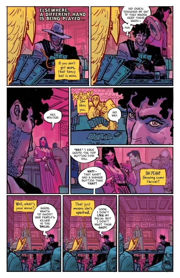
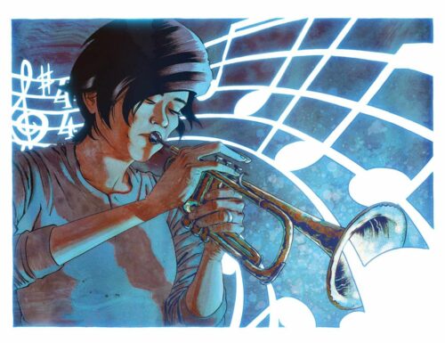
What begins as one woman’s search for her own artistic courage unravels into a stunning look into what jazz music can teach us about our search for the truest version of ourselves.

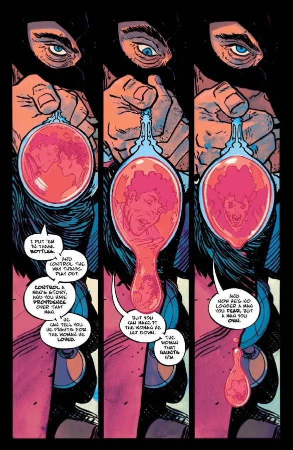
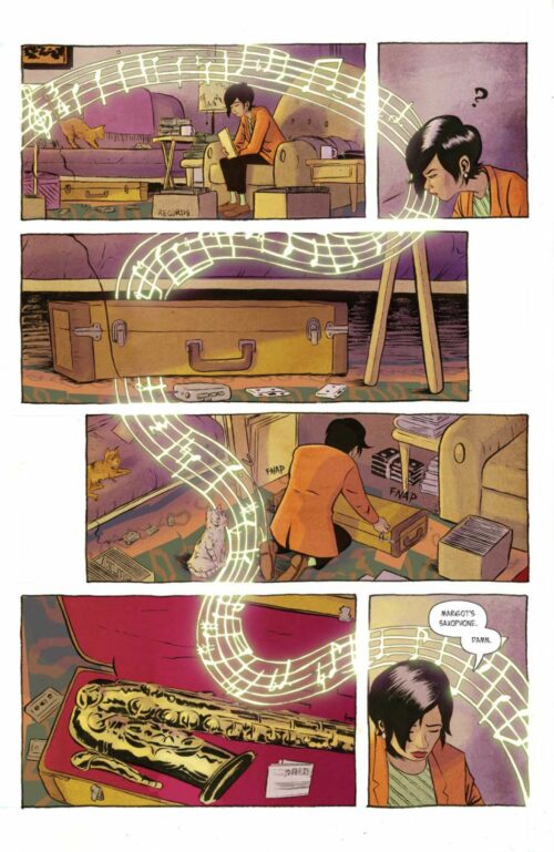
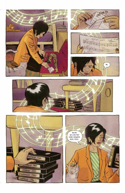
For decades, seasoned players on the scene have spoken in whispered tones about The Blue: a mysterious meeting place for jazz history – a place where ghosts from this music’s storied past spring to life for those courageous enough to enter.

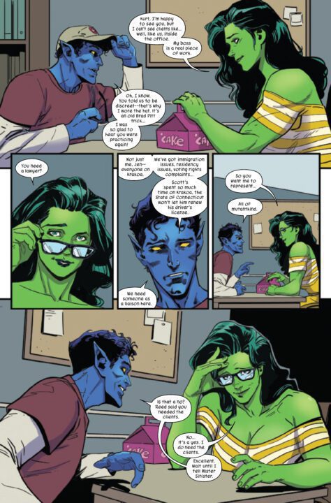
When Jessie Choi’s mentor Jimmy Hightower collapses at a gig and loses consciousness, she finds herself reluctantly pulled back into the jazz scene she abandoned years earlier. In investigating the music and mystery behind Jimmy’s comatose state, every thread leads to the same question: is Jimmy somehow trapped in this enigma known as The Blue? In her search to save her teacher, Jessie rubs shoulders with legends, uncovers the secret history of Blue Note Records, and faces her own deepest fears.

I got to sit down and speak with Chisholm about his process in coming up with and collaborating on the story for Enter The Blue, as well as how he utilizes the comic book medium to tell such a unique story about the world of Jazz.

MFR: Hi Dave, thanks for taking the time to talk with me about Enter The Blue.
I have to say right off that this is one of the best graphic novels of the year.

Chisholm: Thank you so much!

MFR: What were the steps that brought you to make a graphic novel centered around Blue Note records?

Chisholm: All of that stems from my work with Z2 Comics, which primarily specializes in music-based graphic novels that are officially licensed. They had been working with Blue Note’s parent company, and when this idea hit the table they approached me to do this book–definitely thanks to my previous jazz-oriented works Chasin’ the Bird and Instrumental. It’s an amazing record label with so much history, and working with them has been amazing!

MFR: How did you get involved with Z2, and how much, if at all, did they help flesh out the story?

Chisholm: I first met with Z2 at NYCC wayyyyyy back in the fall of 2013. I had pitch packets for my book Instrumental, and I passed one along at a little event at The Society of Illustrators. They were pretty interested, and we stayed in touch, and they released that book in May of 2017–that 3-and-a-half year wait was excruciating, but I am so glad we stayed in touch and that they believed in that strange book enough to publish it. That was actually the first music-related book they put out, shortly before Murder Ballads, which was done with one of the members of The Black Keys. Needless to say, Murder Ballads sold more copies and really pointed Z2 in a fruitful direction. Fast forward a couple of years again, and they asked me to make a book about saxophonist Charlie Parker in coordination with his estate in celebration of his centennial.

As far as their input on Enter the Blue, early on in the project, I really worked out all of the big pieces with my wife Elise, and I delivered it to Sridhar, who was Z2’s main point of contact with the Blue Note people. At that point, it was just tightening a few screws and giving it a thumbs-up, which, thankfully, Sridhar did! It really came together quickly in a very good way–it’s not always good when this happens, but in this case, it worked out really well.

MFR: The spiritual connections between music and religion are as obvious as they are ancient. How did you land on developing a key element of Enter The Blue’s plot around a specific detail in Jewish tradition combined with the sensation of playing jazz?

Chisholm: That was just a case of digging through the details of these historical figures—Alfred Lion and Francis Wolff, the two guys who basically started Blue Note Records. I knew that the metaphysical hook of the story was going to be this mystical, liminal space entered through jazz improvisation, and so it seemed like it would make sense in order for these two men to believe something that sounds so bizarre that they’d be more likely to believe if they themselves had some experiential connection to mysticism. Combining that with their Jewish heritage seemed to make SOME sense, but honestly, within the boundaries of the story, it makes the most sense, specifically from Sherm’s point-of-view. Sherm is a true believer, a conspiracy theorist, who latches onto every possible connection and inflates it until it connects to his framework. It might be a load of BS, right? I mean, Sherm also believes that The Blue is full of chickens! The very fun sequences in his apartment are definitely taking this fantastical, magical idea and pushing it past its limit.

MFR: It may seem silly, but I have to ask: was the story of “the Blue” based on any actual hearsay among jazz musicians at Blue Note? Or was all of this entirely your imagination?

Chisholm: It’s all from my imagination, but it’s also symbolic of what this act of jazz improvisation is, what it does, how it helps you learn, examine yourself, examine the way you think through problems, connects you to the history of this music, and its giants through musical vocabulary and repertoire, and so on. It really is a big historical continuum that you participate in when you play this music with conviction. It is incredible.

MFR: Outside of jazz itself, what were your biggest influences when jumping into Enter The Blue’s creation?

Chisholm: That’s a good question. The biggest influence on the heart of the story, which is this student/teacher relationship between Jessie and Jimmy, is the continuing friendship my wife has with her cello teachers, Steve Doane and Rosemary Elliott, who are a married couple and are both incredible cellists. I got my doctorate in jazz trumpet from The Eastman School of Music here in Rochester, NY, and she has her bachelor’s and master’s degrees from Eastman as well. I have never had that kind of deep friendship with any of my teachers–I think because I tended to be a sort of combative student, and I suppose I would usually work my best when I can find my own path to a skill or to some knowledge. I think that I’d have been better off being a bit more receptive to what my teachers and mentors had to say, but either way, here we are!

In terms of the art/storytelling, I really adore the work of J.H. Williams III, particularly his freedom in bending styles and in using elements of style and comics form to communicate aspects of the narrative itself. He actually posted on Instagram that he snagged one of the Deluxe Editions of Enter the Blue just yesterday which was a pretty huge thrill!

MFR: To you, what about the comic book medium makes it such an apt vehicle for telling stories about music?

Chisholm: Another great question. I teach a class at the Rochester Institute of Technology called COMICS & MUSIC, so this floats around my head all the time. First off, the comics medium is an apt vehicle for ANY kind of story. It’s an infinitely flexible medium that’s endless in its formalist/symbolic potential. For my work, with music, I do get very excited by the superimposition of elements of musical form over the top of comics structure, to see what lines up. Obviously, a 16-panel 4×4 grid is more rhythmic with greater specificity than a page with one big splash image, right? And perhaps a page with very detailed backgrounds and lush colors could represent elements of instrumentation. The way panels are organized on a page could represent the contour of a melody. I mean, that’s what sheet music is, right? Music notation? It’s a container for time that in essence symbolizes something very specific–but, when you look at it, you the reader are not necessarily bound by that temporal constriction, especially if you’re not performing it. You can sit and look at it forever, marvel at the construction, relive your favorite moments in your imagination again and again. That relationship to time, to specificity of happenings, to the whole symbolic nature of the whole thing sounds a hell of a lot like comics to me!

Enter The Blue hits your local comic book shop on September 27th. Talk to your LCS to preorder.

Monkeys Fighting Robots Youtube

Marvel Comics Exclusive Preview: SHE-HULK #6

marvel comics exclusive preview she-hulk

SHE-HULK #6 hits your local comic book store on September 7th, but thanks to Marvel Comics, Monkeys Fighting Robots has an exclusive four-page preview for you!

About the issue:
HOW MANY MILES DOES IT TAKE…TO SAVE THE UNIVERSE?!

The smash hit of 2022 rolls on with its best issue yet. Nightcrawler visits Book Law, but what does HE need legal defense for? And one of the greatest traditions in Marvel Comics history continues here!

The issue is by writer Rainbow Rowell and artist Luca Maresca, with colors by Rico Renzi, and letters by Joe Caramagna. The main cover is by Jen Bartel.

Check out the SHE-HULK #6 preview below:

marvel comics exclusive preview she-hulk

marvel comics exclusive preview she-hulk

marvel comics exclusive preview she-hulk

marvel comics exclusive preview she-hulk


Are you reading SHE-HULK? Sound off in the comments!

Monkeys Fighting Robots Youtube

NEW AMERICA #2 – Read The First Seven Pages!

Exclusive Preview New America #2

NEW AMERICA #2 drops on September 6 from Comixology Originals, but Monkeys Fighting Robots has an exclusive seven-page preview for our readers, thanks to the publisher. Curt Pires is the writer of the series with art by Luca Casalanguida, Mark Dale drops the colors, and you will read Hassan Otsmane-Elhaou’s letter work.

About NEW AMERICA #2:
“Calm Like A Bomb” – Following the shocking revelations at the end of chapter one, Wyatt is dispatched to help locate a missing person within the heart of New America. As he investigates, he discovers things that call into question the moral fiber of the people closest to him and the nature of New America itself.

Enjoy the preview below.

Monkeys Fighting Robots Youtube

AfterShock Comics Exclusive Preview: THERE’S SOMETHING WRONG WITH PATRICK TODD #3

there's something wrong with patrick todd aftershock comics exclusive preview

THERES SOMETHING WRONG WITH PATRICK TODD #3 hits your local comic book store September 14th, but thanks to AfterShock Comics, Monkeys Fighting Robots has an exclusive four-page preview for you.

About the issue:
It’s Patrick vs. Zeus. Where did the machete-wielding maniac Zeus come from and how does he know so much about Patrick? Secrets about Patrick, his mother and his telepathic powers begin to bubble to the surface. Even if Patrick manages to survive, he’ll never be the same again.

The series is by writer Ed Brisson and artist Gavin Guidry, with colors by Chris O’Halloran, and letters by Hassan Otsmane-Elhaou. The main cover is by Guidry and O’Halloran.

Check out THERES SOMETHING WRONG WITH PATRICK TODD #3 preview below:

there's something wrong with patrick todd aftershock comics exclusive preview

there's something wrong with patrick todd aftershock comics exclusive preview

there's something wrong with patrick todd aftershock comics exclusive preview

there's something wrong with patrick todd aftershock comics exclusive preview

there's something wrong with patrick todd aftershock comics exclusive preview

there's something wrong with patrick todd aftershock comics exclusive preview


Are you reading THERE’S SOMETHING WRONG WITH PATRICK TODD? Sound off in the comments!

Monkeys Fighting Robots Youtube

INTERVIEW: Nicola Rose And Her Journey To Making Goodbye, Petrushka

goodbye petrushka-interview-nicola rose

Goodbye, Petrushka is a comedy-drama from director Nicola Rose about a young woman and puppeteer trying to discover her happiness while navigating life in France.

Claire, played by Lizzie Kehoe (More Than Roses), is a quirky girl from New York. She’s a puppeteer who, with the nudging of her friend Julia (Casey Landman), moves from New York City to Paris. In the city of love, Claire works as a nanny, often to families with out-of-control children, deals with bureaucrats, and overcomes a toxic relationship. Unfortunately, Claire also hilariously humiliates herself in front of her crush, a Parisian and former ice skater named Thibaut, played by Thomas Vieljeux (Thanksgiving Masquerade). The film navigates a delicate balance between drama and comedy, often leaning into the former just a degree or two more than the latter.

PopAxiom spoke with director Nicola Rose about becoming a filmmaker and evolving to make Goodbye, Petrushka, a film that draws heavily from her own life.

Then Petrushka

“I didn’t realize I wanted to be a filmmaker until later in life. I was 26,” Nicola begins her story. “Before that, I had been in the arts, acting mostly. Then, for a time, I was a professional puppeteer.”

Much like Claire, Nicola studied puppetry in France. “I ended up coming back to the US where the practice of puppetry is a completely separate thing. So, it was like starting over.”

“The first thing I did was an ongoing puppetry gig at the Boston Public Library,” she says, “I did shows at libraries, daycares, community centers; you name it. I pitched to everyone who might conceivably let a puppeteer entertain kids.”

Nicola “got the idea of doing a web series during my time as a puppeteer. It was the first thing I ever made. Definitely a learning curve experience. From there, it led to a short film, then another short film, and another, then Petrushka.”

goodbye petrushka-movie-interview

About Goodbye, Petrushka

“I did have a situation in France similar to the sh*tshow you see in the movie,” she admits and reveals the reality behind Goodbye, Petrushka’s crazier scenes: “Kids running amok trying to destroy the puppets while the parents sat around drinking and eating.”

Goodbye, Petrushka is directly connected to Nicola’s real life. “Ten years ago, I lived in France. Around 2011 or 2012, I had surreal life experiences that directly or indirectly inspired the film. I felt that I was living in this theatre of the absurd. I kept having conversations and experiences and meeting larger-than-life people.”

“We all get these times in life when things are out-sized,” she says, “they feel like a movie. I’ve only had maybe one or two life chapters like that, but I was lucky to have that group of weird people that allowed me to think, ‘this should be a movie.’”

At the time, Nicola “wrote it down to make a feature. But I didn’t have the means to make a feature. So it was not until years later that my producing partner, Tierney Boorboor, led the charge and steered the ship.”

“Tierney saw the script, which at the time was heavily overweight. It was 122 pages and had other plots and other stuff,” she explains. But as with any piece of art, things evolved. “First thing she said was that I needed to cut it down and make it more producible in a few ways. But she said that whatever I do not to lose the youthful spirit the film has.”

Communication

Despite the more serious places it sometimes treads, the youthful spirit of Goodbye, Petrushka is alive and well. “I’m not a big rom-com fan, but what I was aiming to do here, while it is a comedy and romantic in a way, I wanted to see a movie where things didn’t end up just fine. I remember I was fairly unlucky in romance when I wrote it.”

“One review described it as ‘deeply silly’ and another as a very serious joke.’ Both of those are correct,” she laughs. “It’s a very serious joke, but the joke is the important part. Life is often not that serious; it’s weird and often absurd.”

Once Claire reaches France, the film bounces between English and French with subtitles. “Hopefully, people don’t find it too jarring. Originally, almost the entire movie was in French. Tierney suggested dialing it back as we did for a wider audience. So it’s about 75 percent English in the end.”

“What I think works seamlessly in the film,” she adds, “is that characters who are French that become emotionally charged speak in French.”

Compromise

One of the significant obstacles for the film was COVID. “At that time, we had to ensure everyone was safe and contained on set. So we had a CCO (COVID Compliance Officer) who constantly tested people.”

“We’d planned to shoot part of the movie in France,” she says about the film, which was shot in New York City. “Among our funds, we’d budgeted for this project to go to France for certain scenes. Unfortunately, we couldn’t do it because it wasn’t clear at the time if we could travel. So, you can’t plan for something you don’t know that you can do.”

An essential skill for any filmmaker is making the best of evolving situations. “We used the money for extra finishing, PR, and marketing. Everything in the movie is shot in New York, but it fools everyone except maybe people familiar with the precise spots we used.”

Wrapping Up

Watching Goodbye, Petrushka gives off Amelie vibes, and Nicola lists its director as one of two vital influences “Jean-Pierre Jeunet and Wes Anderson (Rushmore). Céline Sciamma (Girlhood) is another big one for me. There are so many people out there doing wonderful work.”

What’s coming next for Nicola? “I have a project in development. It’s a teen/family comedy called Magnetosphere. The script is done. It has to do with a 13-year-old girl who is neuro-divergent.”

Is Goodbye, Petrushka, on your watch list?

Thanks to Nicola Rose and WildWorks PR
for making this interview possible.

Find more interviews from Ruben R. Diaz!

Monkeys Fighting Robots Youtube

My Favorite Story From AMAZING FANTASY #1000

My Favorite Story From AMAZING FANTASY #1000

AMAZING FANTASY #1000 from Marvel Comics hits your local comic book shop today, and the oversized comic is jammed-packed with creative talent from all over the comic book industry spectrum. The story that tops them all is the one by Neil Gaimen, artist Steve McNiven, colorist Richard Isanove, and letterer Todd Klien.

What makes the Gaimen story so powerful is the infinite joy that Spider-Man brings to a child, but also the deep sadness that Peter Parker struggles with. The story and the art reminded me of Shel Silverstein’s THE GIVING TREE. A children’s book that throws a massive emotional punch. Gaiman’s autobiographical storytelling connects with the reader and makes you empathetic, each page has weight and loneliness, and you leave the story contemplating your own life.

Here were my quick thoughts this morning:

Honorable mention to the Jonathan Hickman story. I laughed out loud, my wife thought I was weird.

About the issue:
The comic that brought you SPIDER-MAN hits issue #1000! We’re going big to celebrate in this, our thousandth issue of AMAZING FANTASY! An ALL-STAR roster of creators are coming together to celebrate Peter Parker and Spider-Man’s birthdays!

Monkeys Fighting Robots Youtube

Review: VANISH #1 Is Pure 90’s Edge

From modern comics all-stars writer Donny Cates (God CountryThor) and artist Ryan Stegman (InhumansAbsolute Carnage) create a tale of rejecting magic and blood-soaked vengeance, 90’s style with Vanish #1. With JP Mayer on inks, Sonia Oback’s colors, and letters by John J. Hill, Vanish is an edge-filled and grimy love letter to Image comics of yester-year, but with its own insane twists. Featuring a gnarly script by Cates and gritty-yet stunning art from the visual team, Vanish #1 is a must-read for old-school Image Comics fans.

“Oliver Harrison was a mythical hero who slayed the greatest threat to his realm before even hitting puberty. But that was then. As an adult, Oliver leads an average cookie-cutter suburban life—aside from the fact that he’s mentally unstable, massively paranoid, smokes like a chimney, and gets blackout drunk every night to hide from his horrific nightmares. Will the arrival of a superhero team called the Prestige prove the madness isn’t all in Oliver’s head? And what about all the epic fantasy crap from his childhood?”

Writing & Plot

It would be easy to misinterpret Donny Cates’s writing in Vanish #1 as dark cynicism – if everything wasn’t so tongue-in-cheek. The overall plot – a wizard turned angry drunk takes vengeance on some superheroes tied to the death of his parents – is pretty cookie-cutter as a concept. However, specific details and circumstances arise to specifically throw these tropes sideways. These little plot events are by and large shocking in hilarious ways, while still absolutely coming off as something that would have been dead serious in a 90’s comic. Cates’s dour narrative and character-specific predictable dialogue perfectly set the expectation for the sort of comic this will be. Vanish immediately has that grimy and nihilistic touch that will ingratiate itself with 90’s Image diehards and fans of that sort of storytelling in general. The comic’s clincher though is one particular scene that I cannot spoil, but is flat out one of the most hilarious twists in comics this year. Cates knew exactly what he wanted this story to be and went for it, all while making something that can still be compelling to those wanting a more class-style grimdark comic book.

Art Direction

Anyone who has been reading Marvel comics for the past several years is familiar with the work of modern artistic heavyweight Ryan Stegman. Having him as the penciler for a throwback-style book like Vanish #1 is a perfect fit. Stegman’s hatching-heavy and detail-focused work comes across like the work of McFarlane or Silvestri but with a slice of modern refinement. His characters all look unique while simultaneously appearing very 90’s. He captures the grime and pollution of the “current” timeline city Oliver lives in now, then switches over to a place of magic without skipping a beat. Due to his specific art style however, the aesthetic never skips a beat. Even the majestic magical realm we visit retains an element of edgy darkness. A lot of this consistency is helped out by JP Mayer’s inks, which perfectly complement the atmosphere. Stegman’s action choreography and sequencing are busy, but easy to follow and well-paced. Vanish is constantly throwing hooks at a breakneck pace, but it’s also structurally expertly managed. The colors from Sonia Oback are rich and vibrant, but intentionally smothered so as to keep with the book’s aesthetic. Every panel feels like it has a layer of grease over it, but this is very much the point. This coloring approach caps off that classic 90’s feel Vanish goes for. Finally, John J. Hill’s letters carry the reader through with dynamic and easy to read fonts, with great SFX design. He utilizes a couple of different font styles for different characters, one in particular being very unique. The SFX work mimics a more old school approach, however, just like book as a whole, still delivers something modern and original unto itself. Visually, Vanish #1 is a love letter and a marvel on its own.

Verdict

Vanish #1 is a smart and compelling love letter to Image Comics of yesteryear. Donny Cates’s script is brutal and grim exactly when it should be, while being punctuated with hilarious twists that make the story an unexpected joy to read. The visuals from Ryan Stegman, Sonia Oback, and John J. Hill are brutally stunning and intricate, combining that grimdark 90’s aesthetic with modern artistic touches and skillful sequencing to make this book a blast to read. Be sure to grab this new #1 when it hits shelves on September 21st!!

Monkeys Fighting Robots Youtube

Review: SHOCK SHOP #1 Presents Double The Horror

Shock Shop #1
Shock Shop #1 Cover Art Credit: Dark Horse

There is always an audience for horror, whether it’s a movie, a TV series, a novel, or comic. The genre is massively popular and attracts committed, passionate fans, who love to indulge in new offerings. Therefore, a new horror anthology title is a welcome addition to the monthly schedule, and is exactly what Dark Horse Comics are offering with their new flip comic Shock Shop, due out on 7th September 2022. The new comic features two stories written by Cullen Bunn and each is illustrated by a different team.

It’s horror; it’s comedy; it’s pantomime. Everything a good horror anthology should be.

Shock Shop #1
Shock Shop #1 Cover Art Credit: Dark Horse

Introducing..

The format of the comic is a clever marketing trick, encompassing two separate covers, one for each story. This allows for the publishers to create a range of appealing covers that can be marketed to different groups within the horror audience. It also leans into the variant cover crazy without having to flood the shelves with too many different versions of the same comic. A variety of superb artists can produce wonderful cover work that can, ultimately, get into more hands. It’s a neat trick.

Another neat trick is introducing a host into the stories. The relationship between hosts and comic horror anthologies dates back to the beginning of comic books and was borrowed from other popular media. From Old Nancy in The Witch’s Tale radio series from 1930 and the ushers and compares of Le Théâtre du Grand-Guignol in Paris which opened in 1897, and whose legacy is referenced within the pages of Shock Shop, the purpose of the host has been to lead the audience into the uncomfortable stories and provide a barrier between the worlds. EC’s Tales from the Crypt and related titles did this superbly with their mix of monstrous and comedic hosts. In those comics each one would go beyond introduction and act as storyteller, interjecting at opportune moments to remind the reader that they are reading a fantasy, a fiction, and often make light of the situation.

Within Shock Shop, Cullen Bunn gives the audience Desdaemona Nimue Moreau and her comic shop of horrors. She gets a full page spread for each story in which to set the tone and give the readers a visual treat of in-jokes and referencing. It could be argued that this is not enough as she is the most intriguing character in the comic and hints at the exciting world around her. However, unlike Rick from Image Comics’ Ice Cream Man, Desdaemona plays no part in the stories, adopting a more traditional role of host from 1950’s horror anthologies. She introduces the story and then, sadly, disappears from the comic.

The Host welcomes you into Shock Shop #1 Credit: Dark Horse

Two Tales Told Well

The two stories are: Something in the Woods, In the Dark drawn and coloured by Danny Luckert, and Familiars drawn by Leila Leiz, coloured by Bill Crabtree. Lettering for both is provided by Nate Piekos.

Out of the two, Luckert’s is more visually stimulating with intense storytelling across the page. His colours are expressive and bring out the acting of the characters. This story is full of emotional exchanges, knowing looks, and empathetic glances. Even before the disturbing, mutated body horror shows up, Luckert has conjured up an uncomfortable and tense atmosphere that is only exaggerated by the wilderness setting. More and more, the simple concept of nature is becoming alien and uncontrollable which makes it a perfect setting for a tale of horror, such as this.

Although, that is not to say that Leiz’ work is lesser; it’s just different. The second tale is more comedic in tone and has a flight of whimsy about it that is reminiscent of the late 1980’s Ghostbusters comics. The clever use of red lenses over occasional panels puts the reader into the position of the spirits haunting the house and humanises them potential threat. The red washes are unsettling, but because the reader has been transposed into the role of the ‘ghost’, the artists create a sense of empathy often missing from ghost stories. The panels and pages are cluttered and busy, representing the chaos of the central character who has been uprooted and thrust into a new home. The divorcee is shown to be somewhat irresponsible which in turn explains why he does not take his situation seriously. Leiz’s triumph here is the setting, the way in which she handles the urban environment to tell the reader something about the character. It’s a harder sell, from a horror perspective, especially with the amount of humour on the page, but the character building is still impressive.

Shock Shop #1
Shock Shop #1 Interior Art Credit: Dark Horse

Side by side, the two stories work visually well together. Each provides something slightly different in style and tone but there is a similarity brewing within the stories themselves. The simplest way to illustrate the differences is to look at the lettering by Nate Piekos. For the intense, family drama, Piekos carefully choreographs the speech, giving enough weight to each statement. Often he changes the font size or uses bold text to emphasise an argument or backhanded comment. His purpose in the first story is to create tensions between the characters and the location. Within the second story, however, there is a more chaotic approach to the lettering. Piekos plays with the word balloons, changing their shape, sometimes subtly and sometimes drastically. In each instance it tells the reader something about the person speaking. In this story Piekos is focusing on the characters and the way they speak, rather than their actual speech.

Shock Shop #1
Shock Shop #1 Variant Cover Art Credit: Dark Horse

Conclusions

When you pick up an anthology comic, not every story will appeal, but you tend to know what to expect from a horror comic. Nothing will come as a surprise, except what is supposed to, narratively speaking. And Shock Shop is no different. It blends modern comic storytelling with classic horror tropes to create enjoyable stories. The contrasting artwork between the two stories gives each one a different tone and if you read them in the right order (Something in the Woods first) the change lulls the reader into a safe space at the start of tale two.

However, despite the lighter tone of Familiars, both stories have the same narrative beats with similar setups. The locations may be different and the dynamics between the characters are more intense in Something in the Woods, but the progression of the stories follow the same pattern. This means that whichever story you encounter second has less of an impact, and may leave you feeling indifferent. Something in the Woods is the stronger horror story, and placed next to Familiars, it becomes obvious, which is then a disservice to the latter.

With Shock Shop, Dark Horse Comics are giving readers two stories spread over four issues. This means that you don’t get a full story, only parts of two, and this ultimately ends up like a taster menu. It wets you appetite but does not satisfy it. One of the greatest appeals for most anthology titles is the one-and-done stories. The Haunt of Fear, Creepy, The House of Mystery, all succeed in telling short stories issue after issue and some of the best creatives working for those titles were able to tell complex and terrifying tales in eight pages or less. With Shock Shop, the artwork is good and fits the tone of each story, there just isn’t enough of each terrifying tale. It’s like watching a horror movie until the first jump scare, turning it off, and then watching a different movie until the same point.

Everything about this comic is great except there just isn’t enough of it. Not enough of the actual stories, not enough of the host, and not enough of a sense of anthology. On this particular occasion, it may be worth waiting for a few issues to come out before sitting down to read them, or buy the trade.

Monkeys Fighting Robots Youtube

Review: ABOVE SNAKES #2 Is Far, Far Above Par

Above Snakes
Above Snakes #2 Cover Art Credit: Image Comics

The second issue of the modern western comic Above Snakes, published by Image comics, is out now. It draws inspiration from a vast catalogue of genre greats, and is undoubtedly a western, but does not limit itself to that moniker. Following such titles are Undone By Blood and the sci-fi western East of West, Above Snakes uses a genre base as a jumping off point for something greater.

Whenever you think of a Western, your subconscious is automatically flooded with a series of tropes that color your impression of the Western that you are about to enjoy. If the creators have done a good job, then they will present these tropes to you in a satisfying and, hopefully, new way so that the product is not stifled and dull. If they have done their job really well, then they will ignore or even subvert these tropes and present a Western that blows your mind. Stephen King did it with his fantasy/western The Gunslinger, as did the Cohen Brothers with their remake of True Grit; see also T.Vs 1883, and DeConnick/Rios/Bellaire’s Pretty Deadly for Image Comics.

Above Snakes definitely falls into the latter grouping. It re-presents the characteristics of the genre while integrating themes that feel more relevant to today’s society. The overwhelming need for vengeance is the backbone of many western tales, but the post-modern storytelling and small supernatural element gives Above Snakes extra dimension. Great character work is woven through atmospheric artwork and the script is humorous and tragic in equal measures.

Above Snakes interior art Credit: Image Comics

Stories within tales…

The second issue of Above Snakes sees the central character, Dirt, play at having a normal life. At least for a very short period of time. And the concept of “play” is important here, because what writer Sean Lewis is giving the reader in his script is an over-the-top performance piece, bordering on a sitcom at times. Several of the sequences are played for laughs and the banter between Dirt, Speck, and Annie forge their characters early in the comic. This then makes the second half of the comic more impactful because those that make us laugh get into our hearts and we are forced to feel their tragedies with them.

This issue’s themes are centralised around fate and not being in control of your own story. The opening of the comic frames this idea succinctly, however the first half of the comic continues to toy with this idea in one way or another. Lewis and artist Hayden Sherman create an air of performance in a bar sequence that could almost have the caption “filmed in front of a live audience” over it. The characters act for the readers in exaggerated ways and there is a sense they are projecting directly out of the comic, like a stage performer acting for the audience. This is quite unusual in comics, which more often than not are trying to draw the reader into the world, but Lewis and Sherman handle the outward performance perfectly.

Above Snakes #2 Bar Scene Credit: Image Comics

Letter me this.

There is a reason that people get excited seeing Hassan Otsmane-Elhaou’s name on a comic cover and a quick flick through the pages of Above Snakes will demonstrate why. The lettering leaps from the page and, on occasions, smacks you in the face. Otsmane-Elhaou’s work is sublime, and there is so much going on just with his letters alone that you almost forget Sherman’s artwork is behind it. In most comics, this would be seen as a bad thing, lettering is supposed to be an invisible art form after all, but on these pages so much of the story and the characteristics are brought alive by the lettering. It acts as an equal partner to the rest of the artwork. In fact, it is obvious that Sherman leaves space for the elaborate letters and, in return, Otsmane-Elhaou integrates the word balloons into the artwork. On the second page for example, liquid drips from a spoon and falls over the speech in a beautifully integrated way.

These are the elements that make reading comics worthwhile. They give you something that you can’t get anywhere else. If you want a narrative where a desperate man hunts the killers of his wife/child/dog then film and television is full of them. But, you will only get the Above Snakes version of that narrative in the comic format because the creators are using the narrative as an excuse to play with the medium.

Above Snakes
Above Snakes #2 interior art Credit: Image Comics

Conclusion

If you love westerns then, yes, you should be reading Above Snakes. However, if you love the comics format, then you should definitely not miss this wonderful example. Sherman’s coloring is unrealistic and garish in a way that only works in comics. Saturated panels and blocks of color for certain characters give each page an emotional atmosphere that precedes reading. This allows the creators to control the reader on every page turn thus creating an emotional flow that dictates expectations.

In the same way that lights are used to create mood on a stage, Sherman uses color as a signifier for emotional context. Even the lettering takes this on board to separate aspects of the storytelling. The slightly supernatural element of Speck, for example, is reflected by speech balloons that stand out against all of the speech balloons surrounding them.

Lewis’ narrative is gripping and packed with character. The comedy is timed perfectly and the drama hits home every time. There are some heartbreaking scenes, which is an impressive feat for characters that you have just been introduced to. This narrative is then presented in the best possible way by two exceptionally talented artists, Sherman and Otsmane-Elhaou.

I very rarely use the term “must buy” but in this case, I think it would be a crime not to use it.

Monkeys Fighting Robots Youtube

Review: Beast is a fun survival thriller

Beast is a straightforward survival thriller that doesn’t overstay its welcome. The story might not deserve the talent of Idris Elbra, but seeing him battle a lion on the big screen makes for a fun theatrical experience. Beast is similar to movies like Crawl, Burning Bright, and other survival films. It’s drenched in tension, has excellent pacing, and Elba delivers a strong performance. Beast does include some lackluster CGI and the writing can be unbearable at times, but this was an adequate man vs creature film.

These types of projects can be hit or miss, but Beast accomplished a lot in the 90 minutes it had to work with. After the hard-hitting opening, the film spends time letting the viewer grow attached to the characters. Not allowing itself to become a highlight reel of carnage, Beast gives viewers a reason to care for the characters before the lion is introduced. Directed by Baltasar Kormakur and written by Ryan Engle, Beast follows Nate Daniels (Elba), a newly widowed man traveling to South Africa with his two daughters, Norah and Meredith.

Elba is joined by Leah Jeffries, Iyana Halley, and Sharlto Copley for this thrilling adventure story. Elba steals the show in his role, which seems to have inspired his on-screen daughters because the trio has phenomenal chemistry. Nate is blaming himself for the recent loss, and his daughters are trying to process it as well. Nate’s struggles allow Elba to deliver a heartfelt monologue that highlights the guilt Nate lives with. While Beast delivers a formulaic story, it makes the character’s survival more significant by making them relatable. Still, Engle’s script relies heavily on stupid decision-making. Beast could have been 10 minutes shorter if the writing made the characters more intelligent.

Despite the nonsensical character decisions, the film manages to be an engaging delight from start to finish. It excels at letting suspense and tension carry the narrative, which leads to effective pacing as well. Although, once our main group becomes trapped in a vehicle, Beast does begin to drag. During this time, characters you’re expected to cheer on become tiresome. For instance, Meredith (Halley) references topics that won’t help them escape the lion at the most inconvenient moments. In an effort to express frustration at her dad, she nearly becomes unlikable.

Philippe Rousselot’s gorgeous cinematography is the perfect distraction from the useless jumpscares Beast decides to incorporate. Jumpscares are only effective when they are not formulaic and when it’s earned. The jumpscares presented in this movie are not earned but will make for an entertaining experience for someone. While the lion depicted is effective enough to spark terror, the CGI isn’t that great. Sadly, practical effects are becoming a thing of the past. As mentioned, performances are great overall, but Idris was consistently delivering a strong performance.

There are times when the acting feels like it’s undermining the tension Beast thrives in. Elba carrying the film saves it from any major downfalls, but those glimpses of poor acting are a small detriment. Kormakur’s direction is solid and he understands how to keep you on the edge of your seat. Beast only suffers from the lackluster CGI and its overreliance on poor decision-making. This movie probably would have gone straight to streaming if it didn’t feature Idris Elba.

Beast is a fast-paced survival film that keeps you on the edge for the vast majority of its runtime. This is an effective 90 minutes of engaging activities with a strong lead performance from Elba. Awful CGI aside, Beast was a solid addition to this genre of survival horror movies. If a sequel happens, I hope the lion returns with a new group of allies to assist in the carnage.


Monkeys Fighting Robots Youtube