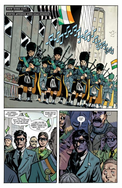
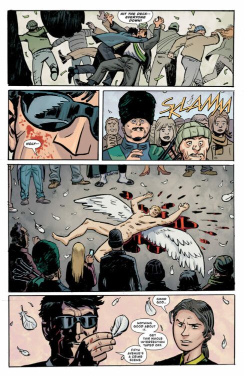
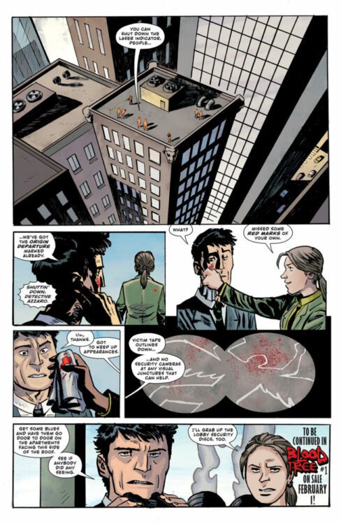
BLOOD TREE #1 hits your local comic book store on February 1, but thanks to Image Comics, Monkeys Fighting Robots has an advanced review for our readers. The book is written by Peter J. Tomasi, with art by Maxim Śimić, John Kalisz drops the color, and you will read Rob Leigh’s letter work.
BLOOD TREE #1 is a New York murder mystery, and we mean the CITY. Tomasi writes from a familiar place that feels like a modern 80s blockbuster film; there’s some nostalgia to make you feel comfortable but with today’s sensibility. The first issue sets up the mystery and puts the hooks into the reader but doesn’t reveal too much. There are a lot of unknowns. BLOOD TREE could be a slow burn or explode in the second issue. Because of this, I’m eagerly awaking the next issue.
Śimić’s art has a grit to it, which works well with Tomasi’s story. Life isn’t perfect, and BLOOD TREE feels like a comic book that is going to get under your skin. The way Śimić places Detective Azzaro on a panel, you can feel the weight of his family and job slowly breaking him down. Also, the panel structure choices add to the story’s slow burn; the back-and-forth and close-ups gnaw away at you with uneasy tension. If the first season of TRUE DETECTIVE were a comic book, it would be BLOOD TREE.
John Kalisz’s color palette is on the bright side in the first issue; I’m interested to see how it evolves as the mystery unfolds. Does it get darker or stay bright, creating an awkward tension between the mystery and reality?
There is a lot to unpack and set up in BLOOD TREE #1, and Leigh’s letter work lets the story unfold naturally. He creates a flow that allows the reader to connect with the story.
The 80s feel, combined with the angelic nature of the murders, makes BLOOD TREE #1 a must-read.
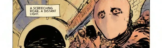
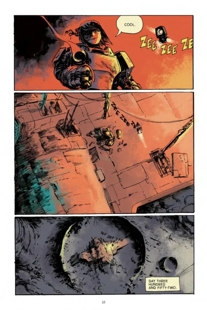
Space is scary. An endless void stretching out in all directions, enveloping all known life. It’s the darker side of stories about man searching the stars. For as much as it could be seen as the final frontier, an exciting new search, anything that could be found in space will be dwarfed by so, so much nothing. DEGA by Dan McDaid combines the loneliness of space with an equally abstract, frightening aberration. One that slowly kills whoever comes into contact with it.
An astronaut finds herself stranded on an alien planet after a crash. Normally, that would be bad enough. But there’s a strange anomaly among the stars that’s eating away at her, bit by bit. So without enough time to fix her ship, she’ll have to search the desolate planet surface for salvation.
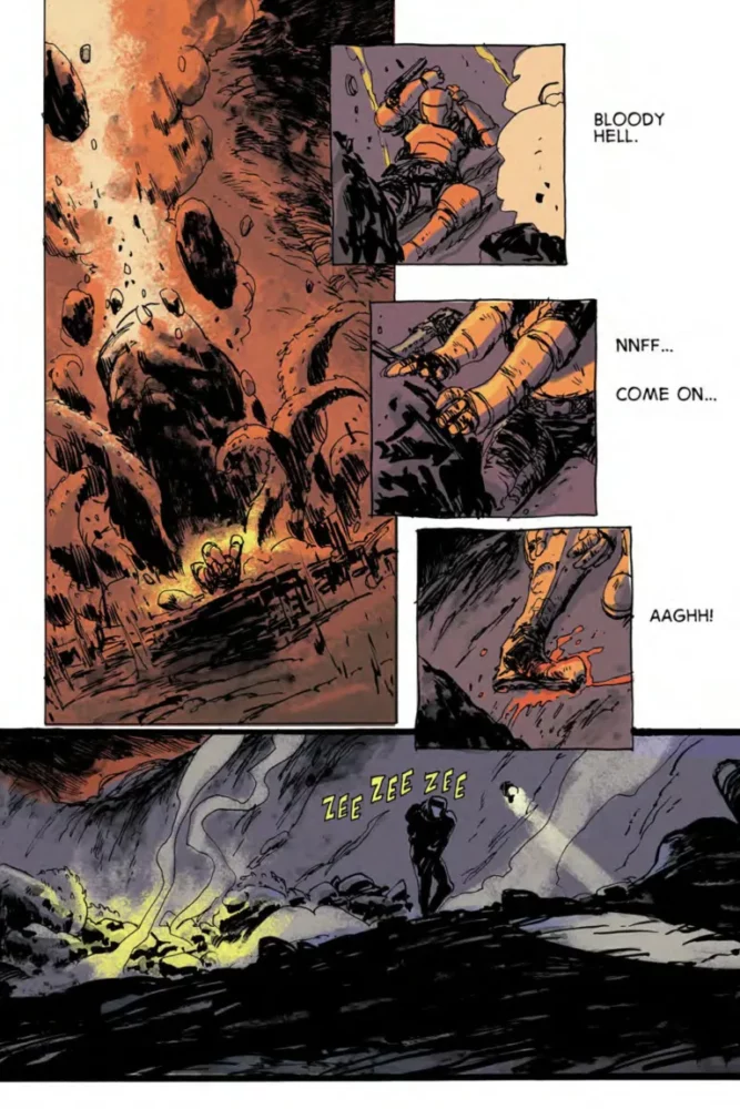
The struggle of DEGA‘s protagonist is one against the mysterious, corrupting influence of an alien world. But by the time the story starts, the nameless astronaut has already been stranded for three hundred and fifty-two days. So less a race and more the tail-end of a marathon. It’s a desperate, exhausted book that leaves the reader to make sense of all the sci-fi high concepts from the internal ramblings of the main character. As the book proceeds, even color fades away, with only a few important objects getting splashes of pigment. Like the red grass that springs beneath the feet of alien “magpies.” Or the color of the sky right before the astronaut’s dragged underground. It’s all about getting in the headspace of someone facing a gnawing, existential threat.
McDaid adopts a loose, thick-lined style for the book that slathers every page in black ink. Characters’ features can easily become obscured by shadow, sometimes a single eye sufficing to get across an emotion. But each page still manages to be incredibly dense, no background spared as alien rocks and rubble loom over the characters in every panel. In the afterword, McDaid mentions that one of his original goals with the book was to make it as fast as possible. He aimed for a month. It took five years. It’s in his combination of sketchy, implied forms with detailed alien landscapes and, well, a whole lot of those implied forms that it becomes clear how work on this project could balloon to such length. But it works in favor of establishing the hazy yet overwhelming setting of the story.
The colors rarely stay inside the lines, adopting a speckled, airbrushed look. It helps add to the loose, sketchy feeling. And while colors may mostly disappear partway through, a strong palette for the book gets set early on. This is a story of rust-orange and a cool blue-purple. Even when the book becomes black-and-white, the small touches of hue remain shades of those two colors. It starts out alien and unsettling, but when the colors pop back in, it feels like a relief from stark white. Though in a slight change from the original, self-published version of DEGA, a few more examples of color are added near the end, adapted from what was originally greyscale. It balances color throughout the book a bit better, and helps the last few pages hit harder.
The letters are the only other change from the original edition of DEGA. Though again, don’t expect anything major. An additional ellipses here, a few lines around an exasperated “huff” there. But they remain stark and simple, fitting the clipped, matter-of-fact tone of the astronaut’s narration (an attempt to keep herself level-headed through panic and exhaustion). The sound-effects, meanwhile, get large, overlapping bubble letters that help sell both the racket of an oncoming train and the repetitive drone of an excavation robot.
VERDICT
DEGA is a short, self-contained tone piece about an astronaut at the end of her rope. But for as dire as things may get, the ending still leaves a small, lingering sense of hope. Though part of the fun is getting to piece the narrative together yourself. It’s out today from Oni Press, so definitely check it out.
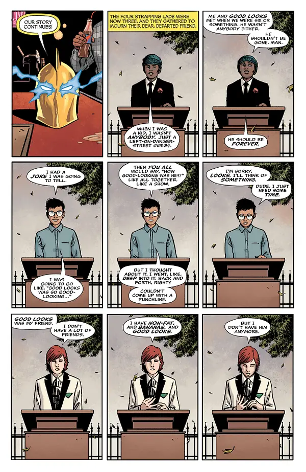
“The sky is falling.” That’s what a crazed Atlas yelled at our characters in the closing moments of Danger Street #1. And that’s exactly how that ending felt. It felt like the sky had fallen, and our hearts fell along with it. Danger Street #2 starts us off in the quiet, heartbreaking aftermath of that chaos. As the rest of the Dingbats of Danger Street eulogize their fallen comrade, writer Tom King, artist Jorge Fornes, colorist Dave Stewart, and letterer Clayton Cowles show us that this series has as much heart as it does action.
Writing
Much of Danger Street feels like it is fueled by a bewitching kind of entropy. All of our characters feel as though they’re on a collision course with each other, and their many spectacular crashes into each others’ worlds is the source of our drama. But there’s also a clear rhythm to King’s writing. Danger Street #2 has as much downtime as it does action. In fact, much of this chapter shows our characters trying to figure out how life goes on after the events of the last issue. King drives home each emotional beat with beautiful subtlety.
We see the Dingbats trying to come up with something to say at Good Looks’ funeral. None of them really seem to know what to say. King shows us, as they grasp about trying to communicate what they’re feeling, that none of them are equipped to deal with a loss like this. They all felt that they would live forever. Similarly, Starman and Warlord try and figure out how to put what happened behind them. Each time Starman tries to bring up his guilt, Warlord compares what they’re facing to his many fantastical adventures in a mythical kingdom. Dinosaurs and evil wizards he knows how to deal with. But grief? Guilt? He has no damn clue.
Art
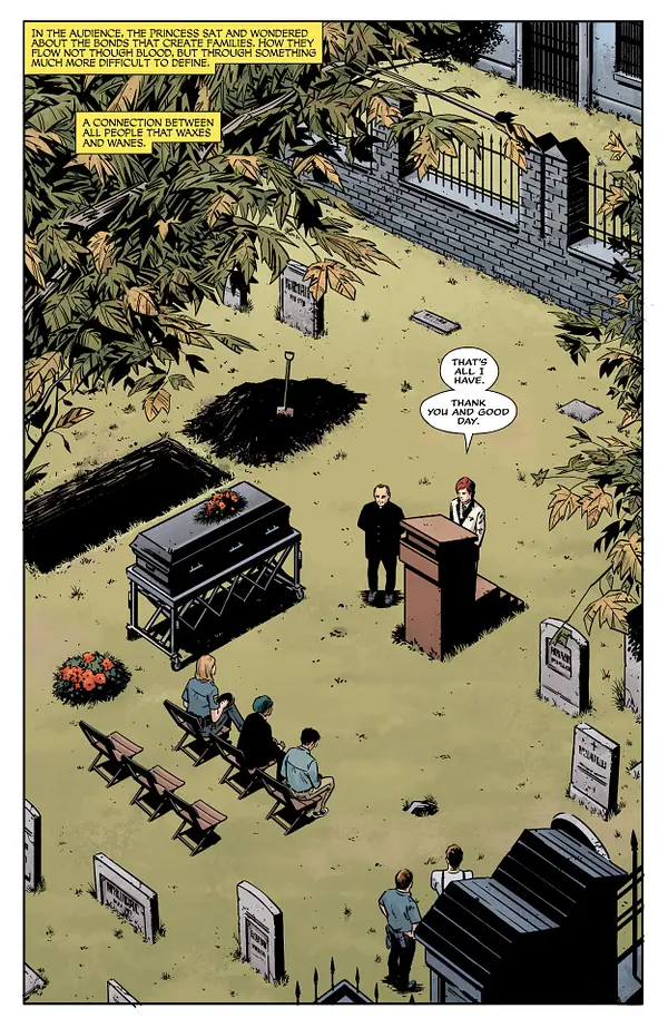
There’s a real conversational feeling to the way Fornes sets up these pages. Much of the issue, we follow Lady Cop as she tries to uncover details about Good Looks’ death. Throughout, we get patterns on the page of bouncing us back and forth. Fornes either does it in rows or columns, showing her interviewing people. On one page, Lady Cop’s face is in one long panel that takes up a whole row. The row of panels beneath it show three people she interviews. The next row is her face again, but her expression has changed. Then another row of three people, and the page ends with her face one more time. Fornes makes us feel a lot of movement through this. It’s like a tennis match of looking over at one half of the conversation to the other, back and forth. We see this in Starman and Warlord’s conversations, too. We see it when the Creeper interrogates someone.
This sets up a norm for the pacing in Danger Street. So when the pattern is broken, that scene is really highlighted. When Highfather meets with Darkseid, Fornes keeps us mainly focused on Darkseid. The third page of their encounter has Darkseid in every panel. It slows us down. It feels like we’re savoring this moment. This interaction means something different. It sticks out. Fornes uses this variation in pacing brilliantly to build tension and focus us in on the details of these characters that get more room on the page.
Coloring
Much of Stewart’s color palette is quite muted, despite the colorful nature of these characters. Even when we see the Creeper in his yellow, green, and red uniform, Stewart casts the whole get-up in a shadow that combats the brightness. Most of the scenes in this issue feel quite real. Nothing is too flashy or vibrant. But there are two major exceptions to this. The few times we see Doctor Fate’s helm, it stands out in glorious gold. And every time we see Starman, his blue skin pops right off the page. Stewart seems to be highlighting both Fate’s helm and Starman as things that don’t quite “belong” in this world. Fate’s helm, at the center of the carnage of last issue, is otherworldly and too powerful to be contained. And Starman is from another planet. The way that he doesn’t seem to fit in, gives you the distinct impression that he wishes he was back home.
There are other subtle variances in Stewart’s colors, too. The Green Team, child aristocrats with no soul, have decked themselves and their headquarters out in their favorite color. You see the dark green table cloth where they play poker, the emerald color of the lamp on their desk, and their suits of deep cadmium green. But only a couple of pages later, we see the Dingbats, still hanging out around Good Looks’ grave. They lie on their backs on the faded grass. Stewart juxtaposes these two groups. One group is surrounded by richness and wealth. The other group is surrounded by death and things that fade.
Lettering
Cowles’ letters bring a lot of life to the script. From the old-timey style of Fate’s narrations, to the cracked “KA-BOOM” of a ship blowing up in the ocean, there’s a ton of variation to what Cowles is doing. Cowles also tends to fight against the mood of certain moments, creating a kind of balance. We hear the screams of someone being tortured shown in big, bold, yellow block letters. While the letters do have a scratchy look that shows us the desperation of the noise, there’s still a strangely fun feel to the vibrant letters. We see the same thing with explosions, gunshots, and maniacal laughter. It punches up those moments of action and gets you ready for the next big “BANG!”
But there’s a really lovely quietness in these pages, too. We see the small letters of Starman barely being able to articulate what he’s done. We see the same minute lettering when a god is – perhaps for the first time – at a loss for words. In all the pandemonium and havoc, Cowles tunes us in on the lines that matter the most.
Conclusion
DC Comics’ Danger Street lures you in with the madness of its plot. But you stick around because of the wonderfully human and heartbreaking characters. King, Fornes, Stewart, and Cowles are creating a work that is somehow electrifying and deeply compassionate at the same time. There’s a gorgeous balance that this series strikes. It’s easily one of the best books on the shelves. Don’t miss out on this fantastic series, out now at a comic shop near you!
Welcome to Project 365! The premise is simple: read one comic every day for the entire year. It seems like a simple task, but there is no way that I read 365 comics last year, even if you count the individual issues in collections. So, this year, I am committing myself to this reading challenge, in the hope that I can broaden my reading habits and fully engage with my hobby again.
The plan, therefore, will be to do a round up each week of the comics that I have read, along with my impression of and reasons for my choices. It’s very possible that I read more than one comic on a particular day and on these occasions I will pick one to include (but will probably keep a list of the others). I also encourage comments and recommendations, as it would be nice to know what other people are reading.
So, without further ado, Week 1 of my 365 comic challenge.
On the surface, a challenge like this should be fairly easy. However, 2022 saw me canceling the regular standing order I had with my local comic book shop. An ongoing order that had been in place for well over 10 years. There are a number of reasons why this happened, the most significant being finances. I just can’t afford to buy comics like I used to. When Marvel published their first Civil War event, I bought every single title which had the Civil War banner on it. Every single one. However, last year I was having to cancel some titles in order to pick up others. There was a one in, one out system in place that made monthly comic buying difficult and, often, unpleasant. So I swept the board clean. I even dropped Saga.
This challenge, then, might not be as easy as I first thought. But I have plenty of back issues to re-read and a determination to find exciting new things, so….
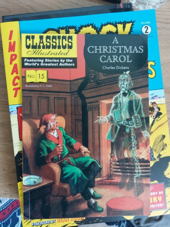
Classics Illustrated adaptation of A Christmas Carol
Comic number 1: Classics Illustrated No 15: A Christmas Carol.
I’ve read this for a purpose, one that will become apparent over the year (hopefully). Originally published in 1948 in America as number 53 in the series (the version I have is the 2009 UK reprint), it’s a retelling of the classic Dicken’s novella with art by Henry Keifer. It is not the best retelling of the tale, or even one of the better Classics Illustrated, but it is enjoyable and includes elements of Dicken’s original that are often forgotten. I didn’t read this for entertainment, but for research purposes, however it was a good comic to start this challenge and probably sets the tone of what’s to come. Expect more classics and historical titles than new releases in the coming weeks.
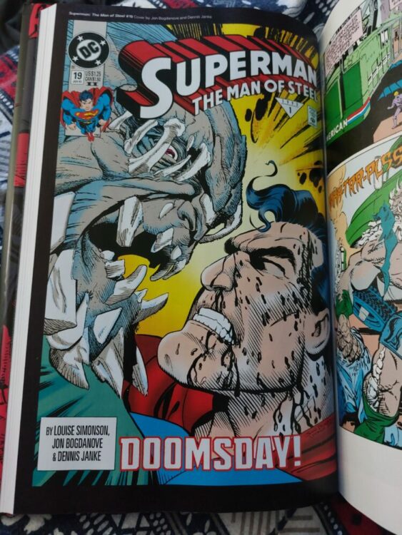
Superman The Man of Steel #10 from DC’s Death of Superman collection
Comic number 2: Superman: The Man of Steel #10
For Christmas I treated myself to The Death of Superman hardback book. The Man of Steel #10 is the penultimate issue before the death mentioned in the title. As an all out action piece, it has interesting layouts, especially taking into account the issues that precede and follow it. With only two panels per page, there is a lot of detail in each panel, although, the narrative itself is pretty straight forward by this point: Doomsday and Superman go at it hammer and tongs. An historical event story that spread across all of the Superman titles and seeped into the rest of the DC Universe, it isn’t the most cerebral of stories, but it does pack an emotional punch, even after all these years.
And the scene where Doomsday knocks Supergirl out of shape, literally, has always stuck in my memory. I had no idea what was going on with Supergirl at the time and reading this when it came out led me straight into reading Supergirl. These days, I’d rather read Supergirl over Superman.
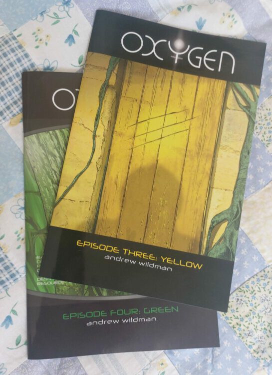
Oxygen issues 3 and 4 Credit Andrew Wildman
Comic number 3: Oxygen Episode Three (and Four)
Oxygen is a self published comic by one of my favorite artists: Andrew Wildman. Issue 4 came out late last year but I re-read number 3 before moving on to number 4. Issue 3, subtitled Yellow, was the point where I started to really grasp what was going on. The series follows a lone astronaut, stranded on a planet fraught with dangers. The comic is a surprisingly personal journey through a single life and reminds me, in style and tone, of Martin Vaugh-James’ The Cage. What do we leave behind? What detritus remains of our memories as we move on through life? Thought provoking and beautifully produced, I’m with Oxygen until the end.
The series is half way through and can be bought directly from Andrew Wildman’s website here. I highly recommend it.
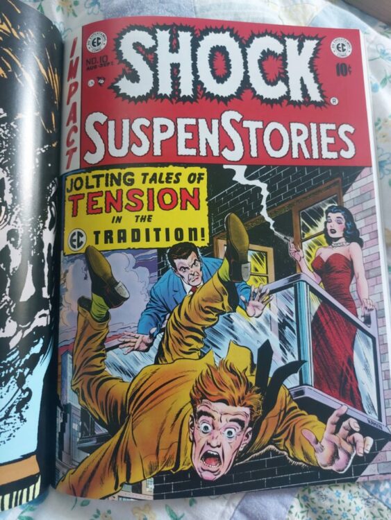
Shock SuspenStories #10 from Dark Horse Comics EC archive collection
Comic number 4: Shock SuspenStories #10
I love EC, and the EC Archives collections published by Dark Horse are a great way to read them. Some great writers and even greater artists worked on these comics, and you can guarantee there will be a gem of a story in each issue. For Shock Suspenstories #10, the diamond in the rough is The Sacrifice by Gaines, Feldstein and Kamen. It is an excellently paced murder mystery with a satisfying twist at the end. A sci-fi story and a horror-lite tale fill the pages of this issue with wonderful art but rather limp endings. The most intriguing story in this issue is …So Shall Ye Reap!, again written by Gaines and Feldstein (aren’t they all?) with art by Wally Wood. For a comic published in 1953, when anti-comics movements are taking America by storm, it is a very ballsy swipe at those people blaming comics for society’s woes. I’ve put this aside for later study.
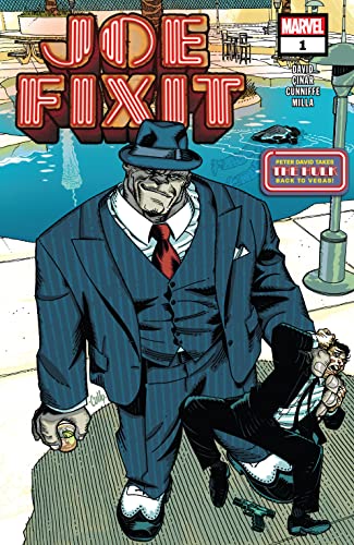
Joe Fixit #1 Cover Credit: Marvel Comics
Comic number 5: Joe Fixit #1
A brand new comic!
I’m not much of a Marvel reader anymore, but I do enjoy Peter David’s early work on titles such as Spider-Man and The Hulk. And Q-Squared is one of my favorite Star Trek books.
Plus the Hulk punches the Kingpin.
‘Nuff said.
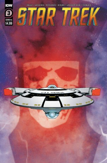
Star Trek #3 Cover Credit: IDW Publishing
Comic number 6: Star Trek #3 (2022)
As a big fan of Star Trek, I do tend to give a lot of the comic runs a go. I really enjoyed the recent Year 5 run with the original crew and have high hopes for the Strange New Worlds tie-in. IDW are putting out some great Star Trek content and this current run, featuring a mix of characters from the television series, is very exciting. With Benjamin Sisko captaining a star ship after being released from the Celestial Wormhole to track down a God Killer, it has adventure written all of it. So far, each issue has featured a number of recognizable faces and this third issue is no exception. With the arrival of Q to the mix, the narrative becomes quite ridiculous but definitely fun. It feels like a bit of a filler issue, but writers Collin Kelly and Jackson Lanzing are clearly enjoying playing in the Star Trek sandbox.
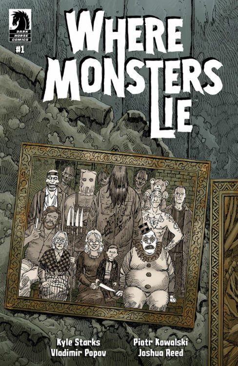
Where Monsters Lie #1 Cover Credit: Dark Horse Comics
Comic number 7: Where Monsters Lie #1
This is my first preview comic of the year. Due out on February 1st from Dark Horse Comics, this tale asks “Where do all the psychotic serial killers go after their killing spree has come to an end?” The answer: Wilmhurst. In this gated community run by a cold and clinical matriarch, the horror b-movie characters, slashers, and cannibal families can all feel safe while they take a little down time between murder sprees.
This first issue by Kyle Starks, with art by Piotr Kowalski, has its moments of slasher style horror, but for the most part is a whimsical comedy, a kind of serial killer sit-com. It’s not clear from this first issue what kind of story the mini-series will tell, whether it will lean more into the killer aspect or the comedy aspect, but this first issue definitely has enough going on to hook fans of either genre.
..
And so ends the first week of the year and a satisfying selection of comics already read. I think this mix of old classics, personal favorites, and brand new comics is going to be the shape of things to come. Hopefully, I will get the chance to look at a few previews to whet your appetite, and not re-read too many out of print, hard to find, back issues that no one can get their hands on if it seems appealing.
So, join me next week to see what seven comics have taken up my time. And why not add a comment below to let us know what you’ve been reading? Let’s share our love of the medium.
THE INVINCIBLE IRON MAN #1 hit your local comic book shop last month from Marvel Comics. The book is written by Gerry Duggan, with art by Juan Frigeri, Bryan Valenza drops the color, and you will read Joe Caramagna’s letter work.
In the Panel Breakdown, we look at the elements that raised the stakes in Tony Starks’ fall from grace.
About THE INVINCIBLE IRON MAN #1: IT ALL ENDS!
Tony Stark, the genius-billionaire-playboy-philanthropist, has lost everything: his wealth? fame? his friends. But Stark doesn’t realize he still has so much more to lose, especially when the assassins start to come for him! It’s the beginning of the end, as the Golden Avenger must fight for his life and find out what it really means to hit rock bottom. Join Gerry Duggan (X-MEN) and Juan Frigeri (AVENGERS) as they take Iron Man to the darkest corners of the Marvel Universe yet!
December 28th would have been Stan Lee’s 100th birthday, so it just made sense to talk about one of his books in the Panel Breakdown. So this week, we look at DAREDEVIL #43 from 1968 and the elements that made it a classic.
DAREDEVIL #43 was written by Stan Lee, with art by Gene Colan, Vince Colleta dropped the inks, and you will read Artie Simek’s letter work.
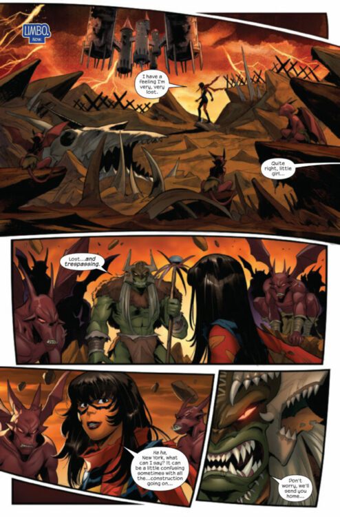
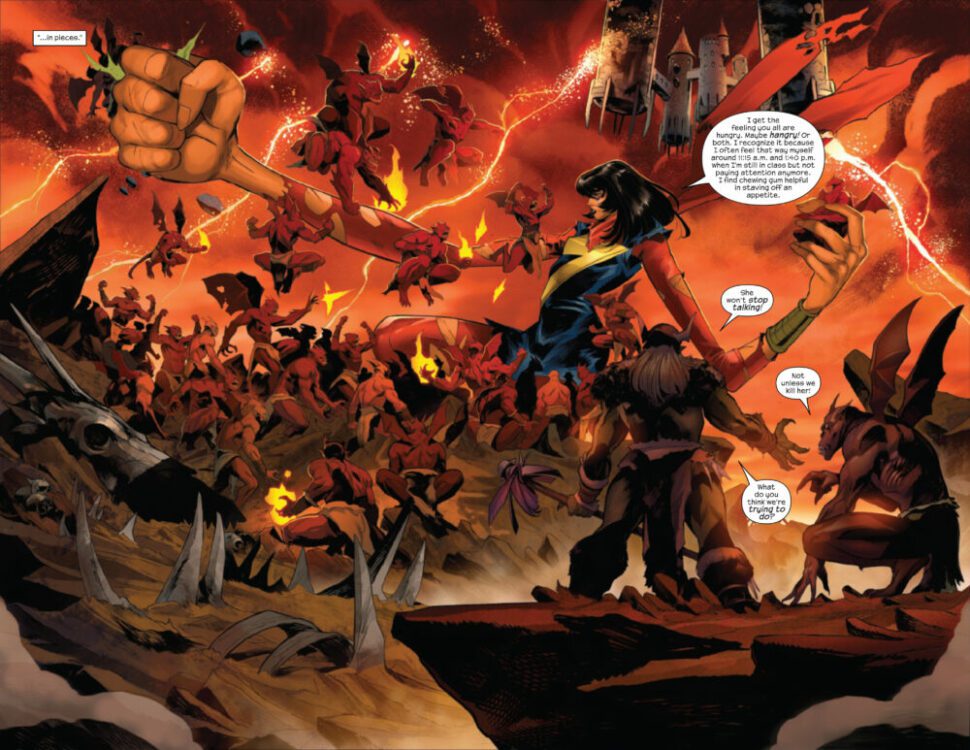
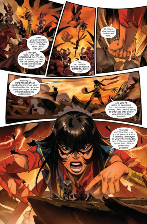
DARK WEB: MS. MARVEL #2 hits your local comic book store on January 11th, but thanks to Marvel Comics, Monkeys Fighting Robots has an exclusive four-page preview for you!
About the issue: Caught in the explosive events unfolding across New York – including a face-to-face confrontation with Chasm himself – Kamala Khan finds herself teleported to Limbo, the domain of the Goblin Queen Madelyne Pryor! As the city descends into chaos that threatens everything and everyone Kamala holds dear, she’s left with no choice but to call on Miles Morales for a helping hand!
The issue is by writer Sabir Pirzada and artist Francesco Mortarino, with colors by Dono Sánchez-Almara & Fernando Sifuentes, and letters by Ariana Maher. The main cover is by Marco Checchetto and Matthew Wilson.
Check out the DARK WEB: MS. MARVEL #2 preview below:
Are you following Marvel’s DARK WEB event? Sound off in the comments!
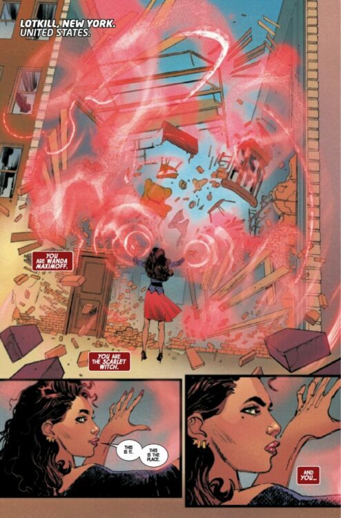
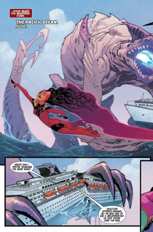
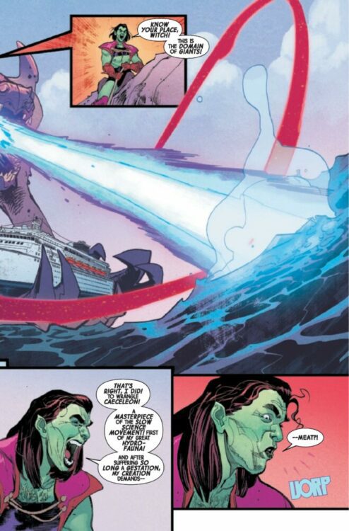
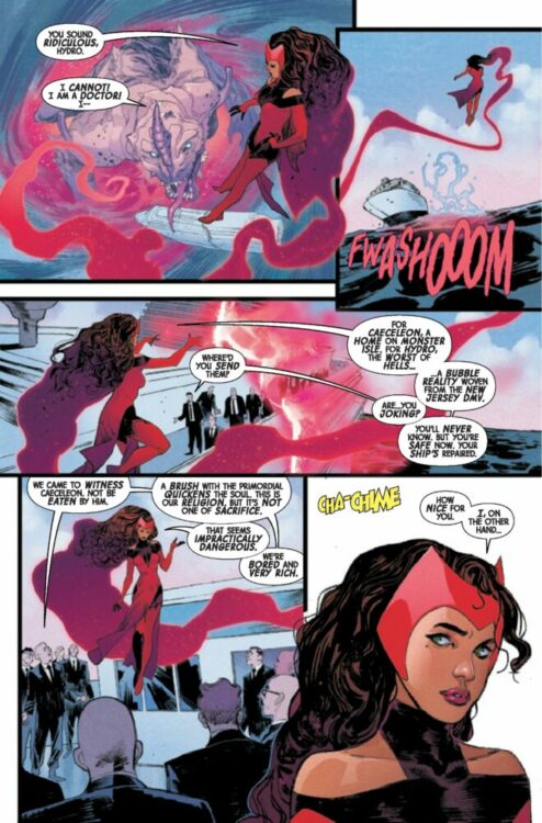
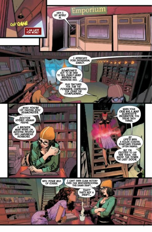
SCARLET WITCH #1 hits your local comic book shop today from Marvel Comics. The series is written by Steve Orlando, with art by Sara Pichelli, Elisabetta D’Amico is the inking assistant, Matthew Wilson drops the colors, and you will read Cory Petit’s letter work.
Orlando hits the ground running, setting up the series with mystery and intrigue. The final page is sure to make the Reddit boards crazy with theories and possibilities. But the concept of “The Last Door” emotionally ties the book to the reader. “When someone has nowhere else to go, they open The Last Door,” says Wanda. We all struggle with personal demons, and “The Last Door” magnifies hope. As Peter Parker was once a relatable character we could all see in ourselves, Wanda might come at the perfect time when everyone’s mental health could use a boost.
Pichelli’s art and Orlando’s story give the book an Edgar Allen Poe / Charlotte Brontë feel. A dark romance novel full of emotion and fear. The emotional spectrum can be felt through Pichelli’s art. She uses tight panels, so there is no mistaking what the characters are feeling. The action sequences are used sparingly, building tension as the reader waits for Wanda to erupt. Wilson’s color palette elevates the emotion on everyone’s face and provides a balance between the calm and intense moments of the story.
Petit’s letter work compliments the action and keeps the story in its proper lane of storytelling. This isn’t a blockbuster movie, heavy on CGI and special effects. SCARLET WITCH #1 is an emotional story with action, not the other way around.
SCARLET WITCH #1 is a must-buy, and I’m excited for the next issue.
About SCARLET WITCH #1: THE SCARLET WITCH RETURNS! There is a door that appears only to those who need it most, who have no one else in the world to turn to. On the other side of this door is the witchcraft shop. Friend or foe, human or otherwise—if your need is great and your hope is gone, there you will meet the SCARLET WITCH! Wanda Maximoff is familiar with hitting rock bottom—and now that she’s finally found peace, she’s pledged all her power to help others who are languishing at their lowest. But when a woman falls through Wanda’s door with a terrifying story of a town gone mad, the Scarlet Witch will have to muster her wits and chaos magic to deal with an insidious threat! Comic powerhouses Steve Orlando (MARAUDERS; Midnighter) and Sara Pichelli (ULTIMATE SPIDER-MAN; SPIDER-MEN) join forces to open a groundbreaking new chapter in the Scarlet Witch’s history!
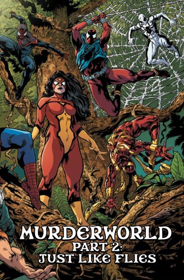
Murderworld Avengers opened up a world of madness for people trying to get rich quickly. Unfortunately, this didn’t pan out too well for many of the contestants. For those who survived, the journey and battle were not close to being over. This week gives us Murderworld Spider-Man from the same writing duo of Jim Zub and Ray Fawkes. Joining them for this issue are Farid Karami on pencils, Chris Sotomayor on colors, and Cory Petit on letters.
WRITING
With this entry into the Murderworld saga, Zub and Fawkes use everyone’s favorite web slingers instead of the Avengers. My one gripe about the writing is that we don’t really get enough of the spiders. Similar to the Avengers in the last issue, the big Marvel characters only appear on a few pages and then disappear. What Zub and Fawkes do well is they continue to develop new characters in the story. Last issue the main character was shockingly killed off, this issue they build up some of the side characters from MurderworldAvengers. Eden Abraha was used last issue, but for Murderworld Spider-Man, she is our point of view character. Zub and Fawkes build Eden up through some flashback pages. She was an MMA fighter who took things too far. This issue also introduces us to a couple of new characters who also have some good potential to become relevant later in the series. As always, Zub and Fawkes write Arcade brilliantly. The make him funny and sadistic, but you can’t help but like him. Murderworld Spider-Man is a fun issue that doesn’t let the reader feel safe as characters are picked off one by one. Another great showing for Zub and Fawkes.
ART
The pencils are done by Farid Karami for this issue. Karami’s pencils are very clear and easy to go panel to panel with. Action sequences look awesome as the survivors try to take down an A.I. Miles Morales. One of the things Karami needed to nail was the facial expressions on Arcade. He’s a character that is very excitable and visually makes a lot of different looks. Karami succeeds in giving us several looks for Arcade as he is thinking seriously at one point to smiling with glee as contestants die off at the hands of his spiders. Karami also does good work establishing the layouts of new areas. As the survivors move on, they enter a blizzard. Karami paints a gorgeous snowy backdrop with covered mountains in the background. The pencils stepped up to the plate to make this issue more enjoyable and easy on the eyes.
The colors are handled by Chris Sotomayor. An issue like this uses several different background colors as our contestants travel through the unknown. Sotomayor will use a darker blue with light whites as the survivors travel through a winter landscape. Earlier in the issue, skies were clear and blue as they were attacked by Spider-Man and his crew. The pages where the Spider-Man crew arrive are colored vibrantly by Sotomayor. The red from Spider-Woman is just the right tone, and Sotomayor also gives us excellent shading as well.
The letters by Cory Petit are good. As the spiders attack, Petit uses several well-placed “THWIP” effects. These are in the upper left-hand corner of the page, and allows the action be seen. Word balloons are placed in the perfect spot so they don’t interfere with the pencils. Petit makes effective use of sound effects as well. A “CRUNCH” is placed in between a contestant’s feet as he is yanked up by a spider web. Petit is easily one of the better letterers in the comic book industry. His work continues to evole and engage readers.
CONCLUSION
Much like this issue before it, Murderworld Spider-Man is a fun and entertaining issue. Jim Zub and Ray Fawkes continue to make this series an enjoyable one. No one knows what will happen next, and that’s the most exciting thing about this book. Murderworld Spider-Man is available at a comic shop near you!
One thing that is almost always guaranteed in gambling and poker movies is tension. This is because writers use these elements to create high-stakes situations. So, the idea behind these gambling movies is to create a gripping story with a lot of excitement and drama and even serve as the basis for a good comedy.
Of course, when you watch movies about casinos, you are also taking a risk. You don’t know whether your two-hour investment will be worth it. So, the goal of this post is to help you mitigate that risk. If you love casino games and poker in movies, keep on reading. Here are some of the best gambling movies you should watch.
Lock, Stock and Two Smoking Barrels
Guy Ritchie has a unique style in cinematography. For some genres, this style really works, while in others, it can feel out of place. Luckily, Lock, Stock, and Two Smoking Barrels is one of the best movies in general, and you should definitely watch it. Gambling doesn’t take a central stage, but it definitely has an impact on the plot. There are underground betting and poker games, and characters suffer consequences for throwing in their lot with these mobsters.
Of course, today’s gambling scene is drastically different. Due to regulations and money laundering laws, it’s more difficult to organize gambling hubs in the underbelly of a big town. Gamers are a lot safer when they play at the best online casinos. They can even use electronic checks to make deposits directly from their bank account. There is a guide to use echeck in online casinos that helps new players who want to use this payment processor. It’s a great option for a deposit, especially if you don’t have an account with other digital payments service providers.
Croupier
This is a great drama about financial struggles and stress that comes from interacting with others who also experience financial problems. Clive Owen plays a character who is desperate to get his hands on some extra cash. He starts working as a croupier, and since he is good with numbers he becomes really good at what he does. However, this job also takes a toll on his personal life, mainly because people aren’t that good at handling losses.
This is why all of the best online casinos heavily advise their players to gamble responsibly. A smart player should always use everything he has to his advantage but never bet with money he or she cannot afford to lose. This is why you should claim the best casino bonus Canadahas to offer and basically gamble risk-free. Some of these promotions require you to sign up or use a specific payment processor, but most of them come with wagering requirements. Make sure to read those terms before opting in because most of these are tailored toward fans of slots.
Rounders
If you are a big fan of poker, then for you Rounders is probably the best poker movie out there. It is filled with tense scenes, but it also has some great life lessons. It’s a story about a card-playing genius that manages to emerge victorious That’s basically the main reason why some people dislike Rounders, it in a way sends a positive message about winning at the poker table. Other than that it is overall a great movie.
It says that you need to do what you were meant to do, and those who are lucky enough life are able to discover their true purpose. It also has another great quote that you can shear sheep multiple times, but you can skin it only once. It’s definitely a philosophy for professional poker players who find themselves playing against the newbies.
The Card Counter
Saying that this is just a movie about gambling wouldn’t do it justice. It’s a great story about a man haunted by his past, and how the US treats its veterans. This is where a parallel with casinos can be drawn. It’s this promise of excitement and luxury, but for many, it ends up being a life of loneliness and struggle. Army recruits with promises of greatness and doing service to their countries. However, many veterans become scared by the atrocities, and they are left to pick up their pieces.
Conclusion
These were some of the best casino movies that you should watch. Hopefully, you will get inspired to give some of them a try, after reading through the descriptions. Of course, there are many other titles out there, like 21, Mississippi Grind, Owning Mahowny, and Molly’s Game. So, if you have already seen the ones listed here, try giving one of these a shot.
Mila Roy is a digital marketing expert with years of experience in the iGaming industry. She works as a content strategist, and she loves blogging about tips and tricks for new gambling enthusiasts. In her free time, Mila likes to relax by camping in state parks or watching thriller movies.


")