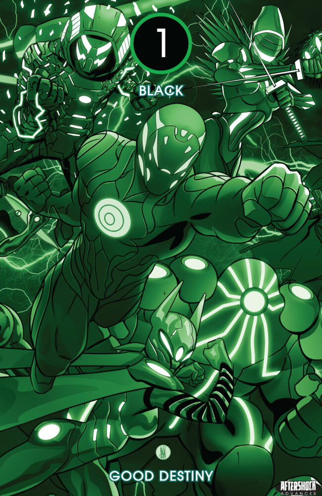
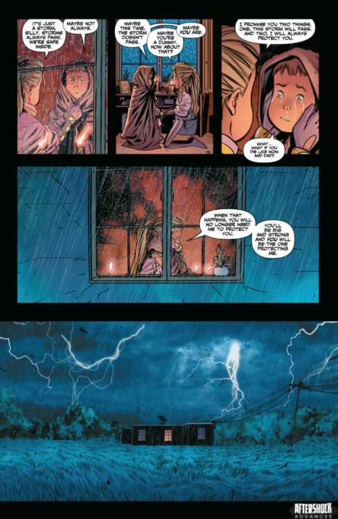
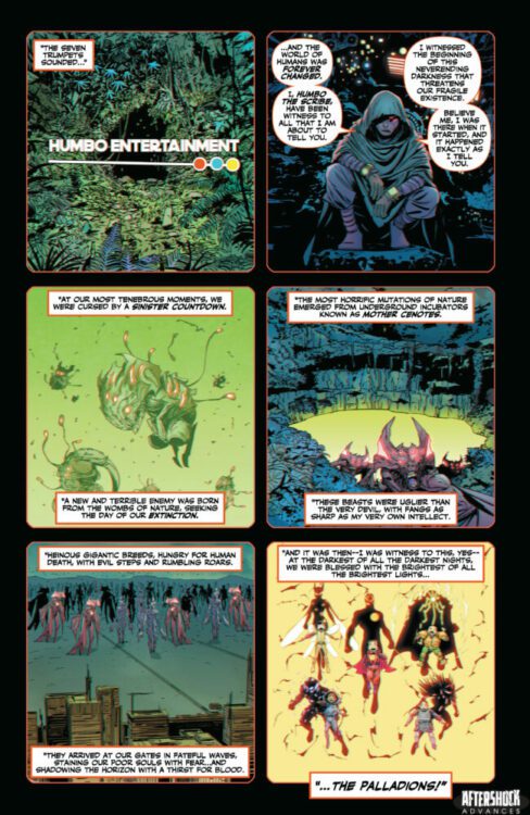
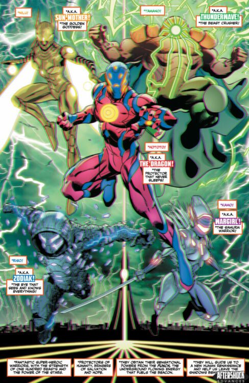
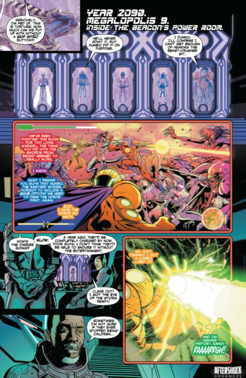
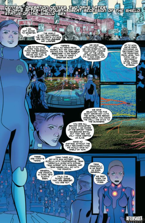
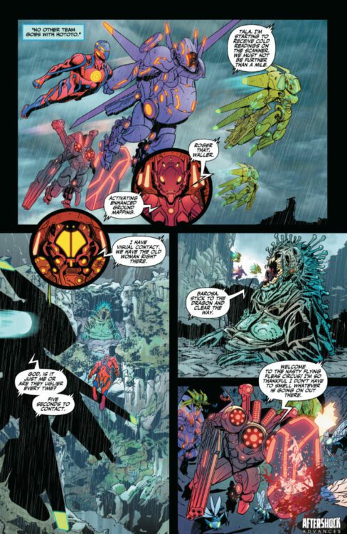
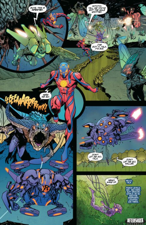
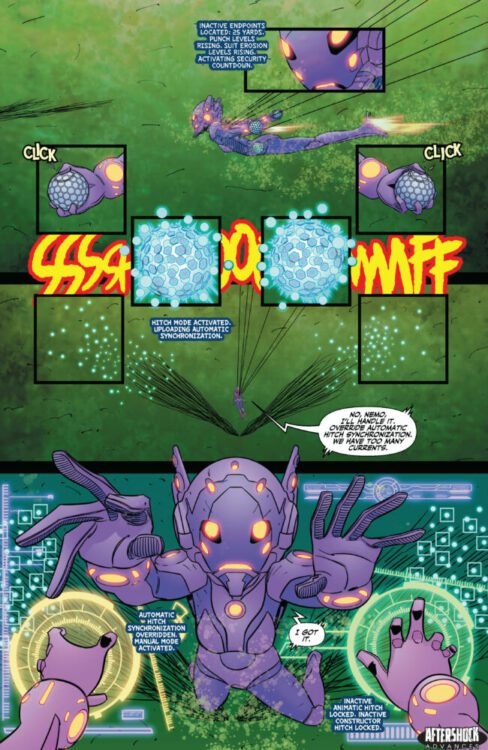
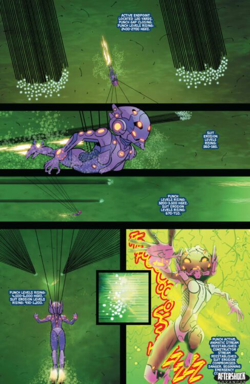
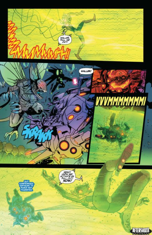
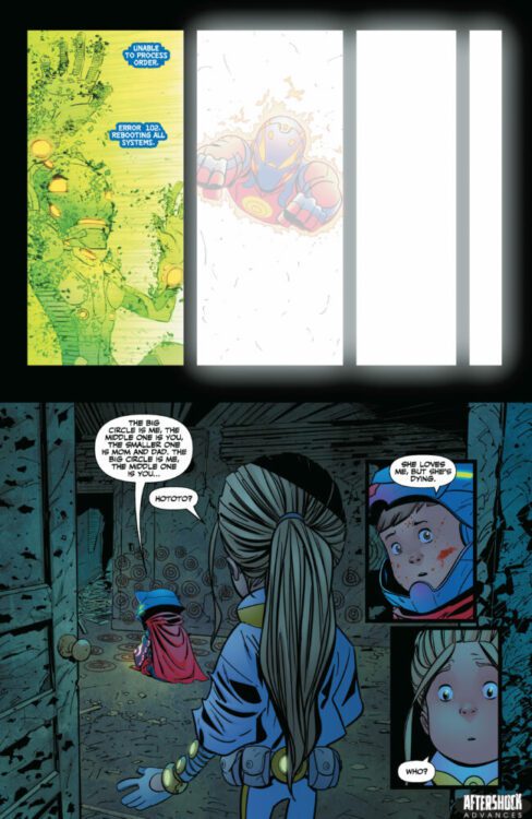
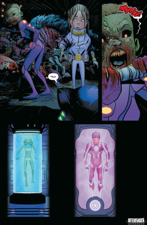
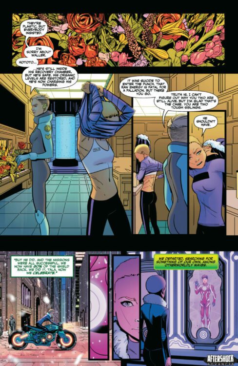
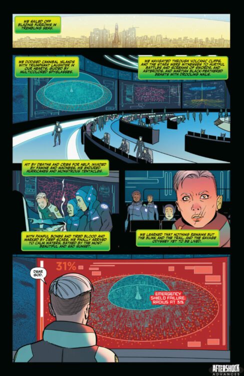
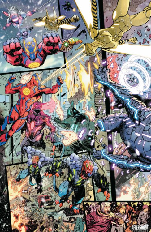
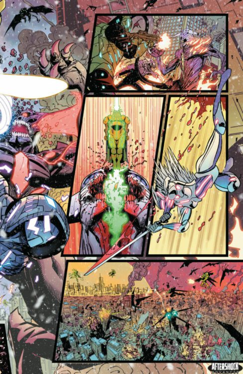
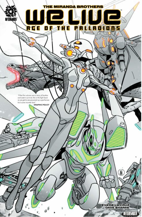
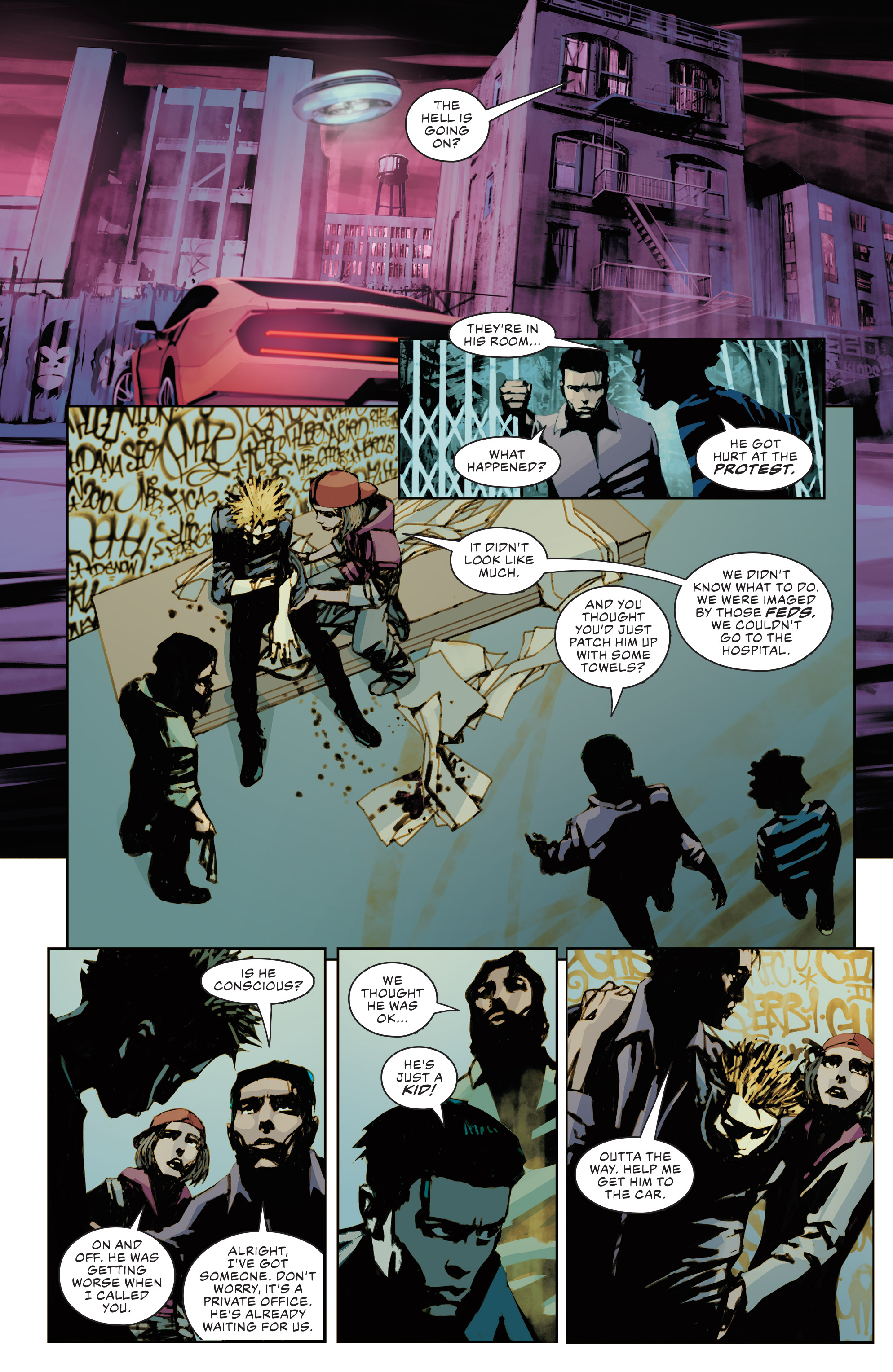
WE LIVE: AGE OF PALLADIONS Vol 2 hits your local comic book store July 19th, but thanks to AfterShock Comics, Monkeys Fighting Robots has an exclusive twenty five-page preview for you.
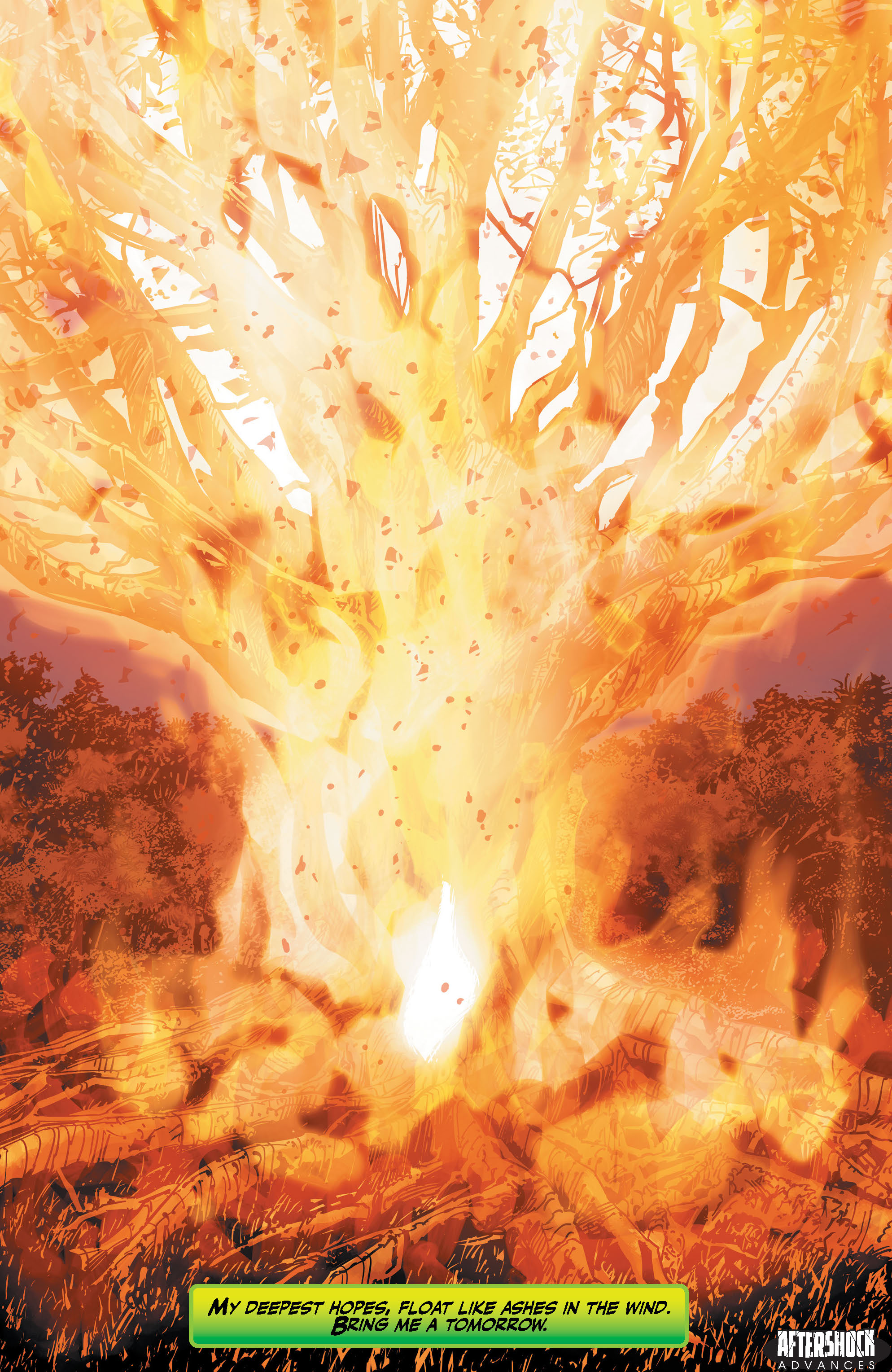
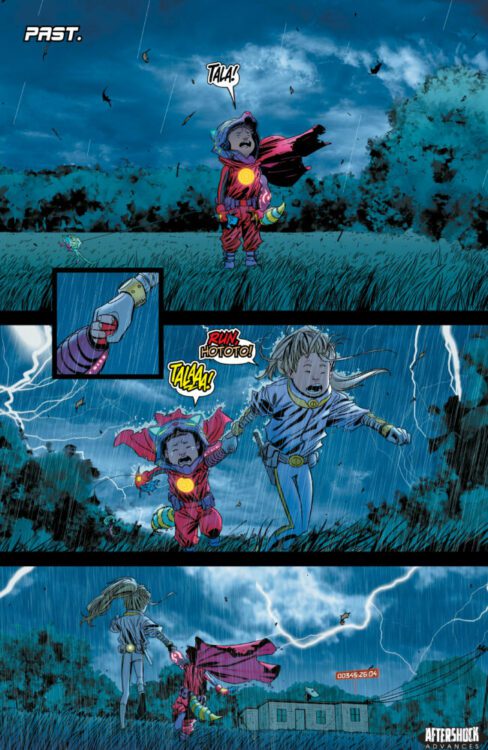
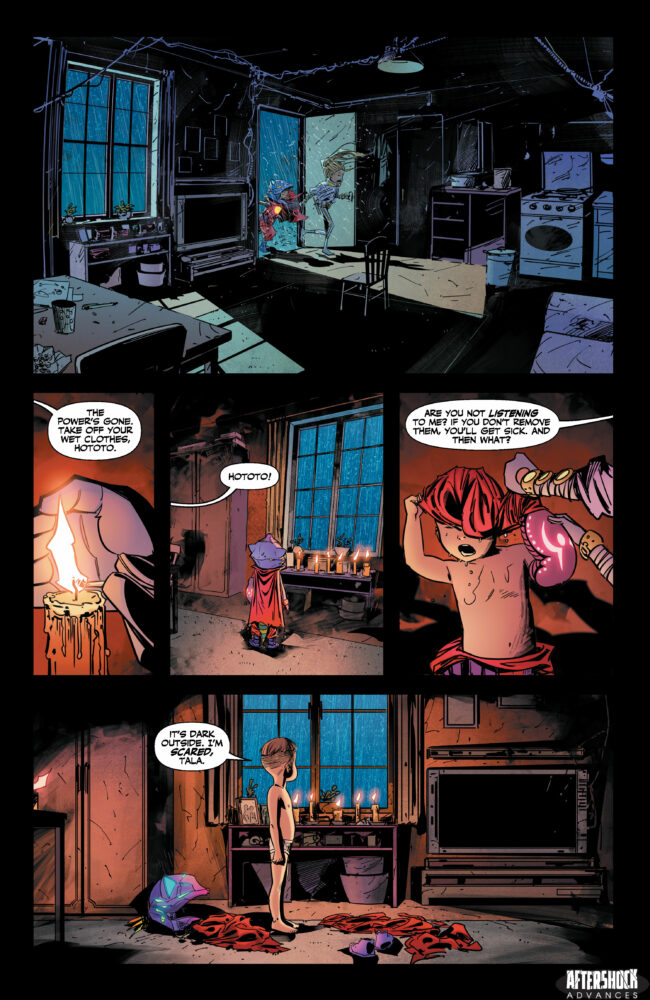
About the trade paperback: Welcome back to the world of WE LIVE — to the hopeful apocalyptic world of Tala and Hototo.
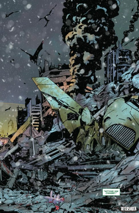
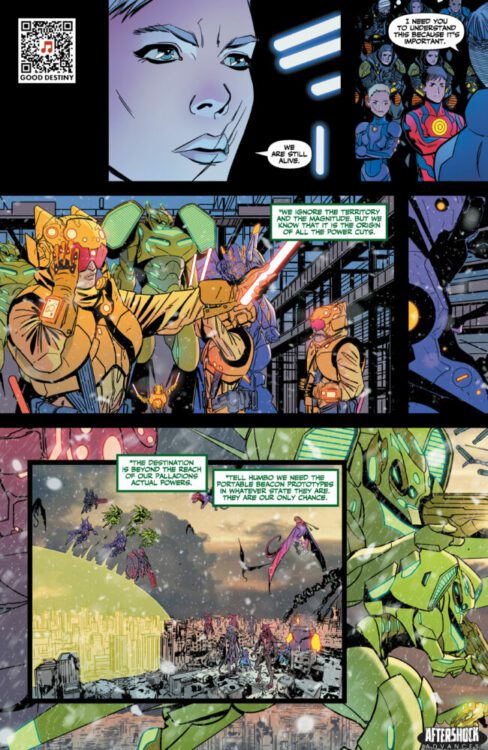
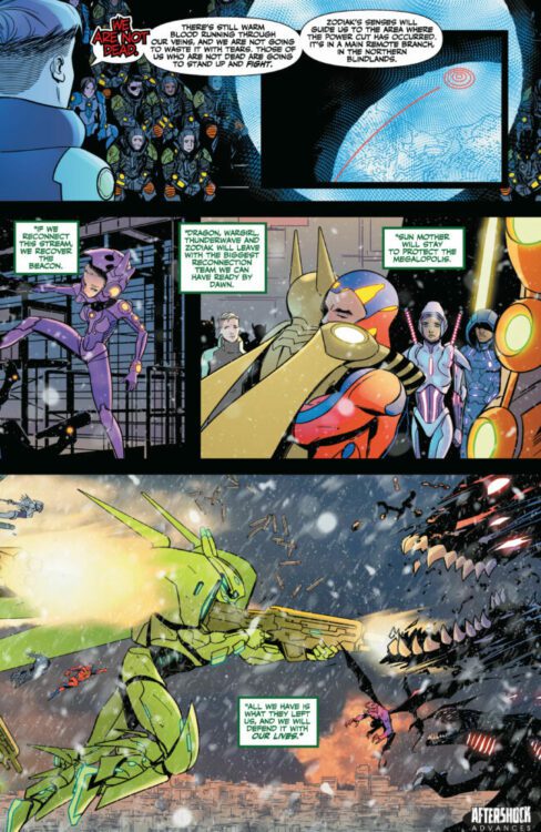
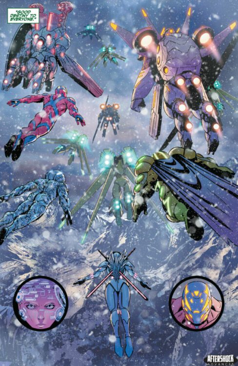
Six years have passed since Salvation Day, when the Palladions emerged as the protectors of humanity, saving the five remaining Megalopolis and securing the future of the human species.
But nothing lasts forever. Death, famine and desperation lurk around the streets of Megalopolis 9. The New Nature has learned how to break the energy channels that power the Beacon, which, in turn, powers the Palladions and the city’s lifesaving shield.
Now, Hototo, along with his sister Tala, plus new friends and old, must venture into the wastelands in search of a solution, to defy the odds and live another day.
Volume one collects the entire second arc, WE LIVE: AGE OF THE PALLADIONS #1 Black, #1 White and issues #2-5.
The series is written by The Miranda Brothers with art by Inaki Miranda, colors by Eva De La Cruz, and letters by Dave Sharpe. The cover is by Inaki Miranda.
Check out our WE LIVE: AGE OF PALLADIONS Vol 2 preview below:
Have you read WE LIVE by the Miranda Brothers? Sound off in the comments!
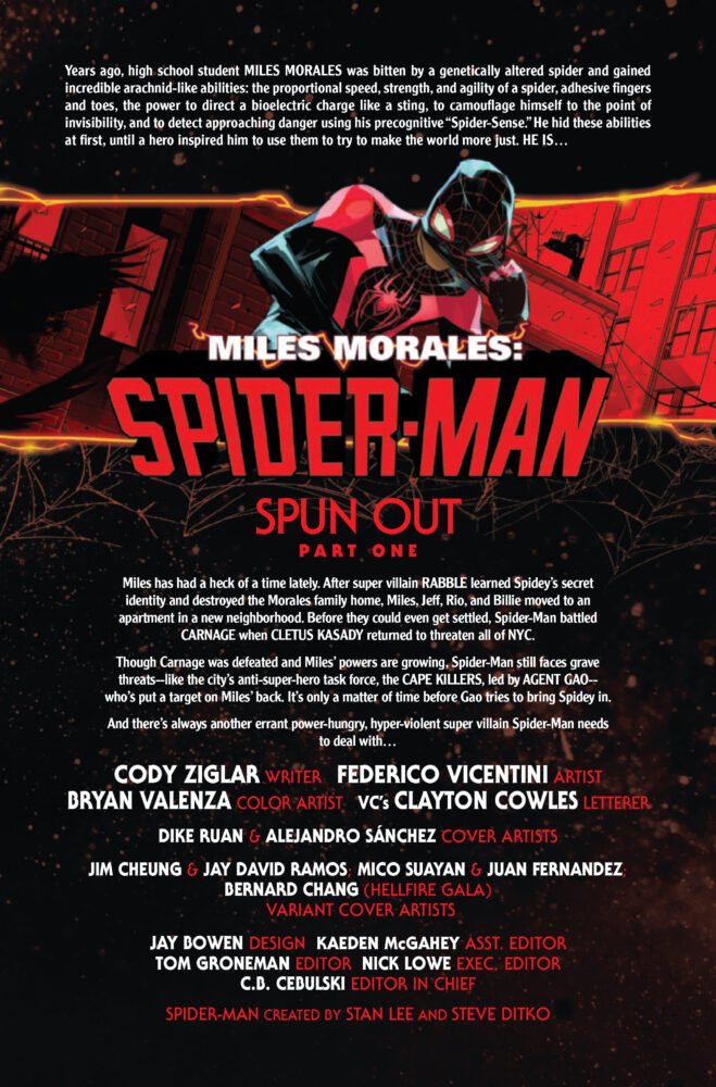
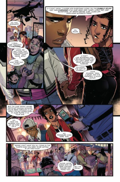
MILES MORALES: SPIDER-MAN #8 hits your local comic book store on July 12th but thanks to Marvel Comics, Monkeys Fighting Robots has an exclusive four-page preview for you!
About the issue: MILES BATTLES THE HOBGOBLIN!
SPIDER-MAN, A.K.A. MILES MORALES, has a target on his spider-symbol’d back. The most dangerous super-villains in NYC keep coming at him – hard. First RABBLE, then CLETUS KASADY and now…THE HOBGOBLIN is back and more dangerous than ever, and he’s got his glider aimed squarely at Miles! How could this get any worse for Spidey? Well…Hobgoblin might not be the ONLY thing Miles needs to worry about…
The issue is by writer Cody Ziglar and artist Federico Vicentini, with colors by Bryan Valenza, and letters by Clayton Cowles. The main cover is by Dike Ruan and Alejandro Sánchez.
This book marks the start of a new story arc for Miles — “Spun Out” featuring the Hobgoblin. Ruan and Sánchez’s cover is an homage to the iconic Amazing Spider-Man #238 cover by John Romita Jr. and his father, the late John Romita Sr.; ASM #238 marked the first appearance of Hobgoblin.
Check out the MILES MORALES: SPIDER-MAN #8 preview below:
Are you reading MILES MORALES: SPIDER-MAN? Sound off in the comments!
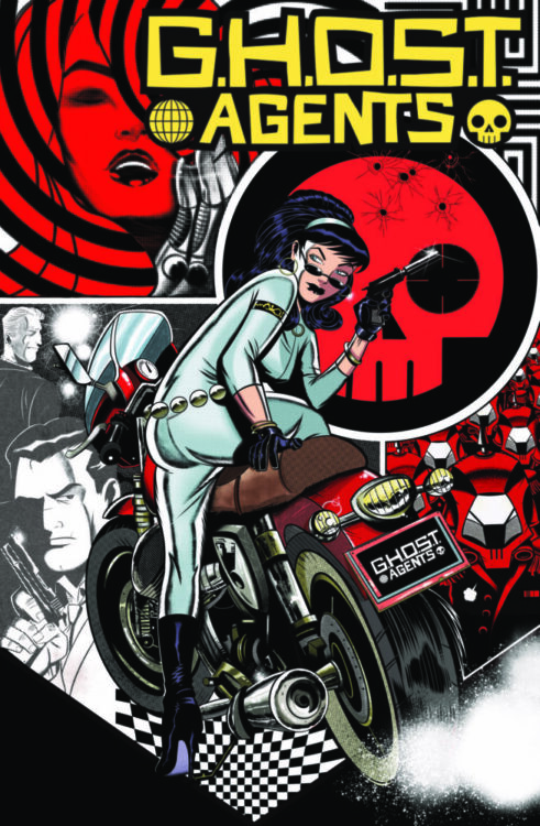
I’ve been a huge fan of G.H.O.S.T. Agentssince its first issue. Writer/Producer Rocko Jerome, along with 20 new artists and outlaw comics icon Ken Landgraf, is making waves in independent comics by riding the Kickstarter system hard. We talked about G.H.O.S.T. Agents: Apocalyptico, a treasury-sized, newsprint-papered book called “a stunning achievement” by cartoonist/podcaster Jim Rugg. He’s currently in the last days of a Kickstarter campaign for the next installment, called G.H.O.S.T. Agents: Crimson Reckoning, which he is feverishly attempting to make successful. Here’s his take on how it’s all going.
G.H.O.S.T Agents creator/producer ROCKO JEROME
Monkeys Fighting Robots: So tell us about G.H.O.S.T. Agents. Rocko Jerome:You mean like what it’s about or how it’s made?
MFR: I’m curious to hear both. Give me plot AND process! RJ:So it’s a spy-fi, sixties, style-as-substance thing that spins out into many genres. It’s all short stories that are very episodic, but if a person commits the bandwidth to read all or a few of the stories, there’s a bigger narrative arc. I write the stories, many artists draw them. I’m monogamous to none. I sleep around. How I make it is that I spot an artist somewhere that I like and just hit them up. Great art you got there. Wanna make some money? If it’s a yes and we connect, I ask them what they wanna draw, how many pages, by when, and then I get high and write that. I always have a few of those going at a time.
MFR: And you used Kickstarter to promote these? RJ: Yeah. My partner, Eli Schwab of Cosmic Lion Productions, and I, we ran five successful G.H.O.S.T. Agents Kickstarter campaigns in 2022. Back to back to back to back to back. We’re running one right now, and it’s our most ambitious one yet. Kickstarter is a fucking miracle for people like us, man.
MFR: Kickstarter is great! How did it work so well for you? RJ:It’s one thing to just go out on a limb and print a bunch of books and try hawking the damn things at local shops, conventions, and whatever pookie-ass online setup you can finagle. It’s quite another to have this established Sherman tank of promotion with a sleek presentation that people are familiar with and a built-in imperative for people to support the thing. You see the goal, you know if it doesn’t hit the goal it won’t be made, you know if you don’t throw in and it does get made, it might be a bitch to get later. It’s all right there for you. And what people don’t tell you is that the profit margin on printing comics is sickeningly thin. A book you can sell for five bucks costs four to print if you do it in America. But a poster you can sell for ten can be printed for a buck. Buttons, stickers, shirts, shit like that, similarly loaded. And Kickstarter helps you package that in the tiers and all that. It’s normalized what we do. Seven years ago, I got my first job in advertising, and I knew Steranko had done that for a while. So I asked him for advice. He said the three big words are new, now, and free, and watch your back. I internalized that. He also said that within ten years, I’d do something really interesting, and I kinda blew him off even though it was flattering. And now I’m almost accidentally doing this shit, so I feel good remembering that.
MFR: What’s the most important thing you would like for people to know about you? RJ:It’s something that you hear a lot from people that make any art at the lowest independent levels, where we’re just kicking cans, but every bit of juice you can get from the squeeze is precious if you’re trying to get something going. Every person whose attention this thing gets, every dime, every share on social media or anywhere, all of it matters. I’m pretty shameless about getting G.H.O.S.T. Agents in front of as many people as possible and selling as many as possible in a way I likely would not be if I drew it. I’m shameless. Because all these artists trusted me to hustle for them. Everybody got paid, and that’s important to me, and I’m proud of that, but now the next thing is, I need this book seen. I look at it all the time. I show it to everybody. I fervently want this thing to succeed because I believe in it beyond any involvement I have in it. I believe in it more than I’ve ever fuckin’ believed in anything I’ve been a part of. This art deserves to thrive.
MFR: So what you are promoting now, G.H.O.S.T. Agents: Apocalyptico and the newer G.H.O.S.T. Agents: Crimson Reckoning, are old-school treasury size and newsprint books, which is a pretty bold choice. I love Apocalyptico and I’m looking forward to Crimson Reckoning. As soon as I opened the book and smelled that newsprint, I was transported to another time. Apocalyptico collects the first three issues of G.H.O.S.T. Agents that you previously did with all these artists, right? RJ:Yeah, that’s right. Or well, there are some changes to a lot of the art, particularly in coloring and stuff. I wouldn’t use the word improvements, but I wanted to add variance, so anyone who bought those previous books wouldn’t feel cheated and might still want this new thing. And I just wanted to try some new ideas out, because newsprint hits differently. Then Crimson Reckoning, that’s all new material.
GHOST Agents Apocalyptico cover. Art by Barry Tan. GHOST Agents title and logo by Sam J. Royale
MFR: Those previous issues, are they still available? RJ: Nope! We printed about as many as we sold and gave the rest of the money to the artists.
MFR: Isn’t the idea of Kickstarter to actually kickstart a project so people can get it later? RJ:I mean, yeah. I guess. We didn’t do that. If you see something that says G.H.O.S.T. Agents on it and you want it, guess you better buy it, huh?
MFR: What separates you from your peers? RJ:I feel like comic writers at the level I’m at, which is, like, barely a comic book writer, they have some big concept in their head, and they maybe are really precious about it. And the way they think of the art is that it’s something they’re gonna go hire. I’m not seeing it that way. I want the artists to soar. I’m like, draw something weird. Draw your nightmares. Push the medium hard. Challenge the perceptions of what a comic book can be.
MFR: finally, what do you wish more people understood about you? RJ:That if this thing works, in five years, I don’t want to be able to afford any of the guys in this book I’m pushing now. I want them all to have made it really big and be swinging hard in the business on their terms. And when that happens, I’ll be doing books with people who will be popping like that in ten years. And I also want everyone to know they can go to GHOSTagents.net and order this badass book that will help this concept keep thriving.
The premise is simple: read one comic every day for the entire year. It seems like a simple task but there is no way that I read 365 comics last year, even if you count the individual issues in collections. So, this year, I am committing myself to this reading challenge, in the hope that I can broaden my reading habits and fully engage with my favorite hobby again.
This week I thought I would catch up on some new (or, at least, fairly new) comics. Issues that may still even be on the shelf of any good comic shop. As you’ll discover this did not really go to plan.
I have no real excuse; I can’t even blame the new series of The Witcher, because that was not out until Thursday. I suppose, it is what it is. Funny how this always happens when I try to read new comics, almost like my brain has an aversion to new and shiny.
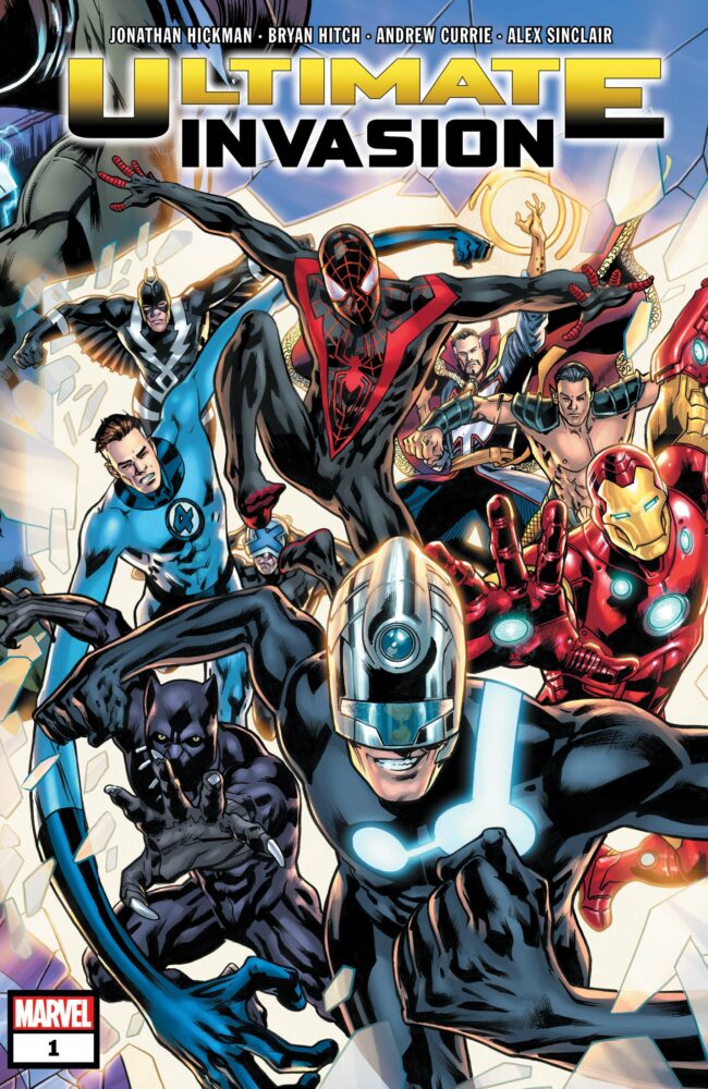
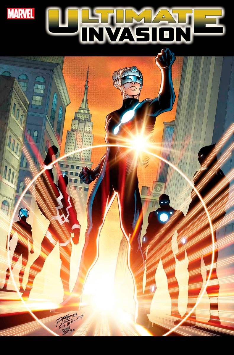
Ultimate Invasion #1 Credit: Marvel Comics
Comic Number 175: Ultimate Invasion #1
On paper, this should be a surefire success, and (judging from the reviews on the internet) it seems to have hit all the right spots for most people. But it just didn’t do it for me. Jonathan Hickman has written a very Hickman-like script with an overload of information, and Bryan Hitch’s artwork is the epitome of modern superhero comics. However, that is the problem with this comic: it’s just another superhero comic with nothing that is really outstanding. It may have something to do with my lack of knowledge (or interest) in the Ultimate Universe. For me, this comic is about a group of people breaking out an evil version of Reed Richards (it took a while for that to become apparent), who then goes home much to the chagrin of the other superheroes.
Insert shrugging emoji here.
It is clear this comic is not for me. I am a massive fan of Hickman and love most of his independent comics. Decorum was one of the best comics to come out in the last five years. It was innovative, challenging, and entertaining. The writing and artwork weren’t compromised by the physical nature of the monthly comic; instead, it was a visual spectacle that engaged and delighted on every page. Ultimate Invasion in comparison lacks innovation and experimentation. It is a wonderful superhero comic that will appeal to people who follow Marvel, and the Ultimate Universe, closely. To anyone else, there is little on offer.
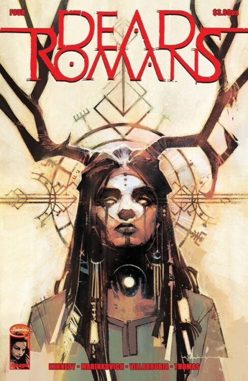
Dead Romans #4 Credit: Image Comics
Comic Number 176: Dead Romans #4
I don’t have much to say about this. I am still loving it. The combination of gritty writing and outstanding artwork makes it a compelling read, issue after issue. See previous posts for what I have said about this comic in the past: nothing has changed.
I’ve really only added it here to highlight its existence and recommend people go buy it.
Go buy it!
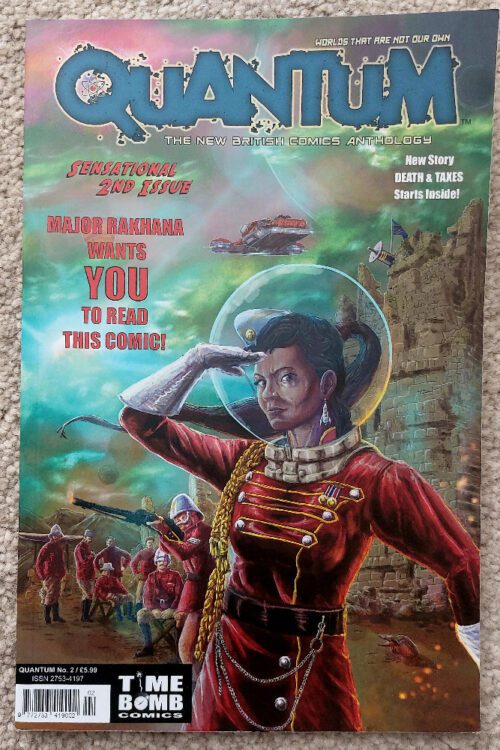
Quantum #2 Credit: Time Bomb Comics
Comic Number 177: Quantum #2
The second issue of this new sci-fi anthology is as good as the first. Some of the stories are blossoming like magnificent flowers, opening up to display depth and complexity with fascinating characters and engaging narratives. Westernoir by Dave West and Gary Crutchley, and Whatever Happened to the World’s Fastest Man?, also by West with Marleen Starkesfield Lowe, are the best of the bunch. They both have strong narratives with a clear purpose and artwork that suits the tone of the story.
The new edition to the line up, Death & Taxes by Katie Cunningham, Tim Newell, John Charles, and Rob Jones is an interesting murder mystery story involving the search for immortality and artificial people. With only six pages to play with, it contains a surprisingly solid introduction to the central character and the world she inhibits. This is achieved through a fair amount of exposition hidden within the caption boxes and speech balloons. The world building is layered into the narrative seamlessly with the strong, noir artwork distracting for an overload of information. It has a gothic horror feel to it with its dark atmospheric rooms, scientific paraphernalia, and brooding mansion house. There’s a butler, a dead scientist, and a knife in a brain. I am looking forward to more from this story, and the creators behind it.
I am not a fan of everything in this comic, however. For example, the two comic strips The Further Adventures of Schrodinger’s Cat and Norton the Dragon have basically the same punchline, but there is more than enough to keep me interested. And the stories I’m not a fan of are still well written and illustrated comics that will definitely appeal to other people.
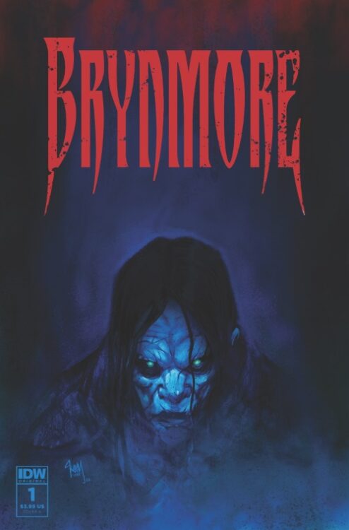
Brynmore #1 Credit: IDW Publishing
Comic Number 178: Brynmore #1
Steve Niles’ new comic for IDW Publishing is a slow-burning, gothic horror with gorgeous artwork by Damien Worm. Each page has a rustic and nostalgic feel to it, but is tainted either by the narrative, with occasions of unexpected violence, or more subtly with encroaching color washes of red or black. As the protagonist begins to build himself a new life, there is an approaching black cloud, threatening the peacefulness of his new start.
I am a fan of Steve Niles. As a writer, he gets to grips with the characters in his stories, making the narrative about them and not the horrors that often engulf the world around them. This first issue of Brynmore is a perfect example of Niles’ work because, with the exception of the final page, this comic is entirely about Mark Turner and his mission to start again, rebuild his life, and reintegrate into his hometown. All of the interactions he has tell the reader something about him, who he is and what he stands for. The artwork focuses on Mark and is shaped by his moods and situations.
This is a character focused comic and because of that, it is a very compelling read. As a reader you become attached to the central character and discover his world as he moves through it. Tensions are built by Mark’s reactions to his surroundings and the opposite is also true. We, as readers, become relaxed when Mark is relaxed.
This comic is not full of gore, violence, or outlandish creatures, yet, but when we get there, we will be so attached to Mark that the journey will be an emotional roller-coaster. How do I know this? Because that’s how Steve Niles works.
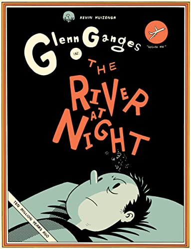
The River At Night Credit: Drawn & Quarterly
Comic Number 179, 180, and 181: The River At Night by Kevin Huizenga
Yesterday was New Comic Book Day and I bought nothing. I read Brynmore digitally because I know that, unless I order it, I will not be able to pick up every issue. So I am trade waiting on it, something I’ve never really done before. If we were to look at all of the new comics that I have bought so far this year, it won’t take long. Gone are the days where I’d walk into a comic shop and leave with armfuls of paper pamphlets and hardback books. There is more putting me off buying new comics now than ever before: cost, availability, continuity, an air of blandness, personal disinterest in the mainstream publishers… the list goes on. I look at my local comic shops and realize they are not for me anymore. They’re for new, younger readers getting into the hobby, or for the old stalwarts who are reading the same comics they have read for 40 plus years, moaning at every change to the characters or stories but still picking up each issue.
My taste in new comics has swung away from monthly superhero or science fiction titles towards high end books like The River At Night. Published by Drawn & Quarterly, the hardback book is over 200 pages of exquisite artwork and involved storytelling. Huizenga tells the tale of Glenn Ganges, who suffers from insomnia and, after a night of reading and drinking coffee, the world in which he lives begins to unravel. The character, and the writer, begin to explore consciousness and our perception of reality. It is also a magnificent exploration of what comics are able to do.
The opening chapter is a prime example of Huizenga’s ability to manipulate the comic page in order to discuss abstract topics. Ganges is rushing to the library before it closes, and he becomes lost in thought, questioning his actions as he experiences a moment of deja vu. Huizenga uses the language of comics to represent this uneasy feeling. Captions inform the reader of the time period but they start to become muddled as they form part of Ganges’ thought process, slipping from the caption boxes into thought balloons. The panel frames begin to overlap and Ganges himself is able to walk freely from one time period to another by stepping from one panel to the next. The whole sequence is magical to read as the constrictions of the comics form are used to create an intense, and often uncomfortable, feeling.
The beauty is that this happens again and again throughout this book. Every chapter focuses on something different, time hopping to examine the personal history of Wendy and Glenn Ganges, and each time the format is used in such a way as to enhance the emotional and narrative context. This is a book that embraces the fact it is a comic and celebrates that. Many modern monthly titles are geared towards creating a sense of realism, almost trying to make the reader forget they are reading a comic, but Huizenga leans into the format and makes it an instrumental part of the narrative process. This is a comic and look at what it can do!!
I can’t recommend this book enough.
And that’s half way through the year. 26 weeks of reading comics and, if we count individual issues, I’m actually well ahead of the game. I have some great comics lined up to read in the second half of the year, and there are a few new titles that I’m hoping to get to. I am also looking for recommendations, so, please comment below with some of your favorite comics.
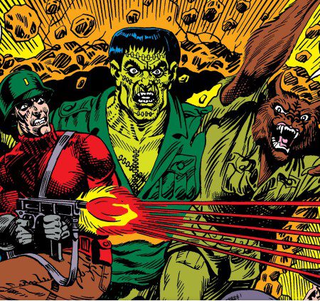
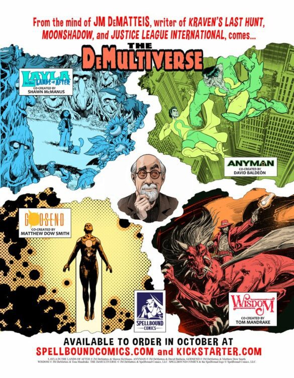
Late last year, DC Studios’ newly minted Co-CEOs and Co-Chairmen — James Gunn and Peter Safran — announced their upcoming slate of DCU movies and TV shows. The first project on their list is none other than Creature Commandos, an animated TV show that will pull from the Weird War Tales stories by writer J.M. DeMatteis, artist Pat Broderick, and artist Fred Carrillo. Mr. DeMatteis, also one of the creative minds behind classics like Justice League International, Kraven’s Last Hunt, and episodes of Justice League Unlimited, was kind enough to answer some of our questions about what it was like to see his weird creations pop back up after all this time.
Monkeys Fighting Robots: When you heard that James Gunn was starting the DCU off with Creature Commandos, what was your reaction?
J.M. DeMatteis: Absolute astonishment. This was an idea I cooked up at the very beginning of my career—and to have it resurface in such a big way, all these years later, was a complete surprise.
MFR: Where did the idea of the Creature Commandos come from? Do you remember how much of it came straight from you versus editorial or from your partners like artists Pat Broderick and Fred Carrillo?
JMD: When I started at DC, new writers broke in on the so-called “mystery” books (they weren’t allowed to say “horror” back then): five-to-eight-page stories for titles like House of Mystery, House of Secrets, Weird War Tales, etc. I was selling stories to Paul Levitz—who edited most of those books (Paul was around twenty at the time and already one of the smartest, most skilled editors in the business)—and always scrambling for the next idea. It was about six months into my DC career when I came up with the Creature Commandos idea (although I didn’t have the title, that came later). For a book called Weird War, it seemed like a no-brainer to have classic monsters fighting in World War II. Looking back, I’m amazed no one else thought of it. I wrote up some notes but, before I could pitch it to Paul, the infamous DC implosion happened and I was out of work for something like ten months. After the DC doors reopened, I began working with the late, great Len Wein—who became both my mentor and good friend. Len was looking for ongoing series for both House of Mystery and Weird War. For HoM, Len gave me a title—I…Vampire—and I created the saga of Andrew Bennett. For Weird War I dusted off the “monsters in WW II” idea I’d hatched the year before and he loved it. I think we came up with the name Creature Commandos together, but it’s been so long that I honestly don’t recall.
MFR: Are you or were you a big fan of Universal Monster movies/Hammer Horror flicks and how much of an influence were they on Creature Commandos?
JMD: When I was growing up, those classic Universal monster movies were always on television. Dracula, Frankenstein, Wolf Man… they were part of the pop culture fabric. I wasn’t a fanatic about them… I was more into science-fiction and fantasy than horror—but I did enjoy them all and watched them whenever they were on. (I have a special fondness for Abbott and Costello Meet Frankenstein, still my favorite horror-comedy ever.)
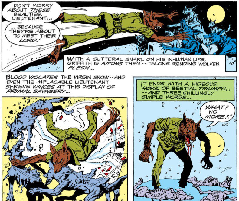
MFR:I could go through each character — Vincent Velcro the vampire, Warren Griffith the Werewolf, “Lucky” Taylor the Frankenstein-esque Patchwork Man, and Lieutenant Shrieve, the most monstrous of them all (yet the only true “human”) — and talk about what each of them brings to the group. Each really represents a response to war – selling your soul but hating that you had to (Velcro), becoming an animal and reveling in the bloodshed (Griffith), or being utterly traumatized by everything around you (Taylor). Did you have a favorite to write, or one you resonated with the most?
JMD: If memory serves, it was “Lucky” Taylor I connected with the most: he was the classic monster with a heart of gold. The disconnect between the grotesque exterior and the sensitive interior made for a fascinating character. I was also fascinated with Shrieve, because he really was the true monster on the team: brutal, cold-hearted. But even he had a deep well of humanity, it was just hidden beneath layers of war-born trauma. Truth is, I enjoyed writing them all. I was a young writer just starting out and there I was, working with, and learning from, Len Wein, creating my own characters. It was a great time.
MFR: If the Creature Commandos stories had been written in the last few years, I would have thought this is a great spiritual successor to something like Inglourious Basterds. But instead, I’d almost think Tarantino had gotten ahold of your comics. You, Broderick and Carrillo use violence in such an effectively satirical way. (I think of Griffith and the pack of wolves.) What do you think makes for effective satire?
JMD: I honestly wasn’t thinking of the Commandos as satire—although it clearly works that way. And maybe that answers your question: To do effective satire, you have to take the subject matter seriously, but just… tilt it a little. The very premise of the Commandos was absurd… and yet it works as a powerful metaphor for the experience of war. Both those elements pull at each other and create something heightened and yet, I hope, grounded in emotional reality.
MFR: You have written screenplays where you hold source material lightly, in things like DC’s Red Son movie or some of your episodes for Justice League Unlimited, being willing to change things up for an adaptation – which I love. It means this iteration isn’t just a carbon copy for a new medium, it’s something new. How do you feel about the changes you can already see in this upcoming adaptation of Creature Commandos? It’s a new cast of characters for the most part. Are you excited to see changes? Is there something you hope those adapting it don’t miss from your comics?
JMD: It’s an adaptation, so they should feel free to adapt! As I’ve learned from working in television and film, you can’t translate these things directly, there are always changes that need to be made for another medium. That said, I hope we get to see the originals in Gunn’s series… perhaps in flashbacks… and that some nod is made to the origins and history of the characters. I also want to add that I never hold the source material “lightly”; you have to have a deep respect for, and understanding of, the source material before you can even think about making changes to it.
MFR: You’re one of the creators behind such amazing teams and characters as the Justice League International, I… Vampire, Maxwell Lord, Frog-Man, and the White Rabbit. You redefined characters like Kraven and the Spectre. What other characters or works would you like to see adapted?
JMD: I’d love to see an adaptation of Kraven’s Last Hunt. Our Justice League International run would make for a wonderful TV series or film. And I’d love to see any of my creator- owned material—from Moonshadow to the recent DeMultiverse titles—make the jump to the screen.
MFR: Your writing creates such an interesting dynamic between levity/silliness and introspective depth. JLI threw the grimdark landscape of the 80s on its head, while something like Creature Commandos takes the campy monster movie characters and adds in a layer of humanity and philosophizing about death. How do you strike that balance? Is there an extreme you feel most comfortable in?
JMD: No, not really. I just follow the story and the characters where they lead. In the end, it doesn’t matter what the tone or genre of the story is, you have to believe in the characters, in the world you’re creating. The more the story takes on a life of its own, the better the story will be. Also, working in diverse genres—as well as jumping from comics to TV to film to prose—keeps my perspective fresh and keeps me interested. If I was locked into one genre or medium, I would get very bored very quickly.
MFR: You’ve co-created classic works like Kraven’s Last Hunt, Justice League International, Batman: Going Sane, and Superman: Speeding Bullets, and you’re still very much involved in comics. Among the works you’re doing for the Big Two, you have also launched the DeMultiverse. Can you tell us more about that and what your plans are for it?
JMD: The DeMultiverse is one of the most exciting creative endeavors of my entire career. Late last year, via Kickstarter and my pal David Baldy of Spellbound Comics, we launched five new titles (four core titles and a bonus book): five first issues, each one in a different style and genre, with five of my favorite artists. These were ideas I’d been nursing for years and it was a real joy to unleash them all on the world simultaneously. The Kickstarter was a huge success and, as a result, I’m already at work on volume two of the DeMultiverse, creating second chapters of Anyman (with David Baldeon), Godsend (with Matthew Dow Smith), Layla in the Lands of After (with Shawn McManus), and Wisdom (with Tom Mandrake). With a little luck, next year will also see the continuation of our bonus book, The Edward Gloom Mysteries (with Vassilis Gogtzilas). Very exciting projects and I hope to keep working on all these titles for a long time to come.
Check Out Creature Commandos and J.M. DeMatteis’ Other Works!
If you haven’t read any of the Creature Commandos stories, DC has collected all of the old Weird War Tales chapters into one volume, available at some comic shops and through Amazon. DeMatteis is also hard at work on his DeMultiverse books. Check out Spellbound’s website on how you can get ahold of those! There’s still no firm release date for the DCU’s Creature Commandos show, but it’s set to come out some time in 2024. If it’s anything like the strange comics that it’s based on, you don’t want to miss it.
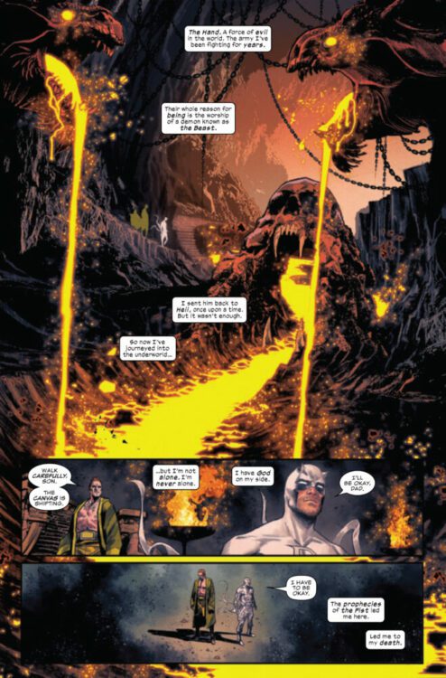
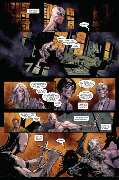
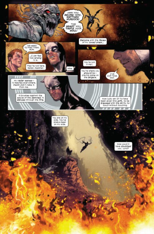
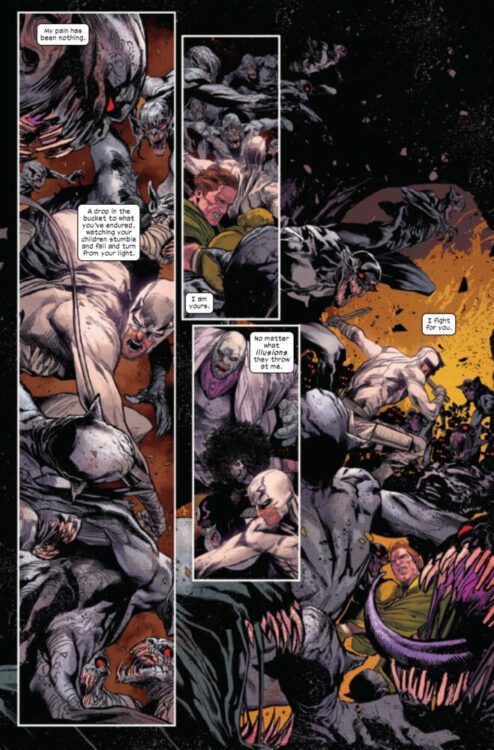
DAREDEVIL #13 hits your local comic book store on July 5th but thanks to Marvel Comics, Monkeys Fighting Robots has an exclusive four-page preview for you!
About the issue: DAREDEVIL IN HELL! Chip Zdarsky and Marco Checchetto are on the last leg of their tour de force through Matt Murdock’s life…and afterlife.
The issue is by writer Chip Zdarsky and artist Marco Checchetto, with colors by Matthew Wilson, and letters by Clayton Cowles. The main cover is by Checchetto and Wilson.
As alluded to in the solicit, Zdarsky, Checchetto, and company are in the midst of concluding their acclaimed run on The Man Without Fear; the final issue is slated to come out in August.
Check out the DAREDEVIL #13 preview below:
Are you excited for the conclusion of Zdarsky and Checchetto’s DAREDEVIL run? Sound off in the comments!
The premise is simple: read one comic every day for the entire year. It seems like a simple task but there is no way that I read 365 comics last year, even if you count the individual issues in collections. So, this year, I am committing myself to this reading challenge, in the hope that I can broaden my reading habits and fully engage with my favorite hobby again.
What is your comic book holy grail? That one comic that, if money wasn’t an issue, you would buy and cherish more than your favorite child?* For me it would be Saru no Wakusei, the Japanese adaptation of Planet of the Apes written by Joji Enami and first published in 1968. The reason for this choice is that Apes is my favorite franchise when taking comics, books and related tie-ins into account, and this is the first comic of the franchise — published long before Marvel got in on the act.
As to why Planet of the Apes is my favorite franchise, I think Corinna Bechko sums it up best in her introduction to The Sacred Scrolls: Comics on the Planet of the Apes:
“In the same way that a prism appears to be a simple lump of glass until it is held up to produce visible rainbows from invisible clear light, the seemingly simplistic setup of a world where apes evolved from men allows us to view every facet of society from a different angle with a fresh perspective.”
So, with that in mind I’m going to read a bunch of different Ape comics, from various eras of publishing to see how they differ and what elements stay the same.
*If my kids are reading this, I love you both equally!
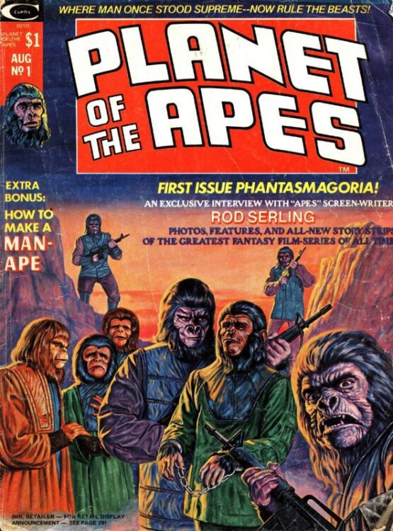
Planet of the Apes #1 Credit: Marvel Comics
Comic Number 168: Planet of the Apes #1 (Marvel Comics 1974)
Over the years I have collected a number of Planet of the Apes comics. Most of the early Marvel ones that I own are from the UK weekly that included backup stories from other comics. However, thanks to the wonderful Hunter’s Planet of the Apes Archive website, you can access copies of the original comics as published, along with other, less known treats.
The original Marvel Apes products were published in a magazine format with a mix of text articles and comic strips. Issue 1 included the first part of Terror on the Planet of the Apes written by Doug Moench and illustrated by Mike Ploog. This is the start of one of the most famous comic book runs of the franchise, and from the very beginning you can see why it is much loved. The story is fast paced, thrilling, and populated with strong characters while the art is superb on every front.
After the first few chapters of Terror, the magazine has a few articles about the film series and an interview with original scripter Rod Serling, before concluding with the first part of Marvel’s adaptation of the first movie. Again the artwork is wonderful but it lacks the depth and finesse of Ploog’s work on the opening comic strip. The opening sequence with the crash of the Icarus onto the planet is dynamic and powerful and demonstrates the commitment the creators had to producing a good comic — not just an easy adaptation. Several pages of silent panels are dedicated to the scene-building suspense and setting the uncomfortable atmosphere that follows for most of the strip. Doug Moench, George Tuska, and Mike Esposito capture the spirit and pacing of the movie (if not the likenesses of the actors) in superb fashion, giving the readers a perfect stand-in for the actual movie, which had long since disappeared from the cinema.
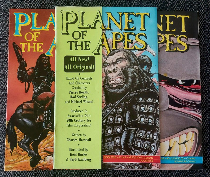
Planet of the Apes #1 (2 and 3) Credit: Malibu Comics
Comic Number 169: Planet of the Apes (Adventure Comics 1990) #1
After the end of the Marvel run, there was a long dry patch for Apes comics. From 1977 to 1990 there were no new Apes comics on the market unless you could read Hungarian*. Then, Malibu Graphics Inc bought up the license and Charles Marshall took the reins. Over the period of three years, Malibu would publish 50 plus Apes comics under their Adventure Comics imprint, with the main title, Planet of the Apes (obviously) taking up 24 of those issues.
On the opening arc, Charles Marshall worked with penciller Kent Burles and inker Barb Kaalberg to reinvent the look and tone of the Apes franchise. The visual element of the strip is the part that stands out most during this run, with the apes looking markedly different to their depiction in the movies and Marvel comics of the 1970s. I don’t think I would be out of place to suggest that the design of these apes was influenced by the late 1980s action movies and the overtly macho visual that was becoming a big part of the comic industry. The first few pages of this first issue contains a number of different ape characters and each one is heavily built with bulging muscles and an overpowering physical presence. Even the human characters, when they do turn up, are fairly buff, but the difference in size and stature is emphasized in every panel. Charles Marshall’s apes are true beasts.
Set shortly after the fifth movie, the Adventure Comics series has more aggressive apes with violence as a major component to the narrative. Some of the humans have speech and high intelligence, but others do not. A lot of the details of the world are not examined or explained but the physical planet itself, with various locations and features, is explored at great length, especially in some of the mini-series from this era (see below). As the story moves into the Forbidden Zone, grotesque mutants are introduced and new species of ape.
This iteration of Planet of the Apes is jarring compared to the other entries into the franchise, especially because of the visual direction that the creators took. It looks, feels, and reads like a small independent publication, with more stylistic artwork and a fast paced plot. There is the sense that everything has to be included at once because no-one is sure if they’ll get another issue. I personally am not a fan of the artwork, and I do find the scripting to be awkward at times. Some of the speech is real B-Movie standard, which is kind of fitting for the franchise, but it doesn’t read like a knowing nod to the heritage of the movies. Exposition is dropped into the speech and the captions to advance the story as quickly as possible.
Having said that, this series is a thrilling ride, if you can accept the artwork and speed through it at the same rate as the writer. Read it, don’t question it, enjoy it, and move on. Wasn’t that the mantra for 1990s comic industry?
*The original novel was adapted into a comic, A Majmok bolygója, and published in Hungarian in 1981. According to Wikipedia it has never been officially translated, however there are fan translations available online.
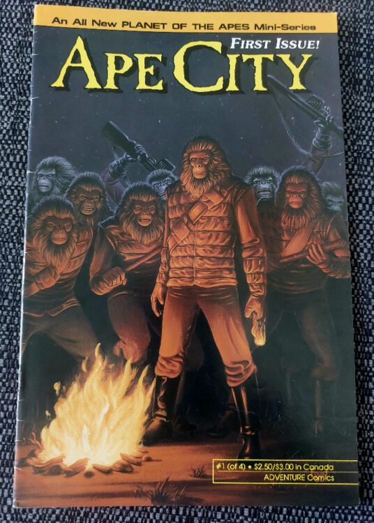
Ape City #1 Credit: Malibu Comics
Comic Number 170: Ape City #1
Adventure comics published 24 issues under the title Planet of the Apes. They also published a small collection of miniseries and annuals set on, or around, the same world. Ape City was their first spin-off and it was something a bit different, as Charles Marshall notes in the introduction: “Instead of more mean gorillas and apes shooting it up on horseback, I [Marshall] had a vision of a pack of gorillas on big, mean Harleys, tearing down a deserted highway like the Horsemen of the Apocalypse”.
The artists are different from the main title, with M.C. Wyman on pencils and Marvin Perry Mann on inks, which means that the look of the comic is also different. The apes are more in line with the movie visual, although they still suffer from broad shoulders and exaggerated physiques.
Set in Europe at roughly the same period as their other title, Ape City throws everything at the wall and doesn’t bother to stop and check if any of it sticks. There are ape lounge singers, ape gangsters, ape scientists, ape ninjas, and a time-traveling human suicide squad hell bent on killing 500,000 apes for reasons that don’t really matter. This comic is like a bag of frogs. Heavily armed frogs. Heavily armed, cliché-spouting frogs. With a guitar.
Out of all of the Apes comics I have read, this is the one that I feel people will either love or hate with no room for mixed feelings. It has some great qualities, the artwork is much better than the sister title, but it suffers from a plot that makes little sense and a pace that is nearly fast enough to send the daughter of George Taylor into the future to find her father. Oh yeah, that’s one of the narrative threads in this story.
They took a risk with Ape City and it succeeded to a point. It demonstrated that it was possible to tell stories in this franchise that were new and different from the original without drifting too far from the core element of the world. The more advanced city aspect of the narrative makes sense in this comic. An army of 1940s style gangster apes, less so.
But it’s all fun until the humans show up. The depiction of the humans in this miniseries is the one element that dates this comic. They are archetypes of the early 1990s comic book heroes, or anti-heroes depending on your viewpoint. Early Image Comics are full of these types of macho, weapon wielding, thugs. It’s not clear if you are supposed to be on their side or not. I think that Marshall was probably hoping the reader would support them in the same way that an audience is on the side of the Suicide Squad, but there is nothing to like about these characters. They take the fun out of an otherwise enjoyable romp.
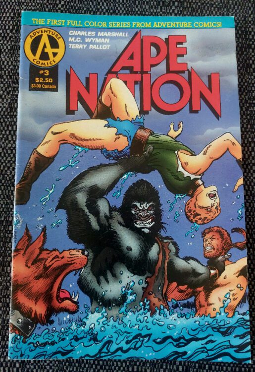
Ape Nation #1 Credit: Malibu Comics
Comic Number 171: Ape Nation #3
Ape Nation was another miniseries published by Adventure Comics. It was a four-issue crossover with another of their licensed properties, Alien Nation. I have included issue 3 because I only have this issue, however, the comic is quite fascinating. It is the first example of a cross-over with the franchise, something that BOOM! Studios would pick up and run with in the 2010s, and the first full-color series from the publisher.
From a narrative point of view, the inclusion of the Tectonese into the Planet of the Apes story makes perfect sense here. Marshall creates a credible plot and one that doesn’t really alter the timeline of the original movies (there is a sense of alternative dimensions from the narrative but without the other issues I never really followed it. To be honest, it actually doesn’t matter). Alien Nation was chosen as a partner for the apes partly due to ease (the publisher owned the rights to both), but also because the B-Movie nature of both franchises made them comfortable bedfellows. The outlandish stories both have the same contextual undergrowth: the examination of difference and racism. Unfortunately, that isn’t something that is really developed in this series but it lays the groundwork for future endeavors.
A quick word on the artwork: it is fantastic. M.C. Wyman and Terry Pallot use very fine lines and clearly love drawing individual strands of hair. The colorist is David de Vries and they are the one who makes this version of Planet of the Apes different and more exciting that the other Adventure Comics runs. There are clear contrasts between the species which are then made more subtle when dealing with particular characters. Each page immediately sets the scene, outside or inside, and the contrast between landscape and characters is immediately noticeable so that the reader can identify character and location before reading any of the text. The colors in this comic make it easier to follow the narrative and is a great addition to this era of ape stories.
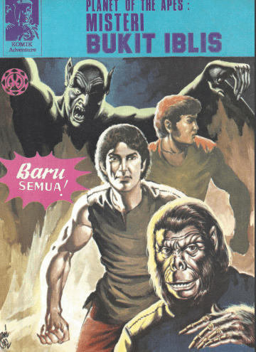
Misteri Bukit Iblis #4 Credit: Maranatha
Comic Number 172: Planet of the Apes #4 (Indonesian publication)
I have read a few of the Dark Horse Comics Planet of the Apes stories that follow the 2001 Tim Burton re-imaging movie but after skipping through a couple of issues today, they didn’t really grab me. They don’t appeal to me but that’s not a judgment on the writing or art, I just find them difficult to get excited about.
The Indonesian Planet of the Apes comics, however, are a different story. Oh boy, are they a wonder to behold. Back in 1981 Indonesian publisher Maranatha produced a number of issues telling stories of high adventure involving apes and humans traveling together in a similar vein to the television series. In fact, the first few issues are re-telling of some of the television episodes.
Translated versions can be found on the Hunter’s Archive site and I highly recommend checking them out. They are hilarious, mostly for the wrong reasons, and are like elaborate works of fan-fiction. You cannot fault the dedication that writer and artist Harry Mintareja puts into the comics and the artwork within the panels is very good. The layouts are simple, two panels per page, with explanatory caption boxes in practically every one. However, the actual stories, especially after the first two issues, are pretty dreadful. The dialogue is cringe worthy but I wonder if some of that is down to the translation process, but no amount of dialogue fixing would be able to save the narrative.
However, as examples of comic book history, and parts of the Planet of the Apes franchise, these comics prove to be fascinating. The appeal of the Apes franchise obviously stretched out from America and reached so many parts of the world that the concepts and stories were picked up and continued, even in unofficial formats. Mintareja was inspired by the previous movies, television shows, and comics enough to produce his own work. The result may not win any Eisner Awards but it does find a place in the hearts of fans, eager for more and more Apes stories. But it also gives researchers of popular culture another avenue to explore in relation to the phenomenon that is Planet of the Apes.
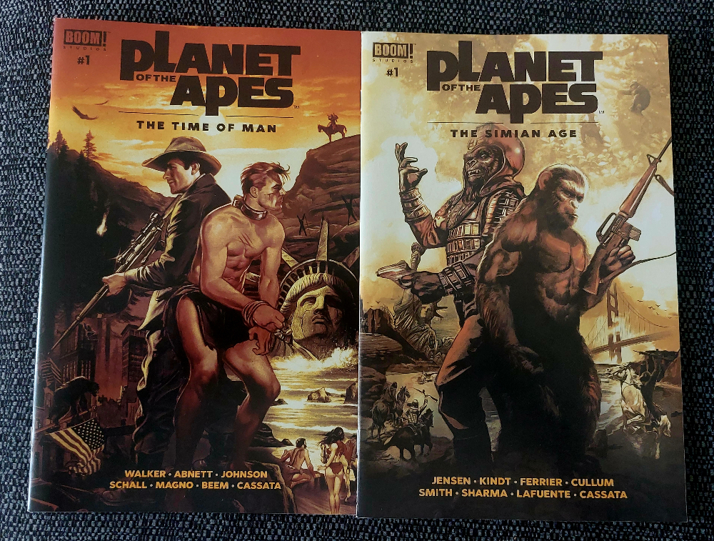
The Time of Man and The Simian Age Credit: BOOM! Studios
Comic Number 173: The Time of Man and The Simian Age
These two are the newest comics in this week’s list. Both are BOOM! Studio annuals and are anthologies featuring several short stories set across a range of continuities. They are also the only comics I have read in the last two weeks that have any link with the rebooted Planet of the Apes movies, of which installment four is currently in the works. “Mountain” by Phillip Kennedy Johnson, Morgan Beem and Ed Dukeshire is a wonderful tale of humans hiding from the ape revolution. Fear is the enemy in this narrative and compassion is the hero. In contrast, “Cloud and Rain” by Ryan Ferrier, Lalit Kumar Sharma, Gabriel Cassara, and Ed Dukeshire demonstrates the power of hate and anger in manipulating the political and social worlds of ape and human.
The Time of Man features two more stories that both share an emotional outcome. One firmly set between the films Escape and Conquest, and the second set much later, detailing the treatment of human pets. This second story, written by Dan Abnett demonstrates the indifference that many of the ape’s have towards the humans, before the purge as depicted in other BOOM! Studios ape comics. But this is a reflection on the way that we, in our current society, treat our pets, wild animals, and to a certain degree the environment as a whole.
The Simian Age also contains three stories. One of them is about a rebellion born within a gorilla soldier who befriends some humans. However, it is the first story in the comic, Mother of Exiles, written by Jeff Jensen and illustrated by Jared Cullum that is the most interesting. The moving tale is helped along by the watercolor style artwork which creates a dreamy, wistful atmosphere. There is the sense of longing, of isolation, and then of hope. The ten page comic encapsulates the very best of Planet of the Apes, in references and emotional contexts. It stands above all of the other stories in these two comics despite each one being a worthy addition to Ape lore. The letters here are by Ed Dukeshire as well, who worked on all of these stories, which in itself is impressive. His work changes subtly between the era’s to reflect the slightly different tones and art styles. It’s fascinating to look at one creator’s work in conjunction with many others within one comic.
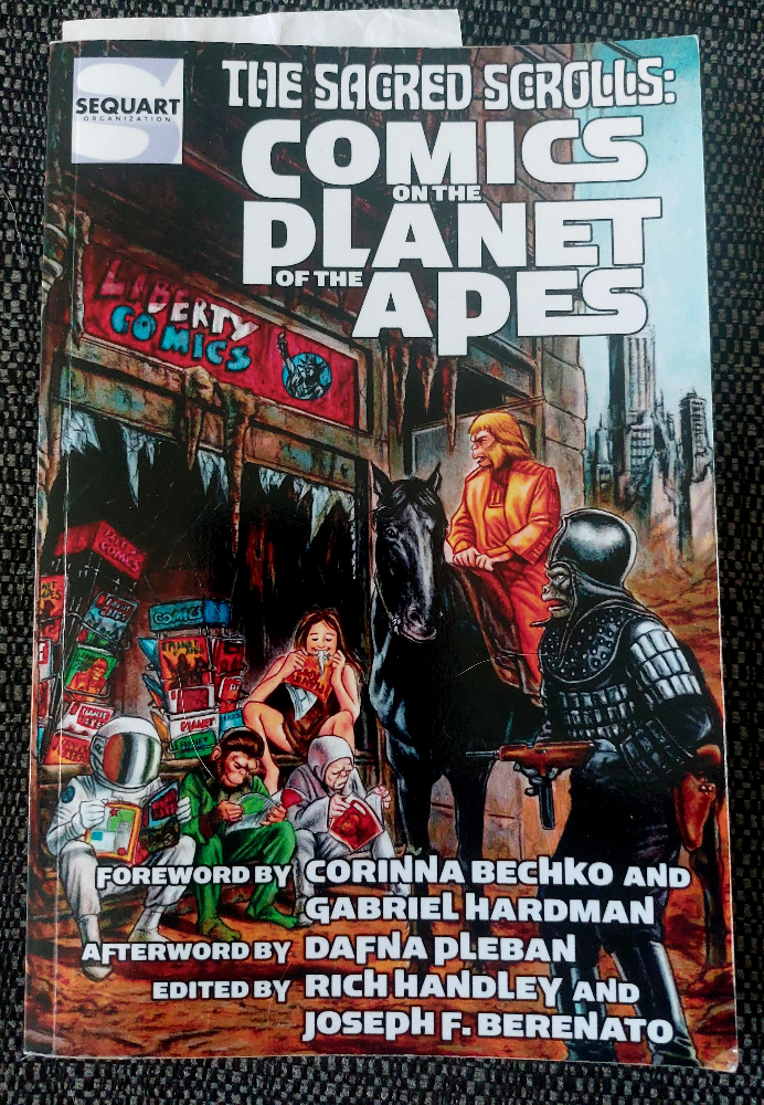
The Sacred Scrolls: Comics on the Planet of the Apes Credit: Sequart
Comic Number 174: The Sacred Scrolls: Comics on the Planet of the Apes (published by Sequart)*
Over the last two weeks, while reading Planet of the Apes comics, I have also been reading books and essays about the franchise that have increased my fascination with it. For example, Susan Bridget McHugh’s article in the South Atlantic Review (Vol 65 No 2) entitled Horses in Blackface: Visualizing Race as Species Difference in “Planet of the Apes” took the racial depiction within the movie franchise to new levels that I’d not even considered before. I am also re-reading John Jakes’ adaptation of Conquest on the Planet of the Apes and noticing turns of phrase and details that I hadn’t previously. And, I re-read The Sacred Scrolls, a wonderful book about the history of the comics from the franchise.
Broken down into a collection of essays focusing on different runs of the comic, The Sacred Scrolls takes an in-depth look at the narrative and artistic qualities of the comics and how they fit into the grander scheme of the franchise. I don’t think there is a single stone left unturned as the book covers comics from all over the world as well as touching on comics that were never even published. If you have any interest in the comics relating to Planet of the Apes, this book is indispensable. It is conversational in tone and doesn’t delve too deeply into sociological or political readings of the texts but then it is designed as a guide to what’s available and succeeds perfectly at being just that.
*I know, it’s not a comic but another book about comics. But I read 40+ issues last week, surely I’m ahead of the curve at this point?
It’s hard not to just excitedly ramble on and on about Marvel Comics’ Ultimate Invasion #1. Writer Jonathan Hickman and penciller Bryan Hitch dive back into the characters and stories they’ve already left such an indelible mark on — along with inker Andrew Currie, colorist Alex Sinclair, and letterer Joe Caramagna. These creators have played in this sandbox before. They’ve created pure magic and gripping intrigue, and blown readers out of the water. In doing so, they’ve given themselves big shoes to fill with a comic like Ultimate Invasion. Thankfully, they absolutely deliver!
Writing
There are two amazing things at work in Hickman’s script. First, you get the sense that all of this has been years in the making — and that’s because it has. Hickman pulls characters, lore, and details from his runs on Fantastic Four, Avengers/New Avengers, Ultimate Comics: The Ultimates, and X-Men. For each story he references, Ultimate Invasion feels like a natural culmination of those plotlines. But that’s only the half of it.
What makes Hickman’s writing sing is that he balances his high stakes, thoroughly-planned, universe-altering plot with a grounded, personal center. This isn’t about the Ultimate universe. It’s not about dead worlds or clandestine power moves. Ultimate Invasion is about Mr. Fantastic and the Maker — each the Reed Richards of their own earth. The Maker is a dark version of the leader of the Fantastic Four that we all know and love, but he makes some strange, twisted sense. The Maker is inhuman and insane. Or is he? Maybe he’s just a version of Reed Richards that doesn’t care what other people think. Hickman knows that a return back to Earth-1610 might get our minds reeling. But it’s the warring ideologies of these haunted men that gets our hearts involved.
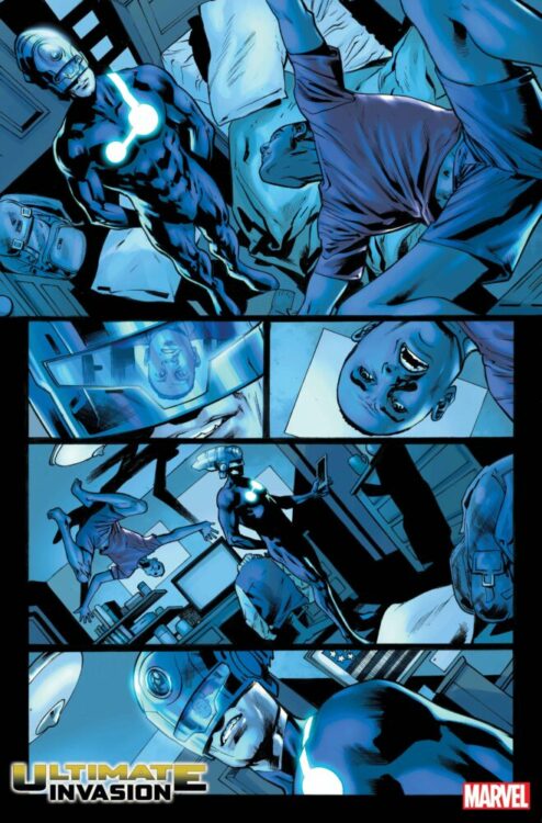
Art
Our introduction to Ultimate Invasion sees a strike team hitting some unknown location. There’s gunfire, explosions, and panic. Hitch and Currie lean into the chaos. Each panel focuses us in too close to see the whole of what’s going on. We see helmeted soldiers aiming at one another, rockets being launched, and explosions that obscure who it is exactly that’s blowing up. We’re often left wondering who is shooting at who, until it’s clarified a panel or two later. Hitch and Currie makes us feel like we’re right there, surrounded by the battle and unable to focus on anything other than dodging bullets and trying to get out alive.
In one particular scene, we see Miles Morales and the Maker have a brief conversation. In the background, the walls are covered in posters, windows, and square furniture. As the two stand in the foreground, the wall behind them looks ever so slightly like a comic book page. They look like characters who have jumped out of the panels and escaped the reality they were supposed to be confined to, which is especially fitting for refugees of a lost world.
Coloring
Sinclair brings so much intensity to the plot through color. Most scenes are cast in an overwhelming hue that changes all the colors in each panel to shades of a single color. When the soldiers enter the location they’re attacking, the alarms turn the entire place red. When they reach their destination, in the lower levels of the building, everything changes to a cool blue. We feel the blood-pumping action of the first scene change to what should be a relaxing aura. Except that Sinclair is playing with us here. We know that whatever these soldiers are after can’t be good, so the blues that are supposed to calm us actually make us lean further forward in our seats. Sinclair is telling us “everything is okay now” just so we can catch him in the lie and worry all the more. It’s a brilliant effect that elicits an incredible amount of dread. Sinclair makes use of this genius technique throughout.
Lettering
Caramagna takes a very grounded and minimalistic approach to lettering in this issue. There are no flourishes in the fonts or the word balloons. Everything is straightforward and downplayed. There aren’t even any sound effects. Bullets fly by silently, bombs go off with no fanfare, and people teleport in and out of places without a sound. The few things in the lettering that do stand out are still quite subtle — with one amazing exception. First, Caramagna draws our attention to the differences between the Maker and those around him. He’s from a different universe, and the font in which he speaks isn’t in all-caps like the rest of 616’s denizens. Elsewhere, a character is speaking as they melt away. Their font looks wobbly and uneven, though only slightly so, and their word balloon remains normal. But in the final moments of Ultimate Invasion #1 we get our first sound effect, written in big, thick, red letters. Caramagna draws our eyes to it to underline its significance and add to the drama with a final, exciting display.
Verdict
UltimateInvasion has the unique distinction of having to meet big expectations — expectations set by the same people working on this very book. Luckily, Hickman, Hitch, Currie, Sinclair, and Caramagna rise to the occasion — even exceeding expectations — and give us a book that is both exciting and grounded at the same time. This is just the beginning of what I’m sure is going to be a wild ride to remember. Ultimate Invasion #1is out from Marvel Comics at a comic shop near you! Do not miss this unbelievable event, you will regret it.
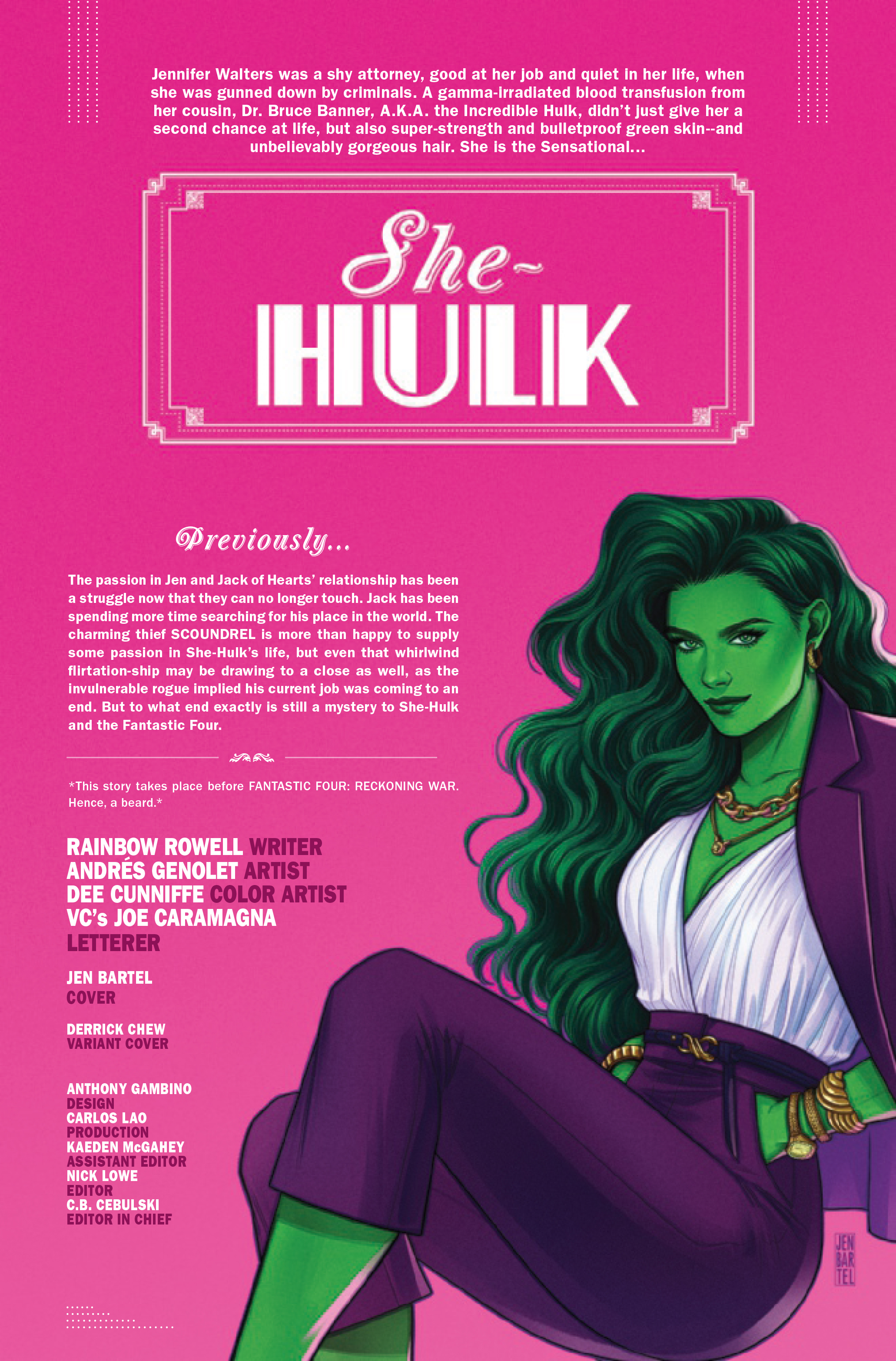
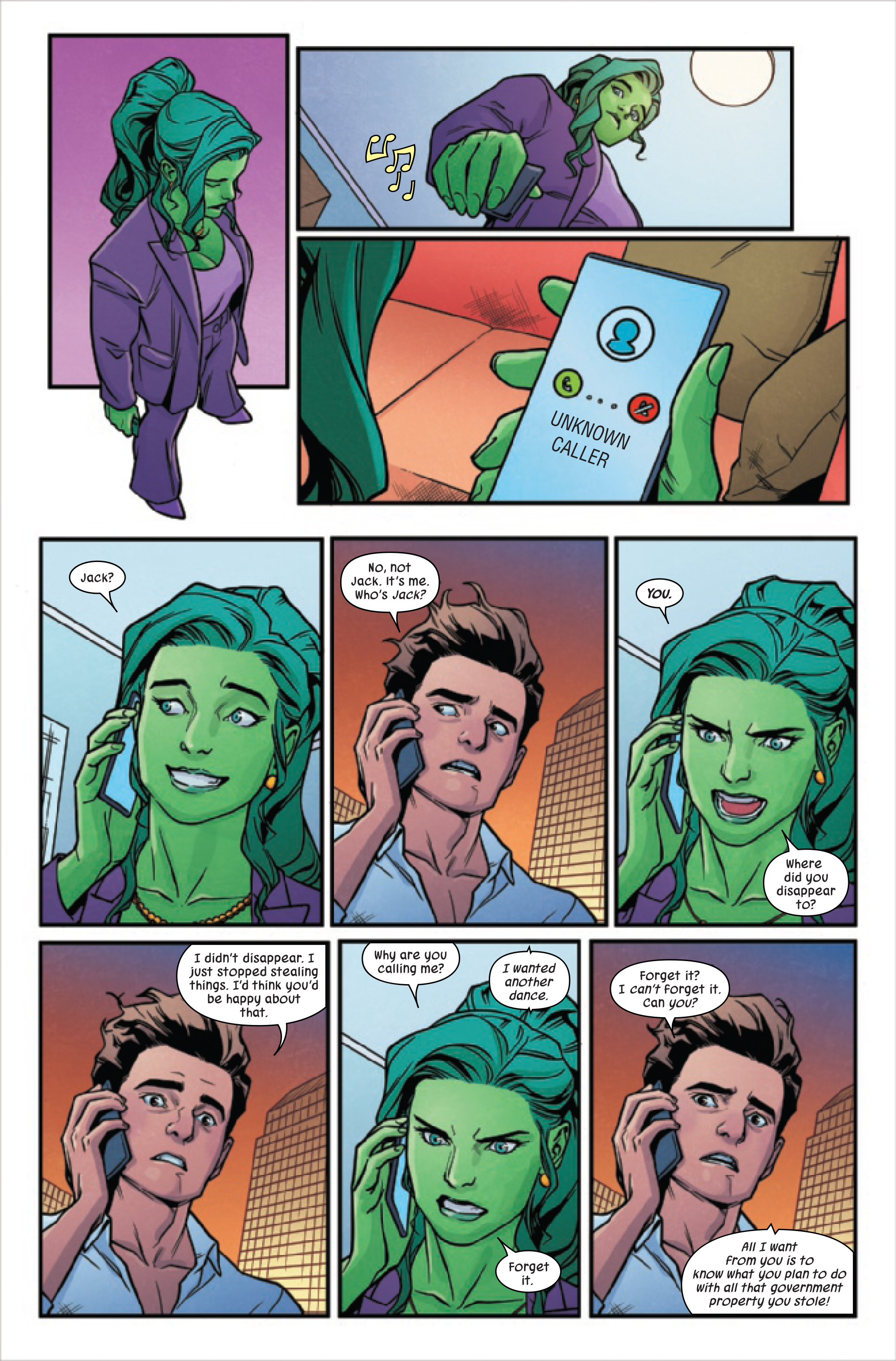
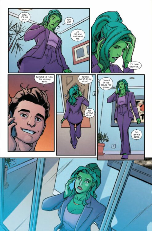
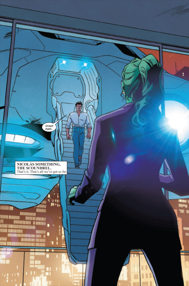
SHE-HULK #14 hits your local comic book store on June 28th but thanks to Marvel Comics, Monkeys Fighting Robots has an exclusive three-page preview for you!
About the issue: The secret history of THE SCOUNDREL revealed! The coolest new villain of 2023 has been shrouded in mystery, but SHE-HULK is putting on her detective hat and getting to the bottom of it…
The issue is by writer Rainbow Rowell and artist Andrés Genolet, with colors by Dee Cunniffe, and letters by Joe Caramagna. The main cover is by Jen Bartel.
Check out the SHE-HULK #14 preview below:
Are you reading Marvel’s current SHE-HULK comic? Sound off in the comments!
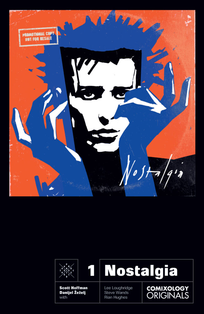
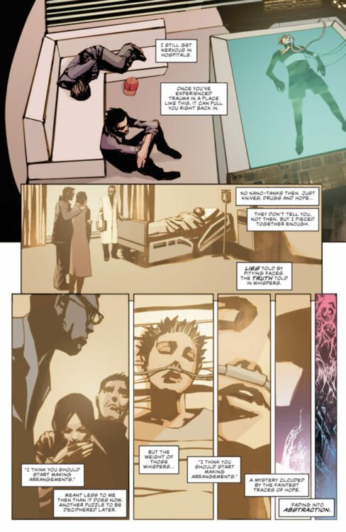
NOSTALGIA #3 hits the digital space on June 27, thanks to Comixology, Monkeys Fighting Robots has a five-page preview for our readers. The book is written by Scott Hoffman, with art by Danijel Zezelj, Lee Loughridge drops the colors, and you will read Steve Wands letter work.
About the series: Nostalgia, a reclusive rock star in a dystopian near-future, receives a mysterious package, addressed from a fan, that leads him to face a shadowy character from his past. As Nostalgia gets closer to Nathan and, hoping to sway him from his bad influences, invites him to stay with him; new faces emerge from Nostalgia’s past, leading them to visit an old friend on his space station.
Enjoy the preview below.
About the Creators: Scott Hoffman (aka Babydaddy) is perhaps best known as the co-founder of the multi-platinum selling rock/disco/glam/pop band Scissor Sisters. Alongside Jason Sellards, aka Jake Shears, Scott co-wrote and produced the music, and from 2001-2012 the band toured worldwide, received (among others) an Ivor Novello and multiple Brit awards, garnered multiple top 10 singles and sold nearly 7 million albums worldwide. “I Don’t Feel Like Dancing,” one of their collaborations with Elton John, went to number one in 9 countries and was a top ten hit in many others. The band’s music was used in countless films and TV shows, and they wrote and recorded original songs for projects including the closing credits for the film “Party Monster” and a sequence in “Shrek: Forever After.”
As a writer/producer, Scott has worked alongside Jason with artists such as Bryan Ferry and Kylie Minogue (their collaboration “I Believe in You” was a worldwide hit, debuting at number 2 in the UK charts). Since the band’s hiatus, Scott has been working for/with other artists including Demi Lovato, Melanie Martinez, Tinashe, Chris Brown, Ariana Grande, additional work with Kylie Minogue, and FRENSHIP (whose “Capsize”, which he co-wrote, has earned over 550 million streams on Spotify alone).
In addition, he has written original music for films including “Kill Your Friends” and has scored three major television shows including “The Great Indoors” for CBS and “Hoops” for Netflix.
Danijel Žeželj is a graphic novelist, animator, illustrator and painter. He is the author of twenty five graphic novels and eight short animation movies. His work has been published by DC Comics, Marvel, Dark Horse, Heavy Metal, Image, Glénat, Dargaud, Eris Edizioni, The New York Times, Harper’s Magazine, etc. Since 1997 he has created a series of multimedia performances merging live painting with live music. They premiered in Europe and the USA. In 2001 in Zagreb, Croatia he co-founded a publishing house and graphic workshop Petikat. He lives and works in Brooklyn and Zagreb. For more head to: https://dzezelj.com/