What happens when you take a 90s-style family sitcom, but switch out the charming, all-American family for Skrull invaders, and the day-to-day tribulations for a sinister interplanetary plot? You get Meet the Skrulls #1.
Skrulls are embedded throughout human society, disguised as ordinary people. Our narrative settles on one Skrull family in particular, the Warners. Their mission is to uncover details about the mysterious Project Blossom, all in service of conquering Earth to host their new throneworld. While the “spies hidden in plain sight” thing may not sound too new, there’s a lot here that works.
The Writing
Similar to shows like The Americans, Meet the Skrulls #1 relies on a family of protagonists carrying out espionage work. The characters check all the right boxes: the gruff father who hides a sensitive side, the caring mom, and the outsider teenager. Scratch the surface, though, and you find a lot more going on.
Much of the issue’s intrigue focuses on Project Blossom, the project the Skrulls are moving desperately to stop. At the same time, they’re being hunted by an unnamed man in a black coat working for the project, who appears like a character out of a stylized Western. However, there’s another dimension of storytelling at work, too.
One of the greatest strengths of Meet the Skrulls #1 is its understated storytelling. Tight dialogue hints at underlying tensions and threads to develop in later issues. Often, though, Thompson allows visual cues from artist Niko Henrichon to fill-in the gaps. Numerous panels allude to a third Warner child lost in the battle. But, rather than just plant that idea for cheap drama, Thompson uses it as an opportunity to build emotional sentiment, to the point that you actually begin to empathize with the family intent on destroying humanity.
The Artwork
As mentioned above, Niko Henrichon’s artwork plays a key storytelling role. It’s rare to see a writer/artist team so clearly in-sync. Even beyond that, though, it’s still excellent work even on its own.
He employs a lighter, penciled line style, which is filled-out by vibrant and heavy colors. While there is not much action in this first issue, he keeps things dynamic in the way he composes panels. Henrichon does an excellent job of capturing minor expressions, and conveying their weight.
Final Thoughts
Meet the Skrulls #1 offers great, understated storytelling and fantastic artwork. It takes what could be a goofy concept, and injects a surprising level of complexity. Highly recommended.
The stage is set; the characters have taken their places; and all await the unravelling of Oberon’s plan. The second issue of AfterShock Comics fantasy adventure leaves the mortal world behind and takes the reader into a magical land.
Brimming with character and adventure, this second issue faces the difficult challenge of transitioning totally from the real world into the imagined.
Writing/Story
Bonnie is still reeling from the news that she is adopted and waking up in the tree house of a Fairy King simply adds to her culture shock. Luckily Nicholas Walker, man servant, is on hand to dispense food and a touch of wisdom.
And then Oberon himself makes his grand entrance, ready for the adventure ahead.
Ryan Parrott writes his characters as if they are from a lavish stage production: all but Bonnie that is. This approach is perfect for a tale of this nature as it has all the hall markings of a Sandman comic and revels in the performance of each character.
In contrast Bonnie is written with a down to Earth attitude and almost a resistance to the magical elements that she is faced with. The stark difference between the central characters are apparent on each page. Oberon is larger than life and every time he speaks you get the impression his voice fills the room he is in. Bonnie on the other hand is small in size and stature. She is often depicted smaller than the other characters, viewed from above or it is shown that others have to physically come down to her level.
This contrast in presence is Parrott’s way of reminding the reader who is, currently, in charge of the situation. Many schemes and plots are in process, some of which still aren’t known to the reader, but Oberon is in charge of them all. Bonnie is a lost girl looking for guidance, in the same way as the reader is.
Parrott fills the plot with an array of mysteries and intrigues, drawing inspiration from the old Shakespearean tradition. As this second act unfolds, the writer is not afraid to introduce many more characters and plot threads. It may take some readers a second read through to pick up on all of the comings and goings but the poetic writing makes this a pleasure not a chore.
Oberon #2 Credit: AfterShock Comics
Art
One element of the comic that every reader will revisit before reaching the end of the issue is Bonnie’s journey into the maze. This forms an important part of the narrative but there is a wonderful trick that the artist employs to enhance the difficulty that Bonnie has.
This sequence, like much of the comic, is a call back to another famous fantasy; in this case Labyrinth. The setup is slightly different but the early onset of frustration that Bonnie feels is the same as the one Sarah feels in that movie. The way that Milos Slavkovic handles it is simply wonderful and you may not even notice it at first.
The rest of the comic shows off Slavkovic’s creative brilliance and attention to detail. Whereas the first issue was very grounded in reality, for the most part, the artist has really let his imagination flow for this second issue. Oberon’s world is full of wonder and spectacle. Slavkovic also manages to cram in a large number of ominous omens which mirror Oberon’s double dealings. Images of skulls and imprisonment are subtly, and not so subtly, entwined into the fabric of the world building.
Taking a lead from Parrott’s flamboyant central character, Slavkovic has produced an over the top, theatrical stage for Oberon’s story to be told. In other comics this would be too much but here, his style is spot on.
The letter, Charles Pritchett, adds another layer of theatrics to the show. His speech balloons give the characters’ voice emphasis with additional support by the bolding of text. The script becomes a performance in Pritchett’s lettering style so much so that it’s difficult not to read each character in a different voice. This is especially true in the conversation between Oberon and Mother Mayie. The contrast between them is brought to life by the opposing speech balloons. A lot of the characterisation of these two is brought out through their speech, which is as it should be for a theatrical piece like this.
Oberon #2 Credit: AfterShock Comics
Conclusion
The story relies heavily on familiar themes and references, something which may put people off. However, Parrott and co are not doing anything that Neil Gaiman didn’t do when plundering older literature for his Sandman comics. The characters and situations may seem familiar but it is the way that they are made different that marks Oberon out as an enjoyable read. Noticing the differences is part of the game.
The art work is superb with close attention to detail and emotion. It is comical in places and stomach turning in others. The only time there is a drop in art standards is when there is fast action. Here the characters are stilted, more amateur dramatics than Royal Shakespeare Company. However, this does not mar the rest of the comic, and these moments are kept to a minimal. It’s just not that type of comic.
Oberon is enjoyable, clever and deliberately over the top. It is well on its way to becoming a fantasy series worth watching for.
This week’s Green Arrow #50 officially marks the end of the series’ Rebirth incarnation that started back in 2016. Now we have word from DC Co-Publisher Dan DiDio that plans are underway for a new series that will make the Emerald Archer “part of the bigger DCU.”
DiDio spoke on video to “DC Daily” about Green Arrow‘s end and eventual new beginning.
“It’s a milestone issue – it’s also the last issue, which is kind of interesting. The book is still performing well for us, but we decided to end the story there because we wanted Green Arrow to play very intricately in a lot of the stories and events that are about to take place across the DCU.”
Comic series are ended and restarted regularly, so you may be wondering what the news is here. Let’s go back to February, when Green Arrow co-writer Jackson Lanzing went on Twitter to discuss DC’s surprise decision to end the book. He wrote that initial plans were for him and Collin Kelly to do “a long run”:
The pair apparently had full support from DC to wrap up old Green Arrow story threads (including some from Heroes In Crisis) before moving on into their new, long form adventures. Lanzing continued:
Now, in DiDio’s words:
“We didn’t want to run in two sepArate directions. So we’re bringing one story to close and let this other chapter going [sic]. But to be very frank with you, we will have another Green Arrow book. He’s one of my favorite characters.”
DiDio used the transition from a Green Lanterns series to Grant Morrison and Liam Sharp’s Green Lantern as an example of his thought process here:
“Every once in a while you need to do a reset. You saw that with ‘Green Lanterns’ to ‘Green Lantern’ with Grant Morrison, so I feel that with Green Arrow we wanted to… show how he’s part of the bigger DCU again, then spin him out.”
You can watch DiDio’s entire “DC Daily” interview here; his Green Arrow comments come around the 7:40 mark.
Have you been picking up Green Arrow? Are you looking forward to seeing what DC’s new plans are for the character? Lets us know in the comments!
The world of Doomsday Clock exploded in more ways than one. The hero Firestorm gets pulled from the sky by civilians in Moscow during a protest. In self-defense, the nuclear hero unleashed his powers, turning the crowds into glass. He runs to Khandaq to seek sanctuary and to begin working to find a way to reverse it. Superman soon joins Firestorm and with their joint efforts find a way to reverse it. The pair head back to Moscow, but the pair are met with hostility. Superman defends Firestorm, causing the world to turn on him as they have with the other Metahumans. During the fight that breaks out, an explosion goes off, killing hundreds of civilians and knocking out Clark. What will happen with the world’s greatest hero injured and hated?
**Some Spoilers Below**
Story:
Shortly after the Moscow incident, the Justice League and other major teams leave the Earth. They do this as they have located the source of the explosion on Mars. That source is supposedly Doctor Manhattan, but Batman is skeptical. While he is recovering from the Moscow incident, he sends a message to the League, which will take around thirteen minutes.
Meanwhile, Superman has been knocked out cold by the explosion. In his comatose state, the world turns against him. People march on the Hall of Justice, the president tweets his disapproval, and Russia demands blood. The only one who gives any hope of bringing the true mastermind to justice is Lex Luthor.
When I read the opening pages, I was worried that we were going just to get fan service. Watching all our heroes get wrecked by Manhattan could have been a disservice to what made Watchmen great. However, I couldn’t help but smile watching Manhattan study each attack on him. He doesn’t even fight back. He just takes each of the powers and studies them as they come at him. It was quite entertaining.
The only negative I can think of is that Lex Luthor just comes out of nowhere. Not that his sudden appearance is unbelievable, it’s the fact we haven’t seen him since issue the fifth issue. It feels like Geoff Johns suddenly remembered that these conspiracies and master plans Ozymandias is up to is right up Lex’s alley, so he needs to be the one to reveal it. If Doomsday Clock has a more solid release schedule, I would probably be okay with it. When you have such large gaps in the story, however, it doesn’t do wonders to the flow.
Art:
Doomsday Clock continues to be the best looking book DC is putting out. The illustrations hook readers in and drag them into the world. From every battle to every expression, the level of detail is out of this world. With the story and art on the same level, it almost forgives the amount of time in between releases.
Conclusion:
You can tell how good a comic is when the biggest complaint is the release schedule. Focusing more on action than emotion, this issue Is a thrill with every page. The art takes the story further with the masterful level of details. Doomsday Clock is setting up for a universe-shaking, and I for one can’t wait.
THE DREAMING concluded its first arc in the dynamic and dramatic previous issue. Battles were had, revelations were made, and one can’t help but admire the complexity of the story being told. In this latest issue, we step away from the Dreaming as the dust settles after the epic bout with Judge Gallows to a focus on what Daniel has been up to since THE SANDMAN UNIVERSE #1.
**Some Spoilers Below**
Story:
A pale god has wandered the Earth, banished and bound. For one ill-fated family, he leaves only the wreckage of a cataclysmic romance. As the Dreaming convalesces after its recent upheavals, at long last it’s time to follow the footsteps of its absent master. But we must tread lightly. For where Dream walks, heartbreak follows.
Writer Simon Spurrier delivers an emotional, human story about dealing with things that are beyond our control. We are (re)introduced to some characters we’ve met earlier, including Rose Walker, who first appeared in Neil Gaiman’s original SANDMAN as the grandchild of Desire of the Endless. We also meet Rose’s mother, dying of cancer in a hospital. She was also seen way back in the Sandman Universe special, where Dora helped ease her suffering with dreams she had forgotten.
While I would have preferred to read on about the primary on-goings in the realm of the Dreaming, this is a well told interlude that fits in nicely with the bigger picture at play.
Art:
Now that THE DREAMING has shifted focus to the human realm, it seems reasonable that the style of artistry would shift as well. Abigail Larson takes over for the magnificent Bilquis Evely.
Larson’s illustrations are much more tame than Evely’s, which is likely their intent. I was particularly a fan of Larson’s use of smoke, which wafted and waved throughout each page. It was a clever device to lead the reader through Rose’s story.
Colors by Quinton Winter were less surreal than done in the previous issues. Winter’s use of a more bold palette when in the flashback sequences were a nice contrast to the dialed down colors in the hospital. The letters by Simon Bowland brought it all together, utilizing different styles for different characters, as well as emphasizing the right words to help express the dialogue’s inflection.
Conclusion:
THE DREAMING #7 is well-told, human story. Hopefully it work its way back to the realm of the Dreaming sooner rather than later.
What do you think of THE DREAMING so far? Let us know in the comments!
With the Batman/Flash crossover event The Price concluded, Batman #66 returns to the Knightmares story arc, dragging Bruce back into an endless string of bad dreams.
Selina and The Question sit down to try and re-litigate the wedding’s last-minute cancellation. Along the way, Selina recounts episodes in her courtship with Batman, and delves into the idea of whether or not Batman can ever find peace and happiness.
The Writing
As with other chapters in the current story, Batman #66 takes place in Bruce’s mind. He’s tortured by a question he can’t—or doesn’t want to—answer: why did Selina break it off?
The issue is an enjoyable retrospective on the gradual development of between Batman and Catwoman’s relationship. Around the halfway point, it pivots to commenting on Batman’s character; specifically, what about him makes it hard to maintain a connection like he had with Selina. By the book’s end, though, something The Question asks makes it seem like she may have second thoughts.
Batman #66 is a good chapter on its own. However, we’re not any closer to uncovering the plot of the story arc, and readers can’t really blamed for feeling that the story’s dragging a little. If you missed it, you would be unlikely to miss much of the broader narrative.
The Artwork
Artist Jorge Fornés contributes art for this issue, and does a great job capturing the tone of the work. Pages of conversation between Catwoman and The Question are divided primarily into grids, but with variation to the pattern. He matches the beats of the writing, rather than trying to force the writing to conform to the visual motif.
Fornés embraces a sparse, spacey, and minimal look for the conversation, as though it’s happening in a void. He breaks up Batman #66 with action-filled flashbacks, though, keeping it from getting boring. It’s in these moments that his skill really shines through; you can clearly read emotion in characters’ expressions, and get a feel for tone in a panel’s composition. It’s the mark of a skilled artist.
Dave Stwart opts for a high-contrast look in the conversation pages, giving it a sterile, clinical look to match the line work. In flashbacks, though, the colors are perfectly-toned to the emotional pitch of the situation.
Final Thoughts
Batman #66 is a good exploration of Selina’s feelings, and of Bruce’s character. However, it’s not a necessity if you’re just trying to keep up with the narrative.
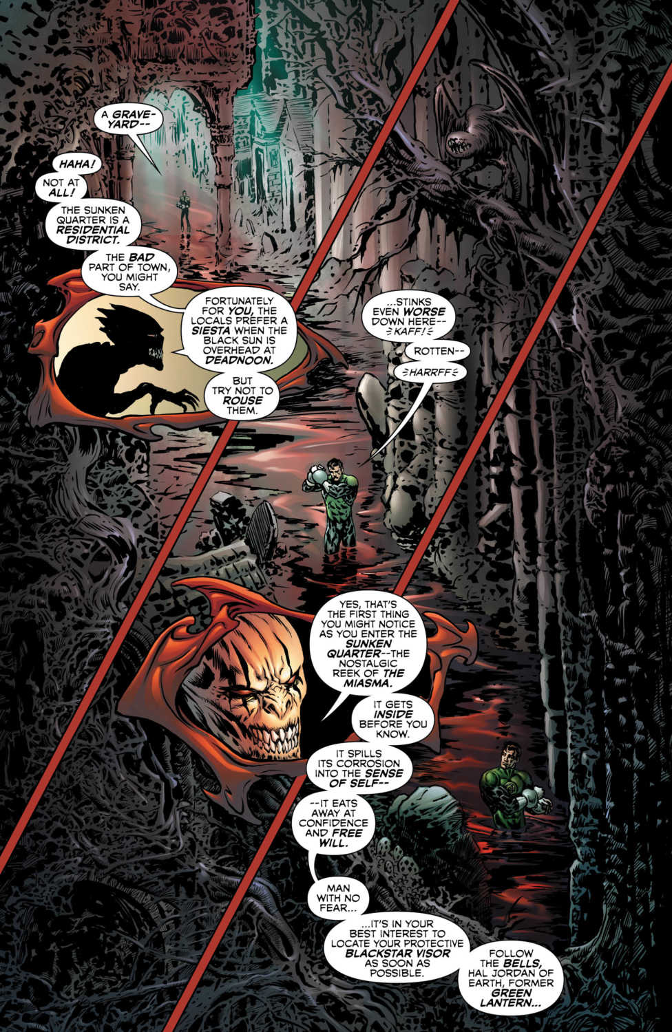
Hal Jordan and the Green Lantern Corps have spent most of Grant Morrison’s run fighting valiantly against the evil Blackstar militia group. But a new twist of fate sees Hal volunteering to join their ranks. Which isn’t all too surprising given his growing dissatisfaction with the Corps methods. Now readers will see if Hal has what it takes to survive the Blackstar initiation process.
Story
The issue wastes no time getting the initiation process underway by plunging Hal into the vampire-filled planet of Vorr. Countess Belzebeth, after handcuffing him, leads Hal through a landscape of gore and horror. The space cop soon realizes everything is not as it seems and finds he must leave aspects of himself behind in order to survive.
It seems Morrison is leading Hal down a path of no return in this issue, but not in the way one might think. The story’s danger lies less in the vampires attacking Hal and more in the psychological ramifications of each initiation task.
Hal learns Belzebeth’s initiation test was designed to serve as the antithesis to his most cherished qualities: individuality, confidence and willpower. These qualities are preventing him from passing the test, and Hal must learn to let go of his bravado and surrender to the Blackstar Collective.
Morrison presents two intriguing versions of Hal in this issue. The classic version of Hal confronts his doubts and fears head-on with a smirk, while the new version, the Blackstar recruit Hal, begrudgingly surrenders his will to Belzebeth. It’s up to the reader to decide which version is truly “Hal” as he dives deeper into the Blackstar’s ranks.
Art
Issue #5 is another visual treat for fans of Liam Sharp’s cosmic artwork. His penciling on the cover and throughout the issue brings to mind the complexity of life in all its glory and horror. It’s almost as if the reader feels the life in each illustration through Sharp’s use of sketched lines that pulse throughout the pages. Also, Steve Oliff’s coloring adds a clear distinction between Hal’s costume and the gray colors of Vorr, further emphasizing his disintegration from the Green Lanterns. Tom Orzechowski’s lettering gives character to the inhabitants of Vorr as Hal navigates his way through their neighborhood.
The variant cover more or less serves the purpose of highlighting Hal’s former Green Lantern glory. Joe St. Pierre and and Steve Firchow use bright greens to emphasize the light he’s leaving behind. The artists also use solid shading and straight lines to represent the straight-laced, uncompromising attitude Hal must also abandon.
Conclusion
Hal undergoes a grueling self-discovery process that’s full of action. Regardless of motive, it’ll be interesting to see how this Blackstar ordeal impacts his psyche. Rest assured, the masterful writing of Morrison will make sure it’s mind-blowing.
What did you think of Hal’s Blackstar initiation? Let us know in the comments below!
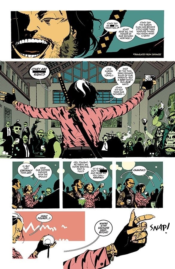
The creative minds of Greg Pak and Giannis Milonogiannis have introduced RONIN ISLAND, an engaging story centered on a group of displaced peoples from China, Japan and Korea. Issue #1 follows two brash samurai students as they learn to overcome their animosity towards one another and work together. Their struggle underlies a deeper unrest within the community as they seek to forge a collective identity amid cultural conflict.
Story
Many writers struggle to define their characters at the beginning of a new series, but Pak is up to the challenge. The issue dives right into characterization from the get-go, presenting concise backstories for its two main characters: Hana and Kenichi. Readers learn Hana, an orphan, comes from a poor farming community while Kenichi hails from a prestigious line of samurai warriors. The only bigger clash than these distinct backgrounds is their competitive personalities.
A big theme in this story is multiculturalism, which is wonderfully emphasized by the village’s mantra: “Together in Strength.” Hana and Kenichi struggle to apply this motto during a samurai trial. One can feel the frustration in both characters as they let loose their preconceived prejudices. They eventually find that it’s much more difficult to succeed when cutting the other person down. The challenge ultimately shows the students the importance of embracing differences and coming together; that is where one finds true strength.
The samurai trial serves as a foreshadow for an impending threat, one bigger than they’ve ever faced. And their only hope of survival lies in the words of a mysterious stranger.
This story wonderfully underscores the very real human fear of the “other.” Readers will find new BOOM! Studios’ favorites in Hana, Kenichi and the others as they face their fears in the coming issues.
Art
Milonogiannias’ penciling creates a solid structure for the issues artwork while the collaborative work of Irma Knivila and Simon Bowland bring it to life. The vast landscapes of the island are coupled with highly-detailed houses and buildings to provide the reader with an authentic East Asian setting. Knivila uses variations of brown and green to emphasize the community’s dependence on the island’s natural environment. In addition, Bowland’s variations in lettering sizes underscore crucial thematic elements, such as the island motto.
The main, preorder, and variant covers give alternative takes on the story in masterfully diverse ways. Milonogiannias’ penciling and Msassyk’s colors give form and structure to the main cover by highlighting the determined looks of its main characters.
Ethan Young’s preorder cover depicts the story’s East Asian setting with monochromatic shades to bring to mind peacefulness and traditional art from the time period. The variant covers offer unique interpretations as well; David Lafuente and Germán García’s version focuses on the coming conflict while Kris Anka’s emphasizes each of the protagonist’s weapon of choice.
Conclusion
RONIN ISLAND #1 offers an engaging story with highly relatable characters. Themes of multiculturalism and diversity abound, making this one of the most fitting tales of our modern time.
Are you looking forward to issue #2? What do you think of the threat? Let us know in the comments below!
Teased back in December of last year, JUSTICE LEAGUE #19 is the first part in Snyder and Jiménez’s storyline The Sixth Dimension, where the League is pit against older versions of themselves, courtesy of Mxyzptlk.
This first issue of the event is, to me, a much needed respite from the overarching (and sometimes overwhelming) story involving The Source Wall. Huge revelations were made, and the team is now one step closer on their journey to saving everything. But before the Justice League can make their way to this sixth dimension, they must first deal with an utterly unhinged Mr. Mxyzptlk.
**Some Spoilers Below**
Story:
“The Sixth Dimension” part one! At last, the Justice League has the map to the Sixth Dimension in hand—and with it, they have the key to saving the Multiverse from utter destruction! But things aren’t as simple as they seem, because they still need to get to the doorway—and to do that, they’ll have to go through the only being in all of existence who can get them there: Mr. Mxyzptlk!
After doling out justice at various places in the cosmos, as well as uncovering more of the mystery of The Source Wall, the core members of the league (now with more Starman) are finally back together. They now have a plan to prevent Lex Luthor from awaking Perpetua, and bringing about the end of the Multiverse.
In JUSTICE LEAGUE #19, Scott Snyder once again delivers on his quest to completely change the DC Universe. He does so by utilizing Mr. Mxyzptlk in a way that has rarely been seen before. This is a Mxy who, if given the chance, could take down every single member of the Justice League in a manner of minutes. The way that Snyder chose to write this, a sequence in which Mxyzptlk brings familiar buildings to monstrous life while manipulating the reality of some of the League members, is both entertaining and horrifying.
The dialogue is worth noting, too. I couldn’t help but smile at Superman’s moments with his signature messages of hope. Where Snyder excels is in his exposition, particularly when Mxyzptlk reveals information about his fifth dimension, as well as the newly unveiled sixth.
Art:
Jorge Jiménez creates some wonderful visuals in this issue. From something like the angle and curvature of Metropolis as Superman flies through it, to a beautiful spread containing imagery of the League, the Multiverse, and the Sixth Dimension, Jimenez masterfully lays out panels that are unique and intricate.
It all comes together with the colors of Alejandro Sanchez, particularly in the background of the panels. Standouts include the pinks and purples of inter-dimensional space, the whites and beige of the Hall of Justice, and the glowing and glittering look of the new, elder Superman.
Conclusion:
Snyder and co continue to make JUSTICE LEAGUE a great book to read, with a high concept story, sincere heroes, terrifying villains, intriguing revelations, and captivating artwork. If you’re a fan of this run of JUSTICE LEAGUE, this issue will not disappoint. Conversely, it will get you excited with what’s to come, both as an introduction to the “The Sixth Dimension” event, as well as a continuation of the overarching Source Wall story.
What did you think of Mister Mxyzptlk in JUSTICE LEAGUE #19? Let us know in the comments!
Rick Remender and Wes Craig’s brilliant series continues it’s brutal and shocking run with DEADLY CLASS #37.
***SPOILERS LIE AHEAD***
Saya and her f*cked up family drama continues to take center stage–and for good reason. Quan continues to see his stock fall after betraying his fellow classmates. Saya’s brother, Kenji, has been slowly becoming one of the best adversaries our cast has faced.
Deadly Class #37 focuses entirely on Quan, Saya, and Kenji’s gang. Remender has really put Quan threw the ringer in service of Kenji. His role at the bottom of the totem pole serves as a reminder of how sick and twisted the series can be.
Kenji treats his gang to a night out at a brothel and it gets pretty vulgar before the fireworks begin. Remender has done an exceptional job at slowly but surely molding Kenji into a fully-formed villain with a clear objective.
This whole chapter of Deadly Class has pushed Saya back into the forefront, even if she spends a lot of it as a captive. At the end of issue #37 she’s primed and ready to get back to work–weapon in hand. She also dispatches of Quan in a shocking moment after his desperate attempt at redemption.
Saya and Kenji’s inevitable showdown will most likely be a memorable and explosive epic. As much as I would like to get Saya back to Marcus and the other students, her family saga has been highly entertaining and I wouldn’t mind lingering a bit longer.
Wes Craig delivers another platter of brutal action and stylistic sequences. There is nobody else in comic books right now that illustrates action and chase sequences as effective as Craig. Every time the pace picks up, it’s a shot of adrenaline directly into the reader’s brain.
Colorist Jordan Boyd is an underrated member of this creative team. Boyd’s work on this series gives an added layer of style and appeal. The old school color pallet and subtle deployment of that beautiful red blood helps this book continue to stand out in an era full of creative comic book art.
Deadly Class is one of the strongest long-running ongoing series. Remender, Craig, and Boyd are a creative trio operating on another level that many teams can’t maintain for this many issues. The series continues to get better and better, still keeping us all on our toes.