Home Blog Page 478

Review: THE EMPTY MAN #5 Pushes The Characters To Breaking Point

Monkeys Fighting Robots

Over worldly horrors and the weakness of Human kind forge the backbone of BOOM! StudiosThe Empty Man series. Part all-consuming virus and part supernatural invasion, The Empty Man twists and turns each issue but at its beating heart is the story of human suffering and a fight to survive.

Fear and pain are the biggest enemies that Cullen Bunn’s protagonists have to face. In this issue technology also poses a problem, but how will the world react to visual proof of the Empty Man virus made flesh?

Alternative Cover Art
The Empty Man #5 Credit: BOOM! Studios

Writing/Story

The Empty Man has manifested into the Human world and is smarter than it’s been given credit for. A deliberate sacrifice leads to worldwide attention giving the virus the exposure it so desperately wants.

The next stage of contamination has begun and only a small handful have a chance of fighting back.

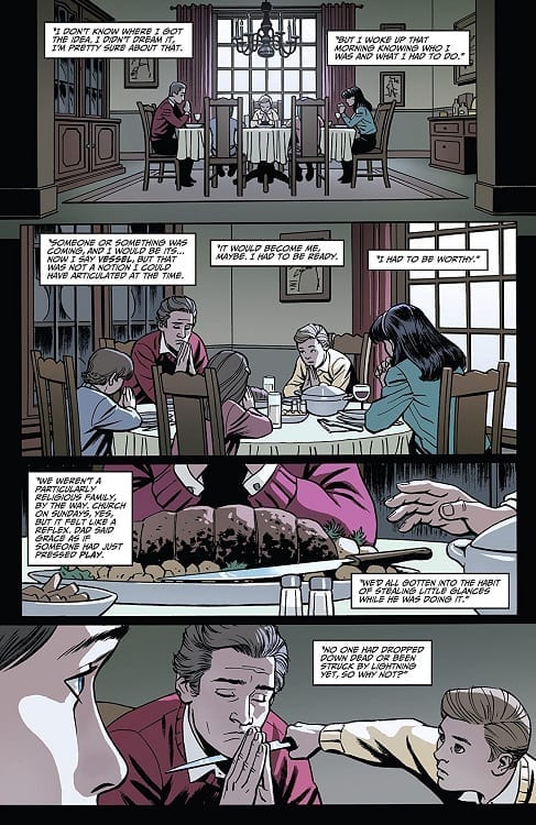
Bunn starts this issue off with a man in the wilderness, affected by the Empty Man virus. This opening is like a twisted version of the 2001: A Space Odyssey opening sequence and it portrays the effects of the virus on a small society. It also leads to the image of a strange figure, religious in nature.

This opening acts as groundwork for this issue of The Empty Man. It expands on the history and mystery of the virus while at the same time preparing the reader for the explosive outbreak that is about to happen. It also has greater significance to a scene later in the comic which is worth waiting for.

The construct of this issue is expertly managed with a definitive beginning, middle and end. It stands on its own two feet and is surprisingly easy for new readers to engage. Quick, throw away lines from various cast member’s give insight into already established character traits without having to elaborately go over the same ground. There is even a flashback sequence that fits perfectly into the story, giving important narrative information without stopping the natural flow of the story.

Bunn builds tension between the ‘heroes’ of the story by highlighting the differences between them and their priorities. There is a conflict bubbling just under the surface that is reaching breaking point. This situation is made more prominent because everything in this issue is surging ahead at great speed. The sense of urgency can be felt in each sequence and conversation. The Empty Man has stepped up the game and Bunn makes sure that the reader knows it.

Interior Art Work
The Empty Man #5 Credit: BOOM! Studios

Art

The layouts for each page set the pace of the story. It starts with a slow walk and unevenly placed panels on the page. The grid pattern changes from page to page in the introduction, slowing the reader down while this set piece unfolds. After this the layouts begin to reflect the increasing pace of the narrative with more panels to a page; high, thin panels to fit more onto a row; and even single images broken up by gutters indicating several things happening at the same time.

Jesus Hervas picks his composition to match the narrative, constantly moving the reader forward and not allowing them to take a breath. The main characters are on the run, for their lives, and Hervas lays out the pages to illustrate this.

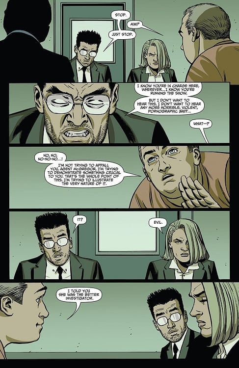
The best example of his layouts comes with Agent Jensen’s flashback sequence. He breaks all of the rules and makes the sequence appear like a collage with images torn from a previous comic and stuck into this one. The effect is mesmerising and disturbing. It reminds the reader of the horror that lays at the heart of this comic.

The color work for this sequence also stands out against the rest of the issue. Niko Guardia gives everything a crimson wash as if it is all soaked in blood. The horror of the Agent’s memory is reflected in the palette Guardia uses.

This crimson color is only used sparingly throughout the rest of the comic and on most occasions it’s when there are images of the mutant creatures, often only seen by Agent Jensen. This makes the appearance of the Empty Man virus stand out whenever it is featured on a page. Instantly your eye is drawn to it amidst the sedated colors of the rest of the world.

The speech balloons bleed into the page layout to help the pacing of the narrative. The most successful part of Ed Dukeshire’s work in this issue of The Empty Man is making the large amount of Radio and T.V. broadcasts stand out from the regular speech. The different types of caption box make it clear exactly where the speech is coming from. In the opening, the on site reporter’s speech flows onto another page even though she does not and Dukeshire gives the caption boxes their own appearance, different from the T.V. reports later in the comic.

Dukeshire also uses the speech balloons to indicate the physical state of the characters, most notably Agent Owen. He is in a serious condition and when he is rushed to the hospital his speech balloons are uneven with long, zigzagged tails. His speech within the balloons is smaller than everybody else’s and the combination of all of these things remind the reader of Owen’s current state. If you took the images away and left the speech balloons, you would still know that the character speaking was physically injured in some way.

Interior Art Work
The Empty Man #5 Credit: BOOM! Studios

Conclusion

The creators working on The Empty Man #5 are coming together to build a narrative that is picking up speed and heading towards a confrontation. Bunn’s script is all inclusive, welcoming new readers and expediting the plot at the same time. The art work has the same effect as the script, starting slowly then building throughout the issue, picking up the pace to keep the reader engaged.

This issue of this modern horror comic deals with the dangers of media manipulation and misunderstanding. It also deals with the fear of what is inside, that element of ourselves that we bury at all costs. At some point we can no longer keep it buried and then, what do we do?

The Empty Man is an astutely entertaining comic. Like Stephen King’s best horror stories, this twisted tale is about people and how they react to situations beyond their control. And it has just reached the point in the narrative where everyone is about to break.

Monkeys Fighting Robots Youtube

Review: Laying The Groundwork On BUFFY THE VAMPIRE SLAYER #3

Monkeys Fighting Robots

Fighting demons and saving Sunnydale was the essence of the weekly episodes of Buffy The Vampire Slayer when Joss Whedon created it back in 1996. But even then, the writers of the show were embracing the series arc and building up a world full of characters that could return at any point.

In BOOM! Studios new Buffy series, Jordie Bellaire understands this all important aspect of the shows history and issue three is still part of the introduction to this Buffy-verse. There is a monster of the week and the laying of groundwork for future stories. Characters are dropped unceremoniously into the mix as if they are simply residents of Sunnydale and not major players in the story; exactly as Joss Whedon did back in the day.

Cover Art
Buffy The Vampire Slayer #3 Credit: BOOM! Studios

Writing/Story

In the Magic Shop, Spike and Dru are making their plans but unwittingly unleash a giant vampire hunting demon upon Sunnydale. Anyanka explains that the oversized red bat creature, known as Camazotz, is as much a danger to Spike and Dru as he is a danger to the residents of Sunnydale so armed with protective amulets, the two vampire’s go bat hunting.

Meanwhile Buffy is still searching for the information regarding the previous piece of jewellery she liberated from a vampire. It isn’t long before these two plot lines converge in spectacular fashion.

Bellaire uses the creature of the week feature to expand the characters of the central cast that she has already introduced. A number of character traits regarding the regulars are dropped in through conversation or from the setting itself. When Buffy’s favourite coffee shop is attacked, for example, an element of Giles’ character is revealed in a way that will be familiar to fans of the T.V. series. The relationships forging between Buffy and her Scooby Gang are also the focus of this issue.

One of Bellaire’s strengths as a writer is her ability to juggle so many complex characters at the same time, even during action sequences. The development of her cast is a constant, ongoing concern. She also leaves enough ambiguity in certain scenes and speeches to make you question where a particular plot thread is going. She did it with Xander beautifully in the last issue and again with Cordelia in this issue.

Plus, the cliff-hanger to this issue has ominous signs scrawled all over it.  I suspect that Jordie Bellaire is going to break some hearts with this series.

Interior Art Work
Buffy The Vampire Slayer #3 Credit: BOOM! Studios

Art

Dan Mora’s art is as exceptional as in previous issues. He brings energy and dynamism to the script. The pages have a cinematic flair to them giving the narrative a large stage on which to play out. The reader is led from panel to panel, often by Ed Dukeshire’s lettering placement, in an easy flow allowing time to take in the beautiful art work.

Mora sets each scene with the required amount of background details; sometimes there is a fully realised set, other times just the impression of a place. The atmosphere is provided by the coloring especially as this entire issue is set during a single night. Raul Angulo changes the tones from the Magic Shop to Buffy’s lonely walk to the well-lit coffee shop, giving each place their own atmosphere. This also helps to break the narrative into different beats, allowing the reader to shift gear from one scene to the next.

Without a doubt the highlight of the art if Mora’s character work. He produces wonderfully accurate representations of the characters when he needs to however, he also manages to make them recognisable with the simplest of lines and shapes. There is never any question of who you are following at any given moment. Add to this Mora’s amazing talent for expressive faces and you get the most emotionally identifiable characters currently in print. Even the vampire hunting beast Camazotz exudes a wide range of emotions producing a full rounded character.

Interior Art work
Buffy The Vampire Slayer #3 Credit: BOOM! Studios

Conclusion

Buffy The Vampire Slayer continues to grow as an exciting and all-consuming narrative under the guidance of Jordie Bellaire and Dan Mora. It has been said before and will continue to be said that this comic from BOOM! Studios feels like a part of the original series but also is new and different in many ways. The characters are so familiar but not the same, it creates a feeling of déjà vu that you just can’t shake.

Everything about this comic is exciting and fresh. BOOM! Studios picked the perfect creators to work on this and we should thank them for it. Buffy The Vampire Slayer is going to be the next big thing. Again.

Monkeys Fighting Robots Youtube

SXSW: Cebulski and Quesada Talk Marvel

Monkeys Fighting Robots

Rumors were flying when the SXSW [South By Southwest Conference] Marvel panel was first announced. Would this be the end of Marvel Comics as we know it? Would Disney be pulling the plug on the publishing side of the company?

Would you believe internet clickbait headlines were 100% wrong?

cebulski sxsw

quesada sxsw

Instead of some dramatic bombshell, the capacity crowd that gathered Friday to hear Marvel Editor-In-Chief C.B. Cebulski and Chief Creative Office Joe Quesada got to hear a casual, wide-ranging discussion about the company and its characters. Unsurprisingly, given the SXSW venue, the conversation leaned more toward Marvel’s films rather than comics, though the two men did spend time on the company’s origins.

Cebulski recounted then-publisher Martin Goodman’s reaction to Stan Lee’s original Spider-Man pitch:

“Goodman said, ‘you’re crazy. No one’s going to want to read a story about a bug. You’re supposed to squash bugs. And who wants to read about a story about a kid in high school?’”

Quesada added:

“Peter Parker is the real person. When he puts on the mask, he becomes somebody else… I think that’s what makes these characters so relatable. We can understand the core person who is Peter Parker, or Tony Stark.”

When discussing Lee’s continuing influence, Cebulski said:

“I think not a day goes by when we’re there in meetings or in editorial when Stan’s name is not invoked in some shape or form.”

In fact, “What would Stan Lee do?” is still a question asked around the halls of Marvel, according to Cebulski.

Some other highlights from the SXSW conversation:

  • The best selling single issue of all time is still 1991’s X-Men #1, at more than 8 million copies.
  • Cebulski cited the 1990s X-Men animated series for its strong female characters, and said he’s heard female creators mention that show as a formative part of their fandom.
  • Quesada mentioned Blade as a character better suited for movies than comics, pointing out that he was never a top seller on paper, but helped Hollywood realize “there’s gold in them hills.”
  • The Infinity Gems (as they were known in comics) being renamed Infinity Stones (as they’re now known everywhere) can be credited to the animated Super Hero Squad show.
  • Runaways, both a successful comic and TV series, came from a forgotten old pitch Quesada found when he started as EiC.
  • Quesada shared an amusing anecdote about a pitch for a Daredevil TV show from years ago, which would have featured Daredevil and a canine sidekick. He jokingly called it “Daredevil and Daredog.”
  • An image of Wave, Marvel’s first Filipina superhero, was revealed prior to her first comic appearance in one of the War of the Realms books: New Agents of Atlas. Writer Greg Pak also posted the image on Twitter.

wave war of the realms sxsw

You can read more about the panel over at Comics Beat.

Even though there was no big “news” broken, did you see anything that surprised you? Leave us a comment!

Monkeys Fighting Robots Youtube

Review: There’s a New Queen in Town with RED SONJA #2

Monkeys Fighting Robots

Red Sonja #2 continues the new adventures of everyone’s favorite redhead barbarian warrior with great action, quality artwork, and even some understated comedy.

Now the queen of Hyrkania, Sonja finds herself staring down the barrel of an imminent invasion. The powerful Zamoran Empire is at her shores; however, Sonja unveils some creative ways to derail their campaign.

The Writing

Red Sonja #2 delivers on the classic sword and sorcery goodness. All of the essential elements are in place as writer Mark Russell lays out his vision for the series. However, he also does a great job of hitting different dynamics with his storytelling, too.

We see Sonja as stoic, collected, and always in control as ruler. At the same time, her relationship her long-lost cousin, Kryon, forms the emotional basis of the story. She could have declined to take the throne, but chose to stay in order to protect him, adding additional layers to the narrative.

Despite the serious tone, there is plenty of sharp humor throughout. From the Hyrkanians’ cynical reactions to the impending invasion, to Emperor Dragan’s awkward family dynamics, there is plenty of great dark humor in Red Sonja #2. Without giving away spoilers, one of the book’s best moments comes when Sonja insists on repeatedly burning bridges with her enemy (literally).

The Artwork

Artist Mirko Kolak relies on a lot of closely-cropped panels, so character designs take center stage. The figures benefit from a realistic style, giving the book a feel of genuine historical drama. However, when the visuals pull-out to an establishing shot, you get a sense of the dedication to craft on display here.

Kolak’s illustrations are done with a fine attention to detail. The excellent artwork helps bring the world to life and makes everything feel much more real and grounded.

Given it’s a desert climate, the book is dominated by a palette of yellows and browns. As a result, colors pop nicely when they break the scheme. It’s a nice effect at key points, though it sometimes leads the eye to focus on unimportant details.

Final Thoughts

Red Sonja #2 offers great storytelling and humor, with very impressive artwork. It looks like the character is in good hands for this run.

Monkeys Fighting Robots Youtube

Review: MEOUCH #1 Is Deadpool Meets Rocket Raccoon

Monkeys Fighting Robots

Take the cartoony style and unapologetic violence of I Hate Fairyland, add a main character that’s one part Garfield the Cat and two parts Rocket Raccoon, throw in some satirical references to The Punisher and Daredevil, and you’ve got the dark, brutal world of Meouch.

**Some Spoilers Below**

Meouch #1 Artwork

Story:

Drawing inspiration from Deadpool, Rocket Raccoon, and the work of Skottie Young, Meouch is an action-comedy comic featuring a gun-toting, pun-cracking assassin cat named Frankie. In the series’ first issue, Frankie is up against a deadly litter of killer cats known as the Nine Lives, whose handy work is getting in the way of his business.

Writing

Written by Paul Carroll, Meouch is a well-structured foray into this world. Readers are quickly given a sense of the gritty, neo-noir tone with introductory captions and enough blood, decapitations, and brain matter splattered throughout the book. Frankie is immediately established as a vulgar (those “fluffling” puns aren’t fooling anyone) and no-holds-barred feline with a enough of an interesting motivation to want to follow him into the underbelly of his world.

Meouch is fairly light on word count, leaving more room for the bloody action sequences in the panels. Overall, Carroll delivers a fun read that doesn’t take itself seriously whatsoever, except with its silly puns and spoof-y references.     

Art:

Gareth Luby’s illustrations bring the words and action of Meouch to life with a curvy, cartoony style akin to Garfield and Tom and Jerry. The blood splatter and brain matter is not off-putting. It also doesn’t leave much to the imagination.

The colors of Joe Griffin only enhance the R-rated Saturday morning cartoon style presented in Meouch. Most notable is his use of dark pink coloring of blood. It looks more like a can of jelly that exploded instead of someone getting a bullet to the head.

Hassan Otsmane-Elhaou’s letters are a nice contrast to the big and animated illustrations. They are jagged, looking as if they have been etched into the pages with a small knife.

Conclusion:

Meouch #1 is a fun read. It packs the high-brow humor from the cartoons of yesteryear and adds a heaping scoop of blood and guns. If you enjoy Rocket Raccoon, Deadpool, The Punisher, or Teenage Mutant Ninja Turtles, do yourself a favor and pick up a copy.

Check out the first few pages of Meouch #1 which is is set to launch at Dublin Comic Con this weekend:

Meouch #1 Page 1Meouch #1 Page 2Meouch #1 Page 3Meouch #1 Page 4

Monkeys Fighting Robots Youtube

INTERVIEW: Production Designer Caylah Eddleblute And Creating The World Of Alita: Battle Angel

Living-legend director James Cameron and pretty-close-to-living-legend Robert Rodriguez joined forces for the science fiction action film Alita: Battle Angel. Based on a popular Japanese franchise, production designer Caylah Eddleblute, along with co-production designer Steve Joyner was in charge of bringing this world to life.

Caylah is no stranger to fantastic worlds like that of Alita. Caylah’s filmography includes places like the Predator training grounds in Predators and the mysterious, mean streets of Sin City. Now, her incredible work is on display in a massive film from the minds of two wildly visionary directors.

PopAxiom fought off cyborg ninjas through dark alleys between towering skyscrapers made of glass to speak with Caylah about being a production designer and working on Alita: Battle Angel.

Taming The Beast

Caylah’s worked on films for nearly thirty years. If you’re a fan of the late 80s/early 90s action films, you might remember a series called Beastmaster. Caylah worked on Beastmaster 2: Through the Portal of Time. It’s a guilty pleasure of mine so bear with me. Caylah talks Beastmaster “That was definitely in the early days. Steve Joyner and I were working with Nigel Klinker … Beastmaster was shooting up by Lake Powell.”

Being a master of beasts required there to be some impressive creatures on set “… there were tigers involved.”

Caylah reveals more about working with the huge cats “One of the things of working on something like Beastmaster is that it trains you to become situationally aware. We worked with an animal trainer, and we had a specific regimen to make sure that the animals aren’t startled.”

If they were startled, Caylah and the crew “… learned that running is the worst thing to do when confronted by a predator animal. The minute you run, you are prey.” File that under things you won’t learn in film school.

Working With Robert

Caylah’s spent a lot of time around Robert Rodriguez having worked with him on just about everything since From Dusk Til Dawn in 1996, including the Spy Kids series and The Faculty. About the filmmaker, she says “Robert loves to edit. Editing is his true passion I think. He shoots and edits in such a syncopated manner,” Caylah adds “He’s got such a great rhythm to his work.”

What about the connection between Robert and James Cameron? “Robert and Jim have been friends for a long time. Their careers kind of evolved in parallel.”

About Alita

Now we’re at Alita. For those not in the know, the story of Alita started out in 1990 as a manga called Gunnm which was later made into an anime commonly known as Battle Angel. Long story short, it’s a story about loss and rediscovery set in a future world and a place called Iron City “… it’s a 62,000 square foot set.” For the record, at this moment I repeated, very slowly … sixty-two thousand square foot set.

Caylah tells us more about the Iron City set “If you go in, you feel like it’s a real city. The scale and texture, those are things that add dimension to an environment, and we really focused on that.”

Deeper Into Iron City

The attention to detail for creating Iron City must also be pragmatic “At the same time, we could redress any street at any time to make Iron City bigger so-to-speak. So, any street could shoot, day or night, as a different street. So that helped us expand Iron City beyond what we built.”

Alita has a big budget, but that doesn’t mean you don’t try to maximize everything possible “The iconic Kansas Bar, that set only plays the Kansas Bar for one sequence. The rest of the time, it’s dressed as different sets.”

However, not all of Iron City was real “We had a great visual FX supervisor, Richard Hollander, he worked on the original Blade Runner. We worked closely together.”

Iron City was built to a height of twenty-four feet “That lets us cover all the action and gave the visual effects team a baseline to build all the vertical parts of the city digitally.”

Rodriguez is not shy about digital sets, having used them extensively throughout many films. But Caylah reveals “James Cameron believes that a set, a real set, can ground a science fiction movie. So we paid a lot of attention to detail while building everything. We made things look worn, we had steam, moss.”

Every word about the work done to create Alita has a distinct sense of pride. Caylah adds “We still have Iron City standing at Troublemaker Studios so I would love to dive into that world again.”

Manga And Movie

James Cameron famously fell in love with Alita back in the 90s when Guillermo DelToro introduced him to the manga. Since as early as 2000, he’s been working towards making a movie happen “We met with Jim during pre-production. He had this beautiful concept art that he’d commissioned back in 2004 or 2005. So we had a foundation on which to begin.”

Super-fans of the manga and subsequent anime films are wondering how closely the film will follow the source material. Rodriguez made fans proud with his Sin City movies. Caylah tells us that the same love exists “Robert had the first three volumes of the manga scanned and we printed out each page. We had three binders so that we could refer to the original story.”

Wrapping Up

As a production designer, what’s a recent film that blew Caylah’s mind from her perspective “Mortal Engines. That movie took me into the world, and I had fun. I was captivated. Such a creative environment.”

What’s next from Caylah? “There are a number of things coming down the pipe … none of which I can talk about yet. I’m looking forward to all of it.” Who doesn’t love a little mystery?

Thanks to Caylah Eddleblute and Impact24 PR for making this interview possible.

Monkeys Fighting Robots Youtube

DC Comics Exclusive Preview: HAWKMAN #10

Monkeys Fighting Robots

Hawkman #10 is out in comic shops on March 13th, but thanks to DC Comics, Monkeys Fighting Robots has an exclusive five-page preview for you.

The book is by Robert Venditti and Bryan Hitch, with inks by Andrew Currie (alongside Hitch), colors by Jeremiah Skipper, and letters by Starkings & Comicraft. Hitch and Alex Sinclair worked on the main cover, while Cully Hammer did the variant.

About the issue:
“London Falling” part two! The Deathbringers have arrived, and no one is safe! As Hawkman struggles to protect London from the devastation, he’s attacked by Idamm and his army at every turn. Carter will need to figure out a solution—and fast!—if he’s going to save the Earth. The answer lies in his past lives—but which one?

Hawkman has been one of DC’s most consistently well-received and well-reviewed comics since it launched last June in the wake of Dark Nights: Metal.

Check out the full HAWKMAN #10 preview here:

hawkman dc comics exclusive preview hawkman dc comics exclusive preview hawkman dc comics exclusive preview hawkman dc comics exclusive preview hawkman dc comics exclusive preview hawkman dc comics exclusive preview hawkman dc comics exclusive preview


Are you reading Hawkman? Comment below with your thoughts on the series!

Monkeys Fighting Robots Youtube

Review: Inside A Clichéd Mind With A WALK THROUGH HELL #8

Monkeys Fighting Robots

Getting inside the mind of a killer is never going to be pretty so it’s no surprise that Garth Ennis’ A Walk Through Hell is a disturbing and uncomfortable read. AfterShock Comics are all about pushing boundaries and allowing their creators to tell the stories they want to tell.

A Walk Through Hell is a comic that couldn’t exist at most other publishers but AfterShock’s commitment allows Ennis and artist Goran Sudzuka to run with their ideas. This freedom allows the creators to tell whatever story they please, no matter how unpleasant.

Writing/Story

Agents Shaw and McGregor conduct their interview on the convicted criminal Paul Carnahan. Their hope is to find clues about the situation that they have found themselves in but is Carnahan’s grim life story what they need to hear?

Ennis does not hold back on the violence and degradation that is Carnahan’s life story. From the opening scene with a young Paul murdering his family, to the time the teenage boy spent in juvenile detention, everything that Paul describes is the very worst experience you could image.

It is all laid out in a matter of fact way giving the story a horrific atmosphere. Even with the interruptions from the two agents breaking up the story A Walk Through Hell #8 is not an easy read. It could be argued that if you pick up a Garth Ennis comic you can’t complain about the content, by now you should know what you are getting, but some of the contents of this issue do seem to be there for shock value only. The idea that Carnahan was learning how to survive in ‘the system’ is relevant to the story but the constant revelling in depravity is too much.

The characters don’t get to grow in this issue, even though it is a life story about one of them. After the initial opening scene with voice over, you don’t learn much more about Carnahan aside from his indifference to life. The two agents become nothing more than sounding boards to bounce Carnahan’s life off.  The worst part is that much of this issue is disturbing but none of it is new; it’s a clichéd emotionless psychopath.

Interior Art
A Walk Through Hell #8 Credit: AfterShock Comics

Art

The saving grace of this issue of A Walk Through Hell is Goran Sudzuka’s art work. His pen work is clean and precise. He uses mostly thin lines to outline the cast and props allowing Ive Svotcina’s color work to provide the shadows and depth.

Sudzuka breathes life into the characters on a greater level than the script does in this issue.  His facial expressions, and expressionistic eyes especially, draws the reader into the scenes and helps them to witness the horrors first hand. It is during the action sequence at the beginning where Sudzuka’s art is the most effective but he also manages to give the interview scenes an element of life and emotion.

Svoticina’s coloring throughout this issue of A Walk Through Hell is of a consistently high quality. All of the atmosphere is created via the interplay of light and dark. The flashback sequences have a different tone to the interview room which is soaked in a queasy grey/green color.

The lettering although well placed by Rob Steen is nothing special. Maybe it’s because of the characters themselves, but the speech doesn’t have any pace or emotion to it. It reads very flat for most of the issue with no emphasis given to words or phrases. This does help the overall uncomfortable atmosphere, and could possibly be an extension of the indifference of the central character. Unfortunately, the speech becomes monotonous because of this.

Interior Art for A Walk Through Hell
A Walk Through Hell #8 Credit: AfterShock Comics

Conclusion

There is some amazing talent working on A Walk Through Hell and the opening story arc was an engrossing read. Issue 8, however, doesn’t have the same impact and reads more like a run of the mill Ennis comic. In the past Ennis has pushed the boundaries well beyond the line but in these pages it seems like he is just putting ticks in the boxes on his ‘disturbing life’ list.

The artwork still manages to draw the reader in. All of the horrific and uncomfortable elements in this issue are provided by the art, not the script. The coloring adds much needed atmosphere but the characters lack depth and barely achieve anything greater than being a cliché.

A Walk Through Hell has been an interesting, modern horror story but is it losing its way?

Monkeys Fighting Robots Youtube

Exclusive AfterShock Preview: Phil Hester And Ryan Kelly’s STRONGHOLD #2

Monkeys Fighting Robots

Stronghold #2 hits your local comic book store on March 20, but thanks to AfterShock Comics, Monkeys Fighting Robots has an exclusive four-page preview for you.

The book is written by Phil Hester, with art by Ryan Kelly, colors by Dee Cunniffe, and letters by Simon Bowland. The cover of Stronghold #2 is by Kelly as well.

About the issue:
As Michael Grey investigates the global conspiracy dedicated to concealing from him his mysterious past, he learns the enemies he created in that forgotten life are decidedly not of this earth. Tragic romance and cosmic horror collide in this second issue of Hester and Kelly’s epic saga.

Check out the preview below with commentary from Hester:

HESTER ON WHAT THE BOOK IS ABOUT AND WHY HE’S EXCITED FOR IT TO COME OUT:

“Stronghold is about a college student and delivery driver named Claire who has fallen in love with a sad sack insurance adjuster on her delivery route named Michael Grey. Claire also happens to belong to a centuries-old secret society called The Stronghold who believes this insurance adjuster is actually an immortal, amnesiac elder god whose awakening would ignite a cosmos-wide Armageddon.

Like all young people, Claire feels restless in her strict faith, but when she tests it by revealing herself to Grey, the results threaten to destroy not only her order, but the world. On the run from The Stronghold, alien enemies, and Grey’s own broken, haunting memories, they both realize that for their love to be born, Earth must die.

A story that begins as a lively, adventurous romance spins into a deeper, darker science fiction tale of existential terror and ultimate sacrifice. It’s very much in the flavor of past work of mine like The Coffin and Deep Sleeper (both with Mike Huddleston). If that’s not enough to hook you, come for Ryan Kelly’s amazing artwork, which alone is worth the cover price. He’s really leveled up on this one. As an artist myself, I’m in awe.”

HESTER ON SOME OF THE PRIMARY INFLUENCES THAT LED HIM TO THE BOOK:

“Like every kid, I was enthralled by “hidden destiny” stories like King Arthur, The Prydain Chronicles, and then as a young adult, stuff like Mage and Dune. As I matured, I saw how these stories were much more than wish fulfillment or simple power fantasies, but cautionary tales about how stepping onto the heroic stage often costs you your personal happiness. I wanted to take that one step further and ask, what if pulling the sword from the stone not only wrecked your life, but all life? Is claiming your identity worth annihilating everything you love? Is taking that red pill worth ruining everyone else’s lives?”

HESTER ON BALANCING THE TELLING OF AN INTIMATE ROMANCE AGAINST A BACKDROP DEPICTING A CATACLYSMIC STORY OF LITERAL EARTH-SHATTERING PROPORTIONS:

“Nothing heightens the unreality of a fantastical story like keeping the real aspects of it authentic. What makes Stephen King’s work scary isn’t the big bad monster as much as how effectively he contrasts it with the reality of everyday life. The most frightening parts of The War of the Worlds radio broadcast or the original Night of the Living Dead film are hearing and seeing the mundane media reports struggling to grasp the bizarre events. To maintain that contrast, I sort of have to keep a bright line in my mind between the down-to-earth details of falling in love and the vast cosmic cataclysm yawning underneath everyone’s feet. If a reader can feel the authenticity of the relationship, they’ll feel like they have a stake in its success or failure in the face of these otherworldly forces.”

Exclusive AfterShock Preview: Phil Hester And Ryan Kelly's STRONGHOLD #2


Are you reading AfterShock comics? Comment below with your favorite titles and your thoughts.

Monkeys Fighting Robots Youtube

Review: THE GOON Is Back In All Its Glory

Monkeys Fighting Robots

After an almost four-year hiatus, The Goon is back at Albatross Funnybooks, and it comes back without missing a beat.

The series is written and illustrated by its creator, Eric Powell. Colors are by Rachael Cohen and Powell.

For the uninitiated, the comic follows Goon and Franky, two small-time thugs who fight zombies, gangsters, and all sorts of other monsters in their small town. And if you are uninitiated, have no fear: you can jump right into The Goon #1 without having read the prior series. One of Goon‘s greatest strengths has always been how easily accessible it is. New readers can jump into the story at any point, and this new volume is no exception.

Everyone can breath a sigh of relief, because Powell gives fans exactly what they want in this return. The Goon is as great as it ever was. The humor you love is back, as are the crass remarks and explosive fistfights. And Powell’s art has only gotten better.

goon comic review eric powell albatross funnybooks

It’s hard to explain what exactly makes Eric Powell’s work on The Goon so great. He creates a tone that just enamors and hypnotizes you. His inking and coloring is so distinct. It can be sketchy and rough, which just enhances the tone, and it adds depth to the work, as well as this dreamy, ethereal atmosphere. It’s like there’s a constant fog over this creepy and mysterious world that pulls you in and keeps you there.

Rachael Cohen joins Powell on colors, a change from Dave Stewart, who colored much of the original run. The change is noticeable, and you can tell which panels Cohen colored as opposed to Powell, but it’s also welcome. Cohen still captures the spirit of The Goon in her work, while giving this new series a fresh feel.

As far as the humor goes, Powell makes you laugh out loud throughout this entire debut issue. It’s a return to the very early days of the series. The jokes come at you fast and furious, and Powell is a master of comedy. The way he structures jokes, the way he paces and executes them, it’s just brilliant. And it’s not even just jokes; sometimes just the way a character talks will make you chuckle. Plus, the visual gags kill just as hard as the written ones

Look, The Goon is a lot of things. Yes, it’s horror. It’s noir. It’s comedy. But above all else, it’s its own thing unto itself. It’s The Goon, and it looks, sounds, and feels like no other comic you’ve ever read.

And listen, we’ve talked a lot about comedy and monster fighting here, but if this is your entry to The Goon, know that there’s so much more to this series than just that. This comic has serious heart. It has the power to wreck you emotionally, and it has abused that power in the past. It’s one of the single most beautiful comics this reviewer has ever read, both visually and thematically, and that’s why it’s endured over all these years.

We can rave about The Goon all day, but the bottom line is that you have to read it yourself to understand the hype. It’s something you have to experience firsthand, but be warned: once you enter this world, there’s no leaving.

Goon

Monkeys Fighting Robots Youtube