Home Blog Page 437

Review: BATGIRL #37 – Amazingly Takes Risks In Storytelling

Monkeys Fighting Robots

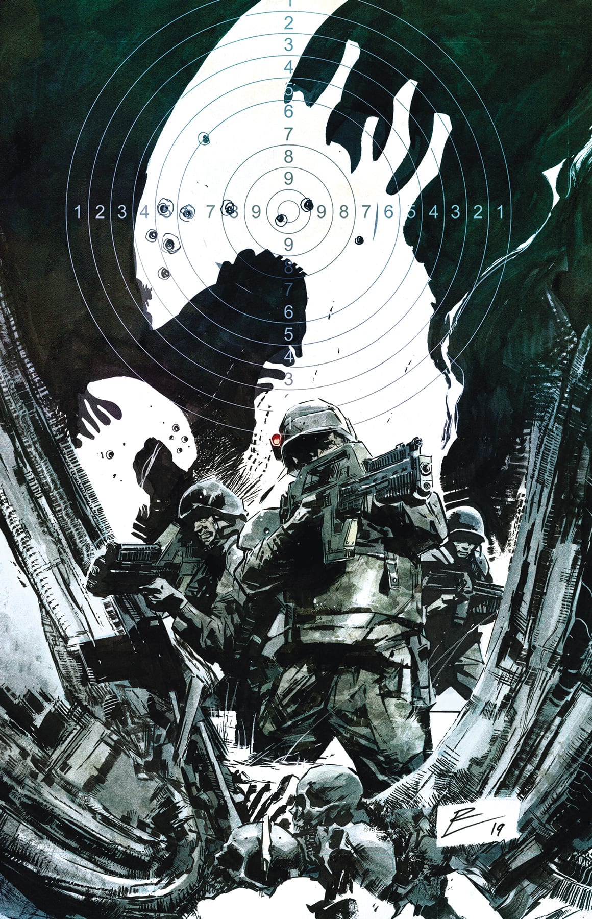
THE YEAR OF THE VILLAIN ‘The Offer’ has made its way over to BATGIRL, and it’s looking a little messy for our heroine. If that wasn’t enough for Barbs to deal with, BATGIRL #37 throws another plot thread into the mix.

*** BATGIRL #37 SPOILERS Below***

Batgirl 37 Cover
The cover for Batgirl #37 shows Batgirl being hunted by the Moth.

Whenever any major event happens in the comic book world, it’s a given that it’ll touch most character series as well. Well, here is the obligatory tie in issue for The Year of the Villain – ‘The Offer.’ That being said, you can honestly read this issue without any understanding of what is happening in that series. The only downside is that you might be slightly confused on why a typically blasé antagonist is going for Batgirl’s throat.

To be fair, the Moth really did need an upgrade. He wasn’t exactly a bad villain before this point, but he’s certainly more interesting when he’s not pulling his punches. And apparently he was very determined to make a name for himself here; by killing the infamous Batgirl. Or rather, he tried. It wouldn’t be very good for the series if she died right here, after all.

Batgirl 37 Page 1
The alternate cover for Batgirl #37 leaves us with even more questions.

What was impressive about this issue is that they didn’t let the tie in railroad the entire issue. Instead, Cecil Castellucci, the writer, decided to simultaneously continue forward with the other plot that has been developing.

You may be wondering; how can you run two plots at once? Easy! While Batgirl is focused on one antagonist (Moth), let her other antagonists go off and do something else. Unfortunately, in this case, said antagonists seem to be in over their heads. It may very well turn out that they’ll end up wishing she had interfered. But only time will tell on that count.

Batgirl 37 Oracle Rising
Batgirl and the Moth having an aerial fight.

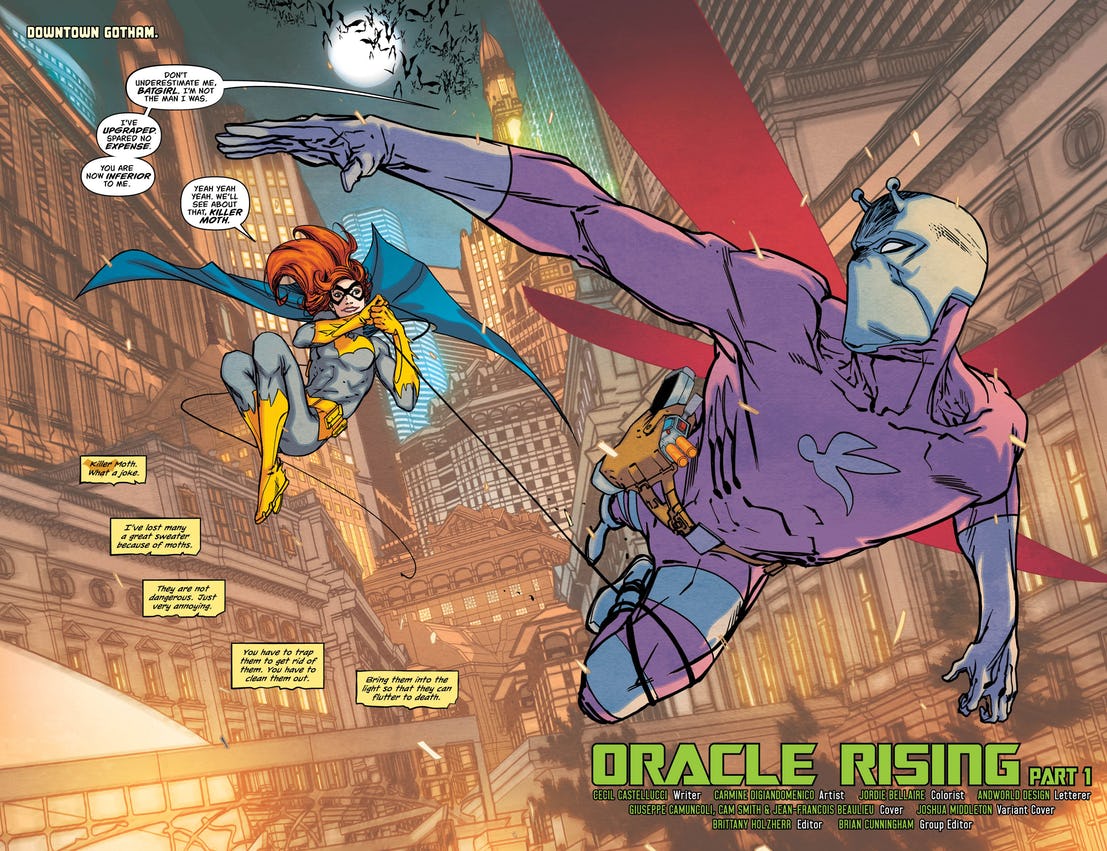
It’s still strange at times to see Batgirl back in her classic black and gold crime-fighting suit. But then there are times when she goes up against a classic antagonist, and it just feels right. Batgirl #37 is one of those times.

There were a lot of flashy moments in this issue, thanks to the new tech that Moth got his hands on. It made for some very dramatic fighting, credit should be given to Carmine Digiandomenico and Jordie Bellaire for making the fight so much fun to look at.

Andworld Design handled the lettering for Batgirl #37, and it shows. There was a ton of dialogue and internal monologuing for this issue. Yet it was relatively easy to tell who was saying what. And give Andworld Design bonus points for altering the font and colors for the newly introduced character at the end. That was a nice touch.

Batgirl 37 Sample Page
There’s a new Oracle in town?

Batgirl #37 took some risks in splitting up the perspectives like this, but it paid off. Jumping back and forth between a tie in plot and the main plot ended up feeling almost organic. And better yet, by continuing with Barbs’ quest, her readers didn’t end up feeling shafted (assuming that they’re not following the major event, of course).

It will be fascinating to see where this plot ends up leading. They’ve messed with Oracle in the past, but never to this extent. Any guesses on what they’re going to do with this new character?

Monkeys Fighting Robots Youtube

Review: Timothy Faces His Friends And Family In BOOKS OF MAGIC #10

Monkeys Fighting Robots

BOOKS OF MAGIC #9 took readers on a wild adventure into a book prison which housed Ellie, the classmate and best friend of Timothy Hunter. Fortunately the determined young woman managed to escape and find a way back home. Timothy, upon hearing the news, rushes to meet with her in the hopes of reigniting their relationship after having been gone for so long; the same goes for his father, who the wizard hasn’t seen in weeks. But the young man will soon learn that the magic in his life comes at a high cost, especially for his friends and family.

Timothy attempts to find his dad

Story

BOOKS OF MAGIC #10 takes readers back into the mind of Timothy as he wrestles with new problems in the “real” world. One would hope his troubles would die down after escaping the magical lands wanting to entrap him, but this individual isn’t so lucky. Upon returning to London, Timothy searches for his father, only to find the anxiety-reducing spell has left him in an almost catatonic state.

Timothy attempts to talk some sense into his father

Hoping to seek reassurance in Ellie, Timothy makes his way to her house. But the traumatized girl has little to say to him as she relays her fear of Mr. Davies, the evil teacher who cast her into the book prison. Timothy reassures her that he’ll be able to stop Davies with magic and proceeds to demonstrate his ability to control pieces of chalk on the ground. Unfortunately, this ignites the fearful memories of Ellie’s imprisonment and causes her to abandon the well-meaning Timothy.

These devastating reactions from his friends and family upon returning to London leave Timothy in a depressed state. It’s clear magic won’t solve all his problems; in this case it appears to make things worse. Readers will grapple with Tim’s desperate attempts to reconnect with the family and friends he’s been forced to abandon for some time.

Art

Tom Fowler’s pencils, Brian Churilla’s inks, Marissa Louise’s colors, and Todd Klein’s lettering work in harmony throughout BOOKS OF MAGIC #10. It may seem difficult to transition the story’s setting back to the non-magical world of London, but the creative does a great job of entrancing readers all the same. The bold outlines framing the London streets, the variety of colors in Timothy’s chalk demonstration, and placement of dialogue boxes give readers the impression of a classic fantasy storybook all the same. It shows us there’s still magic involved in Tim’s life despite his less than ideal circumstances.

The Comic Cover

Kai Carpenter’s cover artwork gives us those fantasy vibes from childhood. He continues the series’ trend of illustrating the cover to look like a storybook while adding a detailed map of the magical lands Timothy traverses.

Conclusion

BOOKS OF MAGIC #10 brings readers back to reality as Timothy seeks to rectify the damage his magic has wrecked upon his life. It’ll be interesting to see how he will continue the wizard training in such circumstances.

What did you think of Timothy and Ellie’s reunion? Let us know in the comments below!

Monkeys Fighting Robots Youtube

Review: BATMAN: CURSE OF THE WHITE KNIGHT- The Beginning Of A New Batman Classic

Monkeys Fighting Robots

When Batman: Curse Of The White Knight was announced in late 2018, fans imagined it following similar themes as Sean Murphy and Matt Hollingsworth’s Batman: White Knight, which was one of the most unique takes of the Batman mythos in recent years. Amazingly, Curse Of The White Knight takes a bolder more mythical approach to the Batman/ Joker relationship that is to be commended.

Spoilers For BATMAN: CURSE OF THE WHITE KNIGHT Below

Joker Escapes Arkham
Arkham’s walls haunt its inmates

Batman: Curse Of The White Knight picks up directly after the events of the first series. Alfred is dead, the Joker is in prison (For now), and Batman revealed his identity to Detective Gordon. The Joker unsurprisingly breaks out of Arkham and recruits Azrael to his cause. While The White Knight dealt mainly with themes of rehabilitation, justice, and the consequences of past deeds done by one’s family, Curse Of The White Knight goes to supernatural lengths to differentiate itself.

Murphy’s script does a marvelous job of blending supernatural with reality and blurring the lines differentiating them. When Bruce is reading Alfred’s letter, the letter does seem prophetic and the act of Bruce finding this hidden tome under his father figures bed looks like he is unveiling a religious artifact.

This push and pull between the supernatural are present in one of the series antagonist, Azrael. The way Murphy blurs the lines between whether Azrael is insane or not is particularly effective. He is unhinged, Azrael smashes an orderly’s head against the wall after being diagnosed with cancer, but then the Joker hands him a flaming sword with imagery reminiscent of someone being ordained by higher powers, think Excalibur to King Arthur.

If there is one negative to Murphy’s script, it’s the lack of Joker/ Jack Napier. What made his original series so compelling was how Murphy was able to distance Joker from Jack Napier, making them completely different characters despite how they shared the same body. Despite his escape from Arkham and finding Azrael being the catalyst for the entire chapter, the reader experiences most of this chapter through the perspective of Batman. But this is something that will surely change in future chapters.

Hollingsworth and Murphy continue to prove they are one of the premier artistic team-ups with their respective colors and line work. Individually their talents are self-evident but together they create a brutish, hulking, almost noir vibe that is perfect for a locale such as Gotham. The architecture of Arkham haunts over its inhabitants with crumbling Spartan walls and heavy shadows, similar to the ones that hide the inner workings of Wayne Manor.

The way Murphy depicts brute strength and violence is borderline iconic. Hollingsworth’s colors push it over that edge. Batman lugs around Gotham with huge shoulders and biceps that look almost cartoonish. He towers over everyone he shares a frame with, as does Azrael. Look no further than the scene in which Batman interrogates the Arkham warden. It’s played almost for laughs, but when Batman got serious, I jumped reading it.

Murphy and Hollingsworth’s Batman: White Knight was nothing short of a modern-day Batman classic. Their newest effort Batman: Curse Of The White Knight, with letters from AndWorld Design looks to be following right in its predecessor’s footsteps.

Monkeys Fighting Robots Youtube

HOUSE OF X #1 – Hickman Almighty

Monkeys Fighting Robots

A new era for the X-Men begins in HOUSE OF X #1. Strap yourselves in, Hickman has schematics for a whole new world for the magnificent mutants of Marvel.

HOUSE OF X 1 CVR

***SPOILERS LIE AHEAD***


Oh my goodness, Jonathan Hickman. Immediately upon starting to read this issue, you can tell it’s something special. This is a very bold and different direction for our beloved mutants. We’re entering uncharted territory for the first time in a long time and there’s nobody more suited to drive us there than Hickman.

We’ve seen Marvel promise plenty of “fresh starts” for the X-Men over the past few years, but nothing has been this impactful. House Of X isn’t just a beginning to a new story or the introduction of a new threat. This is an entirely new vision of the mutant population and their role in the world around them.

What Hickman provides in this introductory issue is an in-depth and highly imaginative exploration of brand new concepts. This reads more like a guidebook than a comic book issue, but it’s all for the better.

Hickman’s time away from Marvel was clearly for the best. He comes back now as a the fully formed creative mastermind that he is. He brings the structure, schematics, tools, and story devices over from his brilliant work on Black Monday Murders, East Of West, and The Manhattan Projects to House Of X in a dense but digestible format.

We’ve read X-Men comics time and time again that set the mutants off on their own somewhere to try and survive away from the world. This isn’t about mutants trying to survive, this is about mutants trying to thrive and succeeding. The nation of Krakoa is both Xavier and Magneto’s dreams realized at once (less violently on Magneto’s part).

Krakoa gets re-purposed in a big way and becomes the most important concept to Hickman’s new mutant landscape. The “habitats” are inventive, eerie, and instantly iconic.

The “Flowers of Krakoa” are a crucial tool for the new mutant nation, one that puts them into a position globally that they’ve never been before. Krakoa has more in common with Wakanda as a nation of power rather than a simple refuge like we’ve seen in the past.

Hickman loads up House Of X #1 with plenty of charts and maps, making this introductory experience less overwhelming and easy to swallow for readers of all levels of X-Men experience. There isn’t any required reading that leads into this issue, readers are provided with everything they need.

The “Orchis Protocol” is another new concept introduced in great detail. They’re proof of just how much thought went into this new layout for mutant kind by Hickman. They could also provide a wonderfully paranoid opposition for Krakoa’s mutants going forward.

House Of X is so fleshed out not only as far as mutants are concerned, but the entire world. In our intro to “Damage Control” we even see the repercussions from Reed Richards and Tony Stark having gone missing for some time. This is a level of planning and layout that we haven’t seen in a very long time.

Hickman’s chart and detail on the “Omega Level Mutants” page provides clarity where we don’t get much anymore in the world of comics. This will be something comic book fans will surely appreciate in our discussions and debates about these characters and this world.

No matter how current you are on X-Men continuity coming into House Of X, it’s a total blank slate. There’s a mystique and atmosphere of unknown that’s established immediately and beautifully maintained thanks to Pepe Larraz and Marte Gracia.

The highly imaginative and dense concepts presented to us are visually stunning and easy to understand thanks to their illustration and tone. The mutants themselves have so much life and wonder to them, there’s a confidence that’s earned and displayed.

House Of X #1 is a gorgeous book that matches the ambition of Hickman’s ideas and lays them out in a way that’ll warrant multiple reads. You couldn’t ask for a better showing in order to really sell this exciting new era for our beloved mutants.

This issue and everything we’re provided inside feels like a reward for all the lackluster years of X-Men comics. For every false start and broken promise there is a page in this issue sure to make any die-hard X-Men fan’s heart flutter.

There hasn’t been an X-Men comic this ambitious and crucial in the 29 years I have been on this Earth. Hickman is an absolute god-send for Marvel’s beautiful mutants. This is the real deal, it delivers on every promise that was being made by Marvel.

This is absolutely the most important X-Men comic to come along in a very long time. Whether you’ve been keeping up on continuity or have stayed away from X-Men for some time, House Of X is the best possible jumping on point you could ask for.

Monkeys Fighting Robots Youtube

Review: MIDDLEWEST #9 and the Heart of a Storm

Monkeys Fighting Robots

Previously, in Middlewest, Magdalena believes that the raging tempest within Abel is incurable, and forces him to leave her travelling carnival. Abel’s anger gets the best of him, who unleashes the inner storm that destroys Magdalena’s fair. In the aftermath, Mags tries to rebuild, but faces resentment from her workers for shunning young Abel. Meanwhile, Abel’s father is still on the hunt for his son, and leaving a path of destruction in his wake. Finally, Abel and Fox continue on their quest for a cure, only to be chased down by giant squirrel creatures, and then surrounded by spear-wielding forest people. 

Middlewest #9 is published by Image Comics, written by Skottie Young, with art by Jorge Corona, colors by Jean-Francois Beaulieu, and lettering by Nate Piekos.

* * Some Spoilers Below **

Middlewest #9 Cover

Story

Run as he might, Abel’s past is catching up to him. He is astounded and relieved, however, when the woodland people he and Fox encounter seem to know his mark.

One of the many admirable traits of Middlewest is that it isn’t a fantasy quest to save the world. That stakes are much more grounded, and personal. Abel and Fox’s journey have similar attributes to, say, Frodo and Sam’s, but the evil they are trying to thwart is from within. In this most recent issue, we seemed to have gotten a pretty good idea of how Abel will be able to do just that, as well as what could happen to him if he lets his heart of a storm take over.

Writer Skottie Young continues to take us down his Yellow Brick Road, this time really doubling down on his familiar, yet wholly unique worldbuilding. In Middlewest #9, we get a glimpse of new faces, a religion thought long-gone, and its deity. Young cracks open the door to his world another inch to make our eyes bulge in curiosity, yet holds back just enough to keep us wanting more. And he paces the book in such a way that lets the readers soak it all in and be captivated by the world and story as it unfolds.

Of course, Middlewest wouldn’t be half as enthralling if it weren’t for Abel and the characters he encounters. Abel is a thoroughly flushed out character in Young’s tale, with relatable attributes such as having to deal with inner demons, as well as the ‘sins of the father’ trope. In this issue, Abel learns that anger isn’t always the best response, thanks in full to the help of his familiar. Yes, Fox is an interesting character, one who isn’t always 100% the kindest of companions, but is wholeheartedly loyal. This issue gave him some intriguing developments, such as a better understanding of why these talking animals exist. There is also clearly much more to learn about Abel, his family history, and the truth of his heart of a storm, given the exciting plot point in this issue’s final page. 

Middlewest #9 Splash Page

Art

Jorge Corona’s work is simply stunning. Each and every panel is something to behold. His characters are animated and full of life. The overtly expressive eyes helps in conveying the emotions of the characters, and we as the reader cannot help but feel as well. But what’s even more impressive are the tiny details in the backgrounds of each panel. Corona adds layer after layer of elements in the scenery and architecture, that you find something new upon each look. 

The Nowak village in this issue of Middlewest is a perfect display of Corona’s finesse and genius. It’s as if George Lucas commissioned Studio Ghibli to craft a new, refreshing take on Endor. Another impeccable example of Corona’s work is the double splash page featuring the Nokoyuna. It is nothing short of awe-inspiring, intimidating, beautiful, and terrifying all at once. 

Conclusion

Middlewest #9 is fantastical storytelling and breathtaking artistry – capturing one’s complete attention as if by magic.

What did you think of Middlewest #9? Let us know in the comments!

Monkeys Fighting Robots Youtube

LUMBERJANES #64 – Pure Chaos and Fun Galore

Monkeys Fighting Robots

The Roanoke has found themselves trapped in the aptly named Land of Lost Things. Surely they’ll find a creative way out of there before LUMBERJANES #64 comes to an end.

Lumberjanes 64 Cover
Another bright and fun cover for the Lumberjanes.

***SPOILERs For LUMBERJANES #64 Below***

The Lumberjanes have always had a talent for getting themselves into (and out of) trouble. That’s just the way it goes. So we everyone knew that when they got themselves trapped in the Land of Lost Things that they would eventually find a way out.

But that doesn’t mean the journey would be any less fun. The Lumberjanes plots have always been somewhat short and sweet – the perfect escape from a world that is sometimes too intense to bear.

Lumberjanes 64 Alt Cover
The alternate cover for Lumberjanes #64 is so sweet.

‘The Fight Stuff’ was a cleverly named and fun issue written by Shannon Watters and Kat Leyh. This issue had a lot of fun playing with a world full of portals. The Land of the Lost, as mentioned earlier, is exactly what it sounds like. So not only did our missing Lumberjane end up here – but so did a lot of other interesting items and creatures.

A giant space station in the middle of the Land of Lost Things.

It may seem odd to see dinosaurs and space stations in the same place (unless you’re a Whovian, then this is just another day of the week), but for the Lumberjanes this is pretty on par for the course.

As was the somewhat insane solution to their problems. Who would have expected that the best way to get home would be to mess with a crashed space station, to free up space (no pun intended) so that a herd of dinosaurs could fit by. Apparently, the Lumberjanes would have guessed that one.

But seriously, this was a cute and fun issue. It had a lot of the elements fans love about the series; the lighter tone, the character interactions, and some witty banter work well. Plus there was some heartfelt dialogue thrown into the mix.

Lumberjanes 64 Page 3
Portals! Space! All a normal day for this crew.

While the plot was fun, it was the artwork that brought Lumberjanes #64 to life. The dinosaurs portrayed were in the same style most of the creatures the Lumberjanes come across – stylized with lots of bold colors. It makes them look cuter than their real-life counterparts, but that’s a good thing.

AnneMarie Rogers clearly had fun coming up with a bunch of different dinosaurs to draw. Meanwhile, Maarta Laiho filled the issue with as many vibrant colors as she could manage. Yet neither of these elements felt out of place. Must be the Lumberjanes charm.

Letterer Aubrey Aiese opted to go with a slightly more classic look (for the Lumberjanes, that is). The word bubbles never blocked any of the fun action that was happening, thankfully. Meanwhile, the font had a slightly handwritten look to it – a trademark of the series.

Lumberjanes 64 Pg 4
Sometimes listing out all of the dangers in a situation isn’t the right call…

Lumberjanes #64 wraps up the current plotline for the series. However, it also appears to be setting up for the next plot. Presumably, our cabin of mischief makers will be making reparations for losing a certain bear lady’s telescope.

Lumbgerjanes 64 Pg 1
Another Lumberjanes badge to add to your mental catalog.

This issue was a fun light read. It’s perfect for younger readers as well as older fans just needing a change of pace from all of the darker-toned comics available.

Monkeys Fighting Robots Youtube

ALIENS: RESCUE #1 – How Will Alec Brand Handle His Latest Encounter?

Monkeys Fighting Robots

ALIENS: RESCUE #1 picks up years after ALIENS: RESISTANCE concluded. Now the young Alec Brand is all grown up. And he’s ready to follow the footsteps of his heroes.

Aliens Rescue 1 Cover
An appropriately dramatic cover for Aliens: Rescue #1

***SPOILER WARNING***

Aliens: Resistance left a mark on the fans of the Aliens franchise, so it was an exciting day when a followup series was announced. For those that may not recall (or those that simply want to pick up at this point), Alec Brand was once a young boy hoping to join a new colony. That was all before the aliens came into his life and with them his heroes Amanda Ripley and Zula Hendricks.

Now Alec is all grown up – and he’s a Colonial Marine to boot. He’s looking to save others just like his heroes saved him. More than that – he’s hoping to find his saviors, and maybe even return the favor someday.

Aliens Rescue 1 Alt Cover
The alternate cover of Aliens: Rescue #1 reminds us of the impending tension.

So far this series looks like it’s going to have a strong followup to the original, which isn’t always a given. Alec has truly grown up, a fact that took only a few panels to make clear. The events of his past clearly affected him, but who can blame him for that?

Aliens Rescue Pg 2
Little Alec Brand all grown up, and not all that little anymore.

Brian Wood did an excellent job of establishing the new plot, while also throwing in reminders of what the original series covered. He managed to keep the tension in the air, even when so many cards were on the table. A few quick bait and switches helped him in that area, at least.

The deep dive into Alec’s past was intriguing and gave us some new perspective on his character. Suddenly he’s more than a kid that was in the wrong place at the wrong time. Now he’s a man carrying the hopes of an entire village – quite an extreme difference.

It was an effective way to make the readers concerned for Alec. Now we’re all rooting for him to succeed since his success means his small village’s success. It was also a poignant reminder of the best parts of humanity – something that is sometimes lost in the darker alien tales.

This issue spent most of its time setting up for what is surely going to be a large plot. Now we know all of the important details about Brand’s history, as well as a connection between him and the other two characters (Ripley and Hendricks). The question is, what sort of situation are they in, exactly?

Aliens Rescue Pg 3
Alec confronting his past, with hopes of repaying the heroes who saved him.

The art style for Aliens: Rescue #1 was nice and crisp. It’s a style that lends well to a space exploration tale, as well as creatures that don’t require a lot of shading. Such as the aliens, for example. It does leave the less intense panels feeling a bit bland at time. But that is something that’ll change soon enough.

Kieran McKeown was the penciler for this issue, while JL Straw did the inking. Together they created a basis for art that can go in any extreme. This is essential for what likely lies ahead. Meanwhile, Dan Jackson provided the colors – and the color palette matched perfectly to expectations based on the Aliens franchise.

There were some panels that were extremely effective, even early on in the issue. The split panels between Brand and his new commander, for example. It was oddly evocative, the dichotomy between the two.

Another smart decision was putting a slight patina effect over all of the flashbacks. It immediately gave the impression of an older film. This is something that allowed us to immediately translate the events as ‘older’, thus saving time on an explanation. Dan Jackson was the color artist on the issue.

The lettering for this issue was solid. Everything was clear and easy to read, even the location and date identifiers in the corners. All credit goes to Nate Piekos (of Blambot) for that.

Aliens Rescue Pg 1
Aliens: Rescue #1 had a massive team involved with the project.

Aliens: Rescue #1 has made the series look like it’s going to be an interesting run. While it is based on events in the previous series, they’ve clearly put effort into making it approachable for new fans as well, which is always a smart call.

Spending the first issue establishing the situation and characters was a smart call. Now the series will be free to focus on all of the action it desires. And since this is an Alien series, that is bound to happen.

What do you think about the plot so far? Will Alec Brand get to his heroes in time?

Monkeys Fighting Robots Youtube

Review: Get a Cosmic Master Class with THE HISTORY OF THE MARVEL UNIVERSE #1

Monkeys Fighting Robots

With 80 years of continuity, reboots, alternate worlds, and conflicting origins in the can, the Marvel universe can get a little confusing. Parsing decades of established canon is intimidating, especially for new readers. Fortunately, The History of the Marvel Universe #1 is here to set the record straight.

The book is like what DC did with their History of the DC Universe book back in the 80s, which outlined the official post-Crisis DC canon. It establishes a firm outline of what is gospel within the Marvel comics multiverse.

The Writing

The History of the Marvel Universe #1 is an abridged survey of everything from the pre-origins of the multiverse, to the early-Twentieth Century. The book outlines how the current multiverse came into existence on a varying scale. We begin at the macroscopic, cosmic level, and eventually dial-in on key figures in Marvel Comics history.

Releasing a book like this could be a great help for newcomers to the Marvel readership, many of whom tend to feel intimidated, or even put-off, by decades of complex canon and cosmology. It’s an interesting compendium for those new readers, and a vital resource for Marvel aficionados alike. Unfortunately, what it’s not—at least in this first issue—is a particularly compelling narrative.

The History of the Marvel Universe #1 reads like an outline, rather than a story. It lists out events as they occurred, with just a skeletal narrative tying it together involving Galactus and Frank Richards. The pair, the last surviving entities of the universe, provide a framing device for the story. Beyond that, it’s essentially CliffsNotes to the Marvel canon; so much so, in fact, that the book’s entire last third consists of annotations for cross-referencing key issues. As such, it’s difficult to judge it as a fully-constructed narrative.

It will be interesting to see what transpires in the next several issues. Will it foretell what’s coming in Marvel’s future? Will we see how the Marvel universe we all know ultimately meets its end…and what comes after that? It’s too early to really speculate on the scope of the story based on this issue alone.

History of the Marvel Universe #1

History of the Marvel Universe #1

History of the Marvel Universe #1

The Artwork

The artwork by Javier Rodriguez and Alvaro Lopez—the former on pencils and colors, the latter on ink—is one of the book’s strong points. The pair of artists provide a dreamy tapestry of images to illustrate Galactus’s outline of Marvel history and cosmology.

Early pages illustrating the formation of Earth and the cosmos flow borderless and shapeless from one into another. Later, The History of the Marvel Universe #1 becomes more firmly paneled as the Marvel cosmos grows and takes shape. It’s a clever device that achieves a nice visual effect along with the storytelling.

The illustrations, despite portraying a lot of contrasting images, maintain a sense of cohesion throughout. Between surreal space-scapes and illustrations of characters, the work still manages to feel uniform, which is a testament to the artists’ skills.

The color work is similarly brilliant. It’s vibrant and possesses a wide range of contrasts, but it manages to avoid overloading the reader’s eye. The colors and line work fit together to deliver a sublimely cohesive final presentation.

Final Thoughts

The History of the Marvel Universe #1 is a great quick reference guide, but it doesn’t offer much beyond that. I highly recommend Marvel fans pick this up for research and reference purposes. However, don’t expect a thrilling story out of it. Pick it up this Wednesday at your local comic book shop.

Monkeys Fighting Robots Youtube

Review: VALKYRIE JANE FOSTER #1 Back in the Saddle Again

Monkeys Fighting Robots

Post War of the Realms, Jason Aaron takes the helm, along with Al Ewing, for a new Jane Foster story as the last Valkyrie.

Aaron’s run on Thor saw Jane become Thor, culminating with her “death” in #705. This is the story of what comes next. CAFU is taking care of the pencils in this series, and right off the bat, you can see that this is some of the best interior art among current Marvel books. Ewing’s run on Immortal Hulk takes the series back to its horror roots; in Valkyrie, he’ll have Jane juggling her lives as a superhero and a doctor. Since the writing duties are split, it appears Aaron will be writing most of the story as it pertains to her human life and saving lives on Midgard. I think Ewing will be handling her other role with death as the last Valkyrie. Jesus Aburtov has the colors on lock. The armor glistening in the sun and the bursting weapons impacting during battle make for captivating fight scenes, as we are learning what Jane can do with her new powers. Joe Sabino has lettering duties and he is perfect for a story diving into the depths of Valhalla. The gold letters on a multi-hued blue background, matches the lead character and conveys a sense of regalia.

Spoilers follow

Valkyrie opens with Jane sizing up the Fast Five, who have robbed Damage Control and taken some Dark Elf and Asgardian weapons, Dragonfang being one of those weapons. Introducing Undrjarn, Jane’s new All-Weapon, that seems to change shape into whatever she needs at the time. Silver Ghost of the Fast Five uses her powers to become invisible, proving to be of no use against Jane with her new powers, as she can see Ghost flee and easily incapacitates her. Gold Rush, the coward of the group, possesses Dragonfang so Jane goes after him, before she can get to him, Redline throws a car full of people, allowing Gold Rush to escape with the sword. He doesn’t get too far as he is tripped up by a dark shadowy figure who stabs Dragonfang through GR’s heart. As we have learned, having two lives is quite tricky to maintain, so while Jane was fighting as Valkyrie, she arrives late to her own performance review at the hospital.

Jane is transferred to Morgue Assistant, upon arriving there is already a body present with a familiar wound, the body is Gold Rush. Learning this Jane summons her Valkyrie powers and teleports to Valhalla, here we learn the All-Weapon is also the key to the gate. Brunnhilde is inside, the owner of Dragonfang, and she explains the powers of this sword and why it is so dangerous in the wrong hands. Jane explains that she knows what she’s doing; she was Thor, then Brunnhilde delivers my favorite line of the book “Thor is a God. Valkyrie… is a job” The wielder of Dragonfang is given the ability to hide from God-Sight, so Jane recruits the help of Heimdall, who’s eyes are healing after the War. Jane gains some understanding of how to control her power that allowed her to see the invisible villain from earlier. She can also see the fates of anyone she looks upon; their deaths are visible to her.

Jane explains everyone has a fate, some large and some tiny, as she turns to Heimdall she sees that his is the largest of all. Rising from behind, we see Gold Rush’s murderer and Dragonfang’s newest owner. It’s a shocker!

Hopefully, Ewing has some awe-inspiring Valhalla quests lined up for this book. We’ve seen his version of Hulk’s hell. I can’t wait to see Jane navigating the world of the dead and see what horrors she comes back with. CAFU’s art in this first installment is absolutely gorgeous and Aburtov brings out the best in the art by blending the colors so realistically almost every millimeter of every page is a different color or different shade. Bringing the art alive with glowing eyes and shimmering weapons is exactly what you would expect from a story about a former God.

Pick up the issue on Wednesday to see how it ends.

What do you think of Jane Foster’s new role in the Marvel Universe? Is this a peek into Natalie Portman’s future in the MCU as well? Let us know what you think in the comments.

Monkeys Fighting Robots Youtube

Review: STAR TREK THE Q CONFLICT Limps Towards The Final Frontier

Monkeys Fighting Robots

All good things must come to an end and this week sees the epic Star Trek crossover The Q Conflict reach its dramatic conclusion. With Star Trek popularity riding high at the moment, it has been an ideal time for IDW to release this ambitious franchise wide undertaking.

But, in the final moments, how did the various crews of the various space vessels handle themselves in the face of such overwhelming odds? And were the creators bold enough to pull off such an epic enterprise?

STAR TREK THE Q CONFLICT Limps Towards The Final Frontier
Star Trek: The Q Conflict #6 Credit: IDW Publishing

In this issue the four captains have been given an opportunity to strike back against Q and his dangerous games. With the arrival of Wesley Crusher, Amanda Rodgers, and the mysterious Traveler, there is finally some light at the end of the tunnel.

But Q will not go down without a fight. A hoard of different aliens are called upon to fight the mutiny against Q’s games and all of the Universe hangs in the balance. It is up to the best of the Federation to stop an outrageous God for going too far.

And ‘going too far’ is a good way to describe the plot as presented by Scott and David Tipton. The original concept was strong but as each issue has floundered under the weight of an idea, the ending crashes to the ground without ceremony. It reads as though the Tipton’s have an Encyclopaedia of Star Trek Aliens in their lap and are ticking each one off as they include them in the story. An already overcrowded comic is simply packed with more and more character references. The narrative buckles beneath the cameo appearances and the plot just disappears.

STAR TREK THE Q CONFLICT Limps Towards The Final Frontier
Star Trek: The Q Conflict #6 Credit: IDW Publishing

Unfortunately, this is nothing more than a web of set pieces that the writers thought would be ‘cool’, spun together around the character of Q just because they can. There is no real rhyme or reason to any of it and the constant references to a universal war do not add enough meat to the bones of the story.

It is a disappointment to see The Q Conflict end in such a way because it had such good intentions to start with. The art work by David Messina and Elisabetta D’Amico has improved as the series has progressed, although it is noticeably again in this issue that Messina favours the closed mouth look for all of his characters in almost every panel. The character representations are solid enough for instant recognition but also have room to express emotional responses to the situations around them.

The fine inking by D’Amico allows for more detailed illustration in the panels. This helps to set the scenes early on but also draws attention to some moments due to the lack of detail. Occasionally the backgrounds drop away and the reader is left with the characters and their reactions. This storytelling technique is also evident with Alessandra Alexakis’ colors. In some panels there is a full color spread, picking up different aspects of the art but in other panels, the color is simplified. It focuses on the characters and their clothing while the background becomes a wash of natural color.

STAR TREK THE Q CONFLICT Limps Towards The Final Frontier
Star Trek: The Q Conflict #6 Credit: IDW Publishing

There are examples of awkward character work and the design is uninspired throughout but this is down to the unimaginative story. It seems to be important that everything is a reference to something. The Tipton’s want the readers to drowning in Easter Eggs instead of having to pick them out of subtext on a second or third reading. This is possibly due to the fact that this comic isn’t going to be read more than once. It is a difficult read, not because of complex storytelling or hard hitting narrative, but because the concept is watered down issue after issue until it is almost none existent.

Neil Uyetake attempts to inject some life into the comic via his lettering. He is clearly having fun with the sound effects and desperate to fill a lot of the white void that is Q’s battlefield. However, it is not enough to engage the reader. It is like putting an upbeat soundtrack over the slow paced movie. Here, as a reader, you take time out of the comic to appreciate the work the letterer has done in certain panels but then have no desire to return to the story.

Star Trek: The Q Conflict had lofty aims but in the end failed to hit any targets. The Artwork was consistent throughout but was ultimately let down by the dull story and over use of referencing. Luckily for fans of the franchise there are much better Star Trek comics currently being published. In some ways it probably a good thing that this particular story has finally come to an end.


Monkeys Fighting Robots Youtube