

All good things must come to an end and this week sees the epic Star Trek crossover The Q Conflict reach its dramatic conclusion. With Star Trek popularity riding high at the moment, it has been an ideal time for IDW to release this ambitious franchise wide undertaking.
But, in the final moments, how did the various crews of the various space vessels handle themselves in the face of such overwhelming odds? And were the creators bold enough to pull off such an epic enterprise?
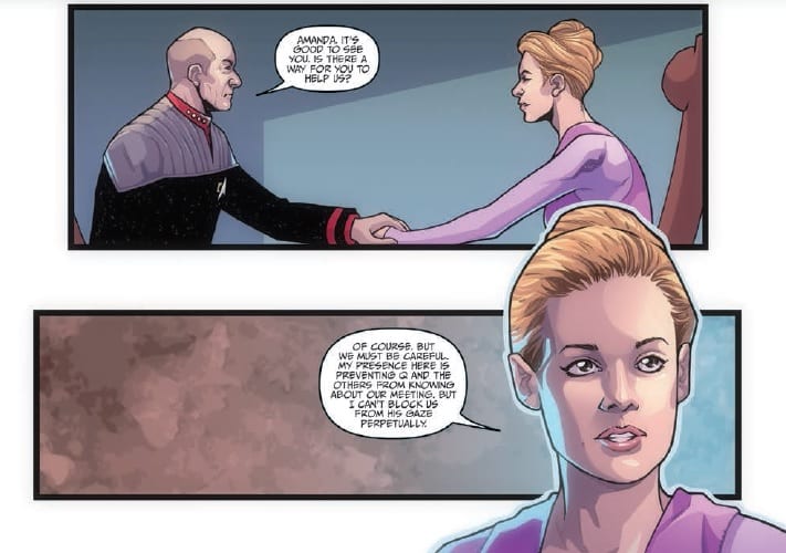
In this issue the four captains have been given an opportunity to strike back against Q and his dangerous games. With the arrival of Wesley Crusher, Amanda Rodgers, and the mysterious Traveler, there is finally some light at the end of the tunnel.
But Q will not go down without a fight. A hoard of different aliens are called upon to fight the mutiny against Q’s games and all of the Universe hangs in the balance. It is up to the best of the Federation to stop an outrageous God for going too far.
And ‘going too far’ is a good way to describe the plot as presented by Scott and David Tipton. The original concept was strong but as each issue has floundered under the weight of an idea, the ending crashes to the ground without ceremony. It reads as though the Tipton’s have an Encyclopaedia of Star Trek Aliens in their lap and are ticking each one off as they include them in the story. An already overcrowded comic is simply packed with more and more character references. The narrative buckles beneath the cameo appearances and the plot just disappears.
Unfortunately, this is nothing more than a web of set pieces that the writers thought would be ‘cool’, spun together around the character of Q just because they can. There is no real rhyme or reason to any of it and the constant references to a universal war do not add enough meat to the bones of the story.
It is a disappointment to see The Q Conflict end in such a way because it had such good intentions to start with. The art work by David Messina and Elisabetta D’Amico has improved as the series has progressed, although it is noticeably again in this issue that Messina favours the closed mouth look for all of his characters in almost every panel. The character representations are solid enough for instant recognition but also have room to express emotional responses to the situations around them.
The fine inking by D’Amico allows for more detailed illustration in the panels. This helps to set the scenes early on but also draws attention to some moments due to the lack of detail. Occasionally the backgrounds drop away and the reader is left with the characters and their reactions. This storytelling technique is also evident with Alessandra Alexakis’ colors. In some panels there is a full color spread, picking up different aspects of the art but in other panels, the color is simplified. It focuses on the characters and their clothing while the background becomes a wash of natural color.

There are examples of awkward character work and the design is uninspired throughout but this is down to the unimaginative story. It seems to be important that everything is a reference to something. The Tipton’s want the readers to drowning in Easter Eggs instead of having to pick them out of subtext on a second or third reading. This is possibly due to the fact that this comic isn’t going to be read more than once. It is a difficult read, not because of complex storytelling or hard hitting narrative, but because the concept is watered down issue after issue until it is almost none existent.
Neil Uyetake attempts to inject some life into the comic via his lettering. He is clearly having fun with the sound effects and desperate to fill a lot of the white void that is Q’s battlefield. However, it is not enough to engage the reader. It is like putting an upbeat soundtrack over the slow paced movie. Here, as a reader, you take time out of the comic to appreciate the work the letterer has done in certain panels but then have no desire to return to the story.
Star Trek: The Q Conflict had lofty aims but in the end failed to hit any targets. The Artwork was consistent throughout but was ultimately let down by the dull story and over use of referencing. Luckily for fans of the franchise there are much better Star Trek comics currently being published. In some ways it probably a good thing that this particular story has finally come to an end.