Home Blog Page 431

Review: FENCE VOLUME 3 Dramatic To The End

Monkeys Fighting Robots

The initial run of Manga inspired, teenage sports drama Fence comes to a conclusion in volume 3 released by BOOM! Studios this week. Collecting the final four issues of the 12 issue run, Volume 3 reaches an epic climax where everything is on the line for Nicholas, the central character.

Originally released at the later end of last year, Fence issues 9-12 continues, and in some way concludes, the story of Nicholas and Seiji’s rivalry as they fight to get into the Kings Row Fencing Team. For Seiji it is an easy walk into the final three but for Nicholas he has to battle every step. As the momentum of the story picks up pace, and with tensions running high, a showdown between the two rivals becomes the central point of the story, and this final collection.

Fence was originally planned as a 12 issue run and the story comes to a satisfactory conclusion in this volume however, there are plenty of narrative threads and budding relationships still to be explored. It is therefore not surprising that C.S. Pacat has announced that this is not the end of Fence. There is a Young Adult novel in the works and the potential for the series to continue as a run of graphic novels.

FENCE VOLUME 3 Dramatic To The End
Fence Volume 3 Cover Credit: BOOM! Studios

Bringing Fence Full Circle

Despite the potential for continuation, Pacat treats these final few issues as if the series is coming to an end. She winds up the story reflecting back on the very first issue. The rivalry between Nicholas and Seiji, the backbone for the entire run, reaches its zenith in these pages and the reader is treated to an epic confrontation.

However, the story wasn’t about Nicholas winning and being the ‘champion of the world’, just like Rocky in the original movie, Fence is a story about striving to be the best that an individual can be. It is about realising what is important and building friendships/relationships along the way. Pacat shows that Nicholas has worked up from nothing to fence with some of the best fencers in the world and she makes sure that his triumph is illustrated in the story.

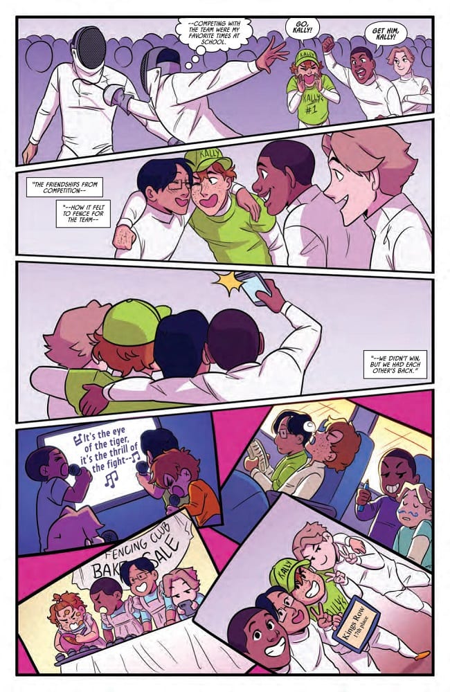
By the end of this volume the reader can see just how far Nicholas, and in some respects Seiji, have come from their 2 dimensional beginnings in issue 1. They started as stereotypes and have grown as characters to be a complex mix of emotions and experiences. This form of storytelling is central to sports dramas, especially the widely popular Manga Sports series, and it is therefore no surprise that Fence has garnered a following.

Pacat has created a beautiful coming of age drama. The sport allows the drama to be drawn out, giving the characters a reason to fight or support each other. Budding relationships spring out of their shared problems but hearts are also broken. Fence focuses on the two central characters but Pacat has populated the comic with a large array of characters for the readers to fall in love with. If you want readers to come back month after month, give them someone to relate to, to follow. Pacat definitely understands this and fills her story with a diverse cast so that there will always be someone for the reader to identify with.

FENCE VOLUME 3 Dramatic To The End
Fence Volume 3 Credit: BOOM! Studios

Artistic Tension 

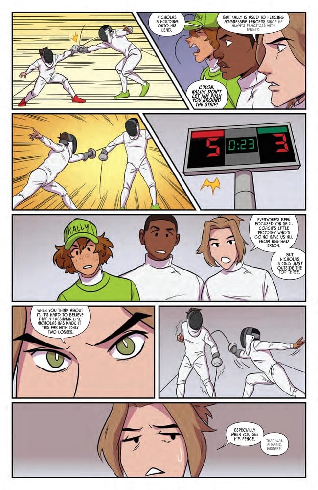
To reflect the mix of high drama and schoolboy shenanigans, Johanna the Mad draws inspiration from Sports Manga art styles. There is a frivolity to some of the panels and pages which lightens the mood after tense fencing bouts. Johanna the Mad uses neat, simple line work which often gives the characters a newspaper comic strip look allowing the relaxed humour of the new friends to shine through. However, she is also able to turn this around so that the minimalistic style heightens the drama of a fencing match or argument between characters.

A lack of background detail, mixed with the all-white fencing uniforms, hones the storytelling and focuses the reader’s attention on one specific moment. Background characters become faceless sketches as the emphasis is drawn towards the cast members that Pacat and Johanna the Mad want you to focus on.

Johanna the Mad has a wonderful talent of switching between the simplified, comical figure work and more detailed, emotional acting for the characters. This makes the narrative skip along at a comfortable pace, breaking up the moments with humour and allowing the reader to share in every aspect of these characters lives. The comic is about the growing relationships between the fencers and the art work represents all aspects of these relationships: the conflicts and the camaraderie.

FENCE VOLUME 3 Dramatic To The End
Fence Volume 3 Credit: BOOM! Studios

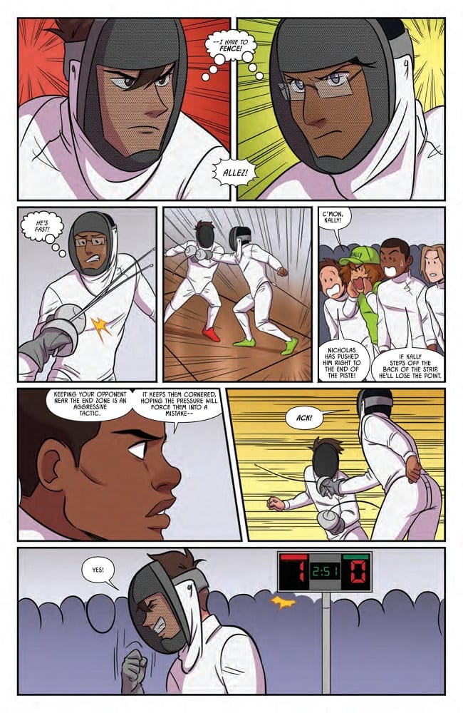
Due to the nature of the artwork, the coloring exists manly for emotional emphasis. Joana Lafuente uses block background colours, simplifying the panels and drawing attention directly to the foreground so as not to detract away from the narrative punches. What becomes clear in this collection is that Lafuente is skilled at expressing emotion and character via signifying colors and a minimalistic use of these colors. The constant changing colours from one panel to the next highlights the difference between the characters and their emotional states at any given point. The inked lines lead the narrative action but the colors express the emotional experiences.

Jim Campbell does a wonderful job with the lettering, taking a lot of exposition and making it almost invisible over the art work. One of unique elements of this comic is the use of thought balloons, a technique that is sorely lacking from comics today, having mostly been replaced by caption boxes. Nicholas is a very thoughtful character, constantly doubting himself and overthinking situations and Campbell illustrates this with the thought balloons that surround the fencer.

FENCE VOLUME 3 Dramatic To The End
Fence Volume 3 Credit: BOOM! Studios

The End?

Fence is enjoyable and has been an entertaining read from day one. It allows itself to be high drama and juvenile humour but makes no judgement on either, accepting that many states of being are allowed at the same time. The characters Pacat has created are growing into adults and they are riddled with all the emotions and insecurities that all teenagers the world over have to contend with. Fence says that it is okay to have these conflicting feelings and helps the reader to work through them with the characters.

The depiction of Fencing has been a joy to read, especially as it has acted as a reflection of the character’s development and not just an excuse for sporting action sequences. This third volume is a perfect end to the first part of the story and a wonderful springboard for future stories. It is also a very easy book to pick up and read, even if you haven’t read any of the previous volumes. There is an instant connection made between the central characters and the reader so that you immediately feel at home no matter where in the story you start.

Obviously, Fence is aimed more towards the teen market. The coming of age story-line is more often identifiable for a younger audience. However, it is also a lot of fun and the artwork is impressive. This comic would suit fans of sport comics in general, especially those who enjoy Manga, but it is also fun escapism for anyone who wants to indulge themselves in some high school drama.

Fence Volume 3 feels like a conclusion in some ways but also a starting point. There is a definite sense that this is merely the End of the Beginning.

Monkeys Fighting Robots Youtube

Review: Gotham is Quiet Tonight in BATMAN #76

Monkeys Fighting Robots

Gotham remains “The City of Bane” in Batman #76. The streets are firmly under the mastermind’s control, thanks to the political cover provided by the Luthor administration.

Gotham Girl patrols the city limits, ensuring all superheroes stay out, while Thomas Wayne rounds up the villains within who resist Bane’s control. Meanwhile, Catwoman is in Paris and working as an art thief-for-hire, nursing a battered and unconscious Bruce Wayne.

The Writing

Bruce Wayne is out of the picture. Bane commands Gotham, enslaving the villains and exiling the heroes. Writer Tom King gleefully dashes even the momentary glimpses of hope again the wall, as if to say, “No. There is no hope.”

Gotham Girl easily overpowers Captain Atom, taunting him while beating him senseless. She demonstrates just how much of a formidable—and dangerous—force she’s become. For his part, Captain Atom bemoans the exchange of justice for security and stability. “Gotham’s peaceful. That’s all they care about,” he says. “Not who’s running it or how. Not the bad being done in there.”

Inadequacy and failure are dominant themes here. We see multiple characters confront their own weaknesses when presented with the situation at hand. Kite Man, Captain Atom, even Damian Wayne…all find themselves grasping for something to cling to, whether that manifests as incredulity, despair, or stubborn frustration. Ultimately, though, they are all forced to reckon with their own complete powerlessness and inability to act in Batman #76. It’s an interesting avenue to explore from a character perspective, though King comes close to overplaying his hand in conducting this theme. This is most apparent with Kite Man’s narrative; King offers a glimmer of hope, only to make the twist of the knife that much more punishing.

It is, for lack for a better term…a bummer. That’s not to say it isn’t damned compelling, though.

Our story approaches the nadir of the narrative with Batman #76. We’ve seen Bruce Wayne battle back and overcome the odds time and again, but those odds are stacked heavily against him here. It’s difficult to imagine what King has in store, but given his take on the story thus far, one has to imagine there are a few more twists coming.

Batman #76

Batman #76

Batman #76

The Artwork

Tony S. Daniel is back on art duties for Batman #76, aided by inks courtesy of Sandu Florea. Following on our last issue, Daniel turns in more quality work here, right from page one. The book opens on an impressive full-page illustration of Selina, before immediately cutting to the showdown between Gotham Girl and Captain Atom. The work conveys the tension of the story well, providing dynamic action and that flows nicely from panel to panel.

He doesn’t delve deep into experimental techniques or abstraction. That said, he employs repetition with variation at multiple points in the book, each successive panel focusing in on the subject to heighten the tension. It’s an effect that can easily become cloying and obnoxious if used improperly. Here, though, the trick works nicely.

Daniel and King have great chemistry as a creative team. The artist expertly nails the story beats in Batman #76, forming a full and cohesive final product.

As with our last issue, Tomeu Morey’s colors are vibrant and eye-catching. They’re warm, but have an edge of grit to them, which works well tonally for the book.

Final Thoughts

Batman #76 is another quality entry in the City of Bane arc. The tension continues to build for the conclusion of King’s epic run on the series. Pick it up now at your local comic book shop.

Monkeys Fighting Robots Youtube

Review: POSTAL DELIVERANCE #2 Stylishly Handles Cause And Effect

Monkeys Fighting Robots

Retribution, punishment, and guilt haunt the pages in the second issue of Image/Top Cow’s Postal Deliverance. The consequences of actions taken in the first issue shape the violent events of this issue and the central characters are forced to reflect on what they have done.

POSTAL DELIVERANCE #2 Stylishly Handles Cause And Effect
POSTAL DELIVERANCE #2 Credit: Image/Top Cow

After Effects of Going Postal

Last month Eric turned up in Eden full of fight and anger. He refused to be told what to do and stamped his dominance on the town with a bloodbath in the bar. When Mark and Maggie turn up, in their roles of Major and Sheriff respectively, they are forced with a confrontation neither of them want.

Meanwhile, Laura has found a new ‘son’ to raise but can she only teach him violence?

Bryan Hill splits the comic into two, each half documenting the psychology of Mark, even though he isn’t even in the second act. In the first act the reader is shown the two faces of Mark. The first is the public, Mayoral face; this is cold, calculated, and harsh when dealing with lawbreakers. In the very first issue of Postal, Laura’s punishment of criminals was a focal point and that moment is recalled in this issue. Marks treatment of Eric is brutal and, in some ways, more of a punishment than the public sacrifice adopted by Laura when she ruled the town.

The second face expresses Mark’s internal struggle with regret for what he has done and the weight of his responsibilities. Hill uses Mark’s internal monologue to give the reader an insight into the character and how he has matured over time.

Laura’s story is also filled with regret but in her case it is the regret of leaving and her inability to let go of her son. Hill compares and contrasts the mother and son’s lives to broaden their characters and link them through the violence that has surrounded them.

POSTAL DELIVERANCE #2 Stylishly Handles Cause And Effect
POSTAL DELIVERANCE #2 Credit: Image/Top Cow

Violence Illustrated

Postal Deliverance’s biggest asset is the realism brought to the story in large part due to Raffaele Ienco’s art work. His fine, detailed lines create highly complex characterisations. The emotional reactions of the character’s shine through each panel and page. Anger, hatred, respect and worry are all expressed through the cast’s acting. The drama is brought to each scene by the visuals and the detailed attention Ienco gives to the characters.

The coloring is very naturalistic until the portrayal of violent acts. Then the violence is heightened by the stark, single color backgrounds. Shades of yellow, turning to orange and finally to red depending on the extremity of the violence.

This approach allows Ienco to signal the disturbing moments and draw them out from the page. The impact of a baseball bat, for example, is accentuated by the simple, signifying color of the background. It focuses the reader’s attention on the act, allowing them to react in revulsion before the narrative moves on to the consequences. As a result, that single moment in time is extended, drawn out to uncomfortable lengths.

One visual element to look out for is the encroaching black shadows, creeping ever closer to the characters. They are like omens of doom surrounding and trapping the characters, sealing their fate. They are created using thick black, cross hatched lines that become denser as certain actions are played out; as if certain choices determine the future of the cast.

The lettering provided by Troy Peteri fits the tone of the comic. Postal Deliverance is a very dry, matter-of-fact, comic and the straight forward lettering reflects this.  The speech balloons are fairly uniform which makes any change stand out more. This allows Troy Peteri to draw particular emphasis to a certain speech or panel without too much alteration to the lettering.

POSTAL DELIVERANCE #2 Stylishly Handles Cause And Effect
POSTAL DELIVERANCE #2 Credit: Image/Top Cow

Conclusion

Postal has come a long way since its first issue in 2015 and this latest issue is one of the best so far in the series. A straightforward visual approach allows the writer and artists to subtly tweak an aspect of the narrative to create a greater impact. A small inserted panel, or slight wobble on a speech balloon stands out and draws the reader’s attention because it is so out of place in the otherwise organised page.

The plot is intriguing and the storytelling is effective. It may not be the easiest jumping on point for new readers but there is plenty for everyone to get their teeth into.


Monkeys Fighting Robots Youtube

IRONHEART #9 – Check Out The First 5 Pages (Exclusive Preview)

Monkeys Fighting Robots

Ironheart #9 hits your local comic book store on August 14, but thanks to Marvel Comics, Monkeys Fighting Robots has an exclusive five-page preview.

About the issue:
Guest-Starring Shuri!
Hot on the trail of the Ten Rings and trying to stop whatever destruction they have planned, Ironheart pays a visit to Wakanda…but doesn’t exactly hit it off with Princess Shuri. And a new ally may be able to shed some light on the story of Midnight’s Fire.


Ironheart #9 is written by Eve L. Ewing, with art by Luciano Vecchio, Geoffo handled layout, Matt Milla is the color artist, and Clayton Cowles was in charge of letters and production.

Check out the Ironheart preview below


Are you reading Ironheart, what do you think of the series so far? Comment below with your thoughts.

Riri Williams, created by Brian Michael Bendis and designed by Mike Deodato, first appeared in Invincible Iron Man Vol. 2 #7, written by Bendis and drawn by Deodato. She then made her first significant appearance two issues later.

Monkeys Fighting Robots Youtube

MILES MORALES SPIDER-MAN #9 – Check Out The First 4 Pages (Exclusive Preview)

Monkeys Fighting Robots

Miles Morales: Spider-Man #9 hits your local comic book store on August 14, but thanks to Marvel Comics, Monkeys Fighting Robots has an exclusive four-page preview.

About the issue:
If Miles is going to escape this new villain, their shadowy masters and diabolical tests, he’ll need help! Good thing his dad’s a former Agent of S.H.I.E.L.D.! And there’s no price Jeff wouldn’t pay to get his son back. But the trade may come back to haunt them, as one of the most formidable foes Miles has EVER faced RETURNS!


Saladin Ahmed and Javi Garrón are the storytellers in Miles Morales: Spider-Man #9, David Curiel handled colors, and Cory Petit put the words down on the pages. This is the last issue to feature a cover by Into the Spider-Verse art director Patrick O’Keefe.

Check out the Miles Morales: Spider-Man preview below


Are you reading Miles Morales: Spider-Man, what do you think of the series eight issues in? Comment below with your thoughts.

Miles Gonzalo Morales was created in 2011 by writer Brian Michael Bendis and artist Sara Pichelli, with input by Marvel’s then-editor-in-chief Axel Alonso. Miles first appeared in Ultimate Fallout #4 (August 2011), following the death of Peter Parker.

Monkeys Fighting Robots Youtube

Review: DEAD END KIDS #2 Peels Back The Layers On This Murder Mystery

Monkeys Fighting Robots

Dead End Kids #2 is out August 21st from Source Point Press, and it’s a haunting reminder of the scars that connect us all and make us human.

As the mystery of Ben’s death begins to unravel, the characters all reflect on their past tragedies and hardships. The series is by writer Frank Gogol and artist Nenad Cviticanin, with letters by Sean Rinehart. The cover is by Criss Madd, and Paul Allor edits the comic.

This issue of Dead End Kids jumps around in time a bit. In the present day, Murphy, Amanda, and Tank investigate their local bully Bulmer’s involvement in Ben’s death. As they do so, the reader gets to take a peek into each character’s past. We get to see why Murphy is so resentful of his foster parents. We see Tank’s parents learn about his heart condition. Even Bulmer gets his turn. 

Gogol and Cviticanin flesh out their cast through these flashbacks. The reader learns what makes the characters tick; we’re peeling back their layers. It makes them feel more real, and it builds sympathy, even for the characters that we may have labeled “villains” after the first issue. 

dead end kids #2 review

Moreover, it connects all the characters, showing that they all have these scars. That seems to be the core message of Dead End Kids: that we all have these traumas that shape who we are. It’s what makes us human. It connects all of us in real life, just as it connects these characters, and it would do us well to remember that more often.

It’s a very personal, and very intimate issue. Yet the present day story – the murder investigation – balances this intimacy with plenty of excitement and intrigue. The murder mystery is the driving force of the plot, and by giving us more insight into these characters, Gogol makes us care more about the outcome. 

Cviticanin’s art is a unique blend of cartoony and realistic, which also helps the audience build a connection to the characters. The cartoony aspect allows readers to see themselves in the characters. Then, when Cviticanin adds some additional detail, it helps deliver the intensity. This is an emotional comic, and words can only carry it so far. The art needs to evoke feeling, and Cviticanin’s work does just that. His colors are soft, which adds an almost dreamlike feeling to the atmosphere, playing opposite this otherwise realistic and intense world.

If you like murder mysteries, emotional dramas, or coming-of-age stories in the vein of Stand By Me, you owe it yourself to check out Dead End Kids. Issue one has already sold out; don’t miss out on this cult classic in the making!

Monkeys Fighting Robots Youtube

Review: THE KITCHEN Needs A Little Remodeling, But It’s Still Watchable

The Kitchen has several good elements that aren’t put together in the best manner. Andrea Berloff, who co-wrote Straight Outta Compton, makes her directional debut here. Sadly, this late 1970’s crime thriller feels like it never goes anywhere.

Based on the DC Vertigo comic book miniseries, The Kitchen follows Claire, Kathy, and Ruby, the wives of New York mobsters, as they oversee the operations after their husbands are caught and sent to prison. Written and directed by Berloff, the film stars Melissa McCarthy, Tiffany Haddish, Elisabeth Moss, Common, Myk Watford, and Domhnall Gleeson. The Kitchen’s premise is similar to last year’s critically successful hit, Widows. Both films depict a group of women cleaning up the remains left by their significant others. However, while Widows knew what it wanted to do, The Kitchen struggles to find its footing and purpose.

Tiffany Haddish, Elisabeth Moss, and Melissa McCarthy in THE KITCHEN

Berloff did not write a film about three women baking in the kitchen, much to the surprise of no one if you saw the trailers. In the past, Berloff has participated in several moderately successful projects and even received an Oscar nomination for her contributions to 2015’s Straight Outta Compton. Her latest outing is a gritty 1970’s gangster movie set in Hell’s Kitchen, New York. The Kitchen’s screenplay is tense, violent and humorous at times, but this combination doesn’t flow that well on-screen.

Scenes go from being really intense one second to awkward and hysterical, which doesn’t work because it happens so fast. The tone of the film is inconsistent, which is fine in most cases, but The Kitchen isn’t balancing it out properly. The script feels overstuffed at points, as the conflict changes more than it should and the film continues this pattern up until the last few minutes. It becomes difficult to care about anything these women get involved in because not enough time is spent on any of the conflicts.

Regardless of that, the performances from Moss, McCarthy, and Haddish are so well done. Each woman starts out dependent on their husbands because that’s all they knew, but they all find their own independence in the end. McCarthy stars as Kathy, a mother who has issues with self-confidence. Moss stars as Claire, a woman who has suffered enough abuse and decides to get even. Haddish stars as Ruby, a very quiet individual who finds her voice and becomes fearless. With a cast including Haddish and McCarthy, there was no way the performances would be anything less than admirable.

Tiffany Haddish, Melissa McCarthy, and Elisabeth Moss in THE KITCHEN

Berloff shouldn’t call it quits as a director, but she should probably use this film to remind herself what not to do next time. As mentioned above, the tone of the film is horribly balanced. Berloff has the potential to do great work behind a camera, and there are a few instances of it here in The Kitchen. However, there are too many scenes and instances that feel out of place compared to what happened prior or mere seconds earlier. For instance, following a near-rape encounter, a laughable scene is then focused on for far too long, and it doesn’t gel well. The way it is shot makes it difficult to understand what direction the narrative is going to go in.

The Kitchen is constantly building towards something that never comes to fruition, and just when it seems like business is about to pick up….the credits appear. A well-acted gangster film that couldn’t seem to find its purpose is ultimately what it feels like, but thankfully, an ensemble trio of well-recognized actresses makes it all worth it. So, while The Kitchen isn’t a complete mess, it could use some cleaning here and there.

Monkeys Fighting Robots Youtube

Review: AGENTS OF ATLAS #1 Is A Fire Breathing Blast of Superhero Fun

Monkeys Fighting Robots

AGENTS OF ATLAS #1 From Marvel Comics brings creators Greg Pak, Jeff Parker, Nico Leon, Carlo Pagulayan, Federico Blee, Jason Paz and Dono Sanchez-Almara together to introduce the 616’s latest team of young heroes from across the pacific and answer the question as to where the original Agents of Atlas are.

The AGENTS OF ATLAS debut in their own series as AMADEUS CHO, SILK, SHANG-CHI, WAVE, JIMMY WOO and all your favorites defend the cross-Asian portal city of Pan against the science-magic threat of one of Marvel’s classic villains! Classic science-magic superhero fun combined with young and old heroes from multiple lands clashing with one another, fighting monsters and maybe saving the world along the way! And who is ISAAC IKEDA, the Protector of Pan?

PLUS: Where are the original AGENTS OF ATLAS? Namora, M-11, Gorilla Man and Marvel Boy in an all-new top-secret mission!

Agents of Atlas #1

‘The Portal City of Pan’ Part 1
Written by: Greg Pak
Art by: Nico Leon
Colors by: Federico Blee
Letters by: Joe Sabino

‘Behind The Veil’
Written by: Jeff Parker
Art by: Carlo Pagulayan
Inks by: Jason Paz
Colors by: Dono Sanchez-Almara
Letters by: Joe Sabino

Writing

Split into two stories, Agents of Atlas is a fast and entertaining read. In the first segment (The Portal City of Pan) writer Greg Pak brings his talent for showcasing young characters to the forefront. From the very first page, the scribe is able to create true chemistry and dynamics between his cast of young characters. They are likable and relatable, especially as a team in the early stages of being a unit. Brawn and Silk are highlights as the defacto dual leaders of the group. There’s also some good banter and a nice sense of levity and humor that gives everything a fun and snappy feel. Pak is also developing a nice mystery here, introducing new character Issac Ikeda, the defender of Pan; plus Jimmy Woo and motherfucking dragons working behind the scenes. That’s right, dragons! War of The Realms brought fantasy to almost every corner of the MU, and it’s great to see a title embracing that and mixing it up with superhero action. The title is also tied to Sword Master, another new Marvel title from Pak that has a very similar feel and goals to Agents of Atlas. It all feels like a cool little corner of the MU that is new and refreshing.

The second segment (Behind The Veil) finds Agents of Atlas veteran Jeff Parker tackling the current whereabouts of the original Agents of Atlas. Veil is a shorter read but Parker easily finds himself comfortable with these tried and true characters. It also shows readers how bizarre and unique the Agents are as a group. It’s great to see these characters on the page again.

Art

In the ‘The Portal City of Pan’ Nico Leon and Federico Blee create a sleek and streamlined look that adds a lot of movement and energy to the narrative. The images pop and move, the delicate and think linework creating a light feeling that is propulsive and exciting. And man do they draw some awesome looking dragons together.

‘Behind The Veil’, illustrated by Carlo Pagulayan, Jason Paz and Dono Sanchez-Almara has a very similar feel but also feels weightier. That makes sense as these are older characters and that added weight to the art and colors emphasis this is a team with history.

Both stories feature great layout work, with clean and well-placed panels and borders. It’s just solid, great looking modern comic book storytelling.

Conclusion

Marvel seems to be spinning a bunch of fun titles out of War of The Realms, and Agent’s of Atlas might easily be the best one yet. It’s a nice little corner of the MU being showcased here and if you are looking for something different and fun, give Agents of Atlas #1 a try.

Monkeys Fighting Robots Youtube

Review: RONIN ISLAND #5: A Test Of Loyalties

Monkeys Fighting Robots

RONIN ISLAND #5, hitting comic book stores on August 7th, details the ramifications of issue #4’s huge reveal. In said issue, Hana uncovers the secret behind the Byonin’s creation and the Shogun’s role in the process. Now the young samurai must decide whether to continue fighting for the immoral overlord or risk certain death in the wilderness.

Story

Greg Pak frames the current events of this story around a series of flashbacks from Hana and Kenichi’s past. The reader sees each child’s perspective when Kenichi’s mother finds the two playing together, no doubt astonished by her choice to rip her son away from the girl. The scene reeks of both racism and class stratification that reflects the ugly attitudes often seen in our own world; it also gives Kenichi his first test of loyalty.

Kenichi's mother taking him away from Hana as children

These flashbacks give readers context into Hana and Kenichi’s adversarial relationship. This adds to Hana’s contempt for the upper echelons of society, specifically the Shogun and his army. She eventually confronts General Sato and demands he explain why he continues to remain loyal to the man who mutated his own people into Byonin. At this the hardened warrior unearths a startling revelation: ” Loyalty’s got nothing to do with it. I just know what the alternative is.”

While Hana is fighting Byonin and debating the merits of staying with the Shogun, Kenichi races as fast as he can to Ronin Island. He’s taken it upon himself to warn them of the Shogun’s treachery and the Byonin menace. But a run in with bandits may put his life in mortal danger.

Art

Giannis Milonogiannis’ penciling, Irma Kniivila’s coloring, and Simon Bowland’s lettering fit perfectly with the narrative laid out by Pak. Milonogiannis’ drawings of Hana’s flashback scenes are beautifully simple, reflecting the innocence of her and Kenichi’s childhood. As the story progresses Kniivila adds in darker hues to signify how much more complex and dangerous their lives have become in this post-Byonin world. Bowland, not to be outdone, makes effective use of bold lettering to drive home the main themes of the story as they arise in character dialogue.

Hana fights off the Byonin

Comic Covers

Milonogiannis and MSASSYK’s main cover places the focus on Kenichi as he faces the terrors of the burned wilderness; Ethan Young’s preorder cover also features the young warrior but uses a monochromatic sketching reminiscent of historic East Asian art forms. Kris Anka’s unlocked retailer variant cover places the brave Hana in the midst of the Shogun’s warriors, giving her an expression of uncertainty as she contemplates why she’s fighting for the unjust ruler.

Conclusion

RONIN ISLAND #5 adds further complexities to Hana and Kenichi’s fight against the Byonin by revealing even more depths of the Shogun’s nefarious schemes. We’re anxious to see what becomes of Ronin Island once the Shogun/Byonin finally reach it.

What did you think of Hana and Kenichi’s flashback scenes? Let us know in the comments below!

Monkeys Fighting Robots Youtube

Review: Strange Planetary Divorce Case is the focus in DOOM PATROL WEIGHT OF THE WORLDS #2

Monkeys Fighting Robots

The Doom Patrol’s bizarre adventure is both a blessing and a curse for readers.

The Doom Patrol has returned, and they have a new destination. After the events of the Milk Wars, the team has worked to find themselves. Negative Man adopted a puppy, Cliff Steele(Robotman) has gone back to see his mother, and Jane gets a crazy new idea. This idea involves the team piling into Casey’s ambulance and fly off into space to save planets. After quick convincing, almost the entire team heads off, except for Cliff. The former Robotman realizes he’s left too many bad memories and relationships to go on. Thinking his only good was as Robotman, he drives off a cliff. Will the team get their favorite robot back?

Doom Patrol Weight of the Worlds 2 cover

**Some Spoilers Below**

Story:

We open our story with the return of Robotman after Casey finds his car crash. Keeg, Negative Man’s spirit, reveals to Cliff that he had been working on an upgraded version of his body. The body includes upgrades that will be unlocked for every act of kindness Cliff does. We also learn that after adopting Hank, Negative Man has been full of positive energy.

While that might be fine for most people, it does cause an issue for Keeg as he can no longer enter Trainor. That same positive energy eventually breaks free and gets lost inside Dannyland. Before they can find the positives, the Doom Patrol heads off to meet a pair of sentient planet headed people to assist in their space divorce.

Doom Patrol WotW 2 p1

If I didn’t stress the bizarre nature of this book before, it practically speaks for itself now. It’s a tough story to follow if you are not used to the Doom Patrol, but it is one that is intriguing. We have moments of fleshing out the characters that we don’t often get with comics. Cliff accepting his role as Robotman, Trainor explaining how his life had turned around thanks to Hank, and even the Planetary divorce is full of these more profound character moments.

That leads me to my biggest problem with the issue: three stories in one normal-sized issue. We had to jam Cliff’s rebirth, Trainor’s positivity change, and a space divorce case into your standard 20+ pages. This wouldn’t be as much of a problem if it weren’t for the fact one was glossed over, and a deus ex machina saved the other. The remaining storyline does show a lot of promise, but it is a tad irritating to watch to other potential stories get tossed aside.

Doom Patrol WotW 2 p2

Art:

James Harvey continues to impress with his illustrations for the Doom Patrol. While it doesn’t have the cartoonish nature of Nick Derrington’s style, this style is better used for the more dramatic character moments. The reveal of Cliff’s return as Robotman is heartbreaking, and you can tell it hurts for him thanks to the detail Harvey put in. Derrington had those moments too, but his style was more suited to the bizarre nature rather than dramatic moments.

Harvey’s best work comes in the form of his two-page spreads. The first is a map of the entirety of Dannyland, which gives nods to the previous series and details the whole of the park. It’s only to show how massive Danny is, but it’s nice to see the level of detail put in. The second two-page is the deus ex machina mentioned in the Story section. While I won’t go into great detail about what saves the day, it’s illustrated beautifully while still capturing the bizarre nature of the book. 

Doom Patrol wotw 2 p3

Conclusion:

This issue is a good follow up to the first issue, but I hesitate to call it a great one. While the dramatic, humanizing moments for Cliff and Trainor are well done, there isn’t much of an overarching plot to get invested in.

While it’s still early in the series, it appears that it will be following the Doom Patrol on random adventures. That can work under the right circumstances, but the question is how long it can keep it up. The art is quite good, but I don’t think it will be enough to carry the series as a whole. I enjoyed myself, but we need to get an actual arc forming soon, or this return is going to fizzle out.

Monkeys Fighting Robots Youtube