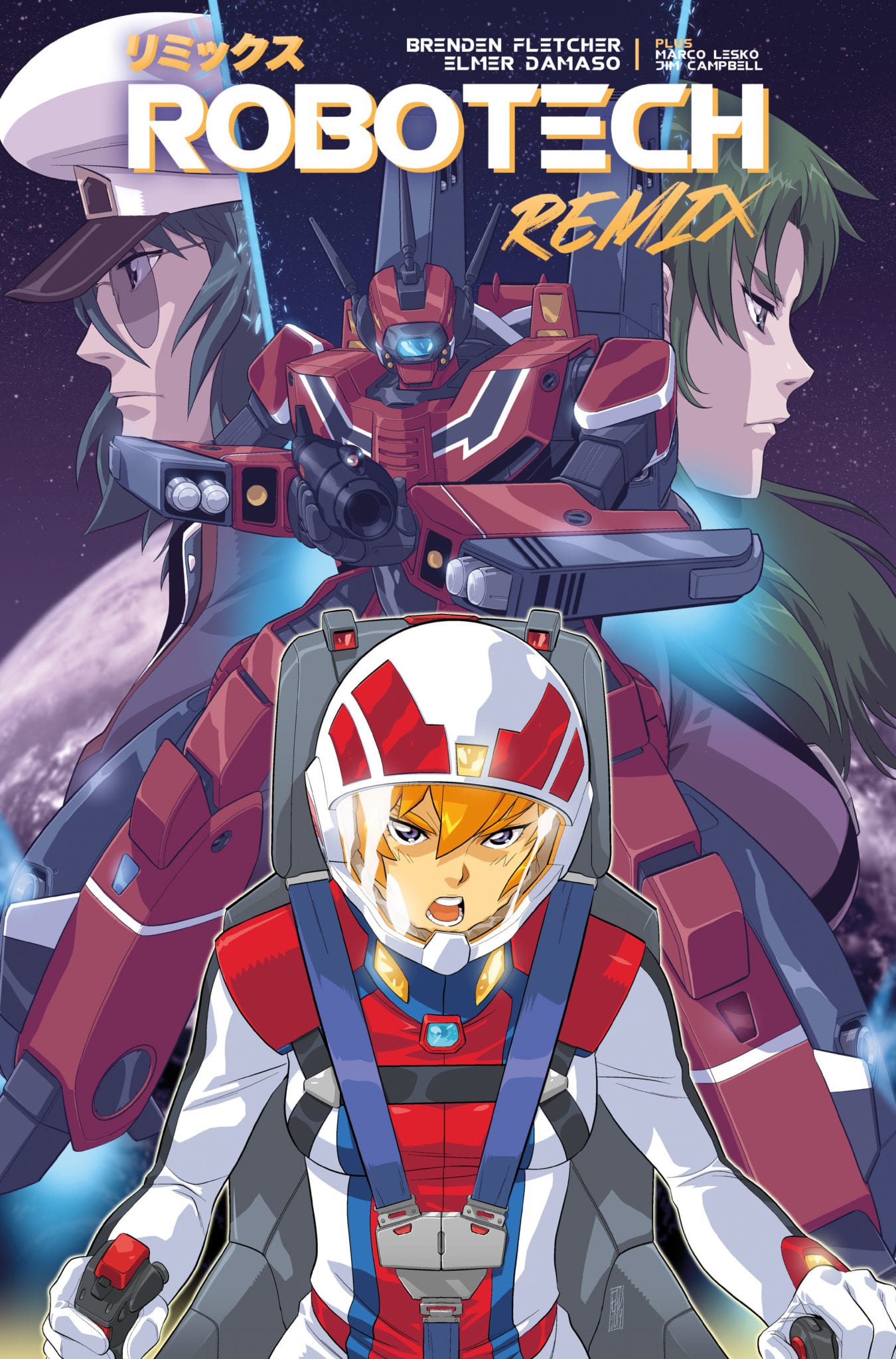
A new chapter begins in the Robotech series with Robotech Remix as Brenden Fletcher puts focus on a Dana Sterling from another universe with the help of Elmer Damaso and Marco Lesko providing the artwork. Will the time displayed pilot be able to deal with making sure she doesn’t destroy the universe in the process?
Summary
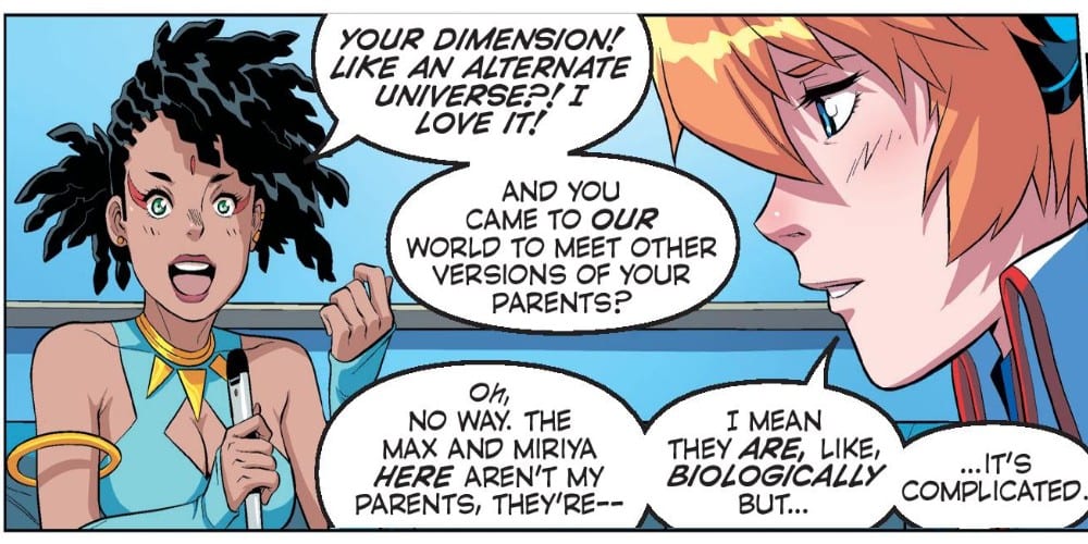
As Dana struggles to find her place, a new enemy arrives and Max may have found a way to send Dana home.
Writing
It’s hard to personify the overall product on display here. It is simultaneously a direct continuation of the previous series while at the same attempting to keep the information simple for readers who might be using this as a starting point. Does it succeed? Kind of, what is presented here is a decent jumping-on point. But it still feels like more enjoyment would be had if the reader was up to date with the previous material.
Brenden Fletcher seems to have a story in line, but it feels like it will appeal to more hardcore fans of this franchise over the newer readers. The blatant callouts to characters introduced in the limited released sequel, Robotech II: The Sentinels are rampant. While it’s exciting and welcoming to have these characters be updated. It makes it a bit hard to not read this issue without having to pull up the Robotech Wikia and check to make sure you’re not missing a character introduction or Easter Egg.
Artwork
The artwork is the real draw of this issue. Elmer Damaso does a fantastic job with the emotional expression of the characters. The indecision and uncertainty Dana is feeling is made vividly clear by the artwork employed. Also, Max looks dapper in his captain uniform.
With Marco Lesko providing the colors, the issue gets plenty of great action moments. The sci-fi and battle effects capture the eye from page to page. The two-page splash, when an alien craft appears out of nowhere, is a monumental moment to behold.
The lettering work by Jim Campbell adds a good dynamic of delivery with the storytelling. The sound effects are on point as well and add a perfect audio element to the issue.
Conclusion
Robotech Remix #1 is a good starting point, but the easter eggs and references drag it down. Credit must be given to Titan Comics for not rehashing the original Robotech stories, but it seems like the book is intended for the more hardcore fans. Still, as long as the story surrounding Dana flows smoothly, then Robotech Remix will be an essential installment for fans of the franchise.
The story continues in STAR WARDS ADVENTURES: RETURN TO VADER’S CASTLE #3. Out this Wednesday from IDW, it would seem that Vader’s Castle is both a source of fascination for the fans and characters – constantly churning out story after story.
Ventress is off on a hunting mission.
***SPOILER WARNING***
It would seem that nobody can stay away from the temptation that is Vader’s Castle. What is it that fascinates us about it? Okay, we know full well what it is. And it’s all thanks to the location and lore of this castle.
So it’s no surprise that once again a series has popped up revolving around Vader’s Castle, and that is has been appropriately named Return to Vader’s Castle. The series has quickly become a collection of short stories, all told by the few residents of Vader’s home.
In the first issue, we saw what Darth Maul had been up to since his…dramatic change in body shape and size. In the second issue, we saw how far Grand Moff Tarkin is willing to go to win. And now? Now we’re seeing a tale revolving around the one and only Ventress.
Thom Hudd isn’t having the best of days…
Star Wars Adventures: Return To Vader’s Castle #3 carries on the format introduced in the first two issues of the series. There is an overarching plot connecting everything, a prisoner and his tormentor, and their collective history. But it also contains a compact plot, telling the story from start to finish.
This issue tells the tale of Ventress and how she never gives up once she’s taken a job. Even if that means she won’t get paid in the end. It’s just the type of person she is. Ventress is a unique and iconic character – especially for fans of Rebels. So it was almost fun seeing her pop up once again.
It was also a good reminder for why you’re seriously better off not arguing with her. Just stick to the agreement, and nobody gets hurt. Probably. Maybe. We can hope, at least, right?
Cavan Scott once again returned to write this miniaturized story, and he had a bit of fun here. He pulled put a vindictive character into the same plot as an iconic creature in the Star Wars realm. But it was still surprising to see how it all panned out.
And of course, there’s the ever-growing curiosity about the main plot of the series. Specifically, about how Thom Hudd is planning on escaping Vanee’s torturous experiments, or Vader’s Castle, for that matter. We’d also like to know what his goal was in arriving here because from where we’re standing, it looks like a bit of a suicide mission.
Maybe muttering isn’t the best thing to do when trying to hide.
Star Wars Adventures: Return To Vader’s Castle #3 portrayed many iconic characters in an almost fun manner. Perhaps it’s just the colors and overall brightness that makes it feel that way. This style is perfect for a younger audience and is just begging for a cartoon version.
But while the artwork itself does have a lighter feel, let’s not forget that sometimes it is portraying something incredibly dark. Scenes such as the Ventress’ hunting spree, or the torturing of Thom Hudd. Or how about the unleashing of an unspeakable monster on an unsuspecting town. Somehow the artists managed to show us all of that, without ever getting overly graphic. It’s an impressive feat.
Francesco Francavilla and Nick Brokenshire were the artists behind these smart and dynamic scenes, with Andworld Design providing the lettering. And you’ve got to admit; together they’ve got style.
Back on Coruscant, there’s a monster on the loose. Well, a different sort of monster, that is.
Star Wars Adventures: Return To Vader’s Castle #3 lived up entirely to the hopes and expectations set by the first couple of issues. And it leaves us wondering what sort of tale they’ll be covering next. No matter what it is, there’s no doubt it’ll be an exciting story.
STRAYED #3, out this Wednesday from Dark Horse comics is the tale of an astral projecting cat – and his journey to find new worlds. This issue will stab at the hearts of cat lovers everywhere while slapping on a bandaid filled with intrigue.
Yet another lovely cover for Strayed.
***SPOILER WARNING***
By now most fans are well aware of the plot behind Strayed. Lou is an adorable cat with the unique ability to astral project. Unfortunately for Lou, where he should be having the time of his life exploring the universe, he’s instead stuck in a horrible situation.
Forced to go on the hunt for new planets to take over, Lou is desperate to make his owner proud. Yet his owner only wants Lou to be free and happy. And healthy. You see, astral projecting has a price, and it’s a hefty one.
And that is where Strayed #3 begins. Lou is once again exploring, though he likely doesn’t know the damage caused by every find he reports. And it’s only a matter of time until the truth comes out. But what can Lou do about the situation? As adorable as he is, he’s just a cat. Right?
The space scenes in this series are truly outstanding.
Strayed is one of those series that will truly tug at the heartstrings of all animal lovers – but especially cat lovers. Seeing Lou’s devotion to his owner is one thing, but then seeing him actively put in danger (through health risks) brings the emotional toll to a whole new level.
So it’s safe to say that Strayed is not a casual and relaxing read. But that’s okay. Instead, it’s perfect for anybody looking to see a whole slew of fascinating new worlds. Or to see a unique take on some science fiction tropes.
Carlos Giffoni is the author of the series, and we’re only now getting to see the long term plan he has for these characters. There’s something much more significant going on behind the scenes. The plot is more than just the human race being its usual greedy selves (though there is that). The story is more than even the love between an owner and her cat.
But Giffoni has taken his time laying out the groundwork for the series. That admittedly resulted in a lot of questions in the earlier parts, but now that we’re getting into the swing of things, it feels like the series is balancing out. Now all of the questions come out of concern for the leading characters.
There are still is a lot left to this tale, naturally. Lou has only just been allowed to realize his role in what was happening. And so far, he hasn’t been given a chance to come to terms with it all. It will be interesting – and perhaps a little heartbreaking – to see how he accepts this information over time. And what he does about it.
Admittedly there is still some room for development, as far as the antagonists are concerned. They feel like flat archetypes, albeit greedy and money-hungry ones. With time the series could potentially push their motives into something truly intimidating. But we’ll have to see how far that goes.
A double-page spread showing off some of the conflict in this series.
As per usual, the artwork behind Strayed #3 is absolutely striking. Honestly, this series is worth reading for the artwork alone. The multitude of unique worlds shown in this series so far has been breathtaking. We’ve seen vibrant worlds full of intricately designed plants, ethereal creatures, all full of effervescent life.
Juan Doe deserves all the credit for how Strayed looks. He’s behind everything, except for the letters, which is done by Matt Krotzer. Doe designs everything from the dynamic lines to vibrant colors. And what he comes up with is truly breathtaking. It leaves us hoping that we’ll see more of space and the many planets available to see just how far his creativity can be pushed.
A new history has been revealed.
Strayed #3 was a surprisingly emotional issue, thanks in part to the way it concluded. Even knowing that things will likely turn out okay (in the short term, at least), it’s hard not to be anxious about what is happening. All while being curious to see how Lou and his owner will get out of their horrid situation. Only time will tell how Lou handles the latest bit of news thrown at him.
Toy Story 4 released in June to rave reviews and has worked its way to a billion or so dollars, but the real story is about Forky, the breakout star character who is getting a series of animated shorts and putting the music to the CGI magic is composer Jake Monaco.
Tony Hale returns in Forky Asks A Question as the voice of the titular character. If you don’t know, this is the mildest of mild spoilers, Forky is a toy that was just a spork until Bonnie, the main human character in Toy Story 4, turns him into Forky. The episodes are set to air starting in November on the upcoming Disney+ subscription service.
PopAxiom spoke with Jake Monaco about his work on scoring some Scooby-Doo, the documentary Through the Windows, and making Forky for Disney and Pixar.
Falling In Love
Jake was born in New Jersey, raised in New Hampshire, and went to college in Virginia. “Music has always been a part of my life. I played the guitar when I was very young … In high school, I joined some bands and played all through college.”
Jake did a “little bit of scoring” during this time too. Eventually, Jake and his bandmates went their separate ways. “I still wanted to pursue a career in music.”
Jake was made aware of the USC film scoring program. “I checked it out … and fell in love.” Jake applied and received a spot in the program.
Post-USC
After finishing the program at USC, Jake earned a gig with composer Christophe Beck (Frozen, Ant-Man). “I was with him for seven-and-a-half years or so. It went from an assistance-ship to an apprenticeship.”
Jake says of his time with Beck, “There’s nothing like real-world experience.”
Jake’s career blossomed from there. “Chris and I are still great friends and work together every so often.”
In the era of the great content expansion, there’s been a more diverse mix of scores and composers thinking outside the box. “I think a lot of the singer-songwriter background I had helps me a lot with my film scoring. It brings a different flavor.”
About Forky Asks A Question
Forky is a product of Pixar who is one of the most consistently good filmmaking studios ever. Oh, and Pixar’s part of Disney, one of the other most consistent studios ever. “What I love about both Disney and Pixar is that everyone is so excited about what they are doing. It’s so collaborative.”
Jake expands on the collaboration present for Forky, “Bob Peterson, who directed all the Forky episodes, flew down with a couple other people from the project. We sat in Studio A at Capitol Records with six or seven of the top musicians in L.A. and went through the recording process.”
“It’s one of my favorite things about my job and the industry I’m in.”
Getting Stinky & Dirty
Last year, our sister-site interviewed Guy Toubes, the creator of hit kids YouTube series Stinky and Dirty. Jake became part of the show after submitting some samples. “I watched the pilot, and one of the things about the show is the trucks, they utilize what they have to solve any issue that they come across. I thought it would be fun to embrace that in the musical approach of the show and try and use more found objects.”
What exactly does that mean? “A banjo made out of a hubcap. Instead of using a standard shaker, I’d fill up a plastic bottle with sand or beads or rice; bang on pots and pans instead of a more traditional drum.”
Stinky & Dirty is a highly creative show about being creative problem solvers, and behind the scenes, that same creativity was going on. “It was about finding interesting and unique instruments to bring to the palette of that show.”
Supporting A Story
Every project is different. But there are questions to ask when starting any new one. “Who is the target audience? Is it for teens … a more mature, adult audience?”
Once those questions are understood, “… then it’s about supporting the story.”
In regards to kids’ shows specifically, Jake explains, “I think one of the tricks is finding that middle ground so that it’s really supporting a story for a pre-school audience but then making it less monotonous for adults watching along with the kids. I want the viewing experience to be fun for everyone involved.”
On Another Note
Jake’s work appears in Through the Windows, a documentary about the Twin Peaks Tavern, a gay bar in the 70s which challenged the status quo by opening its windows. What’s it like shifting gears from computer generated forks to real-world rebellion? “For the documentary, Through the Windows, it’s more about achieving a tone. What’s the mood?”
Jake further explains, “We’re not going to try and acknowledge every beat that’s happening on screen but instead, ride along with the emotion that the storytellers are sharing with us.”
More questions arise. “Is it happy or peppy or serious? And how do we bring those emotions together into a sonically cohesive world.”
Musical Puzzles
Every project is a puzzle to be solved. “With shows like Stinky & Dirty or DinoTrux, it’s more about … jumping in and writing for the episode.”
For other projects, you’re getting pieces of the larger puzzle at a time. So, Jake works with what’s available. “We have a main character theme opportunity here. We have a love scene here. And an opportunity for our antagonist’s theme here.”
“I’ll tackle those three spots, present those, and then from there figure out the rest.”
Singing & Driving
Jake lives in L.A. and primarily works out of a home studio, which means he doesn’t often drive even though it’s a source of inspiration. “My best spot for ideas is while I’m driving in my car. When I’m driving to meetings, I typically don’t listen to much of anything in the car, and my brain will start working.”
Jake continues, “I might start thinking through a story. Toying around with ideas.”
To preserve the idea, “I’ll sing stuff into my phone.”
The snippet of the idea becomes part of the bigger puzzle and the joy of composing for Jake. “Then there’s the challenge of taking that 10 or 15 second bit and making into something that will work for two or three minutes.”
Wrapping Up
Jake worked on Be Cool, Scooby-Doo, so as a lifelong Scooby-Doo fan, I’d be remiss to not ask what that was like. “Having the opportunity to be part of the legacy of Scooby-Doo, it’s amazing.”
Who inspires and influences Jake daily? “Spending those years with Chris was great. He helped my musicality grow by leaps and bounds. Thomas Newman has always been one of my favorites. What he’s done, and continues to do, with Pixar projects from Finding Nemo to Wall-E, is as unique as the stories themselves. ”It’s such an emotional journey that he can take us on.”
Outside of the film music world, “I listen to a lot of indietronica music. It’s got a bit of the indie nature and is rough around the edges but also still more polished. A lot of interesting sounds and devices that bands are using their production these days.”
“What if I used that but flipped it and reversed it and turned it into the sonic identity for this character.
Forky is on its way, so what’s next for Jake? “I’m in the middle of working on another Pixar short called Lamp Life starring Bo Peep.”
Forky Asks A Question will be part of Disney+
when the service launches on November 12th, 2019.
Thanks to Jake Monaco and Rhapsody PR for making this interview possible.
Want to read more interviews like this? CLICK HERE.
Vault Comics has been consistently amazing with its debut issues; this streak continues in the fast-paced, plot-heavy HEIST #1.
The Crew For The Job
Every heist needs a crew, Vault Comics’ newest series is no different, featuring Writer Paul Tobin as the plan man, with a detailed outline (artist) by Arjuna Susini, Vitrio Astoneto on blueprint duty (colors), and Saida Temofonte writing it all down (letters).
Plot, or How To Plan To Steal a Planet
The story in Heist #1 moves quickly; in each moment Tobin adds subtle world building, and varying amounts of character development. Tobin reveals Glane’s character and world in four quick panels.
The following pages, Tobin explains Glane’s recruitment plans. Each new development feels fast and lengthy enough to keep the ball rolling while mysteries evolve. These moments show how deep Tobin built the universe.
But, as fun as Glane is, he feels akin to other con-men tropes, with witty banter, oozing charm, all while being a lovable rogue. These aren’t bad per se; there’s a reason it’s such a long-running trope. But if you placed any other famous con-man character here, the story would feel the same.
The Art of a Heist
Heist (the planet) is as slimy and grimy as you’d expect a planet full of thieves (and worse) to be. This sense of uncleanliness is courtesy Susini’s claustrophobic art. The crowds seen will have you constantly checking pockets for content. Or, even your back for knives, due to the multitude of assassins.
The cluttered vibe Susini’s art emits matches perfectly with the story Tobin tells. But in some moments, the busy panels become a tad much, obscuring things that transpire. But these aren’t common unless multiple things are happening.
The few segments of high octane violence keep the pace the story strives for, as these moments are fun while making you crave more. Helping the busy panels stand out are the contracting colors by Vittorio Astone.
Usually, planets consisting of thieves have landscapes that are presented as grayish and dull. Heist’s planet exudes these grimy colors while adding in a brighter palette to help it seem lively, and futuristic.
As thriving as the crowds are, the world and people never make noise. While reading Heist #1, it seems off, as some added background noises would’ve given Heist an even livelier feeling. Besides that, Temofonte has a lot of words to work with, while trying to find the perfect spot to put boxes/bubbles not to hamper the art.
The Heist of a Lifetime (Conclusion)
Although it does feel clustered at some parts, Heist #1 is a great first issue. Proving that Vault Comics is one of the top publishers at the moment.
Memorable Quote: “You’re the one who farted in the wrong direction, and she got the stink.” – Hardy (Bartender)
Hardy has a unique way with words. I wish he were my Bartender.
Readers of Earth
If this piques your interest, check out, Heist #1 when it releases November 6. When you do, let us know what you think down below. While you’re at it, check out our other Vault Comics reviews!
The Mask, the zany anti-hero that’s been a fan favorite since his debut in 1987, is back in the limelight with THE MASK: I PLEDGE ALLEGIANCE TO THE MASK #1’s release Wednesday, October 16th. The series picks up almost two decades after the notorious figure known as “Big Head” disappeared, a period in which the city has somewhat recovered from the chaos. But the recent murder of two foster parents (who happen to be extremely abusive) has people talking about The Mask again. And in the midst of a highly contentious election season, it’s hard to believe the city will remain unscathed.
Story
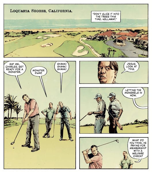
Mitch Kellaway, a detective lieutenant serving Edge City, has lived a largely unglamorous existence throughout his career. Routinely disgraced by his golf buddies and largely unrecognized by the police department, the man resorts to drinking for some reprieve. But Kellaway notices the news report saying one of the foster parents’ children describe the killer as having a “cabeza de verde,” which means “green head” in Spanish. Fending off a horde of bad memories from his past run-ins with The Mask, the detective races to find backup.
While Kellaway attempts to alert those who would help the city prepare for The Mask’s return, Mayor Kathy, the former girlfriend of Stanley Ipkiss (the mask’s previous wearer) charges ahead in her campaign in the U.S. presidential race. Unfortunately, a gigantic obstacle lays in her way. She must find a way to address the crumbling infrastructure of Edge City, deal with the recent reports of The Mask, and, most personal of all, face extortion from a tech billionaire who’s heavily invested in her election. He has dirt on her previous stint as The Mask and plans to implicate her in the recent murders unless she writes legislation to give him full access to user data on any technological platform.
Both of these storylines are set within a political climate filled with hate, distrust, and fear—much like our own.
Writer Christopher Cantwell brilliantly weaves together our modern, contentious, and crazy political climate into the equally zany antics of the THE MASK series. We see the effects the vigilante has on peoples’ lives—Kellaway, Kathy, and many more—and it proves Cantwell can bring multiple unique points of view into the storyline.
Artwork
Patric Reynolds’ penciling, Lee Loughridge’s coloring, and Nate Piekos of Blambot’s lettering each capture the gritty style that marked this series’ heyday in the late eighties and early nineties. We see that the grit is much stronger nowadays, however, with little zaniness at this point in the narrative. The blood from The Mask’s murders looks real, and the font styles presented in the lettering bear witness to the terror each character experiences due to The Mask’s reappearance.
The Comic Covers
Main Cover
Reynolds’ cover artwork features The Mask hiding under an ordinary hoodie, surrounded by posters urging the public to vote for him. This illustration’s is straight to the point: The Mask has returned under our noses, and he’s moving into politics.
Variant Cover
Rafael Albuquerque’s variant cover also depicts the titular character in a hoodie, only this time it’s covered with stars from the America flag. We also see that he’s holding a bag of cash, coupled with a backdrop of red and white stripes. The implication is that the notorious figure is planning to rob the country blind, both in terms of material goods and the values we hold dear.
Conclusion
THE MASK: I PLEDGE ALLEGIANCE TO THE MASK #1 is a promising political satire unlike we’ve ever seen. Marrying the already complex character of The Mask to our own world’s zany and cruel politics will speak to politically aware readers on multiple levels.
Do you like the political tones in this continuation of THE MASK series? Let us know in the comments below!
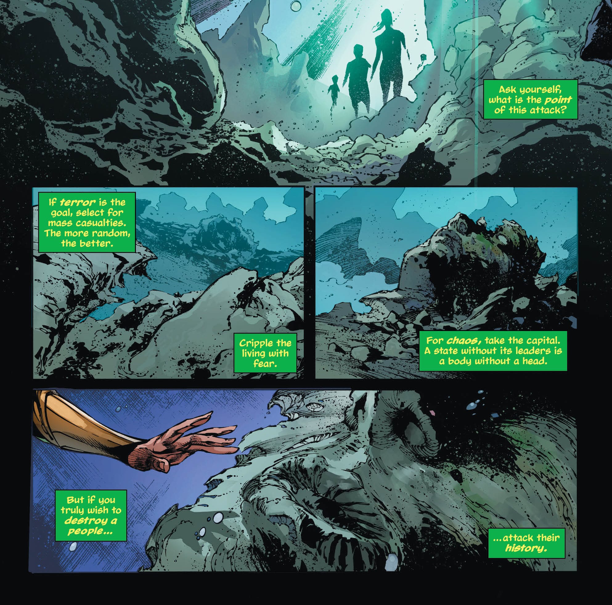
AQUAMAN #53, available in stores on Wednesday, October 16th, opens up a new chapter in the life of Arthur Curry. After failing to save a man named Ralph from a horrific sea creature in issue #52, he’s been looking for answers. Fortunately, those answers have arrived right under his doorstep in the form of Tristram Maurer. The Amnesty Bay loremaster seems to have survived after two centuries, and he has a message for Arthur about the sea beast. At the same time, the villain Black Manta has set his sights on Atlantis. Will the former duo of Arthur and Queen Mera be able to alleviate these threats together, or have the past events destroyed any chance of a reunion?
Story
Mera and her Atlantis guard pay a visit a number of destroyed statues in their city gardens, tracing the evidence left behind to Black Manta. Mera interprets this as an act of aggression, an attempt to erase the nation’s history. In response, she seeks out Arthur’s assistance in taking down the villain, despite their current estrangement.
While this is taking place under the sea, Maurer, who told horrific tales of monstrous beasts some 200 years ago, has a message for Arthur: the monsters are real. The old man shares memories of imagining fantastical creatures as a boy, only to find that they became fully corporeal beings soon after. Because of this unfortunate ability Maurer exiled himself from Amnesty Bay and society at large. Now he’s a man full of regret, both for his creations and lost history.
Writer Kelly Sue DeConnick weaves a tale of lost history within this issue—we see material losses in the histories of Atlantis and Maurer. Mera must cope with the lost of historic architecture from Black Manta’s terrorizing attack, and Maurer comes to terms with his self-imposed exile from his home in Amnesty Bay. Can both of these groups come together and stand up against their respective threats?
Artwork
The artwork was wonderfully diverse throughout AQUAMAN #53. Robson Rocha and Eduardo Pancica’s penciling, fully fleshed out by Daniel Henriques and Júlio Ferreira’s inking, easily transitions from Mera’s underwater kingdom to the small town vibes from Amnesty Bay. Sunny Gho’s coloring adds to this effect as well, especially when Maurer recalls his past; the memories of the old man and his monster creations all have a tan tint to show that these events took place in a distant past—or were ripped out of the pages from a storybook. Clayton Cowles’ lettering is another great feature of the book’s art, offering a variety of narration dialogue boxes to give the reader context; this includes the historical recap of Amnesty Bay’s founding and Maurer’s narration of his childhood memories.
Comic Covers
Main Cover
Rocha, Jason Paz, and Alex Sinclair put together the main cover. It features Arthur’s Aquaman uniform sitting on an empty Atlantis throne, symbolizing Mera’s search for her co-ruler to alleviate the city’s threats.
Variant Cover
Rafa Sandoval and Rex Lokus’ variant cover gets up close and personal, depicting a close-up view of Arthur’s battle scarred face. Its a perfect reflection of the violence ramping up in Amnesty Bay.
Conclusion
AQUAMAN #53 hits home with relevant themes of regret and loss. It also sets up a number of threats that will put our heroes to the test. We can’t wait for the next issue!
What did you think of Arthur and Mera’s short-lived reunion? Let us know in the comments below!
In Marvel Comics’ Absolute Carnage #4, on sale October 16, writer Donny Cates takes the series to a thrilling next level ahead of its looming conclusion. In an event filled with despair, the latest issue gives the reader some hope while it maintains the previously established stakes. After another gripping installment, we can’t wait to see how this epic story ends.
Absolute Carnage #4
Writer: Donny Cates
Penciler: Ryan Stegman
Inkers: JP Mayer, Jay Leisten and Ryan Stegman
Color Artist: Frank Martin
Letterer: VC’s Clayton Cowles
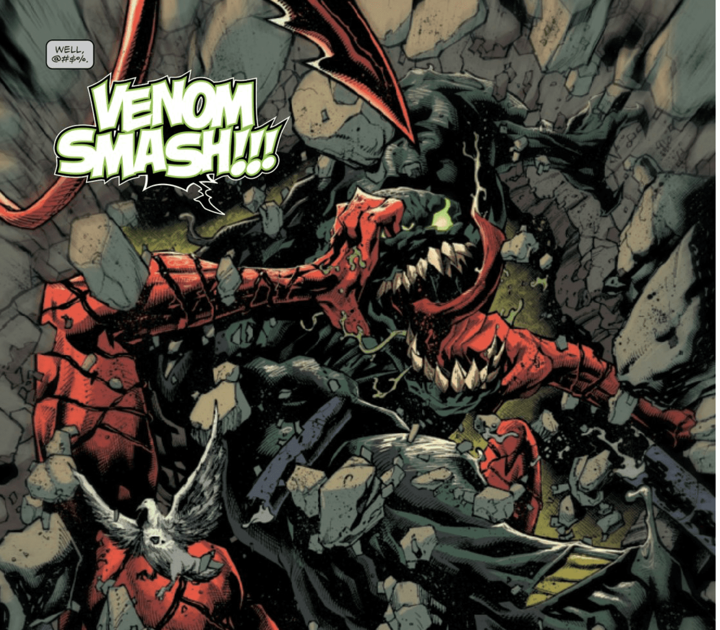
When we left off, the Hulk had just bonded with the Venom symbiote and Cates picks up in this same moment. The first page shows Hulk-Venom crushing Carnage.The image of the Gamma Green Giant fused with a symbiote is delightfully wacky because he’s inherently a beast, so pairing him with a powerful extraterrestrial suit feels like overkill. Hulk-Venom is another reason why Absolute Carnage feels like DC’ Comics’ Dark Nights: Metal; it embraces the ludicrous side of comic books. (In Cates’ Venom, There have also been symbiote dragons and, later this issue, Carnage looks like a winged demonic beast from Hell.) Cates strikes the balance between the goofy and the grim, which is why we can appreciate the cinematic first page.
The Hulk-Venom hybrid is an incredible sight.
This dynamic opening splash from penciler Ryan Stegman makes it feel like the Hulk is bursting out of the comic book. Inkers JP Mayer, Jay Leisten and Stegman add texture to the page; the crumbling wall feels three-dimensional, which adds to the animated style. Color artist Frank Martin makes the Hulk and Carnage look demonic in their own ways. He gives Hulk glowing green eyes and gruesome, gnarly teeth while he continues to make Carnage look like a fiery jack-o’-lantern with a jagged red smile. Finally, letterer VC’s Clayton Cowles conveys the duality of Hulk and Venom by juxtaposing a green outline for the former’s dialogue with a black background for Venom’s speech bubble. Once again, the art team is firing on all cylinders, which makes Absolute Carnage a pleasure to read.
Now that the Venom symbiote has bonded with the Hulk, Eddie Brock is practically powerless. But that doesn’t stop him from being the most heroic character in this issue. Cates continues to give the series’ various protagonists valiant moments and Eddie takes the cake here. Though he’s unarmed, he holds down the fort when the other heroes are incapacitated. Eddie picks up Captain America’s shield and charges into fight a horde of Carnage’s minions. This moment makes you want to stand up and clap. Eddie isn’t as virtuous as Steve Rogers but he keeps growing into his best self. At times, Cates foreshadows that this growth will lead to a heroic sacrifice.
Spider-Man tries to stop Eddie from doing something reckless.
Eddie, a classic loner, has something to live for now. He has to protect Dylan, his son, at all costs. When Carnage’s goons invade the heroes’ safe house, it’s up to Eddie to hold them back. Eddie’s sheer willingness to single-handedly wage war against the swarm is inspirational. Before he risks his life, Spider-Man tries to stop his nemesis. In a heart-warming moment, Eddie asks Spider-Man to protect Dylan. ““You’re all I have,” he says. “Please, for whatever i’ve been to you over the years, just please do this for me.” The complex relationship between Spidey and Eddie has been one of the most fascinating narratives in this series, and hopefully the finale will add even more depth to it.
Absolute Carnage gets better with each passing issue. In the most recent installment, the heroes rally, though Carnage gains momentum, too. The stage has been set for an incredible finale and we’ll have to wait to see how it holds.
What’d you think of Absolute Carnage #4? How do you want to see the series conclude?
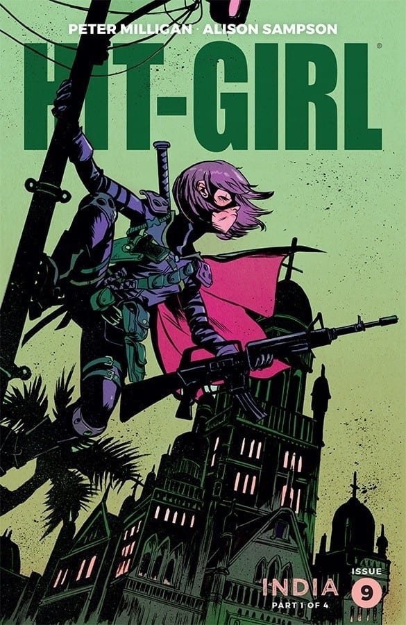
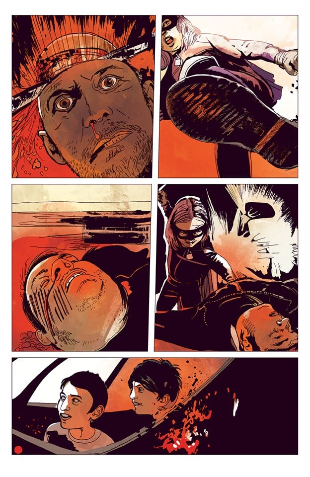
Her tour of the world has brought Hit Girl to India this week in the first part of Peter Milligan’s run on the comic. With the additional talent of Alison Sampson, Triona Farrell, and Clem Robins, Image Comics hold nothing back as the young vigilante brings violence to India’s largest city, Mumbai.
Like a spirit of vengeance crossed with the A-Team, Hit Girl prowls the streets looking for someone who needs her services. With Mumbai’s population being over nineteen million people, it isn’t long before she is engorged in violence but will the cultural differences cause her greater concern than she thought possible?
Hit Girl Season 2 #9 Alternative Cover Credit: Image Comics
Hit the Ground Running
Peter Milligan is no stranger to violence having worked for a number of years on stories for 2000AD. He is also known for crafting surreal mysteries and mind warping tales of wonder. This somehow makes him a perfect fit for a Hit Girl story set in the underworlds of India. His research into the culture is obvious and he uses the culture shock of the central character to explore some of the world of Mumbai.
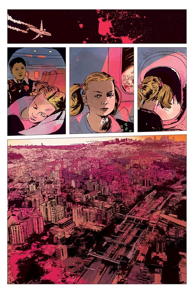
Mindy McCready lands into Mumbai and quickly gets involved with a bizarre kidnapping and exploitation ring. In her attempts to get to the heart of the gang she is faced with blockages she has never encountered before. Meanwhile Milligan shows the reader the otherside of the coin, with the wealth and opulence behind the villainy.
This contrasting nature of Mumbai provides a perfect opportunity for the artwork to really shine; and with Alison Sampson on art duties, the visuals do just that. Sampson has a delicate touch with very fine inked lines. She picks up every detail possible, especially in the architecture, illustrating beautiful, and bountiful, sets for the action to take place in. The exquisite design work in the Indian buildings and decoration is brought to life in every panel. Mumbai becomes a fully immersive world for the reader to get lost in, just as Hit Girl herself does.
Hit Girl Season 2 #9 Credit: Image Comics
Details, Details
The plot has some disturbing elements and so does the artwork. Sampson is as competent at depicting violence as she is at building liveable spaces. There is something unnerving and raw about the violence on show in this issue of Hit Girl. Previous runs of Kick Ass, the more recognisable visuals, have been brutal but always in a comic book way. Sampson brings a disturbing realism to the work. This is enhanced by the realistic coloring style of Triona Farrell.
Farrell’s vibrate colors bring out the beauty of India and the culture but this style makes the violence more impactful. Within this bright, shining world, the slashes of a machete or even something as simple as a slap to the face, stand out. The pain the characters feel is evident and in the readers face. As the story continues, Mindy begins to feel as if she is out of her depth, lulled into a false sense of security, just as the reader is by the attractive and inviting colors from Farrell.
This discomfort and awkwardness is further enhanced by Sampson’s use of unconventional viewpoints. She wildly swings the point of view from a long shot to a close up and then to a ground shot, looking up at the deformed figure of a man, looming over the reader. Sampson used this style to great effect in her horror comic Winnebago Graveyard, and it works just as well here. Hit Girl‘s world is not a safe, comfortable place and that is reflected in the way that Sampson leads the reader through Milligan’s plot.
The lettering brings some much needed grounding to the comic. Clem Robins seemingly straightforward approach to the speech balloons and the captions help to steady the wilder aspects of the comic. However, if you look real close, even Robins is manipulating the reader’s impression of Hit Girl‘s world. Occasional bolding of text not only gives emphasis in a particular speech but also alludes to something larger within the plot. References to the Beggarman and the Mumbai Diary stand out on a page as if they have a great significance.
Hit Girl Season 2 #9 Credit: Image Comics
Conclusion
This issue of Hit Girl is something special. It is obviously Hit Girl and draws likenesses from that world of storytelling but everything else about this comic feels new. The visual aesthetic and attention to cultural details gives the story some weight. The focus on the story is the cultural shock that Hit Girl experiences and this is portrayed through every strand of the comic. The creators invite the reader into this alluring world and then instantly make you feel uncomfortable.
This is a step up in every way from the original source material that spawned Hit Girl. Milligan, Sampson, Farrell and Robins all share one thing in common; their attention to detail. Together this makes for a comic that is instantly re-readable and a pleasurable, visual experience.
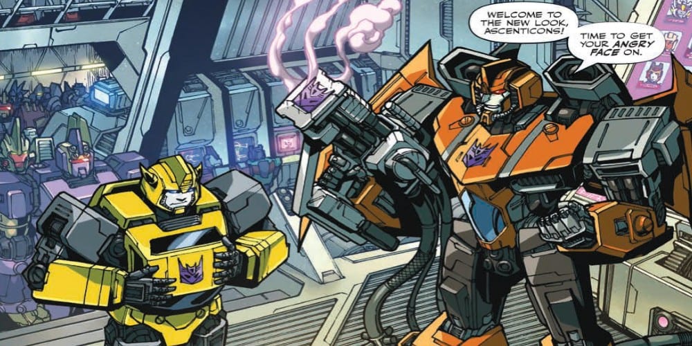
The new Transformers series from IDW Comics written by Brian Ruckley has been playing the slow game to re-introduce famous faces to this new series but takes a step forward with this issue. Fan-favorite Springer comes in but what does he add to the story as the entire planet continues to search for two different killers?
The hunt is on! Chromia and Prowl launch a massive security operation, desperately trying to track down two murderers. Bumblebee visits an injured Windblade, Orion Pax, Sentinel Prime, and Megatron wrestle for control and influence.
Writing
This issue seems to be taking things in a better direction than previous issues. The slow pace has been the major flaw against this series since its reintroduction. The main mystery introduced in the first issue hasn’t been solved but here it at least feels there is some forward momentum. Investigations leading to shootouts do have a way of drawing characters in much more effectively than political dialogue. Thanks, Springer and Sideswipe for shooting first and asking questions later. Your reckless behavior makes for a much more entertaining issue.
On the more low-key side, Brian Ruckley is still playing the underlying tension angle through the use of Bumblebee. The yellow undercover agent is trying to his best to stay in good graces with the Decepticons Ascenticons to the point he is willing to get their new badged etched into his chest. The suspense is high as he tries to find out more information about who killed his mentee and at the same time he doesn’t know who he can trust in his new group of “friends.” Hopefully, he will move closer to cracking this case and ending at least one of the mysteries this story has introduced.
Artwork
The credit for the pencils and inks goes to Alex Milne and Angela Hernandez. Though their styles are different, they seem to blend in a way which doesn’t distract from initial viewing. It’s only after a second reading does the differences become noticeable. Mixing of art styles like this is a testament to their skills as artists.
The coloring work by Joana LaFuente and Josh Perez adds a great deal of atmosphere to the piece. The shadows as Bumblebee investigates the Ascenticons adds a feeling of dread around the situation, while the effect work makes the action scenes pop. There also is a great sense of pain in one scene as Springer is thrown into an energy field which is brought to life perfectly by the colorwork of the pair.
Tom B. Long on lettering adds the right sense of sound to every frame of the comic. The opening showcasing the branding with the new symbols has the perfect sound effect with “Cank-Shhh”. The effect work really helps to add to the cinematic feel of the story.
Conclusion
Transformers # 13 is a step in a better direction with more transforming and more action instead of the building conspiracy. The new Transformers series isn’t bad but it still has a long way to go to catch up to the saga which predated it. With more issues like this, such a feat would actually be obtainable.