From massive monster battles to complex character drama, Mike Mignola’s Hellboy universe has Gothic horror for everyone.
SPOILER ALERT: Minor spoilers for Hellboy and B.P.R.D. ahead.
When Mike Mignola left DC Comics to strike out on his own in the early ’90s, he had horror comics on the brain. He had the early concept for a sort of paranormal Justice League, with the early con-sketches of a character he called “Hellboy” at the forefront. As the concept developed and was picked up by Dark Horse Comics in 1993, it’s doubtful that Mignola had any idea of the scope or influence his new story would have. The meticulously crafted mythology Mignola builds in the first issues of Hellboy would later explode into a massive comic universe of its own. The departure of everyone’s favorite half-demon from the Bureau for Paranormal Research and Defense (B.P.R.D.) spawned a series focused on the remaining cast. This new B.P.R.D. series would, in turn, become the fuel for even more independent series involving the characters of the Hellboy Universe and the world they inhabit. From long-form series like B.P.R.D.: Hell on Earth and Lobster Johnson to mini-series such as “Koschei the Deathless” and “Frankenstein Underground,” the Mignolaverse is rife with unique stories to jump into.
Yeti-Monks, in context, aren’t that weird.
A key element to why the Hellboy Universe is so praised is how consistent the quality of each series is. Mignola and the folks at Dark Horse over the years have brought together a team of top-notch writers, artists, colorists, and letterers that have carried the Hellboy vision forward in dozens of narratives. The talents of John Arcudi, Joshua Dysart, Duncan Fegredo, Max & Sebastian Fiumara, Dave Stewart, and countess others contribute to Mignola’s massive shared vision. The cohesiveness of this universe is something that arose organically, which is why each story has its own personality while still keeping with the central Hellboy plot. There isn’t anything in the 25 years of stories that feels rushed or shoehorned. Every development comes along organically.
Another feat of the Hellboy Universe is just how easy it is to get into for first-time readers. While all are obviously connected, each story stands on its own. Someone could jump right into the beginning of Hellboy, or happen upon the first volume of Sir Edward Grey: Witchfinder. While having knowledge of the events of this entire world does add to the reading experience, each saga reads perfectly on its own.
Beware the Lobster’s Claw!
While all of the series in the Hellboy Universe fall under its unique brand of Gothic/Lovecraftian creature horror, each one also has its own individual style. While Hellboy itself is a slow-moving road story that verges on romantic myth, its companion stories are often more complex. B.P.R.D. is a tense character drama that focuses on its cast’s individual and collective struggles between apocalyptic battles. Lobster Johnson is a pulpy love letter to pre-code comics of the 1930s and ’40s. Witchfinder is an old-fashioned detective tale with 19th-century supernatural bends and hints of political intrigue. The abundance of styles ensures that anyone jumping into this universe for the first time will find something to enjoy.
Arguably the most notable aspect of this comic universe 25 years in the making is that it all comes to an end. The events that were kicked off with Professor Bruttenholm’s discovery of an infant Hellboy in “Seed of Destruction” culminate in the finale that isB.P.R.D.: The Devil You Know. One of the most intimidating obstacles faced by newcomers to comics is where to jump in when it comes to mainstream comic universes. While the decades upon decades of superhero runs and crossover events are easy to parse for veterans, the never-ending cycle of reboots and restarts is dizzying for those who don’t know what they’re getting into. The Hellboy Universe’s stories all head in the same direction, whether they take place parallel to Hellboy’s journey or long before it. Regardless of where a new reader starts, they can be assured they’re heading towards a definite end and not an endless cycle of collectible issues.
So the End Begins.
Mike Mignola and Co.’s creation of the Hellboy Universe is a crowning achievement of long-form storytelling. The organic way its many original stories and characters contribute to the same strange vision is unparalleled in any medium. While the main Hellboy story may be over, there are still plenty of mini-series arriving from the minds of Mignola and his collaborators. Whether starting at the beginning in “Seed of Destruction” or in the middle of nowhere with Sledghammer 44, there is always one hell of a time to be had in this universe.
Lad: The Homecoming #1 is a new fantasy/crime thriller by writer Umar Ditta and artist Carlos Pedro, with letters by Kerrie Smith. The first issue of the comic miniseries recently finished a successful Kickstarter campaign, and will soon be available for all to consume.
Story
Taking inspiration from neo-noir films and comics, Lad: The Homecoming is set in a world that is similar to ours, yet hauntingly different. The Family is a criminal organization that controls a small town in England. However, there is one place where no member of The Family will set foot – The Forest. Engulfing most of the town’s perimeter, The Forest is home to the feared entity, The Hermit. But when Dad, the patriarchal leader of The Family, is found savagely beaten just outside The Forest, The Family believes it to be an act of war. One which sets in motion a series of events that will change everything for The Family forever.
Much like The Forest that is frequently discussed in Lad: The Homecoming, there is an air of magic and mystery about the book, which makes it all the more appealing. Umar Ditta makes it very clear that there is a bigger world at play, with dark secrets to be revealed as the story progresses.
And in the middle of this intriguing mystery is The Family, a ruthless criminal organization of tough guys. And they are ruthless. The notion that these gangsters take on familial titles, as opposed to their proper names, adds to the secrecy of Lad: The Homecoming. It also doesn’t hurt that this book is chock full of violence and offensive language, which makes it all the more entertaining. But what’s truly gripping about the book is not knowing what is waiting for Lad and The Family on the other side of The Forest.
Art
The artwork in Lad: The Homecoming creates this gritty, noir aesthetic, which is fitting for a number of reasons. Characters are obscured by shadow in every panel they appear, adding to the air of darkness and secrecy of the story. Carlos Pedro’s use of heavy contrast makes the book that much more creepy and somewhat otherworldly. Backgrounds are usually solid white or shadowy black, except for when the night sky or Forest is illustrated, which shows off the artist’s command of lighting a panel.
Conclusion
A thriller filled with violence and swearing, Lad: The Homecoming #1 is a solid crime noir comic with an added layer of dark magic and mystery that will hopefully become more and more prominent as the story unfolds.
Want your independent book reviewed like Lad: TheHomecoming? Send us a message on Twitter or email us at info@monkeysfightingrobots.com!
SHOPLIFTERS WILL BE LIQUIDATED #2 hits your local comic book store November 6th, but thanks to AfterShock Comics, Monkeys Fighting Robots has an exclusive four-page preview for you.
About the issue: Future cowboys, peaceful warlords, and pudgy children are all hurdles on Nussbaum’s path to a corporate-led monoculture! But he’s no quitter. It’s time to purge this bucolic underground society, and he’s got the training to get the job done!
Shoplifters Will Be Liquidated is by writer Patrick Kindlon and artist Stefano Simeone, with letters by Hassan Otsmane-Elhaou.
“Shoplifters Will Be Liquidated shines a harsh light on consumerism as it tells a fast paced, action story. The art work is as cold and cruel as the corporation running the Superstore within the comic.”
Check out the SHOPLIFTERS WILL BE LIQUIDATED #2 preview below:
Are you reading Shoplifters Will Be Liquidated from AfterShock Comics? Sound off in the comments!
In The Tall Grass is a Netflix original features a brother and sister trapped in a mysterious field that’s luring them in for some dark purposes. Making the costumes look their best even while falling into mud or getting soaked in blood is designer Ginger Martini.
In The Tall Grass comes from the mind of Stephen King and his son Joe Hill, based on their novella of the same name. The film premiered at Fantastic Fest then landed on Netflix on October 4th. As you’d expect, it’s a twisted horror tale from one of the legends of the genre and directed by Vincenzo Natali, who brought us equally mind-bending films like Cube and Splice.
Googling “Ginger Martini” will bring up all manner of delicious adult beverages. But they are hard to interview. Undoubtedly, the name is super cool, but is it Ginger’s real name? “It is now. I changed it when I was 16.”
Why the change? “I started a clothing line when I was 16. I was looking for a name that stood out.”
As Ginger puts it, “My original name was … common.”
Drastic changes occurred. “I dyed my hair red, and my boyfriend at the time started calling me Ginger, and his last name was Martini.” The rest, as they say, is history.
Energy & Sewing
How did the road of life lead Ginger to make clothes? “I had a lot of energy when I was a kid. My mom was always looking for things to enroll me in to keep me busy. Her friend had a sewing lesson, she signed me up for those.”
However, at first, Ginger “… didn’t want to go.” The reason was simple: “I didn’t think it was very interesting.” Ultimately, though, Ginger says, “I loved it, and I was good at it.”
In her pre- and early teens, Ginger, “… started making my own clothes and wearing them at school. Some of my friends would say ‘I really like that.’”
Ginger adds, “To this day they some of my friends still talk about being so jealous because my scrunchie matched my hoodie because I made my own.”
Growing up in a small town where cool clothes were scarce, Ginger started her brand. “I retired in 2012 because I started working in movies as a costume designer and makeup artist.”
For Ginger, “Movies give me a lot of creative freedom. Instead of being so focused on 100 million things [as business owner], I can focus on the costumes and how they work for the movie and the cast. There’s more time to give creative energy to it without having to worry about the business side of things.”
Comedy & Horror
Ginger adds her talents to the Hulu series called Letterkenny, which is now in its ninth season. What’s it like working on the comedy? “Our creator, Jared, he’s one of the writers with Jacob. The two of them are just brilliant. They write incredible dialogue … it’s so relatable.”
As Ginger points out, “A lot of the show is taken from instances that happened in their life.”
During her work on the seventh season of Letterkenny, Ginger was busy “… shooting In The Tall Grass at the same time …” About that, she puts it as simple and obvious as possible. “That’s pretty hectic.”
She continues, “In The Tall Grass and Letterkenny began shooting on the same day.” One day, Ginger was “… doing this intense horror film and then a full-on comedy …” and also “… shooting in two different parts of the province.”
The contrast continues, “In the Tall Grass is shooting days in a field on a farm. Letterkenny was shooting overnights on a different farm on the other side of Ontario.”
In the Tall Grass shot over several months. For Letterkenny, Ginger says, “Being a comedy, on average we’d shoot about 10-20 pages a day, which is a crazy amount of dialogue. I’ve been a costume designer for 12 years, and this is the only show I’ve seen successfully do that. A lot of that is because of the cast.”
Ginger explains, “They’re all friends in real life, which I think really helps, they have a great rapport and know each other super well.”
To the fans of the show, she says, “As much fun as you think we have shooting it, we have 10 million percent more fun. It’s so hilarious every day.”
Into The Weeds, Uh, Tall Grass
In the Tall Grass mostly takes place on one day but several timelines. The characters played by people like Patrick Wilson (The Conjuring) wear the same clothes for the entire runtime. Along the way, there is blood and dirt and mud. “I’m very big on organization. I made an excel sheet.”
A glimpse at Ginger’s organization.
Ginger expands on how she kept track of things “They all have one outfit; however, those outfits go through many transitional periods. So they have different stages. Becky had nine stages. Travis had 11.”
To make things a little more fun and challenging, the movie didn’t shoot in sequence, and the narrative doesn’t play out in sequence. “There’s a bunch of timelines, and we’re bouncing around.”
Ginger and her team created multiple versions of each stage. “Something is happening post-stunt or post-fight, but we’re shooting it before the actual stunt or fight happens. So, we needed copies ahead of time. Figuring that out is kind of like predicting the future through predicting the past. We talk to the stunt coordinator and director … where do you see the action happening; are they going to land on their back, their front, on their side?
The simple fact about shooting in a grassy field. “When they hit the ground, they’re going to get muddy. There are no two ways about it.”
“There’s a lot of thinking ahead.”
Of course, most actors don’t do their own stunts and productions hire stunt professionals. “Those people need their own versions of the costumes too. And again, we’re shooting out of sequence as well, so you need multiples. The only way to really keep it cohesive is through the Excel doc.”
Ginger runs through some of the numbers. “Becky had 33 of the summer dress. Travis had something crazy like 43 or 45 of the plaid shirt he wears. He only wears a hat for a bit, but we had 10 copies of it.”
Thought Process
Patrick Wilson plays Ross Humboldt, a real clean-cut real estate agent. “From the beginning, it was classic polo. Really great khakis. His watch was actually tough to find.” Ginger ended up using the face from one watch and the strap of another when the right combo just wasn’t anywhere to be found.
As for Patrick’s shirts, “There were 31 copies of that polo.”
“I don’t want to buy everything off the rack. I want to be able to customize.”
Ginger expands on the customization work for the film. “For Becky’s dress, we went through a lot of options. Maternity clothes are a little tricky, so finding a maternity dress that hit all the points we wanted was a challenge. We found a really cool silhouette. The criss-cross loop on the back made it more visually appealing. You’re going to see her from the back a lot, so we wanted that to look cool and interesting too.”
Making Becky’s dress continued, “I found some white bamboo, we built the dresses, then we dyed the bamboo blue because we couldn’t find a blue we liked.”
Dressing Tobin
One of the characters lost In the Tall Grass is Tobin, played by child actor Will Buie Jr. (Gifted, Bunk’d). “I couldn’t find any kids clothes that I liked. Kid’s clothes now are just covered in graphics and logos.”
Will’s outfit turned out to be “… an extra small adult ladies shirt that we did some alterations to.”
The Process
Ginger’s first exposure to a project is the script. “I’ll read over the script, and depending on what the script is asking for, I’ll start doing a presentation board.” Effectively, taking imagines of things from the internet that gives an idea of what Ginger wants to do for the project.
At this early stage, “You’re envisioning a person in this role, but when the role actually gets cast, the outfit could change dramatically.”
The process continues. “The director and I will have a chat after the presentation board. We’ll talk again after getting the cast members. Then I’ll start working with the production designers to talk about color palettes to make sure the clothes don’t clash with the set.”
Set Surprises
Filmmaking is often presented with obstacles from out-of-the-blue. “One thing that people didn’t realize until we got out to the field is that the grass is really sharp. Running through it, it cuts you.”
That reality affects the process. “So, wherever possible, we tried to protect the cast as much as we could and give them clothes that would cover them up so that they wouldn’t get beat up in real life by the grass.”
“You want to make sure everyone is happy, especially in a case where they are wearing only one outfit for sixty-something days. So, making sure that they are comfortable and that they believe in that outfit as a character choice.”
All these factors are blended to create the final result. “The bamboo is another choice behind the material because I knew it was going to breathe well and show the dirt and the blood well, but I also knew it was going to launder well.”
Grass Face
In the Tall Grass features some creepy grass people who wear creepy grass-face masks. “I tried on every single one.”
It was a new challenge for Ginger, who “… never made a mask before …”
Her first attempt at creating the mask began. “I took a hot glue gun, a shelf liner, and took some grass and wove it. I made sure the actors could see through the grass. I showed it. People loved it.”
The next question from the director was, “Can we have 24 more?”
Ginger thought, “It took about 10 hours to make the first one …” Then answered, “Sure!”
However, to create the masks moving forward, Ginger got some help. “We brought in a professional mask maker to help build the other 24. We started incorporating petrified moss into some of them. Nine of them are woven, eight of them are just moss, and eight are moss and grass.”
For Ginger, the masks weren’t scary at all. “I’m a nerd, I gave them all little personalities, and thought they were really cute.”
Of course, movie magic worked its wonders. “I saw them in the movie with the lighting and movement and thought ‘these things are terrifying.’”
“Grass Face” masks by Ginger Martini!
Wrapping Up
We’re all products of things that moved us as a child, young adult, and adult. Who inspires Ginger? “My biggest influence and the person who gave me the biggest ‘You can do this’ was Coco Chanel. I loved her story. Everything got thrown at that woman, and she took it all in stride and found a way to make it work.”
Ginger talks about another important influence. “I love Tim Burton and his movies and his partnership with Colleen Atwood. Just amazing. Awesome. Can’t even think of another word for it.”
What’s next? “At the moment, Letterkenny is taking up my life, and I couldn’t be happier. I have another feature premiering this month called James vs. His Future Self. Another film that I shot is premiering at festivals. It’s a true story, set in the 1920s called Brotherhood.”
Thanks to Ginger Martini and Impact24 PR for making this interview possible.
Want to read more interviews like this? CLICK HERE.
This week, Valiant Entertainment’s DOCTOR MIRAGE #3 continues its hypnotizing art, and emotionally gripping story, taking Doctor Mirage on a grand tour of Hell/The Other Place.
Doctor Mirage is shaping up to be one of the best mini-series of 2019. If you need proof, check out the first two reviews (#1,#2). Or go pick them up at your local Comic Shop!
Letters by Dave Sharpe. Art by Nick Robles. Colors by Jordie Bellaire
Taking a Trip to The Other Side
During the previous issue’s ending Doctor Mirage took her first step into The Other Side. Doctor Mirage #3 sees her take the full leap. Before that leap, writer Magdalene “Mags” Visaggio gives a brief future cryptic plot tease. Luckily the tease returns sooner than later, with the main duo making their way to the room showcased, yet promising more.
Unlike Doctor Mirage #2, Visaggio keeps the story in the present, focused around the duo (Grace/Doctor Mirage) in The Other Side. It was called Hell previously, but here Grace calls it ‘The Other Side.’ This could mean something more profound, or it could just be another name for Hell. Time will tell.
Visaggio puts a heavier emphasis on Doctor Mirage’s doubt in Grace, as she questions Grace’s conversations with Hwen. Increasingly more during key moments where Hwen supposedly tells Grace things that Doctor Mirage deems unlike him. Moments as such and a few teases of hidden characters help drive a new mysterious narrative. As guessed, there seems to be an ulterior-motive behind Grace’s help.
Letters by Dave Sharpe. Art by Nick Robles. Colors by Jordie Bellaire
Atmospheric Art
Nick Robles’ art would go great on a pamphlet of The Other Side. It has all things one looks for: exotic locations, famous structures, not so friendly locals. That aside, Robles seems to one-up himself each issue with Doctor Mirage #3 continuing this trend. Within the second page Robles treats the readers to an opening gorgeous double page spread of The Other Place. This page equally invites the reader while showing the location in its mind-bending glory.
Robles’ art isn’t just grand and beautiful during the huge double spread moments. Throughout the trip, Robles makes the simplest moments look spectacular. Or during the magical fights which are beautiful in their movements and actions. These magical moments are made even more appealing with the colors courtesy Jordie Bellaire.
Bellaire’s colors match Robles’ mind-bending art with the ability to pop off the page in a firework color show. Each breathtaking landscape is accompanied by bombastic colors that illustrate a museum-esque painting that’ll have you staring at it for minutes. Doctor Mirage #3 is filled to the brim with jaw-dropping imagery, meaning bubble placement is essential.
That’s where letterer Dave Sharpe comes in. Even if there’s an abundance of dialogue happening, Sharpe manages to place the bubbles in spots that don’t take away from the art. In other instances, Sharpe adds flavor to the dialogue by adding color or making the mysterious characters lettering non-bold.
Letters by Dave Sharpe. Art by Nick Robles. Colors by Jordie Bellaire
Doctor Mirage and The Crazy Trip to The Other Side
In the last two issues the team behind Valiant Entertainment’s 2019 Doctor Mirage has shown how magnificent of a series they can create. This rings true in its third issue, which ends on a wild cliffhanger that’ll make you impatient for November.
Side Note: If there was ever a The Last of the Really Great Whangdoodles comic adaption, Robles art and Bellaire’s colors would be a perfect fit!
Dear Reader, Let’s Take a Trip
With Hell/The Other Side finally showcased in its glory, how are you enjoying the first few steps in? Let us know below!
Jaime Hernandez, co-creator of Love and Rockets, spoke about his love of women, wrestling, comic books, punk rock, and Dennis the Menace—and how it all feeds his work telling epic stories that ring true—at the Massachusetts Independent Comics Expo (MICE) last weekend.
“I like to surprise myself,” the soft-spoken Hernandez told Paul Karasik, who acted as the interviewer. “That’s how I have as much fun as the reader does.”
Brothers Mario, Gilbert, and Jaime Hernandez started self-publishing Love and Rockets in 1981. The series gained a wider audience after it was picked up by Fantagraphics. Most of the stories Jaime writes and draws for the book follow a cast of characters from a Mexican-American community in Southern California not unlike the Hernandezes’ own hometown of Oxnard, Calif.
“My brothers and I were the weirdos in our neighborhood, because we were rockers,” Hernandez told Karasik and a diverse crowd of 125, some of the 4,255 attendees who filled the halls of Lesley University in Cambridge, Mass., for the tenth edition of MICE. Karasik is a New Yorker cartoonist and the co-author of How to Read Nancy, among other work.
“Even before we got into punk, we were into glam rock, like T. Rex and Kiss,” Hernandez recalled. “Then punk came along. . . . At first, we went to L.A. to see bands. Then we started a little Oxnard scene. You’d go to a record store and see—‘Hey, that guy’s wearing a Blondie pin! He’s a punk!’ We were so hungry for this in our little town.”
Finding Characters
Connecting with fellow outsiders at record shops and sweaty DIY shows sparked Hernandez’ confidence and inspired material for Love and Rockets. “Punk freed me,” he said. “I was shy all the way through high school, never talked to girls. Then in the punk scene, I met a lot of loud girls who spoke their mind and didn’t care what anybody thought.”
In other words, girls like his two central characters, bass player Hopey and rocket mechanic Maggie. (They would move beyond those occupations as the series evolved and the cast aged in real time.)
About his images of women, particularly the curvaceous Maggie, Karasik had a question to relay from Tillie Walden (Spinning), one of several comics creators he solicited for queries ahead of the event. Walden wanted to know: “Are these images based on your own attraction to certain physicalities?”
“And be careful,” Karasik added, to laughter. “I think this is the anti–R. Crumb crowd.”
“I love women,” Hernandez responded. “I’m not afraid to say that. I love them for 100 different reasons—how they look, how they move. . . I don’t get tired of drawing these characters.”
But Hernandez made it clear he is not a pinup artist. It’s a character’s personality, he said, that makes him or her leap off the page, and Hernandez finds women’s personalities more often multi-dimensional.
“Put a character in a situation,” he said. “A guy’s gonna have one of two responses. Well, a woman might go with any of six responses. There’s so much more to write. . . . It’s as simple as, a man or a woman, who would it be more interesting to show fixing a toaster?”
To be sure, Hernandez said, “I didn’t know if I was doing it right until at a convention a woman came up to me and said, ‘I like the way you write women.’ Phew!”
As if to confirm that reception, during the Q&A several women in the crowd praised the series for depicting strong but complex female protagonists. One woman offered, “Maggie was ahead of her time—she gained weight at a time when it was not cool to gain weight, and had self-esteem issues because of her size. And I just want to thank you for that.”
Kids’ Stuff
Hernandez seemed humbled by the compliment. However, he pointed out that strong female characters predate him by centuries. For a recent children’s book, Hernandez adapted a Latin American folk tale about a kitchen maid who faces off against a seven-headed dragon. “It’s like a Cinderella story, but she does all the work herself. It’s kind of like Maggie—she’s got no superpower, but she feels the need to fix things, and she always tries, even if she doesn’t always succeed.”
Dragon Slayer was fun to draw, Hernandez added, because “nobody can tell you, ‘That’s not what a dragon looks like!’”
Not that he’s a stranger to the fantastic. Though Hernandez’ Love and Rockets stories are chiefly rooted in reality, Karasik pointed out there were surreal, sci-fi elements in the early issues: “You’d have aliens and other oddities walking around in the background.”
“That’s because I’d rather draw an alien than a car,” Hernandez joked.
“I’d rather draw anything than a car,” Karasik agreed.
But Hernandez confirmed that at the beginning of the series, “I threw in there everything I was into or had ever been into,” from punk rock to cruising, sci-fi to superhero comics. “Eventually the stuff I liked the most stayed.”
One thing the Hernandez brothers were into as kids that persisted in the plots of Love and Rockets: pro wrestling.
“It was not so much the macho aspect that drew me, but more the humor—and there’s no humor like wrestling humor,” Hernandez said. “Especially in—I hate to say ‘the olden days.’”
“The feuds, the drama,” Karasik prompted.
“Yeah, and the villains who knew how to whip up a crowd. Like Ric Flair coming out in his expensive suit and taking off his shoe and saying, ‘This shoe cost more than your house.’ That’s just cool. And then he gets his butt kicked in the ring and we’re going, ‘Yeahhhhh!’”
Acting, Hold the Ham
What about the comics? Kim Deitch (Boulevard of Broken Dreams) wanted to know who were Hernandez’ favorite artists when he was growing up in the 1960s and ’70s.
The response: Owen Fitzgerald, who drew Dennis the Menace; and Harry Lucey, who drew Archie.
“Lucey had whole stories of people just talking. There were no trappings for them to hide in. But they were doing something while talking, whether it be walking down the street or going into the store.
“Same with Fitzgerald. Dennis would be having a conversation with his mother while she was giving him a bath, toweling him off, putting on his PJs, putting him to bed—just normal stuff. Fitzgerald’s a genius at that.”
“I see that in your own work,” Karasik noted. “Rarely is a character just talking to the reader. No, they’re walking, getting coffee—they’re acting. Because you learn so much more about a character that way.”
“One of the biggest tricks I had to learn,” replied Hernandez. “Yes, they’re acting, but they’re not hamming it up. Get them off the stage. You want it to be as natural as possible.”
When Your Characters Surprise You
What about the time Hopey and Maggie were in a ménage à trois? That was the question from David Mazzucchelli (with whom Karasik collaborated on the graphic adaptation of Paul Aster’s novel City of Glass).
“I read that a number of fans complained about that panel, saying, ‘Hopey would never do that!’ And you responded, ‘I think I know better than anyone what Hopey would do.’”
“Oh yeah, now I remember,” said Hernandez, nodding as Karasik read aloud the email from Mazzucchelli and showed the panel in question on a projector screen. “And then a few months later, Hopey learned she was pregnant.”
“Did you plan that?” asked Karasik.
“No.”
“So it came as a surprise to you, too!?”
For the most part, Hernandez said, he appreciates feedback from fans. “Sometimes they think of angles I hadn’t even intended. I get a lot of insights from that. That’s why I started leaving stories open enough so that readers could make up their minds, come up with their own interpretations.”
The last question of the evening came from an audience member: “As an artist, is there anything you still struggle with?”
“To tell the story the best way I can figure,” said Hernandez. “It’s still important to me to get to the point where you forget that it’s just lines on paper.”
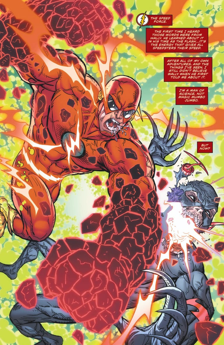
There is a new avatar of the Forces in town, and his name is Hunter Zolomon. While weak from facing the Black Flash, Barry is beaten down by Zoom and loses Steadfast to him. To go against the evil speedster, Barry and Iris look into his past in an attempt to connect with him. It is revealed Hunter was a former FBI agent who made a bad call in assuming a clown serial killer wouldn’t use a gun. This lead to him losing his partner and sent him down the other to become Zoom. With this knowledge, Barry goes to speak to him, only to face him and Black Flash. How will our hero prevail?
**Some Spoilers Below**
Story:
Picking up right where we left off, we find Hunter facing off against the Black Flash. While he may have the other forces under his control, the speedster of death can overpower him. Barry steps in to help, causing Hunter to turn on our hero. Before he can kill him, however, Flash shows Hunter a terrible truth is shown in the Forever Force. It turns out Eobard Thawne had also interfered in Hunter’s past by giving the clown the gun that killed his partner. This has Hunter snap out of his rage, allowing Barry to convince him to help repair the Force Barrier.
Meanwhile, with Wally and Avery, they are spying on the Rogues who have begun working out of Iron Heights Penitentiary. The young speedsters agree that they need to tell Barry what is happening, but soon find themselves caught by Golden Glider. They quickly speed out of there as the Rogues initiate their plan.
As I mentioned in my previous reviews, the story has been losing focus with the looming threat of the Legion War for Year of the Villain. Where it was passing with the last issues, the rushed nature of this one butchers both the ending of the Death of the Speed Force arc and the beginning of the Rogues arc. There isn’t enough time spent on the previous arc to give it a proper sendoff while we also rush into the Rogues’ attack. I don’t know what is to blame, but this forced closing is sloppy in terms of storytelling.
If I had to give a positive anywhere, it would be the attempt at a redemption story for Hunter. Throughout his comic book history, you can tell he never intended to become a supervillain. It just happened to him after disagreements arose. In this one issue, we watch as Hunter’s life passes before his and Barry’s eyes before he makes the sacrifice that most Flashes do. It would be a nice bookend for the character if it weren’t as rushed as it was.
Art:
I’ve stated in the past that I am not a fan of Scott Kolin’s style. It doesn’t quite fit the world of the Flash, having a bit creepier designs for characters. While it works for characters like Black Flash and Hunter, it doesn’t fit Barry or the other heroic speedsters. The colorwork is decent enough, with vibrant colors having the characters pop, but it isn’t enough to save the issue.
Conclusion:
This might be the most disappointing issue of the Flash I’ve ever read. I say disappointing because there was so much potential in this story. This could have been a defining chapter in the Forces Saga, but it was just rushed, affecting both the current and next story. All we can do now is hope the creative team can make it up with the Rogues on the move.
Marvel Zombies: Resurrection #1 hits your local comic book shop on October 30, but thanks to Marvel Comics, Monkeys Fighting Robots has an exclusive five-page preview as a zombie reboot is on a collision course with Marvel Universe.
The book is written by Phillip Kennedy Johnson, with art by Leonard Kirk, Guru-eFX worked on colors, Travis Lanham handled lettering, and In-Hyuk Lee brought the cover to life (zombie jokes). Nick Bradshaw & Rachelle Rosenberg, Greg Land & Frank D’Armata, and Jung-Geun Yoon provide the variant covers.
About the Marvel Zombies: Resurrection #1:
THE HORROR SMASH-HIT LIVES AGAIN!
When Galactus’ corpse appears at the edge of Earth’s solar system, the Avengers, X-Men, and Fantastic Four investigate. Too late, they discover that Galactus’ body is now the vessel of an interstellar terror, which one-by-one transforms Earth’s Mightiest Heroes into the universe’s most terrifying predators! As our heroes try to escape the superpowered, cannibalistic aberrations that were once their friends and family, will any survive? And even if they do, can they hope to protect Earth from the infestation that has already claimed half of the known universe?
Don’t miss the FIRST ISSUE of this terrifying new vision of the classic Marvel tale!
For those of you that were too young to read zombie books back in 2005, the Marvel Zombies were part of Marvel’s Ultimate Universe and discovered by the Ultimate Fantastic Four. When look you look back on it now, it makes sense that Robert Kirkman was the author on the first mini-series with art by Sean Phillips and covers by Arthur Suydam.
What is your favorite Marvel Zombies memory? Comment below with your thoughts.
Check out our Marvel Zombies: Resurrection #1 preview:
Countdown is the latest PG-13 horror film that reinforces just how cancerous they are to the horror genre. It is a rushed film with a moderately interesting plot device that plays out like your typical modern horror film with an unbearable amount of jumpscares. Sitting through the mess of Countdown is the equivalent of self-torture and there is very little to commend in this film.
Death is an inevitability in life as every living person comes to know with time. However, no one knows when it will be their time to take one final breath. Countdown offers the answer with an app, but this app becomes an issue for a few people when they learn they only have a couple of days left to live. Directed and written by Justin Dec, the film stars Elizabeth Lail, Jordan Calloway, Talitha Bateman, Anne Winters, Peter Facinelli, and Tom Segura. Countdown follows Quinn (Lail), a young nurse who tries to avoid death after the app predicts she only has three days to live.
Elizabeth Lail as Quinn in COUNTDOWN
Countdown is a massive misfire mostly do to its wasted potential. The characters are horribly written and there is hardly any development. Also, the film suffers from bad dialogue that is the epitome of cringeworthy. Stupid decisions from characters are in large quantity, it gets to the point where it seems the filmmakers wanted to fit as many moronic moments in as possible. Quinn is a likable character that leads the film, but everyone else feels like an annoyance, or they are introduced midway through with little reason for audiences to care about them. For instance, Quinn becomes acquainted with Matt (Calloway) midway through the film and the two bond over their experiences with the app. The fact that it all happens so fast leaves little time to get invested in his character.
Adding to that, after squandering a ninety-minute runtime, Countdown has the nerve to plant the seeds for an unwarranted followup. It comes at a time where just as you think the film won’t anger you any further, it rushes in the chance for another film to happen. Hopefully, this potential sequel avoids shoving jumpscares in every scene because Countdown offers so many in every other scene that it’s almost laughable at how so many people will still be scared of it. It follows the formula of music leaving the scene, brief silence, and then a sudden loud noise. If you want to mask your failures at telling a compelling and terrifying story you result to inserting a streak of formulaic jumpscares.
Lail does what she can, but her performance seems uninspired and it feels like she is playing the exact same character from her role as Beck in Netflix’s hit series YOU. Not a bad performance, just not good enough to warrant interest for ninety minutes of unbearable trash. The one redeeming quality was Segura, who stole every scene his character Derek participated in. Other than that, most of the acting was subpar at best or just difficult to sit through.
Elizabeth Lail as Quinn in COUNTDOWN
Dec didn’t impress as a writer or director and most of the film is shot in such an odd way, but the biggest crime might have been the pacing. As mentioned earlier, Countdown moves so fast its as if the film is running away from its self. No time whatsoever is available to fully get behind any of the characters introduced and it’s a shame because that may have ended up making the film better overall if it slowed down a bit. However, this would have just lead to spending more time watching a sequence of nonsense unfold so perhaps the shorter the better. There are plenty of effective ninety-minute horror films, but this film misuses the time it has sadly.
Countdown is not a movie worth seeing in theaters or seeing at all for that matter. It is a rushed mess that should have gone straight to home media. The film is generic, hollow, and unbearable. While it does have a few enjoyable moments and some decent technical work, as a whole the film is a complete misfire.
In an industry dominated by cape comics, Giant Days gives you a peek at what else the medium has to offer. Part of this likely has to do with its unique origin from writer and creator John Allison. Allison got his start writing webcomics back in the late ’90s early 2000s with titles such as Bobbins and Scary Go Round. Because of this, Giant Days challenges traditional comic book practices by keeping its webcomic roots intact. Essentially, it has big webcomic energy.
Additionally, Giant Days successfully manages to divide its narrative among its ensemble cast. There is no singular center of attention to whom the story belongs. While there are the three lead heroines, Susan, Esther, and Daisy, character arcs are given amply to the endearing supporting cast as well. In contrast to most solo driven narratives in mainstream comic book media.
An example of the supporting cast, including the cover to issue # 51 which focuses on McGraw. Other characters included are Nina and Ed on the top, Dean Thompson and Esther (Demonized in the background) and on the bottom right are Daisy and Ingrid.
To further break the mold, Giant Days maintains a thematic and believable passing of time that is usually absent from comics you find front and center of the rack at comic shops. For starters, it ended. But leading to that ending, were semesters of growth, and struggles that truly hit home for any college student.
From the very beginning, there was a clear finish line for this story, graduation. This became more apparent as the first semester came to an end in issue #18, which then set a precise pace for the remaining story to follow. The more the flow of time passes, the more our characters grow figuratively and literally. The closer we get to graduation, the closer we come to the end of the tale.
Last panels of issue # 18 concluding the first semester
Being someone who started with superhero comics from DC Comics and Marvel, reading this series to its finale challenged my perspective of what defines a comic book. In this day and age, comics cover many genres. This wasn’t something new to me, but it was something I had to explore more to understand. Giant Days pushed me to look for stories outside my comfort zone. Not just other similar grounded stories, it led me to try comics I was previously indifferent to.
Suddenly I find myself reading Lumberjanes and Chilling Adventures of Sabrina. Both are great stories I might not have given a chance if I was never pulled in by Lissa Treiman’s captivating cover of Giant Days #1.
What comic first challenged your perspective of what a comic book can be? Let us know in the comments.


 “I love women,” Hernandez responded. “I’m not afraid to say that. I love them for 100 different reasons—how they look, how they move. . . I don’t get tired of drawing these characters.”