With Fantastic Four: Grand Design, indie comics sensation Tom Scioli brings his unique and idiosyncratic style to the very start of Marvel Universe in a book that is sure to be one of the year’s best pieces of sequential art.
From Marvel– The bestselling GRAND DESIGN franchise continues with Marvel’s First Family! Brought to you by critically-acclaimed cartoonist TOM SCIOLI (GODLAND, TRANSFORMERS VS. GI JOE) in the sole-authorship tradition made famous by ED PISKOR’S X-MEN: GRAND DESIGN trilogy! Join the Watcher and witness how it all began… Plus appearances by your faves: Doctor Doom! Black Panther! Namor! Galactus! Mole Man! The Inhumans!
Fantastic Four: Grand Design #1 Written, Penciled, Inked, Colored and Lettered by: Tom Scioli
Story
The story of the Fantastic Four has always been pivotal. Their popularity may wax and wane, but ask any comic fan or historian and they will tell you how important ‘Marvel’s First Family’ is to the MU. That makes it a great candidate for a Grand Design take. Scioli’s narrative (like Ed Piskor’s on X-Men: Grand Design) starts with Uatu the Watcher. Scioli then goes on to highlight all the important moments in both the FF’s origin and other early Marvel moments, seamlessly blending them together in a page by page narrative structure that echoes newspaper comic strips as much as it does Silver-Age comics. The structure actually accentuates how much plot was jammed into those early comics, Sciloi is able to capture that creative energy.
We also have a grand cast of characters, with all the major players we expect (The FF, Dr. Doom, Black Panther, Namor, Hulk, Avengers, S.H.I.E.L.D. Mole Man, etc.) but we also get some more obscure roll calls (like the Impossible Man and Dragon Man).
Sciloi also puts a magnifying glass on exactly how weird those early FF comics were; filled with odd characters, weird obsessions, crazy science, offbeat humor and intense melodrama. Scilo understands how creative and narrative energy both were a big part of what made those comics work and he embraces that, runs with it and knocks it out of the galaxy.
Art
Tom Sciloi is a sequential art master with a style completely his own. His linework in FF: Grand Design is like a fusion of indie comics, Kirby-era silver age energy and the look and feel of those great mini-comics that used to come with a ton of ’80s toys like He-Man (Sciloi has, in fact, worked in indie comics, done Kirby style stuff in Image’s Godland and had a great Go-Bots series from IDW; the pedigree is there).
And like in the narrative, Scoli, in the art, highlights the otherness of the FF. These are weirdo looking characters, strange situations and alien landscapes. Sciloi is reminding us how off-beat these characters really are, which is exactly what made them such a huge part of both the culture and counter-culture of the time.
The layouts and panels are also marvelous. Most of the pages are composed of small, hand-drawn feeling panels. It looks and feels handmade in th4 best possible way.
There is also some great lettering at work, with tons of fonts, logos and styles on display.
Conclusion
Fantastic Four: Grand Design is the kind of comic book project we need more of. It crackles with energy, love and history. It’s a comic book for comic book fans made by an obsessive comic book fan. It’s a must-buy if you love this medium.
GIANT DAYS: AS TIME GOES BY #1 is out this Wednesday from Boom! Box and gives fans the chance to have an emotional goodbye with the characters we’ve come to know and love. This issue concludes that saga known as Giant Days.
Look at our adorable trio!
***SPOILER WARNING***
Giant Days: As Time Goes By #1 brings with it the conclusion to a much loved series. As such, it’s pretty much a given that this issue will be bittersweet. But it goes above and beyond with our expectations; giving us one final escapade before the door closes forever.
We all knew that Giant Days was set to end eventually. After all, Daisy, Esther, and Susan could only stay in school for so long (though Susan is still begrudgingly in school). In a way, it’s nice knowing that the creative team behind Giant Days didn’t decide to stretch the series for all it was worth. But it’s still sad to see this series go.
For many comic book readers, Giant Days was a revelation. It broke the mold for storytelling and changed our expectations for what makes a good graphic novel. And for that, we’ll be forever grateful.
This collection of photos is just the sweetest thing ever.
It would have been so easy to write an issue all about sappy goodbyes. Yet that wasn’t what this issue was about. Yes, it did give fans a chance to say goodbye. But it was also so much more than that as well.
After all, is it even a Giant Days story without at least one of our three leading ladies getting into some sort of dilemma? We think not! And thus, John Allison gave us one more escapade to enjoy. And yes, that did add to the bittersweet tally.
Look at how much Ester has changed!
Giant Days: As Time Goes By #1 is set a year after Daisy and Esther graduated. This gave us a chance to see what our girls have gotten up to post-graduation. Well, Esther and Daisy, that is. Though by all appearances, Susan has thrown herself into her future career as well.
Time changes people. We all know that. But how much change can occur to these three? That question – and many others are answered within these pages. Did you want to know what Ed looked like in his professional getup? What about McGraw, any idea what’s keeping him busy these days?
But more important than all of that is the message hidden within this story. Yes, it is the story of growing up. But it’s also a poignant reminder that we all need a support network. And that your friends aren’t always capable of reading minds – if you need help, don’t be ashamed to ask for help.
Of course, this issue also brought along a lot of the sass and drama we’ve come to love about this series. It wouldn’t have been the same without that touch. Or without Susan having at least one bout of anger (complete with fire bursting from her body). So while we had to say goodbye here, in many ways, it somehow felt like we were coming home at the same time.
We’re not loving the way this duo treats out Esther…
Giant Days: As Time Goes By #1 featured much of the charming artwork we’ve come to expect from the series. Max Sarin’s characters and their expressions are perhaps the highlights of this issue, with Esther going above and beyond (as usual) with emoting.
Whitney Cogar was the colorist for this project, and they also did a delightful job. Here the color palette is bright and happy – unless it called for something totally different. There were a few cut scenes and flashbacks in this issue, and they had a slightly different tone from the rest of the panels. This was smart, given that these moments usually only lasted a panel or two.
Jim Campbell’s lettering was the perfect final touch. And you can tell that he had a bit of fun with the sound effects. But frankly, so did we. So it’s all in good fun.
Aww! Look at how cute they are! Daisy deserves this happiness.
It’s hard to believe that this is the last issue for Giant Days. And yet, at the same time, it feels right. It’s always hard to see a series end. But it’s made a bit easier knowing that it was the proper ending for the series.
Writer Steve Orlando teams up with artists V Ken Marion and Sandu Florea to create a safe but reaffirming comic about Wonder Woman’s values, as well as setting up some supporting character backstory for the future of Event Leviathan.
Helen Paul was rescued as a young girl by Diana Prince, a.k.a. Wonder Woman, when a terrorist attack killed her parents. She was then adopted and raised by a pair of retiring A.R.G.U.S. (Advanced Research Group Uniting Superhumans) agents, with a little help from the Amazon herself. When she came of age and learned the truth about who her adoptive parents were, she wanted to join the cause and became an A.R.G.U.S. agent herself. Her missions place her alongside fellow agents like Steve Trevor and her childhood mentor, Wonder Woman. One such mission takes the trio to Gorilla City to rescue a deep-cover agent from the terror of its new ruler, Grodd. Helen proves herself to be a quick-thinking and compassionate hero in her own right, doing her part to avert bloodshed. However, what will become of her when she learns the true secrets of her past?
Orlando’s writing on this issue is solid. This Annual delivers pretty standard fare for an uplifting and action-packed Wonder Woman tale, but it’s still plenty entertaining to read. Watching Diana break out her diplomacy skills right after kicking some baddies into the stratosphere will never get old. The Amazon Princess’ constant desire for peace and simultaneous willingness to fight has always been inspiring. Orlando also does well in making Helen Paul an interesting part of the story as it is partially played out through her eyes. The opening pages are largely from Helen’s perspective, and through this, the audience gets to see Wonder Woman through the eyes of an impressionable growing child. Helen also becomes a semi-engaging part of the Gorilla City sequence, mainly through her technical knowledge and how she uses that to bypass major problems. The dialogue here is snappy, and the pages flip by smoothly as the plot progresses along in a fun but predictable manner.
Unfortunately, the issue’s pacing comes to a bit of a halt on the final few pages. The execution of the Event Leviathan tie-in feels tacked on, as it’s delivered in a flurry of exposition before the final page plot-twist. The issue would have benefited from its exclusion. Also, while Helen Paul is an interesting new character and Orlando does a good job at making her and Diana’s connection feel important, it would have been nice to see her skills more on display during the Gorilla City story. As it is she has a couple of interesting moments, but not much beyond tech jargon and a bit of compassionate play-calling.
V Ken Marion’s pencils are pitch-perfect for the sort of mainstream superhero fare this Annual has. There’s an angular quality to the character drawings that fall under the Jim Lee umbrella of style, while still maintaining Marion’s aesthetic. The action is drawn beautifully, with plenty of kinetic energy that the audience can certainly enjoy without ever losing their place. Gorilla Grodd also looks appropriately menacing, proving that Marion is adept at drawing monstrous telepathic apes. His work is given depth by longtime artist Sandu Florea’s inks and brought to life by explosively vivid Hi-Fi digital colors. “Wonder Woman Annual #3” is undoubtedly a gorgeous comic to behold.
Pat Brosseau’s lettering accomplishes a neat distinction between spoken or narrative dialogue and Grodd’s telepathic speech. It’s a bit of a minor element, but it does add to the atmosphere and understanding that Wonder Woman and her team are dealing with beings who don’t talk like ordinary people. They are a race of telepathic gorillas, after all.
Despite being a bit derivative, “Wonder Woman Annual #3” is a fun adventure from the eyes of a young ally of the Amazon peacekeeper. There’s a nice bit of simple political drama that allows Orlando to show off the complexity of Diana’s character just the way Wonder Woman fans want. Despite the halt in the pacing on the last few pages leading into the Event Leviathan plot, the issue is saved by excellent visuals through an adventure in Gorilla City. Even if the crossover segment is flawed, the final page plot twist is undoubtedly going to be essential for the future of Bendis’ event. For Wonder Woman and Gorilla Grodd fans, this Annual would be a good one to have in your pull list at your local comic shop come October 30th.
Taking a break from the turbulence of “City of Bane” in the main series, writer Tom King and artist Jorge Fornes remind readers what makes the Caped Crusader so endearing.
Alfred Pennyworth, beloved caretaker of the Wayne family and assistant to the Batman, logs every night of the Dark Knight’s “activities” for almost two months. From chasing criminals on horseback to fighting dragons in the Gotham streets, Alfred makes a note of the actions and emotions guiding Batman through his endless crusade against crime.
No, seriously, Batman fights a dragon.
King’s writing of Alfred here as an emotionally invested observer is genuinely some of the most heartfelt work he’s accomplished in his Batman run. He fills his quiet, analytical writing style with Alfred’s full knowledge of specific events without ever getting bogged down in excess exposition. There’s also very little dialogue, as the entire issue is laid out as a series of journal entries. Despite this, King is able to run through nearly every possible emotion that can be had in a Batman comic, from absurd, silly humor to heartbreak. One story is an amusing tale of Batman in a boxing match, and another is a tale of Bruce Wayne’s abandoned first love. King puts the Bat-mythos through any and every set of circumstances, from the street-level to the cosmic, and comes away with one of his most spectacular pieces of writing to date.
See Batman box.
The best way to describe artist and frequent King-collaborator Fornes’ work here is as a mix of Silver Age style and David Mazzucchelli’s work on Year One. Fornes nails everything he draws here, from distinct character facial expressions to ambiguous cosmic entities. The fact that his style remains so consistent while drawing so many situations places him as one of the most impressive artists working today. He gets a little help from artist Mike Norton, who draws a few pages further into the issue. This addition is likely due to the last-minute change of plans this Annual underwent. Fortunately, his inclusion is almost unnoticeable in the best possible way. His work blends nearly seamlessly with Fornes’, to the point where the artist change would likely go unknown if it wasn’t credited in the issue.
What makes this issue visually pop and makes Norton and Fornes’ work blend together so well is undoubtedly Dave Stewart’s colors. His color palate has a slightly muted sensibility to it, making it reflect the Golden Age noir moments and the Silver Age spectacle that this issue pays tribute to. The more detective focused scenes are cast in moody grays and subtle blues, while the big cosmic and fantastical moments are bathed in light. The tone of the comic is further aided by Clayton Cowles’ lettering, which is done in semi-cursive to mimic Alfred’s handwriting. Not only is it believable, but it also accomplishes this neat combination of being distant but also intimate. This isn’t a conventional narrative, just a collection of stories from another person’s eyes. Every part of this issue works together to ensure this concept works, and it pays off in spades.
Cosmic entities are no match for a dude in a batsuit.
King stated that his final Annual would be his “thesis/last word on Batman.” With only a handful of issues left of his run, it’s easy to see why King is delivering such an impactful issue here. “Batman Annual #4” is one of the most emotionally satisfying issues of Batman ever created. King and the wildly talented art team deliver an issue that pays tribute to the World’s Greatest Detective by examining everything that makes the character so special, from the eyes of one of comic’s most beloved supporting characters. Stop by your local comic shop by October 30th and make sure this one is in your pull list.
DC Comics tries its hand at high fantasy this Wednesday in the newest brutal Black Label title, THE LAST GOD #1.
Art by Riccardo Federici, Colors by Sunny Gho, Dean White
A World Built Upon Lies
The Last God #1 begins with an interesting concept; the tales told throughout the lands are lies. Opening on a brazen truth and not keeping it a mystery is different, as other comics would hold the secret over the readers head. But, this change in story telling is the only moment The Last God #1 stands apart form other fantasy stories.
Writer Phillip Kennedy Johnson gives a brief history of the battle that made Tyr who he is now while introducing the main characters. Little is said about each character, other than a quick explanation of their helping of Tyr. Transitioning into the present, Johnson introduced King Tyr, leader of Tyrgolad.
Johnson reveals more history of King Tyr and his lies through a gladiator battle and words from the queen. Through each ‘history’ lesson, the world never feels fleshed out nor the characters. Each moment that should be world-building feels empty, making you long for more. But, not in the fun fashion of learning about a world.
Giving away the ‘every tale is a lie’ was a huge gamble that could’ve paid off substantially if the rest of The Last God #1 tried to shake things up. Instead, no character feels unique, while the world never beckons you to come back. It seems more of time was spent on hyping up a pretty epic villain.
Art by Riccardo Federici, Colors by Sunny Gho, Dean White
High Fantasy, High Art
The Last God #1’s strongest aspect is Riccardo Federici’s art. Federici’s pencils remind you of the classic art of Heavy Metal. Carrying the brunt of the story is his ability to mix brutality of mature high fantasy, and realistic anatomy. Federici’s style is exactly what comes to mind when thinking of mature fantasy. His designs for the creatures and main villain are the highlight of the issue, as each time one graces the page you steer clear of them.
The colors by Sunny Gho and Dean White help portray the world and creatures of The Last God #1 in a realistic yet fantastic manner. The world seems brown and desert-like on the outer rims of the cities, while the inner parts of the towns are lush with life. The duo’s colors combine perfectly with Federici’s designs and art.
Throughout The Last God #1, Steve Wands’ dialogue bubbles look scratchy, as they appear drawn and imperfect. This mixed with the changing fonts works well.
Art by Riccardo Federici, Colors by Sunny Gho, Dean White
The last God Returns (Conclusion)
If The Last God #1 had a higher page count while taking its time it would’ve greatly benefited the organic feeling that was missing. Although the story doesn’t match the epic feeling of the art, further issues could help make the world feel like one you’d want to read more about.
Cover Story: The main cover by Kai Carpenter and variant cover by Riccardo Federici are amazingly beautiful. Both hit that mature fantasy vibe you’d find on Heavy Metal and buy for the cover alone.
Cover by Kai CarpenterCover by Riccardo Federici
Side Note: There are novel stories in the back of The Last God. Novels like these are usually in Fantasy stories, and are always nice ways to expand the story/world.
Dear Reader
What did you think of DC Comics Black Label’s foray into High Fantasy? Let us know below!
Annuals can be hit or miss. Sometimes, they’re integral parts of a story or callbacks to a long-ago tale. Other times, they’re seemingly throwaway stories that may not necessarily add to any ongoing storylines but add to the overall mythology of the character.
(Note: The events in Nightwing Annual #2 take place prior to Nightwing #50)
Nightwing Annual #2, “The Very Friendly Owl,” does both. After Nightwing was shot in the head by KGBeast in front of Batman and Commissioner Gordon on the roof of the GCPD, we see Dick Grayson, who now demands to be called Richard, talking with a world-class expert in brain injuries, Dr. Isabella Haas, hired by Bruce Wayne. Dick (sorry, RICHARD) is talking to Dr. Haas about his complete amnesia resulting from the gunshot wound. He now has no memory beyond his childhood, prior to the death of his parents, and is confused as to why local billionaire Bruce Wayne is interested in him and claims that Richard is part of his extended family.
In addition to his struggles with the present, the story also ventures back into Nightwing’s past. We see the introduction of his father’s great-aunt and great-uncle, Langdon, and Judith Grayson, who take Richard (not Dick) and his parents in for a rare family dinner to properly celebrate Thanksgiving after their circus performance. The story’s main focus throughout is family. Richard remembers the joys of the few memories he has of his blood family while his extended family of Bruce, Alfred Pennyworth, Damian Wayne, and Barbara Gordon, anxiously wait for word of Nightwing’s recovery.
Dan Jurgens’ story is poignant, showing emotions from the Bat Fam we’re not usually privy to. While Damian can still be an obnoxious ass the majority of the time, we are shown private moments of grief. Whether it’s Robin’s tears or Bruce’s impotent anger at being unable to fix the problem, it’s a unique look into the lives of the extraordinary Wayne family dealing with something ordinary families deal with daily, the grief surrounding an unexpected tragedy.
The writing is done well, but it is a little repetitive. We’re reminded over and over that Dick now wants to be called Richard because that’s what his parents called him, and he has no memory of being Dick. We’re also shown Bruce’s constant anger and frustration at being powerless to fix his first son and oldest partner. But it feels plodding at times, meant to take up real estate within the book instead of moving the plot forward. That being said, the payoff is tremendous and promises to add some great storylines in the months to come.
The art by Travis Moore is solid for an emotional book. His pencils are softer, more sentimental, allowing the reader to feel both the sadness of the Wayne family and the melancholy of Richard describing a rare interaction with both his parents and newly-introduced extended relations. Overall, it’s a well-done story that introduces a bigger plot to destroy Nightwing and Batman while maintaining a personal touch intended to tug at the reader’s emotions.
What did you think of the latest attempt to take down the Bat Family? Comment below with your thoughts.
It seems like the Terminator franchise has been dead in the water creatively for quite a while and it still is in some ways with Terminator: Dark Fate. However, after countless sequels failing to live up to the first two installments carried by series favorites Linda Hamilton and Arnold Schwarzenegger, this latest entry plays it safe and because of that, it’s easy to see why this film can be considered the best entry since Terminator 2: Judgment Day.
Terminator: Dark Fate takes notes from the Halloween series and ignores all of the franchise’s previous hiccups. James Cameron returns to the franchise for the first time since the second film as a producer and his involvement is just one of the few reasons this film manages to stay afloat. Taking place a couple of decades after the events in Judgment Day, the film follows Dani Ramos who has been chosen for termination by a machine from the future. Again, this film is very similar to the original two films and it plays it safe by using the premise that made them so amazing. Directed by Tim Miller, the film stars a returning Linda Hamilton, Mackenzie Davis, Natalie Reyes, Gabriel Luna, and Arnold Schwarzenegger returns once again as the T-800.
Linda Hamilton as Sarah Connor and Natalia Reyes as Dani Ramos in Terminator: Dark Fate
The script for Terminator: Dark Fate is all over the place but it includes elements that were missing from previous entries. Cameron clearly had some influence on how things played out because this film has a lot of heart and an emotional impact to it that hasn’t been seen since T2. All of the characters are well written, but Dani (Reyes) is underutilized a bit it seems because of Sarah Connor’s presence. Dani is the new Sarah Connor this time around, but the film never really feels like its focusing on her, as much as it is Sarah trying to save her. However, this may have been done intentionally to show that the series has always been about the character of Sarah Connor.
Adding to that, the dialogue is absolutely ridiculous at times and it brings down some of the humorous moments, which don’t feel out of place at all. For instance, the exchanges between Sarah and the T-800 become cringe-worthy at times but the delivery from the actors makes up for it. The story in Terminator: Dark Fate isn’t doing anything new that fans haven’t seen from the first two films, but it does switch some elements around to make it feel fresh. For example, in T2 John Connor reprograms a T-800 to be sent back in time to protect his ten-year-old self. Dark Fate features a human with advancements being sent back to protect Dani. Davis Stars as Grace, the advanced human sent to protect Dani and she feels like Kyle Reese 2.0. The story in the film is just fine, but it’s not breaking any new ground.
Performances are amazing from every person involved and of course, Hamilton and Schwarzenegger are a delight to see together on screen for the first time since T2. Despite the narrative revolving around Reyes’ character Dani, Davis is the most impressive here as she factors into that missing emotional element that is present heavily in this film. Her portrayal of Grace makes the character very likable and easy to become attached to more so than the girl she is here to protect. Again, it is as if the actual central character was purposely underutilized for everyone else’s benefit. Despite that, Reyes does a great job working with what she is given and audiences will easily sympathize with her.
Director Miller was just having fun with this fast-paced film because nearly every shot is breathtaking and the way everything is captured is awe-inspiring. The film’s pacing probably could have been a bit slower because Terminator: Dark Fate leaves very little room to catch your breath during all of its fun and familiar mayhem. However, the action in the film is completely insane at times and way over the top specifically near the end. Still, Miller directs Terminator: Dark Fate wonderfully as many expected he would.
Mackenzie Davis as Grace in Terminator: Dark Fate
Despite Terminator: Dark Fate featuring some of the worst effects in the franchise, showcasing ridiculous action scenes, and relying a little too much on nostalgia, it is easily the best since T2. Without Hamilton, the film probably wouldn’t have worked because her presence adds a lot to it. Cameron’s involvement also contributed to this movie feeling like the first two films, but it’s not doing anything audiences haven’t already seen. Still, Terminator: Dark Fate is a moderately acceptable sequel to the best Terminator film and fans of the series will have a blast with it.
A Man out of Time; A Magician with no Assistant; A Deal with the worst kind of Demon; John Constantine is back in Sandman Universe Presents Hellblazer Special #1, out this week from DC Comics. Fantasy writer extraordinaire Simon Spurrier re-introduces the popular, Adult only, occult character back into the DC universe with a flourish and an apocalyptic tale that has the highest stakes possible from the outset.
Constantine must rescue his friends, stop an all consuming war, save the world, but most importantly, he needs to find somewhere to get a kebab, an ‘orrible one.
Sandman Universe Presents Hellblazer Special Credit: DC Comics
Bringing Back The Magic
John Constantine was introduced to the world in the pages of The Saga of the Swamp Thing, created by Alan Moore for artists Steve Bissette and John Totleben simply because they like the look of The Police front man Sting. He was a working class warlock, cynical and often appeared heartless. Through the years the character has evolved but he has never strayed too far from his roots,
In Spurrier’s new vision, Constantine embodies all of these earlier attributes and the story itself is linked closely with past versions of the character. If you are a long time follower of the character you will recognise the opening apocalyptic battle as it references Neil Gaiman and John Bolton’s The Books of Magic mini series from 1990. In fact this Special leaps from that springboard into a ‘What John Did Next’ story while at the same time bringing him into the modern day in a similar vein to the Julian Sands helmed movie Warlock.
Spurrier references the larger DC and Sandman Universes constantly throughout the 38 pages but at the same time creates a world that is very much Hellblazer. The attitude and darker edge that is associated with the character is evident on every page, through the art and the script. Spurrier drags the script across the streets of London picking up a host of English vernaculars and abusive language. It is safe to say that easily offended readers should give this a wide berth as the humour is as blue as the language at times.
Sandman Universe Presents Hellblazer Special Credit: DC Comics
The Color (and Letters) Of Magic
As the story progresses, Constantine comes into contact with a number of characters, old and new, with confrontation following confrontation. Not only does this help to establish the central character, and the negative influence he has on those around him, but it also allows Marcio Takara to show off a wide range of artistic skills. Leaping from the surreal magical war of the future to the cold, clinical streets of modern day London provides an array of visual contrasts which are successfully depicted by Takara.
The differences between the future and the present are not just physical but also represent ideologies within the text. Who was John and who can he become? The transitional moods of Spurrier’s story is set by the art work.
The coloring plays a massive part in establishing the scenes and the ideas within John’s new world. The shifting of time frames, mixing of memories with present day, and even the magical elements contrasted against the ‘real’ world, all are accentuated through the coloring styles of Cris Peter. A quick glance at any of the pages allows the reader to instantly separate the different aspects of the story, making the reading experiences more fluid and satisfying,
This is purely down to the different approaches Peter uses in his coloring. A mix of vivid block colors indicates the modern day while a single, watercolor-esq painted approach signifies a flood of memories. The magical war is a blend of garish colors while a more subdued look is adopted for John’s stroll around London.
One of the more satisfying elements of the comic is Adityar Bidikar’s lettering. With a comic like Hellblazer it is imperative that a contrast is made between different realms. In this special, it is the job of Peter’s colors and Bidikar’s lettering. He has produced a number of different fonts to use to represent different aspects or characters within the comic but it is also his approach to the text that makes it so outstanding. Shifts in font size, the use of bold text, and the changing shape of speech balloons are just a few of the techniques that he uses throughout the 38 pages.
Reading the range of lettering on show is almost pleasurable enough without the characters, art or story. This is a master class in visual storytelling with the lettering standing out in a good way. Take away the images and you still get a well paced, emotionally driven story. The words give the reader details but the lettering here gives it feeling.
And the impressiveness doesn’t stop at the Art. Spurrier’s story has a number of levels to it to please any fan. The surface story is fascinating and exciting enough to keep new readers entertained without feeling left out. However, a deeper level of continuity based storytelling is bubbling just under the surface, referencing the 34 year history of the central character. And then, there is another, metaphysical level commenting on the world of Comics and it’s fandom. At one point John’s inner monologue tries to rationalise his reality hopping situation:
“It’s not about neat and tidy. Owes more to story and meaning than cause and bloody effect. You’d go mad – well madder – trying to decide what counts and what doesn’t, what’s real and what’s not. When the only question worth asking is: What matters right now.”
An insight into John Constantine but also an analysis on fans obsession with continuity. Spurrier is shaking things up in the Hellblazer world and he’s telling the readers not to try to tie it all up to the past but concentrate on this new story. He acknowledges his creative forebears but this is the new Hellblazer, with a new and improved Constantine.
Sandman Universe Presents Hellblazer Special Credit: DC Comics
Conclusion
Sandman Universe Presents have produced some excellent new takes on the magical characters from the DC Universe and with the disappearance of the Vertigo Imprint it’s good to see that the characters can live on. Spurrier achievement in this Hellblazer Special is to prove that the characters do not have to be watered down to exist in the modern age. Unlike some of the television interpretations of these characters, whose edges have been smoothed to make them more appealing for T.V audiences, in comics Constantine is still an English Bastard and the very definition of Anti-hero.
The artwork is superb and the story accessible to everyone, with the possible exception of those offended by bad language. With this Hellblazer Special, DC Comics continue to do the old Vertigo crowd justice with yet another brilliant Sandman Universe comic.
Now they are fugitives in space, how will the crew of the Sundog survive? A new arc for Berger Books’ expansive science fiction series, Invisible Kingdom, starts this week and it’s straight into action for G. Willow Wilson and Christian Ward’s band of intergalactic misfits.
When building on an introductory arc, the greatest challenge for the creators is to keep the story fresh but also true to what has come before. A number of series get the beginning right but falter at the next stage. So, how does Invisible Kingdom fare?
Invisible Kingdom #6 Credit: Dark Horse Comics
A New Adventure
After establishing the characters and the world layout in the first arc,Wilson begins the second story by challenging those conceptions. She forces the reader, and the characters, to face uncomfortable realities about the world that she has built. The all powerful Lux corporation holds planets and their people to ransom, with few daring to challenge them. Words spoken by Government officials are just that, words. In reality they are worthless against the hold that Lux has over the people.
This first issue in the second arc reinforces the isolation of the Sundog and it’s crew, highlighting the dangers of non-conformity. The narrative focuses on characters like Vess and Grix, comparing the life they had with the new, dangerous one they have chosen. Their sacrifices become clear as the story unfolds, illustrating what they have to give up to fight the system.
There are a number of wonderful character moments in this issue, especially for Vess. There is an emphasis on her and how she has been affected by the events of the first arc. Wilson shows the reader the inner conflict of the character through a series of events in this issue: struggling with mediation, returning home, and even altering her state of dress, all of these things symbolise a great change within the character.
Taking note from classic heroes-on-the-run science fiction stories, Invisible Kingdom has a diverse central cast and puts them into conflict with a comparable crew. The ‘good’ fugitives face the ‘bad’. Think of the first Guardians of the Galaxy film, the 1970’s Star Wars comics, or even elements of Saga. Wilson is able to bring the heroic nature of the Sundog crew out by contrasting them with characters who are the opposite to them.
Invisible Kingdom #6 Credit: Dark Horse Comics
The Future’s Bright
In a sea of science fiction comics and movies, how do you make yours stand out? The simplest way is to make it look different to everything around it, and that is exactly what Christian Ward does. He has a singular style that is instantly recognisable on the shelf.
Everything about his work is bold; bold shapes that form the characters and backgrounds; bold colors that are striking and emotive; even the layouts are bold as he uses interlocking panel shapes to drive the narrative across the page. Unusual panel layouts represent aspects of the story so that overlapping panels with no gutters speed up the pace of the action or an off kilter layout expresses the chaos of a space battle.
Ward’s work is immersive in that it takes over the page and drowns the reader in the visuals. I’ve said it before and I’ll say it again, the panels borders are their to contain Wards work, to keep it controlled. When those borders disappear it is like the world has been unleashed and there is no stopping it. Invisible Kingdom as a whole feels like this, as if the story is barely scratching the surface of this new universe.
Even Sal Cipriano’s lettering is affected by the bombastic nature of the narrative and art work. His speech balloons appear standardised but the borders are inconsistent, with the border changing thickness around the text. His caption boxes have rounded corners making them match the fluidic artwork and any radio communication has jagged edges, breaking the surface of the images as if it the text is forcing itself onto the panels. Cipriano’s approach blends with Ward’s work to create a single visual style.
Invisible Kingdom #6 Credit: Dark Horse Comics
Conclusion
The first arc for Invisible Kingdom was impressive, it challenged the reader mentally and visually. This new story is continuing this trend and has not lost any of its charm or visual flair. Wilson’s world building and characterisation is wonderfully engrossing. The influences of T.V. shows like Firefly or comics like Saga are there but the style of storytelling and the type of characters that Wilson writes are original and exciting.
It challenges conceptions of dominant corporations and their place in the world. It also looks at faith; at religion on a grand scale but also personal faith and belief. What do we do when our faith is challenged, when we are forced to fight that which we so strongly believed in?
Invisible Kingdom continues to be a majestic read. It is entertaining and thought provoking with a unique visual flair.
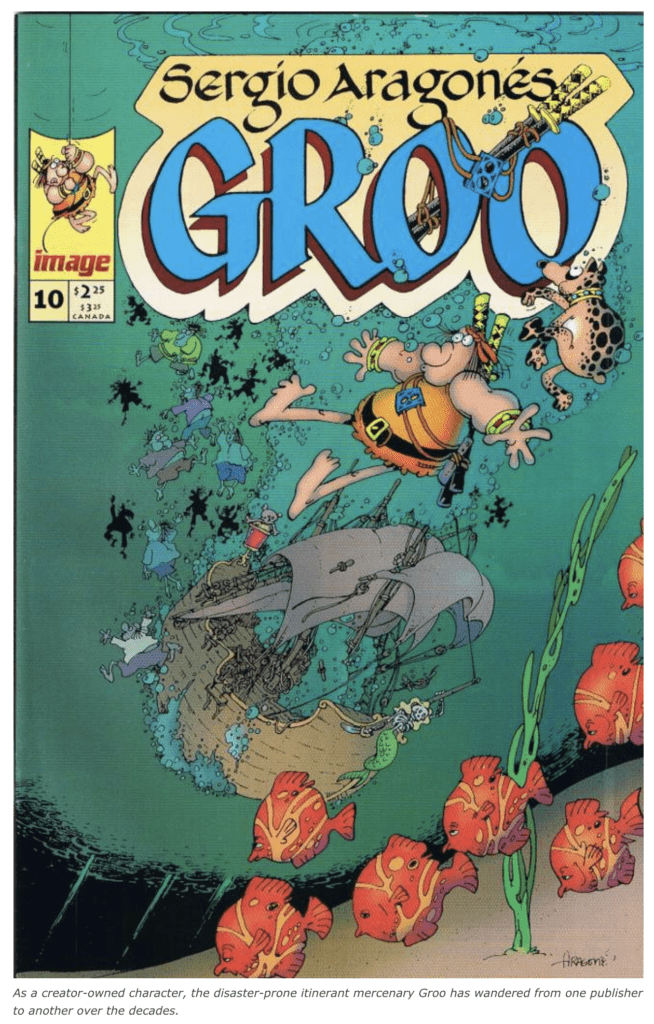
A bulbous, busted nose and a goofy grin, framed by a barbarian’s standard-issue headband and matted, unbarbered mane. Balloon-like muscles and ham-sized hands clutching twin katana-style swords. A pear-shaped girth draped in an orange jerkin that smells like pig filth and old fish (probably because its wearer has stashed fish in his vest and slept in a pig sty). And all that bulk teetering on spindly legs braced by big bare feet.
With a hero like this on the cover, you knew you were in for some fun. Sure enough, Groo the Wanderer taught me that a comic book can be, well, comical.
Out of the Margins
It was 1990 or thereabouts. I was a kid collecting Wolverine and Batman titles. Dark, gritty, “realistic” crime and punishment. Then one day, on the shelves of a local comic book shop, in the midst of all the spandex and explosions, the brooding and the blood, I spotted something unabashedly unrealistic. There was no mistaking that loose, cartoony style. The artist was Sergio Aragonés, beloved for his marginal doodles and wordless comic strips in Mad magazine.
That guy does a whole comic book? An ongoing series with a title and words and everything? And it’s published by Marvel!? This was a revelation to me. It was almost like a dream. (“…And my poodle was driving a ’67 Ford Mustang. But that doesn’t make sense. Fifi can’t drive stick.”)
The material inside didn’t disappoint. Rambling across fictive lands in some bygone age, Groo is a ferocious fighter and an incredible numbskull. Example: Seeing a couple of dragons on the loose, he pauses to count them, and finally exclaims, “One dragon and one dragon heading to town!”
Groo is feared far and wide not only because he can take on an entire army and win, but also because he is astronomically mishap-prone, with vast collateral damage in his wake. If you’re building a temple and you let him near the worksite, plan on starting over real soon. And most reliably, any ship Groo sets foot on will sink. People will hire him against their better judgment and come to regret it.
To Accidentally Do Right
And yet, things somehow work out by yarn’s end. For example, a group of shepherds pay the mercenary in roast lamb to protect a pasture. Their rivals, the cattle ranchers, make a counter-offer: They’ll pay him in steak to oust the sheep and keep the pasture for their cows. Soon, the men are cooking and serving Groo a feast to encourage him to make up his mind. He’s on his second cow, and fourth sheep, when the ranchers realize that while they’ve been standing around feeding Groo, their livestock have been sharing the field peaceably. Their problem is solved, though Groo is out of a job, again.
Groo is most monumentally dense when it comes to his unrequited love, the warrior woman Chakaal. Here’s a representative exchange:
Chakaal: “Get out of my life, Groo! I want you to go far, far from me so that you and I never cross paths again! I want nothing more to do with you since I am a competent swordswoman and you are an utterly inept moron wholly devoid of worth as a human being. Your occasional ability to accidentally do right does not mitigate the fact that I wish to nevermore see your face in or around my presence. You cannot get far enough away to suit me. Listen to the sound of my voice when I tell you to get lost.”
Groo: “Yes, but will you marry me?”
But Groo is loved by at least one character: his loyal, spotted dog. Rufferto is quicker on the uptake on most matters—not that it helps any, since he can’t talk. (Groo, racing into a witch’s castle: “What am I supposed to get again?” Rufferto, in thought balloon: “The antidote!” Groo: “Oh, I remember! The antipasto!”) However, the poor mutt is blind to the depth of his master’s dunderheadedness. (“Always kidding,” he tells himself.)
Wanderin’
Before I offer my little thesis on what makes Groo special, let’s sketch his timeline and meet the men behind the legend. The monthly Groo the Wanderer was smack in the middle of its ten-year run on Marvel (or the Marvel imprint Epic) when I stumbled upon it circa ’90. But because Groo is a creator-owned property (one of the first), when Marvel dropped the comic, the team moved it to Image, and later Dark Horse. And it was initially published by Pacific in 1982.
The stories are drawn by Aragonés, co-written by Aragonés and Mark Evanier, lettered by Stan Sakai, and colored by Tom Luth.
Evanier is a veteran television writer, with credits including animated series (e.g, Richie Rich, Scooby-Doo), sitcoms (Welcome Back, Kotter; Cheers), and even Dick Clark specials. He is also the author of a biography of Jack Kirby, for whom he once worked as an assistant. In writing the dialogue and otherwise collaborating to flesh out Aragonés’ stories, Evanier employs all the tricks of timing and rhythm he honed over his career in TV as well as comics.
Aragonés is a master cartoonist. He certainly knows from gags, but he also takes quite seriously what appear at first to be doodles. In fact, the backgrounds, the architecture, the costumes, the weaponry are all lushly detailed. That’s based on the artist’s own research and travel, he explained in a FAQ on his website. Aragonés was born in Spain, raised in France and (mostly) Mexico, and landed in New York City in 1962. (He is trilingual.) With that kind of global background, it’s no surprise that he combines elements from various ancient cultures, then adds his own twists, to make for the familiar but unique settings that Groo wanders in search of kopins (the currency in his world) and cheese dip.
From Finn to Groo
Here’s what I find so great about Groo. As many readers know, comic books got their start as collections of reprinted newspaper comic strips. Bill Blackbeard argued that it was Popeye (debut in E.C. Segar’s syndicated strip Thimble Theatre: 1929) and not Superman (debut in Action Comics #1: 1938) who was the first modern superhero—the sailor was well-nigh invincible, after all—the difference being that Segar played it for laughs. Popeye was a hyperbolic stereotype of the tough sailor. He was like the outsized subjects of other, often humorous tall tales over the centuries, from Finn McCool to Paul Bunyan. (“How strong was he?…”)
I’ve read collections of Thimble Theatre, covering 1928 to 1938 (when, sadly, Segar died of liver disease at age 43). That strip is seriously uproarious—and not really intended for kids, the way the animated shorts were. (Example: one character asks another about “sewing oats” in his youth. The response: “In all my life, I have only sewn one oat.” “Just one oat?” “Just one oat. But oh, what an oat.”) And the adventure continuities are more fun than a barrel of spinach (or cheese dip). (Mmm, spinach cheese dip….)
The only drawback to reading such stories in a collection? The first panel of each new strip recaps the doings of the previous day’s. That practice made perfect sense when readers were coming back to the story after a 24-hour gap, but it turns into a tic that borders on the tedious when you’re trying to ride along on a voyage via the reprints.
In my mind, Groo is like a classic newspaper comic strip character—he even comes with an adorable dog whose thoughts we can read—but one who was invented wholly for the comic book medium. That means splash panels or double-page spreads depicting busy ports or epic battles that Groo is winning single-handed—or 20 tiny panels showing Groo thinking real hard. It means so much more freedom for the artist. It means stories that are self-contained in one issue, without any need for rehashing plot points, or stories that are broken up over two or more issues, but at least break at satisfying junctures.
Meanwhile, Groo fits firmly within that folk tale tradition, with his scrapping prowess and dimwittedness exaggerated to the Nth degree, and his comedic adventures are brought to life in a way that only comics can pull off (whether in a newspaper, pamphlet, or bound book).
Perhaps upon entering adolescence, I figured I was required to graduate from Peanuts to X-Men, to trade bulbous tykes and chuckles for grim storylines and photo-realistic vigilantes. “Ah, but I was so much older then,” Bob Dylan sang. “I’m younger than that now.” Slinging goofy fun in a mainstream comic book, Groo declared that it was still OK to laugh.
What comic first challenged your perspective of what a comic book can be? Let us know in the comments.