Home Blog Page 395

Review: BASKETFUL OF HEADS #1- Glorious 80’s Summer Camp Horror

With escaped convicts, oncoming storms, and old relics, Scooby Doo and the gang would feel right at home on Brody Island in Basketful of Heads #1, out this week from DC Comics.

Basketful of Heads #1 is written by Joe Hill, illustrated by LEOMACS, colored by Dave Stewart, and lettered by Deron Bennett. This issue from Hill and company gears up for a fun and exciting romp through a small coastal tourist trap. If 80’s horror is your flavor then look no further.

While Basketful of Heads #1 has all the makings of the first 5 minutes of an episode of Scooby Doo, it introduces the characters in a streamlined way that doesn’t reveal too much but gives the readers people to care about. Strong characters are the most important part of a horror story. Writers have to make us care about the people these terrifying things are happening to or there’s no suspense, nothing with any scare value, because we don’t care.

Joe Hill creates a gang that we can invest some emotion into with his first chapter of Hill House Comics. Hill sets the bar pretty high for this story by referencing Shawshank Redemption as the name of the prison the convicts have escaped from, so we’ll see if making readers think of Andy Dufresne is at his own peril or a worthy comparison.

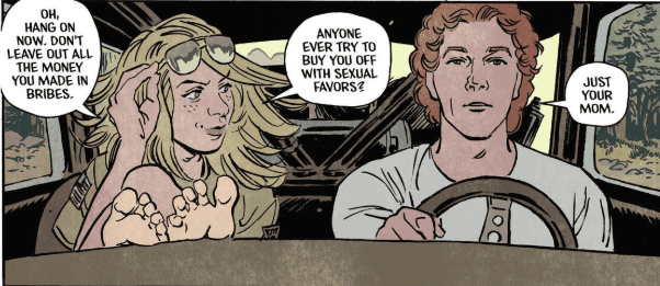
This book looks like it could be an offshoot of the Archie universe as well. The artwork and layout bring back feelings of nostalgia and simpler times, when your mom called you home with a loud whistle or a car horn. Soft lines and and pale colors give this issue a look of yesteryear.

Stewart’s faded colors bring the beach town to life. He does a magnificent job of capturing the weather change with his color palette. Nothing is too bright and everything looks like it’s being viewed through a pair of aviator sunglasses. A storm starts to roll in and that beautiful pre-storm orange rolls in with it, when the sun has to break through the cloud cover close to sunset, it’s the beauty right before the destruction.

All the chaos of the day on Brody Island comes together as Basketful of Heads #1 brews up the perfect storm. Summer is over, convicts have escaped, a tropical storm is coming, there’s a cursed ax in a display case, and the sheriff running the town has a huge house, so he’s definitely up to some extra curricular activities in his free time, or he’s taking bribes and robbing all the tourists.

There’s so much to focus on in Basketful of Heads #1 that there’s no way to predict how this narrative unfolds, and that’s what I like about this story. It’s set up in such a way that it could be an homage to 80’s horror, or it could be something completely different. The title leads me to believe it will be the latter.

Hopefully a dog will show up to help, every gang needs a good boy.

What did you think of Basketful of Heads #1? What do you think of the debut of Hill House Comics? Do you think this will be the HBO Max’s Millarworld? Let us know in the comments below.


Monkeys Fighting Robots Youtube

Review: JOKER: KILLER SMILE #1 – A Beautifully Disturbing Mind

Dr. Ben Arnell tries a new approach at a cure with Joker: Killer Smile #1, from DC Comics Black Label this week.

Jeff Lemire is writing this new haunting horror. Andrea Sorrentino treats us to some exquisite Joker panels. Jordie Bellaire has the task of coloring those beautiful panels while Steve Wands handles the letters.

Lemire and Sorrentino are a dream team and finally getting to read a Joker story from them is something I’ve been looking forward to since this title was announced. Sorrentino uses unique paneling and layouts in so many of the books he works on, and I can’t get enough of it. Gideon Falls has some of the best paneling in comics and this team takes that with them to whatever title they treat the world with. In Joker: Killer Smile #1 he uses teeth shaped panels and illustrates inside Wands’s lettering. It is always amazing to see when teams work so well together in the creative process.

Sorrentino has the perfect style for dark and haunting stories like this one. The shadows appear to have a mind of their own, like something from Little Nemo‘s nightmares. Anything could be hiding among them waiting for the right moment to strike. He can easily build suspense with just his art. It is a remarkably useful talent to have for the horror genre.

Bellaire’s colors give Sorrentino’s art a different feel than what we’re used to seeing from him. A softer and brighter palette gives a more hopeful outlook than other Sorrentino artwork. Joker: Killer Smile #1 instantly reminded me of the Ice Cream Man series from Image comics. The artwork seems almost cheerful until the evil is realized.

Wands does a fantastic job with the lettering. I always love huge letters filled with story art. It gives the impression that the sound is the most prominent aspect of the panel. Visually seeing the impact takes the back seat to the brutal noise it makes during the beat-down. We’ve all seen those World Star videos with smacks heard ’round the world, and Batman gives the Joker one of those.

Joker: Killer Smile #1 follows Dr. Ben Arnell as he tries to fix the Joker. He claims he’s working towards this so he can use what he learns to help other people. His boss gives him something to think about by mentioning he might be doing this for his own ego, and this is obviously something that sticks with him.

Lemire uses children’s stories within the main plot to drive the narrative in a few of his stories. I actually love this tactic he uses as it is always a nice change of pace. Most of Lemire’s work is sad AF, so any moment of happiness, even for a brief moment, is a relief to the senses. It’s like he sits down to write a children’s version of every story he does, so he can use it at any time. Here we meet Mr. Smiles and he is about as evil as it gets when it comes to cuddly creatures.

This is a supernatural horror in the same vein of The Shining. A man is unraveling, he’s losing time, and his memory is failing him. Dr. Ben thinks he can shut out the Joker’s attempts to corrupt his mind, and he’s very confident in that fact. He is very wrong, oh so very, very wrong.

What did you think of Joker: Killer Smile #1? Let us know in the comments below.

Monkeys Fighting Robots Youtube

Review: Conan #10 – The Birth of New Problems for the Cimmerian

The Crimson Witch continues her quest to raise the demon Razazel in Conan #10 as she is impregnated and delivers twins. The children (fraternal twins named Razza, a boy, and Zazella, a girl) are intended to carry on the glory of Razazel by helping their mother kill a warrior whose blood has grown powerful through a lifetime of slaying his enemies. The sacrifice will bring the powerful demon to Earth, where we can assume he doesn’t have mortals’ best interests in mind.

(I had triplet girls in the Crimson Witch baby shower pool)

The story jumps around in time as we see the kids next around age four or five when they’re playing hide and seek. Mother Crimson Witch calls them to her, announcing she’s leaving to find “a slayer unlike any other.” As she mentions him, the Barbarian arrives and appears to lop her head off while the children are hiding.

(Wonder who she means?)

The Crimson Witch somehow survives the attack, thanks in part to her children sewing her head back on, and said spawn continue on, searching for Conan. For years, they follow him, waiting for his blood to strengthen as he does what he does best. When they are finally able to catch him, they attempt to use him to raise Razazel, with gruesome results.

Jason Aaron, whose work on Thor has made him as synonymous with the Asgardian as Walt Simonson (yeah, I said it), has indelibly put his prints on Conan using the same methods that gave the Thunder God an identity away from Chris Helmsworth’s portrayal in the movies. The combination of over-the-top murder combined with real humanity makes Conan, specifically this story, almost touching.

These aren’t evil children, at least not in the classic sense. They regular kids, playing regular games, raised by a mother who loves them. Classic Conan stories would see the twins as a monstrous duo with the Crimson Witch raising them solely to do her bidding. Aaron’s story gives a glimpse of a mother who dotes on her babies with those babies respecting her and seeing her only as their mother. But, you know, also planning to murder Conan in order to bring Razazel to Earth.

The artwork is well-suited for the story. Mahmud Asrar’s pencils are perfectly imperfect. A Jim Lee or Andy Kubert would be overkill for a run like Conan’s. The art, with Matthew Wilson’s colors, creates a definite mood, and that mood is dark. From the first page to the final splash, everything about this comic moans darkness and witchcraft. Conan is only a bit character, for the most part, with the children and their mother at the forefront. The lettering, done capably by VC’s Travis Lanham, moves the story along without distraction and shines with era-appropriate calligraphy.

It’s easy for a book like Conan to get lost in a cycle of old stories and stereotypical barbarian banter and bloodshed, but this team seems to have not only a solid grasp on the title character but the ability to humanize its villains as well.

How do you like the flow of Jason Aaron’s Conan? Provide your opinions below.

Monkeys Fighting Robots Youtube

A Sudden Turn of Events in RUNAWAYS #26

Monkeys Fighting Robots

RUNAWAYS #26, out this Wednesday from Marvel Comics, brings with it a lot of changes to our ragtag group of young heroes. The kid gloves are off in the latest issue, but the real question is: do the Runaways know that yet?

Packing up and shipping off.

***SPOILER WARNING***

That last few issues of the Runaways have brought with them a lot of changes. And this issue appears to be no exception. The Runaways, for good or bad, have decided to trust the mysterious Doc Justice. And we all know the Runaways track record when it comes to trusting adults.

Rainbow Rowell clearly has a long-term plan for the Runaways, and specifically what they might potentially be facing when it comes to the legacy of the Pride. As it turns out, just because you kill the leaders of an organization (however unintentionally that may have been), it doesn’t automatically mean their plans will magically go away.

But of course, nothing is ever as clean-cut or straightforward as it seems. Doc Justice looks like the perfect solution to the Runaways problem. And that’s not sitting easy with us. In fact, it seems more than a little bit suspicious.

That Rowell was able to introduce a character who overall seems to be so helpful and kind, and have him come off as anything but shows her skill in writing. Though admittedly, his pained looking smiles go a long way in leaving us concerned as well.

And this is all while juggling several other subplots in the series. Recall that almost every character has their own hopes and goals, though some of them are being more vocal about that fact than others.

Look at that mansion!

There is one subplot the rest of the characters seem to have forgotten about, but that Rowell won’t let us readers ignore. Gibb. He’s been slowly starving this whole time, thanks to his need for sacrifices as food.

Well, it seems a solution has been found. And the answer is not a pretty one. The Runaways has never been a series to pull its punches, so that shouldn’t be overly surprising. What is surprising (spoiler warning) is seeing apparently killing a dog for the sake of Gibb. Typically here’s where we’d say that this isn’t a moment you should let your kids see, but this is the Runaways we’re talking about.

To be fair, this whole subplot actually started out kind of cute. And maybe just a touch gross. There’s something cute about the idea of Molly’s cat trying to help Gibb out. Old Lace just took it to a whole new (and disturbing) level. And we’ve got to wonder; how will the rest of the Runaways deal with this development? Assuming they even notice.

Gibb isn’t looking so good. Nor is Doc Justice, for that matter.

Runaways #11 has a lot of artwork worth noting upon. We already mentioned one subtly hidden within the artwork (Doc Justice’s expressions). But there’s more going on behind the scenes as well. Everyone else looks normal, so this seems like an intentional choice for Doc’s character in particular.

Andrews Genolet was the lead artist for this issue, and he’s the one who made the expressions we already talked about. Meanwhile, Dee Cunniffe provided some absolutely brilliant (literally) colors to the mix. And finally, VC’s Joe Caramagna’s lettering was on point.

And a quick peek at the description for this issue, alongside the massive creative team.

Runaways #11 is setting up for several big events, from the looks of things. And we’re stuck here wondering how the Runaways will handle all of this hitting them at once because it’s not looking good.

Monkeys Fighting Robots Youtube

HELLBOY AND THE B.P.R.D.: LONG NIGHT AT GOLOSKI STATION

Monkeys Fighting Robots

Dark Horse Comics’ Hellboy Universe is a daunting one with its 20 plus year history, luckily Wednesday’s HELLBOY AND THE B.P.R.D.: LONG NIGHT AT GOLOSKI STATION is a quick, quirky and fun entry-level comic.

Art by Matt Smith, colorist Dave Stewart, letterer Clem Robins

All Aboard The Story Train

Long Night At Goloski Station is exactly what its name implies; a continuous night at a train station. The reason this is important? When a story takes place all in one night and location, it’s easier to tell a focused, new reader friendly story. That’s exactly what Mike Mignola achieves.

Finding a single issue in the Hellboy Universe that invites new readers, while telling an in-canon story that barely references past events is hard. Luckily, Mignola crafts a story that revolves around minimum core characters (only Hellboy), and minimum references all wrapped in a tightly focused one and done tale. Mignola can achieve this feat with the classic story beats: horror, comedy, and love that is seen throughout his famous Universe.

This is made more astonishing when looking at the casting of Long Night At Goloski Station. The one shot’s cast primarily revolves around five main characters, and a few mentioned/shown. Simplicity in the story and cast works to Mignola’s benefit while making Long Night At Goloski Station less intimating.

Art by Matt Smith, colorist Dave Stewart, letterer Clem Robins

Art

Long Night At Goloski Station is interior artist Matt Smith’s first foray into the Hellboy Universe. Not to be confused with Matt Smith (Matthew Dow Smith) who worked on some titles in the 90’s. Turns out there are a few Matt Smith’s in the entertainment industry.

Smith’s style works perfectly for the one-shot, as it mirrors Mignola’s style just not as heavily inked. This likeness is the best-case scenario for newcomers, as it will ease them into Mignola’s unique style. Smith’s characters do look a little more human-shaped, but for the story being told the art works.

The action scenes throughout are fluid while containing a fair amount of chaos transpiring around them. When a character busts through a door it explodes with the splintered wood flying around. In more dramatic cases of action, colorist Dave Stewart voids the background, then adds a dramatic color effect.

Stewart’s name is a staple in the Hellboy Universe. Having been on nearly every title/issue, it’s rare you don’t see Stewart’s name attached to a title. Stewart’s colors continue to help the Universe thrive, voiding panels when needed, or making them more bombastic. There’s a reason he has stuck around these comics, and in Long Night At Goloski Station it shows.

Another veteran joins the team in the form of letterer Clem Robins. Robins continues the trend of knowing what works for a Hellboy comic and showcasing it in the one-shot. With great bubble placement, and the ability to make small sound effects sound large, or large ones feel more substantial, it makes sense why he has also stuck around.

Art by Matt Smith, colorist Dave Stewart, letterer Clem Robins

Train Leaving After a Long Night At Goloski Station

Long Night At Goloski Station may be the best recent Hellboy jumping on point for anyone interested in the character and his world. By combining an easy to follow fun story and art akin to Mignola’s, Long Night At Goloski Station makes for a straightforward entry story for new comers.

Cover Story: Mignola’s famous cover of having the location, characters, and specific items smack dab in the center returns for Long Night At Goloski Station. Some may think it’s not much. But, as a Mignola fan it’s always awesome to see these covers!

New/Old Members of The B.P.R.D.

Did you read Long Night At Goloski Station as a newcomer or long-standing fan of the Universe? Let us know what group you fall under and what you thought below!

Plus, check out why you should start reading the Hellboy Universe if you aren’t already!

Monkeys Fighting Robots Youtube

A Journey Ends in STAR WARS ADVENTURES: RETURN TO VADER’S CASTLE #5

Monkeys Fighting Robots

STAR WARS ADVENTURES: RETURN TO VADER’S CASTLE #5, out this Wednesday from IDW, concludes that strange and eccentric tale of Thom Hudd and his journey within the infamous Vader’s Castle.

Vader is looking very menacing (and green0 on this cover.

***SPOILER WARNING***

Once again we find ourselves back in Vader’s Castle in Star Wars Adventures: Return to Vader’s Castle #5. Honestly, given how fascinating Vader’s Castle is, it’s really no surprise that so many series have popped up focusing on it.

However, all things must end. And that means that Thom Hudd has time for only one story left. Like the rest of the issues in this series, there is the main plot, but inside that, there’s always a short story being told. This time around, Hudd is the listener instead of the storyteller. But it’s still functionally similar.

What’s fascinating is the fact that this final tale is about Vader himself. Better yet – the story is set at Mustafar and Vader’s Castle. This is the moment fans have been waiting for.

Could it be? Is Hudd about to be saved?

Star Wars Adventures: Return to Vader’s Castle #5 has been an interesting series, on the whole. The original storytelling style allowed for multiple characters to get a chance to shine, all while being connected in some surprising ways.

Given that the series was based at least partially on Mustafar, we all knew that eventually, one of the stories told would have to be about Vader. And Cavan Scott lived up to the promise made there, with this final issue.

This tale fits in well, both with the other stories told and with what we know of Vader. It’s also a potent reminder for why one should never underestimate a man as determined and vicious as Vader. It just seems like a good rule to live by.

As for Hudd and the rest of the characters set in the real-time? Let’s just say that the story played out exactly as expected. So at least we know that the promise of the series was kept nice and safe.

Time for a distraction!

Star Wars Adventures: Return to Vader’s Castle #5 had a decent sized art team working on the project. Perhaps that’s the reason why it has such an iconic and vibrant look to it. The artwork doesn’t specifically match the movies or the other comics out there about Star Wars.

Francesco Francavilla and Charles Charles Paul Wilson III provided the pencils and inks for this issue. And Francavilla stepped up once again to also work on the coloring as well, alongside David Garcia Cruz. And as always, Andworld Design provided the lettering.

The colors in this issue are especially vibrant, but then again. This is Mustafar we’re talking about. If you can’t come up with an excuse to show off some amazing lava scenes, odds are you’ve done something wrong.

And so it begins…

Star Wars Adventures: Return to Vader’s Castle was a fun and creative take on a character and world fans have been obsessing about for years. It may not have been quite what fans expected, but it wasn’t afraid to have fun and never took itself too seriously. And thus, it made for a series of memorable moments.

Monkeys Fighting Robots Youtube

How Riri’s Heart Breaks in IRONHEART #11

Monkeys Fighting Robots

IRONHEART #11, out this Wednesday from Marvel Comics, is an emotional and dramatic issue. Riri Williams has been through a lot in her short life, and it’s becoming clear that her journey has only just begun.

Riri is looking justifiably terrified on this cover of Ironheart #11.

***SPOILER WARNING***

Ironheart #11 is a dramatic and thrilling issue. The teacup continues, bringing Ironheart, Shuri, Okoye, and Silhouette, making a powerful and dynamic force to be reckoned with. But all the girl power in the world isn’t enough to prevent an emotional blow from landing on Ironheart.

Fans of Ironheart, aka Riri Williams, are already well aware of everything Riri has gone through in her short time on this earth. It has understandably left her with some long-term issues that she has to work out. And it looks like this issue went a long way in adding something else to her list of things to deal with.

And so Riri’s tale continues. All thanks to this creative team.

The last issue of Ironheart ended on a bit of a cliffhanger. And while this issue started off with a slight detour through the past, it otherwise jumped right to answering all of our questions and concerns. So at least Eve L. Ewing didn’t leave us hanging.

Even though she certainly didn’t hesitate about throwing a gut punch in our (well, Riri’s) direction. To be fair, this is something that comic books have specialized in doing for years. So it was only a matter of time before Riri had a dramatic reveal of her own. But that’s not going to alter the amount of sympathy we’re feeling for her right now.

One of the best things about Riri Williams is how human she is. And that means she doesn’t hide her emotions. What she feels is shown on the surface. And that means when she has an emotional breakdown, you know it. Something is harrowing about seeing a character like Riri go through something such as this perhaps because it hits home just a little bit harder than normal.

Whatever the case, Ironheart #11 pulled off the gauntlet and issued a challenge. And now fans are left wondering how it’s all going to play out. Is this a fakeout? Or is it all disturbingly true? Either way, how is it going to affect Ironheart in the long run?

One thing we do know; they only have one issue to wrap this plot up. At least, if the ‘to be concluded’ at the end of this issue is anything to go by. Wrapping up this bundle of complexity in one issue is going to take some serious talent.

The first page of flashbacks.

Ironheart #11 featured some truly outstanding artwork. The fights, in particular, were memorable. As was the technology, but that’s basically a given with Ironheart’s series at this point. Our badass team of ladies look exactly that – badass and powerful even when Riri is having a moment.

Oddly enough, the weirdest part about this issue is surrounding the newly introduced antagonist. If he is who we’re being led to believe, the man hasn’t aged a day in what, fifteen years? That’s impressive. Or alarming. It could be that they’re intentionally hinting at something here. Or it could be something as simple as wanting to make the comparison an obvious one. Only time will tell.

Another iconic feature of this issue is the layout. There are dramatic cuts and angles all over, enhancing the tale even further. The credit for the layout goes to Geoffo. Meanwhile, Luciano Vecchio (pencils and inks), Matt Milla (colors), and VC’s Clayton Cowles (lettering) completed the overall look of this issue.

Notice anything between this page and the last page?

Ironheart #11 was an emotionally intense issue for Riri. And we can only imagine that it’s going to leave yet another scar on this young woman’s soul. But she’s strong, and thus we know she’ll get through it. In the meantime, we’re going to sit back and look forward to seeing how she gets herself (and her newly found friends) out of this situation.

Monkeys Fighting Robots Youtube

Review: WILD STRAWBERRIES AT THE WORLD’S END is a Great Pick

At a recent NYCC panel, horror comics legend Joe Hill spoke on the need for empathy in horror. If you don’t relate to the characters, he said, you won’t feel the fear that they do. A great example of this concept done right in independent comics is Bruce Kim and Katia Vecchio’s upcoming comic Wild Strawberries at the World’s End. You can read our review of the book below, and pick up your own copy Wednesday, November 6th.

Wild Strawberries at The World’s End, Cover, by Katia Vecchio

Wild Strawberries at the World’s End is a supernatural murder mystery set on the backdrop of a South Korean town in the late 1990s. When his childhood friend Ji-Ah is found dead, protagonist Te-Su must return to his hometown and, in doing so, the heartbreaking and horrifying past he left there. Te-Su begins to have suspicions that Ji-Ah’s death is not the suicide that the cops believe it to be, along with nightmares of masked cults and grotesque, evil entities. To make matters worse, Ji-Ah seems to have left something in his hometown for him to find, and those nightmares apparently don’t want to stay in his head.

THE WRITING

Writer Bruce Kim weaves a resonant, unnerving  in his foray into indie horror comics. Wild Strawberries at the World’s End is paced beautifully, with high strung tension even in the quieter moments of the plot. His characters are rich but not overly expositional, allowing the reader to focus on who they are in the moment rather than just hammering home what they’re pasts have been. That’s very impressive in a story that relies so heavily on flashbacks, but Kim handles it extraordinarily well. His less-is-more philosophy of crafting a story keeps the reader engaged as much as it keeps the events a mystery.

Actually, it’s in that mystery that Wild Strawberries at the World’s End keeps both its many strengths and few weaknesses. On the one hand, Kim’s tendency toward not answer questions is rewarding. There’s a horror beyond human perception going on in these pages, and his light narrative touch allows the reader to fill in the open spaces with whatever’s most nightmarish to them. At the same time, there are some points of this story with which it was a little difficult to track. Occasionally a character will make a choice that seems out of the blue, even though another read-through will reveal their motives. Actually, we recommend that you don’t stop your Wild Strawberries at the World’s End experience with one read-through. Not only will it sure up some of the unexplained elements of the plot, you’ll get to see even more mysterious things left out on purpose, heightening the story’s mystic and haunting nature.

THE ART

Still, that first read-through will demand your appreciation of this comic, and a lot of that comes from the fantastic imagery by Katia Vecchio. Vecchio handles everything you see on the pages of Wild Strawberries at the World’s End, from the pencils to the coloring to the lettering, and she absolutely kicks ass doing so. Vecchio knows, in the words of Neil Gaiman, “when to shout and when to whisper,” oscillating between quiet village scenes and striking cult-horror imagery. Wild Strawberries at the World’s End is a Night Gallery of spooky sights, and the plotting of the panels will have genuine chills running down your back when you see them.

Occasionally, Vecchio’s coloring gets a little distracting, mainly in the shadowy first moments of the book. But by the time Character gets back to his hometown, this issue’s completely resolved. And even if this minor hiccup is something you notice, Vecchio’s living pencils and smooth, well-places lettering makes up for it more than enough. Vecchio’s overall designs on this book make it well worth the cover price, contributing to the haunting vibe at its core. If Kim’s writing has you understanding the cosmic questions in this book, it’s Vecchio’s art that will have you begging for answers.

OVERALL THOUGHTS

Wild Strawberries at the World’s End is indie horror at its most personal. For as otherworldly and unfathomable as the supernatural elements are, the story is a deeply human one, built on the universal emotions of regret, fear, and loss. There are a myriad of reasons to support this indie book (not least of which is the sparkling potential in the creators’ talent), but the only reason you need to pick it up is this: Wild Strawberries at the World’s End will resonate with you. And as Joe Hill would tell you, that’s exactly what makes it great horror.

For more reviews like this, follow us on Twitter. And for all the best comic book reviews, discussion, and news, stay tuned to Monkeys Fighting Robots.

Monkeys Fighting Robots Youtube

Review: The End is Nigh in DCEASED #6

Monkeys Fighting Robots

This is it. The fate of the Earth—and the universe at large—comes down to the actions of our heroes in DCeased #6, out this week from DC Comics.

The infected Clark lays waste to the planet, leaving the remaining Justice League members to plot how to take him down and rescue as many survivors as possible. Readers will be left guessing right up until the last page how humanity could even hope to survive this apocalypse.

DCeased #6

The Writing

First, we have to note that when looking at the series in its entirety, we find that much of the storytelling throughout DCeased has been rather expository. Lois editorializes, while summarizing the action on the page to fit the story within a compact six issues.

At one point in DCeased #6, for instance, Lois says “We had to find a way to live with what we were doing. Or no one would live at all.” We don’t, however, see any of the heroes visibly struggle with that quandary. There’s little time spent in questioning their actions; everyone is all business, with no second guesses. While it makes for concise storytelling, it’s not exceptionally dynamic or complex. Some characters can feel rather flat as a result. That said, writer Tom Taylor managed to make this work through clever use of his framing device.

Telling the story primarily through Lois’s recollections was a gamble. However, the frame used throughout the book kept the reader grounded within one character’s point-of-view, allowing for reasonably intimate storytelling. It’s as if we’re reading the character’s diary, and that keeps us grounded in a story that could, otherwise, have felt overly-rushed and compacted.

That’s not to say that there aren’t moments where other characters get the chance to emote, though. DCeased #6 offers a good balance of emotional tones, spanning considerable distance without clashing. Goodbyes between characters who know they’ll never meet again feel suitably heavy. Yet even in the darkest of times, there’s still room for humor. Early in DCeased #6, for example, it’s revealed that Bruce left Damian with takedown plans for all the members of the Justice League, echoing the JLA: Tower of Babel storyline. One member, however, is conspicuously left out of Bruce’s playbook, leading to a funny exchange.

In all, it’s an excellent showcase from Taylor. Without giving anything away, it’s safe saying that Lois’s final monologue could be interpreted in multiple ways, given how that last panel is composed. How one chooses to read it determines whether the book ultimately has a positive or negative ending.

DCeased #6

DCeased #6

The Artwork

DCeased #6 features some truly breathtaking art courtesy of Trevor Hairsine, Neil Edwards, and Stefano Gaudiano. The work’s strongest asset is its incredible detail; the creators meticulously illustrate even the smallest elements, down to blades of grass and distant background structures. It’s clear that a lot of careful and caring attention went into each page of this book.

For all the richness of the artwork, though, the images are not always the most cohesive from panel to panel. While pages hit the story beats well, the art can be almost overwhelming, leaving the eye unsure of where to focus.

To compensate, Hairsine and Edwards infuse each panel of DCeased #6 with as much energy as possible. Figures and objects jump off the page, while faces and body language are incredibly lively. As a whole, it’s some of the most dynamic visual storytelling of the year, propelling the reader through the book.

Colorist Rain Beredo had his work cut out with this incredible level of detail. However, the artist doesn’t back down from the challenge. The colors are crisp and varied, while matching the level of care present in the linework.

DCeased #6

Final Thoughts

I was somewhat skeptical of DCeased when I first heard about it. However, it’s proved to be one of the most surprisingly-engaging DC stories of the year, and DCeased #6 ends the run on a high note. Definitely recommended.

Monkeys Fighting Robots Youtube

Review: THE LITTLE MERMAID Is A Perfect Series For Young Readers

Monkeys Fighting Robots

Dark Horse Comics has partnered with Disney to produce a new line of comics featuring their classic titles including The Little Mermaid. Is an adaptation of a classic series everyone already knows unnecessary or is it a way of reaching a brand new demographic?

Summary

Experience the unforgettable tale of Disney’s The Little Mermaid through the first-person perspective of Ariel in this comic retelling.

The Little Mermaid

Writing

Thought the story is one many already know, there are always those who have yet to know the story of The Little Mermaid. This new comic series seems like a great way to reach a new demographic of readers by offering them a story and characters they recognize. Being able to give younger readers a book like this will help to keep their interest and help them to grow as readers.

Thought the story is familiar this doesn’t mean the writing by Cecil Castellucci is a simple transferring the film script to the comic. There is a shift in this comic to a first-person perspective allowing the reader to experience the internal dialogue of Ariel as she the adventure unfolds around her. This new viewpoint allows for a great way to look at the story from a familiar yet fresh look at the story. Castellucci does a fantastic job of capturing the character’s curiosity and mental struggle to find her place in the world.

Artwork

The artwork by Zulema Scotto Lavina finds a way to perfectly capture the look and style of the original film. Special attention is paid to Ariel’s facial expressions especially looks of longing and inquiry as she explores the wonders of the human world.

Thanks to the coloring work by Piky Hamilton the book has a very impressive aesthetic. The book takes place under the sea and it feels like it the entire time. Through the attention to detail colorwork employed the comic is able to obtain an atmosphere similar to the movie.

The lettering by Richard Starkings comes into sharp focus thanks to thought boxes containing Ariel’s internal dialogue. This new feature is what makes the book worth picking up. Seeing Ariel’s mental struggle as she fights against Urusela and struggles to obtain Prince Eric’s heart will be even more applying thanks to employing this new detail.

Conclusion

The new The Little Mermaid comic from Dark Horse comics offers a recognizable story but has enough new material to warrant checking out. Though its only the first issue, as long as the rest of the series plays out at the level of quality than fans will have nothing to worry about. This will be an ideal graphic novel to give to young readers when the collection is finally released.

Monkeys Fighting Robots Youtube