Home Blog Page 382

TALES FROM THE DARK MULTIVERSE: INFINITE CRISIS Doesn’t Even Believe Its Own Premise

Tales from the Dark Multiverse: Infinite Crisis, written by James Tynion IV, with pencils by Aaron Lopresti, inks by Matt Ryan, colors by Romulo Fajardo Jr and letters by Rob Leigh is a great juxtaposition to the subtle and complex comic that was Infinite Crisis. While the art is beautiful and reminiscent of the original Infinite Crisis series, the writing gives no space for the art to shine nor does it succeed in providing a believable premise.

In fact, Tynion IV doesn’t seem to believe his own premise. The writing is so heavily over-explanatory it’s almost as though Tynion IV is convincing himself that this plot works, page after page. It doesn’t. Perhaps there is a world where it is believable that Ted Kord, Blue Beetle, would become villainous and murderous under pressure, but Tynion IV’s version of events creates no motive for this transformation and requires nearly all of the characters to act very uncharacteristically to make it work. Maxwell Lord is gullible and uncareful, Beetle is hot-headed and ego-driven, and Alexander Luthor’s brief appearance shows him to be forgettable and rash. Every page is so covered in captions and speech bubbles, piecing together things so that the readers have no chance to realize that the pieces don’t fit. The best part of the writing is lifted straight from the pages of 2005’s Countdown to Infinite Crisis, reminding readers that this comic is riffing on a brilliant work in the past, and not filling those shoes.

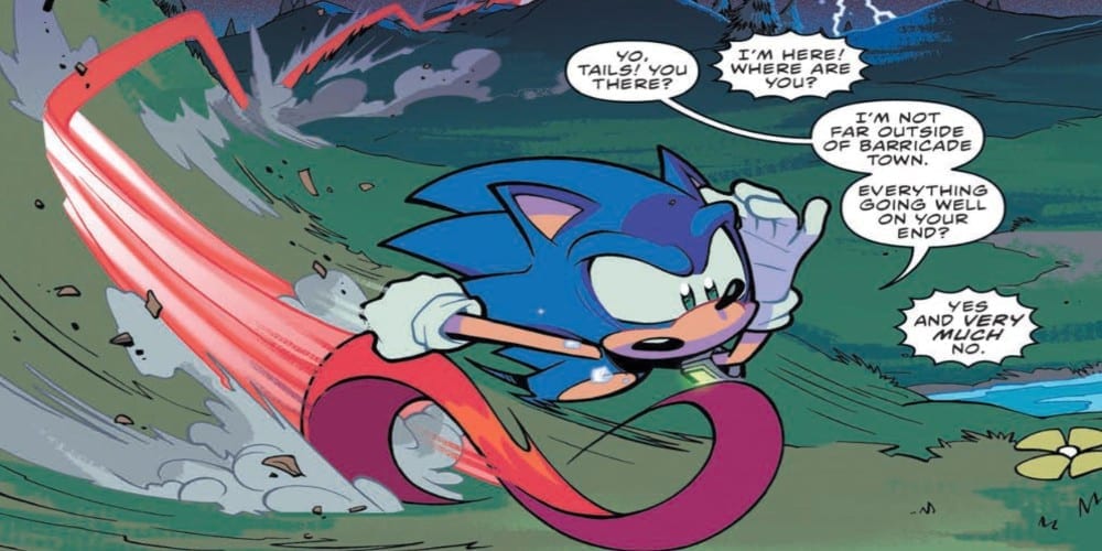
The pencils and inks by Lopresti and Ryan somehow manage to balance homage and originality. Their art is reminiscent of Rags Morales’ work on Countdown to Infinite Crisis in such a way that nostalgically sets the tone, yet they also add in a layer of darkness and expression that is truly their own. It’s a shame that so much of the writing commandeers the art, because the issue is rife with what could have been beautiful silent moments. In a brief silence after a fight between Beetle and Booster Gold, we merely see their faces. Booster’s disappointment and pain plays out on his face so beautifully against his anger. Beetle’s apathy, even obscured by shadow, speaks more than most of the pages combined. The many close-ups on the faces of the characters that Lopresti and Ryan keep bringing us back to show the duo’s incredible grasp of human emotion and succeed in grounding the art in raw moments between quips.

Fajardo Jr’s coloring similarly balances originality with homage. Fajardo Jr mimics colorscapes of other comics’ series when scenes from those comics are interlaced into the story. When characters from Villains United appear, the color palette shifts ever so slightly to a lighter tone, allowing us to call back to that vibrant arc. When characters from the JLI gather together, the colors are again brighter. We get a sense of the innocence of these characters and the warmth that they have despite their jokes and digs at one another. Much of the rest of the comic is cast in a dark hue. This is the Dark Multiverse after all. But it’s Fajardo’s juxtaposition with those light moments that gives the darker moments any punch. As events get darker, so do the colors, and we follow the trajectory of events through Fajardo’s gorgeous visual storytelling.

Leigh doesn’t particularly help the readability of the dialogue and captions. While Leigh really was working with an incredibly high word count, speech bubbles were not divided up to create any kind of pattern. Most of the speeches and captions were placed in daunting chunks that drew away from the rest of the visual experience. While Leigh’s letters were certainly readable and clear, the actual parcelling out of their contents felt uneven and difficult to swallow.

With gorgeous panels like these, it’s a shame that Tales from the Dark Multiverse: Infinite Crisis suffered so much from the writing. It allows for little room for readers to breathe between monologues and enjoy the brilliant expressions and colors that really speak for themselves. If you want to read a great version of Infinite Crisis, then your best bet would be to re-read Infinite Crisis.

Monkeys Fighting Robots Youtube

Review: MALL #4 Is Filled With Action and Revelations

Mall

Vault’s Mall #4 by Michael Moreci, Gary Dauberman, Zac Hartong, Addison Duke and Jim Campbell brings the title to its penultimate chapter in an issue filled with dramatic narrative turns and some of the best art the gorgeous book has had.

From Vault ComicsHere in the heartland of the U.S. of A., the world has ended! But worry not, because the mall still stands. And within the walls of this consumeristic mecca lies a new world order: box store tribes and name brand gangs, all vying for limited space and resources. So, actually…you can worry! Especially for poor Andre Reed, who—after the assassination of a tribal leader—has to navigate the mad haven to prove his innocence, and prevent the end of the world, again!Mall

Mall #4
Written by: Michael Moreci & Gary Dauberman
Art by: Zac Hartong
Colors by: Addison Duke
Letters by: Jim Campbell

Story

One of the biggest strengths Mall has had as a title is its narrative drive. In issue after issue scribes, Moreci and Dauberman have been able to propel their story at a fever pitch, while also explaining and creating the world around it with little exposition. The technique is even more obvious in this excellent issue. This fourth (and penultimate) chapter as a lot of story elements to cover and boy do we get some great revelations and twists. It’s best to avoid spoilers but a lot of questions are answered, we finally get to the ‘deepest door’ and last issue’s awesome cliffhanger with the alligator is where we start off. And what an awesome opening scene it is. It’s bloody, messy, and moves fast. Moreci and Dauberman deliver tight action with some great fight dialog to go along with it.Mall

Yet they also know how to slow things down, and even interrupt the narrative with flashbacks, in order to ratchet up that tension that has made this book so fucking readable from issue one. And this is one tense issue. And then, of course, we get another great cliffhanger (another signature of this book). Narratives like this are why we read monthly books and not trade wait.

Art

Mall is one of the most visually unique and stunning books on the stands. Zac Hartong has been blowing readers away and this issue has some of the best art in the series so far. The alligator battle, with its frantic layouts and fast feeling linework, moves with the speed and momentum of manga. Everything feels fluid, but the thicker outlines give things weight. It’s a fantastic artistic dynamic Harton also knows when to make backgrounds minimal in order to highlight figures, movement and body language. And as far as character design goes, this book is one of the best.Mall

The colors are also fantastic, with a matte yet colorful palette that looks great on both digital formats and the printed page. Mall is just a pure fucking pleasure to hold in your hands and look at.

Conclusion

Mall #4 is one of this week’s best books and this series is one that will have comic fans talking once it’s over. Don’t sleep on it.


Mall #4 is out November 28th, 2019 and is available at your local comic shop

Monkeys Fighting Robots Youtube

Review: Chaos Follows Cockiness In YONDU #2

While the writing may be a bit messy, Thompson, Nadler and McCrea still manage to create a fun ride of a follow-up issue filled with Marvel cosmic lore and awesome action with a twist that is sure to impact the “Annihlation: Scourge” crossover event.

After fleeing a weapons deal gone-bad and somehow finding the all-powerful Cosmic Urn, Yondu Udonta flees to the underbelly of a smuggler’s hideout to flip the relic for a mountain of cash. However, he doesn’t yet realize he’s being followed – not just by his supposed descendant from 1,000 years in the future, but by a merciless cyborg assassin hellbent on retrieving the urn by any means necessary.

Writers Zac Thompson and Lonnie Nadler set up a believable narrative style for Yondu as a character in the first issue. He talks to himself constantly, giving the audience exposure to the larger story as well as the insecurities and beliefs of the space pirate himself. While this was necessary and useful in the first issue, here it comes off as a bit dense and melodramatic. This, again, probably fits the protagonist. However, opening pages that are filled with Yondu’s internal dialogue would be better served with a “less is more” approach to the writing. McCrea’s expressive art would give most readers all they need to know about Udonta’s motivations. This being said, most of the writing here is still fun, with snappy dialogue that fits the sort of slimy chaotic atmosphere that such a story needs to exist in. All of the individual characters have their own sense of dialogue, and it’s especially fun watching the two Yondus (our sleazy protagonist and his noble descendant) interact with such polar opposite behaviors. Yondu Udonta himself is a character whose colorful and sleazy personality Thompson and Nadler have nailed down.

Probably the most attention-grabbing part of “Yondu #2” is the several-page long flashback explaining the origins of the Cosmic Urn. Without getting into spoilers, it’s a short but massive scale story that is sure to please die-hard Cosmic-Marvel fans and relative newcomers alike. This being said, this part is a bit of a double-edged sword. On the one hand, it’s a really cool moment that connects this otherwise small-scale story to the massive Marvel universe as a whole. On the other, it is a giant exposition dump that does harm the pacing of the main plot while also relegating an important new supporting character to a plot-spigot. It is still a worthy addition, and this supporting character is given some cool moments in a fantastic action set-piece moment, but it is something to note.

While the art from John McCrea and colorist Mike Spicer was impressive in the prior issue, “Yondu #2” gives the pair much more to work with. McCrea’s easily identifiable style and deft hand at creating characters up t no good once again works perfectly for the sort of comic “Yondu” is. Character drawings from Yondu himself to the strangest aliens all look like a part of the same universe while still being creatively designed on their own. The kind of filthy aesthetic McCrea maintains is spot on for the atmosphere and environments that are represented, from alien sewers to space-port gentleman’s clubs. The flashback sequence mentioned earlier gives McCrea a chance to work his magic on some of the more iconic members of the Marvel cosmic cast, and his versions do not disappoint. His usual eye for sleazy detail is traded in for moments of genuine beauty for a short time. What’s more, McCrea is given the chance to draw out a chaotic fight scene, and the man nails it. The momentum and sort of low-brow brawl that ensues in this issue is given the kinetic qualities a fight scene should have.

The color work in this issue as well is astonishingly good, as Spicer fills in McCrea’s usual more scuzzy panels along with the more colorful cosmic moments with a wide range of a palette. The dark corners of filthy neighborhoods are filled with grime and dust, while the urban neon of a smuggler’s red light district booms with visual flare. The big spacey moments look fantastic as well, and there’s a certain late-issue twist that gives Spicer a lot to work with. Overall, wonderful art as usual on this issue.

“Yondu #2” is a thrilling and engaging ride of a second issue. Even though it gets a bit cumbersome with its exposition and a cool supporting character addition goes a tad wasted, this is still a comic that’s a good time to read with humorous exchanges and stellar artwork. If you enjoyed the first issue, be sure to pick up this follow-up on 11/27 at your local comic shop.


Monkeys Fighting Robots Youtube

ACTION COMICS #1017 Skips the Action

Action Comics #1017 by writer Brian Michael Bendis, penciller John Romita Jr, inker Klaus Janson, colorist Brad Anderson and letterer Dave Sharpe shows us what a day in the life of Superman is, when he’s playing catch up. There are plenty of comics out there with the Man of Steel showing his mettle, but rarely does he seem quite so off-kilter as in this issue of Action Comics.

Bendis skips the usual fights and brawls throughout this issue, and quickly shows us that no matter how fast Superman can throw off his opponents, they seem to have him cornered. With readers only seeing the aftermath of attacks and escapes, we enter into Superman’s frame of mind as we piece together the jumbled moments and try to figure out what we missed. When Superman is cornered by apes in Gorilla City, who he thought were his allies, we don’t see the punches. We see Clark rush into the Daily Planet, having apparently escaped, to write about all the developments that keep cropping up. It’s an uncomfortable approach to the story, but that seems to be Bendis’ point.

Romita Jr and Janson’s art is phenomenal as usual. When Superman faces off with the Legion of Doom, Romita Jr and Janson show Superman’s ill-footing as they show him stumbling across rubble, turning his back to the reader and constantly looking up at the group from a lower position. We get the sense from Clark’s body language and placement on the page that he is not the one in control of this situation. The Legion of Doom know what they’re doing and have earned their place in the center of the panel, facing out and standing tall. Even Romita Jr and Janson’s simple omission of pupils from characters like Lex Luthor and Brainiac adds a layer of mystery to the characters. It helps the characters look like they are scheming below the surface and that their faces only tell us half of what is going on.

Anderson’s colors are not only gorgeously paired with the artwork to create a sense of depth, but as a whole they almost seem like a Superman-colored flag. We get whole pages that take on a bluish hue, and later we have large explosions and streaks of yellow across the page. We get scenes of Superman flying through the sky in a red blur to scenes of fires being put out by firetrucks lighting the night sky with their red emergency lights. It almost makes it feel like Superman’s identity is bleeding off of him. He isn’t able to be who he wants to be in this moment, and his color scheme is radiating off of him as though he’s losing his sense of self in the environment of chaos.

Sharpe’s lettering is just plain fun. His division of dialogue among bubbles gives us a sense of the difference between these characters. Perry White’s large uncut paragraphs show his propensity for lectures, while Jimmy Olsen’s tiny quips show how much he’s used to being chucked out of the room before he’s done talking. When Perry is listening into Clark and Ms. Leone’s conversation at the door, Sharpe shows this as a gray lettered bubble, quickly overlapped by Jimmy’s interruption. All in all, Sharpe truly experiments with lettering here and the results are noticeable and entertaining.

Action Comics #1017 is an interesting comic, given the series’ title. A lot of the action is this comic takes place off-panel, yet with writing and art like this we feel as though we know what it’s like to don the “S” shield during a hectic day. This story makes it clear there is much to look forward to in the coming months. After all, what could really keep Superman on his toes?

Monkeys Fighting Robots Youtube

The Battle of Mantles in BATGIRL #41

BATGIRL #41, out this Wednesday from DC Comics, brings us back to the dramatic battle for Burnside. Batgirl is being forced to take on a foe she never expected, thanks to her Oracle persona gaining a life of her own.

Oracle is looking fierce on the cover of Batgirl #41.

***SPOILER WARNING***

There was a time when being the Oracle was the only way that Barbara Gordon could help her city. Those days are behind her now, but she certainly never saw this twist coming. The Oracle persona has come to life, and she resents being abandoned by the woman that made her.

A war of Burnside might sound a little extreme, but you must consider the reason that Oracle now lives again. This entire plot ties in with the Year of the Villain plot. And that means that there are darker forces at work here. And that is not a good thing for young Barbara.

Batgirl isn’t looking too good on this alternate cover of Batgirl #41.

Cecil Castellucci continues her run with Batgirl #41. It seems like each issue brings her two lives closer together. Barbara Gordon and Batgirl. How many people know the truth now? And how much longer can she keep it a secret?

Castellucci’s woven a complex tale here, all designed to trap Batgirl in a situation with no easy way out. Fans have little doubt that she’ll find a way (she always does) but we are left concerned about what the cost will end up being.

There are a lot of subtleties mixed into this issue, and thus there’s a lot of time fans could spend picking apart all of the details. It’s just further proof that Castellucci knows how to write a complicated plot arc.

One thing is certain: Oracle is going to push Batgirl farther than she’s ever gone before. After all, this is a villain that intimately knows how Batgirl thinks. And that means she’s going to have to think outside of the box in order to take Oracle down. That’s going to be easier said than done. And that means we’re going to be in for an interesting ride during the next few issues.


Batgirl #41 has some of the best artwork of the series, or at least it feels that way. Oracle’s technological effects are stunning, simply put. There’s evocative and sophisticated all in one. And they leave little doubt about her inorganic nature.

This issue also did an excellent job of showing off Batgirl’s struggles, while also giving some of the other characters a chance to shine. There are a lot of moving pieces on this board right now, and the artistic team hasn’t neglected any of them.

Carmine Di Giandomenico was the lead artist for this issue, providing some truly dramatic scenes. The introductory scene is probably the tensest, though the conclusion is a close second. Then there’s Jordie Bellaire, who provided the colors. And those colors are truly delightful. The series wouldn’t be the same without their touch. And finally, the lettering was provided by Andworld Design. And it’ll come as no surprise to hear that it was exceptionally done.

Batgirl #41 was a whirlwind of an issue, steadily upping the ante for what Batgirl must face. It’s up to her to save Burnside, though she has more enemies there than she would ever like to admit. Fans are once again left wondering how she’s going to find her way out of this dilemma. And what it’s going to cost her.

Monkeys Fighting Robots Youtube

The End Of An Era In IRONHEART #12

IRONHEART #12, out this Wednesday from Marvel Comics, brings with it the end of an era. It’s time for Riri Williams to learn about who she is and comes to terms with it all. This is a bittersweet ending, but it is not goodbye.

Ironheart, Shuri, Silhouette, and Okoye are all looking mighty dramatic on this cover.

***SPOILER WARNING***

It’s hard to believe that Ironheart is coming to an end. And yet this issue helps readers make peace with the news, giving the series the sendoff the fans deserved. There are still questions and plots to be covered with Riri Williams, so there is little doubt that we’ll be seeing her again someday.

Perhaps the most shocking twist of the series.

Ironheart #12 is not your typical final issue. This issue was not afraid to introduce new elements right before the end. That might sound odd, but it gave Riri (and thus the readers) one final chance to come to terms with the ghosts of her past. It was shockingly beautiful and heartwarming.

Eve L. Ewing wrote a powerful goodbye in this issue. Riri quite literally faced her ghosts in this issue, and she came out stronger for it. It was one heck of a send-off. And yes, there are certainly still plot arcs up in the air (such as said ghost she had to face). But that just means there are more reasons for her series to get picked up again in the future. And we’re okay with that.

Ironheart’s time in Wakanda comes to an end alongside the conclusion of this plot. It was fun seeing her work together in a team again – one that seemed to make her feel at home. The wrap up for this plot was unexpected, being much more introspective and cerebral than the battle we were led to expect. But it suited the final issue, and it hopefully gave Riri the confidence she’s been desperately seeking for so long.

Good thing Ironheart has some new allies to have her back during this fight.

Ironheart #12 boasted some of the best artwork of the series, which is saying something. There was a lot going on in this issue, and yet the artistic team was up for the task. The technology has always been wonderfully represented here (especially Ironheart’s holograms), but this issue took it to a whole new level.

Another shining example in this issue had to be the use of flashbacks. They were static or dull. But instead, they were organic and dynamic, flowing around the pages and plot itself. They were distinct in the way that all flashbacks should be – with a slight altering to style and tone, which is always appreciated.

Luciano Vecchio provided the expressions that lent so well to the emotions within Ironheart #12. The full range was shown here, as we were transported through Riri’s past. Geoffo’s layouts enhanced the scenes further, making it a truly unique experience.

Then there’s Matt Milla, who provided the colors that are so worthy of being gushed about. They’re vibrant and alive. The heavy use of blues and pinks really set the tone for this whole issue, while also creating an easy distinction between past and present. And finally, VC’s Clayton Cowles provided the lettering, and as per usual, he did an excellent job of it.

That…does not look good.

While Ironheart’s series may be concluding with Ironheart #12, there’s no doubt that her character will move on. Not only is there a lot left to her tale (this issue alone has made that clear), but there’s no way she’ll be left out of future team-ups as well. In fact, the conclusion of this issue reminds us that we’ll be seeing Riri Williams in Incoming #1 (out in December, for those that are wondering). We don’t know what part she’ll play in that…but you can believe that we’ll be checking it out!

Monkeys Fighting Robots Youtube

Times Steady Trek Forward in CRONE #2

CRONE #2, out this Wednesday from Dark Horse comics, is a poignant reminder in time’s eternal march forward. It’s also the tale of love, loss, and regret. And it’s a strong reminder that there’s more than one type of battle in life.

Bloody Bliss is looking shockingly happy on the cover of Crone #2.

***SPOILER WARNING***

The Crone and Bloody Bliss are one and the same. And yet there’s a lifetime between the woman she was, and the woman she is today. Once she was a fierce warrior. Now she’s waiting for death. It’s not the ending most would expect for a warrior such as she.

And yet, that is the tale unraveling before us. Or rather, it would be that tale, if not for some outside interference. For Bloody Bliss’ job is not yet done. A task she believed completed back in her youth has turned out to be false, leaving her to once again step in and pick up the pieces. Or rather, to strew them across the ground.

That is one heck of a battle trophy.

Crone #2 continued the tale we were introduced to in the last issue. Dennis Culver has done an interesting job of weaving this tale – the tale of the old Crone and her days long past. Only they aren’t that long past, now are they? It would seem even great warriors (or perhaps especially them) cannot run from their pasts.

This issue is told largely in two parts, Bliss’ past and her present. In her past, she was a woman in love. Yet not so in love that she would consider ending her career as a warrior. Now she’s old and alone, missing the love she had failed to treasure.

There’s a lesson to be learned there. And it’s not what readers might have expected from this tale. But that makes it all the more impactful. Bliss’ story may be more dramatic than anything most of us would face, but there’s still a common thread that any one of us could face if we’re not careful. After all, love and loss can strike us all.

Crone #2 also managed to weave in some tongue in cheek humor, mostly in regards to the outfit she used to wear. The commentary is very much appreciated. And it helps to explain the reasons for her outfit from so long ago. This is quickly followed up by a depressing – yet oddly satisfying – fact of life. You can’t neglect your weapon and expect it to be there when you need it. It is not every day you can find a comic series that acknowledges this truth, so we’re really loving this little touch of reality here. Even if our Crone is cursing that fact.

Somebody doe snot look amused here.

Crone #2 had some truly memorable moments tucked within the pages. The first noteworthy element is, of course, the fact that the past and the present are two totally distinct pieces. The color palettes play a huge part in that, with the past being painted with warm tones and the present with cooler tones.

Then there are the battle scenes. There are less in this issue, and yet they’re as dramatic as ever. And then there are the expressions of our leading characters. They’re intense expressions, as one might expect thanks to years of facing danger. But when Bliss smiles, her whole face lights up. It’s actually refreshing to see a different side of her. It reminds us that she’s more human.

Justin Greenwood (pencils), Brad Simpson (colors), and Pat Brosseau (letters) teamed up to bring us this issue. And it’s safe to say that they went above and beyond in their work here. Here’s hoping that this team stays on for the long haul.

Bloody Bliss is one for the people, and that’s pretty amazing.

Crone #2 was a shockingly moving series, as it told us the story of Bloody Bliss’ past. It explained how she ended up in this place, as well as showing us all of the reasons she is so bitter and eager for death. And yet there’s still a spark of life to be found in her.

Monkeys Fighting Robots Youtube

LUMBERJANES #68: How the Series Has Become More Inclusive

LUMBERJANES #68, out this Wednesday from Boom! Studios is the ideal conclusion to the most recent plot arc. In it, you’ll find a battle between goddesses, romantic moments, and cute kittens. In short: It’s the perfect Lumberjanes arc.

Let the battle of the goddesses begin!

***SPOILER WARNING***

Lumberjanes has always been a fun series, what with the campers and their ability to find chaos. And don’t forget all of those magical kittens. It’s no wonder that there are so many fans for the series. Lately, the Janes of Lumber have been put up against a kitten-napping goddess. And you know what that means. Because there’s no way our campers would ever give up their kittens without a fight. That’s what makes them so great. Okay, it’s part of the reason.

But the battle between goddesses is only part of what makes Lumberjanes #68 so brilliant. We’ll get to that in just a moment or two.

Somebody is looking sleepy on the alternate cover of Lumberjanes #68.

Lumberjanes #68 is a fairly fun issue, wrapping up the most recent plot arc with humor and relationship changes. Shannon Watters and Kat Leyh have made several promises during this plot, and this issue brought them all to fruition.

The goddess fight was pretty fun too, naturally. After all, who doesn’t love seeing two goddesses scream and fight with one another? And of course, it’s refreshing to see what Diana can really do with her magic, when she’s not trying to hold back (or when she’s not too busy acting arrogant).

While the wrap up itself had that endearing and sweet charm we’ve come to know about the series, there’s something bigger worth noting here. For one thing, the canon relationship of the series has finally been affirmed with titles (aka, the term girlfriend was finally used and confirmed).

What’s bigger? The series introduced their first ace character. Or more accurately, they revealed that one of the existing characters is ace (asexual). This is huge and is one more feather in Lumberjanes’ cap. The series has always been open and welcoming to all, but this still feels like a major moment for many.

Good to know that Diana can hold her own.

The artwork behind Lumberjanes #68 was a lot of fun. The creative team for this series has never been afraid to fool around or just be silly. And that’s a trait that shined during the battle of the goddesses. There were some appropriately dramatic and beautiful scenes as well (especially for the cat lovers in the audience).

Kanesha C. Bryant’s lines were the perfect foundation for this plot. The expressions on the Lumberjanes were probably the highlight, especially given all of the reveals and affirmations that occur towards the end.

Then there’s the coloring, which was done by Maarta Laiho. Laiho’s colors are bright and bubbly – and if that doesn’t describe the Lumberjanes, we don’t know what does. Her ombre backdrops show a delightful amount of attention to detail while giving an excuse for even more color in this issue.

And finally; the lettering. Aubrey Aiese was the letterer behind this issue, and you can tell that she had fun with the sound effects in particular. And to be fair, there were some funny moments surrounding them. But on the whole, the lettering was precise and yet playful – just like the Lumberjanes themselves.

Meanwhile, the rest of the Lumberjanes are left hiding behind a bush.

Lumberjanes #68 was an incredible issue, all around. Yes, it did conclude yet another Lumberjane plot. But it had fun along the way. It also gave the fans some things we’ve been hoping for, such as a cute moment between the main couple of the series, and another LGBTQ+ character. And that’s perhaps the highlight of this issue, all things considered.

Monkeys Fighting Robots Youtube

Review: X-Force #2 Explores The Mystery of Xavier’s Murder

X-Force #2 cover

With absorbing relationships and the initial fallout of Charles Xavier’s murder, X-Force #2 is mandatory reading for X-Fans and casual readers alike.

Marvel Comics’ various “Dawn of X” titles have established Krakoa as an utopia for mutants. In X-Force #1, writer Benjamin Percy shattered that illusion with the shocking assassination of Charles Xavier. Of course, we all want to know who killed Professor X. In the second installment (on sale November 27), Percy dives into the X-Men’s investigation of the murder.

X-Force #2

Writer: Benjamin Percy

Artist: Joshua Cassara

Color Artist: Dean White

Letterer: VC’s Joe Caramagna

From the opening page, the script is riveting. It opens with Magneto lamenting the loss of Xavier. “If only I had been here, I could have stopped the bullet,” he says. “If only you were made of metal, I might put you back together. If only, old friend.” Each word is packed with tangible grief but the art team adds even more weight to the moment. Artist Joshua Cassara shows Magneto hovering over the corpse and reassembling Xavier’s Cerebro helmet. (Even when he puts it back together, the bullet hole still dominates the blood-spattered metal.) Similarly, color artist Dean White visually depicts the vulnerable paradise with bloody flowers surrounding Xavier’s body.

Even with such a compelling first scene, the story draws us in even further with striking dynamics between characters. First, Magneto and Jean Grey discuss their plan to bring Xavier back. (Come on, we knew it was bound to happen.) Each word of Percy’s dialogue conveys the high stakes of this mission. “You do understand, Ms. Grey, that we won’t be able to hide what’s happened here for long,” Magneto says. “A terrible clock is ticking.” The implication is clear: without Xavier to lead Krakoa, the island’s sovereignty could be over before it truly began. It’s also worth noting that, during this discussion, Grey transforms the Cerebro helmet and gives it to Magneto. Percy may be foreshadowing that the X-Men plan to somehow weaponize Xavier’s death and turn it into a violent cause.

The relationship between Grey and Magneto is dire, so Percy balances the scales with a wonderfully fun buddy cop dynamic between Wolverine and Kid Omega. To the surprise of no one, Logan doesn’t take Xavier’s death well. He goes off with guns blazing on a mission to find the assassins responsible. This hunt leads Logan to an airport, where he bumps into Omega. Before he even opens his mouth, the contrast between the two is obvious.

X-Force #2
Right away, you can tell Omega and Wolverine are polar opposites.

Omega is the anti-Logan, something the art team makes abundantly clear. White gives Omega an electric pink-and-blue aura and a neon pink mohawk. As he stands next to the gruff, grizzly Wolverine, we can tell these characters couldn’t be more different. When they banter, Percy leaves us clamoring for more of their love-hate relationship. Omega isn’t remotely afraid of Logan. When Wolverine tells him, “You should head back to whatever Krakokan preschool you escaped,” Omega retorts, “Don’t pretend competency, Grampa Logan.” A few more verbal jabs show that Omega won’t back down, even in the presence of “Ol’ Canucklehead.” The addicting dynamic between Omega and Logan demonstrates Percy’s ability to craft fascinating relationships, which leaves us eager to see how X-Force continues to progress.

X-Force #2
Despite their differences, Kid Omega and Wolverine go on a mission together.

We’re still in the early stages of the mystery surrounding Xavier’s murder. But such a rich script makes being patient for the plot to unfold a fun ride.

What’d you think of X-Force #2? Where do you hope to see the series go from here?

Monkeys Fighting Robots Youtube

Review: A Battle Between Sonic Vs Eggman Is Center Stage In SONIC THE HEDGEHOG #23

Sonic The Hedgehog

The zombie tropes take a back seat in this issue of Sonic The Hedgehog from IDW so the team of Ian Flynn, Jack Lawrence, Matt Herms, and Shawn Flynn can focus on a long-awaited battle between two great rivals. Does a fight between Eggman and Sonic come at the right time or is it too much distraction from the Zombot storyline?

Summary

“The Last Minute,” Part Three! Sonic has been infected by the Metal Virus, and so far the only thing keeping him from going full-on zombot is his incredible speed… but how long can that last?

Sonic The Hedgehog

Writing

By taking a break from the zombie tropes this issue of Sonic The Hedgehog instead focuses on a bit of character drama. First, the conflict between Dr. Starlite and Dr. Eggman intensifies, as it is becoming painfully obvious Dr. Starlite is not impressed with the methods of his superior. Second, a battle between Sonic and Dr. Eggman which reminds everyone what happens when these two go all out against one another in combat. It’s a welcome sight to see, much like how when Batman faces off against the Joker or Iron Man fights the Mandarin. Watching old enemies face-off never gets boring when its the first time in a long while.

Ian Flynn really knows how to work in the character drama. Just before their fight, Sonic tries to remind Dr. Eggman of his past. As his time as Mr. Tinker when he didn’t have his malicious nature and was instead just intent on helping others. It’s a great series of panels and really shows how to deal with making sure characters have emotional moments during intense moments.

Sonic The Hedgehog

Artwork

The art by Jack Lawrence helps to nail down the emotional conflict taking place in this issue. He makes sure to use some great facial expressions to show the growing tension between Starline and Eggman. There also are some great looks on Sonic’s face as he deals with the desperation he is feeling having his back to the wall constantly.

With Matt Herms on colors, the book has a great shift to it. Between the changes of the action scenes to the gloom representing the oncoming hoards of zombots, there is a distinct contrast form panel to panel. It helps to make each page unique and lively.

Sonic The Hedgehog

The lettering by Shawn Flynn adds a distinct atmosphere to the issue. From the different sound effects to proper formatting of bits of dialogue, the work makes everything line up just right.

Conclusion

Though the Zombots don’t get a lot of attention in Sonic The Hedgehog #23, a good fight between Sonic and Eggman is always welcome. Especially as the breakdown of Dr. Starline’s respect for Dr. Eggman showcases how he may be making a power play in the future. As long as the quality is kept at this level, fans will have something to look forward to in future issues.

Monkeys Fighting Robots Youtube