CRONE #2, out this Wednesday from Dark Horse comics, is a poignant reminder in time’s eternal march forward. It’s also the tale of love, loss, and regret. And it’s a strong reminder that there’s more than one type of battle in life.
Bloody Bliss is looking shockingly happy on the cover of Crone #2.
***SPOILER WARNING***
The Crone and Bloody Bliss are one and the same. And yet there’s a lifetime between the woman she was, and the woman she is today. Once she was a fierce warrior. Now she’s waiting for death. It’s not the ending most would expect for a warrior such as she.
And yet, that is the tale unraveling before us. Or rather, it would be that tale, if not for some outside interference. For Bloody Bliss’ job is not yet done. A task she believed completed back in her youth has turned out to be false, leaving her to once again step in and pick up the pieces. Or rather, to strew them across the ground.
That is one heck of a battle trophy.
Crone #2 continued the tale we were introduced to in the last issue. Dennis Culver has done an interesting job of weaving this tale – the tale of the old Crone and her days long past. Only they aren’t that long past, now are they? It would seem even great warriors (or perhaps especially them) cannot run from their pasts.
This issue is told largely in two parts, Bliss’ past and her present. In her past, she was a woman in love. Yet not so in love that she would consider ending her career as a warrior. Now she’s old and alone, missing the love she had failed to treasure.
There’s a lesson to be learned there. And it’s not what readers might have expected from this tale. But that makes it all the more impactful. Bliss’ story may be more dramatic than anything most of us would face, but there’s still a common thread that any one of us could face if we’re not careful. After all, love and loss can strike us all.
Crone #2 also managed to weave in some tongue in cheek humor, mostly in regards to the outfit she used to wear. The commentary is very much appreciated. And it helps to explain the reasons for her outfit from so long ago. This is quickly followed up by a depressing – yet oddly satisfying – fact of life. You can’t neglect your weapon and expect it to be there when you need it. It is not every day you can find a comic series that acknowledges this truth, so we’re really loving this little touch of reality here. Even if our Crone is cursing that fact.
Somebody doe snot look amused here.
Crone #2 had some truly memorable moments tucked within the pages. The first noteworthy element is, of course, the fact that the past and the present are two totally distinct pieces. The color palettes play a huge part in that, with the past being painted with warm tones and the present with cooler tones.
Then there are the battle scenes. There are less in this issue, and yet they’re as dramatic as ever. And then there are the expressions of our leading characters. They’re intense expressions, as one might expect thanks to years of facing danger. But when Bliss smiles, her whole face lights up. It’s actually refreshing to see a different side of her. It reminds us that she’s more human.
Justin Greenwood (pencils), Brad Simpson (colors), and Pat Brosseau (letters) teamed up to bring us this issue. And it’s safe to say that they went above and beyond in their work here. Here’s hoping that this team stays on for the long haul.
Bloody Bliss is one for the people, and that’s pretty amazing.
Crone #2 was a shockingly moving series, as it told us the story of Bloody Bliss’ past. It explained how she ended up in this place, as well as showing us all of the reasons she is so bitter and eager for death. And yet there’s still a spark of life to be found in her.
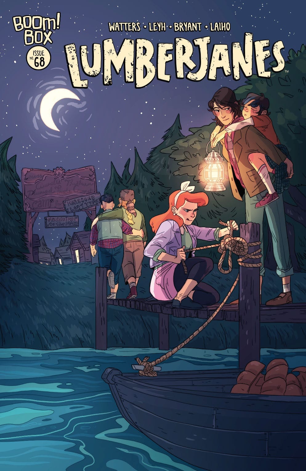
LUMBERJANES #68, out this Wednesday from Boom! Studios is the ideal conclusion to the most recent plot arc. In it, you’ll find a battle between goddesses, romantic moments, and cute kittens. In short: It’s the perfect Lumberjanes arc.
Let the battle of the goddesses begin!
***SPOILER WARNING***
Lumberjanes has always been a fun series, what with the campers and their ability to find chaos. And don’t forget all of those magical kittens. It’s no wonder that there are so many fans for the series. Lately, the Janes of Lumber have been put up against a kitten-napping goddess. And you know what that means. Because there’s no way our campers would ever give up their kittens without a fight. That’s what makes them so great. Okay, it’s part of the reason.
But the battle between goddesses is only part of what makes Lumberjanes #68 so brilliant. We’ll get to that in just a moment or two.
Somebody is looking sleepy on the alternate cover of Lumberjanes #68.
Lumberjanes #68 is a fairly fun issue, wrapping up the most recent plot arc with humor and relationship changes. Shannon Watters and Kat Leyh have made several promises during this plot, and this issue brought them all to fruition.
The goddess fight was pretty fun too, naturally. After all, who doesn’t love seeing two goddesses scream and fight with one another? And of course, it’s refreshing to see what Diana can really do with her magic, when she’s not trying to hold back (or when she’s not too busy acting arrogant).
While the wrap up itself had that endearing and sweet charm we’ve come to know about the series, there’s something bigger worth noting here. For one thing, the canon relationship of the series has finally been affirmed with titles (aka, the term girlfriend was finally used and confirmed).
What’s bigger? The series introduced their first ace character. Or more accurately, they revealed that one of the existing characters is ace (asexual). This is huge and is one more feather in Lumberjanes’ cap. The series has always been open and welcoming to all, but this still feels like a major moment for many.
Good to know that Diana can hold her own.
The artwork behind Lumberjanes #68 was a lot of fun. The creative team for this series has never been afraid to fool around or just be silly. And that’s a trait that shined during the battle of the goddesses. There were some appropriately dramatic and beautiful scenes as well (especially for the cat lovers in the audience).
Kanesha C. Bryant’s lines were the perfect foundation for this plot. The expressions on the Lumberjanes were probably the highlight, especially given all of the reveals and affirmations that occur towards the end.
Then there’s the coloring, which was done by Maarta Laiho. Laiho’s colors are bright and bubbly – and if that doesn’t describe the Lumberjanes, we don’t know what does. Her ombre backdrops show a delightful amount of attention to detail while giving an excuse for even more color in this issue.
And finally; the lettering. Aubrey Aiese was the letterer behind this issue, and you can tell that she had fun with the sound effects in particular. And to be fair, there were some funny moments surrounding them. But on the whole, the lettering was precise and yet playful – just like the Lumberjanes themselves.
Meanwhile, the rest of the Lumberjanes are left hiding behind a bush.
Lumberjanes #68 was an incredible issue, all around. Yes, it did conclude yet another Lumberjane plot. But it had fun along the way. It also gave the fans some things we’ve been hoping for, such as a cute moment between the main couple of the series, and another LGBTQ+ character. And that’s perhaps the highlight of this issue, all things considered.
With absorbing relationships and the initial fallout of Charles Xavier’s murder, X-Force #2 is mandatory reading for X-Fans and casual readers alike.
Marvel Comics’ various “Dawn of X” titles have established Krakoa as an utopia for mutants. In X-Force #1, writer Benjamin Percy shattered that illusion with the shocking assassination of Charles Xavier. Of course, we all want to know who killed Professor X. In the second installment (on sale November 27), Percy dives into the X-Men’s investigation of the murder.
X-Force #2
Writer: Benjamin Percy
Artist: Joshua Cassara
Color Artist: Dean White
Letterer: VC’s Joe Caramagna
From the opening page, the script is riveting. It opens with Magneto lamenting the loss of Xavier. “If only I had been here, I could have stopped the bullet,” he says. “If only you were made of metal, I might put you back together. If only, old friend.” Each word is packed with tangible grief but the art team adds even more weight to the moment. Artist Joshua Cassara shows Magneto hovering over the corpse and reassembling Xavier’s Cerebro helmet. (Even when he puts it back together, the bullet hole still dominates the blood-spattered metal.) Similarly, color artist Dean White visually depicts the vulnerable paradise with bloody flowers surrounding Xavier’s body.
Even with such a compelling first scene, the story draws us in even further with striking dynamics between characters. First, Magneto and Jean Grey discuss their plan to bring Xavier back. (Come on, we knew it was bound to happen.) Each word of Percy’s dialogue conveys the high stakes of this mission. “You do understand, Ms. Grey, that we won’t be able to hide what’s happened here for long,” Magneto says. “A terrible clock is ticking.” The implication is clear: without Xavier to lead Krakoa, the island’s sovereignty could be over before it truly began. It’s also worth noting that, during this discussion, Grey transforms the Cerebro helmet and gives it to Magneto. Percy may be foreshadowing that the X-Men plan to somehow weaponize Xavier’s death and turn it into a violent cause.
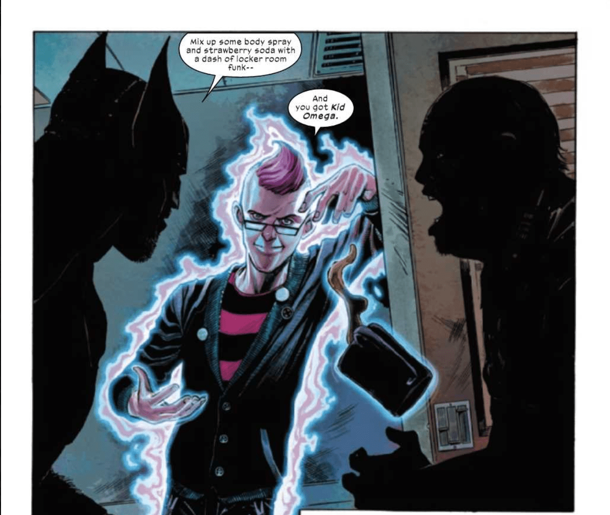
The relationship between Grey and Magneto is dire, so Percy balances the scales with a wonderfully fun buddy cop dynamic between Wolverine and Kid Omega. To the surprise of no one, Logan doesn’t take Xavier’s death well. He goes off with guns blazing on a mission to find the assassins responsible. This hunt leads Logan to an airport, where he bumps into Omega. Before he even opens his mouth, the contrast between the two is obvious.
Right away, you can tell Omega and Wolverine are polar opposites.
Omega is the anti-Logan, something the art team makes abundantly clear. White gives Omega an electric pink-and-blue aura and a neon pink mohawk. As he stands next to the gruff, grizzly Wolverine, we can tell these characters couldn’t be more different. When they banter, Percy leaves us clamoring for more of their love-hate relationship. Omega isn’t remotely afraid of Logan. When Wolverine tells him, “You should head back to whatever Krakokan preschool you escaped,” Omega retorts, “Don’t pretend competency, Grampa Logan.” A few more verbal jabs show that Omega won’t back down, even in the presence of “Ol’ Canucklehead.” The addicting dynamic between Omega and Logan demonstrates Percy’s ability to craft fascinating relationships, which leaves us eager to see how X-Force continues to progress.
Despite their differences, Kid Omega and Wolverine go on a mission together.
We’re still in the early stages of the mystery surrounding Xavier’s murder. But such a rich script makes being patient for the plot to unfold a fun ride.
What’d you think of X-Force #2? Where do you hope to see the series go from here?
The zombie tropes take a back seat in this issue of Sonic The Hedgehog from IDW so the team of Ian Flynn, Jack Lawrence, Matt Herms, and Shawn Flynn can focus on a long-awaited battle between two great rivals. Does a fight between Eggman and Sonic come at the right time or is it too much distraction from the Zombot storyline?
“The Last Minute,” Part Three! Sonic has been infected by the Metal Virus, and so far the only thing keeping him from going full-on zombot is his incredible speed… but how long can that last?
Writing
By taking a break from the zombie tropes this issue of Sonic The Hedgehog instead focuses on a bit of character drama. First, the conflict between Dr. Starlite and Dr. Eggman intensifies, as it is becoming painfully obvious Dr. Starlite is not impressed with the methods of his superior. Second, a battle between Sonic and Dr. Eggman which reminds everyone what happens when these two go all out against one another in combat. It’s a welcome sight to see, much like how when Batman faces off against the Joker or Iron Man fights the Mandarin. Watching old enemies face-off never gets boring when its the first time in a long while.
Ian Flynn really knows how to work in the character drama. Just before their fight, Sonic tries to remind Dr. Eggman of his past. As his time as Mr. Tinker when he didn’t have his malicious nature and was instead just intent on helping others. It’s a great series of panels and really shows how to deal with making sure characters have emotional moments during intense moments.
Artwork
The art by Jack Lawrence helps to nail down the emotional conflict taking place in this issue. He makes sure to use some great facial expressions to show the growing tension between Starline and Eggman. There also are some great looks on Sonic’s face as he deals with the desperation he is feeling having his back to the wall constantly.
With Matt Herms on colors, the book has a great shift to it. Between the changes of the action scenes to the gloom representing the oncoming hoards of zombots, there is a distinct contrast form panel to panel. It helps to make each page unique and lively.
The lettering by Shawn Flynn adds a distinct atmosphere to the issue. From the different sound effects to proper formatting of bits of dialogue, the work makes everything line up just right.
Conclusion
Though the Zombots don’t get a lot of attention in Sonic The Hedgehog #23, a good fight between Sonic and Eggman is always welcome. Especially as the breakdown of Dr. Starline’s respect for Dr. Eggman showcases how he may be making a power play in the future. As long as the quality is kept at this level, fans will have something to look forward to in future issues.
Even with the promising concept of taking a supernatural jab at Jack the Ripper in the Hellboy universe, “Witchfinder: Reign of Darkness #1” doesn’t do much to bolster that premise. Even with some sharp dialogue and a witty protagonist to back it up, this debut issue is plagued with a humdrum series of events and bland visuals.
In 1888, renowned occult investigator and adviser to the Queen Sir Edward Grey is put on the case to hunt down the serial murderer plaguing English alleys known as Jack the Ripper. Despite Grey’s intuitions about this killer being tied to occult agendas, British investigators dismiss his claims. What none of them realize however is just how powerful the forces behind these murders are. Hellboy creator Mike Mignola teams with writer Chris Robeson and artist Christopher Mitten to create a new Hellboy Universe story that’s been years in the making.
Sir Edward Grey, a.k.a. “the Witchfinder” and his associations were introduced into the Hellboy universe years ago during the “Wild Hunt” story line. Since then, the royal supernatural investigator has been an important supporting character and star of his own solid series. The “From the Pages of Hellboy” stamp is essentially a symbol of assured quality in comics, which is why it’s such a shame that this first issue of “Witchfinder: Reign of Darkness” is so bland. The novel (if not a bit overplayed) pitch of implementing Jack the Ripper in this universe is undersold by this issue’s lack of revelations or intriguing events. This issue follows Grey and his assistant Miss Goad as they follow a series of hunches and discover random MacGuffins to further the investigation. There’s an obvious bit of tension between Grey and the police, as well as a promising ending that will hopefully lead to more exciting and terrifying pastures. The Witchfinder series has been known to be a bit on the slow burn side of comic storytelling. However, this issue doesn’t offer the steady series of discoveries and intrigues to start off a compelling plot. There just isn’t much besides Grey’s likability as a protagonist, snappy naturalistic dialogue, and the premise itself to make the plot very engaging.
Perhaps the most iconic element of the Hellboy universe is its’ unique Gothic-horror aesthetic. Mignola has always found artists that reflect his own iconic styling, but manage to also have their own individual artistic looks. One such artist is Christopher Mitten, who has worked on various Hellboy and B.P.R.D. stories in the past and done so to great effect. It’s strange then how the art in this issue is so hit-and-miss. The environmental detail is excellent, and it brings late 19th-century London to life in all its hazy Gothic glory. There are specific trademark “Hellboy-ish’ moments (no spoilers) that are enticing and haunting, as they should be. It’s the character art itself that doesn’t fit. The human character look as if they were superimposed over a pre-drawn background. They look like still-rendering digitizations. This is brought about by what almost looks like a lack of inking on the characters themselves. Facial features are penciled well enough to be able to tell who is who, as well as their facial expressions, but the drawings have no dimension. The color-work on the characters as well is strangely flat. Again, the environments and specific supernatural elements look stellar, but the character art itself is off-putting.
“Witchfinder: Reign of Darkness #1” is a bit of a rocky start for a highly-anticipated new series that details one of the more intriguing anecdotes from Hellboy universe past. The premise is good fun and there is a definite shot at the end that details much more is to come, but the writing and revelations in this first issue aren’t particularly interesting. It’s also plagued by a strange choice of character art that is in stark contrast with the great environmental art and the Hellboy universe as a whole. The final pages of this issue promise that there is much more terror in store for these characters, so here’s hoping the creative team can capitalize on that promise after a lackluster first issue.
Welcome to ‘I’d Buy That For A Dollar’ a column where I will be exploring the weird and wonderful world of dollar bin diving. The only rule is each and every comic is purchased for one dollar (or less!).
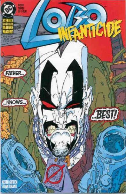
This week’s book is probably one of the most 90s properties there is. Lobo was created by Roger Slifer and Keith Giffen ( the artist on this week’s book as well) in Omega Men #3 (June 1983). Lobo is an alien from the planet Czarnia and works as an interstellar mercenary and bounty hunter.
He was first introduced as a villain in the 80s but soon fell out of popularity. He was revived as an anti-hero biker in the early 1990s. Lobo as a sort of parody of the 90s “grim and gritty” superhero stories and characters (Cable, Wolverine, and Punisher); he was then enthusiastically accepted by fans. This popularity led to Lobo having a high profile in DC Comics stories from then on and as starring roles in various series. Lobo Infanticide is one of them.
Lobo Infanticide#3 Script by: Allan Grant Plot/Art/Ink by: Kieth Giffen Colors by: Digital Chameleon Letters by: Todd Klein
From the opening pages of Lobo Infanticide #3:
The story so far…sick of humiliation and contempt, 200-plus of Lobo’s illegitimate children (or bastards) are scheming to bring about the death of their evil dad (or bastich). So why are the battle squads descending to the surface of Czarnia?
That’s a pretty crazy intro and set up. It’s pretty obvious this isn’t a serious comic (and NOT AT ALL for kids). But it’s effective and sets the tone for the book perfectly. So let’s take a look at some pages!
Here’s my copy! Solid condition. Lobo was always talking on the covers and usually addressing the reader or an off-page, unseen character.
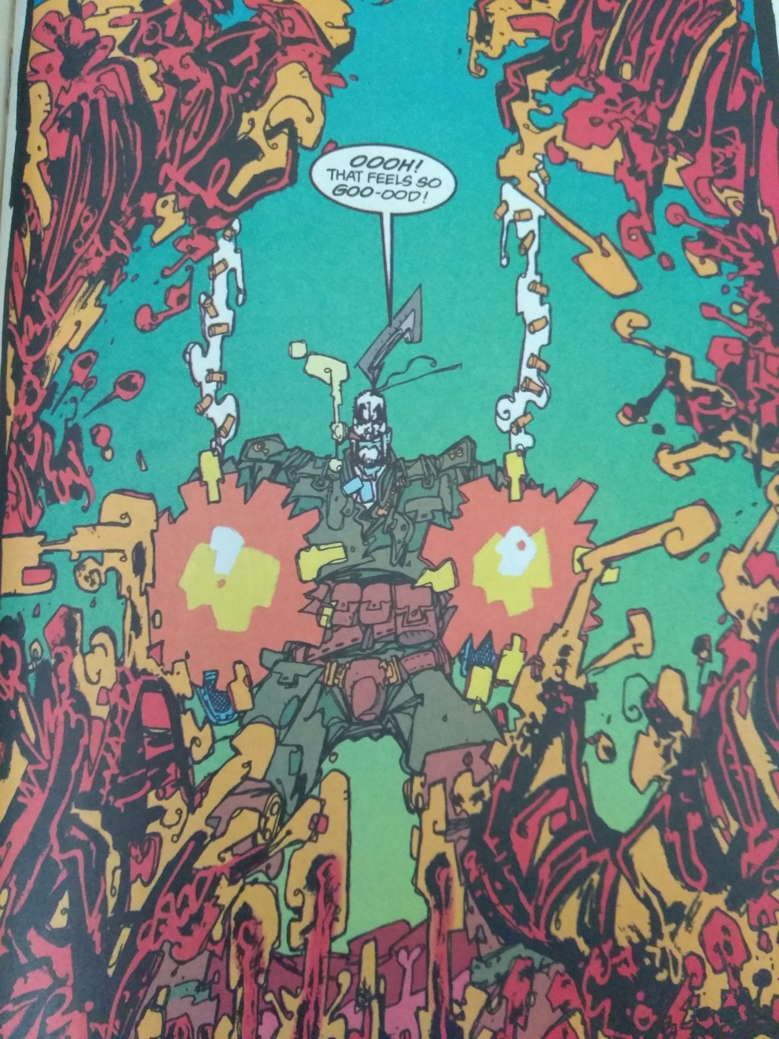
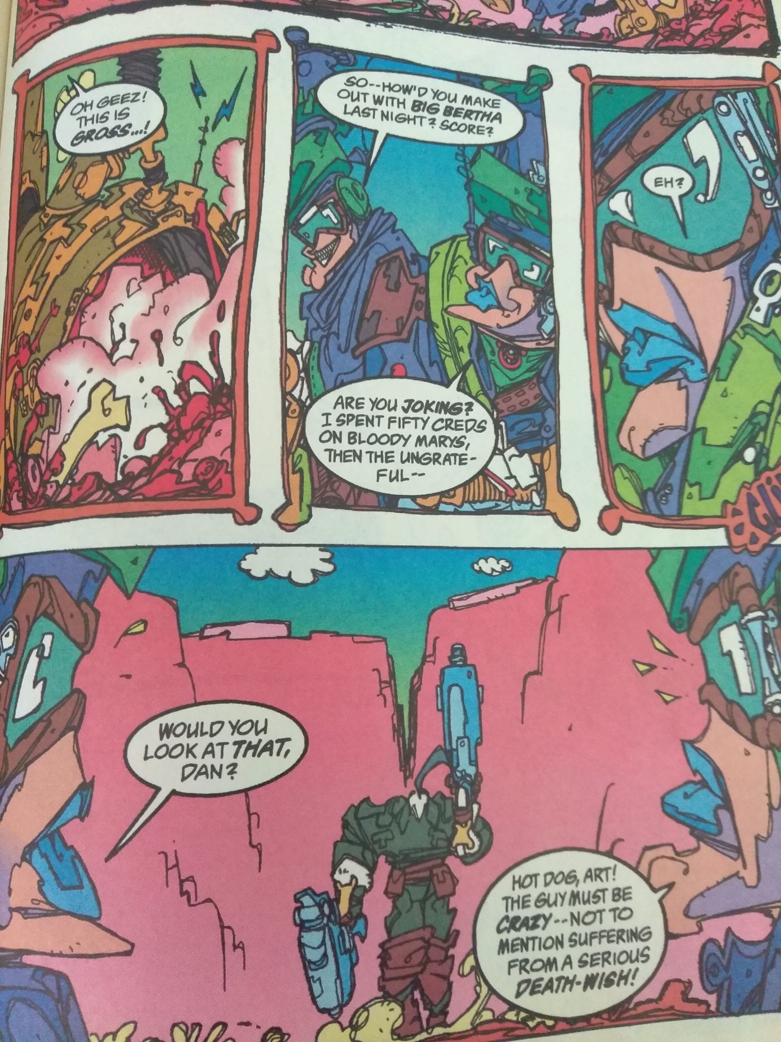
Take a careful look at all the crazy linework of Giffen and the awesome digital coloring that helps make the whole thing such a unique looking book. No one drew Lobo comics like Giffen! There’s so much wild energy! And there’s also some great lettering by Todd Klein!
Giffen always did this extreme close up of Lobo’s face, usually smoking a cigar!Just look at all the squiggly lines. Giffen’s art feels so immediate.Love these layouts. And those panel borders are fantastic!Another busy looking but excellent image. You can stare at this stuff and find so many details.
Great stuff right?! These pictures do not do it justice.
As always, I like to highlight ads in these old comics. The adverts help place it in a time and help tell what was going on in comics and pop-culture at the time. The ad for Superman’s Death is classic and you can tell where DC was going with their Big Two characters with the ad for Bane. The best ad though is the subscription page for DC/Vertigo (although they weren’t using the Vertigo banner just yet). Love they use John Constatine and that he’s smoking (anti-heroes were always lighting up back in the day).
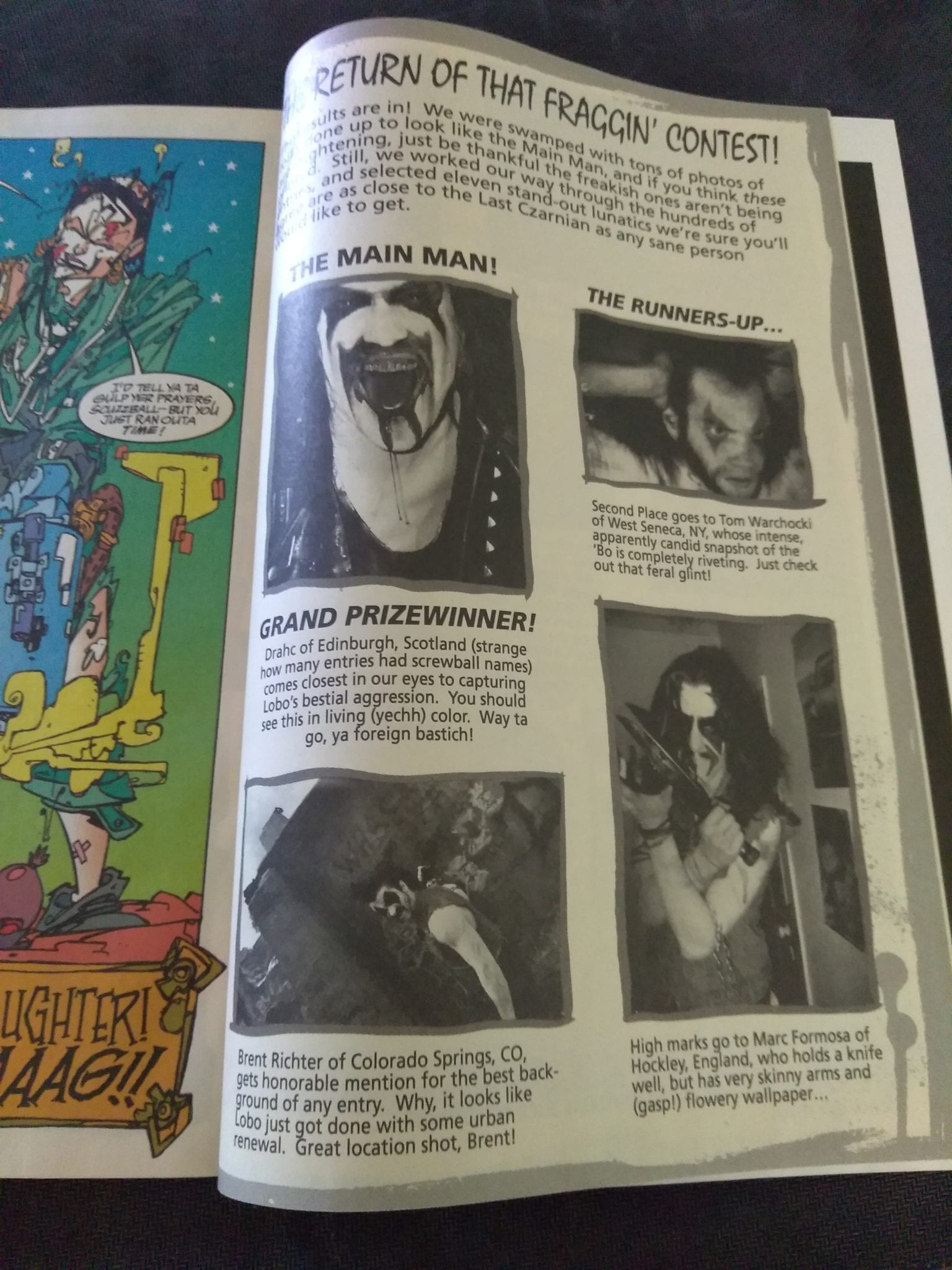
And finally here’s something you still see today in comics; fans sending in cosplay! This being Lobo, the fans and submissions are very interesting, to say the least.
You can find great dollar bins at almost every local comic shop. So find a shop, ask a comic clerk and start bin diving!
Got your own awesome dollar bin finds? Toss them at me! Send emails to manny@monkeysfightingrobots.com Follow me on Instagram: _idbuythatforadollar_
Tweet at me: @MannyG1138
Heading to the shelves with a new title, Dark Horse Comics‘ Machine Gun Wizards #4 contains all of the exciting story elements from previous months. It also brings the larger than life historical adventure to a climactic finale, at least for now.
With a pot overflowing with idea’s and a creative team who know no bounds, what can Christian Ward possibly have planned for the fourth issue of his creator owned masterpiece?
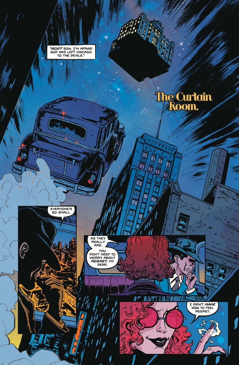
Machine Gun Wizards #4 Credit: Dark Horse Comics
Writing On The Cards
Seemingly defeated, Eliot Ness and his Untouchables still have a few hands to play. With their enemies turning on each other and an unexpected ally on their side, there is still hope for Chicago, and the rest of the world.
In this final issue of the first arc of Machine Gun Wizards, Christian Ward is tying up all of his loose ends. While maintaining an exciting struggle in the present, he allows time for some characters to boast about their past, affording the writer the chance explain the history that shaped this world. The back-up strips from the previous three issues link perfectly into the main story and form the foundation of the magical elements of the story.
To make the narrative work there are a number of surprises in this issue. In fact, more than you would imagine. Ward seems to have a bottomless top hat of tricks from which he pulls his narrative punches. As a reader you barely have time to digest one twist before another is thrown at you. The relentless story pounds throughout the pages to a climactic roof-top ending that would make Robert Rankin proud. The term ‘page turner’ doesn’t do it justice.
Machine Gun Wizards #4 Credit: Dark Horse Comics
Artistic Exploration
Leading the reader through the organised chaos is Sami Kivela’s wonderful artwork. Each panel captures the emotion of the character featured or the magic of the scene. Kivela’s art is as impressive up close and personal as it is is taking in the wide vista’s of 1930’s America.
For a comic steeped so deeply in fantasy and science fiction it is surprising how realistic everything looks. The design and figure work is detailed and precise making it easier to accept the more outlandish elements of the narrative. For example, a flying car, although dramatic, seems natural within the framework of the narrative. Kivela also uses an array of striking viewpoints to heighten the tension within each scene.
As in previous issues, the emotional theme of the scenes is reflected through the color work. The city nights are captured beautifully by an array of cool blues with hints of purple creeping in to represent the in-story magic at work. A number of different colors used by Christian Ward and Dee Cunniffe are either character specific or narrative related. The purple of the Toads blood is a prime example: As the source of the Magic in the world, the Toad touches many lives within the city and this is represented by the slow bleed of purple into the panels.
With an increase in action comes a deluge of sound effects and fast paced text. Hassan Otsmane-Elhaou always excels at letter placement drawing attention to important speech while never overshadowing the images.
Machine Gun Wizards is able to pull off the outlandish because the characterisation of its main cast is so captivating and believable. A large part of this is down to the interaction between the characters and Otsmane-Elhaou’s lettering brings out the best in the verbal back and forth. You get a real sense of who each character is from the lettering and placements of the speech balloons. Al Capone’s self assured arrogance is visualised by his speech overlapping borders and gutters, imposing itself across the panels and pages.
Machine Gun Wizards #4 Credit: Dark Horse Comics
Conclusion
Over the last few months Ward has pulled together a collection of narrative cliches and turned them into a compelling story. Machine Gun Wizards has the wonder of Harry Potter with the drama of The Untouchables and the outlandishness of Saga. All of these elements have been fused together to create the ultimate escapist adventure.
Add into the mix the amazing artistic talent and you are on for a sure fire hit. Each issue has visually pushed the boat that little bit further. The concept never gets tired because Ward keeps twisting the story while Kivela and Co. bombard you with knock out images. The storytelling is engaging, easy to follow, and enthralling to the end.
Machine Gun Wizards will appeal to anyone wanting a fun, exciting read but it will also appeal to genre fans and comic books enthusiasts as it combines a host of different elements all brought together in a single, beautiful package.
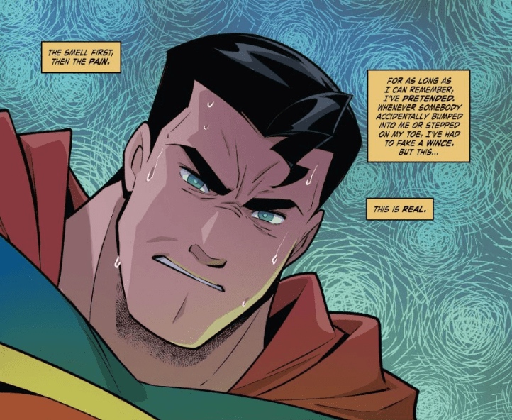
Superman is the quintessential superhero character, serving as one of comics’ highest thresholds. With over 80 years of history, the Man of Steel inspires people by the thousands. He is so influential that even the comic industry’s biggest superhero haters (e.g., Garth Ennis) and cynics (e.g., Mark Millar) are fans. But how is such a character loved by so many people in such a divisive world?
The Idea of Superman
The Man of Steel is the result of much trial and error. The Great Depression was the first obstacle for “Jerry Siegel” and Joe “Shuster” to get their idea published. With comic strips demanding for extravagance, Superman was created as a melting pot of the best character traits. Superman’s powers upon coming to Earth derive from John Carter on Mars. Other influences include “Douglas Fairbanks'” roles like Zorro. His civilian identity Clark Kent meanwhile comes from “Harold Lloyd,” a mild-mannered man who did not take kindly to bullies.
All of these seem arbitrary until the reader looks at how this fleshes out Kal-El into the inspiring Man of Tomorrow. Each story shows an extraordinary man who is just as human as everyone else. In the early stories, he could get angry and help anyone live the fantasy of beating back crooks. The stories that come afterward reflect the world around the Man of Steel and the changes he makes in reaction. Because with every day must come with a new tomorrow.
Superheroes have always been products of his or her home, often combining genres like science fiction with social commentary. This, in turn, helps the audience relate to the character while acknowledging they are still fictional.
How Is Superman So Popular?
Superman, on the surface, seems to be anything but popular. Fans of Superman, however, know that he is very human in spite of being from a more advanced world. A man with so many powers and skills is a simple yet surprisingly complex premise. If Krypton blew up because of factors like its denizens ignoring red flags, how can Earth be the place Kal-El thrives? For the Man of Tomorrow, it’s no longer just about power fantasies but trying to be a better man.
This is also what separates other superheroes from Superman. A significant number of them, such as Batman and Spider-Man, are propelled into crime-fighting by tragedy, including the death of loved ones. Such pessimistic beginnings, however, displays that their actions lean more towards guilt or trauma. At the same time, characters like Batman see Superman as something to strive towards, to the point of even sharing a couple of their influences like Zorro and Robin Hood. The Man of Steel’s kind nature, in turn, helps inspire other characters like Wonder Woman. She, much like Superman, is mighty, but the themes of truth and love in trying to create a better world is where they really compare.
Superman Is The American Way
Part of Clark Kent’s altruism comes from how his foster parents raised him on American values. But America has become more divisive and toxic in recent times, especially with the actions of neoliberals and neoconservatives. Some modern comics have even called this into question with Superman giving up his American citizenship. This, however, seems to have been swept under the rug in some media.
“Truth, Justice, and the American Way” remains an essential piece of the Superman mythos. Despite how America has its flaws, the Man of Steel is a patriot who embodies its values. Unlike ultra-nationalists like his father-in-law General Sam Lane, Kal-El never forces the US’ values on others or make sure it’s always on top. Superman respects the world around him and ideally serves as an example to follow, for both the world and the US.
Truth, Justice, and Democracy
This comes to a head in New Super-Man with the phrase “Truth, Justice, and Democracy” as an ideal for some characters. This is very relevant in the series setting, Shanghai. In the real world, China’s communist rule is becoming more imperialistic with its attempts to force its offshoots, such as Hong Kong, under its banner. As such, the people wish for a more democratic system to have a voice. Having their own Superman is a reaction to those ideals. While it’s not entirely the American Way, they are using an American icon as inspiration.
Superman is Relevant For All People
Even though he’s an inspiration, Kal-El still resembles a cis-gendered, heterosexual, white human. How can someone who resembles the ideal of Third Reich be so loved? It’s because Superman is an ideal to strive towards. It’s why he is called the “Man of Tomorrow” because Clark seeks to be better for himself and the people around him. This, however, is an idea, not a belief that can be tainted.
That is demonstrated in Superman Smashes the Klan. The Man of Steel struggles every day to fit in but knows that he’s different. Despite his job and friends, Clark still feels lonely at times. In Clark Kent’s own way, it’s like having a closeted identity or reaffirming his true self. Imagine how a transgender person goes through life but never understanding what brought them there in the first place. It’s one of the many reasons superheroes are so empowering.
Superman Makes Superheroes Look Good
Superman’s very presence is what kickstarts the appearance of superheroes. At the same time, it’s his very humanity that separates him from other superheroes. While the Man of Steel represents humanity at its very best, the superhuman community is another issue. Many superheroes are inherently flawed people with some questionable morals.
For example, Spider-Man is an altruistic character known for his slip-ups. While even the very best of people fail at important tasks like money problems, there are very toxic sides to the Wall-Crawler. Marvel preferring to keep his civilian identity Peter Parker close to his teenage roots, actually makes him look like a man-child. For all that talk of great power and responsibility, Peter never really lives up to those responsibilities. Many times, Peter puts his loved ones in danger because he never shared his secret identity. You’d think that after Gwen Stacy, he’d have learned better.
In comparison, even the worst stories never feature Superman as being toxic. Betray expectations like in Superman: Grounded maybe, but not toxic. Garth Ennis is a fan of Superman because he was allowed to mature. While the Man of Tomorrow gets stuck in the same traps as other A-list superheroes, his simple life gives meaning to them. It’s also why the usually cynical Mark Millar was devastated by the film Man of Steel, and this is the same guy who made Superman a communist. Making Superman more complicated than he needs to betrays the character’s point.
Don’t Other People Mess Him Up?
Because Superman is more like a symbol in practice, it becomes increasingly harder to write stories about him. Both Frank Miller and Brian Michael Bendis are Superman fanboys who portray the Man of Steel with varying success. What they all have in common, however, is trying to balance the “Super” with the “Man.” Clark Kent steals most of the spotlight for some of Superman’s most notable series; it’s what helps keeps the Man of Steel moments so special. Unfortunately, only a few people, including Grant Morrison, manage to make the sensations meaningful.
Some of those meaningful moments meanwhile are shared with Superman’s supporting cast. Lois Lane and Jimmy Olsen are two crucial people in Clark Kent’s life he can’t live without. Lois represented the complicated feeling boys have when trying to talk to girls until she and Clark get together. Jimmy meanwhile represents that younger friend that goes to you for advice and grows from your example — seeing the Man of Tomorrow from their perspective instead of the other way around creating this empathetic sense of awe. Unfortunately, since so many stories focus on Superman and not these outside forces, the Man of Steel feels bland in comparison.
Conclusion
People only think Superman is uninteresting because he is just as human as his audience. The general populace believes this Man of Steel is the greatest thing to see with his numerous adventures. But this isn’t even a quarter of what makes Superman so inspiring. It’s living life the only way he can and how such a simple idea can give rise to a better tomorrow.
What do you all think? Is Superman as great as people think, or is he just another Marty Sue? Leave your thoughts in the comments?
Acclaimed television writer Rodney Barnes and Spawn artist Jason Shawn Alexander create a bold hybrid of crime thriller and supernatural horror in “Killadelphia #1.” Barnes’ deft and original plotting blends superbly with the darkened realism of the art style to make for one of the most promising first issues of the year.
In “Sins of the Father Part One,” the death of revered detective James Sangster Sr. brings his estranged son, a small town cop, back home to bury him. When this son discovers his father’s latest case on a series of mysterious murders and some rather insane claims, he decides to investigate. Little does he know that he’s about to dive into the maw of long-hungry terror in a story that’s a brilliant supernatural-crime-thriller as well as a searing indictment of those responsible for urban poverty.
The most impressive part of Rodney Barnes‘ writing in this debut issue is the originality of the plot itself. The familiar elements of crime-torn urban projects and vampire horror come together with hints of historical fiction and modern political commentary. Every piece of this genre menagerie fits together like a puzzle and it never comes across as overly audacious or overstuffed. The dialogue adds in great part to both the plot and character development. The frame narrative with Sangster’s investigation is colored with varied character interactions that all have their own distinct tone. Even the protagonist Sangster Jr.’s more quiet and observing personality shines through in his specific moments. Jr.’s characterization is another stroke of genius on Barnes’ part, as it’s made clear that he is this way because of his upbringing. Without getting into spoiler territory, Barnes’ use of early life trauma as a sort of subplot device is key to the entire emotional core of the story, and it stays on the reader’s mind without ever overtaking the external events of the main horror story.
A large chunk of the story is given in emails and journal entries, and this works exceptionally well. Investigative crime stories need these sort of anecdotal devices as part of their nature, but it can be difficult to do without losing the audience in bulky exposition. Fortunately, Barnes is more than capable of delivering here. The notes all feel heartfelt and natural in the same way good dialogue does. There are revelations found in these bits of writing that also cleverly keep the audience in the dark in the best way. There’s a smorgasbord of exceptional writing delivered by Barnes here.
“Killadelphia #1” reaches a state of tonal and atmospheric perfection due in large part to Jason Shawn Alexander‘s immersive artwork. The tortured and tense mood throughout the issue is reflected in the semi-photo-realistic details that Alexander puts into his characters and the settings they inhabit. Sangster Sr.’s experience and determination is contrasted with his son’s quiet reservation. Small tonal touches like this are what stand out most in this comic as far as true talent is concerned, bringing forth Alexander’s skill in a more reserved way than his other well-known works. The grainy and shadow-intensive inks remind the audience that this is still a horror comic, and every monstrous detail (much of which is withheld for suspense) comes across with the perfect amounts of shock. Alexander’s work is filled by Luis Nct’s hazy coloring. Philadelphia is given the look of a proper overcast urban crime environment, with sudden explosions of reds or yellows that work almost as signal flares for the coming horror show. The art in the book is spectacularly good and is perfect for what kind of story is being told.
Marshall Dillon’s lettering is mostly par for the course during the normal dialogue and narrative texts, but he gets more to play with in the form of Sangster Sr.’s journal entries. The handwritten cursive styling of these passages work not only in the sense that they reinforce the immersion, but they also coincide with Sangster Sr.’s personality. The fact that this character wrote his entire journal in cursive fits with Sangster’s traditional and stoic personifications the audience has come to see from him. It can be a little hard to read at points, but being honest, that’s rather the point.“Killadelphia #1” is a gripping and engrossing cross of crime procedural, familial drama, urban political commentary and vampire horror. Barnes somehow manages to blend these genres together seamlessly to make a first chapter that succeeds in spades. It’s emotionally riveting and outright suspenseful. Alexander’s art here brings the world and characters to perfect artistic vision while collaborating with the script to maintain tension and leave the most horrific moments to the imagination of the reader. This is without a doubt one of the most promising debut issues of 2019, and make sure to have in your folder at your local comic shop on 11/27.
Monkeys Fighting Robots and Titan Comics have teamed up to give away a free copy of the upcoming PHILOSOPHY OF DEADPOOL!
About the book: A unique take on Marvel’s katana-wielding, gun-toting, insult-firing anti-hero. This book presents the most outrageous moments from Deadpool’s comic book history in a definitive guide to his wisdom, insights and guiding moral principles. Have you ever been in a tricky situation and asked yourself “what would Deadpool do?” This book provides the answer. And unicorns. Lots of unicorns.
The 144-page book is full of Wade Wilson’s signature quotes and nuggets of wisdom. Take a look at some of the good stuff you have to look forward to:
Courtesy of Titan Comics.Courtesy of Titan Comics.
So how can you win your copy?
The contest is straightforward to enter:
Step 1 – Join our newsletter
Step 2 – Comment on this contest below.
***Bonus entry, share on social media***
The winner will be chosen at random on Friday, November 29, at 3 p.m. EST.


")


 “Truth, Justice, and the American Way” remains an essential piece of the Superman mythos. Despite how America has its flaws, the Man of Steel is a patriot who embodies its values. Unlike ultra-nationalists like his father-in-law General Sam Lane, Kal-El never forces the US’ values on others or make sure it’s always on top. Superman respects the world around him and ideally serves as an example to follow, for both the world and the US.
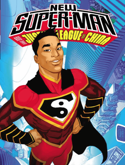
")


 “Killadelphia #1” is a gripping and engrossing cross of crime procedural, familial drama, urban political commentary and vampire horror. Barnes somehow manages to blend these genres together seamlessly to make a first chapter that succeeds in spades. It’s emotionally riveting and outright suspenseful. Alexander’s art here brings the world and characters to perfect artistic vision while collaborating with the script to maintain tension and leave the most horrific moments to the imagination of the reader. This is without a doubt one of the most promising debut issues of 2019, and make sure to have in your folder at your