Home Blog Page 379

Review: 20XX #1 – Are You Down With The New Sickness?

There’s a new sickness going around, but it’s pretty cool if it doesn’t kill you. 20XX, out this week from Image Comics, touches on a realistic future that we should really work harder to avoid.

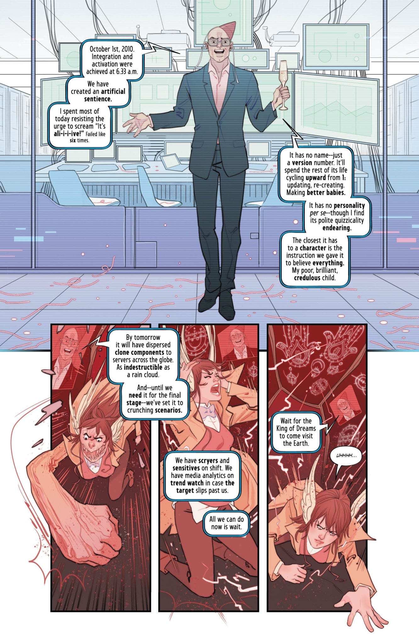
First up we have a newcomer to comics, Lauren Keely writing this story, and another first for Jonathan Luna working in black & white. Luna also handles the lettering, design, and helps Keely with the scripts.

If you’ve been paying any attention to the news you know how frightened the medical science community is getting about the overuse of antibiotics. Bacteria evolves just like any other organism except it happens faster for them. Antibiotics will eventually create “super bugs” that will be immune and resistant to the treatments medicine has come up with.

I highly doubt these “super bugs” will give anyone telekinetic powers, but we can hope. Most likely they will just kill us all and pave the way for a new dominant species on Earth. Here we get a fictionalized look at what we have to look forward to with adaptive super bacteria.

I was initially pretty bummed to see that the book is black & white after such a great cover, but after The Walking Dead‘s exit from store shelves, the industry needs another colorless ongoing to take over. While I love color in comics, this gives Luna more time with the characters and line-work detail. 20XX has all the elements to be the successor: a sickness, death, evil, a fight to survive, and a fight for more than survival. People need something to live for or what is the point of surviving?

There are so many of aspects of this story that will relate to readers everywhere. Everyone all over the globe has to deal with sickness and death. In some countries it has become much easier to deal with dire situations, but for others, and one in particular, it can be a death sentence of a different breed.

In that particular country, society as a whole outcasts the sick, diseased, and disabled, because those people need a little help and there’s no profit in helping people. The victims in 20XX are treated the same way: outcast, shunned, and forgotten. If you can’t make someone money they don’t care about you.

As soon as the main character catches the illness, we see immediately how serious it is and how frightened it makes people. Just before she falls ill, she is on her way to meet her boss for a promotion. After she survives and her sickness is explained to her, she calls her boss only to find out that promotion was given to someone else and her old job has been filled as well. She went from promoted to jobless in a matter of a few days, and unfortunately, this has become the reality for many people. Hopefully there haven’t been any situations exactly like this, but we put up with a system that punishes you for being human.

What she becomes after surviving the illness is something that is treated with contempt. It makes you different so obviously they are immediately treated like garbage. Many humans cannot wrap their minds around anything that is different, and many of them don’t even try to understand. Art can open our eyes and teach us countless lessons. 20XX is a story with humanity in mind, and hopefully it will give us some clues on how to save it.

Stories like this always end up being less about what is happening and more about how the characters handle the situations. This is about human nature, and what people resort to when they are mistreated and cast aside. In desperate times we resort to desperate measures. What would you do to survive?

What did you think of 20XX #1? Do you feel like this could be a successor to The Walking Dead? Let us know in the comments below.


Monkeys Fighting Robots Youtube

Review: DIE #10 – Devious Dictation; Dangerous Deception

Planning and plotting are the themes of the day as the dictator flexes her words in Die #10, out this week from Image Comics.

Back for another chapter from the world of Die is author Kieron Gillen, artist Stephanie Hans, and letterer Clayton Cowles. This is a gorgeous work of art in your hands; cherish it.

With Die #10 Gillen reminds us that this is still an RPG and there are rules for everything. The depths of this story leads me to believe that Gillen sat down and has played through this game several times with several people and has taken all the best ideas that every player has come up with. Gillen has created rules for this world and then figured out a way for each character to exploit those rules.

He also adds an essay at the end discussing the issue along with additions and tips for the Die RPG. Give your dungeon master some Die trades for Christmas and watch their creativity take off.

Hans is creating some incredible works of art for this book. The trades for Die could be easily mistaken for an art book. Her style works so well for fantasy and even better for such a dark fantasy as this. Fully painted and beautiful color shows the time and planning that goes into each issue. Hans changes up the style for the flashbacks so it’s always obvious when we are being shown past events.

Cowles’s work is very easy to read, and since this issue was mostly planning and setting up for the next phase, there was not much action, no huge battle scenes that would necessitate any large lettering to be done.

In this chapter we get a look at what Ash is planning, but we still don’t know how she plans to execute it. Plans don’t tend to workout so well in Die.

In previous issues we have seen some of the history from the other characters, but this is the dictator’s chapter. It would appear some kind of marking or glyph over the left eye is an attribute of dictators. In a battle of words their eyes glow and “spells” seam to spill out of them.

Gillen and Hans have created a real masterpiece. Any panel from any issue would be perfect in a frame to hang on the wall of any fantasy fan’s home. The depths that Gillen has gone to creating such an extensive and original world is inspiring. Even based on something that has been around for decades, he has created original characters with creative twists.

Die is the dark universe to Dungeons & Dragons. Every character has to deal with some terrible aspect of their powers that was not explained to them very well or at all. In that sense it’s like the original Jumanji with Robin Williams. Everything sounds good at first, but once you get into the fine print, you should probably start running.

This book just basks in the beauty of Hans’s work. Die deserves all the accolades and recognition. Not only is it a great story to read but you can get some friends together and play through your own version of it. There are not many other books that can say that.

After reading a reference to King Arthur in Die #10, I can’t help but wonder if some of his research for Die also spawned the creation of Once & Future. I am still fairly new to Gillen’s work, but it appears that history is always an important aspect of his stories. He was probably the kid listening to the teacher in history class and imagining what it would be like if Genghis Khan also had dragons.

If you love beautiful artwork, add this book to your pull list. If you love an amazing fantasy story, add this book to your pull list. If you like something fantastical that still pulls elements from history and literature, add this book to your pull list. If you’re stubborn you don’t have to, but it would be cooler if you did.

What did you think of Die #10? Have you tried playing the RPG yet? How cool is this artwork? Let us know in the comments below.

Monkeys Fighting Robots Youtube

I’d Buy That For A Dollar: EAGLE #1 (September 1986)

I'd Buy That For A Dollar

Welcome to ‘I’d Buy That For A Dollar’ a column where I will be exploring the weird and wonderful world of dollar bin diving. The only rule is each and every comic is purchased for one dollar (or less!).

This week’s book is Eagle #1 from Crystal Comics. The story is pretty awesome: Richard Eagle is a vigilante/ninja who is also kind of a private detective. Oh and he mystical/occult powers too. After his friend, another private eye named Colt (great name!) is murdered by a ninja cult, Eagle starts an investigation; and it all leads to Lord Kagami, a villainous demonic cult leader out to destroy Eagle.

Like I said, pretty good stuff. And the thing also looks cool as hell! So let’s jump right into the issue!

Eagle #1
Created by:  Neil D. Vokes and Rich Rankin
Script by: Jack Herman
Pencils by:  Neil D. Vokes
Inks by: Rich Rankin
Letters by: Gary FieldsEagle

Ok, that’s one cool looking cover. It has a huge manga vibe (that blue background with speed lines) and Richard Eagle also looks A LOT like Bruce Lee, which is also very cool. All in all, a cover that does grab your attention.

Eagle

This title page is awesome. I love all the shapes made by the layout; it even has a Will Eisner vibe. The poster on the wall being used for credits is a very cool touch. And the title, ‘Night of 1000 Ninjas’ is just pure 80s goodness. You have to be totally in at this point.

Eagle

This double-page spread is one of my favorite things in the book. Love the composition and the use of black with all those ninjas (the swords look awesome!). It’s actually an effective image because you totally feel how cornered Eagle is.

Eagle

I really dig this image. The splashing rain and lines give it a totally 80s manga feel.

Eagle

Another great full-page layout. This is from a mystical vision scene and it has a strong Doctor Strange Dikito era vibe. Those circles make for a great floating effect.

Eagle

I love this fight. It moves fast and again those speed lines! Also, all these pages have some great lettering.

I usually talk about the ads in these books, but being an indie book, Eagle has very few ads. But it does have two very cool things at the end. Let’s check those out.

First is this cool pin-up credited to Matt Wagner (Grendel/Mage).

Eagle

And then there’s this. It’s the petition to get Jack Kirby’s original art back to him from Marvel Comics and the petition was started by The Comics Journal. You see a lot of these in random comics from around 1983. It’s neat to see how so many indie publishers were behind this.

Eagle

Eagle #1 has been one of the most fun books I’ve dug out of a dollar bin and I’ll definitely be on the lookout for more in the future.


You can find great dollar bins at almost every local comic shop. So find a shop, ask a comic clerk and start bin diving!

Got your own awesome dollar bin finds? Toss them at me! 
Send emails to manny@monkeysfightingrobots.com
Follow me on Instagram: _idbuythatforadollar_
Tweet at me: @MannyG1138

Monkeys Fighting Robots Youtube

Review: THE DREAMING #16; Deprogramming the Imagination

the dreaming dc comics exclusive preview

Writer Si Spurrier marches ever closer to the end of his stellar run on The Dreaming, and issue #16 brings forth answers to some of the most troubling mysteries the story has had to offer so far. Fantastic dialogue and sharp as always plotting are only slightly marred by this issue’s exposition-laden delivery and the disappointing break from Bilquis Evely’s incredible artwork.

Dora is finally put face to face with the person who tried to unmake her, only he isn’t quite what she was expecting. As it turns out, this man is more connected to her and the Dreaming itself then anyone could have guessed, and his plans for the realm have fallen out of his control and into absolute chaos!the dreaming dc comics exclusive preview

Si Spurrier has done a stellar job at replicating the menagerie of writing styles needed for a proper Sandman story in his 16-issue tenure on The Dreaming thus far. This issue actually trades a bit of that variety for a more journalistic approach to unveiling the story’s major mysteries. The twists this issue put forth are fantastically brilliant, and take the story and concept of Sandman to places even Neil Gaiman himself would have a tough time imagining. The mysticism mixed with science this issue uses is rarely seen or done so well, and it puts the larger pieces of this puzzling story together in a way that is duly shocking and engrossing. A minor gripe could be made due to the exposition-laden approach at telling this specific point of the story, but at the same time it’s difficult to imagine any other way to approach such revelations. The way this issue fits in with the larger story brings serious anticipation not just to the rest of his work on The Dreaming, but on the future of his work for the Sandman Universe as a whole.the dreaming dc comics exclusive preview

In keeping with Sandman tradition, The Dreaming plays host to a multitude of artistic talents. Unfortunately, the lead talent behind the series’ visuals is the incomparable Bilquis Evely, whose art is next to impossible to try and follow up. This becomes a bit of an issue in this chapter. This is not to put down Marguerite Sauvage’s efforts in this issue at all; she still provides work that’s emotionally engaging and detailed enough to stand well enough on its own. It’s just that Evely’s art is so identifiable and detailed that it stands on its own in a completely different caliber, so her absence is felt. Still, the art provided by Sauvage does well for this issue. The fantastic visuals of the realm of the Dreaming are largely absent here, instead mostly taking place in a sterile hospital room. Thus, most of the art is focused on character and facial detail. The work in this regard is still superb. Everything from Dora’s raging internal struggle to her would-be destroyer’s cascading emotional journey are created in strong believable penciling. Enviornmental detail is not much of a worry here due to this issue’s subject matter, but it’s solid when it does arise. The color palette is a notably off choice, however. The panels all appear to be sort of washed out, with only a sort of semblance of its hue really reaching the page. This very well could be a choice based upon what is actually happening in this issue’s story, but it is something to make note of. In the end this is still a very well-drawn issue, even if it does lack Evely’s impeccable hand.the dreaming dc comics exclusive preview

Simon Bowland’s lettering pulls a bit of a neat trick as well. His normal comic font is tilted with emotion and attitude in its usual entertaining way. However, it also uses another much more plain font for the dialogue of Dora’s un-maker. Staying away from spoilers, it’s a simple but still useful touch to separate the dialogue of character who are from characters who were.

The Dreaming #16 is a damn engrossing issue that delivers brilliantly clever twists and takes the story of Sandman into uncharted territory. The utility of the human imagination, for all its flaws and wonders, is explored in a manner that is both chilling and strangely uplifting as this series continues. Despite the “not quite as superb” artwork this issue displays as well as some comparatively safe writing compared to other Dreaming or Sandman issues, #16 is possibly the most important chapter to this series’ plot in the entirety of Si Spurrier’s run. With only three issues left of his run before G. Willow Wilson makes her series debut, be sure to pick this one up at your local comic shop before this saga ends.

Monkeys Fighting Robots Youtube

WONDER WOMAN: COME BACK TO ME #6 Wraps Up This Quest

WONDER WOMAN: COME BACK TO ME #6, out this Wednesday from DC Comics, concludes the epic and slightly crazy quest that Wonder Woman has found herself a part of. And it is every bit the explosive ending we’ve all been looking forward to.

Looks like Wonder Woman is about to face off against a bunch of enemies…again.

***SPOILER WARNING***

Just a friendly reminder before we dive into this review: Wonder Woman Come Back to Me is a series that has already been in print once before. It originally ran as part of the Justice League/Wonder Woman Giant series but is now being compiled into one single series for the sake of the fans (and collectors).

Wonder Woman has been thrown from one adventure to the next during her time in Wonder Woman: Come Back to Me, but the journey is about to end. Wonder Woman: Come Back to Me #6 concludes the series, bringing fans the ending we’ve all been looking forward to. But does it live up to our expectations?

Yeah…Diana might just be a little bit mad.

Wonder Woman: Come Back to Me #6 was in many ways exactly the sort of conclusion fans could expect from this series. After all, Wonder Woman is not unused to space, nor is she afraid to go to drastic measures to save her friends.

However, this issue does bring about it a few twists before it allows the series to conclude. You’d think that the authors, Amanda Conner and Jimmy Palmiotti, would be done upping the ante in this plot. And you’d think wrong. They have one more big bad they need to throw Diana’s way.

But Diana works best under pressure. If anything, she’s more likely to find more allies when facing a greater foe. So her following actions are not surprising to any of her fans, though that doesn’t diminish her willingness to sacrifice any.

All things considered, this was an amusing issue to read. Yes, it got a little sappy at times, especially towards the end. But that tends to happen when a character comes back from the dead (because of time travel shenanigans).

Enter the new big bads of the series.

Wonder Woman: Come Back to Me #6 faced some art style changes, but given how the plot had originally occurred within a couple of different series, that’s not too surprising. Tom Derenick (pencils/inks), Hi-Fi (colors), and Travis Lanham (letters) were all brought on for this two-part issue, and they had a bit of fun here.

Diana’s fights are epic and dramatic – as all of her fights should be. Fans of the character might notice something off during the final fight – but that was done with intent, as Diana is up to something sneaky. It’s brilliant that the artwork was able to leave hints such as that.

The other highlight would have to be the way in which power was represented in this issue. There were some very strong beings presented here. But they had to be believable and something that Diana could potentially be both threatened by and capable of taking out. That’s a fine line to tread. But they did a decent job with these final two antagonists.

And so, even more, fighting begins.


Wonder Woman: Come Back to Me was an interesting and fun series, on the whole. It doesn’t require any readers to know what’s going on in Diana’s current plot, and really just wants to tell a dynamic story about a beloved DC character. And who can blame them there? The series did end up pretty out there (literally) in the end, but it takes a lot to challenge a character as powerful as Wonder Woman.

Monkeys Fighting Robots Youtube

Allies of the Past in WEB OF BLACK WIDOW #4

WEB OF BLACK WIDOW #4, out this Wednesday from Marvel Comics brings us back to a Black Widow on the quest for truth. And maybe a bit of revenge. But when somebody is out there committing murders with her face, what else is Natasha supposed to do?

You can probably guess who Black Widow is about to face, based on this cover alone.

***SPOILER WARNING***

Natasha has been working hard at hunting down the person using her face to kill people from her past. But that means that the Black Widow must also face the past she left behind – and all of the allies and enemies she’s made along the way.

Web of Black Widow #4 brings us perhaps the most iconic partner from Black Widow’s many runs: the one and only Hawkeye. Clint Barton has consistently found a way to make his way into Natasha’s stories. But this time it feels different. And that’s all thanks to the mess of a web that has been woven for her.

Natasha is not looking good, but she’s seen worse…

Tracking down the events of one’s past is always easier when you have complete memories. Unfortunately, that is something Natasha is lacking. Perhaps that is the reason she’s been having so much difficulty here. Well, that and the fact that her allies keep getting in her way.

Jody Houser has woven an intricate web in which to trap Black Widow in. Web of Black Widow #4 once again played around with the past and the present; unraveling Natasha’s story one element at a time. This tactic has been used to a brilliant extent in this series, building intrigue and providing a grounding all at the same time.

The other constant in this series? Each issue has brought Black Widow up against an enemy and an ally of her past. The ally is probably the more notable element here, given that it’s Clint Barton we’re talking about here.

The events that follow are dramatic and deeply emotional, thanks to the combined past of these two heroes. Neither wants to be fighting the other, but they’re both too stubborn to stop or to back down. And talking is simply out of the question. Quippy banter and comebacks are acceptable, of course.

That looks like one of Hawkeye’s arrows, doesn’t it?

Web of Black Widow #4 brought with it some clever artistic scenes. The bouncing in perspectives has lent well to a creative form of storytelling in itself, but it also results in some visually striking panels.

The fighting in this issue was exceptional, showing a dramatic sense of movement and impact. And it wasn’t afraid to draw or show a bit of blood either – which fits with Black Widow, don’t you think?

Stephen Mooney (pencils/inks), Triona Farrell (colors) and VC’s Cory Petit (letters) did an excellent job with this issue, all things considered. Natasha is looking driven and stubborn, which is about par for the course. And the colors for each panel are brilliant, giving us a clear distinction with nearly every time jump (there are exceptions but with intent). And the lettering was simple and understated.

Talk about an unexpected cameo!

Web of Black Widow #4 is the second to last issue in the series. And that means that it’s time to up the ante. This issue brings with it a lot of drama and revelations, but the story isn’t quite over yet. Fans will be left wondering what sort of price Natasha will have to pay when this is all said and done.

Monkeys Fighting Robots Youtube

Enter the World of Magic in NOMEN OMEN #3

NOMEN OMEN #3, out this Wednesday from Image Comics, continues the story of Becky and the insane adventure she has unwillingly been thrust into. This is a world of magic and beasts, and we’ve only just begun to scratch the surface of it all.

Becky and Fer are about to face something magical.

***SPOILER WARNING***

It’s safe to say that Becky has not led a normal life up until now. Even the circumstances of her birth were somewhat…out there. But even that life could not have prepared her for some of the revelations she’s about to face. Though she’s arguably more prepared than most.

Last we saw, Becky was being rescued by the most unlikely of allies; a bulky man determined to face off against several others of his kind. And we were left with so many questions about what was going on.

Don’t worry, Nomen Omen #3 makes good on the promise for answers. Though it might just give you even more questions along the way.

Jumping into a magical realm can have some odd consequences.

Nomen Omen #3 is a wild adventure for little miss Becky. Torn from the world she grew up in, Becky now is faced with the reality of magic. And of the beast that stole her heart. The realization is easier to accept than you might believe. But then again, consider who we’re talking about here.

Marco B. Bucci wove an intricate and fascinating story here. He made clever use of several different storytelling techniques. This helped to keep the pace moving, while also giving us some painfully needed information.

Where previously the characters were interesting – yet still relatively flat – they’ve become something more here. Becky and Fer’s personalities play nicely against one another. There’s still a lot more we need to be shown about these two (and all of the other characters we’ve met), but we’re getting there.

Then there’s the plot itself. We’ve getting tossed fully into the deep end in this issue. And it’s looking to be an absorbing story, if this issue is anything to go by. The magical system is complex, and there’s just the barest hint of the politics and vendettas that run through the magical world. It’ll leave readers desperate to see more. And we’re hoping the next issue will give us exactly that.

Becky and Fer look pretty comfortable on this alternate cover of Nomen Omen #3.

Nomen Omen #3 has perhaps some of the best artwork of the series (so far). And considering one of the highlights for this series has always been the artwork, that is saying something. As with the others, this issue carefully balances gray-scale imagery against panels full of vibrant colors. The effect is stunning.

But it also serves a purpose. There are normal events. And then there are magic events and scenes. You can guess which one has been granted the ability to be shown in brilliant color. There are several pages (a little more than halfway through the issue) that are especially striking. And should probably be made into prints.

All credit goes to Jacopo Camagni for all of the artwork in this issue. They singlehandedly managed both the lines and the colors. And that is why it all looks so blindingly cohesive. There was one other artist on board with this project, Fabio Amelia. They’re the ones in charge of lettering. And unsurprisingly they did a stellar job of it.

And here’s a peek at what Nomen Omen #4 has in store for us.

Nomen Omen #3 went a long way in getting fans even more invested in the series. It’s full of beautiful artwork, character development, and answers. There’s still a whole lot left to this tale, but since we’re only a fifth of the way through this story, that makes sense. And it’s looking to be an interesting ride the rest of the way.

Monkeys Fighting Robots Youtube

Kamala Plays “Hyde” And Seek In THE MAGNIFICENT MS. MARVEL #10

Cover by Eduard Petrovich

Hitting the shelves this week from Marvel Comics, The Magnificent Ms. Marvel #10 keeps us on the edge of our seats with Kamala’s father’s surgery.

Kamala Khan’s newest adventures have had some mixed reception from her fans, but these past few issues have been an emotional roller coaster, to say the least. Issue #9 left us with Tony Stark bringing Dr. Strange to perform Yusuf Khan’s surgery, Kamala kissing Bruno, and a classic Marvel villain, Mister Hyde, showing up to put a wrench in all these gears. Now Kamala has to balance handling this stressful time while her father is under the knife, catch a villainous murderer before someone gets hurt or killed, get back to her mother and brother’s side to support them during this time, protect her secret identity, and to top it all off, she and Bruno will have to talk about that kiss between them.

Cool to see Doctor Strange at work. Very hopeful for Mr. Khan’s recovery.

With everything that’s going on, the way this issue explores these situations surprisingly simple, but also effective. The story continues to unravel with one thing at a time, progressively showing us the events without jumbling them together. The main focus of this issue was Ms. Marvel vs Mister Hyde, and that certainly shows as it takes up most of the narrative, but the other events that are going on do get their points across without overextending and taking up too many pages.

The Magnificent Ms. Marvel has an art style that is generally very different from previous titles with the name. Minkyu Jung keeps to sharper lines and mildly more realistic shapes, which has its ups and downs for this super cartoony character. On one hand, the characters look great as they are, plus the Stormranger suit is a cool redesign for Kamala and I welcome the addition. On the other hand, some of the “Embiggening” looks strange in this style. It’s not particularly off-putting, but it does not really translate perfectly with a more realistic art direction.

I’ve gone back to look at this panel specifically multiple times. There’s just something about the combination of her serious expression, and her stretching neck that makes me chuckle for how silly it is.

The coloring for The Magnificent Ms. Marvel #10 by Ian Herring compliments Jung’s art very well. I’m especially fond of the palette choices for Hyde in these issues, as well as the inking on him. Juan Vlasco gives Hyde these immense dark shadows under his eyes and around his massive figure making him this menacing Hulk-like monster stomping around with his pale skin and outrageously proportioned forest green monkey suit. Hyde’s design fits this style very well and it shows.

A very good panel of Hyde, just one example of how cool he looks in this issue.

Writer Saladin Ahmed has been keeping us guessing on what will happen next in this story, and there’s a lot to consider for the direction it has been going. Each new struggle for Kamala feels just as intense as the last without much of a clear resolution in sight. VC’s Joe Caramagna handles the lettering and gets to have some fun with all the grunts and growls from Hyde as he makes them all pop and practically audible.

As we progress through this heart-wrenching chapter in Kamala’s life, things only seem to get crazier with each turn. While the themes and conflicts have a strong bite of realism, the way Kamala goes about it does keep this feeling like Ms. Marvel. The Magnificent Ms. Marvel #10 continues to hit us with these harsh themes but does so in a way that is still consistent with what we’ve seen in the past. If you’re a long time fan of the stretchy Inhuman superhero, I still recommend this book as it expands more of our spectrum on Kamala’s experiences.


How do you feel about Ms. Marvel’s change in tone to more serious issues? Let us know how in the comments!

Monkeys Fighting Robots Youtube

Review: Hal Faces The Justice League In GREEN LANTERN: BLACKSTARS #2

GREEN LANTERN: BLACKSTARS #2 cover with Justice League

Grant Morrison’s GREEN LANTERN: BLACKSTARS #2, available in comic book stores on Wednesday, December 4th, takes empire of Controller Mu to Earth. In a world where the Green Lanterns never existed (thanks for Mu’s use of the Wishing Machine), the Justice League is falling apart at the seams thanks to an unending swarm of new threats. Now Hal Jordan must attempt to convince Superman to surrender to the Blackstar order lest his home planet is destroyed.

Superman speaks with Hal

Story

This remade universe’s Earth is spinning out of control. The lack of cohesion among the heroes has dampened hopes among the League members, especially the younger ones like Jon Kent. Rather than following his father Clark’s method of crime fighting, the boy would rather join the Blackstar ranks. Their ideology is quite convincing, much to the chagrin of Clark.

Superman speaks with Blackstar Parallax

But what does this Blackstar ideology entail? How is it different from the Green Lantern philosophy of the past?

Morrison answers this question by guiding readers through Belzebeth’s past experiences. We witness pivotal moments in her life: her marriage, assassination attempts on her husband, war against the original Controllers, and her fateful meeting with Mu. We feel the gut-wrenching pain she experienced while attempting to thwart the Controller’s plans of domination, and her ultimate defeat. It’s only because of the defector Mu’s intervention that the warrior is saved; she bears witness to the former Controller’s plans to remove all violence from the universe through universal control of willpower.

But what does Hal think of this plan? Will it truly generate lasting peace in the universe? Is it a philosophy that’s diametrically opposed to the hero’s strong-willed mentality?

Artwork

The artwork within this issue combines the off-kilter style made prominent by Liam Sharp in the recent THE GREEN LANTERN run with the classic look found within JUSTICE LEAGUE over the years. Xermanico’s penciling and ink work combines illustrations made up of both well-defined lines and more twisted curves, representing the supposed stability of Earth’s heroes and the unknown, dubious forces of the Blackstars, respectively. This is effectively paired with Steve Oliff’s coloring mix of nebulous colors with the brighter hues of the League members, allowing readers to see the slowly encroaching reach of Mu into ordinary life.

Another wonderful feature of this issue’s artwork was Steve Wands’ lettering; we see a shift from traditional word balloons to dialogue boxes that look like they were ripped out of one’s diary, complete with a cursive font. This enhances Belzebeth’s storytelling by personalizing the events.

Comic Covers

Main Cover

Liam Sharp’s main cover artwork features Hal and Belzebeth raining down chaos upon the League, showing the ultimate fate of those who fail to surrender to Mu.

Variant Cover

Diego Rodriguez and Darick Robertson’s variant cover is much like the main version in that it positions the two Blackstar leaders in an authoritative position over another entity–this time the entire planet. This illustration signals a major threat Mu’s forces impose upon the Earth.

Conclusion

GREEN LANTERN: BLACKSTARS #2, being a part of a 3-part miniseries, speeds things along at a quick past, but it does so without leaving readers behind. The story is easy enough to follow and keeps us engaged with the main plot points.

Do you think Hal will be able to reverse what Mu has unleashed? Let us know in the comments below!

Monkeys Fighting Robots Youtube

Review: Doctor Doom Conquers NYC In AMAZING SPIDER-MAN #35

Amazing Spider-Man #35 Cover

In Marvel Comics’ Amazing Spider-Man #35, Doctor Doom rules New York City with an iron fist and writer Nick Spencer plunges Spidey deeper into Marvel 2099.

Amazing Spider-Man #35

Writer: Nick Spencer

Artist: Oscar Bazaldua

Colorist: Steve Firchow

Letterer: VC’s Joe Caramagna

Last issue, Spencer took Marvel 2099 to the next level; it went from a slow burn story about time travel to a heart-pounding thriller. After a failed assassination attempt, Doctor Doom vowed vengeance and shut down Manhattan’s power. Meanwhile, Miguel O’Hara finally founded Spider-Man and warned him of the looming crisis. The narrative becomes even more compelling in Amazing Spider-Man #35.

Amazing Spider-Man #35
Doctor Doom holds New York City prisoner in Amazing Spider-Man #35.

Hell hath no fury like a Doctor Doom scorned. Thanks to the art team, the villain is especially terrifying during his conquest of the Big Apple.With bold lettering and red outlines for Doom’s anger-infused speech bubbles, letterer Joe Caramagna gives the dictator a booming voice. Artist Oscar Bazaldua shows Doom towering over the city like a giant; he looks like the menacing figure of the Spectre. Sure, colorist Steve Firchow’s usage of the threatening gray skies and lightning might be clichéd. But it augments the memorable image of the Latverian monarch looming over New York.

Amazing Spider-Man #35
New York’s heroes are overwhelmed by Doctor Doom’s forces in Amazing Spider-Man #35

Spencer’s script demonstrates that Doom’s power extends beyond this physical appearance. Through Spider-Man’s narration, we learn that Doom has launched a full-fledged subjugation of New York. Using an army of Doombots, Doom blocks all exits from the city, shuts down public transportation and drags Manhattan into mass panic. Plus, he dominates all airwaves with his demand: hand over his would-be assassin. With this plan, Doom has thought of everything and he has New York City firmly under his thumb.

Naturally, we’d expect New York’s collection of heroes to stop Doom. But the villain’s swarm of Doombots severely outnumber the Big Apple’s resident defenders. Bazaldua shows Luke Cage, Iron Fist, the Champions and even Doctor Strange struggling to fend off the legion of robots. As Spider-Man points out, “it’s actually a nightmare” because the Avengers and the Fantastic Four are busy with their own problems. (Involving these teams could turn Marvel 2099 into a company-wide event and, after the conclusion of Absolute Carnage, we could use a break from such a wide-ranging story.) Needless to say, the odds are stacked against our heroes.

Amazing Spider-Man #35
Beyond time travel, Marvel 2099 is quickly becoming a spy thriller.

At first, it seemed like Marvel 2099 was a story that would feature the usual time travel shenanigans. While that’s still somewhat true, Spencer shifts gears and expands the mystery underlying Miguel’s quest to save the future (and the present.) Between the attempted assassination, Countess Karkov’s devious schemes to start a war between Latveria and Symkaria and the Chameleon’s deceptions, there are a lot of moving parts here. Spidey represents the reader because, since he’s new to the spy game, he struggles to connect the dots. Thankfully, his sister, Teresa Parker, is well-versed in espionage, so she helps him keep up.

Spidey realizes that only Teresa inherited the “spycraft” in their family. Needless to say, this knowledge makes her a vital piece of the puzzle in the Webhead’s mission to stop the dire future Miguel hopes to prevent. Of course, like any realistic sibling, Teresa takes a little too much pleasure in this advantage. She’s a few steps ahead of Peter and, with a sly smirk on her face, tells him, “I already know where [the Chameleon] is.” Shout out to Bazaldua for the lifelike facial expression.

By the end of the issue, the situation for Spider-Man looks even more grim. A callback to “Days of Future Past” makes it clear that, at this juncture, Marvel 2099 is racing toward one of the most dismal futures fans have ever seen.

What’d you think of Amazing Spider-Man #35? Where do you hope to see Marvel 2099 go from here?

Monkeys Fighting Robots Youtube