WASTED SPACE #13, out this Wednesday from Vault Comics, split up the conflicted team in order to force some soul searching from specific members. This is literally an emotional issue, full of debate and turmoil.
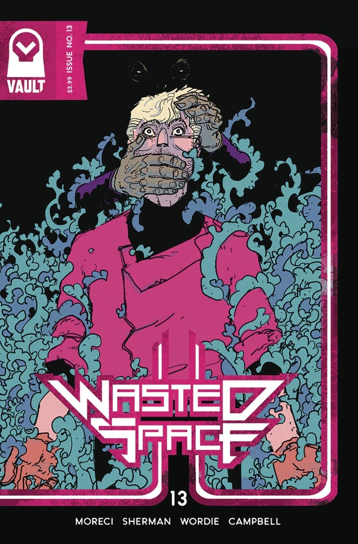
Things are not looking good for Billy on this cover of Wasted Space #13.
***SPOILER WARNING***
Wasted Space has been a quirky and shocking series right from the get go. So at a certain point, fans have just started to expect strange and exciting twists and turns. So it is impressive that they still manage to surprise readers each and every time.
This series is a space odyssey that is as inane as it is entertaining. It’s a series perfect for those searching for something completely different and out of this world – literally. It’s brutal and irreverent and absolutely refuses to pull punches. But all of that makes it so worth the read.
There is honesty, and then there’s brutal emotional honesty. The latter becomes a relevant factor in Wasted Space #13, as our characters are pushed to their limits once again. But this time this around, there’s not a quick and easy solution.
One of the more vibrant credit pages out there; we’re digging the colors.
The Plot
Wasted Space #13 is an emotional hammer of a read. It’s powerful and rips the characters apart, forcing them to face anything and everything they’ve been hiding from. That’s what makes it so shocking – and interesting.
The characters in this series are far from perfect. That’s a fact that Michael Moreci has made clear time and time again. If they had been, the revelations in this issue wouldn’t have been so compelling. So what Billy goes through here – and what Billy learns – is so full of impact. It’s enough to make one stop and think.
This issue was a fast-paced one, thanks in part to the fact that the group has been split into two. While Billy is off being tortured by emotion sucking vampires (perhaps literally), everyone else is off fighting a science fiction battle worth writing about. It makes for a nice balance – the intense and the entertaining. The emotionally brutal with the action.
There’s one running joke throughout this issue (series, actually) that was so hilarious. It really helped to even out all of the tension, giving us a much needed breather here and there. Plus, it was just plain funny. And it got funnier each time it came up.
A temple that demands people to work towards being happy…yeah this is going to go great for Billy.
The Art
The artwork inside Wasted Space #13 is vibrant and full to the brim of interesting events and moments to look at. Naturally, the battle scenes, in particular, are especially busy – and entertaining. But that isn’t to say that Billy’s scenes aren’t visually striking. In fact, the portrayal of his reactions is a highlight of this issue, and with good reason.
Hayden Sherman was the lead artist for this issue, working alongside Jason Wordie for the colors, and Jim Campbell for letters. They did a brilliant job, and it’s nice to think that they had a lot of fun illustrating some of these scenes. Because they sure were fun to read and look at.
Woah, Billy. Was not expecting that from you!
In Conclusion
Wasted Space #13 was another satisfying read in this dramatic yet slightly insane space adventure. Nothing ever goes the way we expect, and that makes the series such an exciting read. The conclusion of this issue is enough to leave readers looking forward to seeing what will happen next.
The final presidential vote is tallied in THE MASK: I PLEDGE ALLEGIANCE TO THE MASK #4, available in comic book stores on Wednesday, January 22nd. Abner Mead, the slimy politician who bonded with Big Head three issues ago, is the newly elected President of the United States of America. But who’s in control: Big Head, or Mead? Either way, the people must live with a leader hell-bent on upending the very foundations of our society.
Story
The news of Big Head/Mead’s inauguration is making its rounds across the country. Vast swaths of people are either elated or horrified—those in the middle are few and far between. But unbeknownst to any group is the internal monologue occurring between the two “Presidents.” It’s here we learn that Big Head is looking to become even more radical during his administration, and Mead may not be the right man for his job.
Pushing Mead to the wayside, Big Head attends to his inaugural duties with the pomp and frills of King George from Hamilton. The people see what kind of person they’ve elected, and if they had any doubts, his first speech makes his intentions quite clear.
Christopher Cantwell’s writing echoes an all-too familiar sense of dread many feel in the political climate of the past few years. It’s an anxiety that’s never quite abated, despite attempts to rationalize what direction our country has moved in. In a hauntingly beautiful move, Cantwell casts these fears onto the insane Big Head.
But there is a resistance forming in response to the despot. Previous wearers of the Mask, including Mayor Kathy Matthews and Detective Mitch Kellaway, are experiencing some weird visions about The Mask. They know his days are numbered and will do anything to bring an end to his reign.
Artwork
Patric Reynolds’s artwork for this issue completes the masterpiece that is this issue. Combined with the coloring talents of Lee Loughridge, this book magically blends the realistic depictions of Inauguration Day in Washington D.C. with the cartoony Big Head. The style reflects the surprising circumstances that all too often infect our political landscape.
What drives home the issue’s message, however, is Nate Piekos’s lettering. In the midst of the traditional ceremony, readers are treated to Big Head’s off-kilter speech, represented by the slanted fonts. We know this being is a disruption in the system, but not to what extent.
Comic Book Covers
Main Cover
Reynolds’s main cover gives readers a clear message: the world is full of The Mask. Each person represented is fully embodied version of the anti-hero.
Variant Cover
Duncan Fegredo’s variant cover artwork gives readers a close look at Big Head in classic, thieving form.
Conclusion
THE MASK: I PLEDGE ALLEGIANCE TO THE MASK #4 wraps up this story beautifully. There’s just enough closure, but leaves enough mystery to wonder where the iconic characters will end up.
Do you think there’s a potential for a spin-off from this series? Let us know in the comments below!
Marvel Comics’ Ruins of Ravencroft: Dracula #1 (on sale January 22) infuses a classic monster movie with the superhero genre. Writer Frank Tieri tells a fun standalone story that smoothly sets up the launch of the upcoming main series, Ravencroft, by ending the issue on a captivating cliffhanger
Ruins of Ravencroft: Dracula #1
Writer: Frank Tieri
Artist (modern day): Angel Unzueta
Artist (flashback): Stefano Landini
Colorist: Rachelle Rosenberg
Letter: VC’s Travis Lanham
Tieri continues where the previous Ravencroft one-shots left off and maintains the same horror-based tone. Like its predecessors, this installment is primarily a period piece that takes us back to the ’40s. Tieri chronologically jumps through time and the story feels dynamic because it shows how Ravencroft has deteriorated over the years.
Many famous characters have passed through Ravencroft’s walls through the years, including Loki.
Whereas last issue showed Nathaniel Essex’s mad science, this story villainizes the United States government, who’s willing to do whatever it takes to win World War II. Naturally, this desperation leads to more evil experimentation. From there, the plot naturally connects to Captain America, the government’s greatest success story. Tieri masterfully weaves various parts of Marvel history together and, even when he brings Dracula into the fold, he gets you to suspend your disbelief. In the Marvel Universe, it’s easy to buy into a world where the Count threatens to use his influence to sway the outcome of the war.
The art team brings the legendary vampire to life by paying tribute to the classic 1931 movie with Bela Lugosi. A few scenes feel like they’re ripped right from the film. When the Count attacks Cap and Bucky Barnes, he takes the form of fog. After Bucky questions the toxic cloud, Dracula ominously says, “…What mere fog can transform into death itself?” Here, flashback artist Stefano Landini depicts the vampire as his natural self, with his dagger-like fangs. In an issue full of borderline campy moments, this one is the most cinematic.
Likewise, when Dracula and Captain America duke it out, the Count delivers another enjoyably cheesy line that’s elevated by the art team. Dracula says that Cap is just a man, while he is “very much…not.” The line is separated into two panels, and, at the ellipsis, Dracula transforms into a bat. Colorist Rachelle Rosenberg exquisitely leads the reader to associate the red on Cap’s shield with Dracula’s affinity for blood; the weapon serves as the Count’s background during this transformation. The combination of the striking art and the entertaining dialogue delivers a story that’s in the same vein as the classic horror movies we know and love.
With that being said, Dracula’s involvement is underwhelming. His fight with Cap ends anticlimactically, and it takes a backseat to other narrative threads, like Jonas Ravencroft’s attempt to take his facility back from the government. The inconclusive battle leaves the reader wanting more, so there’s room for a sequel someday. Still, it’s disappointing to see Dracula feel unimportant in a book where his name is in the title.
Like Arkham Asylum, Ravencroft always looks imposing, even from the outside.
As the last issue of Ruins of Ravencroft before the main series’ debut, Tieri clearly sought to earn the readers’ investment in the upcoming story. Mission accomplished. By the end of the issue, we see that Ravencroft is alive and well with a state-of-the-art-facility. Its new staff, led by John Jameson and Misty Knight, offers intriguing dynamics. We’ve seen Jameson and Knight butt heads throughout these one-shots, so we’re left wondering how their relationship will progress from here. Plus, a shocking addition to the faculty at the end of the issue sets the stage for even more mayhem within the walls of Ravencroft.
Ruins of Ravencroft: Dracula #1 doesn’t quite deliver the cover’s promise of a thrilling fight between Cap and Dracula. But it’s still a fascinating tribute to the horror movies of old and it organically builds the world ahead of next week’s Ravencroft #1.
What’d you think of Ruins of Ravencroft: Dracula #1? Where do you hope to see Ravencroft go from here?
BOOKS OF MAGIC #16, available in stores Wednesday, January 22nd, brings back the future version of Timothy Hunter, and his intentions appear to be far from innocent. After showing the younger boy a little taste of his true magical potential last issue, the future counterpart returns with the intent to show him why he should reject the rules of his guardians, such as Ms. Rose. But Celia Culpepper, a detective from the Other Side, has caught wind of Tim’s unauthorized use of magical trespassing and wants Rose to find him.
Story
Tim believes he’s in a good place now; his father is safe, the Cold Flame isn’t threatening him anymore, and his future double is showing him a whole new world of magical possibilities. He’s been told they’ve placed limits on his power. Now Future Tim is claiming that group believes they can limit his sense of right and wrong as well.
Our hero finds himself at a crossroads–Does he believe what Future Tim said about these limits? Does he really know what being “good” even means?
Writer Kat Howard portrays Tim’s existential crisis well. Using the tools of magic and fantasy, she illustrates a search for identity in a relatable way. Readers can resonate with doubts about their true “goodness” and questions of who they really want to be in this life.
While this is going on, Culpepper commands Rose to join her in the search for Tim. The seasoned detective plans to have him tried for his magical lawbreaking; will Tim be caught before he can find the answers posed by his future self?
Artwork
Tom Fowler’s penciling, Brian Churilla’s ink work, Jordan Boyd and Marissa Louise’s coloring, and Todd Klein’s lettering work harmoniously together throughout this issue. As the scenes transition from Tim’s present and the past remembered, the lines and shading become less solid and defined. We also see a clever use of brighter colors on our hero to distinguish him from the more bland background hues, as if he’s the one bright spot in a world of darkness. The lettering pairs well with the story’s rather chaotic elements by allowing boxes to flow alongside the actions.
Comic Cover
Kai Carpenter’s Cover art features Detective…. with an inquisitive look on her face. This reminds readers of the everpresent watchful eyes aware of Tim’s magical jaunts.
Conclusion
BOOKS OF MAGIC #16 keeps readers on their toes with both the intrigue of Future Tim and the threat of Culpepper. The story is well written, and is clearing building up the narrative into something exciting.
Do you think Tim will ? Let us know in the comments below!
Welcome to PANEL BREAKDOWN, a weekly series where we take a look at our favorite panels of a comic book. This week we are talking about the new Marvel Comics series Guardians Of The Galaxy #1 written by Al Ewing, with art by Juann Cabal, colors by Federico Blee, and you are reading Cory Petit’s letters.
With Guardians Of The Galaxy #1, we take a look at movement, and panel design as this is a dense issue with a ton of action.
About Guardians Of The Galaxy #1:
Once, they were a team of misfits. Now they’re a family, and they’ve earned their peace. But the universe is not a peaceful place — and it’s only getting worse. The Great Empires are in turmoil. The rule of law is dead. And amidst the chaos, the Gods of Olympus have returned — harbingers of a new age of war, reborn to burn their mark on the stars themselves. Someone has to guard the galaxy – but who will accept the mission? And will they survive it? Al Ewing (IMMORTAL HULK) and Juann Cabal (FRIENDLY NEIGHBORHOOD SPIDER-MAN) bring you in on the ground floor of a whole Marvel Universe of action and suspense!
Do you have Guardians Of The Galaxy on your pull-list, let me know what you think after you read it.
After getting a sense of what Li’l Abner‘s creator was like, it’s time to meet Dogpatch, USA’s first family, the Yokums. Of course, readers are probably most interested in Li’l Abner‘s titular character so I’ll start with the big galoot himself.
Meet the Yokums: Li’l Abner Yokum
The heart and soul of Li’l Abner is, not surprisingly, the lovable and naïve Li’l Abner Yokum. Although some stories find Abner on the outskirts of the plot, no plot-line in the strip is ever free of the innocent and gigantic teen.
Capp deftly walks a difficult tightrope with his ongoing characterization of Li’l Abner. Longtime readers of the strip will be familiar with the way Capp poked fun at southern culture while simultaneously revering it. Li’l Abner may not be the sharpest tool in the shed but what he lacks in wit and charm he makes up for in bravery, loyalty, and unbeatable wrasslin’ skills, what he learnt from his Mammy.
Speak Softly But Carry a Big … Pair of Fists
Li’l Abner may be gigantic, but he doesn’t get violent often. His mammy taught him to use his head first and his fists as a last resort. Rest assured that if Abner has to “smack yo’ ’round a bit,” then yo’ deserve it.
Although Li’l Abner almost always does the right thing, he does have a blind spot. Li’l Abner’s relationship with women is decidedly outdated and relatively misogynistic. Li’l Abner sees “girls” as a bore, only reluctantly spending time with any but his beloved Mammy.
Southern Gentlemen Apparently Prefer “Po’k Chops”
“Oh, Li’l Abner…”
One girl Abner often finds hanging around, despite his suspiciously halfhearted attempts to spurn her, is the lovelorn Daisy Mae Scragg. Daisy Mae has to put up with a lot of crap over the first year of Li’l Abner‘s publication, including being psychologically manipulated by a suitor and enduring a fake wedding to Li’l Abner. Although their on-again/off-again relationship eventually culminated in a long-lasting marriage, Daisy Mae had to put up with nearly 20 years of waiting. Luckily, neither of them aged…
Noo Yawk
Although a number of plot-lines take place in the Yokums’ hometown of Dogpatch, USA, Li’l Abner is periodically called to New York by his Aunt Bessie, the Duchess of Bopshire. Abner’s well-to-do socialite aunt stands in contrast to the rest of his salt-of-the-earth family. Rather than taking the gigantic and lovable teen as he is, Aunt Bessie is always working on some plan to educate and refine Li’l Abner. In one such plot-line, Li’l Abner is called to New York to attend college so he might one day realize his Mammy’s dream for him and “be Presidunt.”
Where the rest of the Yokum family act as caricatures of southern hill-folk, Aunt Bessie acts as a caricature of bigwig New Yorkers whom Capp would’ve had much greater familiarity with as a New Yorker himself.
“Ain’t no place like Dogpatch!”
Li’l Abner’s trips to New York are bittersweet for his supporting cast: all are genuinely happy that the big dummy is trying to improve himself but things in Dogpatch just aren’t the same without him, especially for Daisy Mae. In addition to experiencing increased levels of romantic desperation during Abner’s absences, she continually finds herself at the mercies of one creepy yokel or another.
In true ’30s form, though, Abner’s absences only serve as opportunities to have hearty reunions. Abner almost always swoops back in the nick of time to wrassle whomever needs wrasslin’, but if he doesn’t then his Mammy’s always there to back him up.
“Mammy fix!”
Meet Mighty Mammy Yokum
Although Abner may have married Daisy Mae in 1952, his first real love was his pipe-smoking, ham-fisted, and po’k shop slingin’ Mammy. Check out my next article on the Yokum matriarch and the love of her life, the cowardly but tenderhearted Pappy Yokum.
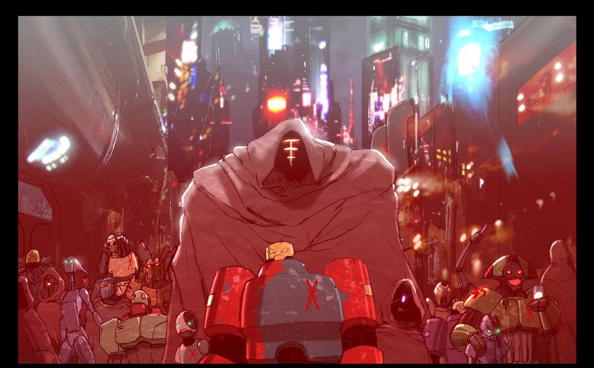
The second issue of Livio Ramondelli’s “The Kill Lock” invests itself into the flaws and backstory of its characters as they seek a cure for their condition. Guided by absolutely phenomenal artwork, “Kill Lock” looks to be one of the most promising new series entering 2020.
Bonded by their Kill Lock, four robots search for a cure—a way to live, and die, independently. Their only clue is a bot known as The Axial, supposed to be a creator of the Lock and keeper of its secrets. Of course, the first thing they have to do is find her… without getting themselves killed!
Writing & Plot
Writer and artist Livio Ramondelli progresses the plot of his characters via their backstories and flaws in “Kill Lock” #2. The quartet’s journey takes them to a crime-riddled planet of debauchery and red-light districts. Ramondelli uses this environment to challenge each of the character’s weaknesses and personalities, placing them in some dicey situations that also keep the forward momentum of the main plot moving. Something truly special about the character work in this comic is that none of the four characters are stereotypes. There are of course hints of other archetypes in the protagonists (the psychopath, the faithful soldier, the innocent child, and the honest working man), but they manage to surprise the reader at almost every turn. The dialogue is plenty natural and well-paced, which may be slightly ironic given that everyone’s a robot, but that’s likely even more of the charm.
Art Direction
Ramondelli combines a “used future” aesthetic with his almost trademark style of drawing humanoid machines. Aside from his fantastic ability to design individually distinct and original robots of all sizes, he also creates perfectly dingy or desolate environments for them to roam around in. The icy tundra from the prior issue is replaced by a grimy urban landscape for “Kill Lock” #2, and it manages to be appropriately claustrophobic. Ramondelli’s combat scenes are a treat as well, short as they may be. They don’t showcase any excessive posing or maneuvering, and everything happens very quickly. Regardless, they’re always a brutal and awesome sight to behold for the whole three panels it takes for the Wraith to disembowel an entire platoon.
“The Kill Lock” #2 is a chapter focused on the backstory and characteristics of the main cast. The environment Ramondelli places them in forces them to act on their own impulses (or lack thereof, for one), revealing more about the quartet of disgraced machines and their ability to work together. The script remains tightly paced with great dialogue. The art is absolutely breathtaking in every regard. “The Kill Lock” is a definite series to watch as we enter 2020.
The creators of Childrens Hospital unleashed a hilarious spinoff on Netflix called Medical Police, which takes parodying procedural dramas and spy thrillers to a whole new level. Lacing all the action and comedy with just the right underscore is composer Matt Novack.
Creators Rob Corddry, Krister Johnson, Jonathan Stern, and David Wain scored a hit with Childrens Hospital back in 2009. The short-form web series premiered on TheWB.com but was picked up by Adult Swim later, where it found a strong following throughout its seven seasons. Now, the team reunites to take their doctors into the spy game where many jokes about nefarious villains and un-killable heroes will undoubtedly fill the screen.
PopAxiom reached out to composer Matt Novack to talk about his road to making music for film and television, the Harley Quinn animated series, and making music for Medical Police.
Beats
Matt became interested in music at an early age. “My dad played a little saxophone. He was a jazz musician for a while before I was born. My mom played a little bit. They encouraged me to pursue music.”
During his formative years, the would-be composer admits he was “… obsessed with film scores early on … Star Wars, of course.”
Matt started off as a percussionist. “Drums and keyboard percussion,” Matt says, “My dad actually bought me my first drum set without running it by my mom first.”
At Northern Illinois, Matt studied “… percussion performance and composition … “ After graduating, Matt says, “I moved out to L.A. and went to USC’s film scoring program and then started working.”
Road To Childrens Hospital
Before Childrens Hospital, Matt worked for “Craig Wedren, as his assistant.”
The young composer also spent time “… working for a music library as an assistant and sort of jack-of-all-trades; composer, orchestrator, office manager.”
He explains a bit about what a music library does. “These are music houses for commercials, documentaries, stuff like that. Their main thing is that they’ll produce albums of music for licensing. Movie trailers, commercials, TV shows, mostly reality TV shows. It’s typically for productions that don’t hire a composer to work on the show. So it’s pre-produced music.”
About working in a music library, Matt says, “It’s a good gig to do between shows.”
Matt considers Childrens Hospital as his big break. “It was my first show on my own with my team. I scored it for seven years. It opened doors for everything else.”
About Medical Police
Medical Police released January 10th on the streaming giant Netflix. “It’s a completely different score from Childrens Hospital. The score was a parody of Grey’s Anatomy.”
Matt continues, “There are some hints of the Childrens Hospital score at the beginning of the season, but then the rest of it we are in full-on international thriller score.”
Where Childrens Hospital leaned heavily into the comedic score, Medical Police takes things in a different direction. “We wanted to make a score that could fit into a more serious version of this kind of movie. The score could be lifted from Medical Police and put into one those kinds of movies and work fine.”
Wrapping Up
Matt rattles off three names in quick succession when asked about influences. “Elliot Goldenthal, John Williams, Jerry Goldsmith are all tied for how much they influence me.”
What would John Williams do? “Whenever I get stuck, I think ‘How would these guys do it?’ It usually helps me unlock my writer’s block. There’s so much to learn from them.”
In the age of remakes, what would Matt love to be a part of? “There was a Greatest American Hero pilot that didn’t go, but that would be so much fun. Maybe Gremlins. Growing up, I was obsessed with Gremlins and Goonies.”
Medical Police is out on Netflix and tickling funny bones, but there’s more to come from the composer. You can hear more of Matt’s work on “Harley Quinn on the DC Universe.”
Will you be watching Medical Police on Netflix?
Thanks to Matt Novack and Impact24 PR for making this interview possible.
Want to read more interviews like this? CLICK HERE.
Tartarus #1 hits your local comic book store on February 12, but thanks to Image Comics, Monkeys Fighting Robots has an excellent interview with the creators of the series Johnnie Christmas and Jack T. Cole.
About TARTARUS #1:
A new adventure series with all the sci-fi drama of Breaking Bad set in Mos Eisley! Promising young cadet Tilde is framed for crimes against the empire after discovering her mother was the ruthless warlord of the deadly colony Tartarus, a vital player in the galactic war. Now, Tilde’s only way home may be to reclaim her mother’s dark crown. #1 New York Times bestseller JOHNNIE CHRISTMAS (Alien 3) and artistic phenom JACK T. COLE (The Unsound) kick off this ongoing series with 44 big pages of story.
CHECK OUT THE INTERVIEW BELOW.
MFR: With a book like TARTARUS, how much world-building is involved?
JOHNNIE:On the writing side, quite a bit, in terms of history and setting. The tech that gave rise to the start of their civilization and its implications. But then I switch focus to the emotional arc of our characters and let Jack take the lead on designing the world. How those technologies evolve and how they’re implemented through his visual depiction of the world.
JACK:Quite a bit. There’s a lot of ideas that Johnnie and I will collaborate on to come up with, and then there’s a bunch of others that Johnnie comes up with, and I figure out how to render, and then another bunch that I figure out and put in to fill things in that I would like to see. For instance, on the space station the look of some of the computers that appear to be made out of a liquid is something that Johnnie and I came up with together, but Johnnie didn’t specify the look of the computers, or if they even needed to be these liquid computers, so it was up to me where to put them in and how they would appear and function in that instance.
Otherwise on my end I research buildings, objects, and styles before I get started on a drawing a panel or a character. Fundamentally world-building is just passive storytelling, so my goal with any world-building is to tell a story in the background that is concurrent with the main narrative and accentuates it. Storytelling like how people in the story dress, or what the advertising on their businesses looks like, or how their streets are designed. Things that your brain will pick up even if they’re not pointed out, and make the main narrative richer, ideally without distracting the reader in the process.
MFR: Johnnie, talk about your relationship with Jack since you are both artists. Are your scripts very detailed, or does Jack have a lot of room to play?
JOHNNIE:I have quite a bit of detail in terms of emotion and feeling. We have beats that have to be addressed on the road to where we’re going, for this arc and the series at large. But when it comes to a fight, action scene, or two characters having a long convo, we’ll switch to “Marvel Method,” and Jack fleshes it out. I won’t depict where each punch will land; I’ll write something like “Good Guy is fighting Bad Guy. Should feel desperate. Bad Guy wins but is missing a tooth.” and leave how that unfolds in Jack’s capable hands.
MFR: Jack, one aspect of your art that stands out is how detailed the world around the characters is. Why is that important to you?
JACK:Let’s say you see a really good picture of a forest, it will excite your imagination, your brain will want to know “What does the rest of the forest look like?” and in your imagination, you will continue the picture. Same goes for anything else, a good street scene you will want to know what the buildings look like on the street over, and your imagination will have a good idea of it. Or if you have an interesting object, your imagination will be engaged knowing that things like this exist in it, and other interesting things could be lurking nearby.
A detailed world when well done creates an experience that is larger than the sum of its parts and creates a space where the reader can go beyond what it is presented and in a way be a co-collaborator with the world.
MFR: Johnnie, with the first issue, how do you balance revealing enough to engage the reader and leaving enough mystery that the reader wants issue two immediately?
JOHNNIE:I try to focus on what motivates the characters in the moment. If it’s truthful, the moment to moment is interesting, since our characters have pretty strong desires. But all the while I’m planting seeds that will bear fruit that we’ll harvest in following issues.
MFR: Jack, can you talk about the vivid color palette of the first issue?
JACK:I was just coming off of THE UNSOUND, where I had been using color in abstract ways to heighten emotional tension and create odd moods. Additionally, I was sort of obsessed with comics from the 70s, 80s, and early 90s at the time and their color palettes, and how stark they could be, and how when the right palette came together it is genuinely divine. Issues 1 through 3 readers will see some more of the influence of this fixation, but recently I realized I had almost forgotten how to use brown and grey in my pursuit of this direction, so I’ve circled back around!
MFR: The title logo for TARTARUS #1 does not scream science fiction, what are the origins and meaning of the logo?
JOHNNIE:We worked with the talented Rian Hughes on that. I gave him the series pitch, a synopsis, and sketches of what Jack had planned for the first issue cover. What became our final logo was in the first round of ideas. I liked the strength and authority connoted in the columns up against the delicacy of the flowers and the deadliness of the thorns. It says, “TARTARUS, tough but pretty.”
MFR: How hard is it to create a main character that readers can connect with, and is Tilde on a “hero’s journey?”
JOHNNIE:I guess I’ll see how well they connect with readers eventually, ha. But I think by giving our cast simple relatable desires is the key. Surka wants out of the clink. Tilde wants to go home to take care of a sick loved one. Klinzu wants to go on a hot date with a cute person, and Sevno wants to be good at his job. Stuff everyone can understand and relate to. If we follow what they want in a truthful way, then I’m hoping it’ll connect with folks. At least that’s the plan. And Tilde is kind of on a hero’s journey, to begin with: She starts in the normal world, there’s an inciting incident, she begins her journey, then the descent into the cave. And that’s where things may start to diverge from the usual hero’s journey. The cave in TARTARUS is very deep.
JACK: It’s tough to know the extent a character will connect or not until people actually read it and a whole variety of complex factors come together. On my end, I try to come up with designs that have some appeal, and give the characters different sets of gestures to help convey their “character” and hope that readers will connect with it.
MFR: TARTARUS is an ongoing series; how far do you have the story outlined?
JOHNNIE:Just because I like to know where I’m going, I have a scratchy outline for the first four arcs. If we get there or beyond is entirely up to reader reaction. We also know the endpoint of each character’s narrative. Though sometimes characters have a mind of their own and decide to go their own way…
MFR: Independent publishing is a tough business. How will you measure success with TARTARUS?
JOHNNIE:Readers. They are the Alpha, the Omega, the measure of success. If they love it, if they buy it, if they talk about it with their friends, everything else will take care of itself.
JACK:If we have enough of a readership that allows us to sustain the story, that’s definitely a big success!
MFR: Thank you again for your time, and best of luck with TARTARUS!
JOHNNIE:Thanks so much for talking to us!
JACK:Thank you!
What did you think of the interview, are you going to add Tartarus #1 to your pull list? Comment below with your thoughts.
Tartarus #1 will also be available for purchase across many digital platforms, including the official Image Comics iOS app, Amazon Kindle, Apple Books, comiXology, and Google Play.
Marvel Comics have announced that more X-Men comics are due out this year, and a planned Crossover event is scheduled for December.
Yeah, massive X-citement for the X-Men.
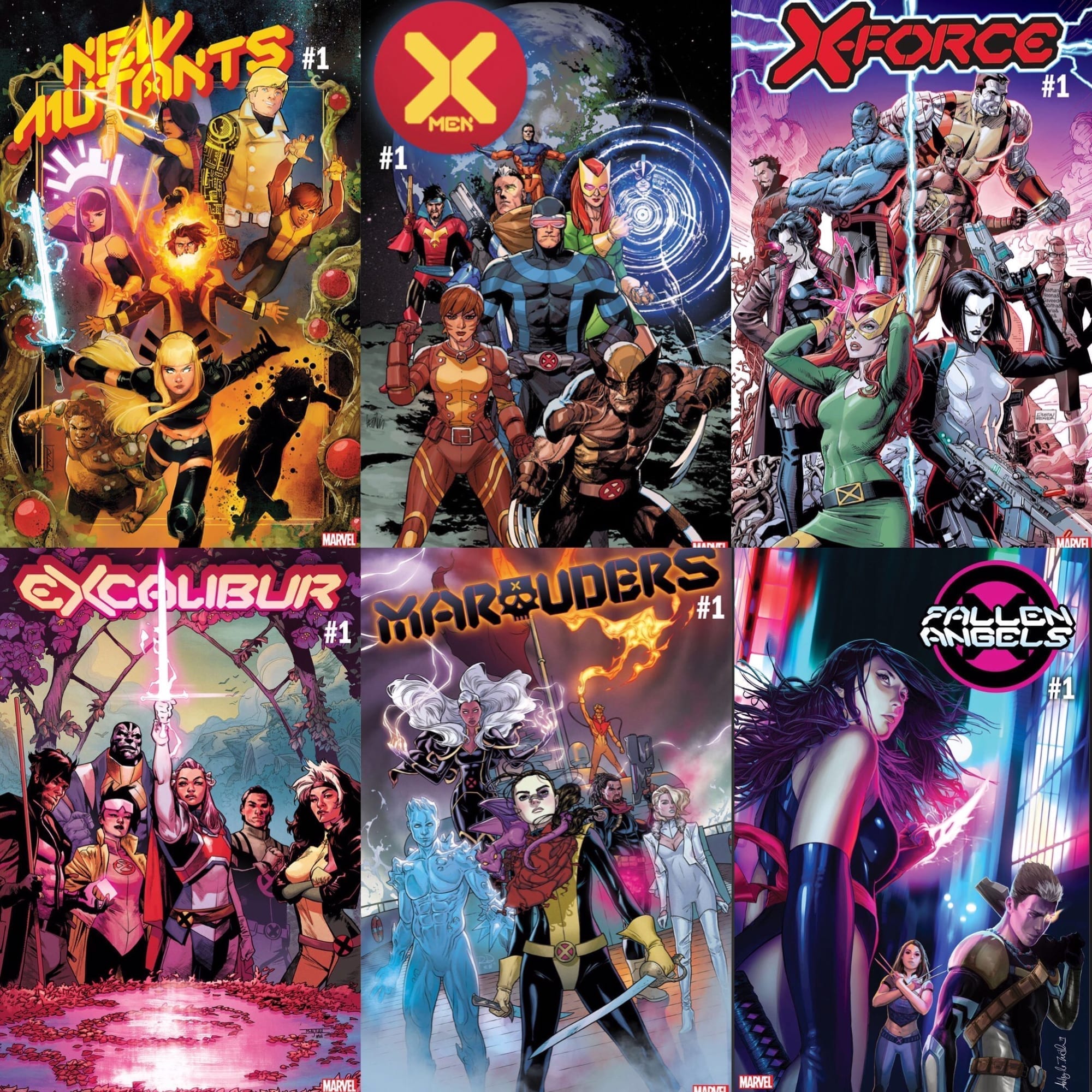
With five titles currently on the roster (six if you include Fallen Angels, however, that is due to finish at issue 6 with no firm announcement of restarting) and more titles announced, that’s a lot of X-Men comics for fans to get their teeth into.
So why, then, am I canceling my orders after the sixth issues are released? Simply put: there are just too many.
As Eric Stephenson states in his interview with Newsarama, there are too many comics released every month. With each fighting for readers’ attention and money, this can ultimately be damaging to overall comic sales.
One X-Men comic will sell well, especially with the right creators on board. Add another into the mix, and the chances are that they will both have good sell-through. However, have six titles on the go, and start to add more, and all you are doing is diluting your audience or taking readers away from other titles.
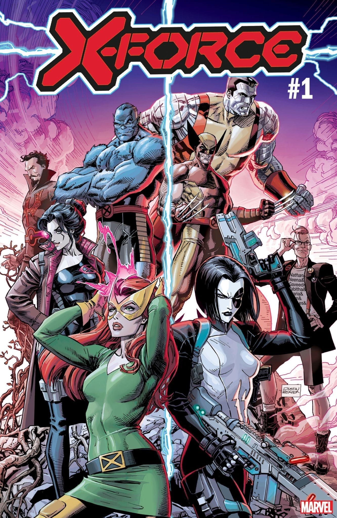
Cover Art fro X-Force from Marvel: Another X-Title to add to the mix
An extra complication is that all of the new X-Books are linked. Not massively, for the most part, you can read Excalibur and not read New Mutants, but there is an underlying story running through it all because that is how Jonathan Hickman works. With no clear idea, at the moment, what that story-line is or which comics best serve what is coming, there is an urge to collect and read them all.
However, not everybody can go all in and buy everything. Financially, it’s a big spend every month, especially as the release rate is more than one issue a month. Since the House/Powers of X comics started last August, Marvel will have released 44 single comics before February. That’s over 7 per month, and it’s just going to increase. March Solicitations contain 12 single X-Men comics.
You could cut down to one or two titles, follow your favorite creator, which is always a good piece of advice, but what of this crossover that’s looming at the end of the year? Which comics do we need to read to follow that, or doesn’t it matter? At this stage, we don’t know, so it’s a risk if you don’t pick up every X-Men comic on the shelf.
In essence, what Marvel is doing with so many X-Men comics on the shelf is alienating a proportion of their readership. An elitist group of people who can, and will, buy all the titles will have an advantage over those who can’t. It also forces some people, like myself, to give up on the entire collection of comics because it is easier to do that than choose between them.
A number of times I’ve been committed to a comic only to get screwed over when it comes to the crossover event. Suddenly I have to buy 20 more comics and catch up on several other titles for the last 6 months to understand what is happening to the characters I enjoy.
Just ditching the event is an option, but one that usually doesn’t work with Marvel or DC because everything leads up to and is resolved in the event. For example, take DC’s New 52 Animal Man and Swamp Thing comics from 2012. Each title had critically acclaimed starts, with Scott Snyder and Jeff Lemire proving there was life in the old Vertigo characters. After a year and a half, both titles came together in an overlong crossover event, Rotworld. It was a disaster.
But more than just being a terrible end to two excellent comics, it ruined potential re-reads. As everything was working towards the events in Rotworld, with the stories that started in issue one concluding in the crossover, the disappointing ending diminishes the prospect of re-reading. Why read so many comics when you know you’ll be disappointed at the end. You could stop reading before the end, but then everything is left open with no conclusions. Either way, you are less likely to pick them up over other comics. In fact, I recently gave my copies away because I doubt I will ever read them again.
Therein lies the worry with the current X-Men. If the crossover doesn’t satisfy, for any reason, then the 18 months of comics leading up to it will sit unwanted, on shelves or in boxes. And Marvel Crossover events have not been critical or satisfying successes in recent years, even the last one written by Jonathan Hickman.
With so many titles on offer, it may be better to trade wait, but that prospect isn’t necessarily any brighter. Based on current solicitations, Marvel is releasing the comics in two different ways. The first is the Dawn Of X collections, with each volume including one issue of each comic, and the second is individual trades collecting six issues of each title. So the choice, in essence, is still the same: All or nothing.
A collection of X-Men comics from Marvel
The X-Men comics are definitely the best they have been for years, content-wise, but the comics market is more than just content. The publishers have several other considerations, and the current trend for flooding the market with as many comics as possible can not continue. The quality of the comic becomes irrelevant if the audience struggles to buy them. A streamlining of the series might even create more demand, selling a higher number of a single title.
But then, maybe not. Maybe the majority of X-Men readers are reading the ‘main’ title and picking up only one or two of the others. This would mean that losing the outlaying titles won’t affect the sales of the leads. In some ways, the sales figures for November and December seem to suggest this. Therefore, Marvel will probably see this as losing out if they cut the number of titles.
If only the obsession with ‘shared universes’ and ‘crossover events’ wasn’t such a big thing. That way, each X-Men title could be its own thing and self-contained. Readers could then pick what they want without having to worry about missing out on essential story elements from other titles.
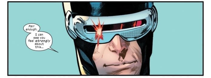
Cyclops gets it. Credit: Marvel Comics
I do not doubt that this year is going to be a big hit for Marvel’s X-Men range, and part of me wants to be along for the ride. The quality of the comics being released are all of a high standard at the moment, with some very interesting ideas. Unfortunately, I can only buy and read so many comics. There are many other stories, from some other publishers, worth discovering, which is why I don’t want to put all my eggs in one basket.
Are you reading them all or picking and choosing? Why don’t you let us know how you do it in the comments below.