Home Blog Page 350

Review: A Deal is Struck in THE DOLLHOUSE FAMILY #4


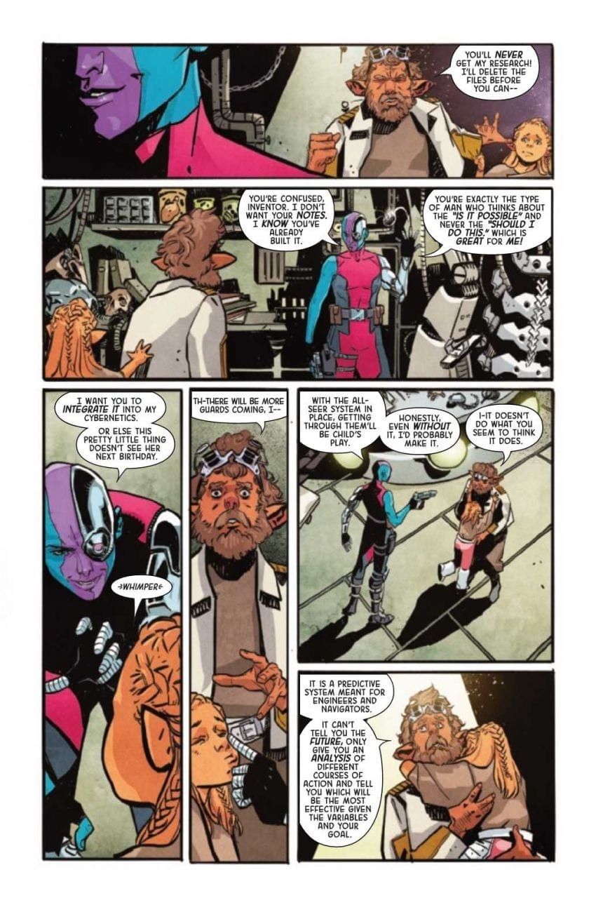
Mike Carey and Peter Gross’ “The Dollhouse Family” has been one of the most exciting and harrowing comics to read over these past few months. This fourth issue is a prime example of why that is. “The Dollhouse Family” #4 is a chapter built with mounting haunted house and cosmic horror that still manages to create fantastic character storytelling. The work of Peter Gross and artist Vince Locke once again lure in the reader with pitch-perfect visuals to make yet another superb chapter in this DC horror comic.

“Alice’s worst nightmare has come true: the Dollhouse has returned…and if it can’t have her, it’ll settle for her daughter! And as horrible as her prior experiences with the House have been, they’re nothing compared to what it’s been able to come up with after 20 years of waiting…”

Writing & Plot

Writer M.R. Carey’s perfect balance of mysterious intelligent horror and relatable character building is on full blast in “The Dollhouse Family” #4. The tragedy of the prior issue is met with the reuniting of a key past character in Alice’s life. Meanwhile, the story of the Dollhouse’s origin is wrapped up in a harrowing and sinister manner. Carey’s flawless ability to flit between these two storylines is once again brilliant, as the two timelines complement each other wonderfully. The sense of passing time from the origin tale to watching Alice grow up presses the agelessness of the terror at this story’s core. Despite the well-orchestrated horror, this series is truly held up by its compelling character drama. Alice’s story has always been interesting, but since her becoming an adult and a mother, it has taken on a whole new level of intimate complexity. Watching Alice attempt to protect her daughter from the Dollhouse’s temptations while maintaining that mother-daughter relationship despite her own traumatizing past is one of the best elements of this series. Truthfully, this human element is what makes this horror story, and any horror story really, so memorable.

Art Direction

The expert layout and panel direction of Peter Gross combined with Vince Locke‘s distinct style creates the perfect slow-burn mystery-horror of “The Dollhouse Family” #4. There’s an almost cinematic manner in which Gross’ layouts direct the reader along, often laying panels in the foreground or adding artistic flairs that ignore convention. This has been a normal practice for the series so far and is one of the reasons that tension is so effective. The other is of course the penciling of Vince Locke with the colors of Cris Peter. The visual aesthetic of this series is character-focused and off-putting in all the right ways. The characters are given proper expression during the quiet scenes that ground this series, while also setting up the horror-drenched sequences. The style and color palette are so special in this classic Vertigo way where they are somewhat naturalistic but also just off-kilter enough to demonstrate that something is amiss with this world. The images of monstruous or haunting figures are always a shock upon the turn of a page, and they contrast brilliantly with those quiet moments.

“The Dollhouse Family” #4 is the climax of this brilliantly spooky and intelligent mini-series, with heartfelt character moments and terrifying twists galore. M.R. Carey’s intricate but careful plotting excels yet again, while the art team of Peter Gross, Vince Locke, and Cris Peter maintain the comic’s original and foreboding atmosphere. Be sure to keep reading this excellent outing when issue #4 comes out on 2/12!

Monkeys Fighting Robots Youtube

DRAGON AGE: BLUE WRAITH #2 – A Tale of Agents and Relics

DRAGON AGE: BLUE WRAITH #2, out February 19th from Dark Horse Comics, continues the tale full of legend and magic. Grim is the setting for this issue, as characters seek to complete their own quests, be it revenge, capturing a relic, or freeing loved ones.

***SPOILER WARNING***

And here’s a sneak peek at the cover for Dragon Age: Blue Wraith #3.

Fans of the Dragon Age video games likely have made a note of this series and with good reason. This series has brought back the infamous Blue Wraith, along with several other fan favorites from other comic series.

That means there’s a lot of fun – and drama – to be had here. After all, the events that occur in Dragon Age can be grim, as characters fight for their lives and freedom left and right. Dragon Age: Blue Wraith is a series that touches upon concepts such as revenge and desperation, in ways that wholly suit the franchise we love so much.

The Plot

It currently feels like there are several plots winding around one another in Dragon Age: Blue Wraith #2. While there’s little doubt that they’ll all eventually come together, it is doing an excellent job of showing complex storytelling. It’s also a strong reminder of how much can be happening at any given moment in the world of Dragon Age.

Nunzio DeFilippis and Christina Weir were the authors involved in this issue, and it’s thanks to them that we’ve been handed such a complex story. There are so many characters involved, each with their own goal and desire.

It’s really no surprise then that this is a fast-paced issue. There’s no room for downtime here, as there’s seemingly always something happening. Thankfully, while there is a lot of information passed to the reader, it never once feels like an info-dump. Instead, it reads as something more organic, thanks to the use of flashbacks and character conversations.

What is shocking is how intense the plot has gotten, and so quickly. There’s really no avoiding the stakes at hand, or what certain characters have had to do in order to get to this point. When you think about it, that is one of the many reasons fans have been drawn to this franchise in the first place. So it’s appropriate to see it here.

The Art

Dragon Age: Blue Wraith #2 is full of dramatic artwork, fight scenes, and magic. It makes for an all-around feast for the eyes. You can tell that the artists really enjoyed portraying some of these scenes, as it feels like a lot of attention has been paid to the details.

Magic is a fickle thing, lending towards flash and brilliant scenes, while also sometimes being more difficult to portray. But that balance has been struck here. There are a few scenes in particular that really stand out here — one of which being an example of how the Blue Wraith got his nickname.

Fernando Heinz Furukawa’s lines are ideal for this series. Their style is on point with the series as a whole, especially in regards to the different races portrayed and the magic they carry. Meanwhile, Michael Atiyeh’s colors are truly striking. They made excellent use of the white space available to really make certain scenes and expressions pop. Finally, Nate Piekos (of Blambot) did a fantastic job with the lettering. They’re so simple and understated that for a moment, you could forget that the balloons are even present.

In Conclusion

Dragon Age: Blue Wraith #2 was an enthralling read. This was an issue that wasn’t afraid to show the darker side of conflicts. The pacing makes it easy to stay invested in this series, while also making it impossible to predict what will happen next. One thing is certain; it will be interesting to see how the series wraps up, given that there’s only one issue left.

Monkeys Fighting Robots Youtube

Sacrifice and Loss in STRANGER THINGS: INTO THE FIRE #2

STRANGER THINGS: INTO THE FIRE #2, out this Wednesday from Dark Horse Comics, provides a gritty view into the lives of the other surviving test subjects. Fans of Stranger Things have been asking what happened to the rest – and this series has the answer.

***SPOILER WARNING***

A retro alternate cover is available for Stranger Things: Into the Fire #2.

Did you know that Stranger Things: Into the Fire isn’t the first comic series focused on the Netflix series? There have actually been a few series at this point, set both before and during the events of the show.

Stranger Things: Into the Fire #2 continues the tale of Dr. Brenner’s wayward subjects. While a shocking number of patients managed to escape (seriously, the count is up to four – and that’s just what we’re aware of) it seems that not every subject has been so lucky.

That is merely the beginning of this story. Set sometime after the events in season two, this series gives a glimpse into how Eight has been doing, as well as leaving a clear idea that the events Dr. Brenner set into motion did not all end with his death.

The Plot

Jody Houser was the mind behind Stranger Things: Into the Fire #2, and you’ll probably recognize that name. She’s been behind several of the Stranger Things projects, and that’s actually a great thing. She’s keeping the stories between series cohesive and unified. That’s not something every spinoff series can brag about, so embrace it.

There are a lot of clever storytelling techniques woven into this issue, starting with the creative use of flashbacks to create a narrative. This allows for multiple viewpoints to merge, telling a fuller story. That story is shockingly dark, but then again, this is Stranger Things we’re talking about. So experimenting on human beings (and worse) has sort of become the norm.

There’s this almost beautifully tragic feeling to the entire issue, as the truth is revealed. What had been a celebration has turned into devastation, as characters learn the price of their freedom – and who they left behind. It’s somber, and it’s jarring, but it’s also thematically appropriate for the franchise.

The end of this issue marks the halfway point for the series. That means we only have two issues left to wrap up the plot, which presumably will involve a rescue mission (or the attempt at one), and all of the chaos that will bring with it. That likely means that the next few issues are going to be packed of action, taking full advantage of all the setting up presented here.

A disturbing comparison is made on this final alternate cover of Stranger Things: Into the Fire #2.

The Art

The artistic team behind Stranger Things: Into the Fire #2 really went all out. As mentioned above, there were a variety of flashbacks presented in this issue. Each and every one of them felt unique, with color palettes and details altering based on who was telling the story. It’s a small but effective piece that made this issue work so well.

Ryan Kelly (pencils), Le Beau Underwood (inks), Triona Farrell (colors), and Nate Piekos of Blambot (letters) all worked together to a brilliant effect here. The scenes are dynamic and powerful, showing off all of the drama and intensity that we’ve come to expect.

Adapting a series to comic book form can sometimes be a challenge – especially when you have to pull in recognizable characters. But this issue did a great job portraying Eight and everything that made her so distinctive — all while showing off their own distinctive flair.

In Conclusion

Stranger Things: Into the Fire #2 was a carefully planned issue. One that hinted at the past, while fanning the flames formed by concern and anxiety. Our characters are headed down a dark path, but it’s also the only right path left for them. This is a feeling fans are familiar with, but we’re still looking forward to seeing how it all plays out.

Monkeys Fighting Robots Youtube

NEBULA #1 Begins Her Quest for Change (Or Victory)

Nebula #1, out this Wednesday from Marvel Comics, is the start of an all-new miniseries focused on the conflicted rogue we love so much. Or love to hate, depending on how you look at it. Nebula is not a character out to make friends or allies, but that just makes her solo story all the more intriguing for fans.

***SPOILER WARNING***

This issue marks the start of a five-issue miniseries following the one and only Nebula. She’s a conflicted and tortured character, and one that has more than earned a chance to tell her story. But given the opportunity, what sort of story will she be inclined to tell?

Nebula, like Gamora, is the adopted daughter of Thanos. Unlike Gamora, she didn’t receive special treatment (for being the favored daughter and all that). That has, understandably, resulted in some bitter feelings on Nebula’s part. Bitter feelings that she’s been drowning in for years.

Perhaps that is the reason she starts off this series with such a drastic measure. For it’s clear that Nebula is desperate to bring change into her life, regardless of any and all risks that may come with it. But then again, this is Nebula we’re talking about…

And so Nebula’s quest begins…by scaring a little girl?

The Plot

Nebula #1 is everything it promised the fans it would be. It’s dramatic and full of all that fantastic Nebula angst fans have come to love. Mind you; this is the Nebula we’ve come to know from the comics. Not the MCU version of Nebula, where she’s found a semblance of peace for herself.

Vita Ayala brings us Nebula in her pure and raw form. A Nebula who is still fuming about everything that has been done to her, and as such, is actively seeking to get an edge. Something, anything to let her escape the shadow of Thanos (and Gamora).

If that sounds like a lot of raw emotion, that’s because it is. Ayala bottled all of that up and tucked it neatly beside the core of this plot. Mainly, that plot involves Nebula getting in over her head, all in the name of doing some great (and dangerous).

In that sense, this series is already proving to be exactly what we expected. But there are actually quite a few surprises to go alongside that, such as the way this issue concludes. It’s unlikely that any fan will see that little revelation coming. Nor can we predict how it’s going to go from here. But we have four more issues to find out.

Nebula is ready for a fight, and perfectly content to grab a child by the head.

The Art

The Cover for Nebula #1 is one of the most vibrant and dynamic covers coming out this month. So for that reason alone, this issue deserves a little bit of attention. The artwork inside is also quite noteworthy, as well as being unafraid to have a little fun.

The artistic team really ran with the concepts provided for this issue. The scenes laid out are either striking or fascinating, depending on what is being depicted. The trick that Nebula sought out was especially well portrayed, with clever alterations to any expectation set.

Claire Roe was the lead artist, with Mike Spicer providing the coloring, and VC’s Travis Lanham doing the lettering. Together they brought us a dramatic issue, one full of fighting, anger (again, this is Nebula we’re talking about), and science fiction insanity.

Well, at least now the reason for grabbing that kid makes sense…

In Conclusion

Nebula #1 is a chaotic and highly entertaining introduction to her latest miniseries. It’s got everything fans could have expected and hoped for – as well as a few surprises to keep us going. The artwork made the entire plot all the more interesting, especially thanks to Nebula’s ability to get herself into the strangest battles.

Monkeys Fighting Robots Youtube

Review: SUPERGIRL #39 Fighting The Fight, For Better Or Worse

Supergirl #39 cover
Supergirl #39 Credit: DC Comics

The Last Daughter of Krypton fights the Amazonian Princess in an epic battle on the pages of DC Comic’s Supergirl, out this week. Continuing the sage of the Infected Supergirl as she tries to adjust to her new life, Jody Houser and Rachael Stott pull no punches.

It’s a superhero punch-up on a grand scale, but just how long will the U.S. Military sit back and watch? Spoiler: Not very long at all.

Supergirl #39
Supergirl #39 Credit: DC Comics

Super Dialogue

This issue opens with Supergirl’s speech from last issue being played to a U.S. Military War Room. The General in charge explains the situation to those gathered, with mentions of the Leviathan Event currently happening elsewhere and of Superman’s recent Identity reveal. Here Houser is able to turn a ‘previously in’ introduction into an element of the story. With this opening scene she brings the readers up to date on everything that has happened, in Supergirl and elsewhere, while also introducing a new element to the narrative.

It takes a while for this new element to appear in the comic because there is the whole issue of Supergirl Vs. Wonder Woman. The conversation between Kara and Diana reflects the current personalities of both women. Diana’s pleading for restraint and Kara’s anger and resentment comes through the speech patterns of Houser’s dialogue. This back and forth keeps the pace of the comic moving, assisted by the visual fight scenes.

The reader gets to understand a lot about what is currently making Kara tick at this point. Long time readers will be able to see the struggle happening within Supergirl and the contrast to how she has been represented in previous stories. There is an emotional battle going on within the hero, and Houser illustrates this perfectly within the narrative.

Supergirl #39
Supergirl #39 Credit: DC Comics

Action Illustrated

With any fight scene in a superhero comic you would expect it to be big and bold and this issue of Supergirl won’t disappoint. A large section of the comic is made up of Kara fighting Diana before yet another fight breaks out. Colorist Cris Peter soaks the pages in action inspired colors. Almost all of the pages are predominantly orange and yellow with inserts of red for the most violent actions.

Tom Napolitano’s lettering serves the script perfectly. The harshness of the contrasting fonts between Supergirl and Wonder Woman highlights the differences in personality. The chaotic appearance of Supergirl’s speech goes one step further as it illustrates the conflict within Kara herself. There is a violent struggle within Supergirl’s psyche which is visualized by the lettering.

Rachael Stott, almost in contrast, has a very clean, precise art style. She uses thin inked lines to define the characters, choosing to focus on the foreground instead of the background. This means that only scenery important to the actual story is illustrated, leaving the action to pop from the page, unhindered by location or setting.

For the most part this approach works, especially within a comic such as this. The story is about the interaction between these two super women and the internal struggle facing Kara; to a vast degree, everything else is immaterial. This point is highlighted within the story itself when Supergirl realizes, in true superhero fashion, the consequences that their fight is having on the local inhabitants.

The drawback of this focus is that any inconsistencies within the art are more noticeable. And there are a number throughout Supergirl #39. There is a moment where Wonder Woman’s Lasso of Truth disappears, causing a brief moment of confusion within the narrative. There are also some questionable anatomical decisions in a few panels, making the reader stop unnaturally, disturbing the rhythm of the comic.

Stott injects the images with energy, and her style brings out the power of the central characters. She is also able to fill the cast full of emotion, alternating between rage and helplessness in the lead role but also giving the supporting cast powerful reaction shots. The locals trapped in the barn are a perfect example of this. Their fear is clearly depicted upon their faces.

Supergirl #39
Supergirl #39 Credit: DC Comics

Conclusion

Part 3 of the ‘I’m the Bad Guy’ story has the continued action that is required for this type of superhero comic. Everything in this issue is larger than life, bursting with color, and has the conversational banter that keeps the story moving. Houser has a good grip on the balance between the action and the story. She is able to introduce elements into the combat that feed the emotional drama playing out without it feeling forced.

The artistic team also knows where to focus their talents. They concentrate on creating a visual difference between the two fighting women, which is the main aspect of this issue’s narrative. Unfortunately, a few inconsistencies and a plot that requires knowledge of stories outside of this title give this issue a disadvantage.

If you have been reading Supergirl for a while, this issue gives you precisely what you are expecting, but if you’re coming into this cold, it’s going to be a difficult read. It isn’t the best jumping on point, in fact, I’d give it a couple of months and come back for issue 41 when this current story arc is over.

Monkeys Fighting Robots Youtube

Review: RONIN ISLAND #10 And The Art Of Loving One’s Enemy

Review: RONIN ISLAND #10 And The Art Of Loving One’s Enemy

RONIN ISLAND #10, available in comic book stores on Wednesday, February 12th, comes full circle in a certain sense, bringing Hana and Kenichi back to the Island from which they came all those months ago. But all is not the same—Hana and Kenichi are full-fledged warriors now, capable of both leading fighters and mounting an effective defense for their homeland. Let’s hope they’re able to rally enough support to fend off the Shogun’s army of Byonin.

Story

Hana and Kenichi have their work cut out for them in terms of rallying support. Readers witnessed the crushing disappointment last issue when Elder Jinn refused to let the two samurais and their band of Shogun deserters onto the island, all because of fear of the outside. Though it was heart-breaking, one could almost sympathize with the Elder’s predicament—is it morally justifiable to let in a group of people and risk them spreading the Byonin disease to her people? But the reader will immediately jump to the next consideration: Is it morally right to bar refugees from the Island because of the harm they might cause?

Now Hana and Kenichi find themselves face-to-face with the Shogun’s forces once again, and they’ve decided to fend them off (despite being shunned by the Island). And what a fight they bring. However, Kenichi realizes Hana has been attempting to care for the wounded enemy soldiers after incapacitating them, something akin to treason in the young warrior’s mind. He claims war requires them to engage in harsh tactics, but Hana believes in upholding the Island’s main motto: “Together in strength.” However, this proves difficult, as her comrades remind her that even the Island itself couldn’t embody this principle.

However, at that exact moment, Jin arrives on the scene just in time to save Hana. And she commands her soldiers to care for the wounded in Shogun’s army. It seems that the ideals of the Island haven’t left her after all.

Greg Pak’s storytelling ability shows its true colors in this installment. He expresses the complexities of morality both in Jin’s fear and ultimate courage to hold fast to the ideals of compassion and togetherness. Readers see what it looks like when this principle is taken a step further by embracing enemy combatants.

Artwork

Giannis Milonogiannis’s penciling and ink work, Irma Kniivila’s coloring, and Simon Bowland’s lettering play well together once again in RONIN ISLAND #10; one could place the art from all ten issues side by side and find each piece fit harmoniously with the rest. The panels full of action, effective shading, and variance in font styles keep readers on the edge of their seats.

Comic Covers

Main Cover

Milonogiannis and Msassyk’s main cover artwork features a formidable Jin standing atop a wall surrounding their village on the Island. We see her battle-ready stance, but is she willing to let anyone through who might pose a threat?

Preorder Cover

Ethan Young’s preorder cover uses a monochromatic palette and depicts a horrific look at the Byonin, showing their true power.

Conclusion

RONIN ISLAND #10 is an action-packed story full of heart and suspense. We’re excited to see what happens next in this saga!

Do you think the Island will be strong enough to defeat the encroaching army now that Hana and Kenichi are back? Let us know in the comments below!

Monkeys Fighting Robots Youtube

Review: A Power Shift Occurs In SONIC THE HEDGEHOG #25

Review: A Power Shift Occurs In SONIC THE HEDGEHOG #25

Sonic The Hedgehog #25 celebrates the first comic book anniversary for the new series thanks to Ian Flynn, Adam Bryce Thomas, Matt Herms, and Shawn Lee. Is this double-sized issue a true party for the readers or does it lack the makings of a proper celebration?

Summary

“A Sudden Shift.” The world has fallen to the Metal Virus. Heroes, villains, and civilians have become Zombots. There’s only one place left to hide and the few survivors—good and bad alike—find themselves up against a new threat commanding the Zombot hordes. Who will Sonic turn to for help in his most desperate hour?

Sonic The Hedgehog

Writing

The setup from previous issues finally pays off in Sonic the Hedgehog #25. A new obstacle arrives as Dr. Starline attempts to use the abilities of the Deadly Six to take control of the Zombots. As one can expect from one villain trying to get help from another, things do not work out well. What plays out is a new plan of attack with the Deadly Six now possessing a greater threat than with their ability to command a zombie horde of robots as they see fit.

As the Deadly Six make their move, another faction is called in to help turn the tide. This new force helps to show just how much Ian Flynn is versed in the lore surrounding the franchise. The ability to use characters utilized only briefly in the games but can help move along the plot of the comic is a valuable skill to have. It showcases just how much Flynn has the story planned out.

Sonic The Hedgehog

Artwork

The art Adam Bryce Thomas with Matt Herms on colors is phenomenal. One particular panel stands out more than any other in the issue and it helps to perfectly encapsulate the quality the team has to offer. The panel consists of Whisper’s face, full of hurt and torment over recent events. She is carrying the burden of being unable to save her dear friend Tangle. It’s an emotional moment and comes off perfectly thanks to the attention to detail by both artists.

With Shawn Lee on lettering, the characters convey a great sense of exhaustion and brief optimism over recent events. The reader is able to tell just how tired Sonic and his team are from having to fight against the Zombots and how the idea of a new challenge is taxing. Also, the use of fewer sound effects during pivotal scenes ensures there is no distraction from the drama as it plays out.

Sonic The Hedgehog

Conclusion

Sonic the Hedgehog #25 is another fantastic issue. The team found a way to raise the stakes of the arc and still keep the art quality at a high level. It just goes to show how Sonic The Hedgehog and the characters around him have found a good home at IDW publishing.

Monkeys Fighting Robots Youtube

Review: HARLEY QUINNN & THE BIRDS OF PREY #1 Is Wild, For Better Or Worse

Harley Quinn Birds of Prey 1 Cover

Just in time for the theatrical release of Birds of Prey, acclaimed Harley Quinn scribes Amanda Conner and Jimmy Palmiotti have teamed up to give fans an adult-oriented take on the popular character. DC Comics’ Harley Quinn & the Birds of Prey #1, on sale February 12, offers an off-the-wall opening chapter to another Harley-focused adventure, but the comic’s excessive bloodshed and sexuality may turn off some readers.

Harley Quinn & The Birds of Prey #1

Writers: Amanda Conner & Jimmy Palmiotti

Artist: Amanda Conner

Colors: Paul Mounts

Letters: John J. Hill

If you don’t know what you’re getting into, you might be tempted to put this comic down after a few pages. It opens with a bizarre dream sequence, where the scantily clad Harley and Poison Ivy treat Superman like submissive eye candy. The duo has captured Jimmy Olsen, so Superman does whatever they want-like serving them Kryptonian shots- in the hopes of saving his friend. When Harley and Ivy discuss Superman’s power set, Ivy suggestively says, “I can see him check out my bloomers.” In the context of the whole issue, the dream doesn’t add anything meaningful to the plot. Even for Conner & Palmiotti’s extra zany take on Harley, the whole scene feels gratuitous. But with some patience, you’ll find that, amidst a surplus of violence and oversexualization, this comic offers a story with some emotional depth. 

Harley Quinn Birds of Prey 1 dream image
Right away, Conner reminds us this comic is meant for adults.

After Harley wakes up from her dream, we quickly see that she’s fallen on hard times. Her relationship with Poison Ivy is on the rocks. Loan sharks burnt down the Dreamin’ Seaman hotel where she housed a bunch of her friends. Harley’s life is in shambles, and she’s determined to get back on track. Her quest brings her to Gotham, against her allies’ wishes. Harley’s return home has the potential to deliver meaningful character growth. We already see her reunite with some of her Birds of Prey teammates; the series could flourish with the exploration of these relationships. Plus, Conner and Palmiotti show us that the Joker plans on getting revenge against Harley. A showdown between Harley and Joker could be the highpoint of the story. Though we’re left merely hoping for these future payoffs, the writers build some strong narrative foundations. 

Harley Quinn and the Birds of Prey 1 Harley
Harley Quinn has fallen on hard times, so we’re already rooting for her to persevere.

Conner’s art, like her work on her acclaimed Harley Quinn series, is fun to look at. Bright colors and a cartoonish style make the story feel like an episode of Harley’s self-titled animated series. During a flashback, Harley recalls a tropical vacation with Ivy. Here, color artist Paul Mounts crafts a heavenly setting, with romantic pinks and purples complimenting a golden sun. Thanks to the art team, this scene compliments the passionate bond between Ivy and Harley.

But to be clear, it’s hard to ignore the carnage and the ham-handed focus on sexuality. Conner’s chaotic fight scenes feature, in no particular order, a billboard decapitating a man, a goon falling head-first onto a spiked bat, Huntress shooting men in the head with her crossbow, and Harley repeatedly shooting a man in the chest. The art team shows these brutal acts with minimal discretion. We see the arrow exit the goons’ heads, the bullets shred another man’s body, and so on. Mounts adds plenty of blood spatter throughout these fights to maximize the carnage. Moments like these make the comic feel like it’s jam-packed with R-rated content just to utilize it’s DC Black Label billing. 

Harley Quinn and the Birds of Prey 1 Harley full page
Harley arrives, in style, and she’s ready to fight.

Likewise, Conner consistently draws Harley as sexually as possible. From needless shots of Harley in her underwear to a whole scene where Huntress helps Harley change her costume, the art consistently objectifies “the Cupid of Crime.” While various other artists are infamous for the lewd way they draw female characters, Conner’s portrayal is still questionable. With each oversexualized drawing of Harley, the comic says, “Look at me, I’m cool because I’m risqué.” Some of DC’s other Black Label series have an excuse for their excess; Joker/Harley: Criminal Sanity features a serial killer, so of course the comic is filled with graphic crime scenes. Here, exaggerated sexuality and violence aren’t needed.

Fans of Conner’s and Palmiotti’s Harley will probably enjoy this opening installment. It captures the quirky tone of their previous work with the character without the limits of a typical comic. In other words, they ran wild with her, and their success ultimately depends on the reader. While there are aspects of the story we can hang onto, the objectification of Harley is off-putting, which makes thoroughly enjoying this issue a tall task.

What’d you think of Harley Quinn and the Birds of Prey #1? Where do you hope to see the series go from here?

Monkeys Fighting Robots Youtube

Marvel Comics Announces EMPYRE: GHOST RIDER #1 One-Shot For May

Marvel Comics Announces EMPYRE: GHOST RIDER #1 One-Shot For May

With Empyre‘s launch in April, Marvel Comics informed Monkeys Fighting Robots Tuesday night that writer Ed Brisson and artist Jefte Palo have put together an Empyre: Ghost Rider one-shot for May 2020. Check out the full solicit below.

“Danny Ketch and Vengeance working side-by-side?!? These two have a tumultuous relationship (that’s putting it lightly) and are going to have to put aside their differences to fight off an intergalactic invasion,” said Brisson via Marvel Comics.

EMPYRE: GHOST RIDER #1
ED BRISSON (W) • JEFTE PALO (A) • COVER BY AARON KUDER

An intergalactic war comes crashing into a supernatural showdown between the Spirit of Corruption and the Spirit of Pollution! But who will be left standing?

Marvel Comics Announces EMPYRE: GHOST RIDER #1 One-Shot For May

Are you excited for Empyre? Comment below with your thoughts.

Here are all the details we have so far on Empyre. The Marvel Event will star the Avengers and the Fantastic Four against the Kree and the Skrulls. The creative team is Al Ewing and Dan Slott with art by Valerio Schiti.

According to Marvel Comics Editor In Chief CB Cebulski, Empyre is one of the most incredible science fiction sagas Marvel has ever put to page.


Are you excited for Empyre? Comment below with your thoughts.

Monkeys Fighting Robots Youtube

Panel Breakdown: GWEN STACY #1 by Christos Gage, Todd Nauck & Rachelle Rosenberg

Panel Breakdown: GWEN STACY #1 by Christos Gagg, Todd Nauck & Rachelle Rosenberg

Welcome to PANEL BREAKDOWN, a weekly series where we take a look at our favorite panels of a comic book. This week we are talking about the new Marvel Comics series Gwen Stacy #1 written by Christos Gage, with art by Todd Nauck, colors by Rachelle Rosenberg, and you are reading Joe Caramagna’s letters.

With Gwen Stacy #1, we take a look at Rosenberg’s colorwork, the drastic change in style for a two-page night scene, and the emotional one-page spread that brings the creative team into perfect harmony.

About Gwen Stacy #1:

The First of Gwen Stacy’s AMAZING Adventures!
Gwen and Peter may not have met until AMAZING SPIDER-MAN #31, but that doesn’t mean Gwen’s life began on that page. Learn the never-before-told origin of Gwen Stacy, top of her class, daughter of the Police Captain, and as her friend, Harry Osborn calls her, “The Beauty Queen of Standard High.” But she’s way more than you even know! Gwen’s got a science brain, a nose for trouble, and a no-quit attitude that always gets her in trouble. In the early Marvel Universe, that’s a recipe for disaster. Don’t miss Gwen, Captain Stacy, Harry and Norman Osborn, Crimemaster, Wilson Fisk, Jean DeWolff, Yuri Watanabe and even Spider-Man!


Do you have Gwen Stacy on your pull-list, let me know what you think after you read it.

Monkeys Fighting Robots Youtube