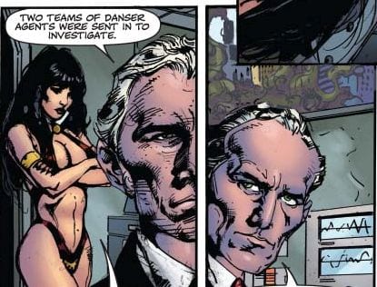
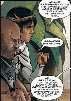
RED SONJA #14 tells a multi-plot story of Faustian bargains in a time of desperation and starvation. Writer Mark Russell challenges Queen Sonja to use her wits instead of her sword, and Bob Q’s art brings even a simple negotiation to life.
Summary
Queen Sonja’s kingdom is on the brink of starvation after a devastating war. She reaches out to an unlikely ally in her desperation, but how far will she go to save her people?
Cover Art
Jae Lee paints a winning cover. Lee’s image is not just cool imagery; it calls back to a minor scene within the book that’s much more dangerous than it looks. Red Sonja, here, doesn’t look like the statuesque warrior she’s historically is seen as, but more roguish and sly. It’s a refreshing take on the character.
Writing
Mark Russell put together a story that forces Queen Sonja to rely on wit and diplomacy over swordplay. In short, her strength as a Queen is put to the test. The dialog is clean and sometimes witty. The overall plot flows well. That said, this issue is much more conversation than action. If you pick this issue up looking for the glory of battle, reset your expectations. It’s a good story, but it’s not an action-packed.
Lettering
Hassan Otsmane-Elhaou does a phenomenal job with the lettering; especially in two key areas. 1) Otsmane-Elhaou clearly transitions carryover dialog from one panel to the next which keeps the reader’s eyes moving. 2) He expertly bolds just the right words to visually interpret inflection and emphasis in the character’s voice. Very well done.
Coloring
There are a lot of browns, greys, and earth tones in this issue, but Dearbhla Kelly manages to keep all the panels looking distinctive. You have a lot of static scenes, but that’s not surprising since there isn’t much action going on. Still, each panel is bright and visually interesting.
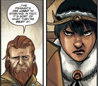
Pencils/Inks
Bob Q’s illustration is a standout in this issue. Q shows a knack for facial expressions that say just as much as Otsmane-Elhaou’s lettering. Q raises and lowers the eyebrows asymmetrically on each character to convey how they’re considering each others words in less-than-pleasant terms. Also, the slant of each mouth really sells how the Aristocratic adviser (on the left) is arrogantly ambivalent to the plight of the peasants, and Isolde’s (on the right) lopsided frown deftly conveys disgust at the adviser’s indifference.
Conclusion
In all, we thoroughly enjoyed this issue. It’s very conversation heavy over action, but the story moves. Queen Sonja takes an important step toward developing as a mature and wise(?) leader. We recommend you pick up this issue.
The evolution of various characters associated with entertainment, be it in the movies or in our comic books, has been quite remarkable over recent years, partly thanks to the numerous technological innovations we’re exposed to. Developers have far more to work with, meaning the characters we love to are changing all of the time. There are certainly more characters around than ever before, that’s for sure.
The world of gaming, for example, has some truly iconic characters that have left their mark on society. The likes of Pac-Man, Zelda, and Mario immediately spring to mind, alongside a whole host of other memorable names. Not all games require strong characters, of course, like, for example, casino brands such as leading scratch cards site casino.com as many of their games simply don’t need one, but plenty of other creations do. The same applies to a movie, where, for instance, if a production has a memorable lead character, people tend to remember the film and all things associated with that particular character. It’s that simple.
We’re here for comic books, though, and – more specifically – comic book characters. So, without further ado, and in an attempt to show our appreciation to some of the greatest and most memorable comic characters ever, here’s a selection of a few who have made a big impression over the years.
The Hulk
Everyone knows who the Hulk is, right? Recognizable the world over, the Hulk likes to punch things continuously, and in doing so, he has well and truly punched himself to the top after being considered a major player in the Marvel Universe these days, especially with the successes of Planet Hulk, World War Hulk, and the Red Hulk storyline. The madder he gets, the stronger Hulk gets too. What an icon.
The Thing
The heart and soul of the Fantastic Four, The Thing is one of the most likable comic book characters in history. Despite clashing endlessly with Hulk and usually losing quite convincingly, The Thing is still a formidable character, although he isn’t a happy one. Trapped in a body he despises, Ben Grimm suffers the occasional bout of depression along the way. Still, this large creature with incredible endurance, and his popular “It’s clobberin’ time!” catchphrase, is much adored.
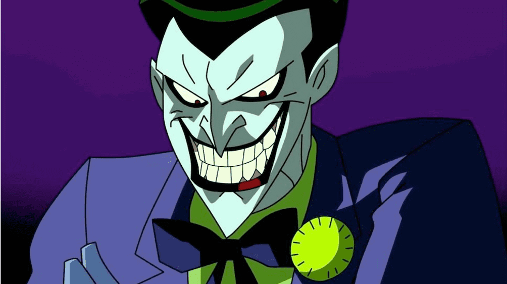
The movie was a huge hit, but before that The Joker really made a name for himself in the Batman franchise. With many seeing him as the greatest comic book villain ever, The Joker pretty much has everything a villain would want. He’s sadistic, he loves a sick joke, he’s annoyingly hard to pin down, he’s tough to defeat, and he looks and sounds incredibly odd with his green hair, white face, fixed grin, and creepy laughter.
The Punisher
One of the most iconic characters ever seen in the Marvel series, The Punisher, is hard to miss with his black-shirted chest, which features a giant skull, his love of guns and his never-ending desire to seek revenge. A lot of people don’t know this, but The Punisher is actually 70 years old according to the fact he ages in real-time. He was born on February 16, 1950, but he’s still very much someone you don’t want to cross.
Marv
Marv is a stable of the Sin City franchise. Usually confused with something, this dumb beast is capable of handling himself once he figures out exactly what it is he has to do. Battling with corruption in the city, Marv is intent on doing things his way. A hard man with a heart of gold, Sin City wouldn’t be the same without Marv.
Ragging on the rich may be the order of the day for current fiction, but few would likely be able to do it quite like Snagglepuss Chronicles and Second Coming writer Mark Russell. Here the satirist teams back up with Flintstones co-creator and artist Steve Pugh for “Billionaire Island” #1, a brutally funny examination of the ultra-wealthy’s lifestyle – and what will one day come of it. Welcome to Billionaire Island, where anything goes…if you can afford it. But the island’s ultra-rich inhabitants are about to learn that their ill-gotten gains come at a very high price.
Writing & Plot
Mark Russell‘s brand of sardonic language and gallows humor brings the overall message to immediate life in “Billionaire Island” #1. The script introduces the plot to be at where many believe to be at the near-apocalyptic endgame of capitalism, but it’s presented with the hokey advertising style of a 90’s gameshow host. The comic keeps this kind of language and narrative presentation over the top of much more grounded realities – some relatable, some grim. This is where Russell’s satire makes itself at home. The comic also has a catharsis at its core; a sort of “coming storm” if you will. Without getting into spoilers, this should prove to be a grossly satisfying experience to get to watch play out. The comedy mixture of absurdist black comedy and flashes of a brutal underlying reality make for a sharp, even read that is both hilarious and compelling.
Art Direction
Artist Steve Pugh between goofy cartoonist style and natural character art in ” Billionaire Island” #1. On the one hand, Pugh’s work is fantastically detailed with human characters that all look distinct and realistic. On the other, he also knows how to implement facial expressions and absurd settings to match Russell’s satirical script. The primary billionaire antagonist is given features that are vaguely rodent-like, while also exuding physical persona of a cocky used-car salesman. There’s also a scene involving a giant hamster wheel which (again, no spoilers) really helps set the tone both visually and story-wise for this comic. Much of the winding aesthetic this issue has is due to the colors from Chris Chuckry. From the 80’s neon hues of the tacky commercial segments to the grounded colors of this world’s harsh realities, the whole book is given a top-notch visual experience in terms of character, setting, and tone.
“Billionaire Island” #1 is Mark Russell and Steve Pugh teaming up to do what they do best. Russell’s brand of satire hits the sort of absurd marks found in political cartoons, but on a larger and more poignant scale. The visual direction of the comic from both Pugh and colorist Chris Chuckry creates a vivid experience that lends itself perfectly to the story being told here. Albeit a bit on the nose, the timely exigency of this series coming in such a politically charged moment towards the one-percent is sure to make it find an audience ready to partake in some much-needed satire. Be sure to pick up “Billionaire Island” #1 when it hits stands on 3/4!
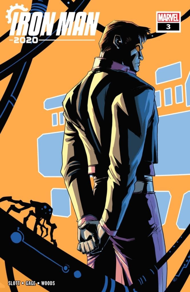
The showdown everyone has been waiting for has arrived in Iron Man 2020 #3 thanks to Dan Slott, Christos Gage, Pete Woods, and VC’s Joe Caramagna. Will this battle be the highlight of the event or will it fall short of expectations?
Arno Stark vs. Tony Stark (aka Mark-1). Who will win?
Writing
The dynamic between Mark-1 and Arno is on full display in this issue. Arno keeps seeming to come off as the more prepared and by his own words “smarter” Stark boy but this doesn’t paint him in the best life. Again, Arno’s actions come off more like a villain than a hero. By his own account, he wants everyone to bow down to him. Name the last time it was a good idea for a hero to want the world to bow to him? Off the top of the head, does Superior Iron Man rings a bell? The series where Tony’s personality was completely inverted and he acted like a villain.
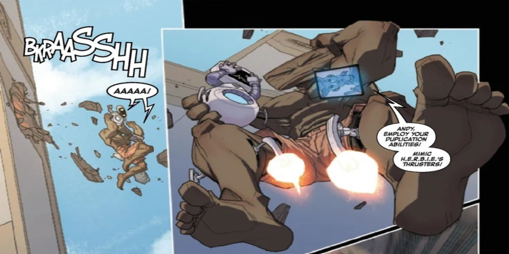
The writing by Dan Slott and Christos Gage isn’t all just angst between the Stark siblings. HERBIE seems to steal the spotlight in every panel he is in. The little guy frequently bites off much more than he can chew and it’s amusing to witness.
Artwork
Pete Woods providing the pencils, inks, and coloring for the issue and all of these aspects are at an incredible level of quality. The action scenes are intense, especially as Arno showcases the gear like shoulder pads aren’t just a strange design choice. There is another scene later where Arno decides to go all out with his attack and is shown to have laser blasters appear in a very menacing fashion.
The lettering by VC’s Joe Caramagna is on the usual level of high performance seen in the previous issues. By offering a great flow to the dialogue, the lettering helps the story to flow from panel to panel. The sound effects during the fight scenes also have a very bombastic feel to them.
Conclusion
Iron Man 2020 #3 has the battle fans have been waiting for since the first issue. It unfolds in incredible detail and still leaves the reader guessing where things will go from here. The real question remains though. Is Arno Stark a good guy or is he no better than a villain?
VENGEANCE OF VAMPIRELLA #6 is a creature feature that matches the spirit of Vampirella’s creator, Forrest J Ackerman. However, some rough art and clunky writing put a damper on the moody fun.
Cover Art
Lucio Parrillo painted the main cover, and it’s gorgeous. If I had a full print of this cover, I would hang it in my home. Parrillo captures Vampirella’s seductive beauty and dangerous potential in one simple pose. I can’t praise this cover enough.
Writing
The overall story by Thomas Sniegoski is simple, unique, and interesting. Something causes a supernatural jungle to suddenly sprout in the middle of Virginia, and Vampirella is called in to stop it. The jungle is growing fast, and it’s populated by assorted mythical monsters.
However, where the plot works, the narration and dialog do not. Sniegoski liters the narration with odd grammatical choices that make it cumbersome to read. The narration is not necessarily wrong or bad; it just doesn’t flow. A few passes of the “read aloud” test would make it a cleaner.
Lettering
Troy Peteri checks all the right boxes with his lettering. It’s clear and easy to distinguish between conversations and narration. The letters stand out boldly, and the lines don’t look cluttered.
Coloring
Ori Remalante Jr.’s coloring is another highlight of this issue. Most of the action takes place in panels overrun with jungle. That’s a LOT of green, and it would be tempting to lose focus on where Vampirella is placed at any given moment. Not so here. Remalante Jr. keeps the surrounding foliage distinctive and structured in a way that avoids having every panel crowded out with a green blobs.
Pencils/Ink
I liked parts of the pencils/inks by Roberto Castro, but was put off by the lack of consistency. In some of the earlier panels, Castro inks characters characters with a very rough, sketchbook style. Castro’s creative choice can work if it’s carried through the whole issue. Here it is not.
Others panels do not have that rough style. The book sometimes looks like it was drawn by different artists on different pages. It would be more visually appealing to choose a style and keep it through the whole issue.
Conclusion
VENGEANCE OF VAMPIRELLA #6 has a fun story and a superb cover, but the clunky writing and inconsistent art put a damper on the fun. Recommend picking up only if you’re a Vampirella completest.
Thirty years ago it was a sex worker reinventing herself. Ten years later, an actress reinvented herself. And ten years ago, a woman finds herself in wonderland.
One-hundred-plus years of film-making provides a long, rich, and deep history to look back on. Retro reviews and analysis of old films are practically necessary full-time specialties. Month after month, films release, vying to make as much money and grab as much attention as possible. Some rise, some fall, but regardless of financial success, the lasting effect of a film in popular culture is unpredictable.
So, where does that leave past box office champs? Let’s take a look back ten, twenty, and thirty years ago at the biggest movies released in March.
1990 • Pretty Woman • 135 million
If a list were ever made of the top months of March for movie releases, then March 1990 would have to be up there. The box office featured a trio of powerhouse films in the annals of pop culture history. At the top of this money-pile is Pretty Woman starring Julia Roberts. The film firmly established Roberts as a bankable box office superstar.
March of 1990 featured the first Teenage Mutant Ninja Turtles. The film was a box office hit taking in 170 million and spawning two not-so-great sequels. In a close third is The Hunt For Red October. Sean Connery at his peak playing a Russian Naval Captain facing off against then rising superstar Alec Baldwin. It was the birth of Jack Ryan on film who’s still with us today played by John Krasinski for Amazon. In fourth, Joe Versus the Volcano, an action-comedy starring Tom Hanks which, if you’ve seen it, you love it. It’s hard not to. Lastly, hip-hop duo Kid and Play starred in House Party. March 1990 is one to remember at the box office.
2000 • Erin Brokovich • 125 million
Ten years after Pretty Woman made her a household name and won the box office, Julia Roberts said to her past self … hold my beer. In March of 2000, Roberts retook the March crown with her Oscar-winning performance in Erin Brockovich. While it technically made less money, the film cemented Roberts as an undisputed Hollywood legend.
The box office in March of 2000 was not as power-packed like in 1990. Making fifty percent less than Erin Brokovich was Mission to Mars, a beautifully shot Brian DePalma film that’s otherwise a hot mess of good actors and a bad story. The Shakespeare-inspired action flick Romeo Must Die starred Jet Li and took third this month. Number four for the month, Final Destination, is probably the biggest pop culture winner here having spawned many sequels. The animated Road to El Dorado closes out the top five, though the film ultimately was a box office dud.
2010 • Alice in Wonderland • 334 million
The box office of March 2010 saw ticket sales soaring due to the release of two films. The champion was Tim Burton’s Alice in Wonderland. Not only did it make the most money of any movie released in March of that year, but the film went on to land in the top three grossing films of the year. It spawned a sequel too, but that’s where it ends. For now.
Arguably, the real winner from this month was the release of How to Train Your Dragon, which came in second. The film earned 217 million but gave birth to a franchise that’s seen two sequels, video games, and an animated series. The rest of March 2010 is mostly a forgettable one. The Bounty Hunter starring Jennifer Aniston and Gerard Butler happened. Diary of a Wimpy Kid fell three million short of third place. And, The Last Song, a film I didn’t know existed until I wrote this article, came in fifth with 62 million. My apologies to stars Miley Cyrus and Liam Hemsworth.
March 2020
March is a curious one. January and February are mostly slow months for films. March is when the pan starts to sizzle. On March 6th is Onward (TRAILER), the latest from Pixar with a voice cast including Spider-Man Tom Holland and Star-Lord Chris Pratt. On March 13th, the cinematic world will meet Valiant Comics character Bloodshot (TRAILER) played by Vin Diesel. Towards the end of the month is A Quiet Place: Part II, which has been mostly quiet as far as buzz. A week later is the release of Disney’s next live-action remake of an animated classic, Mulan.
My prediction …
Before I get on with predictions, a special mention to The Invisible Man starring Elizabeth Moss, which released in late February but is doing some damage at the box office. March of 2020 belongs to Mulan. Onward is sure to make make it rain for Pixar though not to any level like previous super-blockbusters like Toy Story or The Incredibles. A Quiet Place: Part II will do well, and Bloodshot might surprise too. But Mulan is poised to be a big, box office hit for Disney, and it doesn’t seem likely that anything else will come close.
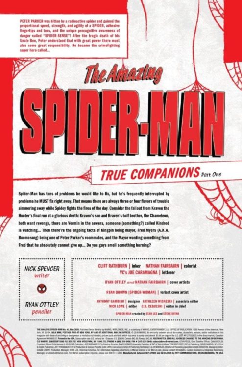
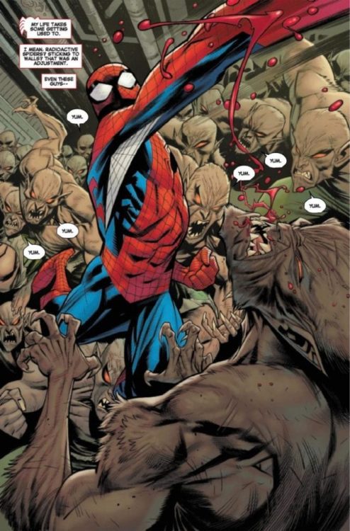
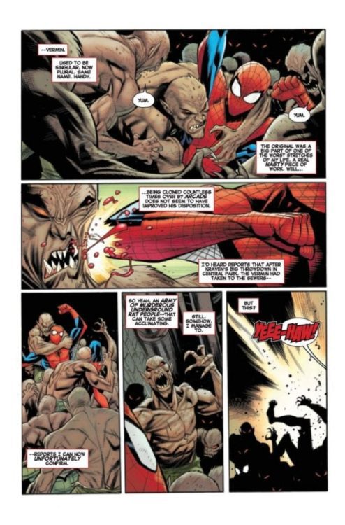
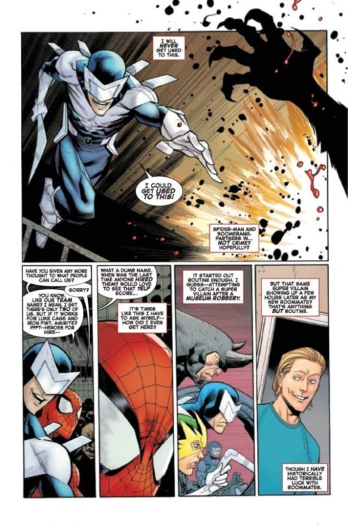
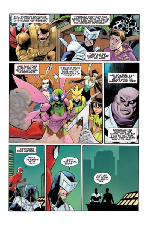
Amazing Spider-Man #41 doesn’t hit your local comic shop until next week, but thanks to Marvel Comics, Monkeys Fighting Robots has a four-page preview to share with you.
The book is written by Nick Spencer, with art by Ryan Ottley, Cliff Rathburn adds inks, Nathan Fairbairn is the colorists on the issue, and you will read Joe Caramagna’s letter work.
About the book: TRUE COMPANIONS Part One
Spider-Man needs to know WHAT BOOMERANG IS UP TO and he (and you) will finally get their answers this issue! What does it have to do with Mayor Kingpin? And who are all those eyes looking at our hero and his lousy roommate?
Where does Spencer rank as a Spider-Man writer? Comment below with your thoughts.
Enjoy the preview
Amazing Spider-Man #41 Side Notes:
Stan Lee and Steve Ditko created Peter Parker and Spider-Man with his first appearance in Amazing Fantasy #15 (1962). Amazing Spider-Man #1 hit the newsstand in March back in 1963.
Lee and Kirby also created Frederick Myers, aka Boomerang. He first appeared in Tales to Astonish #81 from July of 1966.
Lee and John Romita Sr. created Wilson Fisk, aka the Kingpin. Fisk first appeared in The Amazing Spider-Man #50 from July of 1967.
The latest issue of Pandemica from IDW Publishing hit the stands this week with a cover that pays homage to the Discovery One from 2001: A Space Odyssey. The curved floor with decomposing bodies in stasis beds highlights the story closing in on De as she tries to escape. And there ends the similarities.
With a bi-monthly release schedule it feels like there have been many more issues in this comic run than there has been. Trying to keep up with what has happened is also a problem: a quick flick through previous issues for a reminder is definitely needed. The question is, is the wait for the end of the world worth it?
Pandemica #4 Credit: IDW Publishing
A Relevant Plot
When Pandemica started in September last year, the breakneck pace of the plot almost left the artist behind. Jonathan Maberry introduced so much into his first issue with a host of characters in a plethora of situations. There were time jumps, narratives hopping back and forth, and an emerging White Supremacist story-line.
So much of it felt relevant, drawing on the disturbing political climate across the globe. Six months down the line and that real world fear is still there but for an entirely different reason. Reading Pandemica in the midst of a global health crisis adds weight to some of the themes that Maberry is attempting to bring out.
The only problem is, a lot of this issue is over written. Ignoring the opening splash page which sets the scene and attempts to remind the reader what happened at the end of the last issue, the opening sequence is five pages of exposition regarding a character called Lucky Bunny. Lucky Bunny is a danger to all life on Earth. The reader learns this early on but the concept is hammered home again and again, panel after panel.
The story returns to this scene of De and Chick several times, each time progressing slightly but hindered by the need to remind the reader about the danger. Again and again. The constant repetition ends up having the opposite effect than intended. The reader quickly becomes indifferent to Lucky Bunny and, if you are anything like me, you’ll find yourself rooting for Chick; which is the wrong side of the fence to be on.
Whereas issue one had multiple stories and characters fighting for space, this issue is lacking. A few of the characters remain but the plot has been reduced to a few simple beats. Most of what happens in this issue could have been condensed without losing anything.
The general plot is still intriguing and a large proportion of the scripting is engaging, however it could have been improved with some firm editing.
Pandemica #4 Credit: IDW Publishing
Layouts and Art
Due to the rambling story, Alex Sanchez has plenty of time and space to design his layouts. He shows off his figure work with the constant back and forth between the characters. A number of close ups and full body shots allow the artist to bring out the expressive nature of the characters. It also allows him to focus on the violence, drawing out scenes and building the tension in each moment.
The design of the layouts are especially impressive. Sanchez focuses the reader in the first panel and then has clear lines through the page. The stance of a figure in the first tier will lead to a well placed leg in the second tier and into the final dramatic pose in the bottom tier. This easily discernible line from the top of the page to the bottom splits the page in half and emphasises the first and last panels.
The structuring of the panels throughout is impressive and, with Sanchez’s expressive inking style, there is a satisfying visual aspect to the comic. Helping that visual along is the color work by Jay Fotos whose biggest contribution to this issue is distinguishing between locations and time periods. There are a number of scene jumps, each with their own tone and atmosphere. Fotos differentiates between location with subtle alterations to background coloring. This allows for a more drastic change to the color palette when representing the past or future.
Shawn Lee still has the hardest job in this comic because there is a lot of speech to letter. Virtual essays of exposition have to be squeezed into the pages without detracting from Sanchez’s art work. Unfortunately for Lee, this isn’t always possible and there are panels where the visual drama is covered by the verbal.
However, Lee works well with what he is given. He breaks up speeches into smaller chunks and spreads them across a panel, or stacks the balloons depending on the image. This at least gives most of the art some room to breath. Lee also uses color to differentiate between characters voices so that, even when they are off panel, it is easy to follow. For a script that’s almost a novel, Lee does surprisingly well not to bury all of the images in black lines of text.
Pandemica #4 Credit: IDW Publishing
Conclusion
The series got off to an impressive start, full of intrigue and mystery. As the story has unfolded some of that excitement has been lost. Unfortunately for the series, this issue has the feel of a filler chapter, stretched out to make a four part series into a five part series.
There are glimpses of the earlier greatness and the art team are still pushing the boat out. It is just a shame that the boat appears to have a hole in it. An over written script, desperately in need of an editor hampers some of the other creators work which is a shame.
As the resolution of the story is just around the corner (two months away) I would recommend sticking with this title. This may not be the best issue of the run but it contains enough to keep the regular reader interested.
Artemis and the Assassin #1 is out Wednesday, March 18th from AfterShock Comics, and Monkeys Fighting Robots had the chance to speak with writer Stephanie Phillips about the exciting new series.
The series is by Phillips and artists Meghan Hetrick & Francesca Fantini, with colors by Lauren Affe and letters by Troy Peteri. Covers are by Phil Hester.
About the series: What happens when a time-traveling assassin and a spy from 1944 try to kill each other?
For a price, a top-secret assassination organization will travel through time and interfere with watershed moments. Trained as the agency’s top assassin, Maya is sent to kill Virginia Hall, the deadliest spy of WWII. Charged with carrying important plans about the invasion of Normandy to the allied troops, Virginia’s death would have a cataclysmic effect on WWII as we know it.
READ ON FOR OUR FULL INTERVIEW WITH PHILLIPS:
Monkeys Fighting Robots: First off, I LOVE the opening to this book and how Maya is introduced hardly saying a word. There’s so much characterization conveyed in just her body language and facial expressions. What appeals to you about a silent introduction like this, and how closely did you work with Meghan and Francesca to get it right?
Stephanie Phillips: I think it says a lot about Maya’s personality. She’s really a woman of action rather than talk. She’s there to get a job done and move on to the next one. She’s also a loner, so not seeing her with any kind of partner to banter with is important for her. She’s not sarcastic or funny. She’s a killer. And I think Meghan did a great job with the opening sequence of giving the reader a sense of this woman-of-action character that we’re going to see throughout the series.
MFR: I feel like I always learn something from your comics, from the existence of the Butcher of Paris, to the conspiracy surrounding the Lindbergh baby, and now to the life of Virginia “Artemis” Hall. Is that something you set out to do with your stories, teach your readers nuggets of history and inspire them to seek out the true stories?
Phillips: I appreciate you saying that! It’s really for me more than anything else. I am endlessly fascinated by people and I like to include a lot of that in my writing. When I discovered Virginia Hall, I knew I wanted to really introduce her to the world, perhaps in a slightly unique way. Like, in a time traveling kind of way.
MFR: ARTEMIS AND THE ASSASSIN is solicited as being “about the cost of changing history” — what sets it apart from other time travel stories with similar themes?
Phillips: The characters. There are plenty of great time travel stories in the world. There is time travel in this story, but this story is about Virginia and Maya. The time travel element allows for them to interact across time and space, and also pits them against endless foes. It makes for a great setting to throw these two characters into the deep end and see if they sink or swim together.
MFR: How much worldbuilding is involved in creating Maya’s future and the impact her agency has had on history?
Phillips: There was a lot more worldbuilding for Maya than any other character I have written before. Her backstory will unfold over a series of issues and is really unique. It’s hard to say much without giving it away, but I will say that building Maya took a really interesting blend of history and mythology.
1:15 Incentive Variant by Dave Johnson
MFR: You just announced another new book, RED ATLANTIS, also through AfterShock, and you’re working with Jan Neumann, former intelligence officer in Russia’s Federal Security Service. What is it like working with someone and building a story from his personal experiences as opposed to your own?
Phillips: It’s definitely a different experience having others involved in the story like that, but it has been a really positive collaboration. Like I said, I’m really fascinated by people and Jan is one of the most fascinating people I have ever had the privilege to work with and talk to. Honestly, one of my favorite moments of working with Jan was discussing fight choreography. I was Muay Thai fighter, so I approach a lot of my fight scenes with that specific skillset. Jan has some pretty extensive combat experience and training, so he helped impart a lot of his wisdom in order to ensure the fight scenes in Red Atlantis are truly authentic. He also offered to do a combat demo via Skype and I’m pretty stoked.
MFR: Troy Peteri has lettered most of (if not all of) your work; what about Troy’s work stands out to you and makes him the right choice for your projects?
Phillips: I’m really glad you asked about this. Yes, I love working with Troy! On some level, it’s really practical. I can use shorthand with him since we’ve worked together so much. But, I also elect to work with Troy because he’s talented and inventive. He is always looking for ways to make sure the lettering is adding something to the page, and he makes a lot of smart decisions. Lettering can make a huge difference with regards to how a reader interacts with the page, and Troy is one of the best at understanding the reader’s experience and laying out the page.
MFR: Finally, what are some of your favorite time travel stories that influenced the way you approached the time travel in ARTEMIS?
Phillips: Most of the influence for ARTEMIS really comes from pulps with a sense of big adventure and lots of action. But, if there was a time travel story that I love that I’m sure influenced this project, it would be A Connecticut Yankee in King Arthur’s Court by Mark Twain.
Thank you again to Stephanie Phillips for taking the time to chat with us. Call your local comic shop today and tell them you want Artemis and the Assassin#1 when it comes out March 18th.
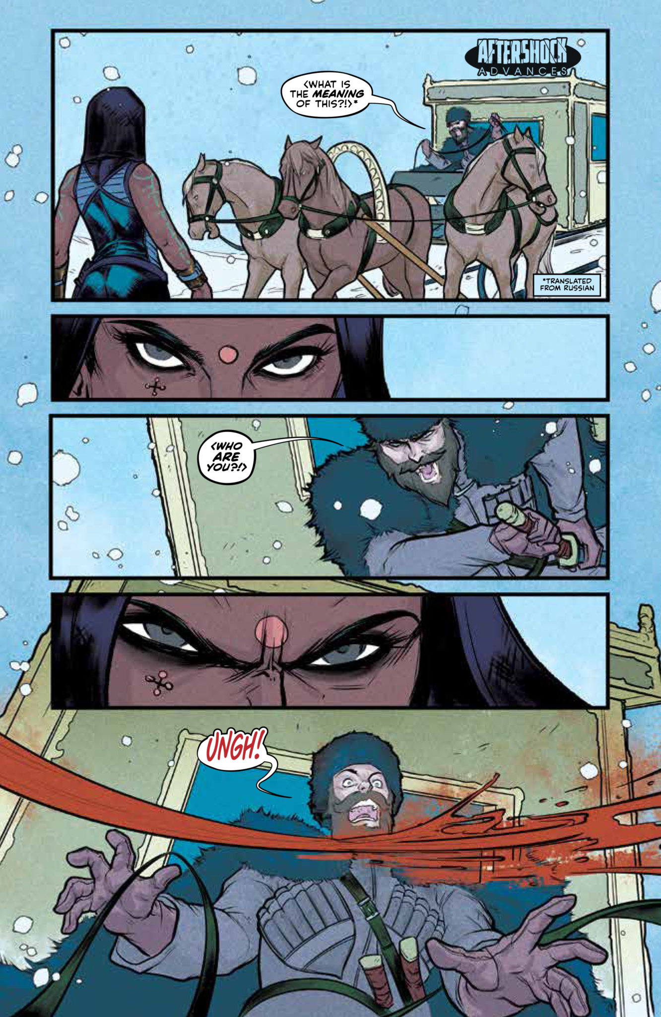
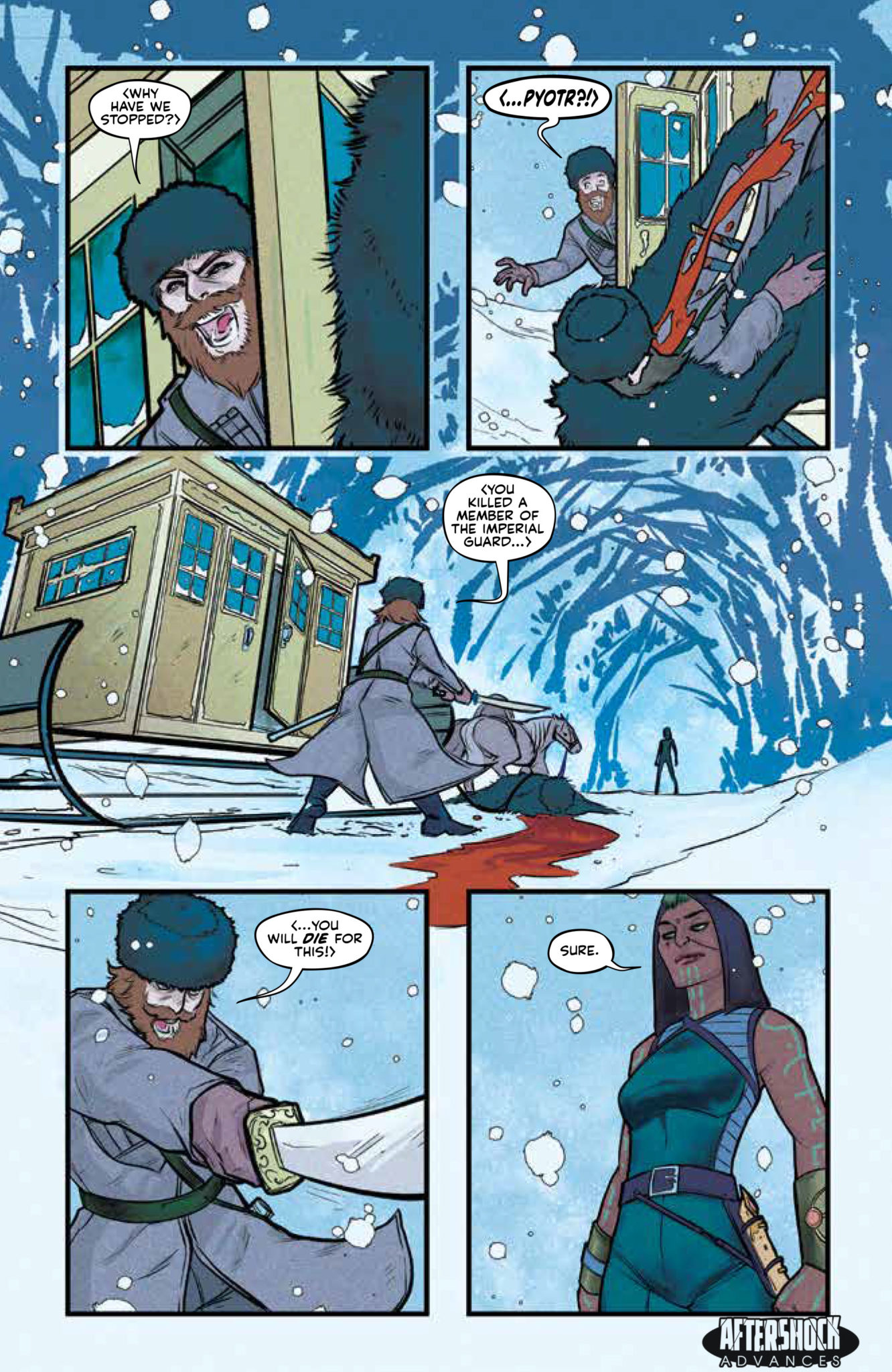
ARTEMIS AND THE ASSASSIN #1 hits your local comic book store March 18th, but thanks to AfterShock Comics, Monkeys Fighting Robots has an exclusive four-page preview for you.
About the issue: What happens when a time-traveling assassin and a spy from 1944 try to kill each other?
For a price, a top-secret assassination organization will travel through time and interfere with watershed moments. Trained as the agency’s top assassin, Maya is sent to kill Virginia Hall, the deadliest spy of WWII. Charged with carrying important plans about the invasion of Normandy to the allied troops, Virginia’s death would have a cataclysmic effect on WWII as we know it.
ARTEMIS AND THE ASSASSIN #1 is by writer Stephanie Phillips and artists Meghan Hetrick & Francesca Fantini, with colors by Lauren Affe and letters by Troy Peteri. Covers are by Phil Hester.


")