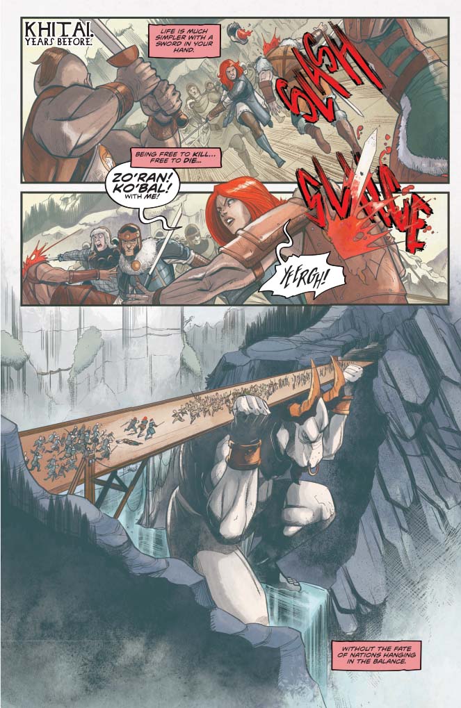
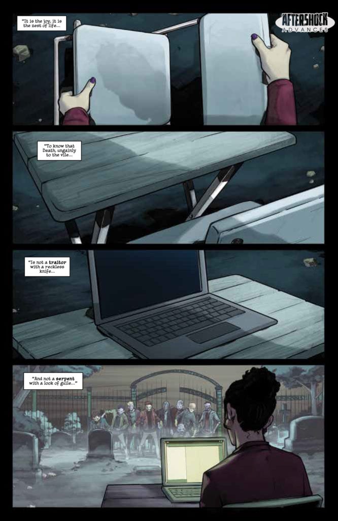
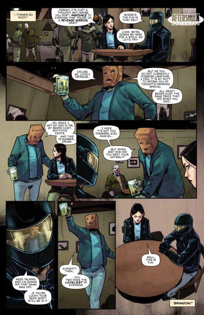
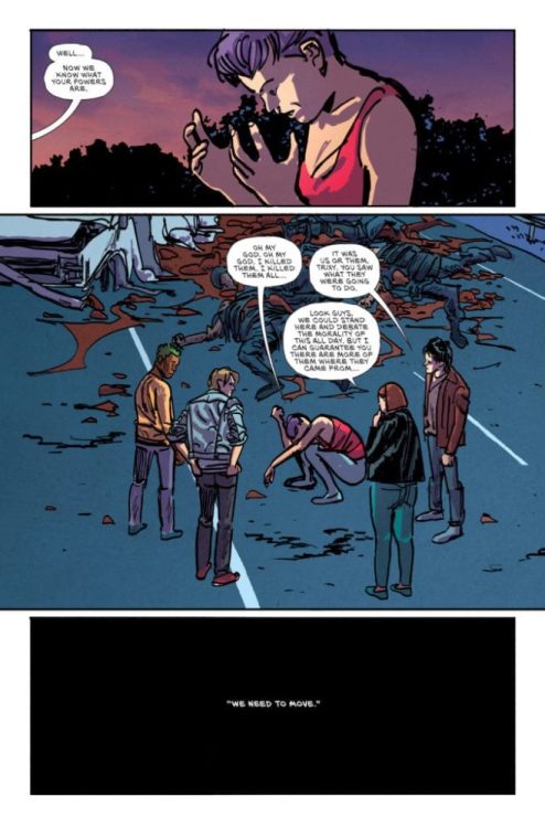
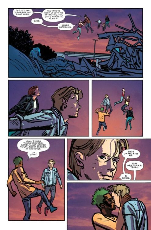
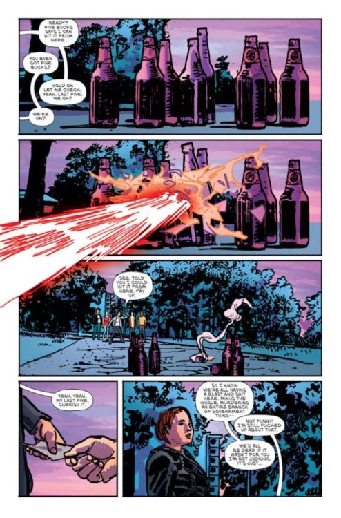
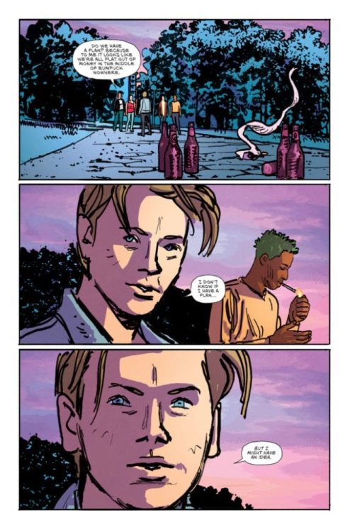
DEAD DAY #2 hits your local comic book store August 19th, but thanks to AfterShock Comics, Monkeys Fighting Robots has an exclusive four-page preview for you.
About the issue: As the dead begin to rise, Melissa follows a mysterious rider on a journey back into a life that could have been, and Brandon witnesses how both the faithful and faithless deal with the undead walking the earth.
DEAD DAY #2 is by writer Ryan Parrott and artist Evgeniy Bornyakov, with colors by JUANCHO! and letters by Charles Pritchett. The main cover is by Andy Clarke with Jose Villarrubia.
The series is described as “an unnerving tale of existential horror with grave consequences.”
Check out the DEAD DAY #2 preview below:
Are you reading DEAD DAY from AfterShock Comics? Sound off in the comments!
Prometheus: The Complete Fire and Stone is the big crossover event of Dark Horse’ Aliens vs. Predator universe. After the divisive introductions of the Prometheus movie, this series brings together different creative teams about an epic of obsession. With Ridley Scott’s films failing to meet expectations, Fire and Stone reuses the premise to do the concept justice.
Overall Story of Prometheus: Fire and Stone
Prometheus: Fire and Stone begins its epic with a salvage crew on the setting of the original movie, LV-223. The captain, Angela Hope, keeps from the crew that she intends to discover the events of the film. Coming off of YouTube Channel Wisecrack’s interpretation of Prometheus, however, such obsessions lead to disappointments. Yet that’s putting it mildly. As it turns out, a lot of people, including survivors from Aliens, also set up shop less than a century ago. And their lives turn for the worse as the actions of these people lead to the current cast’s predicaments. Just about everybody keeps crucial details (like Angela’s quest) to themselves, which leads to disastrous consequences. Most of which end up with people under attack by Xenomorphs.
The Flow of Themes
This cyclical nature outlines the themes of the respective franchise: from Prometheus come obsessions, leading to the brutal nature of Aliens, finishing with the need to overcome this brutality in Predator. Paul Tobin begins the series with how Captain Angela Foster’s obsession with learning the events of Prometheus leads her crew into danger. Chris Roberson meanwhile creates a prequel on Fire and Stone’s setting. One that sets up the conflict of the present by demonstrating how one character’s obsession melds with the setting.
All of which leads to the Predators as they clash with the Xenomorphs in Christopher Sebela’s story. Between all of the philosophical monologues by mutating cyborg Eldan, he pushes the climax of the series where the characters question their obsessions. The main Predator even gets the name Ahab in Joshua Williamson’s Predator run, referencing the conflict of Moby Dick. These obsessions could kill the rest of the cast despite becoming aware of their actions. All before going full circle with the Omega issue by Kelly Sue DeConnick, where the cast makes peace with their decisions, no longer burdened by their obsessions.
Artwork
The Prometheus Fire and Stone epic features many of the pencilers serve as inkers as well. This method allows for a myriad of detail. Juan Ferreyra in the Prometheus section, shows a photorealistic depiction almost looking like this is from the movie this series gets its title from. Patric Reynolds displays a more eerie style in the Aliens section with his depiction of the mountain base setting evoking feelings from the classic H.P. Lovecraft story At The Mountains of Madness. Ariel Olivetti employs more grotesque imagery in addition to the sleek details of the ship Alien vs. Predator takes place on. The fact Olivetti does the coloring with an airbrush shows the amount of detail into just Elden.
Chris Mooneyham’s art has a much rougher detail to display in Predator; the additional shading by John Lucas almost acts as an indicator of something hiding in the shadows to strike. Agustin Alessio finishes Prometheus Fire and Stone’s Omega issue with the photorealistic art, the grotesque imagery, the eerie, claustrophobic atmosphere while ditching rougher sides. Because with an ending about making peace even in the darkest place, who cares about potential actions?
Coloring
The above art styles are further accented by the numerous colorists. It is unknown how much of the coloring in Prometheus Fire and Stone is by Juan. By issue 2 onward, some of the tasks are shared with his brother Eduardo Ferreyra. Yet the cooperation between them goes into the depths of detail surrounding such a complex story. Especially with its equally vibrant setting. Aliens in the meantime gets its coloring by Dave Stewart, which between all of the shading highlights what it brings to all the other installments. This includes the cave notes in the mountain camp that the Prometheus cast likes to use as a reference. Dan Brown does something a little similar in Predator by highlighting the bright backgrounds against the darkened settings.
The rest of the series have their coloring by the penciler/inkers. The dedication these artists go to provide such detailed and elaborate artwork over the span of a few months is worthy of high praise. It’s practically comparable to the work of the late Frank Frazetta in his work with Conan the Barbarian. Each layer from the pencils, the inks, to color upon colors creates a fully realized image.
Lettering by Nate Piekos
The one constant throughout Prometheus The Complete Fire and Stone is Nate Piekos, the letterer. His presence and lettering ensure the reader that this entire epic stays connected. From the moment the Prometheus crew steps out the word balloons waste no time in displaying the scenery. Keeping dialog to a minimum allows for the really tense moments to move uninterrupted. For the bigger panels he has captions slow the reader down enough to fully embrace the artwork. If that’s not enough his ability to depict alien languages matches only with how he communicates with the creative teams. Because without their input, the Predator dialog would either be too short or too long to keep the reader focused.
Prometheus The Complete Fire and Stone is Epic
If Prometheus The Complete Fire and Stone was a movie, it would be the sequel that Alien Covenant failed to be. Continuing its themes of obsessive curiosities and its destructive aftermath, this entire event series does that theme justice. All by encompassing every thematic element from the franchises it shares a universe with. None of this would even be possible without the creative teams bouncing off each other the way they do. Unlike the movie studios’ getting in the way of what could be a great flick. It’s the communication between parties that make this series stand out.
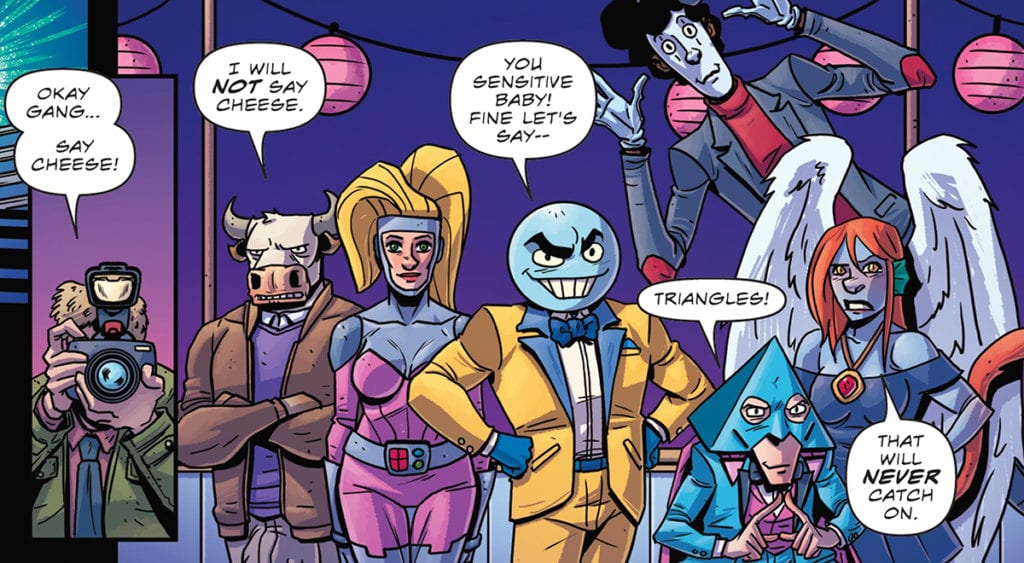
When earth’s greatest heroes die in The Atomic Victory Squad, all that’s left is a motley crew of obscure characters to save us; but can they?
This review covers The Atomic Victory Squad #1-4, written by Lowell Dean, director/creator of WolfCop. On art and colors is Javier Martin Caba, and Micah Myers on letters. As of the publication of this review, The Atomic Victory Squad #1 is on ComiXology, with the others soon to follow.
THE ATOMIC VICTORY SQUAD’S FORMATION
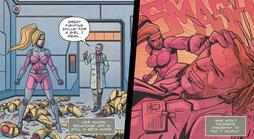
Dean uses the page count to his advantage by taking the four issues to flesh out the team. Granted, it seems that the origin story arc isn’t complete; the slow pace is nice. Instead of making it a quick-paced origin, Dean uses each issue to introduce you to the team. That’s The Atomic Victory Squad’s strength; it takes the time to make you root for the team. Yeah, some of the characters will annoy or piss you off from the get-go, but later on, you learn why they’re like that. You can tell this was the plan from the first issue, as Dean spends no time building up the old team. Instead, he kills them off so we can learn of the new team.
At first glance, The Atomic Victory Squad’s cover seems a bit cartoonish, especially the character designs which will have you thinking it may be for kids. However, don’t let the cover fool you because the inside is filled with drama, action, and themes more suitable for teenagers and up. Be that as it may, not all of these story elements pay off. These moments are a handful of jokes and humorous scenes. The Atomic Victory Squad does include some hilarious dialogue and some hijinks, yet it doesn’t always pay off. In a few cases the joke doesn’t hit the high notes as the others.
A family photo – Lowell Dean, Javier Martin Caba, and Micah Myers
Yet, each character is endearing in their own manner. As The Atomic Victory Squad is Dean’s first steps in the comic writing game, there a few stumbles, but nothing that’ll kill your enjoyment.
THE CRAZY WORLD WE LIVE IN
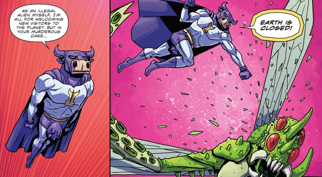
Dean mentions a few times that this story has been living in his head since the ’80s. Included at the end of each issue are character designs he and others have created throughout the years. As great as those designs are, Caba’s art really brings them to life. The world at large in The Atomic Victory Squad isn’t ever fully shown, but the parts that are are quite interesting. Not only do humans inhabit the earth, but so do anthropomorphic animals and other oddities. However, Caba makes none of it look out of the normal. Instead, each design and background character seems like they belong.
Yet, one of the funniest moments visually is when Invincibull’s (Alien Cow hero) planet is showcased. His planet, Cowtopia resembles earth, yet it has udders on it. The design makes absolutely no sense, but it matches the comic so well, and his hilarious to boot. Caba also handles colors, which he handles very well. The color palette throughout The Atomic Victory Squad matches the story’s tone. When the team starts to fight, the colors are bright, poppy and gives the scenes more emphasis. Nonetheless, when the scene transitions to a sneaking mission, the colors as well adapt.
Moooooove over Superman – Lowell Dean, Javier Martin Caba, and Micah Myers
MONSTER IS A BIG WORD
Much like Caba’s art helping tell the story, Myers’ lettering magnifies the scenes just as much. When the villain Ridando is introduced, its design is cool, but Myers’ lettering takes the introduction up a notch. Instead of having the villain use usual word balloons, Myers forgoes those and uses a huge gnarly looking font. Not only does that help set the villain apart, but it makes the creature even more terrifying. Howbeit, this doesn’t only apply to Ridando, as other characters often have unique fonts and colors.
Manners – Lowell Dean, Javier Martin Caba, and Micah Myers
THE FUTURE OF THE ATOMIC VICTORY SQUAD
While reading the four issues, I was often reminded of Axecop. If you didn’t know, Axecop was created by two brothers with the younger (aged 5) coming up with the ideas. It’s a fun, senseless ride at points, and that’s how Atomic Victory Squad feels. It makes sense as Dean started work on these when he was much younger in the ’80s. Yet, that’s what makes the first four issues a blast to read. At some points, it makes sense, while others it leaves you stunned, while still having fun. The origin stories of each character are fun to read, as well. Despite a few bumps, Atomic Victory Squad is a fun start to a new superhero team.
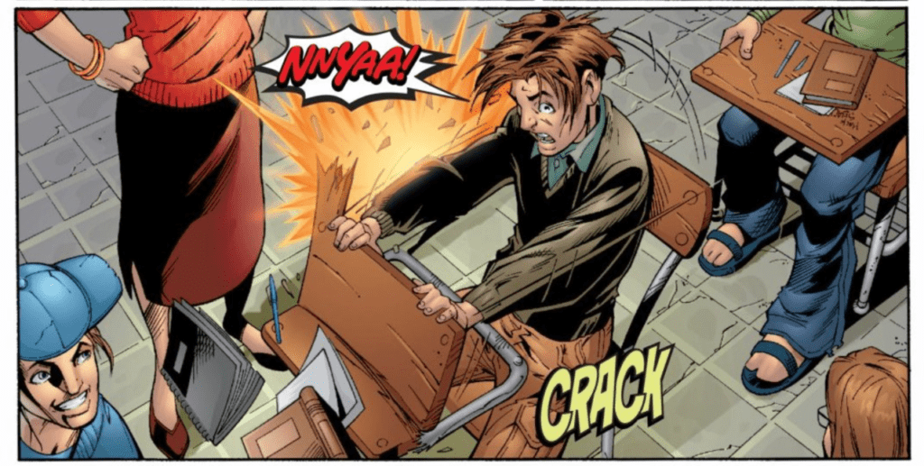
Twenty years after it’s initial launch, Ultimate Spider-Man Vol.1 continues to astound and show why this incarnation of the age-old character stood the test of time, while creating a myriad of media and spin-offs.
Ultimate Spider-Man Vol.1: Powers and Responsibility covers the first seven issues of the series. Beware of spoilers, and if you’re able to support your local comic book shop, pick a copy up there!
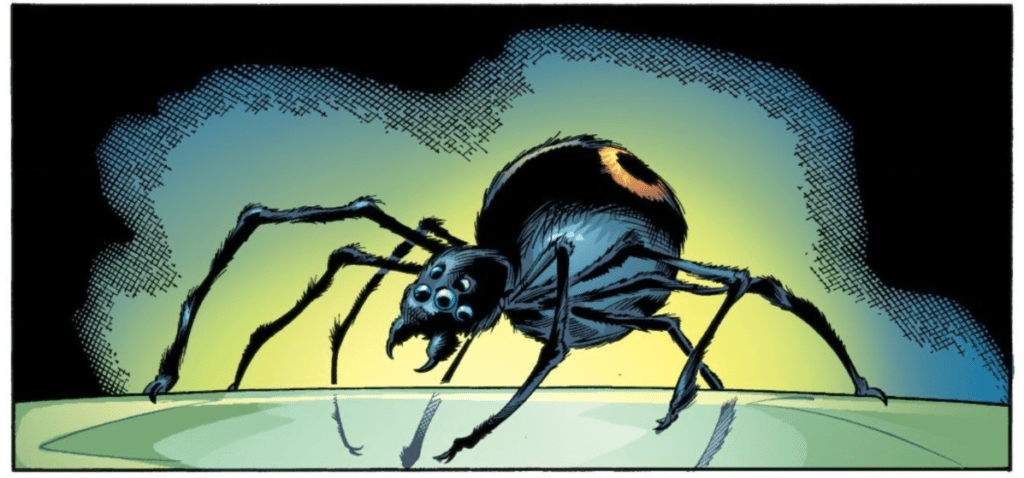
ULTIMATE SPIDER-MAN AND THE NEW ORIGIN
Before you even open Ultimate Spider-Man Vol.1, one colossal change rears its head; the origin story is seven issues. When compared to the original origin in Amazing Fantasy #15, that was only a few pages long. Nonetheless, this was nothing new with writer Brian Michael Bendis, who is known for being heavy with dialogue and taking his time. However, this extended origin was a smart move. Instead of trying to cram one issue full of backstory, Bendis is able to expand it throughout seven. The slow speed does work for some parts, but others feel like they drag on, yet nothing too bad.
Brian Michael Bendis, Mark Bagley, Art Thibert, Dan Panosian, Steve Buccellato, Marie Javins, Colorgraphix, Transparency Digital, Richard Starkings, Comicraft
Bendis takes Spider-Man and gives him a more modern setting. Albeit, it released 20 years ago, some of the elements still relate to teenagers. By having the opportunity to expand the origin to multiple issues, he is able to focus on the everyday life of Peter Parker before and after the spider bite. This extra page count is both Ultimate Spider-Man VOL.1’s strength and weakness. At times it feels as if Bendis is working towards a word count instead of letting parts breathe. Sadly, this isn’t anything new with him, as he tends to get wordy in some of his works. However, this does lead to one of the story’s strengths—its characters.
Not only does Bendis write an amazing Peter and Spider-Man, but the other character’s voices just as well. Sometimes with teenager centric stories the characters feel like they are trying to hard to be young and “hip”. However, the characters in Ultimate Spider-Man VOL.1 don’t feel as such. Instead, they feel organic, especially for the Spider-Man persona that is just starting out.
ULTIMATE ORIGIN, ULTIMATE ART
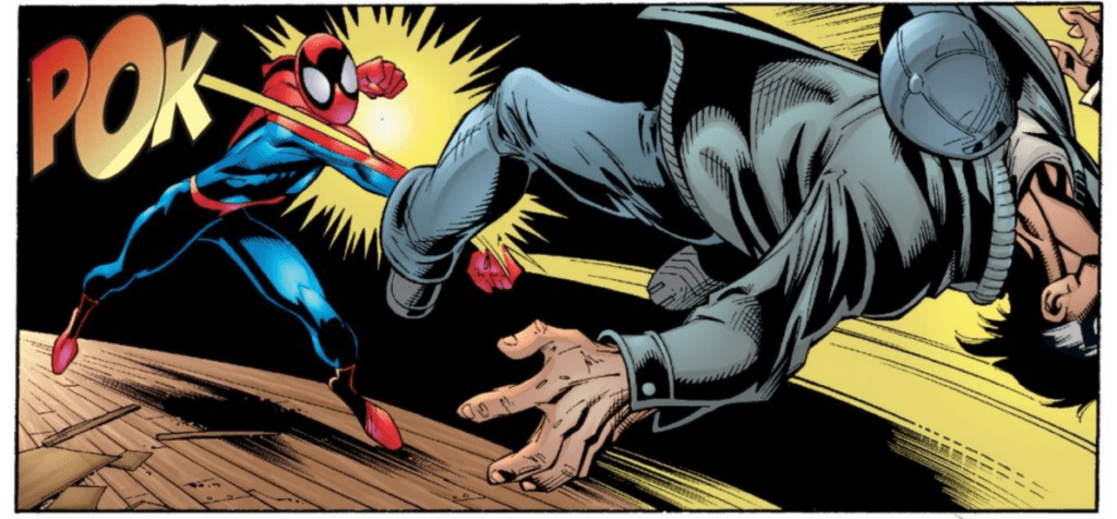
Helping bring the new origin to life is Mark Bagley on art, with Art Thibert and Dan Panosian inking. Bagley went over 100 issues on art duty throughout Ultimate Spider-Man’s history, so it’s nice to look back at his first few. Bagley’s style melds nicely with the modern tone the team set out for, but at times his faces seem off. The amount of medium and close shots the team employs doesn’t help this weakness either. However, when Bagley hits his stride, it’s fantastic.
Contained within Ultimate Spider-Man Vol.1 are some iconic Spider-Man poses and some that would later become iconic. Not only that, since it was a new universe started from scratch, some designs got changed. Spider-Man’s suit wasn’t changed too much, yet the biggest change was Green Goblin. Instead of being a man in a suit, Green Goblin becomes a seven-foot-tall monster that’s extremely intimidating. This change at first might surprise you, – which it should with it being a new universe – but it works amazingly storywise.
The ink jobs by Thibert and Panosian work well throughout the series. The shade they add to Green Goblin’s muscles when he is introduces, makes him seem that much more terrifying. Yet, their inks sadly don’t help the obscure faces in some scenes. Nonetheless, their collaboration helps in most moments.
Brian Michael Bendis, Mark Bagley, Art Thibert, Dan Panosian, Steve Buccellato, Marie Javins, Colorgraphix, Transparency Digital, Richard Starkings, Comicraft
A COLORFUL NEW START
During the seven issues, colors are handled by Steve Buccellato, Marie Javins, Colorgraphix, and Transparency Digital. Having this many colorists working on the origin story seems like, at times, it would be a noticeable change, but that doesn’t transpire. Instead, the colors stay consistent with each other while helping the art. Spider-Man’s suit is bright and popping, making it fly off the page, especially compared to the other colors. For the most part, Ultimate Spider-Man Vol.1 feels grounded with the art and the colors helping. Yet, when it comes to Richard Starkings and Comicraft’s lettering, it’s a different story.
Whereas the art and colors have a more grounded feel, the sound effects feel as much as a comic as they come. Starkings and Comicraft make sure they are big, loud, and in your face. These sound effects give the panel an oomph that helps the action sound that much louder.
Brian Michael Bendis, Mark Bagley, Art Thibert, Dan Panosian, Steve Buccellato, Marie Javins, Colorgraphix, Transparency Digital, Richard Starkings, Comicraft
THE BEGINNING OF SOMETHING NEW
At times Ultimate Spider-Man Vol. 1 shows its age, but that’s to be expected. Be that as it may, it’s still an amazing jumping-on point for those that want to read about Spider-Man. Not only is it a well-updated origin, but it was a comic that inspired further Spider-Man media while making a fan of many at the time.
Brian Michael Bendis, Mark Bagley, Art Thibert, Dan Panosian, Steve Buccellato, Marie Javins, Colorgraphix, Transparency Digital, Richard Starkings, Comicraft
EVERYONE REMEMBERS THEIR FIRST
One of the reasons I wanted to look back at Ultimate Spider-Man Vol.1 was because this trade paperback (TPB) holds a special place in my heart. As the header indicates, it was my first. Not my first comic, but the first TPB I owned, which I received as a gift from my Grandma. I read it so many times as a kid; I had to tape the spine because it was falling apart. It finally met its demise at the hands of a kid. Alas, nothing lasts forever. With that in mind, what was your first trade?
Youth #3 (of 4) hits comiXology on May 26, but thanks to the publisher, Monkeys Fighting Robots has an exclusive four-page preview. In issue three, the kids decide to rob a bank. What could possibly go wrong?
The ComiXology Originals series is written by Curt Pires, with art by Alex Diotto, Dee Cunniffe drops the colors, and you will read Micah Myers’ letters.
About the Youth: YOUTH is a coming of age story that tells the story of two queer teenagers as they run away from their lives in a bigoted small town, and attempt to make their way to California. Along the way, their car breaks down, and they join up with a group of fellow misfits on the road. Embarking together in a van traveling the country, they party and attempt to find themselves. And then something happens… YOUTH is Larry Clark’s KIDS meets CHRONICLE. X MEN by way of FRANK OCEAN. It smashes together the violence of coming of age with the violence of the superhero narrative–as well as the beauty.
Check out the YOUTH #3 preview below:
What comiXology Originals books are you reading? Comment below with your thoughts.
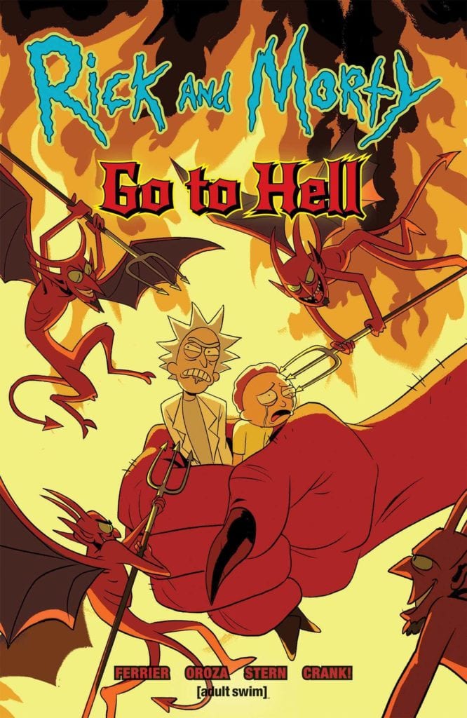
Since its premiere in December of 2013, Rick and Morty have grown into one of, if not the biggest shows Adult Swim had ever aired. To the five people who might not know the story, it follows Rick Sanchez and his grandson Morty as they travel across different realities and planets in raunchy comedic adventures. Due to this aspect of going to different realities, it allows the characters to cover various styles of adventures. From fighting aliens to traversing giant kingdoms, the adventures of Rick and Morty can be translated anywhere. This time around, their destination is a staple for most comic characters at one point or another. It’s time for Rick and Morty to go to Hell!
**Some Spoilers Below**
Story:
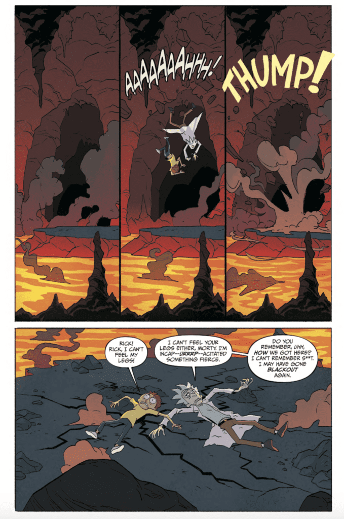
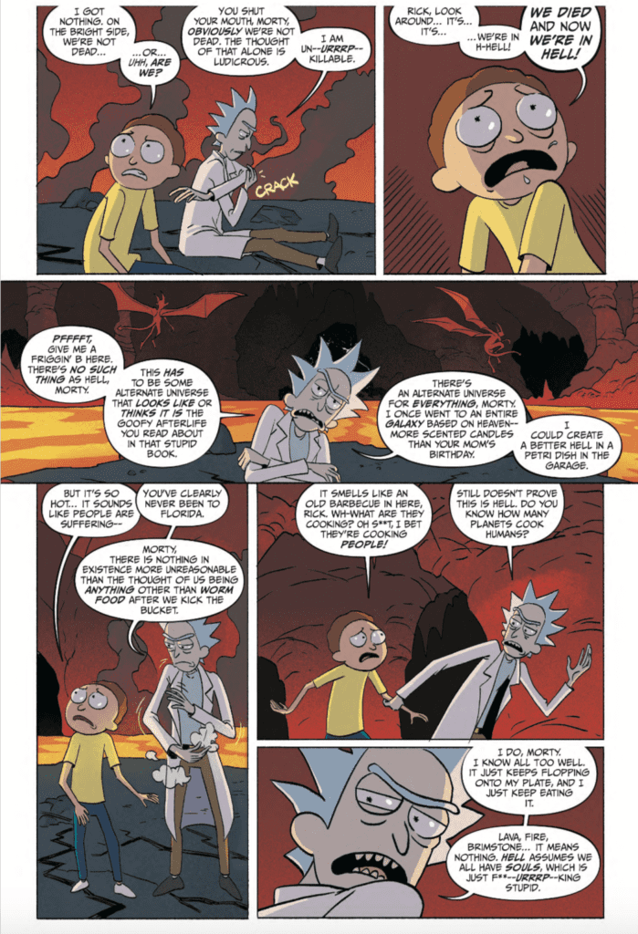
We open up with Rick and Morty crashing through the ceiling of Hell. Both of our protagonists can’t remember what happened before they crashed, but they take their surroundings in. While Morty begins to panic and wonders how they died, Rick doesn’t believe the place they arrived in is Hell. They soon come across other people, including the family, all confused about how they got there. Jerry believes that Rick is to blame, but the old scientist brushes him off as he takes Morty to the gates of Hell. The pair head into the fiery depths to get a grasp of where they are, though Morty has already accepted this place is Hell.
Maybe it’s because of the subject matter, but there was something that felt off about this issue. Rick is an atheist, and as such, believe the place they’re in is just a random reality that looks like Hell. This makes sense to Rick’s character, and he is written how he’s supposed to, but it still feels off. Usually, when comic book characters go to Hell, it’s to kill demons in the style of the Doom video game. Here, we’re dealing with denial, and it’s strangely unfunny.
That’s not to say that there aren’t funny parts in this comic. Morty pointing at the student Rick froze to death in the pilot, makes an appearance, as well as the human resources of Hell being the DMV, got plenty of laughs. Honestly, the funniest moment came from something as simple as Morty eating a burger made of maggots. The world(?) of Hell is actually fascinating, and I honestly can’t wait to see what the rest of the place looks like.
Art:
Constanza Oroza is the illustrator for this issue, and she captured the look perfectly. When I was first reading through it, I thought an artist from the show had to have played a part in the creation. When I reread it, I noticed that Oroza provided her own spin to the details. The slime from food, the tasing Morty gets at the gates, from the flames of Hell itself, she took the time to put as much detail as she could. It’s very well done, and I hope to see more very soon.
Conclusion:
Overall, this is a decent start for a Rick and Morty adventure. We have laughs where we need it, and commentary sprinkled throughout. Rick’s stubbornness to accept their situation is irritating, but that’s just his character. We know there is going to be a twist that will prove Rick right, but maybe we can get some sort of character development for Rick throughout this miniseries. When it comes to the art of the issue, Oroza did a fantastic job of capturing the feel of the original series while adding extra details. If you’re a fan of Rick and Morty, this might be a good comic for you.
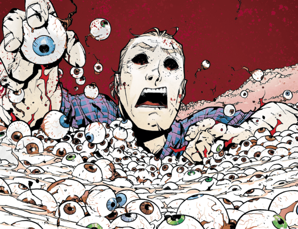
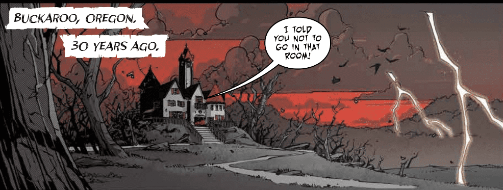
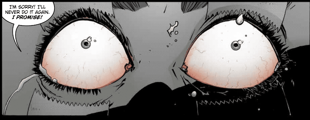
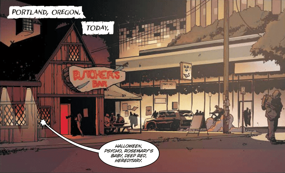
Sixteen serial killers have been birthed in Buckaroo, Oregon. Then came the Butcher in Black, Officer Vaughan, Agent Barker, the Devil Killer, and The Master. In Nailbiter Returns #1 from Image Comics, we learn there might have been a 17th butcher that is elated by eyeballs and an expert in eschatology.
Sequels
If there was ever a great time for Indie books to make a huge splash, now is that time. The big two publishers are scaling back the number of releases for the near future. DC and Marvel will not dominate the shelves in the first few weeks after shipping resumes. The time for Indie books to thrive is now.
We’ve learned from the film industry that sequels make money, they don’t even have to be decent, just tied into a previously successful franchise. Nailbiter was a fantastic series, so to return with a followup right out of quarantine is a fantastic move by Image Comics.
First Impressions
The Buckaroo Butchers are as unique as they are deadly. Some elicit instant fear and others seem silly, but it appears we’ll get a closer look at all of them. Something in this issue tells me so.
Creative Team
Joshua Williamson returns to writing with the same creative team. Mike Henderson restores Buckaroo with Adam Guzowski on colors and lettering by John J. Hill. I finished reading the first 30 issues before completely diving into this review. I wanted everything to be fresh.
Nailbiter is an amazingly well-written murder mystery that I’m reading for the first time since the initial monthly run. Nailbiter Returns picks up right after the end of Nailbiter #30. Reading through I noticed a misspelling in the artwork of Nailbiter Returns #1. The new eyeball fanatic has the list of Buckaroo Butchers on the wall and on it reads “HATE WATER”. It sounds like this new killer hates the very thing that allows him to live.
Henderson’s art looks just like the first 30 issues, and even more refined since then. The characters don’t look hyper realistic, but they don’t need to. Hill’s lettering is fantastic and appears reminiscent of the Joker terrorizing Gotham. Guzowski’s colors immerse us back into this creepy and mysterious universe. The palette is vibrant and jumps off the page thus keeping the eyes thoroughly entertained throughout. If you enjoyed the idea of Twin Peaks, but could do without all the weird, seemingly unrelated scenes, this is a great murder mystery for you.
Conclusion
Nailbiter Returns to the stands with a vengeance. There’s blood, there’s death, there’s old friends, and new acquaintances. With a little taste of YOU and Dexter, this run promises to delight. We learned the mystery of Buckaroo but many parts were missing. Are these the missing parts or just more chaos from the hellish depths of Buckaroo? The mystery unravels June 3rd.
What did you think of Nailbiter Returns? Are you excited to get back to the throat slashing world of the Buckaroo Butchers? Let us know in the comments below.
VENGEANCE OF VAMPIRELLA #7, available from Dynamite on May 27, follows the resurrected vampiress as she begins to form a rebellion against the demonic forces enslaving Earth. Meanwhile, Nyx has her own problem as the Fathers question her authority and force a power struggle. The demon war for Earth is coming.
Cover Art
Lucio Parrillo turns in another beautiful painting on the cover. There’s a special quality about Parrillo’s depiction of Vampirella that evokes the sexy, 70’s vibe that. The shadows are smokey, and the silhouettes for each character are not cartoonish or exaggerated. Parrillo’s cover would work just as well as a velvet painting in the lounge of a night club, in the best possible way.
Writing
Thomas Sniegoski continues Vampirella’s resurrection arc. Now that sunlight has been restored to the Earth’s surface, Vampirella searches for a way to bring back the Danse Macabre to help her and the humans with the rebellion.
Sniegoski is juggling a big story with multiple threads, so it would be easy for the reader to get lost. What helps keep it all centered and moving is Sniegoski’s attention to each character’s motivations and actions. Vampirella is trying to find herself after being “dead” for 25 years. Pendragon is looking to marshal all the resources he can to ensure the survival of humanity. Nyx is killing everyone and everything in her way to hold on to her seat of power. You never get the impression that a decision is random or an action feels out of place. It’s deceptively complex storytelling, and Sniegoski manages to keep it all clear.
Pencils/Inks
The art was uneven in the last issue (read the review here), but Michael Sta. Maria picks up art duties here and does a great job. Nyx gives a speech to a stadium full of assorted demons, and each one is drawn distinctly and cleanly. At one point, Vampirella and Pendragon are attacked by bed sheets. Yes, that’s right…bed sheets, and yet, Sta. Maria succeeds in making bed sheets dangerous. Really nice job here with the artwork from Sta. Maria.
Coloring
Omi Remalante Jr has coloring duty. The shading and eye color are the two high points from Remalante’s work. This is Vampirella after all, so there’s quite a bit of skin showing with the main character. Remalante uses shading to great effect to keep Vampirella’s skin from looking flat in a wide array of lighting settings. Vampirella is on a spaceship, then broad daylight, then inside a “haunted” safehouse and everything in between, but her skin never look plain or flat.
Vampirella’s eye pop with color in several spots to add emotional weight to her mood. The second to last panel on page 23 is the favorite panel for this issue specifically because of the pop of eye color. Vampirella has a look of shock/surprise at the sound of a terrifying voice, and the red color of her eyes is practically electric.
Lettering
Troy Peteri has done something interesting here with the lettering. Throughout a large chunk of the book, both Pendragon and Vampirella hear the disembodied voice of Passion (the “ship’s” computer) to guide them through their mission. Peteri chose to use an action bubble instead of a standard word balloon to keep the voices separate. It largely works, but it takes a little getting used to. The Fathers are also shown as a disembodied voice using a word balloon without the tail. Again, it largely works, but it may get a little confusing keeping all the voices straight in future issues. It may help if Peteri use more background colors in the balloons to create distinction between the voices a little more clearly.
Conclusion
VENGEANCE OF VAMPIRELLA #7 is a strong continuation of the resurrection story. The writing is solid and the art is significantly better than the previous issue. Vampirella fans should pick this up.
Author’s Note: Local Comic Shops (LCS) are going through a tough time right now with the pandemic outbreak of COVID-19. Comics fans of every flavor that care about his or her LCS should try to do what they can. So, here’s my part:
If you’re in Northern Delaware, South East Pennsylvania, or Southern New Jersey area, please take a moment to visit Captain Blue Hen Comics in Newark, DE. Say ‘hi,’ pick up a book, order a book (they’re on Comichub.com), and let them know you support them.
If you’re nowhere near that area, please find YOUR LCS using Comic Shop Locator and lend your support.
RED SONJA #15, available from Dynamite on May 20, picks up immediately after the events of last issue (read the issue #14 review here). Sonja must decide to either abdicate her throne to serve the man who murdered her mentor, or watch her people starve. Her choice isn’t easy, and the consequences may be more dire than she realizes.
Cover Art
Jae Lee paints a mesmerizing cover for this issue. There’s a whimsical quality to Jae Lee’s art that’s very reminiscent to Mike Mignola with respect to anatomy. The proportions for Sonja are misshapen in an almost dreamlike way. Where Mignola’s renditions are blocky and coarse, Lee’s paintings are dream-like and sharp. Lee’s cover is masterful work.
Writing [No Spoilers]
Mark Russell continues Queen Sonja’s story from the last issue, and he uses flashbacks to help her make a tough moral choice. Sonja’s past adventures, which ultimately caused some deaths, teach her how to balance the cost of life with the cost of death. Her choice isn’t one she takes or makes lightly. and past enemies seize the opportunity to pounce as soon as the decision is made.
Russell infused more action in this issue, and Sonja’s battle skills are on full display. However, the action didn’t take away from the progress of the story, and it nicely set up the conflict for future issue.
If there’s one area where Russell’s writing didn’t 100% work, it’s in the dialog. There were a few spots where the phrasing was too modern for the culture and the setting. These characters are in the middle dark ages and represent a diverse range of barbaric cultures. The last thing you expect to read is the Queen’s steward saying “Damn, we really are poor, aren’t we?” It’s a minor critique, but I felt pulled out of the story when those bits of modern vernacular sporadically popped up.
Art
Bob Q turns in another satisfying issue. Beyond the core story, Sonja’s flashback foreshadows a conflict that comes to a head in present day. Although that thread is written by Russell, Q peppers in the visage of a bull’s head in all the right spots to catch your eye and connect the dots. Q’s work is clever and adds layers to this book.
Coloring
Dearbhla Kelly turns in expert coloring work for this issue. Since a significant chunk of the story relates to flashbacks, Kelly adds an opaque filter to help the reader move through the time jumps and keep the events straight in terms of linear storytelling; all done with color. Kelly adds a nice signature by popping Sonja’s red hair just a little more than the surroundings during the flashbacks for visual interest. Really great job by Kelly.
Lettering
Hassan Otsmane-Elhaou does great work here with the lettering. The font is bold and easy to read. There’s no trace of clutter in any of the panels, which is especially impressive since the story is more dialog driven. Otsmane-Elhaou is particularly adept at panel transitions where the visual focus moves from the speaker to an object and the dialog follows. Those seamless transitions keep the story flowing without a skip or stutter in the reading experience. Nicely done by Otsmane-Elhaou.
Conclusion
RED SONJA #15 keeps the reader interested in the crimson-haired warrior as she struggles with problems that can’t be solved with a sword. The story is engaging, the art team turned out top-notch work, and I’m on board to see what happens next in this volume.
Author’s Note: Local Comic Shops (LCS) are going through a tough time right now with the pandemic outbreak of COVID-19. Comics fans of every flavor that care about his or her LCS should try to do what they can. So, here’s my part:
If you’re in Northern Delaware, South East Pennsylvania, or Southern New Jersey area, please take a moment to visit Captain Blue Hen Comics in Newark, DE. Say ‘hi,’ pick up a book, order a book (they’re on Comichub.com), and let them know you support them.
If you’re nowhere near that area, please find YOUR LCS using Comic Shop Locator and lend your support.
Welcome to Self-Published Spotlight, a regular interview column where I will be highlighting self-published comics and the creators and small print publishers who make them.
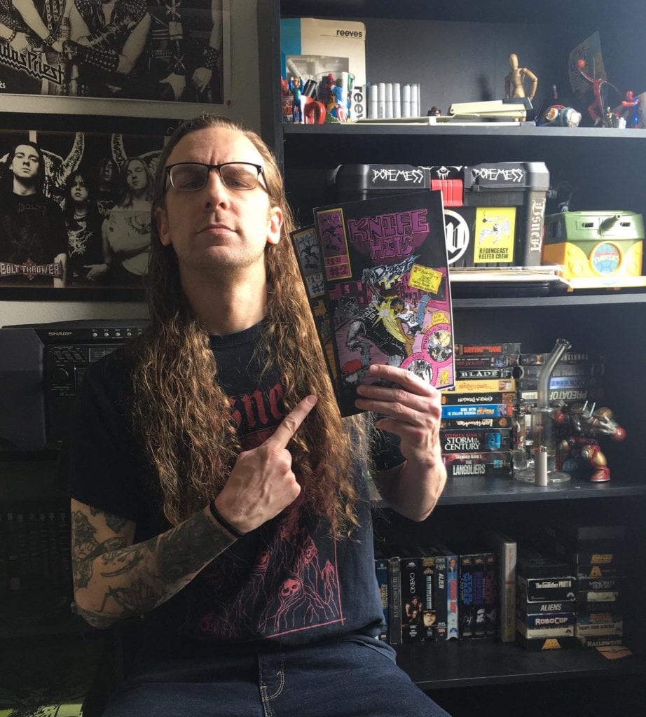
Do you like outlaw comics? Do you like punk rock/metal? Do you like anthologies? And do you like to sometimes hang out in a cloud of ‘smoke’? Well if it’s a yes to any or all of these things, you’re going to love Knife Hits Digest, a self-published gnarly anthology comic by A.R. Paulsen (aka Gloom Wvlf Comix). Knife Hits covers everything from pot-smoking barbarians to ninjas, zombies and punk rock house shows; all of it has a fantastic and irreverent attitude. And so does Paulsen himself, as we at MFR found out when we had the chance to chat with the comix artist.
Cartoonist A.R. Paulsen
Monkeys Fighting Robots: First of thanks for taking the time to talk to us at MFR. Adam Paulsen: Of course! Thanks for the opportunity. And thanks for picking up my comic.
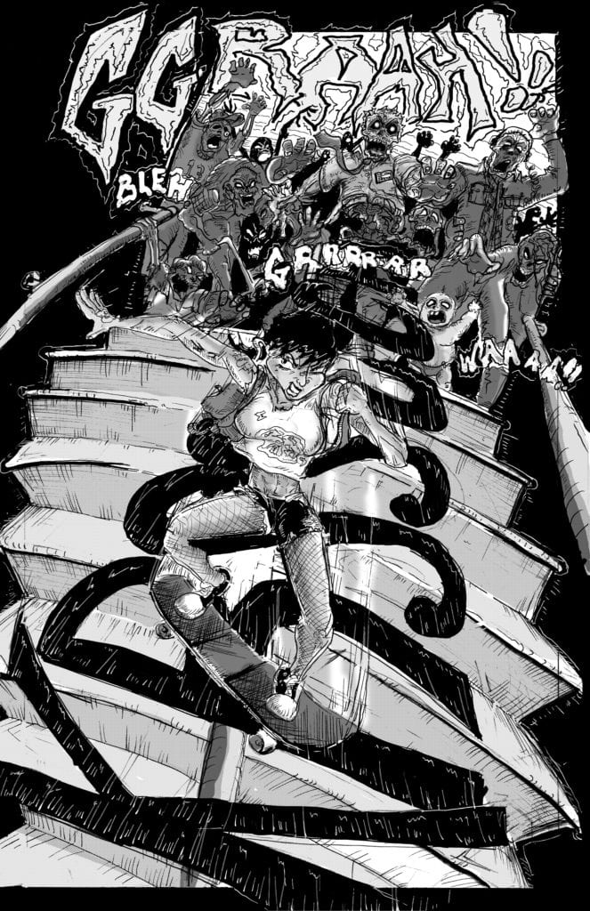
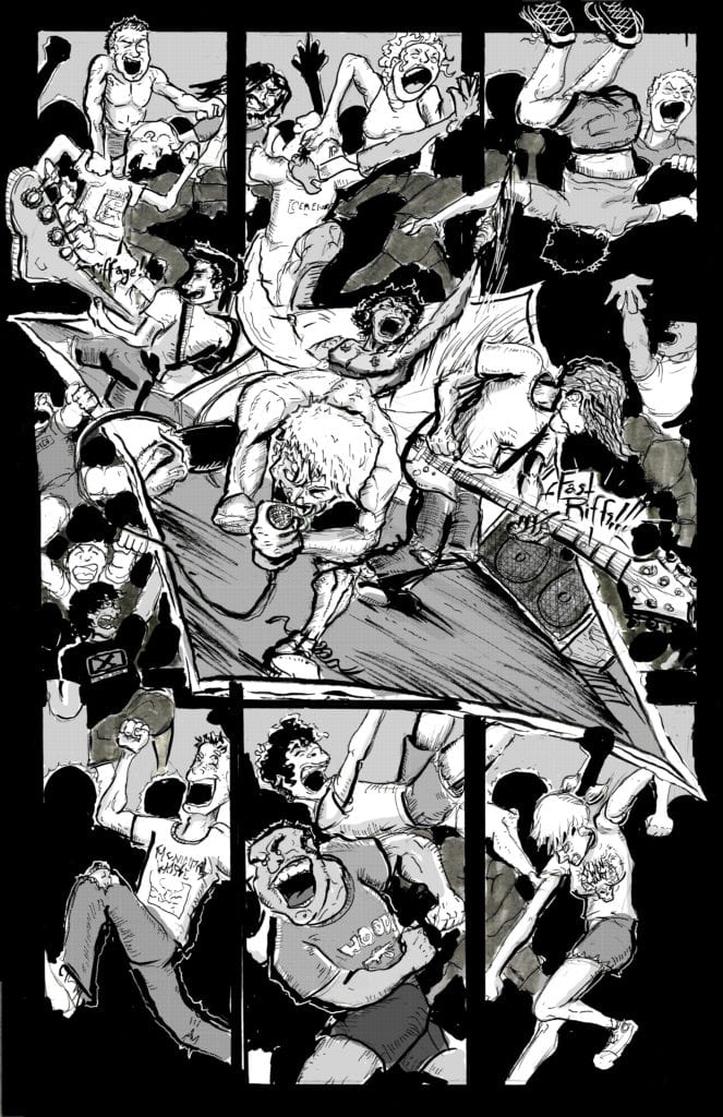
MFR: Yeah man, I was already stoked having read issue one. Anyway for those who may have not yet picked up your comic, why don’t you give them the scoop on Knife Hits Digest? Paulsen: Sure. It’s my black and white anthology series. Featuring stand-alone (mostly silent) stories. Intend to be read in one sitting. Inspired by a love for B movies and punk and metal music.From an artistic standpoint, each story is also a chance for me to practice a new way to tell a story or focus on a specific troupe. For example, the first story in Knife Hits #2 (zombie story with a punk skateboarding away from a hoard) is basically a chance for me to work out a chase scene.
MFR: That’s great. I love the idea of consuming a story like that, in one sitting. I also love that your book is an anthology. Comics need more anthologies. Paulsen: I feel ya, when I was a kid some of my favorite stories were ones I could just digest in one sitting. I mean there’s a time and place for epics, but as I got older I had less time to buy five to six issues to complete a story.
MFR: So the stories are consumed in one sitting, but I’m sure it’s a much longer process to put the bad boy together. So what’s your process like for a story? Like where and how do you start? Paulsen: I start with layouts and thumbnails. Fuck with those for a bit. And then move to pencils on Bristol board. I work most of my motion and dynamics out in pencil ( probably the longest part of the process) and once I’m happy with that, I go over it with blue pencil and erase the OG pencils. Then I add my inks and tighten up a lot of my rendering here. After that, it’s grey tones in photoshop do want to use screen tones at some point, but shits pricey and hard to find.
Skater vs. Zombies!
MFR: What about the printing process? What’s that like? Paulsen: Oh man, that was an adventure!
MFR (laughing): Okay, tell me about it! Paulsen: Well, it took me a sec to find a printer to work with. When I started out making my comic I knew I wanted it to be cheap. Cause I can’t stand it when comics are $5 or more. And as a rookie, I really felt my book needed to be super affordable. So that ruled out like all my online printing services. So I started shopping around locally and everyone was charging crazy prices, cause I think they thought I wanted to make a book. Finally, one dude got what I was going for and got me a barebones price. So I got my books down to about 1.67 an issue for #1 of getting the deal was the place printing it was crazydisorganized and they have to be babysat otherwise it doesn’t get printed (I actually went in and helped them print issue 2 (laughs), that’s why it didn’t take a month like last time (laughs). The second issue was a bit easier because it was fully funded by issue one and I knew how to deal with the printer (laughs). Also, hand cutting 500 comics makes your eyes blur (laughs).
Gloom Wvlf Art Studios
MFR: That’s awesome about issue one paying for issue two. That’s not common so quickly. So when did you get into comics? And what led you to self-publishing?
Paulsen: Always had a love for them, but as I got older and life happened comics kinda worked their way out of my life. My artistic outlet for a long time after that was playing in bands and writing music. But about four years ago, after not having been in bands for a good year or two I was really missing a creative outlet. So I started painting and doing pen and ink drawings for friends album covers and flyer art. And then at the beginning of last year (2019), I started rediscovering comics (all my outlaw shit from the 80s and 90s) and around the same time found “Cartoonist Kayfabe” on YouTube. After listening to those dudes for a few months I decided to get up the courage to do my own comic. So almost this same time last year I started the thumbnails for issue #1. And I decided to self publish because the bands I used to be in were all DIY, and had a strong work ethic in regards to self-promotion and not waiting for someone to do something for you.
MFR: I can totally see the punk flyer art in your work. There’s a total ‘zine feel to Knife Hits Digest. Paulsen: In my mind Knife Hits is like my “demo” (laughs).
MFR: That’s a great analogy. Paulsen: I looooove zines. When my last band toured we always had a large selection of zines at our merch table.
MFR: Where did the title Knife Hits come from? Paulsen: So are you familiar with what a knife hit is?
MFR: No. No clue. Paulsen: It’s one of the worst ways to smoke weed…
MFR (laughing): I’m ashamed I didn’t know that. But that is fantastic. Paulsen: So it involves heating up two kitchen knives over a stove or toaster. Once they are literally glowing you drop a chunk of resin (gnarly black pipe scrapings of leftover burnt weed and spit) then press the other hot knife on top of the other, stick your face over it and inhale. Hahaha. It is horrible. I named it that because it’s a gnarly intense way to get high, kinda like my comic; a really quick gnarly little dude.
MFR: Now I love the title even more. Paulsen: I’ve only done it a few times back when I was in my twenties and didn’t care. But now that I have access to good weed, I can wait to get high (laughs).
MFR: Do you have a favorite among the stories in Knife Hits so far or one you would say is the definite one to read? Paulsen: It’s hard to pick, they all have a special place in my heart. The hessian one from the first issue where he basically goes to Narnia I really enjoyed cause I got a chance to kinda build a mini world (draw a bunch of different environments and stuff). But ‘My War’ also holds a special place in my heart cause the event isn’t real, but the location and all the people in that comic are the homies I used to go to house shows and play in bands with. So that one was fun and nostalgic to draw. Taking the time to put real people in a story was fun.
MFR: Before I forget I gotta say I love how you use corner box art with a price. And also how you have changed the logo too. Paulsen: Thanks, man! I love corner box art (laughs). The inspiration for that was totally X-Men: Grand Design by Ed Piskor. His corner boxes are dope.
MFR: Oh yeah. I have a nice print I made out of one of his corner boxes up on my wall. Paulsen: Rad!
MFR: By the way the design of your cover is great. Paulsen: Thanks man, an homage to Cap #1 (Nazi punching!). In art and spirit (laughing).
MFR: So will some of the stories and characters be recurring? Paulsen:Yes, The Bongbarian has a three-part story that I have mapped out. His second story/ origin will be in issue 4. Have rough layouts done for that one. I’m excited to draw him again. And I think the second story will add some depth to his character and show his motivations for his killing spree. The Hessian is also going to be a reoccurring character of sorts, he’ll be in issue 3. And after doing My War I want each issue to have a story based of some real-life band/ tour shenanigans ( cause I have a bunch of great stories from touring days). And with Issue #3, I’m starting a recurring martial arts storyline called ‘Karate Island’.
MFR: Oh, now THAT sounds awesome Paulsen: It’s based on Mortal Kombat and JCVD movies (laughs).
MFR: Perfect! Or should I say “ Flawless Victory!”. So how long do you plan to keep Knife Hits going? Paulsen: I have so many stories I could go for a minute. At the moment I have five issues mapped out, and my original goal was to print at least four.
MFR: Are there any other projects you want to do or are working on outside of Knife Hits? Paulsen: After four issues at least I’m going to re-evaluate things. Consider doing a story in color, possibly raise the price, and start shopping it around to publishers. I’m doing album art still, and I’ve been working on an idea for a children’s picture book too actually. To totally boil down the kids’ book, I’d want it to be about a kid using music to cope with difficult emotions.
MFR: That’s diverse my dude. Awesome! Paulsen: Thanks, brother!
MFR: Where’s the best place for folks to find your work? Paulsen: Right now it’s my website gloomwvlfart.bigcartel.com and Empire Comics in Sacramento, Ca.I keep wanting to get them in more shops, but I’ve been selling out before I can distribute any!
MFR: You got a bestseller right there.! Well, thanks for taking the time again. We will eagerly away Knife Hits #3 over here at MFR! Paulsen: Thanks! Very much appreciate it!
You can follow A.R. Paulsen on his Instagram (@gloom.wvlf.art) and you should.


")