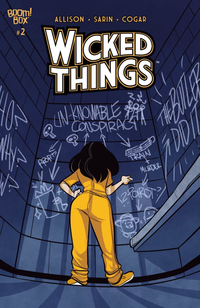
Lottie is determined to solve this case on the cover of Wicked Things #2
WICKED THINGS #2, available this Wednesday from Boom! Box brings us back to a favorite character, set in a world many fans love. We are, of course, talking about Lottie Grote and Giant Days. She has now grown up and begun a new series once again.
Lottie is determined to solve this case on the cover of Wicked Things #2
***SPOILER WARNING***
Lottie Grote may not be a character who made many appearances in Giant Days, but she quickly became a fan favorite. Which explains her multiple appearances throughout other series, including Bad Machinery and now Wicked Things.
Once upon a time, little Lottie was a teenage detective, a brilliant one at that. Now her friends have found other priorities in life, and Lottie herself is quickly aging out of the whole ‘teenage’ part of her reputation.
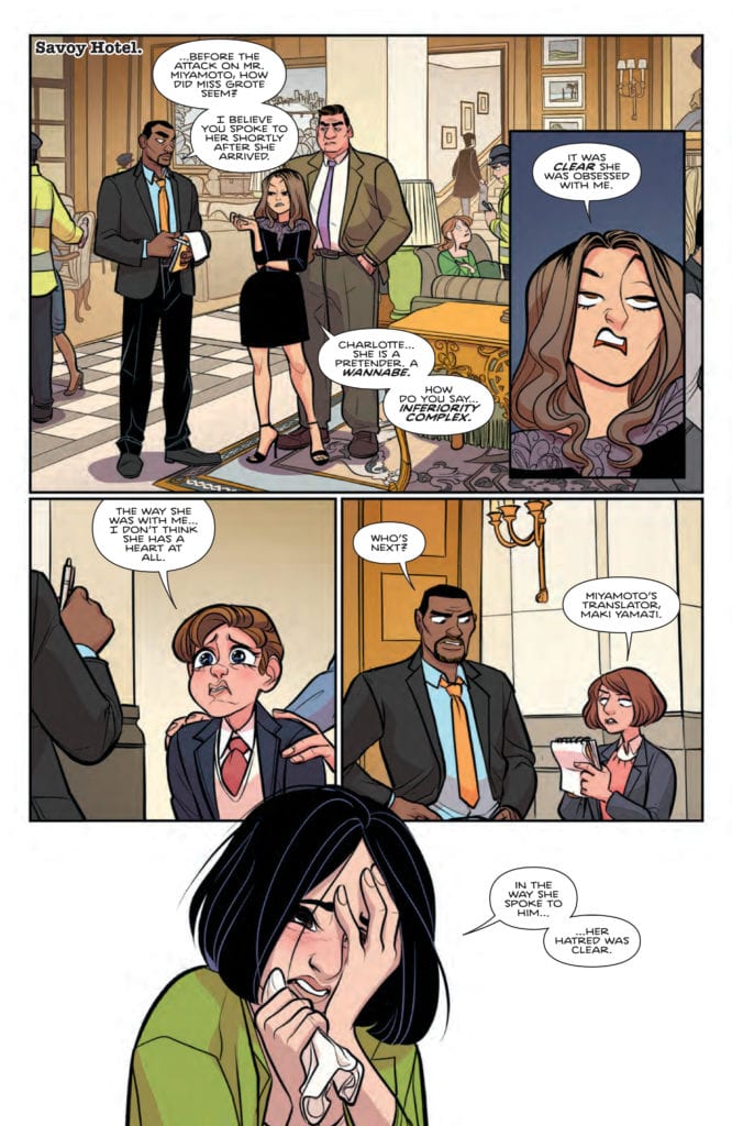
To make matter worse, Lottie has been framed for murder. That may seem like quite the jump to some people, but those people don’t solve mysteries for fun. Lottie can figure this out, she just needs some time to figure out how it all goes together.
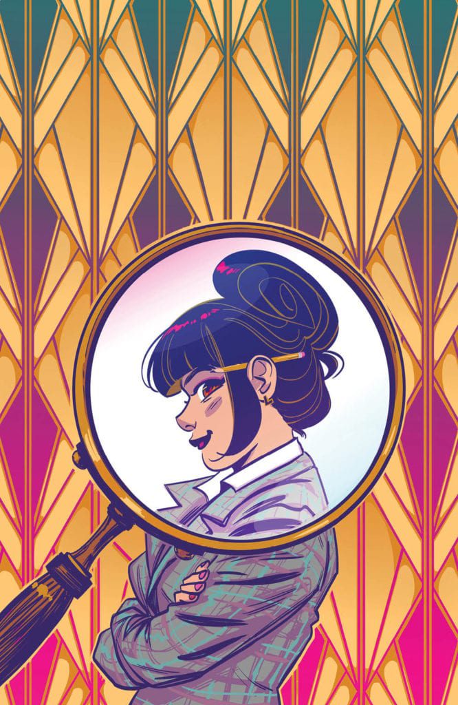
Lottie’s looking fierce on this alternate cover of Wicked Things #2.
The Writing
Wicked Things #2 was written by John Allison, the man behind this and many other series that fans have come to love and cherish. Lottie’s journey may not be what she expected, yet it’s already proving to be highly entertaining.
Especially for those that desperately wanted to see this world, and it’s characters, once again. This issue brings with it another hefty dose of Lottie, alongside her BFF (Claire), and even a brief cameo from her sister (Sarah).
To be honest, Sarah’s cameo is without a doubt the funniest moment in the issue, all while showing how complicated sisterly relationships can be. The rest of the issue focuses on exactly how bad of a situation Lottie has found herself in.
The whole thing is cleverly written, with sardonic and intriguing characters alongside an amusing plot. It’s everything fans could have hoped for from this miniseries. The only downside is the relatively short length of the series.
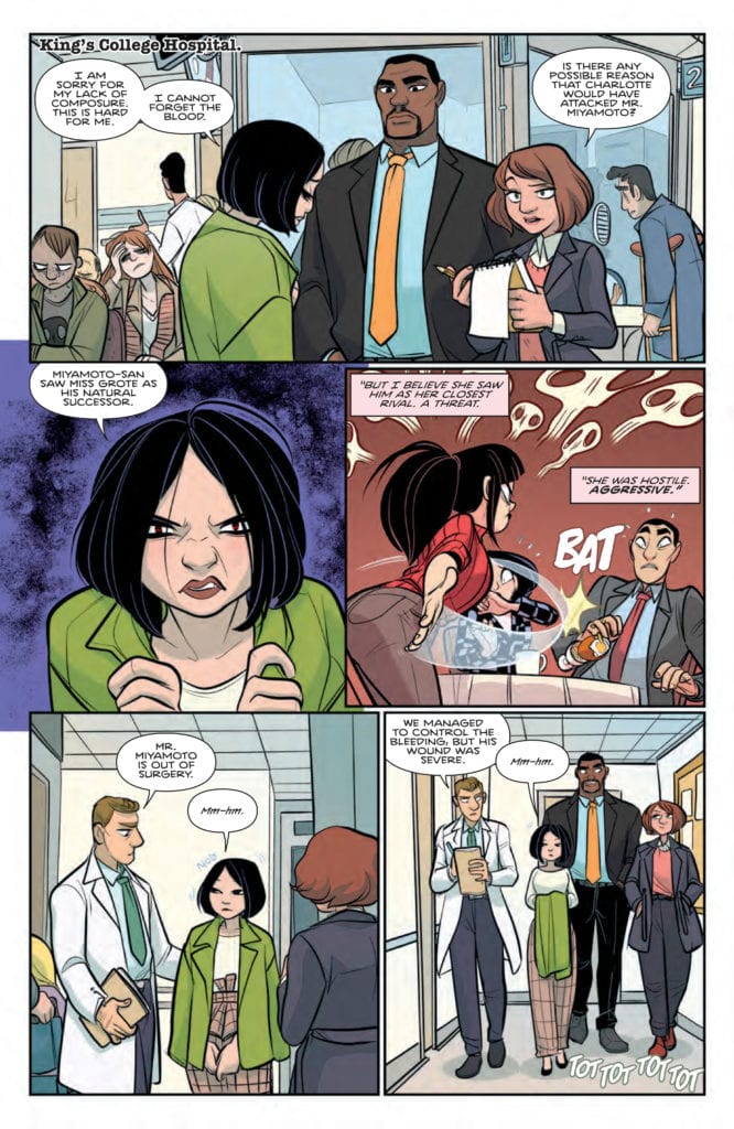
Things aren’t looking good for Lottie…
The Art
The cute and quirky style of Giant Days meets the world of detectives in Wicked Things #2. Much of the issue is set around a crime scene, and what isn’t occurs within a prison. Needless to say, it sets the tone quite nicely.
Max Sarin is the lead artist for this series, providing that iconic style we’ve all come to know and love. Lottie and everyone else may have grown up, but they’re still recognizable for who they are. Though in some cases, their style has improved for the better (love the new look, Sarah).
Whitney Cogar is the one behind the colors, which are divine. They’re bold and bright, making great use of pops of color as well as white space. The combination makes for eye-catching pages. All of that contrasts with the plot, but in a way that works.
Finally, Jim Campbell is behind the lettering, something that’s clear to many fans right from the start. The bold lettering is the final touch that this series needed, flawlessly adding tone and order.
Someday karma is going to catch up with this little liar.
Conclusion
Wicked Things #2 was another diverting excursion into a world we’re all familiar with – but with a twist. Lottie’s tale has been a trial (pun intended), but there’s no doubt that it is likewise entertaining for the fans.
Now that Lottie has made a deal, it’ll be interesting to see what ends up happening next. This is probably not the path she saw for herself when she pictured working alongside the police, huh?
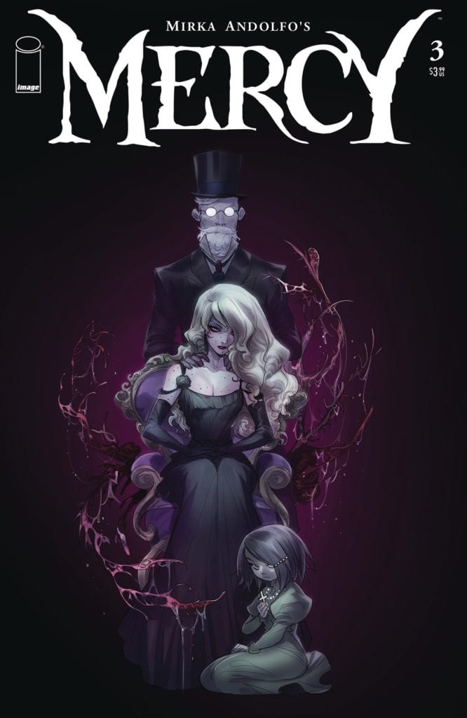
What a twisted family to be found on the cover of Mercy #3.
MIRKA ANDOLFO’S MERCY #3, available this Wednesday from Image Comics dives into the grand scheme of Lady Hellaine, and the poor town that will soon play part in it all. A haunting tale with daunting and terrifying notes aplenty, this is not one to miss.
What a twisted family to be found on the cover of Mercy #3.
***SPOILER WARNING***
The twisted tale continues in Mercy #3. Lady Hellaine is a woman (creature?) with many plans, and they all have to do with Woodsburgh, a town in the middle of nowhere. While her plan may have hit a few snags on the way, there’s plenty of reason to be concerned about the fate of these townspeople.
The Lady has always been accompanied by her keeper, but now she also has a new companion. One who oddly enough believes the wayward woman to be her mother. That is surely not something that was in the plans, though perhaps it will work out in her favor.
One thing is certain, this little town in the middle of nowhere has had its fair share of pain and suffering. In fact, the more we learn of it, the more it seems like the two are directly connected. All that’s left is to put the pieces of the puzzle together.
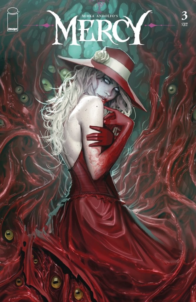
Lady Hellaine is looking haunting on this alternative cover for Mercy #3.
The Writing
Mercy #3 is a chilling read – and it is also intriguing. The sort of horror story that you simply cannot turn away from. Mirka Andolfo has created a spellbinding story of monsters and men, one that is both spectacular and daunting.
There are many elements worth appreciating in this issue. Lady Hellaine’s multiple struggles, for example. Apparently it is not easy to pretend to be human – especially not when one is aiming to be a sweet, beautiful, and approachable one. That is really only the beginning of her struggles, as readers are quick to learn.
It’s actually refreshing, seeing all of the work that goes into hiding a monster. It is reminiscent of classic horror tales involving vampires, but with a unique twist. The end result is something satisfyingly vicious, ideal for horror fans.
Let us not ignore the other element of this series; the implication that there’s a love story to be found. This issue may very well have sown the seeds for that romance. Or perhaps not, only time will tell on that one. One thing is certain; the conclusion to this issue is going to leave readers on the edge of their seats.
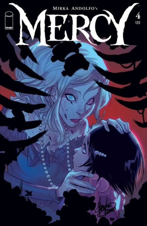
A peek at what is to come with Mercy #4.
The Art
As with the other two issues, Mercy #3 was created largely due to Mirka Andolfo, who is the lead artist as well as the writer. That being said, they did have help. There were two color assistants; Gianluca Papi and Francesca Carotenuto, as well as a letterer, Fabio Amelia. Together these artists created something that is truly breathtaking.
Well, breathtaking and horrifying. That actually works to spectacular effect here. The series is stunning – there can be no doubt of that. Yet it isn’t afraid to turn red with blood and gore as needed. The combination is striking, to say the least.
Everything from the character designs to the horrifying elements are masterfully presented here. Add in the advanced sense of color, and some very fine lettering, and you’ve got yourself a remarkable series.
Conclusion
Mercy #3 went a long way in advancing the plot of this unique series. The monster’s plan may not have been fully revealed, but readers could probably make an educated guess at this point. The sudden addition and revelations at the end of this issue will be enough to get readers coming back for more.
NOMEN OMEN #6, available this Wednesday from Image Comics continues a tale twisted by magic and grief. Becky is about to fully embrace the magical world in which she has been thrown into, but at what cost?
Becky has come into her power in Nomen Omen #6.
***SPOILER WARNING***
Rebecca, aka Becky, is not exactly what you’d call a normal girl. From the first moment she was introduced, readers knew that she was different. Then she had her heart ripped out – and kept on living. Now she’s on a path to get her heart back, along with a healthy dose of revenge.
That brings us to Nomen Omen #6. Becky has officially started a journey that she can not walk away from. This is a world full of magic and creatures, none of whom are inclined to be kind, or to let any slight go.
There’s a catch though. These magical beings haven’t survived so long by letting humanity know about them. There’s always been a rule of secrecy, but why would somebody like Becky care for their rules? After all, they’re the ones who started this war.
A chilling alternative cover of Nomen Omen #6.
The Writing
Nomen Omen #6 is the start of ‘Wicked Game’, a new plot arc in the series. Written by Marco B. Bucci, this is an issue intend to get revenge first, and answers later. Becky is done being that cute little plaything that all these strange creatures assumed she was.
This is an issue showing us an all-new side of Becky. She’s strong and powerful and looks more like one of the beings we’ve seen previously than a human. Though looks can be deceiving, can’t they? The ante has been upped, and this time by Becky herself.
It’s intruding seeing the power play at work here. There are multiple parties involved, all of them with their own ultimate goals – as is always the case with magical creatures, it seems. The real question is; is Becky acting on her own, or has she unknowingly become a pawn?
There are several twists and revelations within this issue, none of which will be spoiled here. They’re much better suited for the context they’re designed for. They do make for a thrilling read – the sort that will stop and make you think.
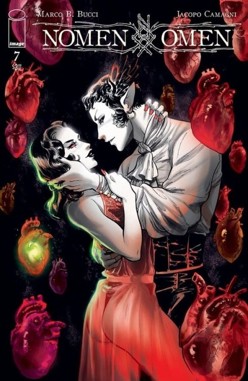
What is the cover of Nomen Omen #7 hinting at?
The Art
The artwork behind Nomen Omen #6 is striking, to say the least. It’s dynamic and beautiful, with a strong sense of the otherworldly. Every scene in this issue is a poignant reminder of the lack of humanity being portrayed on the pages.
Jacopo Camagni was the lead artist for this issue, creating something truly fascinating. The scenes range from beautiful to disturbing, and then back again. It’s all very carefully planned out, with the intent to make the readers pause and feel a variety of emotions.
The decision to allow magic to be the colorful force on the pages is still a brilliant one, even six pages in. Now there’s more color than ever, and you can obviously guess what that means. Yet it’s still highly evocative.
The lettering was done by Fabio Amelia, and it is just as carefully thought out as the artwork itself. It’s a perfect fit for this series, both in format and style.
Conclusion
Nomen Omen #6 continued this intriguing tale, bringing us that much closer to the end. There are nine issues left with which to resolve this conflict. By that we of course mean, Becky has nine issues left to steal back her heart – in the most literal sense. Something tells us it’s going to be a thrilling ride the whole way there.
To commemorate Green Lantern’s 80th Anniversary, DC Comics is releasing a special 100-page collection of short, Green Lantern adventures from assorted writers and artists. What makes this collection particularly special is an adventure, penned by the late Denny O’Neil, that reunites Green Lantern with his emerald colleague Green Arrow, titled “Time Alone”.
The reunited Emerald Enforcers square off against the Clock King in a flashback to their road traveling days. The encounter leads to some introspection as each hero examines their approach to fighting crime and how they can do better.
You can read a FREE PREVIEW of O’Neil’s story via the links in DC’s full press release below.
Is this a signal that we could be seeing more Green Lantern/Green Arrow teamups from DC in the near future? Let us know what you think in the Comments, and please share this article on social media to keep the conversation going.
PREVIEW DENNY O’NEIL’S FINAL ORIGINAL DC STORY FOR FREE!
Today, ring-slinging fans everywhere are rushing to their favorite comic book stores to pick up a copy of the Green Lantern 80th Anniversary 100-Page Super Spectacular. This commemorative tribute celebrates eight decades of the greatest heroes to wear the ring and recite the oath of the Green Lantern Corps. Many of comics’ greatest storytellers have lent their talents to this must-have anthology, including Geoff Johns, Ivan Reis, Gary Frank, James Tynion IV, Ron Marz, Darryl Banks, Peter Tomasi, Robert Venditti among others.
This landmark issue also features the final original DC story written by the late Denny O’Neil, “Time Alone.” Featuring art by legendary artist Mike Grell, the story reunites Hal Jordan with Green Arrow Oliver Queen in an flashback story from their days as “Hard Traveling Heroes.” A particularly violent encounter with the villain Clock King puts Hal and Ollie back out on the open road, both of them reexamining how they fight crime, and how a different approach could make them both better heroes.
In honor of Denny’s final story for DC, the publisher has provided a free online preview of “Time Alone,” available for reading here . The Green Lantern 80th Anniversary 100-Page Super Spectacular is available now at participating open and operating comic book stores and digital retailers and sells for $9.99. To find the nearest store, check out the DC comic shop locator, www.dccomics.com/comicshoptracker.
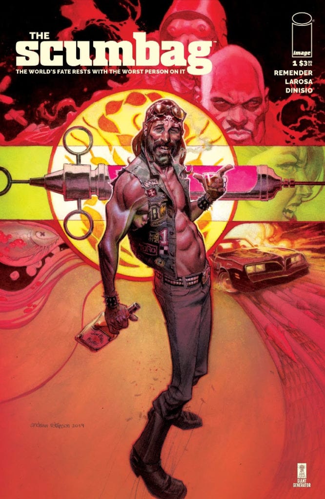
Rick Remender, co-creator and writer of such titles as Deadly Class and Fear Agent, is launching a new title for Image Comics called THE SCUMBAG. The new series chronicles the adventures of “Ernie Ray Clementine, a profane, illiterate, drug addicted, biker, with a fifth-grade education and the only thing standing between us and total Armageddon”. The twist is that Clementine “accidentally received a power-imbuing serum making him the world’s most powerful super spy.”
You can read all about Remender’s take on the new series and check out a few preview images below.
Is this another Remnder hit in the making? Tell us what you think in the Comments section, and please share this post on social media to keep the conversation going.
BESTSELLING CREATOR RICK REMENDER LAUNCHES NEW SERIES THE SCUMBAG THIS OCTOBER
The fate of our world rests in the hands of the worst person on it
PORTLAND, Ore. 06/23/2020 — New York Times bestselling writer, showrunner, and terrific disco dancer Rick Remender (Deadly Class, Black Science) launches an all-new comedy espionage series The Scumbag from Image Comics, set to hit shelves this October. This new ongoing series will feature a murderers’ row of all-star artistic talent rotating each issue. The first issue showcases the stunning work of Lewis LaRosa with subsequent chapters and covers by brilliant talents such as Andrew Robinson, Eric Powell, Tula Lotay, Wes Craig, Roland Boschi, Simone Di Meo, Duncan Fegredo, Yanick Paquette, Mike McKone, Dave Johnson, and Moreno Dinisio.
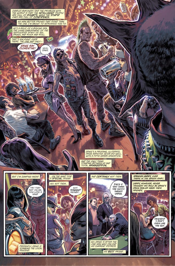
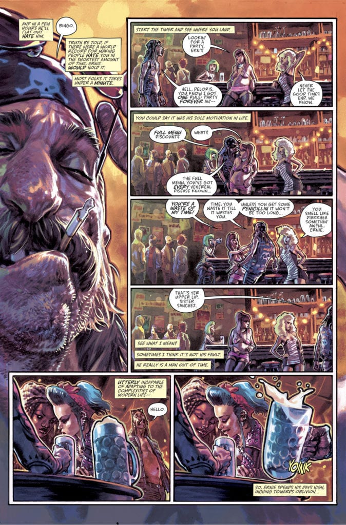
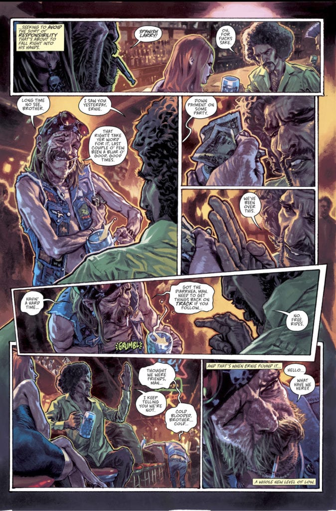
The Scumbag is the story of Ernie Ray Clementine, a profane, illiterate, drug addicted, biker, with a fifth-grade education and the only thing standing between us and total Armageddon because this dummy accidentally received a power-imbuing serum making him the world’s most powerful super spy.
Ernie is a relic of a bygone era, the living embodiment of sex, drugs, and rock and roll—so, this doesn’t make things easy for the spy organization that needs his help as they bribe, cajole, and manipulate Ernie to choose between his own self-interests and doing what’s right.
The Scumbag will join Remender’s growing empire, known as Giant Generator Studios, alongside such beloved series as Death Or Glory with Bengal, Seven to Eternity with Jerome Opeña, Low with Greg Tocchini, Fear Agent with Jerome Opeña and Tony Moore, The Last Days of American Crime with Greg Tocchini, Tokyo Ghost with Sean Gordon Murphy, Black Science with Matteo Scalera, Strange Girl with Eric Nguyen, and Deadly Class with Wes Craig.
The Scumbag #1 will be available at comic book shops on Wednesday, October 21st.
The Scumbag #1 will also be available for purchase across many digital platforms, including Amazon Kindle, Apple Books, comiXology, and Google Play.
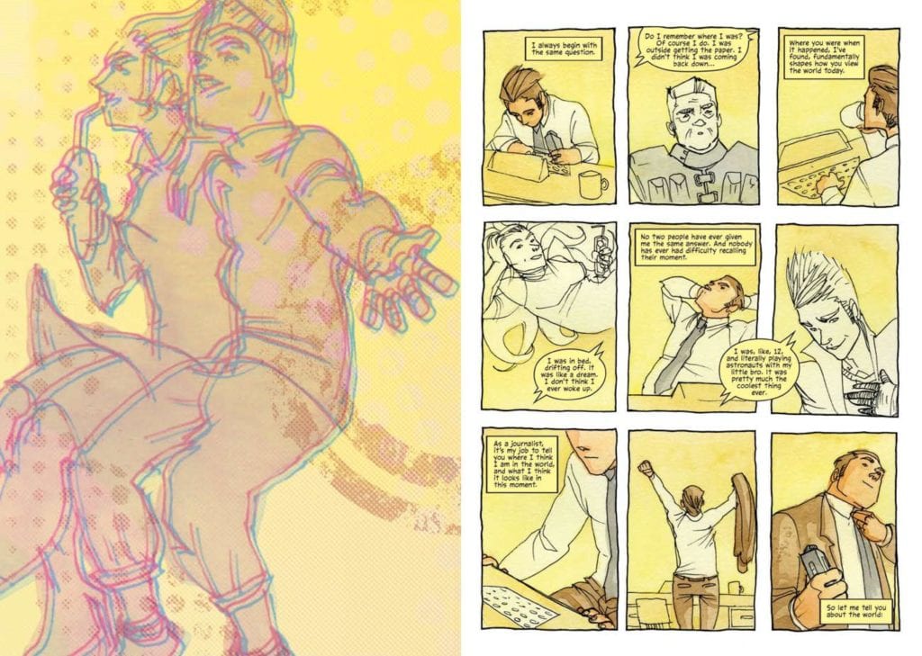
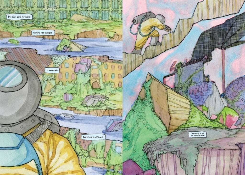
A Radical Shift of Gravity trade paperback hits your local comic book shop on June 24, but thanks to IDW Publishing, Monkeys Fighting Robots has an exclusive interview with writer Nick Tapalansky and artist Kate Glasheen.
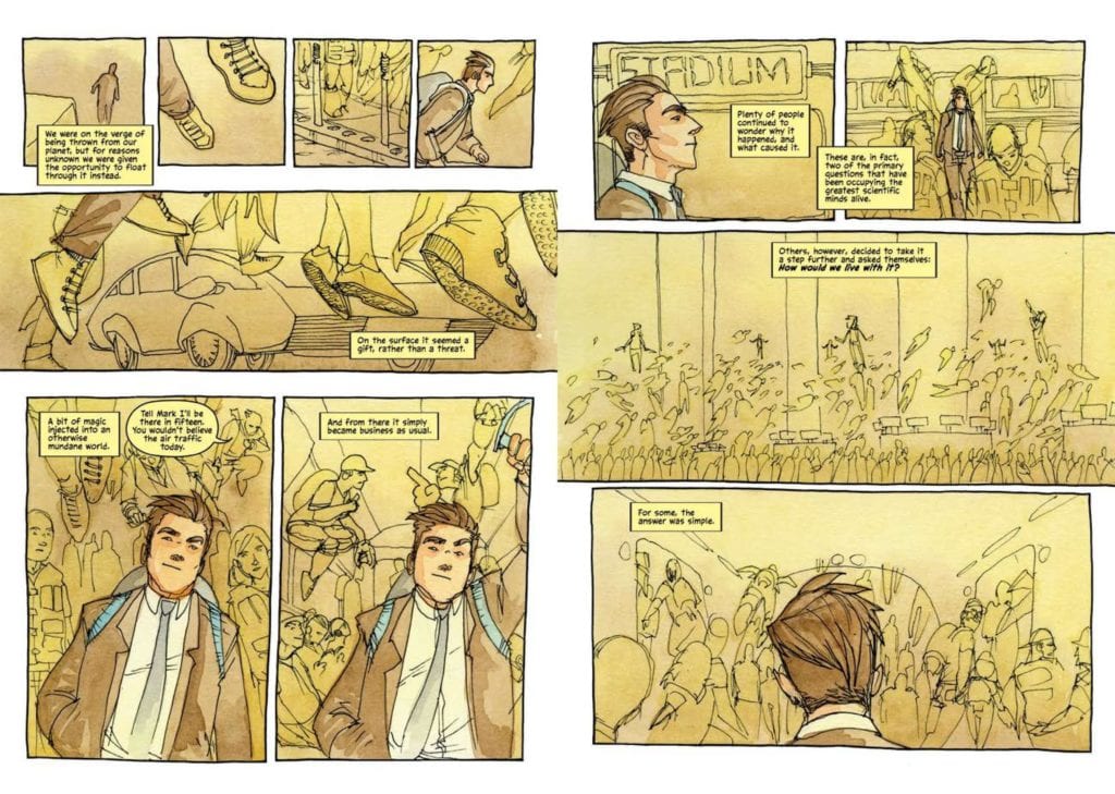
About the book: The world is changing. Gravity, a force everyone takes for granted, has begun to disappear. As a young journalist, Noah spends his days documenting the wondrous and terrifying shifts in the world around him. But Noah’s life is changing, too. Falling in love and raising a rebellious daughter adds new meaning to life in this mysterious floating world. As he covers the invention of new sports, interviews experts, and even journeys into space, each experience shapes how Noah views the world and, in turn, his relationship with his family. And as his daughter grows older, Noah faces the challenge every parent dreads and dreams of: letting go.
A Radical Shift of Gravity is a science-fiction fable: a graphic novel that explores the ties that bind a family together, the forces that threaten to pull them apart, and the quiet beauty of a world where everyone is floating away.
Nick Tapalansky And Kate Glasheen Interview
Even though it’s science fiction, A Radical Shift of Gravity hits home because of the massive changes happening around the world. What are some challenges and fears we might share with the main characters, Noah and Elycia?
Nick:Boy, where to start? We initially set out to tell a story about a family experiencing some pretty normal challenges set against a fantastic world. We wound up with a book that was far more timely (for better and for worse) and relatable than we maybe could have imagined.
Concerns about global crises, from COVID-19 to global warming, certainly come to mind first. How do we adapt to these changes? Is there any good to be done, or any harm we can stave off, delay, or prevent entirely? Is it safe to step outside, go to the supermarket, do the things I took for granted three months ago?
Then you throw in the family dynamic: how do I raise a toddler/tween/teen in this world? How do I keep them safe and make sure they have an opportunity to grow and explore and change without putting themselves very literally in harm’s way? And as that child, how do I find my way in the only world I’ve ever known when I’m not the least bit frightened of it, but the people closest to me may have strong feelings to the contrary?
Kate:It’s worth noting that Nick and his wife Jackie had a baby almost immediately after we signed with Top Shelf, so Nick got to draw from 100% authentic parental terror for inspiration during development.
Nick:It’s true! And that general dynamic and fear is a perennial concern, no matter the state of the world. But when we set out to tell this story, I think we thought creating such a fantastic, fable-like global change would seem far more foreign and metaphorical than it does in 2020.
What inspired you to tell this story from multiple points in time, and how did you pull off that tricky structure?
Nick:A lot of false starts trying to approach it as a linear narrative, haha! Putting it all into an order that worked involved a very complicated spreadsheet and lots of color coding.
It’s pretty much always been split up into multiple points in time, but thinking about them going directly from start to finish never sat right with me. When I finally committed to splitting things up I still wrote them each as individual segments, but knowing I was going to weave them together made that process more fun for me. After they were all written I broke out each scene and then started thinking about them as individual components, looking for break points in each era and finding commonalities between scenes so that the transition wouldn’t feel entirely random.
Kate’s stellar work in creating distinct palette’s and visual motifs for each era did a lot of heavy lifting to keep readers from being unbearably disoriented in these transitions, though I think we both were hoping the transitions would keep folks just a little unmoored while following along.
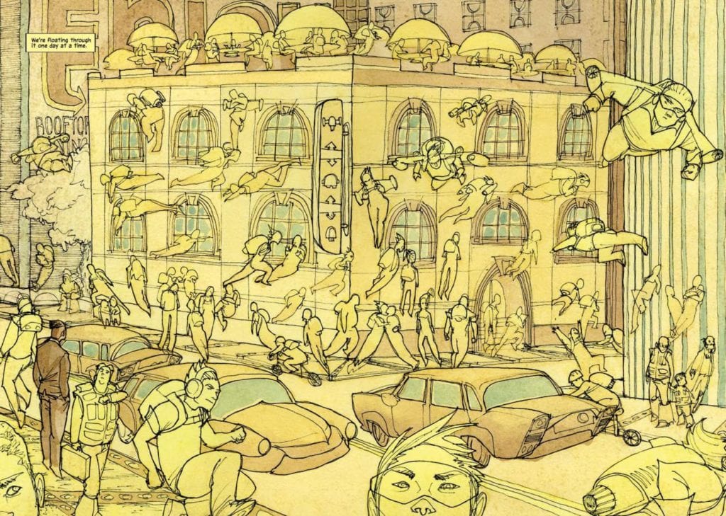
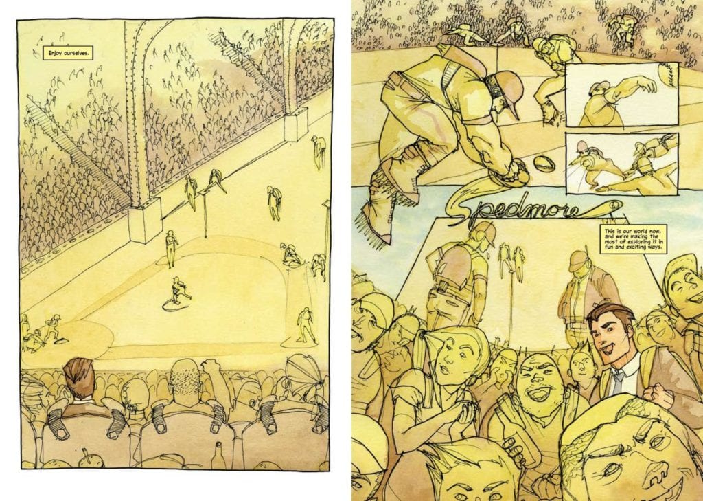
Kate:Each era represents a different popular attitude towards the shifts as well, and I tried to support that in my choice of colors. For example, the opening era, The Golden Age, is right after the first shift. Gravity is less powerful, but not in a hugely life altering way, so people are really embracing the novelty of it. It’s a whimsical time, it’s fun, new products are being rushed out that focus on the enjoyment of the lessened gravity, new sports are invented to be played on multiple planes. It’s almost hedonistic— we modeled it after the roaring twenties philosophically and the Art Deco movement visually. So the base color for The Golden Age is a yellow gold color both for the literal component, and to capture a symbolic joy and a glitz and glamour.
A second example of that is in the chronologically final era we refer to as The Last Journalist on Earth. Noah’s alone on the planet (aside from a few stubborn planetary squatters) and gravity’s just gone completely. He spends these days undertaking his final assignment and reporting on the state of the planet. Nick and I decided at some point that gravity was like an ocean, and though gravity is gone at this point, its presence is most notable in its absence. So I used a soft blue color to represent and to represent the loneliness of Noah’s current journey, despite it not being a sort of pleasant one for him, but also act as this omnipotent ocean voice that we wanted gravity to have.
Nick:There’s a general sense of the Earth reclaiming itself sneaks in throughout the eras and creates some unique visual opportunities. Narratively it could be considered part of the inexplicable situation humanity finds itself in, but the interpretation is up to the reader. The natural reason being that people were hiding inside and not maintaining infrastructure, and weren’t polluting, and the planet responded by thriving in an almost aggressive way. But also, the idea that the world was just done with humanity and kicking us out using every tool at its disposal is on the table.
In either case, it was another element that Kate was able to leverage to showcase changes, both in the presence of this encroaching growth and how its presence impacts color, layout, and action. It’s most present in a segment of the book we think of as The Reclamation, where Noah and Elycia visit a community trying to recreate life on Earth prior to the shifts. Lush forestry and plant life spills across pages and panels, making its presence inescapable for the reader, and the characters.
Kate:Right. The base color for The Reclamation is green, to reinforce nature’s exponential take-back. I also love that the title, “Reclamation,” is as much a question as a descriptor. What’s being reclaimed, and who’s doing the reclaiming? The Grounded Community, and their old way of life? Or nature, and a much, much older way of life?
The page layouts in this book vary quite a lot: from traditional grid structures to double-splash-pages to triangles, circles, and even more unconventional shapes. How do those layouts help tell the story, and how do you decide the look of any given page?
Kate:To live through each era is a markedly different experience from the one before or after. It was easy for me to picture the old man who lived through all of them, tethered to his front porch, lamenting the bygone days of joyfully rocketing to the big game while his family was floating off the planet completely, right in front of him. I wanted the reader to be able to empathize with the crotchety old gravity man, or at least feel for him for living a life that got him to that place. Gravity, the force behind the fable of our book— also affects how people experience time. When it functions as we know it in reality, time is linear. As gravity ebbs and flows, and eventually disappears altogether, that experience becomes more jumbled, more contemporaneous. We wanted that surreality of time to extend beyond the fourth wall, to also affect the reader.
In the Golden Age pages, I tried to keep the layouts more ordered, more straightforward, and relatively traditional, in panel placement and flow since it largely resembles our way of life and experience of time. Then if you jump to The Last Journalist on Earth, I wanted each page to feel untethered by the rules of gravity and the rules of comics. I wanted to reflect Gravity’s abandonment of Earth through panels floating off of the top of the page, or hanging in the gutter space in unorthodox ways.
Another example of this occurs in The Last Journalist on Earth. There’s one page where Noah is gathering ingredients for a meal. Since the order of events isn’t important in this moment—it doesn’t matter if Noah grabs parsley before basil in the way it would matter between two characters conversing— I wanted to use this opportunity to mess with chronology of information delivery. I collapsed the time of this moment by trying to display these four panels in a way that the eye would read them almost simultaneously, or at least in a way that was different from the expected left to right, top to bottom, reading order. Or, at least, that’s what I was trying to do and I hope I did it.
What are your thoughts on the interview? Do you plan on picking up a copy of A Radical Shift of Gravity? Comment below with your thoughts.
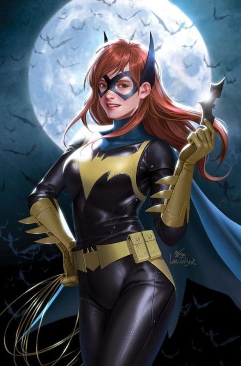
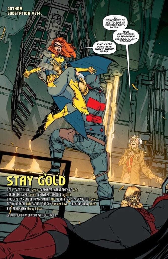
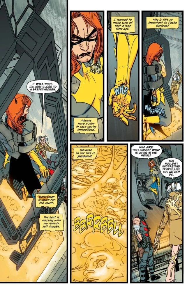
Staying Gold is literal on the cover of Batgirl #46
BATGIRL #46, available now from DC Comics, concludes the latest plot arc, while leaving fans more concerned than ever about the fate of a beloved heroine.
Staying Gold is literal on the cover of Batgirl #46
***SPOILER WARNING***
Batgirl has been doing a brilliant job of holding her own in recent times. Yet the recent cameo from Batwoman is a poignant reminder of Batgirl’s past – and origin. With everything going on in Batman’s series, as well as other events, it forces fans to remember Batgirl’s roots.
Even while she’s actively trying to forge something new for herself here. She’s trying to change her city for the better. Not just focusing on crime, but by helping to create better laws, cleaner initiatives, the works.
She’s also working on her personal life, which is something that too many heroes and vigilantes neglect. When the work gets tough, you need an escape, as well as a support system. That’s a lesson Barbara has learned again and again, and yet sometimes she still struggles to open up.
That brings us to Batgirl #46, ‘Stay Gold’ is a plot arc that brings all of these elements together. Her past, her concerns for the city, her determination to protect others, all of it. The question is, what is she going to learn from the process?
Barbara is looking young and ready for a fight on this alternate cover of Batgirl #46.
Writing
Batgirl #46 was written by Cecil Castellucci, who has been doing an excellent job of creating new events and dilemmas for our heroine to come up against. This issue is just as humanizing as the rest. Reminding fans that even pros in the hero industry need reminders of who they are outside of the costume.
The events that occurred within these pages were tense – as they should always be when many lives are at stake. Honestly though, it’s all of the secondary elements that make this issue shine. Batgirl’s focus on saving people – and trying to make a connection through that unified determination. Her driving passion, her empathy. It’s all laid out clear as day here.
The cameos were a nice touch too, of course. As were the elements surrounding her other life efforts, such as the political fallout from what occurred. That’s to say nothing of the budding relationship that has been hinted at for so long.
All things considered, there’s so much going on within this issue. Castellucci has proven again and again that they can create complex plots, ones that involve more than one plot arc. They have done it again here, with a conclusion that will literally make fans scream.
Diving right into the action, huh?
Art
The artwork behind Batgirl #46 is bold and brilliant. There are many shining points to talk about here, some of them being more literal than others. The action is fast and dramatic, the colors bright, and so much more.
Carmine Di Giandomenico was the lead artist for this issue. They provided a solid support system for this plot. There was something organic yet horrifying about the latest villain, something that you just can’t look away from.
Then there are the colors, provided by Jordie Bellaire. They’re so bright and vibrant. For example, the gold actually does read as just that – in a terrifying molten form, of course. Put against a vivacious blue backdrop, and it’s actually quite stunning. That’s merely one example of the smart designs that occurred within these pages.
Finally, there’s the lettering, provided by Andworld Design. The lettering in this issue is an ideal example of a solid support system. The lettering does exactly what it needed to here, without even thinking about distracting from that luminous artwork.
The molten gold brings with it horrifying implications.
Conclusion
Batgirl #46 was a surprising issue, no matter how you look at it. Batgirl has once again solved a problem through completely different means, all while showing everything that makes her special. She’s made great progress, especially these last few issues. All of that simply makes the conclusion all the more alarming. It’s going to be a long wait for Batgirl #47.
DC Comics released The Question: The Deaths of Vic Sage #3 this past week on June 16. Writer Jeff Lemire continues to weave a tale of intrigue and mystery with one of DC’s most painfully underutilized characters and does so with a profound respect for the history and essence of the character. I’m sure this is helped by having classic Question artist Denys Cowan doing pencils for the issue, who is accompanied by Bill Sienkiewicz on inks. Chris Sotomayor joins them as the colorist along with letterer Willie Schubert.
Writing
Lemire continues Vic’s vision quest through his past lives. After exploring his life in the Old West, Vic now finds himself in the 1940s, working as a private investigator searching for Jacob Fuller, a labor rights advocate. Vic takes on the case from Jacob’s sister, and fellow union activist, Margaret Fuller. Considering The Question’s Objectivist origins, putting him on the side of collective labor over-against upper-class business owners is a clever reversal of Steve Ditko’s original intent for the character. That is the beauty of Lemire’s work on this series. It reminds me of Grant Morrison’s run on Batman in that Lemire has incorporated all of the elements of The Question’s publication and media depictions into his story: the black and white moralist, the PI, the journalist, and even the mystic, all while redefining those stories for modern audiences. Most specifically, Lemire defines the Question’s concern for justice around social issues like race and labor rights.
There’s also a very brief “blink, and you’ll miss it” reference to the Justice Society of America, which seems to indicate that this story is attached to a larger universe. Whether that universe is self-contained or attached to the main DC continuity (in the same way that the Netflix Marvel shows “are” a part of the MCU) is something that I’m sure plenty of fans will probably talk about in chatrooms.
Lemire continues to weave a strong, complex narrative as Vic Sage attempts to overcome evil and keep history from repeating itself once again.
Pencils/Inks
I can’t say enough about Cowan and Sienkiewicz’s art in this book and the series as a whole. Sienkiewicz’s inks are a perfect complement to Cowan’s pencils. Both men’s talents were made to draw this Question story. Their work expertly creates the noir feel of this issue, capturing the cynical and dark corners of Hub City in 1941. This should be no surprise since this isn’t Cowan’s first time drawing The Question, and Sienkiewicz has shown his penchant for noir in Brian Michael Bendis’s Alias. This is Cowan and Sienkiewicz at their best!
Coloring
Sotomayor shines in this issue. His muted colors help to create the noir atmosphere for this story. He also knows how to occasionally brighten certain details up that make them “pop” off the page, usually those of The Question’s outfit. The blue on the cover provides a nice contrast to the dark world the characters inhabit.
Lettering
Adding to the noir sensibility is Schubert, who provides the “voice over” in lettering that looks like it could’ve been written on a typewriter. All of the little lettering details combine to help create the proper atmosphere for this story. Whether it’s Vic’s handwriting on a notepad or the font style of the many newspapers he passes by (one of which contains that JSA easter egg I mentioned earlier), Schubert’s lettering adds as much to the noir elements of this story as the pencils, inks, and colors.
When Lemire and company set out to write their series about The Question, I wonder if they realized how relevant it might be for our current time. Culturally, the series has dealt with issues of racism, both in the present and the past, including police brutality. In issue #3, labor rights are highlighted, and again, police are shown as a means for quelling social protests and outrage. On a more personal level, with the passing of Denny O’Neil this month, it seems only fitting that his former collaborator from The Question series in the 80s, Denys Cowan, is doing the art for this series.
Perhaps this is the promise of DC’s Black Label. People can have the time and freedom to write great stories that relate to the world in meaningful and authentic ways.
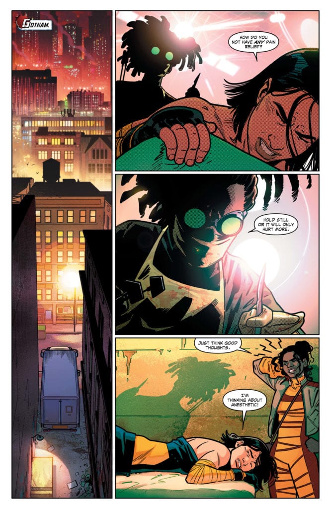
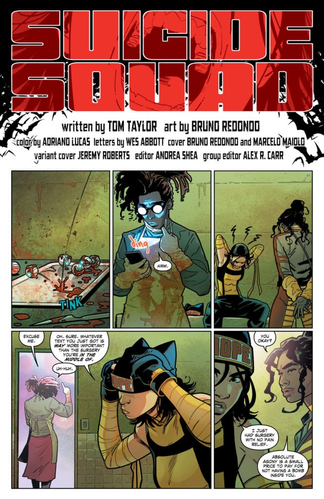
Writer Tom Taylor, artist Bruno Redondo, colorist Adriano Lucas, and letterer Wes Abbott have done it again. Another stellar issue in the series that is Suicide Squad. DC Comics’ Suicide Squad #6 is a ridiculous mess. But would you really want to see this loveable team of psychopaths any other way?
Writing
Taylor is always having fun with this series. And his characters are too. It’s one thing to put a cast of colorful characters up against great odds and see them struggle. It’s another to see them love every second of it. With new developments coming to light, and Batman on their tails, Taylor revels in the shit hitting the fan. Not only does he put the Squad into crazy positions, but he regularly gives them a moment where they step out and notice the ridiculousness of what’s going on. Taylor knows how to keep the ball rolling without dwelling on exposition. Briefly, we get a moment between Osita and Deadshot that seems a little premature, mutual respect and trust that still feels unearned. But Taylor’s treatment of Batman is a spectacle to pardon all grievances. Batman is placed outside of his element, his defensiveness and failure at banter make it a highlight of the series so far. Honestly, give this man a Batman run. Unless… he’s the Tom that already has one?
Art
It’s amazing to see Redondo use the same techniques, to very different effects. At one point, we see the Suicide Squad running out of a dingy operating room when Chaos Kitten stops them. She’s found a puppy, which she then holds up to Osita, asking to keep it. There is very little movement across that page. We see Chaos Kitten see the dog, we see her hold the dog up to Osita for two panels, and then two panels of them closing the doors to their getaway truck. It’s funny. Redondo gives this moment room to breathe in the midst of a getaway. They’re adopting a dog while they’re on the run. But later, as we see Batman tailing them, Redondo uses a similar technique. Very little movement on the page. But this time, all the panels are on the same line, and Batman is placed so he’s never fully in frame. We don’t get the feeling that much time has passed. Instead, it looks as though Batman has moved through the crime scene and gotten what he’s needed in a flash. Redondo’s use of time on the page is masterful. His little variances make something go from hilarious to badass.
Coloring
Lucas gives us the Gotham City of our nightmares. Of course, we get the dark streets, but we also get the brightly lit back-alley doctor’s offices. The fluorescent feel to those pages makes the colors looked washed out and sickly. Fitting, given that anyone would feel sickly in that environment. Outside, the sky is a dark red, like blood. Lucas never lets us forget that the Suicide Squad is now in Batman’s town. It even feels like a vampire’s playground. The bright yellows and greens that interrupt the color scheme feel strangely comforting, but they don’t come often. It’s like the Squad is trying to leave their mark on Gotham, but Gotham already knows who she is. And so, each impression the Squad tries to make is drowned out by the city’s overwhelming personality.
Lettering
Abbott should get a medal. He has his work cut out for him. Everything in this issue makes a noise—the ding of a text message or the bark of a dog. But the real fun begins when the Squad faces off with Batman. Abbott pays homage to the 1960’s Batman TV Show with sound effects that make you want to do the batusi. And they seamlessly give way to the regular sound effects of this series. Pointing out, in a way, that Abbott’s regular style isn’t far off from the fun of the Adam West TV show. And Abbott goes beyond just fun. He uses the sound effects to communicate what’s going on in a character’s head. In a moment when Deadshot stands his ground against Batman, he shoots a Batarang out of the air. “DANG!” is spelled out in large letters. You’d wonder how much Lawton immediately regretted facing the Bat, if Abbott hadn’t just told us.
DC Comics’ Suicide Squad is fun, hilarious, badass, and heartfelt. Often all at once. This creative team has proven themselves over and over on other projects, but here they make the perfect team. Suicide Squad #6 is another ridiculous chapter in a bonkers series. Get your copy, out from DC Comics on Tuesday, June 23rd!
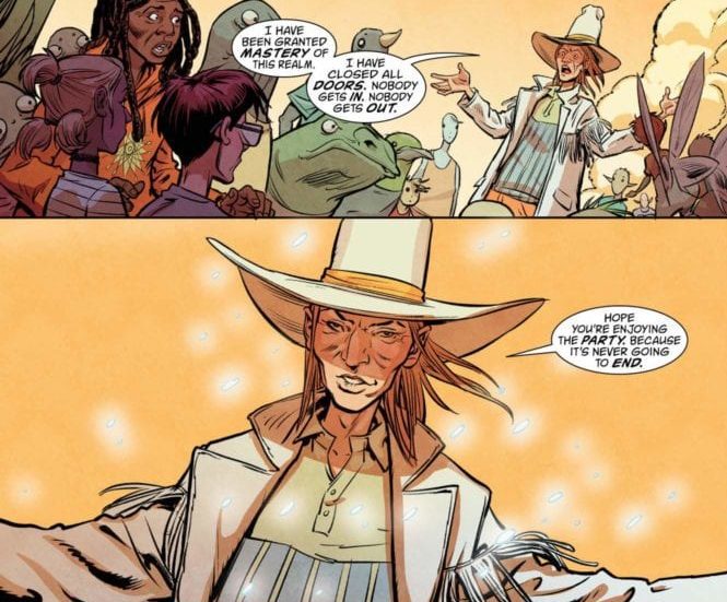
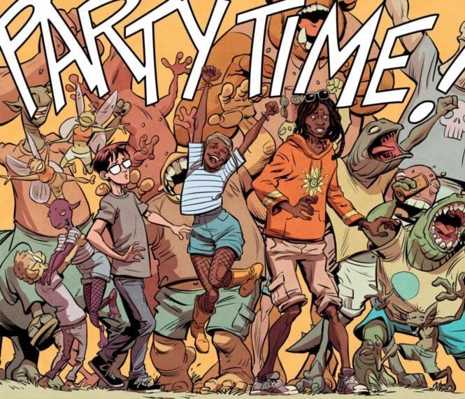
BOOKS OF MAGIC #20 hits comic book stores on Tuesday, June 23rd, concluding writer David Barnett’s two-part arc featuring the realm of Festival. Last issue Timothy Hunter and his new crush Izzy found themselves inadvertently traveling to this locale while attempting to find the Glastonbury Festival. There they ran into Twig, an old time rocker looking for his friend Geoff. The trio then finds good news and bad news; Geoff is in Festival, but he’s refusing to let anyone else leave.
Story
By some unknown means, it appears Geoff has gained complete control over the realm of Festival. So much control, in fact, that he was able to coordinate the mass influx of beings from all of the magical realms.
Tim, being of the most sober mind we’ve seen him in his current run, immediately attempts to reason with Geoff (with Twig’s help). But the newly crowned king of Festival reveals he has no intention of returning to his disappointing mortal life for reasons readers will be anxious to learn.
Barnett’s script in this issue and last’s provides readers with a more lighthearted tale to provide balance to the previous arc. Coming out of a darker arc into a story that focuses on the zany unpredictability of magical realms like Festival was just what we needed.
Artwork
Tom Fowler’s penciling and Craig Taillefer’s ink work, Marissa Louise’s coloring, and Todd Klein’s lettering created a brilliant visual representation of Festival. The illustrations of the events taking place in Festival are full of bright colors and detailed designs. One can feel the energy from each page. And the lettering adds to this with effective use of onomatopoeia, making it look like the words part of the scenes themselves.
Conclusion
BOOKS OF MAGIC #20 offered a heart-felt conclusion to this arc. We’re so used to darker storylines in this series; it’s nice to let some light shine through every now and then.
What realm do you think Tim will visit next? Let us know in the comments below!


 launches an all-new comedy espionage series The Scumbag from Image Comics, set to hit shelves this October. This new ongoing series will feature a murderers’ row of all-star artistic talent rotating each issue. The first issue showcases the stunning work of Lewis LaRosa with subsequent chapters and covers by brilliant talents such as Andrew Robinson, Eric Powell, Tula Lotay, Wes Craig, Roland Boschi, Simone Di Meo, Duncan Fegredo, Yanick Paquette, Mike McKone, Dave Johnson, and Moreno Dinisio.