Home Blog Page 300

Review: ANGEL + SPIKE #11 Where Brooding And Fighting Evil Go Hand In Hand

Angel + Spike #11
Angel + Spike #11 Credit: BOOM! Studios

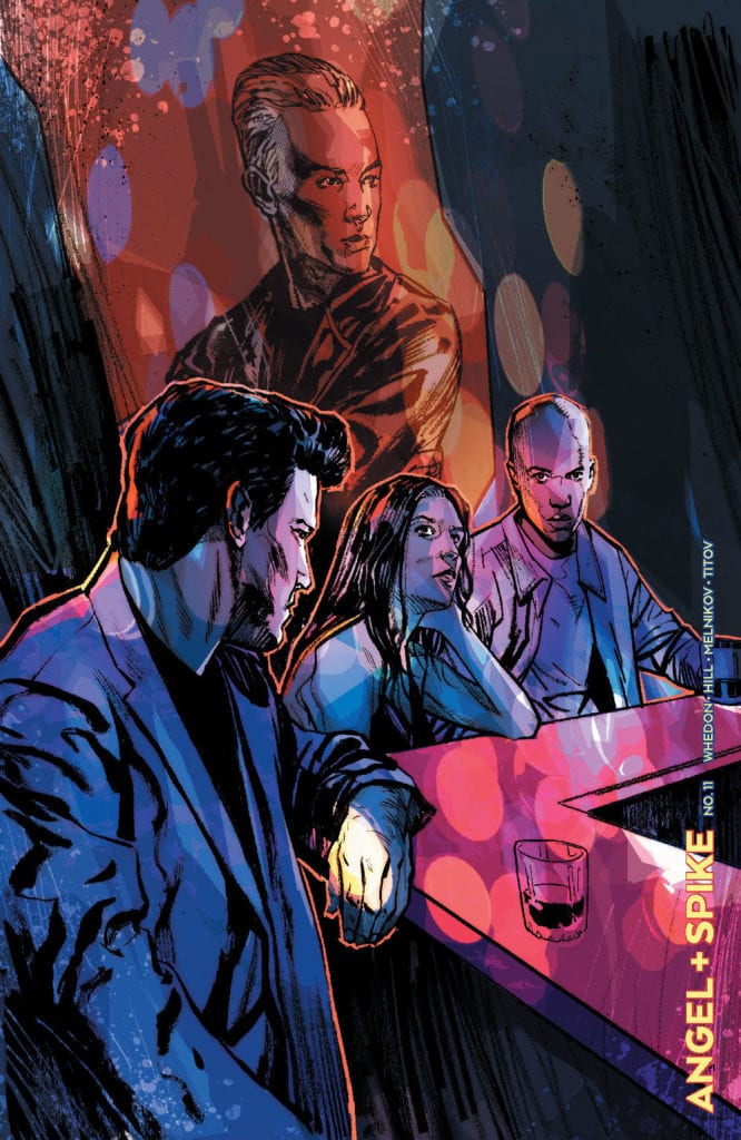
With the Hellmouth crossover still affecting the story-lines, this weeks Angel + Spike #11 has to deal with the fallout as well as new horrors. Continuing the re-imaging from BOOM! Studios, this series has proven to be a hit with fans and new readers alike. Seemingly unfazed by the character’s legacy, the creative team have made Angel their own and continue to push the boundaries of expectation and creativity.

Angel + Spike #11
Angel + Spike #11 Credit: BOOM! Studios

Tales To Tell

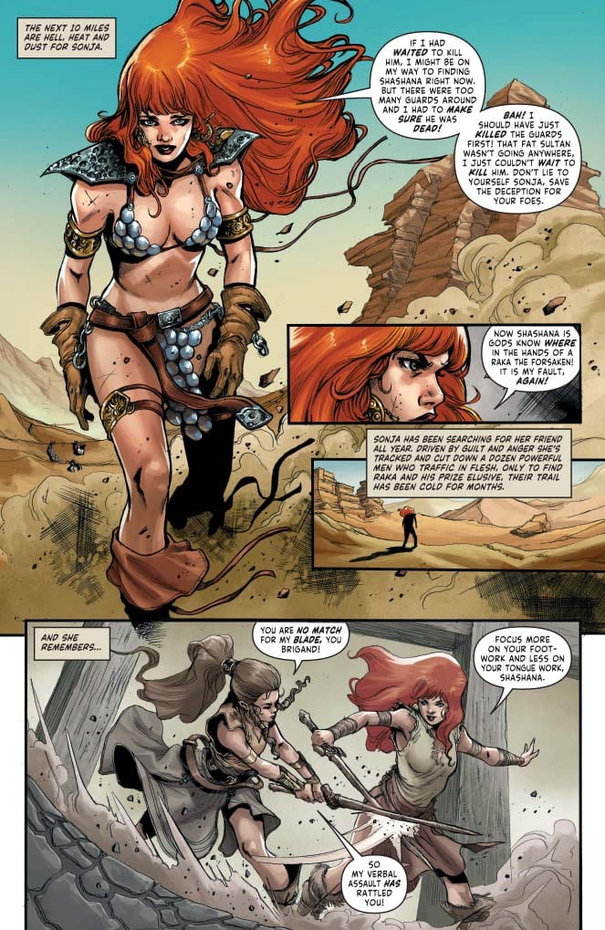
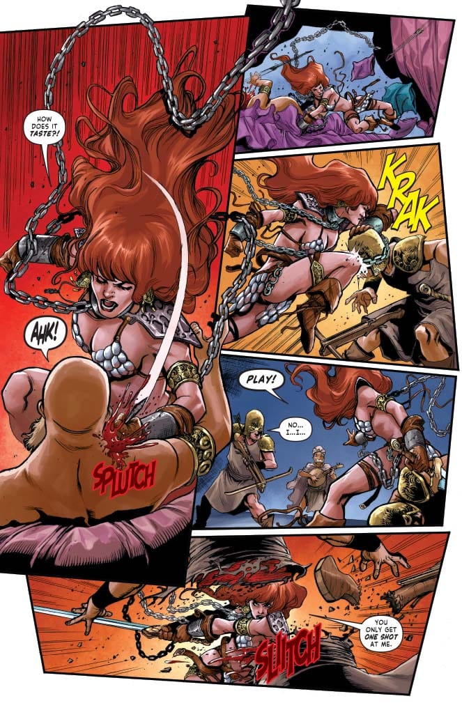
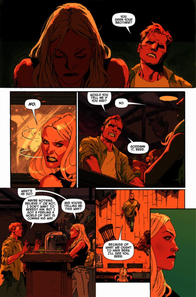
There’s a killer demon on the loose in Los Angeles but then again, when isn’t there?

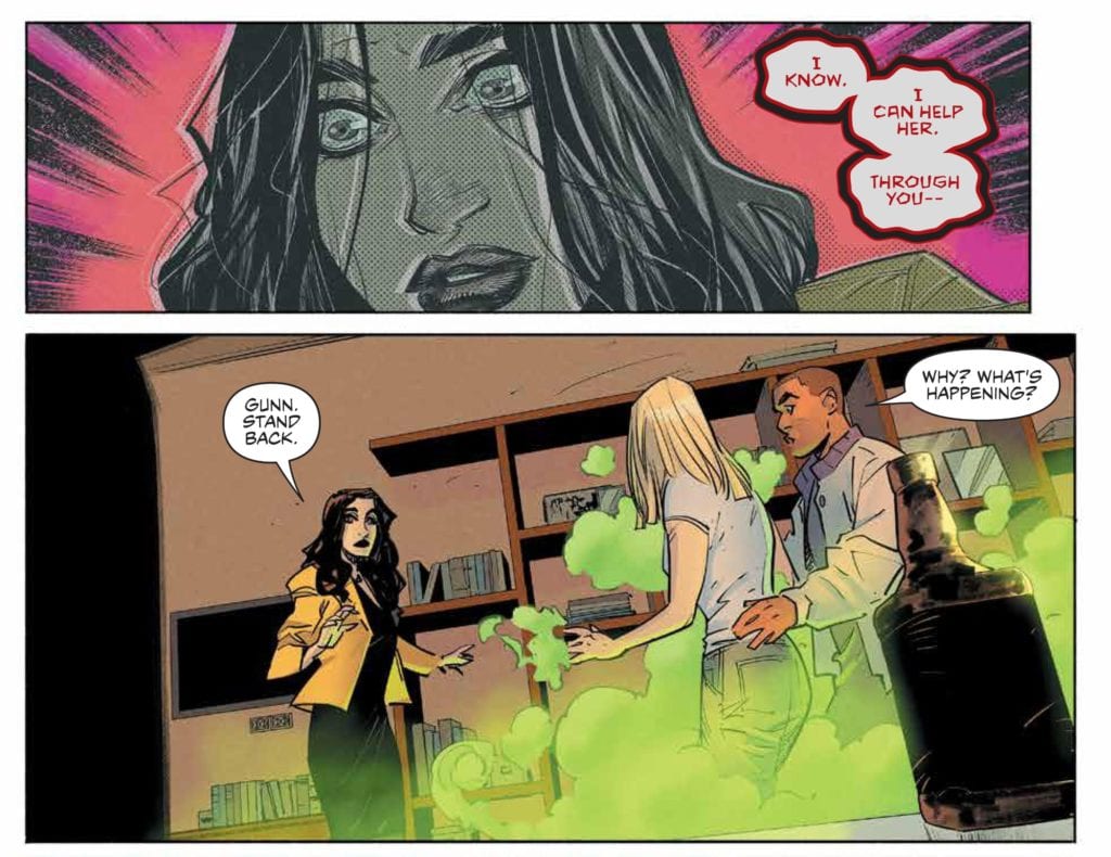
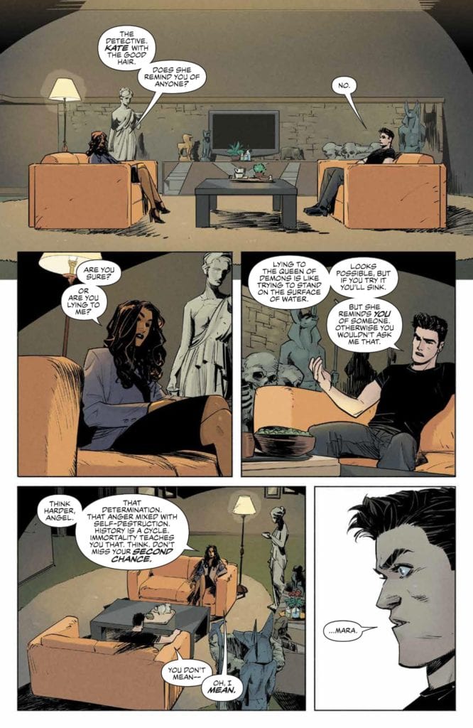
While Angel broods, forced to face part of his past by Lilth, the rest of the gang get to work saving the day. Unfortunately for Fred, saving the day will come at a cost and she will be forced to face her own demons. And on the edges, creeping ever closer, are the infamous law firm Wolfram and Hart.

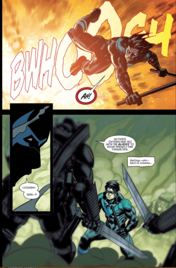
Despite the title, this issue is all about Angel and Fred. Bryan Edward Hill has crafted a story comparing the two characters and their individual plights. Hill puts his cast members into situations indicative of their personalities and then allows the narrative to draw out their fears. Both Angel and Fred have to face an aspect of themselves and their reactions tell the reader everything they need to know about the characters.

Angel broods. Hill literally allows the vampire to sit out of the action and has him engage in a number of conversations. Slowly the therapy-like sessions reveal a little of Angel’s past and Hill is able to play with new ground, expanding on the character’s history which he has hinted at in previous issues.

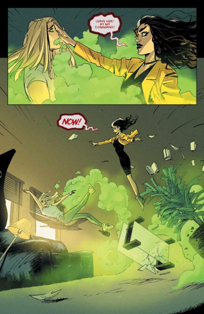
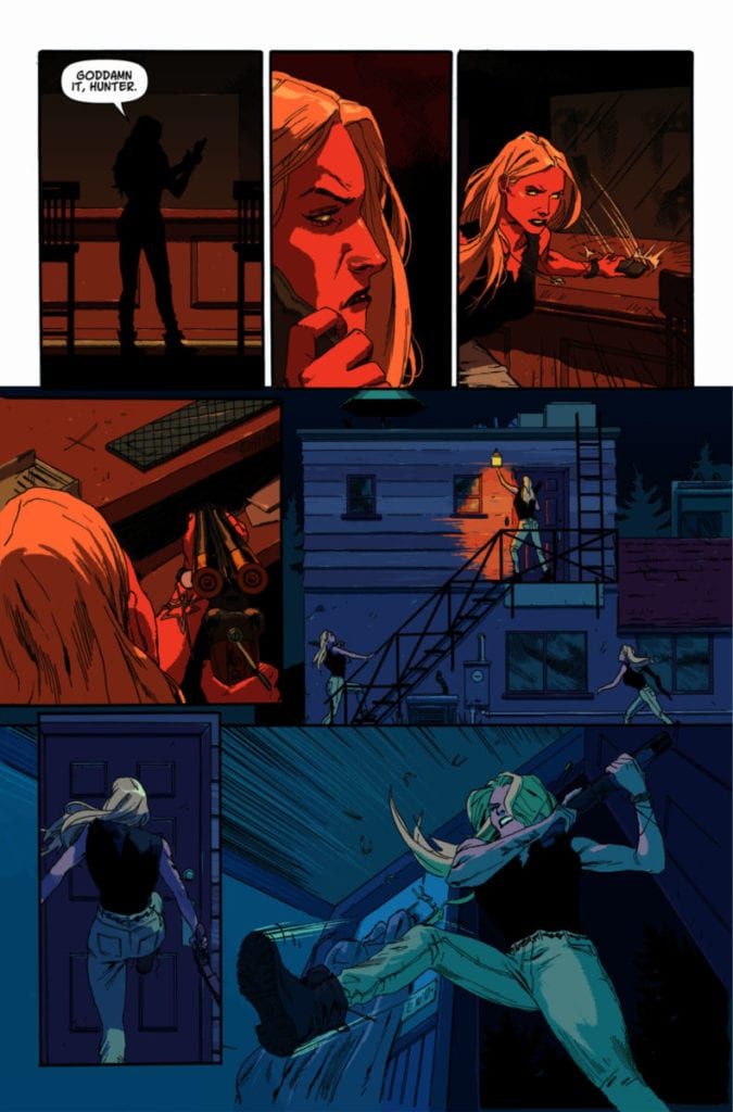
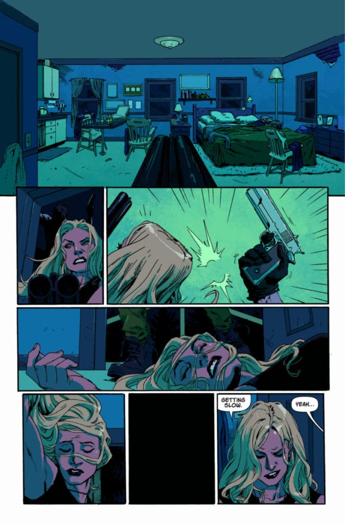
In turn Fred is facing a dilemma that is very much in the present. She has trust issues and this means she doesn’t know where to turn. Afraid of what her new team mates might think of her she desperately leans on the only other person who appears to be able to help: Lilah. To contrast Angel’s journey, Hill shows the reader exactly how powerful Fred is becoming and the temptations she faces. Fred is the action star in this issue.

Angel + Spike #11
Angel + Spike #11 Credit: BOOM! Studios

Running or Sitting

Gleb Melnikov fills this issue of Angel with energy. Whether it is the magical energy emanating from Fred or the personality confrontations between Angel and couch partners, there is a constant electric air on the pages. You can almost feel it crackling from the panels. Melnikov is quick to set the scene in the first panel and then use each following image to tease the cast’s characteristics to the foreground. When he does pull the point of view back it is always for a heart stopping, powerful moment in the narrative.

The pacing is pitch perfect for the story Hill is telling. It is not overrun with action and doesn’t skip through the contemplative moments. Melnikov gives each scene the space it requires to breathe, allowing the narrative to grow slowly and the impact of each revelation to sink in.

His line work is sharp and to the point which gives the comic an eerie, uncomfortable feel. The companion comic, Buffy, has a lighter tone and in comparison is definitely aimed towards a younger audience. Angel is more adult in nature. Not because it is gorier or more explicit in nature, but the themes it deals with, such as the corruption of innocence, is less black and white. It’s not as straightforward as good versus evil. Fred’s move towards Lilah is almost understandable in the circumstances and so is Angel’s reluctance to get involved with Kate.

Angel + Spike #11
Angel + Spike #11 Credit: BOOM! Studios

Letters and Tones

Ed Dukeshire has created some exquisite speech balloons for this issue of Angel. When Fred’s inner demon comes out, her tone and personality dramatically change all because of the thick, harsh borders Dukeshire uses. The change in text color also helps to stamp the character voice onto the scene. You can hear the disturbing tones rattling around your brain as you read these pages.

Dukeshire uses more subtle changes in the text and speech balloons in other sections of the comic, but these are equally as effective for creating individual voices for the cast members. These shifts in tone and mood are assisted by the color work of Roman Titov. Quiet moments of introspection are softly colored with mundane shades and plenty of shadow. This all changes when the scenes shift into supernatural realms where Titov brings out the horror with unsettling color choices.

Angel + Spike #11
Angel + Spike #11 Credit: BOOM! Studios

Conclusion

Angle + Spike has a growing cast but Hill manages to keep focus on the story and not become sidetracked with obsessive fan service. This issue is packed with character development and the world Hill is building is both familiar and brand new. Overall it feels like part of one of the best episodes of the television series.

The artwork is superbly fitting for Hill’s take on the Vampire with a Soul and with every issue the entire creative team push the bar a little bit higher. This run of Angel has become a must read for fans of the franchise and beyond.

Monkeys Fighting Robots Youtube

Review: DEAD BODY ROAD: BAD BLOOD #1 – Don’t Irk the Bartender

A potent mix of Justified and Winter’s Bone, writer Justin Jordan (Reaver, Luther Strode) and artist Benjamin Tiesma’s “Dead Body Road: Bad Blood” #1 is an atmospheric right-hook of small-town crime and punishment. With colorist Mat Lopes and letters by Pat Brosseau, this opening issue is the opening shots of what could turn into one of the best crime comics of the year.

“Bree Hale has left a lot behind in her life. Crime. The military. But she can’t leave behind her own family, and when the local crime boss puts a hit out on her brother, there’s nothing she won’t do to save him. Absolutely nothing.”

Writing & Plot

Justin Jordan clearly knows how to set up a powder keg of a vigilante justice story in this first issue of “Dead Body Road.” The intense face-to-face meetings of badass bar owner Bree Hale and the crooked members of local organized crime are loaded with tension. The backstory of Bree, her history with the town, and her relationships with other characters are delivered with sharp dialogue and potent use of detailed scripting. As a protagonist, Bree Hale is almost instantly likable. She’s a rugged, take-no-crap woman with a troubled past that she has quietly decided to distance herself from. When the heat turns up against one of her own, she becomes an absolute badass, and it’s clear that she is going to be a thrill to watch for the rest of this series. This kind of small-town local justice has obviously been done before in any and all mediums (see above comparisons), but it’s such a satisfying sub-genre to see done right, and Jordan knows what he’s doing in writing this comic.

Art Direction

The real stunner in Benjamin Tiesma‘s artwork on “Bad Blood” is his character detail. The attention paid to the characters’ facial expressions is immense, and it sells the comic’s character-driven narrative style. This is a story ruled by deviousness, panic, and anger, and the character both savior and villain are all duly drawn to easily feature such a range. The environment is a detailed representation of your average rural backwater as well, dominated by the local bar and roadside motel. The aesthetic is tied together by Mat Lopes’s faint, grainy colors, which sells the dark middle of nowhere setting as well as the crime-movie inspired film reel look. The whole issue takes place at night (as these stories often do), so the visuals being so dominated by faint colors and shadows is a practical necessity and not just a stylistic choice. The lettering is fine in the fact that it does its job, but disappointingly the font never alters in form whatsoever to match a character’s tone. This fact is almost unnoticeable due to Tiesma’s feature art, but the fact remains. Overall, “Dead Body Road” #1 is an artistically sold comic that nails the aesthetic for this kind of story.

“Dead Body Road: Bad Blood” #1 is an enticing and gritty start to this small-town vigilante justice comic mini-series. Jordan’s script is full of naturalistic and slick dialogue while leaving plenty of room for the art to talk. Benjamin Tiesma and Mat Lopes’s work is detailed and character-focused, pulling the reader into the panels with fantastic character art and grainy aesthetics. If you want to get in on this sawed-off shotgun blast of a comic, be sure to pick it up from your local comic shop on 6/24!

Monkeys Fighting Robots Youtube

Review: BLEED THEM DRY #2 – The Addiction For This New World Continues

Bleed Them Dry #2 cover

Bleed Them Dry #2 from Vault will end the month of July with a revelation that changes the readers’ perspectives. After the first issue introduces the world of vampires and their dark secrets, readers are eager for more. After this issue this series might become addicting.

Bleed Them Dry #2 Story

Bleed Them Dry #2 keeps a keen interest on the vampires, especially as it relates to Detective Harper Halloway. Coming to terms with last issue’s revelations, she finds comfort in her savior Toyo Yamamoto. This act however isn’t just Eliot Rahal writing a character arc; it’s building Hiroshi Koizumi’s world. In comparison to last issue, this chapter displays how vampires actually run the world. Despite how relatively peaceful Asylum looks, there are dark secrets abound. As for Atticus Black, he also comes to finding his world changed thanks to gaining prosthetics. With the way he reacts readers can only imagine what this means for him.

Artwork

Dike Ruan continues to displays very impressive architecture and detail in Bleed Them Dry #2. The buildings and their unique shapes would present marvels, but seeing them from a lower angle denotes a different feeling. A feeling of unfamiliarity and suffocation, the same applies to Black waking up to his impressively detailed prosthetics. But what really sets that feeling home is the coloring by Miquel Muerto. The watercolors of the buildings’ lights feel like illusions against the dark structures. This make the lights feel less like a means of comfort and more of a distraction. Even the natural sunlight feels like an enemy due to its bleak whiteness causing Black to burn.

Lettering

The lettering by Justin Birch of AndWorld Design continues to display every word as an extension of character. Throughout Bleed Them Dry #2 word balloons show how the characters express themselves. Most vampires have their word balloons surrounded by a red outline when their emotions are high. With knowledge that “immortals” make up the higher ups of Asylum, the police captain’s discussion with the mayor has an additional layer of weight. He tries all that he can to avoid upsetting the mayor less he feels her wrath. Yet it’s the time when the colored captions speak at minimum where emotions are at their highest. Toyo in particular always feels cool even in the face of danger; yet his yellow-orange captions express that it’s because Toyo feels he already lost his place in the dark but vibrant world.

Bleed Them Dry #2 Is A Transfusion

Bleed Them Dry #2 enhances an already impressive story by diving into another part of the world. As the world of vampires in commodity reveals its darker undertone. These revelations give not just a new perspective but waits around the corner. There are still questions that need answers and any enlightenments will come with a price.

Do you think this series has something going for it? Is it as addicting as the above describes? Leave your thoughts in the comments.

Monkeys Fighting Robots Youtube

Review: Taking On GREEN LANTERN EARTH ONE In Preparation For Round Two

Green Lantern Earth One Vol 1
Green Lantern Earth One Vol 1 Credit: DC Comics

With Volume Two of Green Lantern Earth One due out from DC Comics this summer, I thought I would take the opportunity to catch up with Volume One. Released in 2018 as a hard-backed, stand alone reinvention of the Green Lantern story, Earth One has visual and creator appeal.

Writer Corinna Bechko and artist Gabriel Hardman have produced some outstanding work in recent years, most notably Invisible Republic. This politically themed science fiction series, which also included Jordan Boyd as colorist, was an intriguing, impressively constructed narrative. The style and themes used in Invisible Republic are transferred across to Green Lantern Earth One which produces a more grounded superhero comic; in the beginning at least.

Green Lantern Earth One Vol 1
Green Lantern Earth One Vol 1 Credit: DC Comics

Opening Manoeuvres

Hal Jordan is an outcast from NASA and working on an intergalactic mining operation. His team are searching for the mother-lode in the asteroid belt between Mars and Jupiter. What they find instead is a derelict spacecraft and potential proof of alien life.

Unfortunately for Hal, a disintegrating spaceship on a cold hard rock in the middle of space in just the start of his problems.

The opening of Green Lantern Earth One is atmospheric and hard on the science. Everything starts off very mundane with Corinna Bechko slowly introducing Hal Jordan to the readers through the character’s work colleagues. Bechko slips pieces of the astro-miners history into the conversations between workers, building up the man that many DC Comics readers will already know.

As the first act progresses it verges on horror, especially with the darkness that Gabriel Hardman brings to his artwork. The discovery and inevitable search of the derelict spacecraft calls back to 1979’s Alien movie. There is a real sense of claustrophobia to the scenes and the threat level is very high. Hardman’s dynamic inking and Jordan Boyd’s dark, oppressive colors trap the reader helplessly in space with Jordan and his fellow adventurer. There are moments where you will involuntarily stop breathing.

Green Lantern Earth One Vol 1
Green Lantern Earth One Vol 1 Credit: DC Comics

Act Two And Beyond

Once the famous Lantern and power ring are discovered an emerald green hue begins to seep into the artwork. This has a rippling effect that runs throughout the book with more and more color becoming evident, lightening the mood. Hardman’s art continues to flow across the pages with some outstanding panel designs. The shape and composition of the panels match the energy and the actions of the scene they encapsulate. It’s difficult not to be impressed by the sloping panels that appear as the derelict ship starts to slip down a cliff face. Hardman tilts the viewpoint like a camera, twisting and turning the reader with the action.

The artwork pushes the reader out into the depths of space, following Hal on his unbelievable journey. The design work begins to stand out with the introduction of new worlds and life forms. Everything becomes a contrast to the mundanity of the mining ship and it’s small, narrow visioned world. As Bechko drags Hal and the reader through a life changing adventure, Hardman and Boyd bombard you with visual delights and trickery.

As the narrative stakes get bigger, so it seems does the artwork. The pages and panels become more overwhelming with a constant increase in extra’s filling the images. The sequences become chapters, almost like single issues collected together, each gaining momentum as the threat level increases. Until the final, out of this world confrontation that would need a Marvel Movie budget to pull off on the big screen.

Green Lantern Earth One Vol 1
Green Lantern Earth One Vol 1 Credit: DC Comics

Intended Audience

The review could end there with the additional line ‘if you’re a fan of Green Lantern then you will definitely love this book’, however I wouldn’t feel comfortable about it. This is because I don’t know if that statement is true.

Personally, I have no interest in the character and that turned into a large stumbling block for this book. The reason I bought Earth One was because of Corinna Bechko and Gabriel Hardman, and by the end it still hadn’t created an interest in Hal or the Lanterns. It took me four weeks to read this book. I would read a few pages, put it down, and then pick up something else to read instead. There are elements of this comic I love but nothing about the character’s legacy or the Green Lantern Corps world captivates me. And, unfortunately, this did not change that.

As a result, I personally found the story tiresome, although the characters were well written. There are clearly references that I did not understand but fans of the regular series will probably lap up. Unfortunately, without a character to root for the story looses pace and any drama is replaced by a mild desire to simply finish reading the book.

Green Lantern Earth One Vol 2
Green Lantern Earth One Vol 2 Cover Credit: DC Comics

Conclusion

If you love galactic superheroes and reluctant hero stories then this will appeal to you. It has creative worlds and a host of exciting aliens all linked together by glowing green lanterns. It appears to have all of the elements required for a good Green Lantern comic and it has some very exciting storytelling. This will probably appeal to fans of the character. Unfortunately, as soon as the lantern was introduced my interest died.

Green Lantern Earth One is a beautiful book. The artwork is impressive and there are storytelling techniques on display that could keep a fan of comics obsessed for hours. Unfortunately the story does not contain the same momentum and it is too easy to put this book down. It does not have enough appeal for non-superhero fans and will leave those readers out in the cold. Having said that, people who love their DC comics should be picking this, and Volume 2, up.

Monkeys Fighting Robots Youtube

Review: NIGHTWING ANNUAL #3 – I Miss You Dick Grayson!

Nightwing Annual #3, out this week from DC Comics, tells a Nightwing story that longtime fans will love, in that it tells a tale set 18 months in the past before the infamous “Ric” storyline began. This is Dick Grayson at the height of his powers. Dan Jurgens, as a writer, shows his worth as perhaps DC’s most underrated scribe, always sent into course-correct stories that have spun away from the core of who the characters are. He is joined here by artist Inaki Miranda, colorist Nick Filardi, and Andworld Design on Lettering. Together, they weave a tale that thematically touches on a number of the stories told about Dick Grayson over the last decade, including the Court of Owls, crimefighting in Blüdhaven, and involvement with international spy agencies.

Writing

Fans who have missed good ole’ Dick Grayson will love this issue. Jurgens gives us the Dick we’ve all missed since he was shot in the head by KGBeast. This is the fun, wise-cracking Nightwing, confident in his own skin and in who he is. It begins at the Condor base with the Condors watching footage of Condor Red’s encounter with an amnesiac Ric in Nightwing issues 67-68. The issue is mostly a glorified flashback to the Condors’ attempt to recruit Nightwing into their organization 18 months beforehand. It ends with their realization that this amnesiac man in the Talon outfit from Nightwing 67-68 was in fact Nightwing.

Jurgens can’t help himself, though, when it comes to playing up the sexual objectification of Nightwing, specifically the obsession with Nightwing’s ass.

I mean, what in the actual hell? Nothing like some humorous sexual harassment in the age of #MeToo I suppose.

Art

The art in this issue captures the energy and action of this issue. Miranda conveys the quickness of the characters’ actions and appropriately fits the high octane nature of what a Nightwing book should be. Whether it’s Nightwing’s acrobatics, the Condors flying through the air, or even the fight with Blockbuster, the art helps to capture the fun, action-packed nature of each scene.

Coloring

Filardi’s colors are solid in this issue. Any page featuring Dick and Condor Red really “pops” with the contrasting blue, black, and red from the characters’ costumes. Filardi can capture the nuances of the various background colorings needed to convey Nightwing stuck in a cloud of poisonous gas or Nightwing caught in an explosion.

Half of this comic is actually just panels of either of those things, with a brief interlude at the Condor base.

Lettering

The lettering does a good job not only allowing each character’s voice to come through but more importantly, it helps to communicate the action and sound effects (as indicated by the lettering for the explosion above). It helps to shape this issue into a fun, action-adventure (exactly what Nightwing should be) with every “ugh!” and “gyahhh!”

Conclusion

Nightwing Annual #3 was an overall fun and action-packed issue, albeit a bit “by the numbers.” Again, it was good to have a story with the Dick Grayson we all love and miss. It seems to be setting up a future confrontation with the Condors, so I’m imagining Jurgens may be paving the way for stories with Dick being involved in a world of intrigue and spies.

Monkeys Fighting Robots Youtube

INTERVIEW: Composer Amanda Jones Goes From The Anti-Job To Scoring Many Jobs

After founding the rock band, The Anti-Job Amanda Jones found a new musical career path as a composer for film and television shows like Cherish the Day on OWN and Twenties on BET.

For Cherish the Day, the young composer is creating music for a unique anthology series. Cherish The Day is eight episodes that each takes place on a single day in the lives of a couple. For Twenties, it’s a series covering the lives of three young friends who are trying to find their way through life.

PopAxiom spoke with Amanda about her life making music and her road to making music for Ava DuVernay (A Wrinkle In Time) and Lena Waithe (Master of None).

Chemistry to Concerts

For Amanda, music’s been in her life since the beginning. “I started playing piano around 3. Growing up, my dad loved listening to Motown music, and my mom was all about Whitney Houston and Toni Braxton.”

The piano was only the start for Amanda. “There was always music in the house. Around 10, I played clarinet in the school band.”

Rebellious teenage years lead to the discovery of a new instrument that would capture Amanda’s heart. “Around 14 or 15, a friend of mine let me borrow her guitar, and that’s the instrument I’ve fallen in love with.”

However, all that music in her life still didn’t mean Amanda focused on becoming a professional musician. “I went to Vassar College intending to be a chemistry major. A lot of my family works in healthcare. But I fell in love with the music department and switched music from my minor to major.”

amanda jones-composer-BET

City of Angels

Amanda graduated from Vassar in 2010 and then made a big move. “I moved out to LA and started a band [The Anti-Job]. We did the tour circuit for quite a while, and we still play today.”

Now with the drive to make a career out of music, The Anti-Job became Amanda’s, well, job. “Initially, that was my primary focus: touring, performing, album. That was the cycle. Around 2014, I was grinding my gears in the LA music scene and wanted to incorporate other aspects of the music industry into my life.”

Naturally, living in LA means it’s inevitable that you’ll meet people in the film and TV industry. That often leads to “… getting sucked into the entertainment industry.”

For Amanda, she began living that reality. “I’d met a couple of composers along the way and started to think it was a viable career path. So, I set down that path. I took some classes … as a refresher, which plugged me into the SoCal film and television scene.”

Amanda’s education and experience lead to a new gig with an orbit around some composing superstars. “I worked with a music production assistant for Hans Zimmer … John Powell. I worked with film and television composers like Michael Levine, a great friend, and mentor.”

Communication Is Key

The push to become a composer included partaking in a variety of workshops and programs. “… One in particular through ASCAP and Project Involve paired up-and-coming directors with up-and-coming composers … it’s kind of like speed dating … I did that twice. It was amazing. You work on a short film that premiered at the LA Film Festival. Five years later, I’m still working with some of the people I met.”

“‘Finding ‘your director’” is a goal all composers should try and achieve. Amanda’s advice correlates directly to reality, where the most famous on-going pairing of director and composer is likely John Williams and Steven Spielberg. But they are one of many inseparable combos. “Sergio Leone and Ennio Morricone or Ryan Coogler and Ludwig Göransson.”

Collaboration thrives on communication. And finding that director for a composer means a new level of communication. “A large component is being able to communicate well.”

Lionsgate

Amanda began working at Lionsgate, the film studio behind The Hunger Games, Twilight, and John Wick. “It was such a great opportunity to understand the nuts and bolts of the industry.” Her job entailed vetting and hiring critical positions in the music department. “I was responsible for hiring composers, music editors, and supervisors. I worked with showrunners, and it was just awesome.”

The joy in Amanda’s voice is undeniable when she talks about her experience at Lionsgate. “I worked on Greenleaf and Dear White People. Step Up for YouTube Red.”

In 2018, Amanda took the next step. “I had the opportunity to score my first feature film that’s coming out this year. It’s called One Angry Black Man.”

Amanda’s excitement was super-rocket fuel for her skills as a music-maker. “I was so excited to score my first feature that I wrote all the music in two weeks!”

Since 2018, Amanda’s flowed from one project to the next. “I did two feature documentaries and then my first pilot [Twenties on BET].”

Sundance

On a whim, Amanda took a trip to Sundance. “I tried to meet as many directors. The only thing I could talk about was this pilot.”

The pilot, a show created by Lena Waithe (Queen & Slim, The Chi), was enough to land Amanda, a new gig that put her on a popular HBO series. “I met Dime Davis, who is a director for the Black Lady Sketch Show on HBO. She thought I’d be great for it.”

Back in LA, the work began. “We got together, and I went through the classic vetting process. I got the script, I marked it up and spoke with all the creatives. And I was able to hop on the Black Lady Sketch Show.”

Amanda scored six episodes of the Black Lady Sketch Show, and then Twenties got picked up by BET.” Amanda scored the series then hopped on another Lena Waithe project, How To Make Love To A Black Woman.

Now, she’s going back to her roots for Home, a series on Apple TV. On the score, Amanda gets to “… play guitar and sing.”

amanda jones-composer-interview

About Cherish the Day

One Day, in 2019, Amanda received a phone call saying, “Hey, Ava DuVernay wants to meet you at noon.” Amanda arrived to learn about a new show Ava was producing called Cherish The Day.”

The series airs on OWN, Oprah’s network. Ava handed Amanda a script and asked the composer to “… write cues that you think would be part of the sonic palette of the series.”

The excitement-fueled Amanda went into action. “I read the script lightning fast. I wrote two demos and sent them to her [Ava].”

However, two weeks went by without a response before she heard the exciting words “… we’d love to have you on Cherish The Day.”

WATCH THE FIRST EPISODE FREE!

Wrapping Up

Who inspires Amanda’s creative side? “I would have to say more bands than composers but from my earliest years, The Temptations. They inspired me to play guitar. I love bands like Yes, Deerhoof, but also John Williams and Ennio Morricone. I’m a big classic rock fan, so Jimmy Hendrix, Led Zeppelin, Black Sabbath … all that stuff. Bjork is pretty awesome.”

Amanda looks for bands who are bold. “I love bands that aren’t afraid to have long-form songs or be very cinematic in their writing. That’s inspired me. I try to bring that to my work.”

When asked what remake Amanda would love to be a part of, she responds with a little talked about late 80s gem. “… Less Than Zero.”

Amanda is driven and wants to make better music for documentaries, television, and film. She is setting her next major goal quite high. “I’d love to get my feet wet in a Marvel or DC movie. Any fantasy or comic, pulp stuff.” Seems ambitious, but remember, she’s friends with Ava DuVernay, who is helming New Gods for the DCEU.

What’s coming next from The Anti-Job composer? “I’m working on a docu-series for Live Nation called Cradle To Stage. Dave Grohl is one of the executive producers, and it’s all about rock stars and their moms. It’s based on [Virginia Grohl] her book. Also, working on a feature documentary called Krimes, that’s about artists who were formally incarcerated and how they used art as this liberating tool. Black Lady Sketch Show season two is coming out later this year.”

Are Twenties and Cherish the Day on your watch list?

Thanks to Amanda Jones and Rhapsody PR for making this interview possible.

Header photo credit goes to Ian Spanier.

Want to read more interviews like this? CLICK HERE.

Monkeys Fighting Robots Youtube

Visit A Town Where Death Is Forbidden In STILLWATER

Stillwater #1 cover

Image has announced a new horror series, coming September 16th, from Eisner and Harvey award winner Chip Zdarsky titled STILLWATER. Imagine a town abandoned by Death, where all its citizens discover immortality can be a blessing and a curse.

Zdarsky will be joined by artist Ramón K. Pérez on the new Image title, available in print and digital on September 16th. Check out the full press release, preview images, and cover below.

Are you excited for a non-superhero story from Chip Zdarsky? What other genres do you want to see Image pursue? Let us know in the Comments section, and please share this post on social media for more conversation.

GIDEON FALLS MEETS THE WALKING DEAD IN CHIP ZDARSKY AND RAMÓN K. PÉREZ’S CHILLING NEW SKYBOUND HORROR SERIES, STILLWATER

PORTLAND, Ore. 06/19/2020 — The New York Times bestselling, Eisner Award winning writer Chip Zdarsky (The White Trees, Daredevil, Sex Criminals
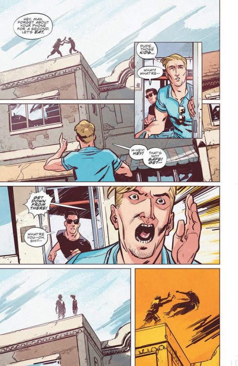
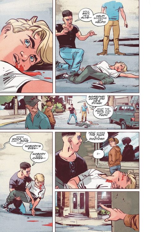
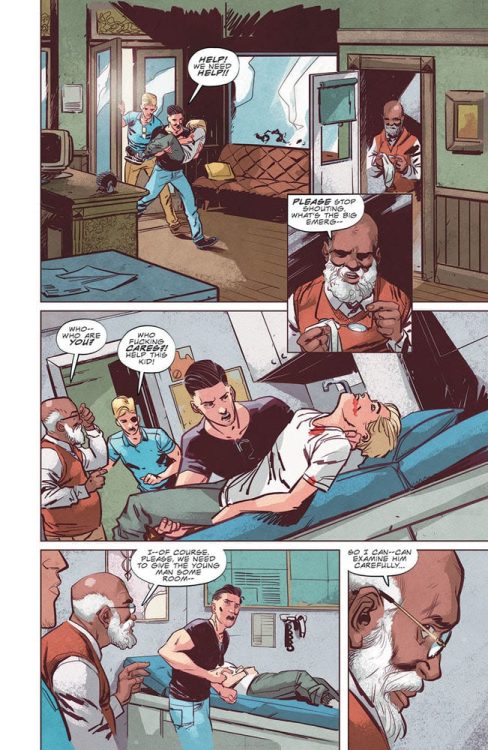
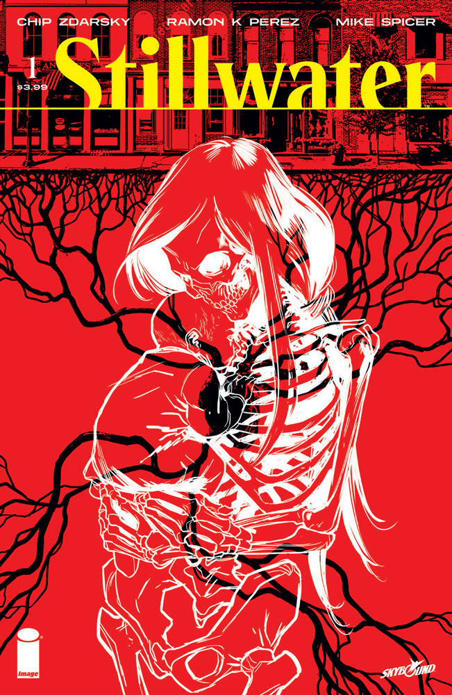
and Eisner, Harvey, and Shuster Award-winning artist Ramón K Pérez (Jim Henson’s Tale of Sand, Jane) dive into a world of horror and intrigue in an all-new, ongoing series from Image/Skybound Entertainment this September—Stillwater.

In the town of Stillwater, nobody dies. That’s not just a promise. It’s a threat.

“I’m thrilled people are finally going to see Stillwater! This idea’s been percolating in my for years now, and it’s been fun working with Ramon to build this tiny, strange world! I’ve always wanted to write a horror comic so I can show the world that I’m not JUST creepy, I can also write creepy!” said Zdarsky. “I love getting to explore immortality on a small stage, the idea that you can live forever but just within such a constrained space. It’s been a treat getting to write characters struggling with that terrifying deal.”

Pérez added: “It’s been a joy to step away from the superhero genre and delve into the horror, thriller, and a dash of mystery genre with Chip on Stillwater! I hope readers are as unsettled as I was drawing the book…”

Stillwater #1 (Diamond Code JUL200017) will be available at comic book shops on Wednesday, September 16.

Stillwater #1 will also be available for purchase across many digital platforms, including Amazon Kindle, Apple Books, comiXology, and Google Play.

Stillwater #1, preview 1Stillwater #1, preview 2Stillwater #1, preview 3

Monkeys Fighting Robots Youtube

New Post-EMPYRE Fantastic Four One-Shot Announced

Empyre Fallout Fantastic Four #1, Silva cover

One of the more anticipated Marvel events scheduled for Summer of 2020 is the EMPYRE crossover spanning multiple titles. However, when the battle ends, the fallout begins. Marvel announced today that Dan Slott will be writing a Fantastic Four one-shot titled EMPYRE: FALLOUT FANTASTIC FOUR #1 scheduled to arrive in September 2020.

Dan Slott, currently wrapping his run on Iron Man 2020, is writing the one-shot with artist Sean Izaakse. You can read the full press release below and check out the cover. Also, check out the nifty cover by R.B. Silva.

Are you excited for the EMPYRE event? What would you like to see Slott do with a Fantastic Four book? Let us know in the Comments, and please share this on social media using the links below.

WHO WILL BE LEFT STANDING IN THE FALLOUT OF ‘EMPYRE’?

Empyre: Fallout Fantastic Four #1 brings turning points and new dangers to the Marvel Universe!


New York, NY — June 19, 2020 — EMPYRE, the legendary epic that will shatter the Marvel Universe, will hit stands starting July 15th – and its seismic events will bring new dangers to Earth’s Mightiest Heroes and Marvel’s First Family! This September, learn the extent of this saga’s repercussions in two titanic one-shots, EMPYRE: AFTERMATH AVENGERS #1 and EMPYRE: FALLOUT FANTASTIC FOUR #1

Dan Slott pens EMPYRE: FALLOUT FANTASTIC FOUR #1, which promises two major turning points for the entire Marvel Universe as the fate of all future Kree/Skrull Wars is placed in the hands of Reed Richards and his family, the Fantastic Four! 

Who will be left standing the fallout of Empyre? Find out this September in EMPYRE: FALLOUT FANTASTIC FOUR #1 and EMPYRE: AFTERMATH AVENGERS #1!

EMPYRE: FALLOUT FANTASTIC FOUR #1

Written by DAN SLOTT

Art by SEAN IZAAKSE

Cover by R.B. SILVA

Monkeys Fighting Robots Youtube

SPIDER-MAN LIFE STORY: The Potential For Multiple Spin-Offs

Spider-Man Life Story

Spider-Man Life Story written by Chip Zdarsky with art by Mark Bagley is one of the best series of Marvel Comics in recent memory, so why shouldn’t Marvel do it again? In this six-issue run, 60 years’ worth of storylines were condensed and distilled into something fresh. Instead of a complicated history lesson, readers get genuine character growth as Spider-Man gets older. Each choice he makes brings Peter Parker a life of authentic legacy and a fantasy devoid of an editorial mandate. Yet in that same series, a few other characters make notable appearances, and they could expand the universe.

Spider-Man Life Story: Fantastic Four Edition

One of Peter Parker’s most significant leaps in Spider-Man Life Story is his relationship with the Fantastic Four. Specifically, Reed Richards, who really shows his age as the decades go by. Each issue by the decade would be a reflection of the family dynamic between Mr. Fantastic and the rest. A good chunk of this would likely involve how Reed’s work ethic affects the people around him. From the Invisible Woman’s interactions with Namor despite her and Reed’s marriage to how his kids look at him. The Thing meanwhile would grapple with his relationships with Alicia Masters (especially when children are involved). Not to mention how Marvel’s First Family can’t decide between being explorers or superheroes. But the biggest obstacle would obviously be Dr. Doom. With his presence in both of the Secret Wars presenting him as the ultimate enemy, the idea has more than enough potential.

Captain America vs. Iron Man

The only other major heroes in Spider-Man Life Story are the ideologically opposing Captain America and Iron Man. Cap represents the conservative-yet-libertarian approach to the political changes of the decades. Instead of basing his life entirely on patriotic duty, he devotes time to helping others. Because with each passing decade come realizations that America still has room to grow. Steve could meet Falcon amid all the counter cultures and disillusionment with America. Because in these polarizing times, making and reuniting with friends could be the best thing.

Iron Man meanwhile approaches things like a neoliberalist. One where opportunities to improve are by competition and the free market. As a weapons maker, Tony Stark would make the most profits off of these conflicts. Given this ideology’s opposition to communism, his classic enemies like Crimson Dynamo and the Mandarin would fit again. With people trying to acquire his company every decade, from SHIELD to the likes of Doctor Doom, Tony would go to any means to keep his company under his control even if it meant privatizing parts of the US government to avoid regulation and acquire other heroes to his cause.

This would lead to the inevitable clash in Civil War where both sides end up losing everything. One where because of mutually petty conflicts, the villains win.

Other Life Story Imprints

Spider-Man Life Story features many characters like the Avengers and Jessica Jones. While not all characters have 60+ years of history, there are still a lot of potential stories to tell. Characters like Thor could have stories that are only touched upon between series. This would give a fresh look into characters with a new perspective on events while focusing on development. A Wolverine/X-Men Life Story would certainly make the mutant’s publications easier to swallow.

But what do you think? Could Spider-Man Life Story open up new What If universes in the vein of MC2? Leave your thoughts in the comments.

Monkeys Fighting Robots Youtube

Review: RED SONJA: BIRTH OF THE SHE-DEVIL Is A Tragic Western In Ancient Times

Red Sonja Birth of the She-Devil TP, Parrillo cover

RED SONJA: BIRTH OF THE SHE-DEVIL, available now from Dynamite, is about Red Sonja’s upbringing, the man who raised her, and the surrogate sister lost to a madman. Luke Lieberman’s story could just as easily be adapted into a Louis L’amour novel as well as Robert E. Howard’s crimson-haired warrior. Of all the Red Sonja comics published in recent years, this collection is probably the most introspective and emotional.

Collection Cover Art

Dynamite’s go-to cover artist, Lucio Parrillo, paints another beautiful cover that’s more in line with the books content than his typical covers. Red Sonja is standing in front of a burning inn, holding a liquor bottle to celebrate the building’s destruction. This exactly mirrors an early scene in the collection, and it adds a level of continuity to the collection that sometimes gets missed with Parrillo covers that are pure cheesecake. Outstanding work here by Parrillo.

Writing

Luke Lieberman’s story takes a different approach from the typical Red Sonja comics in recent years. We’re meeting Red Sonja when she’s a capable warrior but hasn’t yet learned the qualities of maturity and leadership that establish her as a legend. In short, she’s reckless.

Haunted by the kidnapping of her friend many years ago and holding a grudge against her adoptive father for allowing it to happen, Red Sonja goes on a quest to find her. The kidnapper turns out to be a raging lunatic that wants to lunge the world into chaos so that the natural order of predator and prey is reestablished.

It’s a fairly sophisticated story for the sword and sandal genre, and Lieberman writes it straight to give Red Sonja a richness and depth to her backstory. Red Sonja becomes more than the unstoppable warrior roaming the wilderness. She’s a fully realized person with familial connections, regrets, and room to grow. It’s a welcome change of pace.

Pencils/Inks

Sergio Davila’s art paints Lieberman’s story with as much depth as the script itself. There’s plenty of swordplay action, and Red Sonja separates more than a few heads from necks, but it’s all done within the context of her need to set the wrong things right. Every panel that shows Red Sonja’s face is packed with emotion. She projects grim determination to get Shashana back in the heat of battle. She crumples in a heap of despair when the trail goes cold. She seethes with righteous anger when Ozzyus confronts her over her recklessness.

Red Sonja Birth of the She-Devil, art sample

That’s the high point of Davila’s art in this collection. It’s an equal mix of action and drama that all come through in the art.

Coloring

Ulises Arreola’s colors are particularly effective by alternating the background pallets of panels within a single sequence. In one of the earliest sequences starting on page 11, Red Sonja’s been “captured” and led to the bed chambers of an unsavory king. She escapes, of course, but the point is each panel’s background punctuates the actions of her escape. One panel is cool grey to express calm as she walks into the room, another panel is electric gold to emphasize a lightning fast slap, yet another is blood red as she delivers a deadly downward strike. This is a spectacular use of color that’s not on the focal point to emphasize the emotion of the action in the foreground.

Red Sonja Birth of the She-Devil TP, color sample

Lettering

Taylor Esposito’s lettering is tight, clean and efficient. Esposito makes great use of selective bolding to emphasize specific words in the dialog to simulate speaking rhythm. There’s get word balloon and action box placement that straddle separate panels and act as a transition point to keep the reader’s eye moving in the right direction. Really well done by Esposito.

Conclusion

RED SONJA: BIRTH OF THE SHE-DEVIL adds a layer of depth and emotion to Red Sonja’s origin story. The writing is mature, and the art is impactful. This is a great collection for any Red Sonja fan looking for a smart story.

Monkeys Fighting Robots Youtube