MIDDLEWEST #18, available in stores Wednesday, July 22nd, concludes Skottie Young, Jorge Corona, Jean-Francois Beaulieu, and Nate Piekos of Blambot’s original series. After seventeen issues, Abel’s journey has come full circle with the reappearance of his father Dale.
Story
Sensing his son’s distress, Dale ventures to Raider Farms, arriving moments after Abel’s tornado form unleashes itself. The two engage in what appears to be a battle, but Abel is the only one who’s fighting. And for good reason. We feel the young boy’s rage at the man who caused him so much pain.
Young’s writing is full of heart. The reader finds themself feeling the rage, pain, and sorrow that lies between this father and his son. Their exchange is so believable one might find themselves questioning whether the characters are real life human beings.
Artwork
The rip-roaring action in this issue is brought to life by the talented artists involved in this issue. Cornoa’s penciling and ink work, combined with Beaulieu’s coloring, stock this book full of engaging illustrations. The once orderly rows of crops on the farm are caught up in the swirling reads, oranges, and dusky grays of the two tornadoes in brilliant fashion. What’s more, Pikeos’s fonts are placed in such a way that they appear to be caught up in the chaotic winds. These illustrations, when viewed all together, offer readers an amazing visual representation of the narrative.
Conclusion
MIDDLEWEST #18 was the conclusion readers have been waiting for since this unprecedented series began. The end, while satisfying, leaves open plenty of room for new possibilities.
Were you satisfied with the ending to this series? Let us know in the comments below!
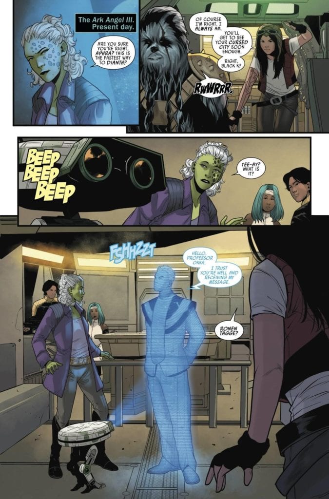
The new quest has some challenges in Doctor Aphra #2.
STAR WARS: DOCTOR APHRA #2, available Wednesday from Marvel Comics, brings fans back to the infamous archaeologist/thief extraordinaire. That’s right, Doctor Aphra is back, and she’s already neck-deep in another quest (unsurprisingly).
***SPOILER WARNING***
Doctor Aphra is a character perfectly designed to fit Star Wars. She loves lore and legends – almost as much as she loves money. Her obsessions take her all over the galaxy, giving fans opportunities to see the farthest reaches available.
All while seeing the chaos that Aphra leaves in her wake. Aphra is not a good person, but Star Wars has shown us that great characters don’t have to be good. They just have to be good at what they do.
In Aphra’s case, that usually means backstabbing and coming up with ill-thought-out plans, you know, the usual. Somehow she always manages to survive, but not without burning a few bridges in the process. It’s what makes her who she is, though, and that’s why fans love her.
Aphra is pretty talented at making enemies on her journies.
The Writing
Doctor Aphra’s latest journey continues. She has a new team, a new enemy, and new plans. The works! She’s totally going to mess things up somehow, even if it technically isn’t her fault (it’s always such a thin technicality too).
Doctor Aphra #2, written by Alyssa Wong is a disturbing tale, as Aphra and her allies explore a location that hasn’t encouraged life in who knows how long. Yet the temptation of lore and riches is too strong – which sounds about right.
The use of flashbacks to provide context and set the tone of the issue was incredibly well done. It’s so easy to forget that Aphra has a history of breaking hearts as well as vaults. She’s also quite talented at making enemies, though this guy is no Darth Vader. Even so, it’s likely that he’s going to cause her endless amounts of trouble.
This series simultaneously worked on humanizing Aphra, all while showcasing the worst traits she has to offer. Further proof that Doctor Aphra is a complex character worthy of her own story.
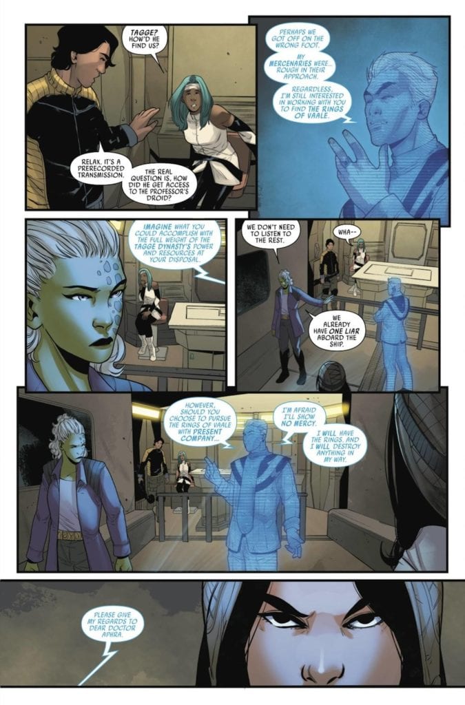
An extra challenge was thrown into the mix for this heist.
The Art
The artwork of Doctor Aphra #2 is striking and horrifying all in one. The artists for this issue did a fantastic job of finding that balance – and of portraying this haunted site Aphra and her crew have located.
The leading artist for this issue was Marika Cresta, who brought the structures of this site to horrifying life. Possibly literally – only time will tell on that count. It’s an element that starts out subtle, yet becomes a larger focus as time goes on. The character reactions help to sell the entire feel of the place, as well as the events that have occurred.
Rachelle Rosenberg was the colorist, and their colors are perfection. The setting is dark and foreshadowing (as it should be), while the characters are vibrant pops of color against it. The scenery found in the workshop would not have had the same impact, if not for those carefully thought out colors.
Then there’s the lettering provided by VC’s Joe Caramagna. This is an issue with plenty of dialogue, and yet the pages don’t ever feel crowded. There’s still plenty of room to appreciate both the characters and the location they are trying to explore.
In Conclusion
Doctor Aphra #2 was a haunting second issue to this series, yet it feels like the tale has only just begun. The cliffhanger ending is undoubtedly more than enough to get fans coming back for more, all in hopes of learning more about this latest twist.
Empyre didn’t start with the “bang” you’d expect from a major event series. But the opening installment still hooked readers in by setting up a compelling conflict between Marvel’s mightiest heroes and a new deadly threat. Unfortunately, this positive momentum doesn’t continue in Empyre #2, on sale July 22, because script writer Dan Slott drags the issue down with excessive exposition. Throughout its second chapter, Empyre spins its wheels and fails to reach the next level.
Empyre #2
Story: Al Ewing & Dan Slott
Script: Al Ewing
Artist: Valerio Schiti
Color Artist: Marte Gracia
Letterer: VC’s Joe Caramagna
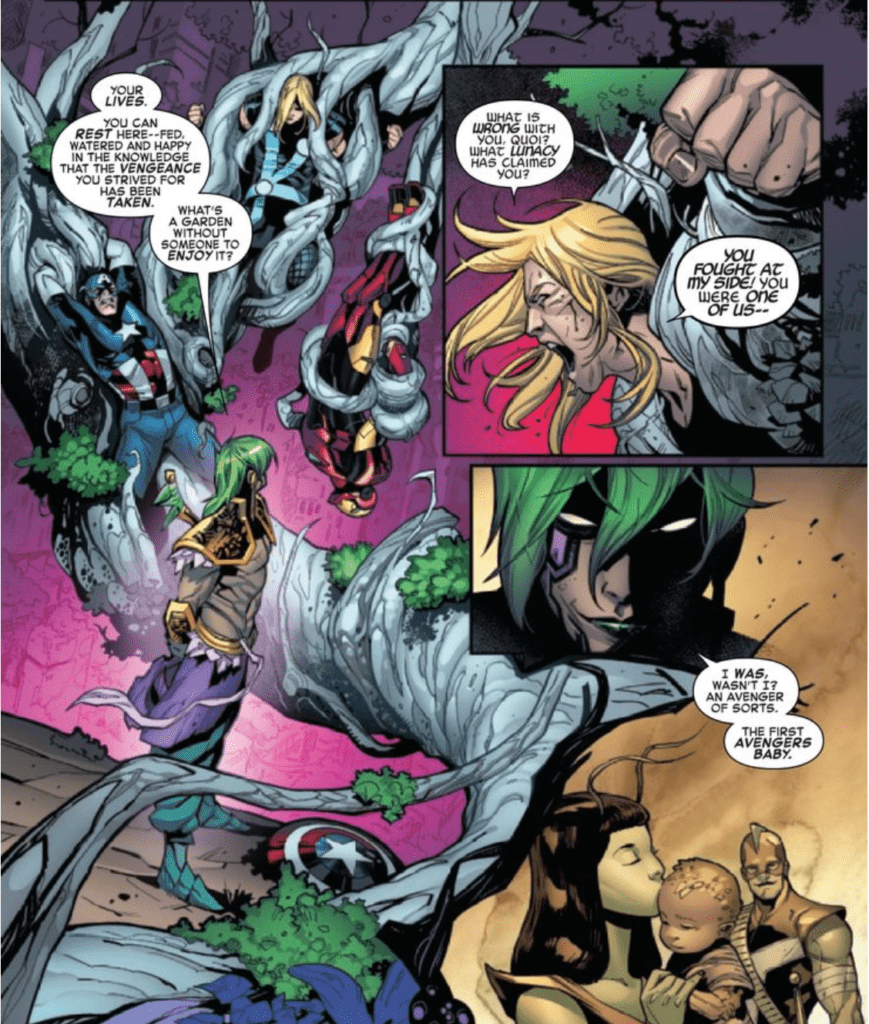
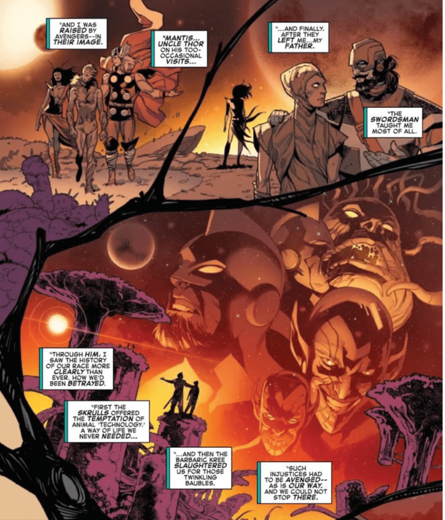
In the event’s premiere, Slott presented Quoi, the Cotati’s mysterious messiah, as a sympathetic leader. But now we’re beginning to see that Quoi is a vengeful, bloodthirsty commander, and the depths of his cruelty become quite clear in Empyre #2. Through a lengthy monologue, Slott shows us that Quoi will stop at nothing to avenge his people. Parts of this speech are entertaining, and Slott’s moving dialogue is right out of a movie. “For the good of all life, they had to be purged, their grotesque sins against us redeemed…in death,” Quoi says. The Avengers’ newest villain comes off like a slightly campier version of Thanos; you can trace his logic, and though their flaws are just as obvious, Quoi’s motives are far from unreasonable. But Slott loses himself in this characterization; he slogs through several flashbacks that expand on the history lesson of the Kree, the Skrull, and the Cotati that dominated Empyre #1. As a result, this issue doesn’t move the event forward in a meaningful way; instead, it’s just a filler installment that leaves us feeling pessimistic about the series’ future.
Quoi’s thirst for revenge is readily apparent in Empyre #2.
We’ve already compared Quoi to Thanos, and it’d be a stretch to consider Empyre an >Avengers: Endgame-like event. But Slott and the art team still provide several cinematic moments that somewhat make up for the disappointing story. First, the Avengers’ big three take center stage and fittingly look like gods when they stand up to Quoi. After they break free of the messiah’s trap, artist Valerio Schiti gives Captain America, Iron Man, and Thor a freeze-frame moment. Schiti shows Thor smirking while he wields Mjolnir and both Captain America and Iron Man looking like they’re ready to kick some Cotati behind. Just a few panels later, the trio teleport to Earth, and Schiti and color artist Marte Gracia again deliver a moment that will give Avengers fans chills. The big three stand together, partially silhouetted as they’re engulfed by the Bifrost Bridge’s brilliant rainbow. All three members of the trio have unshakable resolve written all over their faces, adding to the image’s heroic tone. Time and again, the art team makes the Earth’s Mightiest Heroes live up to their name.
Exposition-heavy flashbacks drag down Empyre #2.
Empyre #2 is a disappointing follow-up to what had been a compelling beginning to Marvel’s latest epic event. Of course, it’s far to early to give up on this series. But after this letdown, the third installment will have a lot of work to do if it hopes to recapture the reader’s interest.
What did you think of Empyre #2? Check out your local comic shop to see if you can get it there, or consider buying the comic online. Are you enjoying the event so far?
DECORUM #3, available from Image Comics on July 22nd, introduces Neha Nori Sood to the assassin school and its head instructor for the first and, perhaps, last time. Jonathan Hickman’s story reads like a dystopian Pygmalion, and Mike Huddleston’s art attacks your eyes like an abstract, post-modern scrapbook.
Cover Art
Huddleston’s cover, a woman punching a hippo-headed opponent, is weird. The trippy design of the background and the bizarre character renderings are a perfect fit for what you can expect inside. That said, I have no idea what the cover means because it has absolutely nothing to do with the story. The figure on the left looks somewhat like the school’s headmaster, but who knows. It looks cool. It’s weird. And that’s about it.
Writing
What do you do with an uncouth street rat like Neha Nori Sood? You recruit her to become a classy assassin. Hickman has assembled a world-hopping chapter in the Decorum series, where Neha is finally introduced to the Sisterhood of Man assassin school for her training with Imogen’s recommendation.
The interaction between Neha and Imogen is the highlight of the issue. Imogen establishes herself very quickly as the seasoned and refined mentor to Neha’s diamond-in-the-rough personality. The freshman introductions at the assassin school are highly amusing, and the headmaster (mistress) can stand up against the toughest of the tough foul-mouthed drill sergeants. It’s a bizarre and surreal issue that’s definitely not boring.
Pencils/Inks
Huddleston’s art is an acquired taste. Nearly every page and panel is a different type of art style, which intentionally(?) imbalances the reader to the surroundings. It forces you to analyze and focus on each panel as an individual work of art. That approach may not be to everyone’s liking, and as mentioned in the intro, it feels very much like a post-modern scrapbook.
If there’s one area that seems at least somewhat off, it’s the abundance of nearly blank white pages. This appears to be a stylistic choice prevalent in other Hickman titles. Most notably the X-Men-related series. Between each chapter in the issue, you’ll have two or more blank pages with nothing more than a few symbols in one spot. That’s fine if you’re looking to re-imagine the comic version of THX-1138 (1971), but here it gets tedious and wasteful.
Coloring
Huddleston’s colors are as abstract as the pencils and inks. Seemingly inconsistent from panel to panel but appropriate for the subject within each individual panel. Sometimes the colors highlight a character to express mood. Sometimes the only color is shading on a random object to draw your attention. If there’s rhyme or reason to the coloring, it’s not immediately apparent. And so, the coloring is a perfect match with the rest of the issue.
Lettering
Rus Wooton’s lettering gets high marks for acting as the glue that holds this post-modern fever dream together. You can follow the dialog quickly and cleanly. The characters have distinctive voices that reflect their personalities. And the cadence and volume of the speaker’s word bubbles help to inform the relationships between the speakers, especially between Imogen and the school’s headmistress.
Conclusion
DECORUM #3, available from Image Comics on July 22nd, is an excellent book for its daring approach to art and visual storytelling. You’ll either love it or hate it, but you’ll certainly never be bored by it. Pick it up for something truly different.
CANTO AND THE CLOCKWORK FAIRIES, available from IDW Publishing on July 22nd, is a simple tale about a clockwork knight and his pet Malorex attempting to save fairies from a wicked witch. David M. Booher’s charming fable, meshed with Drew Zucker’s fanciful art, makes for an entertaining bottle issue in the ongoing Canto saga.
Cover Art
Zucker tells you everything you need to know with a knockout cover. The extreme juxtaposition in size between Canto (who’s already vertically challenged among the folks he meets) and the diminutive fairy renders an appreciation for how small and frail the fairies really are. The lilt of the fairy’s wings and Canto’s look of wonder give you the impression he’s holding a delicate flower that could wither with a strong breeze. Zucker gives you both ends of the spectrum brought together in harmony with a solid, metal protector contrast with a tiny, frail life in need of protecting.
Writing
Booher’s story is as simple as fable’s get: Strong, determined knight, saves the damsel(s) from the evil witch in a cave. What it lacks in originality, Booher’s story more than makes up for in execution and charm.
Despite his short stature and childlike demeanor, Canto’s a courageous knight in the purest form. The Malorex (a giant, pink/purple dog-like animal) is the analog for Canto’s trusty steed. And the fairies, with their charm bracelet bell voices, are every helpless princess trope rolled into one. It may sound like criticism of cliche, but it really isn’t. What makes the obvious tropes so entertaining is the sheer wholesomeness of the story execution. Canto’s plucky determination, the Malorex’s Chewbacca-esque loyalty, and the witches’ malevolent penchant for mutilation all combine flawlessly.
Pencils/Inks
Zucker’s designs for the characters are both familiar and fresh at the same time. This is a form of “Clockwork Punk,” so the setting is high-fantasy medieval, but nearly every character is infused metal and gears to simulate wind-up technology in the biotech. It’s a subset of the techno-organic genres that don’t get enough attention and done well, and it works especially well here because placing it in a high-fantasy, medieval setting allows Zucker to get away with a lot of the design choices by implying magic, which is a very smart way.
Another area that I don’t touch on much in reviews is panel layout. Zucker’s panel choices here are very well done for cramming, on some pages, up to eight panels on a single page without looking cluttered. The panels in this issue are expertly executed, not only for being placed just right to guide the reader’s eye but also for knowing when to go as far to the other extreme of using a single panel for punch—nice job by Zucker in this issue.
Coloring
Vittori Astone’s colors are a great match for the subject matter. Most of the story takes place in the gloom of a nighttime forest or the torch-lit shadows of a cave, but the colors that need to stand out pop. Every detail is visible, from the flowing red of Canto’s scarf to the tiny rust speckles on his helmet. The sparkling blue glow of the witch’s wand crackles with electricity, and the orange glow stands of the furnace fire from Canto’s helmet stands out as a faux smile when the panel calls for it. All the elements of power and emotion are accomplished through Astone’s color work.
Lettering
Deron Bennett’s lettering stands out for the unique take on fairy speak. Through the use of colored fill on the fairies’ word balloons, you get a sense of musicality when they’re speaking. There is a little room for improvement here in that the font choice made the words a little hard to read on some of the panels. For future issues, this could be helped with using more bold in the fairies’ lettering or by using a font that’s more clear to read when using a reverse bold.
Conclusion
CANTO AND THE CLOCKWORK FAIRIES, available from IDW Publishing on July 22nd, is the simplest of fables but is thoroughly enjoyable for stellar art and overwhelming charm. This is a highly entertaining bottle issue that’s completely worth the price.
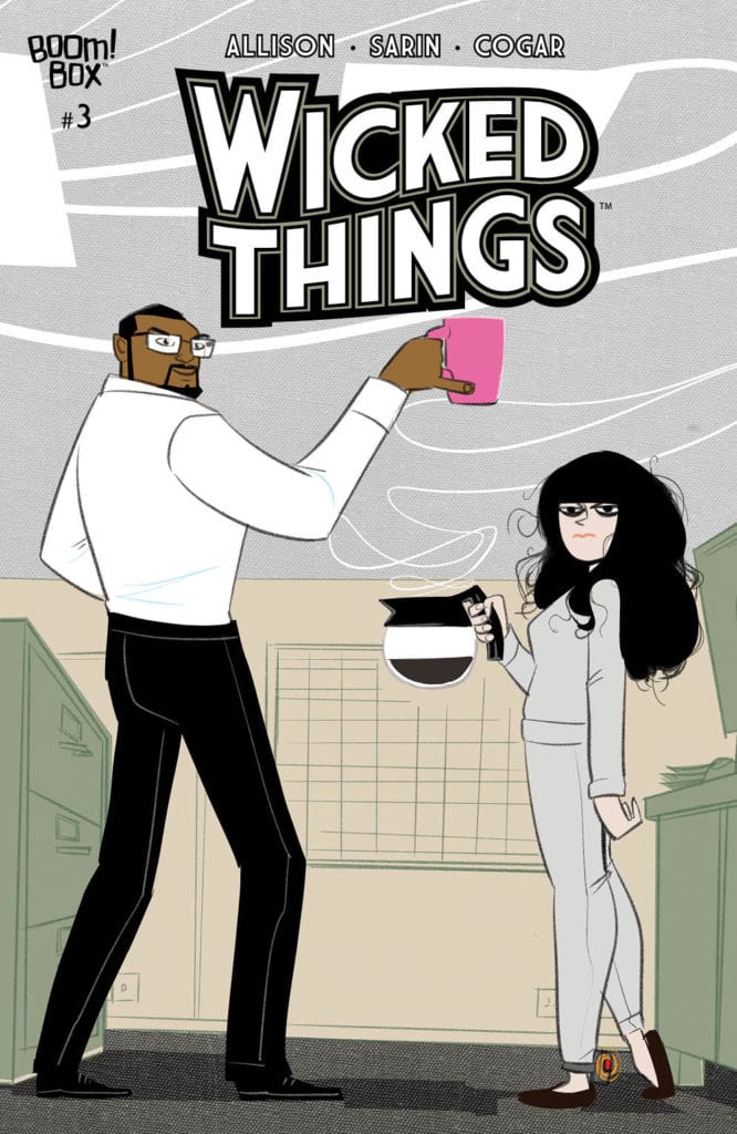
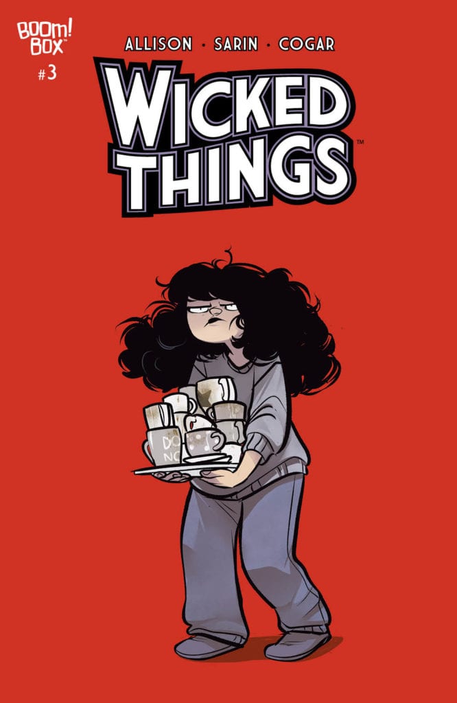
Lottie is looking harried on the cover of Wicked Things #3.
WICKED THINGS #3, available Wednesday from Boom! Box continues the tale of Lottie Grote and all the trouble her investigative life has gotten her into. This is an issue full of frustration and irony.
***SPOILER WARNING***
Thanks to her talent and determination, Lottie has managed to make enemies out of more than one character. Now that’s all come back to bite her, as she’s been framed for murder. She received a break that wasn’t much of a break when given the opportunity (read: order) to assist the police in their cases instead.
This is something that would work a lot better if the police actually, you know, listened to her. But respect, and trust as well, must be earned. The real question is, how is Lottie going to go about earning it?
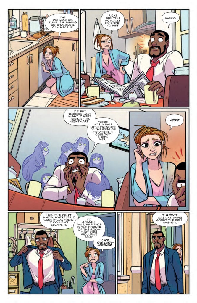
Think she’s about to beat somebody with that coffee pot?
The Writing
Wicked Things #3 was written by John Allison, a fact that is made clear as day once Lottie opens her mouth. Allison has a way of designing his characters, and Lottie is no exception to that rule. This is a character that gets herself into the most extraordinary of circumstances, and her reactions are accordingly overdramatic.
It isn’t just Lottie’s plight that makes this issue intriguing. There are many factors at play here from the police officer in charge of monitoring her, to the IT guy, and all the way back around to the criminals eluding the police.
It’s all connected, of course. Yet thus far, it’s only Lottie that can see how it all ties together. Though technically, one could argue the readers know as well, assuming they were able to follow her quick, intuitive leaps.
As per usual, the entire issue, while dealing with some serious undertones, does have it’s funny moments. Lottie’s reactions are the highlight, naturally, but there are other moments as well. But it’s the comedic timing in regards to the reveals that really sells the whole concept.
It looks like Lottie isn’t the only one getting stressed out.
The Art
Wicked Things #3 was illustrated by Max Sarin, who did a delightful job of bringing Lottie and her excursions (tantrums?) to life. Lottie’s expressions are as over the top as her reactions, and it’s actually perfect.
The colors bounce between being intentional mind-numbingly neutral to bright and vibrant. The juxtaposition of the color palette between panels should be jarring – but it isn’t. It just feels natural in connection to Lottie’s personality.
Okay, so the addition of cute little green skulls around Lottie’s head doesn’t hurt. However, those same skulls are certainly intended to be more sinister. It’s yet another element that fans have come to expect from this creative team, yet still feels so perfectly at home here.
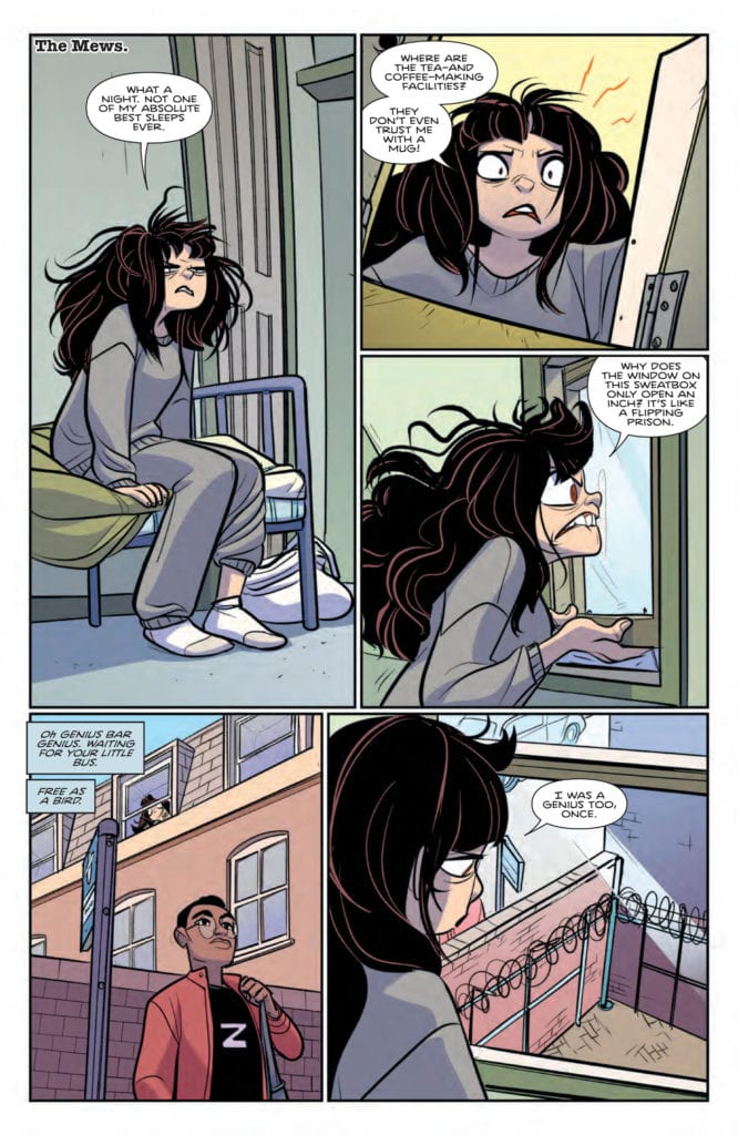
Trapped in a stuffy room with windows that don’t open. Talk about a nightmare.
In Conclusion
This was another fascinating issue in Lottie’s story. Wicked Things #3 is setting up for something bigger, with criminals clearly working on a master plan (that has thus far been ignored). It’s an issue that could have been depressing, if not for the characters that filled the pages with their determination and hope. Now let’s see how long it takes for them to sort out the mess.
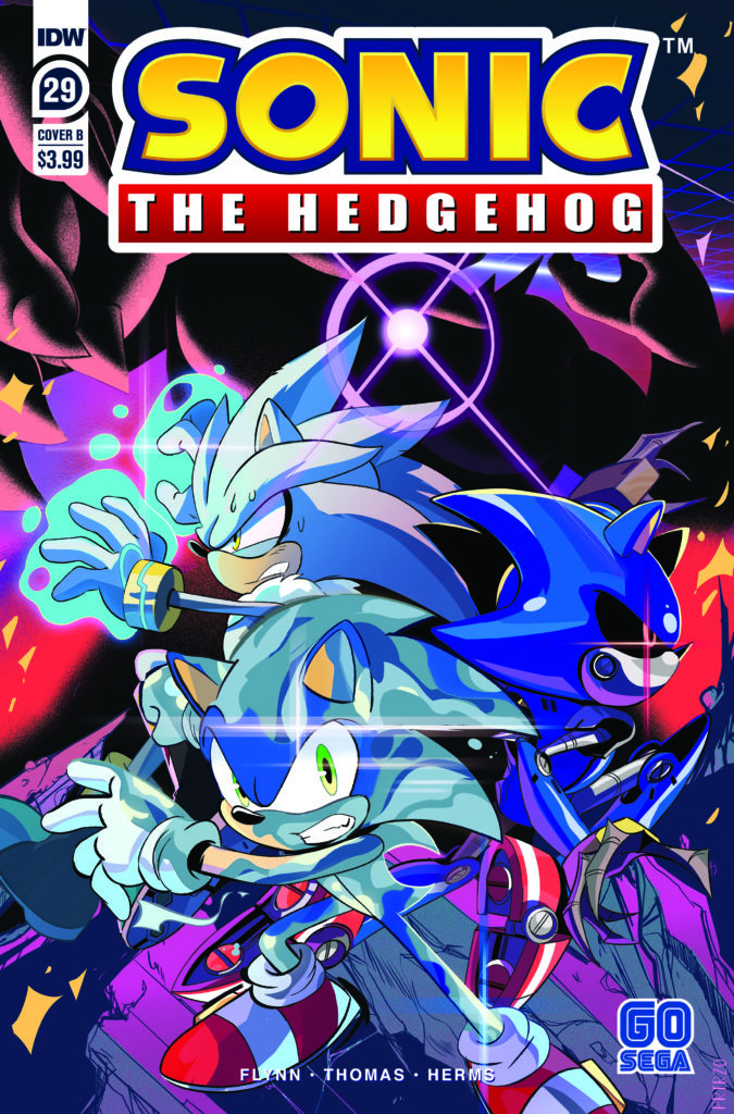
The final chapter of the Zombot saga arrives and an epic battle unfolds in Sonic The Hedgehog #29 by Ian Flynn, Adam Bryce Thomas, Matt Herms, and Shawn Lee. Sonic and his comrades have been pushed to their breaking point fighting against a threat without limits which turned friends into enemies. The wrap up to all this feels like what fans have been waiting for.
This is it! Sonic and the remaining members of the Restoration team-up for their final fight against the ultra powerful Deadly Six.
Writing
The Zombot arc has been going for a while (14 issues) but managed to keep a consistent level of interest through its run thanks to the intensity and drama the story carried. Only a grand ending would be enough to ensure this series wraps up in a tight little package. Luckily writer Ian Flynn delivers such a conclusion.
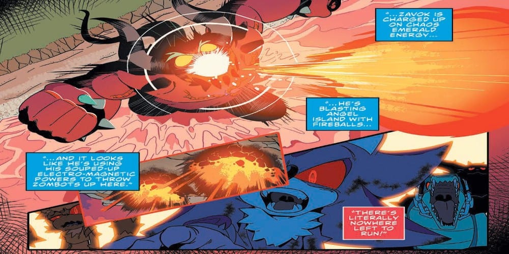
The fight scenes are intense and feel like they have weight. All of the characters are shown to be at the end of their ropes but willing to stand their ground to the very last moments. The battle takes up most of the issue but when it’s all over, the fans will find themselves in awe of what they just witnessed. No spoilers here at its too good of an issue to spoil.
Artwork
The artwork by Adam Bryce Thomas showcases a great flow from panel to panel. The attention to detail comes off especially well with showing how the characters are tired and scared as the battle reaches its climax. If you look closely in the panels you will also see a shoutout to Neon Genesis Evangelion, complete with an AT FIeld.
The colorwork by Matt Herms offers some intense mood lighting for the panels. Adding to the sense of distress and hopelessness, the coloring works to set the mode the heroes are drained and don’t think they are going to make it out of this one. The colors take center stage when a certain event takes place involving Silver and Sonic (again, no spoilers).
The lettering by Shawn Lee captures the emotions of the character as the battle unfolds. There is a special emphasis on conveying the fear and exhaustion the characters are carrying with them as the battle wages on. At the same time, the sound effects manage to be present but not distracting from the story which is always a welcomed sight.
Conclusion
Sonic The Hedgehog #29 is an ending intent on leaving a lasting impression. From here, Ian Flynn will be using the next two issues to wrap up this arc and prepare for a new writer to take over. The creator will have to bring their best work to match an ending this impactful.
BIRTHRIGHT #45, available from Image Comics on July 22nd, follows the aftermath of Lore’s death as Mikey and his parents race to close the portal that joins Earth and Terrenos. Joshua Williamson has written a nail-biter with his co-creator artist, Andrei Bressan, that keeps you guessing if they’ll make it until the very last page.
Cover Art
Bressan has hidden little, subtle hints in the cover about the plot of the book. Blood flows from a fresh battle, a new day dawns, and a mother cradles her child. These small elements Bressan peppers into a single image summarize the plot beautifully.
Writing
Hang on to your butt because there’s a lot of speed going in 30+ pages. Williamson places characters like a Grandmaster in chess, continually moving and yet thinking twenty moves ahead. Mikey’s parents race to get the sigil in place on the Terrenos side of the portal. Brennan pushes the limits of magic beyond anything done before to close the portals in record time. And the monsters scramble to retreat through the portal and straight into Mikey’s parents.
Williamson’s story reads like a top-notch action movie where all the pieces have to fall into place, or it spells doom for the characters, and of course, a little wrinkle at the end sets up a perfectly executed cliffhanger on the last page. This is a high-adrenaline issue.
Pencils/Inks
Bressan’s artwork is surprisingly detailed when you consider the amount of thick line work used in this issue. It’s an interesting contrast. Bressan uses thick line borders for characters and objects to create a high contrast between them and their surroundings. That contrast gives the object of focus a dramatic weight. Bressan then uses fine lines to flesh out the details within the border. It gives the characters and almost embossed texture that’s very striking and visually interesting.
What’s equally striking is Bressan’s design for magic casting, “magic mode” looks like Brennan is on fire with energy and spells. It’s a unique look, and again, visually exciting.
Coloring
Adriano Lucas’ color work pops throughout the whole issue, particularly when magic spells and portals are cast. When Mikey’s parents step through a portal on the first page, the panel practically flares out with light, energy, and power. When Brennan is casting his spells, the energy streaks, flares, and blurs in such a way that it keeps your eyes glued right to the image. Impressive work.
Lettering
Pat Brosseau’s lettering works well for keeping the reader’s eye moving through the panels without bogging down the pace. What’s not obvious is Brosseau’s subtle execution of the use of italics whenever the speaker is speaking with urgency or multi-tasking. It’s a small trick, but what it does is provide an element of urgency to the words that you wouldn’t otherwise get unless you could hear it in the speaker’s voice.
Conclusion
BIRTHRIGHT #45, available from Image Comics on July 22nd, is an adrenaline-pumping, visually fascinating issue in the series. The story has great character interactions with a lot of heart as everyone races to the goal, and the artwork practically glows.
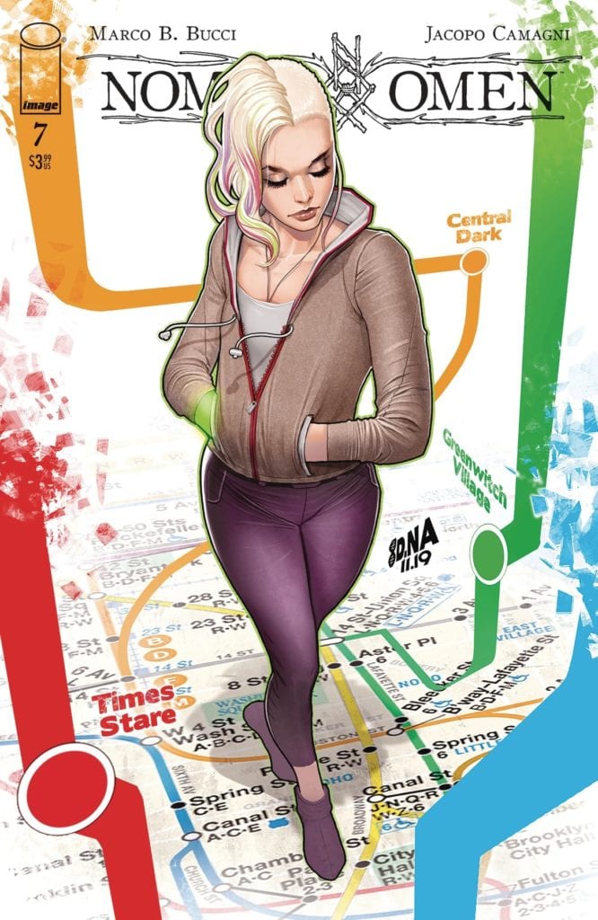
NOMEN OMEN #7, available this Wednesday from Image Comics, is a tale of love, magic, grief, and loss. Becky has had her life altered forever by all of those and more. Now, it’s time for her to find the path forward.
***SPOILER WARNING***
Nomen Omen has been a strange and disturbing series from the first moment. It is the tale of Becky and how magic has permanently changed her life. From the moment her two mothers had her thrust into their lives, Becky has never quite been normal.
Now she’s on a path that there is no turning back from. In the process of trying to gain back the heart that was stolen from her (literally), Becky has changed herself and her abilities to suit those she must fight against.
In Nomen Omen #7, we’re about to find out how Becky has been coping with all of those changes, and what she’s going to do about it.
Time to choose a path in Nomen Omen #7.
The Writing
This unusual and haunting tale continues in Nomen Omen #7. ‘Wicked Game’ Part Two brings yet more changes to the scene – and no shortage of concerning scenes. Written by Marco B. Bucci, this is an issue full of intrigue, coping, and alarm.
There are many questions raised in this issue. Many yet still require answers. Yet that feels perfectly natural in a plot as ethereal as this one. There is no such thing as an easy solution or an easy answer. It’s a lesson that Becky herself has had to learn the hard way.
The insight into what the other side has been up to is…concerning, to say the least. As are the implications for who and what they actually are. These scenes have gone a long way in upping the ante for what Becky is up against.
What’s more intriguing are the implications raised about the people in her life. Yes, some are just as human and ordinary as they appear. But others? Maybe not so much. Only time will tell what complications they’re going to bring to the mix.
The Art
The artwork within Nomen Omen #7 is both brilliant and beautiful, with alarming undertones strewn about. There are some truly stunning images to be found within this issue. As well as a few alarming scenes. There is one notable scene that may be alarming to some, so it’s worth noting that it’s a dream (one that is cut short).
Jacopo Camagni is the one behind the lines and colors, which is so impressive when you think about it. They single-handedly created a world that truly looks to be infused by magic (and all of the wicked things that come with it).
Once again, this issue has made heavy use of the black and white imagery, all of which is in high contrast to the exceptionally bright scenes the magic brings with it. To have both color and black and white panels in an issue may be disorienting, but it feels…right here.
Fabio Amelia was responsible for the lettering, and they went above and beyond here. While there was a lot left unsaid in this issue, they worked smoothly with everything that was actually verbalized, adding in a few details to catch the eyes.
A peek at what is to come in Nomen Omen #8.
In Conclusion
Nomen Omen #7 is arguably one of the most alarming reads of the series, which is saying something. Becky’s life has steadily transitioned from ‘slightly abnormal’ to fully ‘other,’ and the series reflects that.
This is an issue that raised a ton of questions and only answered a few. Now to see what path all of the hints will take.
The Pull List is Marvel Comics’ weekly YouTube show dedicated to discussing upcoming titles. In this week’s episode, the hosts cover a bevvy of titles slated for release in October, and we have a sampling of some of the best bits for you.
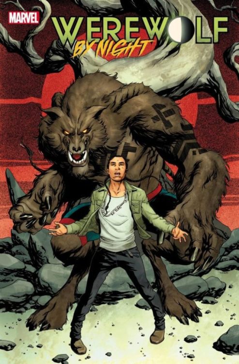
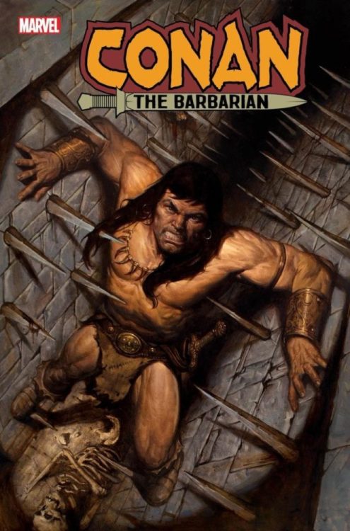
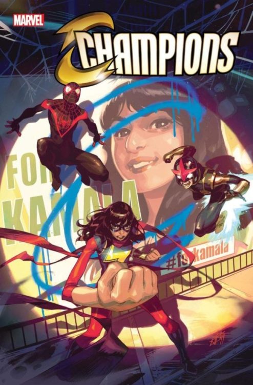
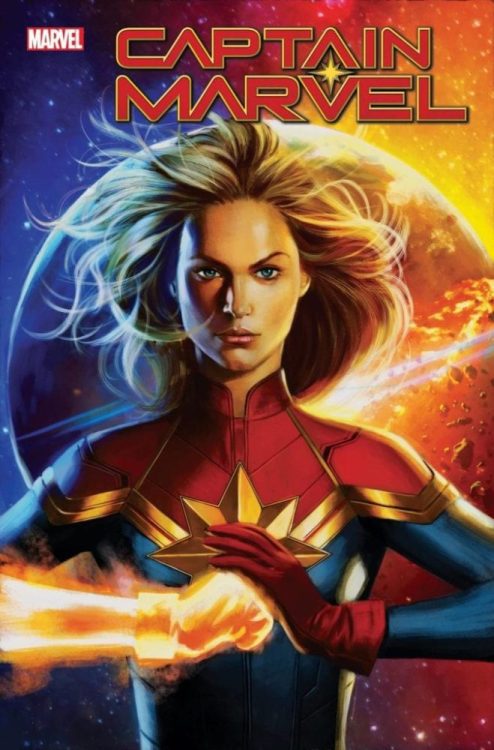
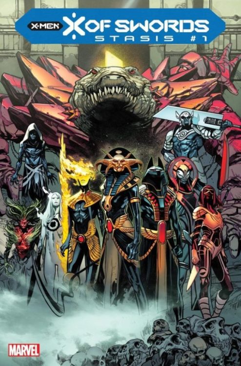
The announcement video covers more detail on the previously announced X Of Swords event, a first look at a Conan omnibus, and more info on the recently announced Werewolf By Night reboot. You can check out the full video presentation, the official Marvel press release, and a few select preview images below from Marvel.
Which October title has you most excited? Let us know what you think in the Comments section, and please share this post on social media using the links below.
MARVEL’S THE PULL LIST UNVEILS EXCLUSIVE PREVIEWS FOR UPCOMING MARVEL COMICS IN OCTOBER
New York, NY— July 21, 2020 — Today, Marvel released its special edition of THE PULL LIST, unveiling exclusive information for the hottest books coming to comic shops this October!
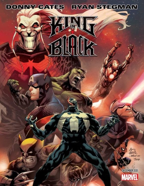
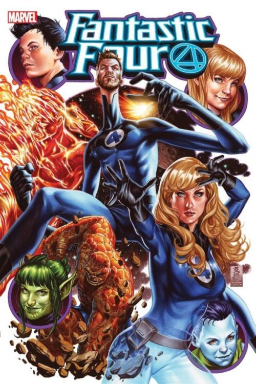
Tucker Markus took the reins of this special previews announcement solo, presenting the first look at a few bleeding-edge Marvel comics, with info all about new series, art, and creative teams heading to your local comic shop in three months! This special previews announcement gave viewers a first look at the highly anticipated X-Men crossover, X OF SWORDS and the celebration of 50 years of Conan the Barbarian’s Marvel Comics legacy in CONAN THE BARBARIAN #15 THE OFFICIAL HANDBOOK OF THE CONAN UNIVERSE ANNIVERSARY EDITION. This latest episode also teased new eras for both the Fantastic Four in FANTASTIC FOUR #25 and Captain Marvel in CAPTAIN MARVEL #25 and exciting starts for the brand new WEREWOLF BY NIGHT and the new CHAMPIONS. The Pull List also shed light on KING IN BLACK, the next chapter in Donny Cates and Ryan Stegman’s landmark run on VENOM coming in December!