Home Blog Page 278

Review: EMPYRE: SAVAGE AVENGERS #1 Takes CONAN THE BARBARIAN To Mexico

Savage Avengers

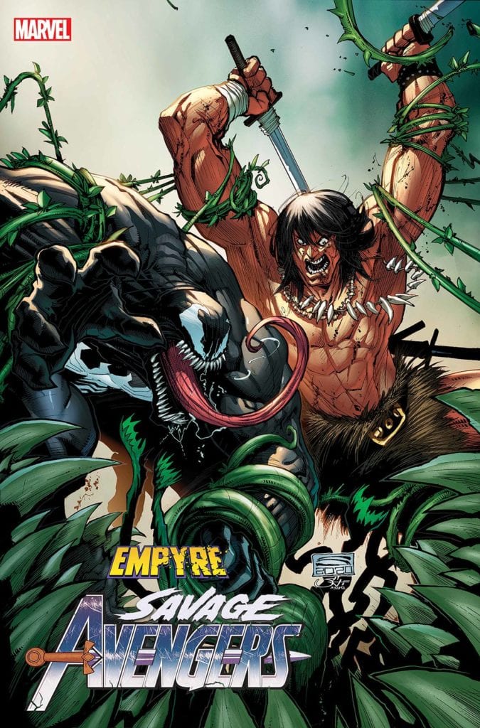
Empyre: Savage Avengers #1 has Conan the Barbarian fighting in modern-day society thanks to Gerry Duggan, Greg Smallwood, and VC’s Travis Lantham. A character like Conan who is out of time finds a way to find his purpose by helping to repel an alien invasion. Which is amazing to watch unfold.

Summary

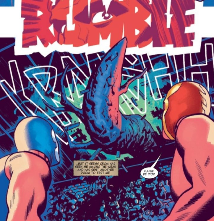
In South America, Conan finds himself enslaved – which is typically bad news for those attempting to do the enslaving! But these enslavers come from beyond the stars, and they’ve got a singular and grisly end in store for the Cimmerian.

Savage Avengers

Writing

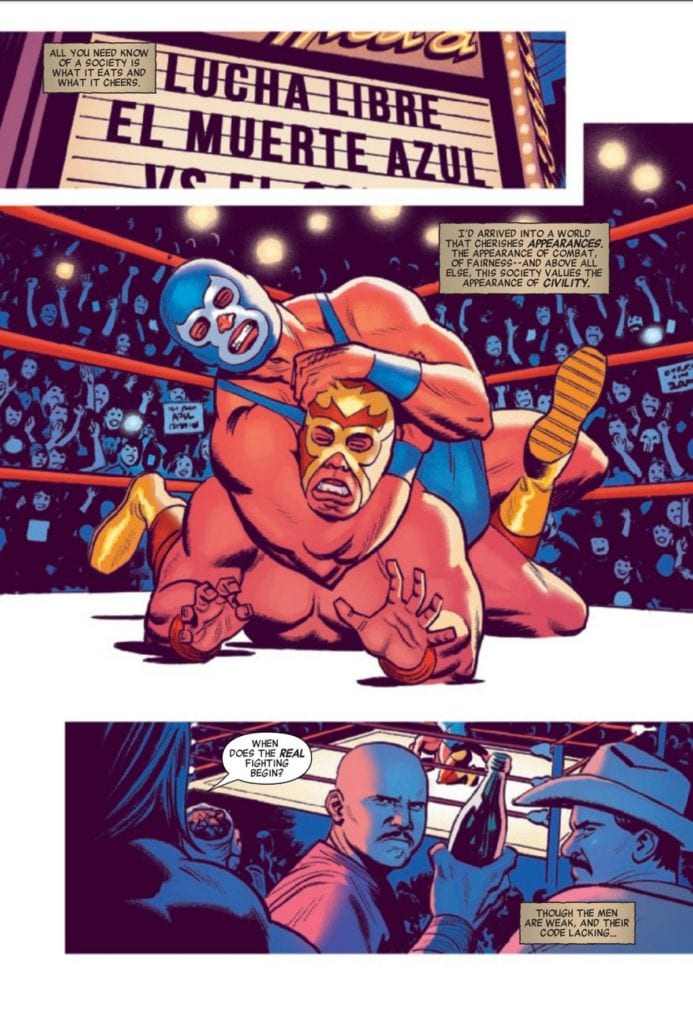
The setup of Conan enjoying modern culture before shifting into combat was a great premise. Especially being in Mexico City (the description is wrong and it’s from the official site) where Conan is shown to be watching Lucha wrestling and calling the action fake. This is a small moment and shifts into what Conan does best (violence) as the aliens invade. From there the issue really picks up speed.

Greg Duggan finds a way to capitalize on Conan’s skill as a warrior. The Cotati are alien plant creatures who don’t bleed blood. This allows for a large amount of decapitation and dismemberment which comes off more as tame. Seeing Venom acting as a “Suck it up and get it together” character seems weird but appropriate given his new calling as an Avenger.

Savage Avengers

Artwork

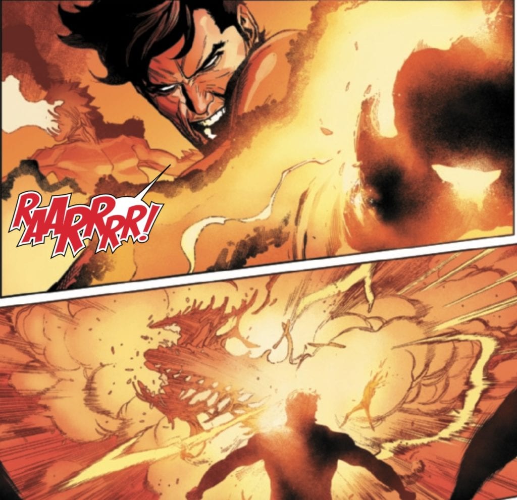
The artwork by Greg Smallwood seems like the perfect style for this issue. The majority of the scenes are tight and focus on Conan as he fights through the streets. This allows attention to the movement of the combat and is entertaining to witness.

The coloring thanks to Smallwood helps with the setting and with showcasing how the Cotati are aliens. With the setting, though most of the issue happens at night, there is a shift to a dream sequence and the change in color helps the reader to tell the scene is different. With the Cotati the color allows the reader to see their blood is green and makes the fact Conan shreds through a large group of them without making the issue feel like it’s made for mature readers.

Savage Avengers

The Lettering by VC’s Travis Lanham, the narration boxes for Conan seems on point looking like the papyrus of a scroll. There also is an impressive use of the special effect lettering for adding to the action scenes. The lettering for the explosions and impact scenes are especially worth mentioning.

Conclusion

Empyre: Savage Avengers #1 isn’t a must-read comic but at the same time it’s a lot of fun. Seeing how Conan the Barbarian would deal with an alien invasion is a question I’m sure many have always wondered and now there is an answer. After reading the issue hopefully, fans will find themselves wanting to check out the regular Savage Avengers series to see what the future has Conan.

Monkeys Fighting Robots Youtube

Review: Tony Strikes Back In IRON MAN 2020 #5

Iron Man

Iron Man 2020 #5 has Tony Stark return to stop his brother Arno thanks to Christos Gage, Dan Slott, Pete Woods and VC’s Joe Caramagna. After all of the carnage of the 2020 event, Tony Stark makes his appearance and intends to make it clear he is the real Iron Man. It’s a phenomenal issue, topped off by a cliffhanger which will leave the audience in suspense.

Summary

Tony Stark is back! But is this the REAL Tony? How is that possible?! Where did that all-new armor come from?! WHAT’S GOING ON?!

Iron Man

Writing

This issue feels like what Dan Slott and Christos Gage have been working towards since the beginning. After putting Tony through a journey of self-doubt, seeing him back and revealing a plan to take on Arno is beyond entertaining. Also, the showdown between the two brothers becomes the highlight of the entire issue.

After all the chaos of the 2020 event (and what has been happening in the real world), seeing Tony Stark back and eager to reclaim his title as the Invincible Iron Man is a welcomed sight. This issue brings together the side stories of Rescue 2020 and Machine Man 2020 making the event feel grander. With only one issue left, the team will hopefully wrap this story up and set up the next installment of Iron Man’s journey.

Iron Man

Artwork

The art by Pete Woods is on point. One of the biggest achievements comes in the attention to the different facial expressions and how impactful they are to each scene. Scenes like when Tony is creating in the virtual world on a forge and the happiness on his face or Sunset Bain’s expression as she decides to adopt an old persona is chilling.

The colorwork by Woods stands out as Tony unveils his new armor. Instead of a traditional suit of metal, the new suit uses a hard light/hologram system. It wraps around Tony’s body but shows the clothes underneath. Thanks to the coloring the effect is mind-blowing to observe.

Iron Man

The lettering work by VC’s Joe Caramagna helps the story to flow with the distinct placement of word bubbles. This helps a lot thanks to the way Woods likes to use a stylized flow to the issue across the two pages. Also, the specific format with the word bubbles for many characters helps with the audio aspect as you read the issue.

Conclusion

Iron Man 2020 #5 truly feels like where the event was leading to the entire time. The issue also features a tribute to the late Denny O’Neil. His run on Iron Man featured some of the best stories and moments in the character’s history. He will be missed.

Monkeys Fighting Robots Youtube

Marvel Comics Exclusive Preview: GUARDIANS OF THE GALAXY #5

marvel comics guardians of the galaxy #5 exclusive preview

GUARDIANS OF THE GALAXY #5 hits your local comic book store August 5th, but thanks to Marvel Comics, Monkeys Fighting Robots has an exclusive five-page preview for you.

About the issue:
Moondragon is a hero. With her wife at her side, she came to our reality from a dimension of heroes – to save us all from evil. But our reality already had a Moondragon, and she can’t be a hero all the time. The DRAGON OF THE MOON has returned — and it won’t leave until it’s fed on a soul. Didn’t we say it could always get worse?

GUARDIANS OF THE GALAXY #5 is by writer Al Ewing and artist Juann Cabal, with colors by Federico Blee, and letters by Cory Petit. Ivan Shavrin illustrated the cover.

Cabal’s layouts in the preview below are exactly what you want in a cosmic comic like GUARDIANS. His work is trippy and other-worldly, and is an excellent visual display of telepath Moondragon’s inner turmoil.

Check out the GUARDIANS OF THE GALAXY #5 preview below:

marvel comics guardians of the galaxy #5 exclusive preview

marvel comics guardians of the galaxy #5 exclusive preview

marvel comics guardians of the galaxy #5 exclusive preview

marvel comics guardians of the galaxy #5 exclusive preview

marvel comics guardians of the galaxy #5 exclusive preview

marvel comics guardians of the galaxy #5 exclusive preview

marvel comics guardians of the galaxy #5 exclusive preview


Who is your favorite Guardian of the Galaxy? Sound off in the comments below!

Monkeys Fighting Robots Youtube

Review: THE AMAZING SPIDER-MAN #45 – An Epic Confrontation

The Amazing Spider-Man #45 Cover

In The Amazing Spider-Man #45, published by Marvel Comics, the Sin-Eater returns and crosses path with the famous web-slinger in an unforgettable issue. Filled with beautifully drawn action scenes, deeply engaging story, and iconic characters, The Amazing Spider-Man #45 promises many things for the Sins Rising event.

About the book:
The writing of Nick Spencer, the pencils of Mark Bagley, the inks of John Dell and Andy Owens, and the lettering of VC’s Joe Caramagna come together to make a stunning issue. After the Sins Rising Prelude, which showed us how the Sin-Eater came back to life, the malicious villain is back to cause trouble for Spider-Man.

The Amazing Spider-Man #45 Intro

“Sins Rising: Part One” Story

In The Amazing Spider-Man #45, Peter Parker must deal with the villain Overdrive as he speeds through the city. We find he is running away from none other than the deceased Sin-Eater, a foe that Spider-Man must now confront. Spencer does a fantastic job of bringing back the old character in a brand new way, and seeing Spider-Man deal with a villain he has such conflicting emotions about is wonderfully portrayed.

An interesting aspect of this issue’s writing is how Spencer chooses to breathe new life into the Sin-Eater, who died in a 1988 story. The first incarnation of the Sin-Eater had him be a very realistic villain in a fantastical world. Rather than the incredibly colorful enemies that Spider-Man typically faces, the Sin-Eater is simply a man with a mental disorder and a gun. Without any powers, the violent actions he committed were bloody and incredibly horrific. Spencer takes this powerless character and upgrades him with the help of the demon Kindred. The Sin-Eater now has the ability to appear and vanish from places he needs to be, as well as a few strange other abilities regarding his weapon. At the end of the first issue, there is still much to be explored about how the Sin-Eater’s new abilities work, and the issue leaves you wanting more.

The Amazing Spider-Man #45 Sin-Eater

Another way that Spencer elevates the story of The Amazing Spider-Man #45 is by always leaving the reader in anticipation. The story is fast-paced, and the issue already had set up the story through the Sins Rising Prelude, leaving the reader interested to see how the confrontation between Spider-Man and the Sin-Eater would play out. On top of that, the issue ends on a cliffhanger. Every page keeps the reader interested.

Art

The pencils and inks are all very clean, and every page of The Amazing Spider-Man #45 is a pleasure to look at. Bagley’s pencils provide incredibly dynamic poses for the characters during action sequences, and the inks of Dell and Owens turn them into an astonishing finished product. The faces of characters in the issue are deeply expressive, and many motion lines are used during action scenes that provide a strong sense of fast-paced movement.

Characters often overlap the borders of panels, which either makes them seem to be reaching out or causes them to stand out in particular scenes. This is used very effectively in several dramatic scenes in the issue, and overall the framing of the issue stood out as particularly spectacular. Many panels are memorable simply due to the framing. One panel was even intentionally left black, and it was deeply effective.

Spider-Man Action Scene

The colors of The Amazing Spider-Man #45, done by Curiel, are very vibrant for most scenes, and it makes the issue very pleasant to the eye. The many colors used on most panels also provide a stark contrast to panels overloaded with a single color, allowing emphasis of one tone during certain scenes. It is a simple but instrumental technique and is executed flawlessly.

Caramagna does a splendid job with lettering The Amazing Spider-Man #45, and his work allows for the story to flow seamlessly. The widths of a few speech bubble borders are increased for emphasis, captions are large and stand out, and sometimes dialogue that is meant to be shouted has a different font and color to it. These techniques come together to deliver some outstanding lettering.

Conclusion

This first part of the Sins Rising event is filled with so much action, drama, and mystery that it is sure to entertain. The art is a visual spectacle and works so easily with the story that the issue feels less like you’re reading something, and more like you are experiencing it. The Amazing Spider-Man #45 set up Sins Rising to be a fantastic event and makes the reader excited for issues to follow.

Monkeys Fighting Robots Youtube

I’d Buy That For A Dollar: DC Comics’ WHO’S WHO (1985-1987)

Who's Who

Welcome to ‘I’d Buy That For A Dollar’ a column where I will be exploring the weird and wonderful world of dollar bin diving. The only rule is each and every comic is purchased for one dollar (or less!).

This Week’s Comic(s): DC Comics’ Who’s Who series!

So I am taking a different approach to this edition of I’d Buy That For A Dollar. Instead of focusing on a single issue, I’m going to showcase some highlights from DC’s Who’s Who books. For those young comic fans who weren’t around before Wikipedia and Google, guidebooks like Who’s Who were the only sources for deep-cut knowledge and statistics on continuity and characters. And as much fun as that is, the real pleasure was in all the fantastic artists that contributed to them (and DC was great about crediting the specific artists on the pages they did),  You could even argue that they are more of a Who’s Who of artists than characters! Anyway, I will let the pages, images, and covers speak for themselves. Enjoy!


Who's Who
Here is an early cover by Todd McFarlane!
Who's Who
McFarlane also did a few interiors. Check this one out. Love that Mr. Bones!
Who's Who
David Mazzuchelli doing Commissioner Gordon! Perfect!
Who's Who
The double-page spreads are classic. Just check out this Joe Kubert Easy Company entry!
Who's Who
And here is another double-pager by the great Rick Veitch!
Who's Who
Marshall Rogers!!!!!!
Who's Who
Classic Superman artist Curt Swan does one of the most beloved Silver Age creations, Composite Superman!
Who's Who
The always great and underused Tim Truman!
Who's Who
Colleen Doran and Karl Kessel!
Who's Who
The Racketeer’s Dave Stevens!
Who's Who
Steve Rude!!!!

There you go, folks! And that’s just the tiniest of tastes! These books are so well worth it, so seek them out in those bins and deep dive!


You can find great dollar bins at almost every local comic shop. So find a shop, ask a comic clerk what they can do for you during this time and get some dollar comics! Pick them up curbside and have them delivered if you must!

Got your own awesome dollar bin finds? Toss them at me! 
Send emails to manny@monkeysfightingrobots.com
Follow me on Instagram: _idbuythatforadollar_
Tweet at me: @MannyG1138

Monkeys Fighting Robots Youtube

AfterShock Comics Exclusive Preview: THE MAN WHO F#%&ED UP TIME #5

aftershock comics exclusive preview the man who effed up time #5

THE MAN WHO F#%&ED UP TIME #5 hits your local comic book store August 26th, but thanks to AfterShock Comics, Monkeys Fighting Robots has an exclusive four-page preview for you.

About the issue:
Time’s up for Sean Bennett, the very unfortunate man who f#%&ed up time and now has a death sentence handed down by the dreaded cyborg Future Police. The past has been f#%&ed up, and it looks like irrevocably so. What does this mean for the future? Nothing good!

THE MAN WHO F#%&ED UP TIME #5 is by writer John Layman and artist Karl Mostert, with colors by Dee Cunniffe, and letters by Layman. The cover is by Mostert and Cunniffe.

“A time-twisted sci-fi action-comedy, a butterfly effect noir…

Check out the THE MAN WHO F#%&ED UP TIME #5 preview below:

aftershock comics exclusive preview the man who effed up time #5

aftershock comics exclusive preview the man who effed up time #5

aftershock comics exclusive preview the man who effed up time #5

aftershock comics exclusive preview the man who effed up time #5

aftershock comics exclusive preview the man who effed up time #5

aftershock comics exclusive preview the man who effed up time #5


Are you reading THE MAN WHO F#%&ED UP TIME? Sound off in the comments with your thoughts!

Monkeys Fighting Robots Youtube

Review: LOST SOLDIERS #1 – Looking Back on the Horror

“Lost Soldiers” #1 is the work of writer Ales Kot and artist Luca Casalanguida, with Heather Marie Lawrence Moore on colors and Aditya Bidikar on letters. This unique Vietnam War-era comic makes use of a twin plot thread, examining the lives of old former soldiers both during their time in Nam, and many years later in their new occupation. Kot’s solid dialogue and haunting poetic passages combine with Casalanguida and Moore’s incredibly atmospheric art make this debut issue a powerful opener, with plenty of potential moving forward.

“Vietnam, 1969. Juarez, forty years later. Three men tied by the war they left behind—on a collision course with a new one.”

Writing & Plot

Ales Kot‘s plot follows a trio of old Vietnam vets who went through the grinder of jungle combat and now work as freelance operatives in operations taking place in Juarez, Mexico. The plot switches between their time in Vietnam as young men fighting in a war they don’t really understand, then to their briefings about their next job, where they do the only things they are likely good at anymore. The notion of old soldiers never being able to leave the battlefield, regardless of time period or location, is an old old story that’s still tragically engaging to read when handled properly. Kot’s three main characters are distinct individuals in their own right, with their own perspectives on the battlefield in ‘Nam, their personality types, and how they handle life 40 years after that war (even though they stayed in the field of blood & bullets). Because of this, there is considerable tension among the three, adding to the overall drama and believability of these three men. It also separates “Lost Soldiers” from much of its war story ilk where men can often be unabashed “brothers in arms” and making these three soldiers distinct individuals with their own moral compasses. The combination of brutal action and believable written humanity in this issue makes for an engaging experience throughout this first chapter and makes me excited to see what Kot has in store for the rest of this 5-issue mini-series.

Art Direction

“Lost Soldiers” #1 is gifted with the pencils of Luca Casalanguida, an artist who has crafted a gritty and fitting visage to every soldier that makes up the cast of this comic. His heavy linework and thick inks set the wear and tear in these men’s faces that paints how tired and unsure they are while in Vietnam, and then shows the age in their gaze 40 years later. There is still a distinct humanity in each man, and Casalanguida is able to show the pained existence behind the eyes of even the most optimistic of the trio, years after the first time they experienced war and have now found it again in a new country. Adding to the excellent artwork are the colors of Heather Marie Lawrence Moore. Outside of her detailed and realistic use of shades and shadows on characters, clothing, and environments both urban and jungle, she often uses this kaleidoscope effect during the battle and confrontation sequences in Vietnam. This coloring is reminiscent of the cinematography of  Apocalypse Now, and casts shadows of mental uncertainty upon these moments. The lettering on this issue is solid, although it doesn’t do much more than purvey the text in the same font throughout the comic, with little to no change based on context. Overall however, this is a fantastic looking book with perfect artwork for the story being told.

“Lost Soldiers” #1 is a deep and unique opening chapter to this Vietnam war comic. Writer Ales Kot’s dual-plot focus and haunting poetic passages, as well as his sharp dialogue and characterization, make for a stellar reading experience. The visuals from Luca Casalanguida’s pencils and Heather Moore’s inspired colors are not only brilliant but perfect for the story that’s being told in this comic. If great war comics are your thing, then be sure to grab the first issue of “Lost Soldiers” on 7/29 from your local comic shop.


Monkeys Fighting Robots Youtube

Review: X-MEN #10 – Death and Violence on the Moon

Introduction

Tying into the Empyre event, Marvel Comics releases X-Men #10 July 29. Writer and “Head of X” Jonathan Hickman is joined by artist Leinil Francis Yu, color artist Sunny Gho, and letterer VC’s Clayton Cowles.

spoilers ahead

Writing

I expressed surprised in my review of Empyre: X-Men #1 that the issue didn’t address the fact that the Summer House is on the move, the location of the Cotati base of attack. Hickman aptly addresses my previous concerns in the opening prose section describing the Cotati’s presence on the moon: “Huh. Who do we know who lives on the Moon?”

The issue focuses on Vulcan (Gabriel Summers) and picks up a previous revelation that the original Vulcan did not die in the War of Kings. As the original Vulcan is captured and probed by aliens from the Fault, whose goal seems to be to embrace being a broken person, we see the Vulcan at the Summer House on the moon muse and reflect about his struggles with violence and darkness as he tries to convince the Cotati not to embrace violence by attacking Earth. Ultimately, the Cotati don’t heed Vulcan’s admonishment and are destroyed, setting up a future conflict between Krakoa and the Cotati.

I’m excited to see where this two Vulcans story goes. They seem to share some sort of psychic link, with Gabriel waking up on the moon appearing to remember his counterpart’s probing. The Fault aliens’ intent seems to be to release Vulcan back into the universe as some kind of trojan horse, appearing to be good, but only as a mask for the brokenness within. If I had to guess on the direction this plot is going, I’d say that there will be some encounter between the two Vulcans, where Gabriel vanquishes his past self as a sign of personal transformation.

But that’s only a guess.

Art

I love Yu’s art in this issue, especially his close-ups of people’s eyes and faces.

I appreciate the detail that Yu gives to his characters close up and have always appreciated the way his art complements Hickman’s writing.

Yu also is able to communicate some comedic timing in what is largely a serious and self-reflective issue for Vulcan. As Vulcan confronts the Cotati, his friends Petra and Sway are back day-drinking at the Summer House. Yu does an excellent job of capturing a funny moment.

Everything about this scene that makes it funny is obviously a collaboration between writer, artist, and letterer. Still, that little explosion on the horizon in an otherwise tranquil scene makes it all work.

And then, of course, there are just badass moments in this issue when Vulcan fights the Cotati.

After having Vulcan standing around trying to reason with the Cotati, Yu does a beautiful job showing him unleashing on some fools.

Coloring

Gho’s colors are gorgeous here and are a great complement to Yu’s art. In the fight with Cotati, the colors of Vulcan’s fire are shaded well, giving them a smoky, smoldering look. That is particularly captured here.

That grainy mixture of black and orange works on a couple of levels, both to capture the fiery destruction, but accompanied by the look on Vulcan’s face, it reminds us of the brokenness, anger, and violence underneath the surface that has now been allowed an outlet.

Again, I very much hope that Vulcan’s arc is leading to redemption and not an unleashing of wrath upon his friends and enemies alike (I thought he might kill Petra and Sway when he turned around in that last panel).

Lettering

Cowles’ lettering is excellent throughout the text. I found it interesting that this is one of the first X-titles I’ve read in a while that lacked a significant prose section unless of course you count Scott’s letter to Gabriel telling him that he’ll be there for him; however, this is accompanied by images, so I don’t think it quite counts. Cowles does a good job differentiating his lettering between the various alien species in this issue, character inflections, and narration without at any point overcrowding the page. His letters are a perfect complement to Yu’s art.

Conclusion

This is another excellent issue by Hickman. Per Hickman’s usual MO, everything he does is a majorly decompressed slow burn. Hickman is giving the X-World he’s creating room to grow and breathe and establish its own status quo. I am waiting for the other shoe to drop, though. Having read House/Powers of X, I know it’s coming, but Hickman isn’t in a hurry to get there. I’m still waiting for all the teased menaces to pay off in a big way. This issue teases that there is something on the horizon.

What did you think of X-Men #10? What do you think is in store for Vulcan’s future? Tell us in the comments below!

Monkeys Fighting Robots Youtube

Review: FIREFLY #18 — The Times Are Changing In This ‘Verse

A foreboding cover for Firefly #18.

FIREFLY #18, available now from BOOM! Studios, brings the tale of Sheriff Malcolm Reynolds ever closer to it’s inevitable conclusion. While their journey has taken unexpected twists, there’s no denying that this is the crew that fans have fallen in love with.

A foreboding cover for Firefly #18.

***SPOILER WARNING***

The infamous outlaw himself has become a sheriff, though everyone in the ‘verse should know that this is not a title he’s going to hold for long. After all, Malcolm Reynolds has always been one for pushing his luck.

Firefly #18 brings fans back to this strange journey, one that takes beloved characters and puts them on a journey like no other. It’s sometimes strange, picturing them on these adventures that are so different from the original series.

While it has been interesting seeing this new side of things, it’s hard not to hope for a rare sighting of the rest of the crew. Mal has taken center stage, with the occasional appearance from Kaylee, Jayne, and Inara.

That leaves fans wondering: What is the rest of the crew up to? Where are the siblings (River and Simon), where are Walsh and Zoe, and where’s Shepherd Book? These characters have rounded out the team on more than one occasion, and their loss is keenly felt.

It is time to go to war on this variant cover of Firefly #18.

The Writing

Firefly #18 is an issue that has its ups and downs. Written by Greg Pak, this is another issue that focuses mainly on two groups of characters: Mal & Inara, and Kaylee & Jayne — plus the new characters in both groups.

There were moments when this issue really did feel like it was going back to the roots of Firefly. Kaylee and Jayne haggling for no reason other than the fun of it. A dangerous (and poorly planned) heist in the works. The usual.

Then there are parts that once again showcase all of the changes, i.e. the lack of beloved characters, Mal’s new position, and the people he’s constantly coming across. It’s all so new and different. But different isn’t bad. In fact, we might be nearing a point where change is needed. Perhaps it’s time to bring the Serenity crew back together again?

Admittedly, that doesn’t seem likely. There are more and more figures getting added to the roster, and naturally, they all have their own goals. In general, that usually means that the crew is gaining yet another problem to deal with.

Kaylee, Jayne, and their latest ally enjoying a heist in Firefly #18.

The Art

The artwork is absolutely one of the highlights of this series, and Firefly #18 is no exception. The art is bold and unafraid to get a little experimental at times, while still having that feeling that the original always carried with it. Sort of Space meets Western.

Lalit Kumar Sharma was the lead artist for this issue. He’s the one behind that tone described above. The lines are rougher, with a textural look and feel even to the simpler backdrops. It’s evocative and quite effective for this series in particular. Especially when flames are involved (which tends to happen quite a lot, with their heists).

Francesco Segala was the colorist, and overall the colors are muted and darker, yet that also works quite nicely with the series. It may seem counter to the level of tech in the world, but it’s still a strong fit to the core of the plot.

Jim Campbell is the mind behind the lettering for this issue, and that’s another highlight worth talking about. His lettering is perfection, being so carefully placed. There are some beautiful scenes in this issue, and they are complemented with the balloon placement here.

Who will win in a verbal standoff, Mal or Leonard?

Conclusion

Firefly #18 is another interesting issue, though admittedly one that continues to raise questions about the crew. What seemed like a temporary change has gone on much longer than expected, and while some characters are still having fun, others haven’t been seen in some time. Will our beloved crew ever get back together again?

Monkeys Fighting Robots Youtube

Two Battle For Dominance In Mirka Andolfo’s MERCY #4

Lady Hellaine's control is slipping in Mercy #4.

Mirka Andolfo’s MERCY #4, available today from Image Comics, dives into a dark world full of monstrous creatures and the humans they feast upon. This is not a series for the weak of heart — or stomach.

Lady Hellaine’s control is slipping in Mercy #4.

***SPOILER WARNING***

Mirka Andolfo’s Mercy #4 continues the tale of the Woodsburgh Devil and the poor town stuck dealing with it. Lady Hellaine has entered this town with a plan, yet nothing has gone according to it. How much longer can the charade hold up?

With this issue, we’re officially past the series’ halfway mark. There are only two issues left with which to wrap up this tale of blood, treachery, and vengeance. While some points have become clearer with time, there are still many answers left to be provided.

This fourth issue in this series is arguably the most graphic thus far, thanks to the imagery as well as everything that is implied. Consider yourself warned.

Lady Hellaine and the little girl who thinks she has found her mother in Mercy #4.

The Writing

Mercy #4 is a hard pill to swallow. There’s so much going on, and very little time provided for readers to fully process what they just experienced. In that sense, there’s a certain bond being formed with the characters themselves.

Mirka Andolfo has created a dark and foreboding world. Never once did she promise readers a happy ending. Yet she has still successfully surprised us at every turn, both with the good and with the bad.

Previously, the more graphic scenes were exactly that — graphic — with not much of an emotional tie to bring them home. That is no longer the case here, with heavy implications being found left and right. The writing and the artwork have fully merged, and it’s going to leave a mark.

Credit to Andolfo for being confident enough to write something so deeply unsettling. This is not a series you can casually read and walk away from. It demands an emotional toll. It has from the start, but even so it was hard to prepare for the events of this issue.

The exploration of memories and humanity was beautifully done, even if it was intentionally harsh at points. If anything, that merely helped increase the impact of the story being told.

The Art

Andolfo is also the leading artist for this series, including Mercy #4. Yet she did not work alone for this issue. Gianluca Papi and Francesca Carotenuto were the color assistants brought on board, while Arancia Studio did the translations, and Fabio Amelia provided the lettering.

The artwork within these pages is incredibly haunting, and obviously quite graphic at times. That isn’t a bad thing, naturally. It’s perfectly suited for the story, which leans towards the darker edges of humanity (and the monsters that attracts).

Lady Hellaine has always been the most notable character, bouncing back and forth between extreme beauty and something truly horrifying. It felt like those latter traits were amplified in this issue, bringing a visual representation of her struggle to the forefront.

A peek at what is in store in Mercy #5.

Conclusion

Mercy #4 is not an issue for young readers. Then again, that should have been painfully obvious several issues ago. Now it’s seeking to tear into the emotions of the readers, all while continuing this almost tragic journey of Lady Hellaine’s.

Monkeys Fighting Robots Youtube