

In The Amazing Spider-Man #45, published by Marvel Comics, the Sin-Eater returns and crosses path with the famous web-slinger in an unforgettable issue. Filled with beautifully drawn action scenes, deeply engaging story, and iconic characters, The Amazing Spider-Man #45 promises many things for the Sins Rising event.
About the book:
The writing of Nick Spencer, the pencils of Mark Bagley, the inks of John Dell and Andy Owens, and the lettering of VC’s Joe Caramagna come together to make a stunning issue. After the Sins Rising Prelude, which showed us how the Sin-Eater came back to life, the malicious villain is back to cause trouble for Spider-Man.
“Sins Rising: Part One” Story
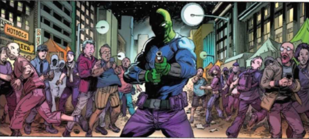
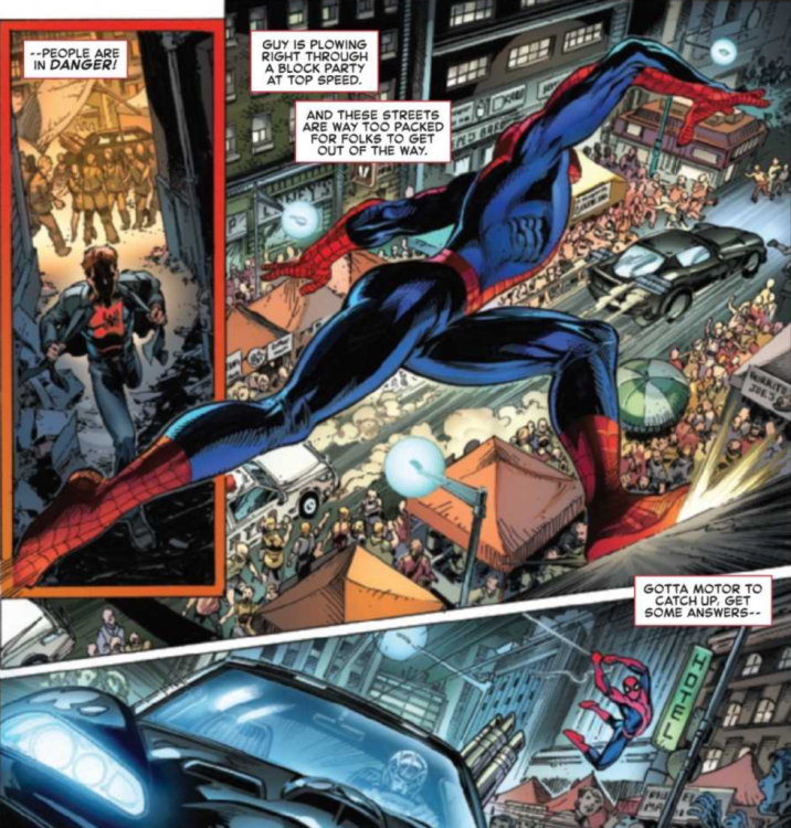
In The Amazing Spider-Man #45, Peter Parker must deal with the villain Overdrive as he speeds through the city. We find he is running away from none other than the deceased Sin-Eater, a foe that Spider-Man must now confront. Spencer does a fantastic job of bringing back the old character in a brand new way, and seeing Spider-Man deal with a villain he has such conflicting emotions about is wonderfully portrayed.
An interesting aspect of this issue’s writing is how Spencer chooses to breathe new life into the Sin-Eater, who died in a 1988 story. The first incarnation of the Sin-Eater had him be a very realistic villain in a fantastical world. Rather than the incredibly colorful enemies that Spider-Man typically faces, the Sin-Eater is simply a man with a mental disorder and a gun. Without any powers, the violent actions he committed were bloody and incredibly horrific. Spencer takes this powerless character and upgrades him with the help of the demon Kindred. The Sin-Eater now has the ability to appear and vanish from places he needs to be, as well as a few strange other abilities regarding his weapon. At the end of the first issue, there is still much to be explored about how the Sin-Eater’s new abilities work, and the issue leaves you wanting more.
Another way that Spencer elevates the story of The Amazing Spider-Man #45 is by always leaving the reader in anticipation. The story is fast-paced, and the issue already had set up the story through the Sins Rising Prelude, leaving the reader interested to see how the confrontation between Spider-Man and the Sin-Eater would play out. On top of that, the issue ends on a cliffhanger. Every page keeps the reader interested.
Art
The pencils and inks are all very clean, and every page of The Amazing Spider-Man #45 is a pleasure to look at. Bagley’s pencils provide incredibly dynamic poses for the characters during action sequences, and the inks of Dell and Owens turn them into an astonishing finished product. The faces of characters in the issue are deeply expressive, and many motion lines are used during action scenes that provide a strong sense of fast-paced movement.
Characters often overlap the borders of panels, which either makes them seem to be reaching out or causes them to stand out in particular scenes. This is used very effectively in several dramatic scenes in the issue, and overall the framing of the issue stood out as particularly spectacular. Many panels are memorable simply due to the framing. One panel was even intentionally left black, and it was deeply effective.
The colors of The Amazing Spider-Man #45, done by Curiel, are very vibrant for most scenes, and it makes the issue very pleasant to the eye. The many colors used on most panels also provide a stark contrast to panels overloaded with a single color, allowing emphasis of one tone during certain scenes. It is a simple but instrumental technique and is executed flawlessly.
Caramagna does a splendid job with lettering The Amazing Spider-Man #45, and his work allows for the story to flow seamlessly. The widths of a few speech bubble borders are increased for emphasis, captions are large and stand out, and sometimes dialogue that is meant to be shouted has a different font and color to it. These techniques come together to deliver some outstanding lettering.
Conclusion
This first part of the Sins Rising event is filled with so much action, drama, and mystery that it is sure to entertain. The art is a visual spectacle and works so easily with the story that the issue feels less like you’re reading something, and more like you are experiencing it. The Amazing Spider-Man #45 set up Sins Rising to be a fantastic event and makes the reader excited for issues to follow.