Young Cable’s adventures continue in Cable #2, released by Marvel Comics on July 29. Writer Gerry Duggan, artist Phil Not, and letterer VC’s Joe Sabino continue unfurling the mystery of the sword Cable found on Monster Island as well as future Cable’s ongoing Hunt (X of Swords prelude?).
Writing
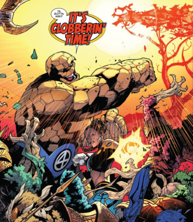
A lot happens in this issue. It begins with a mutant baby kidnapping with possible ties to a cult, the Order of X, but quickly transitions to a battle with space knights who have arrived on Earth to reclaim the sword that Cable discovered. And then, of course, it ends with future Cable’s journey, which I don’t yet understand, but I’m sure Duggan will make clear in upcoming issues.
I don’t know what to think of this book yet. I’m withholding judgment until the first arc is completed, and I can see the bigger picture a bit better.
On a side note, it is always lovely to how all of the X-titles relate to each other. In the case of Fallen Angels, Cable, and Hellions, it’s pretty easy to get the sense of where the first title ends and the other two begin. In the case of Kate Pryde, her death, and her appearance in X-Men-Fantastic Four, I’m a bit more confused. In this issue, we see a bit of payoff from last week’s issue of Wolverine #3, where the Cuckoos tell Wolverine that they want him to hook them up with Cable, and lo and behold, in this issue, Cable is dating ALL of the Cuckoo sisters.
Art
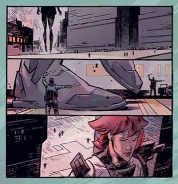
I love Noto’s art in this issue. The character designs are well done, and I think the colors are gorgeous, looking almost like watercolors. The colors, while each is vibrant, are partially shaded, so while the color palette is diverse, they aren’t overly bright.
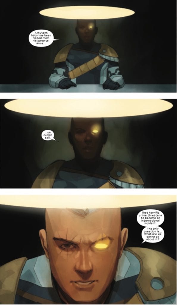
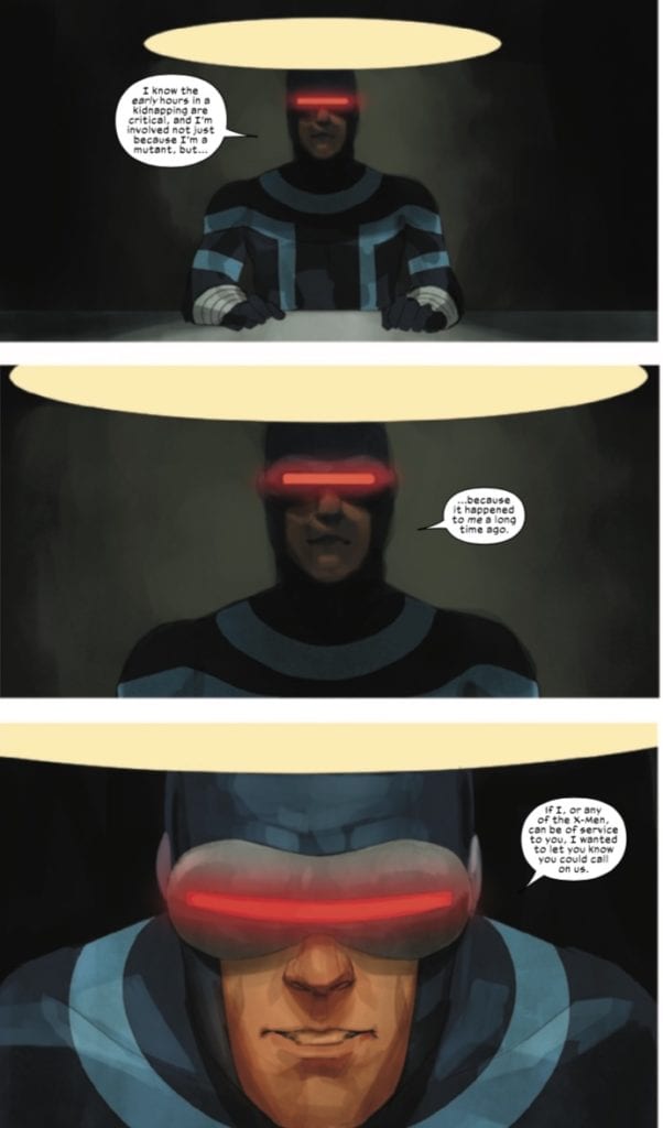
There are some cool panels in this issue, but I particularly appreciate two scenes involving Cable and Cyclops, both talking to the Philadelphia police on separate occasions about the missing persons case.
I appreciate the “like father, like son” vibe that these panels give off. I’m not going to post them here, but the following panels, showing the cops, even mimic each other.
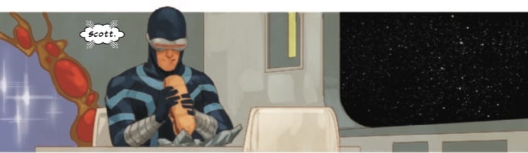
Speaking of the cops, they tell Cyclops to get a Philly cheesesteak, go home, and let them do their jobs.
I love so much about this panel, mostly that he actually GOT the sub and that the smile on his face indicates the joy of being able to sit down and eat it (before getting interrupted by Emma, who chastises him for eating a sandwich while talking to her).
Lettering
Sabino’s lettering is serviceable in this issue. Usually, in an issue with diverse characters, I look to see how the letterer gives each voice its own distinct look so that the page doesn’t become a jumble of interchangeable dialogue. In this issue, you have conversations between humans and mutants, psychics, and space knights. I’m happy to say that Sabino gives each of these voices their own visual inflection, which is always a nice aesthetic touch for the reader.
Conclusion
Cable isn’t my favorite X-title, but it’s only been two issues. It’s seeding some mysteries and plot details (some of which appear to be leading up to X of Swords), so I’m curious to see how they’ll pay off, particularly the future Cable story. This book is beautifully drawn, such that I wish all the X-books could look this good (many of them do, but I’m just not a fan of more “cartoon-y” styles).
What did you think of Cable #2? What do you think future Cable is up to? Tell us in the comments below!
In Marvel Comics’ Empyre #3, on sale July 29, Al Ewing and Dan Slott present the next chapter of Marvel’s latest event and take it to another level by further muddying the waters. Two shocking returns and more deception turns Empyre into a spy movie-like thriller, and the writers also make us wonder if a sequel to Secret Invasion is on the horizon.
Empyre #3
Story: Al Ewing & Dan Slott
Script: Al Ewing
Artist: Valerio Schiti
Color artist: Marte Gracia
Letterer: VC’s Joe Caramagna
Come Together
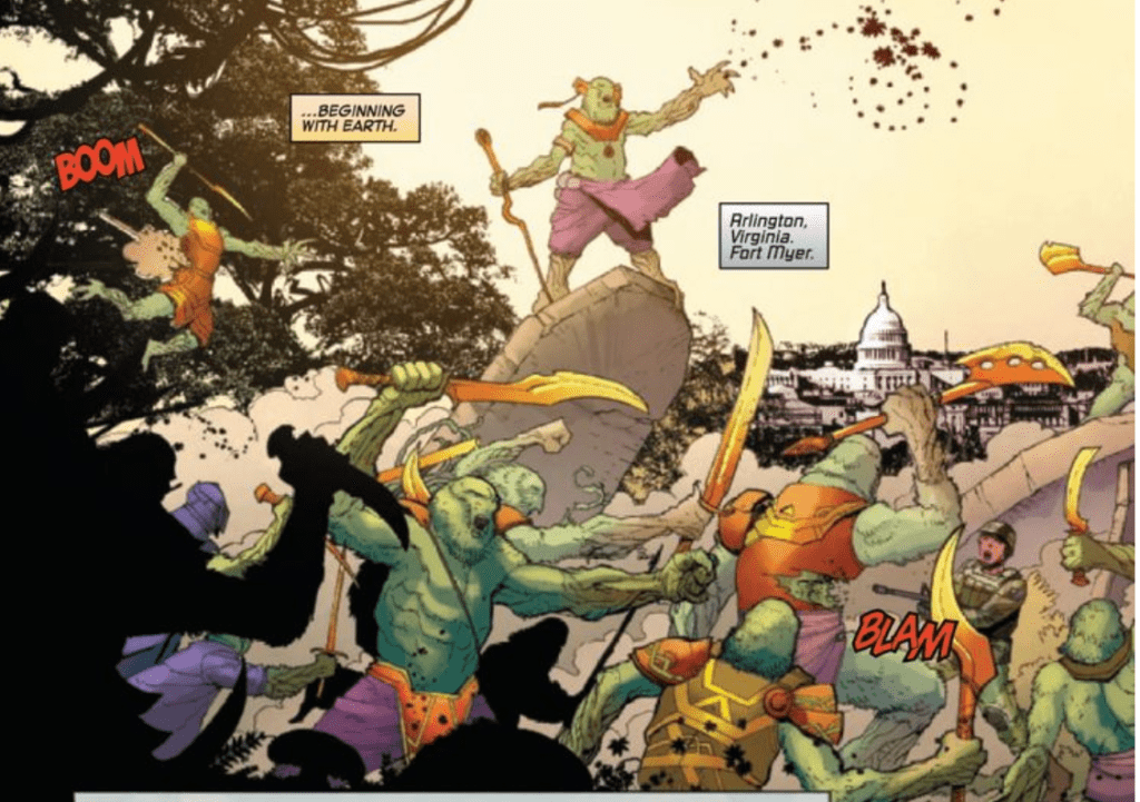
Empyre #3 instantly reminds readers how the Cotati are taking over planet Earth. In the opening pages, artist Valerio Schiti shows the invaders’ plant life covering the Eiffel Tower. It’s only a matter of time before the Cotati reach other iconic landmarks. Naturally, Marvel’s brightest minds join forces as they hope to counteract the potential conquerors. As a result, Reed Richards and Tony Stark come together in a scene that reminds us of the duo’s alliance in Civil War.
It’s an all-out war in Empyre #3
Richards’ team-up with Stark in that legendary event had disastrous consequences for the Marvel Universe. So seeing the two genius side-by-side doesn’t exactly fill the reader with joy. But Ewing and Slott make their reunion a compelling contrast between the two heroes. He juxtaposes Stark’s self-imposed isolation with Richards’ constant connection with his family. Stark is clearly struggling with his guilt for precipitating the Cotati’s onslaught, and Schiti brilliantly conveys just how far he’s fallen. Stark looks like a miserable college student during finals week, with bags under his eyes and stress lines all over his face. The sight of a coffee maker with multiple empty cups of coffee nearby completes the image of a man who’s burning the candle at both ends.
Richards tries to comfort his friend when Stark blames himself for believing Quoi’s lies. “Nobody could have seen this coming,” Richards says as he puts a reassuring hand on Stark’s shoulder. Seeing this reassuring gesture completes Richards’ return to the proverbial main event scene; after a lengthy absence, the Fantastic Four is back where they belong at the center of the Marvel Universe.
Still, Stark rejects Richards’ kindness. He snaps back at Richards’ claim that he’s not alone by saying that it’s easy for him to say that. Richards knows Stark is right because the Fantastic Four uniform is a reminder that Richards is always with his family. With this clear difference, Stark is at a crossroads; will he continue to isolate or will he lean on his allies? That decision could have major ramifications for the rest of this event.
The Fantastic Four’s return isn’t limited to Reed Richards, as The Thing is back in the thick of things.
Secret Invasion II?
The Kree and the Skrull empires have put aside their differences and united. This shift didn’t necessarily spell the Earth’s doom, but now it’s time to sound the alarm. Not only are the Cotati trying to annihilate all animal life on the planet, but now the Kree/Skrull alliance looms as a major threat. That may seem obvious, but the shocking return of a major Skrull supervillain at the end of the leaves us wondering if the next Secret Invasion is on the way. We’re only three issues into this event, but the writers have already shown us how the Kree/Skrull alliance is manipulating some of Empyre‘s significant players.
Deception abounds in Slott’s and Ewing’s story, and it’s fair to wonder how extensive the damage of this duplicity will be before it’s all said and done. The end result may be another attempted hostile takeover by the Skrulls. With the Kree empire by their side, Earth’s Mightiest Heroes may not be able to stop them this time.
Empyre hasn’t quite hit a level where you’re constantly on the edge of your seat, but this issue pushes the story forward in several fruitful directions. The potential of a Secret Invasion follow-up is promising, even if it’s ultimately just wishful thinking. The next installment might be make or break for this event’s ultimate success, as it’s about time Empyre becomes an all-out epic. Slott and Ewing have built a strong foundation through three issues; now, they just have to deliver the goods.
What’d you think of Empyre #3? Where do you hope to see the series go from here? Check out your local comic shop to see if you can get it there, or consider buying the comic online.
ASCENDER #11, available in comic book stores Wednesday, July 29th, brings back one of Descender loyalists most favorite characters. Driller, the massive robot bodyguard of Tim-21 from the previous series, is introduced to Mila, Telsa, and Hilda by his old friend Mizerd. But unfortunately, the meeting is cut short by Mila’s pursuers. Can Driller save the day?
Story
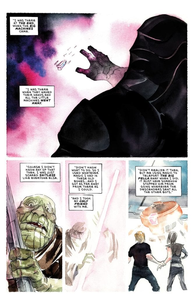
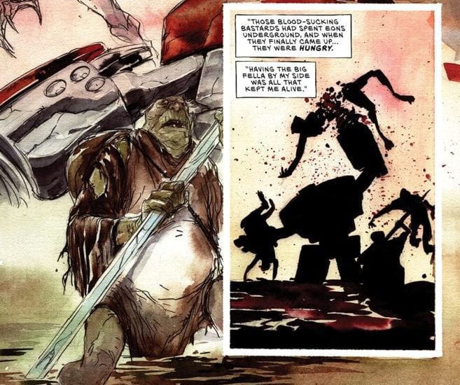
The narrative first brings readers to an important memory of Mizerd, one in which he escapes with Digger for dear life. We’re reminded of the magical forces who used their incredible might to wipe away all bots. And though the twosome escaped from this threat, the magic unleashed didn’t let them rest for long.
In an immediate change of pace, readers are brought back to the present as Mizerd proclaims his joy from finding Mila. The reason? Her unprecedented level of magical ability.
Despite her denial of being a “witch,” we’re given the glimmer of hope we’ve been waiting for in this one-sided battle against Mother’s forces. And less she have any doubts, Driller is ready and willing to help further her quest.
Jeff Lemire’s masterful storytelling immerses readers in the narrative after just a few short events. Even if we knew little of the characters from Descender, we’re pulled into their story through their strong personalities.
Artwork
The illustrations from Dustin Nguyen and lettering form Steve Wands were a pleasure to view. Each panel contains the characteristic Nguyen style readers love—illustrations that look simple at first glance, but contain highly intricate details at a closer look. These characters are brought to life by such features, from the wrinkles on the vampires’ skins to the strands of Tesla’s brilliant red hair. Additionally, the font styles further emphasize each character’s many of speech, specifically with the computeresque type in Digger’s dialogue.
Conclusion
ASCENDER #11 introduces an old fan favorite in an incredibly entertaining way. We look forward to more potential returns of characters from the previous series.
Were you surprised by yet another reappearance of a character from Descender? Let us know in the comments below!
Spawn #308 out this week from Image Comics is the beginning of a new arc in the franchise complete with a new artist Ken Lashley joining creator Todd McFarlane.
Recap
After issue 300, Al Simmons is dealing with the fallout of his failsafe plans. Most recently, the Hellspawns preceding Al have appeared with Spawn contemplating on what to do next.
Spawn #308 Plot
Spawn #308 features a lot of growing tensions from just the beginning. Along with the clashing newscasts from Spawn’s early days, the Hellhound agents are looking to use to the materializing Spawns to their advantage. And with the return of Spawn ally/enemy Cogliostro who in times past manipulate Spawns to his cause, Al and his allies could be in a lot of trouble. Spawn himself plans on taking a few drastic risks that could make or break this new development. It’s little wonder why McFarlane calls this arc “The Consequence of Sin.” Unfortunately, readers will have to wait for next month’s release as the issue ends as the tensions start to boil.
Art
Spawn #308 advertises itself with the appearance of a new artist, Lashley, of X-Men fame. Working primarily in the penciling department, Lashley works between pin-up style artwork and cinematic style movements. The pin-ups always feel frozen in time with captions and word balloons by Peter Steigerwald playing up the intense moments. Unlike the cinematic motions where enough information can be on display in a split second. The inking between Lashley and McFarlane provides just enough contrasting detail to display enough emotion. That same detail shows who has the most weight to a setting with the Spawns having so much detail they drive the pages forward.
The coloring by Tom Orzechowski certainly highlights the situations that take place in these tense moments. With all of the lights and sparse bright colors to otherwise dark settings, this displays what goes on when the characters discuss the situations. As more information comes to light, the brighter the room gets. But when things are at their brightest, things get dangerous. Such as when the Gunslinger Spawn’s host’s eyes glow green.
Get Ready With Spawn #308
Spawn #308 certainly has an interesting set-up that might require some background knowledge of previous issues. Yet Lashley’s inclusion provides enough information to know that the current situation is going to be tense. Something that is only going to rise with the wait for next month’s issue release.
What do you all think? Does this new arc spark your fancy? Or should you see what comes before in Spawn #301 onwards to get the full picture?
On July 28, DC Comics released Legion of Superheroes #7, continuing with writer Brian Michael Bendis’s reimagining of the icon superhero team. Artist Ryan Sook is joined by Wade von Grawbadger (for page 1) and Stephen Byrne, who does the art for pages 2-22. Jordie Bellaire works colors, while Dave Sharpe serves as letterer.
Writing
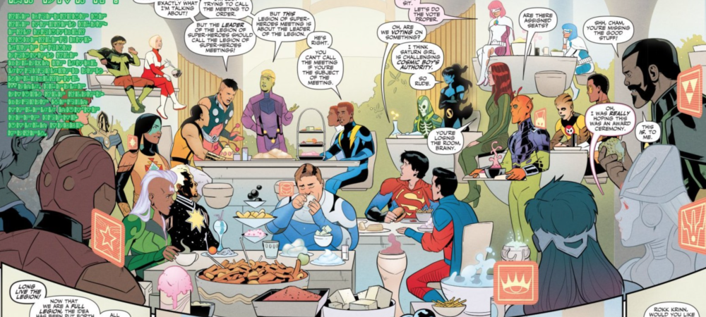
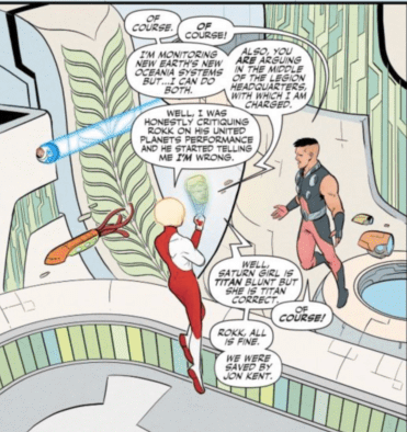
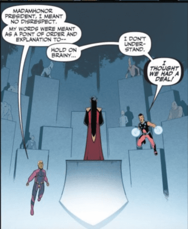
If you bought this issue thinking it would be about the Legion getting arrested by the United Planets, given the fact that they were previously detained by the police, and this issue begins with them confronting President Brande and the United Planets assembly, I‘d understand your confusion. You would, however, be wrong.
Instead, this issue revives a very old Legion tradition…arguing over who the leader is and holding an election about it. I’m sure longtime Legion fans will appreciate this nod to the Legion’s history, although if you are a person who gets annoyed with comics where people sit around talking the whole time, then this issue isn’t for you.
As someone who has enjoyed Bendis’s work on the whole, I have to say some of his dialogue has been a bit “extra” lately. Reading the dialogue in Young Justice can be a bit of a chore, and while it’s a little better here, the dialogue can be a little “jumpy” and frenetic.
Oh? Were you wondering about the “arrest” thing? That’s just Ultra Boy’s father, the leader of Rimbor, showing up at the end to arrest the Legion. We’ll see how that goes, what with Rimbor leaving the United Planets and Ultra Boy getting elected as the leader of the Legion.
Art & Colors
I know sometimes a change in artist can wreck the tone of the book and take readers out of the story. While I’m sure some people will miss Ryan Sook being the main artist of this book, Byrne does a fine job. Aside from his faces looking a bit more rounded at times (I wanted to say “slightly lumpy,” but I’m afraid that will convey the wrong idea), with Bellaire still doing colors, it still looks like the same book. Byrne’s line work is solid, and Bellaire’s colors make this book a joy to read, even if a huge chunk of it is dedicated to the inner politics of the Legion and its relationship with the United Planets.
The art team should be commended for their attention to detail with each character. This isn’t like a Justice League or Avengers book, with maybe seven characters tops. The Legion is vast, and it would be easy to skimp on details for each character, but each character design pops on the page.
It would be easy to cheat and skip some details of character designs of people in the background, but the art team avoids that temptation.
Lettering
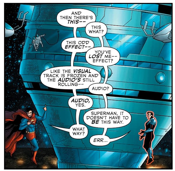
I’ve already noted some of my issues with Bendis’s dialogue of late, and as I pointed out, some of the dialogue bounces back and forth in ways that are slightly confusing.
I understand the dynamic that Bendis and Sharpe are going for here, and on the whole, I appreciate Bendis’s quippy dialogue, but this issue flirts dangerously with Grant Morrison’s satire of such dialogue in The Green Lantern.
This awkward pacing and positioning of dialogue can further be seen when Cosmic Boy and Brainiac 5 have a bit of a squabble over leadership (at least I think that’s what’s going on) in front of the United Planets.
I’m just a bit confused about the pacing of Cosmic Boy’s comments. It reads a bit too close to that Green Lantern panel.
Conclusion
I know I’ve been a bit critical of Bendis and company in this review, but I don’t want that to create a misunderstanding. I like this book, and I’m rooting for it! I think Bendis is doing some cool things in this book reimagining DC’s future. I’m not even saying that I don’t like books that consist more of character interactions than flashy action sequences. I just think he needs to reign in his dialogue a little bit. I’m still excited to see what he has in store for the future of this title, and I hope this book stays with us for a long time!
What do you think of Bendis’s work on The Legion of Superheroes so far? Are you excited? Nervous? Tell us in the comments below!
The final chapter of Livio Ramondelli’s surprise hit “The Kill Lock” has arrived, and it’s as brilliant an ending a mini-series could hope for. Ramondelli’s handling of character development and pacing out the histories of his cast results in an immensely satisfying and sharp ending, fitting for the trajectory of this comic. Along with his consistently incredible signature art style and sense of visual direction, Ramondelli’s final issue of “Kill Lock” will stand out as one of the most memorable finales in comics this year.
“The Kill Lock works. An individual, or a pair, you may be able to hide and survive. Four cannot. When the Artisan, the Kid, the Wraith, and the Laborer reach the end of their journey, doom seems certain, unless…”
Writing & Plot
Livio Ramondelli has maintained much of the mystery in “The Kill Lock” by withholding the backstories of its two most mysterious characters: The Wraith and The Artisan. This issue’s focus on their lives before the Lock while also resolving the prior issue‘s tragic and tumultuous events ends the series with a plot revelation that takes advantage of one character’s (no spoilers) inherent selfishness. However, watching these four machines develop to care about one another, all the while maintaining the core aspects of their individuality, makes for a fantastic and emotionally compelling journey. Much of this comic relies on flashbacks, which are so well-constructed and fascinating that they never detract from the present story. Ramondelli’s ending to this story is both bittersweet and fittingly shocking, with the incredible amount of humanity injected into these robots crescendoing into a beautifully memorable character-driven story that is riveting from beginning to end.
Art Direction
I’ve been singing the praises of Livio Ramondelli’s artwork on “The Kill Lock” ever since the first issue arrived, and now here I am to do the exact same thing. The writer and artist of this mini-series get travels into some new territory on this finale, with the addition of some ethereal and dreamlike sequences during the story’s final moments. Outside of his general beautiful renderings, his direction and focus on character is what makes “Kill Lock” truly special. Ramondelli is able to somehow make the expressionless steel-plate faces of robots some of the most believably expressive comic characters I’ve ever seen. Much of this has to do with how he frames his cast based on context. The Wraith staring upwards into a white void as he awaits his banishment is full of tragedy, although the character wears only a blank metal visage. The artisan plotting his scheme for diabolical greatness is so obvious just from how Ramondelli frames the robot in the panel; obvious to the point that he might as well be rubbing his hands together and cackling. The lettering of Tom Long on “The Kill Lock” has been outstanding from the beginning of the series to the end, with different and unique fonts for each character that perfectly encapsulate their personalities and make it easy to imagine how they sound. Ramondelli’s sensibilities with visual storytelling, as well as his overall artistic talent, are the aspects that make “The Kill Lock” stand out as a fantastic series.
“The Kill Lock” #6 is an emotionally satisfying finale with a fittingly character-driven twist. The steady development of these four exiled machines has been a riveting journey to watch unravel under Livio Ramondelli’s skill as both a writer and a visual storyteller. The sense of pace, characterization, and worldbuilding are matched by his incredible painted artwork and panel direction. With excellent lettering by Tom Long, this entire mini-series has been a joy to experience, and this final issue makes it one of the most easily recommendable reads of the past year. Be sure to grab this final issue when it hits the shelves of your local comic shop on 7/29!
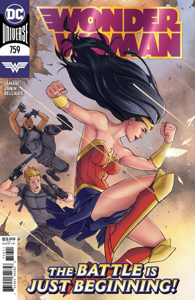
It’s time for another new team to step in for Wonder Woman. Since 2017, we’ve had teams come and go more frequently than most of the other comics. Each team brought their own stories to the table, some of them good while others were bad. The last few issues written by Steve Orlando were average, but now we get a new writer: Mariko Tamaki. While she is still relatively new to the superhero game, only starting to write superhero stories in 2016, her work has been out of this world. With Supergirl: Being Super and She-Hulk under her belt, what stories will she bring to the table for the Amazonian Princess?
**Some Spoilers Below**
Story:
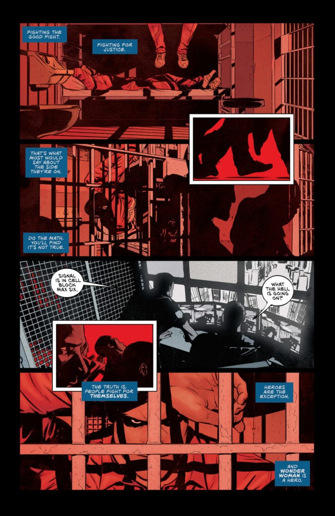
We open with a mysterious narrator talking about the line between good and evil. They point out how those who fight for justice usually fight more for themselves than anything else. The narrator does point out that there is an exception to this belief: Heroes. The example they use is Wonder Woman and how she overcame those who believed they were doing good, such as Max Lord. This is when we cut to the present and find Diana has moved back to Washington DC. She meets her new neighbor, Emma, and joins her on a trip to the DC equivalent of IKEA. There they find a mother out of control, driving her car into oncoming traffic. While not a problem for Wonder Woman, she realizes that the mother was being mind-controlled into doing it.
This issue is an exciting read that is honestly a good issue for both long time fans and first-time readers. We get callbacks to previous iconic stories while getting a grasp on how heroes like Wonder Woman genuinely are good people. Using Max Lord as the opposite end of this belief is a fantastic choice. He is the ultimate example of a “fighting for the greater good” style of character. While many remember him for his evil actions, he started out claiming his want to protect the world. If Tamaki wants to tell this story about the definition of justice, and if the heroes can be held accountable, she picked a great villain for it.
The only real problem I had with the issue was honestly how quick the pacing was. We go from moving in, to stopping the runaway car, to heading to the prison with Max Lord so quickly we don’t get a chance to breathe. It’s nothing that detracts heavily from the story, but it does worry me that we might quickly rush through this story before getting a chance to enjoy it. We’ll just have to see as the series continues.
Art:
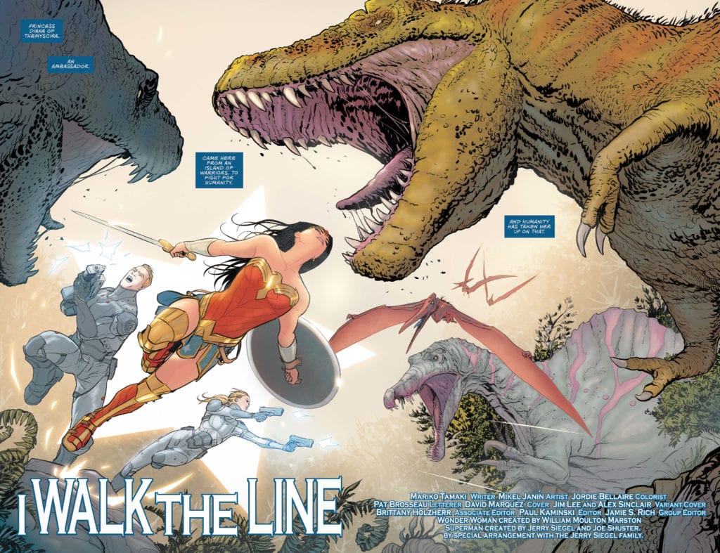
Mikel Janin is the artist for the team, and he illustrates a fantastic first issue. His previous work in Grayson and King’s Batman run shows he has the skills to pull us into the action, and this issue is no exception. Along with brilliant character designs, his work in the chase was terrific. Through the speed lines and sparks, Janin can convey how fast everything is and how dangerous it is. It looked more like stills from an action movie rather than a comic, and I loved it!
Conclusion:
This first issue has me more excited for Wonder Woman more than ever. We have the reintroduction of a menacing villain, a great action piece to set the bar, and Wonder Woman being the kindhearted hero we’ve always known her to be. Mikel Janin’s beautiful art is going to be a draw for the run, but the story itself shows promise. There might be pacing problems going forward, but it can easily be overlooked. This series is in good hands, and this reviewer can’t wait for the next issue.
They say that with comics, there is no budget, that you can do whatever you want and not have to worry about the logistics of creating it on the page. This is probably said more by writers than artists, but in essence, the idea is true. A comic is only limited by the imagination of the creators. This means that there are some comics with ludicrously outlandish concepts out there, way beyond the simple ideas of people with superpowers, able to fly or shoot lazy blasts from their eyes. A character like Deadpool may seem like a fantastical notion, with his constantly healing body and fourth-wall-breaking puns. Still, compared to the mind-boggling, dimension-hopping in Simon Spurrier and Rachael Stott’s Motherlands, he appears rather ordinary and straight forward.
Whether it’s the characters that are absurd, like the over evolved animals of The Superannuated Man, or the story itself, refer to Daniel Warren Johnson’s Murder Falcon, ludicrous ideas can form the backbone of a comic, but that does not make it unreadable or lacking in worth. Some of the more poignant comics from the last one hundred plus years have a concept that appears baffling at least. You only need to look at Art Spiegelman’s Maus to see how a seemingly ridiculous idea can become a work of art. A story about Jewish persecution told using Mice and Cats? If anything, it sounds like a joke and one in poor taste at that. But Maus is a seminal work of Art and recommended reading for all comic book fans.
In comparison, Jason Howard’s upcoming comic from Image, Big Girls, is as much a joke on paper as Maus might appear. Set in a near-future world where giant monsters regularly stomp through downtown American, the only line of defense is a group of giant women controlled by a defense organization called The Preserve. I would argue that such a pitch has limited appeal. However, like so many things in the world of comics, there is so much more going on in this title than making a ‘sexy’ Godzilla.
Big Girls #1 Credit: Jason Howard/Image Comics
Drawing In The Reader
As with any medium, the success or failure of a comic rests on the creator’s abilities to engage the audience. The plot can revolve around anthropomorphic beings dealing in mythological real estate, but if it is written well, a reader will find an element of identification. A small morsel is all that is required to entice an audience in and get them hooked into the story.
The easiest way to engage a reader is to give them empathetic characters. The most relatable element of any story is the cast because, as a reader and a person, we can identify with emotional reactions. The more outlandish the story, the more critical it is to have a grounded central character. This is why most superheroes or adventurers have sidekicks. They act as our entrance into the world depicted on the page.
Howard has set himself a mammoth task with Big Girls. Not only is he drawing the series, but he is writing it as well. Not only has he created a Western Kaiju but also a social discourse on genetics and procreative control. From the very beginning, Big Girls is an alien environment packed with a mixed iconography. The reader is thrown directly into the melee, with a coordinated operation involving The Preserve defense team, but Howard does not overwhelm his audience. Instead, he uses the chaotic opening to give the reader exactly what they need to navigate the story that follows: an empathetic hero.
Big Girls #1 Credit: Jason Howard/Image Comics
Capturing Character
The opening page of Big Girls portrays a shadowed landscape that is instantly recognizable as a modern urban dwelling. There are hints that this is not an idyllic place: a plume of thick smoke drifting over the city, a closer inspection of the buildings reveals some to be in disrepair. Cemented into this image are four panels featuring people running in fear. Across the top of this scene of terror is a voice-over which, by page three, the reader comes to understand is the central character, Ember.
The voice-over is Howard’s first step in integrating the reader into the story. The tone of the speech is down to Earth. The speaker endears herself to the reader by referring to things that we would understand but also by creating an ‘every person’ image. She does not pretend to understand the complex science behind the event she is discussing or to have any insider knowledge. She knows what anyone on the street would know, and this comes across in the way she words her explanations.
When Ember is finally introduced visually, it is with a head and shoulder shot on a featureless background. She appears to be a normal woman. The clothing she wears isn’t too exotic, and even the communications device she wears around her neck is instantly understandable. Howard reinforces the idea that Ember is just like us by making this mission her ‘first,’ as explained in the speech. As a reader, we are experiencing this world for the first time, just as Ember is doing something new. Howard creates a bond between character and reader, an experience that we can share together over the following pages. From the first panel on page three, we know that what we are about to see is new to us but also, to a large extent, new to Ember as well.
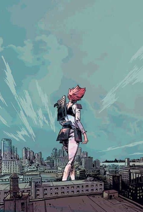
Howard leaves the reveal of Ember’s size until the next page, by which time the reader has already accepted her on an emotional level. We have connected with her personality and the normal-ness that she has displayed. When the reveal comes, it is like a ‘wow’ moment. Her stature is impressive, and we are suddenly looking up at her in wonder. However, there is no sense of fear; she is not portrayed in a threatening light. In fact, the way Howard draws Ember reinforces what we have already learned about her on the previous pages.
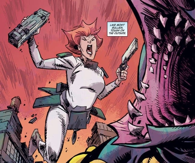
Ember is stood casually at the end of the block with one hand on her hip. Her uniform is mostly white, which catches the sunlight making her a bright beacon in the panel. Her fiery red hair finishes off the image. She stands tall and proud with a smile upon her face. The way Howard draws Ember at this moment makes it impossible not to like her. The other characters on the page are small and mostly featureless, but Ember stands out, warm and welcoming.
Big Girls #1 Credit: Jason Howard/Image Comics
Reinforcement and Horror
As The Preserve operation progresses, Howard continues to grow Ember’s character and personality by contrasting her against the other characters and by constant reinforcement of her gentle nature. This issue builds her up to be a gentle giant in a harsh, unrelenting world.
The main comparison that Howard draws is between Ember and her onsite handler James Tannick. Tannick is the opposite of Ember. He is ‘normal’ sized, experienced at his job, and blunt to the point of being rude. When he confronts Martin Martinez, the subject of the operation, he is insulting, aggressive, and like all bullies, he surrounds himself with colleagues to give him the advantage. He shows no compassion towards Martinez or his son. In fact, his brutal actions makeup one of the most shocking moments of the comic and help establish another aspect of Ember.
Her reaction to the violence she witnesses is as shocking and heartfelt as the readers. The horror on her face and the depression that follows is precisely how Howard wants the reader to react. In the opening pages, the audience is imprinted on Ember so that as the narrative progresses, we follow her and become sensitive to her side of the story. It’s difficult to root for the organization, even when you factor in their ‘for the greater good’ arguments because our entry into this world is through Ember, a character disgusted at the actions of her boss.
From this point onward, we have a center to the narrative, a character to rely on and root for. When anything starts to become outrageous or unfathomable, we can turn to Ember for guidance. Howard pins his outlandish story to the ground with Ember, giving us a solid foundation to watch the mayhem.
Murder Falcon Emotional Art Credit: Daniel Warren Johnson
Conclusion
In Murder Falcon Daniel Warren Johnson was able to ground his story of Heavy Metal demon fighters with a central character suffering from a terminal illness. His pain and struggle is something that most readers can identify with making it easier to accept the rest of the story, no matter how bonkers it gets
With Brian K Vaughan and Fiona Staples’ Saga it is the down to Earth situations that the characters find themselves in that becomes the foundation of the comic. Falling in love, finding a babysitter, arguing with family, all of these things are commonplace across the world. It doesn’t matter who is falling in love; an alien, ghost, or robot with a television for a head, the process, and emotional reactions are the same.
Howard has a very firm understanding of this process of creating a solid foundation from which the readers can view the rest of the narrative. In Big Girls, Howard decides to use emotional response, and his lead character, as that foundation, that solid rock for us to hold onto throughout. He successfully establishes Ember in the opening page, and through that initial engagement, he can draw us deeper and deeper into his wild ride.
After waiting a long time since Hickman and company first launched the Dawn of X, Marvel Comics is giving us a new X-Factor book, releasing X-Factor #1 this Wednesday, July 29. Written by Leah Williams, with art by David Baldeon, colors by Israel Silva, and lettering from VC’s Joe Caramagna, this issue launches a new version of X-Factor Investigations to further serve Krakoan society.
Writing
X-Factor #1 is a fun look into some more of the internal politics of Krakoan life, specifically the resurrection protocols. What does someone do in order to prove that their fellow mutant and loved one is in fact deceased? After all, no one wants a bunch of duplicates of the same person walking around. That could get confusing! This is the question that X-Factor is founded to tackle.
The formation of X-Factor is instigated when one mutant goes missing, prompting the Quiet Council to approve a missing persons bureau. Williams does a good job setting up the initial mystery prompting the formation of X-Factor, firmly establishing this team’s reason for existing and establishing a status quo for future adventures.
This is another one of those books with a cast that may be just a little too big (like New Mutants), but a number of characters are given their moments to shine, including Northstar, Polaris, and Daken. Some of the dialogue, banter, and characterization could, it seems to me, be interchangeable between the characters, such that I think sometimes they can lack their own unique voices (versus just being interchangeable quip machines). Still, it does make for a potentially fun book moving forward.
Art & Colors
Baldean’s art is serviceable in this issue, although at times, I think he makes some of the characters look at bit young. Polaris looks like she’s been aged down, even though once upon a time, in both the original X-Men series and in the early 90s X-Factor, she was one of the X-veterans.
Speaking of character drawings and designs, I didn’t both doing this myself, but if any of our readers read X-Factor #1, please count the number of times, each character’s beady eyes are looking up. Now that I’ve pointed it out, you won’t be able to unsee it.
I should say there are some beautiful pages in this book. A few scenes involving Lorna are a delight (and are a credit to Silva’s colors), and the new X-Factor headquarters has a gorgeous design.
Lettering
The lettering by Caramagna in this issue is fine. I just think there’s a bit too much of it at times. This has a bit more to do with the scripting, but as I said about New Mutants #10, the dialogue can take up a bit too much of the panel sometimes. However, maybe this is to be expected in what amounts to a team detective series. It’s going to involve a discussion of the details of the case, so maybe that can’t be helped.
Recently, I’ve very much been enjoying the prose pages of some of these X-titles. I’ve praised Caramagna before for his work on the prose pages, and I think he does some good work here as well. When you read this issue, you’ll have to comment below and let me know if you agree with me!
Conclusion
X-Factor #1 is a fine launch for the new series. I’m always happy to see a new X-title launch post-House/Powers of X, and the extra page length doesn’t hurt that either! This issue does a fine job establishing the basis and purpose of the series. It’ll be fun to see how some of the mysteries from this issue play out and how this mixture of characters learns to work together.
What did you think of X-Factor #1? Tell us in the comments below!
Empyre Captain America Cover credit of Marvel Comics via CBR
Empyre Captain America Cover credit of Marvel Comics via CBR
Empyre: Captain America 1
Writer: Phillip Kennedy Johnson
Artist: Ariel Olivetti
Color artist: Rachelle Rosenberg
Letterers: VC’s Ariana Maher with Joe Caramagna
In Marvel Comics’ Empyre: Captain America #1, on sale July 28, writer Phillip Kennedy Johnson brings the Cotati invasion to America, where Steve Rogers fights alongside the nation’s armed forces. The issue’s patriotic themes resonate in an increasingly challenging time. By the end of the comic, even jaded readers will feel red, white and blue coursing through their veins.
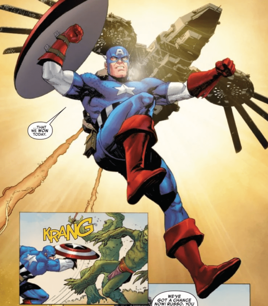
In Empyre, the Cotati’s invasion of Earth plunges the planet into a global fight for survival. Naturally, Captain America steps up to defend his homeland. Right away, the narrator of Empyre: Captain America #1 (presumably Rogers) frames the Cotati as the threat in this high-stakes war. “[They are] led by a self-styled messiah…in a holy war to kill all animal-based life in the universe,” the narrator states. Artiest Ariel Olivetti complements the script by repeatedly proving several cinematic images that are sure to pull at your patriotic heartstrings. In the first few pages, she shows the Cotati annihilating some American soldiers with the Washington Monument towering in the background.
This emotional sight makes the reader feel sympathetic for the soldiers, who are dying with the nation’s capital a stone’s throw away. But Olivetti similarly evokes a strong response when she shows Captain America literally swooping in to save the day. The First Avenger looks angelic as he flies through the air with the sun brightly shining behind him. Cap immediately tips the scales of the battle and helps the troops fend off the invaders and score one for the good guys.
In Empyre: Captain America #1, the global invasion comes to America’s capital.
Any Captain America story, especially with an all-out war like the one featured in Empyre, is the perfect opportunity to tie in real-world politics and philosophy. Kenny Johnson capitalizes on this opportunity by offering some commentary on non-interventionism. When Captain America travels to The Pentagon, he tries to convince a military general to lend a helping hand to America’s allies around the globe. “Our allies need to us supporting them so they’ll support us and one another,” Cap says. The general denies Rogers’ plea, saying that the armed forces need to focus on defending America.He also refuses to help nations who will never be able to return the favor. Olivetti shows unflinching resolve and obstinance on the general’s face, which conveys his unwillingness to compromise.
This self-interested attitude angers Cap, who states that all life is threatened, so every human needs to stand together. In this exchange, Kennedy Johnson may be commenting on some ideological conflicts we’ve seen time and again in the real world; he’s suggesting that in the face of such a powerful threat, border-based philosophy should cease to exist in favor of unity. Thankfully, Cap convinces some soldiers to fight by his side, so the planet might not be doomed after all.
Captain America looks like an angel when he literally flies in and saves the day.
Empyre: Captain America #1 is the event’s first openly political comic. In a story where two opposing empires unite and threaten the Earth, it’s likely that there will be many more to come. If so, they’ll have a hard time topping Kennedy Johnson’s opening salvo, as he comments on real-world philosophy and makes the reader feel proud to be an American at a time where it’s increasingly hard to do so.
What’d you think of Empyre: Captain America #1? Where do you hope to see the story go from here? Check out your local comic shop to see if you can pick it up there, or consider buying the issue online.