Take a look at the cover of the first issue of Buzzard, and you’ll know exactly what you’re about to read. It’s unapologetically British, with a punk rock flair and off-the-wall violence.
Buzzard is created by Andrea Wolf, with art by Ezequiel Assis, cover art by Samuele Zardinoni, and cover graphics by Rob Jonesand. You can check out the second issue, which is currently funding on Kickstarter right here.
About the series: Welcome to modern Britain: a lost land where folks look for meaning in bizarre places, with devastating results. CEOs double as vigilantes, bored millionaires role-play as neo-Nazis and jaded scientists toss ethics in the bin to chase massive leaps. All under the beady eyes of commoners too apathetic to give a damn.
Erik Lincoln aka Buzzard, obnoxious high-schooler-by-day/bladed-armed-hitman-by-night, navigates this chaos better than anyone. Is he a daredevil with peanuts for brains? I mean, yeah. But though he toys with his own life, he’ll do anything to improve his sister’s.
This balls to the wall action-comedy delves with irony and gusto into the contradictions and challenges of today’s world, fueled by British humour and running on a manga edge.
Story
Without giving too much away, it takes a minute to get an idea of where the story is going in the first issue of Buzzard, pivoting to more hi-tech science fiction. That is hardly a criticism, because Wolf gives us plenty of time to get to know the titular character. Buzzard is a smug, verbose anti-hero who has a love for his country. What stands out in this book is the dialogue and captioned narration, as Wolf does a stellar job at keeping the language loose and raw. And it’s also funny. It really helps paint a picture of who Buzzard is and the world he is fighting his way through.
Art
Much like the writing, Assis’ artwork has an intense and unrestrained edge to it. The bone-cracking and blood splattering is in full effect in the first issue of Buzzard. The lack of color gives it this grungy, noir feel, which really helps in emphasizing the seedy underbelly of Britain showcased in the book.
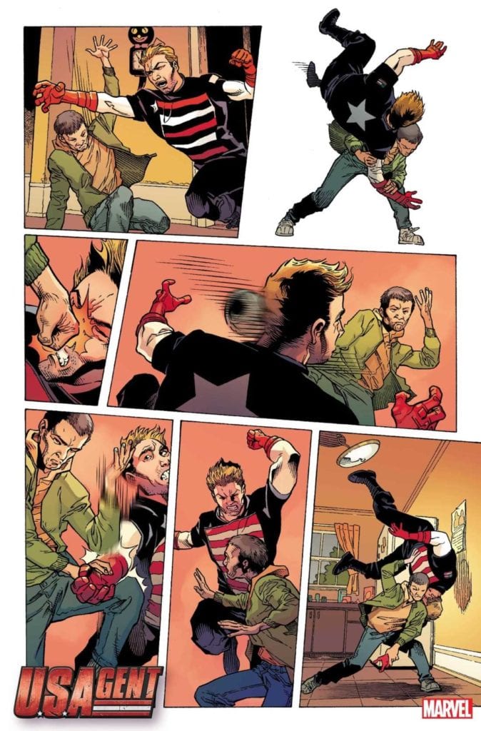
U.S. Agent #1, available from Marvel Comics on November 4th, reintroduces the pseudo-hero fallen on hard times and taking low-status military assignments just to get by. Christopher Priest’s story and the art team of Georges Jeanty and Karl Story bring readers a satirical take on the life of a has-been hero that’s more Deadpool and Wolverine than Captain America.
Cover Art
Marco Checchetto’s cover is deceptively excellent. The subtle punches of red and blue in Agent’s suit make him stand out from the heap of bodies surrounding him. Agent’s simple “skol” toast projects haughty energy, and the pinpoint gleam off his shield reminds the reader that despite his gruff exterior, Agent is an unapologetic patriot.
Writing
Priest’s writing style of late has been a challenge to get through. The scene transitions are very jumpy, and the dialog between characters is sometimes punctuated with dated references. Referential humor can be hit or miss. I thought there was a bit of both in this issue. I was amused with some scenes but rolled my eyes painfully at others.
In a recent Syfy interview, Priest explained how this was an opportunity to show multiple characters with multiple points of view, sometimes leading to uncomfortable moments. To that end, Priest succeeded as Agent is decidedly not politically correct – stopping just short of being overtly racist. To keep things in balance, Agent’s partner in this mission (an Asian government asset) is no better in a completely different but equally offensive way. To be clear, this is not an offensive book, but everyone in it is, in some form or another, is a terrible person. Think Archie Bunker (if anybody today even remembers who that is) with shields and guns, and you’re on the right track.
Did I enjoy the story? I enjoyed some of it. The humor is not going to be everyone’s cup of tea, and the jumpy narrative style lacks focus. In short, U.S. Agent #1 is a mixed bag.
Pencils/Inks
Jeanty ad Story’s art is a fantastic match for Priest’s tone and tenor. From the interviewed mine workers to the detained pizza delivery folk, all the characters have a slightly exaggerated quality to their designs. Those exaggerations don’t rise to the level of cartoonish caricature, but the designs add an element of surreality to the situation, which enhances some of Priest’s humor.
It’s easier to laugh at a joke when the butt of the joke looks like a joke. But it’s not just humor that works in this issue. The action is kinetic and bone-crunching. Shields and bodies fly in all directions, but Jeanty and Story wisely keep the action serious instead of slapstick. The juxtaposition of action and humor through the art makes this a very visually pleasing issue.
Coloring
Matt Milla’s coloring work is bold and eye-catching. In particular, the coloring on the costumes, both hero and civilian alike, stands out against the backgrounds for some enjoyable pop.
Lettering
VC’s Joe Sabino’s lettering work is excellent in this issue. The punchy, humorous dialog is rapid. Sabino keeps the dialog moving and breaks the bubbles up at just the right points for the jokes to land with maximum effect. This is nice work by Sabino.
Conclusion
U.S. Agent #1, available from Marvel Comics on November 4th, is an irreverent take on the Captain America wannabe whose latest assignment suffers from his lack of finesse. The jumpy storyline has some strong moments and jokes that hit more than miss, and the art elevates this issue beyond the sum of its parts. U.S. Agent #1 is a recommended read.
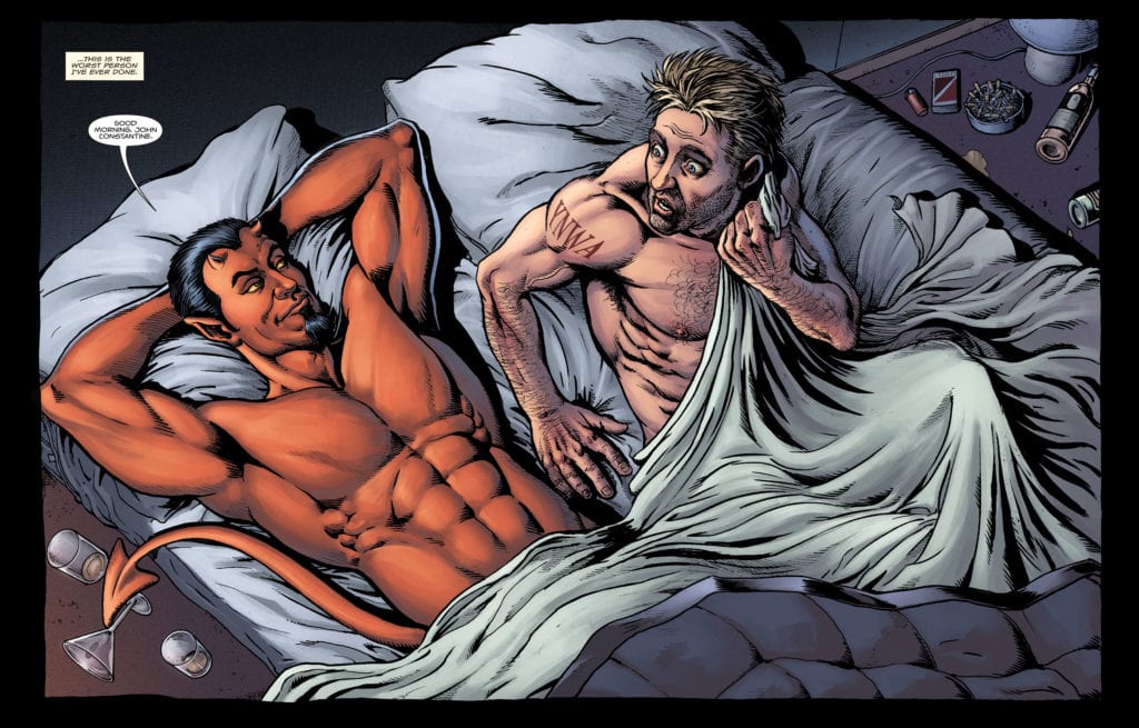
Written by Tom Taylor, with art by Darick Robertson, colors by Diego Rodriguez and letters by Deron Bennett, Hellblazer: Rise and Fall #2is a funny, horrifying, and brutal look at a day in the life of John Constantine. This issue has you disturbed and laughing at the same time. Hellblazer: Rise and Fallshowcases all the dangers that just come along with being someone like Constantine. He’s got ghosts, demons, and the devil himself to stay one step ahead of. We’ll just have to see if he’s bit off more than he can chew this time.
Writing
Taylor’s writing shines the most when he writes Satan. Not because his version of Satan is especially funny or scary, but because Taylor actually chooses to characterize him. While many writers would write Satan as mystically “always one step ahead” or as a cool-headed embodiment of evil, Taylor makes Satan like a petulant child. He messes with Constantine gleefully and seems to know what he’s doing. But when backed into a corner, Satan loses his shit. The whole story of Lucifer is characterized by one thing: he wanted to be his own master. Taylor plays on this every time Satan gets ordered around, even in the most innocuous cases. It makes the character feel like flesh and blood, red horns and all.
Art
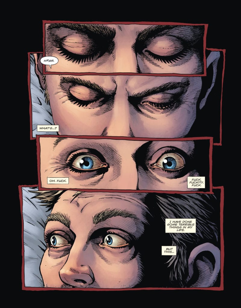
From page one, Robertson gives us something to worry about. We see four panels stacked on top of each other, just showing Constantine’s eyes. Robertson creates an immediate sense of urgency. The first panel is just Constantine’s eyes closed, looking peaceful. The second panel, his eyes are almost the same. We can see the muscles creasing as he’s beginning to open them. Then suddenly, the third panel has his eyes fully open. Through this gradual to sudden shift, Robertson establishes the speed of the moment. Constantine’s eyes have snapped open, and in the fourth panel he’s looking in horror and fear at what’s next to him. Robertson uses time on the page masterfully to allow us to empathize with Constantine’s panic.
Coloring
Rodriguez’s minimalistic approach to coloring this issue allows room for colors to represent certain things. When following Constantine in everyday England, everything looks pretty similar. The browns of the brick buildings match the colors of everyone’s coats and the dirty streets. There aren’t many eye-catching colors on these panels. But when get a page or two seeing events that occured in Hell, everything is colorful. We see yellow fire and red gore. Throughout the rest of the issue, it’s clear to see that red marks a demonic presence. First, we have Satan walking around in his typical crimson form, and then we get the blood and guts that follows where demons go. The only other noticeable use of red is the red of Constantine’s tie. He’s a man who has one foot in both worlds. He’s in a brown suit with grey pants, but around his neck we see a badge of his other citizenship.
Lettering
Bennett shows that many of these characters have a kind of rapport. When Constantine and Satan are talking back and forth, Bennett often connects multiple balloons from one character with a join. So when Satan interjects, we follow the join to what Constantine is saying next. It makes it feel like there’s a back and forth between these two. Whereas, when Constantine is trying to calm Satan down while they’re at a bank, his lines are in independent word balloons. There’s no banter, it’s him struggling to communicate and make himself heard. The fact that Constantine ever has a back-and-forth with Satan, however, gives us plenty to worry about.
Hellblazer: Rise and Fall #2 keeps us on the edge of our seats. It’s a source of constant worry, laughter and intrigue. John Constantine is staying one step ahead in this wild ride. With Satan joining the cast of characters, it’s just going to get wilder. Pick up Hellblazer: Rise and Fall #2, out from DC Comics November 3rd, at a comic shop near you!
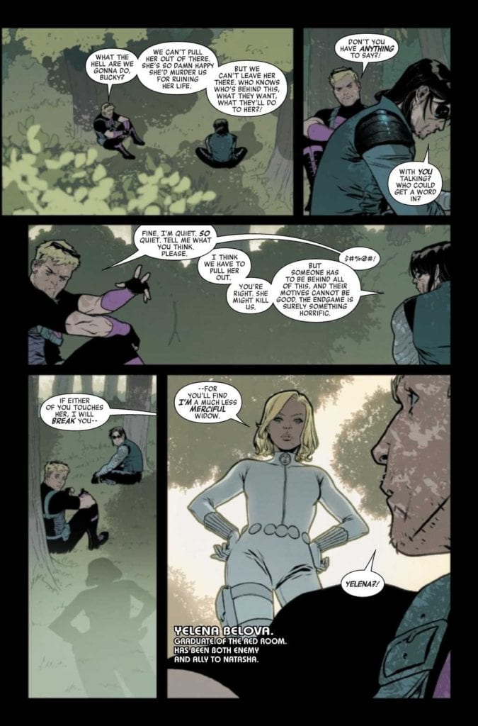
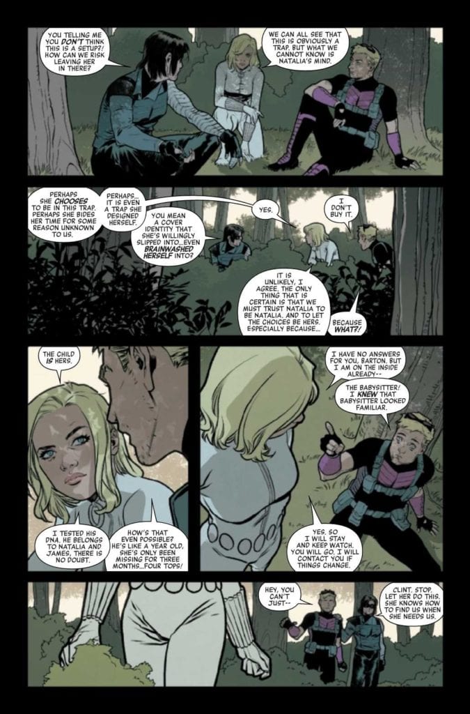
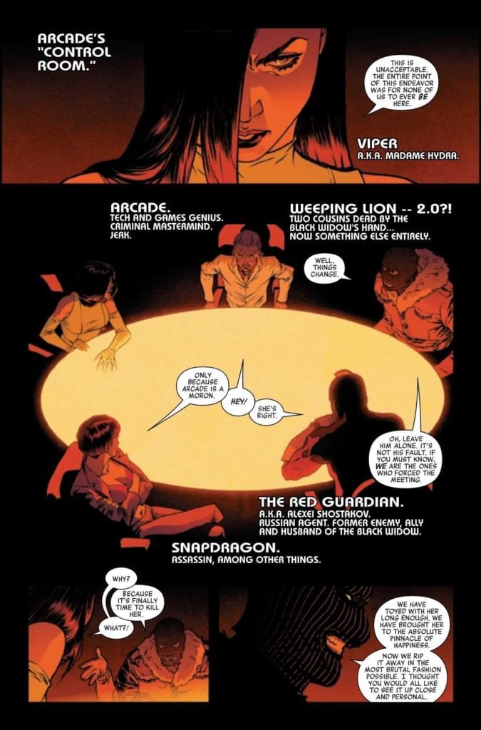
BLACK WIDOW #3, available Wednesday from Marvel Comics, brings the next installment of the Black Widow’s adventure, and it is full to the brim of surprises, and action. Though the latter is probably less surprising, given the leading lady.
Time to listen to the experts here.
Natasha Romanoff, aka the Black Widow, has seen her fair share of stories at this point. Yet none of her tales have unfolded quite like what has been portrayed in this latest series. Written by Kelly Thompson, this is a version of the Black Widow like never before.
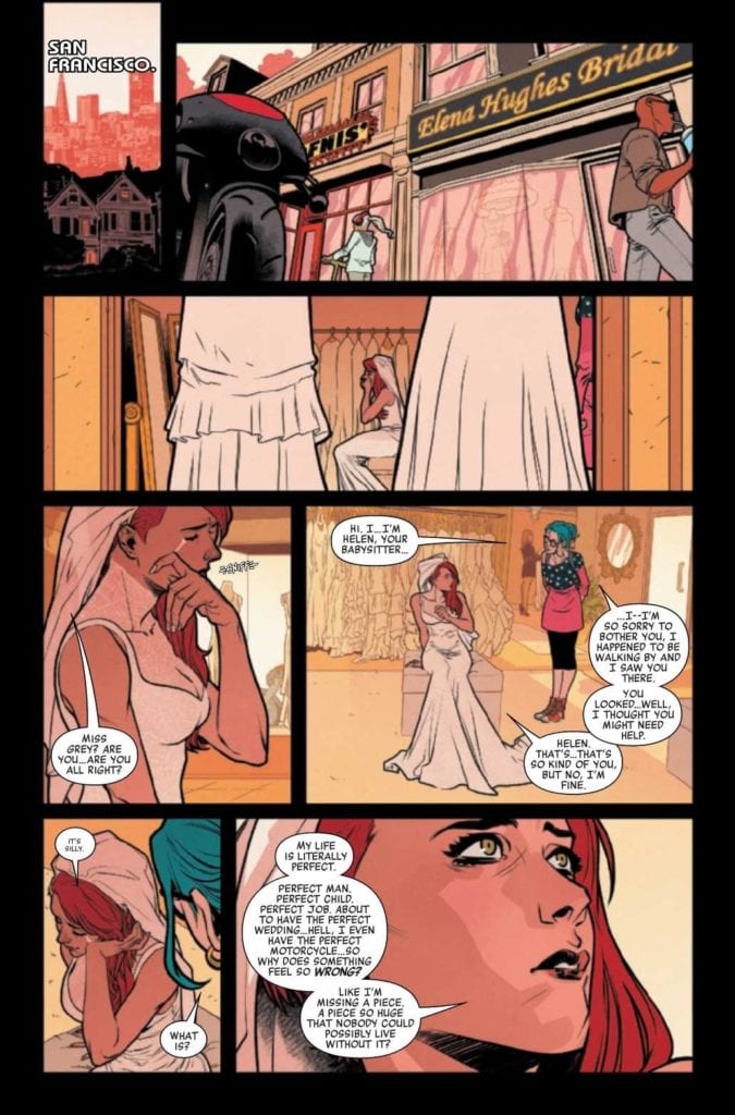
Natasha’s new life is full of changes, and by all appearances, it’s perfect. But appearances can be deceiving, something that Natasha probably knows better than most people. Even she can see the cracks that are forming.
Black Widow #3 brings us back to this setting, with the third part in ‘The Ties that Bind‘, and it’s starting to feel like only a matter of time before those behind it start to feel the pain. Has anybody started a timer yet?
Perhaps it is time to trust Natasha, while still being ready to act.
The Writing
Kelly Thompson’s vision for Natasha Romanoff continues in Black Widow #3, and the stakes are getting higher. This issue is a cocktail of emotions and experiences, balanced in a way that only Thompson can handle.
There’s room for comic relief, and then there’s room for several darker themes and implications. It all weaves together, creating a narrative that is fairly accurate for the one known as Black Widow. Yet, this tale very much feels fresh and different.
This whole plot has been toying with several themes, perfection, illusions, love, and knowing oneself, just to name a few. Many of those themes are still present in this issue, while other darker ones rear their ugly heads.
All put together, it makes for an enthralling read. This is a story with high stakes, and for reasons completely unexpected for this heroine. It raises countless questions, but we’ll have to keep reading in order to get those answers.
Meanwhile, Natasha seems to be having a moment while trying on her gown.
The Art
Black Widow #3 is full of brilliant and intense artwork. It really makes the story come into focus, both the good and the harrowing. In many ways, the artwork makes Natasha’s current life feel so shockingly real, a burst of colors across a darkened screen.
Elena Casagrande is the lead artist for this arc, and she truly outdid herself in this issue. There is something about the juxtaposition portrayed here that really strikes home. It’s one part slice of life, and one part action. Yet the two work wonderfully together. Not to mention, the designs revolving around Natasha (her hair, her dress, etc) look phenomenal.
Those vibrant colors were created by Jordie Bellaire, and they work so well in setting the scene. There’s no denying the truth, not with Natasha’s hair demanding attention. Or a million other details made to stand out here.
The lettering was provided by VC’s Cory Petit, and it’s the back half of Black Widow #3 where the lettering really gets a chance to shine. Natasha’s actions are not silent, nor do they lack impact, and it’s all thanks to Petit.
A peek behind the curtain, so to speak.
Conclusion
Black Widow #3 is an issue that ups the ante, while setting the scene for even more confrontation in the future. It’s both dramatic and intriguing, portraying a completely different version of a beloved character. The sheer level of risk-taking in this arc is going to make it memorable for a long time to come.
WICKED THINGS #6, available Wednesday from Boom! Box, brings with it the conclusion to Lottie Grote’s story, and adventure. It may not have been the adventure she’d choose for herself, but it has been entertaining nonetheless.
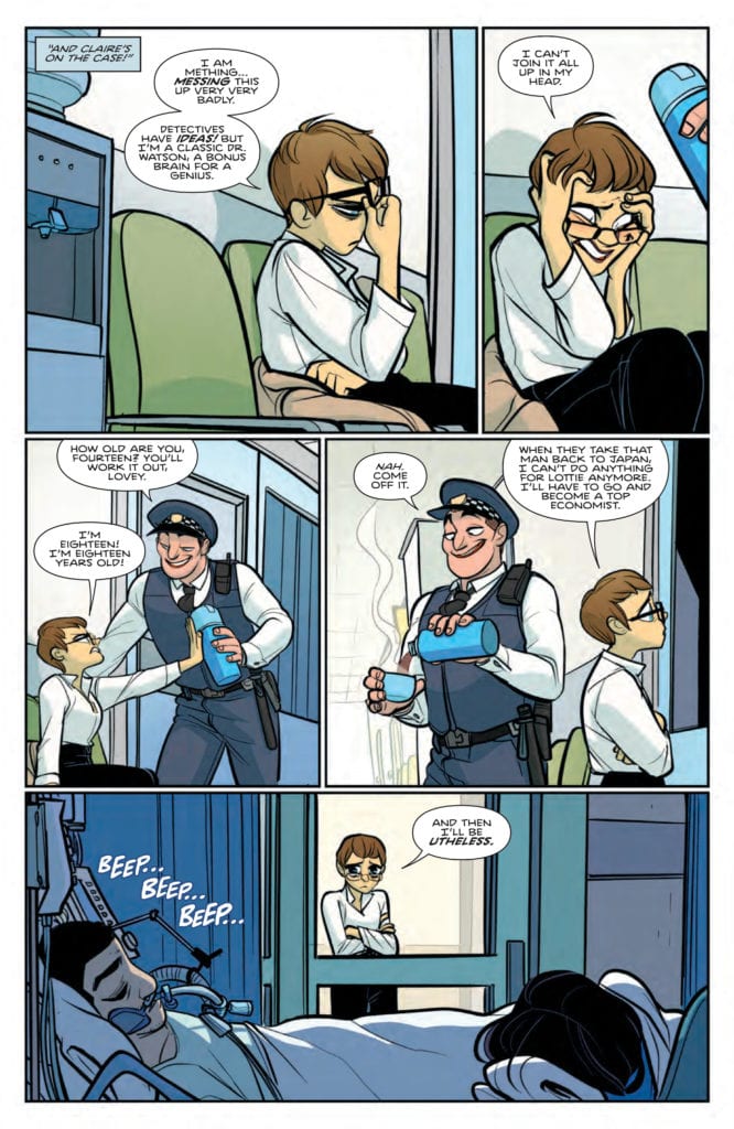
Lottie Grote is on the case in Wicked Things #6.
All of this began when Lottie Grote, teen detective, was falsely accused of murder. The irony, right? Now she’s working for the police (on a trial basis), and doing her best to solve crimes and prove herself an innocent person.
Okay, it’s not all about proving her innocence. Lottie is not the sort of person that can look away from a mystery, once it has been spotted. With the only exception being the only crime that she’s been accused of – that seems to be one she’s content to steer clear of. Oh, the irony.
Wicked Things #6 is the conclusion to Lottie’s little adventure, yet it is unlikely that this will be the last that fans see of her. After all, she’s managed to make her way through several of John Allison’s series at these points, and she’s unlikely to stop now.
The pieces of the puzzle are falling into place in Wicked Things #6.
The Writing
Wicked Things #6 had a lot to deal with, and very little time to do so. It wasn’t just the conclusion of an arc, but the conclusion of a miniseries. Unsurprisingly, John Allison it all with grace and precision.
By that, I of course mean that it was full of humor, resolution, and just a little bit of action. It is a formula that was perfected in Giant Days, and it was put to good use here. Granted, it does come off very differently, with somebody like Lottie taking center stage.
Do you know that feel-good vibe that comes from teen detective stories? Where everything works outright, and the hero puts all the pieces of the puzzle together before it’s too late? That is very much the tone of this final issue.
With a few twists, naturally. There’s a sardonic addition to the story, thanks heavily to the characters and their sense of dry humor. It made for a unique take on what could otherwise have been a run of the mill conclusion.
What is interesting is that this series leaves off with a hint of something more. There’s no cliffhanger, but there certainly is an open door. At least one of the characters from this series will certainly be making an appearance in the future.
The question is, how does it all tie together? (Wicked Things #6)
The Art
The artwork inside Wicked Things #6 is every bit as charming as the rest of the series. If you enjoyed the bold colors and shapes of Giant Days, then you’re going to love what was provided within these pages.
Max Sarin (art), Whitney Cogar (colors), and Jim Campbell (letters) all worked together to bring Lottie’s adventure to life, and it the perfect balance of fun and sassy. The bold characters stand out, thanks to the strong lines and colors used, not to mention their sometimes over the top expressions.
Really though, Lottie is a character one would expect to react strongly, so the artwork makes her quirkiness shine through. Just in comical ways, here and there. The details are the real highlights of this particular issue, from the quirk of a lip to the cramping of a finger.
The backgrounds make everything pop, as most as solid blocks of color whenever possible. It makes the characters, their expressions, and their commentary stand out as nothing else could. Meanwhile, the lettering allowed for a nuanced tale, one that can practically be heard all on its own.
Meanwhile, poor Claire seems to be on the verge of a nervous breakdown in Wicked Things #6.
Conclusion
They say that all good things must come to an end, and that is certainly the case with Wicked Things #6. It’s bittersweet, seeing Lottie’s adventure come to an end, but knowing that she’ll almost certainly appear at a later date. When she does, the odds are good that she’ll be causing chaos or laying down some sass.
Spell is a peculiar blend of Misery and Get Out, and that doesn’t mesh as well as you’d hope. Here is another film that features solid acting, but can’t save itself from the dreadful writing. African American representation in horror is always welcomed, but not in a bland manner. Spell wants to be a social commentary and its message is muddled at best. The film finds more success in being tedious and forgettable.
This film was right to land on VOD because no theater should be allowed to show this at any time. It’s mind-boggling how so much potential can be wasted, and with notable actors along for the ride. Spell struggles to garner interest from anything happening on the screen once the central conflict begins. The mishaps in the script are the film’s biggest detractor since every other aspect was adequate. It is directed by Mark Tonderai and written by Kurt Wimmer, not a good sign at all. Spell stars Omari Hardwick, Loretta Devine, Andre Jacobs, Lorraine Burroughs, and John Beasley. In the film, Marquis Woods (Hardwick) travels with his family to Appalachia after his father’s passing, but their plane crashes. Marquis wakes up under the care of Eloise, a hoodoo specialist who won’t let him leave.
Loretta Devine as Eloise in Spell
Wimmer does little to get audiences interested in Marquis or the predicament he finds himself in. Marquis was raised around very toxic habits, but he made it on his own after running away from home. He hasn’t seen his father in years, struggles to parent his children, so much so that he brushes off his son being bullied. Despite being introduced to Marquis, Spell manages to not spark interest once he is caught up in the hoodoo. The lack of development, combined with us now being thrust into Eloise’s games makes the film dull. Eloise is a firm believer in her African hoodoo and believes black people should respect where they come from. Ultimately, this film ties itself into slavery but does it better than most. Wimmer’s script has a lot going on that wasn’t executed properly, and never gives a reason to care.
Many things don’t quite add up in the end, but that goes back to Marquis being an uninteresting, and underdeveloped protagonist. Still, Hardwick and Devine are having fun with these roles. Devine captures all of Eloise’s traits in the best way possible and eats up every scene. Hardwick does what he can, and while never bad, his performance felt out of place. The character of Marquis came off like it should have been portrayed differently on screen. The actors in Spell make the most of this messy screenplay by serving up solid performances across the board.
Omari Hardwick as Marquis in Spell
Tonderai doesn’t offer much here, every scene feels hollow and meaningless. The moments of Marquis caught in a dire situation aren’t made to feel frightening at all. His saving grace was having two talented stars in the lead throughout the film. The pacing has its highs and lows because of how Spell fails to compel viewers until Marquis has to pull an object out of his foot. However, there is some superb cinematography featured and it compliments the film’s focus on hoodoo practices as well. The color palette choice assists with highlighting Eloise’s insane nature, and it creates a feeling of unease in the area Marquis finds himself in.
Spell stumbles far too much and never developed its characters enough to warrant the third act it offered, which was great. Its message isn’t made clear, but it has to do with slavery and staying true to your roots as a black person. It includes one of the most discomforting gore scenes in recent memory while being a complete trainwreck overall. There’s not much to get out of it, but hopefully, this was the final time hoodoo appears in horror for quite some time.
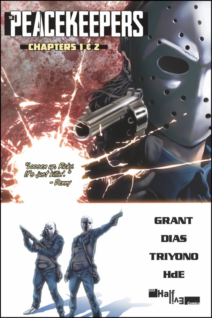
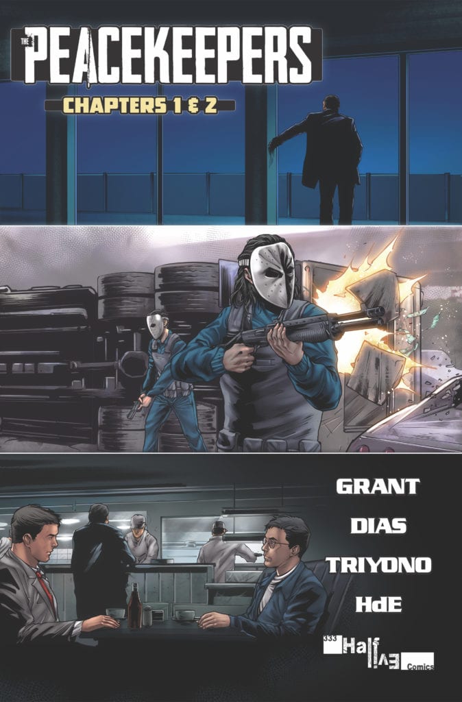
Monkeys Fighting Robots spoke with writer Rylend Grant about his new comic THE PEACEKEEPERS, which is currently funding on Kickstarter.
About THE PEACEKEEPERS: All hell breaks loose in quaint a northern Michigan community when a team of in-over-their-heads bank robbers kills a beloved Sheriff’s Deputy. In a small town with BIG secrets, local detective Richard Holton races to peel back the layers of a depraved down home conspiracy before the bungling Federal Agents assigned to the case send everyone involved to ground.
THE PEACEKEEPERS is a dark, quirky crime drama in the vein of Fargo or No Country for Old Men. It’s a love letter to case-a-season police dramas like True Detective and The Wire, to Elmore Leonard novels, and to comic masterpieces like Criminal and 100 Bullets.
Grant is a screenwriter by trade, having worked on projects for A-list directors (you can read more about that below). He’s co-created PEACEKEEPERS alongside artist Davi Leon Dias, colorist Iwan Joko Triyono, and letterer HdE.
The series is drawing comparisons to Fargo, The Wire, and Grant himself calls it his Pulp Fiction in our interview, so if you’re a crime fiction fan, PEACEKEEPERS is a project you can’t miss.
Monkeys Fighting Robots: Well, first off, your comic BANJAX was nominated for four awards at this year’s Ringo Awards, including Best Series, so huge congrats on that. Combining that with your nominations and win at last year’s Ringos, how does it feel to receive that kind of recognition so early in your comics career? Is there anything you would attribute that critical success to?
Rylend Grant: My first published comic book series – the political action thriller Aberrant – won a Ringo Award last year for BEST VILLAIN and was nominated for two others… BEST SINGLE ISSUE and I was nominated for BEST WRITER along-side Scotty Snyder, Jeff Lemire, Brian Michael Bendis, and Brian K. Vaughan. Banjax was nominated for BEST SERIES this year along-side Bitter Root, Black Hammer: Age of Doom, and Something’s Killing the Children…
It’s so crazy to be in that company. I honestly haven’t really fully processed it yet. Being nominated/winning has opened so many doors for me. I’m staring at a lot of wonderful opportunities in the comic book world right now. I’m so thankful to the folks at the Baltimore Comic Con for actively championing smaller books like Aberrant and Banjax. It’s made all the difference.
In terms of that attributing the critical success… I think it has a lot to do with my day job. I’m a screenwriter by trade. I’ve spent the last 15 years writing movies and TV shows for folks like Ridley Scott, JJ Abrams, Justin Lin, Luc Besson, and John Woo. I’m fairly new to comics, sure, but I’ve been telling great stories for a long time. I had my proverbial 10,000 hours in before I ever even wrote a comic page. I think all of that made the transition a whole lot easier.
MFR: And your new series is THE PEACEKEEPERS, a small-town crime drama in the vein of Fargo. It seems like a departure from your previous work, which has featured superheroes, military action, and high concept sci-fi. Were you purposefully trying to change things up with this new project, or did it just kind of happen?
RG:Banjax and Aberrant were my way of processing 30+ years of consuming traditional comic books. Those are definitely superhero stories. If you look deeply, Aberrant is kind of my twisted take on Captain America. Banjax is my Batman story. I’ve kind of been there and done that now. I don’t know that I’ll do supes again until/unless Marvel or DC come calling.
The Peacekeepers is me branching out, spreading my wings. I don’t think there are enough stories like this in comics. These are the stories I truly love and so I am enthusiastically filling that void while pissing in the wind and howling at the moon.
MFR: What can you tell us about PEACEKEEPERS? What excites you most about working on this book compared to your previous ones?
RG:The Peacekeepers is a story I’ve wanted to tell for 15+ years, but haven’t been able to. I grew up amid the Sundance movement. I saw Pulp Fiction and said, “Hey, I want to do that!” I went to AFI and got my snooty filmmaker education. But by the time I got spit out into the workforce, Hollywood stopped making those movies.
I spend my days writing big poppy action flicks now and it’s a great time, but there is this other, more cerebral side of me that doesn’t always get nourished. Hollywood is a frustrating place. What you’re allowed to do as a writer there you can essentially fit on a postage stamp. They’re only making about five different kinds movies these days. They want you to tell those stories in a very specific way. I’m pretty damn good at writing those movies, but I needed to find another outlet to stay creatively sane.
The beauty of comics is you can tell any kind of story, in any kind of way, as long as it’s GOOD… and I think this is pretty damn good. The Peacekeepers is my Pulp Fiction.
MFR: You’ve worked with artist Davi Leon Dias before on ABERRANT – how did the two of you come to reunite, and what made his style the perfect fit for PEACEKEEPERS?
RG: Well, the truth is, Davi and I never really stopped working together. We did ten pretty kickass issues of Aberrant and then we moved right into another series – a Tokusatu joint called Suicide Jockeys – which got caught up in all of this COVID craziness and has yet to be released.
Davi’s a great artist and an even better guy. We’ve done excellent, award-winning work together. We know each other backwards and forwards at this point. It just makes things so much easier. The basic foundational stuff is already taken care of. It frees us up then to focus on subtly and nuance… and that’s how you end up with a great book instead of just a good book.
MFR: You’re currently funding PEACEKEEPERS on Kickstarter. Now, you have prior experience with crowdfunding, as well as experience going through a more traditional publisher. Why was Kickstarter the right move for this project?
RG: Well, it’s not like I choose one path over the other. I instead chose to do both.
You’re essentially talking about two different audiences. There are the people who pretty much exclusively buy their books in comic shops… and then there are the people who pretty much exclusively buy their books on Kickstarter. There is some overlap, but not nearly as much as one might think. If you are a creator and you’re only serving one of those audiences these days, you are doing yourself and your book a disservice.
It’s such a wonderful time to take a book to Kickstarter. There is a rabid and wildly enthusiastic fanbase there. If your book is good, it will be embraced wholeheartedly… and you can actually make a few dollars! Seriously. Very few of us make money putting books in comic shops and when you’re dealing with creator-owned titles like these, you’re often sinking tens of thousands of dollars – your own money – into art and printing… the idea that you can go to a website and make some of that money back is earth-shattering/a game-changer for a lot of creators.
Things have gotten really bad for everybody in the comics business amid this fit of COVID… creators, publishers, retailers. You had pencils down. You had comic shops closing. You had waves of layoffs and firings. That meant that shops had to be a lot more careful what they ordered/put on the shelf, publishers had to be a ton more careful what they greenlit, and it all resulted in fewer opportunities for guys like me.
But other things are changing… I actually think we’ve entered this age of “creator empowerment” in comics. We saw something similar happen in basketball over the last decade. We saw this era of “player empowerment,” guys like Lebron James, Kawhi Leonard, and Kevin Durant ripping control away from the owners, deciding where they play and who they play with… Again, the same thing is happening in comics. Creators like me, we used to have to wait for permission from a publisher to make the book we wanted to make… well, we no longer need that. Today, we can just make our books and take them directly to the consumer via sites like Kickstarter.
It used to be that publishers were wary of Kickstarted books. That’s not the case anymore. Smart publishers like Scout Comics realized that Kickstarter can be a valuable proving ground for would-be titles. The simple fact is, if something does well on Kickstarter, it’s probably going to do well in a shop. Well, everyone is hopping on board now. Image is publishing Kickstarter books. Dark Horse is too. It’s a new game.
So, the plan is to kickstart the first “season”/story arc of The Peacekeepers and then take it to a traditional publisher. Then, I’m serving both audiences, getting the best of both worlds. You’re going to see a lot of creators doing this in the coming years. Bigger and badder creators too… if only because they can get a better deal. Shit, the Scott Snyders and Kevin Eastmans of the world are already doing it, running six-figure campaigns. More to come.
MFR: I know that screenplays often leave a lot of room for directors to interpret things like blocking and camera angles. Does your background as a screenwriter lead you to write comic scripts the same way? Do you leave a lot of space for the artists you work with to interpret things as they see fit?
RG: Well, for whatever it’s worth, I have a Masters degree in directing from the American Film Institute Conservatory (where David Lynch, Terrence Malick, and Darren Aronofsky went) so I tend to approach each comic issue like it’s a little film I’m directing.
The cool thing about writing comics is there is no set format. Everybody kind of does it a bit differently. My scripts tend to be half screenplay/half director’s notes… everything that I’d hand to a Cinematographer, Production Designer, or Costumer on a film gets handed off to my artist and colorist. My scripts get very specific… “Panel 1 – Wide shot. Low Angle. This character is in the foreground. She’s wearing this. There’s a car in the background. I want it to be this specific car, this specific color. In my experience, artists like it because it takes a lot of the guesswork out of their job.
All that said… I’m working with some extremely talented people here and the first thing I say to every collaborator is, “my scripts are very specific… but if you see a better way to do something, PLEASE let me know.” I’d say about 95% of the time an artist or a colorist comes to me with a change, it ends up on the final page, and the book ends up much better for it.
MFR: You had a very interesting path on your way to comics. Prior to writing, you made a living playing poker, right? Is there anything you learned playing cards that you’ve been able to use in your comics career?
RG: You’ve got to know when to hold ‘em… know when to fold ‘em… LOL.
I’m kidding. Kind of. There was indeed a time in my life where I paid my bills playing poker online and in card rooms around Los Angeles. It’s a great game and yes, playing it for a long time has no doubt helped me in my film/comics career in a number of ways. Poker teaches you patience and discipline, it forces you to set emotions aside and analyze situations logically. I think more than anything, playing for years changed my relationship to failure. You fall on your face a lot playing poker. You can’t let any one hand or any one session sink you. Success is measured over time. Success is won by soldiering on, by getting up after falling over and over and over again. If that isn’t applicable to a career in film, TV, and comics, I don’t know what is.
MFR: And finally, you recently launched a podcast with David Avallone to fill the hole in our hearts where comic conventions used to be. Can you talk a little about the genesis of the project, and what listeners can expect when they tune in?
RG: David Avallone (writer of Betty Page, Elvira, and Drawing Blood with Kevin Eastman) is one of my closest friends in comics and a frequent convention wing-man. He and I have done more than a few of these online cons in the wake of COVID and they have been great, but certain itches were not being scratched.
The thing we missed most about the “con experience” was something many call “bar con…” it’s what happens after the show. After a long day on the floor, we creators always get together at the bar across the street from the convention center and just shoot the shit for a couple of hours. We generally start talking about the day, about the state of the comics union, but it tends to quickly degenerate into us arguing about old Star Trek episodes or something like that. It’s a gloriously beautiful mess.
Anyway, we put our heads together and figured out a way to approximate that in podcast form. The show is called THE WRITERS BLOCK. It airs on a number of YouTube channels now (most notably the COMIC CORPS YouTube channel) and will make the jump to Apple/Spotify very soon. Basically, we get a couple of our fancy creator friends together and just throw a party for an hour or so. The fan/viewer is cast as a fly on that wall. We’ve had some really great guests on… Matt Fraction (Sex Criminals), David F. Walker (Bitter Root), Kevin Eastman (TMNT), Stan Sakai (Usagi Yojimbo)… It’s something that we really look forward to every week and it’s something we’ll definitely keep doing once this COVID ship rights itself. Look, 95% of comics podcasts are exactly the same… one hour, one-on-one interviews… How did you get into comics? What are you promoting right now? There are a few good ones out there. Don’t get me wrong. But we didn’t want to do that. This is something new. It’s something exciting. It’s something real. And folks really seem to be digging it. Tune in!
Thanks again to Rylend for taking the time to chat with us. Be sure to check out THE PEACEKEEPERS on Kickstarter right here.
Canto II #3 from IDW Publishing reminds the readers and characters what David M. Booher brings back from the first saga. With penciler Drew Zucker, inker Philip Sevy, and colorist Vittorio Astone displaying a dangerous yet beautiful fantasy world, letterer by Andworld Design takes the opportunity to record the voices of this world on the power of legends.
Background and Recap
Canto revolves around the titular clockwork run, foot tall, knight, and the many legends surrounding his world. Heroes of old, curses from a dark lord, and the necessary need for faith in these dark times. Canto’s kind had been enslaved by this Shrouded Man through a curse via clockwork hearts on a time limit replacing their original ones. After an initial journey doesn’t get Canto what he wants, he inspires his fellow Clockwork Knights to fight for their freedom. Unfortunately, that freedom is at risk as the Knights’ time limit approaches. Now they meet a former ally of the Shrouded Man who needs their help in lifting her kind’s curse so that she can lift theirs.
Legends Never Die In Canto II #3
Diving right into a literal cliffhanger, Booher reminds readers at every turn why people tell stories. When things look bleak, legends and the events behind them can inspire people to take risks. Risks can be costly as one of Canto’s friends is ready to sacrifice her life for him. The Shrouded Man mocks Canto for as their journey has the risk of dooming every Clockwork Knight. Fortunately, that same act has a flipside that puts the entire curse into question. Again no spoilers, but it seems the dark lord is hiding something among his mockery. Not that it changes the fate of a character who, among the rest of this issue’s cast, shares genuinely heartwarming times before the issue’s end. These moments ensure that despite their fates, these characters will never be forgotten.
Romanticizing The Moment
Penciler Drew Zucker displays a high degree of emotion to make the Clockwork Knights look expressive. With only their eyes being visible, the reader impresses themselves onto them for a form of empathy. This simple design on the knights with angles and body language makes each feel memorable within Canto II #3. Whenever their eyes are closed or obscured, it’s as though the reader is losing a part of themselves.
Inker Philip Sevy ensures that the reader stays on track with the main story. Simultaneously, the thick but lighter strokes can show readers some elements relevant to the obstacle at hand. Like, say a concrete pillar featuring overgrown plants saying that the mechanical Canto is dying after falling into the water.
Finally, the coloring by Vittorio Astone gives identity to the characters of Canto II #3. Each clockwork knight has a distinct coloring accent to them. Falco, for example, with his leaf-like eyepatch and green accents, looks experienced in the worst of the world but is hopeful thanks to Canto’s presence. Compare that to the Shrouded Man, who uses purple coloring to display how detached from everything he is. Something that his contact with Canto through the clockwork knight’s dreams attests towards.
Omniscient Lettering
Andworld Design takes its task of lettering to provide not just context but also memorable characterization. The opening caption is a great introduction to the overall story, and its parchment boxes look like this is a story someone on this journey tells. The color-coded detached speech is highlighted in colors representing the knights, red for Canto, green for Falco. Considering that closing captions boxes are green, suggesting Falco is delivering these last lines, it remains unknown who is telling the overall story, and the end may surprise the reader. In any case, the reader may have to pay attention to further developments after Canto II #3.
Canto II #3 Marks A Milestone
The epic of Canto continues with how it builds a legend out of memorable characters. Every action taken in Canto II #3 feels like a step closer to a story meant to give hope to people entering their darkest hour. When everything seems hopeless, it’s the memory shared with others that can make or break someone. No matter how small or insignificant it may seem, that memory can give rise to a legend. A legend seeing through till the end.
Bomb Queen Trump Card #3 out this week from Image Comics brings Jimmie Robinson’s mini-series to its rising action. By displaying everything the Queen does to push her agenda, the reader sees why she reigns supreme.
Recap
Previous issues deal with Bomb Queen running for president against Donald Trump. Even if it is under the bribe/threat of her heroic counterpart White Knight, not that she’s following his plans.
Bomb Queen Trump Card #3: Bluffing Hands Win
With Bomb Queen handling things her way, her confidants/opposers try to get a leg up on her. But no matter what they do, the results only seem to blow up in their faces. Bomb Queen Trump Card #3 only further explores why. Some critics against Bomb Queen say she’s an anti-hero, but this issue reminds readers and critics that she’s a supervillain who outsmarts all who oppose her. What better way to display that than doubling down on her vileness. Still, even stuff like exploding thongs and such are a distraction from her true villainous qualities. What makes the Queen so dangerous is her ability to turn all odds in her favor. By coming to the White Knight in his time of need, she not only secures her place in the election but is in the process of removing his restrain on her.
Nothing Is Too Far!
Robinson gets the chance to show off all of his skills. At one point, he even displays how far he’s come since Bomb Queen’s early days, through the roughs of an issue. His art is extremely emotive, from facial features to character actions, unlike before, where designs were much simpler. Even masked characters have wrinkles in their mask’s designs to display detail. Bomb Queen Trump Card #3 also displays coloring for action scenes as the backgrounds fade away to reflect the character’s color schemes. That way, it tells how characters are the central focus of the immediate narrative. Sometimes just sitting on a red chair is an indicator that White Knight is the one in trouble.
Then there’s arguably some of the less notable but important parts of comic art, lettering. On that page with roughs, Bomb Queen Trump Card #3 goes out of its way to show how Robinson uses both traditional lettering tools and setting them up before inking. It’s why many of the wordmarks look similar but are never the same or get in the way; they’re tailor-made for situations. In particular, one matches the flashbang explosion it accompanies as a natural extension, complete with a Silver Age style design; it looks harmless as comics in that era.
Bomb Queen Trump Card #3 Holds The Detonator
Bomb Queen Trump Card #3 holds everyone’s expectations by the balls, forcing them to pay attention. Because if they dismiss this as just bad girl trash, they miss out on why the Queen rules all. Every action, reaction, and small detail has a purpose that a supervillain takes to her full advantage. One that wins the approval of hardcore fans while compromising her ideals for a bigger payoff that’s coming.
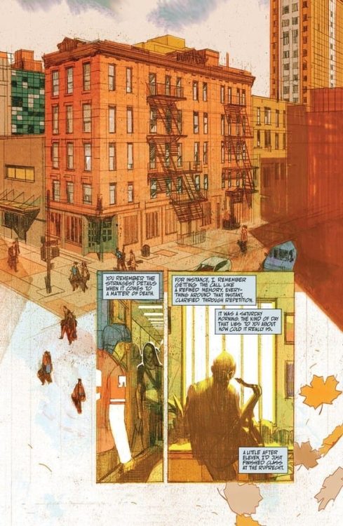
Blue In Green, out now from Image Comics, is a horror OGN about an aspiring musician who returns home for his mother’s funeral and finds amongst his mother’s keepsakes a photograph of a late sixties jazz musician.
Now, I know what you’re thinking. “How can a comic with a simple premise like this turn out to be one of the greatest graphic novels of 2020?” Well, this is exactly what I’m here for. Get ready to read all about why Blue In Green has become my new favorite horror graphic novel.
Writing
This book is wordy. Incredibly wordy. The way writer Ram V writes his narration; it’s sometimes easy to get lost in the words and feel like you’re reading a proper novel. It’s a stylistic choice that works well. All I’m saying is it might not be everyone’s cup of tea. So, be warned.
Speaking of the narration, the captions are mellow and mysterious. Ram V describes the main character’s feelings and thoughts elegantly, using intricate and vivid descriptions, but not to the point where it starts confusing the readers.
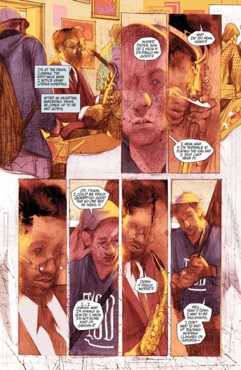
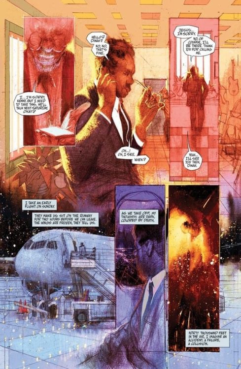
Early on, the reader can’t help but feel for Erik, the main character, and want him to find greatness. Throughout the entire comic, we’re witnessing Erik pursuing the extraordinary, willing to take every step necessary to achieve it. We see him fall, get beaten up, relieve painful memories, ruin relationships, but we never judge him or grow to hate him. By making the reader sympathize with Erik initially, we can understand every choice Erik makes even if we disagree with it.
Overall, it’s a beautiful and effective horror story. It’s poignant and terrifying. Everything you can hope for in a horror graphic novel. But, beneath the surface hides a wonderful thought piece about jazz music, obsession with greatness, talent, and art.
Art
Anand RK‘s work on this book is nothing short of exquisite; he chose to use mixed media and a unique art style to tell this strange, gloomy tale.
Inspired by Dave McKean’s work, the style fits in perfectly with this story’s dark themes.
Most of the time, the pencils are rough, raw, all over the place, Weirdly poetic. Some of the pages, especially the panels where buildings appear, look like painted-over architectural drawings. It’s a bold choice that works well here. The panel layouts are messy, blending into one another, creating a trippy look to the pages while we watch Erik slowly slipping into madness.
Anand RK usually holds back on details concerning the characters’ faces, which complements the mysterious vibe of the writing, but to emphasize an important character moment or dramatic beat, Anand RK isn’t afraid to go all out and draw the faces in great detail. Almost too many details which definitely make the readers feel awfully uneasy. More specifically, there are two instances in the book where the main character plays the sax. As backgrounds, there are music sheets behind Erik. A simple, ingenious touch.
Anand RK often takes every chance he can get to use high angles to make the panels resemble a vinyl record.
The artwork oozes with uniqueness. It’s not an exaggeration to say that every page and every panel in this book can stand on its own as a beautiful piece of art.
Coloring
John J. Pearson definitely knows how to use colors to play with the readers’ emotions. Whenever there is daylight and Pearson wants us to feel safe and comfortable, the color tones are warm and friendly. They truly feel like cozy summer days in New York City. But whenever Pearson wants us to feel anxious and nervous, pink and purple colors are visible everywhere. They’re not colors which usually make us feel goosey, but it absolutely works here.
With a unique art style such as Anand RK’s, it would have been easy to play it safe and color the pages as realistically as possible, but Pearson bravely decided against it. The strange color choices compliment the dreamy art style and supernatural story perfectly.
Lettering
Aditya Bidikar‘s lettering is on par with the other amazing elements of this book. The balloons are rugged, crude. The font is hand-lettered and looks somewhat inconsistent, which works especially when the story takes its dark turns. Bidikar also chooses to remove the caption boxes surrounding the narration from time to time and blends the words with Anand RK’s art. He sometimes doesn’t even show us all the words, hiding them behind the art. By doing this, Bidikar makes the readers work a bit and lets us fill in the blanks for ourselves. Bidikar’s stylistic approach complements the art beautifully and elevates the story’s eerie, enigmatic vibes.
Conclusion
In years to come, Blue In Green will turn out to be one of those books art kids just won’t shut up about. It’s stylish, haunting, terrifying, and exceeds expectations on all accounts. If you like horror stories where the jump scares are the least important thing, Blue In Green is the graphic novel for you.