

Blue In Green, out now from Image Comics, is a horror OGN about an aspiring musician who returns home for his mother’s funeral and finds amongst his mother’s keepsakes a photograph of a late sixties jazz musician.
Now, I know what you’re thinking. “How can a comic with a simple premise like this turn out to be one of the greatest graphic novels of 2020?” Well, this is exactly what I’m here for. Get ready to read all about why Blue In Green has become my new favorite horror graphic novel.
Writing
This book is wordy. Incredibly wordy. The way writer Ram V writes his narration; it’s sometimes easy to get lost in the words and feel like you’re reading a proper novel. It’s a stylistic choice that works well. All I’m saying is it might not be everyone’s cup of tea. So, be warned.
Speaking of the narration, the captions are mellow and mysterious. Ram V describes the main character’s feelings and thoughts elegantly, using intricate and vivid descriptions, but not to the point where it starts confusing the readers.
Early on, the reader can’t help but feel for Erik, the main character, and want him to find greatness. Throughout the entire comic, we’re witnessing Erik pursuing the extraordinary, willing to take every step necessary to achieve it. We see him fall, get beaten up, relieve painful memories, ruin relationships, but we never judge him or grow to hate him. By making the reader sympathize with Erik initially, we can understand every choice Erik makes even if we disagree with it.
Overall, it’s a beautiful and effective horror story. It’s poignant and terrifying. Everything you can hope for in a horror graphic novel. But, beneath the surface hides a wonderful thought piece about jazz music, obsession with greatness, talent, and art.
Art
Anand RK‘s work on this book is nothing short of exquisite; he chose to use mixed media and a unique art style to tell this strange, gloomy tale.
Inspired by Dave McKean’s work, the style fits in perfectly with this story’s dark themes.
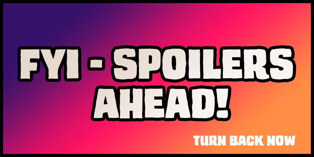
Most of the time, the pencils are rough, raw, all over the place, Weirdly poetic. Some of the pages, especially the panels where buildings appear, look like painted-over architectural drawings. It’s a bold choice that works well here. The panel layouts are messy, blending into one another, creating a trippy look to the pages while we watch Erik slowly slipping into madness.
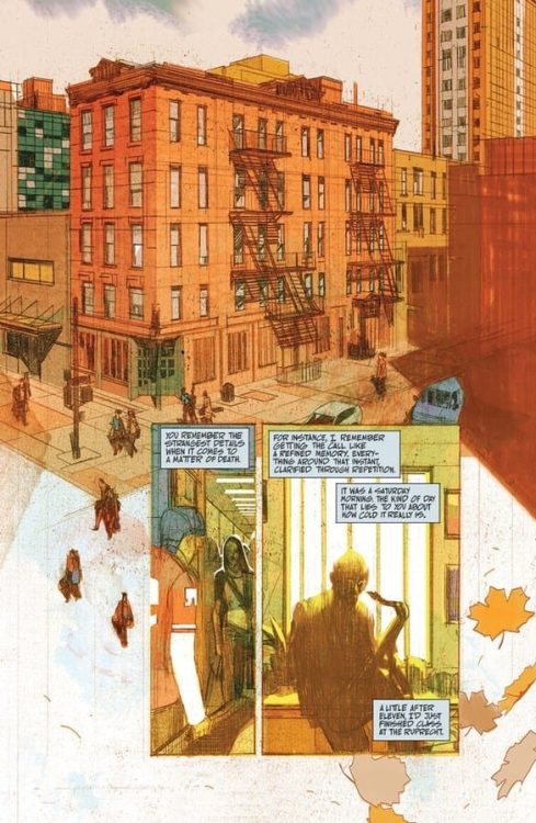
Anand RK usually holds back on details concerning the characters’ faces, which complements the mysterious vibe of the writing, but to emphasize an important character moment or dramatic beat, Anand RK isn’t afraid to go all out and draw the faces in great detail. Almost too many details which definitely make the readers feel awfully uneasy. More specifically, there are two instances in the book where the main character plays the sax. As backgrounds, there are music sheets behind Erik. A simple, ingenious touch.
Anand RK often takes every chance he can get to use high angles to make the panels resemble a vinyl record.
The artwork oozes with uniqueness. It’s not an exaggeration to say that every page and every panel in this book can stand on its own as a beautiful piece of art.
Coloring
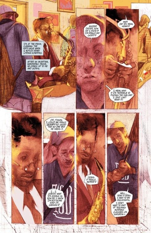
John J. Pearson definitely knows how to use colors to play with the readers’ emotions. Whenever there is daylight and Pearson wants us to feel safe and comfortable, the color tones are warm and friendly. They truly feel like cozy summer days in New York City. But whenever Pearson wants us to feel anxious and nervous, pink and purple colors are visible everywhere. They’re not colors which usually make us feel goosey, but it absolutely works here.
With a unique art style such as Anand RK’s, it would have been easy to play it safe and color the pages as realistically as possible, but Pearson bravely decided against it. The strange color choices compliment the dreamy art style and supernatural story perfectly.
Lettering
Aditya Bidikar‘s lettering is on par with the other amazing elements of this book. The balloons are rugged, crude. The font is hand-lettered and looks somewhat inconsistent, which works especially when the story takes its dark turns. Bidikar also chooses to remove the caption boxes surrounding the narration from time to time and blends the words with Anand RK’s art. He sometimes doesn’t even show us all the words, hiding them behind the art. By doing this, Bidikar makes the readers work a bit and lets us fill in the blanks for ourselves. Bidikar’s stylistic approach complements the art beautifully and elevates the story’s eerie, enigmatic vibes.
Conclusion
In years to come, Blue In Green will turn out to be one of those books art kids just won’t shut up about. It’s stylish, haunting, terrifying, and exceeds expectations on all accounts. If you like horror stories where the jump scares are the least important thing, Blue In Green is the graphic novel for you.