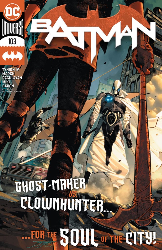
Batman isn’t the only head vigilante anymore. As the city continues to pick up the pieces after the Joker War, a new threat approaches Gotham. The vigilante known as Ghost-Maker has come to Gotham to deliver his own brand of justice. As he begins leaving a trail of dead criminals, Batman realizes who he is and why he has to work quickly to stop him. By the time Bruce finds him, Ghost-Maker descends on Clownhunter. Now the two well-armed vigilantes clash over the life of Gotham’s version of the Punisher. Who will win?
**Some Spoilers Below**
Story:
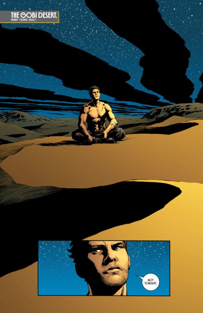
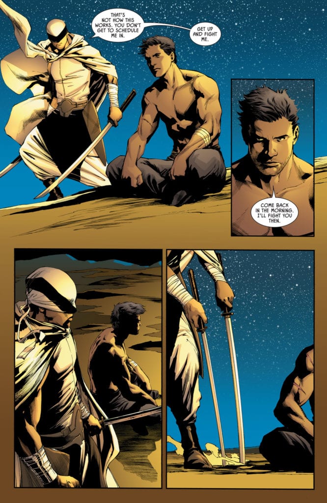
We open with a flashback as Bruce meditates in the desert. The man who would become Ghost-Maker approaches him with two katanas, challenging him to a duel. Bruce initially refuses, as he just wants to have a quiet night to remember his parents, but soon takes the blade, ready to fight. In the present, Batman and Ghost-Maker throw down on the rooftops of Gotham as Clownhunter makes a run for it. While they fight, the new vigilante reveals to Bruce that, through his Ghost Network, he was able to bring down several criminals before he even got off his plane.
This issue is about 95 percent action, and it felt really nice. After the past few issues of massive exposition dumps and setting up this new age, we get a chance to sit back and watch the fists fly. Batman and Ghost-Maker are matched in combat expertise, so each page of their fight is more impressive than the last. Even Clownhunter gets a fight with Harley, which is honestly funny. Not because of any slapstick, but because of how clearly outclassed the new vigilante is in comparison.
Just because this issue is mostly action, it doesn’t mean we don’t have character moments. The best part of the issue is Ghost-Maker revealing what he did before he got off the plane. It shows that he is a capable vigilante like Bruce, but more vindictive to get the verdict. This moment gets even better when Bruce reveals that he knew about the crimes. He only let them continue happening as a way to try and cut the evil out at the true root cause. It’s a nice piece of back and forth dialogue that really cements the differences between the two. I can’t wait to see them fight more as the story progresses.
Art:
We have a trio of artists working on illustrating the issue, which can honestly be a little jarring. While the styles are very similar, they have just enough differences to throw an unprepared reader off. All three art styles are fine, especially in how they showcase the battles, but it’s hard to get invested without that consistency.
Conclusion:
In the end, this issue was a nice break from the back to back information dumps we’ve gotten. Batman’s new adversary is shaping up to be memorable, with his style of crimefighting and intertwined origin with Bruce. He’s a perfect opponent in this post-Joker War Gotham, and I can’t wait to see more. The only downside this issue has would be the multiple artists coming at it with their own styles. Hopefully, the future issues iron that problem out. That would honestly turn this good comic into an excellent one.
Writer Saif Ahmed and artist Fabiana Mascolo return with another chapter of one of the most emotionally effective comics of the year with “Yasmeen” #4. While this issue utilizes more familiar (even a bit cheesy) cliches seen in many a high school movie, the weight of this story’s core still carries through every page and allows for some more brilliant writing within Yasmeen’s family. Guided by Mascolo’s stunning visuals and direction, this issue is yet another great chapter in one of the most important comics in recent memory.
“Yasmeen is starting to lose hope after her last attempt to escape has failed. While two years later in America, Yasmeen goes on a mission with her mother in a race against time to stop a nude photo of her friend from spreading online.”
Writing & Plot
Saif Ahmed’s script for “Yasmeen” #4 is probably the least remarkable in the series thus far, and this isn’t necessarily a bad thing. The first half of this mini-series has been largely about what had happened to Yasmeen in captivity, which created the devastating but important situations that have made this comic so jarring. What truly makes this comic special however is how empathetic and human it is while covering traumas and real-world socio-political situations that few have the talent and subtlety to cover appropriately. Ahmed takes the disheartening decision Yasmeen made in the last issue and moves forward with her attempts to “fit in” as an American high schooler. This leads to what is the weakest part of this comic so far, and that’s just the cliched plot that is used to develop Yasmeen’s character more. It isn’t necessarily bad, but the characterization is something that has been done so many times it’s sort of unexciting. This being said, what happens to Yasmeen’s friend is a very real problem that rarely gets addressed in a sincere manner. What Saif does with this arc from Yasmeen and her mother’s perspective is truly special and difficult not to enjoy. The dialogue and human moments feel real as always, and watching Yasmeen’s family try to find their way in this new land is enlightening and heartbreaking.
Art Direction
The visual work of Fabiana Mascolo combines expression-filled animations, airy colors, and focused direction to give “Yasmeen” #4 its flow. Mascolo puts considerable effort in creaitng the exact postures and complexities of expression to make the whole cast look like real people. Her use of colors bounces all over the place in terms of what tone she is conveying, but every panel looks as though it is filled with a light – some bright, some sinister. There’s an almost watercolor effect throughout this series that is almost unmistakable stylistically. Mascolo’s panel and page directions have an almost unnoticeable style that guides the reader along the story with a definite focus on character. “Yasmeen” continually stays a gorgeous comic in terms of art with nuanced and intelligent direction.
“Yasmeen” #4 is the most uneventful and safest chapter of this outstanding comic series thus far, and that is in no way a bad thing. While the high school characterization is forgettable and not exactly new, it’s presented with a weight and heart that is poignant and enjoyable. Saif Ahmed’s storytelling still feels like the accounts of real people rebuilding their lives after experiencing unknowable trauma but are still bolstered by hope. Fabiana Mascolo’s artistic touch is pristine and comes with a very natural sense of visual direction. This is still undoubtedly one of the best comics coming out this year, and as such it’s worth your time to go to your local comic shop and pick it up on 11/25!
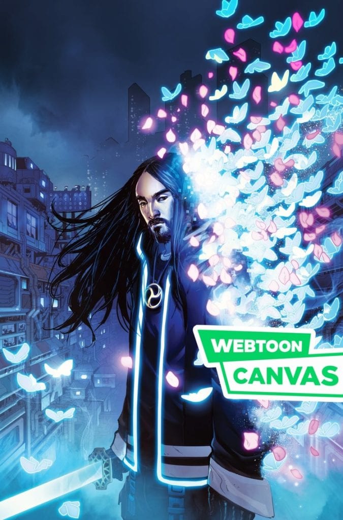
In this day and age, comics are entering a new era of distribution and presentation. After some inspiration from South Korea’s webtoon industry, some indie publishers are entering this new frontier. Comfort & Adam, AWA Studios, and Impact Theory are putting their own spin on things. But what do these three publishers do that’s so different from other digital publishing? For that matter, can other companies follow suit in this age of Western Webtoons? This is the research from the gutters.
What Are Webtoons?
Webtoons, in their modern definition, are comics built with smartphone reading in mind. With its free public wi-fi, South Korea provides the perfect opportunity for people to read while on the go. After some trial and error between web portal companies Daum and Naver, the use of the infinite canvas function allows for new breakthroughs. Since touchscreens allow for various effects, the viewing experience requires fewer panels for a more fluid experience—all without charging potential customers. After a sound success at home, these companies expand abroad to offer their services as platforms.
Webtoons In The Western World
After this advent, many webcomic creators have put their work on services like Line Webtoon and Tapas. Every day hundreds of creators put their work on display for everyone’s viewing purposes. Some of them are lucky enough to be featured content with full payments; some were through contests. Even Stan Lee made use of this with Backchannel before his untimely death. On the other side is Discovery sections, where creators display their work without any backing. Tapas has the nickname of “Youtube for Comics” because of this. Some creators like “Merryweather” have thousands of subscribers with a very decent payment in ad revenue. Not bad for people essentially on their own.
Western Webtoons Proto-Stage: Comfort & Adam
Catch “The Uniques” Season 2 on Webtoon
Comfort & Adam are husband, and wife Harvey nominated creative publishers. Their series Rainbow In The Dark and especially The Uniques are passion projects that go through constant revision. That being the case, how does this publisher go from pages to infinite scrolls without destroying their previous efforts in the process? One technique involves remaking panels into two separate sections. When scrolling through on a touchscreen, it looks like a video camera shifts position like the reader sees the events in motion. Later chapters feature close-ups to previous wide panels to save time and space to further emphasize with this; it helps to have word balloons that break apart dialogue without looking overbearing.
AWA Advertising
Then there’s AWA, which seems a little more limited in scale. This might have to do with how, despite using the webtoon services, these adaptations are primarily for advertising the standard editions, which isn’t to say that AWA doesn’t try to implement the Western Webtoon format. In The Resistance #4, a wide panel separates into two panels in the webtoon. This feels less like a camera moving as Comfort & Adam’s style and more splitting up actions to keep one from distracting the other. This is good for changes in points-of-view for surprises. But perhaps the most effective stylization from AWA is the use of the gutters. These empty spaces can enhance actions like what are grids in standard become spaces to fill when the reader scrolls downwards.
Impact Theory Following Trends
Impact Theory, on the other hand, was always ready to transfer their material onto scrolling screens. At a C2E2 2020 panel I attended, Tom Bilyeu spoke about utilizing trends like webtoons and TikTok videos. The original content from the print and standard digital contents are carefully arranged in a way for easier editing to make the transition into “Western Webtoons.” Similar to Comfort & Adams, this can range from wide panels cut in two or closeups. Unique to Impact Theory is the dynamic usage of panels, closeups, and backups to make the experience more cinematic in presentation. Thus making big action sequences like in Hexagon deliver twice the impact.
A Future In Western Webtoons?
What makes these different from regular digital comics is in the presentation. Time in comics reads and functions differently depending on the medium. A standard page flows side to side, unlike the infinite canvas that always goes downwards. But this means constant movements instead of trying to stop and appreciate the moment, which is why dialogue and captions need to be short and sweet because people’s attention spans can only last so long. The same elements like panels and gutters get dynamic changes sometimes with newer dialog than before to emphasize that feeling. This preservation of the original illustration along with more digestible sequences allows for what is essentially Western Webtoons. These three publishers just help pave the way for comics modernization.
What do you all think? Are these Western Webtoons just a trend that will die out? Or are hopeful artists ready to repaint their work on an infinite canvas?
Available this week,Buffy the Vampire Slayer: Willow #5 brings the limited series to an end. Writer Mariko Tamaki and illustrator Natacha Bustos end their run with letterer Jodi Wynne and colorist Eleonora Bruni. Sadly, after four exciting, tension-filled issues, the series ends with a whimper instead of a bang.
If you’ve been keeping up with each issue up to this point, you’ve been waiting for a dramatic conclusion to what’s been an exciting mystery. But, to put it plainly, this ain’t it. Tamaki has undone everything she so carefully set up from the beginning of the limited series.
As soon as Willow set foot in Abhainn, she was unsettled and experienced strange things such as once standoffish witches turning warm and welcoming, watchful crows, and dreams. The fun of the series was trying to unpack the symbolism and mystery behind Aelara and Abhainn. I looked forward to how these symbols would be explained, thinking that perhaps it all tied into how Aelara was manipulating Willow.
Exposition
To answer the mystery of the crows, the specter of Xander makes a deus ex machina appearance. He explains that he sent the crows to watch her and the dreams to warn her. In one of two action sequences of the issue, Xander’s crows attack Aelara, who has spent most of the issue trying verbally to convince Willow to stay. The wolves she brought with her aren’t put to work.
Willow then easily dispatches with the useless wolves by breaking open a chasm in the ground for them to fall into. Once they’re out of the way, the Tara look-alike who set this confrontation in motion makes her escape. Then, Willow and Aelara talk while magically dueling until Aelara falls back.
The two women negotiate diplomatically and flashback to their first meeting. They come up with an agreement: if Aelara lets Willow go back to her friends in Sunnydale, then Willow will return to help defend the women of Abhainn whenever they need. It’s here where the issue falls apart for me.
Denouement
Despite being built up as a potential antagonist, Aelara is forgiven, and her tendency to entrap witches in Abhainn isn’t dealt with. I see Tamaki’s intent here as perhaps remedying the long-standing trope of pitting women against each other. While I support that in principle, it just feels like a let-down in terms of storytelling. If there aren’t any consequences for this morally grey antagonist, then what was the point of the previous four issues? Aelara’s attempt to hold Willow hostage is a huge betrayal when considering how much Willow genuinely felt at home in Abhainn and friendly with the other witches.
Furthermore, it’s unclear what or whom Aelara believes would be a threat to Abhainn. We know from issue one that at least one guy from a nearby town dislikes witches, but nothing else in their environment seems to justify Aelara’s attitude. From my perspective, Aelara has made up a vague threat against witches to justify the need for Abhainn and keep them there.
Writing aside, artistically this issue is as strong as the previous four. Given the use of magic in the issue, Bustos had an opportunity to get bold and big with her expressions and backgrounds. Letterer Jodi Wynne also obviously had fun creating dynamic special effects. The art satisfies and excites where the writing lacks. Nonetheless, we can look forward to the possibility of some of the story threads in this limited series showing up in the main Buffy series.
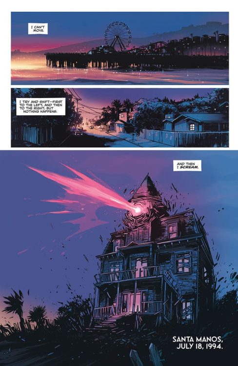
HOME SICK PILOTS #1, out on December 9th from Image Comics, is the first issue of an ongoing series by writer Dan Watters, artist Caspar Wijngaard, and letterer Aditya Bidikar.
With a story that takes very thrilling, unique turns, and a beautiful artwork that is a joy to look at, Home Sick Pilots begins to show signs of an extraordinary series every comic reader should watch out for.
About the series:
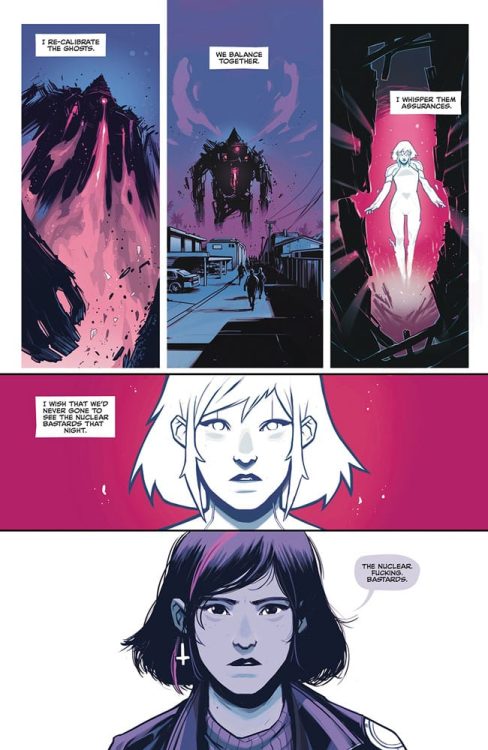
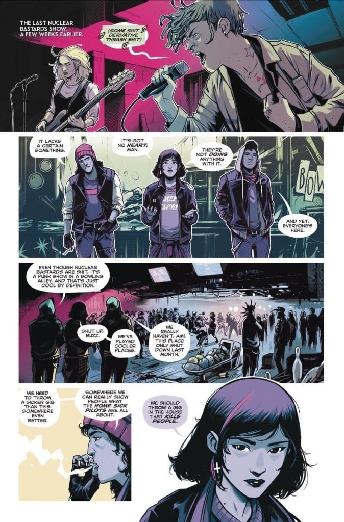
In the summer of 1994, a haunted house walks across California. Inside is Ami, lead singer of a high school punk band—who’s been missing for weeks. How did she get there, and what do these ghosts want?
Writing
If you’re a first-time reader of Watters’ work, prepare yourself to be amazed. Every element of Watters’ writing goes like clockwork. The story’s pace never drags out, with each reveal coming at exactly the perfect time. The characters are sharply-written, believable, and positively punk. The dialogue flows nicely and naturally, with each character having his or her own unique manner of speaking.
But, Watters’ writing especially shines when he gives the reader a breather from time to time in the form of a blank page with sparse narration. It gives the reader time to think- time to process what they had just read. Most importantly, this further puts the reader in the main character’s shoes and allows them to learn more about her past, personality, and relationship with this bizarre house.
Art
Wijngaard’s gorgeous artwork steals the show in Home Sick Pilots #1. The acting looks phenomenal yet simple, giving the reader the ability to tell how the characters feel at any given moment. His choice to always show the midst of a violent act, like a cop being kicked in the face, pulls the reader right into the action. In addition, the vibrant colors Wijngaard uses, especially in the pages’ blank backgrounds, make this comic look all the more alive and fun, and his choice to pull back on the amount of colors he usually uses in the rather freakish moments of this book gives these sequences all the more importance and tension.
Most notably, there is a two-page scene where all the characters we’ve met so far are inside the Old James house. The way those two pages are laid out is nothing short of brilliant. We’re watching the characters interact with each other and explore the house like puppets in a dollhouse. In this scene, it’s almost as if the reader themselves is taking the point of view of this strange house. Also, what adds to the weirdness and creepiness of it all is that the scene plays out non-linearly. With that, the reader also gets to take a peek at how this strange house might actually work—great work from Wijngaard.
Lettering
Bidikar‘s lettering style in Home Sick Pilots #1 is as punk as it gets. The balloons are never perfect shapes, elevating the comic’s rebellious mood. The simple, small sound effects never draw too much intention to themselves, which works great with the stylish artwork. Bidikar places the sparse narration in the blank pages and manages to keep the reader engaged, even though those pages don’t have much to offer.
It would’ve been easy for Bidikar to go crazy with his lettering style, considering the comic’s punk, hipster feel. But, Bidikar resists the temptation and letters in a very delicate, constrained manner, which works beautifully here.
Conclusion
Home Sick Pilots #1 is an exciting first issue. The story takes surprising turns and keeps the reader engaged from start to finish; The stunning art looks fresh and lively, which is exactly how a comic book about punk teens and a living house should look like. Strongly recommended for fans of Monster House and Green Room.
The Amazing Spider-Man #53, out now from Marvel Comics, features some gorgeous art and a neat revisiting of an old issue.
About the Book:
We have been aware that the villainous Kindred’s true identity has been Harry Osborn for many issues. Now, watch the tense reveal as Spider-Man is in the captivity of Kindred and must listen to what he has to say.
The Amazing Spider-Man #53 Story
Having the identity of Kindred known to us but not our titular hero has been an enjoyable case of dramatic irony. We knew that when Spider-Man discovers this enormous secret, the moment would be tense and thrilling, and Nick Spencer understands how to make it just that. The Amazing Spider-Man #53 is undoubtedly a page-turner. It builds towards the critical moment, uses silent panels, and revisits an old issue to make it more interesting. Rather than using one or two silent panels to represent a pause in a scene, Spencer has pages full of silent panels. This results in a rise in suspense similar to that in a horror film, as you dread what actions Kindred will perform next. It creates some deeply unsettling moments and keeps the reader enthralled.
In The Amazing Spider-Man #53, Peter experiences a dream state forced upon him by Kindred. This dream has him reliving a day in his life shown in 2007’s Amazing Spider-Man #545 by Joe Quesada and Danny Miki. Before this issue, Harry Osborn was presumed dead after we saw him passing away in an ambulance. This turned out to be false, and his death had been faked. What makes Amazing Spider-Man #545 such an important issue is that it was the first time Peter had seen Harry since his “death.” Every character repeats their dialogue from the 2007 issue besides Peter, making The Amazing Spider-Man #53 feel like a Groundhog Day scenario. This direct referencing is fantastic because it rewards long-time readers by letting them know what is coming, and new readers can experience what is happening, just like Peter is. This referencing also demonstrates Spencer’s knowledge and love of the character and his history.
Art
Mark Bagley and John Dell provide some beautiful art in The Amazing Spider-Man #53 that makes each page a pleasure to read. Each panel has a delightful amount of detail, and Bagley and Dell create awe-inspiring shadows that bring scenes together. In mimicking Amazing Spider-Man #545, Bagley and Dell recreate the older comic’s characters and poses in a new art style, which is interesting to see. They also play with panel borders in the issue for a variety of outcomes. Often characters will overlap a panel, which brings more attention to them and fills the character’s action with more energy. Another use had a panel without borders, so all of the focus is directed onto one character, which provides an exciting effect.
The colors of The Amazing Spider-Man #53 were done by Edgar Delgado, whose work pairs wonderfully with Bagley and Dell’s art. For the long scenes without any dialogue, Delgado’s palette is dark and instills a creepy, disturbing tone. Delgado also provides some stunning shading, which adds drama to the issue.
The Amazing Spider-Man #53 was lettered by VC’s Joe Caramagna, who does an outstanding job making the dialogue flow with the art. In the issue, sentences are broken up over multiple tiny captions. Their placement allows them to be read in a natural way that makes it seem as if the character is talking slowly and stressing every word. Caramagna also uses techniques such as extending words past their speech bubbles, which is a great way to portray someone shouting or screaming, as it makes it seem as if their words can not be contained.
Conclusion
The Amazing Spider-Man #53 features more interaction between Spider-Man and Kindred, which has been built up over many issues. The art and lettering make the moment incredibly memorable, and the issue is a fun read.
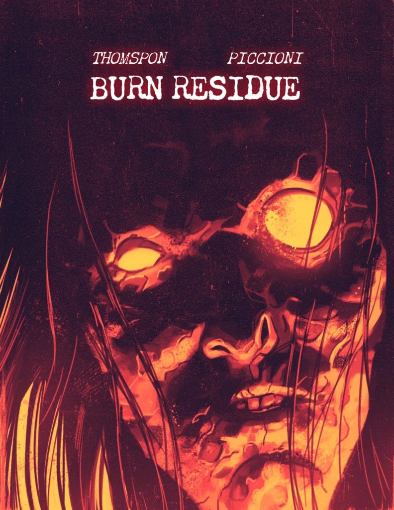
Burn Residue writer Jonathan Thompson has shared something very special with us at Monkeys Fighting Robots. Last month, when we spoke to Jonathan, he let it drop that Jacob Phillips (artist on That Texas Blood and colorist on the more recent Criminal comics) would be drawing the cover to the collected edition of the upcoming Burn Residue. And now, we at MFR have that cover for you all to see. Check it out below!
Art by Jacob Phillips
That’s one striking cover! You can practically feel the heat coming off it! Personally, I can’t wait to see this on a physical cover and neither should you. The book is one killer crime comic (check out our early review of the first issue) and this cover is just icing on the burned cake!
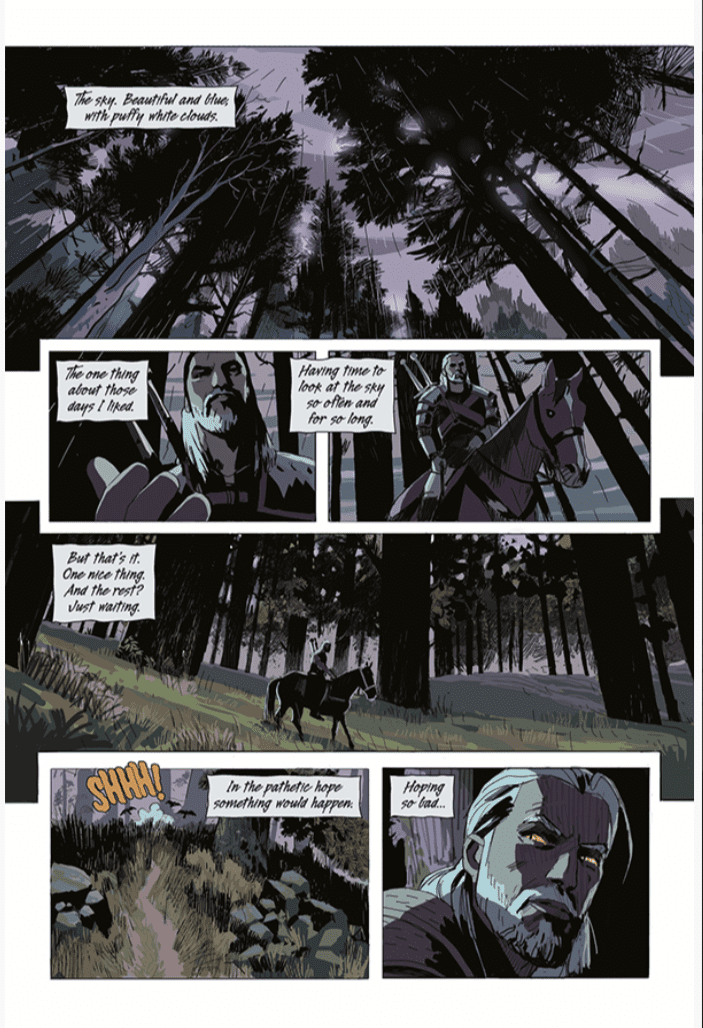
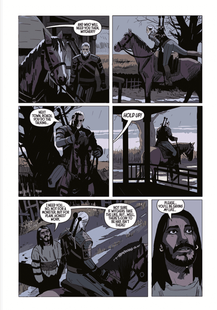
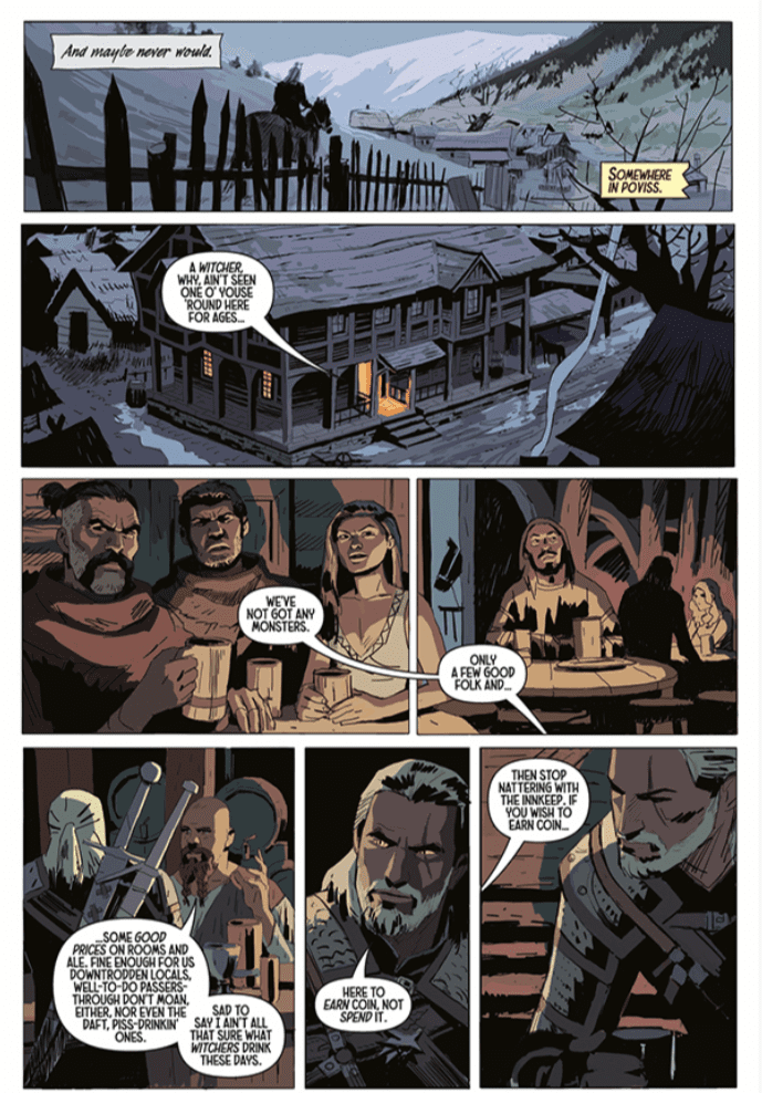
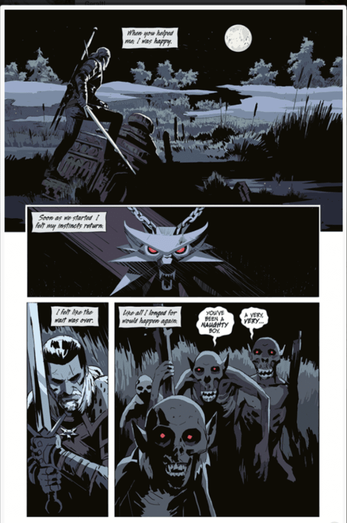
Dark Horse Comics will publish the first issue of a four-part series entitled, The Witcher: Fading Memories on November 25, under the supervision of CD Projekt Red. The story is written by Bastoz Sztybor, art by Amad Mir, colors by Hamidreza Sheykh, and letters by Steve Dutro. This comic is a masterful first issue that commands respect on page one and holds it through the entire issue.
Story
The world is changing, and our protagonist, Geralt is trying to discover if he can change with it. A Witcher is a monster hunter, and in this story, world monsters are becoming scarce. We journey along with Geralt as he reckons with what he will do if he becomes obsolete. The first issue does a great job of introducing a complex world and is easy to follow even if this is the first step you are taking into the Witcher universe. The character Geralt is curt, but he never comes across as unlikeable, and you want to follow him on his journey. While this issue does not have an abundance of action, a future call to action is seeded in what is a great character piece. Sztybor is amazing at episodic storytelling. While the issue is part of a larger story, it did not feel like a chapter; rather it felt like a self-contained story that fuels a larger narrative. After completing the comic, I wanted more. I laughed, I cried, and I wanted the story to keep going. I cannot wait for the second issue.
Art
Amad Mir’s art compliments the story perfectly and is a great fit for Sztybor’s story. Mir is adept at shadow works, and it conveys such a great tone in the book. The lighting dances across the page and fills the issue with life. The book also does a great job of conveying emotion through the eyes. This work evokes so much emotion and tells so much story in a short amount of time, and the art never makes the reader feel cheated. This comic is a master class on adapting material from another medium and employing comic art to make it work in this medium.
Colors
Hamidreza Sheykh employs a muted pallet to convey a somber (but appropriate) mood over the entire work. As mentioned above, the story focuses on Geralt contemplating his role as a Witcher in a changing world. The coloring gives the sense that night is ever impeding on the world and echoes Geralt’s feelings that his sunset is coming. The coloring is outstanding.
Lettering
Steve Dutro’s lettering in the caption boxes is exquisite. It helps the reader hear Geralt with a gravelly voice, as he is portrayed in the game. Dutro also uses a slight change to the lettering when he has Geralt reading a letter. It is a small and slight change, but it is a chef’s kiss to visualize internal dialogue masterfully. However, the letters in word balloons feel a smidge too big and throw off a panel’s proportion. Beyond that, the lettering does a fine job in aiding to tell a visual story.
Conclusion
If you are a fan of the Witcher series you will adore this comic. If you are new to the universe, you will adore this comic and want to explore other stories in the Witcher universe. My litmus test for the first issue is always how excited I am for the second issue. After reading The Witcher: Fading Memories, I find myself counting the days until next month. Until then, I am firing up the Xbox and installing The Witcher 3 to help calm the cravings.
All Joking Aside is a comedy-drama from director Shannon Kohli (The Magicians, Supergirl) about an up-and-coming comedian and a comedian on the rocks bringing out the best in each other.
Raylene Harewood (Legends of Tomorrow) plays Charlie in All Joking Aside. Charlie is a smart young woman taking her first shot at stand up comedy. Bob, played by Brian Markinson (Continuum), is a top-notch heckler in the sparse audience. Charlie and Bob’s paths cross again, where Bob takes the opportunity to troll Charlie some more. Charlie digs into Bob, learning that he’s a failed comedian. Soon, the pair form sort of odd-couple relationship that ends up uplifting both their lives.
PopAxiomspoke with Shannon Kohli about becoming a director, working in TV, and her first feature film, All Joking Aside.
Passion
Shannon new up in Geneva, Switzerland, where she says, “there weren’t many films being made there.” But the would-be director admits, “I loved anything to do with films. I researched everything. I watched everything.”
“We only had one English speaking channel,” Shannon says, diving into the kinds of films she grew up watching, “and it was Ted Turner Classics. I grew up on all the old classic films.”
Shannon was no doubt a cinephile, but also “loved photography. I got my first camera when I was six-years-old. I was always going out and taking photos. It was always a passion.”
“But I didn’t think I could make it a reality and a career,” she says, due to the lack of a film community in Geneva. That changed when Shannon “moved to Vancouver and went to the University of British Colombia. I was enrolled in economics, and soon as I got to Vancouver and saw all these film productions happening on the streets, I joined the film society at university and met a whole bunch of film people.”
A year or so into economics, Shannon “ended up switching to the film program.” Her dive into the Canadian film world was full steam. “At the same time, I was volunteering on the weekends and my days off on different sets. And quickly that lead to getting paid work in lighting.”
“I was getting all this theory at school,” she says, “but then I saw the real world while working on different TV shows and features. It was a great learning experience. Once I entered the film world, I knew I was hooked. I knew it was going to be a lifelong passion.”
Directing
Shannon’s directorial debut happened at university. “To get into the film program, you had to submit a film that you directed. So, I wrote a script and asked a friend to be in it. The film society came together to help me. That was my first directing experience.”
Now in the film program with only fifteen or so other students, Shannon “specialized a little more in cinematography, but I was always directing on the side doing music videos and short films.”
A few years ago, Shannon directed her first episode of TV with an episode of Shadowhunters. What’s it like coming in to direct one out of many episodes of a series? “It can be daunting. You’re the new kid at school. All the cast and the crew have been working together for, sometimes, years.”
“You get about a week-and-a-half to prep,” Shannon takes us into the world of a TV director, “so it’s a lot of meetings. Sometimes you get a script in advance; sometimes, you get it the day before. Then the next day, you’re sitting in these huge meetings being asked how you want to film this and do that.”
Preparation is vital for working in the film industry and perhaps nowhere else as much as on television. “I watch every episode of a show before I start, so I have a good idea of the style. They often send you a reference book with color palettes or, in the case of Supergirl because it’s a comic book, there’s information about camera movements.”
Shannon’s worked on Supergirl, Legends of Tomorrow, and The Magicians, all shows backed by major studios. All Joking Aside is Shannon’s first feature, and it’s an indie production. “The big difference with All Joking Aside was that since it’s an indie feature, we were figuring out a lot of different departments. I had more creative input in it but a lot less support and backing. We didn’t have a big studio or network behind us saying, ‘Yes, do it, it’s no problem.’”
“You have to be solution-based,” Shannon says about indie filmmaking. “If we lost a location, we had to think about where we could do the scene without producers who could say, ‘Oh, yeah, no problem, we can just do it here’ or ‘we can build a set for it.’”
About All Joking Aside
Shannon’s connection to All Joking Aside began through producer Jon Ornoy. “I’ve known Jon for a long time. He approached me about directing it. He’d optioned the script from InkTip, a place where writers can post tagline and synopsis of scripts they want to sell. It was from writer James Pickering. Jon adapted the script with James for New York. It was a great collaboration.”
Initial discussions about making All Joking Aside included a lot of adapting it for the United States. “A lot of the comedy was very British, so it didn’t translate to American characters.”
“Also, when we cast the characters,” she adds, “we were looking for the actors to bring a lot to the table. It’s difficult to write comedy, but it’s even more difficult to write comedy for other people. So, it was great when we cast Raylene Harewood and Brian Markinson, who could bring a lot. They had great ideas.”
All Joking Aside takes place in and around the beautiful city of New York. However, beauty sometimes comes with quirks. “At the duck pond, it was one of the coldest days of the year, and the pond was frozen over. So, instead of getting ducks swimming, we had ducks sliding around on the ice. We went with it. It’s pretty comical.”
“None of the ducks wanted to come near us,” Shannon says, “because they were staying huddled together for warmth. I went over and tried to entice them to come over. That was pretty funny too.”
What’s something Shannon will do differently for her next feature film? “All Joking Aside, because of the budget limits, I wish we had more days. I will fight for more days for my next feature.”
“It’s always time,” Shannon declares about the biggest enemy of any TV or film production.
Wrapping Up
“Growing up, Katherine Bigelow was a director who stood out for me,” Shannon says about one of the influences flowing through her filmmaking veins. “I loved Near Dark; I watched it so many times. Point Break was such a different film. I thought, wow, here’s a woman who’s out there making great action films. She’s always been a role model for me as a director. She was one who said ‘I can do anything.’”
Shannon focused on cinematography early on, “so I love watching films for the cinematography. Films like Delicatessen from Darius Khondji or Roger Deakins. Now is an exciting time; a lot of opportunities have opened.”
“I love biopics,” Shannon admits when asked about a dream project, “anything based around real characters. The Hedy Lamar biopic would’ve been fascinating to direct.”
All Joking Aside is available on a digital service near you. So, what’s next for Shannon? “I’m attached to direct a feature called Love Bomb based on the play by Meghan Gardiner. I’m directing two episodes of Another Life for Netflix.”
Is All Joking Aside on your watch list?
Thanks to Shannon Kohli and October Coast
for making this interview possible.
GI JOE – A REAL AMERICAN HERO #275, available from IDW Publishing on November 18th, concludes the Snake Hunt arc by staging a non-stop, action-fueled escape for Snake Eyes and the team. Written by Larry Hama, the story wraps up the 10-issue arc in classic Joe fashion with a ton of eye candy and not much else.
Cover Art
The Robert Atkins covers in this run have been a true treat of nostalgic fan service. The colors are bold. Snake Eyes assumes a classic hero action pose, and the overall composition looks like it was ripped straight from an action figure box. If you love the original cartoons and toys, this cover is pure joy.
Writing
Hama’s story concludes with an unrelenting escape from the hospital by Snake Eyes, and the Joe team sent in to rescue him. (Check out our review of GI Joe #274 to see how we got here.) This review’s title is not at all misleading as there’s not a single word in this entire issue. No dialog. No captions. No narration of any kind. It’s an entire issue of guns blazing and grenades exploding during a daring escape.
Of course, the Joes escape to fight another day. If you’re into stories where you flip through the pages and soak it all in, this one’s for you.
Pencils/Inks
This entire issue is exactly 30 panels. That’s it, and that’s all. 30 panels. Every page is a single splash page that’s good enough to pull double duty as a cover or a poster; for GI Joe fans or comics fans that like action in general, this issue is one continuous battle from start to finish.
What’s exceptional about this novelty type of comic is how well the art team (Robert Atkins, Netho Diaz, Brian Atkins, and Maria Keane) successfully tell a story simply through the motion and art on the page. To be fair, there’s not much story to tell, but action lovers won’t mind it one bit.
Coloring
J. Brown’s coloring work is one of the stars of this issue. The color captures the bold, eye-popping feel of an action cartoon without devolving into cartoonish tackiness. The explosions bloom brightly, and ordnance lights up every page—great work here by Brown.
Conclusion
GI JOE – A REAL AMERICAN HERO #275, available from IDW Publishing on November 18th, takes the “tell the story through art” model to an extreme with great success. The artwork is spot on for the material, and it wraps up the arc in a neat little bow. I highly recommend this series for GI Joe enthusiasts.


 After this advent, many webcomic creators have put their work on services like Line Webtoon and Tapas. Every day hundreds of creators put their work on display for everyone’s viewing purposes. Some of them are lucky enough to be featured content with full payments; some were through
 Impact Theory, on the other hand, was always ready to transfer their material onto scrolling screens. At a C2E2 2020 panel I attended, Tom Bilyeu spoke about utilizing trends like webtoons and TikTok videos. The original content from the print and standard digital contents are carefully arranged in a way for easier editing to make the transition into “Western Webtoons.” Similar to Comfort & Adams, this can range from wide panels cut in two or closeups. Unique to Impact Theory is the dynamic usage of panels, closeups, and backups to make the experience more cinematic in presentation. Thus making big action sequences like in Hexagon deliver twice the impact.