Home Blog Page 204

X-O MANOWAR #3: The Compromising Compromises

X-O Manowar #3 main cover

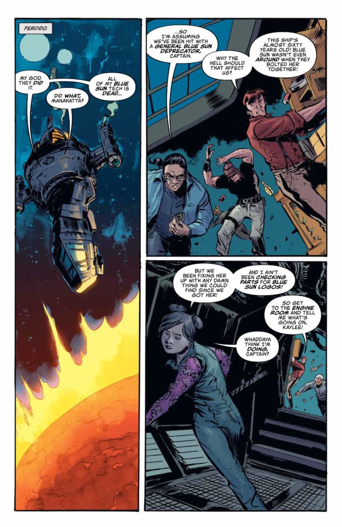
X-O Manowar #3 drops December 23 by Valiant Entertainment. Writer Dennis Hopeless brings out a story about compromises and speaking in unison. Artist Emilio Laiso highlights this issue with not just detail but unique mechanical designs. Joining them are colorist Ruth Redmond and letterer Hassan Otsmane-Elhaou.

X-O Manowar #3 The Revolving Table

Hopeless and his storytelling techniques stay on point throughout in terms of consistency. One of the best parts of X-O Manowar #3 comes from how it presents the issue’s main theme. Aric is out to find a dangerous warlord and bring him in. To do so without arrests, he agrees to work with tech billionaire Troy to spin the narrative positively. While it works to a degree, not everyone is on the same page. This exemplifies itself when Aric is at breakfast with his found family. Desmond and his mother appreciate Aric and the armor Shanharra’s company, especially when that can lead to Desmond doing better with his grades and a preview to a video game. Everybody is contributing, but no one seems to be connecting until Aric speaks up.

This all translates into Aric’s and Shanharra’s relationship with Troy. Troy certainly has the resources to help Aric out, but he has preferences on how it’s done. Like when he sends Aric to a wildfire zone, and his first thoughts are to save his friend’s mansion. Not only that, he happens to know about the nature of a goop monster that appears in it. Clearly, Troy knows more than he lets on; throughout X-O Manowar #3, he always prefers to have Aric’s consent on major decisions. Rather than work with Aric, Troy seems to be controlling him.

Art Is Always On Point

Laiso makes every scene stand out with impressive detail and line work. Everything from the wrinkles on characters, the architecture, and machinery looks impressive. So impressive, Laiso gives bold lines to everything, making the plot-driving elements more apparent. For example, X-O Manowar is in the background while a helicopter releases retardants on a wildfire. In this case, the helicopter gets the emboldening treatment echoing Aric’s earlier statement; there are things that local authorities can do without the aid of Aric, and he knows that.

X-O Manowar #3 page

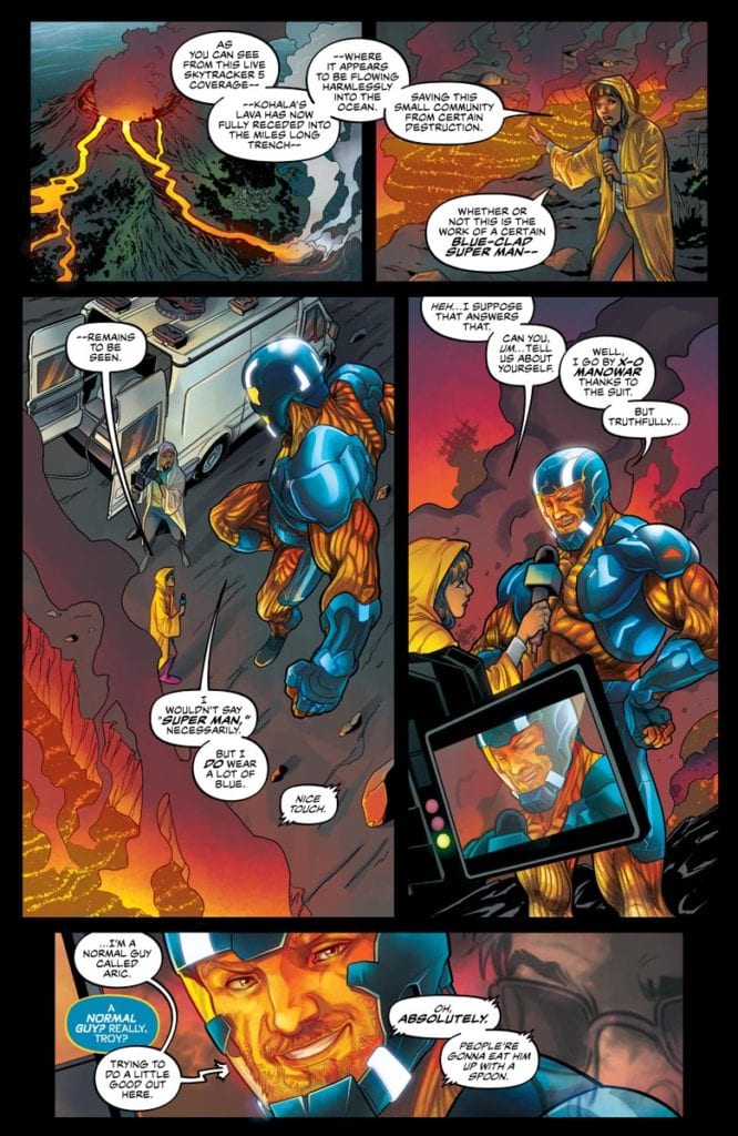
Redmond’s coloring tends to highlight much of the conflicts of X-O Manowar #3. Usually, the brighter colors stand out the most, including the green monster that appears out of nowhere. Among the flames of the wildfire, this demonstrates it as a more serious threat than a force of nature. Then there’s Otsmane-Elhaou’s lettering that feels like a natural extension of everything they highlight. Shanharra’s word balloons reflect the suit’s color, and its mechanical nature contrasts with humans whose words turn red in moments of intense emotion. Then there are the hand-drawn wordmarks for certain situations; the fire and monster are so notable that they culminate in a major development between Aric, Shanharra, and Troy. No specific spoilers but Shanharra’s blue word balloons turning red suggests she will be able to connect with Aric a little more emotionally.

X-O Manowar #3 Gets The Attention It Deserves

X-O Manowar continues to be a title that serves as some of the best Valiant Entertainment offers. This issue highlights the strengths in a one-issue story by staying on point in not just themes and art; it’s practically a meta-commentary on its concept. Because once everyone is on board and helping each other out, they create an experience where the reader wants more.

Monkeys Fighting Robots Youtube

Review: KILLADELPHIA #11 – New Historical Figures

Killadelphia #11 Cover

Killadelphia #11, out today from Image Comics, is another captivating issue where the story takes unexpected turns, and the art is stunning.

Rodney Barnes’s initial choice to have John Adams be the main vampire villain in the series’ first arc was an interesting choice that added an enjoyable historical fiction aspect to Killadelphia. After Adams left the story, Barnes continued to find ways to tie the story to historical elements. Such is the case in Killadelphia #11, which introduces another character that has historical significance.

Killadelphia #11 Writing Example

This issue has the difficulty of navigating between multiple different storylines, which Barnes does with grace. Killadelphia #11 has three separate groups of people that we follow and a flashback for one character. It is a lot to follow along with, especially for only 23 pages, but Barnes has no trouble pulling this off. No scene feels like it goes on for too long or little, and because of this, the entire issue feels incredibly dense with content. The story is always moving, there is virtually no filler, and the issue is a fantastic read.

Killadelphia #11 is some gorgeous work from Jason Shawn Alexander. The series is lucky to have him. Alexander’s work has made every issue an absolute joy to read, and Killadelphia #11 is some of his best work in the series. His faces are realistic and expressive as always, and this issue features some unconventional paneling and a full-page splash that allows Alexander to shine. It makes you feel fortunate to be a reader. The issue also features some macabre art that is immensely creepy and disturbing. I hope to see more of this in future issues because the macabre art can make the series even more horrifying.

Killadelphia #11 Art Example

Luis NCT provides astounding coloring in Killadelphia #11. He makes heaven feel like heaven, and purgatory feel like purgatory. The sepia tones he uses for flashbacks make them easily recognizable as past events, and I don’t know anyone who does bloodshed better. NCT’s work heavily enhances Alexander’s art and causes both the violent and dialogue-heavy scenes to have more impact.

Killadelphia #11 Coloring

Marshall Dillon’s lettering in Killadelphia #11 has substantial effects on the tone of scenes. For example, the issue features an ultra-violent sequence, but one character has an internal monologue told through captions as that is happening. The sound effects that result from the violence are placed behind the characters involved when most modern comic books would put them in front. This choice causes the lettering to have less impact and helps direct the reader’s attention to the character the captions want the reader to focus on. This makes the transition to a flashback later in the issue easier.

Killadelphia #11 is another breathtaking installment of the series that is sure to become a classic. Alexander’s brilliant art and NCT’s coloring complement Barnes’ fun mix of vampires and historical fiction, and Dillon’s lettering polishes it all. I can’t wait to see where this series will go, especially after this issue took such an unexpected turn.

Monkeys Fighting Robots Youtube

Review: CYBERPUNK 2077: TRAUMA TEAM #4—Ego and Id

Main Cover

Available now from Dark Horse Comics, Cyberpunk 2077: Trauma Team #4 brings this nail-biter of a limited series to an end. Writer Cullen Bunn and artist Miguel Valderrama with colorist Jason Wordie and letterer Frank Cvetkovic pull out all the stops to close the story with a bang.

After four issues, I’ve now realized that Nadia’s journey at its core is a battle between the id and the ego. The id and the ego make up a psychoanalytical theory famously developed by Sigmund Freud. At the risk of simplifying the theory, the id is the most unrestrained aspect of an individual’s personality, while the ego keeps the id in check. Nadia’s client represents her id as he kills without restraint and uses others’ conflict to his own advantage. After struggling with her desire for revenge on the client, this last issue presents their final showdown.

spoilers ahead

Picking up where the third issue left off, Nadia, Stratter, and the client finally make it out of the high-rise apartment complex. Wasting no time, Stratter calls for an evac and berates Nadia again, blaming her for their fellow team members’ deaths. Before Nadia can defend herself, the client snaps Stratter’s neck. They argue, but a surviving gang member leaps out of the building to finish the client off.

The Thick of It

True to her job description, Nadia defends her client as even more gang members come out of the woodwork. In a flurry of blue and red wide panels with varied SFX, we get a closer look at the action as Nadia fights her way through a group of five guys. Meanwhile, the client goes up against a guy three times his size.

It’s probably the longest continuous action sequence of the series, and it’s exhilarating. Sure, up to this point, we’ve seen plenty of shootouts and rage-filled fistfights, but this one sequence exhibits each individual talent involved. Artistically, illustrator Valderrama and colorist Wordie have contrasted ruddy gore with neon pinks, yellows, and blues. Cvetkovic’s lettering augments the style with graffiti-like lettering.

Overall, the effect is a stylized look that dispels any sense of realism in the reader. However, the high contrast also makes the emotional moments so much more impactful. In the above-mentioned action sequence, for one, the art shows us exactly how broken down the main characters are by this mission.

To the Death

To Bunn’s credit, his use of cliffhangers to build suspense in the previous issues make the final action sequence so satisfying. By this point, the reader wants an end to the suffering, regardless if Nadia gets her revenge. But Bunn intelligently leaves the ending ambiguous. A panel of blood and bullet shells ends the series, leaving us to question whether Nadia’s ego has triumphed over the id. I also wonder if this is meant as a lesson on revenge. Perhaps we’re meant to ask, “Is revenge worth the bloodshed?”

All in all, Cyberpunk 2077: Trauma Team #4 is a satisfying conclusion to a gripping, character-driven limited series. It stands on its own against the video game, especially given that the cyberpunk world (i. e., culture, location) is mostly handled visually and hinted at through side characters. If you were disappointed with the game, give the comic books a chance. On the other hand, if you’re not a gamer or never even heard of the game, I would recommend you give the series a try.

Monkeys Fighting Robots Youtube

Marvel Comics Exclusive Preview: KING IN BLACK: IRON MAN/DOCTOR DOOM #1

king in black iron man doctor doom marvel comics exclusive preview

KING IN BLACK: IRON MAN/DOCTOR DOOM #1 hits your local comic book store December 30th, but thanks to Marvel Comics, Monkeys Fighting Robots has an exclusive four-page preview for you.

About the issue:
Iron Man has risked everything to save Eddie Brock, but now he’s left with nothing but guilt. As longtime ‘frenemy’ Doctor Doom shows up with both counseling words and ulterior motives, they’lll be forced to battle an all-too-familiar specter of the holiday season-albeit one now twisted and controlled by the recent invasion of Earth by the symbiote homeworld. As Iron Man and Doom fight as temporary allies, their unexpected encounter both with each other and a horrifying inversion of yuletide joy may ultimately reveal to them the true meaning of Knull-mas.

KING IN BLACK: IRON MAN/DOCTOR DOOM #1 is by writer Christopher Cantwell and artist Salvador Larroca, with colors by Guru-eFX, and letters by Travis Lanham.

The issue serves as both a tie-in to Marvel’s KING IN BLACK event and a holiday issue. Cantwell is currently writing both the IRON MAN and DOCTOR DOOM solo series.

Check out the KING IN BLACK: IRON MAN/DOCTOR DOOM #1 preview below:

king in black iron man doctor doom marvel comics exclusive preview

king in black iron man doctor doom marvel comics exclusive preview

king in black iron man doctor doom marvel comics exclusive preview

king in black iron man doctor doom marvel comics exclusive preview

king in black iron man doctor doom marvel comics exclusive preview

king in black iron man doctor doom marvel comics exclusive preview


Are you enjoying Marvel’s KING IN BLACK event? Sound off in the comments!

Monkeys Fighting Robots Youtube

Review: Al Simmons Takes On The World In SPAWN #313

SPAWN #313, available in comic book stores on Wednesday, December 23rd, concludes the Cult of Omega story arc in epic fashion. After countless hours of searching for missing Hellspawn, Al Simmons finally decides to contact someone who isn’t on the best of terms with him—the ultimate last resort. The story that ensures takes readers across the world in a last ditch attempt to prevent the universe from coming apart at the seams.

Story

The first half of the issue focuses once again on Gunslinger Spawn as he deals with the aftermath of Heaven’s most recent attack. But out of the blue Jessica Priest arrives on the scene. The latter senses a disturbance among their kin, and offers to assist Gunslinger. Their interaction is as testy as one would expect, but sees the two getting close to being on the same page.

The tales shifts to Al’s perspective shortly after. Despite operating with much less power than usual, Al wastes no time beginning his search for a cure for his pal Overt-Kill. He realizes he must visit someone, but decides to take his friend along as back-up.

Knowing full well about the danger facing Hellspawn throughout the world—not to mention his weakened state—our hero still places himself in harms way to protect his ally. Unfortunately, the monstrosity they find themselves facing could be more than the two of them can handle.

Writer Todd McFarlane takes readers on a journey at break-neck speed. Yet the highly detailed narration ensures they’re able to follow each moment of action. It was great getting to dive deeper into Al, Jessica, and Gunslinger’s unique personalities.

Artwork

Carlo Barberi’s penciling, ink work, and coloring crafted equally intriguing locales no matter where the scenes took place. The flat, nearly barren farmland makes one think they’ll see tumbleweed rolling across any second. Then, we find ourselves moved into a laboratory, and eventually find ourselves on an uncharted island. These scenes may move quickly, but letterer Tom Orzechowski’s dialogue boxes makes each set of illustrations easily navigable.

Conclusion

SPAWN #313 introduces menacing new threats in an engaging way. It was great getting to see Al, Jessica, and Gunslinger react to challenges in their own ways.

Who do you think this newcomer is? Let us know in the comments below!

Monkeys Fighting Robots Youtube

Review: STAR WARS ADVENTURES: SMUGGLER’S RUN #1 Brings A Fan Favorite Novel To Comics

STAR WARS ADVENTURES: SMUGGLER’S RUN #1, available in stores on Wednesday, December 23rd, brings one of the Star Wars universe’s most popular novels to the comic book medium. Greg Rucka’s novel of the same name details Han Solo and Chewbacca’s true “initiation” into the Rebel Alliance. And in this comic book adaptation readers are treated to the antics of their favorite duo in an engaging form.

Story

The scene is set: Leia Organa and the rebels are regrouping after their well-known destruction of the Death Star. She calls in Han and Chewie, charging them with the task of saving Lieutenant Ematt, who’s heading to Crykon. According to her, he has valuable information that must be kept from the Empire at all costs.

Alec Worley’s adaptation reads and flows much like its novel counterpart. It’s a brilliant translation of Rucka’s narrative into the comic book medium. We loved the back and forth bickering between Leia and Han. And it was equally entertaining watching Han and Chewie scramble to hide their identities from curious Empire soldiers. The ensuing story is full of action, adventure, and espionage that all Star Wars fans will love.

Artwork

Ingo Römling’s penciling, ink work, coloring, and lettering worked together beautifully in this opening issue. The characters exhibit a realness much like their live action counterparts, while simultaneously embodying cartoonish styles that emphasize their personalities. It was great seeing these individuals set against space themed backgrounds full of bright and dark shades. And the way the word balloons alternate between jagged and smooth borders helps us differentiate between speech in-person and via radio.

Conclusion

STAR WARS ADVENTURES: SMUGGLER’S RUN #1 is an awesome kickoff to this adaptation of ‘s novel. We’re excited to see where Han and Chewie’s adventure takes them next.

Do you hope more classic Star Wars trilogy characters will show up in this run? Let us know in the comments below!

Monkeys Fighting Robots Youtube

When Events Merge in SPIDER-WOMAN #7

SPIDER-WOMAN #7, available Wednesday from Marvel Comics, is about to merge the already intense plot of Spider-Woman with the event that is tearing apart the Marvel universe. It’s no surprise that she would get pulled into this mess, when you think about it.

Well, that’s one way to phrase what’s going on.

The Knull Invasion is in full force on Earth, something that Jessica Drew and her allies just learned the hard way. Much of what happens in this issue (but not all) is heavily tied in with the vents of The King in Black, and that means this dark plot is about to get just a little bit darker.

Ever since her series started up (again), Jessica Drew has been fighting for her life. Literally. And it’s not just her life, it’s the life of her son, and the niece she never knew she had. She doesn’t exactly have time to get involved with a war. Nor is she in the most stable state, at the moment.

Thus, that is where Spider-Woman #7. She’s facing a war on two fronts (three, if you count the mental state her ‘treatment’ is putting her in). Something’s gotta give, the real question is, what?

Look at who’s shown up for this battle!

The Writing

Spider-Woman #7 is a lot of things. It’s thrilling and intense. It’s humorous (at times), and it’s also heartbreaking. If one thing is certain, it’s that Karla Pacheco wrote in dozens of highs and lows into this particular issue.

It makes sense, given everything that’s going on. We have the main plot, we have the invasion, the best friend drama, and the drama/humor that comes with multiple heroes interacting. In short, it’s a feast for the readers.

While this issue may be hard for some fans to read, it did an excellent job of highlighting everything that is truly going on behind the scenes. The full effects of the cure (if you can call it that), the strain of being a hero, the worry that can eat away at a person. It’s all so painfully clear.

All of that before taking into account the cameos. Those helped to heighten and lighten the scenes, depending on what was needed. It’s a fine balance, but it is one that was found here. Naturally, some characters leaned more towards the funny side of the scale, while others were clearly there for physical (read: battle) backup.

The cliffhanger ending for this issue is perhaps the most intriguing turn of events so far. Once again a classic Spider character has entered the fray, and that just raises even more questions. Only time will tell how that will fallout.

Time to take a peek at how the invasion is going…

The Art

If you’re looking for an issue full of action and fighting, then Spider-Woman #7 is the issue for you. Pere Perez (art), Frank D’Armata (colors), and VC’s Travis Lanham (letters) did an outstanding job of portraying a variety of scenes and emotions.

To put it bluntly, this issue feels raw. Not in the incomplete sense, but in the sheer amount of emotions, from pain to rage, that cross the pages. It is Spider-Woman like we’ve never seen her before, and you can’t escape what she’s going through.

Bold colors and lines work together to create dynamic scenes, either full of action or those dramatic poses we all know so well. The clever borders helped to enhance the scene as well, while also reminding readers of what is at stake. (Especially those readers who are following along with The King in Black).

Spider-Woman #7 features some of the best lettering of the series thus far. The zaps and hits feel real, while the screeches almost resonate in our eardrums. It all works together to create a sense of scale and chaos.

Well, that can’t be good!

Conclusion

Spider-Woman #7 is an intense read, right from the very beginning, up until the very end. It makes for a tough read at points, but that just furthers the impact of it all. After all, no story is complete without a little bit of upheaval.

It’s going to be fascinating to see where Jessica’s story leads from here, and if she’ll be involved ever again in the current war tearing it’s way across Earth 616. Only time will tell.

Monkeys Fighting Robots Youtube

The End of An Adventure in FIREFLY: BLUE SUN RISING #1

FIREFLY: BLUE SUN RISING #1, available Wednesday from BOOM! Studios, concludes both the Blue Sun Rising plot arc, and the main plot for the most recent run of Firefly. However, their story is far from over.

A tech oriented variant cover for Firefly: Blue Sun Rising #1.

It all comes to a head here, in Firefly: Blue Sun Rising #1. The crew on Serenity has gotten in over their heads on more than one occasion, and this time is no exception. Heck, even the stakes are something they’ve had to deal with before. It’s almost refreshing to see them tackling it all head on, once again.

Blue Sun Rising was the first-ever crossover event that Firefly got a chance to play with. So it makes sense that it was also used to conclude this major plot arc at the same time. That doesn’t mean that the series will conclude after this issue is over, however.

The next issue of Firefly (Firefly #25) will begin a new plot arc. One that follows the events of Serenity – as in, follows the events of the movies. That’s going to be…tough. It’ll be one of the first times fans have seen the crew (in comic form) since all of the changes that occurred over the course of that plot.

We’ve always wondered how they continued on after that, and very soon, we’re going to be getting a chance to find out. Any theories?

Malcolm Reynolds is doing what he does best, in Firefly: Blue Sun Rising #1.

The Writing

Firefly: Blue Sun Rising #1 made one major promise in its advert – that everything was going to change. As far as that promise goes, they really hit the nail on the head there. Everything did change. The crew went up against new enemies, made new friends, had some scraps, and kept on moving. It’s what they do.

Written by Greg Pak, this issue is the one that ties the last plot arc up in a neat little bow. It’s clear that this is meant to be a finale of sorts, even while the series continues on. After all, it’s going to be quite a jump from here, as a whole new plot and timeline take control.

While I haven’t loved every moment of the Blue Sun Rising plot, I have to admit that it was wrapped up rather cleanly here. Each character seemed to get a moment to shine, even the newer ones introduced over the course of this series.

Yes, that does include the enemies. Though perhaps ‘shine’ isn’t the best descriptor in that case. The point is, everything felt…complete by the time it was all said and done. There are no loose ends, and we’re left with a reminder of the original characters and how we fell in love with them.

A black and white version of that famous character.

The Art

Firefly: Blue Sun Rising #1 is one of those issues that has a little bit of everything, at least on the artwork side. It has drama and action (in the form of some difficult flying), it shows pain and love, and it even has a little bit of humor.

Dan McDaid was the lead artist, with Vincenzo Federici providing some of the inking for this issue. As such, the scenes are highly stylized, yet feel thematically appropriate. Once again that odd blend of space and Western is found here, with a few heavier science fiction elements thrown into the mix.

Marcelo Costa’s colors help to bring it all together. The skies are an absolute highlight, as always. Even when the stars aren’t visible. The tech of the enemy really does stand out once colors are brought into the mix, and I think that helps solidify the concept and name of it all.

Then there’s the lettering, created by Jim Campbell. The lettering is another highlight of this issue, especially given all of the space battles going on. You can see that a bit of fun was had there, but that is far from being a bad thing here.

Right into the action in Firefly: Blue Sun Rising #1.

Conclusion

And so, with Firefly: Blue Sun Rising #1 coming to an end, so this crossover event, and the plot arc as a whole. It had its ups and downs. But at least it’s good to know that the series is still up for taking risks.

Now we’re left wondering how things will go, following the events of the movie. Granted, there isn’t much longer to wait.

Monkeys Fighting Robots Youtube

How They Survive in FAMILY TREE #10

FAMILY TREE #10, available Wednesday from Image Comics, brings us ever closer to what is starting to feel like an inevitable conclusion in Family Tree. The horror and family drama elements are still going strong, just in different ways than before.

Things are looking pretty dangerous in Family Tree #10.

This is one family who has seen it all. If by all, you mean the fall of civilization as we know it. They’ve been through hell and back, and still, somehow have managed to stay together. Even when certain family members have taken on…different forms.

Created by Jeff Lemire, Phil Hester, Eric Gapstur, and Ryan Cody, Family Tree #10 brings readers ever closer to the conclusion of the series, leaving us with only two issues before the end. It’s amazing (and more than a little bit horrifying) to see how quickly this world has changed.

The Writing

As the world changes, so do the dynamics. The sense of family drama is still there, but in fewer quantities than before. In its place is a survivalist element, as Josh struggles for survival – both in the past, and in the present.

Family Tree #10 is another harrowing addition to this series. One that isn’t afraid to get more than a little bit speculative about the future. It’s hard to say if this is wishful thinking, or if it is well and truly horrifying. I imagine any doubt will be erased over the course of the next two issues.

As with the past two issues, this one divides its time between the past and the present. There’s no narrator to tell us when a switch occurs, and yet it is clear as day when it does occur. That is how dramatically the world has been changing.

It’s fascinating to see how much this one family has had to adapt in order to survive. In a way, the entire lot of them is almost unrecognizable between one point in time and the next. Done by intent, naturally. Though it does beg the question, how many more changes are in store for them?

The Art

The artwork inside Family Tree #10 is full of that stylized design we’ve come to expect at this point. Every page feels more organic than usual, which matches the theme and premise of the story with alarming accuracy.

Watching the characters age and grow has become a surprising highlight of this series. There are plenty of correlations to be made between then and their…less active family members. It’s quite clever, and credit should be given to the overall art style.

The color palette seemed to bring in lighter hues of green this time around, yet they appear to be serving a purpose. It helps to distinguish the fresh green of new growth. Versus the older trees and forests that become dominant later.

Conclusion

Family Tree #10 brings with it some dark changes, as well as some brighter moments as well. All of which will help make the reader even more curious to see how this series intends to conclude. After all, there are only a couple of issues left.

Monkeys Fighting Robots Youtube

KING-SIZE CONAN: The Epic Nature Of The Cimmerian

King-Size Conan Cover

King-Size Conan is Marvel Comics celebrating the 50th anniversary of its first Conan The Barbarian comic. Releasing on December 23, this anthology brings several notable creatives who have a history with Conan. These include writers Roy Thomas, Kurt Busiek, Chris Claremont, Kevin Eastman, and Steven S. DeKnight. The artists on the book are Steven McNiven, Pete Woods, Roberto de la Torre, Jesus Saiz, as well as colorists Ive Svorcina, Carlos Lopez, and Neeraj Menon illustrate each depiction. Wrapping them all up is letterer Travis Lanham, acting almost like a chronicler to Conan’s adventures.

King-Size Conan The “X”

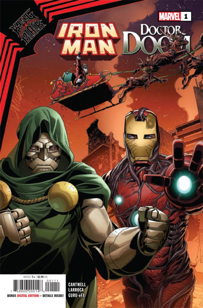
The nearly century-old character of Conan has many depictions, “Barbarian” just being one of several titles in King-Size Conan. Within Thomas’ “Aftermath–and a Beginning,” readers see the classic depiction of Conan’s struggle against civilization. One of Conan’s defining characteristics that many readers identify with is his search for an identity. Conan doesn’t feel at home with his fellow Cimmerians with many of his family and friends dead. This serves as a motivator for Conan to go out into the world. Some of these adventures and encounters make Conan less prone to suicidal risks. That being said, Busiek’s “In The City Of Thieves” displays Conan as a smarmy pickpocket who robs the careless out of hedonism.

Let it be said that Conan is not without compassion; Claremont and Eastman write their segments of King-Size Conan to show the Cimmerian as less of a conqueror. “Die By The Sword” has Conan comforting the mourning daughter of a woman he slew. “Requiem” in the meantime shows the Cimmerian doing whatever is necessary to pay debts. These display warmth in a cold, cruel world where “might often makes right” and how Conan appreciates small moments of kindness. Because as DeKnight’s “Ship Of The Damned” showcases, these moments, while timeless, are fleeting like with his lost love Belit.

Epic Illustrations


Within the different segments, each artist in King-Size Conan showcases how they portray the legend of Conan. McNiven displays Conan’s pride in his Cimmerian heritage by adorning him in keepsakes of fallen loved ones. The coloring by Svorcina presents Conan and people like him standing out in fiery bright colors, unlike soldiers in armor. Woods demonstrates this further by how Conan stands out both in his simple attire within civilization and in bold line work. This is what makes de la Torre’s artwork of him practically blending into battle stand out; even Carlos Lopez’s coloring displays him in the same light as a soon to be dead character. Not only is Conan in his element, but he could very well die in such a place, something the Cimmerian admits is out of luck.

The rougher artwork by Eastman and coloring by Menon goes straight into the more action-oriented savagery. The detailing line work, actions in sequence, and color changes in reaction are an artform in symbology. Conan is a person of conflict, and it follows him wherever he goes. Finally, Saiz gives a photorealistic airbrush touch that displays the Cimmerian with someone his equal. Conan and Belit are larger-than-life characters who encounter the equally absurd. A ship made out of what looks like past victims is something that only Conan can survive.

The Chronicler Speaks!

King-Size Conan Introduction
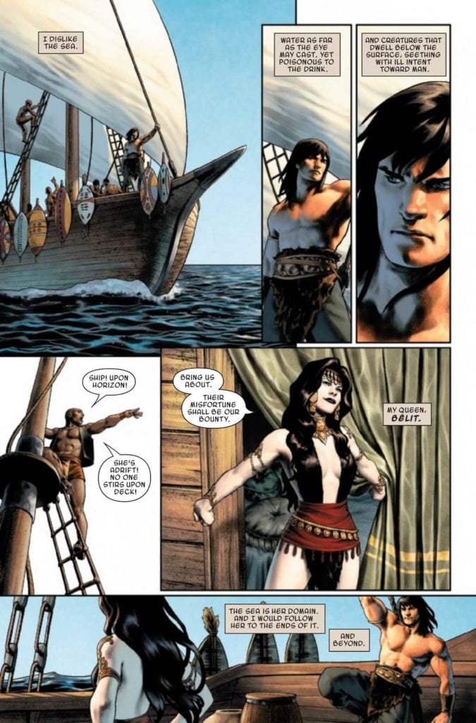
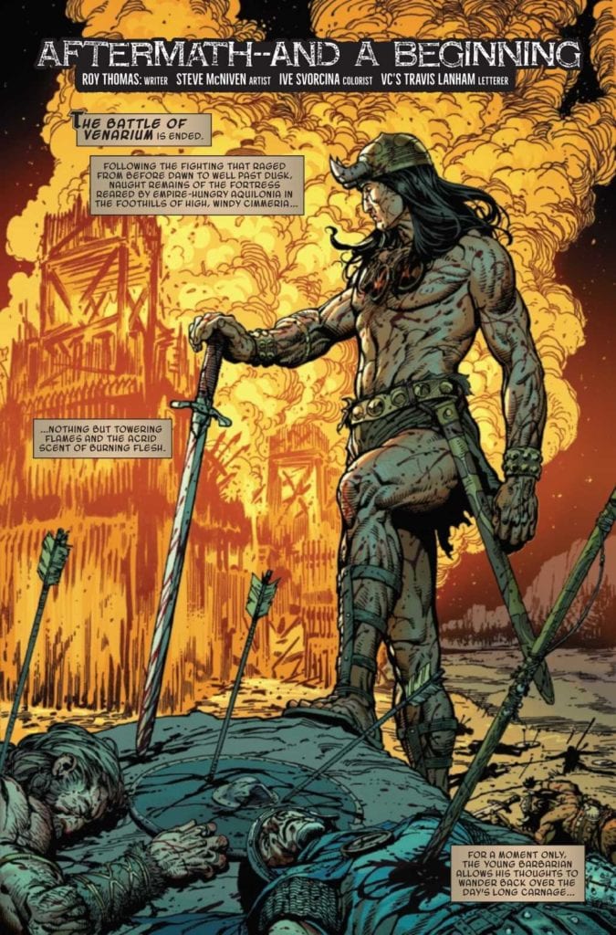
Anybody familiar with the line “Hither came Conan” seen in the beginning of King-Size Conan may likely equate VC’s Lanham with a Chronicler who tells Conan’s adventures. The captions help the reader appreciate the artwork for large scenes as moments frozen time. Unlike the short but sweet moments in action that hit hard and fast. Something that reappears in the last segment where Conan serves as narrator where his confines are simple and in the moment. Conan can certainly speak for himself when people gloss over or add parts to his story. The biggest takeaway comes in a papyrus-like caption at the end of the first story segment. It invites the readers to read Conan’s chronicles throughout Marvel’s run, for the story of Conan the Barbarian is ever-changing and revised.

King-Size Conan Is For Everyone

After getting back Conan, Marvel really goes out of its way to showcase its love for the Cimmerian. With so many at the pen, it’s nice to see how they interpret such a cultural icon. “Ship of the Damned” stands out over the other stories by displaying Conan’s beliefs at their utmost limit: live in the moment because you never know when you could lose them and the people you love… especially when you become a little more aware of yours and others fate. It’s what helps people like myself deal with an absurd world.

Monkeys Fighting Robots Youtube