WOLVERINE: BLACK, WHITE, & BLOOD #3 hits your local comic book store February 10th, but thanks to Marvel Comics, Monkeys Fighting Robots has an exclusive first-look preview for you.
About the issue: THE BEST THERE IS BY THE BEST THERE ARE!
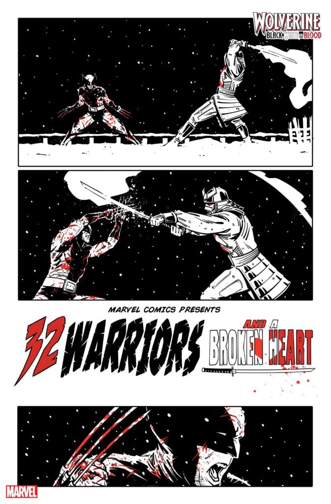
The groundbreaking series continues! Thrill to the Marvel Comics debut of Oscar winner JOHN RIDLEY (12 Years a Slave, The American Way) as he and JORGE FORNÉS bring LOGAN to Japan, where he will question his honor as he clashes blades with the SILVER SAMURAI!
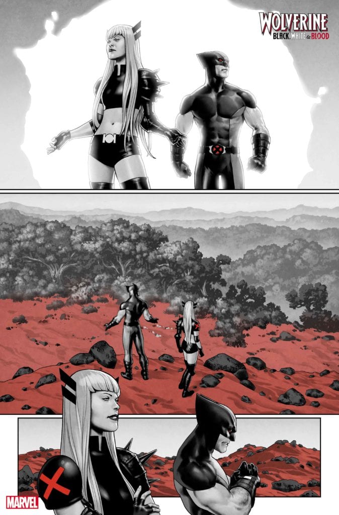
Then, it’s back to his X-FORCE days with JED MacKAY and JESUS SAIZ, as WOLVERINE must stop A.I.M.’s plot for the red planet! And, nothing can prepare you for the unstoppable team-up of DONNY CATES and CHRIS BACHALO as Wolverine has a run-in with…COSMIC GHOST RIDER?!
Check out the stunning, unlettered preview art from each short story below:
Story by John Ridley & Jorge Fornes:
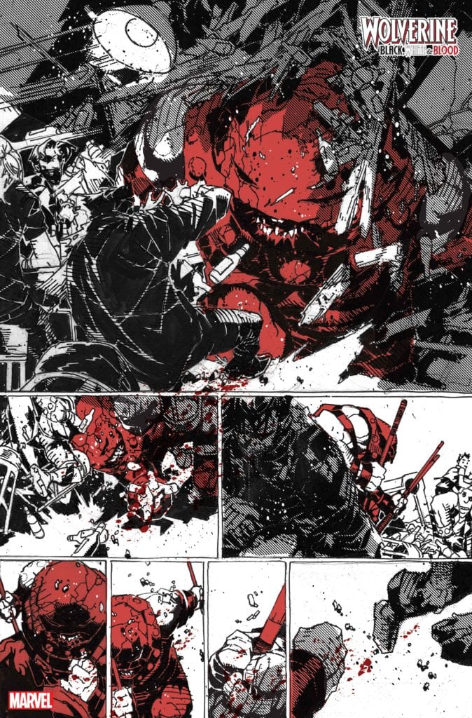
Story by Donny Cates & Chris Bachalo:
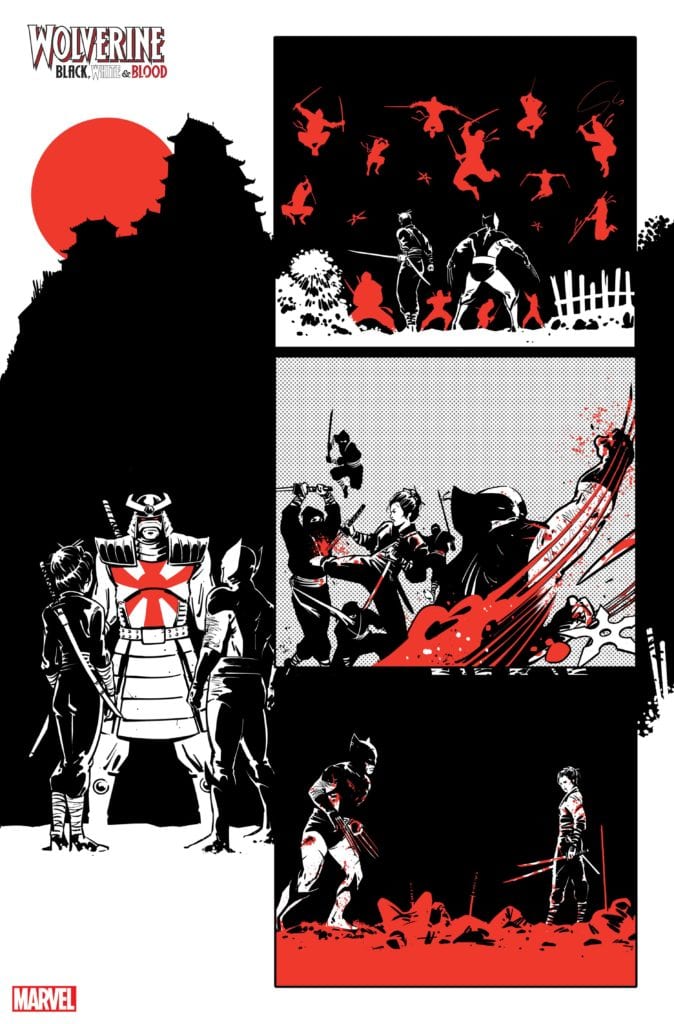
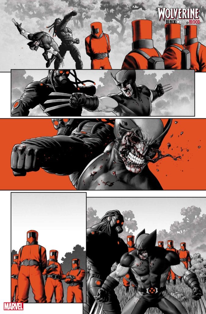
Story by Jed Mackay & Jesus Saiz:
Are you liking WOLVERINE: BLACK, WHITE, & BLOOD? Do you enjoy anthology comics as a whole? Sound off in the comments!
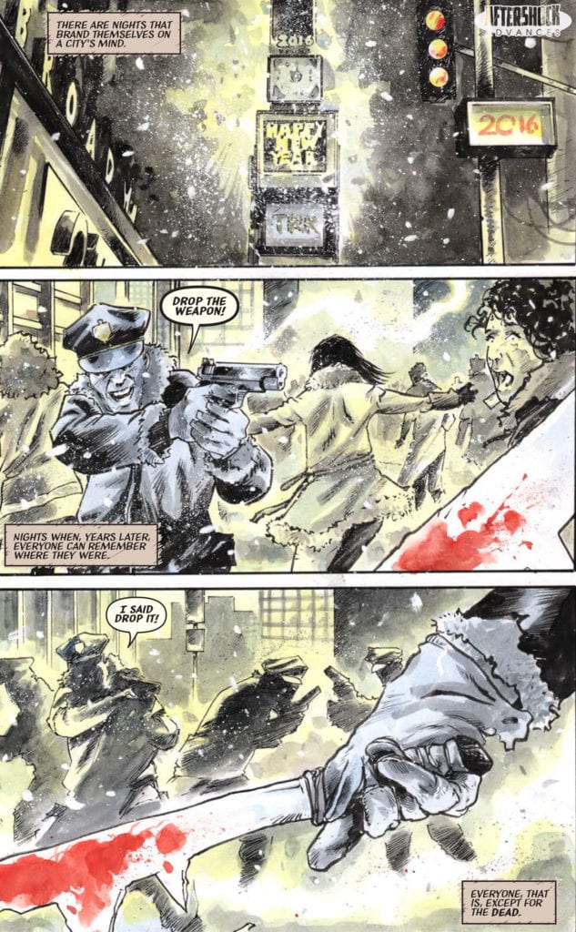
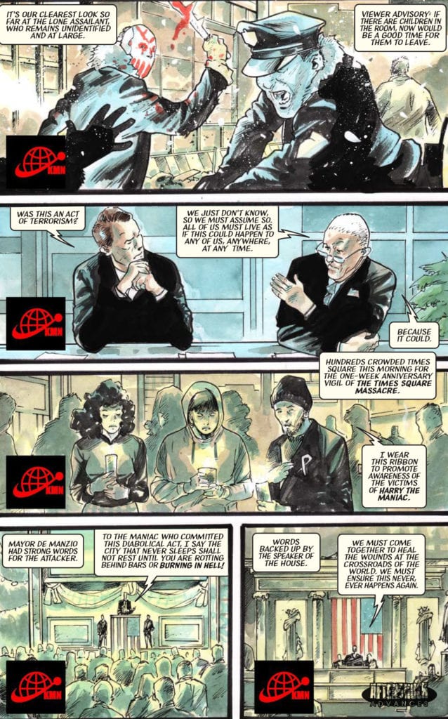
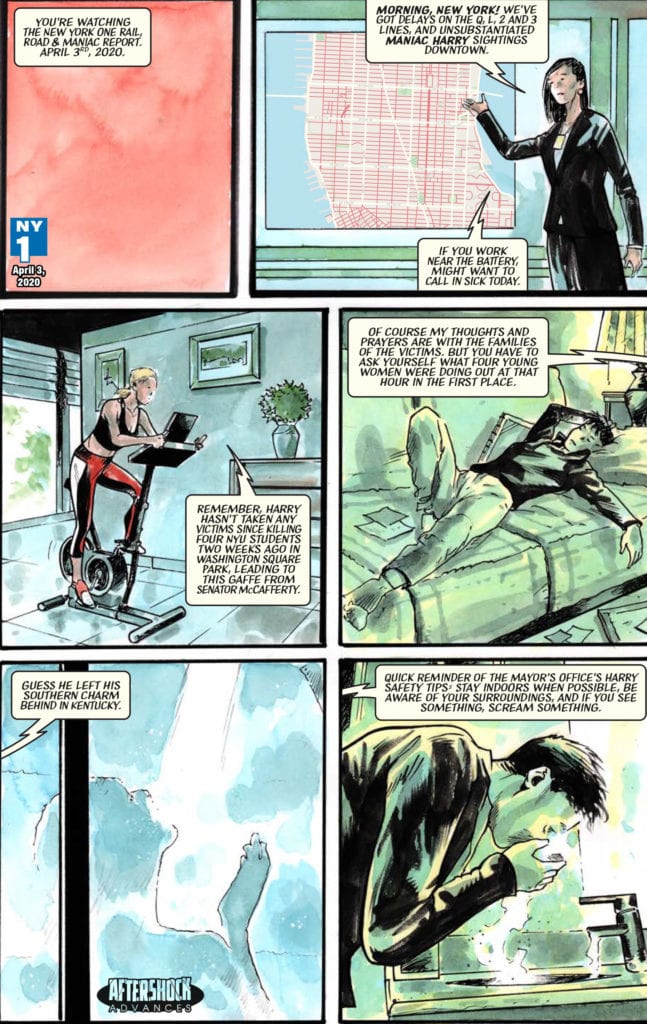
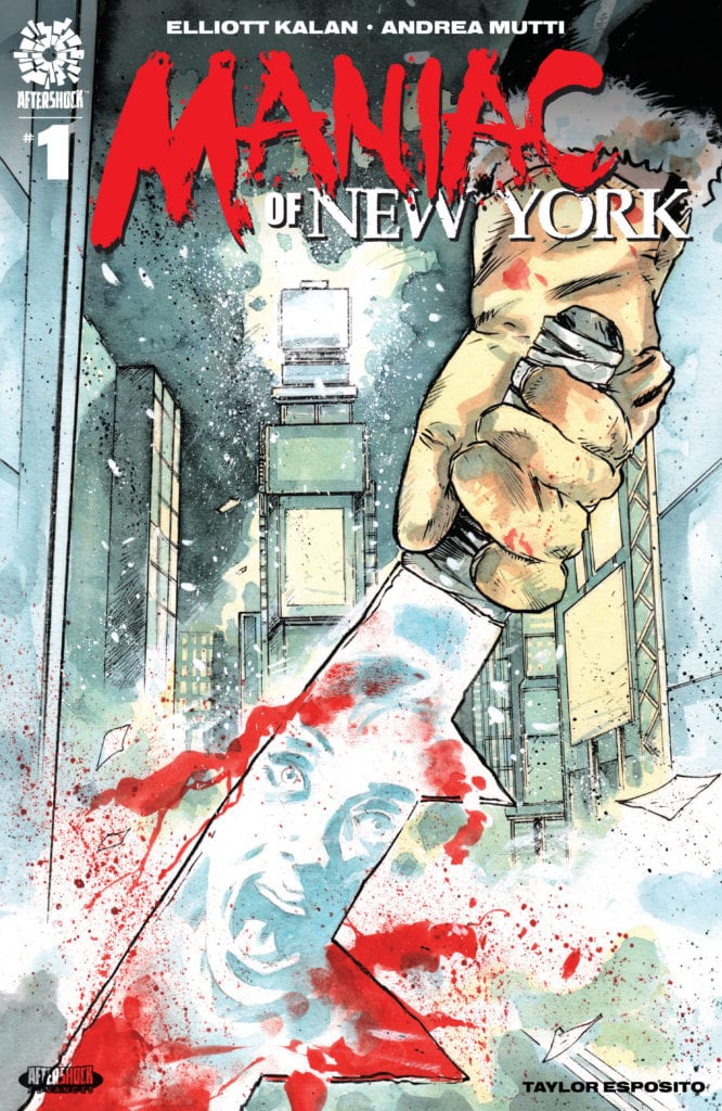
MANIAC OF NEW YORK #1 hits your local comic book store February 3rd, but thanks to AfterShock Comics, Monkeys Fighting Robots has an exclusive four-page preview for you.
About the issue: Four years ago, a masked slasher began stalking the streets of New York City.
Maniac Harry is inhuman, unkillable and unstoppable. Which is why the authorities’ solution has been to ignore him, and let New Yorkers adapt to a world where death can strike at any moment. When Maniac Harry starts killing his way through the subway system, trauma-haunted political aide Gina Greene and disgraced NYPD detective Zelda Pettibone become determined to go rogue and destroy him. But how can they fight a monster when they can’t fight City Hall?
MANIAC OF NEW YORK #1 is by writer Elliott Kalan and artist Andrea Mutti, with letters by Taylor Esposito.
“A frightening, thought-provoking, sometimes funny, always timely tale of murder, obsession and urban living.“
Check out the MANIAC OF NEW YORK #1 preview below:
Are you excited for MANIAC OF NEW YORK? Sound off in the comments!
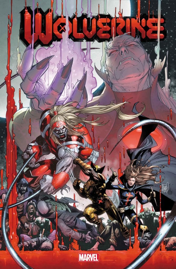
WOLVERINE #11 is due to hit your local comic shop in April, but thanks to Marvel Comics, Monkeys Fighting Robots has the privilege of revealing the cover and solicit text for you today!
The comic is by writer Benjamin Percy and artist Scot Eaton, with a cover by Adam Kubert.
About the issue: SNIKTERVIEW WITH A VAMPIRE! WOLVERINE takes the fight to the vampire nation in a quest to stop DRACULA’s plot to co-opt his mutant healing factor! But what sacrifices and moral compromises must be made before humans and mutants see the dawn?
Check out the WOLVERINE #11 cover below:
Are you reading WOLVERINE? Sound off in the comments!
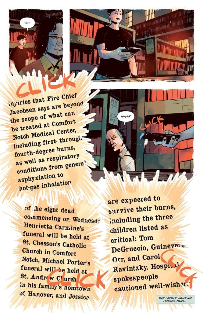
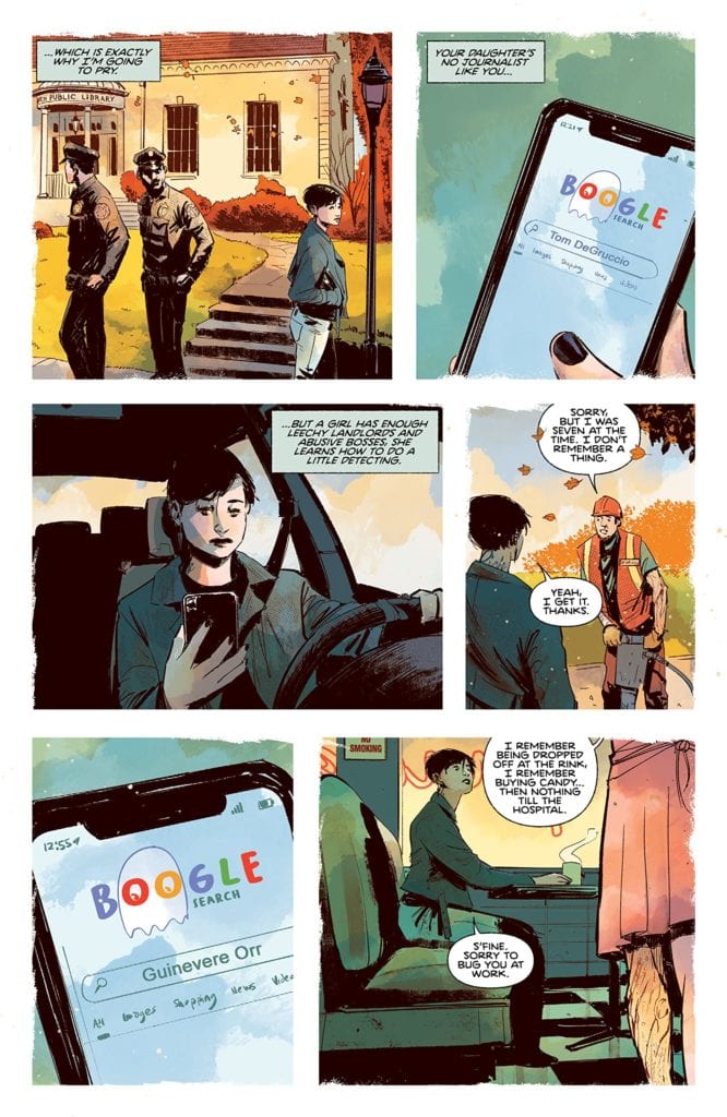
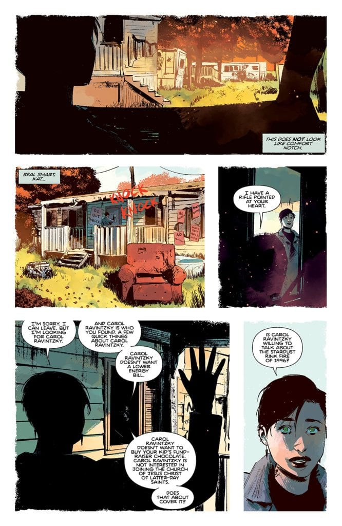
Writer Daniel Kraus and artist Chris Shehan, along with colorist Jason Wordie and letterer Jim Campbell, return to the town of Comfort Notch to tell some fireside tales of woe in “The Autumnal” #4. This fourth chapter has Kat going to great lengths to overturn the stones covering this town’s past, and she meets some…interesting characters in the process. While this issue is delivered largely in an exposition-filled chat, it’s such a creepy and entertaining story that it’s hard to be mad. With great dialogue and more insightful character-focused writing, along with more brilliantly atmospheric visuals, this issue may honestly be the best one yet.
“After Kat learns of an old tragedy that brought Comfort Notch to its knees, the bitter, burn-scarred Carol Ravintzky finally tells the tale of the terrible death of Clementine Biddle.”
Writing & Plot
Daniel Kraus pens a familiar part of any horror story in “The Autumnal” #4. This issue functions as the part of the narrative where the protagonist (Kat) seeks the input of an expert or survivor (Carol Ravintzky) in her investigation to uncover the supernatural mystery plaguing her and her new hometown. What commences from this point on is a quiet chat with a physically and emotionally scarred woman detailing not just the horrific fire that killed numerous children, but the true nature of the alleged curse behind Comfort Notch. While the expository storytelling from Carol (and by extension Kraus) is an almost cliched part of any horror story, it’s delivered with such an air of tension and creepiness that it can’t even be faulted. The backstory to the entity living in the woods of this peaceful town is also relatively unoriginal, but again, the delivery is just so damn satisfying. Every passage of dialogue and narration is written with such loaded suspense while also sounding wholly unique to the character speaking the lines. The other big narrative part of this chapter is also the foil to the “expert opinion” portion, and also an aspect not often seen in a horror story. There’s a scene later in the comic that plays as the skeptical portion of the horror formula, where another character attempts to explain away the supernatural elements with real world logic. However, this scene and this character turn that notion on its head. This character doesn’t outright say Kat is crazy for believing in the possibility of what’s happening in Comfort Notch, nor does he discredit the possibility of there being some strange things happening in the town. What he does instead is offer his input based on his experiences, as well as a genuine opinion on how people cope with trauma and how these elements are linked. It’s a beautiful moment that I don’t think I’ve ever seen in a horror story regardless of the medium. The fact that this series continues to be both intensely unnerving and so human is a wonder on behalf of the writer, and makes this one of the best comics coming out on stands right now.
Art Direction
Of course, the real reason this comic is so unnerving and atmospheric is because of the artwork from Chris Shehan and Jordie Bellaire. Shehan’s thick lines and shading give dimension to the well-animated characters, some of who look to have more history that even the oldest buildings in Comfort Notch. Each panel is full of depth, with buildings and scenery designed with a gritty realness that’s somehow also blended with the feeling of being something out of a fantasy novel. While most of the visuals in this book stay away from the supernatural, the sequence in which Ravintzky is reciting the town’s big unnatural secret is put together in a dreamlike web of blood and visual horrors that excel in keeping up the terror. The colors from Bellaire are a stunning watercolor-style blend of cool autumn hues and foggy damp, foggy nights. Every surface in each panel is rife with texture that’s blotted with tiny specks of different shades to give everything a realistic dimension. There’s also the constant specter of shadow caused by moonlight or what appears to be sunset, and it always sets the tone of the book perfectly. It’s visually reminiscent of Dean Cundey’s cinematography on the original Halloween. The letters from Jim Campbell are a great blend of font usage, from a more typical font during central character’s dialogue and narration to a scratchy, razor-in-a-chalkboard font during more unnatural goings-on. The visual work on this chapter, as in every chapter prior, is a gorgeous and thematic use of the comics medium to convey this unique horror tale.
“The Autumnal” #4 is a special comic not just for its own series, but for what it does for horror storytelling as a whole. Daniel Kraus has constructed a script that uses some classic clichés from other horror stories and not only executes them brilliantly, but he actively usurps those clichés by introducing insightful commentary into the story. The visual work of Chris Shehan and Jordie Bellaire is a foggy and eerie yet gorgeous view of the autumnal northeast, that switches to being intensely foreboding at the drop of a hat. This continues to be one of the most unique comics, and horror stories as a whole, on shelves right now, so be sure to grab this newest issue when it releases on 1-13!
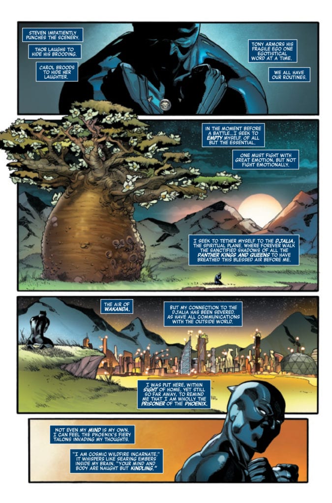
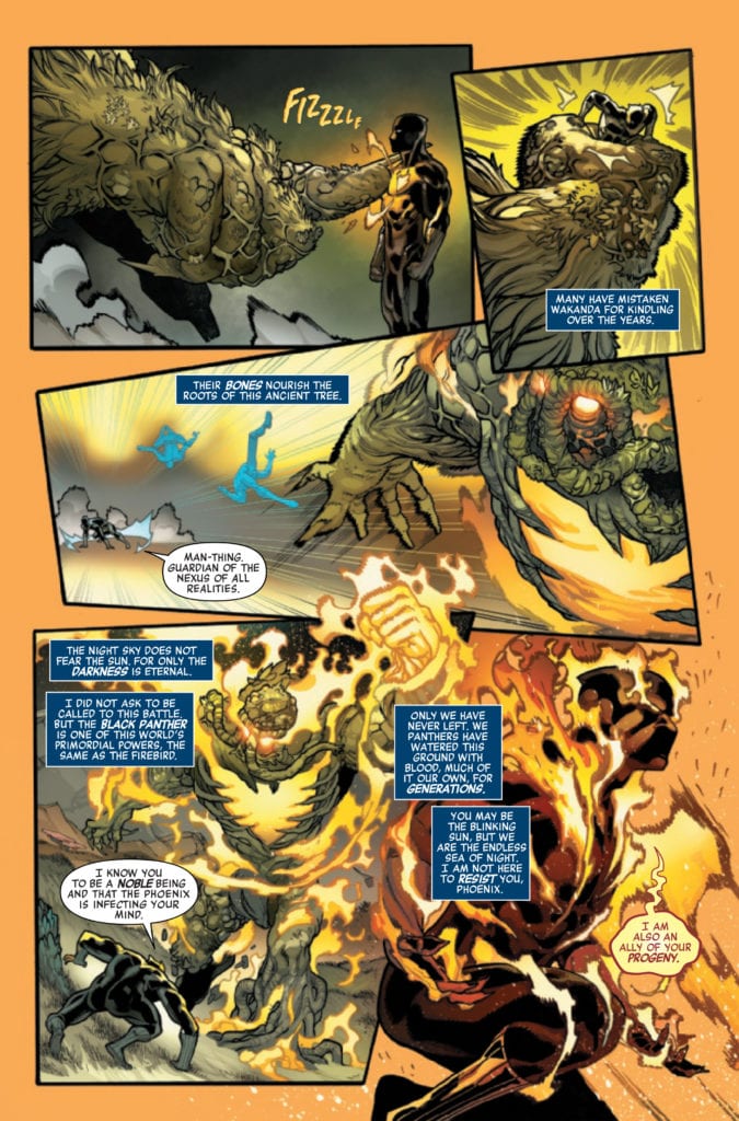
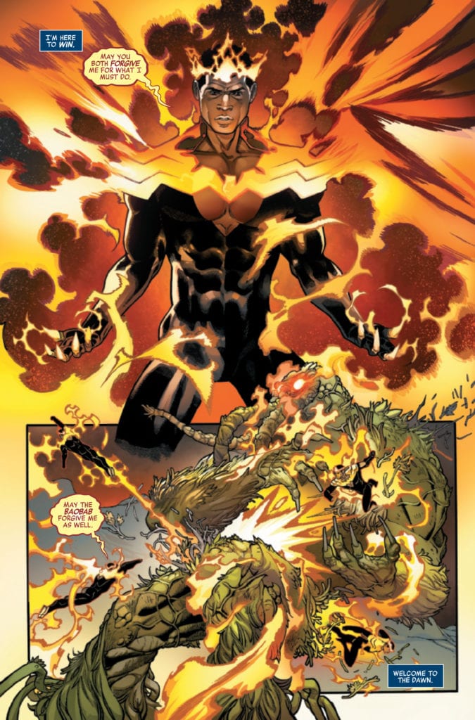
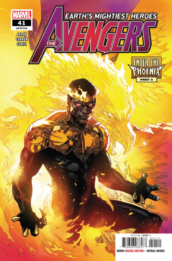
AVENGERS #41 hits your local comic book store January 20th, but thanks to Marvel Comics, Monkeys Fighting Robots has an exclusive four-page preview for you.
About the issue: THE BATTLE TO DECIDE THE ALL-NEW PHOENIX CONTINUES! Who will wield the power of the PHOENIX FORCE? A globe-spanning tournament is underway, under the direction of the firebird itself, pitting some of Marvel’s greatest heroes against their fiercest enemies and also against each other, giving each of them a taste of the awesome cosmic might that’s at stake. All will be transformed. Not all will survive.
AVENGERS #41 is by writer Jason Aaron and artist Javier Garrón, with colors by David Curiel, and letters by Cory Petit. The cover is by Leinil Francis Yu and Sunny Gho.
The issue is the second part of the “Enter the Phoenix” storyline.
Check out the AVENGERS #41 preview below:
Are you reading Marvel’s AVENGERS? Sound off in the comments!
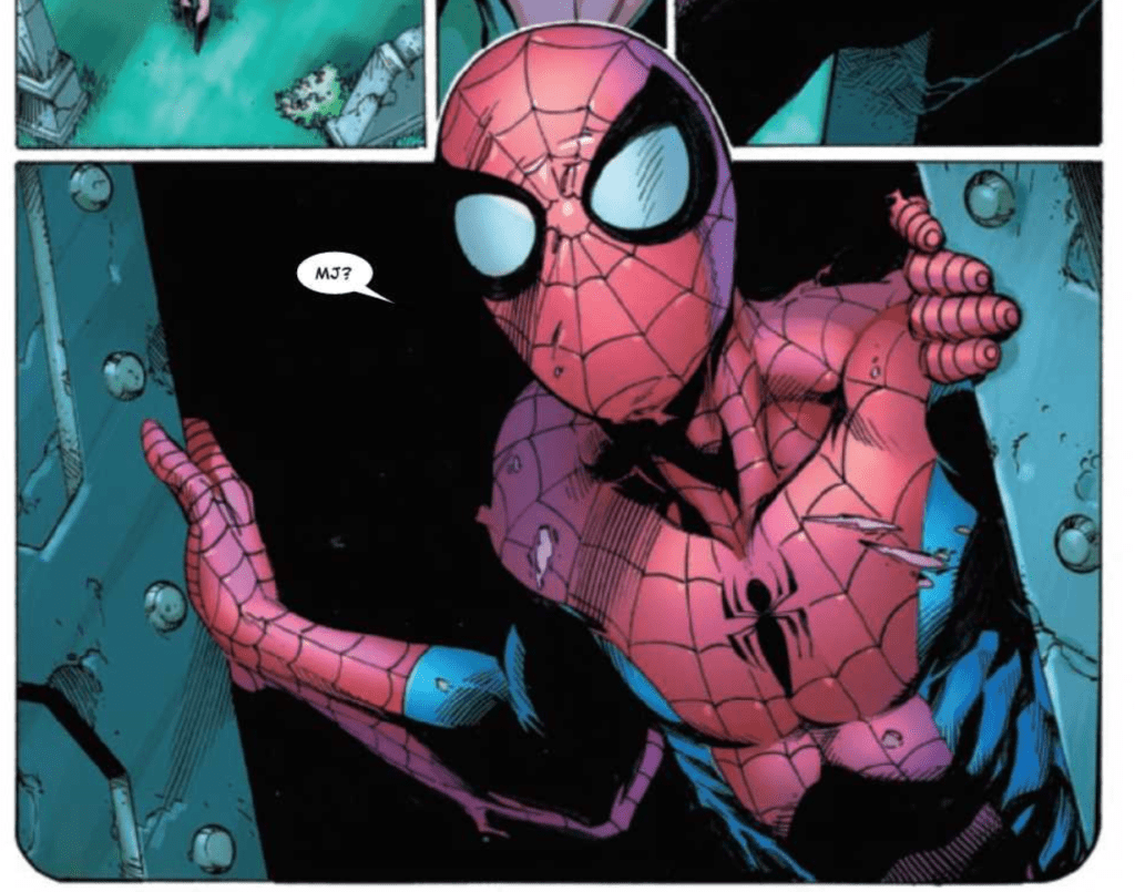
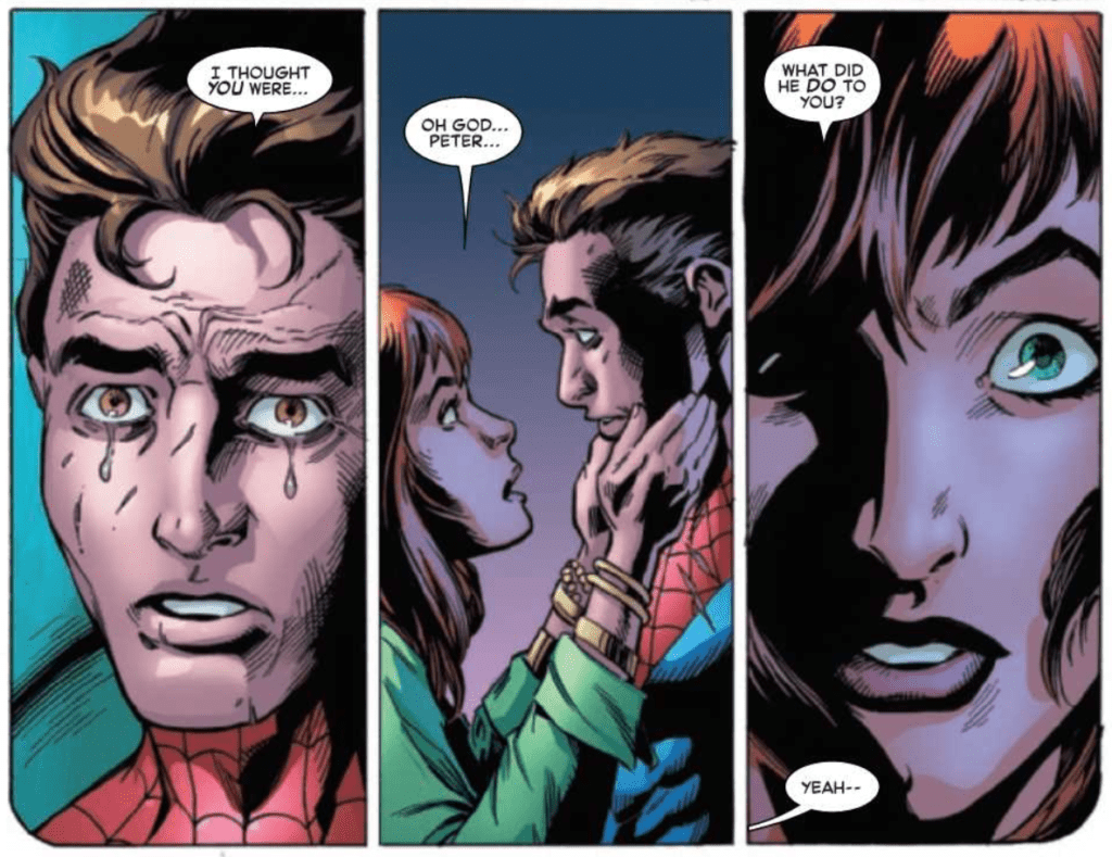
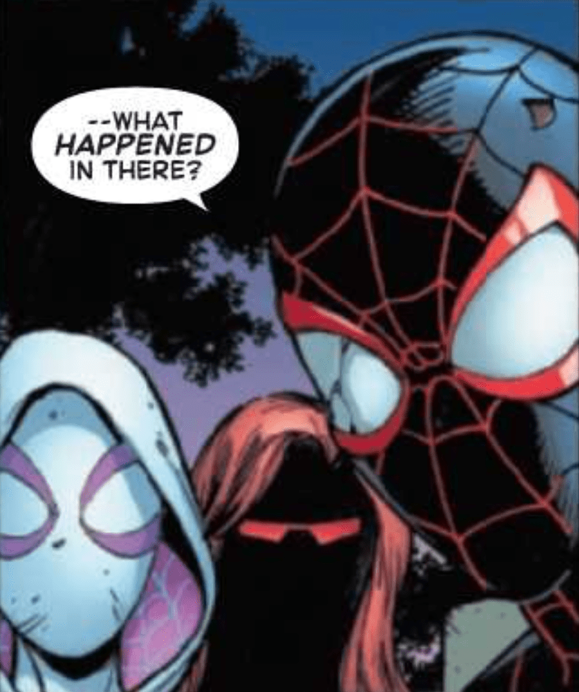
The Amazing Spider-Man #57, out now from Marvel Comics, is an issue full of biting dialogue and story that is supported phenomenally by the art, coloring, and lettering.
It has been a while since we’ve had an issue with writing this splendid. Nick Spencer makes The Amazing Spider-Man #57 into an unforgettable issue. Characters are pushed to their breaking points, and this is accompanied by dialogue that stings. I was taken aback several times while reading and verbally gasped at one moment. Spencer also makes use of silent panels, which leaves the reader haunted by the actions that occurred before them. All of this combined provides for a captivating issue that leaves the reader gripping the pages tight in suspense, wondering what will happen next. In true Spencer fashion, the issue features a cliffhanger, but it is not on the final page as we would expect. Instead, the last page has silent panels and a quick dialogue exchange that perfectly captures the dread the characters feel of what is to come. It is a thoroughly spine-tingling scene.
Mark Bagley’s pencils and John Dell, Andrew Hennessy, and Andy Owens’ inks create some spectacular art for The Amazing Spider-Man #57. The staging of panels and body language of characters adds a remarkable amount of weight to dramatic scenes, and I’m not even sure how it’s possible to show so much emotion through a character’s mask. The team also uses techniques such as characters extending past the panels’ borders, which is always a fantastic way to make the issue feel more energetic.
The Amazing Spider-Man #57 features the coloring talents of Rachelle Rosenberg and Edgar Delgado, and they greatly enhance the reading experience. The initial palette used has very calm and cool colors, and later in the issue the palette is dramatically shifted in a manner that shocks the reader. It goes in hand-in-hand with the story and results in a jaw-dropping moment. Rosenberg and Delgado also use methods such as using a brightly colored background to instill energy into a scene, which is done in an extraordinary way in the issue.
VC’s Joes Caramagna lettered The Amazing Spider-Man #57, and his choices help make the dialogue-heavy scenes a joy to read. By emphasizing the right words and arranging speech bubbles in a way that allows the story to flow uninterrupted, Caramagna helps immerse the reader in the scene. Caramagna also utilizes techniques such as making the borders of speech bubbles thicker for emphasis, which is highly effective.
The Amazing Spider-Man #57 is a wild ride from start to finish and pulls out a plethora of emotions from the reader like few comics are able to do. The art is gorgeous, and this issue features some of my favorite coloring of the entire series. The lettering helps it all flow smoothly, and we are left with an astounding issue that any Spider-Man fan would be disappointed to miss.
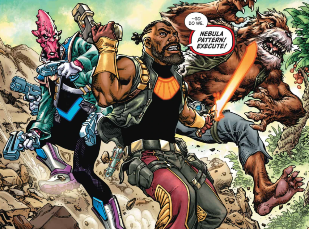
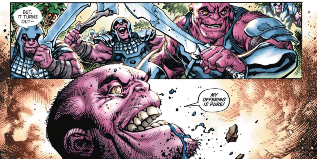
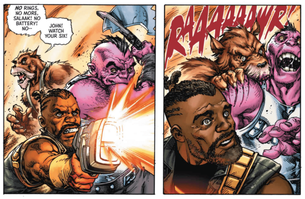
Future State: Green Lantern #1, out now from DC Comics, shows us enthralling tales where members of the Green Lantern core lose their power rings. What will become of some of your favorite heroes when they are stripped of their powers?
“Last Lanterns”
The main story of Future State: Green Lantern #1, titled “Last Lanterns,” is an action-heavy story of John Stewart and a group of other lanterns defending an alien planet against invading hordes, which is easier said than done when none of them have access to a power ring. What we get is an epic gunfight that allows for the dynamic art of Tom Raney to shine. I felt the story lacked slightly, but Geoffrey Thorne more than made up for it by allowing the artist and colorist to shine. Thorne also did a fantastic job of establishing the feeling of a chaotic battle happening on all sides, which gives the reader an uneasy sense that an attack could come from anywhere. Mike Atiyeh provides a pleasant color palette to the story, and the brightly-colored aliens add energy to the otherwise plainly colored world. Andworld Design provides bold captions that add weight to action scenes and causes dramatic moments to have a much more profound impact on the reader.
“The Taking of Sector 0123”
“The Taking of Sector 0123” is a wonderfully written tale in Future State: Green Lantern #1 of Jessica Cruz defending a station from yellow lanterns. Written by Ryan Cody, the story feels a lot like Ridley Scott’s Alien, only now our hero is the vicious monster creeping through the vents. It is an intense story that is wonderfully complemented by the art of Sami Basai and the coloring of Hi-Fi. The lettering utilizes a stunning technique that works hand-in-hand with a story element. It is rare to have lettering make such a profound impact on a story, and it is incredible to see. I can’t describe the amazing lettering technique without giving away any spoilers, but rest assured, Dave Sharpe knocks it out of the park with his lettering in Future State: Green Lantern #1.
“The Book of Guy”
Guy Gardner is a character that is very easy to mishandle. His brash attitude is a neat trait, but it can result in him being unlikable if handled incorrectly. When the ring is taken away from him in “The Book of Guy,” Ernie Altbacker is able to tell us a Guy Gardner story that gets to the core of the character, and it is delightful. Clayton Henry’s art provides for excellent facial expressions that make every piece of dialogue pack a harder punch, and Marcelo Maiolo’s coloring features beautiful gradient shading that brings the characters to life. Steve Wands arranges the lettering so that the story is able to flow smoothly, and the result is an amazing, feel-good story.
Conclusion
Future State: Green Lantern #1 is not a book you will want to miss if you’re a Green Lantern fan. It presents your favorite characters in a way that we don’t often get to see and puts them in interesting situations that are an absolute joy to read. The art and coloring is breathtaking, and the issue features some of the coolest cases of lettering that I have seen in a while.
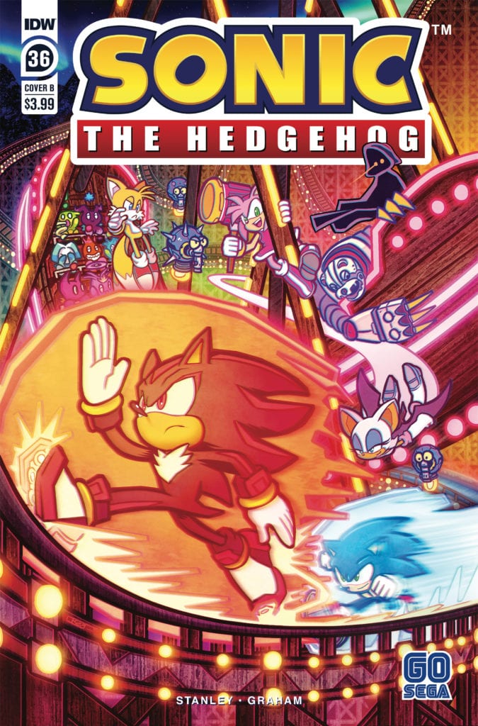
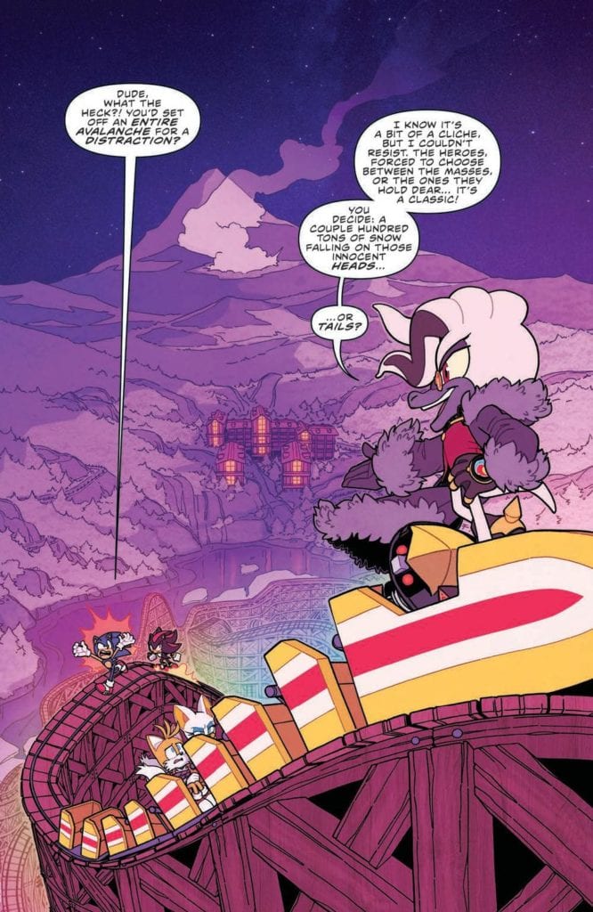
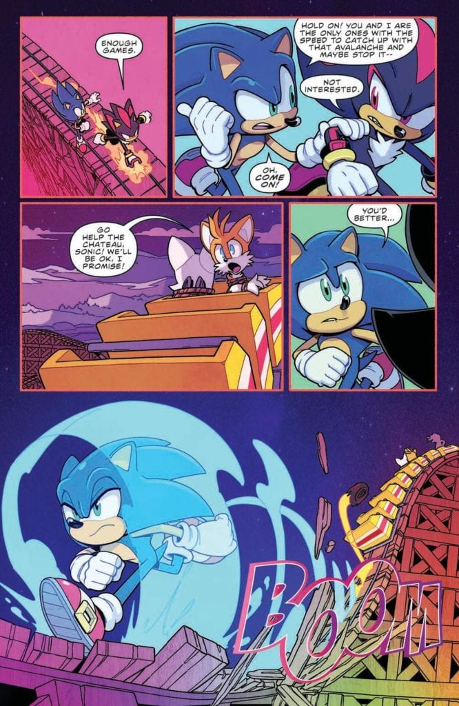
Sonic The Hedgehog #36 comes out this week from IDW comic and concludes the “Chao Races and Badnik Bases” storyline. The first story after the metal virus arc, this more lighthearted tale takes time to lay the groundwork for events happening in the future. The wrap-up arrives thanks to Evan Stanley, Reggie Graham, and Shawn Lee.
Strap on your snowshoes, an avalanche is headed straight for White Park Chateau! Sonic and gang are going to have to act quickly if they want to save the White Park guests and stop the hooded figure from getting away with Tails!
Writing
Sonic has a lot on his plate this issue, having to save Tails and Rouge, and at the same time find a way to stop an avalanche. Luckily he doesn’t have to do it alone and a lot of characters aid in helping to set things right. It’s a decent issue with some entertaining moments but honestly, it does not exactly knock your socks off good.
Thie issue wraps up the arc without major revelations but there is a lot of setup for future events. Writer Evan Stanley seems to be setting up the pieces for future events. Between the introduction of Belle The Tinkerer and Dr. Starling’s schemes, the groundwork for bigger happenings down the line is on display.
Artwork
The art by Evan Stanley again focuses on his strong suit by displaying strong character expressions. Thanks to serving double duty as Artist and Writer, Stanley finds a way to convey a lot of emotion into the look and feel of the characters. This can be seen in the above picture as Sonic displays frustration and Dr. Starling exudes smug confidence.
The colorwork by Reggie Graham enhances the issue. Not only does it help to accentuate the visual effects such as Sonic’s speed but it also adds aesthetic to the setting. A particular panel of note came in the small detail of the character getting a little lighter to demonstrate a hole was opened in the roof.
The Letterwork by Shawn Lee adds an auditory aspect to the issue. Lee finds a way to perfectly blend effects into the issue without them detracting from the other visuals in the panels. This seems to be a lost talent when it comes to a lot of letterwork present in modern comics.
Conclusion
Sonic The Hedgehog #36 isn’t a must-read issue but it still is an above-average experience. Thanks to the creative team who made it, even a minor storyline ends up being an entertaining adventure. Still, with the introduction of Belle, it would best for fans to pay attention to this series as a mystery is brewing.
King In Black: Planet of the Symbiotes #1 begins a special tie-in from Marvel Comics out on January 13. This serves as a sequel to characters from the tie-ins of the preceding event Absolute Carnage.
Background
In the Absolute Carnage event former Venom co-stars Andi Benton and symbiote Scream bonded to fight the monstrosities of Knull. The titular King in Black is a fierce entity with a cult following within the institute of Ravencroft. So dangerous a threat that current warden John Jameson (Man-Wolf) needs assistance from Misty Knight to deal with the cult.
Planet of the Symbiotes #1: A Decent Callback
The Scream story of King In Black: Planet of the Symbiotes #1 by Clay McLeod Chapman does the title justice. In a tribute to the original event from the 90s, Chapman demonstrates the event’s premise in a manner more akin to a horror movie. Both of these series deal with how families can be toxic. With some of Venom’s offspring on a killing spree under Knull’s influence, it’s nice to see Scream take after their parent’s more heroic side. Besides coming off Curse of Carnage, Scream already feels at home with Andi. This is thanks in no small part to Andi’s nurturing side when she comforts a mourning child.
Guiu Vilanova gives the symbiotes a fittingly monstrous appearance, especially in their hybrid form. The gaping mouth in the middle of the gestalt body is practically a demonstration of Knull’s influence. Since he is able to speak through this mouth, the threat of the Scream symbiote becoming one with this atrocity is terrifying.
Thankfully, Dean White’s coloring demonstrates in Scream’s design that she’s unlike her sibling in every way. Her bright yellow and red appearance complements her host Andi’s pyrokinetic abilities. This source of light is able to drive away the dark colors of the Hybrid.
Ravencroft’s Monster
The other half of Planet of the Symbiotes #1 features another monstrosity that will make King in Black even bleaker. Since Ruins of Ravencroft, Frank Tieri has been building up Cortland Kasady as a legendary figure. Now with his appearance as a zombie symbiote, Cortland is ready to wreak havoc in Knull’s name. The title of Plague perfectly demonstrates the threat he presents; the ability to drain the life of anybody in his vicinity. With Knull sicking Plague on Dylan Brock, there is a tough road ahead.
Danilo S. Beyruth designs this Plague monster in a way that would evoke terror. The lanky/ghastly form of him looks frightening enough. Rachelle Rosenberg’s purple coloring and glow accented by Plague’s flowing hair make him look terrifying. That’s not even including the stream of black specks Plague uses to steal his victim’s life. Plague is practically a death personification ready to do his master’s bidding. And unlike the Scream story, there’s little indication of a way to stop him.
King in Black: Voices of the Symbiotes
VC’s Cory Petit gives every symbiote in King in Black: Planet of the Symbiotes #1 a unique voice. On simple coloring they match the designs of each symbiote’s appearance: Scream’s external voice is red with a yellow word balloon, her internal thoughts are yellow with red captions. The designs of the word balloons are what makes them more unique as they look distorted. This highlights their alien appearance and their connection to their God Knull. The fact he can connect to every symbiote denotes the fact that any symbiote can become his servant.
One small bit of confusion comes in the use of purple captions and word balloons. The former is from the internal monologues of Andi, while Plague speaks the latter. While both are death bringers to their intended targets they are on different sides. It seems like there should have been a way to differentiate these two.
King In Black: Planet of The Symbiotes #1…Is Supplementary
King in Black: Planet of the Symbiotes #1 is best for readers familiar with related material. Both segments are major developments, but it requires background information to appreciate fully. Since the Ravencroft story seems to be leading into the main Venom run, readers will probably be confused by Plague’s appearance. Some fans might even require knowledge of the original Planet of the Symbiotes to see how this series stands out. Otherwise, this issue is just okay.
King In Black Thunderbolts #1 begins Marvel Comics’ newest rendition of a supervillain ensemble on January 13. Through Kingpin, writer Matthew Rosenberg puts Taskmaster and Star through a gauntlet they might not survive. Artist Juan Ferreyra showcases the entire issue’s dire mood with impressive panel work, scale, and shading. Letterer Joe Sabino completes the package through his word balloons.
The Kingpin’s Comeback Thunderbolts
King In Black Thunderbolts #1 follows the Kingpin’s copyright legal version of the Suicide Squad. Rosenberg puts some of Marvel’s less egotistical villains together for the chance of seeing their personalities bounce and clash.
Taskmaster remains one of the more levelheaded characters, as his record with dealing with the absurd suggests. So when he encounters an event so absurd, his practical mind gives him the most common sense. Taskmaster knows when the Thunderbolts need the right equipment and can’t afford a distraction.
Because Star is the only one with any firepower to survive against giant symbiote dragons, her recent series keeps her fresh and full of opportunity for developments despite her newcomer status. She wants to be a hero but has limitations in both power and opportunity for good. Luckily one of her co-stars seems to provide just enough backup to make up for it.
Batroc the Leaper is always a fan-favorite character and serves as good comic relief. His lighthearted attitude complements both his more serious teammates and the whole situation. Back in the initial meeting, he displays a more professional attitude than Taskmaster. No amount of death threats seem to get him down.
King In Black Thunderbolts #1: Keeping Control
With Ferreyra serving as the overall artist of King In Black Thunderbolts #1, it says a lot about his dedication. His panel layout certainly attests to this statement, including the use of a 9-panel grid. That one page, along with Kingpin’s presence, demonstrates the amount of power he has over the immediate situation. One way or another, Wilson Fisk will get what he wants out of the Thunderbolts.
The other giant of King In Black Thunderbolts #1, Rhino, also demonstrates his presence in scale alone. His large size gives him an edge over others in hypotheticals. The fact he wasn’t in the issue’s introduction with the rest of the team calls into question his fate.
Finally, there comes the colors and shading within the issue. Anyone following King In Black knows the situation is dark, with shadows blanketing the panels. To make matters worse, the color red is practically a signifier that someone will die or is at risk of dying. Considering Star’s role in King In Black Thunderbolts #1, the red on her costume makes her a target.
Letters Between Artists
VC’s Joe Sabino is the main letterer of King In Black Thunderbolts #1. The word balloons he employs keep the pacing and tone in overall flux. A single splash page with a speech shows Kingpin’s presence and the Thunderbolts in question. Then there are the widescreen panels that feature short but sweet sentences to not slow down the action.
One point to question is the SFX; crashes, a gunshot, and a sudden attack look more like Ferreyra’s art. Either Sabino is really good at making SFX extensions of his co-artists, or Ferreyra is going uncredited for this.
Pay Attention to King In Black Thunderbolts #1
King In Black Thunderbolts #1 brings out the best in an ensemble of villainous characters. Each has a role that makes them stand out and complement one another. It’s something that the artwork goes to lengths in order to showcase their roles and the stakes they face. This iteration of the Thunderbolts is one team to keep track of.


 With Ferreyra serving as the overall artist of King In Black Thunderbolts #1, it says a lot about his dedication. His panel layout certainly attests to this statement, including the use of a 9-panel grid. That one page, along with Kingpin’s presence, demonstrates the amount of power he has over the immediate situation. One way or another, Wilson Fisk will get what he wants out of the Thunderbolts.