Home Blog Page 197

Review: BATMAN CATWOMAN #2 is an Inevitable Second Chapter

Batman Catwoman King DC Comics

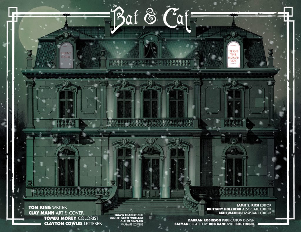
There’s an aspect to DC Comics’ Batman Catwoman #2 that might feel predictable. But that’s because writer Tom King, artist Clay Mann, colorist Tomeu Morey and letterer Clayton Cowles place good storytelling over “shock and awe.” There are definitely moments that’ll shock readers, but so much of this script is the inevitable next step of the explosive first chapter. This issue is hard to talk about without spoilers for Batman Catwoman #1, so be warned, some spoilers ahead for the first issue of this great new series!

spoilers ahead

Writing

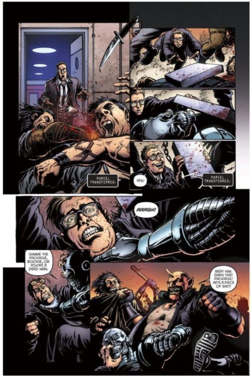
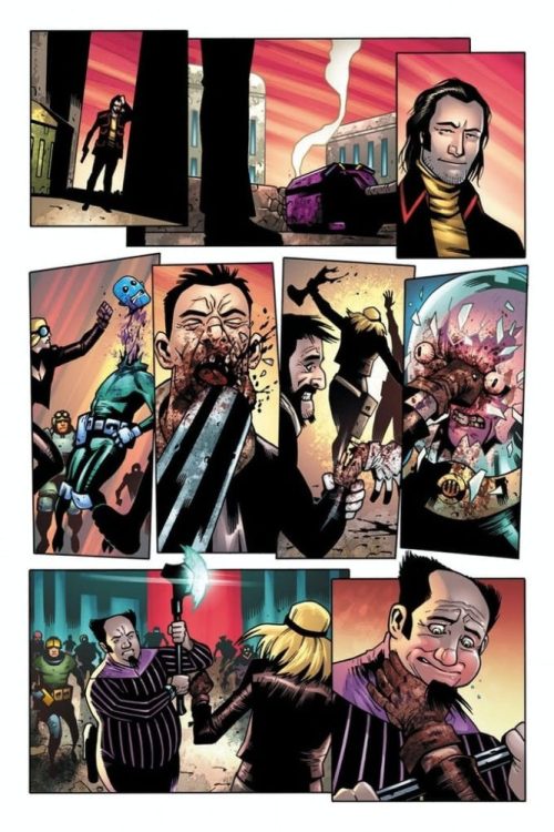
Just like the first issue, Batman Catwoman #2 is more about Joker and Catwoman than it is about the Bat. In fact, Batman is a small player. He’s the eye of the storm, as Joker, Phantasm and Catwoman bring down chaos all around. We’re seeing the fallout of Andrea Beaumont coming to town and Selina stealing Jimmy the Lion’s necklace. King has us following everyone but Batman. Batman appears only to try and piece together everything we’re seeing all the other characters do. This isn’t a script with secrets. At least not secrets kept from us. It’s one where King gives us all the information so that we can watch Batman clamber around in the dark.

And with Catwoman and Joker’s conversations in the future, everything has some distance. When Catwoman and Joker talk about the night they almost killed each other, she says “I knew you’d make it.” “You say that now,” Joker replies. “You can say anything when everything was so long ago.” That’s the purpose of these scenes. It feels like two people returning to the scene of the crime. It somehow minimizes present day events while also creating a mysticism around them. What changed them so much? So much that Catwoman and Joker would meet back up, years in the future, still talking about it? That’s what Batman Catwoman #2 begins to do: show the chaos that’ll leave scars for decades to come.

Art

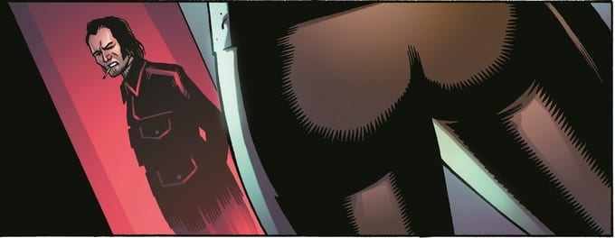
Much of the mysticism of Batman Catwoman #2 comes from Mann’s depiction of characters. It’s incredibly rare in this issue that we see characters straight on with their faces unobscured. We either see half their face, see them in profile or their faces are blurred by shadows or windows. This is particularly true of Catwoman and Joker. It’s as though they’re scared to look at the reader. Like they’re guilty for everything that’s happened in the previous issue. And Mann continues to draw a connection between these two. One moment where we see them both, face on without anything in the way, they look nearly identical. Selina looks crazed and scarily similar to the Clown Prince of Crime.

And Mann’s depictions of Bruce look almost identical to one another. He’s got the same set jaw we see under the cowl, even if he’s just eating dinner with Selina in civilian clothing. Through this, Mann shows us that Bruce is beginning to worry about Selina. He’s still got his guard up around her. So, while the cowl might come off, the suspicion in his eyes never does. He’s always on the job in this issue, never taking a break.

Batman Catwoman King DC Comics

Coloring

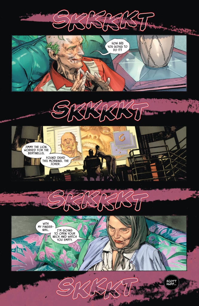
The first issue had a color scheme of purple, green and red running through it. Morey continues that color palette but adds in a few more symbolic hues. We still see the kinship between Catwoman and Joker. Old man Joker’s home is covered in greens and purples, and old lady Selina is wearing a light purple cardigan. In fact, Selina is often shown garbed in different shades of purple. In the future, old man Joker is wearing a red shirt, like the years of violence that hang around his neck, but in the present he’s gleefully sucking on a red candy cane, drinking the violence in.

But Morey also throws in shades of blue and orange. A blue moon covers the page in its light. Batman and Phantasm’s eyes glow blue. And all of the major plot devices are depicted as orange or yellow. Jimmy the Lion’s gold necklace, the bright light of Batman’s signal, the orange hued scene of a fateful night at a bar. These are all the things that drive the plot forward. Morey hones us in on the most important scenes and the most important objects. Morey is creating a work that could have a key or legend for it. Every color is there for a reason, steeped in storytelling relevance.

Batman Catwoman King DC Comics

Lettering

Cowles brings so much rhythm to this script. He breaks up every line into small portions. It gives room for the art, but also adds a sense of silence. We hear the pauses between each sentence and the quiet that surrounds their dialogue. It’s as though each thing said is piercing through a layer of silence. And the sound effects don’t jeopardize the silence of the issue either. The “PWFF” noise of bullets hitting a chair is colored similarly to the upholstery. And while the “AAAAAAAAHHHH” of someone being stabbed stands out in yellow, it’s small enough on the page to look muffled and distant.

Cowles also attains a sense of silence by hollowing out his sound effects. Some are just outlines. The “SKKKKT” noises across the page don’t get in the way of the splash of purple blood. As big as the letters are, their transparency makes them still seem quiet. This way, noises can catch our eye but still feel restrained. Overall, Cowles gives the issue a tone of spookiness. It’s subtle, the quiet sizzle of the fuse before the bomb goes off.


DC Comics’ Batman Catwoman #2 might be predictable, but it will still keep you on the edge of your seat. It’s no less chaotic for its predictability. King, Mann, Morey and Cowles are writing a love letter to comics and they’re not letting twists or tropes get in the way. They’re writing a quality story that takes its own consequences seriously. Pick up Batman Catwoman #2, out from DC Comics January 19th, at a comic shop near you!

Monkeys Fighting Robots Youtube

Review: PANTOMIME #3 Keeps You On Your Toes

PANTOMIME #3, out now from Mad Cave Studios, is the third issue of the crime miniseries by writer Christopher Sebela, artist David Stoll, colorist Dearbhla Kelly, and letterer Justin Birch. This issue’s story plays out in brilliant, unexpected ways, and the art continues to amaze the reader and appear well thought out.

About the issue:

Our kid thieves have been under the boot of the Manager for too long, and finally, the table is set to fire him. Can they succeed in breaking the cycle, or will the Manager make good on his promise?

Writing

One of the best things a writer can do is have their reader on the edge of their seat with each twist and turn. In this third issue, Sebela does just that. At the issue’s beginning, there is still an unsolved question hovering in the reader’s mind: Will the kids’ plan to “fire” the Manager succeed or fail terribly? And throughout the entire issue, no one knows for sure. There is always a sense of danger in the air. We get the feeling that the Manager is going to interrupt the kids and their plans at any second. Whether he does or not, you’ll have to see for yourself. But, just the fact that Sebela makes the reader feel this way is a great testament to his effective storytelling skills.

Art

Stoll’s artwork definitely stole (pun intended) the show in Pantomime #3. His clever layout choices, expressive facial expressions, and his simply beautiful, stylish artwork are all things the reader is well familiar with. But, what catches the reader’s eye even more and improves the reading experience is how Stoll chooses not to show certain moments in this issue. A terrible incident happens in the first few pages of this comic, and to emphasize how traumatic the experience was for our main character, Haley, Stoll decides to add all-black panels that are placed in a very unorderly manner. Stoll barely shows the reader anything of what really went down. This clever use of layouts and Stoll’s choice of what to show and not to show further puts the reader in Haley’s shoes and reminds us once again that everything we see taking place is viewed through her eyes and memories.

Coloring & Lettering

Kelly continues to play with the reader’s emotions brilliantly. Every single page has a certain feeling or mood. Whether it’s sadness, a sense of danger, innocence, or happiness, Kelly manages to convey those feelings flawlessly simply by using different color palettes or color groups. Especially when the aforementioned traumatic experience plays out, Kelly colors the panels in monochromatic reds. This leaves no doubt in the reader’s mind as to what they need to feel here. Great work from Kelly.

Birch’s lettering continues to be effective and in service of the story. The balloons and captions are placed in a way that makes Pantomime #3 an easy reading experience. I’ll forever be a fan of Birch’s choice to have word balloons coming from the kids’ hands, when they’re speaking in sign language. It’s a small detail, but it makes a huge difference.

Conclusion

Pantomime #3 continues to be both one of the best and most criminally underrated comics on the shelves. Every creator brings their A-game here- I just wish this comic was as appreciated as it deserves to be. Strongly, wholeheartedly recommended!

Monkeys Fighting Robots Youtube

Interview: Writers Eric Peterson & Joe Aubrey Talk SPACE BASTARDS

Eric Peterson and Joe Aubrey are the wild-minded writers behind the brand new series Space Bastards. Their first issue is out at your local comic book shop now, and volume one — illustrated by The Boys artist Darick Robertson — is available for order starting today!

A little about Space Bastards: In the first volume, “Tooth & Mail,” Peterson and Aubrey are joined by Robertson, colorist Diego Rodriguez, and letterer Simon Bowland. The story follows veteran mailman Manny “The Manicorn” Corns and his newbie partner David S. Proton as we’re introduced to the bloody, gruesome world of interplanetary postage.

And later in the year, Peterson and Aubrey will add brilliant artists like Simon Bisley (Lobo) and Clint Langley (2000AD) to the team for a bunch of Space Bastards specials, a one-shot, and a couple of annuals! The Kickstarter for volume 2 just launched this morning — check it out!

And read on for our interview with Peterson and Aubrey:

Monkeys Fighting Robots: Where in the world did such an outrageous idea come from, and what is it that you have against postal services?

Eric Peterson: Oh crap no I have nothing against the postal service. Not at all! It was born out of my original teenage dream of making stories about dudes in space that have it hard and give me an excuse to write smuggler stories, heist stories, etc. And then I think after sleeping under my desk in some production jobs in my late teens and early twenties, I just sort of realized “This is what life is,” and the smuggler thing turned to “if a smuggler has a job, what is it?” “Oh its moving packages from planet to planet and getting shot at and getting into trouble.” Add to the mix my best bud Joe as co-writer for like over a decade and it elevated the piece into what it is today.

Joe Aubrey: This comic will do for postal carriers what Raiders of the Lost Ark did for archeologists. (Or perhaps what Silence of the Lambs did for psychiatrists).

MFR: There are some really cool influences you can see here in Space Bastards #1. Little things like the big corporation being called “Wayne Powers,” like the company in Batman Beyond, and Manny Corns being a bit of a Lobo type character. What were some other things that inspired you guys to make this?

EP: Powers Industries was really inspired by just the antithesis of Roy and the Intergalactic Postal Service. If they are cutting a bloody swathe across the galaxy, who would be the opposite of that? A well-meaning corporate machine that is there to build infrastructure across the cosmos to bring safety and prosperity. There’s no hyperbole there. I think Wayne Powers, CEO of Powers Industries, ultimately does want that. In terms of how, why, etc— readers will have to continue on a bit to find that out. Manny definitely has some Lobo in him, but I don’t think he was originally cut out of that cloth. Generally speaking we wanted a character who, if you put giant heaps of money in front of him and then an intangible thing called revenge right next to it, he’s going to reach for revenge. I think most of the inspiration behind the characters in year one of Space Bastards is pretty grounded in personal tales or things we relate to, just blown up larger than life.

JA: Wayne Powers’ name came from an early fan whose name actually is Wayne Powers. Back in 2013, before Darick Robertson’s involvement, he understood Space Bastards and was so supportive of the book that we felt we had to honor him somehow.

MFR: This issue really starts off with a huge scene, one that we can put together is coming up sometime in the future. How do you feel setting up an ending, or showing a flash forward, changes a reader’s experience of a work? (For what it’s worth, I’m a huge fan of dramatic irony. Loved the first scene.)

EP: Hey thanks! I’m almost never a fan of it. And then there’s like these little outliers like Breaking Bad season two or Tarantino films or Sunset Blvd that make me just love when it is done correctly. I think if we were telling a story of altruistic selfless people who ultimately end up prosperous and maybe start from a place of despair it wouldn’t work. I lean on the Scorsese ruling on this— when you want readers to anticipate an inevitable train wreck it can be handy for setting the stage.

JA: Issue 1 is our tamest issue. There’s less chaos and complexity than in subsequent stories. That flash forward is our promise to readers that things get ramped up fairly quickly.

MFR: How long do you see this series going for? It feels like it has huge potential to go on for ages, even if not all the characters stick around.

EP: Forever. Absolutely forever and ever. We have an ending in mind, as well as a lot of major plots that we think could span a long time. Ultimately I hope readers have enough of a good time with year one’s issues to give us the chance to play this out how we want to. At the same time, I do hope I get the chance to wring every ounce of Space Bastards out of my blood because my life has been infinitely more meaningful not only writing these stories with Joe but also getting to see the end result from the artists. Every day that I get a fresh page from the artists I grew up reading and loving is like a miniature Christmas for me.

MFR: Space Bastards is lots of fun, but it has a lot going on beneath the surface. A major theme, right from the get-go of Space Bastards, is how greed makes us see others as less than human. Just obstacles in the way of our next paycheck. Do you think your work is prophetic at all, hinting at where we’re headed, or do you just see it as a funny hypothetical future?

EP: Hmm… Good question. I’m not sure that I view it as prophetic as much as just a hyperbolic version of the way things are. I’m guilty. I have been pretty coin operated in times of my life. There’s something to be said for the importance of owning your own future. I also think there is a cost. I’m not sure this cost existed in the same way hundreds of years ago, but I think Robert E. Howard would say “Uh yeah, for sure.” I have a lot of fun exploring those observations with Space Bastards, the cost of pushing the pendulum.

JA: We are trying to entertain our readers. Make them laugh. All of this is satire. I suppose our story could be viewed as a cautionary tale against the extremes of capitalism, but hopefully our real life future is steered toward something less dire and isolating.


For more updates find Humanoids on Twitter, Facebook and Instagram. For all things Space Bastards visit Spacebastards.com. Check out my review of Space Bastards #1 and the Kickstarter for the Space Bastards Vol. 2 hardcover! You heard Eric Peterson, this series is going on forever, so back it on Kickstarter to make sure that’s the case.

Monkeys Fighting Robots Youtube

IRON FIST: HEART OF THE DRAGON #1 – A Marvel Martial Arts Epic

Iron Fist Heart of the Dragon #1 Cover

Iron Fist: Heart of the Dragon #1 by Marvel Comics hits your local comic book shop on January 20. Veteran writer Larry Hama works with artist David Wachter to showcase the scales Danny Rand faces. Colorist Neeraj Menon highlights the mystical elements of an underutilized part of the Marvel Universe. Finally, Travis Lantham gives a voice to every action.

A mutual feeling between parties

The Iron Fist world has always been full of potential, with martial arts characters carving a niche within Marvel. While the likes of Shang-Chi occupy one corner and Daredevil touches upon another, they never seem to interact. That seems to be changing this time around.

Of Course, It Has Ninjas

Both Hama and Wachter have experience within the martial arts sub-genre, especially with ninjas. Hama throws the cast immediately into a conflict without warning, with a healthy dose of ironic humor. Iron Fist’s first impression of location is not with shock but with a mundane outlook. Because for a superhero universe, zombies are just another Wednesday.

Iron Fist: Heart of the Dragon #1 Page scales
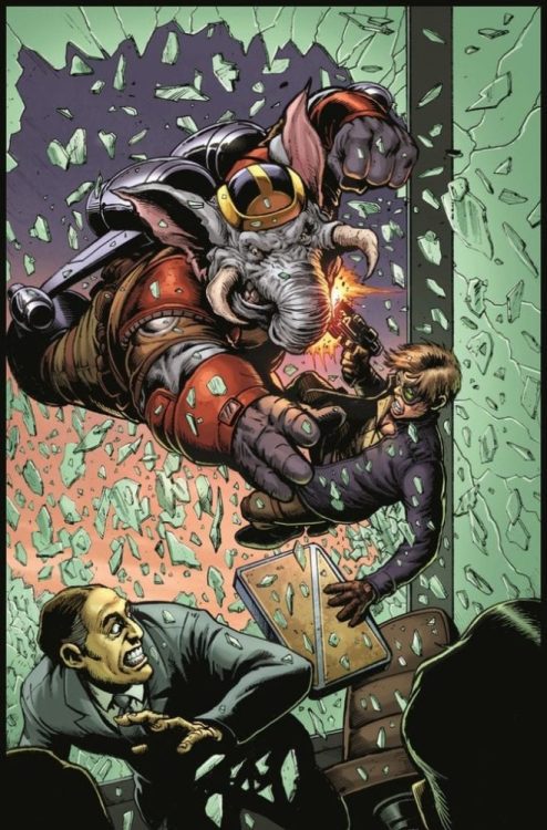
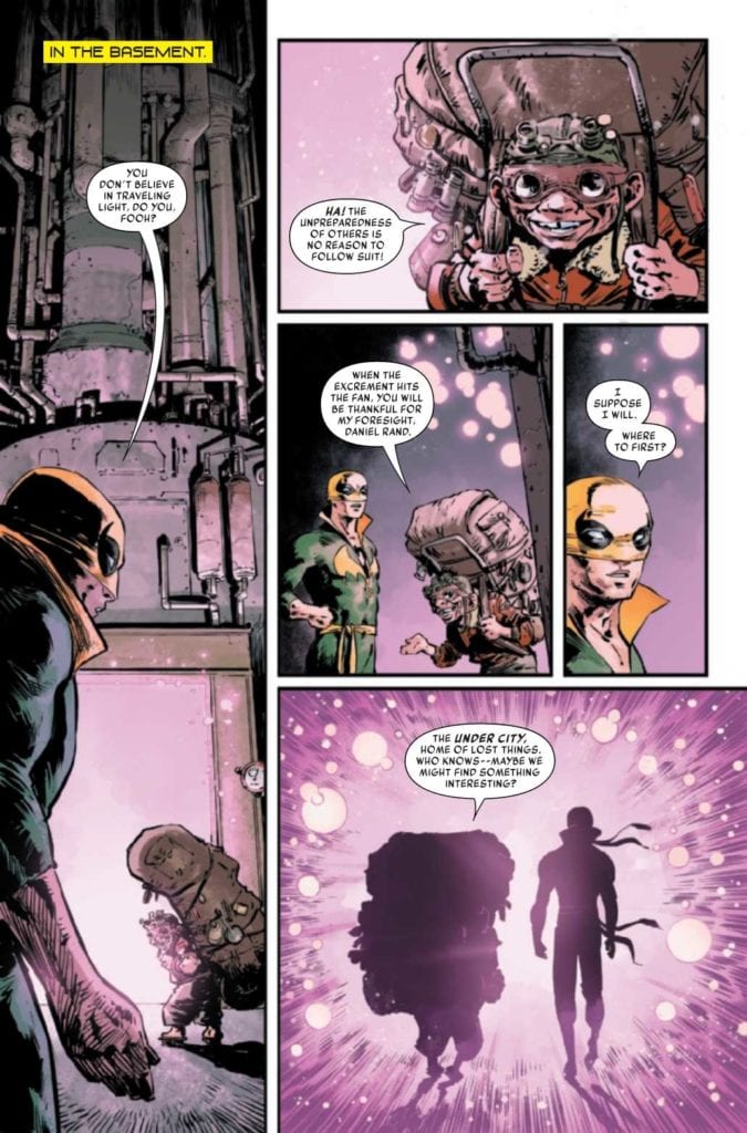
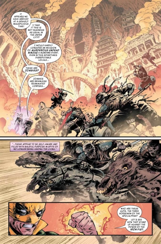
Wachter demonstrates the scale of Iron Fist: Heart of the Dragon #1 through architecture. In just one of the settings, the building of the Under City, along with the burning smoke, look disorienting. For anyone other than Iron Fist, a sudden attack from a zombie calvary would kill them in an instant.

The fight scenes evoke the capabilities of the characters, often through panel work. The panels featuring Iron Fist, in particular, showcase the champion in both anticipation and split-second movements. In just one page, Iron Fist destroys a zombie ninja and its horse in the blink of an eye, which is why appearances from fighters who can keep up with Iron Fist like Taskmaster have fewer panels. These bigger panels emphasize the explosive blows they use to keep Iron Fist off balance.

Iron Fist: Heart of the Dragon #1 Mystic Colors

Menon provides Iron Fist: Heart of the Dragon #1 with a mystic undertone. Among all of the dangers that are highlighted with yellow and red, cooler colors exist in contrast. For example, a mystic doorway is purple, acting almost like a warning of danger ahead, unlike the safer Rand Tower. Then there comes a visitor near the end of the issue which is coated with a glow of blue whose very presence can cause some relief. Anything specific might be spoilers, so let’s just say that this entity is godly in every way.

Impact Lettering

VC’s Lantham keeps pace throughout the issue through efficient use of word balloons, captions, and SFX. In keeping pace with the action, no more than two sentences in carefully placed word balloons occupy a panel. The few uses of captions differ from highlighting locations to a monologue of a character off-panel. As for the SFX, each usage of action is unique, never repeating a usage for similar occurrences. This gives each blow by the characters a distinct identity. This all gives readers something to look forward to in later issues.

The most unique use of all the lettering in Iron Fist: Heart of the Dragon #1 comes from a surprise visitor. Her divine presence has her speak in a distinct light blue font that denotes her benevolence. This is why the plea she relays to Iron Fist feels so dire. There is a threat that a divine incarnation of compassion cannot face.

Psyche Yourself Up In Iron Fist: Heart of the Dragon #1

Within this issue is a chance to see a part of the Marvel Universe between heroics and magic. With plenty of martial arts action to go around, a plot of intrigue is boiling to the surface. Could this new force have something to do with Marvel’s evil ninja clan The Hand, considering the zombie ninja? Iron Fist: Heart of the Dragon #1 leaves readers begging for more.

Monkeys Fighting Robots Youtube

INTERVIEW: Editor Morten Højbjerg Cuts The Crown’s Controversial Episode

The Crown is a Netflix series about England’s royal family from creator Peter Morgan, which tackles the drama and power struggles that have gone on behind the scenes for decades and, more realistically, centuries. Editor Morten Højbjerg sat in a dark room for long periods to cut together the shocking and controversial seventh episode of season four.

The Crown’s fourth season premiered on Netflix in November, delivering another stellar set of episodes praised by audiences and critics alike. Season four covers the family from 1979 to the early 90s, which means topics such as the rise and untimely death of Princess Diana are pivotal moments. Helena Bonham Carter’s Princess Margaret features in episode seven, “The Hereditary Principle,” which reveals another royal secret that must stay hidden.

PopAxiom and Morten spoke about becoming an editor, choosing between Helena Bonham Carter’s takes, and editing The Crown episode seven.

He Looks, He Sees, He Reacts

It’s common that people’s origin story in the filmmaking business usually starts with falling in love with film at an early age. From there, it’s a dream waiting to be fulfilled. For Morten, that’s far from his reality. “I’m a country boy,” he laughs then continues, “I’m from the countryside. In my family and upbringing, there was no creative intent or film industry anywhere around. I grew up thinking I was going to be a veterinarian.”

For a long time, Morten admits, “I didn’t even know what editing was or even thought about what it took to make a film.”

“I moved to Copenhagen,” he says, “and by a weird coincidence, I got a job as a runner at a production company. It was back in the day when editing was physical on actual film.”

The company Morten was working for “bought a state-of-the-art machine, the AVID. It was one of the first machines in Denmark. But nobody knew how to use it. It was a brand new technology.”

“I became incredibly fascinated by this machine that let you cut video on a computer,” Morten reveals, “It was mind-blowing.”

Morten’s fascination with the AVID lead to “digging into it by reading the manual. I started cutting little things. Before I knew it, I was cutting commercials for Playstation and car commercials.”

By this point, already a working editor, Morten “applied for film school to learn the theories behind what I was doing.”

After four years at the National Film School Morten, “never looked back.”

“You can cut from a super-wide shot where you can barely see the characters. They’re just tiny moving objects in the back of the frame. And then you cut to a close-up shot, continuing the movement, and your brain knows that this is that person.”

Morten Højbjerg-editor-the crown-netflix

About The Crown

The Crown is an acclaimed show with three seasons of top-quality storytelling under its belt. “When you come in on something like this, that’s such a massive show, and there’s three entire series before it you’re expected to know the show. You have to understand the universe and contribute to that.”

Morten’s work on The Crown featured a lighthouse in the form of a person. “Show-runner Peter Morgan, who is also the writer of most of the episodes, it’s his child. He’s a lighthouse. If you have questions, thoughts, comments, or you’re just in doubt, you can always ask him. He will know. He is The Crown.”

The Crown’s an evolving beast that’s painstakingly taking viewers on a dramatic ride with the royal family. It’s dense and detailed. “It’s incredibly useful,” Morten adds, talking about Peter and his intimate knowledge of the show. “It gives the whole thing a singular feel.”

“Every episode is sort of treated as an independent piece of work,” Morten says, “There’s never a time when an editor works on more than one episode in a season. We live with our episode. I worked on my episode for six months. You’re very much encouraged to treat each episode like a feature film.”

The Crown is a big production that can often make the cogs in the wheel feel small. “You’re part of this big wheel that’s spinning, but you’re also making a special piece.”

The Character

Prior to working on The Crown, Morten edited four episodes for the Amazon series Hanna based on the action film from 2011. “From project to project, it takes a bit of time before you completely land in the universe. Coming from Hanna, which is this complete other kind of thing, you jump into this Royal Family thing, and it couldn’t be more different.”

To some, it might sound jarring, but to editors, it’s part of the fun. “But it’s always like that somehow, which is one of the fascinating things about the work. You get to submerge yourself in so many different universes, and then you’re there for a few months, maybe a year. Then you leap out of it and into something else. It’s inspiring. Of course, it’s completely schizophrenic, but I feel fine.”

Helena Bonham Carter, as Margaret, sister of Queen Elizabeth and the family gut-puncher who likes to call BS, features heavily in “The Hereditary Principle.” Morten has to decide which version of a scene a legend like Carter is better. “Having to choose between cuts is almost impossible. There’s nothing you want to cut out.”

“The first cut is usually much longer,” Morten admits. “They shoot so much, and there’s so much to work with. But you gotta take that chisel and hammer out the sculpture.”

It’s not so strange that “The first cut is bulky,” Morten reveals, “because you want to keep some choices open. You keep it in as long as possible until it has to go because the episode is just too long. If you trim it down to maximum efficiency from the get-go, you risk losing a lot of subtle things.”

“The Hereditary Principle” is a significant episode of season four in a series where every episode feels significant. “It was such a pleasure to be a part of The Crown. Editing scenes, together with those incredible performances, was a wonderful experience. Whether it’s spaceships or bank robberies, it’s always about the character.”

helena bonham carter-the crown-Morten Højbjerg-interview

Wrapping Up

“Sometimes you watch a film, and it brings you back a great feeling, and it’s so surprising. It takes over. It’s so fantastic,” Morten says.

Morten says he’d love to do “something like Joker. It’s one of my favorite films of recent times. I want to do something that has that kind of intensity and authority. Brilliant storytelling. Joaquin Phoenix was just fantastic.”

The life of any filmmaker is never a dull moment. What’s next for Morten? “I’m working on a film in Iceland at the moment. It’s dark and very windy. Apart from that, it’s great. It’s a film based on a real-life incident in the early 20th century about two explorers who get stuck on the ice.”

Did you watch The Crown on Netflix?

Thanks to Morten Højbjerg and Impact24 PR
for making this interview possible.

Read more interviews from Ruben R. Diaz!

Monkeys Fighting Robots Youtube

Review: A Cathartic And Wholesome End In YASMEEN #6

Over the past six months and five issues, Writer Saif Ahmed and artist Fabiana Mascolo have been telling one of the most emotionally impactful and socially important comics of the past decade. Now,this tale reaches its end with Yasmeen #6. This final chapter neatly wraps up all of its plot threads in an emotionally cathartic and sentimental manner that, while admittedly a little cheesy, is still an uplifting and satisfying end to this outstanding comic story.

“Past and present clash in the series finale as Yasmeen must find the courage to face her darkest memories during a police investigation into her history. Meanwhile, Wassan forces Khalid to listen as she tells him about what Yasmeen had been through in Iraq, prompting Khalid to reveal a dark part of Yasmeen’s survival story.”

Writing & Plot

Every issue of Yasmeen has been a heavy shot of devastating circumstance coupled with uplifting hope. This final issue gives us that same mix, with the story Yasmeen’s time in captivity coming to a close as well as resolving the recent issues in her current life. This chapter contains a surprising and effective action sequence from the perspective of Iraqi soldiers that (while obviously not the main focus of this book) is written so well it makes me want to see Ahmed take a stab at writing a war story. The focus of this point however is the unimaginable loss Yasmeen witnesses during this moment, and how that influences her perspective in her new life. The other end of this comic is about Yasmeen’s affect on the people who surround her, and every element of reality that this entails. From the encouragement she gives her friends to the thoughtless comments and racism she receives, there’s sharp commentary for every part of the story. The character highlight of this issue is the resolution of Yasmeen’s father’s story. He had been getting to the point where it was hard to sympathize with due to how he had been ignoring his own daughter, but this plot resolves in a believable manner that allows us into his perspective and basically grants him another chance as an audience. This issue is written in the usual form of flashbacks intercutting with the present day, and it’s used as cleanly and effectively as it has in every issue thus far. Like in the past couple of issues, the present-day moments involving Yasmeen and her high school friends can come off as a little corny and a little bit cliched, but there’s an emotional sincerity to the script that makes this elements easy to overlook. This issue also feels a bit breakneck in terms of pacing, as the final pages wrap up different subplots in a montage style. This is a fine way to end those plots, but it does feel like it robs certain stories of their emotional weight. Overall, this is still a satisfying and cathartic end to one of the best comic stories of the past year.

Art Direction

Artist Fabiana Mascolo once again delivers the gorgeous light tones and character focused visual direction this series has always used in Yasmeen #6. Her linework and focus on character’s facial animations gets us into the headspace of the cast with little effort, as all of her interpretations of emotion are visually spot-on. She also gets a chance to work with some explosive action on this issue, and she excels. The panels full of fire and men making tense tactical decisions, as well as the emotional devastation embedded in these scenes, are some of the most memorable moments of the entire series. Mascolo’s colors are yet again an array of light, as if every panel regardless of what time it takes place has this wave of sunlight being flashed upon it. As per usual, Mascolo’s panel direction is a well-crafted mix of character close-ups and intercutting between past and present. Her shots present the most emotional scenes in a manner that captures the emotional journeys of every affected person, and her structure for switching from flashback to present-day is neat and flawless. It has to be said however that the quality of the pencils seems more inconsistent than in prior issues. It isn’t a widespread issue, but there’s a noticable quality dip in a few select spots that I’ve never noticed in prior issues. This being said, Yasmeen #6 is still a stellar book in terms of visual creativity.

Yasmeen #6 is an emotionally satisfying end to this courageous and important comic series. Saif Ahmed’s script dedicates itself to delivering effective ends to every character’s arc. His handling of unimaginable trauma is sincere and respectful while also being optimistic and offering messages of hope. While the story here can be a bit corny and the pace is a bit rocky near the end, this is still a great issue that does this outstanding series justice. The visuals of Fabiana Mascolo, while inconsistent compared to prior issues, is still a gorgeous mixture of character studies and sharp panel direction. Be sure to grab the final chapter of Yasmeen when it hits shelves on 1-20!

Monkeys Fighting Robots Youtube

Review: BUFFY THE VAMPIRE SLAYER #21 — Convergence

All About Anya

Out now, Buffy the Vampire Slayer #21 continues the collaboration between writers Jordie Bellaire and Jeremy Lambert, and illustrator Andres Genolet. Rounding out the team are colorist Raul Angulo and letterer Ed Dukeshire. With new characters complicating the situation, the creators seem close to a crisis point for the Scooby Gang.

In previous issues, a new slayer, Faith Lehane, and her watcher, Wesley Wyndham-Price, were introduced, compounding the Scooby Gang’s problems. Now there are three slayers, two watchers, and, lurking in the background, a secret fourth slayer and a demon operating under the leadership of Anya. As the character count grows, so each character moment intensifies. Thus it is in issue #21, an Anya-centric issue.

spoilers ahead

Taking cues from the TV show and Dark Horse continuities, we’re introduced to a slightly different Anya in this issue. She’s still a vengeance demon, but Lambert and Bellaire give her a backstory as an erstwhile watcher who was fired for defending her slayer from the Council’s deliberate endangerment. For long-time fans of the character (myself included), such a decidedly feminist change feels so satisfying. Furthermore, the choice gives us a chance to root for a character other than Buffy in an otherwise unlikely scenario.

A Challenge

In the Buffyverse, the Watcher Council often seemed an enemy greater than demons and vampires. Because they were so feared, Buffy was the only one to stand up to them. Therefore, it’s refreshing to see Anya as a former Watcher, defying members of the Council to their faces.

However, this issue takes the conflict a step further with Anya and her not-so-dead slayer, Morgan, threatening not only the lives of the Watcher Council, but Buffy’s closest friend and father figure.

On an artistic level, Genolet matches the scope of Bellaire and Lambert’s drama through his use of close-up, wide-paneling, and instances of no panel delineation at all. It’s a big, intense issue. Angulo’s color palette of warm orange fire and cold blues accentuate the feeling that we’re drawing closer to the underworld. By contrast, Dukeshire’s lettering shows restraint with SFX and allows for an exposition-heavy scene to feel more like a movie than a novel.

Now, we have all the players, the subplots have dove-tailed, and the threat is clear. The only question is whether Anya will make it out of the impending climactic battle as a friend or a foe. It looks like all that’s left for the Scooby Gang is to find their way out of the Ring of Fire.

Monkeys Fighting Robots Youtube

Review: FUTURE STATE: JUSTICE LEAGUE #1 Falls Short of Greatness

Future State Justice League 1 cover

The Justice League of the Future Faces a Past Threat!

Future State is upon us, and we get to meet an all-new generation of heroes. Last week, we had several comics introducing us to the Next Batman, Superman, and more. As with the generation before, the heroes of tomorrow have gathered to form a Justice League of their own. We have new characters such as The Flash and Yara Flor, Wonder Woman, teaming up with names we’ve known for years, such as Jon Kent and Jo Mullein of the Green Lantern Corps. With all these heroes gathered, are they ready to take on the threats of this future?

Future State Justice League 1 cover

**Some Spoilers Below**

Story:

We open with a monologue explaining how this new Justice League has stepped up. The narrator revealed to be an old T.O. Morrow, goes through each member and how they’ve changed the state of the world. He says this to his new Legion of Doom and promises that together they will defeat the heroes. This doesn’t come to pass, as the next day, they are murdered. The League goes in, but with few clues, Green Lantern tells them all to wait until she figures out who did this. They all go their separate ways, but Superman doesn’t feel right.

This opening issue was honestly disappointing to me. Justice League, like all team-up comics, needs to have interactions at the forefront. Characters with such memorable personalities meeting and clashing is usually a fantastic time. We’re only told about this League’s accomplishments, but nothing really about their personalities. Granted, we know a little about Jon, Batman, and Yara, but unless you read Far Sector, the other three are entirely blank slates. Due to an incident(the one hinted at during Flash/Batman: The Button), the heroes aren’t allowed actually to get to know one another. What kind of team-up story is this when there are no stakes in relationships?

That being said, I am still intrigued to see where this story is going to go. The killers have been revealed as an old Justice League foe that hasn’t been seen in over a decade. While I will keep the identity a secret, the idea it implies is that these heroes will need to break their rule. The only way to beat an enemy such as this is to trust in one another completely. If that’s the idea the writers are going for, then I’m very excited.

Art:

Robson Rocha is the illustrator for this issue, and he does a spectacular job. This version of the Justice League looks fantastic, with the designs of the characters looking top-notch. Even the villains end up looking cool, making me feel sad that we wouldn’t get a proper action sequence with them. Rocha also succeeds in crafting the world itself, with the city looking breathtaking with its bright lights. It’s a nice contrast when compared to the run down Hall of Justice. This artist definitely needs more work at DC because he really brings his A-game.

Conclusion:

Overall I was disappointed in this issue, but I am not quite giving up hope on the series. We don’t get a ton of action or character, but the world is still interesting. The latter is definitely due to the fantastic work on the art team’s part. The story itself has left enough intrigue to pull people into the second issue, but it needs more work. This series would probably be more successful if we had more time to really get to know these characters. If we are able to get more character in the coming issues, then I think this mini-series will really succeed.

Monkeys Fighting Robots Youtube

5-Page Preview: SPECTER INSPECTORS #1 From BOOM! Studios

BOOM! Studios Exclusive First Look: SPECTER INSPECTORS #1

SPECTER INSPECTORS #1 hits your local comic book store on February 3, but thanks to BOOM! Studios, Monkeys Fighting Robots has an exclusive five-page preview for you.


About the five-issue mini-series:

True believer Noa, her cynical little sibling Gus, credulous camera man Ko, and Noa’s skeptical best friend (and secret crush) Astrid head to one of the most haunted towns in America to prove that ghosts exist, for all the social media likes! The investigations of hauntings uncover something more devilish than just a couple of ghosts, something that will put Noa and Astrid’s relationship to the test… and reveal the centuries-old sinister secrets of the town itself.


SPECTER INSPECTORS #1 is co-written by Bowen McCurdy and Kaityln Musto, with art by McCurdy, Erica Henderson and Mirka Andolfo worked on the variant covers.

“This book is everything I wanted to read when I was young; queer characters on adventures, ghosts, romance, and only a handful of demons. The story is based on one of the first comics I ever did, so it has a big place in my heart. I fell in love with the SPECTER INSPECTORS while writing them, and even more so while bringing them to life through art. I’m so excited to share them with you!” said McCurdy back in November.

Check out the SPECTER INSPECTORS #1 preview below:

Are you excited for SPECTER INSPECTORS? Sound off in the comments!

Monkeys Fighting Robots Youtube

INTERVIEW: Director Sergine Dumais & Writer Bo Price Take Us To WICHITA With Jeremy Sisto

Wichita is a short film starring Jeremy Sisto (Clueless, FBI) and Maxim Roy (Mirage, October Faction) as a married couple whose relationship is in a special place.

Of course, that lead sentence is vague for the sake of spoilers. Wichita’s limited run-time is carefully crafted for maximum effect by director Sergine Dumais and writer Bo Price.

PopAxiom discussed Wichita and more with Sergine and Bo.

Getting Started

Sergine and Bo have nearly 100 IMDB credits between them. When did the filmmaking bug bite? Bo answers first, “I’ve wanted to do it since I was about ten years old. I used to make movies with my friends back in Wichita, Kansas.”

“I started my career as a dancer, then I wanted to be part of the people telling the story and studied to be an actress,” Sergine shares. “I started a musical theatre career, but soon after, I wanted to be the one telling the story. I became a director in theater. I moved to Los Angeles about nine years ago, which is not a theater town. I had to reinvent myself and started a career directing voice over and did a lot of dubbing American movies into French.”

As theatre deprived as LA may be compared to places like New York, Sergine worked on stages throughout the city, including working with Jeremy Sisto. “While working with Jeremy on that play, I debated with myself if I wanted to transition to film. I thought, ‘If I do make that change, I want to work with this guy. And he’s now in my first movie.”

wichita-film-interview-writer

Transitions

What was the transition from theatre director to film director like? “It could not have been easier,” Sergine says. “This was a dream team. The cast and Bo were fantastic. Serge Desrosiers is a top DP [Director of Photography] from Canada that was kind enough to help. I had such great support. I leaned on my experience in directing actors; that’s my strength. For the rest, I leaned on my incredible team.”

Bo Price’s script for Wichita started from a familiar place. ”I grew up in Wichita in the 80s. At that time, the famous things that happened were that Barry Sanders won the Heisman trophy; Pizza Hut was created a few years before and made many millionaires in town; Kirstie Alley got on Cheers.”

These landmarks in Kansas history inspired Bo. “I thought if you could be from Wichita and win a Heisman or create a huge company or even get on TV, it was terrific.”

“About seven years ago,” Bo explains, “I thought it would be funny to write about these famous things. Famous only to people who are from Wichita. So it would be these people talking about these things as if they’re describing the Eiffel Tower or Statue of Liberty, but instead of these world-wide landmarks, they were talking about very specific things.”

Bo wrote a “little sketch” that “evolved slightly, but I didn’t think much about it until years later while working with Sergine. We’d done several projects together, and she asked if she could do one of my scripts as her first short. She picked Wichita.”

“For sentimental reasons,” Bo shares, “I’m glad she picked that one. It was exciting for me to have something called Wichita. The best part was she took what I’d written and transitioned it into something that could not exist without her.”

Bo credits Sergine with rounding up the incredible cast. “She approached it as a real story with real relationships and not as something funny that was name-checking these things. She brought her theatre skills to it that elevated the whole thing.”

“It’s a strange mix,” Bo ponders about the project as a whole. “Sergine brought the French-Canadian culture to this film about the culture in Wichita, Kansas that’s shot in Los Angeles.”

Making Wichita

Wichita is a short film that’s made the rounds at festivals and collected dozens of accolades. The shoot, according to Sergine, took “Two days. Jeremy came in and knocked out his scene in one hour. He’s so good.”

“It was a dream shoot,” Sergine says, “All the stars were aligned. We were nervous because we were expecting rain. And it was raining until ten minutes before we started shooting and started again right after we wrapped.”

The short shoot time and impressive turn-around from both lead actors were a result of preparation and familiarity. Sergine explains, “I’ve worked with Jeremy and Maxim, and we know how each other works. You know, if you meet the actor the same day and you only have a half-hour to rehearse, it takes almost all that time just to meet them. We didn’t have that problem. We made use of the half-hour from the get-go.”

Wrapping Up

“I’m a big Bob Fosse fan,” Sergine, the former dancer turned musical theatre actor turned director, says about inspiration. “When we were preparing to shoot Wichita, Marriage Story was on Netflix, and that was very inspiring.”

For Bo, his lifelong desire to become a filmmaker means his cinematic creative fuel goes way back. “My three favorites were Martin Scorsese, Stanley Kubrick, and Woody Allen. I love everything they did and couldn’t get enough of it. I admire any filmmaker who sort of becomes a genre with just their name.”

If Hollywood came knocking with a blank check to remake anything, what would Sergine and Bo Choose? Oh, that’s a tough one,” Sergine exclaims, but then the answer is clear. “For me, it would have to be a movie musical for sure. Sweet Charity, yeah, that’s my pick!”

“There are movies that I love like Wizard of Oz or Chaplin’s City Lights, which is one of the best movies ever,” Bo begins his answer. “I don’t know if I have the capacity to remake those. It’s fun to think about. I wish I had a better answer.”

What’s next for the longtime collaborators? “Right now, we’re working on a feature version of Wichita.”

Is Wichita on your watch list?

Thanks to Sergine Dumais & Bo Price and Rhapsody PR
for making this interview possible.

Read more interviews from Ruben R. Diaz!

Monkeys Fighting Robots Youtube